Archive
Mounting Tension
There was more odd market behavior today, but at least it was odd in a different way. Stocks rallied 0.4% while Treasury yields backed up to 2.72% (10y note), so the normal relationship resumed for at least a day. Moreover, the dollar rallied – sort of. It was unchanged against the Euro, but 2 big figures weaker against the Yen as the Bank of Japan intervened to buy as much as $20bln versus yen (Reuters story here). Japan has become concerned at the increasing strength of its currency against the dollar (near all-time highs), partly since a strengthening domestic currency helps to lower domestic inflation…which is just about the last thing that Japan needs. Word was that the sale of yen wasn’t sterilized, implying that the BOJ also was adding to its money supply.
I don’t know a lot about currency intervention, but here is what I do know and I think it’s pretty close to all that I need to know: intervention tends to work only when the market was overextended anyway relative to the fundamentals, not merely because it is inconvenient for the central bankers. If Japan’s currency is strengthening relative to the dollar, it is partly because the US appears to be moving towards quantitative easing with much more determination than Japan ever showed. If the BOJ wants to weaken the yen, it should print a lot more of them. If the U.S. increases the supply of dollars, relative to other currencies, appreciably, then its relative price will decrease (this is one reason that we ought to be wary of concerted QE, since not many countries likely want to see their currencies strengthen a whole lot against the buck…especially when they own trillions of dollars).
The unusual move today was in the VIX index, which despite recent low volumes and fairly uninspiring ranges (and higher equity prices, which tends to move us down the skew) rose abruptly in the morning and ended 0.5 higher at 22.10. What caused the bid for vol today? Why is the tension mounting? Was it the currency intervention in Japan? Was it the fact that the EU is moving to ban all naked short-selling, allow national regulators to ban all short-selling for temporary periods, and require mandatory reporting of “short” positions to a central database (why not longs)? (Link to story.) Can you imagine the carnage if levered long-short portfolios are forced to unwind? Covering the shorts will require covering the matched longs as well!
Changes like this, no doubt, create additional risk in the marketplace, just as the long-standing crusade against market-makers (see yesterday’s comment) drives away liquidity to the same effect. I really have no idea what these politicians are thinking, but perhaps the problem is that I am trying to use “politicians” and “thinking” in the same sentence.
If implied volatility continues to rise, especially if it rises in the context of another deflationary financial shudder, one player who will be unhappy is Pimco. An article in Bloomberg today revealed that in a regulatory filing Pimco’s mutual funds sold $8.1bln “deflation floors.” This is an OTC structure that is designed to mimic the embedded principal floor in TIPS. A 10-year deflation floor would have a one-time payment of Notional * max(0, endCPIindex / beginCPIindex – 1). That is, if the price level is lower in 10 years’ time, Pimco will owe money to the buyer of this protection; in exchange, Pimco receives an up-front premium.
It is usually a bad idea to sell options on highly-unlikely events, because it is extremely hard to evaluate the true probability of those events. Pimco is convinced, as am I, that it is very unlikely that prices will fall on balance for a whole decade. Pimco is also convinced, as am I, that the price of the option is too high relative to the expected value of the protection they are selling. However, unlike Pimco I’d be extremely reticent to sell this option, for two reasons. One is that when I was an OTC options trader I learned a very important lesson from a more-experienced options trader. The rule was “Never be a weenie and sell a teeny.” (A teeny is 1/64th of 1%, the lowest price at which you used to be able to sell an exchange-traded option. They regularly trade when there is essentially no chance of the outcome in question.) The point was that you need to be unlucky only once for your losses to amount to huge multiples of your all-time cumulative gains. Moreover, we really don’t have a good feel for what the tails of the distribution…where you’re playing, if you sell this option…look like because they are so unlikely we can’t ever have enough history to evaluate that probability. Unless, of course, you assume lognormality; if you are tempted to do so, I recommend reading either of Nassim Taleb’s books, Fooled by Randomness: The Hidden Role of Chance in Life and in the Markets

The other reason I wouldn’t do it is that the seller of these options can’t just “fire and forget.” If implied volatility doubles tomorrow, Pimco will show to its investors a large mark-to-market loss, and if the investors all flee there is no way for the firm to buy back this exposure – the market isn’t that well-developed. If another financial calamity hits, which is hardly a scenario we can discount completely, then a sharp move lower in inflation expectations, combined with a sharp move higher in volatility, would result in a mark-to-market loss far in excess of any likely eventual loss Pimco may have. I think that if I was a betting man I might make the same bet Pimco made, but I’m an investing man and I think this risk has too many downsides. But perhaps they have something on the other side…
Today’s economic data were ho-hum, and tomorrow’s PPI (Consensus: +0.3%, +0.1% ex-food-and-energy) doesn’t really matter. But Initial Claims (Consensus: 459k) ought to be fun. Last week’s number, remember, plunged to 451k; this happened coincidentally at the same time that eight states were unable to get their actual claims into the BLS and those numbers had to be estimated. For some reason, the estimate showed a sharp improvement in the labor market. It is really odd to me that economists, in forecasting a bounce only to 459k, are essentially giving that number full credibility. Before last week, the 4-week moving average was 487k and the 8-week average was 473k. Where is the evidence of a marked improvement? I may be eating my words, but I would expect something more like 475k with a sharp upward revision to the prior week (unless, that is, those states are still behind on their paperwork). The highest estimate recorded on Bloomberg of the 42 economists who forecast the number is 476k, and quite a number of economists are projecting in the 435k-445karea. That would be in the neighborhood of the best prints since 2008. I just don’t see the evidence of such a sharp improvement in the labor market.
What Is Bad About The Top Of The Hill
Bonds rallied again today, with the 10y note yield down to 2.66%. Stocks were higher for most of the day – again, at the same time as bonds – although they settled back to be mixed at the close. Commodities rallied again and gold set another record as the dollar dropped again. The greenback now has seen its worst 2-day decline in over a year. Inflation swaps were down a smidge (when yields fall, it is hard for inflation breakevens to head aggressively the other way repeatedly), but otherwise it sounds very similar to Monday’s price action.
And my suspicions from yesterday, that this might be related to market intuition about the increasing likelihood of QE2, were partly confirmed. Goldman Sachs’ Jan Hatzius (who is really good, and regular readers will know I rarely say that about an economist or strategies) said in a customer note that he sees QE2 coming, probably in November or December. I’ve said the same thing for a month or so. While the Fed doesn’t care what I say, however, the fact that Goldman is projecting quantitative easing actually makes it marginally more difficult for it to happen since the Fed would prefer not to look like Goldman’s lackeys (like, for example, the Treasury often does).
Not only did Mr. Hatzius write this, however; it was also picked up by the Wall Street Journal. So it isn’t far-fetched to me to relate some of the recent market action to the hypothesis that QE2 is drawing nearer.
Retail Sales didn’t make the case for quantitative easing any easier, as core Retail Sales was slightly above expectations at +0.6%. There are some signs from retail outlets that consumption might be recovering somewhat, but given the problems with seasonally adjusting economic data this year – since the historical seasonal patterns were not generated during a depression – I would not get overly excited about a small beat.
Inventories rose, and several recent inventory numbers have been modestly better-than-expected. I don’t tend to focus on inventories because the answer to “is a rise in inventories good or bad” is “it depends.” If inventories are rising “intentionally” because manufacturers see increasing demand, that’s a good sign; if inventories are accumulating “unintentionally” then it means growth has disappointed and manufacturers will need to cut back on production. With the trajectory of growth in Q1-Q2-Q3, I would tend to suspect the latter, but I would never bet on it. I am mentioning it only because I want to make another point, and that is that lower interest rates cause the opportunity cost of inventories to be lower. Lower interest rates, combined with the prevalence of cash on defensive company balance sheets, means that ‘investing’ in bigger inventories for the insurance value of doing so isn’t as costly. At the margin, this may tend to increase carried inventories.
.
Just for fun, let’s suppose for a moment that the economy bulls are right and the world is pulling out of this contraction. You might think this would create a salutatory environment for equities: low interest rates, improving growth. The problem is that in such an environment, interest rates will not be staying low of course, especially as growing businesses compete with Treasury debt for funds. It isn’t so much the level of interest rates that matter as it is the direction of rates. You may be standing on top of a sunny hill that offers many advantages, but all paths (at least in terms of interest rates) lead down the hill. Especially since growth is already mostly discounted, but higher interest rates are not, it would seem to me that growth which obviates the need for crisis-level interest rates would be bad for equities, not good.
Think about it this way. The Gordon Growth Model says that the fair price of an equity is D1/(k-g), where D1 is next year’s dividend, k is the required return, and g is the expected long-term growth rate. Some people say that stocks are cheap because, essentially, k compares favorably with interest rates. This may presently be true. Right now the dividend yield of the S&P is right at 2%. Let’s use 5.0% for g (2.5% real growth, 2.5% inflation); with SPX at 1121, this implies that k is 7.1% with 10y rates at 2.66%. That’s a spread of 4.44%.
But what happens if near-term growth rises? Presumably, that shouldn’t change the assessment of long-term growth very much, but what if 10y interest rates rose to, golly, 5% to be equal with the long-run nominal growth we assumed? Then stocks that are priced to deliver a return of 7.1% are going to look pretty expensive. If the spread between the bond yield and the required return on equities narrowed to a mere 4%, the SPX would be priced at 1121*2%*1.05 (D1) / (9%-5%) = 588.
Something between 588 and 1121 probably makes sense if we really are recovering a little, but unless we are about to experience a new Renaissance, I don’t think the stock market is prepared for a repricing of competing assets.
.
If equities do need to reprice lower at some point, they will have to do so largely without traditional market-makers. An article on Bloomberg today suggested that the flash crash may have triggered an “oh rats[1]” moment at the SEC, which has abruptly realized that driving away the market-makers by removing their advantages means they also have no one to adopt the specialists’ responsibilities, one of which was provision of liquidity (buying when no one would buy and selling when no one would sell). The rest of us would call this a “no rats,[2] Sherlock” moment. Here is hoping that they recognize this is exactly what the Volcker Rule is doing to the rest of the markets!
.
In other strange news today, Cisco initiated a dividend. This isn’t strange; merely the timing is a bit strange since dividends are scheduled to lose their tax rate advantage in 2011. (This is in fact something I bite my fingernails about every day, since I give a lot of attention to dividend yield. These securities may well cheapen. I still prefer the margin of safety to something that doesn’t have a cash flow, though). I guess timing like this helps to explains why Cisco, one of Cramer’s former “Four Horsemen” of tech, has a 16 multiple.
The data calendar stays active tomorrow with Empire Manufacturing (Consensus: 8.00 from 7.10) at 8:30ET followed by Industrial Production/Capacity Utilization (Consensus: +0.2%/75.0%) at 9:15. Neither is a top-tier report, but as we get closer to decision time on QE2 even these lesser reports will begin to take on more gravity.
[1] Not the word I wanted to use.
[2] The same word, which makes no sense here. If you use the word I intended, though, both phrases make sense.
Trillion-Dollar Fool?
Another news-less day, another equity melt-up (+1.1%). The curious thing was that today the equity melt-up was joined by a bond melt-up. The Dec 10y Note contract rallied 16.5/32nds and kept going after the close. At 3:00 ET, the 10y yield was back down to 2.74%.
I try not to get too caught up in the wiggles, and I suspect that this is just a reaction to what some people saw as an oversold market. 30bps over a week and a half wouldn’t ordinarily qualify as “oversold” in my mind, but in the context of the normally-strong September seasonal pattern, it makes some sense.
But rallies in both markets are a little curious. I wonder – the dollar weakened today by the most since July 1 (as measured by the dollar index) and closed at the weakest level in a month of sideways trading. It isn’t a large move; nor was the continued widening in the inflation markets a particularly large move. One thing that could align all of these directional trades is investor anticipation that the Fed’s QE2 is growing increasingly likely. Ordinarily, one would think that quantitative easing would be associated with higher interest rates, and a rise in inflationary pressures would sock equity multiples. But if QE is conducted through direct purchases of bonds, then interest rates won’t rise for a while; and although it is wrong and contrary to copious evidence, conventional wisdom continues to be that inflation is good for equities.
Regardless of whether inflation is good for equities, additional liquidity would certainly tempt a squirt higher in prices. Nominal bonds are only a decent investment at these levels if you’re pretty sure there is a trillion-dollar fool waiting to bail you out at higher prices. But both might make sense if that trillion-dollar fool is stepping up. Of course, injecting more money into the system would tend to quicken inflation (that is, after all, the point) and thereby weaken the dollar unless other monetary authorities are doing the same. So far, that doesn’t seem to be the case.
Like I said, I don’t want to read too much into one day’s wiggles, but part of investing is “aiming high in steering” and trying to figure out where the next curve ball may be coming from. Although I don’t like equity valuations, I would be nervous to be short right now.
.
So much for new banking rules for Basel…I still can’t think of why you would want to own banks in this environment given what is happening to their market and their regulation, but at least there isn’t the threat of a “Big Bang” from the Basel Committee on Banking Supervision. The new rules announced this weekend will phase in over 8 years…that’s right, at least one full economic cycle. According to the Wall Street Journal, “Bank of America Corp and PNC Financial Services Group Inc. could be forced to sell their ownership stake in giant asset-management firm Blackrock Inc.,” which would be a very big deal, but the firms have several years to do with it and I’ll bet they can structure around the new rules. The paper also noted, regarding time frame, “Some changes will go into effect as soon as 2013, but others won’t be in place until the beginning of 2019. Technical changes to the definitions of capital won’t be fully in place until 2023.” Here’s betting that over the next 13 years there may well be innovations that require further changes to the definitions of capital. What century do these regulators think they are operating in, anyway?
.
Tomorrow, we will have some more concrete data to invest with. Retail Sales (Consensus: +0.3%, +0.3% ex-autos) for August may squeeze out another marginally positive print, but nothing to write home about. Retail Sales is usually volatile and, consequently, is usually not worth reacting to but as it is the first piece of marginally interesting data in a week, we could get a reaction to a miss.
What Is The Duration Of Gold?
On Friday, the U.S. inflation market rallied further. Inflation-linked bonds were well-bid as zero-coupon inflation swaps rose 5-7bps across the board. Considering that nominal yields rose only 1-3bps, this is a noticeable outperformance: TIPS went up; nominal bonds went down.
Equities did their by-now-usual afternoon squirt higher. All of this occurred in a veritable news vacuum. Next week sees Retail Sales, Empire Manufacturing, Industrial Production, PPI, an updated Initial Claims number, and CPI. We will see how strong these hands are then.
There were some news stories out of Europe worth noting. In the “not a bad idea” category, the UK Telegraph reported some details from “senior sources” about the Basel rules that were scheduled to be agreed upon this weekend. They are said to require not only higher capitalization ratios from banks – many of whom, recall, are probably already undercapitalized if the PIIGS debt was properly scored – but also a special surcharge on banks deemed “too big to fail.” This is bad news for shareholders of those banks, as return on equity will fall when the leverage falls, but good news for the debt holders. And it makes sense: make the costs of being big reflect the rewards of being big. That’s a much better idea than just forcing them to break up (which probably wouldn’t be legal in this country, anyway), although of course they will never set the price right. Either the price will be set too low and banks will strive to merge and become bigger so that they can get the safety net, or it will be too high and all of the big banks will split up. (Frankly, the latter outcome isn’t that bad).
In news that is almost certainly related, Deutsche Bank reportedly plans to raise $11.4bln worth in a sale of new shares. Given how overvalued these banks are in an environment where the gross margins are shrinking, turnover is declining, and leverage is declining, it makes sense to be selling shares even if the Basel rules do not come to fruition as the Telegraph article suggests. I doubt Deutsche Bank will be the last. I imagine banks will keep selling to people who want to own banks at these prices until investors are sated.
I would target Norway as a potential investor. They announced recently a plan to buy more Greek debt, because after all it’s a great idea to take limited upside and unlimited downside, especially when there is a pretty decent chance that downside will be realized. But if investors in Norway like Greek debt, then they probably will also like European bank debt because those institutions have lots of Greek debt too.
.
You might think I would learn my lesson about writing columns concerning the barbarous relic[1] after my experience last month. But today I wanted to consider briefly not the level of gold nor the value of gold, but rather a secondary investment characteristic of the metal: its duration.
An aside is warranted for those readers who are not familiar with the concept of duration. There are two types of duration we who focus on fixed-income markets are typically concerned with. One, called Macaulay Duration, is a measure of the average time to cash flows. Specifically, it is a weighted average time to receipt of the cash flows, where the weight is given by the present value of the cash flow in question.[2] Gold obviously has no cash flows, and an effectively unlimited life, so it makes no sense to talk about its Macaulay Duration.
The other sort of duration is called “modified” duration. The formula happens to look very similar to the one for Macaulay Duration, which is comforting, but the significance of the calculation is that it gives the percentage change in the bond’s price for a percentage change in yield (and as traders, we multiply by the full price and divide by 100 to get the dollar value of an .01). In other words, it is the answer to the question “if this bond’s yield declines by 1%, by about how much should the price of the security rise?” It is a measure of the sensitivity of the bond’s price to changes in yield, which is useful for calculating the portfolio’s sensitivity and for matching the sensitivity of the portfolio to the sensitivity of the liability mix (or the risk tolerance of the entity).
Of course, the sensitivity of the price of the bond to its yield-to-maturity turns out to be importantly related to the structure and timing of the cash flows, so it isn’t surprising that the two formulas look similar. But when we look at the second concept, we can see other ways to achieve a reasonably-close answer. We can perturb the bond’s yield slightly, recalculate the price, and observe the difference in price. Or, if we didn’t have a bond calculator, in theory we could look at a series of observations of price and yield and run a regression to find out how price responds to a change in yield.
We could take this latter approach to evaluate gold’s “duration” with respect to interest rates or inflation. Why might we want to do this? Well, a pension fund or endowment generally has a pretty good idea of how the present value of their obligations changes when interest rates and (depending on the obligation) inflation change. A corporate postretirement benefit plan, for example, reports (in footnotes to the annual 10-K, usually around footnote 14 or so) the effect of a 1% change in trend health care inflation rates. So plan sponsors who want to protect their plans from an unexpected increase in inflation need to know how much protection they need to buy. The answer, clearly, is related to how much protection is provided by each type of available asset in the “inflation protection” bucket.
Unfortunately, the historical data makes this approach difficult because (a) there is a lot of noise in the price of gold, which reflects a lot more than just the changing price level, and (b) over the last 35 years gold has had a positive bubble, a negative bubble, and … well, I don’t know where it is now. The result is that the relationships are sloppy. The chart below shows the percentage change in the front Gold futures contract as a function of the inflation rate.

If gold is a tight hedge, then these points should be arrayed in a generally straight-ish line from the origin to the upper-right of the chart. Clearly that’s not the chart we are looking at. Indeed, if gold is a tight hedge, then it shouldn’t have year-on-year declines unless the general level of prices in the economy is declining! The R2 here is 0.04, showing effectively no relationship between the inflation rate and the change in gold.[3]
This is surprising, is it not? Over the (very) long run, I would expect that gold keeps pace roughly 1:1 with the price level, since it is after all a real asset and should appreciate as the value of the currency (in real terms) depreciates (which is what CPI is measuring). And over the very long run that does seem to be the case. From December 1981 to December 2008, the total change in gold was 120% while the price level according to CPI rose 124%. Because gold is volatile, the exact ratio depends a lot on whether you’re measuring peak-to-peak or trough-to-peak or peak-to-trough, but over the very long run it seems a decent 1:1 price hedge. This makes sense. However, I ought to point out that there have been several periods where gold has declined on net for more than 10 years before catching up, so you do need to realize that you’re looking at a long-run price hedge, and the return after inflation is near zero. Both of these make sense.
But I started this exercise wanting to look at gold’s duration, which is a little different. What I want to know is what happens to gold when inflation accelerates or decelerates. So I don’t want the annual change in prices (the first difference); what I want to look at is the change in the rate of change in prices (the second difference).
The chart below shows the annual percentage change in gold versus the change in the CPI rate from year-to-year.

To the naked eye, this looks like there may be something of a positive relationship here, which is what we would expect: an acceleration in inflation tends to be associated with a rise in gold prices. The R2, however, still comes in at only 0.068.
It turns out that this is partly due to the fact that, because inflation has some persistence (that is, it tends to be pretty similar from year to year; it doesn’t go from +10% to -2% to +6%), there are many small changes in inflation that are associated with a wide range of changes in gold. From the standpoint of our investor/hedger, this is white noise and it is reasonable to exclude some of these points from the relationship.
If we remove all of the points where the annual inflation rate changed by less than 0.5% (which are covered by the blue box in the chart), the R2 rises to 0.26. This isn’t great, but it is at least respectable (equivalent to a correlation coefficient of about 0.5).
The slope of the line through those points is 8.3, which is to say that the expected response of the price of gold to a 1% change in CPI inflation is 8.3%.
This may seem disappointing, since most people who buy gold are doing so because they expect 20%, 30%, or larger gains. But that’s a tactical investing decision. I’m looking at a deeper question, which is the role of gold as a portfolio hedge in the long run. I expected something a little longer, since as a zero-coupon perpetual investment the Macaulay duration is effectively infinite and the modified duration for a zero coupon bond in a period of low rates can get into the 20s, but 8% isn’t bad. For hedging, I’d probably assume it is somewhat higher, maybe 10-15%. If you include 1979, the slope goes to 32, so something higher than 8% is defensible. As you can see from the chart, the relationship isn’t exactly tight.
(What I would really like to know, actually, is the response of gold to changes in inflation expectations, but we have only a short history of inflation breakevens in the U.S. and that was mostly during a period of quiescent inflation. I could do the same analysis in sterling, since a longer history exists there, and perhaps if a client is interested I will do that).
The real investing problem, of course, is not the beta of gold with respect to inflation but its alpha. The total return of gold can be thought of then as something like this:
GoldReturn = 8.3% * (change in inflation) + alpha
In other words, alpha is the “unexplained” variance in this relationship. Visually, if you draw the 8% slope line on that chart, the alpha is the difference in the actual performance compared to the “predicted” performance from the line. And it can be 20% or more on both the positive and negative sides. For my money, I would set investment guidelines on that basis rather than on the basis of the “duration” of gold, and that – combined with the long-run expectation of a zero real yield – will limit my concentration in gold. But it does seem to have some value as a hedge against inflation accelerations, and obvious diversification benefits.
[1] Technically, I think Keynes was referring to the gold standard as a relic, not gold itself, but it seems many people apply the appellation to the yellow metal.
[2] In calculating Macaulay Duration, we use the bond’s yield-to-maturity to discount all cash flows, even though
[3] If I start the chart a few years earlier, the R2 rises to 0.20 due to the single point of 1979, when 13.3% CPI inflation was matched with a 136% rise in gold. But without that outlier point, there is no relationship at least on a year-on-year sense.
One More Week At The Beach Perhaps
When did we decide to extend August into September? Late-summer trends have persisted now well past Labor Day. Bonds are the biggest surprise, with the September selloff now 30bps deep in the 10yr, but volumes in equity-land seem more consistent with thin summer trading. I expected some decline in liquidity when the Volcker Rule passed and banks began to curtail proprietary trading, but surely the effect can’t be so dramatic? June volume averaged something like 1.3bln shares; so far in September – admittedly including a half-day, but that day happened to be Employment Friday – the average is only 890mm shares and only one day has exceeded $1bln shares. And this, in a bullish move.
It seems hard to believe that those lucky 83% of the folks who want a full-time job and actually have one are taking extended vacations in this environment, but I guess that seems to be happening at least in government. Today’s Initial Claims data showed a sharp improvement to 451k, versus expectations for 470k. That number is back to being closer to the bottom of the range than to the top…but, alas, it turns out that the confidence bands on it are a little wider than usual. It seems that nine states didn’t get around to filing their actual Initial Claims figures because of the Labor Day holiday (ironic, ain’t it?), so the BLS guessed at what those states might have reported. Actually, two of the states provided their own guesses, and since one of those is the big state of California we can confidently say that we cannot be confident in this number (which is a pity, since it was one of the only important releases this week).
Lazy bureaucrats.
While bonds continued to retreat and stocks continued to do well (+0.5%), I want to point out another development that is somewhat concerning but may have escaped notice in some quarters. Inflation swaps rallied today, some 5bps or so, less than the 7bps in TIPS breakevens. This isn’t terribly concerning by itself. Most of the 30bp selloff in nominal yields so far has come from a rise in real yields rather than in implied inflation, so some catching up was due. But in Europe, inflation swaps have risen sharply of late. European 5y inflation swaps rose from 1.35% in late August to 1.60% on Monday. UK inflation swaps have also risen over this period; only about 10-15bps, but rising each day in September.
These aren’t huge moves, but why are they happening at all? Investors on the Continent are suddenly buying inflation. Perhaps it is only short-covering of inflation? This is something to keep an eye on. 25bps doesn’t worry me too much. Yet.
Late today, the money supply figures came out. As an inflation guy, I probably spend more time than is good for me looking over what is a boring weekly release. But, perhaps because I was looking at the European inflation markets and wondering why inflation expectations were suddenly bumping higher, I noticed that the 52-week rate of change of M2 rose above 3% for the first time this year. Now, a 3% rate of growth in money doesn’t risk an inflationary conflagration as long as the velocity of money doesn’t come roaring back as well…but that is, after all, what the Fed is trying to do, right? To stimulate lending and spending?
My models have core inflation bottoming basically sometime over the next 3-4 months. I think inflation expectations may already be bottoming, and if it isn’t yet then the Fed’s move soon towards QE2 ought to do it. I suppose we should joy this bonus week on the beach. The next couple of months might be pretty rough (I just hope that liquidity really does come back!)
QE2 Beats QT1 Hands Down
Kocherlakota didn’t drop any bombshells (as an inflation guy I note that his forecast of 1.5%-2% inflation next year represents almost a doubling from current levels and is higher than the market’s 0.9% implied 2011 inflation rate, but the real question is what happens after that), but the Beige Book was surprisingly downbeat. It declared that Fed banks saw “widespread signs of a deceleration,” with home sales “very low” or “declining” in most districts and “sluggish in general” consumer lending.
As I had expected, the markets mostly ignored the Beige Book, and stocks clocked another very low-volume day. However, they racked up gains as investors – I guess – decided that the failure of nations in the periphery of Europe was old news. The S&P gained 0.6% while the 10y Treasury note sold off to 2.65%. (However, the VIX didn’t drop very much even with the stock market back near four-month highs, so there seems to be someone out there who is concerned.) Stories continue to circulate about how European regulators are still finding new documents concerning Greece’s debt. On the other side of Europe, Anglo Irish Bank Corp is to be split into a “good bank” and a “bad bank.”
As an aside: The good bank/bad bank idea seems to have endless traction. It is easy to prove that a company in distress has more value the more entities it splits up into, since each piece can only trade to zero as long as there is limited liability. A portfolio of two options (remember Bob Merton showed that equity can be considered an option on the firm) always has a value equal to or greater than the value of a portfolio consisting of a single option (generally greater…only merely equal if the correlation between the good-pool and bad-pool is exactly 1.0). But that value from splitting one bank into a good/bad bank combo doesn’t come from thin air. It comes from the hides of the debt holders. In the U.S., the debt holders can prevent such a split through litigation, which is why this didn’t happen when it was proposed as a way to save Lehman. I guess that alternative may not be available in Ireland.
After a multi-month respite while Europe went on vacation, it seems that the headlines about Greek debt, problems in Ireland, and the condition of Over There Banks is picking up where it left off after the “stress tests.” Today, investors exhibited a blithe unconcern even though the recent weakening of U.S. growth can certainly not have salutatory effects on the condition of European countries and financial institutions. I may be wrong, because it is unusual to let one’s self be bitten twice by the same dog, but I doubt we have seen the apogee of market concern over the European debt crisis.
.
Right before our eyes, we are seeing a disturbing trend. Myths about the crisis and the end of the crisis are propagating, only a couple of years after its end. Just today, a commenter on one of my columns[1] implied that monetary easing saved the banks. First of all, it isn’t clear that the banks are saved yet, but to the extent that the risk of imminent collapse of banks receded in late 2008 it was due primarily to the Commercial Paper Funding Facility, when the Fed replaced market financing with direct financing of the banks. That isn’t monetary easing; it is a liquidity backstop.
There is of course the persistent myth that quantitative easing cannot end deflation, because of Japan’s experience in this regard. As I wrote last month (here), this is only because they didn’t really do very much QE. The lesson should be that you need more QE to get inflation, not that it is ineffectual at every dosage.
And there is the myth that loan demand is weak. Perhaps large companies are not demanding loans, because they have had access to the capital markets. But the prevalence of cash on many balance sheets is partly due to the fact that for middle-size companies, traditional cash-management tools like credit revolvers are not available, or only available on onerous terms. Some people misinterpret the improvement in the Fed’s Senior Loan Officer Survey Bank as indicating that credit is ample, but the survey is a measure of the rate of change, not the absolute level of credit supply and demand, and it isn’t surprising that since credit was completely unavailable in late 2008 and early 2009 it is more available now.
The main information we have on credit is the quantity outstanding. The chart below shows that it is still declining, albeit at a shallower pace.
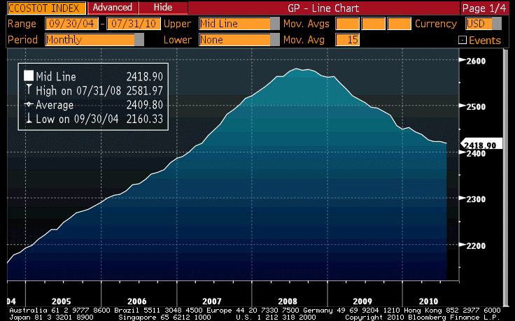
Whether the cause is supply or demand, the quantity of credit is still declining.
This could be because no one wants loans at 0% interest. Or it could be that no one wants to lend money at 0% interest, especially when they just recently had to raise a ton of expensive equity capital and need to buy back the Trust Preferred securities that no longer provide a tax advantage and are therefore expensive. Which do you think is more likely?
It is no longer the case that an individual with a sparkling credit score and a pulse can get a loan – you need more, like a solid job you’ve had for a while or excellent collateral, to get a loan. It is fair to say that in the grand scheme of things, this is an improvement over the time when you needed only a pulse, but again: it isn’t a demand-side issue, it’s a supply side issue.
The books about this period will be written for generations, and some of these myths will die while some of them will propagate. This is a great lesson about history: it isn’t necessarily written by the victors any more, but merely by the people who got to Kindle first. Speaking of which, I expect my book will be ported to the Kindle in the next month or so, but in the meantime you can get a copy pretty cheaply here.
But some of these myths can be damaging in real time. The myth that interest rates should go up to stimulate activity, most-recently propagated by Minneapolis Fed President Kocherlakota, is dangerous because if the Fed follows through on the idea (as Canada did today in raising rates) the outcome will be a disastrous, lengthy depression. Full stop.
It would be no less painful for being ironic if the Fed were to get ahead of the economy, rather than adjusting monetary policy too late, for the first time in decades just when what we need is time for the economy to heal and gather momentum on its own. With thought processes like that floating about, I find myself almost hoping that Initial Claims tomorrow (Consensus: 470k from 472k) is weak. That feels un-American, but while QE2 will likely have bad consequences (notably, inflation) they are ones that we can defend ourselves against. QE2 is vastly preferable to Quantitative Tightening 1.
[1] Make no mistake, I love reading the comments, even ones that disagree with my opinions…it is for the thoughtful feedback that I write this missive every day.
Hard To Flunk When You Have The Answer Key
As expected, the passage of the long holiday weekend served to sober up financial markets after the exuberant finish to last week. In the sobering-up process, they were helped by a Wall Street Journal article entitled “Europe’s Bank Stress Tests Minimized Debt Risk.” This article read, in part,
“An examination of the banks’ disclosures indicates that some banks didn’t provide as comprehensive a picture of their government-debt holdings as regulators claimed. Some banks excluded certain bonds, and many reduced the sums to account for “short” positions they held—facts that neither regulators nor most banks disclosed when the test results were published in late July.”
Whoooops!
The banks claimed that they only did what they were told to do. That is, it was the test that was rigged and not the banks being dishonest.
Recall that only 7 banks flunked those tests, a result that many of us found improbable (albeit predictable, since no half-awake regulator would ask a question publicly that it didn’t already know the answer to). It was fairly likely that the books were cooked, and I said so at the time (see my column on the topic).
So equities reversed almost all of the Friday gains, and the bond curve rallied and flattened. Credit default swaps for European banks widened sharply. The VIX rebounded, but volumes remained excruciatingly light. Volumes will build over the next couple of weeks, as summer vacations end and all of the kids get off to school. If volumes do not build, then that in itself is a bad sign.
.
So often, Monday (and in this case Tuesday of a long weekend) produces little news. I am thankful at times like these for the occasional article in the popular press that makes the job of writing so much easier. This weekend, the cover story on Barron’s did the trick. The cover promised to tell “What’s Ahead For Stocks,” but the clincher for me was the subtitle, “Wall Street’s top equity strategists are wary, but their consensus view is that the market will rise 7% by year end.”
Wow, they are really wary, aren’t they? I prefer this alternative subtitle: “Wall Street’s top equity strategists see stocks bounding ahead at a rate three or four times faster than the long-run historical after-inflation rate of return.” If the market is 7% higher in four months, that implies a 21% annual rate of increase. That doesn’t sound wary to me. And that’s 20% over inflation, while in the long run we cannot expect more than about 4.5% over inflation (see Cornell and Arnott, “The Basic Speed Law for Capital Markets”) without multiple expansion. Oh, wait…that 4.5% includes dividends, and the Wall Street strategists were talking about index values, so these wary strategists are expecting a 20% pace of growth in the index after inflation when the normal pace is something like 2-2.5%. So these conservative fellows are looking at something like ten times the average annual pace of index advance.
It gets worse. The bearish strategists basically saw no advance (no one saw any significant decline) while the bullish strategists saw an 18% rally in the four remaining months. That’s 53% annualized after inflation, so around 20-25 times the long-term average.
Now, if the market had positive momentum and/or was undervalued, then perhaps it would not be such a crazy forecast. After all, if you have concluded we’re going to have the “up” part of the distribution, then 7% for four months might be defensible. Let’s look at these.
The first chart below shows the seventeen-week rate of change of the S&P 500. That’s roughly one third of a year. Is there momentum here? Actually, as of Friday the market was about ½% lower than it was 17 weeks earlier. That isn’t what I would call strong positive momentum, nor even an oversold situation. That sounds pretty neutral to me.
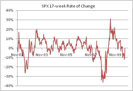
I don't see much equity momentum, do you?
But perhaps stocks are cheap and just looking to launch higher? Here, too, the argument is difficult to make. Equities are simply not valued at bear-market-bargain lows. The chart below, from the website of Smithers & Co shows the Q ratio (which measures the price of the equity market relative to its replacement value) and the cyclically-adjusted price/earnings ratio popularized by Robert Shiller. Both suggest that the market is quite substantially overvalued. Although the chart is from Q1 data and June prices, we have seen the stock market has not moved significantly since that point so it’s reasonably relevant.

..And the market doesn't look cheap, either.
So while it is possible that stocks may gain 7% by year-end – heck, they might gain 7% by month-end – it certainly isn’t a “wary” or conservative forecast. It is, in my view, another sign…as if one were needed…that the cult of equities is alive and well. It is amazing that there was not a bona fide bearish strategist in the bunch. How can that be? And if it is obvious that the market is going to go up, or do no worse than stay steady, then why isn’t everyone already very invested?
These things are bad for my blood pressure.
Tomorrow, the Fed’s Beige Book is released, and I don’t expect we will get much reaction to that. But at 2:30 ET, Minneapolis Fed President Kocherlakota will be speaking in Missoula on the topic “Inside the Fed.” Kocherlakota was the gentleman who presented the confused argument recently that mixed up causation when it comes to deflation and low rates. He argued that low rates will cause deflation, which is absurd (I wrote about it in this post). It is worth paying attention to see if he has been corrected and no longer sees higher interest rates as the cure to deflation.
Market Muses: Faith, Hope, and Liquidity
The Employment report – really the only item of significance before this long holiday weekend – probably ended up raising more questions than it answered. In one sense, this is good news. If the report had been exceptionally weak, then there would be fewer questions but we wouldn’t have liked the answers. At least this report holds out some hope!
Private jobs in the report grew a bit faster-than-expected at 67k, but with some reasonable upward revisions to prior months. There were fewer subtractions for Census workers (which is strange since you would think we should have that number pretty clearly – just call the darn Census Department). Manufacturing employment contracted, but one month of contraction is not much to get exercised about.
The Unemployment Rate rose to 9.642%, as a rebound in the workforce did, as expected, raise the ‘Rate. I wonder if the report would have been considered as much of a positive if the ‘Rate had rounded up to 9.7%? The bottom line there is that with private payrolls growing 50-100k, if indeed it is that strong, the Unemployment Rate shouldn’t decline much if at all (absent the disturbing trend of people leaving the workforce).
The index of hours worked didn’t move, which isn’t the best of news. All in all, this was better-than-expected but still a pretty dismal number for an economy that is supposed to be expanding robustly by now.
I was initially excited to see that the median and average durations of unemployment plunged (see Chart of median unemployment duration). This would be great news…except for the fact that it is artificially lowered by the fact that several hundred thousand workers (the Census workers) have only been unemployed for a handful of weeks. Anyone who likes clean data will be very glad when that elephant has finished passing through the python.

If only this sharp improvement were real!
When the number printed it was pretty obviously going to be bearish for bonds and bullish for stocks, but after two days of watching bonds getting beaten up I was surprised to see the 10y Note contract down a full point in the early going. Both stocks and bonds reached their extremes within a few minutes of the report and then retraced some of those extremes. Still, equities rallied to end near the highs, with the S&P recording a 1.3% gain, and 10y yields finished at the somehow-generous-sounding 2.70%. The 5y inflation swap rose to 1.53%; 10y ended at 2.09%.
The VIX declined sharply but – surprising, considering how much equity prices have risen and the fact that some event risk passed – managed to hold recent lows. That seems like non-confirmation to me. I believe I have become tactically bearish with this rally.
While the report holds out hope, it also confuses policymaking in the near future. Again, that might not be a bad thing; we have arguably had too many erstwhile saviors over the last couple of years. However, the particular challenge we confront over the next couple of months does, in fact, beg for someone to do something. At least, I imagine that is how it will be read in Washington. For even if the recent, admittedly short skein of surprisingly bad numbers is what turns out to be the aberration, and not the Employment Report and the ISM report, there is still the issue that next year we’re going to get some very bad fiscal news (on Federal as well as municipal fronts). To the extent that the economic news is not so bad that it forces Congress to extend the Bush tax cuts (which still carries its own risks, don’t forget, because of the burgeoning debt – it makes the Federal Reserve’s job even more urgent.
Extending tax cuts: good (especially if spending is rolled back responsibly). Quantitative easing: bad. But, as I have pointed out before, QE has the virtue of needing no confirming vote of the populace. That is supposed to make the Fed resistant to the unwelcome urges of the proletariat. Ironically, in this case it makes them more exposed to the unwelcome urges of the parliament.
There is one other piece of news worth noting today. Apparently, Goldman is shutting its “Principal Strategies” (that is, proprietary trading) unit; this follows the JPM news earlier this week. Of, course, all of the banks will be shutting down proprietary trading – the Volcker Rule makes it very hard to just spin the units out – so it isn’t “news” in that sense. But it is significant when all of this liquidity leaves the markets (especially, heading into the normally less-liquid quarter of the year).
It isn’t only in the units named “proprietary trading” where proprietary trading occurs, though, and that’s where the big effects will be felt. Unless banks feel like relying on the forbearance of the regulators…and that seems a bad idea given that the torches have already been lit and passed around…then proprietary trading that augments market-making activities will also be curtailed.
If you’re not attached to the financial markets you might not understand what I mean. Let me give a real-world example. Once upon a time, I was trading inflation derivatives on a desk at a big bank. We were speaking to a particular counterparty about the possibility that they might issue a large inflation-linked note. If they issued that note, they would want to swap the flows back into Libor because that was how they, like many institutions, evaluated their financing. At the time, the size of the potential issue was huge relative to the size of the inflation-linked derivatives market – it was probably six weeks’ worth of interbank volume at the time – and I was going to be asked to quote the swap for the customer.
I began to carefully buy my hedge in the market as we worked on convincing the customer to do the deal. The more of my hedge I got on, the better my quote could be for them (because once the deal hit the screens there was no way I’d ever get the hedge off well, and I’d have to charge for that fact). However, it was clearly my risk (actually, the bank’s risk) that if the deal didn’t happen, I would have to unwind my hedge. I accumulated about a third of the hedge, which took almost two weeks.
Folks, this is “proprietary trading.” I was taking a calculated risk so that I could make an aggressive price – or at least, not a bad price – for the customer and increase the odds that the deal would get done. If I could just manage to break even on my hedge, the bank would make good money underwriting the deal; of course, there was also the possibility that I might actually make money on the deal in the inflation book (although at the time that consideration was secondary). Keep in mind too that in doing these trades, I was also providing liquidity to someone on the other side of the market.
In the event, the deal didn’t happen. The hedge that I had accumulated over two weeks I now had to unwind over the next two weeks. I recall that I lost about a quarter of a million dollars on that round-trip, and felt lucky to have done so.
The postscript is that the client eventually did a similar deal with another bank that had apparently not set up for it. That bank foisted the bonds, and the hedge, in a package together, to a bunch of hedge funds. Several weeks later, the hedge funds wanted to unwind part of their risk … and the bank wasn’t there to provide the liquidity. It was a mess, and lost that bank money, prestige, and probably clients, and damaged the inflation-linked bond market. No large deal has been done in the U.S. inflation market in the half-decade since then, despite the fact that the interbank volume now is multiples of what it was back then.
This sort of trading, which is clearly proprietary risk-taking, happens all the time. Without it, many of those deals don’t happen because the deal requires that all of the liquidity be priced at once and the cost to do so is prohibitive. The banks make money by figuring out the most efficient way to source liquidity, partly through “temporal disintermediation”: spreading the hedge over time. I have seen this happen personally in debt and commodity transactions, and it happens in equity transactions as well. I continue to believe that the Volcker rule will be very destructive to liquidity in many markets, and not just because the JPM and GS of the world shut their prop books. Just wait and see.
Monday is the Labor Day holiday in the U.S., so I will not be writing a commentary then. This column will return on Tuesday.
The Last Blistering Blast
As the last blistering blast of the summer season blows itself out both literally and metaphorically, heading into the long Labor Day weekend, the stock market is trying to do the same. Although propelled by weaker winds than impel Earl forward (equity volume was only 80% of Thursday’s volume and only 49 days since the beginning of 2008 have seen less action than today…and eight of those were just last month), the surge is probably no less ephemeral. By the time we return on Tuesday, if not by tomorrow afternoon, we will be looking forward to the annual falling of the leaves, and the almost-as-typical falling of the market during this season.
Over the 35 calendar days (5 weeks) following September 4th over the decade from 2000-2009, the S&P fell an average of 4% (see Chart). But that obscures important differences: in five up years (2003, 2004, 2006, 2007, 2009), the market gained an average of 3.2%; in the five down years (2000, 2001, 2002, 2005, 2008), the market lost an average of 11%. If you are in a bear market, September can be a cruel month.

Equity market aggregate pattern over last 10 years.
But you know, perhaps we aren’t in a recession, or heading for a double-dip, after all! Today’s #1 top story on Bloomberg news, when I walked into the office this morning, was this: “U.S. Avoids Recession Relapse as Data Can’t Get Much Worse.”
Two obvious observations: First, this doesn’t seem like unmitigated good news to me. Second, and more poignantly, if you think the data can’t get much worse then you don’t have any imagination at all. Heck, you don’t have much memory at all since it was only two years ago that the data were much, much worse. The author’s reasoning is that the sectors that led us into the recession are pretty much completely crushed, so they can’t get worse. Sure, if you’re a builder…yeah, you’re right, it probably isn’t going to get much worse than 50-year lows in Housing Starts. But if you are in manufacturing? Entertainment? Medicine? Hospitality? Agriculture? It can’t get worse?
I’m not saying it will get worse; I’m just saying that this is a really odd time to be complacent about how bad it can get, especially if we think it can’t get worse.
Today’s data weren’t too bad – Initial Claims at 472k won’t set the world afire but it won’t douse the blaze either – but the main event is tomorrow. Employment is expected to be -100k, with +42k coming in Private Payrolls (the rest is Census workers).
It makes eminent sense to strip out the Census effect if you are trying to track the economy’s underlying trajectory, in just the same way that it makes sense to strip out food and energy from CPI if you’re trying to figure out what is really happening with prices. But just as with changes in gasoline prices, stripping them out doesn’t make them irrelevant. I am much more willing to ignore short-term gasoline wiggles, since what goes up usually comes down, than I am to blithely pronounce the irrelevance of the layoffs at Census. What goes down, in this case, will not soon go back up. While that doesn’t mean the underlying trend is worse (although +42k per month from the private sector is a recession-type number), it matters for spending and confidence (just as a gasoline spike matters for other discretionary spending…but that case is a little less worrisome because the money is still being spent – it’s just that more of it is going to gasoline sellers than to Hallmark).
Remember that the underlying story about the Employment figure for the last few months has been the sharp contraction in the labor force. The participation rate last month, at 64.6%, was the lowest since about 1985 (you can read my summary of last month’s number here). If the participation rate rises tomorrow, that will be long-term good news and short-term bad news, since it would cause the Unemployment Rate to push back up (Consensus for tomorrow is a rise to 9.6% from 9.5%).
I have a lot of other tidbits on my notepad that I didn’t get to this week; for example, sometime next week I will try to write about gold’s “inflation duration”. Tomorrow I will write something on the Employment report and the day’s market action, but since I mentioned the weak equity market seasonal earlier I want to make sure I discuss the fixed-income market’s seasonal pattern. Certain times of the year are much more regular for bonds than are other times, but the most consistent pattern for many years is this: starting in September, it is much better to be long bonds than to be short them. Over the 29 years from 1981-2009, the 10-year yield fell in the 60 days following August 31st 76% of the time (22/29), and the average of all changes – including when yields rose – was a decline of 23bps. Moreover, as you can see from the chart below the average 60-day change in yields remains strongly negative for a while. Over the last 29 years, the average 10y yield change in the 120 calendar days following August 31st has been a decline of about 40bps.

Bond seasonal pattern over last 29 years
I am well aware of the caveats that ought to be applied here. First, the last 29 years have been a bull market, so expecting a decline in yields in any given month hasn’t been a bad bet (except perhaps in March and April); if we are in the midst of turning the secular trend around, this dependable pattern will surely eventually weaken. Moreover, we have just experienced a pretty rockin’ August, and expecting a further 20-40bp rally when 10-year yields are already at 2.63% is courageous. I wouldn’t be a bond buyer on the basis of these figures. But I’d be very careful about selling.
Boring Is Beautiful
It was in general a “reboot” kind of day, two days before the Employment report. Overnight, equity futures launched higher; according to Bloomberg this was because the Chinese economy had some marginally stronger numbers. That seems to me unlikely in the extreme to have caused such a violent reaction. More plausible, but still of the wrong scale, was the report that Burger King is shopping itself (are they telling prospective partners that they can “have it your way”?) – recently, M&A activity has been more active than in some time, lending some sense of positive “creative destruction” going on.
But neither of those makes much sense in isolation as the reason for the strong overnight tone, and the concomitantly weak tone to fixed income.
The early data was slightly weak, with the ADP employment report showing -10k against expectations of +15k, but when the ISM Manufacturing report actually rose to 56.3 from 55.5, rather than falling as expected to 52.8, the play was writ. Bonds dropped off the shelf, and it has recently been a pretty high one, while stocks rocketed higher.
But again, the reaction to ISM was out of proportion to the usual reaction to ISM, especially when the surprising increase is along the lines of a wiggle on the chart rather than the sharp reversal that bond sellers seemed to have perceived (see Chart).
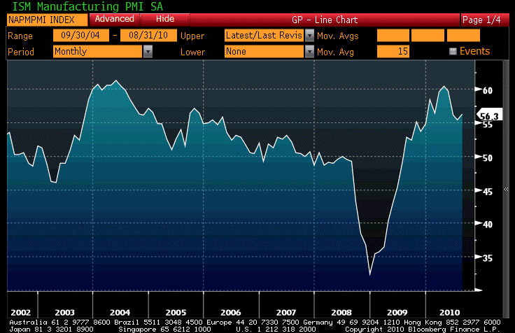
This wiggle is what set equity bulls' hearts aflutter today.
There was negative news on the economy, of course. What day would be complete without it? Car sales were again weak; the domestic sales at an 8.66mm unit pace represented the slowest August sales in a quarter century (although that statistic is aided by the fact that in August 2008 the crisis was only just becoming acute while in August 2009 the cash-for-clunkers program was peaking). ISM might be wiggling upward this month, but to steal Gertrude Stein’s line about Oakland, there’s no ‘there’ there.
None of this is cause, two days before Employment, for 10y yields to back up to 2.58%, for the stock market to catapult 3% higher and for the S&P to bust out of its “indecision zone” with feeling. Interestingly, despite the size of the price move market volumes were lower than on Tuesday’s relatively boring session.
The markets basically showed us that investors were over-short equities and over-long bonds, relative to their comfort zone, and it took very little to shake these weak positions out. This is good and bad news, for on the one hand the markets are now less proximate to breakout/breakdown points but on the other hand investors are also closer to neutrally positioned and hence a surprise on the Employment figure may have a larger effect than it otherwise would. But that is Friday’s news.
.
In yesterday’s column, I opined that the next truly big trade to come, in my opinion, is when both stocks and bonds decline as inflation expectations rise. I promised to talk about how I am positioned for such a possibility.
When I talk about that possibility, I am not referring to a one- or two-month phenomenon. I am talking about the reversal of the secular disinflation trend that we have enjoyed, more or less, for thirty years and which has been the prime driver in the stock market’s rise to exceptional multiples. Even now, after a decade of essentially sideways trade, the multiple on reported earnings for the S&P is still at 16.1.
Whether the 1970s inflation ends at the current level of rough price-stability or collapses further into deflation (I believe the former, of course, but if the latter then equity multiples also should suffer but high-quality bonds of course will do fine), the trend cannot continue forever. We have come very close to the limits of that trend. Sometime, and I think the process is already underway, we will enter a secular inflation trend.
I seriously doubt that we will have an inflationary trend that is long in duration; that is only feasible if the US currency itself enters into a lasting downward spiral. While not impossible, this is not my expectation. We can, however, have a general uptick in prices and a fairly brisk move to higher levels of inflation (even with a spike to, say, 8% before it settles back down some) that is global in nature and results from concerted cheapening of paper money relative to real assets as a way of effectively reducing global sovereign debt burdens. I think this is not only possible, it is likely and the main uncertainty is the timing.
In such an event, both bonds and stocks will suffer. Holding non-US assets is no panacea, because in a global inflation there is no reason the dollar would necessarily weaken – it might even strengthen.
Real assets will do well, but as we know the real yield on most physical commodities is zero (negative when you include insurance and warehousing) so if this isn’t a 2011 event but a 2012 or 2013 event, there will be a long period of weak performance.
If TIPS yields were in the 3-4% range they enjoyed in the depths of the crisis, the investment would be easy. If nominal yields were high, then coupons would give some protection against the capital loss caused by higher yields. If dividend yields were high, then there would be some margin of safety protecting equity claims against a cheapening of multiples. Unfortunately, none of these things is true.
In my view, investing for the big turn is about treading water, taking only such small risks as the market pays us to take – although almost no risk today carries much compensation – and for which the likelihood of serious debacle is low.
When I look at the fixed-income part of the portfolio, I want to stay short duration of course because I think yields will be rising at some point in the not-too-distant future. The fact that other people believe this also is one reason the yield curve is quite steep and short yields are very low, because many investors are living in the very front end of the curve. Tbills in normal times are a good safe investment that even tends to keep up with inflation – but these are not normal times; central banks are keeping short rates ultra-low and if I roll TBills at 0.15% (and they could go negative again if the FOMC institutes a penalty IOER as I suggested yesterday), I will get nothing, or less than nothing after inflation, for perhaps several years – even if inflation rises sooner than that. I need to go out the curve a little bit, but how far?
One way to look at this problem is to ask “how much am I being compensated for each additional year of maturity?”[1] The two charts below (Source: Enduring Investments) show the current spot Treasury curves for nominal interest rates (first chart) and real rates (second chart) in red, along with the curve of one-year forward rates in blue. That is, each point on the blue curves answers the question “how much am I being compensated for a one year extension starting from year x to year x+1?”

Spot nominal yield curve, and curve of 1y forwards

Spot real yield curve, and curve of 1y forwards.
These charts tell me that I might want to go out as far as 5 or 6 years on the curve, but no further as the years after that point keep adding risk but don’t add much return. Moreover, I can compare the real and nominal forward curves to see how much fixed yield I am giving up for the inflation-linked part of the TIPS return. The chart below (Source: Enduring Investments) shows the difference between the blue lines on the prior two charts.

Forward implied inflation, from forward nominal and forward real yield curvess
I am willing to give up ½% or so over the next year in order to get actual inflation. I am willing to give up about 1% over the following year (the first point on the chart above is the 1y, 1y forward) to get inflation in that second year. And in general I think that trade of fixed yield for inflation possibilities is a good deal for the next couple of years after that.
The consequence of this analysis is that in fixed income, I wouldn’t hold nominal Treasuries at all. I would hold 4-6yr TIPS. I prefer the July-14, July-15, and July-16 issues. Holding a TIPS ETF or a mutual fund is not my druthers, because an ETF will hold all of the bonds in the index and both an ETF and a mutual fund will maintain their durations rather than “rolling down the curve.”
Although the real yield for these bonds is in the 0.11%-0.42% range, it’s better than nothing while I wait to reinvest at higher yields. That is, of course, the plan: when yields rise, it won’t hurt my portfolio very much because the maturities are short, and in a few years there will be ample opportunities to invest at higher yields. I’m treading water while I wait, and locking in a positive after-inflation return. (Similar analysis can be performed on non-US curves, for those who have the ability to invest in non-dollar bonds).
I want some shorter-duration stuff that is still protected against inflation, and with short real yields negative, there is room in my portfolio for those zero-real-yield commodities. However, I prefer commodity indices, which have other sources of return besides the return to the spot commodity. I own GSG, an ETF that tracks the S&P-GSCI index, but am considering changing the position to UCD, a leveraged ETF that tracks (2x) the DJ-AIG index. Of course, while this is “short-duration” in a fixed-income sense, commodity index investments are very volatile.
For diversification, I do hold some equity positions, but these I want to be as bondlike as possible. I seek high dividend-payers with low leverage. I still expect these to lose in the next leg of the bear market, but again my purpose here is to earn something in the “shoulder period” while the secular trends are reversing and to avoid being carried out when the first waves hit. I am fixed-income heavy. In addition to the TIPS mentioned above, I own OSM, an inflation-linked exchange-traded note issued by Sallie Mae that I wrote about in this space back in May (link to comment).
This is not a portfolio that will shoot the lights out, but then again it is also a portfolio that won’t get shot at very much, either. My philosophy is that I have worked hard for my assets, and I am primarily concerned with keeping them (and, of course, maintaining their real value)…especially in times like these, when the downside risks are legion and the upside opportunities rather scarce. It won’t always be like that, but for now boring is beautiful.
[1] Technical note: Fixed-income purists may object that we should more-precisely look at the added compensation for each additional unit of risk, a concept that explains some of the curvature of the spot curve. That is, the extension from a 10-year maturity to an 11-year maturity adds much less duration than the extension from a 1-year to a 2-year maturity. However, at interest rates this low the effect is actually fairly small over the interval of the curve that is of interest, and using maturities rather than durations doesn’t affect my answer.
