Update and Summary on Housing Inflation
It’s inflation week, and so an excellent time to sign up to follow my live CPI tweets on my “premium” channel by signing up at PremoSocial. Membership also gets you access to my daily and weekly chart packages, to which I tweet a link daily on that channel. (Consider it – for only $10/month!)
It’s worth turning for a bit to look at the housing market. Shelter is a large part of what consumers spend money on, and therefore a large part of the CPI. It also happens that primary rents (if you rent your dwelling) and “Owners’ Equivalent Rent” or OER tend to be some of the slowest-moving pieces of the CPI. I’ve said many times that if you can get the direction of OER right, it’s very hard to be extremely wrong on the direction of core inflation.
Recently, there’s been some softening in home sales, and so in some quarters there has been an alarm raised that OER is about to start softening and therefore core inflation has peaked. My purpose in this article is to examine that evidence with an eye that is a bit more studied on these matters.
I think that often, economists tend to see patterns in the data when those patterns are congruent with what their models suggest should be happening. For example, it is reasonable to think that high home prices, coupled with rising mortgage rates, ought to slow home sales. There’s certainly evidence that changes in yields affects refinancing activity, as the chart below (source: Bloomberg) relating the Mortgage Bankers’ Association refi index to 10-year yields shows. The recent rise in yields (I’ve shown Treasuries, but mortgage rates move similarly) has depressed refinancing activity – and this makes sense, since fewer mortgages are profitable to refinance at these rates.

Alas, this relationship doesn’t hold very well when it comes to purchase data. Far more important to a home purchaser are current incomes and job prospects, both of which remain relatively strong for now. This next chart shows 10 year yields against the MBA “Purchase” index. At best, interest rates are a secondary or tertiary effect. This makes sense because the decision to refinance a house is a financing decision; the decision to buy a house in the first place is an investing decision.

Nevertheless, there has recently been some softening in purchasing activity of new homes. This next chart shows the seasonally-adjusted rate of existing home sales. I can see the softening, but I’m not sure it looks like it’s a very big deal yet. This is where, though, economists’ models might cause one to say that this looks like it’s rolling over because higher interest rates and lower affordability are dampening demand. Maybe. But this might also be noise especially considering we don’t see any softening in the purchase data. It might be that there’s less home-hopping (maybe because more people have secure jobs, there’s less migration?) or perhaps there’s less activity from the pure financial buyer (pension fund, e.g.) who is paying cash. Or, it could be noise.

Now, one of the reasons that people are sounding an alarm about housing might be that equities of home builders have recently swooned. The chart below shows the S&P Homebuilders SPDR ETF (Ticker: XHB), which has been declining rather sharply of late. Weak homebuilders, weak homebuilding, right? Perhaps. But lumber prices also recently doubled and then halved so there could be some volatility on costs as well. In any event, I’m extremely reluctant to attribute dramatic economic significance, not to mention prescience, to a collection of stocks run by equity monkeys.

I think the picture of home sales and home building is a typical late-cycle picture. That shouldn’t be surprising – we’re late in the cycle, even if there are some people who believe that the expansion will still be going strong in 2020. I’m not one of those people, although I hope I’m wrong. There is definitely some softening in activity indicators. But we’re talking here about pricing indicators. How do those look in housing and rents?
The chart below is the Case-Shiller 20-city composite, y/y. I’ve definitely read commentaries recently saying that this is a sign that housing inflation is rolling over.

The problem is that the Case-Shiller survey is smoothed, lagged, and revised. Moreover, it typically has much more volatility than we have seen in the last few years. The chart below is longer-term. I don’t know that I’d read a great deal into the recent weakening. Even if it is a true reading of a slowdown in pricing, it’s a pretty small effect. My own study suggests about a 10% pass-through to rents, with an 18-month lag. So, even if you want to get alarmed, you have a year and a half to do it.

I’m not really convinced, in case you couldn’t tell, that home prices are about to plunge even though I think they’re high. For one thing, the inventory of homes available for sale remains very low (a regression of properly lagged-and-seasonally-adjusted home inventories against the change in CPI shelter suggests that the current level of inventories is consistent with a 3.6% rise in Shelter CPI between August 2019 and August 2020. Currently, Shelter CPI is at 3.39%).

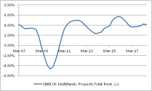
A more direct effect on Primary Rents and OER is from actual rental inflation, rather than indirectly through home prices. And here the information is again pretty ho-hum. The chart below is of CBRE apartment rents, y/y percentage change. Rents have slowed from 2015-16, but they’re still well above core inflation.
There have been some anecdotal reports of cooling rentals in hot or dense markets, but so far these are mostly anecdotes. Rental prices bear some watching, of course – especially since they pass through into CPI much more quickly than changes in home prices do.
Now, here’s a cautionary note about housing in general. I am most assuredly not a bull on real home prices and I think that they’ll probably underperform CPI going forward. And here’s the reason why. For many years, the relationship between home prices and incomes was very stable. Starting in 2000, home prices began to rise sharply faster than incomes, culminating in what we now know was a pretty ugly bubble. The chart below shows that bubble, and the return to the traditional relationship between home prices and incomes…and a renewed rise in that ratio. I am not saying that home prices are as bubbly now as they were in 2005. Indeed, the easy availability of credit these days makes it plausible that the equilibrium ratio is higher than the 3.4x of the 1970s, 80s, and 90s. The caveat, of course, is that this is true only if there has been a permanent easing in the availability of credit…and as the Fed is currently starting to slowly drain excess reserves, this is less clear. So, this is the warning sign and one good reason to keep a careful eye on home prices going forward.

Adding it all up, I don’t think there’s very persuasive evidence that we are about to see a meaningful deceleration in rental inflation. But just as I’m not persuaded that rents are about to decelerate markedly, I don’t see a great chance of a strong further acceleration (and our model is strikingly boring at present, as the chart below – source Enduring Intellectual Properties – illustrates).

Ergo, core inflation (and more importantly, median), to accelerate much further, needs to see a broadening of pressures from beyond merely rent. And we’re starting to see some signs of that in core goods, and a faint whisper in other quarters. Rents are not likely to be the driving force for the next leg higher in inflation. But at the same time, we haven’t yet seen very much evidence that rents are about to collapse. Home prices are too high, relative to incomes. They’re probably higher partly because of optimism about incomes, though, and if wages validate that optimism then home prices may not be due for as bruising a correction this time. Wages are clearly accelerating, so the jury is out on that point.
I think the overall conclusion therefore is that a fair forecast for rents and OER in the CPI still calls for stability for a while. If you’re hoping for inflation to decelerate soon, you ought look elsewhere.
Again, don’t forget to sign up at PremoSocial to get access to my CPI-day updates!