Archive
Some Abbreviated but Important Thoughts on Housing
I posted this chart yesterday to my Twitter feed (@inflation_guy, or @inflation_guyPV through PremoSocial for some additional content), but didn’t have time to write very much about it. This is the Shiller 20-City Home Price Index year/year change (Source: Bloomberg).

My observation was that when you take out the housing bubble, it looks more ominous. It’s actually really the bubble and bust, which makes the recent trend look uninteresting. This is what the chart looks like if you go further back like that.

So it actually looks calm and stable, because the axis explodes to -20% to +20%. The volatility of recent years has caused us to forget that for decades before that, the behavior of home prices was actually pretty sedate. Although residential real estate over very long time periods has only a slightly positive real return, adjusted for the maintenance and other required expenditures, that means the ratio of home prices to median income has tended to be fairly stable. We have historically valued homes as a consumption good only, which meant that the home price traded as a multiple of rents or incomes within a pretty narrow range. Here’s a chart of median home prices to median household income going back to the 1970s (Source: Bloomberg, Enduring Intellectual Properties calculations).

This is true even though there have been important tax changes along the way which changed the value of the home as a tax shelter, changes in the structure of the typical family unit, and so on. Despite that, homes were pretty stable investments – really, they were more savings vehicles than investments.
The fact that home prices are now accelerating, and are rising faster than incomes, implies several things. First, as the last chart above shows, the ‘investment value’ of the home is again inflating to levels that, in 2005-2008, proved unsustainable. The bubble in housing isn’t as bad as it was, and not as bad as stocks are now, but the combination of those two bubbles might be worse than they were when they were mostly independent (in 2000 there wasn’t a housing bubble and in 2007 the bubble in stocks wasn’t nearly as bad as in 2000 and now).
The second implication is that as home prices rise, it isn’t just the value of the investment in the home that is rising but also its cost as a consumption item. Because shelter to rent is a substitute for shelter that you own, rising home prices tends to imply that rents also accelerate. Recently, “Owner’s Equivalent Rent” has been decelerating somewhat, although only coming back to our model. But the gradual acceleration in the home price increase implies that shelter inflation is not going to continue to moderate, but rather should continue to put upward pressure on core inflation, of which 42% consists of “Rent of Shelter.”
Higher Wages: Good for You, Not Good for Stocks
The documentation of the endless march of asset markets higher has become passé; the illustration of the markets’ overvaluation redundant and tiresome. After years in which these same arguments have been made, without any discernable correction, the sober voices of warning have been discredited and discounted. The defenders of higher valuations have grown more numerous, more vocal, and more bulletproof.
I recently commented in a forum on cryptocurrencies…something to the effect that while I see blockchain as being a useful technology – although one which, like all technologies, will be superseded someday – I don’t expect that cryptocurrency in any of its current forms will survive because they don’t offer anything particularly useful compared to traditional money, and moreover have a considerable trust hurdle to overcome due to the numerous errors, scandals, and betrayals that have plagued the industry periodically since MtGox. Whatever you say about ‘traditional’ money, no one worries that it will vanish from your bank account tomorrow due to some accident. I don’t see anything particularly controversial about that statement, although reasonable people can disagree with my conclusion that cryptocurrency will never gain widespread acceptance. However, the reaction was aggressive and unabashed bashing of my right to have an opinion. I hadn’t even uttered an opinion about whether the valuation of bitcoin is a bubble (it obviously is – certainly there’s no sign of the stability you’d want in a currency!), and yet I almost felt the need to run for my life. The bitcoin folks make the gold nuts look like Caine in the TV show “Kung Fu”: the epitome of calm reasonableness.
But, again, chronicling the various instances of bubble-like behavior has also become passé. It will all make sense after it’s over, when the crowd recovers its senses “slowly, and one by one” as Mackay had it about 170 years ago.
Today though I want to address a quantitative error that I hope is hard to argue with. It has become de rigeur throughout this…let’s call it the recent stages of an extended bull market…to list all of the reasons that a continued rally makes sense. I always find this fascinating because such enumeration is almost never conducted with reference to whether these things are already “in the price.” On the weekend money shows I heard several pundits opine that the stock market’s rally was likely to continue because “growth is pretty good, at around 3%; interest rates are relatively low; inflation is relatively low; government has become more business-friendly, and wages seem to be going up again.” As I say, it seems to me that most of this should already be in the market price of most securities, and not a cause for further advance. But one of those items is in fact a bearish item.
Make no mistake, wages going up is a great thing. And it’s nice to hear that people are finally starting to note that wages are rising (I pointed this out in April of 2016, citing the Atlanta Fed’s macroblog article on the topic, here. But not everyone reads this column, sadly). The chart below shows the Atlanta Fed’s Wage Growth Tracker, against Median CPI.

So wages are going up for continuously-employed persons, and this is good news for workers. But it’s bad news for corporate earnings. Corporate margins have been very high for a very long time (see chart, source Bloomberg), and that’s partly because a large pool of available labor was keeping a lid on wages while weak global demand was helping to hold down commodity input prices.

Higher wages are, in fact, a negative for stocks.
The argument for why higher wages seem like they ought to be a positive for stocks goes through consumption. If workers are earning more money, the thinking goes, then they can buy more stuff from companies. But this obviously doesn’t make a lot of sense – unless the worker is spending more than 100% of his additional wages in consumption (which can happen if a worker changes his/her savings pattern). If a worker earns $10, and spends $9 buying goods, then business revenues rise by less than wage expenditures and business profits fall, all else being equal.
This shows up in the Kalecki profits equation, which says that corporate profits equal Investment minus Household Savings minus Government Savings minus Foreign Savings plus Dividends. (Look up Kalecki Profit Equation on Wikipedia for a further explanation.) Rearranging, Kalecki profits equal Investment, minus Government Savings (that is, surplus…so currently the deficit contributes to profits), minus Foreign Savings, plus (Dividends minus Household Savings). So, if workers save some of their new, higher earnings then corporate profits decline. The chart below shows how the Kalecki decomposition of profits tends to track pretty well with reported business profits (source: Bloomberg).

Now, profit margins have been high over the last year despite the rise in wages (not because of it) because the personal savings rate has been declining (see chart, source Bloomberg).

If wages continue to grow, and workers start to save more of their earnings (paying off credit cards perhaps?), then it means that labor is taking a larger portion of the pie compared to the historically-large portion that has been going to capital. This is good for workers. It is not good for stocks.
Summary of My Post-CPI Tweets (Nov 2017)
Below is a summary of my post-CPI tweets. You can (and should!) follow me @inflation_guyPV by going to PremoSocial or sign up for email updates to my occasional articles here. Investors with interests in this area be sure to stop by Enduring Investments or Enduring Intellectual Properties. Plus…buy my book about money and inflation. The title of the book is What’s Wrong with Money? The Biggest Bubble of All; order from Amazon here or get it a little cheaper on our site here.
- Consensus is for a soft 0.2% m/m on core CPI, keeping the y/y figure at 1.7%. I think the consensus works out to about 0.16%.
- We are dropping off, from y/y numbers, last October’s 0.147% print. The last two months we’ve seen are 0.25% in Sept, and 0.13% in Oct.
- The upshot is that to get the y/y to round up to 1.8%, we need 0.201%
- We will be paying attention to cars and trucks. Today the Daily Shot caught on to something I pointed out a while ago:

- That chart is actually out of date; the Mannheim used car index has risen further. Floods lead to car price increases. Only Q is when.
- I don’t spend a lot of time on headline CPI forecasts – they obv matter more to TIPS holders in the near-term but they’re all gasoline vol.
- Still, the consensus of 0.1% m/m looks low to me given the rise in gasoline prices. To me, gasoline should be additive this month.
- Does seem like everyone talking about upside risk, which scares me a bit. Guess we’ll know in 6 minutes.
- 10y breakevens -1bp on the day. Investors concerned they’re out over their skis at 1.89% breakevens!!
- 1%/0.2%. But it’s a hefty 0.2%, 0.225% to three decimals.
- y/y to 1.774%, rounding up to 1.8%.
- Last 12 months. Is high the aberration or low?

- 10y breaks back positive.
- New and Used cars and trucks are NOT the culprit so we will have to see.
- Medical Care broad category 1.68% from 1.56%, so the breakdown there will be interesting.
- Core goods stayed at -1.0%; core services rose to 2.7%. Three months ago core services y/y was 2.4%; a year ago it was 3.2%.
- y/y core cpi. BUY THE DIP!! Well, something like that. Those dips were one-offs, and those one-offs are fading (I think…calculating now)

- OK, breakdown…housing was unch at 2.786% y/y. But primary rents dropped again, to 3.695%. OER rose slightly, to 3.196% from 3.182%.
- Those two effects don’t quite offset, actually a net drag.
- So new vehicles (3.68% of CPI) was -1.38% vs -1.00%; used cars (1.99% of CPI) was -2.89% vs -3.79%. So used cars contributed a tiny bit.
- But still….wayyyyy lower than it should be. Unless the Manheim index is just plain wrong, and BLS is right, this is all in future.
- In Medical Care, always fun: Drugs dropped further to 0.88% from 1.01%. So crazy. But Prof Services, and Hospitals, both rose:
- Prof services 0.38% vs 0.23%, hospital services 4.54% vs 4.27%. Not big increases, but changing the direction.
- Health insurance still basically zero: 0.15% vs 0.06% y/y. This should change if my latest renewal is any indication.
- Professional Services y/y. A bounce, but don’t get too excited!

- @pearkes: doesn’t CPI HI measure profit margins, not gross premiums?
- Replying to @pearkes: Well, sort of, tho not exactly. But if all of the pieces of medical care are low, and insurance rises sharply, gotta show up somewhere.
[Editor’s note: I don’t usually put comments and responses in this summary but that was an important question]
- College tuition & Fees: 2.17% vs 2.08%. Tuition increases have been moderating because endowments are flush thanks to the bull market.
- Core inflation ex-housing: 0.71% vs 0.58%. The sudden drooping in primary rents is really the main story now.
- Oddly, CPI for shelter in Houston has decelerated from 2.6% to 1.5% the last two months. That’s at odds with what happened after Ike.
- But this may be another delayed effect.
- 10y breakevens spiked 1-2bps on the print, but are fading. Word on Street is “used cars, shelter, airfares…this was all expected.”
- Apparently not so expected that they could have forecast it. And primary rents were down, not up.
- and used cars were not up more than the seasonal expectation so the y/y didn’t change. So really, no.
- Early guess at median is 0.24%-0.26%…median category looks like one of the OER subindices and the BLS doesn’t release the seasonal adj.
- This is our model for OER. So I think Primary Rents’ decline is the outlier.

- And here are primary rents.

- I think the real story here is that medical was not the drag it has been recently. But the one-offs still haven’t really reversed hard yet.

- Speaking of one-offs…the most famous one is wireless telecom. This will all smooth out over 12 months.

- OK, inflation in four pieces: First Food & Energy.

- Next less-volatile piece: Core goods. Deflation here surprisingly persistent, given dollar’s retreat.

- Core services less rent of shelter bounces for 2nd month in a row. This is where medical care shows up.

- And rent of shelter we have already discussed. It’s where it should be and probably accelerates marginally from here.

- Last one: weight of categories above 3% still hanging out just below 50%. Still some very long left tails separating core from median.

- Thanks for tuning in.
- As a bonus for my private followers – if you’d like a copy of the Quarterly Inflation Outlook (out today or tomorrow), DM me your email.
Thanks again to everyone who tuned in. If you want to get these tweets in real time so you can impress and amaze your friends, then please go to the PremoSocial signup page and contribute a ten-spot.
This data is going to get increasingly important as the one-offs fade and the next upswing in inflation happens. And we don’t need anything really weird to happen in order to get that upswing. The cell phone aberration will gradually exit the data, and make year-on-year comparisons of cell phone service very easy (actually, we might have inflation in cell phone services, simply because after unlimited data it’s hard to have any more big quality improvements!). Autos will eventually respond to the heightened demand post-flood. Medical Care is unlikely to be flat forever, once all of the compositional shifts have happened (and, if Obamacare is gutted, as the Republicans keep trying to do, then the compositional shifts back could make medical care inflation seem illusorily high, just as now it is illusorily low).
The next few months see difficult year-ago comparisons for CPI: 0.18%, 0.22%, 0.31%, 0.21% are the m/m figures for November and December 2016 and January and February 2017. That averages 0.23%, compared to 0.20% for the last three months we have seen. Ergo, rises in the y/y figures will happen slowly if at all, until March’s data in April. March/April/May/June/July averaged 0.05%, so in that time frame the y/y will be rising 0.1%-0.2% every month. And that’s when alarm will set in in the bond market, even though this is totally foreseeable.
Inflation is rising globally. The only place this isn’t really clear is in Europe, where it’s rising but from such a low level that the wiggles change the visceral appearance of the chart every month. This will keep the US central bank tightening, and other central banks will gradually exit QE. This is very bad for asset markets, and as rates rise and money velocity perks back up, the vicious cycle may well be ignited. 2018 is going to be very, very interesting.
Velocity and Rates and the Vicious Cycle Possibility
There was a potentially important development in inflation recently, but one that was generally overlooked.
Perhaps it was mostly overlooked because it is way too early to say that a trend is developed that could cause an adverse inflation occurrence. But I think that the main reason it was overlooked is that monetary velocity is not very well understood. In particular, most people seem to think that money velocity – definitionally, the number of times a unit of money is transacted in a year, on average – is somehow tied to nervousness about the economy. So, when money velocity fell in the global financial crisis, many observers attributed that to savers stuffing dollar bills in the proverbial mattress.
There may be some role for investor/consumer uncertainty in the modeling of velocity, but at best it is a secondary or tertiary cause. The main cause of changes in velocity is simple: when the cost of holding money is high, we work hard to hold less of it, and when the cost of holding money is low, we don’t mind holding more of it. Friedman first noticed this, so it isn’t a new discovery. In monetarist speak, velocity is the “inverse of the demand for real cash balances,” and the demand for such balances depends of course on the relative cost of cash balances relative to other investments.
The chart below shows the power of this relationship. I’m using the 5-year constant maturity treasury rate, but there are obviously other investments that would get thrown into this relationship. But it’s easy to envision the effect here. When interest rates are at 6%, then money does not sit idle for very long or accumulate without limit in your bank account – you will invest those monies in, say, a 5-year CD or Treasury Note, rather than earn basically nothing in a checking account. But when interest rates are at 1%, the urge to do so isn’t as much.

What you can see in the chart is that interest rate moves tend to precede movements in money velocity, which is what we would expect from a causal relationship such as this. So the reason that money velocity plunged in the GFC wasn’t because people were scared; it was mostly because interest rates fell, taking away the incentive to invest longer-term.
Changes in money velocity, of course, tend to cause changes in inflation. MVºPQ, after all, and Q tends to be mostly exogenously determined by aggregate fiscal variables, industrial policy (what’s that?) and the like. Changes in M and changes in V tend to be reflected mainly in P over time.
Also, interest rates are affected by inflation, or more properly by the expectations of inflation. And expectations about inflation tend to follow inflation.
So, the history of the 1980s’ declining inflation can be read like this, without too much of a stretch: declining money growth under Volcker caused declining inflation initially. The decline in inflation tended to cause interest rates to decline. Declining interest rates tended to cause declines in money velocity. Declining money velocity tended to cause declines in inflation…and we were in a virtuous cycle that extended, and extended, and extended, until we were close to zero in interest rates and inflation, and money velocity was as low as it has ever been.
Now, you can see from this chart that interest rates bottomed in 2013, but really have not appreciably risen above the lows, and so money velocity hasn’t reversed its slide although since the beginning of last year the trajectory has been slowing (I suspect some nonlinearity/stickiness of this relationship near zero). But the GDP report from last Friday, combined with recent money growth and increase in the price deflator, implied that money velocity actually rose slightly.
It has nudged higher before, but not by very much. And this is why I am reluctant to make a huge deal about this being the start of something, except that this is the first time since 2008 that there has been a reasonable expectation that interest rates might continue to rise because the central bank wishes it so.
And so I don’t think it’s wrong to consider the “what if” of the next cycle. Normalization of interest rates implies normalization of velocity, and there’s just no way to get appreciably higher velocity without higher inflation. Higher inflation would probably produce higher interest rates, because however much your expectations about inflation are “anchored” they are likely to become unanchored if inflation of 3%-4% starts to print. Higher interest rates could lead to higher velocity, and we have a cocktail for the opposite of the 1980s virtuous interest rate cycle.
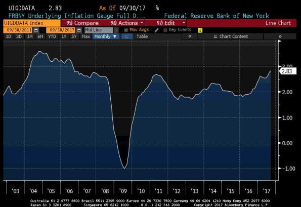
This speculation isn’t destiny, and a lot depends on whether interest rates start to move higher and by how much. But there is already starting to be some concern about inflation and the FRBNY’s “Underlying Inflation Gauge” has recently gone to new post-crisis highs (see Chart above, source Bloomberg), so I don’t think it is unreasonable to consider and prepare. Because the best case for the next inflation uptick is that it rises a bit and falls back. But there are elements in place that support a much worse case, and that is a feedback loop through interest rates and velocity. The chances of that outcome are considerably higher than zero.
Note: these articles are now first released on my private Twitter feed, which you can subscribe to for only $10 per month here. Subscribers also get my real-time tweet analysis on the monthly CPI report, which are not on my public feed, and I am working on adding a free chart package to the mix as well.