Archive
What is the Season for an Inflation-Proof Currency?
By now readers will be well aware of USDi, the cryptocurrency whose price represents how many of today’s dollars you would need to buy a December 2024 dollar. (The answer at the time of this writing, according to https://usdicoin.com, is $1.044755). That construction means that USDi is inflation-proof, since as the price level increases so does its price. It is a ‘real’ dollar, always buying what a December 2024 dollar bought.
Now, I have recently pointed out that since recent NSA CPI prints were extremely high, USDi is accruing at a 12.6% rate in May and will accrue at a 10.2% rate in June. Buying a cash instrument with those yields is a no-brainer of course, and they won’t be sustained – as the energy price spike passes, future USDi yields will decline to become more normal.
But that’s a tactical call – compare USDi’s current return to 1-month TBills and allocate to whichever is higher. It’s fairly uninteresting grade school math and, anyway, not something you’d want to do with the whole nut, if you’re managing a $200mm stable portfolio. The more interesting question is about the longer-term strategic call. If you’re going to hold cash in your portfolio in some amount, and want to make an educated guess about the next year or two rather than actively move money in and out at hedge fund speeds – what’s the right ‘season’ for that? In what sorts of economic environments would you prefer to invest in an inflation-proof dollar, rather than in a dollar paying some simple nominal no-credit-risk interest rate?
The answer may surprise you, because of the recency effect. I am showing this most-recent period first for two reasons. (1) It will sync very nicely with people’s short-term memories of the last couple of years, when short-term interest rates have been above inflation, and (2) if I only show charts where USDi wins, any analyst worth his salt will assume I am hiding the bad chart. [N.b. – USDi was first launched in April 2025. But, since it is explicitly linked to the CPI index, we can easily and with complete confidence project its price backwards to any time there was a CPI index. So in these charts, I have labeled the return of “USDi” even though USDi did not exist at the time. Ergo, they are all charts about what returns would have been had USDi existed.]

The last few years have been a tale of great success for money-market investors. The Fed raised rates aggressively (finally) in 2022 and 2023, so that when we start this chart the Fed funds target rate was 5.25% and y/y CPI was 3.4%. Even though the Fed has subsequently eased rates a bit (despite inflation’s stubborn refusal to play along and fall to 2%), it was only recently that these lines started to move in parallel again as y/y CPI is 3.8% and 3-month Tbills are at 3.66%. Over the last few years, you would have lost roughly 5% holding an inflation-proof currency instead of rolling 3-month Treasury bills.
But whoa, let’s not forget the prior before that!

Here we see one solid reason to prefer an inflation-proof dollar, in that it adjusts automatically regardless of whether the central bank believes inflation to be ‘transitory.’ Ouch, this was a tough period for holders of cash. People for a long time leading up to this were holding lots of cash because precautionary cash balances are an option on future opportunities. The cost of that option – the time decay – is inflation, as I mentioned in an early podcast Ep. 18: Cash is an Option Whose Cost is Inflation. Holding cash through this period was painful: the price index (USDi) rose 18.2% versus Tbills at 6.6%, but it was really worse than that because the price level was up nearly 15% before the Fed did anything.
Speaking of the Fed, why don’t we go back to the Global Financial Crisis?

In 2005-2006, with growth strong the Fed was hiking rates. In 2007, Fed funds leveled off at 5.25% before stuff started coming unglued in the subprime mortgage market – but it was ‘contained’ – and the Fed started cutting rates. By late 2007 interest rates were at 3% but inflation was still rising. Then the bottom fell out, home prices declined, and oil prices dropped from $147/bbl to about $33/bbl. While core inflation never got below 0.6% y/y, the price index itself fell about 5% thanks to oil, leading to a lengthy period of deflation. Oh, wait…no, I guess it didn’t. As you can see from the green line, prices kept marching slowly higher – long after the Fed had collapsed interest rates to zero and were shoveling dirt on Lehman.
No need to cover every single year. But here are a couple of segments from the post-GFC period (aka ‘financial repression from the central bank’).

Inflation was low in the early ‘teens. But interest rates were even lower. The Fed felt they had a license to keep rates low, because inflation was low, and didn’t feel a need to impose positive real returns at the short end of the risk curve.
The same was true later in the decade, where the Fed responded to a growing economy by raising interest rates a little bit but still keeping them below the rate of inflation.

These periods cover lots of different economic environments, and for the last 20 years or so inflation has outperformed interest rates over a wide variety of them: the GFC collapse. Extended periods of low inflation in a period of Fed financial repression. Normal growth with a dovish central bank. The only time that it has not outperformed short rates is in a period like December 2023-March 2026, after inflation has already spiked and the Fed is belatedly trying to fix the problem by being hawkish.
Let’s back up even further. The chart below shows the annual return from rolling 3-month Treasury bills, compared with the inflation realized during that holding period, going back to 1969. [N.b. prior to 1983, the CPI’s shelter component incorporated home prices and mortgage rates, so that by construction CPI tended to be closer to interest rates.]

You can see, looking at the chart, that there are certainly periods when interest rates do outperform inflation. Not surprisingly, these include the epoch defined by Paul Volcker and the echo of Volcker maintained by his acolytes for years. Here are the annualized after-inflation returns of Tbills (approximately), by decade:

So in the inflationary 1970s and the disinflationary 2010s and so far since 2020, it paid to hold inflation (or it would have, if USDi had existed). I would argue that what those decades had in common was a Federal Reserve that leaned towards dovish. On the other hand, the 1980s and 1990s were a great time for bondholders – not to mention equityholders – as the Fed routinely held short rates above inflation and managed to squeeze inflation out of the system to lower rates. The 2000s were a period of transition between these two, and about a wash.
Therefore, in my opinion:
In order to bet against owning USDi in preference for Tbills or other credit-risk-free cash strategically rather than tactically, you need to believe one of the following:
- Kevin Warsh is the second coming of Paul Volcker, and he will tend to keep short-term interest rates above inflation. I do believe that Warsh is one of the more hawkish-by-construction Fed Chairs we have had in a while, but notably he is hawkish on the balance sheet and more dovish on rates themselves. So…this is difficult for me to believe. Inflation also started Volcker’s term quite high, so there was a long decline where rates could be lowered and still be above inflation. We aren’t in that situation right now.
- Or, you believe it’s a close call – maybe we are finally post-GFC-crisis and can return to the model of the 2000s – and you don’t care about the portfolio benefits of having a built-in hedge in your cash holdings. Because make no mistake, if it’s a coin flip on average then I want the Dec-2020 to Dec-2023 outcome where an inflation accident gives me a long-tail benefit rather than a long-tail cost!
The season for an inflation-proof currency is now.
The Dollar – Best House on a Bad Block
I’m here to draw your attention to something alarming happening in currencies at the moment. Here is a picture of the US Dollar, which has lost a huge amount of value in the past year.

Now, before certain ones of you get all excited and say that this proves Trump is ruining the dollar and forcing foreigners to vamoose out of the United States, take a look at the Euro.

I’m not going to tease you too much with this. The first chart is just the dollar in terms of ounces of gold; the second is the Euro in terms of ounces of silver. Don’t worry, longtime readers: I’m not about to go all gold-bug on you. I could have done those charts with almost any currency against a wide variety of commodities: the Bloomberg Commodity Index is up 23% since mid-August, and +12% since the end of the year. So this isn’t just a precious metals story, and it isn’t just a dollar story. It’s a fiat currency vs ‘stuff’ story.
The recent breathless coverage of the melt-up in precious metals seemed to me to miss the bigger point of what it means. It’s awesome if you’re long precious metals. But the abrupt turn vertical is – or should be – alarming. But nothing looks alarming when it’s pointed higher.
Treasury Secretary Bessent, as I write this, just came out and stated that the United States has a strong dollar policy and has not intervened (at least not yet) to push the dollar lower against the yen. That’s all very nice but I don’t worry a lot about the level of the dollar against other currencies in the medium term and here’s why.
Let’s look at the monetary pipes, which to me imply an increase in the dollar and/or a sharp increase in long-term interest rates regardless of what happens to overnight policy rates. (Many people are concerned about long-term rates because of some vague sense that we are borrowing too much or because everyone is going to sell their US bonds – to buy what with the dollars they receive, no one seems to mention – but there is a mechanical/accounting relationship could cause that outcome).
To this end, the illustration below (Source: Enduring Investments[1]) is a helpful visual guide. For this analysis we are interested in the flows of the dollar system, more than its stock. And the important flows are – or have been – pretty stable. The US has for a long time run a substantial budget deficit, which means the government needs to source dollars by borrowing them. The three sources of those dollars have historically been foreign investors, the Fed, and domestic savers. Foreign investors have extra dollars because the trade deficit means that Americans send more dollars to foreign producers than foreign consumers send to US producers, and those extra dollars are invested in the US into government bonds (spigot on the lower left) or otherwise invested in markets or direct investment (spigot on the lower right). The Fed balance sheet, over the last decade or so, has often been a supplier of dollars to the system when it has been expanding more often than not. Finally, there are domestic savers who buy Treasury bonds among other things (but consider that when they’re buying US stocks, for example, the dollars are just sloshing from one domestic saver to another – that’s why there’s no flow shown for domestic savers buying US stocks). Those three ‘suppliers of dollars’ are the top hoses filling up the barrel of dollars in the illustration below.

Those flows tend to reach stasis via automatic stabilizers. For example, if the government is draining more money (with a big budget deficit) than is being supplied elsewhere, then either interest rates rise to induce domestic savers to provide more money, or the trade deficit expands. My concern is that automatic stabilizers tend to take time to stabilize, and currently there are some big changes. See the next illustration and focus on the differences compared with the prior one.

The cessation of the expansion of the Fed’s balance sheet has been happening for a while, and the balance sheet has even been shrinking a little. But the Trump Administration’s trade policies have caused two major changes: first, the trade deficit has been shrinking sharply (see charts below, source Bloomberg; the first shows the net trade balance monthly and the second shows the recent trends of declining imports and rising exports).


Some of this may be ‘payback’ for the surge in imports at the beginning of the year by importers trying to beat the imposition of tariffs, but there seems little question now that the trade deficit really is closing substantially. At the same time, foreign companies have been tripping all over each other to start making substantial investments into the US. In the second ‘barrel of money’ chart above, note the spigot at the lower right is really gushing, and two of the hoses supplying dollars have slowed to a trickle or stopped.
If that’s a fair representation, then what are the implications? If those trends persist, then the demand for dollars is going to outweigh the supply of dollars, leading to two outcomes. One of those is that in order to induce more dollars to fund the federal deficit, interest rates will have to rise. The Fed can control the policy rate, but in order to keep long-term rates down the Committee may eventually be forced to start up their hose again – intervening to buy Treasuries in the market to prevent long rates from rising, and expanding the balance sheet. The market stabilizer here would be for interest rates to rise and induce more domestic savings; if for policy reasons the Fed doesn’t want that then they’ll have to add more money themselves, with inflationary consequences. (It’s inflationary either way, but if interest rates rise it’s only indirectly inflationary in that higher interest rates also increase money velocity).
The other implication is that the dollar would strengthen on foreign exchange markets, since if foreigners are going to invest in the US in financial markets (or with direct investment, building new plants and so forth) they will need dollars to do so and the trade deficit is no longer providing a surplus of those dollars. It’s likely also that, with fewer dollars being sent abroad, domestic stock and bond markets would struggle more than they have been. A stronger dollar would be disinflationary at the margin, helping to hold down core goods prices, but this effect is fairly small…especially in the broader context I’ve mentioned, which is that all fiat currencies right now are getting smashed versus real stuff.
These are the implications of the recent large changes in financial flows. There are potential offsets available. If the trade deficit declines and the federal budget deficit declines also, it diminishes upward pressure on interest rates since domestic savers do not have to be incentivized to provide as much of the dollars in deficit. You can infer this from the barrel illustrations as well: if the federal budget moves towards balance, it lessens the net change in the system.
And there had been some positive signs on that score. The tariff revenue has been large, and some of the spending priorities of the prior Administration have been de-emphasized. These are positive developments which could lessen the pressure on the dollar and interest rates…except that the Trump Administration has been mooting the idea of ‘tariff dividend checks,’ increased defense spending, buying Greenland, and other significant spending initiatives.
It is also possible, even probable, that the Fed or Congress could change banking liquidity regulations in such a way that banks are forced to hold more Treasuries, which would add an additional hose to the top of the barrel. However, the more assets that banks are required to hold, worsening the return on assets of traditional banks, the more banking functions will start to move to non-bank entities or into crypto, increasing the money supply while decreasing the Fed’s control of it.
The upshot of all of these changes is that – based on the flows as we see them now, which could change – I believe we are going to see a significantly steeper yield curve and a significantly stronger dollar over the next few years.
Having said all of that, let me circle back to the start of this note – while the USD is not likely to collapse against other currencies, the movement against commodities (not to mention equities) and other real assets is disturbing. The US money supply has been accelerating recently; M2 is only +4.6% in the last 12 months, but that’s near (or may even be above) the maximum rate that is sustainable without causing inflation in a country that is deglobalizing and in demographic reverse. I am not bullish on gold and silver at these levels, and am more cautious on commodities than I have been in a while. But while I am a dollar bull against other currencies, I am a bear of fiat currencies against real assets generally…and I am concerned that the recent waterfall-like behavior of fiat presages a re-acceleration of CPI-style inflation. Commodities feed broadly into prices, but so do wages and lots of other things that are measured in terms of dollars. If the problem is fiat, and not gold and silver themselves, then it’s a bullish signal for inflation.
[1] These images were generated using AI image generation tools to create an illustrative representation for explanatory purposes.
Which Rates Are Converging?
In early 2020, global nominal interest rates converged around zero, with the US (at the 10-year maturity point) under 1% and the EU slightly negative. The monetary spigots were on, and central banks coordinated to squirt liquidity everywhere they could. Since that time, as monetary policy has diverged somewhat, nominal interest rates have diverged. Notably, Japanese rates remained lower than other developed country rates, but in general the picture spread out a bit.

What is interesting, though, is that this behavior of nominal rates obscures what is really happening ‘under the hood’ so to speak. Recall that nominal rates are (approximately) the sum of real rates – the cost of money – and compensation for expected inflation. Thanks to the CPI swaps market and/or the inflation-indexed bond market, we can break nominal rates into these two components. The evolution of those two components tells very different stories depending on the country or region. For the purposes of this article, I’m considering the US, EU, Japan, and the UK. Obviously the UK is the smallest economic unit there but they have the oldest inflation-linked bond market so they’re a crowd favorite.
In 2020, the UK had the highest implied inflation of this set, and the lowest real rates. In the UK, long-term real rates have been persistently very much lower than in the rest of the developed world, mainly because pension fund demand caused long-term linkers to be outrageously expensive.[1] On the other end of the curve, investors in Japanese inflation have persistently priced near-deflation so that in 2020 Japan had the lowest implied inflation and the highest real rates. So, even though Japan and the UK had very similar 10-year nominal rates, the composition of those real rates was wildly different. Note that in the second chart below, I am representing real rates as the spread between LIBOR/SOFR rates and the CPI swap rates, rather than looking at the inflation bond yields.[2]


Collectively, what these charts say is that inflation expectations across many disparate economies are converging, and right now that convergence looks like it’s headed to roughly where the US is at 2.5% (adjusting for differences in index composition). On the other hand, the cost of money is not noticeably converging, although real rates are gradually rising across many economies. Real interest rates are supposed to roughly reflect equilibrium economic growth, so the picture seems to be of gradually strengthening long-term equilibrium growth expectations across the US, EU, Japan, and UK, with the US having the strongest expected growth and Japan the weakest. Notably, the UK real rate has moved above the EU’s rate, which seems to make sense to me given the hot mess Europe is right now.
I don’t think this has any hot money trading implications. But I do think it’s useful to understand that while nominal rates remain different across economies, that’s becoming more and more due to differences in real rates and less and less due to differences in expected inflation rates. Of course, you can also see that the average cost of money globally is rising. Eventually, that could cause issues for other asset classes.
[1] Naturally, there are also some differences in the inflation definitions from one country to the next, and differences in what index is used for inflation swaps, which can account for some of these differences and explain why they never will, nor should, fully converge. I am abstracting from these differences; just look at the overall trend rather than try to read too much into the absolute differences, which may have good economic reasons.
[2] One reason I am doing so is that the JGBi bonds, unlike the inflation bonds in the US, UK, and Europe, do not have a deflation floor so that when inflation is very low, the real yields on those bonds naturally diverge because of the value of the embedded deflation floor. Which isn’t what we’re trying to look at. [ADDENDUM – A reader pointed out that I am very old. What I call the “new JGBis” do in fact have the deflation floor. The “new ones” have been issued since…2013. So this turns out to not be a very good reason supporting the way I’m doing this. Man, time flies.]
The Fate of FAIT was Fated
Growth in the US is ebbing, and it is likely only the AI boom that is keeping us from recording a small recession. Unemployment is still rising, although slowly, and credit delinquencies are rising. Because the services sector and the goods sector are still asynchronous – a holdover from the COVID period – we haven’t seen an aggregate contraction, but it will happen eventually. That doesn’t concern me. Recessions happen. It is only worrisome because equity markets are so ‘fully valued’ that an adjustment to a recession could be rough. On the other hand, all signs point to the Federal Reserve starting to ease, and this may support stocks. I would go so far as to say that investors are counting on that.
That is a rather ordinary problem. The bigger problem has not yet been realized by equity markets, but as we look at long maturities on the yield curve we see that yields are near the highs of the year even with the Fed expected to ease. That is not normal. When the Fed eases the curve tends to steepen, because however long the period of lower short rates, it will be a larger proportion of a shorter-maturity instrument. But long rates still decline in that case, normally.
You can insert your favorite story here, about how foreign investors hate Trump, or people are worried about inflation, or the credit profile of the United States. My preferred explanation (see “The Twin Deficits – One Out of Two IS Bad”) is that if you reduce the trade deficit sharply but do not reduce the budget deficit equally sharply, then the balance must be made up by domestic savers and that implies a higher rate of interest.
There’s also some reason to be wary of the turn higher in inflation, even though that was entirely foreseen (see “Ep. 145: Beware the Coming Inflation Bounce”) and a good part due to base effects. There are, though, some signs of underlying secular rather than cyclical pressures on prices. For example thanks partly to AI electricity prices started accelerating higher in 2021 but unlike other parts of the CPI have continued to rise. The CPI for Electricity stands 35% above the level of year-end 2020, and well beyond the long-term trend. Beef prices are 41% higher and still rising.
Of course, there are always prices that are rising but there are two reasons I am more concerned about this now. The first is that the money supply has returned to a positive and rising growth rate and is at a level inconsistent with long-term price stability even before the Fed renews its easing campaign.

Five percent was once a nice level for M2 growth, when demographics and globalization were following winds. Now they are headwinds and we need to be lower. Still, I wouldn’t get panicky about 5%. Get to 8% and I’ll be more concerned. But the reason that might happen concerns changes happening at the central bank.
What gets the headlines is the continual pressure that the Trump Administration is putting on Fed Chairman Powell and others on the Federal Reserve Board, several of whom are jockeying to be dovish enough to be selected as the next Fed Chair. But the much more important development was the 5-year review of the Fed’s operating framework, which Powell discussed at his Jackson Hole speech. The significance of this was seeming lost on most investors, although 10-year breakevens have gradually risen and are up at 2.42%, and other than in the post-COVID surge they’ve not been much higher than that since 2012 or so.

These are 10-year breakevens, so this isn’t a tariff effect. What’s going on here? Not much, yet, but…there is the change in the Fed’s framework, which I think is important.
Five years ago, the Fed abandoned a specific inflation target in favor of “Flexible Average Inflation Targeting”, or FAIT, which basically said “we are targeting 2% inflation, but only over time. So when inflation is too low for a while, then it’s okay to let it run hot for a while later.” At the time, this was a clear sign that monetarists – who don’t necessarily believe there is a tradeoff between inflation and growth like the Keynesians do – were losing the battle. More flexibility to respond to inflation ‘tactically’ is not something that we needed, and it wasn’t clear how that would be a helpful change anyway.
But the current 5-year framework adjustment is worse. It basically abandoned the good part of FAIT, which was any kind of soft commitment to be hawkish in the future if necessary. In Powell’s words – and I’m not making this up – “…we returned to a framework of flexible inflation targeting and eliminated the ‘makeup’ strategy.”
Yep, that’s what he said.
There is a lot more in Powell’s explanation, but most of it all leans in the same direction. For all my historical criticism of former Chairman Greenspan, he deserves credit for this: he used to say that achieving low and stable inflation was key to achieving maximum stable employment over time. Thus, inflation was primary, not secondary, in achieving the dual mandate. Now, the Fed ostensibly wants to target a low level of inflation…because that’s what central banks are supposed to do…but recognizes that sometimes they’ll want to emphasize lower rates to help Employment – and the important part is that as I just noted, they won’t ‘make up’ for running too much liquidity now by running less liquidity later. Does anyone want to take the other side of the bet that the Fed will have an easier time lowering rates and keeping them low, than raising them and keeping them high? Accordingly, the long-term inflation outlook just got worse. I don’t think we are returning to the 1970s, but we aren’t returning to 2% any time soon – and the Fed is okay with that!
FAIT was never a very good idea, and I didn’t think it would survive the first time inflation ran too high and dictated an extended period of very tight money. It didn’t. I didn’t think they’d actively make it worse, and maybe the joke’s on me. They always make it worse.
The Twin Deficits – One Out of Two IS Bad
From time to time on this blog, I circle back to the question of the balance of deficits. In my mind, as our economy goes through whatever the “Trump Transition” is, the biggest risk to the bond markets is not from some fear about whether the Treasury will default or whether the US dollar will cease to be the world’s currency of choice for reserves (neither of which I think is going to happen any time soon) but that large secular changes in the balances of savings and dollar demand could lead to outsized moves in interest rates.
First, let me remind you that the deficits are all intertwined. When the US Federal Government runs a deficit and borrows money, they have to get it from people/entities that have saved that money. One place that the government bond salesmen know they can turn to is non-US investors, who are in possession of those dollars because the US runs a large trade deficit with most other countries. When we run a trade deficit, it means we are importing more stuff than we are exporting or, equivalently, we are exporting more dollars than we are importing. Those dollars are pretty useless except to buy things that are dollar-denominated. By construction, we know that the new owners of dollars aren’t buying goods, because if they did there wouldn’t be a deficit; the main other thing they buy are securities or real property.
So if you don’t want other countries buying US stocks, buildings, and farmland, run a big trade surplus and they won’t have the dollars to do it.
It’s a good thing they have all of those dollars, because the Federal government needs them! The federal deficit needs to be funded by those foreign dollars, or by domestic savings (banks, individuals, companies, e.g.), or by the central bank buying up those bonds. And that’s pretty much it. Over time, the trade balance plus the budget balance plus the central bank balance plus private savings equals zero, more or less. During COVID, the massive expansion of the federal deficit was only possible because the Fed bought about the same number of bonds as the government sold. Had they not, interest rates would have risen precipitously because private savers would have had to be induced to put those dollars into bonds.
(Or, the government would give incentives for banks to hold more govvies, say by exempting them from the SLR. Not that such a thing would ever happen!)
Let’s pivot this then back to the Trump Transition. The stated goal of the Administration was to lower the trade deficit a lot, lower the budget deficit a lot, and lower interest rates. That all makes sense and is internally consistent. It could happen that way, if all of it happens that way.
What if, though, the President’s team makes more progress on one front than on the other? Early returns on the tariff front seem to imply that the US will face a smaller trade deficit going forward. Now, the latest spike higher (smaller deficit) here is at least partly and maybe mostly due to a ‘payback’ of the pre-tariff front-running that led to massive deficits in the prior three months. But it should not surprise us that increasing tariffs should cause the trade deficit to decline. That is, after all, sort of the point.

If we concede that the trade deficit is actually heading back towards some better semblance of balance, then that’s plank 1 of the Trump agenda. That will supply fewer dollars to cover the federal budget deficit, though. As long as the federal budget gets into something closer to balance…
That was the promise of DOGE, and of the revenues from tariffs. The latter will indeed be yuge, and will help balancing the budget. Or it would, if we weren’t about to run an even bigger deficit with the Big Beautiful Bill soon passing into law. The trailing-twelve-month budget deficit is just less than $2 trillion, which was a number we never even sniffed prior to COVID. So that’s the demand for savings: the feds look like they’re going to keep on spending more than they take in.

Unlike during COVID, too, the Fed is now letting its balance sheet shrink. No help there.

Now, there is also a movement in Congress to pass legislation preventing the Fed from paying interest on the reserves that banks hold at the Fed. For decades, the way the Fed managed the money supply was to adjust the quantity of reserves, which rationed credit and caused the price of credit (interest rates) to move as well. But it was the rationing of credit, not changing the price, that affected the money supply. Beginning with the Global Financial Crisis, the Fed flooded extra reserves into the system, forcibly deleveraging banks (look at that chart above again) – but, since that would also crush bank earnings, they started paying interest on reserves (IOR). Since, if banks were not being paid to hold reserves, they would hold as little as they could, the Fed had to pay interest or the excess of reserves in the overnight market would cause interest rates to always be zero. So the Fed started to manage the price of credit, rather than its quantity. The central bank fully intends to always hold way more in securities and therefore force way more reserves into the banks, going forward – but has gradually been reducing its portfolio securities. As I said, no help there.
If Congress succeeds in preventing the payment of IOR – and the politics on this looks good since the Fed now runs operating deficits, so that it is basically paying banks interest with taxpayer dollars (see chart below…Fed remits to the Treasury have dried up completely), then as I said above banks will try to hold fewer reserves and overnight interest rates will drop as banks compete to lend their excess reserves at anything above zero, unless (a) the fed increases the reserves banks are required to hold (really unlikely) or (b) the fed makes reserves scarce so some banks will have to buy them and some will sell them (the old way) (also really unlikely). In neither case does the Fed expand the balance sheet as a first intention, so unless we get another crisis the expansion of the Fed balance sheet is unlikely in my view.

So that leaves private savings. If the trade deficit declines and the budget balance doesn’t move significantly towards balance, then interest rates will have to rise, potentially a lot. I think the President’s stated plan makes very good economic sense. I just wonder if it’s going to be derailed by the desire to keep the Federal spend going.
Why a 4.5% Nominal Rate is Roughly Equilibrium…Hmmm, Sounds Familiar…
I was planning to write today about why a 4.5%-5.0% nominal Treasury rate is not only not the end of the world, but actually sort of normal. Naturally, the reason I am even thinking about the topic is because of all of the apparent alarm because the current long bond recent peeked above 5% and the 10-year note at 4.50% continues to flirt with those levels. Because we haven’t seen the 10-year rate above 5% for a sustained period in about 18 years, it is natural that some of the young folks who were raised in an era of free money would think that this is the end of the world.
I’ve previously written about the return of some of the phenomena that we used to take for granted, such as the presence of optionality in the bond contract. After most of two decades of unhealthy interest rates produced unhealthy leverage habits among other unwelcome developments (including the leveraging of the government balance sheet because it was so cheap to borrow for one’s programs with no cost), I suppose it shouldn’t be surprising that there is so much wailing and gnashing of teeth, rending of garments, etc. But for those people who expect the Fed to lower rates significantly, because “after all 2% is the normal level of interest rates,” I am here to say that you probably don’t want the crack-up that would be necessary to make that plausible. The current level of interest rates is inconvenient for many organizations with a borrowing problem, but it is really quite normal.
Anyway, I’d intended to write a longer version of that, and as I started to write something bugged me and I looked back and noticed that I’d already written essentially the same thing a few years ago. At the time (June 2022) I was explaining “Why Roughly 2.25% is an Equilibrium Real Rate,” and of course if you add reasonable inflation expectations of 2.5%-3% you get to 4.75%-5.25% as an equilibrium nominal rate (and a bit higher than that for the 30-year, which also incorporates a modest additional risk premium). If you go and read that article directly, you can also get my screed on how models trained on the last 25 years of data leading up to the inflation spike only survived if they forecast a very strong reversion to the mean, and so *eureka* all of those models missed the entire inflation spike. But here is a reprinted snippet (reprinted by permission from myself) outlining the argument for why the current level of long-term real interest rates is about right.
Kashkari made a different error, in an essay posted on the Minneapolis Fed website on May 6th.[1] He claimed that the neutral long-term real interest rate is around 0.25%, which conveniently is where long-term real rates are now.
However, we can demonstrate that logic, reinforced by history, indicates that long-term real rates ought to be in the neighborhood of the economy’s long-term real growth rate potential.
I will use the classic economist’s expedient of a desert-island economy. Consider such an island, which has two coconut-milk producers and for mathematical convenience no inflation, so that real and nominal quantities are the same. These producers are able to expand production and profits by about 2% per year by deploying new machinery to extract the milk from the coconuts. Now, let’s suppose that one of the producers offers to sell his company to the other, and to finance the purchase by lending money at 5%. The proposal will fall on deaf ears, since paying 5% to expand production and profits by 2% makes no sense. At that interest rate, either producer would rather be a banker. Conversely, suppose one producer offers to sell his company to the other and to finance the purchase at a 0% rate of interest – the buyer can pay off the loan over time with no interest charged. Now the buyer will jump at the chance, because he can pay off the loan with the increased production and keep more money in the bargain. The leverage granted him by this loan is very attractive. In this circumstance, the only way the deal is struck is if the lender is not good at math. Clearly, the lender could increase his wealth by 2% per year by producing coconut milk, but is choosing instead to maintain his current level of wealth. Perhaps he likes playing golf more than cracking coconuts.
In this economy, a lender cannot charge more than the natural growth in production since a borrower will not intentionally reduce his real wealth by borrowing to buy an asset that returns less than the loan costs. And a lender will not intentionally reduce his real wealth by lending at a rate lower than he could expand his wealth by producing. Thus, the natural real rate of interest will tend to be in equilibrium at the natural real rate of economic growth. Lower real interest rates will induce leveraging of productive activities; higher real interest rates will result in deleveraging.
This isn’t only true of the coconut economy, although I would strongly caution that this isn’t exactly a trading model and only a natural tendency with a long history. The chart below shows (1) a naïve real 10-year yield created by taking the 10-year nominal Treasury yield and subtracting trailing 1-year inflation, in purple; (2) a real yield series derived from a research paper by Shanken & Kothari, in red; (3) the Enduring Investments real yield series, in green, and (4) 10y TIPS, in black.
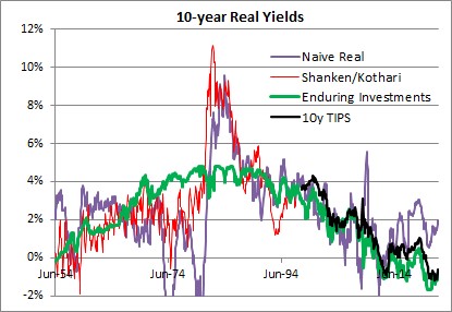
The long-term averages for these four series are as follows:
- Naïve real: 2.34%
- Shanken/Kothari: 3.13%
- Enduring Investments: 2.34%
- 10y TIPS: 1.39%
- Shanken/Kothari thru 2007; 10y TIPS from 2007-present: 2.50%
It isn’t just a coincidence that calculating a long-term average of long-term real interest rates, no matter how you do it, ends up being about 2.3%-2.5%. That is also close to the long-term real growth rate of the economy. Using Commerce Department data, the compounded annual US growth rate from 1954-2021 was 2.95%.
It is generally conceded that the economy’s sustainable growth rate has fallen over the last 50 years, although some people place great stock (no pun intended) on the productivity enhancements which power the fantasies of tech sector investors. I believe that something like 2.25%-2.50% is the long-term growth rate that the US economy can sustain, although global demographic trends may be dampening that further. Which in turn implies that something like 2.00%-2.25% is where long-term real interest rates should be, in equilibrium.[2] Kashkari says “We do know that neutral rates have been falling in advanced economies around the world due to factors outside the influence of monetary policy, such as demographics, technology developments and trade.” Except that we don’t know anything of the sort, since there is a strong argument against each of these totems. Abbreviating, those counterarguments are (a) aging demographics is a supply shock which should decrease output and raise prices with the singular counterargument of Japan also happening to be the country with the lowest growth rate in money in the last three decades; (b) productivity has been improving since the Middle Ages, and there is no evidence that it is improving noticeably faster today – and if it did, that would raise the expected real growth rate and the demand for money; and (c) while trade certainly was a following wind for the last quarter century, every indication is that it is going to be the opposite sign for the next decade. It is time to retire these shibboleths. Real interest rates have been kept artificially too low for far too long, inducing excessive financial leverage. They will eventually return to equilibrium…but it will be a long and painful process.
At the time I wrote the passage above, 10-year TIPS yielded about 0.25%; today they yield 2.125%. It turned out that returning to equilibrium wasn’t at all a long process. But it certainly was painful!
Returning to the original point: just because 10-year rates are now approximately at equilibrium is not at all a prediction that they will remain at equilibrium. Indeed, if I made that prediction I would be making a very similar mistake to the one I criticized above. Mean reversion in rates is not a particularly powerful force, when set against an active central bank and a profligate legislature. But if it matters at all, it is very important to correctly identify the mean to which rates should revert.
And it’s not 2%.
[1] https://www.minneapolisfed.org/article/2022/policy-has-tightened-a-lot-is-it-enough
[2] The reason that real interest rates will be slightly lower than real growth rates is that real interest rates are typically computed using the Consumer Price Index, which is generally slightly higher than the GDP Deflator.
Inflation Market Valuations and Tactics in the New Year
There is so much to talk about, since it has been such a long time since I posted, that it is a little hard to know where to begin. So let’s begin 2025 with a few quick notes about inflation markets and markets generally. I wouldn’t call this an outlook, per se…I am trying to resist making that year-end/year-beginning offering to the jinx gods…but an update with some observations. As an aside, later today I’m planning to post a new Inflation Guy Podcast (this is a Podbean link but it’s available anywhere you get your podcasts) with some comments on the trajectory of inflation (as opposed to markets), and how that may be affected by things such as the massive California wildfires.
I will begin with a content warning: this note is much denser than most of my columns. If you’re a retail investor and/or only interested in developments in inflation rather than inflation instruments, then you might skip this one. I’ll talk more about expectations for inflation, of course, in other posts. But that’s not today’s post.
Let’s start by looking at 10-year real yields. The blue line in the chart below is 10-year TIPS yields; the black line (because it’s topical) is 10-year UK Gilt linker (real) yields. TIPS yields are up to 2.25%. Normally, when they get to around 2% I think of them as roughly fair in an absolute sense, because long-term risk-free real yields ought to in principle look something like long-term real economic growth. Instructive in the chart below is that as far as nominal UK yields have risen, inflation-linked yields are still well below US real yields.[1]

That’s partly a clientele effect, since there are many forced holders of UK linkers. But still, while US real yields ran up from -1% to +2.25% once inflation started (that is, TIPS declined in a mark-to-market sense when inflation went up – very, very important to understand if you think of TIPS as an inflation hedge. They are, but only at maturity), Gilt real yields went from -3% to +1.19%. The selloff was 100bps worse. Yikes.
The next chart shows my quantitative measure of relative cheapness (negative indicates richness, because I’m a bond guy). I said before that TIPS are now roughly fair in an absolute sense; relative to nominal bonds, they’re also roughly fair to slightly cheap. That’s the blue line. You can see that TIPS for most of the past decade were pretty cheap relative to nominals (even while they were absolutely rich because of negative real yields), but since people started caring a bit about inflation they’ve gone back to being mostly fair. However, Gilt linkers have been massively rich for a long time – again, because of the forced-holders problem. But they are starting to get cheaper. That 100bps greater selloff I mentioned above happens to show up here as 100bps cheapening relative to nominals, and relative to TIPS!

Today’s column is supposed to be mostly about US markets, but I can’t help myself. I ought to also point out that breakeven inflation in the UK is roughly 100bps higher than it is in the US, even though core inflation in the UK is 3.6% and in the US it’s 3.5%. So, possibly, part of the relative richness of UK linkers – since I’m looking at each country’s linkers in relation to its own nominal bonds – is actually cheapness of UK nominals, compared to the actual inflation there. Or maybe it’s the richness of US nominals, compared to the actual inflation here. (This is why relative value trading is so useful and important – we don’t need to have an opinion about which of these two things is true. Are US nominals too rich, maybe because they can be financed cheaply in repo markets at ‘special’ rates? Or are UK nominals too cheap, maybe because the UK budget situation is perceived to be somehow even more precarious than our own? I don’t know.)
Sorry about the digression there to the UK. I just got excited. The inflation markets and inflation in Japan are also really interesting right now, especially as wage growth is surging and the yen is bordering on collapsing…yet 10-year inflation in Japan is quoted around 1.5%. If you can get someone to transact. Maybe I’ll talk about Japan another time.
US markets. First, note the weird shape of the US CPI swaps curve.

I have several issues here, with one of them being the overall optimism that inflation is definitely going back to be close to target, despite any real sign that is going to happen. It borders on religious conviction, frankly. But also, we have a weird implied path where inflation droops, then spikes near the 10-year point, and then declines. To be sure, I’m committing a chart crime here with the y-axis; if you stepped back this would look almost flat. But this is more than enough for a hedgie to be interested, usually. What is really happening is that if we had a core inflation swaps curve (I do, but you don’t) it would show a gentle decline out to 8 years. It’s steep on the CPI swaps curve because the energy curves imply that energy inflation will drag core inflation lower for years.

Of course, they won’t but you can hedge the energy. Out to about 5-8 years, probably. And that’s probably why we have that little dip in the CPI curve – it’s really an energy thing.
So I’ve said that 2.25% real yields on TIPS are fairly attractive. About as attractive as they’ve been for some time, actually. But be aware of a couple of things. One is that the bond market as a whole is under pressure and probably will stay under pressure for a bit as investors worry about financing the government in a world where the trade deficit is probably going to be coming down (implying that domestic savings will have to go up, and the only good way to make that happen is with higher yields). Real yields could go higher, and probably will at some point. But you should recognize that seasonality works in favor of the TIPS buyer right now.

Breakevens have a strong tendency to rise in the early part of the year. In 22 of the last 26 years, 10-year breakevens have risen in the 60 days following January 8th. To be sure, some of that is because TIPS bear flat-to-negative accretions in the early part of the year because CPI in December almost always declines on an NSA basis, so the rise in price/decline in real yields that helps widen breakevens is partly reflecting a change in the source of total return in TIPS during those months to being more price and less yield.[2] The point being that buying nominal bonds in the beginning of the year, up until about May, runs into difficult seasonal patterns but this is not true with TIPS. Indeed, it means that if you’re buying fixed income at all in Q1, it probably should be TIPS.
Finally, I really should say something about equities here. I think it’s always important to realize that TIPS yields are a direct competitor with equities. Nominal yields are not, necessarily, because 7% nominal yields in a world where prices (and earnings) are going up at 9% are much worse than 5% nominal yields in a world where prices (and earnings) are going up at 3%. Equity earnings do tend to rise with inflation (but stocks are a poor inflation hedge because multiples also tend to contract significantly when there is inflation, so you need to hold equities for a long, long time for them to be a good inflation hedge), and since they do it means that inflation-linked yields are a more-fair comparison. Real yields at 2.25% are neither rich nor cheap in the grand scheme of things. But equities are, once you discount expected earnings growth for expected inflation. I calculate the expected long-term S&P real return assuming that the current multiple of long-term average earnings (the Shiller PE) reverts 2/3 of the way to its mean over 10 years. By making it 10 years, and not demanding full reversion, I lessen the impact of apparent overvaluation on expected returns. But high returns do, historically, tend to precede low returns! In any event, you can debate my approach but below you can see my point.

This first chart shows 10-year TIPS yields set against my calculated expected 10-year annualized real returns from the S&P 500. Granted, the S&P 500 is cheaper outside of the Magnificent 7. But you can see that while stocks and TIPS cheapened together in the inflation spike of 2022, equities have ‘forgotten’ that they should be priced for higher real yields…resulting in the chart below, which I call the “Real Equity Risk Premium” of expected equity returns minus TIPS real yields.

Some of you will say “that’s a trend. Let’s get on that and buy stocks.” To me, that sounds like the fellow falling out a window on the 29th floor and declaring as he passes the 6th floor ‘so far, so good.’ The point of the chart is that when you buy stocks now, you should be expecting to lose money, in real terms, over the next decade. Maybe you’ll average 3% and inflation will be 4%, for example. But TIPS will guarantee you will make 2.25% after inflation. As this spread gets more and more tilted against stocks, it gets harder and harder to explain why anyone would choose equity risk over TIPS risk, other than as a diversifier.
[1] This is not wholly unique to the UK. US 10y inflation bonds have higher real yields than linkers in Australia, Italy, Israel, Canada, France, the UK, Germany, and Spain.
[2] This is wonky stuff. If the expected forward price level doesn’t change, then the breakeven needs to go up because we are starting from lower and lower current price levels due to the (short) lag between the reporting of CPI and its realization in the carry of TIPS. If you don’t understand this because you’re not a rates strategist, don’t worry about it and take my word for it.
2024 Balance of Risks
I am a risk manager, both literally and figuratively. Literally, since whether it is with our own funds and strategies or allocations for individual investor clients, or with my trading book back when I worked on Wall Street, the hard constraints are always capital, capital, and capital and so managing risk is part of how you make sure you don’t lose that capital. But also figuratively – my natural disposition is conservative, which is why I am a bond guy (concerned with getting my original investment back at par, at the end) rather than an equity guy (filled with dreams of a 10-bagger because I’m the first guy to figure out that Blockbuster Video is going to revolutionize video rental, and not so worried about how it will vanish almost overnight to Netflix).

So when I look at the investing landscape, I’m generally not focusing very much on ‘what I think is going to happen’; rather I spend more time thinking about the range of possible things that might happen, and their relative likelihoods. In theory, all rational investors do this but the markets do not trade like it. For example, currently Crude Oil trading at $72.60 does not seem to put any weight on the possibility of a hot war in the Middle East that could abruptly spike prices to $125/bbl or more. That’s not a prediction there will be a conflict that disrupts oil production or distribution (which, since there’s already a conflict – even though it hasn’t impacted oil production and only marginally impacted distribution – doesn’t seem like the sort of tiny-risk possibility we can ignore), but merely an observation. If you think there’s even a 10% chance that oil spikes $50/bbl, it would be worth $5/bbl. “But Mike,” you say, “maybe that’s already in the price and but for that possibility oil would be $5 lower?” Well, the risk manager in me looks for confirmation that the market is at least a little nervous, and with the Oil VIX trading at its long-term average and well below the average of the post-2020 spike it strikes me as hard to characterize the energy markets as ‘nervous.’

Anyway, this is why I dislike year-end ‘outlook’ pieces and why when I forecast CPI for a year or two out I almost always focus on a range of probable outcomes rather than a point estimate.[1] Honestly we should all do this, but not enough people have studied enough statistics to understand the significance of the error bars. If you have an experimental mean, and a nice large error bar, it signifies that you can’t reject the possibility that the true mean is anywhere in the range covered by the error bar. And that’s why, when someone introduces a new rent index that supposedly is more current but by their own admission has 15 times the standard error…I ignore it.

Enough of the preliminaries. Let me get on with this. Here are my thoughts about the balance of risks for just a few important items:
Interest rates: balance of risks is clearly higher. This was even more true at the end of the year. But with 10-year rates at 4.11%, down from 5% in October, keep in mind that two ways to get lower interest rates are already priced in: the short end of the curve reflects expectations (despite Fed officials’ protestations to the contrary) of roughly 150bps of cuts in the overnight policy rate this year, and the long end reflects inflation expectations of only 2.27% inflation over the next 5 years and only 2.30% inflation over the next decade. On top of this, consider that with the trade deficit declining but the budget deficit not declining, more of the budget deficit will have to be funded from domestic saving – and the Fed is still shrinking its balance sheet, so it is pushing in the opposite direction. The balance of risks in the bond market is to higher rates.

Stock market: balance of risks is lower, with the caveat that the picture is much better if looking at the market ex-the ‘Magnificent 7’ hot stocks (Apple, Nvidia, Meta, Tesla, Amazon, Microsoft, and Google). The S&P currently has a P/E of 21.4 and is up 24% since the end of 2022. The S&P ex-Mag7 has a P/E of 18.4 and is up 11% since the end of 2022. The Magnificent 7 themselves have a P/E of 39.5 and are up 110% over the last year.

The overall market P/E looks not-too-bad, until you remember that this is only because profit margins are currently only just a bit below at least 30-year highs (and probably lots longer – this is as far back as Bloomberg has trailing-12-months margins). The balance of risks is definitely for lower margins, which means lower earnings, which means the same equity prices would represent higher P/Es. Oh, and whatever happened to those people saying that the high equity prices were due to the really low interest rates? Haven’t heard from them in a while.

Where I have clients who are long equities, they’re long equal-weight indices so as to lessen exposure to the Magnificent 7. But even if those stocks were the only ones overvalued, it’s not reasonable to think that they can come back to earth and not bring down the rest of the market. If Apple, Nvidia, Meta, and Microsoft drop 30%, the rest of the market isn’t going to go up. However, if such a thing were to happen the market outside of the Mag 7 could feasibly eventually get to looking cheap.
Credit spreads: balance of risks is wider, with the 10-year Baa credit spread near 30-year lows. Really, how low does this go? And the tails are obviously one-way.

So I’ve said the balance of risks favor higher interest rates, wider credit spreads, lower corporate margins, and lower equity prices. It’s also useful to think about where the risks are in my risk assessments. If we get lower interest rates, instead of higher, then it’s very likely due to the economy being a lot weaker than it currently is, and the Fed ends up having to ease more than 150bps in 2024. That seems unlikely to me, but if it happens then notice that probably also means that credit spreads will widen and corporate margins, earnings, and stock prices decline. So, if you’re bullish on bonds and stocks, it seems to me you’re taking a dangerously narrow path. The balance of risks to me look bearish on both sides of that, but the bullish outcome for bonds implies (I think) a bearish outcome for stocks. It’s difficult for me to see an environment with appreciably higher stocks and bonds, unless the Fed eases aggressively without any economic weakness. So that’s your implied bet.
On the other hand, being bearish both stocks and bonds doesn’t carry such a narrow path risk. Unless the Fed eases despite a solid economy, It isn’t hard to envision an environment with lower stocks and bonds. Heck, we had just such an environment a few months ago, pre-‘pivot.’ It’s not a reach.
None of the preceding is a forecast. But investing and trading are about evaluating the range of risks, and trying to take positions with asymmetric risk-adjusted payoffs. In my opinion, long-only investors should be playing short on the yield curve (and going up credit, and inflation-linked rather than nominal) and anti- cap-weighting their stock holdings.
That’s as close to an outlook piece as I am doing this year. Have fun.
[1] In the last few years, I’ve started putting a point estimate for CPI in my Quarterly Inflation Outlook, but I also report what I see as the 1 standard deviation range so I can indicate the skewness of the risks in my view.
How Higher Rates Cause Big Changes in the Bond Contract
Two weeks ago I pointed out one of the effects of higher interest rates is that leveraged return strategies get swiftly worse as rates rise. Today, I want to talk about another result of higher interest rates which is, to me, much more fun and exciting. It involves the Treasury Bond cash-futures basis.
I know, that doesn’t sound so interesting. For many years, it hasn’t been. But lately, it has gotten really, really interesting – and institutional fixed-income investors and hedgers need to know that one of the major effects of higher interest rates is that it makes the bond contract negatively convex, not to mention that right now the bond contract also looks wildly expensive.
Some background is required. The CBOT bond futures contract (and the other bond contracts such as the Ultra, the (10y) Note, the 5y, and the 2y) calls for the physical delivery of actual Treasury securities, rather than cash settlement. Right now, thanks to ‘robust’ Treasury issuance patterns, there are an amazing 54 securities that are deliverable against the December bond futures contract. The futures contract short may deliver any of these bonds to satisfy his obligations under the contract, and may do so any time within the delivery month.
Now, if we just said the short can deliver any bond, the short would obviously choose the lowest-priced bond. The lowest-coupon bond is almost always going to be the lowest-priced; right now, the 1.125%-8/15/2040 sports a dollar price of 55.5.[1] But if we already know what bond is going to be deliverable, and it’s always the optimal bond to deliver, then the futures contract is just a forward contract on that bond, and it becomes very uninteresting (not to mention that liquidity of that one bond will determine the liquidity of the contract). So, when the contract was developed the CBOT determined that when the bond is delivered it will be priced, relative to the contract’s price, according to a conversion factor that is meant to put all of the bonds on more or less similar footing.[2] The price that the contract short gets paid when he delivers that particular bond is determined by the futures price, the factor, and the accrued interest on the delivery date…and not the price of the bond in the market.
Because the conversion factor is fixed, but the bonds all have different durations, which bond is cheapest-to-deliver (“CTD”) changes as interest rates change. When interest rates fall, short-duration bonds rise in price more slowly than long-duration bonds and so they get relatively cheaper and tend to become CTD. When interest rates rise, long-duration bonds fall in price more quickly than short-duration bonds and so tend to become CTD in that circumstance. And here’s the rub: when interest rates were well below the 6% “contract rate”, the CTD bond got locked at the shortest-duration deliverable, which also usually happened to be the shortest-maturity deliverable, because that bond got cheaper and cheaper and cheaper as the market rose and rose and rose. The consequence is that the bond contract, as mentioned earlier, eventually did become just a forward contract on the CTD (and a short-duration CTD at that), which meant that the volatility of the futures contract was lower, the implied volatility of futures options was lower, and the price of the futures contract was uninteresting to arbitrageurs because it was very obviously the forward price of the CTD. And this situation persisted for decades. The last time the bond and 10-year note yielded as much as 6% (which is where all of the excitement is maximized, since after all the conversion factor is designed to make them all more or less interchangeable at that level) was 2000. [Coincidentally or not, that was right about the time I stopped being exclusively a fixed-income relative value strategist/salesman and started trading options, and then inflation.]
So, now the long bond yields 4.96% and the deliverable bonds in the December bond contract basket have yields between 5.03% and 5.22%. This starts to get interesting. As of today, the CTD bond is the 4.75%-Feb 15, 2041. If you buy that bond and sell the contract,[3] then the worst possible case for you is that you deliver that bond into the contract and lose roughly 12/32nds after carry.
However.
Because you are short the futures contract, you can deliver whatever bond is most-advantageous to you at the time you elect to deliver. If any other bond is cheaper than the 4.75s-Feb41, then you buy that bond, sell the Feb41s, and deliver. And obviously, that’s a gain to you. And you can make that switch as often as you like, up until delivery.
Can you predict approximately when the bonds will switch? Sure, because we know the bonds’ durations we can estimate the CTD – and the value of switching – for normal yield curve shifts. While the steepening and flattening of the deliverable curve also matter, remember that anything that adds volatility to the potential switch point adds value to you, the futures short. Here is, roughly, the expected basis at delivery of that Feb41 bond.

Now isn’t this interesting? If the bond market rallies, then we know that shorter-duration bonds will become CTD, pushing the Feb 41s out. And if the bond market sells off, then we know that longer-duration bonds will replace the Feb 41s as CTD. Notice that this looks something like an options strangle? That’s because it essentially is. You own a strangle, and you’re paying 12/32nds for that strangle. (Spoiler alert: you can sell a comparable options position in the market for roughly 28/32nds, making the basis of that bond about half a point cheap, or equivalently the futures are about half a point rich.
Okay – if you’re not a fixed-income relative value strategist…and let’s face it, they’re a dying breed…then why do you care?
If you’re a plain old bond portfolio manager, you may use futures as a hedge for your position; you might use futures to get long bonds quickly without having to buy actual bonds, or because you aren’t allowed to repo your physical bonds but you can get some of the same benefits by buying the futures contract. You might buy options on futures to get convexity on your position, or to hedge the negative convexity in your mortgage portfolio.
Well guess what! None of that stuff works the same way it did 15 months ago!
Because longer-duration bonds are CTD now, the contract has more volatility. Which means the options on those futures have more implied volatility. Also, the bond contract is no longer guaranteed to be within a tick of fair value because the CTD is locked. When I worked for JP Morgan’s futures group, we thought if the futures contract got 6 ticks rich or cheap it was exciting. Well, we’re looking at a futures contract that’s a half-point mispriced![4]
Finally – as I said, the bond contract now has negative convexity, which means that when you are long the contract you will underperform in a rally and underperform in a selloff (while earning the net basis of 12 ticks, in a best case). Because when you own the bond contract you have the opposite position I’ve illustrated above: you’re short a strangle. If you’re long the contract then as the market sells off the bond contract will go down faster and faster as it tracks longer and longer duration deliverables. And if the market rallies, the contract will rise slower and slower as it tracks shorter duration deliverables. The implication is that especially because the bond contract is rich, it is great as a hedge for long cash positions at the moment, and a pretty bad hedge for short positions. And it’s great to hedge long mortgage positions, since when you sell the contract you also pick up some convexity rather than adding to your short-convexity position.
This all sounds, I’m sure, very “inside baseball.” And it is, because most of the people who used to trade this stuff and understood it are retired, have moved to corner offices, or are old inflation guys who just wonder why we don’t have a deliverable TIPS contract. But just as with my article two weeks ago, it’s something that I think it important to point out. We’re so obsessed with the ‘macro’ implications of higher rates, we stand to miss some of the really important implications on the ‘micro’ side of things!
[1] I’m using decimals to make this more accessible to non-bond folks, but we all know that this really means 55-16.
[2] The conversion factor is the answer to the question, “what would the price of this bond be if, on the first day of the delivery month, it were to yield exactly 6% to maturity”? So the aforementioned 1-1/8 of Aug-40s have a conversion factor into the December contract of 0.4938 while the 3-7/8 of Aug-40 has a conversion factor of 0.7794.
[3] I am abstracting here from the more technical nuances of how one weights a bond basis trade, again for brevity and accessibility.
[4] There’s a big caveat here in that the yield curve dynamics in my model for the shape of the deliverable bond yield curve are out-of-date, as I haven’t used this model in years…so the contract might be anywhere from 10 ticks to 20 ticks rich. But it’s rich!
Higher Rates’ Impact on Levered Strategies
I am old enough (fortunately??) to be able to remember when interest rates were last at this level. Even higher – I can remember in my first job, at technical analysis firm Technical Data, being tasked with updating the point-and-figure chart of the 10 3/8 – 2012 as it rallied from 9%! I mention this because, as interest rates have headed back higher I have noticed that a lot of people don’t remember some of the investment implications of higher rates. So, I want to review one of them today. Next week, I’ll write about how the rise in rates will tend to make bond futures negatively convex after years of positive convexity…there aren’t many bond basis traders left, because it’s been years since there has been a shift in bond deliverables, but it makes a lot of things more interesting and I suspect will resurrect some old relative-value trades that haven’t been seen in a dog’s age.
But today, I want to point out one big effect on the hedge fund industry: higher interest rates leads to lower hedge fund risk-adjusted returns, directly and significantly. If you’re a hedge fund, you already know this. If you’re an allocator, you may or may not realize that you need to carefully monitor any changes in the risk-taking of your existing hedge fund portfolio, and start to ask tougher questions of hedge funds touting high returns.
The dirty little secret of hedge fund returns is that you can make a good edge look like a fantastic return if leverage is cheap enough and if you lever enough. If I buy a bond yielding 5% with $100, and then borrow $90 at a 0% borrowing rate, by pledging that bond as collateral…and invest in another bond yielding 5%, then magically I have turned a simple bond-buying strategy into one that yields 9.5% (5% on 100, plus 5% on another 90, divided by the 100 in unlevered principal). Yes, I have almost doubled my risk but I have created a return that looks really nice.
But if instead of borrowing at 0% I am borrowing at 2.5%, then levering to buy that bond doesn’t add as much. The $90 spent on that 5% bond now costs me 2.5%, for a net 2.5% return on that piece. I still have the risk, but my return has gone down to 7.25%. If I can borrow another 90, and do the trick again, I’ll get back to my 9.5% return but now I’m 3x levered instead of 2x. (Naturally, most hedge fund strategies are more complex but this is the basic concept).
Now, for small changes in financing rates this is of course a small effect. And for decreases in financing rates, it’s a positive effect. But when you have large increases in interest rates, it has a big effect on returns:

Yes, I know this is overly simplistic but the easiest way to think about this is with a bond strategy where you’re leveraging up a simple yield. The significance of a change in the cost of leverage, though, is felt across many hedge fund categories. There’s an exception with many CTA strategies because there is no money required to hold the natural underlying. The longs and shorts are exchanging daily P&L, and no one actually needs to hold the underlying instrument because there isn’t any. Similarly, long/short bond and equity strategies, in principle, only care about the spread between the financing of the long position (which is paid) and the financing of the short position (which is earned) rather than its level, assuming equal notionals on long and short. But most long/short strategies – including fixed-income arbitrage, weirdly – are highly correlated to stocks, which suggests that in most cases there’s net long exposure. Here are charts of the CS long/short equity hedge index, and the Bloomberg Fixed-Income Arb index, against the S&P 500.


Managed futures, not so much, although there’s a decent correlation to commodity indices (not as much as in the above examples relating long/short returns to equity returns).
If a futures strategy or a long/short strategy holds unencumbered cash, they should get some benefit from higher rates…but most such strategies don’t tend to have a lot of unencumbered cash. In the same way, commodity futures indices such as the Bloomberg Commodity Index or the Goldman Sachs Commodity Index (and many others) get some benefit in expected returns because they earn more on the collateral they hold against futures positions, and they do hold a lot of cash and Tbills.
However you slice it, the sharply higher financing rate environment we are now in is likely to have a meaningful effect on the returns (and the risks, if more leverage is used to chase a higher return) of many hedge fund strategies. All else being equal, this will be a lower penalty on less-levered strategies; which means investor money should flow to less-levered strategies for a better risk-reward tradeoff.