Archive
Mamdani’s Effect on the CPI
Surprising no one, and yet shocking many, avowed socialist Zohran Mamdani won the election yesterday to become Mayor of the largest city in the United States.[1]
Probably the main reason for Mamdani’s victory is that he pursued the tried-and-true method of giving out free stuff, and a whole generation of Americans who have systematically been poorly educated in history and economics said “that sounds awesome.” So, now we will see whether socialism will work for the first time ever.
This is an inflation blog, so I want to review briefly the effects of price controls on inflation – and indirectly, on inflation instruments. It’s interesting because we actually have some direct and recent experience with what were effectively price controls: the Biden Administration’s ‘eviction moratorium’ during COVID, that prevented landlords from tossing out renters who weren’t paying their rent. Really, it’s a pretty amazing thing that says a lot about Americans that the vast majority of renters continued to pay rent anyway.[2] An ancillary effect, though, was that landlords had no leverage to raise rents and therefore, rents stopped going up. Unsurprisingly (and here is where the lesson should have been learned), when the eviction moratorium was lifted rents re-accelerated. In the chart below, note how in 2021 effective rents declined while asking rents went up – but the red line eventually rebounded and exceeded the prior trend.

I actually haven’t looked at that chart in a little while. It’s fascinating to me that ‘asking rents’ (which come from the Census department) have maintained their divergence from ‘effective rents’ (sourced from Reis Inc). I wonder if some of that is the effect of the LA wildfires. In any case, not today’s article. The point is that the effective price controls on rents did have an effect on measured rents, but it didn’t change the economics and eventually prices caught up.
Back in 2022, I produced an excellent podcast episode entitled Ep. 37: Bad Idea of the Year – Wage and Price Controls. In it, I discussed some of the trial balloons that had been floated by the Administration and some of the really bad economics that was being used to support the idea. This is a part of the transcript (from Turboscribe.ai), and I still love the analogy:
“But the basics of how it works are very simple to visualize. Price is a teeter-totter, okay? It’s a seesaw. On one side of the seesaw sits all of the buyers. On the other side sits all of the sellers. If there are lots more buyers jumping onto one side, then the teeter-totter drops on that side, and the fulcrum, in order to make everything balance, the fulcrum has to move. And if you move the fulcrum, then you can get that to balance even with more buyers and fewer sellers.
It just means that the fulcrum, which is price, has to move in one direction. If then people, those buyers drop off, then the fulcrum moves back the other direction. If more sellers jump onto the teeter-totter, the fulcrum moves the other direction as well.
So it’s a simple way to visualize it…and yes, there are all kinds of complexities in the real world. There’s behavioral, there’s stickiness that happens, but that’s the fundamental theory of price, is what I’ve just given you, is that price is the fulcrum that balances the buyers and sellers.
So what price controls say is that, well, we don’t like where this balanced. We have too many buyers, not enough sellers, and the fulcrum has moved way over to one side and we don’t think it should be there. So we’re going to take the fulcrum and we’re going to move it to where we like it. And guess what happens? There’s no balance. All of a sudden, if you move the fulcrum away, then all of a sudden, the side with all the buyers goes down and goes thunk on the ground. There’s no balance.
“How do you then balance it? If you say that the fulcrum has to be in this location, how do you balance the teeter-totter? Well, you have to take buyers away. And you take buyers away by making a shortage. And so those buyers can’t buy anything. And then voila. So if you force the price, then the quantity has to change. And if you let both things happen, then it will magically go and balance. If it’s truly a free market and there’s good information and all that stuff.
“So does this solve the problem to push the fulcrum to one side and say, oh, there’s no inflation and to make it balanced, we shove everybody off the teeter-totter by creating a shortage? It doesn’t solve the problem. And furthermore, the people that you’ve pushed off the teeter-totter who can’t get access to the thing anymore are pretty upset. They should be upset because before they had a way to get what they wanted and what they were willing to pay for. And now they can’t because you’ve shoved them off the teeter-totter. You’ve created a shortage.”
That was a public service announcement, just to remind you why price controls don’t work. That doesn’t mean they aren’t really good politics, especially if you can leave the removal of the controls to the next guy who ‘causes’ the inflation when they come off. And it’s the politics, not the economics, that leads to this dumb idea being tried over and over despite a roughly 0% record of success.[3]
Because can price controls affect price indices? You betcha. If you make it illegal to move prices, then at least official prices will not move. So let’s consider the potential impact of Mamdani freezing rents and grocery prices, for example.
New York City is about 7% of the CPI sample. Technically, it’s New York-Newark-Jersey City but we know most of that is NYC. In the New York consumption basket, Rent of Primary Residence is about 11%, 28% is Owners’ Equivalent Rent, and 8% is Food at Home. So, if rents and grocery prices were frozen, about 19% of the NY CPI would go to zero month/month right away (at least officially – the best tomatoes will be sold on the black market for a premium of course and the best catch of the day will be sold in NJ…[4]) And since OER is based on a survey of primary rents, eventually 47% or so of the NY CPI basket will go to zero price change. I’m ignoring the quality adjustments in the housing stock, which have the effect of increasing OER inflation slightly.[5]
The effect of this on the national CPI: if 47% of the NY basket goes from, say, 4% inflation to 0%, and NY is 7% of the national CPI, then the really-rough effect on the US CPI would be 47% x -4% x 7% = -13bps per year. Obviously that’s extremely rough, but I’m just aiming for an order of magnitude calculation. 13bps is small, but noticeable. Probably not tradeable.
But here is something that’s interesting and potentially tradeable. New York City is about 30% of the Case-Shiller 10-City Home Price Index. Let’s suppose that home prices in New York over the next year drop, say, 10%.[6] That move would cause the nationwide Case-Shiller (10-city) index to drop 3%, or to rise 3% less than it otherwise would. Here’s what is interesting. The chart below shows the February 2027 NYC Metro Case-Shiller futures contract, which trades on the CME (and settles to the index for December 2026, which is released in February 2027).

There has been exactly zero price effect of the Mamdani victory. To be sure, open interest in the NYC contract – in all of the Case-Shiller contracts, for that matter – is extremely low but there is an active market-maker and the current price as I write this is 344.40 bid/351.60 offer. The last print of the S&P Cotality Case-Shiller New York Home Price NSA Index, for August 2025, was 334.08. On the bid side, then, the market is paying 3.1% higher prices than the current index. That seems sporty to me. Why would home prices rise if rents are frozen? Why would they rise if people are leaving the city?
As always, my musings here are not trade recommendations; do your own research. Disclosure: I do not currently have a position either long or short in any housing futures contract, nor does any account or fund that I or Enduring Investments manages, nor do I currently have plans to initiate any position.
[1] New York, at least for now.
[2] At the time, we worried about what would happen with the CPI since a renter paying zero rent is not skipped but the rent goes into the calculation as a zero. So you could in theory have had 10% of the basket going to zero, which would have destroyed the inflation market.
[3] If you listen to the episode: I also love my thermometer analogy.
[4] Also, though rents will stop rising the quality of the apartments will deteriorate since landlords will skimp on maintenance. Mamdani has a plan for that, though – he has said the city will order maintenance to be done and if it isn’t, the city will seize the property. Just in case there was any question who really owns any property that you can’t pick up and transport elsewhere.
[5] N.b. – the increase in the CPI nationally from the owned-housing quality adjustment almost exactly cancels the decrease from quality/hedonic adjustments in other parts of the CPI. Yet another reason that the whining about hedonic adjustment being used to ‘manipulate CPI lower’ makes no sense.
[6] You can easily make a case for a much steeper drop if the city increases property taxes to make up for declining income tax collections, not to mention if the exodus from the city looks anything like the 9% of the population who claim they’d move if Mamdani won, or if the finance industry continues to relocate to Dallas and Miami.
How to Calculate USDi’s Current Value
I haven’t been writing a lot during August, nor have I done many podcast episodes. I feel like I make this apology almost every year, but it seems every year August just gets slower, and slower, and slower – and any content I push out gets less engagement during August than during any other full month (although the end of December, naturally, gets very thin as well. It’s really remarkable how August has changed during my career. In the 1990s, there were maybe a couple of weeks that were a little thin in the markets, but that has metastasized so that now it’s all of August and a week or two into July. I am speaking of the US markets – Europe has always been slow for the second half of the summer, at least in my experience, and I don’t know if there has been much change in that over the last few decades.
In any event, I’m more than happy as a writer to take a little time off and recharge. As an entrepreneur? Not so much.
This is, though, a good time for a ‘utility’ post. As readers know, a few months ago we launched USDi, the first CPI-linked cryptocurrency that’s fully backed by traditional finance assets. Because those assets for the most part reside in a private fund (which, because it’s a private fund issued under Reg D, I can’t talk much about on a public post so forgive my vagueness here about what the fund does and how), there is regularly confusion when potential buyers of USDi think that they are buying a share of the fund. They are not, for two reasons. The first is that a coin that represents a tokenized share of a traditional-finance fund would clearly be a security under US law, which creates lots of other complexities that we don’t want: for example just as I can’t tell you much about the fund, if the token was a security then I couldn’t tell you much about that, either! Which would make distribution difficult, to say the least.
The second reason that we didn’t want the coin to represent a tokenized share of the fund is that then the coin would not exactly track CPI. It is important that the coin be a zero-risk instrument, and I illustrate why that’s important in the post “USELESS Coin vs Very Useful Coin”. Accordingly, USDi’s value is entirely formulaic, and known in advance by at least a few weeks. It’s my purpose today to explain how the value of USDi is derived from CPI prints.
USDi, like TIPS and US CPI swaps, is linked to the Non-seasonally Adjusted Consumer Price Index for All Urban Consumers…the NSA CPI for short. The CPI that is released every month is related to this number – specifically, the ‘headline CPI’ is the month-on-month percentage change in the Seasonally-adjusted number. Here is where you find that number (rounded, of course) in the monthly BLS release found at https://www.bls.gov/news.release/cpi.nr0.htm:

The problem with using a seasonally-adjusted number is, you guessed it, that the seasonal adjustment factors can change. Consequently, all inflation derivatives rely on NSA numbers, which are almost never revised. In the same report linked above, the BLS notes the NSA number:

The highlighted number, 323.048 in this case, is the number that TIPS traders and inflation swaps traders care about. And, if you buy USDi, you will care about this number as well. This is the price index value defined relative to the base of 100.000 representing the average of the 1982-1984 price level. The index value of 323.048 tells you that the (quality-adjusted) price level has risen 223.048% since the early 1980s, slightly more than a tripling!
(As an aside, the BLS has an enormous number of NSA series for different subcomponents available. You can see and chart a lot of them here: https://data.bls.gov/dataQuery/find?fq=survey:%5Bcu%5D&s=popularity:D )
Now, the BLS reports this number just once a month, and in arrears. It was mid-August when they reported the July CPI referenced above. So we have two things we need to account for when we turn this into an index that USDi (or TIPS or inflation swaps) can track: 1. We have a monthly number, and we need a daily number – or in USDi’s case, one number every block, and 2. We have numbers for every month ending in July, but today isn’t July, so we need something for today. Let’s call the index value that we are going to construct, to use for TIPS/swaps/USDi, the “Reference CPI.”[1]
The second problem is handled in the simplest way possible: we just lag the data.[2]

So when we got the July data this month, we have the Ref CPI for October 1 (the 323.048 number I mentioned above). We already have the Ref CPI for September 1 (that was the June CPI, reported in July, 322.561). So now, we can straight-line interpolate the Ref CPI for any day in between those two dates, based on the number of calendar days in that month. So, the Ref CPI for September 2nd is:
1/30 * 323.048 + 29/30 * 322.561 = 322.57723
Voila, that’s just what the Treasury calculates for September 2nd, which isn’t surprising because that’s how math works.

Now, the only subtlety to USDi is that while TIPS and CPI swaps have one settlement per day USDi in principle is tradeable 24/7. That means that if we changed the Ref CPI for USDi just once per day, at 1 second before midnight every day you could buy USDi and then sell it at 1 second after midnight and get the entire day’s interest. That doesn’t seem fair. The blockchain is much closer to continuous settlement, so we have to interpolate not by day, but by block. On Ethereum (where USDi exists, initially), a block is roughly 10-15 seconds long, so USDi accrues interest basically every 10 seconds. The actual code for USDi looks at the block number and does the exact same calculation that we do above except that it is interpolating between the first block in September and the first block in October. You can get very close to the right answer by simply using spreadsheet NOW() functions, which in Google Sheets has 1-second precision. I do the approximate calculation for USDi on a Google Sheet here: https://docs.google.com/spreadsheets/d/1UnPzAu-U2zy5TEIcxgLBqkVP7QNtBJhwrwLnHt9EitM/edit?gid=0#gid=0
Let’s see, why did I want to calculate the Reference CPI? Oh, I remember: I want to find the price of USDi for a given time, in the past or present or any time up until (for now) the end of September. We have done all of the work except for the last step, which is to divide the current price level index – the Reference CPI – by the base price level index. For USDi, we defined the denominator as the December 2024 CPI. This is why we say that USDi is a dollar that preserves the purchasing power of a December 2024 dollar.
The December 2024 CPI was 315.605. Since the December 2024 CPI was also the Reference CPI for March 1st (see the handy drawing above), that means the value of USDi on March 1st was (drum roll) 315.605/315.605 = 1.000000. The value of USDi on October 1st will be 323.048/315.605 = $1.023583.
So the USDi coin is not a fund, nor a share of a fund. It is a time machine.

[1] The Reference CPI for TIPS and swaps is identical. The Treasury calculates them too, and reports them at https://treasurydirect.gov/auctions/announcements-data-results/tips-cpi-data/ (look for the PDF and XML files for the “Reference CPI Numbers and Daily Index Ratios Table.”)
[2] In principle, we could take the recent data trend and project to the current date, which would make it contemporaneous but lose accuracy…since when the inflation data is actually released, we will find out that method isn’t perfect. It would also be confusing, since on any given day in the past there would now be the actual CPI data and the previously-used projected-trend data. Since the importance of the exact timing of the price level diminishes with distance, while the two-index confusion would persist, the simple-lag method makes sense to me.
Inflation Market Valuations and Tactics in the New Year
There is so much to talk about, since it has been such a long time since I posted, that it is a little hard to know where to begin. So let’s begin 2025 with a few quick notes about inflation markets and markets generally. I wouldn’t call this an outlook, per se…I am trying to resist making that year-end/year-beginning offering to the jinx gods…but an update with some observations. As an aside, later today I’m planning to post a new Inflation Guy Podcast (this is a Podbean link but it’s available anywhere you get your podcasts) with some comments on the trajectory of inflation (as opposed to markets), and how that may be affected by things such as the massive California wildfires.
I will begin with a content warning: this note is much denser than most of my columns. If you’re a retail investor and/or only interested in developments in inflation rather than inflation instruments, then you might skip this one. I’ll talk more about expectations for inflation, of course, in other posts. But that’s not today’s post.
Let’s start by looking at 10-year real yields. The blue line in the chart below is 10-year TIPS yields; the black line (because it’s topical) is 10-year UK Gilt linker (real) yields. TIPS yields are up to 2.25%. Normally, when they get to around 2% I think of them as roughly fair in an absolute sense, because long-term risk-free real yields ought to in principle look something like long-term real economic growth. Instructive in the chart below is that as far as nominal UK yields have risen, inflation-linked yields are still well below US real yields.[1]

That’s partly a clientele effect, since there are many forced holders of UK linkers. But still, while US real yields ran up from -1% to +2.25% once inflation started (that is, TIPS declined in a mark-to-market sense when inflation went up – very, very important to understand if you think of TIPS as an inflation hedge. They are, but only at maturity), Gilt real yields went from -3% to +1.19%. The selloff was 100bps worse. Yikes.
The next chart shows my quantitative measure of relative cheapness (negative indicates richness, because I’m a bond guy). I said before that TIPS are now roughly fair in an absolute sense; relative to nominal bonds, they’re also roughly fair to slightly cheap. That’s the blue line. You can see that TIPS for most of the past decade were pretty cheap relative to nominals (even while they were absolutely rich because of negative real yields), but since people started caring a bit about inflation they’ve gone back to being mostly fair. However, Gilt linkers have been massively rich for a long time – again, because of the forced-holders problem. But they are starting to get cheaper. That 100bps greater selloff I mentioned above happens to show up here as 100bps cheapening relative to nominals, and relative to TIPS!

Today’s column is supposed to be mostly about US markets, but I can’t help myself. I ought to also point out that breakeven inflation in the UK is roughly 100bps higher than it is in the US, even though core inflation in the UK is 3.6% and in the US it’s 3.5%. So, possibly, part of the relative richness of UK linkers – since I’m looking at each country’s linkers in relation to its own nominal bonds – is actually cheapness of UK nominals, compared to the actual inflation there. Or maybe it’s the richness of US nominals, compared to the actual inflation here. (This is why relative value trading is so useful and important – we don’t need to have an opinion about which of these two things is true. Are US nominals too rich, maybe because they can be financed cheaply in repo markets at ‘special’ rates? Or are UK nominals too cheap, maybe because the UK budget situation is perceived to be somehow even more precarious than our own? I don’t know.)
Sorry about the digression there to the UK. I just got excited. The inflation markets and inflation in Japan are also really interesting right now, especially as wage growth is surging and the yen is bordering on collapsing…yet 10-year inflation in Japan is quoted around 1.5%. If you can get someone to transact. Maybe I’ll talk about Japan another time.
US markets. First, note the weird shape of the US CPI swaps curve.

I have several issues here, with one of them being the overall optimism that inflation is definitely going back to be close to target, despite any real sign that is going to happen. It borders on religious conviction, frankly. But also, we have a weird implied path where inflation droops, then spikes near the 10-year point, and then declines. To be sure, I’m committing a chart crime here with the y-axis; if you stepped back this would look almost flat. But this is more than enough for a hedgie to be interested, usually. What is really happening is that if we had a core inflation swaps curve (I do, but you don’t) it would show a gentle decline out to 8 years. It’s steep on the CPI swaps curve because the energy curves imply that energy inflation will drag core inflation lower for years.

Of course, they won’t but you can hedge the energy. Out to about 5-8 years, probably. And that’s probably why we have that little dip in the CPI curve – it’s really an energy thing.
So I’ve said that 2.25% real yields on TIPS are fairly attractive. About as attractive as they’ve been for some time, actually. But be aware of a couple of things. One is that the bond market as a whole is under pressure and probably will stay under pressure for a bit as investors worry about financing the government in a world where the trade deficit is probably going to be coming down (implying that domestic savings will have to go up, and the only good way to make that happen is with higher yields). Real yields could go higher, and probably will at some point. But you should recognize that seasonality works in favor of the TIPS buyer right now.

Breakevens have a strong tendency to rise in the early part of the year. In 22 of the last 26 years, 10-year breakevens have risen in the 60 days following January 8th. To be sure, some of that is because TIPS bear flat-to-negative accretions in the early part of the year because CPI in December almost always declines on an NSA basis, so the rise in price/decline in real yields that helps widen breakevens is partly reflecting a change in the source of total return in TIPS during those months to being more price and less yield.[2] The point being that buying nominal bonds in the beginning of the year, up until about May, runs into difficult seasonal patterns but this is not true with TIPS. Indeed, it means that if you’re buying fixed income at all in Q1, it probably should be TIPS.
Finally, I really should say something about equities here. I think it’s always important to realize that TIPS yields are a direct competitor with equities. Nominal yields are not, necessarily, because 7% nominal yields in a world where prices (and earnings) are going up at 9% are much worse than 5% nominal yields in a world where prices (and earnings) are going up at 3%. Equity earnings do tend to rise with inflation (but stocks are a poor inflation hedge because multiples also tend to contract significantly when there is inflation, so you need to hold equities for a long, long time for them to be a good inflation hedge), and since they do it means that inflation-linked yields are a more-fair comparison. Real yields at 2.25% are neither rich nor cheap in the grand scheme of things. But equities are, once you discount expected earnings growth for expected inflation. I calculate the expected long-term S&P real return assuming that the current multiple of long-term average earnings (the Shiller PE) reverts 2/3 of the way to its mean over 10 years. By making it 10 years, and not demanding full reversion, I lessen the impact of apparent overvaluation on expected returns. But high returns do, historically, tend to precede low returns! In any event, you can debate my approach but below you can see my point.

This first chart shows 10-year TIPS yields set against my calculated expected 10-year annualized real returns from the S&P 500. Granted, the S&P 500 is cheaper outside of the Magnificent 7. But you can see that while stocks and TIPS cheapened together in the inflation spike of 2022, equities have ‘forgotten’ that they should be priced for higher real yields…resulting in the chart below, which I call the “Real Equity Risk Premium” of expected equity returns minus TIPS real yields.

Some of you will say “that’s a trend. Let’s get on that and buy stocks.” To me, that sounds like the fellow falling out a window on the 29th floor and declaring as he passes the 6th floor ‘so far, so good.’ The point of the chart is that when you buy stocks now, you should be expecting to lose money, in real terms, over the next decade. Maybe you’ll average 3% and inflation will be 4%, for example. But TIPS will guarantee you will make 2.25% after inflation. As this spread gets more and more tilted against stocks, it gets harder and harder to explain why anyone would choose equity risk over TIPS risk, other than as a diversifier.
[1] This is not wholly unique to the UK. US 10y inflation bonds have higher real yields than linkers in Australia, Italy, Israel, Canada, France, the UK, Germany, and Spain.
[2] This is wonky stuff. If the expected forward price level doesn’t change, then the breakeven needs to go up because we are starting from lower and lower current price levels due to the (short) lag between the reporting of CPI and its realization in the carry of TIPS. If you don’t understand this because you’re not a rates strategist, don’t worry about it and take my word for it.
When to Own Breakeven Inflation
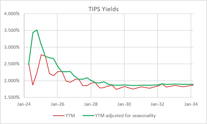
It is interesting to me that, with as important and liquid as the inflation-linked bond market is, tactical allocation between TIPS and nominal bonds is at best an afterthought for most investors. Perhaps this is because TIPS – if you think in nominal space, like most investors do – can be quirky and complex to analyze on a bond-by-bond basis. Here’s a picture of the TIPS yield curve. The red line is the way that TIPS real yields are calculated, and therefore the curve as perceived in the market. The green line is the true yield curve, adjusting for the way the seasonality of inflation prints affects each particular bond.
That’s understandable, but I don’t think it’s sufficient. Most investors do not invest in individual bonds, especially in TIPS space. They invest via mutual funds or ETFs, although the ‘laddering’ of TIPS to form a crude inflation-linked annuity is a popular approach amongst do-it-yourselfers. So why do so many investors own nominal bonds, instead of inflation-linked bonds, as an immutable strategic allocation? Even those who make occasional tactical shifts into TIPS seem to do so when they are expecting inflation to rise, and so are making a macro call instead of a quantitative call. But there are lots of times when owning TIPS instead of nominal bonds is just a good bet, regardless of your immediate inflation view. The most obvious one I wrote about back in March 2020 in “The Big Bet of 10-year Breakevens at 0.94%,” and I’ve also written generally about why you might want to be long inflation-linked bonds even if the current level of implied inflation (aka ‘breakevens’) is near to fair on the basis of your own view about the trajectory of inflation (see “A Guess at the Value of Long Inflation Tails” as an example).
But the times when just being long TIPS instead of nominals…or being long breakevens or inflation swaps if you do it as a leveraged play…is advantageous are not limited to unusual circumstances. TIPS also have tended to be systematically cheap over long periods of time, which I’ve also documented. Another way to consider the same question is to ask, “if I bought 10-year breakevens when they were at a particular level, how would I have done historically?” Or, equivalently, “if I had switched into 10y TIPS, instead of 10y Treasuries, when the spread was at a particular level, how much would I have out- or under-performed historically?” The chart below answers that question.

I went back to February 1998. For each of 6,453 days (ending in June 2023 since I had to look forward 6 months) I considered the starting 10-year breakeven rate and calculated the return to being long that breakeven over the next 6 months.[1] That return is dependent on the relative yields of the different securities, how those yields (and hence the breakeven) changed over time, and how actual inflation developed. It’s worth pointing out that this time period, core inflation was below 3% for 90% of the time. Ergo, you wouldn’t expect to have lots of big wins because of inflation surprise, although of course toward the end of the historical period you did.
The chart shows for each bin (I threw all 58 days with 10-year breakevens lower than 0.75% into the same bucket, which turned out to be equal to the number of days in the 2.75%-3.00% bucket) what the average 6-month return was to being long 10-year breakevens along with the 10th percentile and 90th percentile. So you can see that on average, you didn’t lose money being long breakevens anywhere under 2.50%, despite the fact that inflation throughout this period was very low. That’s a function of what I said before, that TIPS in general were cheap throughout this period. And if you bought breakevens (or switched into TIPS) any time that the breakeven was below 1.5%, you had a 90% or better chance of winning.
Naturally, it shouldn’t be a surprise that if you buy breakevens at a cheap level – as with any asset – you stand a better chance of winning than if you bought it at a dear level. What is a little more of a surprise is that there hasn’t historically been very much pain, on average, to being long breakevens even when they are high. In fact, unless you bought breakevens above 2.75% – basically, one event in 2022 – you had at least a 40% chance of winning your bet (10y TIPS outperforming).

This isn’t to say that there aren’t a lot of ways to lose, trading or investing in TIPS. Like any other investment, they can lose money and in 2022-2023 being naked long TIPS was almost as painful as being naked long any other fixed-income instrument. Almost. You did lots better than if you’d owned nominal Treasuries through the same episode!
[1] I used the Bloomberg US 10 year Breakeven Inflation Index, which is a total return index (BXIIUB10 Index on Bloomberg), from its inception in 2006; prior to that I used Enduring Investments calculations which utilized roughly the same methodology.
Thanksgiving Memories: Re-Blog of Two Goodies
Since there aren’t a lot of folks out there trading today, that also means there probably aren’t a lot of folks reading articles about markets. I could just talk about the OpenAI guy going to Microsoft and then back again (I really couldn’t care less, but it seems everyone is breathless for new episodes of the Real Housewives of Artificial Intelligence), but I thought readers would be better served by a reprise of a couple of my old articles on inflation tails.
The first one is a lightly edited re-post of “Royally Skewed,” first posted May 9, 2011. (Wow, I’ve been doing this blog for a while!) Incidentally, feel free to go to the inflationguy.blog and search for topics of interest. Sometimes you can find a nugget among the 1100 or so articles!
Royally Skewed
Although commodities do occasionally crash, in general commodity prices are positively kurtotic (fat-tailed) and positively skewed. This is in contradistinction to equity prices, which are positively kurtotic but negatively skewed. In English, that means that both stock prices and commodity prices crash more than we would expect them to if price changes were random, but while stocks tend to crash down, commodities tend to crash up.
The reason for this is simple: commodity supply curves become very inelastic (steeper) when the level of actual, current inventory is fully allocated. There are only so many soybeans available right now. But at low levels of demand and lower prices, the supply curve gets more and more elastic (flatter), which means large declines in demand don’t drop prices as sharply as large increases in demand can increase them at the other end of the curve.
The practical import of this observation is this: one must be more careful shorting commodities than shorting stocks, because while a bull market in stocks can grind you to death, a bull move in commodities can rip you to suddenly to shreds (the fact that in a limit up market there is literally no price at which you are allowed to cover, while this situation rarely exists in equities, means that market infrastructure contributes to the danger).
Skewness and kurtosis, in addition to being great cocktail-party words, are also important concepts for investors to understand. More specifically, it is important for investors to think carefully about the difference of the “higher moments” (as skewness and kurtosis are sometimes collectively called) between asset classes and particular investments. Given a choice between two investments with the same expected return and variance, a long-only investor should always choose the one with ‘fat tails’ on the upside rather than the one with ‘fat tails’ on the downside. This is true for two reasons. First, the marginal pleasure of a gain, for most investors, is lower than the marginal pain of a loss, and this is increasingly true for large gains and losses. Second, a large gain increases the bankroll, but a large loss can be a portfolio-ending experience. All of the rules about long-term investing are based on the assumption that the long term can be reached – or, as Warren Buffett has said, one “-100%” really messes up any series of portfolio returns.
Recently, in a great customer letter called “Five fallacies about inflation (and why global policy rates are too low),” Markus Heider, Jerome Saragoussi, and Francis Yared of Deutsche Bank made some very adroit observations about the risks of inflation going forward. The quick summary is that they see inflation as the greater risk than deflation because 1. The output gap is smaller than suggested by the high unemployment rate; 2. A negative output gap does not imply declining inflation [frequent readers know I harp on this a lot]; 3. EM countries are exporting inflation rather than disinflation; 4. Commodity price inflation is becoming structural and is exacerbated by low global real policy rates; and 5. Central banks’ credibility is at risk of being eroded.
But the single best part of the report, in my opinion, is the chart they created to summarize the effect of their views on the distribution of possible inflation outcomes going forward. That chart is below (reprinted with permission):

In short, the higher expected value, flatter distribution, and fat upper tail combine to make long-inflation bets worthwhile even if they are somewhat expensive right now. This is one reason that TIPS are seemingly egregiously priced. It’s all about the skew. If we don’t get inflation, we probably bounce around between 1% and 3% inflation for a while. If we do get inflation, it could get ugly. Therefore, it makes sense to give up some current return to ‘buy the tail option.’ I agree, and think their picture is truly worth a thousand words. (I still think that TIPS are too expensive for my taste even with this fact, but it is the reason I was willing to be long them when 10-year real yields were as low as 1%. It’s just a harder call at 0.65%!).
I highly recommend you contact your Deutsche Bank contact to get a copy of this report (from April 1). Honestly, while the overall state of inflation research is clearly better now than it was, just a few years ago, these guys at DB seem to me to have some of the most consistently high-quality research in the space.
The second article dovetails with that one. In this article, from December 7, 2021, I provide a guess at the value of long inflation tails. This article is cleverly titled “A Guess at the Value of Long Inflation Tails,” because “Royally Skewed” was already taken.
A Guess at the Value of Long Inflation Tails
In my last post, “You Have Not Missed It,” I promised the following:
“There is one final point that I will explain in more detail in another post. Breakevens also should embed some premium because the tails to inflation are to the upside. When you estimate the value of that tail, it’s actually fairly large.”
So, as promised, here is that explanation.
Viewing the forward inflation curve as a forecast of expected inflation (whether using “breakevens” or, more accurately, inflation swaps) is biased in a particular way. Or, at least, it should be. The “breakeven” inflation rate is the rate at which a long-only investor over the ensuing period would be roughly as well off with a nominal bond (which pays a real rate plus a premium for expected inflation) and an inflation-indexed bond (which pays a real rate, plus actual inflation realized over the period). Obviously the inflation-indexed bond is safer in real space, so arguably nominal bonds should also offer a risk premium to induce a buyer to take inflation risk.[1] Ordinarily, though, we ignore this risk and just consider breakeven inflation to be the difference between real and nominal yields. Inflation swaps are cleaner, in that if inflation is higher than the stated fixed rate, the fixed-rate payer on the swap ‘wins’ and receives a cash flow at the end, whereas if inflation turns out to be lower than the stated fixed rate, it is the fixed-rate receiver who wins. So from here on, I will talk in terms of inflation swaps, which also abstract from various bond-financing issues of the breakeven…but the reader should understand that the concept applies to other measures of expected inflation as well.
Now, suppose that you expect 10-year inflation to come in at 2% per annum. Suppose that in the inflation swap market, the 10-year rate is 2% ‘choice’ – that is, you may either buy inflation at 2% or sell inflation at 2%. Since you expect inflation to be 2%, are you indifferent about whether you should buy or sell?
The answer is no. In this case you should be much more eager to buy 2% than to sell 2%, given that your point estimate is 2%. The reason why is that the distribution of inflation outcomes is not symmetrical: you are much more likely to observe a miss far above your expectation than to observe a miss far below your expectation. Therefore, the expected value of that miss is in your favor if you buy the inflation swap (pay fixed and receive inflation) at 2%. There is, in other words, an embedded option here that means the swap market should trade above where most people expect inflation to be.
We can roughly quantify at least the order of magnitude of this effect. Consider the distribution below. This chart (Source: Enduring Investments) shows the difference, from 1956 until 2011, of 10-year inflation expectations[2] compared with subsequent 10-year actual inflation results. The blue line is at 0% – at that point, actual inflation turned out to be right where a priori expectations had it. The chart obviously only covers until 2011 since that is the last year from which we have a completed 10-year period. Recognize that I am not charting the levels of inflation, but the level of inflation relative to the original expectation.

Notice that the chart has a cluster of outcomes (and in fact, the most-probable outcomes) just to the left of zero, where expectations exceeded the actual outcome by a little bit, but that there are very few long tails to the left. However, misses to the right, where the actual outcome was above the beginning-of-period expectations, were sometimes quite large. The median point (where half of the misses are to the left, and half are to the right) is 0.21%. But this is not a symmetric distribution, so if we randomly sample points from this distribution, we find that the average of that sample is 0.59%.
So, if you buy the inflation swap at 2% when your expectations are at 2%, on average you’ll win by 59bps, at least historically. Of course, past results are no indication of future returns, and a Fed economist would argue that we have much better control of inflation now than we ever have in the past (Ha ha. I crack myself up.). And inflation volatility markets, when they can be found, don’t trade at such high implied volatilities. Noted, although the wild swings in growth and the deficit and the money supply, not to mention recent realized outcomes, might make more cynical observers question whether we should be so confident in that view right at the moment.
Moreover, a counterargument is that at the present time an investor also has the advantage of investing when expectations are fairly low, so the downside tails are not as likely. The worst outcome of that whole 1956-2011 period was an 8.75% undershoot of inflation versus expectations. This happened in the 10 years following September 1981, when expectations were for 10-year inflation of 12.70% and actual inflation was 3.95%. But with expectations at 2.50%, is it really feasible to get a -6.25% compounded inflation rate? That would imply a 50% fall in the price level (and, I should note, it would mean that investors in TIPS would win hugely in real space since they get back no worse than nominal par. But that doesn’t help the swap buyer).
To be a little more fair, then, the following chart considers only the periods where inflation expectations were 5% per annum or less at the beginning of the period. That truncates only 10% of the distribution, but as you might expect the vast majority of the truncation is on the left-hand side. This is fair because it’s naturally harder to miss far below your expectations when your expectations are very low to begin with.[3]

The value of the expected miss in this contingent view is 1.13%. So, in order for the market to be priced fairly if general expectations are for 2.5% average CPI inflation the 10-year inflation swap would have to be around 3.63%. Again, even allowing for the “policymakers are smarter now” argument (an argument quite lacking, I would argue, in empirical evidence) I would feel comfortable saying that 10-year inflation swaps, and breakevens, should embed at least a 50bps or so ‘option premium’ relative to expectations.
I don’t believe that they do. Indeed, consider that the buyer of 10-year TIPS (with breakevens at 2.50%) not only wins if 10-year inflation is above 2.50% but the average win historically (conditioned on breakevens being below 5% to start, and by construction only considering wins) has been about 2.07% per annum – a massive outperformance. Not only that, but any losses are essentially guaranteed to be small because the tails on the left-hand side are truncated: if inflation is negative (that is, if the loss would have been greater than 2.50%) it is limited by the fact that the Treasury guarantees the nominal principal.
As an aside, we do consider this sort of option in other contexts. In the Eurodollar futures market, for example, we recognize that the person who is short the Eurodollar contract (and therefore gets a positive mark-to-market when interest rates rise) is in a better situation than the long (who gets the positive mark-to-market when interest rates fall), because the short gets to invest wins at higher interest rates and borrow losses at lower interest rates, while the long must borrow to cover losses when interest rates are higher, and but gets to invest wins when interest rates are lower. As a result, Eurodollar futures trade lower than the forwards implied from the swap curve, since the buyer needs to be induced by a better-than-expected price. And there are other such examples. But I am pretty sure I have never seen an example of an embedded option like this that is priced so differently relative to history than the embedded options in the inflation market!
[1] However, since this risk is symmetric – the seller of the bond also has risk in real space, but in the opposite direction – it isn’t immediately obvious why one side should get an inducement over the other. So I will leave the ‘risk premium’ aside.
[2] For long-term inflation expectations back before the advent of TIPS, I used the Enduring model relating real yields to nominal yields, about which I’ve written previously. You can find a brief discussion of this and an illustration of the model at this link: https://inflationguy.blog/2016/12/23/a-very-long-history-of-real-interest-rates/
[3] The author’s wife has been known to make something like this observation from time to time.
What Happens if CPI Isn’t Released?
One thing I’ve stopped worrying very much about is a government shutdown. It could even be a good thing, given the bloated deficit, except for the fact that the government basically keeps spending anyway. The federal government employs about 4.5mm workers, and no more than 800k have every been furloughed – moreover, many of those furloughed workers often receive back pay. Social Security gets paid, Treasuries get paid, and the wheel keeps turning. That’s not a guarantee, of course – it’s possible that an extended shutdown could cause Treasuries interest to not be paid, but we all know that before that happens, the Fed would just print the money and make sure the checks go out. At worst, there could be a one-day technical default, if important people had given the heads-up to insiders to get really long CDS.
But my cynicism is getting the better of me so let’s turn to what could happen in a shutdown that impacts the inflation markets: in the past, some data releases of federal agencies have been delayed (or their quality impacted), and if the delay was long enough then it could affect TIPS. Lots of people are asking about this, so I thought I’d lay out what would happen and how.
First of all, the quality of the CPI data could potentially be impacted. That has happened in the past, because data collection agents are not ‘essential workers’ so if the government shuts down, a lot of the data collection stops. This is less of a problem than it has been in the past, though, because a lot more of the data is collected electronically than in the past. For example, the new cars sample is no longer collected by hand but is sourced from J.D. Power. Prescription drugs data is partly supplied by one large firm that didn’t want to allow data collectors to collect data in store. A similar story applies to apparel. Many of these ‘big data’ changes are discussed in this BLS white paper, but the point is that these changes also mean that the quality of the data won’t be impacted as much as would be the case if data collection was entirely done by hand as it once was.
The bigger potential problem is that the CPI report could be delayed.[1] The NSA CPI is used almost exclusively as the index in inflation swaps, and is the index that determines escalation of TIPS principals. Other subindices are used in contract arrangements (for example, in long-term airplane purchase contracts), but those applications are generally less urgent.
If the BLS is unable to release the CPI on October 12th, what happens? The first thing to know is that the September CPI (which is what is released in October) is only relevant to swap payments and TIPS accruals in November and December. For each day in November, the inflation index is interpolated between the August and September prints; for each day in December, the inflation index is interpolated between the September and October prints. Ergo, missing the September print would make it impossible to settle inflation swaps payments – but more importantly, every TIPS trade that settles in November or December would be impossible to settle because the invoice price couldn’t be calculated.
Fortunately, the Treasury thought about that a very long time ago. Title 31 of the Code of Federal Regulations (CFR) spells out what would happen if the BLS didn’t report a CPI by the end of October (it also spells out what happens if the BLS makes a large change to the CPI, or stops calculating it). In a nutshell, the Treasury would use the August CPI index, inflated by the decompounded year-over-year inflation rate from August 2022-August 2023:

I’ll do the math for you. If the CPI isn’t released, the figure for September will be 307.94834, which is +0.3004% on the month. While that sounds very convenient, since economists are forecasting a +0.3% m/m change for this data point, remember that the economists’ +0.3% is seasonally adjusted while the +0.3004% change is NSA. The difference is that 0.3004% NSA is about 0.50% SA this month.
Naturally, this wouldn’t matter very much in the long run; once the October CPI was released at the proper level the artificial change from Sep-Oct would wash out the artificial change for Aug-Sep.
Except, that is, for one pain-in-the-ass way, and that is the second part of the code snippet shown above: the Treasury would never adjust the official number back to match the BLS back-dated release of September CPI. Forever after, if you ran the sequence of monthly Treasury CPI Index numbers and the BLS CPI numbers, they would be exactly the same except for the one data point. The economic significance of that approaches zero, but the Inflation-Guy-Irritation figure on that approaches infinity.
So let’s hope cooler heads prevail.
[1] How likely is this? Kalshi has a market for this as well as markets on the probability of a government shutdown and the length of a government shutdown. As of this writing, Kalshi traders are saying there is an 18% chance that the CPI data will not be released in October.
Season(al)’s Greetings
As we move into 2023, one of my New Year’s resolutions is to write more frequently on the blog and post podcasts more frequently. I have a list of topics that is certainly long enough. When I was writing commentary for Bankers Trust, and for Barclays, and for Natixis, I wrote every day and somehow I never ran out of words…
Sometimes, as with today’s article, I am going to refer to pictures and observations that I have previously made on the private/subscription Twitter channel. You can subscribe to the Private Twitter feed at https://inflationguy.blog/shop/ . Not only that, but as of January 2023 I have marked the price down from $99 to only $69, which is a 30% nominal decline in the subscription price – and a 35% or so real decline. (Those of you who subscribed at the $99 price unfortunately will have to cancel and re-subscribe to get the lower price because there’s no way for me to edit a recurring subscription’s price, which annoys me as much as it annoys you but I suppose it’s to keep unscrupulous sellers from raising the price without your permission).
Today I want to present some oldie-but-goodie charts that I developed years ago to look at the seasonality of inflation breakevens. In updating the charts, what was amazing is that…the seasonality hasn’t changed much. Fairly consistently, breakevens rise in the early part of the year, and then decline from May to October. It’s not a guarantee,[1] but it is a pretty consistent tendency. The chart below shows, in black, the percentage of the time (1999-2021, so 22 years of history) in which 10-year breakevens increased in the 60 days following that date. So, on January 3rd, the number was about 70% which means that in 70% of those years, breakevens were higher 60 days after January 3rd than on January 3rd. The average increase (including years in which it decreased) is in red, and shows about 10bps on average. That doesn’t sound like much, but it’s an average of over 22 years. Buying breakevens early in the year is typically a good idea.

The next chart steps back and shows the average for the full year, properly de-trending the data so that any drift over time falls out (since breakevens have gone basically nowhere for a quarter-century, this doesn’t do much but it’s the right way). So, breakevens start the year below the level that will subsequently be the average, and by May they’re well above that level. Ergo, it has historically been good to be long into the first part of May. And then I guess you sell in May and go away, to coin a phrase.

None of this is guaranteed, as I said, but seasonal patterns which are consistent are valuable tools. The way I look at seasonals is that I want to see a move of some decent economic value, but mainly I want to see the consistency. And personally I won’t do a trade just to take advantage of the seasonal trend, but if I want to sell and the market shows a strong tendency to rally then I might consider “flat” the same as selling in that environment. Conversely, a market which has a strong tendency to rally when I want to buy is likely to make me be more aggressive getting in rather than trying to steal a tick on the bid/offer by hanging out on the bid. If you’re bearish on breakevens, then I don’t think you should be a buyer just because it’s a good time of the year to buy. But between the low level of breakevens, and the seasonal trend itself…I would be cautious about being aggressively short.
[1] …and some of it is an artifact: in the early part of the year, a breakeven buyer often has negative carry from bad inflation prints in November and December; as that carry passes, breakevens rise. But this only explains part of the early-season seasonality, not the whole thing.
2022 Year-End Thoughts About 2023
Use: This article may only be reposted in its unedited entirety (including all links), including the title and author with linkbacks to the original. If you wish to repost in serial form, please contact me via the form at https://enduringinvestments.com to discuss.
When I was a Street strategist, and/or producing ‘sales and trading commentary’ as a trader, it was de rigueur to produce an annual outlook piece. Naturally, everyone does one of those; consequently, I stopped doing them. It seems to me like it would get lost in the shuffle (this is one of the reasons that Enduring’s “Quarterly Inflation Outlook,” which we distribute to customers and is also available by subscription here, is produced on the ‘refunding schedule’ of February, May, August, and November rather than at quarter-end). Having said that – it does seem that, given what inflation has done recently, there are more people asking for my outlook.
I do have to raise one point of order before I begin. As regular readers of this column know, in my writing, I generally try to propose the ‘right questions,’ and I don’t claim to have all the right answers. An outlook piece is often interpreted as being the analyst’s best guess at the answers. While it is that, for me the answers I suggest here are likely to be less valuable to the reader (I do not recommend that you blindly place trades based on my outlook for where markets will go!) than the thought process that is going into them. You may and probably will disagree with some of my answers. But hopefully, you’ll be able to identify where in my reasoning you have specific disagreements, which will either enhance your own view or cause you to thoughtfully reconsider it. That’s the whole point, and I don’t care at all if you disagree! That’s what makes markets.
Moreover…even if my guesses end up being “wrong,” or “right,” based on the actual outcomes in the future, that doesn’t mean they were wrong or right in terms of being a good approach/positioning. Investing is not really all about making the “right” bet in terms of whether you can call the next card off the deck, but about making the “right” bet with respect to the odds offered by the game, and betting the right amount given the odds and the edge. On this topic, I recommend “Thinking in Bets” by Annie Duke as excellent reading.
So, here goes.
MACROECONOMICS
For most of this year, I have been saying that we would get a recession by early 2023. In 2022Q1 and Q2, US GDP contracted. This produced the predictable shrill announcements of recession, coupled this year with sadly simple-minded declarations that the Biden Administration had “changed the definition of recession” by saying we weren’t in one. One television commentator I saw strongly profess the view that the two-quarters-of-negative-growth-is-a-recession definition is “in every economic textbook.” Having read my fair share of economic textbooks and having taught or tutored from a few, I can assure you that is not the case.
I was, and remain, sympathetic to the incoming fire that the Biden Administration took then, because they were basically right: whether we chose to call it a ‘recession’ or not, there was scant sign of any economic distress. Employment (which lags, of course) remained strong, corporate earnings were solid, confidence was reasonably high except for inflation, and citizens still had a substantial cash hoard left over from the COVID stimmy checks. However, while the critics were wrong on the timing they weren’t wrong about the eventuality of a recession. As I also said a bunch of times, there has never been a period where energy prices rose as rapidly as they did between early 2021 and mid-2022, combined with interest rates increasing as rapidly as they did thanks to Federal Reserve policy, that did not end in recession. But it takes Wile E. Coyote some time to figure out that there is nothing under his feet, before he falls, and recessions work similarly. We will have a recession in 2023.
We are already seeing the early signs of this recession. One indicator I like to look at is the Truck Tonnage index, which falls significantly in every recession (see chart, source Bloomberg). The last two months have seen a decline in this seasonally-adjusted index. It is early yet – we saw a similar-sized decline in 2016, for example, so there are false signals for small changes – but the fact that this decline happened heading into the Christmas season gives it more significance.

That’s the goods side. The services side shows up more in the labor market, which lags behind the overall cycle. Yet there too we have started to see some hints of weakness. Jobless claims are well off the post-COVID lows, although they are still roughly “normal” for the tight pre-COVID labor market. And the labor market is really hard to read right now, given the continuing crosswinds from the COVID-period volatility and the fact that so many services jobs now are at least partly virtual. Upward wage pressure is continuing, partly because virtual workers are less productive (shocker reveal there), so this recession in my view will probably not feel as bad as the last couple of recessions (GFC, Covid) have felt. However, we will have a recession in 2023.
The bad news, though is that a recession does not imply that inflation, ex-energy, will decline. Look at this chart, which captures the last three recessions. The post-GFC recession was the worst in 100 years, and while core inflation slowed that was almost entirely a function of the housing market collapse and not the general level of activity. The COVID recession was worse than that, and core inflation accelerated. And the post-tech-bubble recession wasn’t a slouch either; core inflation accelerated throughout 2001 until it started to decline, but only got down to 1.1%, in late 2003.

This chart shows y/y changes, but helpfully shows core-ex-shelter (Enduring Investments calculations). There isn’t a lot to see here in terms of the effect of these three huge recessions.

Lest you think I am just cherry-picking the 2000-2022 period, here is core CPI and GDP normalized as of December 1979. Again, you can see in the GDP line the recessions of the early 1980s, of the early 1990s, and that post-tech-bubble recession. I can’t see those, in the CPI line.[1]

And hey, as long as we are doing this…how about the 1970s malaise when the multiple recessions and flat growth led to … well, not disinflation.

I think the evidence is very clear: forecasters who are relying on the “recession” forecast (which I share) to make a “hard disinflation” forecast are simply ignoring the data. Those two concepts, outside of energy, are not related historically.
That being said, I expect core inflation and median inflation to decelerate in 2023. I just don’t think they will decelerate nearly as much as Wall Street economists think. Shelter inflation is already well above my model, and I expect will come back towards it, but my model otherwise doesn’t see a lot of downward pressure on rents yet. The strong dollar, and some healing of supply chains, will help core goods – but core goods inflation will remain positive next year and probably for a long time, thanks to secular deglobalization, instead of being in persistent slow deflation. And core services ex-rents will decelerate, but mainly because of the technical adjustment in health insurance. Until wages start to ebb, it’s hard to see a crash in core services ex-rents inflation. So that brings me to this forecast for core CPI:
| Current | 2023 Fcast | |
| Core Goods | 3.7% | 2.3% |
| Rent of Shelter | 7.2% | 4.8% |
| Core Services less ROS | 6.3% | 5.1% |
| Core CPI | 6.0% | 4.2% |
Most of the Street is in the mid-2s for core inflation; the Conference Board forecast for Core PCE recently was raised to 2.8% which would put core CPI at 3% or 3.1%. They’re getting there, but frankly it’s hard to see how you can get to those levels. In my view, most of the risks to my forecast are to the upside.
MONETARY POLICY
An important disclosure should be made here: in 2022, I was utterly wrong about the path the Fed would take. Almost as wrong as it is possible to be. Ergo, take everything I say hereafter in this section with a grain of salt.
Coming into 2022, I thought the Fed would follow the same script they had used for more than a quarter-century with respect to tightening policy: slow, late, tentative, and quickly reversed. Although inflation was already plainly not transitory, I know that the Fed’s models assume a strong homeostasis especially with inflation, to the extent that the persistent part of inflation is essentially (albeit with a lot more math) modeled as a very slow moving average and overall inflation is assumed to pull back to that level. When the Fed talks about the “underlying inflation trend,” that is in simple terms what they are saying. But if you believe that, then there’s very little reason to pursue something similar to a Taylor Rule where policy is driven by simple deviations of growth and inflation from the target levels.
So, when the Fed started to move I expected them to tighten a few times and then to stop and ultimately reverse when financial markets started doing ugly illiquid things. One thing I didn’t anticipate: the markets never really did ugly illiquid things. Investors welcomed the tighter policy, and ran ahead of the Fed to give them room. Especially considering that, at the end of 2021, I think most sophisticated investors viewed the Fed as incompetent (at best) or counterproductive (at worse), the markets gave the Committee an amazing amount of latitude. The Fed, to its credit, saw the gap in the defense and sprinted through it. I did not see that coming.
After nearly 500bps of rate hikes, and a small decline in the Fed’s balance sheet, money supply growth has come to a screeching halt. That’s largely spurious, I think, since money supply growth is a function of bank lending and banks are neither capital-constrained nor reserve-constrained at the moment, and longer-term interest rates have risen but not very much (except in the mortgage market). I suspect that most of the decrease in loan demand that is evidently happening is not in response to the increase in short-term rates but rather to the increase in mortgage rates almost entirely. If that’s the case, then it’s a one-time effect on M2 growth: mortgage origination can only go to zero once. The chart below shows the connection between M2 growth (in blue) and the MBA Purchase index (black). The correlation is not as incredible as it looks, because one is a rate of change that is off-center by 6 months (it’s y/y) and one is a level of activity, but if I expressed both in rate of change you would still say they look suspiciously similar.

If I am right about that point, then the money supply will shortly resume its growth as the overall volume of lending continues to grow without the negative offset of declining mortgage origination. With money velocity on the upswing now, this will support the level of inflation at a previously-uncomfortable level. So what will the Fed do?
Importantly, the Fed won’t really know that inflation isn’t dropping straight to 2% until after the midpoint of the year. But they’ll make the decision to pause rate hikes sooner than that. I think a 5% Fed funds rate is a reasonable target given their assumptions, a key one of which is that if “underlying inflation” is really 2%-3% then a 5% nominal rate will be plenty restrictive.
What is really amazing to me – which the ‘me’ of 2021 would never have anticipated – is that Fed watchers and market participants are starting to talk as if they believe the Fed might overdo the tightening, raising rates higher than needed to restrain the economy and inflation (yes, I know I said that a recession doesn’t cause lower inflation but it’s an article of faith at the Fed so we need to pretend as if we believe it). It’s incredible, when you think about it: the Fed hasn’t come close to ‘overdoing it’ in a tightening cycle in decades, if by ‘overdoing it’ we mean that they caused a deflationary crash. The Fed has caused plenty of recessions, but core inflation hasn’t been negative since the Great Depression. And we’re worried about them overdoing it?
Naturally, if you don’t think that raising rates causes inflation to come down then any rate hikes at all…actually, any active monetary policy at all…is too much. But in any event, it’s striking to me that the Fed has somehow restored some credibility as a hawkish central bank. Not that credibility per se matters, since expectations don’t cause inflation. But I digress. It’s still pretty amazing.
When Powell was first named Chairman, I was hopeful that a non-economist could help break the Fed out of its scholarly stupor. As time went on I lost that hope, as Powell trotted out various vacuous terms like “transitory” and leaned on discredited models (nevertheless still in vogue at the Fed) such as those which utilize the ‘anchored expectations’ hypothesis. But I have to say, my opinion of him has risen along with the Fed funds rate.
In my view, the biggest Fed error of the last forty years was Greenspan’s move to make the Fed transparent, which caused the pressures on the Fed to be entirely one-way. The second-biggest Fed error follows from that, and that is the tendency to move rates further and further away from neutral, holding rates at such a level by maintaining vastly higher levels of liquidity than were needed to run the banking system. The consequence of this has been a series of bubbles and asset markets at levels where the prospect of future real returns was abysmal. Plus, it led to the heyday of hedge funds where cheap money levered small returns into big returns.
The Powell Fed, for all of its flaws and awful forecasting, has succeeded in getting the yield curve to the vicinity of long-term fair value, which I define as sovereign real rates near the long-term growth rate of the economy (2.00-2.25% in the US – see chart below, source Enduring Investments before 1997 and Bloomberg after 1997). With a Fed inflation target at 2.25% or so in CPI terms, this means long-term nominal interest rates should be in the vicinity of 4%-4.5% over the long term in the context of a responsible central bank. We’re not there, but we’re getting close.

All of which means that I think the FOMC is just about done with hiking rates for this cycle. I believe they will get to 5%, pause, and stay paused for a long time. I do not expect them to lower interest rates, even if there is a recession, unless markets or banks start to have difficulties or Unemployment gets above 6%. That might happen in late 2023, but even if it does I think the Fed will be much more measured about cutting rates than they have in previous cycles. Credit to Powell for the change in attitude.
Those pieces, the Macro and the MonPol, along with my assessment of relative valuations, inform everything else.
RATES, BREAKEVENS, AND CURVES
The long, long, long downtrend in interest rates is decisively finished. As noted above, when inflation is under control and in the vicinity of the Fed’s 2% target, long-term interest rates should be in the vicinity of 4-4.5%. Over the last century, when rates have been away from the 3-5% range it has generally been either because inflation was unstuck on the high side (1970s, 1980s) or unstuck on the low side (1920s, 1930s, 2010s) (see chart, source Federal Reserve and Bloomberg). The long-term downtrend can be thought of as going from unstuck-high inflation, to normal, and overshooting to the downside in the last decade. But we have now definitively ended that low-rates period.

At a current level of roughly 3.5% nominal, 1.4% real, interest rates are ‘too low’ again, but this is normal for an economy headed into recession. Ordinarily, this configuration of events – a Fed nearing the end of a tightening cycle, a recession looming, and interest rates that have risen 320bps over two years – would make me bullish on bonds. And I do think that the first part of 2023 may see a decent rally as the Fed finishes their business and the stickiness of inflation is not yet apparent, but the recession is. Seasonally, you’d really prefer to be long the bond market/out of equities in the last quarter of the year and out of the bond market/long equities in the first quarter of the year, but I think the seasonal pattern will be reversed this year. So we will come in all happy as bond investors, and get unhappy later in the year.
The reason I think the first quarter of the year will be pretty decent for bonds is because of the timing of the recession and of the end of the Fed tightening cycle. But why the selloff as the year progresses? Well, investors will start to see that inflation is not falling as fast as they had expected, the Fed is showing no signs of easing…and the Federal deficit is blowing up.
In FY 2022, the US government had a $1.38 trillion deficit,[2] in an expansion during peacetime. But there are some inexorable effects pushing that higher next year. For example, interest on the debt: higher interest rates will affect only the part of the public debt that has rolled over, but that is an awful lot of it.

In December 2021, the rolling-12-month interest expense on US Debt Outstanding (see chart, source Bloomberg) was $584bln.[3] As of November 2022, the rolling-12-month expense was $766bln. It will be up another $100bln, at least, in 2023. Social Security benefits paid this year were roughly $1.2 trillion, and benefit payments are due to increase 8.7% next year – so, even neglecting the fact that there will be more recipients next year, Social Security should also be $100bln further in the red. That’s $200bln, on top of the approximately $1.4trillion deficit, and I haven’t even considered Medicare, the decline in tax receipts that will occur thanks to a decline in asset markets this year, or the decline in taxes on earned income when the economy enters a recession. A $2 trillion, peacetime deficit is easily in reach and will be much more if it’s a bad recession. The last time we had that big a deficit, the Fed happened to also be buying a couple trillion dollars’ worth of Treasuries. This time, though, the Fed is shrinking its balance sheet.

It is fairly easy to imagine that longer interest rates will have to rise some, in order to roll the maturing debt. As I said, higher interest rates don’t really bother me because I don’t run a highly-levered hedge fund. (But if the rise in rates were to get sloppy or rates were to rise enough to threaten a spiral in the deficit, then I can imagine the Fed stepping in to reverse its balance sheet reduction and being under even more pressure to guide rates lower. However, it’s not my base case.)
Also, as the year goes along the stickiness of inflation will become more apparent and investors will rightly start to put that assumption back into their required return for nominal bonds. One of the really crazy things that happened in 2022 was that inflation compensation in nominal bonds (aka ‘breakevens,’ the mathematical difference between yields on nominal bonds and yields on inflation-linked bonds that pay inflation on top) declined even as the overall level of inflation continued to climb. At the time of this writing, Median CPI has not yet even decisively peaked, although I think it will. But with Median CPI at 6.98%, it’s incredible that the market is demanding only 2.28% annual compensation for inflation over the next decade (see chart, source Bloomberg). That basically says investors are comfortable earning an increment that underpays them for inflation in the near term, and in the long term will only compensate them for what the Fed says they are trying to pin inflation at.

That’s not as easy a trade as it was when 10-year breakevens were at 0.94% in March 2020, but it still seems to me that most of the risk over that decade would be for inflation to miss too high, rather than too low. I understand that the FOMC wants inflation down around 2%. And as for me, I want a Maserati. Neither one of us is likely to get what he wants, just because we want it.
As the first quarter of the year passes and long-term interest rates decline, the curve may invert further from its current level. But I don’t think it can invert that much, which limits the value to being long, say, 10-year notes from this level. Given the current level of inversion, it is fairly easy to construct steepener trades that throw off positive carry. For that matter, a leveraged investor who is financing at 4.5% and earning 3.75% is more likely to want to go the other way! I think it’s going to be difficult to get a good bull market rally going in bonds, and if I was a leveraged hedge fund investor I’d be playing from the short side/steepener side even in the first quarter of the year (albeit cautiously). The chart below (source: Bloomberg) shows 2s/10s monthly going back to 1980. The only time the curve was more inverted was in the early 1980s, a couple of years after Volcker’s Saturday Night Special and with the hiking campaign solidly underway as it is now. I’m expecting 2s/10s to go positive in 2023, although the best shot at something like +50bps would come if the Fed actually did ease. Ergo, a steepening trade is also nice because it works in my favor more if I’m wrong about the Fed staying on hold for a while after they finish hiking to 5%.

Put those together and I see Fed funds at 5%, 2yr Treasuries at 4.25%, and 10s at 4.5%.
We obviously look deeper than that, though, on this channel. We can separate nominal yields into real yields (represented by TIPS) and inflation compensation (breakevens, or inflation swaps). Here are what the curves look like today (source: Enduring Investments).

From here, it looks fairly obvious that a good deal of the steepening should come from longer-term real rates rising. The 2y TIPS bond is at roughly 2%, so 2s-10s in reals is about the same as it is in nominals. The inflation curve is ridiculously flat. I do think that the inflation curve is more likely to shift higher in parallel than to steepen; a steepening inflation curve would imply accelerating inflation going forward and I don’t think investors really believe we’ll get acceleration. So I think that the movement in the shape of the TIPS curve will be very similar to the movement in the nominal curve, but with the level of the nominal curve being driven by an upward parallel-ish shift in the inflation curve.
| 2y | 10y | |
| Current TIPS Yields | 1.96% | 1.42% |
| EOY TIPS Yields | 1.80% | 1.85% |
| Current Breakevens | 2.30% | 2.27% |
| EOY Breakevens | 2.45% | 2.65% |
VOLATILITY
Generally speaking, a higher-inflation environment is a higher-volatility environment. The chart below (source: Bloomberg) shows core CPI in blue against the ICE BofA MOVE Index of fixed-income option volatility. True to form, the higher-inflation regime has correlated with higher levels of fixed-income volatility.

It isn’t terribly shocking that volatility is higher in bonds than it had been during the years when interest rates were fixed within a stone’s throw of zero. And it shouldn’t be terribly shocking that I expect volatility to stay somewhat higher than the 2017-2019 and 2020-early 2021 levels, even as core inflation recedes somewhat. What may be surprising is the observation that a sizeable gap has opened up in the behavior of fixed-income volatility and equity volatility, as the following chart comparing the VIX (equity vol) and MOVE (fixed-income vol) shows. Note that these are different axes, but you can clearly see the uptrend in the MOVE that has not been replicated by the VIX.

I mentioned earlier how regular and controlled the decline in the stock market has been, and how this has allowed the Fed to push rates further than anyone thought they would, a year ago. There have not been too many periods where option sellers have been punished for being short vol in equities. On the other hand, bond vol has been very different now from what it was a few years ago. In short, there has been a regime change in bond vol, but not in equity vol. At some level, this will continue, but the spread should narrow as the Fed gets to the end of the tightening regime. I think we will end 2023 with the VIX above 22 log vol – where it is today or slightly higher – but with the MOVE around 90 norm vol.
Both of those figures represent more-volatile conditions than we have seen for some years pre-COVID.
EQUITIES
It hurts to say, but equities are still far, far, far overvalued.
For many years, there has been a running tension between people who use the “Fed model” as a way to justify the current level of the stock market and the people who point out that the “Fed model” does not imply that the current level of the market is fair. The “Fed model” essentially says that when interest rates are very low, the present value of future cash flows is higher; ergo, the equilibrium value of the average equity (whose fair value is dependent on the present value of future earnings) and hence the overall stock market is higher, when interest rates are lower. This is analytically true. However, it does not mean that your expectation of future returns, when P/E multiples are at 40 but interest rates are low, should be the same as your expectation when P/E multiples are at 15 but interest rates are high. The level of interest rates explains higher equity prices, but it does not imply that those are now long-term fair value levels.
But this tension was almost always resolved in favor of the people who thought that rock-bottom interest rates meant that stocks should be at sky-high multiples, and value investors were left in the dust for more than a decade.
Unfortunately, this tension is being reduced because interest rates are going higher, and may never go back to those levels again. Consequently, equity price/earnings multiples need to re-rate for the new level of interest rates. The same logic that was used to justify the stock market at a 35 Shiller P/E, reconciles to lower prices now and going forward. The chart below (source: Robert J Shiller, updated with Enduring Investments calculations) shows the Shiller P/E (aka Cyclically-Adjusted P/E Ratio, or CAPE) versus 10-year interest rates in the post-WWII period. There is, ex-Internet bubble, a pretty clear relationship between interest rates and valuations. The red dot is where current multiples and interest rates are.

My forecast of 4.5% 10-year Treasuries implies something like a 23 Shiller P/E, down from 30 now. Without earnings growth, that 23% decline in the multiple implies a 23% decline in the stock market from these levels. I don’t think earnings themselves will increase or decrease very much unless the recession is much worse than I think it’s going to be, but the same lag between wages and product prices that flattered earnings when inflation was heading higher will detract when inflation decelerates. Moreover, if I’m right that Powell is intentionally steering interest rates to a level that is consistent with a long-term equilibrium around 4%-4.5% then this 23% adjustment in prices will not necessarily be followed by another massive bull market the likes of which we became accustomed to during the long bond bull market of the last 40 years. A Shiller P/E in the low-20s is still fairly generous historically but it may be sustainable.
So, my point forecast is for the S&P to get to 3,000 sometime in 2023. I don’t think the current bear market will last the entire year, and in fact I am sure there will be a rollicking rally when it is clear the Fed is done tightening. But sticky inflation will hurt here, too, and after that rollicking rally I think we’ll have another low, and from that low is where a modest bull market will begin.
However, I should also note that 1-year equity vol is around 25%, so my projection is within 1 standard deviation of unchanged!
COMMODITIES
From 1999 through 2008, commodities were in a bull market. After a brutal crash in the Global Financial Crisis, commodity indices had another mini-bull market from 2009-2011 before enduring a 9-year bear market. Since March 2020, the massive increase in the quantity of money has driven down the value of money relative to commodities or, to put it in the normal way, has driven up the price of commodities.
The Bloomberg Commodity Index (spot) rose from 59 in March 2020 to 124 in March 2022, and has come off the boil a bit since then. At the highs, though, the level of the index was only back to the levels of 2014. This is normal with spot commodities, which thanks to improved production and extraction technology over time tend to be perpetually deflating in real terms.[4] The good news is that an investor in commodities does not generally buy spot commodities but rather invests through collateralized futures contracts or invests in an index based on collateralized futures contracts. Over time, the collateral return happens to be a very important source of return (in addition to spot returns, the return from normal backwardation, and the volatility/rebalancing return), and this year there is terrific news in that collateral returns are ~4% higher than they were before the Fed started to hike. This means that, all else equal, commodities index returns should be expected to be 4% better (in nominal terms) this year than over the last couple of years. All else is not equal, but I expect gains in investible commodities indices in 2023.
That’s entirely separate from the question of whether we are in a commodity supercycle, due to chronic underinvestment in exploration and extraction technologies and more difficult geopolitical pressures that increase the costs of mining, growing (e.g. because of fertilizer costs/shortages), and transporting the raw commodities. I think the answer there appears to be ‘yes,’ which means that in general I want to play the commodity market from the long side more than from the short side. Of course there will be brutal moves in both directions, and bears will really want to sell commodities as the recession comes to the fore. But most of that is already in the price, with gasoline at levels much closer to the GFC lows than to anything approximating the highs. The chart below shows retail gasoline prices, adjusted for inflation (using 2012 dollars).

Energy prices of course could fall further, but considering that part of the reason prices have fallen this far is that the Strategic Petroleum Reserve has been flushing oil into the system (and that has ended, in theory) and China’s economy has been sputtering under Zero Covid (which has also ended, in theory), it is hard to think that is the better direction at the moment.
OTHER THINGS
I want to append one very important admonition for investors and investment advisors. I mention this frequently on podcasts, TV and radio appearances, at cocktail parties and to random strangers on mass transit:
The next decade will be very unlike the decades we have just experienced. Not only will inflation and interest rates be higher than we’ve become accustomed to, and markets more volatile, but some important drivers of portfolio construction will shift. The good news is that at least some of those shifts are systematic and predictable. The table below shows how 60/40 returns correlate with inflation, with inflation expectations, and with inflation surprise over two periods. The first period was the 30 years ending in 2004, when inflation averaged 4.89% and was three times as volatile as during the subsequent period. During that period, a 60-40 portfolio was significantly exposed to inflation. The more-recent period, during which inflation was low and stable, produced placid 60/40 returns and correlations with inflation that are mostly spurious because there was more noise than signal. Inflation didn’t move!

The first implication of this is that portfolios which have productively ignored inflation-fighting elements over the last two decades need them now, because the main asset classes used in portfolio construction are terribly inflation-exposed. All portfolios for investors who do not have sufficient ‘natural’ inflation hedges should include such assets as commodities and an allocation to inflation-linked bonds in lieu of some of the nominal bond allocation.
The second implication is related but less conspicuous. The entire correlation matrix is shifting away from what it has been over the last couple of decades, and back to something that incorporates the inflation factor that has been dormant. As the most obvious example, stocks and bonds which have been inversely correlated for a while, due to the fact that they respond differently to economic growth, are becoming correlated again. This is not an aberration but entirely normal for regimes in which inflation is not low and stable. The chart below illustrates this. When 3-year average inflation is above 3% (the red shaded area), then 3-year correlations of stocks and bonds tend to be positive (blue line). When inflation is below that level, correlations tend to be negative.

Negative correlations between stocks and bonds are great because they lower portfolio risk. But in the coming decade, 60/40 won’t be as low risk as it has been. But beyond that, the entire covariance matrix that an advisor relies on to simulate and optimize portfolios needs to be examined. The normal way is to use recent returns (say, the last 10 years) to generate this covariance matrix, which then is used to find the mean/variance-optimized portfolio for a given level of risk. That’s normally okay, but as inflation proves sticky that sort of covariance matrix will be wrong, and wrong in a systematic way. What I am doing for our customers is comparing portfolios optimized with a recent covariance matrix to portfolios optimized using a covariance matrix from the 1980s-1990s. It’s important to be aware of this potential problem in portfolio construction, and to get ahead of it.
Finally, let me take a moment to thank the readers of this blog for their interest in it. I write partly because the discipline of arguing my points out thoroughly makes me (I think) a better trader and investor, but I also garner a lot of value from the information and ideas I receive reciprocally from readers who agree or disagree with what I write. I appreciate this feedback very much, and I thank the readers who take the time to share their opinions with me.
Aside from the personally selfish reason I have for writing, there is also the corporate mission the blog is meant to accomplish, and that is to raise the profile of Enduring Investments and the Inflation Guy franchise with prospective clients, and to encourage them to do business with us. If prospective clients see value in these musings, then I hope they will choose to do business with us. Yes, that’s crassly commercial. But ‘tis the season! And if you read this far in this missive, please consider what that means about the value you’re getting, and how much more value you might get from a deeper relationship with Enduring Investments!
And if not, Merry Christmas anyway! Happy holidays and Happy New Year.
– Mike ‘The Inflation Guy’ Ashton
DISCLOSURE – My company and/or funds and accounts we manage have positions in inflation-indexed bonds and various commodity and financial futures products and ETFs related to them that are discussed in this column.
[1] It bears noting, though, that until 1982 the shelter component of CPI was tied to mortgage rates and home prices and not rents, so that the early-80s rise in core CPI partly reflected the Volcker rate hikes. Fixing that problem was what released the conspiracy nuts who plague us to this day claiming that the BLS “manipulated” CPI downward.
[2] https://fiscaldata.treasury.gov/americas-finance-guide/national-deficit/
[3] Net interest was about $110bln less, since some of that interest is paid to other parts of the government, for example the Federal Reserve system. For now.
[4] I wrote a nice, short little piece called “Corn Prices – Has the Correction Run its Course?” that is worth reading if you are interested in commodities.
Fair is Fair, and TIPS are There (Almost)
For a very long time, I have been writing in our Quarterly Inflation Outlook that TIPS were “relatively cheap, but absolutely expensive.” By that I meant that TIPS real yields at -1%, -2%, etc were not exciting (implying as they did that a buyer would have long-term real wealth destruction), but that compared with nominal Treasury yields of 1%, 1.5%, or 2% any investor in fixed income should have vastly preferred TIPS.
I have repeatedly said – as far back as 2016 – that with breakevens below 1.5% there wasn’t even a decent strategic case to own nominal bonds rather than inflation-linked bonds (ILBs) except to defease specific nominal liabilities and that at times those low breakevens meant that owning nominals instead of ILB amounted to a really big bet (as I said in this article from March 2020). Those are relative concepts.
But 10-year real yields were below zero, and as low as -1.2%, for most of 2020, 2021, and the first half of 2022. And 10-year real yields have been below +1% almost continuously since 2011. When real yields were below zero or just fractionally positive, it meant that TIPS were absolutely expensive. That wasn’t just a TIPS problem of course: low real yields were the most obvious in TIPS, but you couldn’t avoid them by trafficking in other asset classes because they were a characteristic of the environment we were in. Everything was absolutely expensive, but TIPS were at least relatively cheap.

More recently, our models indicated TIPS getting quantitatively fair on a relative basis, which is historically unusual (see chart, source Enduring Investments); they even got somewhat rich a couple of months ago and that’s historically unheard of.[1] Real and nominal yields were still low, but at least it was a fair horse race between which ones to hold. And if you’d bought TIPS when I said there was “a big bet” being made against them, and sold them when we said they were fair, you crushed a nominal portfolio’s return. (As an aside, the rich/cheap chart and value is available every day on my private Twitter feed. Sign up for that private feed here: https://inflationguy.blog/shop/ I keep adding more charts etc, in addition to the main event, my live CPI report coverage each month).

As of today, 10-year TIPS yields are all the way up to 1.67%, the highest they’ve been since 2010. I explained back in June why the equilibrium risk-free real interest rate is approximately 2.25%, so TIPS are getting to the neighborhood of long-term fair values in an absolute sense. TIPS have no risk in real space, when held to maturity, so if you can get an annual 2%ish real increase in wealth with no risk, that’s a good deal. And inflation-linked bond yields in developed markets basically never yield more than 4% or 4.5%, so the higher the yield goes the less your potential mark-to-market downside. A 5-yr or 10-yr TIPS yield of 4% is back-up-the-truck stuff if you see it. At those real yields, with no risk, other asset classes simply can’t compete. At 1% breakevens there was no reason to own nominal bonds rather than TIPS; at 4% real yield there would be no reason to own stocks rather than TIPS.
But that sort of yield is of course very rare and we won’t see it unless nominal yields get up to double-digit land. At the current level, with TIPS at fair or slightly-cheap relative value and approaching fair absolute value, it is worth accumulating TIPS as a long-term hold.
It has been an astonishingly long time since I could make that statement. And TIPS may well get cheaper from here. I hope they do! But in the meantime, you can do a lot worse than guarantee yourself that your wealth will increase 18% more over the next decade than the price level rises.[2]
[1] I have written previously though about the value of long inflation tails, and how that value is NOT reflected in TIPS so that even when our model says TIPS are fair, they’re still very cheap if that tail option is reasonably valued. But that isn’t included here.
[2] (1+1.67%)^10 – 1 = 18%.
A Guess at the Value of Long Inflation Tails
In my last post, “You Have Not Missed It,” I promised the following:
“There is one final point that I will explain in more detail in another post. Breakevens also should embed some premium because the tails to inflation are to the upside. When you estimate the value of that tail, it’s actually fairly large.”
So, as promised, here is that explanation.
Viewing the forward inflation curve as a forecast of expected inflation (whether using “breakevens” or, more accurately, inflation swaps) is biased in a particular way. Or, at least, it should be. The “breakeven” inflation rate is the rate at which a long-only investor over the ensuing period would be roughly as well off with a nominal bond (which pays a real rate plus a premium for expected inflation) and an inflation-indexed bond (which pays a real rate, plus actual inflation realized over the period). Obviously the inflation-indexed bond is safer in real space, so arguably nominal bonds should also offer a risk premium to induce a buyer to take inflation risk.[1] Ordinarily, though, we ignore this risk and just consider breakeven inflation to be the difference between real and nominal yields. Inflation swaps are cleaner, in that if inflation is higher than the stated fixed rate, the fixed-rate payer on the swap ‘wins’ and receives a cash flow at the end, whereas if inflation turns out to be lower than the stated fixed rate, it is the fixed-rate receiver who wins. So from here on, I will talk in terms of inflation swaps, which also abstract from various bond-financing issues of the breakeven…but the reader should understand that the concept applies to other measures of expected inflation as well.
Now, suppose that you expect 10-year inflation to come in at 2% per annum. Suppose that in the inflation swap market, the 10-year rate is 2% ‘choice’ – that is, you may either buy inflation at 2% or sell inflation at 2%. Since you expect inflation to be 2%, are you indifferent about whether you should buy or sell?
The answer is no. In this case you should be much more eager to buy 2% than to sell 2%, given that your point estimate is 2%. The reason why is that the distribution of inflation outcomes is not symmetrical: you are much more likely to observe a miss far above your expectation than to observe a miss far below your expectation. Therefore, the expected value of that miss is in your favor if you buy the inflation swap (pay fixed and receive inflation) at 2%. There is, in other words, an embedded option here that means the swap market should trade above where most people expect inflation to be.
We can roughly quantify at least the order of magnitude of this effect. Consider the distribution below. This chart (Source: Enduring Investments) shows the difference, from 1956 until 2011, of 10-year inflation expectations[2] compared with subsequent 10-year actual inflation results. The blue line is at 0% – at that point, actual inflation turned out to be right where a priori expectations had it. The chart obviously only covers until 2011 since that is the last year from which we have a completed 10-year period. Recognize that I am not charting the levels of inflation, but the level of inflation relative to the original expectation.
Notice that the chart has a cluster of outcomes (and in fact, the most-probable outcomes) just to the left of zero, where expectations exceeded the actual outcome by a little bit, but that there are very few long tails to the left. However, misses to the right, where the actual outcome was above the beginning-of-period expectations, were sometimes quite large. The median point (where half of the misses are to the left, and half are to the right) is 0.21%. But this is not a symmetric distribution, so if we randomly sample points from this distribution, we find that the average of that sample is 0.59%.
So, if you buy the inflation swap at 2% when your expectations are at 2%, on average you’ll win by 59bps, at least historically. Of course, past results are no indication of future returns, and a Fed economist would argue that we have much better control of inflation now than we ever have in the past (Ha ha. I crack myself up.). And inflation volatility markets, when they can be found, don’t trade at such high implied volatilities. Noted, although the wild swings in growth and the deficit and the money supply, not to mention recent realized outcomes, might make more cynical observers question whether we should be so confident in that view right at the moment.
Moreover, a counterargument is that at the present time an investor also has the advantage of investing when expectations are fairly low, so the downside tails are not as likely. The worst outcome of that whole 1956-2011 period was an 8.75% undershoot of inflation versus expectations. This happened in the 10 years following September 1981, when expectations were for 10-year inflation of 12.70% and actual inflation was 3.95%. But with expectations at 2.50%, is it really feasible to get a -6.25% compounded inflation rate? That would imply a 50% fall in the price level (and, I should note, it would mean that investors in TIPS would win hugely in real space since they get back no worse than nominal par. But that doesn’t help the swap buyer).
To be a little more fair, then, the following chart considers only the periods where inflation expectations were 5% per annum or less at the beginning of the period. That truncates only 10% of the distribution, but as you might expect the vast majority of the truncation is on the left-hand side. This is fair because it’s naturally harder to miss far below your expectations when your expectations are very low to begin with.[3]
The value of the expected miss in this contingent view is 1.13%. So, in order for the market to be priced fairly if general expectations are for 2.5% average CPI inflation the 10-year inflation swap would have to be around 3.63%. Again, even allowing for the “policymakers are smarter now” argument (an argument quite lacking, I would argue, in empirical evidence) I would feel comfortable saying that 10-year inflation swaps, and breakevens, should embed at least a 50bps or so ‘option premium’ relative to expectations.
I don’t believe that they do. Indeed, consider that the buyer of 10-year TIPS (with breakevens at 2.50%) not only wins if 10-year inflation is above 2.50% but the average win historically (conditioned on breakevens being below 5% to start, and by construction only considering wins) has been about 2.07% per annum – a massive outperformance. Not only that, but any losses are essentially guaranteed to be small because the tails on the left-hand side are truncated: if inflation is negative (that is, if the loss would have been greater than 2.50%) it is limited by the fact that the Treasury guarantees the nominal principal.
As an aside, we do consider this sort of option in other contexts. In the Eurodollar futures market, for example, we recognize that the person who is short the Eurodollar contract (and therefore gets a positive mark-to-market when interest rates rise) is in a better situation than the long (who gets the positive mark-to-market when interest rates fall), because the short gets to invest wins at higher interest rates and borrow losses at lower interest rates, while the long must borrow to cover losses when interest rates are higher, and but gets to invest wins when interest rates are lower. As a result, Eurodollar futures trade lower than the forwards implied from the swap curve, since the buyer needs to be induced by a better-than-expected price. And there are other such examples. But I am pretty sure I have never seen an example of an embedded option like this that is priced so differently relative to history than the embedded options in the inflation market!
[1] However, since this risk is symmetric – the seller of the bond also has risk in real space, but in the opposite direction – it isn’t immediately obvious why one side should get an inducement over the other. So I will leave the ‘risk premium’ aside.
[2] For long-term inflation expectations back before the advent of TIPS, I used the Enduring model relating real yields to nominal yields, about which I’ve written previously. You can find a brief discussion of this and an illustration of the model at this link: https://inflationguy.blog/2016/12/23/a-very-long-history-of-real-interest-rates/
[3] The author’s wife has been known to make something like this observation from time to time.