Archive
How to Calculate USDi’s Current Value
I haven’t been writing a lot during August, nor have I done many podcast episodes. I feel like I make this apology almost every year, but it seems every year August just gets slower, and slower, and slower – and any content I push out gets less engagement during August than during any other full month (although the end of December, naturally, gets very thin as well. It’s really remarkable how August has changed during my career. In the 1990s, there were maybe a couple of weeks that were a little thin in the markets, but that has metastasized so that now it’s all of August and a week or two into July. I am speaking of the US markets – Europe has always been slow for the second half of the summer, at least in my experience, and I don’t know if there has been much change in that over the last few decades.
In any event, I’m more than happy as a writer to take a little time off and recharge. As an entrepreneur? Not so much.
This is, though, a good time for a ‘utility’ post. As readers know, a few months ago we launched USDi, the first CPI-linked cryptocurrency that’s fully backed by traditional finance assets. Because those assets for the most part reside in a private fund (which, because it’s a private fund issued under Reg D, I can’t talk much about on a public post so forgive my vagueness here about what the fund does and how), there is regularly confusion when potential buyers of USDi think that they are buying a share of the fund. They are not, for two reasons. The first is that a coin that represents a tokenized share of a traditional-finance fund would clearly be a security under US law, which creates lots of other complexities that we don’t want: for example just as I can’t tell you much about the fund, if the token was a security then I couldn’t tell you much about that, either! Which would make distribution difficult, to say the least.
The second reason that we didn’t want the coin to represent a tokenized share of the fund is that then the coin would not exactly track CPI. It is important that the coin be a zero-risk instrument, and I illustrate why that’s important in the post “USELESS Coin vs Very Useful Coin”. Accordingly, USDi’s value is entirely formulaic, and known in advance by at least a few weeks. It’s my purpose today to explain how the value of USDi is derived from CPI prints.
USDi, like TIPS and US CPI swaps, is linked to the Non-seasonally Adjusted Consumer Price Index for All Urban Consumers…the NSA CPI for short. The CPI that is released every month is related to this number – specifically, the ‘headline CPI’ is the month-on-month percentage change in the Seasonally-adjusted number. Here is where you find that number (rounded, of course) in the monthly BLS release found at https://www.bls.gov/news.release/cpi.nr0.htm:

The problem with using a seasonally-adjusted number is, you guessed it, that the seasonal adjustment factors can change. Consequently, all inflation derivatives rely on NSA numbers, which are almost never revised. In the same report linked above, the BLS notes the NSA number:

The highlighted number, 323.048 in this case, is the number that TIPS traders and inflation swaps traders care about. And, if you buy USDi, you will care about this number as well. This is the price index value defined relative to the base of 100.000 representing the average of the 1982-1984 price level. The index value of 323.048 tells you that the (quality-adjusted) price level has risen 223.048% since the early 1980s, slightly more than a tripling!
(As an aside, the BLS has an enormous number of NSA series for different subcomponents available. You can see and chart a lot of them here: https://data.bls.gov/dataQuery/find?fq=survey:%5Bcu%5D&s=popularity:D )
Now, the BLS reports this number just once a month, and in arrears. It was mid-August when they reported the July CPI referenced above. So we have two things we need to account for when we turn this into an index that USDi (or TIPS or inflation swaps) can track: 1. We have a monthly number, and we need a daily number – or in USDi’s case, one number every block, and 2. We have numbers for every month ending in July, but today isn’t July, so we need something for today. Let’s call the index value that we are going to construct, to use for TIPS/swaps/USDi, the “Reference CPI.”[1]
The second problem is handled in the simplest way possible: we just lag the data.[2]

So when we got the July data this month, we have the Ref CPI for October 1 (the 323.048 number I mentioned above). We already have the Ref CPI for September 1 (that was the June CPI, reported in July, 322.561). So now, we can straight-line interpolate the Ref CPI for any day in between those two dates, based on the number of calendar days in that month. So, the Ref CPI for September 2nd is:
1/30 * 323.048 + 29/30 * 322.561 = 322.57723
Voila, that’s just what the Treasury calculates for September 2nd, which isn’t surprising because that’s how math works.

Now, the only subtlety to USDi is that while TIPS and CPI swaps have one settlement per day USDi in principle is tradeable 24/7. That means that if we changed the Ref CPI for USDi just once per day, at 1 second before midnight every day you could buy USDi and then sell it at 1 second after midnight and get the entire day’s interest. That doesn’t seem fair. The blockchain is much closer to continuous settlement, so we have to interpolate not by day, but by block. On Ethereum (where USDi exists, initially), a block is roughly 10-15 seconds long, so USDi accrues interest basically every 10 seconds. The actual code for USDi looks at the block number and does the exact same calculation that we do above except that it is interpolating between the first block in September and the first block in October. You can get very close to the right answer by simply using spreadsheet NOW() functions, which in Google Sheets has 1-second precision. I do the approximate calculation for USDi on a Google Sheet here: https://docs.google.com/spreadsheets/d/1UnPzAu-U2zy5TEIcxgLBqkVP7QNtBJhwrwLnHt9EitM/edit?gid=0#gid=0
Let’s see, why did I want to calculate the Reference CPI? Oh, I remember: I want to find the price of USDi for a given time, in the past or present or any time up until (for now) the end of September. We have done all of the work except for the last step, which is to divide the current price level index – the Reference CPI – by the base price level index. For USDi, we defined the denominator as the December 2024 CPI. This is why we say that USDi is a dollar that preserves the purchasing power of a December 2024 dollar.
The December 2024 CPI was 315.605. Since the December 2024 CPI was also the Reference CPI for March 1st (see the handy drawing above), that means the value of USDi on March 1st was (drum roll) 315.605/315.605 = 1.000000. The value of USDi on October 1st will be 323.048/315.605 = $1.023583.
So the USDi coin is not a fund, nor a share of a fund. It is a time machine.

[1] The Reference CPI for TIPS and swaps is identical. The Treasury calculates them too, and reports them at https://treasurydirect.gov/auctions/announcements-data-results/tips-cpi-data/ (look for the PDF and XML files for the “Reference CPI Numbers and Daily Index Ratios Table.”)
[2] In principle, we could take the recent data trend and project to the current date, which would make it contemporaneous but lose accuracy…since when the inflation data is actually released, we will find out that method isn’t perfect. It would also be confusing, since on any given day in the past there would now be the actual CPI data and the previously-used projected-trend data. Since the importance of the exact timing of the price level diminishes with distance, while the two-index confusion would persist, the simple-lag method makes sense to me.
What Makes a Stable Coin Stable?
The early growth of Bitcoin and the cryptocurrency space was originally stimulated by the mistrust of centralized control of monetary policy and financial institutions. While Bitcoin is a fiat currency, in the sense that it is not ‘backed’ by anything and has value only because other people believe it has value, the rules for the expansion of the total float of Bitcoin are mechanical and so the unit benefits from being isolated from the whim of flesh-and-blood central bankers. Milton Friedman once said in an interview with the Cato Institute that “We don’t need a Fed…I have, for many years, been in favor of replacing the Fed with a computer [which would, each year] print out a specified number of paper dollars…Same number, month after month, week after week, year after year.”[1] And, with Bitcoin, that is exactly what you have. Management of Bitcoin is decentralized, automatic, and the rules are stable.
Unfortunately, ‘fiat’ cryptocurrencies are anything but stable. Moreover, since their value depends entirely on the trust[2] of other actors in the economic system that these currencies will have value, it is entirely possible that any of them could crash just like any fiat currency sometimes crashes when confidence in the currency issuer vanishes. There is no intrinsic value to a fiat currency – digital, or analog – which means that they are stable only when looked at in a self-referential frame. A US Dollar has a stable value of $1 but is volatile from the viewpoint of a Mexican-peso-based observer. I will return to this observation presently.
Because these fiat cryptos are unstable when looked at by a participant in the analog world, the concept of ‘stablecoin’ was developed. In Coinbase’s summary ‘What is a stablecoin?’, the first two bullet points are:
- Stablecoins are a type of cryptocurrency whose value is pegged to another asset, such as a fiat currency or gold, to maintain a stable price.
- They strive to provide an alternative to the high volatility of popular cryptocurrencies, making them potentially more suitable for common transactions.[3]
Why is a stable price important? The answer goes back to the question of whether Bitcoin and similar cryptos are money, or assets. In the conventional definition of money, such a label only applies to units that provide a medium of exchange, store of value, and unit of account. First-generation cryptos certainly serve as a medium of exchange but are sketchy on the ‘store of value’ and ‘unit of account’ dimensions. Nothing natively is priced in BTC, so it is not a good unit of account, and the high volatility creates a high barrier to any argument about being a store of value. Cryptos are most assuredly financial assets. It is hard to argue that they are money.
Enter the stablecoin. By pegging the value to an existing currency, a stablecoin ‘borrows’ the characteristics of that currency as a store of value and unit of account. It’s true by mathematical association: if USDC is equal to one US dollar, and the US dollar is money, then (as long as it’s accepted a medium of exchange) USDC is money because it has equal ‘store of value’ and ‘unit of account’ dimensions.[4] A stablecoin maintains its stability by means of holding reserves and being fully convertible on demand into the underlying currency.[5]
But Stable with Respect to What?
Stability, though, depends on the frame of reference. Consider a stablecoin linked to the US Dollar, which always can be minted or burned at $1 (ignoring fees). Consider a second stablecoin linked to the Japanese Yen, which always can be minted or burned at ¥1. Which one is stable?

Figure 1 – US Dollar Frame – US Dollar is stable

Figure 2 – Japanese Yen Frame – Japanese Yen is stable
The answer, of course, depends on your frame of reference. From the standpoint of someone in Japan, who is buying goods and services with Yen, a stablecoin like USDC that is linked to the dollar is most assuredly not stable in any useful sense of the word. Conversely, a US dollar investor would not find a Yen stablecoin to be stable. This, then, is an important element of defining a stablecoin: something which matches the volatility and behavior of the basis of the frame you are in, is stable with respect to you. This raises an interesting question when it comes to stablecoin regulation. A coin could very easily be regulated as a stablecoin in one jurisdiction, and not be regulated as such in a different jurisdiction – even between regulatory jurisdictions that are congruent in their treatment of most assets.
What passes for stability, in short, depends on the transactional frame – literally, the underlying currency in which transactions happen – of the observer.
Stable with Respect to When?
The meaning of stability also fluctuates with the time horizon of the observer. Fixed-income investors are very familiar with the concept of Macaulay duration, which is the future horizon at which the value of a bond holding is completely insensitive to parallel shifts in the yield curve, because the change in the value of reinvested coupons (which goes up with higher interest rates) exactly offsets the change in the value of the remaining cash flows (which go down with higher interest rates). What is the riskiness of a bond with a 7-year duration? Or more to the point of this discussion – which is riskier, a 1-month Treasury bill, or a 7-year zero coupon bond?[6]
As it turns out, it depends on the applicable horizon of the observer.
Suppose an investor pursues one of two strategies: in the first strategy, he or she buys a 1-month Treasury bill, initially at 5%, and then rolls the proceeds every month for 7 years. Alternatively, he or she could buy a 7-year zero coupon bond yielding 5%. Using a simple two-factor model with no drift, I generated 250 iterations of T-bill paths and yield curve shapes, to produce hypothetical monthly time series of returns for the two strategies. For example, here is one such random path (Figure 3):

Figure 3 – Illustrative single random path of cumulative returns for two strategies
The a priori expected return is approximately the same for both strategies; sometimes the T-bill roll strategy ends up ahead and sometimes the buy-and-hold strategy wins. With similar expected returns, a rational investor would therefore choose the one which has the lowest risk. But the riskiness or stability of the returns depends very much on the observer’s time horizon. Each of the following three charts is drawn from the same 250 Monte Carlo iterations, but the cumulative return is sampled at a different horizon. In Figure 4, the cumulative returns are sampled at the 1-month horizon. In Figure 5, the sampling is at the 3-year horizon. In Figure 6, the sampling is at the 7-year horizon. For each figure, the cumulative return for the T-bill strategy is shown on the x-axis and the cumulative return for the zero-coupon-bond buy-and-hold strategy is on the y-axis.

Figure 4 – 1-month T-Bill strategy is riskless at a 1-month horizon

Figure 5 – Both strategies are relatively risky at a 3-year horizon

Figure 6 – The 7-year zero-coupon-bond is riskless (in nominal terms) at a 7-year horizon
Although this conclusion is trivial and inevitable to fixed-income investors, the reason for our observation here is to point out that what is considered ‘stable’ not only depends on one’s functional currency but also on one’s holding period horizon.
Is the Nominal Frame the Most Important Frame?
The prior points are likely obvious to most investors. If you are investing with the intention of spending the proceeds in US Dollars, then a USD frame is most relevant. If you are investing for a known future nominal payout (for example, a life insurance company hedging scheduled annuity flows), then an investment that matures to a given value at the time when the money is needed is the most-relevant frame. However, investors sometimes lose track of one of the most important frames, and that is the “real” frame where values track the price level.
While a $1 bill is ‘stable’ in nominal terms – it will always be worth $1 – it is very unstable in purchasing-power terms.

Figure 7 – A dollar is inherently unstable in the main consumer frame
The framework where we ignore the value of the dollar, in preference for the fixed price of the dollar at $1, is the “nominal” framework. When inflation is low and stable, this frame is a useful shorthand in much the same way that when traveling abroad a tourist in the year 2000 might translate Mexican Peso prices into US Dollar prices by dividing by 10 even though the exact exchange rate differs from 10:1. In the short term, such a shortcut framework makes up for in convenience what it surrenders in precision. But in the long term, what starts out as mild imprecision becomes wildly inaccurate as the Peso exchange rate has gone from 10:1 to 20:1.
Similarly, while the nominal frame is the default for short-term comparisons it is clearly not the most important one to a consumer. Someone who is negotiating a salary at a new job, who knows he or she made $40,000 per year in 2004, would be ill-suited to use that figure as the starting point. The frame that matters over time is the real, or inflation-adjusted, frame. In the chart above, if we plotted the purchasing power of an inflation-adjusted 1983 dollar, it would be a flat line at $1.[7] On the other hand, if we plotted the nominal value of that same inflation-adjusted 1983 dollar, it would show a mostly steady increase from $1 to $3.15 over the same time period.
As before, the frame matters. A dollar that is stable in nominal space is very unstable in purchasing-power space. A unit that is stable in purchasing-power space looks unstable in nominal space.
If an investor or consumer had to choose one frame to care about, it would surely be the one in which his or her money represents not just a medium of exchange and a unit of account, but also a store of value. What this means is that a coin that is native currency and inflation-adjusted in the local price level is the most stable of stablecoins. And what that further implies is that what we currently call ‘stablecoins’ are stable only in the narrow context of being fixed at a certain nominal value of domestic currency…and that is suboptimal since all investors and consumers live in a world where prices change.
Tying Frames Together
What is interesting is that each of these frames describes “stability” in a different context. People in one frame see their own side as stable and the other side as volatile – and the exact same thing is true, in reverse, for the other side.
The various frames do traffic with each other. A holder of US Dollars (in the nominal-USD-short-term-stable frame) exchanges those dollars with a person who holds Euros (in the nominal-Euro-short-term-stable frame). We call that an exchange rate. And what ties together the nominal dollar and the inflation-linked dollar is the price index.

Figure 8 – Exchanging dollars with different purchasing power is functionally the same as exchanging currencies with different purchasing power.
In fact, the relationship between the Dollar and the Euro is so much like the relationship between the nominal dollar and the inflation-linked dollar that in 2004 Robert Jarrow and Yildiray Yildirim wrote a paper describing how to value inflation-protected securities and derivatives using a model designed for foreign exchange.[8] And that highlights the fact that an inflation-linked stablecoin isn’t some strange construct but rather an important new product to be added to the cryptocurrency universe. It is just another currency – one that is fixed in time, rather in nominal dollars, that is exchangeable to today’s dollars at the ‘inflation exchange rate’. If a 1983 dollar existed today, it could be exchanged for $3.15 current dollars because the dollar that was frozen in time in 1983 buys more than today’s dollars. That’s just an exchange rate!
Conclusion
It seems that ‘stability’ is not a stable term. Perhaps a more accurate description of the current crop of ‘stablecoins,’ which are exchangeable 1:1 with the base currency, is “fixed coins.” Only an inflation-linked coin would be a “stablecoin” in the true sense of the word, and only because being stable in purchasing-power space is the most important frame.
[1] http://www.cato.org/publications/commentary/milton-rose-friedman-offer-radical-ideas-21st-century
[2] This is not to be confused with the trustless nature of the transaction verification process of the blockchain, where the peer-to-peer nature of the process allows transactors to be certain their counterparty has the amount of bitcoin in question before completing a transaction. Rather, this is a comment on the entire system itself.
[3] https://www.coinbase.com/learn/crypto-basics/what-is-a-stablecoin
[4] Arguing that a coin pegged to gold or other commodities is a stablecoin is a bit of a stretch. Such a coin may be granted intrinsic value by such backing, and it may even be a better store of value in the long run because of such backing, but it is lacking as a unit of account (nothing is priced in gold units) and as a short-term store of value it leaves a lot to be desired.
[5] So-called ‘algorithmic stablecoins’ are mostly stable because of fiat reasons. That is, only because people believe the algorithm can guarantee that the coin is fully backed, will they behave as if they are. My usage of ‘stablecoins’ leaves out algorithmic stablecoins.
[6] I made this a zero-coupon bond to make it easier. A zero-coupon bond has a Macaulay duration equal to its maturity. However, at the 7-year horizon, any bond with a 7-year Macaulay duration has the same risk to a parallel shift of the yield curve: none. The point of this paper, though, is not fixed-income mathematics so take my word for it for the sake of this argument.
[7] Naturally, whether it is truly precisely flat depends on whether the price index we are adjusting with is an accurate representation of changes in purchasing power. Of course, such an index would look different for every person based on his or her consumption patterns so the line would not be truly flat for any person. But it would be much more stable than the non-inflation-adjusted dollar.
[8] Jarrow, Robert A. and Yildirim, Yildiray, Pricing Treasury Inflation Protected Securities and Related Derivatives Using an Hjm Model (February 1, 2011). Journal of Financial and Quantitative Analysis (JFQA), Vol. 38, No. 2, pp. 337-359, June 2003, Available at SSRN: https://ssrn.com/abstract=585828
Inflation Subcomponents – Time for Trading Draws Near
The topic of this blog is somewhat different than my other posts. In these articles, I am typically taking the role of an economist or analyst (talking about some particular insight into how inflation is evolving), an educator (explaining some aspect of how inflation works, or how one might forecast it or a piece of it), or a trader/investor (describing how prices for securities in inflation-linked or inflation-adjacent markets are discounting different possible…or sometimes nearly impossible…outcomes).
Today, I want to write in my role as an evangelist.
Almost exactly 20 years ago, I delivered a speech at Barclays Capital’s Inflation Conference at Key Biscayne, Florida entitled “CPI Futures and OTC Derivatives – Practical Applications.” I had led the way the prior year in starting to make markets on US inflation swaps in interbank markets, and we were about to see the launch of the CPI Futures that I was the instigator of and the sole market-maker for. It was a heady time, and excitement at the conference for these new developments in inflation was palpable. I practiced my presentation until I knew it so well that I was able to recite it word for word while going on an 8-mile run the day before. I don’t mind saying that I killed it. I was a terrific evangelist.
Unfortunately, sometimes the evangelist preaches things that don’t happen on schedule. In my presentation, I showed the classic picture of the “March of Progress” and declared that within five years from that date, inflation markets would have swaps, options, futures, options on TIPS, swaptions, and most importantly the ability to trade inflation subcomponents, like Medical Care or College Tuition so that each customer could create his own customized inflation basket reflecting his own inflation exposure.

I was off by (so far) about 15 years. Now, there were some close brushes with this vision.
In 2004 I tried (and failed) to get Barclays to issue inflation-subcomponent bonds representing slices of TIPS held in a trust (essentially the way that the Treasury’s STRIPS program started as LYONs and TIGRs back in the early 1980s). “Barclays Real Accreting-Inflation Notes,” aka BRAINS, I called them (because I really wanted to hear salespeople telling their clients to get some BRAINS)…but we could never get it done. Also, many readers of this column are already familiar with the near-miss we had when I was at Natixis and in 2007-08 worked with Bob Shiller and got really close to issuing a security that would have allowed for transparent trading of Medical Care inflation, before the global financial crisis intervened. Most recently, TBAC toyed with the idea of Treasuries linked to subcomponents of CPI back in 2019. But though we have tried, we haven’t gotten there yet.
However, I’m growing more optimistic. I recently spoke with the founders of IMX Health, which was launched a couple of years ago with the intention of creating instruments with which to hedge healthcare exposure and recently got approved to be a DCM (designated contract market – aka a futures exchange). Unfortunately, their first futures contract launch will be on medical care stocks but in person they seem earnest about the mission of making healthcare tradeable…even drilling down to specifics of price and utilization of different types of care. And I continue to be optimistic that Kalshi, where you can today trade binary contracts based on headline, core, used car inflation, and several other markets, will be approved this year to offer traditional-structure inflation futures contracts as well.
It took a couple of decades, and it wasn’t always pretty, but we’re getting there.
Until such time as these markets are launched and become accepted, though, we can trade over the counter. So why don’t we? To start some conversations, I’ve put up some hypothetical basis markets on a view-only Google sheet here. Now, I don’t have capital set aside to actually take either side of these markets, so consider these indicative broker quotes for now, based on some vague guesses I have about where these things might trade. Tell me what you think! And if you’re interested in finding the other side and doing a real transaction, let me know and I will look around and…who knows? Maybe we can get these component markets started today.
The Neatest Idea Ever for Reducing the Fed’s Balance Sheet
I mentioned a week and a half ago that I’d had a “really cool” idea that I had mentioned to a member of the Fed’s Open Market Desk, and I promised to write about it soon. “It’s an idea that would simultaneously be really helpful for investors and help the Fed reduce a balance sheet that they claim to be happy with but we all really know they wish they could reduce.” First, some background.
It is currently not possible to directly access any inflation index other than headline inflation (in any country that has inflation-linked bonds, aka ILBs). Yet, many of the concerns that people have do not involve general inflation, of the sort that describes increases in the cost of living and erodes real investment returns (hint – people should care, more than they do, about inflation), but about more precise exposures. For examples, many parents care greatly about the inflation in the price of college tuition, which is why we developed a college tuition inflation proxy hedge which S&P launched last year as the “S&P Target Tuition Inflation Index.” But so far, that’s really the only subcomponent you can easily access (or will, once someone launches an investment product tied to the index), and it is only an approximate hedge.
This lack has been apparent since literally the beginning. CPI inflation derivatives started trading in 2003 (I traded the first USCPI swap in the interbank broker market), and in February 2004 I gave a speech at a Barclays inflation conference promising that inflation components would be tradeable in five years.
I just didn’t say five years from when.
We’ve made little progress since then, although not for lack of trying. Wall Street can’t handle the “basis risks,” management of which are a bad use of capital for banks. Another possible approach involves mimicking the way that TIGRs (and CATS and LIONs), the precursors to the Treasury’s STRIPS program, allowed investors to access Treasury bonds in a zero coupon form even though the Treasury didn’t issue zero coupon bonds. With the TIGR program, Merrill Lynch would put normal Treasury bonds into a trust and then issue receipts that entitled the buyer to particular cash flows of that bond. The sum of all of the receipts equaled the bond, and the trust simply allowed Merrill to disperse the ownership of particular cash flows. In 1986, the Treasury wised up and realized that they could issue separate CUSIPs for each cash flow and make them naturally strippable, and TIGRs were no longer necessary.
A similar approach was used with CDOs (Collateralized Debt Obligations). A collection of corporate bonds was put into a trust[1], and certificates issued that entitled the buyer to the first X% of the cash flows, the next Y%, and so on until 100% of the cash flows were accounted for. Since the security at the top of the ‘waterfall’ got paid off first, it had a very good rating since even if some of the securities in the trust went bust, that wouldn’t affect the top tranche. The next tranche was lower-rated and higher-yielding, and so on. It turns out that with some (as it happens, somewhat heroic) assumptions about the lack of correlation of credit defaults, such a CDO would produce a very large AAA-rated piece, a somewhat smaller AA-rated piece, and only a small amount of sludge at the bottom.
So, in 2004 I thought “why don’t we do this for TIPS? Only the coupons would be tied to particular subcomponents. If I have 100% CPI, that’s really 42% housing, 3% Apparel, 9% Medical, and so on, adding up to 100%. We will call them ‘Barclays Real Accreting-Inflation Notes,’ or ‘BRAINs’, so that I can hear salespeople tell their clients that they need to get some BRAINs.” A chart of what that would look like appears below. Before reading onward, see if you can figure out why we never had BRAINs.
 When I was discussing CDOs above, you may notice that the largest piece was the AAA piece, which was a really popular piece, and the sludge was a really small piece at the bottom. So the bank would find someone who would buy the sludge, and once they found someone who wanted that risk they could quickly put the rest of the structure together and sell the pieces that were in high-demand. But with BRAINs, the most valuable pieces were things like Education, and Medical Care…pretty small pieces, and the sludge was “Food and Beverages” or “Transportation” or, heaven forbid, “Other goods and services.” When you create this structure, you first need to find someone who wants to buy a bunch of big boring pieces so you can sell the small exciting pieces. That’s a lot harder. And if you don’t do that, the bank ends up holding Recreation inflation, and they don’t really enjoy eating BRAINs. Even the zombie banks.
Now we get to the really cool part.
So the Fed holds about $115.6 billion TIPS, along with trillions of other Treasury securities. And they really can’t sell these securities to reduce their balance sheet, because it would completely crater the market. Although the Fed makes brave noises about how they know they can sell these securities and it really wouldn’t hurt the market, they just have decided they don’t want to…we all know that’s baloney. The whole reason that no one really objected to QE2 and QE3 was that the Fed said it was only temporary, after all…
So here’s the idea. The Fed can’t sell $115bln of TIPS because it would crush the market. But they could easily sell $115bln of BRAINs (I guess Barclays wouldn’t be involved, which is sad, because the Fed as issuer makes this FRAINs, which makes no sense), and if they ended up holding “Other Goods and Services” would they really care? The basis risk that a bank hates is nothing to the Fed, and the Fed need hold no capital against the tracking error. But if they were able to distribute, say, 60% of these securities they would have shrunk the balance sheet by about $70 billion…and not only would this probably not affect the TIPS market – Apparel inflation isn’t really a good substitute for headline CPI – it would likely have the large positive effect of jump-starting a really important market: the market for inflation subcomponents.
And all I ask is a single basis point for the idea!
[1] This was eventually done through derivatives with no explicit trust needed…and I mean that in the totally ironic way that you could read it.
Inflation-Related Impressions from Recent Events
It has been a long time since I’ve posted, and in the meantime the topics to cover have been stacking up. My lack of writing has certainly not been for lack of topics but rather for a lack of time. So: heartfelt apologies that this article will feel a lot like a brain dump.
A lot of what I want to write about today was provoked/involves last week. But one item I wanted to quickly point out is more stale than that and yet worth pointing out. It seems astounding, but in early August Japan’s Ministry of Health, Labour, and Welfare reported the largest nominal wage increase in 1997. (See chart, source Bloomberg). This month there was a correction, but the trend does appear firmly upward. This is a good point for me to add the reminder that wages tend to follow inflation rather than lead it. But I believe Japanese JGBis are a tremendous long-tail opportunity, priced with almost no inflation implied in the price…but if there is any developed country with a potential long-tail inflation outcome that’s possible, it is Japan. I think, in fact, that if you asked me to pick one developed country that would be the first to have “uncomfortable” levels of inflation, it would be Japan. So dramatically out-of-consensus numbers like these wage figures ought to be filed away mentally.

While readers are still reeling from the fact that I just said that Japan is going to be the first country that has uncomfortable inflation, let me talk about last week. I had four inflation-related appearances on the holiday-shortened week (! is that an indicator? A contrary indicator?), but two that I want to take special note of. The first of these was a segment on Bloomberg in which we talked about how to hedge college tuition inflation and about the S&P Target Tuition Inflation Index (which my company Enduring Investments designed). I think the opportunity to hedge this specific risk, and to create products that help people hedge their exposure to higher tuition costs, is hugely important and my company continues to work to figure out the best way and the best partner with whom to deploy such an investment product. The Bloomberg piece is a very good segment.
I spent most of Wednesday at the Real Return XII conference organized by Euromoney Conferences (who also published one of my articles about real assets, in a nice glossy form). I think this is the longest continually-running inflation conference in the US and it’s always nice to see old friends from the inflation world. Here are a couple of quick impressions from the conference:
- There were a couple of large hedge funds in attendance. But they seem to be looking at the inflation markets as a place they can make macro bets, not one where they can take advantage of the massive mispricings. That’s good news for the rest of us.
- St. Louis Fed President James Bullard gave a speech about the outlook for inflation. What really stood out for me is that he, and the Fed in general, put enormous faith in market signals. The fact that inflation breakevens haven’t broken to new highs recently carried a lot of weight with Dr. Bullard, for example. I find it incredible that the Fed is actually looking to fixed-income markets for information – the same fixed-income markets that have been completely polluted by the Fed’s dominating of the float. In what way are breakevens being established in a free market when the Treasury owns trillions of the bonds??
- Bullard is much more concerned about recession than inflation. The fact that they can both occur simultaneously is not something that carries any weight at the Fed – their models simply can’t produce such an outcome. Oddly, on the same day Neel Kashkari said in an interview “We say that we have a symmetric view of inflation. We don’t mind if it’s 2.1 or 1.9, but in our practice, in what we actually do, we are much more worried about high inflation than we are low inflation. And I think that that is the scar from the 1970s.” That’s ludicrous, by the way – there is no way in the world that the Fed would have done the second and third QEs, with the recession far in the rear view mirror, if the Fed was more concerned with high inflation. Certainly, Bullard showed no signs of even the slightest concern that inflation would poke much above 2%, much less 3%.
- In general, the economists at the conference – remember, this is a conference for people involved in inflation markets – were uniform in their expectation that inflation is going nowhere fast. I heard demographics blamed (although current demographics, indicating a leftward shift of the supply curve, are actually inflationary it is a point of faith among some economists that inflation drops when the number of workers declines. It’s actually a Marxist view of the economic cycle but I don’t think they see it that way). I heard technology blamed, even though there’s nothing particularly modern about technological advance. Economists speaking at the conference were of the opinion that the current trade war would cause a one-time increase in inflation of between 0.2%-0.4% (depending on who was speaking), which would then pass out of the data, and thought the bigger effect was recessionary and would push inflation lower. Where did these people learn economics? “Comparative advantage” and the gain from trade is, I suppose, somewhat new…some guy named David Ricardo more than two centuries ago developed the idea, if I recall correctly…so perhaps they don’t understand that the loss from trade is a real thing, and not just a growth thing. Finally, a phrase I heard several times was “the Fed will not let inflation get out of hand.” This platitude was uttered without any apparent irony deriving from the fact that the Fed has been trying to push inflation up for a decade and has been unable to do so, but the speakers are assuming the same Fed can make inflation stick at the target like an arrow quivering in the bullseye once it reaches the target as if fired by some dead-eye monetary Robin Hood. Um, maybe.
- I marveled at the apparent unanimity of this conclusion despite the fact that these economists were surely employing different models. But then I think I hit on the reason why. If you built any economic model in the last two decades, a key characteristic of the model had to be that it predicted inflation would be very low and very stable no matter what other characteristics it had. If it had that prediction as an output, then it perfectly predicted the last quarter-century. It’s like designing a technical trading model: if you design one that had you ‘out’ of the 1987 stock market crash, even if it was because of the phase of the moon or the number of times the word “chocolate” appeared in the New York Times, then your trading model looks better than one that doesn’t include that “factor.” I think all mainstream economists today are using models that have essentially been trained on dimensionless inflation data. That doesn’t make them good – it means they have almost no predictive power when it comes to inflation.
This article is already getting long, so I am going to leave out for now the idea I mentioned to someone who works for the Fed’s Open Market Desk. But it’s really cool and I’ll write about it at some point soon. It’s an idea that would simultaneously be really helpful for investors and help the Fed reduce a balance sheet that they claim to be happy with but we all really know they wish they could reduce.
So I’ll move past last week and close with one final off-the-wall observation. I was poking around in Chinese commodity futures markets today because someone asked me to design a trading strategy for them (don’t ask). I didn’t even know there was such a thing as PVC futures! And Hot Rolled Coils! But one chart really struck me:

This is a chart of PTA, or Purified Terephthalic Acid. What the heck is that? PTA is an organic commodity chemical, mainly used to make polyester PET, which is in turn used to make clothing and plastic bottles. Yeah, I didn’t know that either. Here’s what else I don’t know: I don’t know why the price of PTA rose 50% in less than two months. And I don’t know whether it is used in large enough quantities to affect the end price of apparel or plastic bottles. But it’s a pretty interesting chart, and something to file away just in case we start to see something odd in apparel prices.
Let me conclude by apologizing again for the disjointed nature of this article. But I feel better for having burped some of these thoughts out there and I hope you enjoyed the burp as well.
The Changing Face of Free Stuff
Today’s article isn’t about inflation, or the bond market, or the Federal Reserve. It is more of a meta-article: an article about articles or, more precisely, research.
I started my career as a technical and quantitative analyst back when we were still doing point-and-figure charting on large sheets of graph paper tacked to the wall. After coming to Wall Street in the early 1990s, I went to JP Morgan in 1994 as a futures researcher. Subsequently, I became the lead US fixed-income researcher at Bankers Trust before gradually parlaying my research skills into a trading position at Barclays.[1]
In those years, and really until now, compensation of researchers was pretty reasonable. While few researchers – especially in fixed-income – earn seven-figure compensation packages, they still earn an awfully nice living and get to go home at night and not worry about whether their short options position is blowing up in Japan while they sleep. Researchers in general don’t need to wake up at 2am to talk to Hong Kong and delta-hedge the book.
However, there is a downside to being a researcher and that is that historically there hasn’t been a very good connection between the quality of the research (and the eyeballs it commands) and the bonus at the end of the year. On Wall Street, if you don’t have a P&L attached to your name then you don’t have much ammunition when it comes to the bonus discussion. If you can point to a trade that you recommended, the sales force sold, and the trading desk profited from (as well as, hopefully, the clients…since if the clients don’t profit they don’t listen to your next recommendation), and you can compute how much money you made the desk; or if you can claim responsibility for a bond tip that happened as a customer reward for help you gave them on some other matter; or you are a “star” analyst who is the “axe” on some company or market and clients clearly give the firm business so as to have access to you (this is more likely to be the case at a small shop that would otherwise not get such business), then you’re in good shape. But the vast majority of analysts have nothing to say when they sit down with management to discuss their bonuses, because the research bonus pool is essentially a gift from Sales & Trading and not an allocation from their own profits.
Enter the second chapter of the “Markets in Financial Instruments Directive,” aka MiFID II, a product of the European Securities and Markets Authority (ESMA).
I don’t claim to understand everything, or even very much, about MiFID II. I’ve spent a lot of time talking to people who understand more, but no one is really sure what the ultimate impact of MiFID II is going to be, just like no one was sure how bad Dodd-Frank would be for the financial markets. But I want to focus here on the impact of MiFID II on the provision of sell-side and, more to the point, independent research.
Part of MiFID II essentially requires broker-dealers (in Europe, but practically speaking it’s hard to ring fence a global B/D’s activities and clients to just one jurisdiction) to separate the fees for execution and for research. Previously, research – including access to research analysts, for good clients – was provided free to clients in almost all cases. The European regulator, observing that this meant that research must be an ancillary benefit to clients paid for by dealers from their trading profits, reasoned that bid/offer spreads must be wider than they would be if dealers didn’t have to bear this invisible charge.
It is a risible argument, even if it must technically be true. But no trader ever, I am sure, adjusted his bid/offer spread wider to cover the cost of research being provided. Traders think of the bid/offer as being a price for liquidity, period. So I would be shocked if the effort to split these charges resulted in (as is intended) lower trading costs for clients.
Anyway, the bottom line is that now if clients want to get research from their dealers they need to explicitly pay for it, and disclose to the clients what the client is being charged for the research. (We have vaguely similar rules here regarding how ‘soft dollars’ must be used and disclosed, but research that is “free” is not subject to that measurement and reporting.) And so dealers have been announcing what they will charge for research starting on January 1, 2018.
So here’s the interesting side-effect on independent research. Previously, it was virtually impossible for quality independent research providers to make a living. There are a very few who have succeeded at this – Bianco research, Medley, etc – but those numbers are small and those folks have been having a more difficult time of it in recent years. It’s really hard to compete with “free” research coming from the sell side. And so – to bring this home – people like me have had to give away content, hoping to someday recoup the cost of writing and researching by attracting more clients to other lines of business or to a paid research product. Honestly, I’ve tried ten different ways and haven’t figured it out, and I’m the only person I’m aware of with deep domain knowledge in inflation that’s putting out commentary or research.
MiFID II may change that. If buy-side institutions no longer get research for free from the Street, they may be more discerning about what they spend money on. Why pay dealer X for research that used to be free – and was worth about what you paid for it – when independent researcher Y is charging $100 for research that is twice as good? Buy side firms have been wrestling with this question, and there have also arisen several platforms for research providers to hawk their wares – Alpha Exchange, ERI-C, and RSRCHXchange, just to name three. In fact, my company is posting our research on those platforms as well, and in January we will see if anyone is willing to pay for it.
Here is where we make it really personal.
I never wanted to be a ‘blogger.’ I get value from the process of writing my thoughts down, and I get value from feedback from readers. Lots of value. But it takes a ton of time, and it’s hard to justify the time and effort to the fellow stakeholders in my company if there is no revenue attached, ever. And so over the years I have stopped allowing platforms to publish my articles (such as Seeking Alpha) if they weren’t willing to allow me to mention my company, for example; I have also gone from publishing daily (as I did for years) to once or twice per week.
I intend to continue to produce these articles, and distribute them freely on my blog (http://mikeashton.wordpress.com ), on Investing.com, Harvest, and TalkMarkets as well as other places where it is picked up from time to time. And I hope you like them. But my CPI-day tweets, and some other occasional content, will be moving to a new channel. You can go to PremoSocial and subscribe to get access to that “premium content” for only $10 per month. Here is the link.
You can help make sure that this column remains free, by subscribing to that channel. If you think my out-of-the-box viewpoint on markets and especially inflation is valuable, please consider signing up. If the response is very good, it may even justify my spending more time on the research-for-public-consumption (as opposed to R&D) part of the business, and writing more frequent articles. I am eager to see what the response is. Surely my work is worth more than zero. Anyway, I hope so.
Thanks in advance!
[1] I don’t recommend that path for any new graduate starting off on Wall Street. It is quite hard to get from the research desk to a risk-taking role and I got lucky.
Targeting Tuition as a Long Run Goal
A few months ago, in a couple of articles entitled “The Bias in Investor Perceptions” and “What’s Wrong With the Long Run?”, I started to lay out the case for individuals and family offices to approach the investment challenge like a well-run pension fund or endowment would. Most well-run pensions and endowments these days are run in a “liability-driven” manner, which means that instead of maximizing the performance of the fund’s assets, subject to the risk of those assets – classic “mean variance optimization” based on “Modern Portfolio Theory” – the manager aims to maximize the funded status of the plan subject to the variance in the funded status. That is, the manager recognizes that having assets which mimic the behavior of the liabilities is valuable and worth at least some sacrifice in expected return. Many such portfolios, especially when they are fully funded, have two “buckets” for assets, one that is designated as the “liability immunizing” portfolio and one that is designated the “return-seeking” portfolio.
The reason this is a valuable mode of thought for an individual or family office is that it tends to force a focus on the long run, since the “liabilities” in question (such as retirement, college education, bequests, etc) tend to be long-term in nature. But there are a couple of challenges.
One such challenge is to get the client to focus on that long run, rather than on the brokerage statement that shows up in the mail every month and is always one mouse-click away. And that’s what I discussed/lamented on in those prior two articles.
The other challenge is that, unlike a pension fund or endowment, an individual has a kaleidoscope of different liabilities that behave differently from each other. Some of these, like saving for retirement, can be approximated by general consumer price inflation (CPI). But some, like saving for college or saving for future health care costs, behave in their own unique ways. And so the conundrum for many years has been “sure, personal Liability-Driven-Investing makes sense, but what assets do I hold against those liabilities?”
This has driven calls for “goal-appropriate financial instruments,” led by people like Arun Muralidhar (who specifically used that term in “Goals Based Investing, the KISS Principle, and the Case for New Financial Instruments”) and Robert Shiller, who muses on making “previously untradable risks tradable” in Finance and the Good Society, and has a history of innovative enterprises to attempt the same.
What I am excited about is a step forward in creating these instruments…one that my company Enduring Intellectual Properties has had a key role in. Last week, S&P Dow Jones Indices announced the launch of the “S&P Target Tuition Inflation Index,” which is designed to reflect inflation of college tuition and fees over long-term periods. The index was designed by S&P on the basis of a method that we developed a very long time ago but could never figure out how to commercialize. It involves liquid securities, and so can easily be made into investible products such as mutual funds, ETFs, UITs, and other structured products that individual investors can buy. The chart below shows the index, alongside CPI for College Tuition and Fees (NSA).

As with any liquid markets-based index compared to a periodic economic indicator, the tracking error on a day to day basis is not necessarily good. But it is also not terribly relevant – how your fund does next week should not affect how you feel about your college fund! The strategy is built on an understanding of what the main drivers of college tuition are, and these turn out to be fairly simple (unlike is the case with, say, Medical Care). Because the main drivers of college tuition inflation are the same as the drivers of the index, the errors tend to be “mean-reverting,” meaning that the longer you hold the index the closer (in annualized terms) you tend to be to the target.
Investing in a product linked to this index will not be a substitute for saving money in the first place. But, having saved, investing in such a product should help to reduce the risk that the money saved for college suddenly evaporates, as it did for many parents in 2000-2002 and 2007-2009.
I am ecstatic that we were able to team up with S&P to create such an important index – one that will help investors save in a goal-driven way, with their eyes turned to the future rather than to the latest wiggle in the markets.
Entering the RINF Cycle
Because I write a lot about inflation – we all have our spheres of expertise, and this is mine – I am often asked about how to invest in the space. From time to time, I’ve commented on relative valuations of commodities, for example, and so people will ask how I feel about GLD, or whether USCI is better than DJP, or whether I like MOO today. I generally deflect any inquiry about my specific recommendations (years of Wall Street compliance regimes triggers a nervous tic if I even think about recommending a particular security), even though I certainly have an opinion about gold’s relative value at the moment or whether it is the right time to play an agriculture ETF.
But I don’t mind making general statements of principle, or an analytical/statistical analysis about a particular fund. For example, I am comfortable saying that in general, a broad-based commodity exposure offers a better long-term profit expectation than a single-commodity ETF, partly because of the rebalancing effect of such an index. In 2010 I opined that USCI is a smarter way to assemble a commodity index. And so on.
When it comes to inflation itself, however, the answers have been difficult because there are so few alternatives. Yes, there are dozens of TIPS funds – which are correlated each to the other at about 0.99. But even these funds and ETFs don’t solve the problem I am talking about. TIPS allow you to trade real interest rates; but when inflation expectations rise, real interest rates tend also to rise and TIPS actually lose value on a mark-to-market basis. This can be frustrating to TIPS owners who correctly identify that inflation expectations are about to rise, but lose because of the real rates exposure. What we need is a way to trade inflation expectations themselves.
When I was at Barclays, we persuaded the CME to introduce a CPI futures contract, but it was poorly constructed (my fault) and died. Inflation swaps are available, but not to non-institutional clients. Institutional investors can also trade ‘breakevens’ by buying TIPS and shorting nominal Treasuries, since the difference between the nominal yield and the real yield is inflation expectations. But individual investors cannot easily do this. So what is the alternative for these investors? Buy TIP and marry it with an inverse Treasury ETF? The difficulties of figuring (and maintaining) the hedge ratio for such a trade, and the fact that you need two dollars (and double fees) in order to buy one dollar of breakeven exposure in this fashion, makes this a poor solution.
There have been attempts to fill this need. Some years ago, Deutsche Bank launched INFL, a PowerShares ETN that was tied to an index consisting of several points on the inflation-expectations curve. That ETN is now delisted. ProShares at about the same time introduced UINF and RINF, two ETFs that tracked the 10-year breakeven and 30-year breakeven rate, respectively. UINF was delisted, and RINF struggled. I lamented this fact as recently as last March, when I observed the following:
“Unfortunately, for the non-institutional investor it is hard to be long breakevens. The CME has never re-launched CPI futures, despite my many pleadings, and most ETF products related to breakevens have been dissolved – with the notable, if marginal, exception of RINF, which tracks 30-year breakevens but has a very small float. It appears to be approximately fair, however. Other than that – your options are to be long a TIPS product and long an inverse-Treasury product, but the hedge ratios are not simple, not static, and the fees would make this unpleasant.”
And so when people asked me how to trade breakevens, when my articles would mention them, I had to shrug and share my distress with them, and say “someday!”
But recently, this started to change. As TIPS late last year awoke from their long slumber, and went from being egregiously cheap to just typical levels of cheapness (TIPS almost always are slightly cheap to fair value), the RINF ETF also woke up. The chart below shows the number of shares outstanding, in thousands, for the RINF ETF.
 To be sure, RINF is still small. The float – although float is less critical in an ETF that has a liquid underlying than it is in an equity issue – is still only around $50mm. But that is up 1200% from what it was in mid-November. The bid/offer is still far too wide, so as a trading vehicle RINF is still not super useful. But for intermediate swing trading, or as a longer-term hedge for some other part of your portfolio…it’s at least available, and the increase in float is the most positive sign of growth in this area that I have seen in a while. So, if you are one of the people who has asked me this question in the past: I no longer have a fear of an imminent de-listing of RINF, and it’s worth a look.
CPI, Your Way
For those of you on the East coast, looking for something fun to do with your weekend between shoveling turns, I thought this might be a good time to introduce our “personal CPI calculator.”
Sounds exciting, right?
It is an old idea: one of the reasons that people don’t like the Consumer Price Index is that no one is an “average” consumer. Everyone consumes more or less than the “typical” amounts; moreover, everyone notices or cares more about some costs than they do for others. It turns out that for most people, the CPI is a decent description of their consumption, at least close enough to use the CPI as a reference…but that answer varies with the person.
Moreover, CPI turns out to be a very poor measure for a corporate entity, which cares much more about some costs than others. Caterpillar cares a lot about grain prices, energy prices, and most importantly tractor prices, but they don’t care much about education. (This is one reason that corporate entities don’t issue inflation-linked bonds…it isn’t really a hedge for them. Which is why I have tried for years to get inflation subindices quoted and traded, so that issuers could issue bonds linked to their particular exposures, and investors could construct the precise exposure they wanted. But I digress.)
The BLS makes available many different subindices, and the weights used to construct the index from these subindices. Last year, the Federal Reserve Bank of Atlanta published on their macroblog an article about what they call “myCPI.” They constructed a whole mess of individualized market baskets, and if you go to the blog post they will direct you to a place you can get one of these market baskets emailed to you automatically every month. Which is pretty good, and starting to be what I think we need.
But what I wanted was something like this, which has been available from the Federal Statistical Office of Germany for years. I want to chart my own CPI, and be able to see how varying the weights of different consumption would result in different comparative inflation rates. The German FSO was very helpful and even offered their code, but in the end we re-created it ourselves but tried to preserve some of the look-and-feel of the German site (which is itself similar to the French site, and there are others, but not for US inflation).
Here is the link to Enduring’s “Personal CPI Calculator.” I think it is fairly self-explanatory and you will find it addicting to play around with the sliders and see how different weights would affect the effective price inflation you experience. You can also look at particular subindices, through the “products” button. Some of these are directly BLS series (but normalized to Jan 1999=100), and some are collections of subindices that I did to make the list manageable.
I think you’ll find it interesting. If you do, let me know!
Do Floating-Rate Notes (FRNs) Protect Against Inflation?
Since the Treasury this week auctioned floating-rate notes (FRNs) for the first time, it seems that it is probably the right time for a brief discussion of whether FRNs protect against inflation.
The short answer is that FRNs protect against inflation slightly more than fixed-rate bonds, but not nearly as well as true TIPS-style bonds. This also goes, incidentally, for CPI-linked floaters that pay back par at maturity.
However, there are a number of advisors who advocate FRNs as an inflation hedge; my purpose here is to illustrate why this is not correct.
There are reasonable-sounding arguments to be made about the utility of FRNs as an inflation hedge. Where central bankers employ a Taylor-Rule-based approach, it is plausible to argue that short rates ought to be made to track inflation fairly explicitly, and even to outperform when inflation is rising as policymakers seek to establish positive real rates. And indeed, history shows this to be the case as LIBOR tracks CPI with some reasonable fidelity (the correlation between month-end 3m Libor and contemporaneous Y/Y CPI is 0.59 since 1985, see chart below, data sourced from Bloomberg).
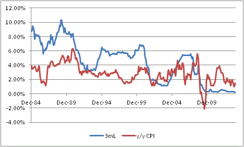
It bears noting that the correlation of Libor with forward-looking inflation is not as strong, but these are still reasonable correlations for financial markets.
The correlation between inflation and T-Bills has a much longer history, and a higher correlation (0.69) as a result of tracking well through the ‘80s inflation (see chart below, source Bloomberg and Economagic.com).

And, of course, the contemporaneous correlation of CPI to itself, if we are thinking about CPI-linked bonds, is 1.0 although the more-relevant correlation, given the lags involved with the way CPI floaters are structured, of last year’s CPI to next year’s CPI is only 0.63.
Still, these are good correlations, and might lead you to argue that FRNs are likely good hedges for inflation. Simulations of LIBOR-based bonds compared to inflation outcomes also appear to support the conclusion that these bonds are suitable alternatives to inflation-linked bonds (ILBs) like TIPS. I simulated the performance of two 10-year bonds:
Bond 1: Pays 1y Libor+100, 10y swaps at 2.5%.
Bond 2: Pays an annual TIPS-style coupon of 1.5%, with expected inflation at 2.0%.
Note that both bonds have an a priori expected nominal return of 3.5%, and an a priori expected real return of 1.5%.
I generated 250 random paths for inflation and correlated LIBOR outcomes. I took normalized inflation volatility to be 1.0%, in line with current markets for 10-year caps, and normalized LIBOR volatility to be 1.0% (about 6.25bp/day but it doesn’t make sense to be less than inflation, if LIBOR isn’t pegged anyway) with a correlation of 0.7, with means of 2% for expected inflation and 2.5% for expected LIBOR and no memory. For each path, I calculated the IRR of both bonds, and the results of this simulation are shown in the chart below.
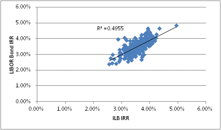
You can see that the simulation produced a chart that seems to suggest that the nominal internal rates of return of nominal bonds and of inflation-linked bonds (like TIPS) are highly correlated, with a mean of about 3.5% in each case and a correlation of about 0.7 (which is the same as an r-squared, indicated on the chart, of 0.49).
Plugged into a mean-variance optimization routine, the allocation to one or the other will be largely influenced by the correlation of the particular bond returns with other parts of the investor’s portfolio. It should also be noted that the LIBOR-based bond may be more liquid in some cases than the TIPS-style bond, and that there may be opportunities for credit alpha if the analyst can select issuers that are trading at spreads which more than compensate for expected default losses.
The analysis so far certainly appears to validate the hypothesis that LIBOR bonds are nearly-equivalent inflation hedges, and perhaps even superior in certain ways, to explicitly indexed bonds. The simulation seems to suggest that LIBOR bonds should behave quite similarly to inflation-linked bonds. Since we know that inflation-linked bonds are good inflation hedges, it follows (or does it?) that FRNs are good inflation hedges, and so they are a reasonable substitute for TIPS. Right?
However, we are missing a crucial part of the story. Investors do not, in fact, seek to maximize nominal returns subject to limiting nominal risks, but rather seek to maximize real return subject to limiting real risks.[1]
If we run the same simulation, but this time calculate the Real IRRs, rather than the nominal IRRs, a very different picture emerges. It is summarized in the chart below.

The simulation produced the assumed equivalent average real returns of 1.5% for both the LIBOR bond and the TIPS-style bond. But the real story here is the relative variance. The TIPS-style bond had zero variance around the expected return, while the LIBOR bond had a non-zero variance. When these characteristics are fed into a mean-variance optimizer, the TIPS-style bond is likely to completely dominate the LIBOR bond as long as the investor isn’t risk-seeking. This significantly raises the hurdle for the expected return required if an investor is going to include LIBOR-based bonds in an inflation-aware portfolio.
So what is happening here? The problem is that while the coupons in this case are both roughly inflation-protected, since LIBOR (it is assumed) is highly correlated to inflation, there is a serious difference in the value of the capital returned at the maturity of the bond. In one case, the principal is fully inflation-protected: if there has been 25% inflation, then the inflation-linked bond will return $125 on an initial $100 investment. But the LIBOR-based bond in this case, and in all other cases, returns only $100. That $100 is worth, in real terms, a widely varying amount (I should note that the only reason the real IRR of the LIBOR-based bond is as constrained as it appears to be in this simulation is because I gave the process no memory – that is, I can’t get a 5% compounded inflation rate, but will usually get something close to the 2% assumed figure. So, in reality, the performance in real terms of a LIBOR bond is going to be even more variable than this simulation suggests.
The resolution of the conundrum is, therefore, this: if you have a floating rate annuity, with no terminal value, then that is passably decent protection for an inflation-linked annuity. But as soon as you add the principal paid at maturity, the TIPS-style bond dominates a similar LIBOR bond. “Hooray! I got a 15% coupon! Boo! That means my principal is worth 15% less!”
The moral of the story is that if your advisor doesn’t understand this nuance, they don’t understand how inflation operates on nominal values in an investor’s portfolio. I am sorry if that sounds harsh, but what is even worse than the fact that so many advisors don’t know this is that many of those advisors don’t know that they don’t know it!
[1] N.b. Of course, they seek to maximize after-tax real returns and risks, but since the tax treatments of ILBs and Libor floaters are essentially identical we can abstract from this detail.