Archive
The Dollar – Best House on a Bad Block
I’m here to draw your attention to something alarming happening in currencies at the moment. Here is a picture of the US Dollar, which has lost a huge amount of value in the past year.

Now, before certain ones of you get all excited and say that this proves Trump is ruining the dollar and forcing foreigners to vamoose out of the United States, take a look at the Euro.

I’m not going to tease you too much with this. The first chart is just the dollar in terms of ounces of gold; the second is the Euro in terms of ounces of silver. Don’t worry, longtime readers: I’m not about to go all gold-bug on you. I could have done those charts with almost any currency against a wide variety of commodities: the Bloomberg Commodity Index is up 23% since mid-August, and +12% since the end of the year. So this isn’t just a precious metals story, and it isn’t just a dollar story. It’s a fiat currency vs ‘stuff’ story.
The recent breathless coverage of the melt-up in precious metals seemed to me to miss the bigger point of what it means. It’s awesome if you’re long precious metals. But the abrupt turn vertical is – or should be – alarming. But nothing looks alarming when it’s pointed higher.
Treasury Secretary Bessent, as I write this, just came out and stated that the United States has a strong dollar policy and has not intervened (at least not yet) to push the dollar lower against the yen. That’s all very nice but I don’t worry a lot about the level of the dollar against other currencies in the medium term and here’s why.
Let’s look at the monetary pipes, which to me imply an increase in the dollar and/or a sharp increase in long-term interest rates regardless of what happens to overnight policy rates. (Many people are concerned about long-term rates because of some vague sense that we are borrowing too much or because everyone is going to sell their US bonds – to buy what with the dollars they receive, no one seems to mention – but there is a mechanical/accounting relationship could cause that outcome).
To this end, the illustration below (Source: Enduring Investments[1]) is a helpful visual guide. For this analysis we are interested in the flows of the dollar system, more than its stock. And the important flows are – or have been – pretty stable. The US has for a long time run a substantial budget deficit, which means the government needs to source dollars by borrowing them. The three sources of those dollars have historically been foreign investors, the Fed, and domestic savers. Foreign investors have extra dollars because the trade deficit means that Americans send more dollars to foreign producers than foreign consumers send to US producers, and those extra dollars are invested in the US into government bonds (spigot on the lower left) or otherwise invested in markets or direct investment (spigot on the lower right). The Fed balance sheet, over the last decade or so, has often been a supplier of dollars to the system when it has been expanding more often than not. Finally, there are domestic savers who buy Treasury bonds among other things (but consider that when they’re buying US stocks, for example, the dollars are just sloshing from one domestic saver to another – that’s why there’s no flow shown for domestic savers buying US stocks). Those three ‘suppliers of dollars’ are the top hoses filling up the barrel of dollars in the illustration below.

Those flows tend to reach stasis via automatic stabilizers. For example, if the government is draining more money (with a big budget deficit) than is being supplied elsewhere, then either interest rates rise to induce domestic savers to provide more money, or the trade deficit expands. My concern is that automatic stabilizers tend to take time to stabilize, and currently there are some big changes. See the next illustration and focus on the differences compared with the prior one.

The cessation of the expansion of the Fed’s balance sheet has been happening for a while, and the balance sheet has even been shrinking a little. But the Trump Administration’s trade policies have caused two major changes: first, the trade deficit has been shrinking sharply (see charts below, source Bloomberg; the first shows the net trade balance monthly and the second shows the recent trends of declining imports and rising exports).


Some of this may be ‘payback’ for the surge in imports at the beginning of the year by importers trying to beat the imposition of tariffs, but there seems little question now that the trade deficit really is closing substantially. At the same time, foreign companies have been tripping all over each other to start making substantial investments into the US. In the second ‘barrel of money’ chart above, note the spigot at the lower right is really gushing, and two of the hoses supplying dollars have slowed to a trickle or stopped.
If that’s a fair representation, then what are the implications? If those trends persist, then the demand for dollars is going to outweigh the supply of dollars, leading to two outcomes. One of those is that in order to induce more dollars to fund the federal deficit, interest rates will have to rise. The Fed can control the policy rate, but in order to keep long-term rates down the Committee may eventually be forced to start up their hose again – intervening to buy Treasuries in the market to prevent long rates from rising, and expanding the balance sheet. The market stabilizer here would be for interest rates to rise and induce more domestic savings; if for policy reasons the Fed doesn’t want that then they’ll have to add more money themselves, with inflationary consequences. (It’s inflationary either way, but if interest rates rise it’s only indirectly inflationary in that higher interest rates also increase money velocity).
The other implication is that the dollar would strengthen on foreign exchange markets, since if foreigners are going to invest in the US in financial markets (or with direct investment, building new plants and so forth) they will need dollars to do so and the trade deficit is no longer providing a surplus of those dollars. It’s likely also that, with fewer dollars being sent abroad, domestic stock and bond markets would struggle more than they have been. A stronger dollar would be disinflationary at the margin, helping to hold down core goods prices, but this effect is fairly small…especially in the broader context I’ve mentioned, which is that all fiat currencies right now are getting smashed versus real stuff.
These are the implications of the recent large changes in financial flows. There are potential offsets available. If the trade deficit declines and the federal budget deficit declines also, it diminishes upward pressure on interest rates since domestic savers do not have to be incentivized to provide as much of the dollars in deficit. You can infer this from the barrel illustrations as well: if the federal budget moves towards balance, it lessens the net change in the system.
And there had been some positive signs on that score. The tariff revenue has been large, and some of the spending priorities of the prior Administration have been de-emphasized. These are positive developments which could lessen the pressure on the dollar and interest rates…except that the Trump Administration has been mooting the idea of ‘tariff dividend checks,’ increased defense spending, buying Greenland, and other significant spending initiatives.
It is also possible, even probable, that the Fed or Congress could change banking liquidity regulations in such a way that banks are forced to hold more Treasuries, which would add an additional hose to the top of the barrel. However, the more assets that banks are required to hold, worsening the return on assets of traditional banks, the more banking functions will start to move to non-bank entities or into crypto, increasing the money supply while decreasing the Fed’s control of it.
The upshot of all of these changes is that – based on the flows as we see them now, which could change – I believe we are going to see a significantly steeper yield curve and a significantly stronger dollar over the next few years.
Having said all of that, let me circle back to the start of this note – while the USD is not likely to collapse against other currencies, the movement against commodities (not to mention equities) and other real assets is disturbing. The US money supply has been accelerating recently; M2 is only +4.6% in the last 12 months, but that’s near (or may even be above) the maximum rate that is sustainable without causing inflation in a country that is deglobalizing and in demographic reverse. I am not bullish on gold and silver at these levels, and am more cautious on commodities than I have been in a while. But while I am a dollar bull against other currencies, I am a bear of fiat currencies against real assets generally…and I am concerned that the recent waterfall-like behavior of fiat presages a re-acceleration of CPI-style inflation. Commodities feed broadly into prices, but so do wages and lots of other things that are measured in terms of dollars. If the problem is fiat, and not gold and silver themselves, then it’s a bullish signal for inflation.
[1] These images were generated using AI image generation tools to create an illustrative representation for explanatory purposes.
Gold Prices Are Getting Frothy
Behold, my roughly-annual blog post on gold.
I recognize that there is a good case for gold at a time when the price level is rising steadily and there are upside risks to inflation and downside risks to the dollar. Let me start there.
I get a little confused trying to decide whether, if we find out that Fort Knox doesn’t have as much gold as we thought, that’s bullish or bearish. I think the consensus is that is bullish because it means there’s one less holder that could potentially sell into the market…but doesn’t that mean there is more actual floating supply? Because that gold is out there somewhere. Anyway, that is all idle speculation anyway until we find out whether the unaudited stockpiles at Fort Knox are intact. (As an aside, the whole monetary history of why there are gold stockpiles at Fort Knox or the New York Federal Reserve is fascinating. I just finished reading Lords of Finance: The Bankers Who Broke the World, which is a little unfair of a title but really interesting.)
But the $2,910 question is whether the case for gold at the current price is good or not. Okay, let’s be real – if people still believed that the current price mattered for future returns then most of the Magnificent 7 stocks wouldn’t be where they are…most of the rest of the equity market, probably too. Certainly bitcoin. For today, though, let’s pretend that trees don’t grow to the sky and that your future returns depend at least a little bit on the price you buy at relative to the future price you will sell at.[1]
Erb and Harvey wrote a paper in 2013 called “The Golden Dilemma” which had a wonderful chart in it (Exhibit 5) that showed the annualized 10-year real gold return versus the starting real price. The key insight is the translation to real values. Because the gold nominal price does, in fact, rise with the price level over time to reflect the diminishing value of the dollar. But whether it is likely to rise faster than the price level, or slower, or even decline over some period of time is obviously really important to the question of whether gold right now is a good inflation-hedging asset.[2] The chart below shows the Erb and Harvey chart, updated to today and with a more meaningful x axis priced in terms of the starting real price. The vertical line is the current gold price. All other gold prices are converted to their values in terms of today’s price level, and then the return calculated over the subsequent ten years.

The chart highlights that when the gold price is high in a real sense…when it has outrun inflation for a while…it is likely to underperform inflation going forward. When it has lagged inflation for a while it is likely to outperform inflation going forward. There is a fork on the chart of two different periods, the first being the gold prices when we used to care about value more (the lower fork, where the lowest point is January 1980), and the second being the more recent period where value mattered, but less so. The most-recent point for which we can calculate the 10-year real return is January 2015 when the nominal price of gold was $1278 but in terms of today’s dollars it was $1738 because we’ve had 36% inflation since then. Either way, the current price of gold would suggest that while the nominal price may rise over the next decade, that’s likely only to be the case if the price level rises more (that is, negative real returns for gold). That says that while gold is probably a better investment right now that equities – which have deeply negative expected real returns from the current price – it’s not likely to be as good an inflation hedge as, say, 10-year TIPS at 2% real yields.
Now, I have to address one possibility. There are nuts out there who will say “the fork here is evidence that the changes made to CPI caused it to understate inflation by 2% per year – gold, relative to the price level, is suddenly doing 2-5% per year better than it would historically have done.” It is crazy talk, but given the chart it is due a reply. There are two parts of the refutation. The first part is that the bottom fork doesn’t end in 1980; in fact that was the only fork evident in the Erb and Harvey 2013 piece. If CPI was monkeyed with in a serious way as the conspiracy nuts claim, it happened in the early 1980s. Maybe no one figured it out for a quarter century. I think a better argument is that the first gold ETF, GLD, launched in 2004. The abrupt ease in the difficulty of owning and holding gold almost certainly led to an increase in the allocation to gold in global investment portfolios. If that’s the cause, then the happy fork in this card should be the aberration and we should start to converge on the lower fork over time once that change in the acceptance of gold as a portfolio allocation has been fully realized.
The second part of my refutation is to point to another way that it looks like gold might be a bit frothy. People have pointed to the divergence of gold from TIPS (including me, back in 2024), since gold tends to behave like a long-term zero-coupon inflation-linked bond – in other words, it has a lot of real duration, but for some reason not recently. But showing the deviation of TIPS from gold could mean that gold is expensive or that TIPS became cheap. Look instead at the following chart, which relates two zero-coupon real assets: owned homes, and gold. The line is the price of gold divided by the Existing Home Sales Median Sale Price in thousands (so, one ounce of gold will currently buy 0.726% of a median home right now or, conversely, you need about 138oz of gold to buy the median existing home.

The chart shows three distinct extremes prior to the current rise. The peak in 1980 and the trough in the early 2000s are both obviously gold phenomena. The spike in 2010-2012 is a consequence of the housing bust after the GFC, when home prices drastically overcorrected to clear the excess inventory. And then we have the current increase in the ratio, which either means that gold prices are getting too high, or home prices are getting too low.
I think it’s hard to make the argument that home prices are getting too low.
[1] It is really hard to imagine how it cannot be true that today’s price matters for your return experience. The only way it could be irrelevant is if the growth rate of the asset is independent of the price, so that when today’s price goes up the expected future price goes up the same amount. But this leads to the absurdity that there is no price at which you wouldn’t buy an asset. I know this is really, really obvious to most of us but you have to realize that the belief that future prices are untethered to any fundamental value is the only reason the price of BTC – which can be redeemed for exactly zero, forever – is not zero. So lots of people clearly believe that everything has a ‘value’ if someone else will buy it today, even if no one will buy it tomorrow.
[2] People also hold gold for an end-of-the-world/fiat-collapse hedge. This is in my mind a separate case. If the price level goes up 500%, then the question of whether gold returns 490% or 510% is fairly irrelevant to me. The argument I am making is only salient for inflation at non-hyperinflation sorts of levels. Just want you to know I recognize that.
2022 Year-End Thoughts About 2023
Use: This article may only be reposted in its unedited entirety (including all links), including the title and author with linkbacks to the original. If you wish to repost in serial form, please contact me via the form at https://enduringinvestments.com to discuss.
When I was a Street strategist, and/or producing ‘sales and trading commentary’ as a trader, it was de rigueur to produce an annual outlook piece. Naturally, everyone does one of those; consequently, I stopped doing them. It seems to me like it would get lost in the shuffle (this is one of the reasons that Enduring’s “Quarterly Inflation Outlook,” which we distribute to customers and is also available by subscription here, is produced on the ‘refunding schedule’ of February, May, August, and November rather than at quarter-end). Having said that – it does seem that, given what inflation has done recently, there are more people asking for my outlook.
I do have to raise one point of order before I begin. As regular readers of this column know, in my writing, I generally try to propose the ‘right questions,’ and I don’t claim to have all the right answers. An outlook piece is often interpreted as being the analyst’s best guess at the answers. While it is that, for me the answers I suggest here are likely to be less valuable to the reader (I do not recommend that you blindly place trades based on my outlook for where markets will go!) than the thought process that is going into them. You may and probably will disagree with some of my answers. But hopefully, you’ll be able to identify where in my reasoning you have specific disagreements, which will either enhance your own view or cause you to thoughtfully reconsider it. That’s the whole point, and I don’t care at all if you disagree! That’s what makes markets.
Moreover…even if my guesses end up being “wrong,” or “right,” based on the actual outcomes in the future, that doesn’t mean they were wrong or right in terms of being a good approach/positioning. Investing is not really all about making the “right” bet in terms of whether you can call the next card off the deck, but about making the “right” bet with respect to the odds offered by the game, and betting the right amount given the odds and the edge. On this topic, I recommend “Thinking in Bets” by Annie Duke as excellent reading.
So, here goes.
MACROECONOMICS
For most of this year, I have been saying that we would get a recession by early 2023. In 2022Q1 and Q2, US GDP contracted. This produced the predictable shrill announcements of recession, coupled this year with sadly simple-minded declarations that the Biden Administration had “changed the definition of recession” by saying we weren’t in one. One television commentator I saw strongly profess the view that the two-quarters-of-negative-growth-is-a-recession definition is “in every economic textbook.” Having read my fair share of economic textbooks and having taught or tutored from a few, I can assure you that is not the case.
I was, and remain, sympathetic to the incoming fire that the Biden Administration took then, because they were basically right: whether we chose to call it a ‘recession’ or not, there was scant sign of any economic distress. Employment (which lags, of course) remained strong, corporate earnings were solid, confidence was reasonably high except for inflation, and citizens still had a substantial cash hoard left over from the COVID stimmy checks. However, while the critics were wrong on the timing they weren’t wrong about the eventuality of a recession. As I also said a bunch of times, there has never been a period where energy prices rose as rapidly as they did between early 2021 and mid-2022, combined with interest rates increasing as rapidly as they did thanks to Federal Reserve policy, that did not end in recession. But it takes Wile E. Coyote some time to figure out that there is nothing under his feet, before he falls, and recessions work similarly. We will have a recession in 2023.
We are already seeing the early signs of this recession. One indicator I like to look at is the Truck Tonnage index, which falls significantly in every recession (see chart, source Bloomberg). The last two months have seen a decline in this seasonally-adjusted index. It is early yet – we saw a similar-sized decline in 2016, for example, so there are false signals for small changes – but the fact that this decline happened heading into the Christmas season gives it more significance.

That’s the goods side. The services side shows up more in the labor market, which lags behind the overall cycle. Yet there too we have started to see some hints of weakness. Jobless claims are well off the post-COVID lows, although they are still roughly “normal” for the tight pre-COVID labor market. And the labor market is really hard to read right now, given the continuing crosswinds from the COVID-period volatility and the fact that so many services jobs now are at least partly virtual. Upward wage pressure is continuing, partly because virtual workers are less productive (shocker reveal there), so this recession in my view will probably not feel as bad as the last couple of recessions (GFC, Covid) have felt. However, we will have a recession in 2023.
The bad news, though is that a recession does not imply that inflation, ex-energy, will decline. Look at this chart, which captures the last three recessions. The post-GFC recession was the worst in 100 years, and while core inflation slowed that was almost entirely a function of the housing market collapse and not the general level of activity. The COVID recession was worse than that, and core inflation accelerated. And the post-tech-bubble recession wasn’t a slouch either; core inflation accelerated throughout 2001 until it started to decline, but only got down to 1.1%, in late 2003.

This chart shows y/y changes, but helpfully shows core-ex-shelter (Enduring Investments calculations). There isn’t a lot to see here in terms of the effect of these three huge recessions.

Lest you think I am just cherry-picking the 2000-2022 period, here is core CPI and GDP normalized as of December 1979. Again, you can see in the GDP line the recessions of the early 1980s, of the early 1990s, and that post-tech-bubble recession. I can’t see those, in the CPI line.[1]

And hey, as long as we are doing this…how about the 1970s malaise when the multiple recessions and flat growth led to … well, not disinflation.

I think the evidence is very clear: forecasters who are relying on the “recession” forecast (which I share) to make a “hard disinflation” forecast are simply ignoring the data. Those two concepts, outside of energy, are not related historically.
That being said, I expect core inflation and median inflation to decelerate in 2023. I just don’t think they will decelerate nearly as much as Wall Street economists think. Shelter inflation is already well above my model, and I expect will come back towards it, but my model otherwise doesn’t see a lot of downward pressure on rents yet. The strong dollar, and some healing of supply chains, will help core goods – but core goods inflation will remain positive next year and probably for a long time, thanks to secular deglobalization, instead of being in persistent slow deflation. And core services ex-rents will decelerate, but mainly because of the technical adjustment in health insurance. Until wages start to ebb, it’s hard to see a crash in core services ex-rents inflation. So that brings me to this forecast for core CPI:
| Current | 2023 Fcast | |
| Core Goods | 3.7% | 2.3% |
| Rent of Shelter | 7.2% | 4.8% |
| Core Services less ROS | 6.3% | 5.1% |
| Core CPI | 6.0% | 4.2% |
Most of the Street is in the mid-2s for core inflation; the Conference Board forecast for Core PCE recently was raised to 2.8% which would put core CPI at 3% or 3.1%. They’re getting there, but frankly it’s hard to see how you can get to those levels. In my view, most of the risks to my forecast are to the upside.
MONETARY POLICY
An important disclosure should be made here: in 2022, I was utterly wrong about the path the Fed would take. Almost as wrong as it is possible to be. Ergo, take everything I say hereafter in this section with a grain of salt.
Coming into 2022, I thought the Fed would follow the same script they had used for more than a quarter-century with respect to tightening policy: slow, late, tentative, and quickly reversed. Although inflation was already plainly not transitory, I know that the Fed’s models assume a strong homeostasis especially with inflation, to the extent that the persistent part of inflation is essentially (albeit with a lot more math) modeled as a very slow moving average and overall inflation is assumed to pull back to that level. When the Fed talks about the “underlying inflation trend,” that is in simple terms what they are saying. But if you believe that, then there’s very little reason to pursue something similar to a Taylor Rule where policy is driven by simple deviations of growth and inflation from the target levels.
So, when the Fed started to move I expected them to tighten a few times and then to stop and ultimately reverse when financial markets started doing ugly illiquid things. One thing I didn’t anticipate: the markets never really did ugly illiquid things. Investors welcomed the tighter policy, and ran ahead of the Fed to give them room. Especially considering that, at the end of 2021, I think most sophisticated investors viewed the Fed as incompetent (at best) or counterproductive (at worse), the markets gave the Committee an amazing amount of latitude. The Fed, to its credit, saw the gap in the defense and sprinted through it. I did not see that coming.
After nearly 500bps of rate hikes, and a small decline in the Fed’s balance sheet, money supply growth has come to a screeching halt. That’s largely spurious, I think, since money supply growth is a function of bank lending and banks are neither capital-constrained nor reserve-constrained at the moment, and longer-term interest rates have risen but not very much (except in the mortgage market). I suspect that most of the decrease in loan demand that is evidently happening is not in response to the increase in short-term rates but rather to the increase in mortgage rates almost entirely. If that’s the case, then it’s a one-time effect on M2 growth: mortgage origination can only go to zero once. The chart below shows the connection between M2 growth (in blue) and the MBA Purchase index (black). The correlation is not as incredible as it looks, because one is a rate of change that is off-center by 6 months (it’s y/y) and one is a level of activity, but if I expressed both in rate of change you would still say they look suspiciously similar.

If I am right about that point, then the money supply will shortly resume its growth as the overall volume of lending continues to grow without the negative offset of declining mortgage origination. With money velocity on the upswing now, this will support the level of inflation at a previously-uncomfortable level. So what will the Fed do?
Importantly, the Fed won’t really know that inflation isn’t dropping straight to 2% until after the midpoint of the year. But they’ll make the decision to pause rate hikes sooner than that. I think a 5% Fed funds rate is a reasonable target given their assumptions, a key one of which is that if “underlying inflation” is really 2%-3% then a 5% nominal rate will be plenty restrictive.
What is really amazing to me – which the ‘me’ of 2021 would never have anticipated – is that Fed watchers and market participants are starting to talk as if they believe the Fed might overdo the tightening, raising rates higher than needed to restrain the economy and inflation (yes, I know I said that a recession doesn’t cause lower inflation but it’s an article of faith at the Fed so we need to pretend as if we believe it). It’s incredible, when you think about it: the Fed hasn’t come close to ‘overdoing it’ in a tightening cycle in decades, if by ‘overdoing it’ we mean that they caused a deflationary crash. The Fed has caused plenty of recessions, but core inflation hasn’t been negative since the Great Depression. And we’re worried about them overdoing it?
Naturally, if you don’t think that raising rates causes inflation to come down then any rate hikes at all…actually, any active monetary policy at all…is too much. But in any event, it’s striking to me that the Fed has somehow restored some credibility as a hawkish central bank. Not that credibility per se matters, since expectations don’t cause inflation. But I digress. It’s still pretty amazing.
When Powell was first named Chairman, I was hopeful that a non-economist could help break the Fed out of its scholarly stupor. As time went on I lost that hope, as Powell trotted out various vacuous terms like “transitory” and leaned on discredited models (nevertheless still in vogue at the Fed) such as those which utilize the ‘anchored expectations’ hypothesis. But I have to say, my opinion of him has risen along with the Fed funds rate.
In my view, the biggest Fed error of the last forty years was Greenspan’s move to make the Fed transparent, which caused the pressures on the Fed to be entirely one-way. The second-biggest Fed error follows from that, and that is the tendency to move rates further and further away from neutral, holding rates at such a level by maintaining vastly higher levels of liquidity than were needed to run the banking system. The consequence of this has been a series of bubbles and asset markets at levels where the prospect of future real returns was abysmal. Plus, it led to the heyday of hedge funds where cheap money levered small returns into big returns.
The Powell Fed, for all of its flaws and awful forecasting, has succeeded in getting the yield curve to the vicinity of long-term fair value, which I define as sovereign real rates near the long-term growth rate of the economy (2.00-2.25% in the US – see chart below, source Enduring Investments before 1997 and Bloomberg after 1997). With a Fed inflation target at 2.25% or so in CPI terms, this means long-term nominal interest rates should be in the vicinity of 4%-4.5% over the long term in the context of a responsible central bank. We’re not there, but we’re getting close.

All of which means that I think the FOMC is just about done with hiking rates for this cycle. I believe they will get to 5%, pause, and stay paused for a long time. I do not expect them to lower interest rates, even if there is a recession, unless markets or banks start to have difficulties or Unemployment gets above 6%. That might happen in late 2023, but even if it does I think the Fed will be much more measured about cutting rates than they have in previous cycles. Credit to Powell for the change in attitude.
Those pieces, the Macro and the MonPol, along with my assessment of relative valuations, inform everything else.
RATES, BREAKEVENS, AND CURVES
The long, long, long downtrend in interest rates is decisively finished. As noted above, when inflation is under control and in the vicinity of the Fed’s 2% target, long-term interest rates should be in the vicinity of 4-4.5%. Over the last century, when rates have been away from the 3-5% range it has generally been either because inflation was unstuck on the high side (1970s, 1980s) or unstuck on the low side (1920s, 1930s, 2010s) (see chart, source Federal Reserve and Bloomberg). The long-term downtrend can be thought of as going from unstuck-high inflation, to normal, and overshooting to the downside in the last decade. But we have now definitively ended that low-rates period.

At a current level of roughly 3.5% nominal, 1.4% real, interest rates are ‘too low’ again, but this is normal for an economy headed into recession. Ordinarily, this configuration of events – a Fed nearing the end of a tightening cycle, a recession looming, and interest rates that have risen 320bps over two years – would make me bullish on bonds. And I do think that the first part of 2023 may see a decent rally as the Fed finishes their business and the stickiness of inflation is not yet apparent, but the recession is. Seasonally, you’d really prefer to be long the bond market/out of equities in the last quarter of the year and out of the bond market/long equities in the first quarter of the year, but I think the seasonal pattern will be reversed this year. So we will come in all happy as bond investors, and get unhappy later in the year.
The reason I think the first quarter of the year will be pretty decent for bonds is because of the timing of the recession and of the end of the Fed tightening cycle. But why the selloff as the year progresses? Well, investors will start to see that inflation is not falling as fast as they had expected, the Fed is showing no signs of easing…and the Federal deficit is blowing up.
In FY 2022, the US government had a $1.38 trillion deficit,[2] in an expansion during peacetime. But there are some inexorable effects pushing that higher next year. For example, interest on the debt: higher interest rates will affect only the part of the public debt that has rolled over, but that is an awful lot of it.

In December 2021, the rolling-12-month interest expense on US Debt Outstanding (see chart, source Bloomberg) was $584bln.[3] As of November 2022, the rolling-12-month expense was $766bln. It will be up another $100bln, at least, in 2023. Social Security benefits paid this year were roughly $1.2 trillion, and benefit payments are due to increase 8.7% next year – so, even neglecting the fact that there will be more recipients next year, Social Security should also be $100bln further in the red. That’s $200bln, on top of the approximately $1.4trillion deficit, and I haven’t even considered Medicare, the decline in tax receipts that will occur thanks to a decline in asset markets this year, or the decline in taxes on earned income when the economy enters a recession. A $2 trillion, peacetime deficit is easily in reach and will be much more if it’s a bad recession. The last time we had that big a deficit, the Fed happened to also be buying a couple trillion dollars’ worth of Treasuries. This time, though, the Fed is shrinking its balance sheet.

It is fairly easy to imagine that longer interest rates will have to rise some, in order to roll the maturing debt. As I said, higher interest rates don’t really bother me because I don’t run a highly-levered hedge fund. (But if the rise in rates were to get sloppy or rates were to rise enough to threaten a spiral in the deficit, then I can imagine the Fed stepping in to reverse its balance sheet reduction and being under even more pressure to guide rates lower. However, it’s not my base case.)
Also, as the year goes along the stickiness of inflation will become more apparent and investors will rightly start to put that assumption back into their required return for nominal bonds. One of the really crazy things that happened in 2022 was that inflation compensation in nominal bonds (aka ‘breakevens,’ the mathematical difference between yields on nominal bonds and yields on inflation-linked bonds that pay inflation on top) declined even as the overall level of inflation continued to climb. At the time of this writing, Median CPI has not yet even decisively peaked, although I think it will. But with Median CPI at 6.98%, it’s incredible that the market is demanding only 2.28% annual compensation for inflation over the next decade (see chart, source Bloomberg). That basically says investors are comfortable earning an increment that underpays them for inflation in the near term, and in the long term will only compensate them for what the Fed says they are trying to pin inflation at.

That’s not as easy a trade as it was when 10-year breakevens were at 0.94% in March 2020, but it still seems to me that most of the risk over that decade would be for inflation to miss too high, rather than too low. I understand that the FOMC wants inflation down around 2%. And as for me, I want a Maserati. Neither one of us is likely to get what he wants, just because we want it.
As the first quarter of the year passes and long-term interest rates decline, the curve may invert further from its current level. But I don’t think it can invert that much, which limits the value to being long, say, 10-year notes from this level. Given the current level of inversion, it is fairly easy to construct steepener trades that throw off positive carry. For that matter, a leveraged investor who is financing at 4.5% and earning 3.75% is more likely to want to go the other way! I think it’s going to be difficult to get a good bull market rally going in bonds, and if I was a leveraged hedge fund investor I’d be playing from the short side/steepener side even in the first quarter of the year (albeit cautiously). The chart below (source: Bloomberg) shows 2s/10s monthly going back to 1980. The only time the curve was more inverted was in the early 1980s, a couple of years after Volcker’s Saturday Night Special and with the hiking campaign solidly underway as it is now. I’m expecting 2s/10s to go positive in 2023, although the best shot at something like +50bps would come if the Fed actually did ease. Ergo, a steepening trade is also nice because it works in my favor more if I’m wrong about the Fed staying on hold for a while after they finish hiking to 5%.

Put those together and I see Fed funds at 5%, 2yr Treasuries at 4.25%, and 10s at 4.5%.
We obviously look deeper than that, though, on this channel. We can separate nominal yields into real yields (represented by TIPS) and inflation compensation (breakevens, or inflation swaps). Here are what the curves look like today (source: Enduring Investments).

From here, it looks fairly obvious that a good deal of the steepening should come from longer-term real rates rising. The 2y TIPS bond is at roughly 2%, so 2s-10s in reals is about the same as it is in nominals. The inflation curve is ridiculously flat. I do think that the inflation curve is more likely to shift higher in parallel than to steepen; a steepening inflation curve would imply accelerating inflation going forward and I don’t think investors really believe we’ll get acceleration. So I think that the movement in the shape of the TIPS curve will be very similar to the movement in the nominal curve, but with the level of the nominal curve being driven by an upward parallel-ish shift in the inflation curve.
| 2y | 10y | |
| Current TIPS Yields | 1.96% | 1.42% |
| EOY TIPS Yields | 1.80% | 1.85% |
| Current Breakevens | 2.30% | 2.27% |
| EOY Breakevens | 2.45% | 2.65% |
VOLATILITY
Generally speaking, a higher-inflation environment is a higher-volatility environment. The chart below (source: Bloomberg) shows core CPI in blue against the ICE BofA MOVE Index of fixed-income option volatility. True to form, the higher-inflation regime has correlated with higher levels of fixed-income volatility.

It isn’t terribly shocking that volatility is higher in bonds than it had been during the years when interest rates were fixed within a stone’s throw of zero. And it shouldn’t be terribly shocking that I expect volatility to stay somewhat higher than the 2017-2019 and 2020-early 2021 levels, even as core inflation recedes somewhat. What may be surprising is the observation that a sizeable gap has opened up in the behavior of fixed-income volatility and equity volatility, as the following chart comparing the VIX (equity vol) and MOVE (fixed-income vol) shows. Note that these are different axes, but you can clearly see the uptrend in the MOVE that has not been replicated by the VIX.

I mentioned earlier how regular and controlled the decline in the stock market has been, and how this has allowed the Fed to push rates further than anyone thought they would, a year ago. There have not been too many periods where option sellers have been punished for being short vol in equities. On the other hand, bond vol has been very different now from what it was a few years ago. In short, there has been a regime change in bond vol, but not in equity vol. At some level, this will continue, but the spread should narrow as the Fed gets to the end of the tightening regime. I think we will end 2023 with the VIX above 22 log vol – where it is today or slightly higher – but with the MOVE around 90 norm vol.
Both of those figures represent more-volatile conditions than we have seen for some years pre-COVID.
EQUITIES
It hurts to say, but equities are still far, far, far overvalued.
For many years, there has been a running tension between people who use the “Fed model” as a way to justify the current level of the stock market and the people who point out that the “Fed model” does not imply that the current level of the market is fair. The “Fed model” essentially says that when interest rates are very low, the present value of future cash flows is higher; ergo, the equilibrium value of the average equity (whose fair value is dependent on the present value of future earnings) and hence the overall stock market is higher, when interest rates are lower. This is analytically true. However, it does not mean that your expectation of future returns, when P/E multiples are at 40 but interest rates are low, should be the same as your expectation when P/E multiples are at 15 but interest rates are high. The level of interest rates explains higher equity prices, but it does not imply that those are now long-term fair value levels.
But this tension was almost always resolved in favor of the people who thought that rock-bottom interest rates meant that stocks should be at sky-high multiples, and value investors were left in the dust for more than a decade.
Unfortunately, this tension is being reduced because interest rates are going higher, and may never go back to those levels again. Consequently, equity price/earnings multiples need to re-rate for the new level of interest rates. The same logic that was used to justify the stock market at a 35 Shiller P/E, reconciles to lower prices now and going forward. The chart below (source: Robert J Shiller, updated with Enduring Investments calculations) shows the Shiller P/E (aka Cyclically-Adjusted P/E Ratio, or CAPE) versus 10-year interest rates in the post-WWII period. There is, ex-Internet bubble, a pretty clear relationship between interest rates and valuations. The red dot is where current multiples and interest rates are.

My forecast of 4.5% 10-year Treasuries implies something like a 23 Shiller P/E, down from 30 now. Without earnings growth, that 23% decline in the multiple implies a 23% decline in the stock market from these levels. I don’t think earnings themselves will increase or decrease very much unless the recession is much worse than I think it’s going to be, but the same lag between wages and product prices that flattered earnings when inflation was heading higher will detract when inflation decelerates. Moreover, if I’m right that Powell is intentionally steering interest rates to a level that is consistent with a long-term equilibrium around 4%-4.5% then this 23% adjustment in prices will not necessarily be followed by another massive bull market the likes of which we became accustomed to during the long bond bull market of the last 40 years. A Shiller P/E in the low-20s is still fairly generous historically but it may be sustainable.
So, my point forecast is for the S&P to get to 3,000 sometime in 2023. I don’t think the current bear market will last the entire year, and in fact I am sure there will be a rollicking rally when it is clear the Fed is done tightening. But sticky inflation will hurt here, too, and after that rollicking rally I think we’ll have another low, and from that low is where a modest bull market will begin.
However, I should also note that 1-year equity vol is around 25%, so my projection is within 1 standard deviation of unchanged!
COMMODITIES
From 1999 through 2008, commodities were in a bull market. After a brutal crash in the Global Financial Crisis, commodity indices had another mini-bull market from 2009-2011 before enduring a 9-year bear market. Since March 2020, the massive increase in the quantity of money has driven down the value of money relative to commodities or, to put it in the normal way, has driven up the price of commodities.
The Bloomberg Commodity Index (spot) rose from 59 in March 2020 to 124 in March 2022, and has come off the boil a bit since then. At the highs, though, the level of the index was only back to the levels of 2014. This is normal with spot commodities, which thanks to improved production and extraction technology over time tend to be perpetually deflating in real terms.[4] The good news is that an investor in commodities does not generally buy spot commodities but rather invests through collateralized futures contracts or invests in an index based on collateralized futures contracts. Over time, the collateral return happens to be a very important source of return (in addition to spot returns, the return from normal backwardation, and the volatility/rebalancing return), and this year there is terrific news in that collateral returns are ~4% higher than they were before the Fed started to hike. This means that, all else equal, commodities index returns should be expected to be 4% better (in nominal terms) this year than over the last couple of years. All else is not equal, but I expect gains in investible commodities indices in 2023.
That’s entirely separate from the question of whether we are in a commodity supercycle, due to chronic underinvestment in exploration and extraction technologies and more difficult geopolitical pressures that increase the costs of mining, growing (e.g. because of fertilizer costs/shortages), and transporting the raw commodities. I think the answer there appears to be ‘yes,’ which means that in general I want to play the commodity market from the long side more than from the short side. Of course there will be brutal moves in both directions, and bears will really want to sell commodities as the recession comes to the fore. But most of that is already in the price, with gasoline at levels much closer to the GFC lows than to anything approximating the highs. The chart below shows retail gasoline prices, adjusted for inflation (using 2012 dollars).

Energy prices of course could fall further, but considering that part of the reason prices have fallen this far is that the Strategic Petroleum Reserve has been flushing oil into the system (and that has ended, in theory) and China’s economy has been sputtering under Zero Covid (which has also ended, in theory), it is hard to think that is the better direction at the moment.
OTHER THINGS
I want to append one very important admonition for investors and investment advisors. I mention this frequently on podcasts, TV and radio appearances, at cocktail parties and to random strangers on mass transit:
The next decade will be very unlike the decades we have just experienced. Not only will inflation and interest rates be higher than we’ve become accustomed to, and markets more volatile, but some important drivers of portfolio construction will shift. The good news is that at least some of those shifts are systematic and predictable. The table below shows how 60/40 returns correlate with inflation, with inflation expectations, and with inflation surprise over two periods. The first period was the 30 years ending in 2004, when inflation averaged 4.89% and was three times as volatile as during the subsequent period. During that period, a 60-40 portfolio was significantly exposed to inflation. The more-recent period, during which inflation was low and stable, produced placid 60/40 returns and correlations with inflation that are mostly spurious because there was more noise than signal. Inflation didn’t move!

The first implication of this is that portfolios which have productively ignored inflation-fighting elements over the last two decades need them now, because the main asset classes used in portfolio construction are terribly inflation-exposed. All portfolios for investors who do not have sufficient ‘natural’ inflation hedges should include such assets as commodities and an allocation to inflation-linked bonds in lieu of some of the nominal bond allocation.
The second implication is related but less conspicuous. The entire correlation matrix is shifting away from what it has been over the last couple of decades, and back to something that incorporates the inflation factor that has been dormant. As the most obvious example, stocks and bonds which have been inversely correlated for a while, due to the fact that they respond differently to economic growth, are becoming correlated again. This is not an aberration but entirely normal for regimes in which inflation is not low and stable. The chart below illustrates this. When 3-year average inflation is above 3% (the red shaded area), then 3-year correlations of stocks and bonds tend to be positive (blue line). When inflation is below that level, correlations tend to be negative.

Negative correlations between stocks and bonds are great because they lower portfolio risk. But in the coming decade, 60/40 won’t be as low risk as it has been. But beyond that, the entire covariance matrix that an advisor relies on to simulate and optimize portfolios needs to be examined. The normal way is to use recent returns (say, the last 10 years) to generate this covariance matrix, which then is used to find the mean/variance-optimized portfolio for a given level of risk. That’s normally okay, but as inflation proves sticky that sort of covariance matrix will be wrong, and wrong in a systematic way. What I am doing for our customers is comparing portfolios optimized with a recent covariance matrix to portfolios optimized using a covariance matrix from the 1980s-1990s. It’s important to be aware of this potential problem in portfolio construction, and to get ahead of it.
Finally, let me take a moment to thank the readers of this blog for their interest in it. I write partly because the discipline of arguing my points out thoroughly makes me (I think) a better trader and investor, but I also garner a lot of value from the information and ideas I receive reciprocally from readers who agree or disagree with what I write. I appreciate this feedback very much, and I thank the readers who take the time to share their opinions with me.
Aside from the personally selfish reason I have for writing, there is also the corporate mission the blog is meant to accomplish, and that is to raise the profile of Enduring Investments and the Inflation Guy franchise with prospective clients, and to encourage them to do business with us. If prospective clients see value in these musings, then I hope they will choose to do business with us. Yes, that’s crassly commercial. But ‘tis the season! And if you read this far in this missive, please consider what that means about the value you’re getting, and how much more value you might get from a deeper relationship with Enduring Investments!
And if not, Merry Christmas anyway! Happy holidays and Happy New Year.
– Mike ‘The Inflation Guy’ Ashton
DISCLOSURE – My company and/or funds and accounts we manage have positions in inflation-indexed bonds and various commodity and financial futures products and ETFs related to them that are discussed in this column.
[1] It bears noting, though, that until 1982 the shelter component of CPI was tied to mortgage rates and home prices and not rents, so that the early-80s rise in core CPI partly reflected the Volcker rate hikes. Fixing that problem was what released the conspiracy nuts who plague us to this day claiming that the BLS “manipulated” CPI downward.
[2] https://fiscaldata.treasury.gov/americas-finance-guide/national-deficit/
[3] Net interest was about $110bln less, since some of that interest is paid to other parts of the government, for example the Federal Reserve system. For now.
[4] I wrote a nice, short little piece called “Corn Prices – Has the Correction Run its Course?” that is worth reading if you are interested in commodities.
Oil Be Home For Christmas
As a general rule, don’t trade on pre-holiday thin-liquidity sessions. There can be amazing-seeming opportunities, but price can still get shoved in your face by whoever it is who feels like pushing markets around.
A prime example today is the energy market, where front-month oil prices are down nearly 4% at this writing. Recently, energy futures have been regularly jammed lower overnight in low-liquidity conditions and then have recovered during the day. There is a structural shortage of energy globally at the moment, and inventories are low…but sentiment is also very poor and as I’ve shown before, open interest has been in a downtrend for years – aggregate open interest in NYMEX Crude hasn’t been lower since 2012.

So, it’s a market ripe for pushing around and the day before Thanksgiving is probably not the day to take a stand by getting long even when the reasons given for the selloff are nonsense. Today, the story is again about the price cap on Russian oil that is being implemented soon by the US and EU. Market participants seem to struggle with Econ 101 here. A price cap has one of two effects in the market under consideration: if the price cap is set above the market-clearing price, it has no effect. If the price cap is set below the market-clearing price, it leads to shortages as suppliers – in this case, Russia – won’t supply as much oil (if any) to the capped market when there are other uncapped markets (say, China and India). There is probably an area near the price cap where the cost of switching to delivering oil in other markets is higher than the gain from switching deliveries, but that’s only in round 1 of the game theoretic outcome.[1]
In this case, since only the price from one supplier is capped, the result should be higher prices in the markets than otherwise since once price exceeds the cap, one supplier is lost. The chart below shows the classic outcome. Below the cap, the supply curve is normal. Above the cap, the supply curve is left-shifted.

This leads, at least in a frictionless market (which this isn’t), to prices being discontinuous around the cap. As demand shifts from left to right, prices behave normally and rise as they normally would, until abruptly jumping higher once the capped producer is removed. In any case, price is more volatile than it would otherwise be…but, and this is important, it is never lower in a market where some or all of the suppliers are capped, than it is in an uncapped market. At best, prices are the same if the caps aren’t in play. At worst, a combination of shortages and higher prices obtain.
Speaking of shortages…it seems that people are growing calmer about the chances of a bad energy outcome over the winter in Europe. This seems, to me, to be related to the fact that inventories of gas are reasonably flush thanks to conservation efforts and vigorous efforts to replace lost Russian pipeline supply (see Chart, source Gas Infrastructure Europe via Bloomberg).

That’s great, but the problem is that since the pipelines are not flowing Europe needs more gas going into the winter than they otherwise would have – because it’s not being replenished by pipeline during the winter, either. We certainly hope that Europe doesn’t run out of heat this winter, but the level of gas inventories is not exciting.
Putting downward pressure on both of these markets, but especially Crude, is the idea that the world will enter a global recession in 2023. As I’ve been saying since early this year, that’s virtually a sure thing: we’ve never seen interest rates and energy prices rise this much and not had a recession. But I have thought that the recession would be relatively mild, a ‘garden variety’ recession compared to the last three we’ve had (the tech bubble implosion, the global financial crisis, and the COVID recession). What worries me a bit is that the consensus is now moving to that conclusion. It seems that most forecasts are for a mild recession (although predictably, economists are all over the map on inflation depending on the degree to which they understand that inflation is a monetary phenomenon and not a growth phenomenon). I’m still in that camp, but that concerns me, because the consensus is usually wrong.
[1] In round 2, after oil delivery from Russia is switched to the uncapped markets, the available price in the capped market will need to be appreciably above the market clearing price in the uncapped market in order to cause the switch back.
Corn Prices – Has the Correction Run its Course?
Recently there has understandably been a lot of focus on the extremely high prices of agricultural products. The front Corn futures contract hit an all-time month-end high back in April, at over $8/bu (see chart, source Bloomberg). Over the last decade-plus, in fact, grain prices have been generally higher and more-volatile than in the 40 or so years prior to the GFC.
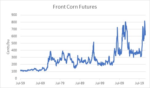
It is always good to remember, though, that because the overall value of the currency is in more or less perpetual decline, it is expected that the price of any good or service should be expected to rise over time. The more important question is, what has the real price of grains done over the decades? And here, the picture is starkly different and looks like the chart of many, many goods. It’s the way that the real price of consumer goods should look over time, given that the arrow of productivity points mostly in one direction. This one chart shows the price of corn, in 2022 dollars. Back in the 1970s, corn only cost $3/bu, but the dollar was worth more then. It would have taken more than $20 of today’s dollars to buy a bushel of corn in mid-1974.
The chart also has an orange line on it, which shows the US Cereal Crop Yield each year according to the World Bank.[1] I’ve inverted that series, so that when we are able to get more crops from each hectare, the line declines. It’s also on a logarithmic axis.
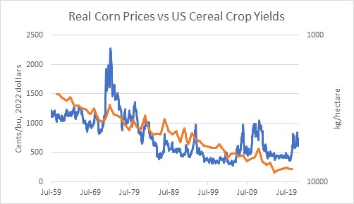
The point of this chart is merely to illustrate that real corn prices have declined over a long period of time because contrary to Mathus’s fears the production of cereal grains has been able to keep up and in fact exceed the increase in the demand for them over time. The chart is necessarily imprecise, since we’re not considering how the number of hectares producing corn changes each year, and we’re not looking at specific corn yields. Nevertheless, you will notice that many of the spikes in prices are associated with spikes (that is, dips, since it’s inverted) in crop yields. Which makes sense, of course.
What causes changes in crop yields? Different planting and harvesting techniques are obvious improvements that are pretty much one-way. Also, improved fertilizers and pest control, and better use of the proper mix of fertilizers. But then why do crop yields sometimes decrease, if all of these things tend to get better over time?
One obvious answer to that is the weather. Less obvious is that the use of fertilizers isn’t constant. When fertilizer prices are high, farmers try to use less and that reduces crop yields. Also – and this is directly relevant to today – when there is a shortage of fertilizer then less of it is used and the price of fertilizer goes up. With the conflict in Ukraine and the cutting off of natural gas supplies to Europe (natty is an important input into the manufacture of some fertilizers), we are in that sort of situation. If we overlay real corn prices with real fertilizer prices[2] you can tell that these are closely related series.
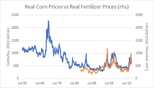
So in the long run, the general level of corn prices is driven by the purchasing power of the dollar (aka the overall price level) and the steady improvement in agricultural productivity. In the short run, corn prices are driven by fertilizer prices.
Fertilizer prices have come down somewhat. The continued embargo of natural gas into Europe has only a small effect on fertilizer supply, and Russia only directly provides about 10% of the global supply of fertilizers.[3] But the overall level of commodity inputs into the manufacture of various sorts of fertilizer obviously impacts the output price. I suspect it will be a while before fertilizer prices even in real terms get back to their pre-COVID levels. And the overall CPI is not about to decline any time soon. Does that mean that corn (and wheat, etc etc) prices can’t decline from here? Of course not – but my guess is that we’ve seen most of the good news on the agricultural commodity front for a while.
[1] https://data.worldbank.org/indicator/AG.YLD.CREL.KG?locations=US Annual data through 2020.
[2] US Cornbelt Urea Granular Spot Price, source Bloomberg. The 1:1 congruence of scales and amplitudes is mostly coincidental – one is cents per bushel and one is dollars per short ton.
[3] https://www.fas.usda.gov/data/impacts-and-repercussions-price-increases-global-fertilizer-market
Financial Buyers Aren’t to Blame For High Commodities Prices
Today’s does of non-Ukraine content concerns a misunderstanding about commodities that seems to require regular correction. I’ve seen it resurface recently, most recently in a daily digest from Bloomberg this morning:
“There seems to be something of a vicious circle developing in the commodities space, where investors are increasing their exposure as an inflation hedge, thereby possibly driving up prices further. “
This is not something you should worry about.
I suspect this sort of thinking derives from observations about financial futures, in particular cash-settled sorts. But in contracts for physical delivery, it doesn’t work this way. A purely financial investor cannot drive up prices in the spot market, because such an investor never gets to the spot market. No one, outside of a few sophisticated hedge funds, holds physical commodities as an inflation hedge (with the possible exception of precious metals, which isn’t what they’re discussing here). No one keeps a silo of corn or beans for investment, taking that supply off the market in the process. (Almost) no one keeps a tanker truck of gasoline as an inflation hedge or a pile of aluminum.[1] A financial investor must cover their (long) positions by finding an offset before delivery. Only buyers who actually want the commodity delivered, or sellers who actually have the commodity to deliver, go all the way to final settlement. Ergo, the spot price is determined by actual buyers and sellers of the spot commodity and not financial players.
So, if financial investors in commodities do anything at all, they might push up deferred contract prices relative to spot prices, putting the market further in contango. If anything, this actually would cause the opposite effect from the one noted above since a producer who owns future commodities (in other words, they make production decisions about how much to grow or mine) can lock in a higher selling price than the current spot price – which obviously would make them want to supply more to the market.
But if this was the dynamic, then commodities curves would be in contango (deferred contracts higher than spot contracts); instead we find that commodities curves are in backwardation at levels we haven’t seen in a long time.

[N.b.: if you have the Inflation Guy mobile app, you can look for the Daily Chart Pack under “tools” and on page 17 you will find this chart, updated every day.]
Commodities curves being in backwardation is actually one strong piece of evidence that financial buyers are not driving volatility or activity in commodities markets. Curves are in backwardation because there are shortages in the spot market but producers are still willing to sell future production lower than the current level.
In short – don’t blame the financial players for the rise in commodities prices. Blame years of underinvestment followed by massive money-stoked demand. It’s not hard to see why commodities have risen so much. It’s only hard to guess how much farther they will go. But they answer in any event will not depend on how heavily invested institutions or the general public are.
[1] That can occasionally include pure arbs doing cash-and-carry metals arb, but that’s not much fun when the curves are backwardated like they are now.
A More Optimistic Outlook for Gold? Or Not?
Something interesting has been happening in gold over the last decade.
I know that sounds strange, but what has been happening is interesting in a very specific way: gold has been outperforming a priori expectations for returns, by a significant margin. So far, that’s still not very interesting since just about every asset class has been outperforming a priori expectations for returns for quite a while. That’s what excess liquidity provision will do (and is supposed to do), after all. But what’s interesting about gold is that for a very long time the relationship between the starting real price of gold and the subsequent real return has been very strong, and it still is – but the relationship seems to have shifted.
Naturally, the key to good long-term returns is buying at low prices and selling at high prices. But the question of what “high” and “low” prices are is the squishy part. In gold, though, it turns out that going back for quite a while the subsequent real return to gold has been strikingly regular. The chart below is snipped from Erb and Harvey’s “The Golden Dilemma,” an excellent paper published in 2013. It shows the subsequent 10-year annualized after-inflation return to gold, as a function of its starting real price (defined by E&H here as simply the gold price divided by the CPI Index).

The chart below shows this relationship as I’ve recreated it, but putting the prices relative to the current spot price (that is, adjusting past prices by the ratio of the current CPI price level index to the CPI Index at that time). This is for periods starting 1975-2000 and ending therefore 1985-2010. Unsurprisingly, it matches Erb & Harvey except for the different ending point, and the choice of how the x-axis is represented. I’ve also drawn a log regression line here. Obviously there should be a bit more curvature to the line but you get the idea. It’s a pretty decent fit: tell me the starting price in today’s dollars and I can give you a pretty accurate guess at the future real return. Lower prices lead to better subsequent real returns. The current price, though (where the vertical line is drawn), is not encouraging.

But here’s where the interesting part comes in. The next 10 years’ worth of starting points and ending points, after those plotted above, still fall on a very nice curve. But the curve is a lot higher.

This is much more encouraging! Whereas the original curve suggested that the expected real return to gold, starting from the current price, is presently about -8% per annum, the more recent curve suggests that the expectation should be roughly a 0% real return. That is, gold ought to approximately keep up with the price level. The curve in red is also more encouraging in that it suggests that while you can have great real returns by buying gold when it occasionally gets quite cheap, it shouldn’t drastically underperform inflation even when it gets kinda expensive. That’s great news for owners of gold, if we can believe it.
I have one mild concern, though – what caused this shift in curves? Clearly, gold has done wonderfully since 2001 partly because it started at a very low real price but also partly because the tremendous liquidity that has been a feature of the financial landscape for the last 13 years (at least) has raised all “real” boats. Because it turns out that gold – moreso than a lot of other commodities – also reacts fairly directly to real interest rates. In a study that we did as part of our work with Simplify Asset Management, we found that for one-year horizons gold has approximately 4 times as much duration with respect to real interest rates than it does to the price level, and the delta to the 10-year real interest rate is about 10x. That is, if real interest rates drop 1%, then that effect alone will influence gold to rise about 10%.
Thus, at least some of what is happening here is that the ‘new curve’ reflects the steady decline in 10-year real interest rates since the late 1990s, from a bit above 4% to the neighborhood of -1% now. Given the (current) starting real price of gold, our expectation for gold’s return over the next decade is that it should be roughly equal to the aggregate inflation over that time frame. The caveat, though, is significant. If real interest rates rise during that time, then gold will probably underperform inflation. Only if real interest rates fall appreciably further – which seems unlikely – can we concoct a scenario where we would think a priori that gold should beat inflation comfortably. And that means that even if you think the red dots in the plot above are a better basis for a forecast, the net message should still not be overly bullish for gold. The most optimistic guess would be that gold’s return equals the change in CPI, unless interest rates collapse further.
However, that circumstance is not damning to gold alone; just about every asset class is subject to the same law of liquidity/gravity. Take away liquidity, and real interest rates tend to rise. Take away liquidity, and prices of all sorts of assets decline – to some level where they’ll offer a better future return from a lower starting price.
The Flip Side of Financialization of Commodities
Recently, a paper by Ilia Bouchouev (“From risk bearing to propheteering”) was published that had some very thought-provoking analysis. The paper traced the development of the use of futures and concluded that while futures markets in the past (specifically, he was considering energy markets but notes the idea started with agricultural commodities) tended towards backwardation – in which contracts for distant delivery dates trade at lower prices than those for nearer delivery dates – this is no longer as true. While others have noticed that futures markets do not seem to provide as much ‘roll return’ as in the past, Mr. Bouchouev suggested that this is not a random occurrence but rather a consequence of financialization. (My discussion of his fairly brief paper will not really do it justice – so go and read the original from the Journal of Quantitative Finance here).
Let me first take a step backward and explain why commodities markets tend towards backwardation, at least in theory. The idea is that a producer of a commodity, such as a farmer growing corn, has an affirmative need to hedge his future production to ensure that his realized product price adequately compensates him for producing the commodity in the first place. If it costs a farmer $3 per bushel to grow corn, and he expects to sell it for $5 per bushel, then he will plant a crop. But if prices subsequently fall to $2 per bushel, he has lost money. Accordingly, it behooves him when planting to hedge against a decline in corn prices by selling futures, locking in his margin. The farmer is willing to do this at a price that is lower than his true expectation, and possibly lower than the current spot price (although, technical note: Keynes’ ‘Theory of Normal Backwardation’ refers to the difference between his expected forward price and the price at which he is willing to sell futures, so that futures prices are expected to be downwardly biased forecasts of prices in the future, and not that they are expected to be actually lower than spot ‘normally’). He is willing to do this in order to induce speculators to take the other side of the trade; they will do so because they expect, on average, to realize a gain by buying futures and selling in the future spot market at a higher price.
Unfortunately, no one has ever been able to convincingly prove normal backwardation for individual commodities, because there is no way to get into the collective mind of market participants to know what they really expect the spot price to be in the future. Some evidence has been found (Till 2000) that a risk premium may exist for difficult-to-store commodities (agricultural commodities, for example), where we may expect producers to be the most interested in locking in an appropriate profit, but on the whole the evidence has been somewhat weak that futures are biased estimators of forward prices. In my view, that’s at least partly because the consumer of the product (say, Nabisco) also has a reason to hedge their future purchases of the good, so it isn’t a one-sided affair. That being said, owners of long futures positions have several other sources of return that are significant and persistent,[1] and so commodity futures indices over a long period of time have had returns and risks that are similar to those found in equity indices but deriving from very different sources. As a consequence, since the mid-2000s institutional investment into commodity indices has been significant compared to the prior level of interest, even as actual commodity returns have disappointed over the last 5-10 years. Which brings us back to Mr. Bouchouev’s story again.
He makes the provocative point that part of the reason commodity returns have been poorer in recent years is because markets have tended more toward contango (higher prices for distant contracts than for those nearer to expiry) than backwardation, and moreover that that is a consequence of the arrival of these institutional investors – the ‘financialization’ of commodities futures markets, in other words. After all, if Keynes was right and the tendency of anxious producers to be more aggressive than patient speculators caused futures to be downwardly biased, then it stands to reason that introducing more price-insensitive, institutional long-only buyers into the equation might tilt that scale in the other direction. His argument is appealing, and I think he may be right although as I said, commodities are still an important asset class – it’s just that the sources of returns has changed over time. (Right now, for what it’s worth, I think the potential return to spot commodities themselves, which are ordinarily a negative, are presently a strong positive given how badly beaten-down they have become over time).
All of that prelude, though, is to point out a wonderful corollary. If it is the case that futures prices are no longer biased lower by as much as they once were, then it means that hedgers are now getting the benefit of markets where they don’t have to surrender as much expectation to hedge. That is, where an oil producer might in the past have had to commit to selling next year’s oil $1 lower than where he expected to be able to sell it if he took the risk and waited, he may now be able to sell it $1 higher thanks to those institutions who are buying long-only indices.
And that, in turn, will likely lead to futures curves being extended further into the future (or, equivalently, the effective liquidity for existing markets will be extended further out). For example, over the last decade there have been several new commodities indices that systematically buy further out the curve to reduce the cost of contango. In doing so, they’re pushing the contango further out, and also providing bids for hedgers to be able to better sell against. So Mr. Bouchouev’s story is a good one, and for those of us who care about the financial markets liquidity ecosystem it’s a beautiful one. Because it isn’t the end of the story. Chapter 1 was producers, putting curves into backwardation to provide an inducement to draw out speculators to be the other side of the hedge. Chapter 2 is Bouchouev’s tale, in which financial buyers push futures markets towards contango, which in turn provides an inducement to draw out speculators on the other side, or for hedgers to hedge more of their production. In Chapter 3, also according to Bouchouev, the market balances with hedgers reacting to economic uncertainty, and speculators fill in the gaps. Of course, in Chapter 4 the Fed comes in and wrecks the market altogether… but let’s enjoy this while we can.
[1] …and beyond the scope of this article. Interested parties may refer to History of Commodities as the Original Real Return Asset Class, by Michael Ashton and Bob Greer, which is Chapter 4 in Inflation Risks and Products, 2008, by Incisive Media. You can contact me for a copy if you are unable to find it.
COVID-19 in China is a Supply Shock to the World
The reaction of much of the financial media to the virtual shutdown of large swaths of Chinese production has been interesting. The initial reaction, not terribly surprising, was to shrug and say that the COVID-19 virus epidemic would probably not amount to much in the big scheme of things, and therefore no threat to economic growth (or, Heaven forbid, the markets. The mere suggestion that stocks might decline positively gives me the vapors!) Then this chart made the rounds on Friday…

…and suddenly, it seemed that maybe there was something worth being concerned about. Equity markets had a serious slump yesterday, but I’m not here to talk about whether this means it is time to buy TSLA (after all, isn’t it always time to buy Tesla? Or so they say), but to talk about the other common belief and that is that having China shuttered for the better part of a quarter is deflationary. My tweet on the subject was, surprisingly, one of my most-engaging posts in a very long time.
It has been so long since we have seen a supply shock that we have forgotten what they look like. China Inc shutting down is a supply shock. Supply shocks are inflationary, not disinflationary. Carry on.
— Michael Ashton (@inflation_guy) February 24, 2020
The reason this distinction between “supply shock” and “demand shock” is important is that the effects on prices are very different. The first stylistic depiction below shows a demand shock; the second shows a supply shock. In the first case, demand moves from D to D’ against a stable supply curve S; in the latter case, supply moves from S to S’ against a stable demand curve D.


Note that in both cases, the quantity demanded (Q axis) declines from c to d. Both (negative) demand and supply shocks are negative for growth. However, in the case of a negative demand shock, prices fall from a to b; in the case of a negative supply shock prices rise from a to b.
Of course, in this case there are both demand and supply shocks going on. China is, after all, a huge consumption engine (although a fraction of US consumption). So the growth picture is unambiguous: Chinese growth is going to be seriously impacted by the virtual shutdown of Wuhan and the surrounding province, as well as some ports and lots of other ancillary things that outsiders are not privy to. But what about the price picture? The demand shock is pushing prices down, and the supply shock is pushing them up. Which matters more?
The answer is not so neat and clean, but it is neater and cleaner than you think. Is China’s importance to the global economy more because of its consumption, as a destination for goods and services? Or is it more because of its production, as a source of goods and services? Well, in 2018 (source: Worldbank.org) China’s exports amounted to about $2.5trillion in USD, versus imports of $2.1trillion. So, as a first cut – if China completely vanished from global trade, it would amount to a net $400bln in lost supply. It is a supply shock.
When you look deeper, there is of course more complexity. Of China’s imports, about $239bln is petroleum. So if China vanished from global trade, it would be a demand shock in petroleum of $240bln (about 13mbpd, so huge), but a bigger supply shock on everything else, of $639bln. Again, it is a supply shock, at least ex-energy.
And even deeper, the picture is really interesting and really clear. From the same Worldbank source:
 China is a huge net importer of raw goods (a large part of that is energy), roughly flat on intermediate goods, and a huge net exporter of consumer and capital goods. China Inc is an apt name – as a country, she takes in raw goods, processes them, and sells them. So, if China were to suddenly vanish, we would expect to see a major demand shock in raw materials and a major supply shock in finished goods.
The effects naturally vary with the specific product. Some places we might expect to see significant price pressures are in pharmaceuticals, for example, where China is a critical source of active pharmaceutical ingredients and many drugs including about 80% of the US consumption of antibiotics. On the other hand, energy prices are under downward price pressure as are many industrial materials. Since these prices are most immediately visible (they are commodities, after all), it is natural for the knee-jerk reaction of investors to be “this is a demand shock.” Plus, as I said in the tweet, it has been a long time since we have seen a serious supply shock. But after the demand shock in raw goods (and possibly showing in PPI?), do not be surprised to see an impact on the prices of consumer goods especially if China remains shuttered for a long time. Interestingly, the inflation markets are semi-efficiently pricing this. The chart below is the 1-year inflation swap rate, after stripping out the energy effect (source: Enduring Investments). Overall it is too low – core inflation is already well above this level and likely to remain so – but the recent move has been to higher implied core inflation, not lower.

Now, if COVID-19 blossoms into a true global contagion that collapses demand in developed countries – especially in the US – then the answer is different and much more along the lines of a demand shock. But I also think that, even if this global health threat retreats, real damage has been done to the status of China as the world’s supplier. Although it is less sexy, less scary, and slower, de-globalization of trade (for example, the US repatriating pharmaceuticals production to the US, or other manufacturers pulling back supply chains to produce more in the NAFTA bloc) is also a supply shock.
Inflation-Related Impressions from Recent Events
It has been a long time since I’ve posted, and in the meantime the topics to cover have been stacking up. My lack of writing has certainly not been for lack of topics but rather for a lack of time. So: heartfelt apologies that this article will feel a lot like a brain dump.
A lot of what I want to write about today was provoked/involves last week. But one item I wanted to quickly point out is more stale than that and yet worth pointing out. It seems astounding, but in early August Japan’s Ministry of Health, Labour, and Welfare reported the largest nominal wage increase in 1997. (See chart, source Bloomberg). This month there was a correction, but the trend does appear firmly upward. This is a good point for me to add the reminder that wages tend to follow inflation rather than lead it. But I believe Japanese JGBis are a tremendous long-tail opportunity, priced with almost no inflation implied in the price…but if there is any developed country with a potential long-tail inflation outcome that’s possible, it is Japan. I think, in fact, that if you asked me to pick one developed country that would be the first to have “uncomfortable” levels of inflation, it would be Japan. So dramatically out-of-consensus numbers like these wage figures ought to be filed away mentally.

While readers are still reeling from the fact that I just said that Japan is going to be the first country that has uncomfortable inflation, let me talk about last week. I had four inflation-related appearances on the holiday-shortened week (! is that an indicator? A contrary indicator?), but two that I want to take special note of. The first of these was a segment on Bloomberg in which we talked about how to hedge college tuition inflation and about the S&P Target Tuition Inflation Index (which my company Enduring Investments designed). I think the opportunity to hedge this specific risk, and to create products that help people hedge their exposure to higher tuition costs, is hugely important and my company continues to work to figure out the best way and the best partner with whom to deploy such an investment product. The Bloomberg piece is a very good segment.
I spent most of Wednesday at the Real Return XII conference organized by Euromoney Conferences (who also published one of my articles about real assets, in a nice glossy form). I think this is the longest continually-running inflation conference in the US and it’s always nice to see old friends from the inflation world. Here are a couple of quick impressions from the conference:
- There were a couple of large hedge funds in attendance. But they seem to be looking at the inflation markets as a place they can make macro bets, not one where they can take advantage of the massive mispricings. That’s good news for the rest of us.
- St. Louis Fed President James Bullard gave a speech about the outlook for inflation. What really stood out for me is that he, and the Fed in general, put enormous faith in market signals. The fact that inflation breakevens haven’t broken to new highs recently carried a lot of weight with Dr. Bullard, for example. I find it incredible that the Fed is actually looking to fixed-income markets for information – the same fixed-income markets that have been completely polluted by the Fed’s dominating of the float. In what way are breakevens being established in a free market when the Treasury owns trillions of the bonds??
- Bullard is much more concerned about recession than inflation. The fact that they can both occur simultaneously is not something that carries any weight at the Fed – their models simply can’t produce such an outcome. Oddly, on the same day Neel Kashkari said in an interview “We say that we have a symmetric view of inflation. We don’t mind if it’s 2.1 or 1.9, but in our practice, in what we actually do, we are much more worried about high inflation than we are low inflation. And I think that that is the scar from the 1970s.” That’s ludicrous, by the way – there is no way in the world that the Fed would have done the second and third QEs, with the recession far in the rear view mirror, if the Fed was more concerned with high inflation. Certainly, Bullard showed no signs of even the slightest concern that inflation would poke much above 2%, much less 3%.
- In general, the economists at the conference – remember, this is a conference for people involved in inflation markets – were uniform in their expectation that inflation is going nowhere fast. I heard demographics blamed (although current demographics, indicating a leftward shift of the supply curve, are actually inflationary it is a point of faith among some economists that inflation drops when the number of workers declines. It’s actually a Marxist view of the economic cycle but I don’t think they see it that way). I heard technology blamed, even though there’s nothing particularly modern about technological advance. Economists speaking at the conference were of the opinion that the current trade war would cause a one-time increase in inflation of between 0.2%-0.4% (depending on who was speaking), which would then pass out of the data, and thought the bigger effect was recessionary and would push inflation lower. Where did these people learn economics? “Comparative advantage” and the gain from trade is, I suppose, somewhat new…some guy named David Ricardo more than two centuries ago developed the idea, if I recall correctly…so perhaps they don’t understand that the loss from trade is a real thing, and not just a growth thing. Finally, a phrase I heard several times was “the Fed will not let inflation get out of hand.” This platitude was uttered without any apparent irony deriving from the fact that the Fed has been trying to push inflation up for a decade and has been unable to do so, but the speakers are assuming the same Fed can make inflation stick at the target like an arrow quivering in the bullseye once it reaches the target as if fired by some dead-eye monetary Robin Hood. Um, maybe.
- I marveled at the apparent unanimity of this conclusion despite the fact that these economists were surely employing different models. But then I think I hit on the reason why. If you built any economic model in the last two decades, a key characteristic of the model had to be that it predicted inflation would be very low and very stable no matter what other characteristics it had. If it had that prediction as an output, then it perfectly predicted the last quarter-century. It’s like designing a technical trading model: if you design one that had you ‘out’ of the 1987 stock market crash, even if it was because of the phase of the moon or the number of times the word “chocolate” appeared in the New York Times, then your trading model looks better than one that doesn’t include that “factor.” I think all mainstream economists today are using models that have essentially been trained on dimensionless inflation data. That doesn’t make them good – it means they have almost no predictive power when it comes to inflation.
This article is already getting long, so I am going to leave out for now the idea I mentioned to someone who works for the Fed’s Open Market Desk. But it’s really cool and I’ll write about it at some point soon. It’s an idea that would simultaneously be really helpful for investors and help the Fed reduce a balance sheet that they claim to be happy with but we all really know they wish they could reduce.
So I’ll move past last week and close with one final off-the-wall observation. I was poking around in Chinese commodity futures markets today because someone asked me to design a trading strategy for them (don’t ask). I didn’t even know there was such a thing as PVC futures! And Hot Rolled Coils! But one chart really struck me:

This is a chart of PTA, or Purified Terephthalic Acid. What the heck is that? PTA is an organic commodity chemical, mainly used to make polyester PET, which is in turn used to make clothing and plastic bottles. Yeah, I didn’t know that either. Here’s what else I don’t know: I don’t know why the price of PTA rose 50% in less than two months. And I don’t know whether it is used in large enough quantities to affect the end price of apparel or plastic bottles. But it’s a pretty interesting chart, and something to file away just in case we start to see something odd in apparel prices.
Let me conclude by apologizing again for the disjointed nature of this article. But I feel better for having burped some of these thoughts out there and I hope you enjoyed the burp as well.