Archive
Inflation in One Easy Lesson
For Christmas, my daughter gave me the pamphlet “Inflation in One Easy Lesson,” by Harry Scherman. (Yes, I am that typecast that my daughter gives me inflation memorabilia for Christmas!) It was written during World War II, and distributed by the Council for Democracy. It is so delightfully simple and direct, and makes the main point so obvious, that I want to share it. It also happens to be, given the current war against Iran, somewhat timely. Here is the cover:

I scanned the whole pamphlet into a pdf, after ascertaining with some confidence that the pamphlet is no longer under copyright as there is no sign the copyright was renewed after the initial period of protection. If you believe yourself to hold a copyright on this material, please contact me at inflationguy@enduringinvestments.com and I will remove the post.
Here is the 22-page pamphlet. Frankly the pictures are wonderful by themselves, even without the text!
The Fault, Dear Brutus, is in R*
I want to say something briefly about the “neutral rate of interest,” which has recently become grist for financial television because of new Trump-appointed Fed Governor Stephen Miran’s speech a couple of days ago in which he opined that the neutral rate of interest is much lower than the Fed believes it is, and that therefore the Fed funds target should be more like 2%-2.25% right now instead of 4.25%.
Cue the usual media clowns screaming that this is evidence of how Trump appointees do not properly respect the academic work of their presumed betters.
If that was all this is, then I would wholeheartedly support Miran’s suggestion. Most of the academic work in monetary finance is just plain wrong, or worse it’s the wrong answer to the wrong question being asked. And that’s what we have here. Anyone who thinks that Miran is an economic-denialist should read the speech. It is mostly a well-reasoned argument about all the reasons that the neutral rate may be lower now than it has been in the past. And I applaud him when he comments “I don’t want to imply more precision than I think it possible in economics.” Indeed, if we were to be honest about the degree of precision with which we measure the economy in real time and the precision of the models (even assuming they’re parameterized properly, which is questionable), the Fed would almost never be able to decisively reject the null hypothesis that nothing important has changed and therefore no rate change is required!
I can’t say that I agree with Miran’s argument though. Not because it’s wrong, but because it’s completely irrelevant.
Sometimes I think that geeks with their models is just another form of ‘boys with their toys.’ And that is what is happening here. The “neutral rate of interest” is a concept that is cousin to NAIRU, the non-accelerating-inflation rate of unemployment. The neutral rate, often called ‘r-star’ r* (which is your clue that we’re arguing about models), is the theoretical interest rate that represents perfect balance, where the economy will neither tend to generate inflation, nor tend to generate unemployment. Like I said, it’s just like NAIRU which is a level of unemployment below which inflation accelerates. And they have something else in common: they are totally unobservable.
Now, lots of things are unobservable. For example, gravity is unobservable. Yet we have a very precise estimate of the gravitational constant[1] because we can make lots of really precise measurements and work it out. Economists would love for you to think that what they’re doing with r* is similar to calibrating our estimate of the gravitational constant. It’s not remotely similar, for (at least) two enormous reasons:
- Measuring the gravitational constant is only possible because we know (as much as anything can be known) what the formula is that we are calibrating. Fg=Gm1m2/r2. So all we have to do is measure the masses, measure the distance between the centers of gravity, and infer the force from something else.[2] Then we can back into G, the gravitational constant. Here’s the thing. The theory of how interest rates affect inflation and growth, despite being ensconced in literally-weighty economics tomes, is just a theory. Actually, several different theories. And, by the way, a theory with a terrible record of actually working. To calibrate r*, the hand-waving that is being done is ‘assume that interest rates affect the economy through a James and Bartles equilibrium…’ or something like that. It is an assumption that we shouldn’t accept. And if we don’t accept it, calibrating r* is just masturbation via mathematics.[3]
- With the gravitational constant, every subsequent measurement and experiment confirms the original measurement. Every use of the model and the constant in real life, say by sending a spacecraft slingshotting around Jupiter to visit Pluto, works with ridiculous precision. On the other hand, r* has approximately a zero percent success rate in forecasting actual outcomes with anything like useful precision, and every person who measures r* gets something totally different. And r* – if it is even a real thing, which I don’t think it is – evidently moves all the time, and no one knows how. Which is Miran’s point, but the upshot is really that monetary economists should stop pretending that they know what they’re doing.
In short, we are arguing about an unmeasurable mental construct that has no useful track record of success, and we are using that mental construct to argue about whether policy rates should be at 2% or 4%. Actually, even worse, Miran says that the market rate he looks at is the 5y, 5y forward real interest rate extracted from TIPS. The Fed has nothing to do with that rate. But if that’s what he is looking at why are we arguing about overnight rates?
I should say that if there is such a thing as a ‘neutral rate’ that neither stimulates nor dampens output and inflation, I would prefer to get there by first principles. It makes sense to me that the neutral long-term real rate should be something like the long-run real growth rate of the economy. And if that’s true, then Miran is probably at least directionally accurate because as our working population levels off and shrinks, the economy’s natural growth rate declines (unless productivity conveniently surges) since output is just the product of the number of hours worked times the output per hour. But I can’t imagine that the economy ‘cares’ (if I may anthropomorphize the economy) about a 1% change in the long-run real or nominal interest rate, at least on any time scale that a monetary policymaker can operate at.
The best answer here is that whether Miran is right or not, the Fed should just pick a level of interest rates…I’m good with 3-4% at the short end…and then change its meeting schedule to once every other year.
[1] Which may in fact not be constant, but that’s a topic for someone else’s blog.
[2] In the first experiment to measure gravity, which yours truly replicated for a science fair project in high school, Henry Cavendish in 1797 figured the force in this equation by measuring the torsion force exerted by the string from which his two-mass barbell was suspended, with one of those masses attracted to another nearby mass.
[3] Yeah, I said it.
Why a 4.5% Nominal Rate is Roughly Equilibrium…Hmmm, Sounds Familiar…
I was planning to write today about why a 4.5%-5.0% nominal Treasury rate is not only not the end of the world, but actually sort of normal. Naturally, the reason I am even thinking about the topic is because of all of the apparent alarm because the current long bond recent peeked above 5% and the 10-year note at 4.50% continues to flirt with those levels. Because we haven’t seen the 10-year rate above 5% for a sustained period in about 18 years, it is natural that some of the young folks who were raised in an era of free money would think that this is the end of the world.
I’ve previously written about the return of some of the phenomena that we used to take for granted, such as the presence of optionality in the bond contract. After most of two decades of unhealthy interest rates produced unhealthy leverage habits among other unwelcome developments (including the leveraging of the government balance sheet because it was so cheap to borrow for one’s programs with no cost), I suppose it shouldn’t be surprising that there is so much wailing and gnashing of teeth, rending of garments, etc. But for those people who expect the Fed to lower rates significantly, because “after all 2% is the normal level of interest rates,” I am here to say that you probably don’t want the crack-up that would be necessary to make that plausible. The current level of interest rates is inconvenient for many organizations with a borrowing problem, but it is really quite normal.
Anyway, I’d intended to write a longer version of that, and as I started to write something bugged me and I looked back and noticed that I’d already written essentially the same thing a few years ago. At the time (June 2022) I was explaining “Why Roughly 2.25% is an Equilibrium Real Rate,” and of course if you add reasonable inflation expectations of 2.5%-3% you get to 4.75%-5.25% as an equilibrium nominal rate (and a bit higher than that for the 30-year, which also incorporates a modest additional risk premium). If you go and read that article directly, you can also get my screed on how models trained on the last 25 years of data leading up to the inflation spike only survived if they forecast a very strong reversion to the mean, and so *eureka* all of those models missed the entire inflation spike. But here is a reprinted snippet (reprinted by permission from myself) outlining the argument for why the current level of long-term real interest rates is about right.
Kashkari made a different error, in an essay posted on the Minneapolis Fed website on May 6th.[1] He claimed that the neutral long-term real interest rate is around 0.25%, which conveniently is where long-term real rates are now.
However, we can demonstrate that logic, reinforced by history, indicates that long-term real rates ought to be in the neighborhood of the economy’s long-term real growth rate potential.
I will use the classic economist’s expedient of a desert-island economy. Consider such an island, which has two coconut-milk producers and for mathematical convenience no inflation, so that real and nominal quantities are the same. These producers are able to expand production and profits by about 2% per year by deploying new machinery to extract the milk from the coconuts. Now, let’s suppose that one of the producers offers to sell his company to the other, and to finance the purchase by lending money at 5%. The proposal will fall on deaf ears, since paying 5% to expand production and profits by 2% makes no sense. At that interest rate, either producer would rather be a banker. Conversely, suppose one producer offers to sell his company to the other and to finance the purchase at a 0% rate of interest – the buyer can pay off the loan over time with no interest charged. Now the buyer will jump at the chance, because he can pay off the loan with the increased production and keep more money in the bargain. The leverage granted him by this loan is very attractive. In this circumstance, the only way the deal is struck is if the lender is not good at math. Clearly, the lender could increase his wealth by 2% per year by producing coconut milk, but is choosing instead to maintain his current level of wealth. Perhaps he likes playing golf more than cracking coconuts.
In this economy, a lender cannot charge more than the natural growth in production since a borrower will not intentionally reduce his real wealth by borrowing to buy an asset that returns less than the loan costs. And a lender will not intentionally reduce his real wealth by lending at a rate lower than he could expand his wealth by producing. Thus, the natural real rate of interest will tend to be in equilibrium at the natural real rate of economic growth. Lower real interest rates will induce leveraging of productive activities; higher real interest rates will result in deleveraging.
This isn’t only true of the coconut economy, although I would strongly caution that this isn’t exactly a trading model and only a natural tendency with a long history. The chart below shows (1) a naïve real 10-year yield created by taking the 10-year nominal Treasury yield and subtracting trailing 1-year inflation, in purple; (2) a real yield series derived from a research paper by Shanken & Kothari, in red; (3) the Enduring Investments real yield series, in green, and (4) 10y TIPS, in black.
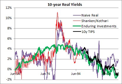
The long-term averages for these four series are as follows:
- Naïve real: 2.34%
- Shanken/Kothari: 3.13%
- Enduring Investments: 2.34%
- 10y TIPS: 1.39%
- Shanken/Kothari thru 2007; 10y TIPS from 2007-present: 2.50%
It isn’t just a coincidence that calculating a long-term average of long-term real interest rates, no matter how you do it, ends up being about 2.3%-2.5%. That is also close to the long-term real growth rate of the economy. Using Commerce Department data, the compounded annual US growth rate from 1954-2021 was 2.95%.
It is generally conceded that the economy’s sustainable growth rate has fallen over the last 50 years, although some people place great stock (no pun intended) on the productivity enhancements which power the fantasies of tech sector investors. I believe that something like 2.25%-2.50% is the long-term growth rate that the US economy can sustain, although global demographic trends may be dampening that further. Which in turn implies that something like 2.00%-2.25% is where long-term real interest rates should be, in equilibrium.[2] Kashkari says “We do know that neutral rates have been falling in advanced economies around the world due to factors outside the influence of monetary policy, such as demographics, technology developments and trade.” Except that we don’t know anything of the sort, since there is a strong argument against each of these totems. Abbreviating, those counterarguments are (a) aging demographics is a supply shock which should decrease output and raise prices with the singular counterargument of Japan also happening to be the country with the lowest growth rate in money in the last three decades; (b) productivity has been improving since the Middle Ages, and there is no evidence that it is improving noticeably faster today – and if it did, that would raise the expected real growth rate and the demand for money; and (c) while trade certainly was a following wind for the last quarter century, every indication is that it is going to be the opposite sign for the next decade. It is time to retire these shibboleths. Real interest rates have been kept artificially too low for far too long, inducing excessive financial leverage. They will eventually return to equilibrium…but it will be a long and painful process.
At the time I wrote the passage above, 10-year TIPS yielded about 0.25%; today they yield 2.125%. It turned out that returning to equilibrium wasn’t at all a long process. But it certainly was painful!
Returning to the original point: just because 10-year rates are now approximately at equilibrium is not at all a prediction that they will remain at equilibrium. Indeed, if I made that prediction I would be making a very similar mistake to the one I criticized above. Mean reversion in rates is not a particularly powerful force, when set against an active central bank and a profligate legislature. But if it matters at all, it is very important to correctly identify the mean to which rates should revert.
And it’s not 2%.
[1] https://www.minneapolisfed.org/article/2022/policy-has-tightened-a-lot-is-it-enough
[2] The reason that real interest rates will be slightly lower than real growth rates is that real interest rates are typically computed using the Consumer Price Index, which is generally slightly higher than the GDP Deflator.
Growth. Does. Not. Cause. Inflation.
I am constantly amazed at certain articles of faith among the economics community. In my line of expertise, one of the most amazing to me is the absolute conviction with which the economics community believes that if the economy grows too fast, inflation will result and if it grows too slowly, disinflation or deflation will result. That this conviction is so strongly held is especially incredible, since there is essentially no evidence for that belief.
Theory says it is so. Growing too fast puts too much pressure on land, labor, and capital, which causes their prices to rise and therefore the price of the output. I mean, obviously.
Except that it doesn’t seem to have ever happened that way, at least for a long, long time.
Heck, let’s just take recent experience. In the last twenty years, we have had two global economic crises. The upheaval in 2008 was the largest since at least the Great Depression. The economic contraction in 2020 made the Global Financial Crisis look like a piker. So obviously, if we look at inflation it must have massively slowed down in those events, right?

Hmmm. Now, I’ve showed the Core CPI price level against GDP. If you squint, you can see a small deceleration in core CPI in 2010: it actually reached only +0.6% y/y at one point. We never even reached deflation, despite the fact that the GFC was triggered by housing and housing is by far the largest component of CPI. I don’t need to say anything about the COVID period because it is so recent. Core inflation vaulted higher, and continued to do so long after economic output had been fully restored to its prior level.
The other wonderful counterexample I like to show is the 1970s.

Notice there are several flat points here, where GDP was steady-to-lower and the price level kept on truckin’ (that’s a 1970s reference, kids). Notice that since I’m using core CPI, you can’t even say ‘well, the OPEC embargo caused energy prices to spike and that also slowed the economy.’ Yes, it did, but shouldn’t that slowing of the economy have taken pressure off of other non-energy prices? Well, it didn’t. Inflation was robust during the 1970s, despite growth that lurched forward and back in fits and starts.
Those are fun, visual aids but sometimes our eyes can deceive us and hide or exaggerate a relationship that is statistically present (or not). So here I did the economist thing and ran scatterplots at different lags. Each of these shows the y/y change in GDP on the x-axis (quarterly observations, since 1960 until 2024), and y/y changes in Core CPI on the y-axis. Chart A shows the y/y changes contemporaneously (1965Q1 vs 1965Q1, e.g.). Chart B lags the inflation one quarter, so we see if this year’s growth affected this year’s inflation but lagged a little bit. Chart C lags the inflation one year, so we see if this year’s growth affects the coming year’s inflation. And Chart D lags the inflation two years, so we see if this past year’s growth affects next year’s inflation.

The correlation coefficients, for your reference: -0.18, -0.13, 0.03, 0.14. That’s thin gruel on which to make a strong argument about growth causing inflation, in my mind.
Now, I’ve run these regressions since 1960 since the core CPI index only goes back to 1957. The same regressions with headline inflation show coefficients of -0.11, -0.05, 0.10, and 0.11. I’m actually surprised they’re not any better, because energy prices should be correlated with growth and flatter the relationship. The OPEC embargo does hurt that relationship, but even if we just run these regressions since 1980 the correlations between growth and headline inflation are just 0.13, 0.19, 0.16, and -0.09.
So where do we get the idea that growth causes inflation?
Well, if I look at GDP growth versus headline inflation, from 1929 until 1960, and I exclude 1946 when industry relaxed from its war footing and war-time price controls were removed, then I can coax a really nice correlation of 0.73.

Indeed, if you look at the correlation between 1929 and 1945, it becomes a whopping 0.88. That’s science, baby – fitting the data to the story! But now I think we get to the heart of the matter because something else momentous happened in 1948 and that was the publication of the first edition of the most-used textbook in history: Paul Samuelson’s Economics. It is no surprise, perhaps, that generations of economists learned this ‘fact’ based on a correlation of 0.88…that has been falling ever since.
Since that time, the correlation between core inflation and growth has been low, and sometimes even negative, over very long periods. If there is any causal relationship, it is completely swamped in exceptions. Decades-long exceptions. It is time to give up this idea. One unfortunate consequence of that is that the way the Federal Reserve operates is as if there is one dial it can turn and that is ‘the dial that increases growth until inflation gets hot, then decreases growth.’ The problem is that isn’t one dial, it’s two. In general, I think the Fed should keep its hands off the growth dial, but if it wanted to meddle on rare occasions it would do so by manipulating medium-term interest rates. To control inflation, it needs to moderate the growth of the money supply. Frankly, in my opinion the FOMC should simply focus on the latter mission and let growth, and markets, take care of themselves. They’re not good at any of these missions anyway.
Trump Tactical Targeted Tariffs: A Reminder of the Impact of Tariffs
Representative Alexandria Ocasio-Cortez, aka AOC, recently railed against the President when he threatened Colombia with tariffs if they should refuse to accept their citizens being deported back to them. In her typical hyperventilated fashion, she implored us to “remember” that “WE pay the tariffs, not Colombia.”
For a change, AOC is not entirely wrong but merely mostly wrong. She seems to remember at least one important thing from Econ 101 and that is that businesses don’t pay anything to anyone, since a business is just a legal structure. Shareholders, other stakeholders, consumers, or suppliers pay and/or receive the cost of goods sold, taxes, wages, and so on. Unfortunately, I don’t think that was her point and she missed the important bit which is that ‘who pays the tariff’ depends almost entirely on the elasticity of demand for the product. Here are two charts. In each case, the tariff shifts the supply curve leftward/upward by the amount of the tariff, the same amount in both pictures. In each picture, the quantity consumed of the good being tariffed goes from c to d and the price goes from a to b as the market moves from one equilibrium to the other.


The first chart shows an inelastic demand curve, which is characterized by the fact that large changes in price do not change the quantity demanded very much. In this case, the main effect is that consumers buy almost as much of the good, but the price moves almost the full amount of the tariff. Consumers end up paying most of the tariff.
The second chart shows an elastic demand curve, in which even small changes in price induce large changes in the quantity demanded. In this case, the main effect is that consumers buy much less of the more-expensive good, and the price goes up only a little so that the seller bears most of the cost of the tariff.
Thus a blanket statement that “we pay the tariffs” is wrong. It is sensitive to the characteristics of the product market. One needs to be very careful about how we define the product market because it matters. I would argue that the elasticity of the demand for coffee is quite low, which is why Starbucks even exists. If the demand for coffee was very elastic, charging $5 a cup for bad coffee would not produce a line around the block at rush hour. But that is not what we are talking about here. The question here is, what is the demand elasticity for Colombian coffee? The answer to that question is very different. Coffee as a way to wake up in the morning has few close substitutes. But Colombian coffee has many, very very very close substitutes. My favorite right now is Ethiopian Yirgacheffe coffee. I also like a good Panama Boquete. Add 20% to the cost of the Boquete, and I think I’ll mostly drink the Yirgacheffe. Add 20% to both of them, and I’ll go to Brazilian Santos, or Colombian, or Kona.
I think the reaction of the Colombian President tells you everything you need to know about what he perceives about the demand for Colombian coffee and therefore the impact a tariff would have on exports of Colombian coffee to the United States. Trump very quickly got what he wanted with his Trump Tactical Targeted Tariffs (TTTT™). So to review: +1 for TTTT, -1 for AOC.
A couple of other points about tariffs and tariff strategy.
First, this episode illustrates a very important distinction to be made between the use of targeted tariffs and the use of blanket tariffs. Blanket tariffs, for example on everything we import from a major trading partner or on every trading partner, definitely increase prices for consumers. How much, and which prices, depends on how easily domestic untariffed supply can substitute for the imported supply. But the answer is certainly that prices go up. But let me point you to two articles I’ve written previously about this:
Tariffs Don’t Hurt Domestic Growth (https://inflationguy.blog/2019/08/28/tariffs-dont-hurt-domestic-growth/), August 28, 2019. This is a really good piece. In summary, tariffs are bad for global growth but they are not the unalloyed negative you learned about in school. How good/bad they are for growth depends on whether you are a net importer or a net exporter, and how large the Ex-Im sector is in your country. Truly free trade works in a non-theoretical world only if “(a) all of the participants are roughly equal in total capability or (b) the dominant participant is willing to concede its dominant position in order to enrich the whole system, rather than using that dominant position to secure its preferred slices for itself.” Really, you should read this.
The Re-Onshoring Trend and the Long-Term Impact on Core Goods (https://inflationguy.blog/2022/02/22/the-re-onshoring-trend-and-the-long-term-impact-on-core-goods/) February 22, 2022. This is not directly about tariffs, but the broad imposition of tariffs (if they happen) should be thought of as reinforcing this prior trend. The prior trend, of re-onshoring production to the US, has been under way for several years – the way that COVID exposed long supply lines certainly helped the trend but the long-term globalization trend was already reversing and in this article I argue that this means core goods inflation going forward is likely to be small positive, rather than persistently in deflation. In the context of the current discussion, President Trump has certainly made re-onshoring of production a major goal of his Administration. So whether it happens because of TTTT, or because of blanket tariffs, or because of tax breaks given for domestic production, the direction of the inflation arrow is clear.
I’m not worried about hyperinflation from tariffs and I think that if you’re the biggest and the strongest economic actor they’re probably more good than bad for domestic economic outcomes.
Reality is more nuanced than we learned in school. Not everything that expands the economy is good, and not everything that is good expands the economy. Not everything that is bad causes inflation to go up, and not everything that causes inflation to go up is bad.
“Why Aren’t Home Prices Falling?”
From time to time, I like to point out errors that we make because we think in nominal space, or because we had 25 years of inflation being so low that we didn’t have to think about it very much. I do think that at some level, we should consider pointing the finger at economics education, which teaches static equilibria until you get into fairly advanced (graduate level) classes – and even then, generally in nominal terms.
There’s a very good videocast that I like to check in with occasionally, by Altos Research, which runs through recent data on home buying trends along with useful commentary. It tends to be more thoughtful and to not fall victim to the wild swings of emotion that seem to affect a lot of housing market observers. I think it’s important for me to say that I like this channel, since I’m about to criticize an episode they recently put out.
It was called ‘Why Aren’t Home Prices Falling?’ and you can find the quick 15-minute video here: https://www.youtube.com/watch?v=J-0bkqeFZEE. You can get a good feel for the videocast, and the useful analysis they bring, from this episode.
But the question ‘why aren’t home prices falling?’ is an odd one. Median CPI is still running at 4.2% y/y. Sticky CPI is +4.1%. Apartment rents are +5.0% and never declined y/y, even when there was a rent moratorium. Asset prices in general are quite a bit higher over the last few years also, so whether you’re looking at homes from the standpoint of an investment or a consumption item, it’s hard to see why one would naturally default to ‘home prices should be falling.’
The thought process is that ‘home prices went up so much, no one can afford them! Therefore, prices should fall.’ This thought process does not originate with Altos; they are just trying to answer the question being asked. In my view, though, they aren’t answering the right question. Really, when you think about it, the whole framing of the question evokes Yogi Berra saying that ‘no one goes to that club any more because it’s too crowded.’ Home prices going up a lot is a pretty serious piece of evidence that supply and demand has previously cleared at a price that (it is assumed) is too high for people to afford. That should sound odd.
The thought process goes further by noting that the volume of transactions has really declined markedly over the last couple of years, thanks to high interest rates keeping supply off the market as homeowners with current low interest rates locked in recognize that buying a new home would involve an effective refinancing to more expensive money. But if that restriction in supply is the main reason that home prices didn’t decline, then why have home prices in Australia and the UK also generally been rising, except for a dip around the same time that we had a dip in the US? Australian mortgages are normally floating-rate, and in the UK a 5-year fixed rate is the standard. But the low y/y change in Australia (according to the Dallas Fed’s index of Australian home prices – don’t ask me why they track Australian home prices) in 2023 was -4.3% (now +7.7%), the low in the UK was -2.5% (now +2.2%), and the low in the US was -3.4% (now +2.9%, using Existing Home Sales Median y/y). All of those markets saw very large rises, small and brief declines, and are now rising again.
These are very different property markets, very different mortgage markets, very different governments, taxation regimes, populations, and yet they have strikingly similar patterns of home price changes in a market that classically is all about ‘location, location, location.’ This should lead the thoughtful analyst to think that there’s something else going on.
The something else – not to beat a dead horse again – is the change in the quantity of money, which has followed a very similar pattern in every major economy in the years after 2019. And this is where conventional Economics education falls short. Here is a chart of the y/y changes in US M2, alongside the y/y change in Existing Home Median sales prices.

Not all of the price changes you are seeing in homes is a ‘real’ price change. Much of what you are seeing is a change not in the value of a home, but in the value of the currency unit relative to durable physical assets. But in Econ 101, they’d tell you that you should look at changes in supply and demand, and that will predict changes in the price and quantity at which the market clears. In that narrow frame, you might look at the large increase in home prices and attribute it to changes in demand due to declining interest rates, although you’d be confused when the massive increase in interest rates caused only a modest and temporary drop in nominal home prices. (In late 2022, the Case-Shiller futures for end-of-2023 were pricing in a 19% decline in nominal prices with inflation at a positive 3-5% per year, implying an unprecedented collapse in real prices).[1]
Obviously, that frame doesn’t make sense when the underlying price level is rapidly changing, and the underlying quantity of money is rapidly changing. This is often more obvious when we make it extreme. Suppose the money supply went up 400%, and prices quintupled as well, and interest rates went to 100%. Would you expect home prices to decline in nominal terms? That would be absurd – the price level going up by a factor of 5 means that the value of the measuring stick is what is changing. And remember, it is entirely consistent to have the volume of transactions decline sharply while the nominal price increases. Homebuilders care about the volume of transactions; homebuyers care about the price. You may be absolutely bearish on homebuilders, while still expecting home prices to increase, especially if the price level is increasing.
That’s exactly what we have been experiencing. And, with the money supply growing again and median prices still rising at 4% per year, it does not seem to me that there is any natural reason to expect home prices to decline. So the short answer to the question ‘Why Aren’t Home Prices Falling?’ is ‘There’s no reason they should.’
[1] Markets are where risk clears, not where investors ‘expect’ prices to be, and there were wonderful gains to be made even well into 2023 by helping the nervous real estate longs clear their risk. https://inflationguy.blog/2023/08/29/home-price-futures-curve-still-looks-weird/
AI: Even a Big Deal is Smaller Than You Think
So, we are back to the argument about whether we have reached a new era of permanently higher growth and earnings, and because of productivity also a permanent state of steady disinflationary pressures.
Live long enough, and you’ll see this argument come around a couple of times. In the late 60s with the “Nifty Fifty” stocks, in the 1990s with the Internet, and now with AI. As a first pass, it’s worth noting as an equity investor that the first two of those eras were followed by long periods of flat to negative real returns in equities. But my purpose here is simply to revisit the important fact that productivity is always improving, so something which improves productivity is normal and not exciting. The question which arises periodically when we see some really golly-gee-whiz innovation is whether that innovation can meaningfully accelerate the rate of productivity growth over time.
Total real growth over time is simply the growth in the labor force, plus the growth in output per hour (productivity). Assuming that the labor force grows at roughly the same rate as the overall population,[1] real GDP per capita should grow at roughly the rate of productivity. The chart below extends a chart which first appeared in an article by Brad Cornell and Rob Arnott in 2008 (“The ‘Basic Speed Law’ for Capital Markets Returns“), updated to the end of 2023Q3. Note that real earnings and real GDP grow at almost the same rate over time – the log regression slope is 2.09% for real per capita GDP and 2.17% for real earnings.

(By the way, although it isn’t part of my discussion here note that the middle line, real stock prices, isn’t parallel. It was, back when this chart first appeared in 2008; the fact that it isn’t any more is obviously attributable to increases in valuation multiples over a long period of time. Discuss.)
A permanent (or at least long-lived) increase in the long-run rate of productivity growth, then, would be massively important. It would mean that GDP per capita – standard of living, in other words – would rise at a permanently faster pace. This is the crux of the question, as I said above and as NY Fed President John Williams said in an interview with Axios a few days ago (ht Alex Manzara):
“One way to think of it is AI is – and this is my own, but based on what I heard from others – is AI is just that new thing that’s going to get us that 1% to 1.5% productivity growth that we’ve been getting for decades or even a century.
“It’s the thing that gets us that, just like computers did or other changes in technology and how we produce things in the economy. So it’s just the thing that gets us that 1% to 1.5% productivity growth.
“The other view, which I think has some support, is AI is more of a general purpose technology. …So there is a possibility that we could get a decade or more faster productivity growth if this really is its general purpose and revolution. You can’t exclude that.”
What Williams said, about AI being a “general purpose technology” that spurs faster productivity growth for a decade or more, is something that we honestly have a pretty good history of. The explosion of the internet into general use in the late 1990s triggered an equity market bubble that eventually popped. Greenspan mused, in late 1996, that it’s hard to tell when stock prices reflect “irrational exuberance” and in February 1997 he said “history counsels caution” because “…regrettably, history is strewn with visions of such ‘new eras’ that in the end have proven to be a mirage.”
Was it a mirage? There is no question, a quarter-century later, that the internet has completely changed almost everything about the way that we live and work. If there was ever a ‘general purpose’ technology that led to a sustained long-term increase in productivity, the Internet is it.
My next chart only goes back to 1979. It shows US Nonfarm Business Productivity, calculated quarterly by the BLS as part of the GDP report. Obviously, the quarterly numbers are incredibly volatile – so much so, in fact, that I’ve truncated a large portion of the tails. It’s devilishly hard to measure productivity. More on that in a moment. The red line is the 20-quarter (5-year) moving average. The average over the whole period is…surprise!…1.92%, very close to the average increase in real earnings and real GDP per capita. As I said before, that’s what we expected to find.

But there is certainly a bulge in the chart. Noticeably, it doesn’t happen until long after the internet hype had crested, but it is definitely there. The average on this chart from 1979-1998 is 1.78%, and the average since 2005 is 1.59%. But the average from 1999-2005 inclusive is a whopping 3.11%. An acceleration of productivity growth of 1.4% or so, for 7 years, means that our standard of living moved permanently higher by about 10% during that period, over and above what it would have done anyway.
That’s meaningful. I would also argue that it’s probably the upper limit of what we should expect from the AI revolution. Starting in few years, if this is a “general purpose technology” advancement, we could conceivably see growth accelerate by 1.5% per year for some part of a decade. Let’s all hope that happens, because that 10% total growth is the real growth – it is extra growth without any extra inflation. A free lunch, as it were. I say that’s probably the rough upper limit because I can’t imagine how the AI revolution could possibly be more impactful than the internet revolution was, or any of the other major technology revolutions we have seen over the past century.
That’s the good news. If this is real, it would be a wonderful thing and there’s some historical evidence that when the market gets excited like this, it might not be entirely a mirage. Now the bad news. If this is an internet-style leap forward, the aggregate incremental increase in real earnings we should expect compared with the normal trend is…10%. Not a doubling, or tripling, but 10%. Naturally, those gains will accrue to a smaller subset of companies at first, but the other lesson of the internet boom is that those gains eventually percolate around because that’s the whole point of a “general purpose technology.”
Have we gotten our 10% yet? Seems like maybe we have.
[1] This assumption is clearly false, but it’s false in transparent ways. Right now, the population is growing faster than the labor force due to immigration. As Baby Boomers retire, the labor force will grow more slowly than the population. Etc. The assumption here is not meant to be uniformly and universally true, but approximately true on average so as to make the general point which follows. To the extent that this assumption is transparently incorrect, we know how to adjust the general point which follows, for the specific conditions.
Enough with Interest Rates Already
One of the things which alternately frustrates me and fascinates me is the mythology surrounding the idea that the central bank can address inflation by manipulating the price of money, even if it ignores the quantity of money.
I say “mythology” because there is virtually no empirical support for this notion, and the theoretical support for it depends on a model of flows in the economy that seem contrary to how the economy actually works. The idea, coarsely, is that by making money more dear the central bank will make it harder for businesses to borrow and invest, and for consumers to borrow and spend; therefore growth will slow. This seems to be a reasonable description of how the world works. But this then gets tied into inflation by appealing to the idea that lower aggregate demand should lower price pressures, leading to lower inflation. The models are very clear on this point: lower growth causes less inflation and more growth causes more inflation. The fact that this doesn’t appear to be the case in practice seems not to have lessened the fervor of policymakers for this framework. This is the frustrating part – especially since there is a viable alternative framework which seems to actually describe how the world works in practice, and that is monetarism.
The fascinating part are the incredibly short memories that policymakers enjoy when it comes to pursuing new policy using their preferred framework. Here’s the simplest of examples: from December 2008 until December 2019, the Fed Funds target rate spent 65% of the time pinned at 0.25%. The average Fed funds rate over that period was 0.69%. During that period, core inflation ranged from a low of 0.6% in 2010 to a high of 2.4%, hitting either 2.3% or 2.4% in 2012, 2016, 2017, 2018, and 2019. That 0.6% was an aberration – fully 86% of the time over that 11 years, core inflation was between 1.5% and 2.4%. Ergo, it seems reasonable to point out that ultra–low interest rates did not seem to cause higher inflation. If that is our most-recent experience, then why would the Fed now be aggressively pursuing a theory that depends on the idea that high interest rates will cause lower inflation? The most-recent evidence we have is that interest rates do not seem to affect inflation.
This isn’t just a recent phenomenon. But the nice thing about the post-GFC period is that for a good part of it, the Fed was ignoring bank reserves and the money supply and effecting policy entirely through interest rates (well, occasionally squirting some QE around, but if anything that should have increased inflation – it certainly didn’t dampen the effect of low interest rates). This became explicit in 2014 when Joseph Gagnon and Brian Sack, shortly after leaving the Fed themselves, published “Monetary Policy with Abundant Liquidity: A New Operating Framework for the Federal Reserve.” In this piece, they argued that the Fed should ignore the quantity of reserves in the system, and simply change interest rates that it pays on reserves generated by its open market operations. The fundamental idea is that interest rates matter, and money does not, and the Fed dutifully has followed that framework ever since. As I just noted, though, the results of that experiment would seem to indicate that low interest rates, anyway, don’t seem to have the effect that would be predicted (and which effect is necessary if the policy is to be meaningful).
And really, this shouldn’t be a surprise because for the prior three decades, the level of the real policy rate (adjusting the nominal rate here by core CPI, not headline) has been completely unrelated to the subsequent change in core inflation.

So, to sum up: for at least 40 years, the level of real policy rates has had no discernable effect on changes in the level of inflation. And yet, current central bank dogma is that rates are the only thing that matters.
I stopped the chart in 2014 because that’s when the Gagnon/Sack experiment began, but it doesn’t really change anything to extend it to the current day. Actually, all you get is a massive acceleration and deceleration in core inflation that all happened before any interest rate changes affected growth (seeing as how we have not yet had a recession). So it’s a result-within-a-result, in fact.
Any observation about how the Fed manages the price of money rather than its quantity would not be complete without pointing out that the St. Louis Federal Reserve’s economist emeritus Daniel L Thorton, one of the last known monetarists at the Fed until his retirement, wrote a paper in 2012 entitled “Monetary Policy: Why Money Matters and Interest Rates Don’t” [emphasis in the original title]. In this well-argued, landmark, iconic, and totally ignored paper Dr. Thornton argued that the central bank should focus almost entirely on the quantity of money, and not its price. Naturally, this is concordant with my own view, plus more than a century of evidence around the world that the price level is closely tied to the quantity of money.
To be fair, the connection of changes in M2 to changes in the price level has also been weak since the mid-1990s, for reasons I’ve discussed at length elsewhere. But at least money has a history of being related to inflation, whereas interest rates do not (except as a result of inflation, rather than as a cause of them); moreover, we can rehabilitate money by separately modeling money velocity.
There does not appear to be any way to rehabilitate interest rate policy as a tool for addressing inflation. It hasn’t worked, it isn’t working, and it won’t work.
The Phillips Curve is Still Working Just Fine
About five and a half years ago, I wrote a blog article entitled “The Phillips Curve is Working Just Fine, Thanks”, in response to the exhaustively-repeated nonsense that the ‘Phillips Curve is Broken.’ This nonsense never really goes away, but last week Fed Governor Waller delivered a speech on “The Unstable Phillips Curve,” derived from the same nonsense, and I felt duty-bound to resurrect my prior article and update it. The Phillips Curve has not been unstable at all, over the last quarter century at least. Here is my original article, linked here:

I must say that it is discouraging how often I have to write about the Phillips Curve.
The Phillips Curve is a very simple idea and a very powerful model. It simply says that when labor is in short supply, its price goes up. In other words: labor, like everything else, is traded in the context of supply and demand, and the price is sensitive to the balance of supply and demand.
Somewhere along the line, people decided that what Phillips really meant was that low unemployment caused consumer price inflation. It turns out that doesn’t really work (see chart, source BLS, showing unemployment versus CPI since 1997).

Accordingly, since the Phillips Curve is “broken,” lots of work has been done to resurrect it by “augmenting” it with expectations. This also does not work, although if you add enough variables to any model you will eventually get a decent fit.
And so here we are, with Federal Reserve officials and blue-chip economists alike bemoaning that the Fed has “only one model, and it’s broken,” when it never really worked in the first place. (Incidentally, the monetary model that relates money and velocity (via interest rates) to the price level works quite well, but apparently they haven’t gotten around to rediscovering monetarism at the Fed).
But the problem is not in our stars, but in ourselves. There is nothing wrong with the Phillips Curve. The title of William Phillips’ original paper is “The Relation between Unemployment and the Rate of Change of Money Wage Rates in the United Kingdom, 1861-1957.” Note that there is nothing in that title about consumer inflation! Here is the actual Phillips Curve in the US over the last 20 years, relating the Unemployment Rate to wages 9 months later.

The trendline here is a simple power function and actually resembles the shape of Phillips’ original curve. The R-squared of 0.91, I think, sufficiently rehabilitates Phillips. Don’t you?
I haven’t done anything tricky here. The Atlanta Fed Wage Growth Tracker is a relevant measure of wages which tracks the change in the wages of continuously-employed persons, and so avoids composition effects such as the fact that when unemployment drops, lower-quality workers (who earn lower wages) are the last to be hired. The 9-month lag is a reasonable response time for employers to respond to labor conditions when they are changing rapidly such as in 2009…but even with no lag, the R-squared is still 0.73 or so, despite the rapid changes in the Unemployment Rate in 2008-09.
So let Phillips rest in peace with his considerable contribution in place. Blame the lack of inflation on someone else.
Before I add to my rant, let me update the chart above with data since then, including the pandemic. The green dots in the chart below correspond to the dots in the chart above; the blue dots are for the period since then.

Amazingly, even during the pandemic and post-pandemic period, the Phillips Curve did a pretty decent job of describing the basic shape of this relationship. The dots overall are a bit higher; that’s attributable I think to the fact that inflation itself is higher and I’ve done this chart in nominal terms. There is some money illusion operating (or else the latest dots would be a lot higher), but it’s still a pretty nice fit, considering. I’ve preserved the prior regression line, but it doesn’t really shift very much.
In fact, the deviation prior to the pandemic – the little knot of blue dots to the left – are somewhat more surprising in a way, given the much lower economic volatility that there was when those points were laid down. But in any event, though, there is nothing obviously wrong with the Phillips Curve.
Now, it is true that the Unemployment Rate and the rate of consumer inflation have not been particularly well-behaved. But that isn’t a new phenomenon; that particular inconvenience has been that way for decades. The reason is pretty straightforward, and only confusing if you spent too much time getting a PhD and getting taught dumb things: the connection between wages and prices is not 1:1. It’s not constant. And there’s no particular reason that it should be, because labor is just one input into production costs, and the cost of production just affects the supply side of the supply/demand interplay which determines price. The really weird thing is that anyone ever thought that prices would be set by taking the current wage cost and adding a simple and stable markup.
A wage is just the price of labor, which is set in the market for labor, which involves the demand for labor and the supply of labor. The supply of labor changes very slowly. The demand for labor moves with the economic cycle. When the economic cycle is ebbing, the demand for labor falls – and that causes the quantity of labor demanded to decline (the unemployment rate goes up) as it also causes the price of labor to fall. That’s what happens when a demand curve shifts leftward on a mostly-static supply curve: Q down, P down. When the economic cycle is flowing, the demand for labor rises, which causes the quantity of labor demanded to increase (the unemployment rate declines) and the price of labor to rise. It isn’t that hard. In fact, you learn that in pretty much the first semester of economics.
It’s those later semesters that screw up economists, encouraging them to design complicated models that are very pretty but don’t necessarily relate to real-world dynamics. We should not be at all surprised when those models don’t work in the real world.
But don’t blame Phillips.
The Powell of Positive Thinking
Yes: Federal Reserve Chairman Powell was very hawkish at his Congressional testimony on Tuesday and Wednesday. He clearly signaled (again) that once Fed overnight policy rates reach a peak, they would not be declining for a while. He additionally signaled that the peak probably will be higher than previously signaled (I’ve been saying and thinking 5% for a while, but it’s going to be higher), and even signaled the increasing likelihood of a return to 50bp hikes after the recent deceleration to 25bps.
This latter point, in my view, is the least likely since all of the reasons for the step down to 25bps remain valid: whether the peak is 5% or 6%, it is relatively nearby and the confidence that we should have that rates have not risen enough should therefore be decreasing rapidly. Moreover, since monetary policy works with a lag and there has been very little lag since the aggressive tightening campaign began, it would be reasonable to slow down or stop to assess the effect that prior hikes have had.
But here is the bigger point, and one that Powell did not broach. There is really not much evidence at all that the Fed’s hikes to date have affected inflation. It is completely an article of faith that they surely will, but this is not the same as saying that they have. Consider for a moment: in what way could we plausibly argue that rate hikes so far have been responsible for the decline in inflation? The decline in inflation has been entirely from the goods sector, and a good portion of that has been from used cars returning to a normal level (meaning, in line with the growth in money) after having overshot. How exactly has monetary policy driven down the prices of goods?
This is not to say that higher interest rates have not affected economic activity, and this (to me) is the real surprise: given the amount of leverage extant in the corporate world, it amazes me that we haven’t seen a more-serious retrenchment. Some of this is pent-up demand that still needs to be satisfied, for example in housing where significant rate hikes would normally dampen housing demand substantially and seems to have. However, there is a severe shortage of housing in the country and so construction continues (and home prices, while they have fallen slightly, show no signs of the collapse that so many have forecast). Higher rates are also rippling through the commercial MBS market, as many commercial landlords have inexplicably financed their projects with floating rate debt and where the cost of leverage can make or break the project.
Higher interest rates, on the other hand, tend to support residential rents, at least until unemployment eventually rises appreciably. I think perhaps that not many economists are landlords, but higher costs tend to not result in a desire to charge lower rents. On the commercial side, leases are for longer and turnover is more costly, but the average residential landlord these days is not facing a shortage of demand.
So where have rate hikes caused inflation to decline? Judging from the fact that Median CPI just set a new high, I think the answer is pretty plain: they haven’t. And yet, the Fed believes that if they keep hiking, inflation will fall into place. Where else can we more plainly see at work the maxim that “if a piece doesn’t fit, you’re not using a big enough hammer?” Or maybe, this is just a reflection of the notion that if you want something bad enough, the wanting itself will cause the thing to happen. [N.B. this is really more in line with the prescription from Napoleon Hill’s classic book “Think and Grow Rich”, but the title of Peale’s equally-classic “The Power of Positive Thinking” suggested a catchier title for this article. Consider it poetic license.]
Moreover, what we have seen is that higher interest rates have had the predicted effect on money velocity. Although I have elsewhere noted that part of the rebound in money velocity so far is due to the ‘spring force’ effect, there is substantial evidence that one of the main drivers of money velocity is the interest rate earned on non-cash balances. Enough so, in fact, that I wrote about the connection in June 2022 in a piece entitled “The Coming Rise in Money Velocity,” before the recent surge in velocity began. [I’d also call your attention to a recently-published article by Samuel Reynard of the Swiss National Bank, “Central bank balance sheet, money, and inflation,” where he incorporates money velocity into his adjusted money supply growth figure. Reynard is one of the last monetarists extant in central banking circles.]
Now, nothing that I have just written is going to deter Powell & Co from continuing to hike rates until demand is finally crushed and, according to their faith but in the absence of evidence to date, inflation will decelerate back to where they want it. But with long-term inflation breakevens priced at levels mirroring that faith, it is worth questioning whether there is some value in being apostate.