Archive
A New Era of Positive Stock/Bond Correlations and What That Means
I read recently – I can’t find where – that stock/bond correlations in the US are the highest (most positive) they have been in decades. This of course is bad news for investors who commonly allocate to both stocks and bonds with the expectation that adding bonds will reduce the risk of a portfolio not only because they have a lower natural volatility than do stocks but also because the expectation of negative correlations between them have the effect of lowering the volatility of the portfolio further (since the variance of a 2-asset portfolio is equal to the weighted sum of the variances plus 2 times the product of the weights and the covariance between the two assets. So, when two assets are negatively correlated, total portfolio variance is lower than the sum of the weighted variances of the assets; when they are positively correlated, total portfolio variance is higher than the sum). That’s sort of Portfolio Management 101, but since most of my readers are not professional portfolio managers: think of one person pushing another person on a swing. If they’re pushing in rhythm with the swing (positive covariance), then the person on the swing goes higher and higher. But if they’re pushing in the opposite rhythm (negative covariance), then the swing goes up less and less and Dad is telling the kid it’s time to go home.
So, this matters a lot for portfolio construction and optimization, of course.
By the way, it isn’t like this just started happening. I’ve been warning about this (and showing the chart I am about to show) since at least 2019. In 2022 I even had a nice table to go with the chart (see this year-end piece, and scroll to the “Other Things” part at the end https://inflationguy.blog/2022/12/22/2022-year-end-thoughts-about-2023/ ). But let’s update it.

This heavy line in this chart shows the rolling 3-year correlation of monthly returns of stocks and bonds, going back to 1948 (I sourced equity returns from Ken French’s site based on CRSP data; bond returns I estimated based on Shiller’s lengthy series). You will notice that stock/bond correlations are not guaranteed to be negative – in fact, for the 35 years or so prior to 1998, correlations were positive. The shaded area illustrates the salient point, and that is that correlations tend to flip when inflation gets sustainably over about 2.5% (the shading is positive when 3-year compounded inflation is above 2.5%, and negative when it is below). That’s not coincidence. The simple way to explain it is that stocks and bonds react very similarly to the inflation factor and very differently to the growth factor. That is to say, when there’s news about good economic growth, then stocks tend to rise and bonds tend to sell off (yields rise because real yields rise). But when there is bad news about inflation, then stocks tend to fall and bonds also tend to fall (yields rise because inflation expectations rise). So, in periods where inflation is low and stable, the growth factor dominates and stocks and bonds move in different directions; in periods where asset markets perceive inflation risk, stocks and bonds tend to move together more often.
By the way, this shifting of correlations isn’t only true with stocks and bonds. The entire correlation matrix between many asset classes experiences a shift when the inflation-state changes. But since portfolios tend to be most heavily weighted in stocks and bonds, and because the math gets quite a bit uglier when we add more assets, we tend to focus this sort of discussion on stocks and bonds.
Again, the point of this is that portfolio optimization routines – which tend to be built on covariance matrices built from some recent window of historical data – will tend to completely miss this shift unless portfolio managers intervene, and portfolio managers are loathe to mess with the models.
How much does it matter?
Let me introduce another concept. A ‘risk parity’ portfolio is one in which the assets are weighted in such a way that they each contribute the same amount to the overall variance of the portfolio. So, since bonds are lots less volatile than stocks in general, a risk-parity allocation means that you’ll tend to hold a lot more weight in bonds.[1] Suppose stocks have over time a 15% standard deviation and bonds have a 7.5% standard deviation (which isn’t that far off, actually). Then the weight in stocks, ignoring the stock/bond covariance for now, is 7.5% / (15%+7.5%) = 33.33%; the weight in bonds is 15%/(15%+7.5%) = 66.67%. The 2/3 of your portfolio that is in bonds will contribute 66.67% x 7.5% = 5% to your portfolio risk, and the 1/3 that is in stocks will contribute 33.33% x 15% = 5% to your portfolio risk. That’s the ‘parity’ in risk parity.
Now, true risk parity is done with variances, not standard deviations, and also takes into account the correlation between the assets – and here’s where it gets interesting. If I assume stocks and bonds have a correlation of -0.3, then my weight in stocks is more like 26% and my weight in bonds 74%. But, if the stock/bond correlation is +0.3, the weight of stocks drops to 10.5% and bonds go to 89.5%. So that correlation shift should cause you to cut your holdings of stocks by 60%, from 26% of your portfolio to 10.5% of your portfolio!
[“Heck,” you say. “I gotta hold more stocks than that! I can handle the risk!” That’s fine. The risk parity proposition is merely that you get better returns per unit of risk if you equate the marginal contribution of risk. With stocks, since 1948 you’ve earned 11.74% annualized through the end of April (relax, we are ending this accounting in the middle of a bubble so of course it looks stupid), on annual risk of 14.85%. So every 1% of risk got you 0.79% return. On the other hand, the naïve risk parity got you 7.47% return on 7.15% risk, so you got 1.04% return per unit of risk. And that’s where the risk parity firms will lever up that portfolio so you get similar to equity risk or at least 60/40 risk.]
Again, my point though is not to argue for risk parity. My point is that shifting the correlation between stocks and bonds given even basic approaches to portfolio construction implies a significant reduction in equity risk is in order in an inflationary environment – and that doesn’t even consider the fact that inflation tends to lower market-clearing equity multiples so that prospective equity returns are lower in that kind of environment. So if the new higher-inflation era (and it appears ever more difficult to refute the notion that we are in one) means that investors either need to accept higher levels of portfolio risk or to shed equity risk…where is the stock market selloff?
Your guess is as good as mine. Either (a) investors still don’t believe that inflation is going to be persistent (although the flip in correlations suggests they do), or (b) investors are willing at least for now to hold more portfolio risk in order to harvest the fruits of the AI valuation explosion, or (c) portfolio managers are loathe to cut equity exposures because they don’t want to lose performance to their peers (since actual customers tend to look at returns, not risk-adjusted returns!). I think the answer is some combination of (b) and (c). But both of those reasons are ephemeral, and depend on continued momentum. Given the valuation levels in the equity market, a prudent manager will be at least trimming risks opportunistically these days.
[1] Since over time, stocks have better returns than bonds, people tend to hold more stocks than bonds and firms who deploy risk-parity portfolios typically employ leverage so that they aren’t sacrificing stock allocations so much as adding levered bonds. Anyway, a mean-variance optimization done correctly makes more sense than risk parity, but I’m just using risk parity as a way to illustrate the size of the effect a correlation shift can have on a portfolio.
Modeling Shortfall Risk versus Inflation – What a Good Hedge Looks Like
When people ask me about hedging inflation, they aren’t always asking what they think they’re asking. There are two approaches to addressing inflation in your portfolio so that the portfolio grows in real terms. One of the approaches is to try to simply outrun inflation: “If inflation averages 3%, and I have an investment that averages 5%, I’ve succeeded.” This mode of thinking derives, I think, from the fact that all of our education has been in nominal space and in most financial modeling problems inflation is just assumed rather than modeled as a random variable. It turns out to be a lot harder than it sounds to find an asset class or collection of asset classes that dependably beat inflation over moderate (10+ year) periods, because there is significant (inverse) correlation between inflation and the performance of many asset classes. Most obvious here are stocks and bonds, so if you build a 60-40 portfolio that “should” return 5% over the long term and figure that will beat inflation, you’ll be right…as long as inflation stays low. If inflation goes up, you won’t only lose purchasing power but you’ll lose actual nominal value, since equities and bonds both tend to decline when inflation goes up. Let’s put that aside for a second but I will come back to it.
The other approach to addressing inflation is to try to hedge inflation: exceed inflation by a little bit, but all the time, so that your returns go up when inflation goes up and your returns go down when inflation goes down, but you always are experiencing some positive real return.
The difference between the first approach and the second approach can be summarized by thinking about shortfall risk. As an investor, you care about the upside (in real terms) but most of us are risk-averse meaning that we care more about the downside. Ask most people whether they’d risk a 25% loss in their portfolio purchasing power to have a similar risk of gaining 25%, and they will experience a strong preference to avoid that coin flip. Risk aversion isn’t linear, so investors treat small gains and losses differently from large gains and losses, and of course it matters whether you’re barely covering your goals or easily exceeding them so that you’re ‘playing with house money.’ Many things, in other words, affect risk preferences. But the bottom line is that if you are trying to ‘hedge’ inflation, you care about your shortfall risk over some horizon. What is the probability that you underperform inflation – that is, lose value in real terms – by some given amount between now and a stated horizon?
Now we are going to get a little mathy, but for those who aren’t so mathy I will try to explain in English as well.
If you want to evaluate the probability of asset B underperforming asset A by some given amount over some period, of course you need an estimate of the expected returns of A and B, or how they’re expected to drift relative to one another. That determines your jumping off point. Let’s suppose that A and B have the same expected return. The next thing that determines the frequency and severity of a shortfall of B versus A is the volatility of the spread between them, which is driven by (a) how correlated A and B are, and (b) how volatile each of them is. If they are highly correlated but B is far more volatile than A, you can have a large shortfall if B just has a bad day. If they aren’t very correlated, then when B happens to zig lower as A zags higher, you’ll get a shortfall even if they have similar volatilities. Essentially, we are valuing a spread or Margrabe option and like any option, we need a volatility parameter. In this case, it’s the volatility of the spread we care about, so we can evaluate “what’s the likelihood that the B-A spread is negative.”
If “SA” is the value of an inflation index (or an indexed token like USDi), and “SB” is the value of the hedging asset, then if distributions of A and B are approximately normal,[1] the option value is
C = SA N(d1) – SB N(d2), where

and

and, crucially, is the volatility of the ratio of A to B, which is a formula that will be familiar to travelers in traditional finance and depends on the individual asset volatilities and the correlation () between them:

For this ‘shortfall’ option to be as small as possible, assets A and B should have small volatilities () and a high correlation () between them.
In plain English terms: imagine two drunk guys walking down the boardwalk. What determines how far away they are from each other at any given time? Assuming no drift, it will depend on how much they’re weaving (volatility) and how much they’re weaving in the same pattern (correlation). If they’re holding hands (imposing high correlation), they’ll never get too far away from each other. And if neither one is very drunk (low volatility) they also won’t stray very far from each other. On the other hand, if both are wildly drunk and they don’t know each other, the spread between them will be wildly variable.
We aren’t trying to evaluate the spread between drunks, though. Let’s take this thought process and apply it to the inflation-hedging problem with an example. Suppose you are considering which of two assets is a better ‘hedge’ for inflation: the “INFL” ETF, or a hypothetical fund – let’s call it “HYPO.” Here is relevant data for these two assets, and for CPI. These are 3-year returns, volatilities, and month/month correlations, ending November 2025, for CPI and INFL (return, vol, and correlation for HYPO are invented):

Using this data, we can see that the spread volatility (the result of the last formula listed above) for INFL versus CPI is 15.2%, while the spread volatility for HYPO vs CPI is 1.6%. The Hypo Fund is the drunk holding hands with the other drunk, with neither of them that drunk; but INFL is really smashed (14.9% vol) and tending to zig when the CPI drunk zags (negative correlation).
Let’s extend this out one year, assume that INFL, HYPO, and CPI all have the same expected returns, volatilities, and correlations. Practical question: What is the probability that your investment in INFL or HYPO underperforms inflation?
For INFL: based on prior returns, it is expected to outperform CPI by 8.99% (11.97% – 2.98%). With a spread volatility of 15.2%, underperforming inflation (a spread of 0% or less) would mean an outcome that is 0.59 standard deviations below the mean. The probability of a draw from a normal distribution being 0.59 standard deviations below the mean is about 27.8%, which means that if you hedge your inflation exposure with INFL, you’ll underperform inflation about two years in every seven. Your chances of underperforming inflation by 10% or more in a given year is about 11%.
For HYPO: based on prior returns, it is expected to outperform CPI by 3.02% (6.00% – 2.98%). With a spread volatility of 1.6%, underperforming inflation (a spread of 0% or less) would mean an outcome that is 1.89 standard deviations below the mean. The probability of a draw from a normal distribution being 1.89 standard deviations below the mean is about 2.9%, which means that if you hedge your inflation exposure with HYPO, you’ll underperform inflation for a full year about once every 34 years. Your chances of underperforming inflation by 10%…even by 5% for that matter…is essentially zero.
Put a star by this paragraph: the assumptions here are key and I am making no claims about either of these strategies having those same characteristics going forward. This is only to illustrate the point that if you want an inflation hedge, meaning that you want to minimize shortfall risk, then it is very important to look at the volatility and correlation to CPI of your intended hedge. Having a better return is important, but less important than you think it is: at a 5-year horizon, the INFL ETF would be expected to outperform inflation (if we think 12% and 3% are decent long-term projections too) by about 60% compounded, but the spread standard deviation is now 15.2% times the square root of 5 years, so you’re only about 1.76 standard deviations above zero and thus you still have a 4% chance of underperforming inflation at the 5-year horizon! On the other hand, your chance of outperforming inflation by a huge amount, if you use the Hypo Fund, is also very small while that possibility exists if you use INFL. That’s what a hedge does: you give up the possibility of big outperformance to ‘buy back’ the chance of underperformance. If you are risk averse, that is a good trade because you’re giving up the less-salient part of your gains (big outperformance) to protect against the more-salient part (big underperformance).
So getting back to answering the question that we started with: what does a good inflation hedge look like?
- It has highly positive correlation to inflation at whatever horizon you’re focused on
- It has low volatility
- It outperforms, or at least doesn’t underperform, inflation over time
To this, I’ll add a fourth characteristic. It’s almost humorous, because hedges that fit those three characteristics are themselves quite rare. But the fourth one I would add is that it has convexity to higher inflation; that is, it does better at an increasing rate, the higher inflation gets. An inflation option, in other words.
Most of us should be happy with three! But at least now you’ll know how to evaluate whether you’re really getting a hedge, or something that will hopefully perform so well that you won’t care that it isn’t a hedge.
[1] I also conveniently wave away some complexities like the relative growth rates and the time value of money to make the math clearer with respect to volatility and correlation, which is my point here.
The Fault, Dear Brutus, is in R*
I want to say something briefly about the “neutral rate of interest,” which has recently become grist for financial television because of new Trump-appointed Fed Governor Stephen Miran’s speech a couple of days ago in which he opined that the neutral rate of interest is much lower than the Fed believes it is, and that therefore the Fed funds target should be more like 2%-2.25% right now instead of 4.25%.
Cue the usual media clowns screaming that this is evidence of how Trump appointees do not properly respect the academic work of their presumed betters.
If that was all this is, then I would wholeheartedly support Miran’s suggestion. Most of the academic work in monetary finance is just plain wrong, or worse it’s the wrong answer to the wrong question being asked. And that’s what we have here. Anyone who thinks that Miran is an economic-denialist should read the speech. It is mostly a well-reasoned argument about all the reasons that the neutral rate may be lower now than it has been in the past. And I applaud him when he comments “I don’t want to imply more precision than I think it possible in economics.” Indeed, if we were to be honest about the degree of precision with which we measure the economy in real time and the precision of the models (even assuming they’re parameterized properly, which is questionable), the Fed would almost never be able to decisively reject the null hypothesis that nothing important has changed and therefore no rate change is required!
I can’t say that I agree with Miran’s argument though. Not because it’s wrong, but because it’s completely irrelevant.
Sometimes I think that geeks with their models is just another form of ‘boys with their toys.’ And that is what is happening here. The “neutral rate of interest” is a concept that is cousin to NAIRU, the non-accelerating-inflation rate of unemployment. The neutral rate, often called ‘r-star’ r* (which is your clue that we’re arguing about models), is the theoretical interest rate that represents perfect balance, where the economy will neither tend to generate inflation, nor tend to generate unemployment. Like I said, it’s just like NAIRU which is a level of unemployment below which inflation accelerates. And they have something else in common: they are totally unobservable.
Now, lots of things are unobservable. For example, gravity is unobservable. Yet we have a very precise estimate of the gravitational constant[1] because we can make lots of really precise measurements and work it out. Economists would love for you to think that what they’re doing with r* is similar to calibrating our estimate of the gravitational constant. It’s not remotely similar, for (at least) two enormous reasons:
- Measuring the gravitational constant is only possible because we know (as much as anything can be known) what the formula is that we are calibrating. Fg=Gm1m2/r2. So all we have to do is measure the masses, measure the distance between the centers of gravity, and infer the force from something else.[2] Then we can back into G, the gravitational constant. Here’s the thing. The theory of how interest rates affect inflation and growth, despite being ensconced in literally-weighty economics tomes, is just a theory. Actually, several different theories. And, by the way, a theory with a terrible record of actually working. To calibrate r*, the hand-waving that is being done is ‘assume that interest rates affect the economy through a James and Bartles equilibrium…’ or something like that. It is an assumption that we shouldn’t accept. And if we don’t accept it, calibrating r* is just masturbation via mathematics.[3]
- With the gravitational constant, every subsequent measurement and experiment confirms the original measurement. Every use of the model and the constant in real life, say by sending a spacecraft slingshotting around Jupiter to visit Pluto, works with ridiculous precision. On the other hand, r* has approximately a zero percent success rate in forecasting actual outcomes with anything like useful precision, and every person who measures r* gets something totally different. And r* – if it is even a real thing, which I don’t think it is – evidently moves all the time, and no one knows how. Which is Miran’s point, but the upshot is really that monetary economists should stop pretending that they know what they’re doing.
In short, we are arguing about an unmeasurable mental construct that has no useful track record of success, and we are using that mental construct to argue about whether policy rates should be at 2% or 4%. Actually, even worse, Miran says that the market rate he looks at is the 5y, 5y forward real interest rate extracted from TIPS. The Fed has nothing to do with that rate. But if that’s what he is looking at why are we arguing about overnight rates?
I should say that if there is such a thing as a ‘neutral rate’ that neither stimulates nor dampens output and inflation, I would prefer to get there by first principles. It makes sense to me that the neutral long-term real rate should be something like the long-run real growth rate of the economy. And if that’s true, then Miran is probably at least directionally accurate because as our working population levels off and shrinks, the economy’s natural growth rate declines (unless productivity conveniently surges) since output is just the product of the number of hours worked times the output per hour. But I can’t imagine that the economy ‘cares’ (if I may anthropomorphize the economy) about a 1% change in the long-run real or nominal interest rate, at least on any time scale that a monetary policymaker can operate at.
The best answer here is that whether Miran is right or not, the Fed should just pick a level of interest rates…I’m good with 3-4% at the short end…and then change its meeting schedule to once every other year.
[1] Which may in fact not be constant, but that’s a topic for someone else’s blog.
[2] In the first experiment to measure gravity, which yours truly replicated for a science fair project in high school, Henry Cavendish in 1797 figured the force in this equation by measuring the torsion force exerted by the string from which his two-mass barbell was suspended, with one of those masses attracted to another nearby mass.
[3] Yeah, I said it.
Why a 4.5% Nominal Rate is Roughly Equilibrium…Hmmm, Sounds Familiar…
I was planning to write today about why a 4.5%-5.0% nominal Treasury rate is not only not the end of the world, but actually sort of normal. Naturally, the reason I am even thinking about the topic is because of all of the apparent alarm because the current long bond recent peeked above 5% and the 10-year note at 4.50% continues to flirt with those levels. Because we haven’t seen the 10-year rate above 5% for a sustained period in about 18 years, it is natural that some of the young folks who were raised in an era of free money would think that this is the end of the world.
I’ve previously written about the return of some of the phenomena that we used to take for granted, such as the presence of optionality in the bond contract. After most of two decades of unhealthy interest rates produced unhealthy leverage habits among other unwelcome developments (including the leveraging of the government balance sheet because it was so cheap to borrow for one’s programs with no cost), I suppose it shouldn’t be surprising that there is so much wailing and gnashing of teeth, rending of garments, etc. But for those people who expect the Fed to lower rates significantly, because “after all 2% is the normal level of interest rates,” I am here to say that you probably don’t want the crack-up that would be necessary to make that plausible. The current level of interest rates is inconvenient for many organizations with a borrowing problem, but it is really quite normal.
Anyway, I’d intended to write a longer version of that, and as I started to write something bugged me and I looked back and noticed that I’d already written essentially the same thing a few years ago. At the time (June 2022) I was explaining “Why Roughly 2.25% is an Equilibrium Real Rate,” and of course if you add reasonable inflation expectations of 2.5%-3% you get to 4.75%-5.25% as an equilibrium nominal rate (and a bit higher than that for the 30-year, which also incorporates a modest additional risk premium). If you go and read that article directly, you can also get my screed on how models trained on the last 25 years of data leading up to the inflation spike only survived if they forecast a very strong reversion to the mean, and so *eureka* all of those models missed the entire inflation spike. But here is a reprinted snippet (reprinted by permission from myself) outlining the argument for why the current level of long-term real interest rates is about right.
Kashkari made a different error, in an essay posted on the Minneapolis Fed website on May 6th.[1] He claimed that the neutral long-term real interest rate is around 0.25%, which conveniently is where long-term real rates are now.
However, we can demonstrate that logic, reinforced by history, indicates that long-term real rates ought to be in the neighborhood of the economy’s long-term real growth rate potential.
I will use the classic economist’s expedient of a desert-island economy. Consider such an island, which has two coconut-milk producers and for mathematical convenience no inflation, so that real and nominal quantities are the same. These producers are able to expand production and profits by about 2% per year by deploying new machinery to extract the milk from the coconuts. Now, let’s suppose that one of the producers offers to sell his company to the other, and to finance the purchase by lending money at 5%. The proposal will fall on deaf ears, since paying 5% to expand production and profits by 2% makes no sense. At that interest rate, either producer would rather be a banker. Conversely, suppose one producer offers to sell his company to the other and to finance the purchase at a 0% rate of interest – the buyer can pay off the loan over time with no interest charged. Now the buyer will jump at the chance, because he can pay off the loan with the increased production and keep more money in the bargain. The leverage granted him by this loan is very attractive. In this circumstance, the only way the deal is struck is if the lender is not good at math. Clearly, the lender could increase his wealth by 2% per year by producing coconut milk, but is choosing instead to maintain his current level of wealth. Perhaps he likes playing golf more than cracking coconuts.
In this economy, a lender cannot charge more than the natural growth in production since a borrower will not intentionally reduce his real wealth by borrowing to buy an asset that returns less than the loan costs. And a lender will not intentionally reduce his real wealth by lending at a rate lower than he could expand his wealth by producing. Thus, the natural real rate of interest will tend to be in equilibrium at the natural real rate of economic growth. Lower real interest rates will induce leveraging of productive activities; higher real interest rates will result in deleveraging.
This isn’t only true of the coconut economy, although I would strongly caution that this isn’t exactly a trading model and only a natural tendency with a long history. The chart below shows (1) a naïve real 10-year yield created by taking the 10-year nominal Treasury yield and subtracting trailing 1-year inflation, in purple; (2) a real yield series derived from a research paper by Shanken & Kothari, in red; (3) the Enduring Investments real yield series, in green, and (4) 10y TIPS, in black.

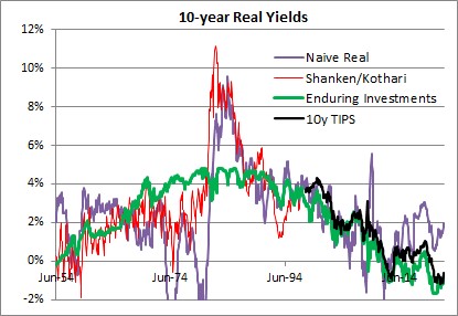
The long-term averages for these four series are as follows:
- Naïve real: 2.34%
- Shanken/Kothari: 3.13%
- Enduring Investments: 2.34%
- 10y TIPS: 1.39%
- Shanken/Kothari thru 2007; 10y TIPS from 2007-present: 2.50%
It isn’t just a coincidence that calculating a long-term average of long-term real interest rates, no matter how you do it, ends up being about 2.3%-2.5%. That is also close to the long-term real growth rate of the economy. Using Commerce Department data, the compounded annual US growth rate from 1954-2021 was 2.95%.
It is generally conceded that the economy’s sustainable growth rate has fallen over the last 50 years, although some people place great stock (no pun intended) on the productivity enhancements which power the fantasies of tech sector investors. I believe that something like 2.25%-2.50% is the long-term growth rate that the US economy can sustain, although global demographic trends may be dampening that further. Which in turn implies that something like 2.00%-2.25% is where long-term real interest rates should be, in equilibrium.[2] Kashkari says “We do know that neutral rates have been falling in advanced economies around the world due to factors outside the influence of monetary policy, such as demographics, technology developments and trade.” Except that we don’t know anything of the sort, since there is a strong argument against each of these totems. Abbreviating, those counterarguments are (a) aging demographics is a supply shock which should decrease output and raise prices with the singular counterargument of Japan also happening to be the country with the lowest growth rate in money in the last three decades; (b) productivity has been improving since the Middle Ages, and there is no evidence that it is improving noticeably faster today – and if it did, that would raise the expected real growth rate and the demand for money; and (c) while trade certainly was a following wind for the last quarter century, every indication is that it is going to be the opposite sign for the next decade. It is time to retire these shibboleths. Real interest rates have been kept artificially too low for far too long, inducing excessive financial leverage. They will eventually return to equilibrium…but it will be a long and painful process.
At the time I wrote the passage above, 10-year TIPS yielded about 0.25%; today they yield 2.125%. It turned out that returning to equilibrium wasn’t at all a long process. But it certainly was painful!
Returning to the original point: just because 10-year rates are now approximately at equilibrium is not at all a prediction that they will remain at equilibrium. Indeed, if I made that prediction I would be making a very similar mistake to the one I criticized above. Mean reversion in rates is not a particularly powerful force, when set against an active central bank and a profligate legislature. But if it matters at all, it is very important to correctly identify the mean to which rates should revert.
And it’s not 2%.
[1] https://www.minneapolisfed.org/article/2022/policy-has-tightened-a-lot-is-it-enough
[2] The reason that real interest rates will be slightly lower than real growth rates is that real interest rates are typically computed using the Consumer Price Index, which is generally slightly higher than the GDP Deflator.
Illustrating the Cost of Leverage Effect on Returns
A couple of weeks ago, I presented a blog post called “The Effect of Crazy Time on Portfolio Allocations,” in which I pointed out that the effect of increasing volatility generally is to decrease the optimal portfolio allocations towards safer allocations. It was one of those posts where you initially say ‘well, duh’ but hopefully liked the fact that I ‘proved’ the intuition with the illustrations. While market volatility since then has been almost unbelievably low, it is hard for me to imagine that is sustained. It feels a little like a ‘deer in the headlights’ reaction from investors, as the Trump Train comes on so rapidly that all they can do is pull the shades.
I suspect that at some point, unless the Donald suddenly becomes a milquetoast business-as-usual kind of President, we will see those allocations shift.
But a few days ago I had another realization that called to mind the same old CFA-Level-I charts. I was explaining to someone who wanted me to leverage our really cool inflation-tracking strategy[1] that leveraging a mid-single-digits return makes a lot of sense when the cost of leverage is zero, but not so much sense when the cost of leverage was mid-single-digits. I’ve talked about this before – in October 2023 I published “Higher Rates’ Impact on Levered Strategies.”[2] I showed a table, but there’s a really simple way to illustrate the same thing.

I don’t really need the portfolio efficient frontier here. Maybe the optimizer spits out some share of the optimal portfolio that represents an investment in some hedge fund strategy you really like. Maybe it doesn’t. More likely, you don’t even use an optimizer. But if you really like that strategy, but want higher returns, you ask the manager ‘hey, can you lever that’? The manager says sure. But the manager can’t give you twice the returns for twice the risk – the leverage math doesn’t work that way. If the cost of leverage is 3% – which you can tell it is in this chart because that’s where the line hits the axis, at a risk-free rate of 3% – then your return for twice the risk is (2 x 4% – 1 x 3%) = 5%. So you pick up only 1% return for doubling the risk. And you can see that on the chart, because that’s the point the red line goes through: 5% return, 15% risk. For 3x risk, you get (3 x 4% – 2 x 3%) = 6%. And so on. The slope of the line is such that 7.5% additional risk gets you 1% additional return, no matter how many times you lever it.
So why do people ask for leverage? Well, because since 2008 the overnight rate was mostly at 0%.

If you can borrow at zero then levering simply multiplies risk and return simultaneously. At 2x leverage, your return is (2 x 4% – 1 x 0%) = 8%. You can see where this goes since 0 times anything drops out of the formula.
But this doesn’t work at higher costs of leverage. If the cost of leverage is equal to the expected return, then you just get more risk every turn of leverage you deploy. And if the cost of leverage is above the expected return, you make things worse every time you add leverage.

So it doesn’t make any sense to lever low-return strategies unless the cost of leverage is really low. And by the way, it doesn’t make much sense to lever high-return strategies unless they happen to be low risk. Because this math doesn’t just work with expected returns but also (and more importantly) with actual returns. Suppose you have a strategy that has a 6% expected return and a 15% risk. Say, an equity index. Now, you lever it 2x with the cost of leverage at 5% (by the way, if you use a levered ETF you’re not escaping the cost of leverage…but that’s for another day). Your expected return is now 7%, with 30% risk (check your understanding by doing the math).
Now, however, you get a 2-standard deviation outcome to the downside. Supposedly that happens only one year out of 40, but we know that there are fat tails in equity markets. But whatever the real probability, your unlevered return is now 6% – 2 x 15% = -24%. But now you’re riding the lightning and your return on the 2x leverage is (2 x -24% – 5%) = -53%. (Alternatively, you get to the same number if you just look at the new 7%ret/30%risk portfolio return as 7% – 2 x 30%).
Hedge fund managers understand this math…or should; if they don’t then get out…and it should change the numbers they report in forward-looking statements when interest rates are higher, for levered strategies. I will not comment on normal industry practice…
[1] To be clear, none of the red dots in this article represent the risk/return tradeoff for that strategy. I’m not trying to cagily present our fund’s performance because that would get me in trouble.
[2] This was a golden era for the blog. Right about the same time I also published one of my best posts in years, pointing out how the CME Bond Contract has shortened in duration and also has negative convexity again. “How Higher Rates Cause Big Changes in the Bond Contract.” How I loved that piece.
The Effect of Crazy Time on Portfolio Allocations
I am continually fascinated by how many second-order ‘understandings’ are missed, even by those people who have a really good first-order understanding of finance. For example, every financial advisor understands that bonds are less volatile than stocks. Most financial advisors understand that stocks and bonds in a portfolio together also benefit because they’re not correlated. Some financial advisors, and most CTAs, understand that diversifying a portfolio works because when you add uncorrelated assets together, the risk of the whole is less than the sum of the risks because of the offset from the correlation effects. Those are all coarse understandings that any financial professional should ‘get.’ However, it is fairly unusual for advisors or even CTAs to understand that the correlation of stocks and bonds undergoes a state shift when inflation get above about 2.5% for a few years, and become correlated, and that means more risk for the same combination of stocks and bonds. Here’s that chart I love to show, updated through the end of the year.

While that’s an example of a ‘second-order understanding’ that isn’t widely known, it isn’t what I want to write about today. Actually, for a change what I want to discuss is something that has nothing directly to do with inflation, and that is the effect of volatility on asset allocation.
This is an important discussion right now, because whether or not you have gotten the message yet that President Trump is going to be much more Machiavellian in his approach to the global world order than prior Presidents have been – and whether you think that’s a good thing or a bad thing – you surely must have noticed that the volatility of the markets under this regime is likely to be somewhat higher than under Sleepy Joe and also higher than it was during Trump’s first term. And that leads to the second-order understanding about what that implies for markets. Hang with me here; if you’re not a finance person this gets a little hairy.
The next chart shows Modern Portfolio Theory on one chart.

The blue line is the Markowitz efficient frontier: every point on the line represents a portfolio of assets that is the least-risky for that level of expected return. So, the highest vertical point is a portfolio of 100% in the asset with the highest expected return…you can’t get more return without leverage.[1] In this case, let’s assume that is equities. As you go down the curve, you allocate more to other less-risky assets and give up some portfolio return. Because assets are not 100% correlated, you can always get a portfolio that has at least as good (and usually better) returns for a unit of risk than any single asset – that’s the benefit of diversification. As you get to very low expected returns, you get to the part of the curve you’d have to be irrational to be on because you get higher risk and lower returns, and so we usually ignore that part of the curve that bends back.
The red line is popularly called the “Capital Asset Line.” Assuming there is some zero-risk instrument (that’s not already in the assets we’ve considered, so there’s some hand-waving here) and you can both borrow and invest at that rate, you can think of a portfolio that is the ‘best’ portfolio on the blue curve, either combined with the zero risk instrument (sliding down the red line to the left) or levered at the zero risk instrument (moving up the red line to the right). The ‘best’ portfolio here is defined as the place where the red curve is tangent to the blue curve.
A lot of times you’ll just see those two lines, but it doesn’t answer the question of which portfolio an actual investor prefers. It turns out that investors do not have linear risk preferences…that is, if I make my portfolio 10% more risky, perhaps I require 1% more return but if I make it another 10% risky, I’m going to need more than 1% additional return. I’m not only risk averse, but I get more risk averse the larger the potential risks. [Lots of experimental data on this. If I offer you a bet where you pay me $1 and on the basis of a coin flip I will either pay you $2 or $0, you are much more likely to take that bet than if I offer you a bet where you are risking $10,000 for the chance at $20,000…or zero]. So the purple dotted line is a hypothetical ‘investor indifference curve’. I just made up that term because I can’t remember what the theoreticians call it. The curve represents all of the combinations of risk and return that make the investor equally happy. So, the best portfolio for this investor is where the purple line – the highest purple line we can find, indicating the MOST happiness – touches the red line.
With me? Now consider the next chart. All I have done here is to increase the risk of every asset and shift the whole portfolio efficient frontier to the right.

What happens? The Capital Asset Line (red) now flattens out. And that means that the prior purple line no longer has a point of tangency. We have to go to a lower purple line, and since the purple line is concave upward the red line becomes tangent to the purple line at a point further to the left (the slope of the red line is flatter, and the flatter parts of the purple line are to the left). I’ve put the new ‘optimal portfolio’ as a dot in purple.
The implication is this: if overall risk in markets is perceived to have permanently increased, then rational investors will move from portfolios with more risky assets to portfolios with fewer risky assets.
You probably could have guessed that without all of the curves. If I am comfortable with a certain amount of risk, and the overall risk of things goes up, then it stands to reason that I’d work to reduce my overall risk. The second-order understanding here is, then, that if President Trump is perceived by investors to increase the overall volatility in markets and individual country and company outcomes, we should expect investors to lighten up on equities.
And that brings me to the final chart. This is the Baker, Bloom and Davis news-based Economic Policy Uncertainty Index, which counts the number of articles in US-based news sources that contain a set of predefined terms that indicate uncertainty about economic policy. The dotted lines below show weekly data; the heavy red line shows the 12-week moving average to get rid of the noise.

Notice the three prior spikes on the chart are during and immediately following the end of the internet/stock market bubble in the early 2000s, the end of the housing bubble and the Global Financial Crisis in 2008-09, and the COVID crisis. All three of those episodes were associated with significantly lower markets, although you could argue that harsh bear markets might trigger some policy uncertainty (that certainly happened after 2008). The jump on the right is the Trump jump, and it is already higher than any other period on this chart other than COVID.[2] Volatility we have. Uncertainty we have. And even if you like the President’s policies, the volatility means that we should not be surprised to see investors pull some chips off the table.
[1] If you take this best-returning asset and leverage it, you basically get a straight line going up and to the right forever; the slope of the line depends on the cost of leverage.
[2] Incidentally, the index goes back to about 1985 and although I didn’t show it there are two more bumps that are similar to the leftmost two on this chart: around the 1993 recession, and around the time of the stock market crash in 1987. They are all lower than the Trump jump.
