Archive
The Fault, Dear Brutus, is in R*
I want to say something briefly about the “neutral rate of interest,” which has recently become grist for financial television because of new Trump-appointed Fed Governor Stephen Miran’s speech a couple of days ago in which he opined that the neutral rate of interest is much lower than the Fed believes it is, and that therefore the Fed funds target should be more like 2%-2.25% right now instead of 4.25%.
Cue the usual media clowns screaming that this is evidence of how Trump appointees do not properly respect the academic work of their presumed betters.
If that was all this is, then I would wholeheartedly support Miran’s suggestion. Most of the academic work in monetary finance is just plain wrong, or worse it’s the wrong answer to the wrong question being asked. And that’s what we have here. Anyone who thinks that Miran is an economic-denialist should read the speech. It is mostly a well-reasoned argument about all the reasons that the neutral rate may be lower now than it has been in the past. And I applaud him when he comments “I don’t want to imply more precision than I think it possible in economics.” Indeed, if we were to be honest about the degree of precision with which we measure the economy in real time and the precision of the models (even assuming they’re parameterized properly, which is questionable), the Fed would almost never be able to decisively reject the null hypothesis that nothing important has changed and therefore no rate change is required!
I can’t say that I agree with Miran’s argument though. Not because it’s wrong, but because it’s completely irrelevant.
Sometimes I think that geeks with their models is just another form of ‘boys with their toys.’ And that is what is happening here. The “neutral rate of interest” is a concept that is cousin to NAIRU, the non-accelerating-inflation rate of unemployment. The neutral rate, often called ‘r-star’ r* (which is your clue that we’re arguing about models), is the theoretical interest rate that represents perfect balance, where the economy will neither tend to generate inflation, nor tend to generate unemployment. Like I said, it’s just like NAIRU which is a level of unemployment below which inflation accelerates. And they have something else in common: they are totally unobservable.
Now, lots of things are unobservable. For example, gravity is unobservable. Yet we have a very precise estimate of the gravitational constant[1] because we can make lots of really precise measurements and work it out. Economists would love for you to think that what they’re doing with r* is similar to calibrating our estimate of the gravitational constant. It’s not remotely similar, for (at least) two enormous reasons:
- Measuring the gravitational constant is only possible because we know (as much as anything can be known) what the formula is that we are calibrating. Fg=Gm1m2/r2. So all we have to do is measure the masses, measure the distance between the centers of gravity, and infer the force from something else.[2] Then we can back into G, the gravitational constant. Here’s the thing. The theory of how interest rates affect inflation and growth, despite being ensconced in literally-weighty economics tomes, is just a theory. Actually, several different theories. And, by the way, a theory with a terrible record of actually working. To calibrate r*, the hand-waving that is being done is ‘assume that interest rates affect the economy through a James and Bartles equilibrium…’ or something like that. It is an assumption that we shouldn’t accept. And if we don’t accept it, calibrating r* is just masturbation via mathematics.[3]
- With the gravitational constant, every subsequent measurement and experiment confirms the original measurement. Every use of the model and the constant in real life, say by sending a spacecraft slingshotting around Jupiter to visit Pluto, works with ridiculous precision. On the other hand, r* has approximately a zero percent success rate in forecasting actual outcomes with anything like useful precision, and every person who measures r* gets something totally different. And r* – if it is even a real thing, which I don’t think it is – evidently moves all the time, and no one knows how. Which is Miran’s point, but the upshot is really that monetary economists should stop pretending that they know what they’re doing.
In short, we are arguing about an unmeasurable mental construct that has no useful track record of success, and we are using that mental construct to argue about whether policy rates should be at 2% or 4%. Actually, even worse, Miran says that the market rate he looks at is the 5y, 5y forward real interest rate extracted from TIPS. The Fed has nothing to do with that rate. But if that’s what he is looking at why are we arguing about overnight rates?
I should say that if there is such a thing as a ‘neutral rate’ that neither stimulates nor dampens output and inflation, I would prefer to get there by first principles. It makes sense to me that the neutral long-term real rate should be something like the long-run real growth rate of the economy. And if that’s true, then Miran is probably at least directionally accurate because as our working population levels off and shrinks, the economy’s natural growth rate declines (unless productivity conveniently surges) since output is just the product of the number of hours worked times the output per hour. But I can’t imagine that the economy ‘cares’ (if I may anthropomorphize the economy) about a 1% change in the long-run real or nominal interest rate, at least on any time scale that a monetary policymaker can operate at.
The best answer here is that whether Miran is right or not, the Fed should just pick a level of interest rates…I’m good with 3-4% at the short end…and then change its meeting schedule to once every other year.
[1] Which may in fact not be constant, but that’s a topic for someone else’s blog.
[2] In the first experiment to measure gravity, which yours truly replicated for a science fair project in high school, Henry Cavendish in 1797 figured the force in this equation by measuring the torsion force exerted by the string from which his two-mass barbell was suspended, with one of those masses attracted to another nearby mass.
[3] Yeah, I said it.
Inflation Guy’s CPI Summary (February 2025)
Look, I know that traders sometimes think their job is to overreact. And media folks benefit from overreacting. And political strategists have been genetically bred to overreacting. But a bit of rational analysis here is probably worthwhile.
The obvious backdrop to the CPI release this morning is the somewhat-greater-than-usual volatility in the equity market,[1] and some concerns that the economy might finally get that recession that I and others have been expecting for so long – although don’t get too chippy on that, since the Q1 contraction would be mostly due to a surge in imports from front-running tariffs. The narrative has shifted back to the question of how soon the Fed might ease, even if inflation is still a little problem, since Unemployment has risen to the nosebleed level of 4.1% and stocks are in the crapper (technical term).
Geez folks, take a chill pill.
Similarly, don’t cue the trumpets just yet on inflation. The expectations coming into today’s figure were for +0.31% on headline CPI and +0.30% on core CPI. The actual prints were +0.22% and a delightful +0.23% on Core.

Sure, the chart shows this is definitely better than last month! And it’s even better than the average of the last two months (I’d said last month you probably should average between December and January figures). But…it’s also a little early to take a victory lap. Here is Median CPI (last point, as usual, is my estimate for today).

If it’s 0.29% m/m, as per my estimate, then we are at a 3.5% run rate. And that’s basically where we have been over the last six months. Oh, and while y/y Core CPI is down to 3.1%, it’s at 3.5% over the last three and the last six months. We are settling in at the mid-3s.
The culprits behind last month’s spike were used cars, health insurance, lodging away from home, pharmaceuticals, and hospital services. Of those, only Used Cars (+0.88% m/m) contributed very much to this month’s number. On the other hand, Airfares dropped -4% m/m. Here are the Major-8 categories.

The optimistic view is that there isn’t any one category that looks out of control on a y/y basis. That’s also the pessimistic view, because it speaks of a broad – if not particularly high – inflation that is still percolating out there. Core Goods this month was still -0.1% y/y, but Core Services dropped from 4.3% to 4.1% y/y. Pharmaceutical prices, which just had their largest monthly rise in history last month as drugmakers tried to get their licks in before the Trump Administration forces them to lower prices, rose only +0.18% m/m this month. Both Primary Rents and Owners’ Equivalent Rent were +0.281% m/m. These are also settling in, on schedule.

“Settling in” is what is happening in shelter. And that again is both good news and bad news. A lot of the forecasts we have seen over the last couple of years that called for inflation to steadily return to trend depended on the assumption that the rent declines we have seen for new rents in a few cities would become a broad-based trend in all of shelter. But it’s not, for two reasons. On the rental side, costs keep rising for landlords (that’s the basis for our model in the prior chart). And on the home purchase side, there’s just still a big deficit in homes available for sale.

While that could change – it seems to be changing in the Washington, DC area but the people leaving Washington still need homes elsewhere – if deportations pick up a lot, there is no sign yet that shelter is going to do the heavy lifting of getting inflation back to 2%. Neither is SuperCore, although this month it was +0.22% m/m and in general is looking a little better.

But none of this looks exciting. None of this looks like it’s going to be the start of a Fed victory lap on inflation. Even the Enduring Investments Inflation Diffusion Index looks like it’s settling in, and like all of the other stuff we have looked at, it’s settling in at a level higher than pre-COVID.

And while we’re talking about distributions, here’s another one I haven’t run in a while. This is the distribution of y/y changes by the lowest-level CPI components. The big spike in the middle is obviously housing. There is a cluster between 1% and 4%. But look at that big left tail. 20% of the basket is actually deflating, y/y.

What’s interesting about that column on the left is that it is a whole bunch of little things. Breakfast cereal. Pasta. “Other meats” (shudder). Potatoes. Tomatoes. Soups. Snacks. Window coverings. Dishes. Men’s shirts. Audio equipment. In other words, a whole lot of things that are so small, consumers don’t really notice them so much and so they don’t really affect their sense of inflation being high. But they notice eggs.
So this is good news…in that a lot of things are deflating…but also bad news is that a lot of these are things that tend to mean-revert. You’ll notice that some of the categories I just listed are core goods, which are still in deflation…but which are also the things which are going to rise in price when the tariffs start to hit. The largest single piece still in deflation is New Cars, at a 4.4% weight or so. Unfortunately, that’s not going to be in deflation when tariffs hit auto parts and slow the import of non-US vehicles.

So let’s wrap this up.
The conspiracy nuts will say that Trump cooked the numbers, because it was better-than-expected about something that was a campaign promise of his. But this is normal variation, and the bottom line is that the inflation figures look to be converging on 3.5% or so, before the effects of tariffs kick in. The near-term effects on inflation are definitely upwards. Peace in Israel and Ukraine, if it comes, may put a small damper on energy prices but the bigger effect there is US energy being unleashed again, which will take some time. But outside of the peace effect, there are few good near-term trends but also few really bad near-term trends other than the (relatively small) effect of tariffs. Inflation is settling in.
The funny thing is, I don’t think the Fed cares. I think they’re satisfied enough with the progress on inflation, and they still think that recessions cause disinflation (they don’t) so that they feel they can focus on the growth part of the mandate, for now.
[1] Dubbed a ‘crash’, or ‘freefall’, or some other appellation by observers who can’t remember the last time we saw a 10% pullback. Which is only about 6% if you look at the equal-weight, or a 60-40 blend of stocks and bonds. If this warrants the “what do you say to Americans who now can’t retire because they’re seeing their retirement accounts collapsing” line, my answer would be “I would say those Americans probably shouldn’t have been invested in stocks at all if this causes them to delay retirement.”
RE-BLOG: Side Bet With Ben?
Note: The following blog post originally appeared on June 14, 2012 and is part of a continuing year-end ‘best of’ series, calling up old posts that some readers may have not seen before. I have removed some of the references to then-current market movements and otherwise cut the article down to the interesting bits. You can read the original post here.
…
That said, there could be some signs that core CPI is flattening out. Of the eight ‘major-groups’, only Medical Care, Education & Communication, and Other saw their rates of rise accelerate (and those groups only total 18.9% of the consumption basket) while Food & Beverages, Housing, Apparel, Transportation, and Recreation (81.1%) all accelerated. However, the deceleration in Housing was entirely due to “Fuels and Utilities,” which is energy again. The Shelter subcategory accelerated a bit, and if you put that to the “accelerating” side of the ledger we end up with a 50-50 split. So perhaps this is encouraging?
The problem is that there is, as yet, no sign of deceleration in core prices overall, while money growth continues to grow apace. I spend a lot of time in this space writing about how important money growth is, and how growth doesn’t drive inflation. I recently found a simple and elegant illustration of the point, in a 1999 article from the Federal Reserve Board of Atlanta’s Economic Review entitled “Are Money Growth and Inflation Still Related?” Their conclusion is pretty straightforward:
“…substantial changes in inflation in a country are associated with changes in the growth of money relative to real income…the evidence in the charts is inconsistent with any suggestion that inflation is unrelated to the growth of money relative to real income. On the contrary, there appears to be substantial support for a positive, proportional relationship between the price level and money relative to income.”[1]
But the power of the argument was in the charts. Out of curiosity, I updated their chart of U.S. prices (the GDP deflator) versus M2 relative to income to include the last 14 years (see Chart, sources: for M2 Friedman & Schwartz, Rasche, and St. Louis Fed, and Measuring Worth for the GDP and price series). Note the chart is logarithmic on the y-axis, and the series are scaled in such a way that you can see how they parallel each other.

That’s a pretty impressive correlation over a long period of time starting from the year the Federal Reserve was founded. When the authors produced their version of this chart, they were addressing the question of why inflation had stayed above zero even though M2/GDP had flattened out, and they noted that after a brief transition of a couple of years the latter line had resumed growing at the same pace (because it’s a logarithmic chart, the slope tells you the percentage rate of change). Obviously, this is a question of why changes in velocity happen, since any difference in slopes implies that the assumption of unchanged velocity must not hold. We’ve talked about how leverage and velocity are related before, but an important point is that the wiggles in velocity only matter if the level of inflation is pretty low.
A related point I have made is that at low levels of inflation, it is hard to disentangle growth and money effects on inflation – an observation that Fama made about thirty years ago. But at high levels of inflation, there’s no confusion. Clearly, money is far and away the most important driver of inflation at the levels of inflation we actually care about (say, above 4%!). The article contained this chart, showing the same relationship for Brazil and Chile as in the chart updated above:

That was pretty instructive, but the authors also looked across countries to see whether 5-year changes in M2/GDP was correlated with 5-year changes in inflation (GDP deflator) for two windows. In the chart below, the cluster of points around a 45-degree line indicates that if X is the rate of increase in M2/GDP for a given 5-year period, then X is also the best guess of the rate of inflation over the same 5-year period. Moreover, the further out on the line you go, the better the fit is (they left off one point on each chart which was so far out it would have made the rest of the chart a smudge – but which in each case was right on the 45-degree line).

That’s pretty powerful evidence, apparently forgotten by the current Federal Reserve. But what does it mean for us? The chart below shows non-overlapping 5-year periods since 1951 in the U.S., ending with 2011. The arrow points to where we would be for the 5-year period ending 2012, assuming M2 continues to grow for the rest of this year at 9% and the economy is able to achieve a 2% growth rate for the year.

So the Fed, in short, has gotten very lucky to date that velocity really did respond as they expected – plunging in 2008-09. Had that not happened, then instead of prices rising about 10% over the last five years, they would have risen about 37%.
Are we willing to bet that this time is not only different, but permanently different, from all of the previous experience, across dozens of countries for decades, in all sorts of monetary regimes? Like it or not, that is the bet we currently have on. To be bullish on bonds over a medium-term horizon, to be bullish on equity valuations over a medium-term horizon, to be bearish on commodities over a medium-term horizon, you have to recognize that you are stacking your chips alongside Chairman Bernanke’s chips, and making a big side bet with long odds against you.
I do not expect core inflation to begin to fall any time soon. [Editor’s Note: While core inflation in fact began to decelerate in the months after this post, median inflation has basically been flat from 2.2% to just above 2.0% since then. The reason for the stark difference, I have noted in more-recent commentaries, involves large changes in some fairly small segments of CPI, most notably Medical Care, and so the median is a better measure of the central tendency of price changes. Or, put another way, a bet in June 2012 that core inflation was about to decline from 2.3% to 1.6% only won because Medical Care inflation unexpectedly plunged, while broader inflation did not. So, while I was wrong in suggesting that core inflation would not begin to fall any time soon, I wasn’t as wrong as it looks like if you focus only on core inflation!]
[1] The reference of “money relative to income” comes from manipulation of the monetary identity, MV≡PQ. If V is constant, then P≡M/Q, which is money relative to real output, and real output equals income.
Food Fight at the Fed!
Now, now, children! Stop fighting! This is unbecoming!
It is apparent now that the disagreements in the FOMC – while nothing new – are becoming more significant and the hurly-burly is spilling into the public eye. It is somewhat amazing to me that the Fed is allowing this argument to be conducted in public (traditionally, all remarks by Fed officials are first vetted by the Chairman’s office). Today Dallas Fed President Richard Fisher actually questioned the Fed’s credibility! This article is worth reading, and not just for the part where Fisher says that Yellen is “dead wrong on policy.” It’s also fascinating that Fisher attributed the decision to delay the taper to “a perceived ‘tenderness’” in the housing recovery.
Below is a chart (source: Enduring Investments) of the ratio of median existing home sale prices to median household income. If this is “tenderness” in a recovery, it only shows a lack of knowledge of history: this is the second highest ratio of home prices to income we have since this particular data begins…and the first highest ratio sunk the global economy for a half-decade and counting.

On the other side of the fence were the New York Fed’s Bill Dudley and the Atlanta Fed’s Dennis Lockhart, who lamented that (Dudley) there has been no pickup in the economy’s “forward momentum” and asked (Lockhart) “Is America losing its economic mojo?” These questions, and the result of these questions during the recent FOMC meeting, illustrate two points. First, that the bar for removing never-before-seen levels of monetary accommodation has been raised so high that doves believe it is appropriate to keep the foot on the accelerator until growth is drastically above-average. As I illustrated back at the beginning of August, it is unreasonable to expect more than about 200,000 new jobs per month to be created by the economy. Repairing all of the damage is simply going to take time. We would all love to see 5% growth, but is the Fed’s job really to make sure that happens, or to try and manage the downside (or, as I personally believe, to merely manage the price level)?
The second point that the Fisher/Dudley/Lockhart comments illustrate is that the doves at the Fed are clearly in control. The hawks were completely unable even to get a marginal tapering, although the Fed had clearly indicated previously that such a taper was likely to happen.
It is a Dudley/Bernanke/Yellen Fed (and they have allies too!), and anyone who thinks that the Fed is abruptly going to find religion once CPI peeks above 2% is fighting against all historical indications. One need only consider the fact that the post-FOMC meeting statement pointed out a “tightening of financial conditions observed in recent months,” a clear reference to the rapid rise in interest rates that accompanied the initial talk about tapering. But if the Fed begged off on the taper partly because of the tightening of financial conditions, that is the rise in interest rates that was caused by an expectation that the taper would stop, then the argument circular, isn’t it? It’s impossible for them to stop, since any indication that they were going to stop is obviously going to cause interest rates to rise, which would be a tightening of financial conditions, which would keep them from stopping… Does anyone seriously think that a core inflation print of 2.1% would change that?
To the extent that cutting from 20 cups of coffee per day to 19 cups of coffee per day could be called a “bold step,” wouldn’t the best time to take such a “bold step” with monetary policy be when the equity markets are at their highs and real estate markets back above their long-term value anchors?
And yet, the initial enthusiasm for the stock market for the continuation of QE seems to have faded rapidly. The entire post-FOMC rally that caused such joy around the offices of CNBC last Wednesday has been erased. Interestingly, the initial spike in commodities prices has also been erased, which is more curious since commodities prices don’t depend on growth as much as they do on inflation. And 10-year inflation expectations are back around 2.25%, basically the highest level they have seen since the Q2 swoon (see chart, source Bloomberg). So, as usual, I am flummoxed by the behavior of commodities.

I know that there is a great deal of confidence in some quarters that the Federal Reserve can keep its foot on the gas until such time as inflation actually rises to a level that concerns them. I cannot imagine the reason for such confidence when the drivers of the car are such committed doves. There are multiple problems undermining my confidence in such a possibility. There is the “Wesbury hypothesis” that the Fed will adjust its definition of what worries them about inflation – a hypothesis which, after this month’s FOMC meeting, should be even more compelling. There is the fact that there is no evidence I am aware of that the Fed was able to easily restrain inflation after it came unglued in any prior episode (and no one knows where and when and how it will come unglued). And finally, it isn’t clear to me how the Fed would go about restraining inflation anyway, given the overabundance of excess reserves and the fact that those reserves insulate any inflation process against the tender ministrations of the central bank.
One thing seems to be sure. The food fight at the Fed is not likely to end soon, and together with the dysfunction on Capitol Hill is raises the very real question of whether anything economically helpful is going to be accomplished in Washington DC this year.
Higher Rates, Higher Credit Growth: Sober Look
I wrote recently about money velocity and reminded readers that theory says higher interest rates tend to increase money velocity because it decreases the demand for real cash balances. This was around the discussion of whether the enormous demand for Verizon bonds could be anecdotal evidence that velocity is increasing.
Yesterday the blog Sober Look – which is one of my favorites because it gives intelligent looks at many different markets – ran an article entitled “Could rising rates fuel credit growth in the US?” in which they in turn cite Deutsche Bank research. It’s a very quick article and worth a read, because it sheds some light on one of the mechanisms by which credit growth may increase with higher rates. Ordinarily, higher rates inhibit money growth at the same time that they increase velocity, partly because the yield curve flattens. But in this case, higher rates may increase both credit growth and money velocity – at least when rates initially rise – since the market is moving ahead of the Fed and steepening the yield curve in a selloff.
It’s just another puzzle piece to rotate in your mind, to try and see how it all fits together!
Summary of My Post-CPI Tweets
Here is a summary of my tweets after the CPI release this morning. You can follow me @inflation_guy.
- CPI +0.1%/+0.1% core, y/y core to 1.8%. Core only slightly weaker than expected as it rounded down to 0.1% rather than up to 0.2%.
- Housing CPI was weak, second month in a row. Rents will eventually catch up w/ housing prices…but not yet.
- Apparel CPI was weak after a couple of strong up months. I’ll have the whole breakdown in a bit.
- Core was actually only 0.13%, suggesting last August’s 0.06% and this August’s number might merely be bad seasonals.
- Market was only looking for 0.17% or so, so it’s not a HUGE miss. Still disappointing to my forecasts as upturn in rents remains overdue.
- Core CPI now 1.766% y/y. More difficult comparison next month although still <0.2%.
- Accelerating major grps: Apparel, Medical Care, Educ/Comm, Other (20.9%); decel: Food/Bev, Housing(!), Transp (73.1%), unch: Recreation
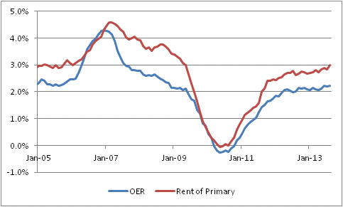
- Housing deceleration actually isn’t worrisome. Primary rents were 3.0% y/y vs 2.8% last. OER was 2.23% vs 2.19% last.
- Housing subcomponent drag was from lodging away from home, household energy, other minor pieces. So housing inflation story still intact.
- Core services inflation unch at 2.4% y/y; core goods inflation up to 0% from -0.2%. Source of uptick: mean reversion in core goods.
- So OER still reaches a new cycle high at 2.23%…it’s just not accelerating yet as fast as I expect it to. Lags are hard!
The initial reading of this number, as the tweet timeline above shows, was negative. The figure was weaker-than-expected, and Housing CPI decelerated from 2.26% to 2.17%. This seemed to be a painful blow to my thesis, which is that rising home prices will pass through into housing inflation (expressed in rents) and push core inflation much higher than economists currently expect.
Housing CPI is one of eight major subgroups of CPI, the other seven being Food and Beverages, Medical Care, Transportation, Apparel, Recreation, Education and Communication, and Other. Housing receives the most weight, at 41% of the consumption basket and an even heavier weight in core inflation. So, a deceleration in Housing makes it very hard for core inflation to increase, and vice-versa. If you can get the direction of Housing CPI right, then you’ll have a leg up in your medium-term inflation forecast (although it isn’t very helpful in terms of projecting month-to-month numbers, which are mostly noise). Thus, the deceleration in Housing seemed discouraging.
But on closer inspection, the main portions of Housing CPI are doing about what I expected them to do. Primary Rents (aka “Rent of primary residence”) is now above 3%, in sharp contrast to the expectations of those economists and observers who thought that active investor interest in buying vacant homes would drive up the price of housing but drive down the price of rents. Though I never thought that was likely…the substitution effect is very strong…it was a plausible enough story that it was worth considering and watching out for. But in the event, primary rents are clearly rising, and accelerating, and Owners’ Equivalent Rent is also rising although less-obviously accelerating (see Chart, source BLS).
 So, it is much less clear upon further review that this is a terribly encouraging CPI figure. It is running behind my expectations for the pace of the acceleration, but it is clearly meeting my expectations for what should be driving inflation higher. As I say above, econometric lags are hard – they are tendencies only, and in this case the lags have been slightly longer, or the acceleration somewhat muted, from what would typically have been expected from the behavior of home prices. Some of that may be from the “investors producing too many rental units” effect, or it might simply be chance. In any event, the ultimate picture hasn’t changed. Core inflation will continue to rise for some time, and will be well above 2% and probably 3% before the Fed’s actions have any meaningful effect on slowing the increase.
But How Near is the Fall?
I will resist the temptation, succumbed to by many others, to offer a pithy title turning on some pun involving Larry Summers’ name. For example, I will not title this article:
- Summers’ Not Lovin’
- Summers of Our Discontent
- Summer Happy, Summer Not So Happy
- Cruel Summers
- School’s Out For Summers, or
- Lazy-Hazy-Crazy Days of Summers
Such tomfoolery is occasioned by the news yesterday that Larry Summers has withdrawn his name for consideration to be the next Fed Chairman, succeeding Bernanke. The markets reacted with similar tomfoolery. Although the equity markets hadn’t exactly plunged as Summers became the odds-on candidate (at a conference I went to last week, all six of the panelists during one segment said Summers would be the selection), stocks rocketed higher today as this supposedly makes a dovish Chairman more likely. Bonds rallied as well, and the dollar fell – all of these for the same reason. Strangely (but not so strangely if you have been watching commodities for the last couple of years), commodities fell on the potential for a more-dovish Chairman.
The odds-on favorite just became Janet Yellen, with Donald Kohn the runner-up. Both of these are considered to be more-dovish than Summers, which is odd because it is generally acknowledged that Summers had virtually no track record expressing his opinions on matters of monetary policy, and was essentially a policy unknown.
In any event, markets for the nonce are enjoying the notion that a Chairman Yellen or Kohn would bring “continuity” to the Federal Reserve and make the adjustment from the Bernanke years seamless. You can be a short seller of that idea. Volcker to Greenspan, Greenspan to Bernanke…neither of those transitions was expected to make a dramatic difference in monetary policy, but of course ultimately they did. Going back further, Volcker was chosen partly as an antidote for G. William Miller, so it is not surprising that things changed under Volcker – but we were looking for change). You probably have to go back to the Arthur Burns/G William Miller transition in the late 1970s to find a transition that truly didn’t matter very much, although that was mostly because Burns had made such a mess of things and triggered such an ugly inflation by adding too much liquidity to the system in order to cure the recession that the only thing Miller thought he could do was to continue on…
Oh. I see the parallel now.
In any event, a Chairman Kohn or Chairman Yellen is very likely to turn out to be something different from what we think we are getting, or from what the President thinks he is getting (not necessarily the same thing). It is much like appointing a Supreme Court justice: after donning the robes, physically or metaphorically, a justice might vote in a way very different from the way his nominator expected him or her to. Just ask G.H.W. Bush. So, regardless of whether the next Chairman is Yellen, Kohn, or some as-yet-unknown candidate, the bottom line is that investors should expect surprises. If your investment strategy is reliant on there not being any surprises, then I advise you to reconsider that strategy!
Speaking of surprises, Tuesday brings the CPI report. The market consensus is for +0.2% on headline and +0.2% on core inflation, with the y/y core inflation reading rising to 1.8% from 1.7%. However, since last year’s CPI print was a mere +0.06%, forecasting a rise is very easy. If the monthly figure is only 0.105%, y/y core inflation will still tick up to 1.8% (rounded). Indeed, the risk here is that it only takes a +0.21% to produce a 1.9%, which would make for some panicky portfolio adjustments even though it would not be an extreme outlier.
In my view we are probably overdue for a +0.25% print on core inflation. The current rise of core CPI back towards median CPI, which has been either 2.1% or 2.2% for a year and a half, is happening because some of the unusual effects that pushed core CPI later are waning. Moreover, as I have written about expansively previously, housing inflation appears to have turned up but a more-substantial move higher is due (or perhaps overdue).
The CPI report and the adjustment to the market’s expectations about the next Fed Chairman are somewhat related. There is a notion out there – which I think is foolish – that the removal of Summers from consideration as the next Chairman, coupled with slightly weak recent data, lessens the chance that the “taper” will be announced this week. I do not think that either event bears on the probability that a taper will be announced. While I originally expected the taper to come later in the year than this, the voluminous statements of Fed Governors and Fed Presidents seems to indicate that it will begin imminently. The likelihood that a dove will take the Chairman’s seat does not change that. However, to the extent that the stock and bond markets rallied because they think a taper is less likely, a CPI print that takes core to 1.9% on the year will extinguish that frail hope. I think today’s stock market rally is subject to a near-term disappointment if this happens, and this is likely the case, although less so, for the bond market as well.
Verizon and Velocity
What is the significance of the fact that Verizon on Wednesday managed to sell $49bln in bonds without any kind of hiccup?
Obviously, it means that the corporate market is doing okay, that investors who are starved for good spreads like the attractive spread the bonds were priced at, and that there is reasonable confidence in the marketplace that Verizon can succeed even as a much more-leveraged company. All are good things.
But here is another thing to think about. My friend Peter Tchir, who writes the excellent T-Report, noted this morning that “Investors weren’t selling other bonds to buy Verizon.” That is, a fair amount of the money may well have been coming out of cash to go into the Verizon bonds.
Why does this matter? Remember that the velocity of money is the inverse of the demand for real cash balances. That is, when everyone is holding cash, the velocity of money is low; when no one wants to hold cash, the velocity of money is high. I have shown the chart below (source: Enduring Investments) before and argued that higher interest rates will tend to increase velocity by decreasing the demand for real cash balances. At least, that usually is what happens.

What would a turn higher in velocity look like? Well, I think it may well look something like this. “I no longer have to reach as much for yield and take all the risk I had to in March to get a 3% yield. So it’s time to invest some of this cash.”
Now, the ultimate flows get a little confusing, because cash is neither created nor destroyed in this transaction. Cash is transferred to Verizon from investors; Verizon then transfers that to Vodafone investors, who perhaps put it back in the bank for no net change. But if those investors in turn say “I don’t want those cash balances, either,” and then go invest or lend it or spend it, then you’re starting to see how money velocity is increasing. The money essentially becomes a kind of financial “hot potato” now, moving more rapidly from investor to investor, from consumer to vendor, and so on. The volume of transactions rises, which increases prices and output as explained by the MV≡PQ monetarist credo.
And that is how higher rates can produce more inflation.
We are seeing other strange things, too, that could be consistent with this explanation. Another great blog, “Sober Look,” observed last week that 30-year jumbo mortgage loan rates have fallen below conforming mortgage loan rates. Their explanation of the phenomenon is worth reading, but note this part: “Flush with deposits, banks have access to extraordinarily cheap capital and are seeking to earn more interest income.” Yet this has been true for some time. What has changed is that interest rates are now higher, increasing the opportunity cost of cash in both nominal and real terms.
This doesn’t automatically mean that money velocity is increasing; it may just be an interesting bond sale and unusual market activity in jumbo mortgages. But it is worth thinking about, because as I note in that article linked to above, even a modest rise in money velocity could produce an aggressive response from inflation.
The Fed and Regulators Should Draw the Veil
When I remark, from time to time, that I think the Fed has made a mistake in increasing transparency of its deliberations and actions, people occasionally look at me as if I had come out opposed to motherhood or apple pie. But my point is that transparency is good if it permanently decreases risk…but it doesn’t.
What matters is how market actors respond to increased transparency. It is much like the old debate about whether football players ought to wear helmets. It is clear that helmets decrease the likelihood of brain damage in any given collision, compared to the un-helmeted rider in an identical collision. But it is also clear that as helmets have gotten better and better, football players have played faster and faster, with more abandon, and lead with their heads a lot more than they did when all they had was a leather cap. The net effect is indeterminate.[1]
In markets, increased transparency from a central bank or regulator leads to increased leverage in a very direct way. The central bank’s dial is for transparency, but the investor’s dial is for risk appetite and when the central bank turns its dial it does not change the investor’s risk preferences. The result is that increasing transparency, which decreases the risk at any given leverage and at any particular moment, leads to higher levels of leverage, which lowers the tolerance for error. And, as we have seen, central banks and regulators are quite prone to error.
In an interesting way, this is tied into the volume question. The chart below (source: Bloomberg) shows rolling 250-trading-day volume for the NYSE in billions of shares. As has been well-documented, market volumes have been steadily declining for years.

As we have mentioned here before, there are lots of excuses for lower market volumes on the major exchanges, and probably many of those excuses are part of the answer. But we can no longer simply attribute this to the movement of volumes to “dark pools.” There is simply less going on in the markets, whether in rates or in equities. Ask the dealers. Dodd-Frank and the Volcker Rule are simply decimating volumes. And this is not just bad for dealers, it is bad for everyone.
When a trade happens, there is information revealed. Indeed, in some markets a meaningful proportion of the volume transacted is between dealers who are testing the market to get more information. More trades means that there are more quanta of information. More quanta of information produces more confidence in prices. More confidence in prices means more support for the current prices, and more de facto liquidity.
Think of it this way. If a bond has never traded, and two counterparties come together to trade some at a price of 103, what is your estimate of the true market for another trade? Is it one tick around 103? If so, then you are displaying almost outrageous overconfidence – one data point between two counterparties, about whose motivations you know precisely nothing, tells you almost zero about what the true market (by which I mean, the prices at which you could buy, for an offer, or sell, for a bid, a typical-sized transaction) is, and even less about what the support market (by which I mean the prices at which you could transact in substantially larger sizes) is. And so bid/offer spreads, whether quoted on-screen or over-the-counter from a dealer in the security, must be wider since the market-maker just doesn’t know as much as he would if volumes were higher – and, more to the point, the market must be wider because the client who initiates the trade is likely to know more than the market-maker does about the right price. This is because the market-maker must make a market whether or not he knows the fair price, but the buyer or seller doesn’t have to trade unless he/she believes the fair price is outside of the quoted range. Of course, that’s where the information comes from: if the offer is lifted, it means someone is saying “I think the fair price is higher than your offer,” and that is information.
I mention this today for several reasons. First, because it has been a while since I showed the NYSE volumes chart in a while. Second, because there was an article on Bloomberg today entitled “Professor Who Helped Pop Junk Bubble Says Trace Slows Trade” which ties transparency to diminished volumes. To the extent that Trace produces true transparency and reduces the need for “testing” trades, it is a good thing…but then we should see tighter spreads for size, and while the study is suggestive it isn’t conclusive on this point. More interestingly, the professor in question also made the point that “less trading may hurt investors if, instead of reducing ‘noise’ from the market, the reduction slows how quickly new information alters prices.” And this point is also key:
”…if the decrease in trading activity is the result of dealers’ unwillingness to hold inventory, transparency will have caused a reduction in the range of investing opportunities. That is, even if a decline in price dispersion reflects a decrease in transaction costs, the concomitant decrease in trading activity could reflect an increased cost of transacting due to the inability to complete trades.”
So transparency, it seems, is not an unalloyed positive like apple pie. But lower trading volumes, which are partly the result of transparency (and partly the result of poorly-conceived rules like Dodd-Frank, the Volcker Rule, and Basel III), are very probably bad for everyone. This doesn’t just affect hedge funds. Markets which are deep and liquid are much less prone to sudden price breaks. With the US equity market still floating near the highs despite rapid increases in nominal and real interest rates and worst-ever outflows from ETFs last month, this is a point that may be more than academic at the moment.
[1] However, no one disputes that the faster game is a lot more fun to watch. What I suspect has happened is that the introduction of hard-sided helmets probably increased injuries until players essentially reached maximum speed/recklessness, after which point the further improvements in helmet design probably started to make the game safer again. But it is really hard to prove that.
Japanese Inflation is Rising – Of Course!
The Financial Times today carried an article entitled “Japan Inflation Rises to Highest in Nearly Five Years.” Core inflation in Japan reached -0.1%, which is actually the highest since early 2009, so not quite five years (see chart, source Enduring Investments, below). More importantly, however, the year-on-year figures are near the highest in the last decade-plus, with base effects likely to push core inflation above zero in the near future.
 This should be shocking to no one, since Japanese M2 growth recently reached the highest year-on-year growth level since … wait for it … 1999, and is now actually growing slightly faster than European money supply for the first time in a long, long time. Because, you see, money growth is intimately related to inflation. News flash!!
But the Japanese have only just begun to increase their money supply, and it is going to go a lot higher. As will inflation in Japan.
Now, here’s the conundrum of the day. If the Japanese pat themselves on the back because they are near to exorcising the deflation demon with quantitative easing, then how can Bernanke, Yellen, Summers, et. al. be so confident that our QE will not increase inflation? It can’t be the case that QE is effective at ending deflation (which was one benefit that Bernanke trumpeted in the past, too), but doesn’t tend to increase inflation. Well, I suppose it can be the case, but it would be quite weird.
The difference between the US and Japanese response to money growth over the last few years is that money velocity in the US has been declining with interest rates, while the Japanese already had rates so low that velocity had nowhere to go but up. As I have noted previously, even if velocity in the US merely levels out, 7% money growth will produce an uncomfortable rise in inflation.
So before settling into the belief, as Summers has expressed, that quantitative easing has “few harmful side effects,” it seems to me that we ought to reflect on the Japanese QE example.