Archive
They’re Starting to Come Around on Rent Inflation
For a couple of years, I have been relentlessly defending my forward inflation forecasts against a sizeable group of people who looked at various high-frequency rent indicators and concluded that rents were going to be imminently in deflation. (For most of the last year many of those same people thought tariffs would be a large and immediate effect increasing inflation. Fortunately for them, being wrong on both counts, at least the errors offset somewhat.)
This battle began in early 2023, shortly after the publication of new indices by the Federal Reserve Bank of Cleveland, supported by a paper entitled “Disentangling Rent Index Differences: Data, Methods, and Scope” by Adams, Lowenstein, and Verbrugge. Those authors parsed the BLS rent microdata to separate out the new tenants, and created a “New Tenant Repeat Rent” (NTRR) Index that supposedly served as a leading indicator of what all rents were going to do. Naturally, NTRR had peaked early and was heading down sharply, which reinforced the observation from things like Zillow, Apartment list, etc that new rents in the aftermath of the post-eviction-moratorium catch-up were declining.[1]
The San Francisco Fed also published a piece in mid-2023, entitled “Where is Shelter Inflation Headed,” by Kmetz, Louis, and Mondragon. Don’t get me wrong, I love it when people try to create better models of inflation processes. But this was another one that made just terrible forecasts, because (as in the former case) it was put together by econometricians who didn’t understand the actual underlying process and thought they could just torture the truth out of the data. They included this wonderful (and subsequently damning, because the Internet remembers everything) chart.

Accompanying that chart was the helpful clarifying statement, in case you didn’t get the import: “Our baseline forecast suggests that year-over-year shelter inflation will continue to slow through late 2024 and may even turn negative by mid-2024.”
In case you were curious, it didn’t turn negative; in mid-2024 it was a bit above 5%.
So back then is when I had to start defending a fairly simple premise: the behavior of landlords when they offer rents to new renters does not necessarily mirror what they offer to renewing renters. In fact, I could be even more strident – landlords could not offer lower rents to everyone, even if they offered them to new renters. That’s because a landlord needs to cover his costs or he won’t be a landlord for long. And in 2023, the costs for a landlord were still rising very rapidly – labor, energy, insurance, taxes, maintenance, and so on. My model – first presented in Enduring Investments’ Quarterly Inflation Outlook in August 2023 – suggested that rents were going to decelerate, but much more slowly than others were forecasting. I had them as low as 3% by mid-2024 before flattening out, and even that turned out to be too aggressive on the disinflation side.

By now, regular readers are familiar with this model and familiar with the fact that it still is calling for Rent of Primary Residence to hang around the current 3% level for quite a while yet. Want ‘em lower? Lower landlord costs.
But this article isn’t meant (only) to pat myself on the back. I also want to recognize when someone gets it right and the great inflation analysts at Barclays recently published an article entitled “Apples and oranges in the CPI basket: Why market rent gauges mislead on shelter,” by Millar, Sriram, Giannoni, and Johanson. It is marvelous article, and you have access to Barclays Live and care about this topic you should read it. While they don’t build a cost-plus model like I did, they got to many of the core reasons why looking at new-renter indices is bound to be misleading. My favorite charts from the piece are below (I also had these in my recent CPI report).

What my model does is tell you why that had to be the case: landlords can’t just lower rents on their whole renter base if their costs are increasing. The only exception to that would be if there had been significant overbuilding such that there was a surplus of apartments over the demand from renters. In some places, especially those currently experiencing a negative immigration shock, that may be the case (although those places happen to also be the ones experiencing large increases in insurance costs, so it’s not quite that easy). But nationwide, there is not a surfeit of apartments for rent. Ergo, no rent deflation. And it’s going to stay that way for a while.
One final note here, about the recent Trump announcement that the Administration desires less institutional ownership of single family homes and apartments. I say ‘desires,’ even though that isn’t how it was phrased, since there appears to be no obvious way that the Administration can force this. They are reportedly looking into whether antitrust regulations can be used to keep institutions from accumulating very large portfolios of shelter units, but this looks like (at best) a task for the legislature, not the executive. But let’s consider quickly what the effect would be if Trump got his way in this regard.[2] Institutions which own homes and apartments don’t hold them off the market. That would be terrible carry. They rent them, just as landlords do. If you forced institutions to divest single-family homes, it would simply move supply from the rental market to the owned-home market. That would probably drive home prices a little lower, relative to the prior baseline, but increase rent growth at the margin. This doesn’t seem productive!
[1] I talked about NTRR in a July 2023 episode of my podcast: Ep.74: Inflation Folk Remedies
[2] Honestly, I don’t think he really means to do this. Some amount of what the President says – especially the impossible things – are intended for consumption by voters. I could be wrong on this. Mr. Trump does have a way of making things happen that didn’t seem possible initially, but in this case there’s probably not much he can do and anyway it wouldn’t have a big impact anyway.
Are Home Prices Too High?
There is an advantage to squatting in the same niche of the market for years, even decades. And that is that your brain will sometimes make connections on its own – connections that would not have occurred to your conscious mind, even if you were studying a particular question in what you thought was depth.
A case in point: yesterday I was re-writing an old piece I had on the value of real estate as a hedge, to make it a permanent page on my blog and a “How-To” on the Inflation Guy app. At one point, I’m illustrating how a homeowner might look at the “breakeven inflation” of homeownership, and my brain asked “I wonder how this has changed over time?”
So, I went back in the Shiller dataset and I calculated it. To save you time reading the other article, the basic notion is that a homeowner breaks even when the value of the home rises enough to cover the after-tax cost of interest, property taxes, and insurance. In what follows, I ignore taxes and insurance because those vary tremendously by locality, while interest does not. But you can assume that the “breakeven inflation” line for housing ought to be at least a little higher. In the chart below, I calculate the breakeven inflation assuming that mortgage rates are roughly equal to the long Treasury rate (which isn’t an awful assumption if there’s some upward slope to the yield curve, since the duration of a 30-year mortgage is a lot less than the duration of a 30-year Treasury), that a homeowner finances 80% of the purchase, pays taxes at the top marginal rate, and can fully deduct the amount of mortgage interest. I have a time series of the top marginal rate, but don’t have a good series for “normal down payment,” so this illustration could be more accurate if someone had those data. The series for inflation-linked bonds is the Enduring Investments imputed real yield series prior to 1997 (discussed in more detail here, but better and more realistic than other real yield research series). Here then are the breakeven inflation rates for bonds and homes.

It makes perfect sense that these should look similar. In both cases, the long bond rate plays an important role, because in both cases you are “borrowing” at the fixed rate to invest in something inflation-sensitive.
The intuition behind the relationship between the two lines makes sense as well. Prior to the administration of Ronald Wilson Reagan, the top income tax rate was 70% or above. Consequently, the value of the tax sheltering aspect of the mortgage interest made it much easier to break even on the housing investment than to invest in inflation bonds (had they existed). That’s why the red line is so much lower than the blue line, prior to 1982 (when the top marginal rate was cut to 50%) and why the lines converged further in 1986 or so (the top marginal rate dropped to 39% in 1987). The red line even moves above the blue line, indicating that it was becoming harder to break even owning a home, when the top rate dropped to 28%-31% for 1988-1992. Pretty cool, huh?
Now, this just looks at the amount of (housing) inflation of the purchase price of the home needed to break even. But the probability of realizing that level of housing inflation depends, of course, on (a) the overall level of inflation itself and (b) the level of home prices relative to some notion of fair value. This is similar to the way we look at probable equity returns: what earnings or dividends do we expect to receive (which is related to nominal economic growth), and what is the starting valuation level of equities (since we expect multiples to mean-revert over time). That brings me back to a chart that I have previously found disturbing, and that’s the relationship between median household income and median home prices. For decades, the median home price was about 3.4x median household income. Leading up to the housing bubble, that ballooned to over 5x…and we are back to about 5x now.

That’s the second part of the question, then – what is the starting valuation of housing? The answer right now is, it’s quite high. So are we in another housing bubble? To answer that, let’s compare the two pictures here. In the key chart below, the red line is the home price/income line from the chart above (and plotted on the right scale) while the blue line is the difference between the breakeven inflation for housing versus breakeven inflation in the bond market.

In 2006, the breakeven values were similar but home prices were very high, which means that you were better off taking the bird-in-the-hand of inflation bonds and not buying a home at those high prices. But today, the question is much more mixed. Yes, you are paying a high price for a home today; however, you also don’t need much inflation to break even. If home prices rise 1.5% less than general inflation, you will be indifferent between owning real estate and owning an inflation bond. Which means that, unlike in 2006-7, you aren’t betting on home prices continue to outpace inflation. It’s a closer call.
I can come up with a more quantitative answer than this, but my gut feeling is that home prices are somewhat rich, but not nearly as much so as in 2006-07, and not as rich as I had previously assumed. Moreover, while a home buyer today is clearly exposed to an increase in interest rates (which doesn’t affect the cash flow of the owner, but affects the value the home has to a future buyer), a home buyer will benefit from additional “tax shelter value” if income tax rates rise (as long as mortgage interest remains tax deductible!). And folks, I don’t know if taxes are going up, but that’s the direction I’d place my bets.
RE-BLOG: Keynes, Marx, and Bernanke
Note: The following blog post originally appeared on April 4th, 2012 and is part of a continuing year-end ‘best of’ series, calling up old posts that some readers may have not seen before. I have removed some of the references to then-current market movements and otherwise cut the article down to the interesting bits. You can read the original post here.
…
I routinely deride economists who rely on the discredited notion that growth in excess of a nation’s productive capacity is what causes inflation – and, conversely, a surplus of productive capacity is what causes deflation. See, for example, here, here, and here. And that is just in the last month!
I want to point out that it isn’t that I don’t believe in microeconomics (where an increase in supply causes prices to fall and a decrease in supply causes prices to rise). I believe deeply in the supply-demand construct.
But the problem with applying these ideas to the macroeconomy is that people get confused with real and nominal quantities, and they think of the “productive frontier” of an economy as being one thing rather than a multi-dimensional construct.
When an economy reaches “productive capacity,” it isn’t because it has used up all of its resources. It is because it has used up the scarcest resource. Theory says that what should happen isn’t that all prices should rise, but that the price of the scarce resource should rise relative to the prices of other resources. For example, when labor is plentiful relative to capital, then what should happen is that real wages should stagnate while real margins increase – that is, because productivity is constrained by the scarce resource of capital, more of the economy’s gains should accrue to capital. And so Marx was right, in this sort of circumstance: the “industrial reserve army of the unemployed” should indeed increase the share of the economic spoils that go to the kapitalists.
And that is exactly what is happening now. In the banking crisis, the nation’s productive capacity declined because of a paucity of available capital, in particular because banks were forced to de-lever. Output declined, and after the shock adjustments the margins of corporate America rose sharply (which I recently illustrated here), near record levels from earlier in the decade of the 00s. And real wages stagnated. Be very clear on this point: it is real wages which are supposed to stagnate when labor is plentiful, not nominal wages.
Now, what should happen next in a free market system is that the real cost of capital should decline, or real wages should increase, or both, as labor is substituted for capital because of the shortage of capital. We indeed see that the real cost of capital is declining, because real rates are sharply negative out to 10 years and equities are trading at lusty multiples. But real wages are stagnating, going exactly nowhere over the last 36 months. Why is the adjustment only occurring on the capital side, with bull markets in bonds and stocks?
We can thank central bankers, and especially Dr. Bernanke and the Federal Reserve, for working assiduously to lower the cost of capital – also known as supporting the markets for capital. This has the effect, hopefully unintended, of lowering the level at which the convergence between real wages and the real cost of capital happens; and of course, it obviously also favors the existing owners of capital. By defending the owners of capital (and, among other things, refusing to let any of them go out of business), the Fed is actually helping to hold down real wages since there is no reason to substitute away from capital to labor!
But all of this happens in real space. One way that the real cost of capital and the real wage can stay low is to increase the price level, which is exactly what is happening. We call this inflation.
———
You can follow me @inflation_guy, or subscribe to receive these articles by email here.
Food Fight at the Fed!
Now, now, children! Stop fighting! This is unbecoming!
It is apparent now that the disagreements in the FOMC – while nothing new – are becoming more significant and the hurly-burly is spilling into the public eye. It is somewhat amazing to me that the Fed is allowing this argument to be conducted in public (traditionally, all remarks by Fed officials are first vetted by the Chairman’s office). Today Dallas Fed President Richard Fisher actually questioned the Fed’s credibility! This article is worth reading, and not just for the part where Fisher says that Yellen is “dead wrong on policy.” It’s also fascinating that Fisher attributed the decision to delay the taper to “a perceived ‘tenderness’” in the housing recovery.
Below is a chart (source: Enduring Investments) of the ratio of median existing home sale prices to median household income. If this is “tenderness” in a recovery, it only shows a lack of knowledge of history: this is the second highest ratio of home prices to income we have since this particular data begins…and the first highest ratio sunk the global economy for a half-decade and counting.

On the other side of the fence were the New York Fed’s Bill Dudley and the Atlanta Fed’s Dennis Lockhart, who lamented that (Dudley) there has been no pickup in the economy’s “forward momentum” and asked (Lockhart) “Is America losing its economic mojo?” These questions, and the result of these questions during the recent FOMC meeting, illustrate two points. First, that the bar for removing never-before-seen levels of monetary accommodation has been raised so high that doves believe it is appropriate to keep the foot on the accelerator until growth is drastically above-average. As I illustrated back at the beginning of August, it is unreasonable to expect more than about 200,000 new jobs per month to be created by the economy. Repairing all of the damage is simply going to take time. We would all love to see 5% growth, but is the Fed’s job really to make sure that happens, or to try and manage the downside (or, as I personally believe, to merely manage the price level)?
The second point that the Fisher/Dudley/Lockhart comments illustrate is that the doves at the Fed are clearly in control. The hawks were completely unable even to get a marginal tapering, although the Fed had clearly indicated previously that such a taper was likely to happen.
It is a Dudley/Bernanke/Yellen Fed (and they have allies too!), and anyone who thinks that the Fed is abruptly going to find religion once CPI peeks above 2% is fighting against all historical indications. One need only consider the fact that the post-FOMC meeting statement pointed out a “tightening of financial conditions observed in recent months,” a clear reference to the rapid rise in interest rates that accompanied the initial talk about tapering. But if the Fed begged off on the taper partly because of the tightening of financial conditions, that is the rise in interest rates that was caused by an expectation that the taper would stop, then the argument circular, isn’t it? It’s impossible for them to stop, since any indication that they were going to stop is obviously going to cause interest rates to rise, which would be a tightening of financial conditions, which would keep them from stopping… Does anyone seriously think that a core inflation print of 2.1% would change that?
To the extent that cutting from 20 cups of coffee per day to 19 cups of coffee per day could be called a “bold step,” wouldn’t the best time to take such a “bold step” with monetary policy be when the equity markets are at their highs and real estate markets back above their long-term value anchors?
And yet, the initial enthusiasm for the stock market for the continuation of QE seems to have faded rapidly. The entire post-FOMC rally that caused such joy around the offices of CNBC last Wednesday has been erased. Interestingly, the initial spike in commodities prices has also been erased, which is more curious since commodities prices don’t depend on growth as much as they do on inflation. And 10-year inflation expectations are back around 2.25%, basically the highest level they have seen since the Q2 swoon (see chart, source Bloomberg). So, as usual, I am flummoxed by the behavior of commodities.

I know that there is a great deal of confidence in some quarters that the Federal Reserve can keep its foot on the gas until such time as inflation actually rises to a level that concerns them. I cannot imagine the reason for such confidence when the drivers of the car are such committed doves. There are multiple problems undermining my confidence in such a possibility. There is the “Wesbury hypothesis” that the Fed will adjust its definition of what worries them about inflation – a hypothesis which, after this month’s FOMC meeting, should be even more compelling. There is the fact that there is no evidence I am aware of that the Fed was able to easily restrain inflation after it came unglued in any prior episode (and no one knows where and when and how it will come unglued). And finally, it isn’t clear to me how the Fed would go about restraining inflation anyway, given the overabundance of excess reserves and the fact that those reserves insulate any inflation process against the tender ministrations of the central bank.
One thing seems to be sure. The food fight at the Fed is not likely to end soon, and together with the dysfunction on Capitol Hill is raises the very real question of whether anything economically helpful is going to be accomplished in Washington DC this year.
Summary of My Post-CPI Tweets
Here is a summary of my tweets after the CPI release this morning. You can follow me @inflation_guy.
- CPI +0.1%/+0.1% core, y/y core to 1.8%. Core only slightly weaker than expected as it rounded down to 0.1% rather than up to 0.2%.
- Housing CPI was weak, second month in a row. Rents will eventually catch up w/ housing prices…but not yet.
- Apparel CPI was weak after a couple of strong up months. I’ll have the whole breakdown in a bit.
- Core was actually only 0.13%, suggesting last August’s 0.06% and this August’s number might merely be bad seasonals.
- Market was only looking for 0.17% or so, so it’s not a HUGE miss. Still disappointing to my forecasts as upturn in rents remains overdue.
- Core CPI now 1.766% y/y. More difficult comparison next month although still <0.2%.
- Accelerating major grps: Apparel, Medical Care, Educ/Comm, Other (20.9%); decel: Food/Bev, Housing(!), Transp (73.1%), unch: Recreation
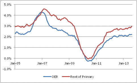
- Housing deceleration actually isn’t worrisome. Primary rents were 3.0% y/y vs 2.8% last. OER was 2.23% vs 2.19% last.
- Housing subcomponent drag was from lodging away from home, household energy, other minor pieces. So housing inflation story still intact.
- Core services inflation unch at 2.4% y/y; core goods inflation up to 0% from -0.2%. Source of uptick: mean reversion in core goods.
- So OER still reaches a new cycle high at 2.23%…it’s just not accelerating yet as fast as I expect it to. Lags are hard!
The initial reading of this number, as the tweet timeline above shows, was negative. The figure was weaker-than-expected, and Housing CPI decelerated from 2.26% to 2.17%. This seemed to be a painful blow to my thesis, which is that rising home prices will pass through into housing inflation (expressed in rents) and push core inflation much higher than economists currently expect.
Housing CPI is one of eight major subgroups of CPI, the other seven being Food and Beverages, Medical Care, Transportation, Apparel, Recreation, Education and Communication, and Other. Housing receives the most weight, at 41% of the consumption basket and an even heavier weight in core inflation. So, a deceleration in Housing makes it very hard for core inflation to increase, and vice-versa. If you can get the direction of Housing CPI right, then you’ll have a leg up in your medium-term inflation forecast (although it isn’t very helpful in terms of projecting month-to-month numbers, which are mostly noise). Thus, the deceleration in Housing seemed discouraging.
But on closer inspection, the main portions of Housing CPI are doing about what I expected them to do. Primary Rents (aka “Rent of primary residence”) is now above 3%, in sharp contrast to the expectations of those economists and observers who thought that active investor interest in buying vacant homes would drive up the price of housing but drive down the price of rents. Though I never thought that was likely…the substitution effect is very strong…it was a plausible enough story that it was worth considering and watching out for. But in the event, primary rents are clearly rising, and accelerating, and Owners’ Equivalent Rent is also rising although less-obviously accelerating (see Chart, source BLS).
 So, it is much less clear upon further review that this is a terribly encouraging CPI figure. It is running behind my expectations for the pace of the acceleration, but it is clearly meeting my expectations for what should be driving inflation higher. As I say above, econometric lags are hard – they are tendencies only, and in this case the lags have been slightly longer, or the acceleration somewhat muted, from what would typically have been expected from the behavior of home prices. Some of that may be from the “investors producing too many rental units” effect, or it might simply be chance. In any event, the ultimate picture hasn’t changed. Core inflation will continue to rise for some time, and will be well above 2% and probably 3% before the Fed’s actions have any meaningful effect on slowing the increase.
Verizon and Velocity
What is the significance of the fact that Verizon on Wednesday managed to sell $49bln in bonds without any kind of hiccup?
Obviously, it means that the corporate market is doing okay, that investors who are starved for good spreads like the attractive spread the bonds were priced at, and that there is reasonable confidence in the marketplace that Verizon can succeed even as a much more-leveraged company. All are good things.
But here is another thing to think about. My friend Peter Tchir, who writes the excellent T-Report, noted this morning that “Investors weren’t selling other bonds to buy Verizon.” That is, a fair amount of the money may well have been coming out of cash to go into the Verizon bonds.
Why does this matter? Remember that the velocity of money is the inverse of the demand for real cash balances. That is, when everyone is holding cash, the velocity of money is low; when no one wants to hold cash, the velocity of money is high. I have shown the chart below (source: Enduring Investments) before and argued that higher interest rates will tend to increase velocity by decreasing the demand for real cash balances. At least, that usually is what happens.

What would a turn higher in velocity look like? Well, I think it may well look something like this. “I no longer have to reach as much for yield and take all the risk I had to in March to get a 3% yield. So it’s time to invest some of this cash.”
Now, the ultimate flows get a little confusing, because cash is neither created nor destroyed in this transaction. Cash is transferred to Verizon from investors; Verizon then transfers that to Vodafone investors, who perhaps put it back in the bank for no net change. But if those investors in turn say “I don’t want those cash balances, either,” and then go invest or lend it or spend it, then you’re starting to see how money velocity is increasing. The money essentially becomes a kind of financial “hot potato” now, moving more rapidly from investor to investor, from consumer to vendor, and so on. The volume of transactions rises, which increases prices and output as explained by the MV≡PQ monetarist credo.
And that is how higher rates can produce more inflation.
We are seeing other strange things, too, that could be consistent with this explanation. Another great blog, “Sober Look,” observed last week that 30-year jumbo mortgage loan rates have fallen below conforming mortgage loan rates. Their explanation of the phenomenon is worth reading, but note this part: “Flush with deposits, banks have access to extraordinarily cheap capital and are seeking to earn more interest income.” Yet this has been true for some time. What has changed is that interest rates are now higher, increasing the opportunity cost of cash in both nominal and real terms.
This doesn’t automatically mean that money velocity is increasing; it may just be an interesting bond sale and unusual market activity in jumbo mortgages. But it is worth thinking about, because as I note in that article linked to above, even a modest rise in money velocity could produce an aggressive response from inflation.
A Summary of My Post-CPI Tweets
Here are my post-CPI tweets from this morning. You can follow me @inflation_guy:
- CPI
#inflation +0.2% core. But here’s the thing: that’s with housing showing unexpected softness. And housing markets are bubbling. - Unrounded core inflation 1.698%. That’s the last we’ll see of 1.6% handles for years.
- Core inflation actually barely rounded up, at +0.155% m/m. But, again, that’s with housing inexplicably weak.
- Core services 2.4%. Core goods still plodding along at -0.2%, and holding overall core inflation down. That won’t persist.
- CPI major groups accelerating: Food/bev, Housing, Apparel, Transp, Rec, Educ/Comm (89.5%). Decelerating: Medical and Other (10.5%).
- …but housing only accelerated b/c household energy. OER was unch at 2.2% and primary rents 2.8% from 2.9%. That’s a quirk.
- certainly nothing in today’s inflation data to scare the Fed into a faster taper.
- bonds are breaking lower; although the convexity overhang has been worked off, we never got the expected bounce! Not sure why they’re weak.
- higher rates->higher velocity->more inflation pressure, ironically. in this case, higher rates won’t affect money supply as offset to that
Of all of the places I expected to see a downside surprise, housing was not it. Of course, econometric lags aren’t the same as destiny, so the fact that the leading series all turned higher at the “right time” to cause a rise in Owners’ Equivalent Rent right about now is helpful information for investing, but not necessarily a timing tool!
At 2.2%, OER is still well above core inflation and primary rents at 2.8% are as well. But core goods continue to drag on the overall core inflation number (and to hold core inflation well below median inflation, which comes out later this morning).
I feel I should nudge lower my forecast for 2013 core inflation again, to a range of 2.4%-2.7% from 2.5%-2.8%. I am doing this for two practical reasons related to housing. One is that every month that passes without the expected acceleration is one less month over which inflation can accelerate to reach my year-end target. The other is that every month that passes without the expected acceleration increases the odds that I’m simply wrong, and something is holding down rents even though home prices are launching higher. I don’t think that’s true, but I want to be cognizant of overconfidence bias! However, at this point my nudging of the forecast is more about the former point: my 2014 forecast range remains 3.0%-3.6% for core.
Why Aren’t Delinquencies Falling Faster?
The great news today is that mortgage delinquencies dropped to their lowest level in five years. Look at the chart (source: Bloomberg)! Doesn’t it look great?
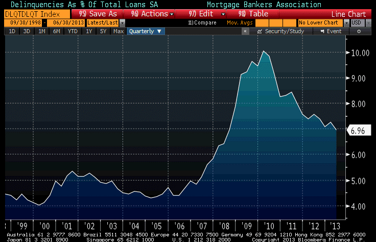 This was actually a bit surprising to me. With the Unemployment Rate doing about what it usually does in recoveries, and the economy adding something a bit shy of 200,000 new jobs per month, and with interest rates low and housing prices rising, you would think that delinquencies would have improved much more than they have.
Pretty much all of the delinquency data looks the same way. Here is a chart of new foreclosure actions as a (seasonally-adjusted) percentage of total loans.
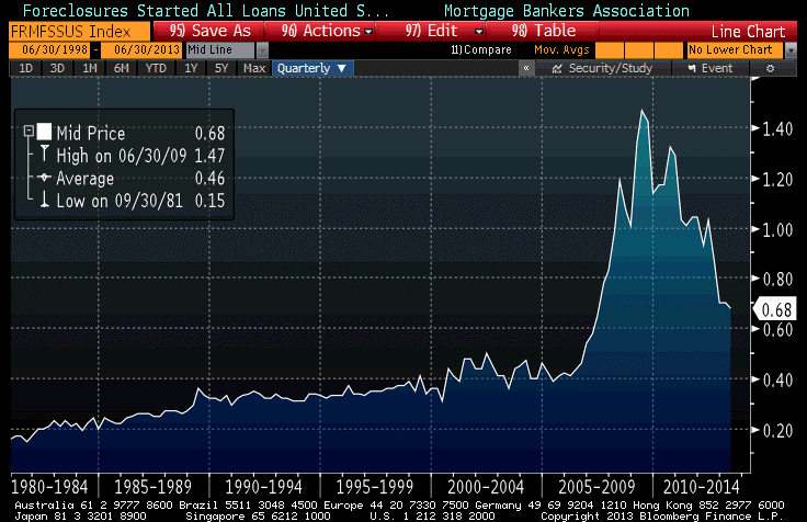 While well off its highs, this would have been a record level just a few years ago.
Is this a symptom of the “part-time America” phenomenon, in which all of these new jobs are being generated as part-time work, so that the improvement in the lot of the average worker is not paralleling the improvement in the jobs or unemployment rate numbers? (I’m not disputing that such a phenomenon exists; in fact I think it does. I am asking whether this is a symptom of that, or if there is another cause?) In any event, it isn’t a very good sign, and is one reason that even once QE ends, the Fed will endeavor to keep rates low for a very long time.
By the way, it also makes me wonder whether the celebrated move of institutional investors into the private residential real estate market is having a smaller effect than many people think it is. If there were big players looking to buy bank REO on the offered side, then wouldn’t you think banks would be accelerating foreclosures and that the delinquencies would be dropping faster (as homeowners either get into the foreclosure process, whereupon they aren’t in the delinquency stats, or get serious about becoming current)? I don’t know the answer.
.
Here is a technical point for institutional investors in inflation-indexed bonds and/or swaps – something worth watching for.
There has been much concern in some quarters recently about the coming increase in demand for high-quality collateral to back swaps under Dodd-Frank regulations. One way this could manifest in the inflation markets is to narrow the spread between inflation “breakevens” and inflation swaps. As the chart below (Source: Enduring Investments) illustrates, the inflation swaps curve is always above the “breakeven” curve. In theory, both curves should be measuring the same thing: aggregate inflation expectations over some period. And, in fact, they do. But while the inflation swaps market is a relatively-pure measure of inflation expectations, breakevens have some idiosyncrasies that make them less useful for this purpose. Predominant among these idiosyncrasies is the fact that nominal Treasury bonds act in the market as if they are very, very good collateral and so often trade at “special” financing rates. That is, when you buy a Treasury bond you not only buy a stream of cash flows, but you pay a little extra for it since you can borrow against it at attractive rates sometimes (if you are an investor who does not utilize the bonds for collateral, then you are paying for this value for no reason). However, TIPS are much more likely to be “general” collateral, and to offer no special financing advantage. There is no fundamental reason for this: TIPS are Treasuries, and are just as valuable as collateral to post as margin as are nominal Treasuries. There just isn’t a deep short base, and the main owners of TIPS are inflation-linked bond funds that actively repo them out so that they are rarely in short supply. It is unusual, although no longer unprecedented, to see a TIPS issue trade special.
The consequence of this is that Treasury yields are lower than they would otherwise be, by the amount of the “specialness option,” and TIPS yields are not affected by the same phenomenon. Therefore, breakevens are lower than they would otherwise be.
If, in fact, there becomes a shortage of “good” collateral to use to post as swaps margin, one place I would expect that to show up would be in the TIPS market. I would expect that TIPS issues would begin to go on special more-frequently, and to start to behave like the good collateral they are. The consequence of that would be to cause TIPS yields to decline relative to nominal yields as they gain the “specialness option,”, and for breakevens to rise towards inflation swap levels. (As an aside, that would also cause TIPS asset swaps to richen of course).
A long time ago, I summarized this argument here,[1] and a slightly more-rigorous draft of a paper is here.[2]
As I said, this is a technical point and not something the non-institutional investor needs to worry about.
[1] I am bound to include this notice with any online use of the article: “This article was originally published in The Euromoney Derivatives & Risk Management Handbook 2008/09. For further information, please visit www.euromoney-yearbooks.com/handbooks.”
[2] Frankly, I need to update this paper and get it published, but the last time I submitted it I had one referee tell me “this is wrong” and the second referee said “this is obvious” so I decided in frustration to let it drift.
Sweet And Sour
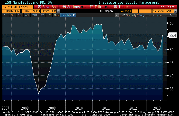
Yes, I understand that it is an absolute blast to be long stocks when they are ripping higher. Everyone has fun, everyone feels wealthy, and all it took was for the Fed to defer a statement on the taper plan for at least a couple of months. For equity folks, that was equivalent to sounding the “all clear” signal to keep the party going for another couple of months. Add to that great news the fact that the ISM manufacturing index unexpectedly leapt today to two-year highs (see chart, source Bloomberg, below), and you have the possibility of good growth, with a supportive Fed. It isn’t that surprising that in the short term the equity folks are happy and the bond folks are a bit concerned.
But the worst threat to stocks isn’t the taper, it isn’t an incipient slowdown in China, and it isn’t the fact that margins appear to be compressing. It’s that they will, some day, face competition for investment dollars from interest rates, commodities, real estate, and all of those other things that haven’t been exciting to invest in for a while.
Ten-year interest rates at 2.70% are not an exciting investment, but they are definitely more exciting than 1.60% rates were. However, you don’t really need to think about whether marginal investment dollars will flow to bonds since rates are 110bps higher now. You know that, no matter what the yield, more investment dollars are going to be flowing to fixed income going forward.
How do we know this? We know it because the Fed isn’t going to be buying $85bln per month, at some point in the not-too-distant future. So we know that, even if the Fed doesn’t sell, the bond market will be soaking up another $85bln of investment dollars compared to what it has been doing during QE3. And those dollars will need to come from somewhere. After all, this is just the ‘portfolio balance channel’ in reverse. The Fed pushed risky markets higher by buying all the safe stuff, so as to force investors to move out the risk spectrum. By taking away the “safe” alternatives, in other words, the Fed substituted for “animal spirits” in the market. (I discussed and illustrated this back in January.)
The opposite also occurs, though. When the Fed steps out, some investors will buy those “safer” investments at the higher yields where those markets clear. Those investors will be coming out of stocks, mainly. By substituting for animal spirits, the Fed pushed the stock market higher when investors didn’t feel much like pushing it there. And, once they start to taper that policy, they need investors with real animal spirits to step in and take risky positions in stocks because they want to.
The head-scratcher for me is, why would I want to take a risky position in stocks now, when interest rates and in particular real interest rates, are higher…if I didn’t want to take that position before? Does growth suddenly look that much better?
I ought to reiterate here that I still think a bond rally is due, despite today’s shellacking in a fairly illiquid-seeming market. I will change that view if 10-year yields rise another 5-10bps, however. I frankly think that while Bernanke likely wants to take the first step towards tapering while he is still Chairman – since it’s the polite thing to do to take the riskiest step of unwinding his policy before the next Chairman is forced to do it – I doubt he wants to get so far down the tapering road that the next Chairman feels locked in to a certain course of policy. So I suspect we will not see as much tapering this year as the market expects. Investors clearly thought we would get some indication about tapering at this meeting, and we didn’t. Bond folks know we will, eventually. Equity folks also know we will, but they all think they can get out as soon as the Fed gives the signal.
The problem, of course, is that some investors won’t wait for the explicit signal. To be fair, it has been a losing trade to be early on the Fed taper story, but that just means the ultimate comeuppance is going to be worse.
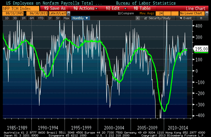
There is a ton of data due out on Friday, but my attention will not be on the Payrolls figure (Consensus: 185k). It is perhaps frightening to think about this, but Payrolls in the neighborhood of 200k is about all that we can expect. The chart below (Source: Bloomberg) shows the BLS Nonfarm Payrolls statistics along with a 24-month moving average. Ignore the swings from month to month. Instead, notice that in the expansion in the mid-2000s the 2-year average never got above 200k, and even in the robust expansion of the late 1990s the average was only about 250k (and we’re not about to have a robust expansion any time soon!). So, whether you like it or not, 200k per month is about all you’re going to get.
The Unemployment Rate is expected to decline back to 7.5% after rising to 7.6% last month. And again, here, the rate of decline in the Unemployment Rate is about as fast as you’re going to get it (see chart below, source Bloomberg). In fact, if anything the decline in the ‘Rate is slightly faster than in recoveries past, although as has been well documented the unemployment rate is much higher if you discount the increased prevalence in this recovery of part-time work.
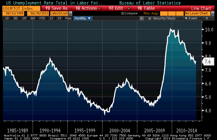 So, on growth the sad truth is that we have been waiting for economic improvement, but none is coming. This is about as good as it is likely to get, economically speaking (at least, in terms of the pace of improvement, though with time this will pull the Unemployment Rate gradually lower).
Indeed, much faster growth would likely incline the Fed to taper faster, and even to consider additional tightening measures. And much slower growth would probably dampen the rather ebullient earnings estimates of the sell-side analysts. The dividend yield is less than 2% with inflation-linked bonds paying around 0.5%. So I won’t be looking at the numbers very closely. We are already in the sweet spot. What I am going to be looking for, tomorrow and going forward, is any sign that investors are getting a sour taste.
Is A Bond Rally Due?
As we head into a very busy week of economic data, the bond market remains drippy with the 10-year yield up to 2.59%. (Just writing that makes me laugh. Who would have thought, only a few years ago, that 2.59% was a high-ish yield?)
How we got here, from the ultra-low levels of the last two years, is well-traveled territory. The Fed’s swing from “QE-infinity” to “someday, maybe, we might not buy as many bonds” helped trigger a run for the exits, and then negative convexity inflection points kept the rout going for a long time. Most lately, the threat of muni bond convexity has been looming as the next big concern.
But my message today is actually one of good cheer. The worst of the bond selloff was now more than three weeks ago, without a further low being established. In my experience, convexity-inspired selloffs typically end not with a sharp rebound but with a sideways trade as “trapped” long positions gradually work their way out and buyers start to nibble. But it remains a buyer’s market for several weeks, at least.
We are getting far enough along in that process that I suspect we have a rally due. This has nothing to do with any economic data coming up. There is enough data coming this week, from Consumer Confidence to Payrolls to GDP to the Fed statement, that both bulls and bears will be able to find something to point to. And I am not pointing to technicals, exactly. I am just saying that markets rarely move in a straight line, and even bear markets – such as the one I think we have now entered, in bonds – have nice rallies from time to time.
But here’s a reason to expect this to happen relatively soon. The chart below is a neat “seasonal heat map” chart from Bloomberg showing the monthly yield change for the last 10 years and the average monthly change on the top line.
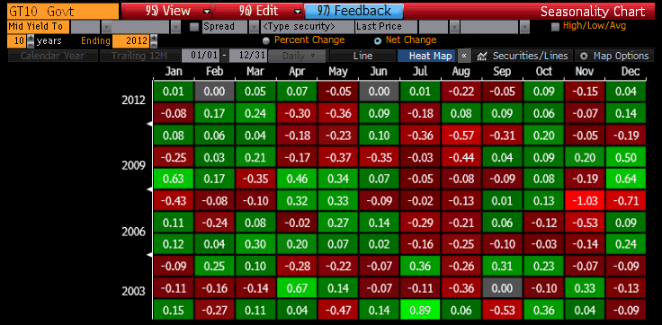 For a long time, I have been following the rule of thumb I learned as a mere babe in the bond market, and that’s that the best time of the year to buy bonds is the first few days of September. From at least the late 1970s until today, September until mid-October has been the strongest seasonal period of the year (not every year, but with enough consistency that you wanted to avoid being short in September). But the heat map above shows that this tendency may have shifted. The month that has seen the best average bond market performance over the last decade has been August, with yields falling an average of 22bps with rallies in 8 of the last 10 years. If we were sitting with 10-year yields at 1.59%, I would be less interested in this observation, but at 2.59% I am looking for the counter-trade.
To be sure, yields in the big picture are headed higher, not lower. But I am looking for signs that the recent selloff has over-discounted the immediate threat of ebbing Federal Reserve purchases. And I don’t expect growth to suddenly leap forward here, either.
As an aside, 10-year TIPS yields have also experienced one of their best months in August, with the other clear positive month being January. But, because nominal yields have been so strong, August has been the worst month for breakevens, with 10-year breakevens falling 10bps on average over the last ten years. No other month has seen breakevens decline as much as 6bps, on average.
Now, although I am a bond bear in the big picture, I don’t think that the housing market is doomed because interest rates will go up one or two or three percent. I am fascinated by how many analysts seem to think that unless 10-year rates are below 3%, the housing market will collapse. I argued about six weeks ago that higher mortgage rates should not impact sales of homes very much as long as the interest rate is less than the expected capital gain the homeowner expects to make on the home. (Higher rates will, however, cut fairly quickly into speculative building activity, which is much more rates-sensitive). And here is another reason not to worry too much about the housing market. A story in Bloomberg last week says that adjustable-rate mortgages are booming again, with mortgagees taking them out at the highest pace since 2008. Faced with higher rates, and a Fed with is not likely to raise short rates for a long while – as they have taken pains to keep reminding us – homebuyers have rationally decided to take the cheaper money and let the future refinancing take care of itself.
Whether that is sowing the seeds of a future debacle I will leave to other pundits to debate. From my perspective, the important point is that higher rates are not likely to slow home sales, or the recent rise in home prices, very much…unless they get a lot higher.