Archive
They’re Starting to Come Around on Rent Inflation
For a couple of years, I have been relentlessly defending my forward inflation forecasts against a sizeable group of people who looked at various high-frequency rent indicators and concluded that rents were going to be imminently in deflation. (For most of the last year many of those same people thought tariffs would be a large and immediate effect increasing inflation. Fortunately for them, being wrong on both counts, at least the errors offset somewhat.)
This battle began in early 2023, shortly after the publication of new indices by the Federal Reserve Bank of Cleveland, supported by a paper entitled “Disentangling Rent Index Differences: Data, Methods, and Scope” by Adams, Lowenstein, and Verbrugge. Those authors parsed the BLS rent microdata to separate out the new tenants, and created a “New Tenant Repeat Rent” (NTRR) Index that supposedly served as a leading indicator of what all rents were going to do. Naturally, NTRR had peaked early and was heading down sharply, which reinforced the observation from things like Zillow, Apartment list, etc that new rents in the aftermath of the post-eviction-moratorium catch-up were declining.[1]
The San Francisco Fed also published a piece in mid-2023, entitled “Where is Shelter Inflation Headed,” by Kmetz, Louis, and Mondragon. Don’t get me wrong, I love it when people try to create better models of inflation processes. But this was another one that made just terrible forecasts, because (as in the former case) it was put together by econometricians who didn’t understand the actual underlying process and thought they could just torture the truth out of the data. They included this wonderful (and subsequently damning, because the Internet remembers everything) chart.

Accompanying that chart was the helpful clarifying statement, in case you didn’t get the import: “Our baseline forecast suggests that year-over-year shelter inflation will continue to slow through late 2024 and may even turn negative by mid-2024.”
In case you were curious, it didn’t turn negative; in mid-2024 it was a bit above 5%.
So back then is when I had to start defending a fairly simple premise: the behavior of landlords when they offer rents to new renters does not necessarily mirror what they offer to renewing renters. In fact, I could be even more strident – landlords could not offer lower rents to everyone, even if they offered them to new renters. That’s because a landlord needs to cover his costs or he won’t be a landlord for long. And in 2023, the costs for a landlord were still rising very rapidly – labor, energy, insurance, taxes, maintenance, and so on. My model – first presented in Enduring Investments’ Quarterly Inflation Outlook in August 2023 – suggested that rents were going to decelerate, but much more slowly than others were forecasting. I had them as low as 3% by mid-2024 before flattening out, and even that turned out to be too aggressive on the disinflation side.

By now, regular readers are familiar with this model and familiar with the fact that it still is calling for Rent of Primary Residence to hang around the current 3% level for quite a while yet. Want ‘em lower? Lower landlord costs.
But this article isn’t meant (only) to pat myself on the back. I also want to recognize when someone gets it right and the great inflation analysts at Barclays recently published an article entitled “Apples and oranges in the CPI basket: Why market rent gauges mislead on shelter,” by Millar, Sriram, Giannoni, and Johanson. It is marvelous article, and you have access to Barclays Live and care about this topic you should read it. While they don’t build a cost-plus model like I did, they got to many of the core reasons why looking at new-renter indices is bound to be misleading. My favorite charts from the piece are below (I also had these in my recent CPI report).

What my model does is tell you why that had to be the case: landlords can’t just lower rents on their whole renter base if their costs are increasing. The only exception to that would be if there had been significant overbuilding such that there was a surplus of apartments over the demand from renters. In some places, especially those currently experiencing a negative immigration shock, that may be the case (although those places happen to also be the ones experiencing large increases in insurance costs, so it’s not quite that easy). But nationwide, there is not a surfeit of apartments for rent. Ergo, no rent deflation. And it’s going to stay that way for a while.
One final note here, about the recent Trump announcement that the Administration desires less institutional ownership of single family homes and apartments. I say ‘desires,’ even though that isn’t how it was phrased, since there appears to be no obvious way that the Administration can force this. They are reportedly looking into whether antitrust regulations can be used to keep institutions from accumulating very large portfolios of shelter units, but this looks like (at best) a task for the legislature, not the executive. But let’s consider quickly what the effect would be if Trump got his way in this regard.[2] Institutions which own homes and apartments don’t hold them off the market. That would be terrible carry. They rent them, just as landlords do. If you forced institutions to divest single-family homes, it would simply move supply from the rental market to the owned-home market. That would probably drive home prices a little lower, relative to the prior baseline, but increase rent growth at the margin. This doesn’t seem productive!
[1] I talked about NTRR in a July 2023 episode of my podcast: Ep.74: Inflation Folk Remedies
[2] Honestly, I don’t think he really means to do this. Some amount of what the President says – especially the impossible things – are intended for consumption by voters. I could be wrong on this. Mr. Trump does have a way of making things happen that didn’t seem possible initially, but in this case there’s probably not much he can do and anyway it wouldn’t have a big impact anyway.
Enough with Interest Rates Already
One of the things which alternately frustrates me and fascinates me is the mythology surrounding the idea that the central bank can address inflation by manipulating the price of money, even if it ignores the quantity of money.
I say “mythology” because there is virtually no empirical support for this notion, and the theoretical support for it depends on a model of flows in the economy that seem contrary to how the economy actually works. The idea, coarsely, is that by making money more dear the central bank will make it harder for businesses to borrow and invest, and for consumers to borrow and spend; therefore growth will slow. This seems to be a reasonable description of how the world works. But this then gets tied into inflation by appealing to the idea that lower aggregate demand should lower price pressures, leading to lower inflation. The models are very clear on this point: lower growth causes less inflation and more growth causes more inflation. The fact that this doesn’t appear to be the case in practice seems not to have lessened the fervor of policymakers for this framework. This is the frustrating part – especially since there is a viable alternative framework which seems to actually describe how the world works in practice, and that is monetarism.
The fascinating part are the incredibly short memories that policymakers enjoy when it comes to pursuing new policy using their preferred framework. Here’s the simplest of examples: from December 2008 until December 2019, the Fed Funds target rate spent 65% of the time pinned at 0.25%. The average Fed funds rate over that period was 0.69%. During that period, core inflation ranged from a low of 0.6% in 2010 to a high of 2.4%, hitting either 2.3% or 2.4% in 2012, 2016, 2017, 2018, and 2019. That 0.6% was an aberration – fully 86% of the time over that 11 years, core inflation was between 1.5% and 2.4%. Ergo, it seems reasonable to point out that ultra–low interest rates did not seem to cause higher inflation. If that is our most-recent experience, then why would the Fed now be aggressively pursuing a theory that depends on the idea that high interest rates will cause lower inflation? The most-recent evidence we have is that interest rates do not seem to affect inflation.
This isn’t just a recent phenomenon. But the nice thing about the post-GFC period is that for a good part of it, the Fed was ignoring bank reserves and the money supply and effecting policy entirely through interest rates (well, occasionally squirting some QE around, but if anything that should have increased inflation – it certainly didn’t dampen the effect of low interest rates). This became explicit in 2014 when Joseph Gagnon and Brian Sack, shortly after leaving the Fed themselves, published “Monetary Policy with Abundant Liquidity: A New Operating Framework for the Federal Reserve.” In this piece, they argued that the Fed should ignore the quantity of reserves in the system, and simply change interest rates that it pays on reserves generated by its open market operations. The fundamental idea is that interest rates matter, and money does not, and the Fed dutifully has followed that framework ever since. As I just noted, though, the results of that experiment would seem to indicate that low interest rates, anyway, don’t seem to have the effect that would be predicted (and which effect is necessary if the policy is to be meaningful).
And really, this shouldn’t be a surprise because for the prior three decades, the level of the real policy rate (adjusting the nominal rate here by core CPI, not headline) has been completely unrelated to the subsequent change in core inflation.

So, to sum up: for at least 40 years, the level of real policy rates has had no discernable effect on changes in the level of inflation. And yet, current central bank dogma is that rates are the only thing that matters.
I stopped the chart in 2014 because that’s when the Gagnon/Sack experiment began, but it doesn’t really change anything to extend it to the current day. Actually, all you get is a massive acceleration and deceleration in core inflation that all happened before any interest rate changes affected growth (seeing as how we have not yet had a recession). So it’s a result-within-a-result, in fact.
Any observation about how the Fed manages the price of money rather than its quantity would not be complete without pointing out that the St. Louis Federal Reserve’s economist emeritus Daniel L Thorton, one of the last known monetarists at the Fed until his retirement, wrote a paper in 2012 entitled “Monetary Policy: Why Money Matters and Interest Rates Don’t” [emphasis in the original title]. In this well-argued, landmark, iconic, and totally ignored paper Dr. Thornton argued that the central bank should focus almost entirely on the quantity of money, and not its price. Naturally, this is concordant with my own view, plus more than a century of evidence around the world that the price level is closely tied to the quantity of money.
To be fair, the connection of changes in M2 to changes in the price level has also been weak since the mid-1990s, for reasons I’ve discussed at length elsewhere. But at least money has a history of being related to inflation, whereas interest rates do not (except as a result of inflation, rather than as a cause of them); moreover, we can rehabilitate money by separately modeling money velocity.
There does not appear to be any way to rehabilitate interest rate policy as a tool for addressing inflation. It hasn’t worked, it isn’t working, and it won’t work.
Do Rents Really Actually Lead Home Prices?
The inflation thesis at this point has both a top-down and a bottom-up rationale (as all good theses do). The top-down rationale is that the extraordinary rise in the quantity of money over the last few years has yet to be fully reflected in the price level; ergo, inflation should continue for a while – even if money supply growth stops cold – because the price level has a lot of ‘catching up’ to do.
The bottom-up rationale depends a lot on what happens in the housing market. The first place that prices shot up was in the more flexible components of inflation, especially in goods. “Sticky” inflation followed, only turning north in 2021 and then accelerating in earnest especially as the eviction moratorium eventually ended and rents began to catch up. As the chart below (source: Atlanta Fed) illustrates, core “flexible” CPI (in white, right hand scale) is decelerating and is down to about 7% y/y…but core “sticky” CPI (red, left hand scale) is at 5.6% and shows no signs of even peaking.

An important part of the “sticky” basket is the weighting assigned to rents. Rents show up as both Rent of Primary Residence (you rent a place to live) and Owners’ Equivalent Rent of Residences (your opportunity cost is that you don’t have to pay for an apartment, so this is an imputed cost). Both rents move together, mostly because the Bureau of Labor Statistics reasons quite naturally that the best measure of the imputed rent a homeowner would pay is the market for rentals that he/she actually could pay. These two pieces of CPI are the biggest and the baddest, and they don’t even exercise. I always say that if you can forecast rents accurately, you will not be terribly wrong on overall inflation. Rents are the 800lb gorilla. Where they sit has a big influence on overall inflation.
Traditionally, observers of the inflation market have forecast rent based on a simple lag of home prices. There are reasons to suspect that’s not the whole story, but it has worked for a very long time. Here is a chart of the last 20 years or so, with the Case-Shiller index (lagged 18 months) in green and the Existing Home Sales Median Price y/y (lagged 15 months) in blue against Owners’ Equivalent Rent in red.

Even though inflation as a whole has been low and stable, home prices themselves have varied enough thanks to the housing implosion in the mid-2000s that you can see a reasonable outline of why inflation people tend to like this simple model. It’s at least suggestive.
Recently, that has been called into question by a researcher at the Mercatus Center at George Mason University. Kevin Erdmann wrote a paper published this year entitled “Rising Home Prices are Mostly from Rising Rents.” When the paper came out I tweeted it with the note “I need to read the whole paper.” If Erdmann is right, then the entire market is doing it wrong and (a) home price inflation should not be slowing down right now, since rents are not, and (b) the way the market models rents is just plain useless. So, this was definitely worth looking at from my perspective!
Well, I’ve read the paper. I am sorry to report that in my view, the author makes very strong claims but supports his argument with very weak statistics. That being said, I still think this is a paper worth reading – some might come to a different conclusion than I have.
It isn’t like I think the author is completely out of his gourd. It is absolutely reasonable to expect home prices and rents to be related since they are both ways to acquire shelter services. It isn’t as if Erdmann is saying that they aren’t related, and some of his cross-sectional data and findings are interesting. The problem is that he starts with a mental model of how things work, and then proceeds to show information which, given his assumptions, seem to support what he is saying. The mental model isn’t absurd: a home can be thought of as a way to purchase a whole stream of shelter services in one lump. When home prices rise, it could mean that buyers are evaluating this stream of services as being worth more than they previously were because they are observing rising rents, or because they were priced out of the rental market and chose to buy an asset with a shelter services component instead.
But it could also be the case that home buyers are reflecting rising expectations of long-term rent inflation, in which case spot rents needn’t change at all. It might be the case that home buyers are making totally stochastic decisions, and it just happens that when lots of people buy homes it pushes up home prices which then displaces people into the rental market.
All of these stories would result in time series that are highly correlated. And Erdmann has a number of illustrations and data points showing that there is a correlation. For example, he pointed out that in 2021, “the metropolitan areas with the highest rents also had the highest prices.” However, Erdmann’s real claim isn’t that home prices and rents are closely related, but that rents lead home prices. The point about the connection of rents and prices in various metropolitan areas is not evidence supporting his claim that rents cause prices, but it doesn’t refute it either. The problem is, he takes such data as support of his claim, when it isn’t. This turns out to be his modus operandi – start with a mental model of how it works, show data that demonstrates the two things are connected, and then assert causality.
In the paper, there is not a single test of causality. With time series, we can test whether one series statistically leads another in various ways; for example, with the Granger Causality Test (which doesn’t actually test causality but merely the lead-lag relationship). If the point of the paper is that (contrary to the usual assumption) movements in rents cause movements in home prices – which is a big claim – then at the very least I’d have expected to see a Granger test.
There is some evidence that statistical inference is not the author’s strong suit. He shows several clouds of data points where any reasonable person can see there is no clear trend, and then proceeds to run a regression line through them. The fact that we can calculate a regression slope – we can always calculate a regression slope – does not mean that it is statistically significant. And even if it is statistically significant, it may not be economically significant. Unfortunately, there are no such tests of significance in the paper and I suspect for several of the charts it would be impossible to reject the null hypothesis that there is no relationship at all between the variables despite a provocatively-drawn regression line.
He also has a figure (Figure 9 in the paper) which shows changes in prices and rents for a number of metro areas over time. Clearly, there is a positive relationship – but no one disputes that. The question is, does the relationship get better when you lag one of the variables? No such analysis is done.
In general, all the author “proves” is that there is a relationship between rents and home prices, which I think we already knew. The rest of it is storytelling, trying to persuade us that the causality makes sense his way. I don’t mean to suggest that the paper is a complete bust! The author does have some good ideas that I will borrow. He makes the point that discounting home prices by general inflation doesn’t really make sense because we don’t care about the general price level when we buy a home; we care about the price level of shelter. This is a simple point, but fairly profound in a way. It risks being somewhat circular if we aren’t careful, but it’s a good point.
And the funny thing is, despite the fact that I think the evidence is much stronger that the evidence for causality runs the other way, I agree with some of his policy conclusions. His main conclusion is that “…if rising rents are the more important factor [rather than temporary demand factors or monetary stimulus], then policies aimed at stimulating more construction may be more apt and may help increase real incomes for Americans in neighborhoods where rents have been rising.” I completely agree that, given the severe housing shortage that we seem to have in this country, that making it easier for builders to create homes and apartments would be good industrial policy.
But you don’t need to believe that rents lead home prices to think that is a good idea!
The Flip Side of Financialization of Commodities
Recently, a paper by Ilia Bouchouev (“From risk bearing to propheteering”) was published that had some very thought-provoking analysis. The paper traced the development of the use of futures and concluded that while futures markets in the past (specifically, he was considering energy markets but notes the idea started with agricultural commodities) tended towards backwardation – in which contracts for distant delivery dates trade at lower prices than those for nearer delivery dates – this is no longer as true. While others have noticed that futures markets do not seem to provide as much ‘roll return’ as in the past, Mr. Bouchouev suggested that this is not a random occurrence but rather a consequence of financialization. (My discussion of his fairly brief paper will not really do it justice – so go and read the original from the Journal of Quantitative Finance here).
Let me first take a step backward and explain why commodities markets tend towards backwardation, at least in theory. The idea is that a producer of a commodity, such as a farmer growing corn, has an affirmative need to hedge his future production to ensure that his realized product price adequately compensates him for producing the commodity in the first place. If it costs a farmer $3 per bushel to grow corn, and he expects to sell it for $5 per bushel, then he will plant a crop. But if prices subsequently fall to $2 per bushel, he has lost money. Accordingly, it behooves him when planting to hedge against a decline in corn prices by selling futures, locking in his margin. The farmer is willing to do this at a price that is lower than his true expectation, and possibly lower than the current spot price (although, technical note: Keynes’ ‘Theory of Normal Backwardation’ refers to the difference between his expected forward price and the price at which he is willing to sell futures, so that futures prices are expected to be downwardly biased forecasts of prices in the future, and not that they are expected to be actually lower than spot ‘normally’). He is willing to do this in order to induce speculators to take the other side of the trade; they will do so because they expect, on average, to realize a gain by buying futures and selling in the future spot market at a higher price.
Unfortunately, no one has ever been able to convincingly prove normal backwardation for individual commodities, because there is no way to get into the collective mind of market participants to know what they really expect the spot price to be in the future. Some evidence has been found (Till 2000) that a risk premium may exist for difficult-to-store commodities (agricultural commodities, for example), where we may expect producers to be the most interested in locking in an appropriate profit, but on the whole the evidence has been somewhat weak that futures are biased estimators of forward prices. In my view, that’s at least partly because the consumer of the product (say, Nabisco) also has a reason to hedge their future purchases of the good, so it isn’t a one-sided affair. That being said, owners of long futures positions have several other sources of return that are significant and persistent,[1] and so commodity futures indices over a long period of time have had returns and risks that are similar to those found in equity indices but deriving from very different sources. As a consequence, since the mid-2000s institutional investment into commodity indices has been significant compared to the prior level of interest, even as actual commodity returns have disappointed over the last 5-10 years. Which brings us back to Mr. Bouchouev’s story again.
He makes the provocative point that part of the reason commodity returns have been poorer in recent years is because markets have tended more toward contango (higher prices for distant contracts than for those nearer to expiry) than backwardation, and moreover that that is a consequence of the arrival of these institutional investors – the ‘financialization’ of commodities futures markets, in other words. After all, if Keynes was right and the tendency of anxious producers to be more aggressive than patient speculators caused futures to be downwardly biased, then it stands to reason that introducing more price-insensitive, institutional long-only buyers into the equation might tilt that scale in the other direction. His argument is appealing, and I think he may be right although as I said, commodities are still an important asset class – it’s just that the sources of returns has changed over time. (Right now, for what it’s worth, I think the potential return to spot commodities themselves, which are ordinarily a negative, are presently a strong positive given how badly beaten-down they have become over time).
All of that prelude, though, is to point out a wonderful corollary. If it is the case that futures prices are no longer biased lower by as much as they once were, then it means that hedgers are now getting the benefit of markets where they don’t have to surrender as much expectation to hedge. That is, where an oil producer might in the past have had to commit to selling next year’s oil $1 lower than where he expected to be able to sell it if he took the risk and waited, he may now be able to sell it $1 higher thanks to those institutions who are buying long-only indices.
And that, in turn, will likely lead to futures curves being extended further into the future (or, equivalently, the effective liquidity for existing markets will be extended further out). For example, over the last decade there have been several new commodities indices that systematically buy further out the curve to reduce the cost of contango. In doing so, they’re pushing the contango further out, and also providing bids for hedgers to be able to better sell against. So Mr. Bouchouev’s story is a good one, and for those of us who care about the financial markets liquidity ecosystem it’s a beautiful one. Because it isn’t the end of the story. Chapter 1 was producers, putting curves into backwardation to provide an inducement to draw out speculators to be the other side of the hedge. Chapter 2 is Bouchouev’s tale, in which financial buyers push futures markets towards contango, which in turn provides an inducement to draw out speculators on the other side, or for hedgers to hedge more of their production. In Chapter 3, also according to Bouchouev, the market balances with hedgers reacting to economic uncertainty, and speculators fill in the gaps. Of course, in Chapter 4 the Fed comes in and wrecks the market altogether… but let’s enjoy this while we can.
[1] …and beyond the scope of this article. Interested parties may refer to History of Commodities as the Original Real Return Asset Class, by Michael Ashton and Bob Greer, which is Chapter 4 in Inflation Risks and Products, 2008, by Incisive Media. You can contact me for a copy if you are unable to find it.
Inflation and Castles Built on Sand
Note: my articles are now released somewhat earlier on the blog site and on my private Twitter feed @inflation_guyPV, which you can sign up for here, than they are released on my ‘regular’ Twitter feed. Moreover, my monthly live tweets during the CPI report are only available on that feed.
Also note: if you haven’t heard it yet, you can listen to my appearance on the Bloomberg Odd Lots podcast last month here. For that matter, you can listen to it at that link even if you have heard it yet.
Now that we can stop focusing on the imminent destruction of wealth in the stock market, for at least today (I am underwhelmed at the rebound on light volume), we can get back to something that matters: inflation.
The chart below shows a straight, unweighted average of core or median inflation in the US, Europe, Japan, the UK, and China. (The chart looks similar if we only include the US, Europe, and China and exclude the recent ‘outlier’ Japan and UK experiences).

We know that, in the US, measured inflation is going to be rising at least until the summer, as the one-offs from 2017 drop out of the data. The prior decline, and the current rise, obscure the underlying trend…which is for steady acceleration in prices. But it’s important to realize that this is not merely a US trend, caused supposedly by ‘tight labor markets’ or somesuch. It is a much broader phenomenon. The chart below shows four of those five countries.

In the US, inflation has been rising steadily (other than that one-off burp caused by cell phones etc) since 2013. In the UK, China, and Europe, inflation has been rising since ~2015, to lesser or greater degree. In the UK, core inflation is showing some signs of topping as the Brexit-related spike fades, and the trend is less convincing in Europe so far. In Japan (see below), inflation has been rising since 2010, but the tax-induced spike in 2014 has messed up the steadiness of the trend. And of course, it is worth pointing out that 0.3% is only high relative to the average of -0.3% since 1999!

I point out these trends because inflation is less of a concern if it happens in one country than if it happens as part of a global inflation process. Imagine that inflation is represented by the proportion of the sand on a beach that is wet rather than dry. There are two ways that sand can get wet: because of random wave action that comes and goes, or because the tide is coming in.
Where you build your sand castle depends on which of these two – tide or waves – is responsible for wetting the sand on the beach.
This isn’t an idle question or speculation. In 2005, two researchers at the ECB[1] discovered that the first principal component of inflation in the G7 countries accounted for about 60-70% of the inflation in those countries. They theorized that this factor was a “global inflation” process and that FX rates compensated for the accumulated idiosyncratic inflation in each country pair. (Enduring Investments subsequently confirmed their work and we actually use this insight to drive some of our strategy models). It makes sense that there is an inflation “tide,” since central bank behaviors as well as fiscal behaviors (and cross-border interactions such as trade liberalization) are somewhat synchronized globally. Over the last decade, everyone has been easing monetary policy and running stimulative fiscal policy. Since the early 1990s, until lately, everyone was liberalizing trade policy and reaching more free trade agreements. So it isn’t a stretch to think that to at least some degree, the global inflation cycle should be synchronized as well.
(Indeed, I would argue that if there had been less synchronization in policy, then the idiosyncratic factor of an aggressively easing Japanese central bank would probably have led to a much weaker Yen and higher inflation in Japan than we have seen. Easy monetary policy is only inflationary in the short-term if there is an FX response – the waves that impact inflation idiosyncratically – which don’t really happen when everyone is doing it.) In the long-run, of course, excessively easy monetary policy changes the tide level. And, like the tide, it isn’t that easy to reverse.
The signs suggest the tide is coming in. Place your sand castle accordingly.
[1] M. Ciccarelli & B. Mojon, “Global Inflation”, ECB Working Paper N⁰537, October 2005.
John Mauldin and Long Soapy Showers
I feel like I am falling behind in my articles and commenting on other articles that people have recently written about inflation. After years – literally, years – in which almost no one wrote anything about inflation, suddenly everyone wants to opine on the new shiny object they just found. At the same time, interest in the solutions that we offer – investment strategies, consulting, bespoke inflation hedges, etc – has abruptly picked up, so it feels like the demand for these articles is rising at the same time that my time to write them is shrinking…
But I try.
I want to quickly respond to an article that came out over the weekend, by widely-read author John Mauldin. I’ve corresponded over the years from time to time about inflation, especially when he got way out on the crazy-person “CPI is made up” conspiracy theory limb. To be fair, I think he considers me the crazy person, which is why he’s never referred to me as the inflation expert in his articles. C’est la vie.
His recent article “State of Inflationary Confusion”, though, was much more on-point. Honestly, this is the best article Mauldin has written on this topic in years. I don’t agree with all of it but he at least correctly identifies most of the issues correctly. He even seems to understand hedonic adjustment and the reason we need it, and the reason the PCE/CPI debate exists (which is no easy thing – it depends on what you’re trying to do, which one is ‘better’), and that hasn’t always been the case.
Where I agree with him is when he says that ‘None of us are average’. This is obviously true, and is one reason that we have on our website a calculator where you can look at your own CPI by adjusting the components for what you personally spend (though it doesn’t take into account where you live, which is one reason your experience differs).
But I disagree with him when he says “Reducing this complexity to one number and then using that number to guide monetary policy is asking for trouble.” What an odd remark. We do that for every other piece of data: GDP, home sales, home prices, durable goods sales, retail sales, unemployment, and so on, and we use that information to guide all sorts of policy. Why would it be the case that CPI, of all of the figures, isn’t very useful for this reason? Look, your personal unemployment number is not 4%. It is either 0% or 100%. Totally binary. If Mauldin was making a compelling argument here, you’d throw out the Unemployment Rate long before you’d throw out CPI.
Indeed, if you play with the numbers on our calculator you will find that unless your consumption basket is wildly different, your CPI is likely to be fairly similar to the average. This is why TIPS make sense for many investors – it’s “close enough” to what your consumption basket is actually doing. And it is certainly close enough for policy.
The problem with monetary policy isn’t that they’re using PCE or CPI when they should be using the other, or that neither PCE nor CPI reflects the exact experience of most people. The problem with monetary policy is that policymakers don’t know what the right policy response is given the numbers because they don’t believe in monetarism any more. So their models don’t work. And that’s the problem.
Here’s an analogy (and you know I love analogies). You’re taking a shower, and your impression is “hey, this seems too hot.” It doesn’t really matter if you are using Celsius or Fahrenheit, or just a general visceral sense that it’s too hot. You simply think the water is too hot. So, to solve your problem you apply more soap.
That’s what the Fed is doing. The water is too hot, so they’re applying soap. And they’re really confused when that doesn’t seem to make the water any colder. So they say “gosh, our model must be wrong. The water temperature must be somewhat less sensitive to the amount of soap applied than we thought it was. So let’s recalibrate and apply more soap.” It never occurs to them that they’ve got the wrong model.
That’s the problem with central banking. It isn’t what you use to measure the water temperature, as long as you’re close; it’s how you respond to it that matters. And policymakers don’t understand inflation and, as a result, don’t understand how to affect it.
That Smell in the Fed’s Elevator
A new paper that was presented last week at the 2017 U.S. Monetary Policy Forum has garnered, rightly, a lot of attention. The paper, entitled “Deflating Inflation Expectations: The Implications of Inflation’s Simple Dynamics,” has spawned news articles such as “Research undercuts Fed’s two favorite U.S. inflation tools”(Reuters) and “Everything the Market Thinks About Inflation Might Be Wrong,”(Wall Street Journal) the titles of which are a pretty decent summary of the impact of the article. I should note, because the WSJ didn’t, that the “five top economists” are Stephen Cecchetti, Michael Feroli, Peter Hooper, Anil Kashyap, and Kermit Schoenholtz, and the authors themselves summarize their work on the FiveThirtyEight blog here.
The main conclusion – but read the FiveThirtyEight summary to get it in their own words – is that the momentum of the inflation process is the most important variable (last year’s core inflation is the best predictor of this year’s core inflation), which is generally known, but after that they say that the exchange rate, M2 money supply growth, total nonfinancial credit growth, and U.S. financial conditions more broadly all matter more than labor market slack and inflation expectations.
Whoops! Who farted in the Fed’s elevator?
The Fed and other central banks have, for many years, relied predominantly on an understanding that inflation was caused by an economy running “too hot,” in that capacity utilization was too high and/or the unemployment rate too low. And, at least since the financial crisis, this understanding has been (like Lehman, actually) utterly bankrupt and obviously so. The chart below is a plain refutation of the notion that slack matters – although much less robust than the argument from the top economists. If slack matters, then why didn’t the greatest slack in a hundred years cause deflation in core prices? Or even get us at least close to deflation?

I’ve been talking about this for a long time. If you’ve been reading this blog for a while, you know that! Chapters 7-10 of my book “What’s Wrong With Money?: The Biggest Bubble of All” concerns the disconnect between models that work and the models the Fed (and most Wall Street economists) insist on using. In fact, the chart above is from page 91. I have talked about this at conferences and in front of clients until I am blue in the face, and have become accustomed to people in the audience staring at me like I have two heads. But the evidence is, and has long been, incontrovertible: the standard “expectations-augmented-Phillips-Curve” makes crappy predictions.[1] And that means that it is a stupid way to manage monetary policy.
I am not alone in having this view, but until this paper came out there weren’t too many reputable people who agreed.
Now, I don’t agree with everything in this paper, and the authors acknowledge that since their analysis covers 1984-present, a period of mostly quiescent inflation, it may essentially overstate the persistence of inflation. I think that’s very likely; inflation seems to have long tails in that once it starts to rise, it tends to rise for some time. This isn’t mysterious if you use a monetary model that incorporates the feedback loop from interest rates to velocity, but the authors of this paper didn’t go that far. However, they went far enough. Hopefully, this stink bomb will at last cause some reflection in the halls of the Eccles building – reflection that has been resisted institutionally for a very long time.
[1] And that, my friends, is the first time I have ever used “crap” and “fart” in the same article – and hopefully the last. But my blood pressure is up, so cut me some slack.
Need a Jedi to Blow Up the R-Star
I haven’t written an article for a couple of weeks. This is not entirely unusual: I have written this commentary, in some form, since about 1996 and there are occasional breaks in the series. It happens for several reasons. Sometimes it is simple ennui, as writing an analysis/opinion article for twenty years can occasionally get boring especially when markets are listless as they frequently are in August. Other times, it is because work – the real work, the stuff we get paid for – is too consuming and I have not time or energy left to write a few hundred words of readable prose. Maybe that’s part of the reason here, since the number of inflation-investing-related inquiries has definitely increased recently, along with some new client flows (and not to mention that we are raising capital for Enduring Investments through a 506(c) offering – you can find details on Crowdfunder or contact me through our website). Finally, in recent years as the ability to track the number of clicks/eyeballs on my writing has improved, I’ve simply written less during those times…such as August…when I know that not many people will read the writing.
But this time is a little different. While some of those excuses apply in some measure, I’ve actually skipped writing over the last two weeks because there is too much to say. (Fortunately, I said some of it on two Bloomberg TV appearances, which you can see here and here.)
Well, my list of notes is not going to go away on its own so I am going to have to tackle some of them or throw them away. Unfortunately, a lot of them have to do with the inane nattering coming out of Federal Reserve mouthpieces. Let’s start today with the publication that gathered a lot of ink a couple of weeks ago: San Francisco Fed President John Williams’ FRBSF Economic Letter called “Monetary Policy in a Low R-star World.”
The conclusion that Williams reached was sensational, especially since it resonates with the “low return world” meme. Williams concluded that “The time has come to critically reassess prevailing policy frameworks and consider adjustments to handle new challenges, specifically those related to a low natural real rate of interest.” This article was grating from the first paragraph, where Williams casts the Federal Reserve as the explorer/hero:
“As nature abhors a vacuum, so monetary policy abhors stasis. Instead of being a rigid set of precepts, it follows the adage, that which survives is that which is most adaptive to change… In the wake of the global financial crisis, monetary policy has continued to evolve… As we move forward, economic conditions require that central banks and governments throughout the world carefully reexamine their policy frameworks and consider further adjustments in terms of monetary policy strategy—both in its own right and as it relates to other policy arenas—to successfully navigate these new seas.”
One might give the Federal Reserve more credit if subsequent evolutions of policy prescriptions were not getting progressively worse rather than better. Constructive change first requires critical evaluation of the shortcomings of current policy, doesn’t it?
Williams carries on to argue that the natural rate of interest (R-star) is lower now than it has been in the past. Now, Fed watchers should note that if true, this implies that current monetary policy is not as loose as has been believed. This is a useful conclusion for the Fed, since it would explain – within their existing model framework – why exceptionally low rates have not triggered better growth; it also would allow the Fed to raise rates more slowly than otherwise. I’ve pointed out before the frustrating tendency of groupthinking economists to attribute persistent poor model predictions to calibration issues rather than specification issues. This is exactly what Williams is doing. He’s saying “there’s nothing wrong with our model! If we had simply known that the natural rate was lower, we would have understood that we weren’t as stimulative as we thought.” Possible, but it might also be that the whole model sucks, and that the monetarists are right when they say that monetary policy doesn’t move real variables very well. That’s a hypothesis that at least bears examining, but I haven’t seen any fancy Fed papers on it.
What is really remarkable is that the rest of the paper is largely circular, and yet no one seems to mind. Williams attributes the current low r-star to several factors, including “a more general global savings glut.” Note that his estimates of r-star take a sharp turn lower in 2008-9 (see chart below, source FRBSF Economic Letter, figure 1).

Wow, I wonder what could have caused an increase in the global savings glut starting in 2008? Could it be because the world’s central banks persistently added far more liquidity than was needed for the proper functioning of the economy, leading to huge excess reserves – aka a savings glut?
So, according to Williams, the neutral interest rate is lower at least in part because…central banks added a lot of liquidity. Kind of circular, ain’t it?
Since according to Williams this fact explains “uncomfortably low inflation and growth despite very low interest rates,” it must mean he is bravely taking responsibility – since, after all, quantitative easing caused the global savings glut which, in his construct, caused low growth and inflation. Except that I don’t think that’s what he wants us to conclude.
This isn’t research – it’s a recognition that what they did didn’t work, so they are backfilling to try and find an excuse for why their theories are still good. To the Fed, it is just that something happened they didn’t realize and take account of. Williams wants to be able to claim “see, we didn’t get growth because we weren’t as stimulative as we thought we were,” because then they can use their old theories to explain how moving rates around is really important…even though it didn’t work this time. But the problem is that low rates don’t cause growth. The model is wrong. And no amount of calibration can fix a mis-specified model.
Obamacare, Monopsonies, and Inflation – Nice Try!
Recently, the San Francisco Federal Reserve published an Economic Letter in which they described why “Medicare Payment Cuts Continue to Restrain Inflation.” Their summary is:
“A steady downward trend in health-care services price inflation over the past decade has been a major factor holding down core inflation. Much of this downward trend reflects lower payments from public insurance programs. Looking ahead, current legislative guidelines imply considerable restraint on future public insurance payment growth. Therefore, overall health-care services price inflation is unlikely to rebound and appears likely to continue to be a drag on inflation.”
The article is worth reading. But I always have a somewhat uncomfortable reaction to pieces like this. On the one hand, what the authors are discussing is well known: healthcare services held down PCE inflation, and core CPI inflation, due to sequestration. Even Ben Bernanke knew that, and it was one reason that it was so baffling that the Fed was focused on declining core inflation in 2012-2014 when we knew why core was being dragged lower – and it was these temporary effects (see chart, source Bloomberg, showing core and Median CPI).

But okay, perhaps the San Francisco Fed is now supplying the reason: these were not one-off effects, they suggest; instead, “current legislative guidelines” (i.e., the master plan for Obamacare) are going to continue to restrain payments in the future. Ergo, prepare for extended lowflation.
This is where my discomfort comes in. The article combines these well-known things with questionable (at best) assumptions about the future. In this latter category the screaming assumption is the Medicare can affect prices simply by choosing to pay different prices. In a static analysis that’s true, of course. But it strikes me as extremely unlikely in the long run.
It’s a classic monopsonist pricing analysis. Just as “monopoly” is a term to describe a market with just one dominant seller, “monopsony” describes a market with just one dominant buyer. The chart below (By SilverStar at English Wikipedia, CC BY 2.5, https://commons.wikimedia.org/w/index.php?curid=13863070) illustrates the classic monopsony outcome.
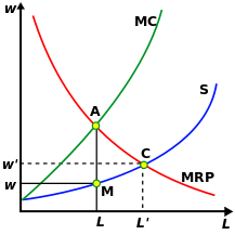
The monopsonist forces an equilibrium based on the marginal revenue product of what it is buying, compared to the marginal cost, at point A. This results in the market being cleared at point M, at a quantity L and a price w, as distinct from the price (w’) and quantity (L’) that would be determined by the competitive-market equilibrium C. So, just as the San Fran Fed economists have it, a monopsonist (like Medicare) forces a lower price and a lower quantity of healthcare consumed (they don’t talk so much about this part but it’s a key to the ‘healthcare cost containment’ assumptions of the ACA neé Obamacare). Straight out of the book!
But that’s true only in a static equilibrium case. I admit that I wasn’t able to find anything relevant in my Varian text, but plain common-sense (and observation of the real world) tells us that over time, the supply of goods and services to the monopsonist responds to the actual price the monopsonist pays. That is, supply decreases because period t+1 supply is related to the reward offered in period t. There is no futures market for medical care services; there is no way for a medical student to hedge future earnings in case they fall. The way the prospective medical student responds to declining wages in the medical profession is to eschew attending medical school. This changes the supply curve in period t+1.
Any other outcome, in fact, would lead to a weird conclusion (at least, I think it’s weird; Bernie Sanders may not): it would suggest that the government should take over the purchase and distribution of all goods, since they could hold prices down by doing so. In other words, full-on socialism. But…we know from experience that pure socialist regimes tend to produce higher rates of inflation (Venezuela, anyone?), and one can hardly help but notice that when the government competes with private industry – for example, in the provision of express mail service – the government tends to lose on price and quality.
In short, I find it very hard to believe that mere “legislative guidelines” can restrain inflation in medical care, in the long run.
Wage Growth Tracker – Wage Inflation is Already here
(**Administrative Note: Get your copy of my new book What’s Wrong with Money: The Biggest Bubble of All! Here is the Amazon link).
I am often critical of central banks these days, and especially the Federal Reserve. But that doesn’t mean I think the entire institution is worthless. While quite often the staff at the Fed puts out papers that use convoluted and inscrutable mathematics to “prove” something that only works because the assumptions used are garbage, there are also occasionally good bits of work that come out. While it is uneven, I find that the Atlanta Fed’s “macroblog” often has good content, and occasionally has a terrific insight.
The latest macroblog post may fall into the latter category. Before I talk about the post, however, let me as usual admonish readers to remember that wages follow inflation; they do not lead or cause inflation. That reminder is very important to keep in mind, along with the realization that some policymakers do think that wages lead inflation and so don’t get worried about inflation until wages rise as well.
With that said, John Robertson and Ellyn Terry at the Atlanta Fed published this great macroblog article in which they present the Atlanta Fed’s Wage Growth Tracker. Here’s the summary of what they say: most wage surveys have significant composition effects, since the group of people whose wages you are surveying now are very different from the group you surveyed last year. Thus, measures like Average Hourly Wages from the Employment report (which has been rising, but not alarmingly so) are very noisy and moreover might miss important trends because, say, high-wage people are retiring and being replaced by low-wage people (or industries).
But the Atlanta Fed’s Wage Growth Tracker estimates the wage growth of the same worker’s wage versus a year ago. That is, they avoid the composition effect.
It turns out that the Wage Growth Tracker has been rising much more steadily and at a higher rate than average hourly earnings. Here is the drop-the-mic chart:
 This shows that the wage-growth tracker follows the unemployment gap (lagged 6 months) very well: with a correlation of 0.93, actually. Moreover, the wage growth tracker is (and has been) over 3%.
With this data, the Phillips curve works like a charm. Higher employment is not only related, but closely related to higher wage growth. (For the record, Phillips never said that broad inflation was related to the unemployment rate. He said wage inflation was. See my post on the topic here.) The good news is that this doesn’t really say anything about future inflation, and what it means is that the worker who is actually employed right now is still keeping pace with inflation (barely) thanks to relatively strong employment dynamics.
The bad news, for Yellen and the other doves on the FOMC, is that if they were hiding behind the “tepid wage growth” argument as a reason to be suspicious that inflation will not be maintained, the Atlanta Fed just took a weed-whacker to their argument.