Archive
The Dollar – Best House on a Bad Block
I’m here to draw your attention to something alarming happening in currencies at the moment. Here is a picture of the US Dollar, which has lost a huge amount of value in the past year.

Now, before certain ones of you get all excited and say that this proves Trump is ruining the dollar and forcing foreigners to vamoose out of the United States, take a look at the Euro.

I’m not going to tease you too much with this. The first chart is just the dollar in terms of ounces of gold; the second is the Euro in terms of ounces of silver. Don’t worry, longtime readers: I’m not about to go all gold-bug on you. I could have done those charts with almost any currency against a wide variety of commodities: the Bloomberg Commodity Index is up 23% since mid-August, and +12% since the end of the year. So this isn’t just a precious metals story, and it isn’t just a dollar story. It’s a fiat currency vs ‘stuff’ story.
The recent breathless coverage of the melt-up in precious metals seemed to me to miss the bigger point of what it means. It’s awesome if you’re long precious metals. But the abrupt turn vertical is – or should be – alarming. But nothing looks alarming when it’s pointed higher.
Treasury Secretary Bessent, as I write this, just came out and stated that the United States has a strong dollar policy and has not intervened (at least not yet) to push the dollar lower against the yen. That’s all very nice but I don’t worry a lot about the level of the dollar against other currencies in the medium term and here’s why.
Let’s look at the monetary pipes, which to me imply an increase in the dollar and/or a sharp increase in long-term interest rates regardless of what happens to overnight policy rates. (Many people are concerned about long-term rates because of some vague sense that we are borrowing too much or because everyone is going to sell their US bonds – to buy what with the dollars they receive, no one seems to mention – but there is a mechanical/accounting relationship could cause that outcome).
To this end, the illustration below (Source: Enduring Investments[1]) is a helpful visual guide. For this analysis we are interested in the flows of the dollar system, more than its stock. And the important flows are – or have been – pretty stable. The US has for a long time run a substantial budget deficit, which means the government needs to source dollars by borrowing them. The three sources of those dollars have historically been foreign investors, the Fed, and domestic savers. Foreign investors have extra dollars because the trade deficit means that Americans send more dollars to foreign producers than foreign consumers send to US producers, and those extra dollars are invested in the US into government bonds (spigot on the lower left) or otherwise invested in markets or direct investment (spigot on the lower right). The Fed balance sheet, over the last decade or so, has often been a supplier of dollars to the system when it has been expanding more often than not. Finally, there are domestic savers who buy Treasury bonds among other things (but consider that when they’re buying US stocks, for example, the dollars are just sloshing from one domestic saver to another – that’s why there’s no flow shown for domestic savers buying US stocks). Those three ‘suppliers of dollars’ are the top hoses filling up the barrel of dollars in the illustration below.

Those flows tend to reach stasis via automatic stabilizers. For example, if the government is draining more money (with a big budget deficit) than is being supplied elsewhere, then either interest rates rise to induce domestic savers to provide more money, or the trade deficit expands. My concern is that automatic stabilizers tend to take time to stabilize, and currently there are some big changes. See the next illustration and focus on the differences compared with the prior one.

The cessation of the expansion of the Fed’s balance sheet has been happening for a while, and the balance sheet has even been shrinking a little. But the Trump Administration’s trade policies have caused two major changes: first, the trade deficit has been shrinking sharply (see charts below, source Bloomberg; the first shows the net trade balance monthly and the second shows the recent trends of declining imports and rising exports).


Some of this may be ‘payback’ for the surge in imports at the beginning of the year by importers trying to beat the imposition of tariffs, but there seems little question now that the trade deficit really is closing substantially. At the same time, foreign companies have been tripping all over each other to start making substantial investments into the US. In the second ‘barrel of money’ chart above, note the spigot at the lower right is really gushing, and two of the hoses supplying dollars have slowed to a trickle or stopped.
If that’s a fair representation, then what are the implications? If those trends persist, then the demand for dollars is going to outweigh the supply of dollars, leading to two outcomes. One of those is that in order to induce more dollars to fund the federal deficit, interest rates will have to rise. The Fed can control the policy rate, but in order to keep long-term rates down the Committee may eventually be forced to start up their hose again – intervening to buy Treasuries in the market to prevent long rates from rising, and expanding the balance sheet. The market stabilizer here would be for interest rates to rise and induce more domestic savings; if for policy reasons the Fed doesn’t want that then they’ll have to add more money themselves, with inflationary consequences. (It’s inflationary either way, but if interest rates rise it’s only indirectly inflationary in that higher interest rates also increase money velocity).
The other implication is that the dollar would strengthen on foreign exchange markets, since if foreigners are going to invest in the US in financial markets (or with direct investment, building new plants and so forth) they will need dollars to do so and the trade deficit is no longer providing a surplus of those dollars. It’s likely also that, with fewer dollars being sent abroad, domestic stock and bond markets would struggle more than they have been. A stronger dollar would be disinflationary at the margin, helping to hold down core goods prices, but this effect is fairly small…especially in the broader context I’ve mentioned, which is that all fiat currencies right now are getting smashed versus real stuff.
These are the implications of the recent large changes in financial flows. There are potential offsets available. If the trade deficit declines and the federal budget deficit declines also, it diminishes upward pressure on interest rates since domestic savers do not have to be incentivized to provide as much of the dollars in deficit. You can infer this from the barrel illustrations as well: if the federal budget moves towards balance, it lessens the net change in the system.
And there had been some positive signs on that score. The tariff revenue has been large, and some of the spending priorities of the prior Administration have been de-emphasized. These are positive developments which could lessen the pressure on the dollar and interest rates…except that the Trump Administration has been mooting the idea of ‘tariff dividend checks,’ increased defense spending, buying Greenland, and other significant spending initiatives.
It is also possible, even probable, that the Fed or Congress could change banking liquidity regulations in such a way that banks are forced to hold more Treasuries, which would add an additional hose to the top of the barrel. However, the more assets that banks are required to hold, worsening the return on assets of traditional banks, the more banking functions will start to move to non-bank entities or into crypto, increasing the money supply while decreasing the Fed’s control of it.
The upshot of all of these changes is that – based on the flows as we see them now, which could change – I believe we are going to see a significantly steeper yield curve and a significantly stronger dollar over the next few years.
Having said all of that, let me circle back to the start of this note – while the USD is not likely to collapse against other currencies, the movement against commodities (not to mention equities) and other real assets is disturbing. The US money supply has been accelerating recently; M2 is only +4.6% in the last 12 months, but that’s near (or may even be above) the maximum rate that is sustainable without causing inflation in a country that is deglobalizing and in demographic reverse. I am not bullish on gold and silver at these levels, and am more cautious on commodities than I have been in a while. But while I am a dollar bull against other currencies, I am a bear of fiat currencies against real assets generally…and I am concerned that the recent waterfall-like behavior of fiat presages a re-acceleration of CPI-style inflation. Commodities feed broadly into prices, but so do wages and lots of other things that are measured in terms of dollars. If the problem is fiat, and not gold and silver themselves, then it’s a bullish signal for inflation.
[1] These images were generated using AI image generation tools to create an illustrative representation for explanatory purposes.
No Need to Rob Peter to Pay Paul
So, I suppose the good news is that policymakers have stopped pretending that prices will go back down to the pre-pandemic levels. My friend Andy Fately (@fx_poet) in his daily note today called to my attention these dark remarks from Bank of England Chief “Economist” Huw Pill:
“If the cost of what you’re buying has gone up compared to what you’re selling, you’re going to be worse off…So somehow in the UK, someone needs to accept that they’re worse off and stop trying to maintain their real spending power by bidding up prices, whether higher wages or passing the energy costs through on to customers…And what we’re facing now is that reluctance to accept that, yes, we’re all worse off, and we all have to take our share.”
I think it’s worth stopping to re-read those words again. There are two implications that immediately leap out to me.
The first is that this is scary-full-Socialist. “We all have to take our share” is so anti-capitalist, anti-freedom, anti-individualist that it reeks of something that came from the pages of Atlas Shrugged. No, thank you, I don’t care to take my share of your screw-up. I would like to defend my money, and my real spending power, and my real lifestyle. If that comes at the cost of your lifestyle, Mr. Pill, then I’m sorry.
But the second point is that…it doesn’t come at the cost of someone else’s lifestyle. This is why I put “economist” in quotation marks above. There is still a lot of confusion out there between the price level and inflation, and what a change in the price level means, but if you’re an economist there shouldn’t be.
You see statements like this everywhere…”food prices are up 18%. If people are spending 18% more on food, it means they’re spending less elsewhere.” “Rents are up 17%. If people are spending 17% more on rent, it means they’re spending less elsewhere.” “Pet food is up 21%. If people are spending 21% more on pet food, it means they’re spending less elsewhere.” “New vehicle prices are up 22%. If people are spending 22% more on new vehicles, it means they’re spending less elsewhere.” “Price of appliances are up 19%. If people are spending 19% more on new appliances, it means they’re spending less elsewhere.”
You get my point. All of those, incidentally, are actual aggregate price changes since the end of 2019.
This is where an actual economist should step in and say “if the amount of money in circulation is up 37%, why does spending 18% more on good or service A mean that we have to spend less on good or service B?” In fact, this is only true if the growth in the aggregate amount of money is distributed highly unevenly. In ‘normal’ times, that might be a defensible assumption but during the pandemic money was distributed remarkably evenly.
Okay…the amount of money in circulation is a ‘stock’ number and the prices of stuff changing over time is a ‘flow’ number, which is why money velocity also matters. M*V is up about 24% since the end of 2019. So a 20% rise in prices shouldn’t be surprising, and since there’s lots more money out there a 20% rise in the price of one good does not imply you need to spend less on another good. That’s only true in a non-inflationary environment. The world has changed. You need to learn to think in real terms, especially if you are a “Chief Economist.”

(N.b. to be sure, this is somewhat definitional since we define V as PQ/M, but the overarching point is that with 40% more money in the system, it should be not the slightest bit surprising to see prices up 20%. And, if velocity really does act like a spring storing potential energy, then we should eventually expect to see prices up more like 30-40%.)
Here’s a little bonus thought.
Rents are +17%, which is roughly in line with a general rise in the prices of goods and services. Home prices are up about 36% (using Shiller 20-City Home Price Index), which is roughly in line with the raw increase in M2.
Proposition: since the price of unproductive real assets is essentially an exchange rate of dollars:asset – which means that an increase in a real asset’s price is the inverse of the dollar’s decrease – then the price of a real asset should reflect the stock of money since price is dictated by the relative scarcity of the quantity of dollars versus the real asset. But the price of a consumer good or service should reflect the flow of money, so something more like the MV/Q concept.
Implication:

Discuss.
Who’s Afraid of De-Dollarization?
Do we need to worry about the end of dollar dominance in international trade – the de-dollarization of global finance?
I am hoping to do a podcast on this topic in a few weeks, featuring a guest who is actually an expert on foreign exchange and who can push back on my thought processes (or, less likely, echo them) – but the topic seems timely now. There is widespread discussion and concern in some quarters, as China and Russia push forward efforts to establish the Chinese Yuan as an alternative currency for international trade settlement, that this could spell the sunset of the dollar’s dominance. Some of the more animated commentators declare that de-dollarization will dramatically and immediately eviscerate the standard of living in the United States and condemn the nation to be an also-ran third-rate economy as its citizens descend into unspeakable squalor.
Obviously, such ghoulish prognostications are ridiculously overdone for the purpose of generating clicks. But how much of it is true, at least on some level? What would happen if, tomorrow, the US dollar lost its status as the world’s primary reserve currency?
One thing that wouldn’t change at all is the quantity of dollars in circulation. That’s a number that the Federal Reserve exerts some control over (they used to have almost total control, when banks were reserve-constrained; now that banks have far more reserves than they need, they can lend as much as they like, creating as many floating dollars as they like, constrained only by their balance sheet). The holders of dollars have absolutely no control over the amount of them in circulation! If Party A doesn’t like owning dollars, they can sell their dollars – but they have to sell it to some Party B, who then holds the dollars.
What also wouldn’t change immediately is how many dollar reserves every country holds. From time to time, people get concerned that “China is going to sell all of its dollars.” But China got those dollars because they sell us more stuff than we sell them, which causes them to accumulate dollars over time. How can China get rid of their dollars? Their options are fairly limited:
- They can start buying more from us than they sell to us. We’ve been trying to get them to do this for years! Seems unlikely.
- They can buy from us, stuff priced in dollars, but only sell goods to us that are priced in Yuan. To get Yuan, a US purchaser would have to sell dollars to buy Yuan. Since China doesn’t want to be the other side of that trade (which would leave them with the same amount of dollars), the US purchaser would have to go elsewhere to buy Yuan. This would strengthen the Yuan. This is also something we’ve been trying to get them to do for years! The Bank of China stops the Yuan from strengthening against the dollar by…selling Yuan and buying dollars. Hmmm.
- They can just hit the bid and sell dollars against all sorts of other currencies. This would greatly weaken the dollar, and is perhaps the biggest fear of many of the people worried about de-dollarization.
Supposing that China decided on #3, they would be making US industry much more competitive around the world against all of the currencies that China was buying. Foreign buyers of US products would now be able to buy US goods much more cheaply. It would cause more inflation in the US, but it would take a large dollar decline to drastically increase US inflation since foreign trade is a smaller part of the US economy than it is for many other countries.
A much lower dollar, making US prices look lower to non-US customers, would help balance the US trade deficit. Yay!
A tendency towards balance of the trade deficit would have ancillary impacts. When the US government runs a fiscal deficit, it borrows from essentially two places: domestic savers and foreign savers. Foreigners, having a surplus of dollars (since they have trade surpluses with us), buy Treasuries among other things. If the trade deficit went down drastically, so would foreign demand for US Treasuries. That in turn would (unless the government started to balance its fiscal deficit) cause higher interest rates, which would be necessary to induce domestic savers to buy more Treasuries. Or, if domestic savers were not up to the task, the buyer of last resort would be…the Federal Reserve, which could buy those bonds with printed money. And that’s a really bad outcome.

Now, does any of this cause a collapse of the American system or spell an end to US hegemony? No. If policymakers respond to such an event by refusing to get the fiscal house in order, then things could get ugly. But it would be hard to blame that outcome on the end of the dollar as the medium of international trade – blame would more appropriately be directed at the failure of domestic policymakers to adjust in response.
In the end, it is hard to escape the idea that good or bad economic and inflation outcomes in the United States track mainly, one way or the other, back to domestic policy decisions. Whether the US economic system remains a dominant one is…fortunately or unfortunately…in our hands, not in the hands of foreign state actors.
Trade Surplus and Budget Deficit? Ouch.
The market gyrations of late are interesting, especially during the NCAA Basketball tourney. Normally, volatility declines when these games are on during the week, as traders watch their brackets as much as they do the market (I’ve seen quantitative analysis that says this isn’t actually true, but I’m skeptical since I’ve been there and I can promise you – the televisions on the trading floor are tuned to the NCAA, not the CNBC, on those days). Higher volatility not only implies that lower prices are appropriate in theory but it also tends to happen in practice: higher actual volatility tends to force leveraged traders to reduce position size because their calculation of “value at risk” or VAR generally uses trailing volatility; moreover, these days we also need to be cognizant of the small, but still relevant, risk-parity community which will tend to trim the relative allocation to equities when equity vol rises relative to other asset classes.
My guess is that the risk-parity guys probably respond as much to changes in implied volatility as to realized volatility, so some of that move has already happened (and it’s not terribly large). But the VAR effect is entirely a lagging effect, and it’s proportional to the change in volatility as well as to the length of time the volatility persists (since one day’s sharp move doesn’t change the realized volatility calculation very much). Moreover, it doesn’t need to be very large per trader in order to add up to a very large effect since there are many, many traders who use some form of VAR in their risk control.
Keep in mind that a sharp move higher, as the market had yesterday, has as much effect on VAR as a sharp move lower. The momentum guys care about direction, but the VAR effect is related to the absolute value of the daily change. So if you’re bullish, you want a slow and steady move higher, not a sharp move higher. Ideally, that slow and steady move occurs on good volume, too.
The underlying fundamentals, of course, haven’t changed much between Friday and Monday. The chance of a trade war didn’t decline – the probability of a trade war is now 1.0, since it has already happened. Unless you want to call an attack and counterattack a mere skirmish, rather than a trade war, there is no longer any debate about whether there will be conflict on trade; the only discussion is on magnitude. And on that point, nothing much has changed either: it was always going to be the case that the initial salvo would be stridently delivered and then negotiated backwards. I’m not sure why people are so delighted about the weekend’s developments, except for the fact that investors love stories, and the story “trade war is ended!” is a fun story to tell the gulli-bulls.
As a reminder, it isn’t necessary to get Smoot/Hawley 2.0 to get inflation. Perhaps you need Smoot/Hawley to get another Depression, but not to get inflation. The mere fact that globalization is arrested, rather than continuing to advance, is enough to change the tradeoff between growth and inflation adversely. And that has been in the cards since day 1 of the Trump Administration. A full-on trade war, implying decreased globalization, changes the growth/inflation tradeoff in a very negative way, implying much tighter money growth will be required to tamp down inflation, which implies higher interest rates. I’m not sure we aren’t still headed that way.
But there is a much bigger issue on trade, which also implies higher interest rates…perhaps substantially higher interest rates. We (and by ‘we’ I mean ‘he’) are trying to reduce the trade deficit while increasing the budget deficit sharply. This can only happen one way, and that is if domestic savings increases drastically. I wrote about this point first in 2010, and then re-blogged it in 2013, here. I think that column is worth re-reading. Here’s a snippet:
“And this leads to the worry – if the trade deficit explodes, then two other things are going to happen, although how much of each I can’t even guess: (I) protectionist sentiment is going to become very shrill, and fall on the ears of a President who is looking to burnish his populist creds, and (II) the dollar is going to be beaten like a red-headed stepchild (being a red-headed stepchild, I use that simile grudgingly).”
Well, it took a while to happen and I never dreamed the “President looking to burnish his populist creds” would be a (supposed) Republican…but that’s what we have.
Here’s the updated chart showing the relationship between these two variables.

It’s important to remember that you can’t have a trade account surplus and a financial account surplus. If someone sells a good to a US consumer, that seller holds dollars and they can either sell the dollars to someone else (in which case the problem just changes hands), buy a US good (in which case there’s no trade deficit), or buy a US security. If we need non-US persons to buy US securities, then we need to run a trade deficit. If we want to run flat on trade, then we either need to run a balanced budget or fund the difference out of domestic savings. A large increase in domestic savings implies a large decrease in domestic spending, especially if the Fed is now ‘dissaving’ by reducing its balance sheet. Inducing extra domestic savings also implies higher real interest rates. Now, this isn’t a cataclysmic result – more domestic savings implies more long-term domestic growth, although perhaps not if it’s being sopped up by the federal government – but it’s a very large shift to what the current balances are.
If you want to run a flat balance of trade, the best way to do it is to run a balanced federal budget. Going opposite directions in those two accounts implies uncomfortably large shifts in the account that makes up the difference: domestic savings, and large shifts in interest rates to induce that savings.
Two Disturbing Trends
Note: We are currently experimenting with offering daily, weekly, monthly, and quarterly analytical reports and chart packages. While we work though the kinks of mechanizing the generation and distribution of these reports, and begin to clean them up and improve their appearance, we are distributing them for free. You can sign up for a ‘free trial’ of sorts here.
Today I want to mention two disturbing trends – one of which may have some minor implications for inflation.
The first is the six-month downtrend in the US Dollar (see chart, source Bloomberg).

I’ve included the last several years’ worth of pricing for the broad trade-weighted dollar so as to help avoid any alarmist conclusions. While the trade-weighted dollar is down more than 7% since the beginning of 2017, it is unchanged on a trailing-two-year basis and still quite a bit above the level of three years ago. Moreover, as I’ve mentioned before – when the question concerned the effect of the dollar’s rise on inflation – the dollar doesn’t have a huge impact on US inflation. The US economy is much more closed than, for example, the economies of the Eurozone, the UK, or Switzerland – while the US is a major trade partner for virtually every country in the world, exports and imports as a percentage of GDP are less important than they are for most other countries in the world. Consequently, while movements in currency pairs will cause the declining currency to absorb more of the joint inflationary impulse of the two countries, the effect is fairly small in the US. A 15% dollar appreciation over a two-year period is associated with roughly a 1% deflation in core goods, nine months later, which is close to where core goods inflation has been (actually between 0 and -0.8% for the last few years). Core goods themselves are only about ¼ of core inflation overall. Since the dollar’s appreciation or depreciation has almost no discernable effect on core services a 15% dollar appreciation over two years only nudges core CPI down 0.25%.
So the effect is not large. However, it’s worth noting when the two-year rate of change goes from +16% (which it was one year ago) to 0%. This should start to add incrementally to core goods inflation, and provide a small upward lift to core inflation over the next year or so. But that assumes the dollar does not continue to slide. Continued dollar weakness might be attributed to the US political situation, but it isn’t as if most of our major trading partners are experiencing striking political stability (UK? Europe?). But dollar weakness could also be associated with a reversal in the relative hawkishness of the US Fed compared to other global central banks.
The run-up in the dollar corresponded with the end of Quantitative Easing in the US in 2014, combined with the continuation of QE (and more to the point, LSAP) in Europe and Japan. As hard as it is to think of Janet Yellen as being a hawk, on a global, relative basis her Fed was comparatively hawkish and this helped push the dollar higher.
Which brings us to the second disturbing trend, which may help to explain why the dollar is weakening: commercial bank credit growth has slowed markedly over the last year. The chart below (Source: Enduring Investments) shows the year-over-year change in commercial bank credit, based on data reported by the Federal Reserve.

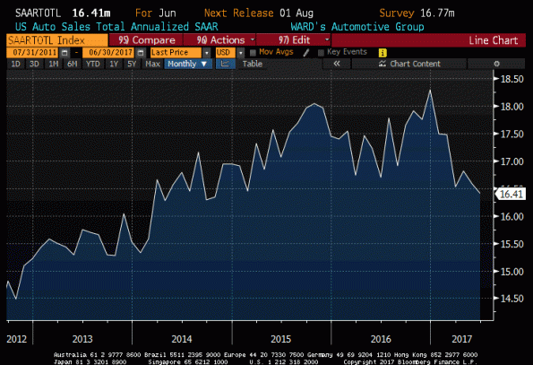
The current y/y rate of credit growth, at 3.4%, is a number much more consistent with recession than with expansion as the chart above illustrates. To be sure, it is hard to see many overt signs of weakness in the domestic economy, although auto sales have been weakening (see chart, source Bloomberg) and they can sometimes be an early harbinger of economic difficulties.
It is also worth noting that credit growth hasn’t translated into slower money growth – M2 is still rising at 6% per year – so there is not an implication of slower inflation from the deceleration in corporate credit (at least, so far). But, between the suggestion the dollar is making that Federal Reserve policy may not be as hawkish going forward as the market had assumed, and the interesting and possibly disturbing sign from slowing growth in corporate credit, I’m starting to become alert for other early signs of recession.
Of course, the dollar’s slide might instead indicate that the ECB and/or BOJ are about to become less dovish, more rapidly than the market had expected. While core Euro inflation has been a little more buoyant than many had expected (1.1% in the last release), it seems unlikely to drastically change Draghi’s course. However, I will keep an open mind on that point. I’m not saying a recession is imminent; I’m just saying that I’m starting to watch more carefully.
The Destination Currency in the Global Carry Trade: USD?
If you are an investor of the Ben Graham school, you’ve lived your life looking for “value” investments with a “margin of safety.” Periodically, if you are a pure value investor, then you go through long periods of pulling your hair out when momentum rules the day, even if you believe – as GMO’s Ben Inker eloquently stated in last month’s letter – that in the long run, no factor is as important to investment returns as valuation.
This is one of those times. Stocks have been egregiously overvalued (using the Shiller CAPE, or Tobin’s Q, or any of a dozen other traditional value metrics) for a very long time now. Ten-year Treasuries are at 1.80% in an environment where median inflation is at 2.5% and rising, and where the Fed’s target for inflation is above the long-term nominal yield. TIPS yields are significantly better, but 10-year real yields at 0.23% won’t make you rich. Commodities are very cheap, but that’s just a bubble in the other direction. The bottom line is that the last few years have not been a great time to be purely a value investor. The value investor laments “why?”, and tries to incorporate some momentum metrics into his or her approach, to at least avoid the value traps.
Well, here is one reason why: the US is the destination currency in the global carry trade.
A “carry trade” is one in which regular returns can be earned simply on the difference in yields between different instruments. If I can borrow at LIBOR flat and lend at LIBOR+2%, I am in a carry trade. Carry trades that are riskless and result from one’s market position (e.g., if I am a bank and I can borrow from 5-year CD customers at 0.5% and invest in 5-year Treasuries at 1.35%) are usually more like accrual trades, and are not what we are talking about here. We are talking about positions that imply some risk, even if it is believed to be small. For example, because we are pretty sure that the Fed will not tighten aggressively any time soon, we could simply buy 2-year Treasuries at 0.88% and borrow the money in overnight repo markets at 0.40% and earn 48bps per year for two years. This will work unless overnight interest rates rise appreciably above 88bps.
We all know that carry trades can be terribly dangerous. Carry trades are implicit short-option bets where you make a little money a lot of the time, and then get run over with some (unknown) frequency and lose a lot of money occasionally. But they are seductive bets since we all like to think we will see the train coming and leap free just in time. There’s a reason these bets exist – someone wants the other side, after all.
Carry trades in currency-land are some of the most common and most curious of all. If I borrow money for three years in Japan and lend it in Brazil, then I expect to make a huge interest spread. Of course, though, this is entirely reflected in the 3-year forward rate between yen and real, which is set precisely in this way (covered-interest arbitrage, it is called). So, to make money on the Yen/Real carry bet, you need to carry the trade and reverse the exchange rate bet at the end. If the Real has appreciated, or has been stable, or has declined only a little, then you “won” the carry trade. But all you really did was bet against the forward exchange rate. Still, lots and lots of investors make precisely this sort of bet: borrowing money is low-interest rate currencies, investing in high-interest-rate currencies, and betting that the latter currency will at least not decline very much.
How does this get back to the value question?
Over the last several years, the US interest rate advantage relative to Europe and Japan has grown. This should mean that the dollar is expected to weaken going forward, so that someone who borrows in Euro to invest in the US ought to expect to lose on the future exchange rate when they cash out their dollars. And indeed, as the interest rate advantage has widened so has the steepness of the forward points curve that expresses this relationship. But, because investors like to go to higher-yielding currencies, the dollar in fact has strengthened.
This flow is a lot like what happens to people on a ship that has foundered on rocks. Someone lowers a lifeboat, which looks like a great deal. So people begin to pour into the lifeboat, and they keep doing so until it ceases, suddenly, to be a good deal. Then all of those people start to wish they had stayed on the ship and waited for help.
In any event, back to value: the chart below (source: Bloomberg) shows the difference between the 10-year US$ Libor swap rate minus the 10-year Euribor swap rate, in white and plotted in percentage terms on the right-hand scale. The yellow line is the S&P 500, and is plotted on the left-hand scale. Notice anything interesting?

The next chart shows a longer time scale. You can see that this is not a phenomenon unique to the last few years.

Yes, the correlation isn’t perfect but to me, it’s striking. And we can probably do better. After all, the chart above is just showing the level of equity prices, not whether they are overvalued or undervalued, and my thesis is that the fact that the US is the high-yielding currency in the carry trade causes the angst for value investors. We can show this by looking at the interest rate spread as above, but this time against a measure of valuation. I’ve chosen, for simplicity, the Shiller Cyclically-Adjusted P/E (CAPE) (Source: http://www.econ.yale.edu/~shiller/data.htm)

Now, I should take pains to point out that I have not proven any causality here. It may turn out, in fact, that the causality runs the other way: overheated markets lead to tight US monetary policy that causes the interest rate spread to widen. I am skeptical of that, because I can’t recall many episodes in the last couple of decades where frothy markets led to tight monetary policy, but the point is that this chart is only suggestive of a relationship, not indicative of it. Still, it is highly suggestive!
The implication, if there is a causal relationship here, is interesting. It suggests that we need not fear these levels of valuation, as long as interest rates continue to suggest that the US is a good place to keep your money (that is, as long as you aren’t afraid of the dollar weakening). That, in turn, suggests that we ought to keep an eye on rates of change: if the ECB tightens more, or eases less, than is priced into European markets (which seems unlikely), or the Fed tightens less, or eases more, than is priced into US markets (which seems more likely, but not super likely since not much is presently priced in), or the dollar trend changes clearly. When one of those things happens, it will be a sign that not only are the future returns to equities looking unrewarding, but the more immediate returns as well.
The Pendulum of Inflation Complacency
I am sure that in my career I have seen weirder reactions, but when the Durable Goods number came out and plainly was significantly weaker-than-expected and energy rallied I must admit it was hard to think of one.
Presumably the reaction was an indirect one: weaker growth means the Fed is less likely to tighten, which means a lower dollar and hence, higher global demand for oil. But that seems a wild overthink. If there is a recession in the offing, and if we care about demand in oil markets (and I think we should), then weak economic growth from one of the world’s largest economies probably ought to be reflected in lower oil prices.
There is part of me that wants to say “maybe investors have finally realized that any given month of Durable Goods Orders is almost meaningless because the volatility of the number makes it hard to reject any particular null hypothesis.” I haven’t done this recently, but many years ago I discovered that a forecast driven by the mechanical rule of -0.5 times last month’s Durables change had a better forecasting record than Street economists. Flip the sign, divide by two. However, I don’t really think the market suddenly got wise.
I also don’t think it’s that a bunch of people got the API report, which came out at 4:30pm to subscribers only, early. That report supposedly showed a large draw in crude inventories when a build was expected – but I’m not into conspiracy theories. That would be too obvious, anyway.
The perspective of analysts on Bloomberg was that the oil market will “rebalance” this year, a point which isn’t very far from the point I made last week in my article “Don’t Forget Oil Demand Elasticity!” But rebalancing doesn’t mean that prices should go higher. They have, after all, already gone quite a bit off the lows. By our proprietary measure, the real price of oil is at a level which implies a 10-year expected real return of about 1% per annum. In other words, it’s within about 10% of fair value quantitatively; given the immense supply overhang that doesn’t seem to promise lots of upside from these levels.
It isn’t just energy. The Bloomberg Commodity Index is 15% off its January lows (see chart, source Bloomberg). Precious metals, industrial metals, softs, grains, and meats are all above their lows of the last 1-2 quarters.

Unfortunately, much of this is simply a function of the dollar’s retracement. The chart below (source: Bloomberg) shows the Bloomberg Commodity Index (left axis, inverted) against the broad trade-weighted dollar. Heck, arguably commodities are still lagging.

But the winds of change do seem to be about. Last week, the Treasury auctioned 5y TIPS; though this isn’t an event in and of itself, the fact that the auction was strongly bid is certainly unusual. The 5y TIPS are a difficult sell. People who are concerned about inflation are typically looking to protect against the long-term. But TIPS also represent real interest rate risk, and if you think inflation is going to be rising near-term then you probably don’t want to own lots of interest rate risk. Sure, you’ll prefer inflation-linked real rates to nominal rates (see my timely comment from January, “No Strategic Reason to Own Nominal Bonds Now”: since then, 10y real yields have fallen 40bps while 10y nominal yields have fallen 7bps), but if you really think inflation is about to rear its ugly head then you don’t want any real or nominal duration but only inflation duration.
And inflation duration has lately been doing really well. The chart below (source: Bloomberg) shows the marked rebound in the 10-year breakeven inflation rate since February 9th.

I think there’s some evidence that the pendulum of complacency on inflation has begun finally to swing back the other way. Core inflation is rising in Europe, the UK, Japan, and the US, and it was inevitable that someone would notice. Ironically, it took energy’s rally to make people notice (and energy, of course, isn’t in core inflation). But what do I care?
If in fact the pendulum of complacency and concern has finally reversed, then both stocks and bonds are in for a rough ride. Bonds may be marginally protected by a dovish Fed, but that only works as long as the inscrutable Fed stays dovish…or inscrutable.
(**Administrative Note: Get your copy of my new book What’s Wrong with Money: The Biggest Bubble of All! Here is the Amazon link.)
Grab the Reins on the Dollar, Part 2
I hadn’t meant to do a ‘part 2’ on the dollar, but I wanted to clear something up.
Some comments on yesterday’s article have suggested that a strong dollar is a global deflationary event, and vice-versa. But this is incorrect.
The global level of prices is determined by the amount of money, globally, compared to global GDP. But the movements of currencies will determine how that inflation or deflation is divvied up. Let us look at a simplified (economist-style) example; I apologize in advance to those who get college flashbacks when reading this.
Consider a world in which there are two countries of interest: country “Responsible” (R), and country “Irresponsible” (I). They have different currencies, r in country R and i in country I (the currencies will be boldface, lowercase).
Country R and I both produce widgets, which retail in country R for 10 r and in country I for 10 i. Suppose that R and I both produce 10 widgets per year, and that represents the total global supply of widgets. In this first year, the money supply is 1000r, and 1000i. The exchange rate is 1:1 of r for i.
In year two, country I decides to address its serious debt issues by printing lots of i. That country triples its money supply. FX traders respond by weakening the i currency so that the exchange rate is now 1:2 of r to i.
What happens to the price of widgets? Well, consumers in country R are still willing to pay 10 r. But consumers in country I find they have (on average) three times as much money in their wallets, so they would be willing to pay 30 i for a widget (or, equivalently, 15 r). Widget manufacturers in country R find they can raise their prices from 10 r, while widget manufacturers in country I find they need to lower their price from 30 i in order to be competitive with widget manufacturers in R. Perhaps the price in R ends up at 26r, and 13i in I (and notice that at this price, it doesn’t matter if you buy a widget in country R, or exchange your currency at 1:2 and buy the widget in country I).
Now, what has happened to prices? The increase in global money supply – in this case, caused exclusively by country I – has caused the price of widgets everywhere to rise. Prices are up 30% in country R, and by 160% in country I. But this division is entirely due to the fact that the currency exchange rate did not fully reflect the increased money supply in country I. If it had, then the exchange rate would have gone to 1:3, and prices would have gone up 0% in country R and 200% in country I. If the exchange rate had overreacted, and gone to 1:4, then the price of a widget in country R would have likely fallen while it would have risen even further in country I.
No matter how you slice it, though – no matter how extreme or how placid the currency movements are, the total amount of currency exchanged for widgets went up (that is, there was inflation in the price of widgets in terms of the average global price paid – or if you like, the average price in some third, independent currency). Depending on the exchange rate fluctuations, country R might see deflation, stable prices, or inflation; technically, that is also true of country I although it is far more likely that, since there is a lot more i in circulation, country I saw inflation. But overall, the “global” price of a widget has risen. More money means higher prices. Period.
In short, currency movements don’t determine the size of the cake. They merely cut the cake.
In a fully efficient market, the currency movement would fully offset the relative scarcity or plenty of a currency, so that only domestic monetary policy would matter to domestic prices. In practice, currency markets do a pretty decent job but they don’t exactly discount the relative changes in currency supplies. But as a first approximation, MV≡PQ in one’s own home currency is not a bad way to understand the movements in prices.
Grab the Reins on the Dollar
Let us all grab the reins on the dollar. Yes, it is true: the buck is up some 25% from a year ago, and at the highest level in more than a decade. After retracing recently, the dollar index has been chugging higher again although it has yet to penetrate recent highs. But put this all into context. In the early 1980s, the dollar index exceeded 160 before dropping nearly by half. A subsequent rally into the early 2000s was a 50% rally from the lows and took the index to 120. This latest rally is a clear third place, but also a distant third place (see chart, source Bloomberg).

We can probably draw some instruction from reviewing these past circumstances. The rally of the early 1980s was launched by the aggressively hawkish monetary policy of Paul Volcker, who vowed to rein in inflation by restraining money growth. He succeeded, and took core inflation from nearly 14% in 1980 (with the dollar index at 85) down to 4.5% in 1985 (with the dollar index at 160). If you make a thing, in this case dollars, more scarce, its price rises. An optimistic press wrote about the “Superdollar” and the return of that signature American optimism.
Well, one out of two isn’t bad. The dollar soon slipped back, as other central banks instituted similar monetary restraint and the relative advantage to the greenback faded. It bounced around until the late 1990s, when Congress attacked the federal deficit – actually turning it into a surplus in the late 1990s. The dollar rallied fairly steadily from 1995 until topping out between late 2000 and early 2002, thanks to aggressive easing action from the Fed which took the Fed Funds target rate from 6.5% to 1.0%.
But it is important to remember that with currencies, it is all relative. If everyone is easing or everyone is tightening, then there shouldn’t be much in the way of relative currency movements. Thus, even though the Fed has spent most of the last seven years doing quantitative easing, the dollar hasn’t done much on net because everyone else is doing so as well. All currencies should be cheapening relative to real assets (and are, with respect to real estate, but not so much with commodities…for reasons that make little sense to me), but not relative to one another.
But recently, the dollar has outperformed because the investing community collectively perceived a divergence in monetary policies in the offing. While Japan and Europe have been ramping their QE higher, the Fed has ended its QE and at least some people expect them to raise rates soon. If it were to actually happen that money growth in Japan and Europe continued to accelerate while it slowed in the U.S., then it makes perfect sense that the dollar should appreciate. That is happening a little: the chart below (source: Bloomberg) shows that in the most recent data, European M2 money growth exceeded US M2 money growth (as well as UK and Japan M2 money growth) for the first time since 2008. Look at that spike on the red line in the chart below!
 On the other hand, there doesn’t seem to be anything dramatic happening on that chart, with all growth rates between 3.5% and 6.1%. And, honestly, I think investors have it generally wrong in thinking that if the Fed hikes US interest rates, money growth should slow and overall monetary conditions should tighten. Quite the contrary: I believe that with enormous excess reserves in place, rising interest rates will only spur bank interest in lending, and money growth will not slow but may even increase. But in any event, dollars are not about to become more scarce. The Fed doesn’t need to do any more QE; the vast quantities of excess reserves act as a reservoir of future money.
I have been surprised by the dollar’s rally, but unless something changes in a more serious way I don’t expect the rally to end up resembling the two prior periods of extended dollar strength.
Whither (Wither?) Profits
Surprisingly, markets are treading water here. The dollar, interest rates, and stocks are all oscillating in a narrow range. In some ways, this is surprising. It does not shock me that interest rates are fairly boring right now, with the 10-year yield trading almost exclusively within 25bps of 2% since November. Market participants are divided between those who see the Fed’s cessation of QE as indicative that prices should decline to fair market-clearing levels (that is, higher yields) and those who see weakness economically both domestically and abroad. There is room for confusion here.
I am similarly not terribly shocked that the dollar is consolidating after a long run, especially when part of that run was fueled by the popular delusion that the Federal Reserve had suddenly become extremely hawkish and would preemptively hike rates before convincing signs of inflation arose. I am hard-pressed to think of a time when the Fed pre-emptively did anything, but that was the popular belief in any event. Now that it is becoming clear that a hike in rates in June is about as likely as the possibility that the Easter Bunny will deliver eggs at the same time, dollar traders who were relying on widening interest rate differentials are pausing to take stock of the situation. I will say that it certainly seems plausible to me that the dollar’s rally will continue for at least a little while, due to the volatility coming our way as the Greek drama plays out, but the buck is not an automatic buy either. Money growth in the U.S. continues to outpace money growth in most other economies (see chart, source Bloomberg), although it is a much closer thing these days.

An increase in relative supply, if the demand curves are similar, should provoke a decrease in relative price. Unless you believe that the Fed isn’t just going to increase rates but is also going to shrink its balance sheet so that money growth abates eventually, it is hard to envision the dollar launching continuously higher. More likely is that as more and more currencies see their supplies increase, the exchange rates meander but the whole kit-and-kaboodle loses ground to real assets.
One of those real assets is housing. An underpinning to my argument, for several years running now, that core prices were not going to be deflating any time soon was the observation that housing prices (and hence rents, with a lag) have been rising rapidly once again. The deceleration in the year/year growth rates in 2014 was a positive sign, but the increase in prices in 2012 and 2013 is still pressing rents higher now and any sag in rents is yet to be felt. However, today’s release of FHA price index data as well as the Existing Home Sales report suggests that it is premature to expect this second housing bubble to unwind gently. The chart below is the year/year change in the median price of existing homes (source: Bloomberg). The recent dip now seems to have been an aberration, and indeed the slowdown in 2014 may have merely presaged the next acceleration higher.

And that bodes ill for core (median) price pressures, which have been steady around 2.2% for a while but may also be readying for the next leg up. Review my post-CPI summary for some of the fascinating details! (Well, fascinating to me.)
This doesn’t mean that I am sanguine about growth, either domestic or global, looking forward. I thought we would get out of 2014 without a recession, but I am less sure about 2015. Europe is going to do better, thanks to weaker energy and a weaker currency (although the weaker currency counteracts some of the energy weakness), but the structural problems in Europe are profound and the exit of Greece will cause turmoil in the banks. But US growth is in trouble: the benefit from lower energy prices is diffuse, while the pain from lower energy prices is concentrated in a way it hasn’t been in the past. And the dollar strength pressures company earnings, as we have seen, on a broad basis. And that’s where it is a little surprising that we are seeing water-treading. It gets increasingly difficult for me to figure out what equity buyers are seeing. Profits are flattening out and even weakening, and they are already at a very high level of GDP so that any economic weakness is going to be felt in profits directly. Furthermore, I find it very interesting that the last time actual reported profits diverged from “Kalecki Profits” corresponded to the last equity bubble (see chart, source Bloomberg).

“Kalecki Profits” is a line that computes corporate profits as Investment minus Household Savings minus Government Savings minus Foreign Savings plus Dividends. Look up Kalecki Profit Equation on Wikipedia for a further explanation. The “Corp Business Prof After Tax” is from the Federal Reserve’s Flow of Funds Z.1 report and is measured directly. The implication is that if companies are reporting greater profits than the sum of the whole, then the difference is suspect. For example, leverage: by increasing financial leverage, the same top line creates more of a bottom line (in either direction). The chart below (source: Federal Reserve; Enduring Investments analysis) plots the 1-year percentage change in business debt outstanding (lagged 2 quarters to center it on the year in question) versus the difference between the two lines in the prior chart.

We might call this “pretty cool,” but in econometrics terms this is merely an explanatory relationship. That is, it doesn’t really help us other than to help explain why the two series diverge. It doesn’t, for example, tell us whether Kalecki profits will converge upwards to reported profits, or whether reported profits will decline; it doesn’t tell us whether it is a decline or deceleration in business debt outstanding that prompts that convergence or whether something else causes both things to happen. I think it’s unlikely that the divergence in the two profit measures causes the change in debt, but it’s possible. I will say that this last chart makes me more comfortable that the Kalecki equation isn’t broken, but merely that it isn’t capturing everything. And my argument, for what it is worth, would be that business leverage cannot increase without bound. At some point, business borrowing will decline.
It does not look like that is happening yet. I have been reading recently about how credit officers have been declining credit more frequently recently. That may be true, but it isn’t resulting in slower credit growth. Commercial bank credit growth, according to the Fed’s H.8 report and illustrated below, continues to grow at the fastest y/y pace since well before the crisis.

If credit officers are really declining credit more often than before, it must mean that applications are up, or that the credit is being extended on fewer loans (that is, to bigger borrowers). Otherwise, we can’t square the fact that there’s rapid credit growth with the proffered fact that credit is being declined more often.
There is a lot to sort through here, but the bottom line is this: I have no idea what the dollar is going to do. I am not sure what the bond market will do. I have no idea what stocks will do. But, if I have to invest (and I do!), then in general I am aiming for real assets and avoiding financial assets.