Archive
Food Inflation Served Hot and Cold
Well, the Fed is done raising interest rates. They aren’t quite done tightening yet, because the Federal Reserve is going to continue to shrink its balance sheet slowly. That’s important. The fact that the Fed is no longer hiking rates, but is continuing to normalize its balance sheet, is quietly impressive to me. It makes me wonder whether someone at the Fed understands that saturating the economy with bank reserves means that today’s tightening is fundamentally different from the tightening of yesteryear, which was a money phenomenon and not a rates phenomenon.
We may never know, but I do have to admit that Chairman Powell impressed me a little in his post-FOMC presser. Not impressed me like ‘he’s the greatest’ but impressed me like ‘this is what I’d hoped we were getting.’ I wrote back in 2017 that the fact he is not an economics PhD was a positive…although the fact that he did not know anything about macroeconomics before joining the Fed suggested that he has learned economics in an echo chamber from some of the most blinkered non-monetarists on the planet, whose main claim to fame is that their forecasts have been consistently, and sometimes colossally, wrong for a long period of time. Still, he has a different background and that always offers hope.
The conduct of monetary policy under Powell has certainly been different than it was under his predecessors. We have to give him that! In any event, he said several things that impressed me because they surprised me. I’ll have more details and specifics in our Quarterly Inflation Outlook released a few days after CPI this month (you can subscribe at https://inflationguy.blog/shop/ ).
But today, I’m here to talk about food inflation. Normally, food inflation along with energy is deducted from the CPI to produce Core CPI, which is more stable and therefore should give better signals with less noise as long as food and energy inflation are mostly mean-reverting. And normally, they are. Energy is famously mean-reverting; the nationwide average price of a gallon of gasoline right now is $3.574, which is down 5 cents from…April 2008. There is a lot of noise and not much signal, so it makes sense to deduct.
Similarly, food inflation has a large commodity component and is also very volatile. It is not as volatile as is energy, partly because we don’t consume most of the foods that we buy in pure commodity form but rather in a packaged form; also foodstuffs are much more heterogeneous than gasoline and so branding matters a lot. Still, the food component of CPI is pretty volatile and normally fairly mean reverting although unlike energy it definitely has an upward tilt over time.
For some time now, though, food prices have been consistently adding to overall inflation. In mid-2021, trailing 12-month CPI for the “Food” subindex was about 2%; by late 2022 that was up to 11%! Recently, though, Food has started to come back to earth a little bit. The reason why is interesting and illuminating.
“Food,” which is 13.5% of the CPI, has two primary subgroups. “Food at home” is 8.7% of the CPI (about 2/3 of “Food”) and “Food away from home” is 4.8% of the CPI. The recent deceleration in the Food category has come entirely from “Food at home” (see chart, source BLS). That group got to about 14% y/y inflation, but most recently has fallen to a mere 8%. The steadier “Food away from home” is still plugging away, last at 8.8% y/y…a new high, actually.

As you might expect, while “Food at home” does not directly track, say, wholesale cattle or wheat prices, persistent changes in commodities prices does eventually percolate into pricing. The following chart shows a very simple relationship between “Food at home” and the Bloomberg Commodity Index “Agriculture” subindex (which tracks the performance of coffee, corn, wheat, beans, bean oil, cattle, hogs, cotton, and sugar. Aside from cotton, that list comprises a good part of what Americans buy to eat at home. So it isn’t terribly surprising that, at least for large movements in prices, these things eventually show up in the prices of things we buy. In this chart, the commodity index is lagged 12 months and shown on the right-hand scale. As an aside, consider how little of the price of what we buy must represent the actual commodity cost, if a 60% rise in commodities prices only results in a 14% increase in the price of Food at home, a full year later!

That chart says that “Food at home” should continue to decelerate and be a gentle drag for another year. On the other hand, “Food away from home” has completely different drivers that aren’t related to commodities prices hardly at all.

In contrast to the prior observation, consider how much of “Food away from home” must be labor, if the correlation between labor inflation and “Food away from home” is so high and of such a similar scale. Of course, we know that to be the case: the labor shortage hit the restaurant industry very hard and those effects are still being felt. There is not yet any sign of a decline in wage growth among these workers, and consequently there is not any sign of a deceleration in inflation of “Food away from home.” It should continue to be additive to CPI for a while.
The dichotomy between these two parts of the “Food” category is, of course, exactly what concerns the Federal Reserve and other economists who examine inflation. I’ve written about it here (and spoken about it on my podcast) a bunch of times: core services ex housing is where the wage-price feedback loop lives. It’s where the persistence of inflation comes from, and that is why it is the Fed’s main focus. Although I was writing about this before the Fed ever mentioned it, I have to give them credit – I thought they would seize on the fact that energy prices are pulling down overall inflation, or that rents may be decelerating soon, and use that as an excuse to take their usual dovish turn. They have not. The Fed actually seems to be focused on the right thing.
Maybe Powell is different, after all.
Corn Prices – Has the Correction Run its Course?
Recently there has understandably been a lot of focus on the extremely high prices of agricultural products. The front Corn futures contract hit an all-time month-end high back in April, at over $8/bu (see chart, source Bloomberg). Over the last decade-plus, in fact, grain prices have been generally higher and more-volatile than in the 40 or so years prior to the GFC.
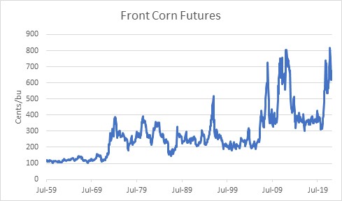
It is always good to remember, though, that because the overall value of the currency is in more or less perpetual decline, it is expected that the price of any good or service should be expected to rise over time. The more important question is, what has the real price of grains done over the decades? And here, the picture is starkly different and looks like the chart of many, many goods. It’s the way that the real price of consumer goods should look over time, given that the arrow of productivity points mostly in one direction. This one chart shows the price of corn, in 2022 dollars. Back in the 1970s, corn only cost $3/bu, but the dollar was worth more then. It would have taken more than $20 of today’s dollars to buy a bushel of corn in mid-1974.
The chart also has an orange line on it, which shows the US Cereal Crop Yield each year according to the World Bank.[1] I’ve inverted that series, so that when we are able to get more crops from each hectare, the line declines. It’s also on a logarithmic axis.
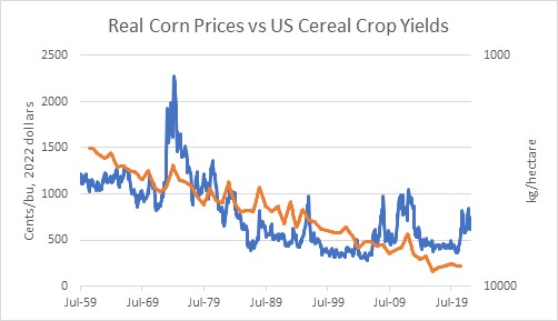
The point of this chart is merely to illustrate that real corn prices have declined over a long period of time because contrary to Mathus’s fears the production of cereal grains has been able to keep up and in fact exceed the increase in the demand for them over time. The chart is necessarily imprecise, since we’re not considering how the number of hectares producing corn changes each year, and we’re not looking at specific corn yields. Nevertheless, you will notice that many of the spikes in prices are associated with spikes (that is, dips, since it’s inverted) in crop yields. Which makes sense, of course.
What causes changes in crop yields? Different planting and harvesting techniques are obvious improvements that are pretty much one-way. Also, improved fertilizers and pest control, and better use of the proper mix of fertilizers. But then why do crop yields sometimes decrease, if all of these things tend to get better over time?
One obvious answer to that is the weather. Less obvious is that the use of fertilizers isn’t constant. When fertilizer prices are high, farmers try to use less and that reduces crop yields. Also – and this is directly relevant to today – when there is a shortage of fertilizer then less of it is used and the price of fertilizer goes up. With the conflict in Ukraine and the cutting off of natural gas supplies to Europe (natty is an important input into the manufacture of some fertilizers), we are in that sort of situation. If we overlay real corn prices with real fertilizer prices[2] you can tell that these are closely related series.
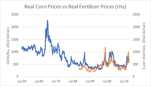
So in the long run, the general level of corn prices is driven by the purchasing power of the dollar (aka the overall price level) and the steady improvement in agricultural productivity. In the short run, corn prices are driven by fertilizer prices.
Fertilizer prices have come down somewhat. The continued embargo of natural gas into Europe has only a small effect on fertilizer supply, and Russia only directly provides about 10% of the global supply of fertilizers.[3] But the overall level of commodity inputs into the manufacture of various sorts of fertilizer obviously impacts the output price. I suspect it will be a while before fertilizer prices even in real terms get back to their pre-COVID levels. And the overall CPI is not about to decline any time soon. Does that mean that corn (and wheat, etc etc) prices can’t decline from here? Of course not – but my guess is that we’ve seen most of the good news on the agricultural commodity front for a while.
[1] https://data.worldbank.org/indicator/AG.YLD.CREL.KG?locations=US Annual data through 2020.
[2] US Cornbelt Urea Granular Spot Price, source Bloomberg. The 1:1 congruence of scales and amplitudes is mostly coincidental – one is cents per bushel and one is dollars per short ton.
[3] https://www.fas.usda.gov/data/impacts-and-repercussions-price-increases-global-fertilizer-market