Archive
2022 Year-End Thoughts About 2023
Use: This article may only be reposted in its unedited entirety (including all links), including the title and author with linkbacks to the original. If you wish to repost in serial form, please contact me via the form at https://enduringinvestments.com to discuss.
When I was a Street strategist, and/or producing ‘sales and trading commentary’ as a trader, it was de rigueur to produce an annual outlook piece. Naturally, everyone does one of those; consequently, I stopped doing them. It seems to me like it would get lost in the shuffle (this is one of the reasons that Enduring’s “Quarterly Inflation Outlook,” which we distribute to customers and is also available by subscription here, is produced on the ‘refunding schedule’ of February, May, August, and November rather than at quarter-end). Having said that – it does seem that, given what inflation has done recently, there are more people asking for my outlook.
I do have to raise one point of order before I begin. As regular readers of this column know, in my writing, I generally try to propose the ‘right questions,’ and I don’t claim to have all the right answers. An outlook piece is often interpreted as being the analyst’s best guess at the answers. While it is that, for me the answers I suggest here are likely to be less valuable to the reader (I do not recommend that you blindly place trades based on my outlook for where markets will go!) than the thought process that is going into them. You may and probably will disagree with some of my answers. But hopefully, you’ll be able to identify where in my reasoning you have specific disagreements, which will either enhance your own view or cause you to thoughtfully reconsider it. That’s the whole point, and I don’t care at all if you disagree! That’s what makes markets.
Moreover…even if my guesses end up being “wrong,” or “right,” based on the actual outcomes in the future, that doesn’t mean they were wrong or right in terms of being a good approach/positioning. Investing is not really all about making the “right” bet in terms of whether you can call the next card off the deck, but about making the “right” bet with respect to the odds offered by the game, and betting the right amount given the odds and the edge. On this topic, I recommend “Thinking in Bets” by Annie Duke as excellent reading.
So, here goes.
MACROECONOMICS
For most of this year, I have been saying that we would get a recession by early 2023. In 2022Q1 and Q2, US GDP contracted. This produced the predictable shrill announcements of recession, coupled this year with sadly simple-minded declarations that the Biden Administration had “changed the definition of recession” by saying we weren’t in one. One television commentator I saw strongly profess the view that the two-quarters-of-negative-growth-is-a-recession definition is “in every economic textbook.” Having read my fair share of economic textbooks and having taught or tutored from a few, I can assure you that is not the case.
I was, and remain, sympathetic to the incoming fire that the Biden Administration took then, because they were basically right: whether we chose to call it a ‘recession’ or not, there was scant sign of any economic distress. Employment (which lags, of course) remained strong, corporate earnings were solid, confidence was reasonably high except for inflation, and citizens still had a substantial cash hoard left over from the COVID stimmy checks. However, while the critics were wrong on the timing they weren’t wrong about the eventuality of a recession. As I also said a bunch of times, there has never been a period where energy prices rose as rapidly as they did between early 2021 and mid-2022, combined with interest rates increasing as rapidly as they did thanks to Federal Reserve policy, that did not end in recession. But it takes Wile E. Coyote some time to figure out that there is nothing under his feet, before he falls, and recessions work similarly. We will have a recession in 2023.
We are already seeing the early signs of this recession. One indicator I like to look at is the Truck Tonnage index, which falls significantly in every recession (see chart, source Bloomberg). The last two months have seen a decline in this seasonally-adjusted index. It is early yet – we saw a similar-sized decline in 2016, for example, so there are false signals for small changes – but the fact that this decline happened heading into the Christmas season gives it more significance.

That’s the goods side. The services side shows up more in the labor market, which lags behind the overall cycle. Yet there too we have started to see some hints of weakness. Jobless claims are well off the post-COVID lows, although they are still roughly “normal” for the tight pre-COVID labor market. And the labor market is really hard to read right now, given the continuing crosswinds from the COVID-period volatility and the fact that so many services jobs now are at least partly virtual. Upward wage pressure is continuing, partly because virtual workers are less productive (shocker reveal there), so this recession in my view will probably not feel as bad as the last couple of recessions (GFC, Covid) have felt. However, we will have a recession in 2023.
The bad news, though is that a recession does not imply that inflation, ex-energy, will decline. Look at this chart, which captures the last three recessions. The post-GFC recession was the worst in 100 years, and while core inflation slowed that was almost entirely a function of the housing market collapse and not the general level of activity. The COVID recession was worse than that, and core inflation accelerated. And the post-tech-bubble recession wasn’t a slouch either; core inflation accelerated throughout 2001 until it started to decline, but only got down to 1.1%, in late 2003.

This chart shows y/y changes, but helpfully shows core-ex-shelter (Enduring Investments calculations). There isn’t a lot to see here in terms of the effect of these three huge recessions.

Lest you think I am just cherry-picking the 2000-2022 period, here is core CPI and GDP normalized as of December 1979. Again, you can see in the GDP line the recessions of the early 1980s, of the early 1990s, and that post-tech-bubble recession. I can’t see those, in the CPI line.[1]

And hey, as long as we are doing this…how about the 1970s malaise when the multiple recessions and flat growth led to … well, not disinflation.

I think the evidence is very clear: forecasters who are relying on the “recession” forecast (which I share) to make a “hard disinflation” forecast are simply ignoring the data. Those two concepts, outside of energy, are not related historically.
That being said, I expect core inflation and median inflation to decelerate in 2023. I just don’t think they will decelerate nearly as much as Wall Street economists think. Shelter inflation is already well above my model, and I expect will come back towards it, but my model otherwise doesn’t see a lot of downward pressure on rents yet. The strong dollar, and some healing of supply chains, will help core goods – but core goods inflation will remain positive next year and probably for a long time, thanks to secular deglobalization, instead of being in persistent slow deflation. And core services ex-rents will decelerate, but mainly because of the technical adjustment in health insurance. Until wages start to ebb, it’s hard to see a crash in core services ex-rents inflation. So that brings me to this forecast for core CPI:
| Current | 2023 Fcast | |
| Core Goods | 3.7% | 2.3% |
| Rent of Shelter | 7.2% | 4.8% |
| Core Services less ROS | 6.3% | 5.1% |
| Core CPI | 6.0% | 4.2% |
Most of the Street is in the mid-2s for core inflation; the Conference Board forecast for Core PCE recently was raised to 2.8% which would put core CPI at 3% or 3.1%. They’re getting there, but frankly it’s hard to see how you can get to those levels. In my view, most of the risks to my forecast are to the upside.
MONETARY POLICY
An important disclosure should be made here: in 2022, I was utterly wrong about the path the Fed would take. Almost as wrong as it is possible to be. Ergo, take everything I say hereafter in this section with a grain of salt.
Coming into 2022, I thought the Fed would follow the same script they had used for more than a quarter-century with respect to tightening policy: slow, late, tentative, and quickly reversed. Although inflation was already plainly not transitory, I know that the Fed’s models assume a strong homeostasis especially with inflation, to the extent that the persistent part of inflation is essentially (albeit with a lot more math) modeled as a very slow moving average and overall inflation is assumed to pull back to that level. When the Fed talks about the “underlying inflation trend,” that is in simple terms what they are saying. But if you believe that, then there’s very little reason to pursue something similar to a Taylor Rule where policy is driven by simple deviations of growth and inflation from the target levels.
So, when the Fed started to move I expected them to tighten a few times and then to stop and ultimately reverse when financial markets started doing ugly illiquid things. One thing I didn’t anticipate: the markets never really did ugly illiquid things. Investors welcomed the tighter policy, and ran ahead of the Fed to give them room. Especially considering that, at the end of 2021, I think most sophisticated investors viewed the Fed as incompetent (at best) or counterproductive (at worse), the markets gave the Committee an amazing amount of latitude. The Fed, to its credit, saw the gap in the defense and sprinted through it. I did not see that coming.
After nearly 500bps of rate hikes, and a small decline in the Fed’s balance sheet, money supply growth has come to a screeching halt. That’s largely spurious, I think, since money supply growth is a function of bank lending and banks are neither capital-constrained nor reserve-constrained at the moment, and longer-term interest rates have risen but not very much (except in the mortgage market). I suspect that most of the decrease in loan demand that is evidently happening is not in response to the increase in short-term rates but rather to the increase in mortgage rates almost entirely. If that’s the case, then it’s a one-time effect on M2 growth: mortgage origination can only go to zero once. The chart below shows the connection between M2 growth (in blue) and the MBA Purchase index (black). The correlation is not as incredible as it looks, because one is a rate of change that is off-center by 6 months (it’s y/y) and one is a level of activity, but if I expressed both in rate of change you would still say they look suspiciously similar.

If I am right about that point, then the money supply will shortly resume its growth as the overall volume of lending continues to grow without the negative offset of declining mortgage origination. With money velocity on the upswing now, this will support the level of inflation at a previously-uncomfortable level. So what will the Fed do?
Importantly, the Fed won’t really know that inflation isn’t dropping straight to 2% until after the midpoint of the year. But they’ll make the decision to pause rate hikes sooner than that. I think a 5% Fed funds rate is a reasonable target given their assumptions, a key one of which is that if “underlying inflation” is really 2%-3% then a 5% nominal rate will be plenty restrictive.
What is really amazing to me – which the ‘me’ of 2021 would never have anticipated – is that Fed watchers and market participants are starting to talk as if they believe the Fed might overdo the tightening, raising rates higher than needed to restrain the economy and inflation (yes, I know I said that a recession doesn’t cause lower inflation but it’s an article of faith at the Fed so we need to pretend as if we believe it). It’s incredible, when you think about it: the Fed hasn’t come close to ‘overdoing it’ in a tightening cycle in decades, if by ‘overdoing it’ we mean that they caused a deflationary crash. The Fed has caused plenty of recessions, but core inflation hasn’t been negative since the Great Depression. And we’re worried about them overdoing it?
Naturally, if you don’t think that raising rates causes inflation to come down then any rate hikes at all…actually, any active monetary policy at all…is too much. But in any event, it’s striking to me that the Fed has somehow restored some credibility as a hawkish central bank. Not that credibility per se matters, since expectations don’t cause inflation. But I digress. It’s still pretty amazing.
When Powell was first named Chairman, I was hopeful that a non-economist could help break the Fed out of its scholarly stupor. As time went on I lost that hope, as Powell trotted out various vacuous terms like “transitory” and leaned on discredited models (nevertheless still in vogue at the Fed) such as those which utilize the ‘anchored expectations’ hypothesis. But I have to say, my opinion of him has risen along with the Fed funds rate.
In my view, the biggest Fed error of the last forty years was Greenspan’s move to make the Fed transparent, which caused the pressures on the Fed to be entirely one-way. The second-biggest Fed error follows from that, and that is the tendency to move rates further and further away from neutral, holding rates at such a level by maintaining vastly higher levels of liquidity than were needed to run the banking system. The consequence of this has been a series of bubbles and asset markets at levels where the prospect of future real returns was abysmal. Plus, it led to the heyday of hedge funds where cheap money levered small returns into big returns.
The Powell Fed, for all of its flaws and awful forecasting, has succeeded in getting the yield curve to the vicinity of long-term fair value, which I define as sovereign real rates near the long-term growth rate of the economy (2.00-2.25% in the US – see chart below, source Enduring Investments before 1997 and Bloomberg after 1997). With a Fed inflation target at 2.25% or so in CPI terms, this means long-term nominal interest rates should be in the vicinity of 4%-4.5% over the long term in the context of a responsible central bank. We’re not there, but we’re getting close.

All of which means that I think the FOMC is just about done with hiking rates for this cycle. I believe they will get to 5%, pause, and stay paused for a long time. I do not expect them to lower interest rates, even if there is a recession, unless markets or banks start to have difficulties or Unemployment gets above 6%. That might happen in late 2023, but even if it does I think the Fed will be much more measured about cutting rates than they have in previous cycles. Credit to Powell for the change in attitude.
Those pieces, the Macro and the MonPol, along with my assessment of relative valuations, inform everything else.
RATES, BREAKEVENS, AND CURVES
The long, long, long downtrend in interest rates is decisively finished. As noted above, when inflation is under control and in the vicinity of the Fed’s 2% target, long-term interest rates should be in the vicinity of 4-4.5%. Over the last century, when rates have been away from the 3-5% range it has generally been either because inflation was unstuck on the high side (1970s, 1980s) or unstuck on the low side (1920s, 1930s, 2010s) (see chart, source Federal Reserve and Bloomberg). The long-term downtrend can be thought of as going from unstuck-high inflation, to normal, and overshooting to the downside in the last decade. But we have now definitively ended that low-rates period.

At a current level of roughly 3.5% nominal, 1.4% real, interest rates are ‘too low’ again, but this is normal for an economy headed into recession. Ordinarily, this configuration of events – a Fed nearing the end of a tightening cycle, a recession looming, and interest rates that have risen 320bps over two years – would make me bullish on bonds. And I do think that the first part of 2023 may see a decent rally as the Fed finishes their business and the stickiness of inflation is not yet apparent, but the recession is. Seasonally, you’d really prefer to be long the bond market/out of equities in the last quarter of the year and out of the bond market/long equities in the first quarter of the year, but I think the seasonal pattern will be reversed this year. So we will come in all happy as bond investors, and get unhappy later in the year.
The reason I think the first quarter of the year will be pretty decent for bonds is because of the timing of the recession and of the end of the Fed tightening cycle. But why the selloff as the year progresses? Well, investors will start to see that inflation is not falling as fast as they had expected, the Fed is showing no signs of easing…and the Federal deficit is blowing up.
In FY 2022, the US government had a $1.38 trillion deficit,[2] in an expansion during peacetime. But there are some inexorable effects pushing that higher next year. For example, interest on the debt: higher interest rates will affect only the part of the public debt that has rolled over, but that is an awful lot of it.

In December 2021, the rolling-12-month interest expense on US Debt Outstanding (see chart, source Bloomberg) was $584bln.[3] As of November 2022, the rolling-12-month expense was $766bln. It will be up another $100bln, at least, in 2023. Social Security benefits paid this year were roughly $1.2 trillion, and benefit payments are due to increase 8.7% next year – so, even neglecting the fact that there will be more recipients next year, Social Security should also be $100bln further in the red. That’s $200bln, on top of the approximately $1.4trillion deficit, and I haven’t even considered Medicare, the decline in tax receipts that will occur thanks to a decline in asset markets this year, or the decline in taxes on earned income when the economy enters a recession. A $2 trillion, peacetime deficit is easily in reach and will be much more if it’s a bad recession. The last time we had that big a deficit, the Fed happened to also be buying a couple trillion dollars’ worth of Treasuries. This time, though, the Fed is shrinking its balance sheet.

It is fairly easy to imagine that longer interest rates will have to rise some, in order to roll the maturing debt. As I said, higher interest rates don’t really bother me because I don’t run a highly-levered hedge fund. (But if the rise in rates were to get sloppy or rates were to rise enough to threaten a spiral in the deficit, then I can imagine the Fed stepping in to reverse its balance sheet reduction and being under even more pressure to guide rates lower. However, it’s not my base case.)
Also, as the year goes along the stickiness of inflation will become more apparent and investors will rightly start to put that assumption back into their required return for nominal bonds. One of the really crazy things that happened in 2022 was that inflation compensation in nominal bonds (aka ‘breakevens,’ the mathematical difference between yields on nominal bonds and yields on inflation-linked bonds that pay inflation on top) declined even as the overall level of inflation continued to climb. At the time of this writing, Median CPI has not yet even decisively peaked, although I think it will. But with Median CPI at 6.98%, it’s incredible that the market is demanding only 2.28% annual compensation for inflation over the next decade (see chart, source Bloomberg). That basically says investors are comfortable earning an increment that underpays them for inflation in the near term, and in the long term will only compensate them for what the Fed says they are trying to pin inflation at.

That’s not as easy a trade as it was when 10-year breakevens were at 0.94% in March 2020, but it still seems to me that most of the risk over that decade would be for inflation to miss too high, rather than too low. I understand that the FOMC wants inflation down around 2%. And as for me, I want a Maserati. Neither one of us is likely to get what he wants, just because we want it.
As the first quarter of the year passes and long-term interest rates decline, the curve may invert further from its current level. But I don’t think it can invert that much, which limits the value to being long, say, 10-year notes from this level. Given the current level of inversion, it is fairly easy to construct steepener trades that throw off positive carry. For that matter, a leveraged investor who is financing at 4.5% and earning 3.75% is more likely to want to go the other way! I think it’s going to be difficult to get a good bull market rally going in bonds, and if I was a leveraged hedge fund investor I’d be playing from the short side/steepener side even in the first quarter of the year (albeit cautiously). The chart below (source: Bloomberg) shows 2s/10s monthly going back to 1980. The only time the curve was more inverted was in the early 1980s, a couple of years after Volcker’s Saturday Night Special and with the hiking campaign solidly underway as it is now. I’m expecting 2s/10s to go positive in 2023, although the best shot at something like +50bps would come if the Fed actually did ease. Ergo, a steepening trade is also nice because it works in my favor more if I’m wrong about the Fed staying on hold for a while after they finish hiking to 5%.

Put those together and I see Fed funds at 5%, 2yr Treasuries at 4.25%, and 10s at 4.5%.
We obviously look deeper than that, though, on this channel. We can separate nominal yields into real yields (represented by TIPS) and inflation compensation (breakevens, or inflation swaps). Here are what the curves look like today (source: Enduring Investments).

From here, it looks fairly obvious that a good deal of the steepening should come from longer-term real rates rising. The 2y TIPS bond is at roughly 2%, so 2s-10s in reals is about the same as it is in nominals. The inflation curve is ridiculously flat. I do think that the inflation curve is more likely to shift higher in parallel than to steepen; a steepening inflation curve would imply accelerating inflation going forward and I don’t think investors really believe we’ll get acceleration. So I think that the movement in the shape of the TIPS curve will be very similar to the movement in the nominal curve, but with the level of the nominal curve being driven by an upward parallel-ish shift in the inflation curve.
| 2y | 10y | |
| Current TIPS Yields | 1.96% | 1.42% |
| EOY TIPS Yields | 1.80% | 1.85% |
| Current Breakevens | 2.30% | 2.27% |
| EOY Breakevens | 2.45% | 2.65% |
VOLATILITY
Generally speaking, a higher-inflation environment is a higher-volatility environment. The chart below (source: Bloomberg) shows core CPI in blue against the ICE BofA MOVE Index of fixed-income option volatility. True to form, the higher-inflation regime has correlated with higher levels of fixed-income volatility.

It isn’t terribly shocking that volatility is higher in bonds than it had been during the years when interest rates were fixed within a stone’s throw of zero. And it shouldn’t be terribly shocking that I expect volatility to stay somewhat higher than the 2017-2019 and 2020-early 2021 levels, even as core inflation recedes somewhat. What may be surprising is the observation that a sizeable gap has opened up in the behavior of fixed-income volatility and equity volatility, as the following chart comparing the VIX (equity vol) and MOVE (fixed-income vol) shows. Note that these are different axes, but you can clearly see the uptrend in the MOVE that has not been replicated by the VIX.

I mentioned earlier how regular and controlled the decline in the stock market has been, and how this has allowed the Fed to push rates further than anyone thought they would, a year ago. There have not been too many periods where option sellers have been punished for being short vol in equities. On the other hand, bond vol has been very different now from what it was a few years ago. In short, there has been a regime change in bond vol, but not in equity vol. At some level, this will continue, but the spread should narrow as the Fed gets to the end of the tightening regime. I think we will end 2023 with the VIX above 22 log vol – where it is today or slightly higher – but with the MOVE around 90 norm vol.
Both of those figures represent more-volatile conditions than we have seen for some years pre-COVID.
EQUITIES
It hurts to say, but equities are still far, far, far overvalued.
For many years, there has been a running tension between people who use the “Fed model” as a way to justify the current level of the stock market and the people who point out that the “Fed model” does not imply that the current level of the market is fair. The “Fed model” essentially says that when interest rates are very low, the present value of future cash flows is higher; ergo, the equilibrium value of the average equity (whose fair value is dependent on the present value of future earnings) and hence the overall stock market is higher, when interest rates are lower. This is analytically true. However, it does not mean that your expectation of future returns, when P/E multiples are at 40 but interest rates are low, should be the same as your expectation when P/E multiples are at 15 but interest rates are high. The level of interest rates explains higher equity prices, but it does not imply that those are now long-term fair value levels.
But this tension was almost always resolved in favor of the people who thought that rock-bottom interest rates meant that stocks should be at sky-high multiples, and value investors were left in the dust for more than a decade.
Unfortunately, this tension is being reduced because interest rates are going higher, and may never go back to those levels again. Consequently, equity price/earnings multiples need to re-rate for the new level of interest rates. The same logic that was used to justify the stock market at a 35 Shiller P/E, reconciles to lower prices now and going forward. The chart below (source: Robert J Shiller, updated with Enduring Investments calculations) shows the Shiller P/E (aka Cyclically-Adjusted P/E Ratio, or CAPE) versus 10-year interest rates in the post-WWII period. There is, ex-Internet bubble, a pretty clear relationship between interest rates and valuations. The red dot is where current multiples and interest rates are.

My forecast of 4.5% 10-year Treasuries implies something like a 23 Shiller P/E, down from 30 now. Without earnings growth, that 23% decline in the multiple implies a 23% decline in the stock market from these levels. I don’t think earnings themselves will increase or decrease very much unless the recession is much worse than I think it’s going to be, but the same lag between wages and product prices that flattered earnings when inflation was heading higher will detract when inflation decelerates. Moreover, if I’m right that Powell is intentionally steering interest rates to a level that is consistent with a long-term equilibrium around 4%-4.5% then this 23% adjustment in prices will not necessarily be followed by another massive bull market the likes of which we became accustomed to during the long bond bull market of the last 40 years. A Shiller P/E in the low-20s is still fairly generous historically but it may be sustainable.
So, my point forecast is for the S&P to get to 3,000 sometime in 2023. I don’t think the current bear market will last the entire year, and in fact I am sure there will be a rollicking rally when it is clear the Fed is done tightening. But sticky inflation will hurt here, too, and after that rollicking rally I think we’ll have another low, and from that low is where a modest bull market will begin.
However, I should also note that 1-year equity vol is around 25%, so my projection is within 1 standard deviation of unchanged!
COMMODITIES
From 1999 through 2008, commodities were in a bull market. After a brutal crash in the Global Financial Crisis, commodity indices had another mini-bull market from 2009-2011 before enduring a 9-year bear market. Since March 2020, the massive increase in the quantity of money has driven down the value of money relative to commodities or, to put it in the normal way, has driven up the price of commodities.
The Bloomberg Commodity Index (spot) rose from 59 in March 2020 to 124 in March 2022, and has come off the boil a bit since then. At the highs, though, the level of the index was only back to the levels of 2014. This is normal with spot commodities, which thanks to improved production and extraction technology over time tend to be perpetually deflating in real terms.[4] The good news is that an investor in commodities does not generally buy spot commodities but rather invests through collateralized futures contracts or invests in an index based on collateralized futures contracts. Over time, the collateral return happens to be a very important source of return (in addition to spot returns, the return from normal backwardation, and the volatility/rebalancing return), and this year there is terrific news in that collateral returns are ~4% higher than they were before the Fed started to hike. This means that, all else equal, commodities index returns should be expected to be 4% better (in nominal terms) this year than over the last couple of years. All else is not equal, but I expect gains in investible commodities indices in 2023.
That’s entirely separate from the question of whether we are in a commodity supercycle, due to chronic underinvestment in exploration and extraction technologies and more difficult geopolitical pressures that increase the costs of mining, growing (e.g. because of fertilizer costs/shortages), and transporting the raw commodities. I think the answer there appears to be ‘yes,’ which means that in general I want to play the commodity market from the long side more than from the short side. Of course there will be brutal moves in both directions, and bears will really want to sell commodities as the recession comes to the fore. But most of that is already in the price, with gasoline at levels much closer to the GFC lows than to anything approximating the highs. The chart below shows retail gasoline prices, adjusted for inflation (using 2012 dollars).

Energy prices of course could fall further, but considering that part of the reason prices have fallen this far is that the Strategic Petroleum Reserve has been flushing oil into the system (and that has ended, in theory) and China’s economy has been sputtering under Zero Covid (which has also ended, in theory), it is hard to think that is the better direction at the moment.
OTHER THINGS
I want to append one very important admonition for investors and investment advisors. I mention this frequently on podcasts, TV and radio appearances, at cocktail parties and to random strangers on mass transit:
The next decade will be very unlike the decades we have just experienced. Not only will inflation and interest rates be higher than we’ve become accustomed to, and markets more volatile, but some important drivers of portfolio construction will shift. The good news is that at least some of those shifts are systematic and predictable. The table below shows how 60/40 returns correlate with inflation, with inflation expectations, and with inflation surprise over two periods. The first period was the 30 years ending in 2004, when inflation averaged 4.89% and was three times as volatile as during the subsequent period. During that period, a 60-40 portfolio was significantly exposed to inflation. The more-recent period, during which inflation was low and stable, produced placid 60/40 returns and correlations with inflation that are mostly spurious because there was more noise than signal. Inflation didn’t move!

The first implication of this is that portfolios which have productively ignored inflation-fighting elements over the last two decades need them now, because the main asset classes used in portfolio construction are terribly inflation-exposed. All portfolios for investors who do not have sufficient ‘natural’ inflation hedges should include such assets as commodities and an allocation to inflation-linked bonds in lieu of some of the nominal bond allocation.
The second implication is related but less conspicuous. The entire correlation matrix is shifting away from what it has been over the last couple of decades, and back to something that incorporates the inflation factor that has been dormant. As the most obvious example, stocks and bonds which have been inversely correlated for a while, due to the fact that they respond differently to economic growth, are becoming correlated again. This is not an aberration but entirely normal for regimes in which inflation is not low and stable. The chart below illustrates this. When 3-year average inflation is above 3% (the red shaded area), then 3-year correlations of stocks and bonds tend to be positive (blue line). When inflation is below that level, correlations tend to be negative.

Negative correlations between stocks and bonds are great because they lower portfolio risk. But in the coming decade, 60/40 won’t be as low risk as it has been. But beyond that, the entire covariance matrix that an advisor relies on to simulate and optimize portfolios needs to be examined. The normal way is to use recent returns (say, the last 10 years) to generate this covariance matrix, which then is used to find the mean/variance-optimized portfolio for a given level of risk. That’s normally okay, but as inflation proves sticky that sort of covariance matrix will be wrong, and wrong in a systematic way. What I am doing for our customers is comparing portfolios optimized with a recent covariance matrix to portfolios optimized using a covariance matrix from the 1980s-1990s. It’s important to be aware of this potential problem in portfolio construction, and to get ahead of it.
Finally, let me take a moment to thank the readers of this blog for their interest in it. I write partly because the discipline of arguing my points out thoroughly makes me (I think) a better trader and investor, but I also garner a lot of value from the information and ideas I receive reciprocally from readers who agree or disagree with what I write. I appreciate this feedback very much, and I thank the readers who take the time to share their opinions with me.
Aside from the personally selfish reason I have for writing, there is also the corporate mission the blog is meant to accomplish, and that is to raise the profile of Enduring Investments and the Inflation Guy franchise with prospective clients, and to encourage them to do business with us. If prospective clients see value in these musings, then I hope they will choose to do business with us. Yes, that’s crassly commercial. But ‘tis the season! And if you read this far in this missive, please consider what that means about the value you’re getting, and how much more value you might get from a deeper relationship with Enduring Investments!
And if not, Merry Christmas anyway! Happy holidays and Happy New Year.
– Mike ‘The Inflation Guy’ Ashton
DISCLOSURE – My company and/or funds and accounts we manage have positions in inflation-indexed bonds and various commodity and financial futures products and ETFs related to them that are discussed in this column.
[1] It bears noting, though, that until 1982 the shelter component of CPI was tied to mortgage rates and home prices and not rents, so that the early-80s rise in core CPI partly reflected the Volcker rate hikes. Fixing that problem was what released the conspiracy nuts who plague us to this day claiming that the BLS “manipulated” CPI downward.
[2] https://fiscaldata.treasury.gov/americas-finance-guide/national-deficit/
[3] Net interest was about $110bln less, since some of that interest is paid to other parts of the government, for example the Federal Reserve system. For now.
[4] I wrote a nice, short little piece called “Corn Prices – Has the Correction Run its Course?” that is worth reading if you are interested in commodities.
Point Forecast for Real Equity Returns in 2018
Point forecasts are evil.
Economists are asked to make point forecasts, and they oblige. But it’s a dumb thing to do, and they know it. Practitioners, who should know better, rely on these point forecasts far more than they should. Because, in economics and especially in markets, there are enormous error bars around any reasonable point forecast, and those error bars are larger the shorter-term the forecast is (if there is any mean-reversion at all). I can no more forecast tomorrow’s change in stock market prices than I can forecast whether I will draw a red card from a deck of cards that you hand me. I can make a reasonable 5-year or 10-year forecast, at least on a compounded annualized basis, but in the short term the noise simply swamps the signal.[1]
Point forecasts are especially humorous when it comes to the various year-end navel-gazing forecasts of stock market returns that we see. These forecasts almost never have fair error bars around the estimate…because, if they did, there would be no real point in publishing them. I will illustrate that – and in the meantime, please realize that this implies the forecast pieces are, for the most part, designed to be marketing pieces and not really science or research. So every sell-side firm will forecast stock market rallies every year without fail. Some buy side firms (Hoisington springs to mind) will predict poor returns, and that usually means they are specializing in something other than stocks. A few respectable firms (GMO, e.g.) will be careful to make only long-term forecasts, over periods of time in which their analysis actually has some reasonable predictive power, and even then they’ll tend to couch their analysis in terms of risks. These are good firms.
So let’s look at why point forecasts of equity returns are useless. The table below shows Enduring’s year-end 10-year forecast for the compounded real return on the S&P 500, based on a model that is similar to what GMO and others use (incorporating current valuation levels and an assumption about how those valuations mean-revert).[2] That’s in the green column labeled “10y model point forecast.” To that forecast, I subtract (to the left) and add (to the right) one standard deviation, based on the year-end spot VIX index for the forecast date.[3] Those columns are pink. Then, to the right of those columns, I present the actual subsequent real total return of the S&P 500 that year, using core CPI to deflate the nominal return; the column the farthest to the right is the “Z-score” and tells how many a priori standard deviations the actual return differed from the “point forecast.” If the volatility estimate is a good one, then roughly 68% of all of the observations should be between -1 and +1 in Z score. And hello, how about that? 14 of the 20 observations fall in the [-1,1] range.

Clearly, 2017 was remarkable in that we were 1.4 standard deviations above the 12/31/2016 forecast of +1.0% real. Sure, that “forecast” is really a forecast of the long-term average real return, but that’s not a bad place to start for a guess about next year’s return, if we must make a point forecast.
This is all preliminary, of course, to the forecast implied by the year-end figures in 2017. The forecast we would make would be that real S&P returns in 2018 have a 2/3 chance of being between -10.9% and +11.1%, with a point forecast (for what that’s worth) of +0.10%. In other words, a rally this year by more than CPI rises is still as likely as heads on a coin flip, even though a forecast of 0.10% real is a truly weak forecast and the weakest implied by this model in a long time.
It is clearly the worst time to be invested in equities since the early 2000s. Even so, there’s a 50-50 chance we see a rally in 2018. That’s not a very good marketing pitch. But it’s better science.[4]
[1] Obligatory Robert Shiller reference: his 1981 paper “Do Stock Prices Move Too Much to be Justified by Subsequent Changes in Dividends” formulated the “excess volatility puzzle,” which essentially says that there’s a lot more noise than signal in the short run.
[2] Forecasts prior to 2009 predate this firm and are arrived at by applying the same methodology to historical data. None of these are discretionary forecasts and none should be taken as implying any sort of recommendation. They may differ from our own discretionary forecasts. They are for illustration only. Buyer beware. Etc.
[3] The spot VIX is an annualized volatility but incorporating much nearer-term option expiries than the 1-year horizon we want. However, since the VIX futures curve generally slopes upward this is biased narrow.
[4] And, I should hasten point out: it does have implications for portfolio allocations. With Jan-2019 TIPS yielding 0.10% real – identical to the equity point forecast but with essentially zero risk around that point – any decent portfolio allocation algorithm will favor low-risk real bonds over stocks more than usual (even though TIPS pay on headline CPI, and not the core CPI I am using in the table).
Ugly CPI
Here is a summary of my post-CPI tweets. You can follow me @inflation_guy or (if you’re already following me on Twitter or seeing this elsewhere) subscribe to direct email of my free articles here.
- Complete shocker of a CPI figure. Core at +0.01%, barely needed any rounding to get to 0.0. Y/y falls to 1.73%. Awful.
- Zero chance the Fed does anything today, anyway. The doves just need to point to one number and they win.
- Stocks ought to LOVE this.
- Core services dropped to 2.5% y/y from 2.6% and core goods to -0.4% from -0.3%.
- Accelerating major groups: Food/bev. That’s all. 14.9% of basket. Everything else decelerating.
- I just don’t see, anecdotally, a sudden change in the pricing dynamics in the economy. That’s why this is shocking to me.
- Primary rents to 3.18% from 3.28%. Owners’ Equiv to 2.68% from 2.72%. Both in contravention of every indicator of market tightness.
- Apparel goes to 0.0% from +0.3% y/y. That’s where you can see a dollar effect, since apparel is mostly manufactured outside US.
- Airline fares -2.7% versus -0.2% y/y last month and +4.7% three months ago. It’s only 0.74% of the basket but big moves like that add up.
- Medical care: 2.09% versus 2.61% y/y. Now THAT is where the surprise comes in. Plunge in ‘hospital and related services.’ to 3.8% vs 5.5%.
- …we (and everyone else!) expect medical care to bounce back from the sequester-inspired break last year. I still think it will.
- core inflation ex-housing at 0.91% y/y, lowest since August 2004. Yes, one decade.
- core inflation ex-housing is now closer to deflation than during the deflation scare. In late 2010 it got to 1.08% y/y.
- Needless to say our inflation-angst indicator remains at really really low levels.
- Interestingly, the proportion of CPI subindices w y/y changes more than 2 std dev >0 (measuring broad deflation risk) still high at 38%.
- To sum up. Awful CPI nbr. Housing dip is temporary & will continue to keep core from declining much. Suspect a lot of this is one-off.
- …but I thought the same thing last month.
- Neil Diamond said some days are diamonds, some days are stones. If you run an inflation-focused investment mgr, this is a stone day.
- Interestingly, Median CPI was unchanged at 2.2% this month. I’d thought it fell too much last month so this makes sense.
I am still breathing heavily after this truly shocking number. This sort of inflation figure, outside of a crisis or post-crisis recovery, is essentially unprecedented. Lower prints happened once in 2010, once in 2008, three times in 2003, and once in 1999. But otherwise, basically not since the 1960s.
The really amazing figure is the core-ex-Housing number of 0.91% y/y. A chart of that (source: Enduring Investments) is below.

There are interesting similarities between the current situation and late 2003, which is the last time that ex-housing inflation flirted with deflation. Between late 2000 and June 2003, money velocity fell 11%, in concert with generally weakening money growth. Velocity fell primarily because of a sharp decline in interest rates from 6% on the 5y note to around 2.25%. The circumstances are similar now: 5y interest rates declined from around 5% to 0.5% from 2006 through mid-2013, accompanied by a 24% decline in money velocity. And voilá, we have weakness in core inflation ex-housing.
The important differences now, though, are twofold. The first is that the absolute levels of money velocity, and of interest rates, are much lower and very unlikely to fall much further – indeed, money velocity is lower than it “should” be for this level of interest rates. And the second is that there is an enormous supply of inert reserves in the system which will be difficult to remove once inflation begins to rise again. The Fed began to increase interest rates in 2004, which helped increase money velocity (and hence, inflation) while it also caused M2 growth to decline to below 4% y/y. Core inflation rose to 3%, but the Fed was basically in control. Today, however, the Fed has no direct control over the money supply because any reserves they remove will be drawn from the “excess” reserves held by banks. This will make it difficult to increase overnight rates except by fiat (and increasing them by setting a floor rate will merely cause money velocity to rise while having no effect on the money supply). So the ‘potential inflation energy’ is much higher than it was in 2003. As an aside, in 2004 I was quite vocal in my opinions that inflation was not about to run away on the upside, which is another key difference!
If you are a tactical inflation trader, today’s CPI figure should make you despise inflation-linked bonds for a few weeks. But they have already taken quite a drubbing this month, with 10-year breakevens falling from 2.27% to 2.08% as I type. It’s okay to watch them fall, tactically, especially if nominal bonds generally rally. But strategically, not much has changed about the inflationary backdrop. I don’t expect airline fares to continue to drop. I don’t expect Medical Care inflation, which has a strong upward bias due to base effects, to plunge further but to return to the 3%-4% range over the next 6-12 months. And Housing inflation slowed slightly this month but remains on course to continue to rise. So, if you are considering your inflation allocations, this is a good time to increase them while markets are dismissive of any possibility of higher prices.
Without a doubt, today’s number – especially following another weak CPI print last month – is a head-scratcher. But there aren’t a lot of downside inflation risks at the moment. Our forecast had been for core (or median) inflation to reach 2.6%-3.0% in 2014. I would say that core CPI isn’t going to get to that level this year with 4 prints left, and even median CPI (which is a better measure right now of the central tendency of inflation, thanks to the aforementioned base effects in medical care, and remained at 2.2% this month) is going to have a harder time reaching that target. I’d lower and narrow the target range for 2014 median inflation to 2.5%-2.8% based on today’s data.
Meteorologists and Defenseless Receivers
The stock market really seemed to “want” to get to 2000 on the S&P. I hope it was worth it. Now as real yields seem to be moving higher once again (see chart below, source Bloomberg) – in direct contravention, it should be noted, of the usual seasonal trend which anticipates bond rallies in September and October – and the Fed is essentially fully ‘tapered’, market valuations are again going to be a topic of conversation as we head into Q4 just a few weeks from now.

To use an American football analogy, the stock market right now is in an extended position like a wide receiver reaching for a high pass, but with no rules in place to prevent the hitting of a defenseless receiver. This kind of stretch is what can get a player laid up for a while.
Now, it has been this way for a long time. And, like many other value investors, I have been wary of valuations for a long time. I want to make a distinction, though, between certain value investors and others. There are some who believe that the more a market gets overvalued, the more dramatic the ensuing fall must be. These folks get more and more animated and exercised the longer that the market crash doesn’t happened. I think that they have a point – a market which is 100% overvalued is in more perilous position than one which is a mere 50% overvalued. But we really must keep in mind the limits of our knowledge about the market. That is, while we can say the market is x% overvalued with respect to the Shiller PE or whatever our favorite metric is, and we can say that it is becoming more overextended than it previously was, we do not know where true fair value lies.
That is to say that it may be – I don’t think it is, but it’s possible – that when stocks are at a 20 Shiller PE (versus a long-term average of 16) they are not 25% overvalued but actually at fair value. Therefore, when they go to a 24 PE, they are more overvalued but instead of 50% overvalued they are only 25% overvalued because true fair value is, in this example, at 20. What this means is that knowing the Shiller PE went from 20 to 24 has no particular implications for the size of the eventual market break, because we don’t actually know that 16 really represents fair value. That’s an assumption, and an untestable assumption at that.
Now, we need assumptions. There is no way to keep from making assumptions in financial markets, and we do it every day. I happen to think that the notion that a 16 Shiller PE is roughly fair value is probably a good assumption. But my point is that when you’re talking about how much more overvalued a market is than it was previously, with the implication that the ensuing break ought to be larger, you need to remember that we are only guessing at fair value. Always. This is why you won’t catch me saying that I think the S&P will drop eventually to some specific figure, unless I’m eyeballing a chart or something. In my mind, my job is to talk about the probabilities of winning or losing and the expected value of those wagers. That is, harking back to the old Kelly Criterion thinking– we try to assess our edge and odds but we always have to remember we can’t know either for certain.
Bringing this back to inflation (it is, after all, CPI week): even though we can’t state with certainty what the odds of a particular outcome actually are, we can state what probability the market is placing on certain outcomes. In inflation space, we can look at the options market to infer the probability that market participants place on the odds of a certain inflation rate being realized over a certain time period (n.b. the market currently only offers options on headline inflation, which is somewhat less interesting than options on core inflation, but we can extract the latter information using other techniques. For this exercise, however, we are focusing on headline inflation.)
What the inflation options market tells us is that over the next year, market participants see only about an 18% chance that headline inflation will be above 2.25% (that is, roughly the Fed’s target, applied to CPI). This is despite the fact that headline inflation is already at 2%, and median inflation is at 2.2%. So the market is overwhelmingly of the opinion that inflation declines, or at least rises no further, from here. You can buy a one-year, 2.5% inflation cap for about 5-7bps, depending who you ask. That’s really amazing to me.
Looking out a few years (see table below, source Enduring Investments), we see that the market prices roughly a 50-50 chance of inflation being above the Fed’s target starting about three years from now (September 2016-September 2017, approximately), and for each year thereafter. But how long are the tails? The inflation caplet market says that there is no better than a 24% chance that any of the next 10 years sees inflation above 4%. We are not talking about core inflation, but headline inflation – so we are implicitly saying that there will be no spikes in gasoline, as well as no general rise in core inflation, in any year over the next decade. That strikes me as … optimistic, especially since our view is that core inflation will be well above 3% for calendar 2015.
| Probability that inflation is above | |||||
| in year | 2.25% | 3.00% | 4.00% | 5.00% | 6.00% |
| 1 | 18% | 5% | 3% | 1% | 0% |
| 2 | 41% | 19% | 8% | 3% | 1% |
| 3 | 46% | 25% | 11% | 5% | 3% |
| 4 | 50% | 31% | 15% | 7% | 4% |
| 5 | 52% | 35% | 18% | 10% | 6% |
| 6 | 50% | 35% | 19% | 11% | 7% |
| 7 | 50% | 36% | 21% | 13% | 8% |
| 8 | 49% | 37% | 22% | 14% | 9% |
| 9 | 48% | 37% | 23% | 15% | 10% |
| 10 | 47% | 37% | 24% | 16% | 11% |
What is especially interesting about this table is that the historical record says that high inflation is both more probable than we think, and that inflation tails tend to be much longer than we think. Over the last 100 years (since the Fed was founded, essentially), headline inflation has been above 4% fully 31% of the time. And the conditional probability that inflation was over 10%, given that it was over 4%, was 32%. In other words, once inflation exceeds 4%, there is a 1 in 3 chance, historically, that it goes above 10%.
Cautions remain the same as above: we cannot know the true probability of the event, either a priori or even in retrospect when the occurrence will be either probability=1 (it happened) or probability=0 (it didn’t). This is why it is so hard to evaluate meteorologists, and economists, after the fact! But in my view, the market is remarkably sanguine about the prospects for an inflation accident. To be fair, it has been sanguine…and correct…for a long time. But I think it is no longer a good bet for that streak to continue.
Deflation, Indeed!
Today’s post-CPI update is later than usual (normally, on CPI day I ‘tweet’ my impressions as I have them). A prospect meeting got in the way – yes, isn’t it interesting that there is demand for creative inflation-linked solutions?
Probably, after today, this will be a trifle less surprising. Core inflation surprised on the high side. Consensus had been for the month-over-month figure to be +0.1%; instead it printed +0.236%. This pushed the year-on-year core inflation rate to 1.826%, the highest it has been in a year…and yet still the lowest it is likely to be for a very long time.
So, with the wonderful perfection of timing that is only possible from elite policymakers, the Fed has begun to chirp about deflation fears at just exactly the time that core inflation is turning higher. Do recall that core inflation never got below 1.6% – very far from “deflation” – and was only that low because of well-known effects stemming from the impact of the sequester last year on Medicare payments. Median inflation, which eliminates the influence of small outlier decreases (and increases) on the number, scraped as low as 2.0%, and now sits at 2.2%. It has not been higher than that since mid-2012. Median inflation hasn’t been higher than 2.3% since 2009, so it is fair to say that inflation is much closer to the highs of the last five years than to the lows. Deflation, indeed.
A closer view of the subcomponents do not give any less cause for concern. Of the eight major subcomponents, six (Food & Beverages, Apparel, Transportation, Medical Care, Recreation, and Education & Communication) accelerated on a year-over-year basis while only two (Housing and “Other”) decelerated.
At first glance, that sounds promising. Housing inflation dropped to 2.5% from 2.8%, and those people who are worried about another housing bust right now will be quick to seize on that deceleration. Housing inflation, which is 41% of the total consumption basket, has been a primary driver of core inflation’s recovery in recent months so a deceleration would be welcome. But a closer look suggests that the number for Housing overstates the ‘deceleration’ case considerably. “Fuels and utilities,” which is 5.2% of the entire consumption basket and about 1/8th of Housing, dropped from 6.8% y/y to 4.2%. That was the entire source of the deceleration in housing. The larger pieces, which are also much more persistent, were higher: Primary rents rose from 2.88% y/y to 3.05% y/y, while Owners’ Equivalent Rent was roughly flat at 2.62% compared to 2.61%. So it is perhaps too early to panic about deflation, since the rise in OER and Primary rents is right on schedule as we have been marking it for some time (see chart below, source Enduring Investments).
Outside of housing, core inflation accelerated as well. Core ex-Shelter rose to 1.16% from 0.90%. The inflation is still significantly in services, as core commodities are still only -0.3% year/year. But that will rise soon, probably starting as soon as next month, based on our proxy measure.
As has been well advertised, the temporary depression in Medical Care inflation growth has officially ended. Now that April 2013 is out of the year/year data, the Medical Care major group saw prices rise 2.42% over the last year compared with 2.17% y/y a month ago. Medicinal drugs are at +1.70% compared with +1.44%. Medical equipment and supplies -1.39% vs -1.53%. Hospital and related services +5.55% vs 4.69%. I don’t see the deflation, do you?
This rise in CPI was broad and deep, with nearly 80% of the lower-level indices seeing increases in the y/y rate. It is hard to find any major component about which I would have to express concern, if I was a Federal Reserve official worried about deflation. The breadth of increase is itself a signal. When some prices go up, it is a change in relative prices and will be considered inflation by some people (those who are sensitive to those prices) and not so much by others. But “inflation” is really about a general rise in prices, in which most goods and services participate. As I mentioned above, not all goods prices are participating but in general most prices are rising and, if this month is any gauge, accelerating.
We should hesitate to read too much into any one month’s inflation number. There is a lot of noise in any economic data, so that it can be hard to discern the signal. I believe that there is enough underlying strength here that this is in fact more signal than noise, though, and so I continue to expect core inflation to accelerate for the balance of the year.
I have no idea how long Fed officials will continue to fret about deflation, nor how long it will take the concern to shift to inflation. I suspect it will take a long time, although the stock market today seems less certain on that point with the S&P at this writing down -1.3%. Curiously bonds, which are clearly overvalued if inflation is not contained, rallied today (although breakevens predictably widened). But I think all markets are safe for some time from the risk that central bankers will develop a concern about inflation that is acute enough to spur them to action. (Not to mention that it isn’t at all clear to me what action they could take that would have an effect on the inflation dynamic in any reasonable time frame given that excess reserves must be drained first before any tightening has teeth). This does not mean that I am sanguine about the prospects for nominal asset classes such as stocks and nominal bonds – but at some point, they won’t need the Fed’s cudgel to persuade them to re-price. When inflation is obvious enough to all, that will be sufficient.
A Summary of My Post-CPI Tweets
Below is a summary of my post-CPI tweets. You can follow me @inflation_guy, or see the twitter scroll on the right side of the page here :
- CPI +0.2%/+0.2%, above expectations.
- Core actually 0.204%, almost a full tenth above the implicit rounding in the forecasts. y/y at 1.66%, rounding up to 1.7%.
- Perfect, just after the Fed starts publicly fretting about deflation. Those guys are funny.
- Core services up to 2.3%; core goods still at -0.3% although that’s up from last month. If that number ever mean-reverts (and it will).
- Accel major groups: Food/Bev, Housing, Apparel, Transp (76%). Decel: Med Care (8%). Unch: Rec, Educ/Commun/Other
- Med Care inflation decelerated to 2.17% from 2.26%, so not a big drop. But Housing rose to 2.8% from 2.45%!
- In housing: OER 2.61% from 2.51%, Primary rents 2.88% from 2.82% (all what we have been saying). Lodging away from home 3.3% from 1.8%.
- Core ex-housing 0.9% from 0.8% – still very low. The rise in core will be driven by housing, but the rest will come along.
- Our OER model had 2.62% as the y/y forecast this month; actual was 2.61%. Model says we’ll be at 3.1% on OER at least by year-end.
- Median CPI won’t be out for a while but there’s a decent chance it ticks back up to 2.1%, based on my back-of-the-envelope.
It is worth pointing out that it was not particularly difficult to forecast that housing inflation would accelerate, and continue to accelerate, for a while. The chart below (source: Enduring Investments) is something I’ve been running for more than a year.

A simple blend of just these three components suggests a 3.3% rise in Owners’ Equivalent Rent by the end of the year (our more-detailed model has it at 3.1%, so consider that the forecast range), with primary rents a few tenths above that. If all of the other core components inflate at just 1.2%, overall core would be above 2%.
The other components of core include Medical Care, which has been held down by unusual factors for the last year but has recently been rising again. It includes Apparel, which is only rising at 0.5%. It includes airfares, which have been declining at a 4% rate over the last year, and automobiles, which are unchanged over the last year. In short, there is a lot of upside in the non-housing core elements.
Catching Up on the Week
Friday before a long weekend is probably the worst time in the world to publish a blog article, but other obligations having consumed me this week, Friday afternoon is all I am left with. Herewith, then, a few thoughts on the week’s events. [Note to editors at sites where this comment is syndicated. Feel free to split this article into separate articles if you wish.]
Follow the Bouncing Market
In case there was any doubt about how fervently the dip-buyers feel about how cheap the market is, and how badly they feel about the possibility of missing the only dip that the equity market will ever have, those doubts were dispelled this week when Monday’s sharp fall in stock prices was substantially reversed by Tuesday and new all-time highs reached on Wednesday. Neither selloff nor rally was precipitated by real data; Friday’s weak jobs data might plausibly have resulted in a rally (and it did, on Friday) on the theory that the Fed’s taper might be downshifted slightly, but there was no other data; on Tuesday, December Retail Sales was modestly stronger than expected but hardly worth a huge rally; on Wednesday, Empire Manufacturing was strong – but who considers that an important report to move billions of dollars around on? There were some memorable Fed quotes, chief among them of course Dallas Fed President Fisher’s observation that the Fed’s adding of liquidity has done what adding liquidity in other contexts often does, and so investors are looking at assets with “beer goggles.” It’s not a punch bowl reference, but the same basic idea. But certainly, not a reason for a sharp reversal of the Monday selloff!
The lows of Monday almost reached the highs of the first half of December, before the late-month, near volume-less updraft. Put another way, anyone who missed the second half of December and lightened up on risk before going on vacation missed the big up-move. I would guess that some of these folks were seizing on a chance to get back involved. To a manager who hasn’t seen a 5% correction since June of last year, a 1.5% correction probably feels like a huge opportunity. Unfortunately, this is characteristic of bubble markets. That doesn’t necessarily imply that today’s equity market is a bubble market that will end as all bubble markets eventually do; but it means it has at least one more characteristic of such markets: drawdowns get progressively smaller until they vanish altogether in a final melt-up that proceeds the melt-down. The table below shows the last 5 drawdowns from the highs (measuring close to close) – the ones you can see by eyeballing a chart, by the date the drawdown ended.
|
6/24/2013 |
5.80% |
|
8/27/2013 |
4.60% |
|
10/8/2013 |
4.10% |
|
12/13/2013 |
1.80% |
|
1/13/2014 |
1.60% |
I mentioned last week that in equities I’d like to sell weakness. We now have some specificity to that desire: a break of this week’s lows would seem to me to be weakness sufficient to sell because it would indicate a deeper drawdown than the ones we have had, possibly breaking the pattern.
There is nothing about this week’s price action, in short, that is remotely soothing to me.
A Couple of Further Thoughts on Thursday’s CPI Data
I have written previously about why it is that you want to look at some measure of the central tendency of inflation right now other than core CPI. In a nutshell, there is one significant drag on core inflation – the deceleration in medical care CPI – which is pulling down the averages and creating the illusion of disinflation. On Thursday, the Cleveland Fed reported that Median CPI rose to 2.1%, the first 0.1% rise since February (see chart, source Bloomberg).
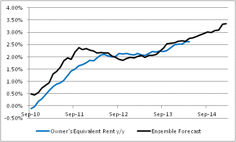
 Moreover, as I have long been predicting, Rents are following home prices higher with (slightly longer than) the usual lag. The chart below (source Bloomberg ) shows Owners’ Equivalent Rent, which jumped from 2.37% y/y to 2.49% y/y this month. The re-acceleration, which represents the single biggest near-term threat to the continued low CPI readings, is unmistakeable.
 Sorry folks, but this is just exactly what is supposed to happen. An updated reminder (source: Enduring Investments) is below. Our model had the December 2013 level for y/y OER at 2.52%…in June 2012. Okay, so the accuracy is mere luck, but the direction should not be surprising.
 For the record, the same model has OER at 3.3% by December 2014, 3.4% for OER plus Primary Rents. That means if every other price in the country remains unchanged, core inflation would be at 1.4% or so at year-end just based on the weight that rents have in core inflation (of course, median inflation would then be at zero). If every other price in the country goes up at, say, 2%, then core inflation would be at 2.6%. (Our own core inflation forecast is actually slightly higher than that, because we see other upward risks to prices). And the tails, as I often say, are almost entirely to the upside.
Famous Last Words?
So, Dr. Bernanke is riding off into the sunset. In an interview at the Brookings Institution, the “Buddha of Banking,” as someone (probably himself) has dubbed the soon-to-be-former Chairman spoke with great confidence about how well everything, really, has gone so far and how he has no doubt this will continue in the future.
“The problem with Q.E.,” he said, with more than a hint of a smile, “is that it works in practice, but it doesn’t work in theory.” “I don’t think that’s a concern and those who’ve been saying for the last five years that we’re just on the brink of hyperinflation I would point them to this morning’s C.P.I. number.” (“Reflections by America’s Buddha of Banking“, NY Times)
Smug superiority and trashing of straw men aside, no one rational ever said we were on the “brink of hyperinflation,” and in fact a fair number of economists these days say we’re on the brink of deflation – certainly, far more than say that we’re about to experience hyperinflation.
“He noted the Labor Department’s report Thursday that overall consumer prices in December were up just 1.5% from a year earlier and core prices, which strip out volatile food and energy costs, were up 1.7%. The Fed aims for an annual inflation rate of 2%.
“Such readings, he said, ‘suggest that inflation is just not really a significant risk of this policy.’“ (“Bernanke Turns Focus to Financial Bubbles, Instability”, Wall Street Journal )
And that’s simply idiotic. It’s simply ignorant to claim that the policy was a complete success when you haven’t completed the round-trip on policy yet by unwinding what you have done. It’s almost as stupid as saying you’re “100 percent” confident that anything that is being done for the first time in history will work as you believe it will. And, of course, he said that once.
I will also note that if QE doesn’t have anything to do with inflation, then why would it be deployed to stop deflation…which was one of the important purposes of QE, as discussed by Bernanke before he ever became Chairman (“Deflation: Making Sure “It” Doesn’t Happen Here”, 11/21/2002)? Does he know that we have an Internet and can find this stuff? And if QE is being deployed to stop deflation, doesn’t that mean you think it causes inflation?
On inflation, Bernanke said, “I think we have plenty of tools to manage interest rates and tighten monetary policy even if (the Fed’s) balance sheet stays where it is or gets bigger.” (“Bernanke downplays cost of economic stimulus”, USA Today)
No one has ever doubted that the Fed has plenty of tools, even though the efficacy of some of the historically-useful tools is in doubt because of the large balance of sterile excess reserves that stand between Fed action and the part of the money supply that matters. No, what is in question is whether they have the will to use those tools. The Fed deserves some small positive marks from beginning the taper under Bernanke’s watch, although it has wussied out by saying it wasn’t tightening (which, of course, it is). But the real question will not be answered for a while, and that is whether the FOMC has the stones to yank hard on the money supply chain when inflation and money velocity start heading higher.
It’s not hard, politically, to ease. For every one person complaining about the long-run costs, there are ten who are basking in the short-run benefits. But tightening is the opposite. This is why the punch bowl analogy of William McChesney Martin (Fed Chairman from 1951 to 1970, and remembered fondly partly because he preceded Arthur Burns and Bill Miller, who both apparently really liked punch) is so apropos. It’s no fun going the other way, and I don’t think that a wide-open Fed that discourses in public, gives frequent interviews, and stands for magazine covers has any chance of standing firm against what will become raging public opinion in short order once they begin tightening. And then it will become very apparent why it was so much better when no one knew anything about the Fed.
The question of why the Fed would withdraw QE, if there was no inflationary side effect, was answered by Bernanke – which is good, because otherwise you’d really wonder why they want to retreat from a policy that only has salutatory effects.
“Bernanke said the only genuine risk of the Fed’s bond-buying is the danger of asset bubbles as low interest rates drive investments to riskier holdings, such as stocks, real estate or junk bonds.But he added that he thinks stocks and other markets ‘seem to be within historical ranges.’” (Ibid.)
I suppose this is technically true. If you include prior bubble periods, then today’s equity market valuation is “within the historical range.” However, if you exclude the 1999 equity market bubble, it is much harder to make that argument with a straight face, at least using traditional valuation metrics. I won’t re-prosecute that case here.
So, this is perhaps Bernanke’s last public appearance, we are told. I suspect that is only true until he begins the unseemly victory lap lecture circuit as Greenspan did, or signs on with a big asset management firm, as Greenspan also did. I am afraid that this, in fact, will not be the last we hear from the Buddha of Banking. We can only hope that he takes his new moniker to heart and takes a Buddhist vow of silence.
Forecasting Cold to Continue Into Summer?
We are a people of language. The way we talk about a thing affects how we think about it. This is something that behavioral economists are very aware of; and even more so, marketers. There is a reason that portfolio “insurance” was such a popular strategy. Language matters. When we call a market decline a “correction,” we tend to want to buy it; when we call it a “crash” or a “bear market”, we tend to want to sell it.
And so as the “arctic vortex” reaches its cold fingers down from the frozen northland, it is really hard for us to think about economic “overheating.” Even though economic overheating doesn’t lead to inflation, I really believe that it is hard for investors to worry about inflation (the “fire” in the traditional “fire versus ice” economic tightrope that central bankers walk) when it is so. Darn. Cold.
But nevertheless, we can take executive notice of certain details that may suggest, overheating or not, inflation pressures really are building. I have been writing for some time about how the recent rapid rise in housing prices was eventually going to pass through to rents, and although the lag was a couple of months longer than it has historically been, it seems to be finally happening as an article in today’s Wall Street Journal suggests. This is significant for at least two reasons. The first is that housing costs are a very large part of the consumption basket for the average consumer, so any acceleration in those prices can move the otherwise-ponderous core CPI comparatively quickly. The second reason, though, is more important. Over the last couple of years, as housing prices have improbably spiked again and inventories have declined sharply, many observers have pointed out the presence of an institutional element among home purchasers. That is to say that homes have been bought in large numbers not only by individuals, but by investors who saw an inexpensive asset (they sure solved that problem!). And some analysts reasoned that the prevalence of these investors might break the historical connection between rents and home prices, at least in the short run, in the same way that a sudden influx of pension fund money could change the relationship between equity prices and earnings (that is, P/Es).
In the long run, of course, this is unlikely, but to the extent it happens in the short run it could delay the upturn in core inflation for a long time. But recent indications, such as that article referred to above, are that this effect is not as large as some had thought. The substitution effect does work. Higher home prices do cause rents to rise as more potential buyers choose to rent instead. It is a question for econometricians in the next decade whether the institutions had a large and lasting effect, or a short and ephemeral effect, or no effect at all. But what we can begin to say with a bit more confidence is that this influx of investors did not remove the tendency of home prices and rents to move together, with a lag.
On to other matters. The market curve for inflation has remained remarkably static for a long time. It is relatively steep, and perennially seems to forecast benign inflation for the next couple of years before headline inflation becomes slightly less-benign (but still not high) a few years down the road. The chart below (Source: Enduring Investments) shows the first eight years of the inflation swaps curve from today, and one year ago.
 If that was the only story, I probably wouldn’t bother mentioning it. But inflation swaps settle to headline CPI, like TIPS and other inflation-linked bonds do; however, a fair amount of the volatility in headline inflation comes from movements in energy. This is why policymakers and prognosticators look at core inflation. You cannot directly trade core inflation yet, but we can extract expected energy inflation (implied by other markets) from the implied headline inflation rates and derive “implied core inflation swaps” curves. And here, we find that the relatively static yield curves seen above hide a more interesting story. The chart below (Source: Enduring Investments) shows these two curves as of today, and one year ago.
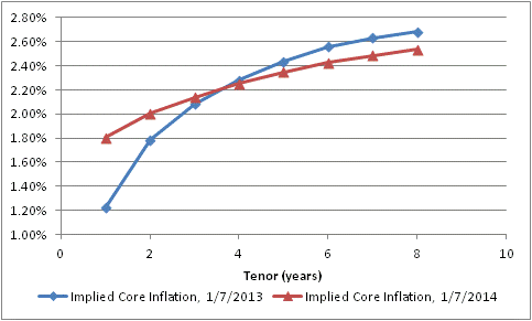 At the beginning of 2013, investors has just experienced a 1.94% rise in core prices (November to November, which is the data they would have had at the time), yet anticipated that core inflation would plunge to only 1.22% in 2013. They actually got 1.72% (as of the latest report, so still Nov/Nov). Now, investors are anticipating about 1.8% over the next 12 months – I am abstracting from some lags – but expect that inflation will ultimately not rise as much as they had feared at this time last year.
Another way to look at this change is to map the implied forward core inflation rates onto the years they would apply to. The chart below (Source: Enduring Investments) does that.
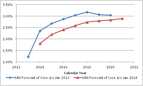 The blue line shows the market’s forecast of core inflation as of January 7th, 2013, year by year. So investors were implicitly saying that core CPI would be 1.22% in 2013, 2.36% in 2014, 2.68% in 2015, 2.87% in 2016, and so on. One year later, the forecast (in red) for 2014 has come down to 1.80%, the forecast for 2015 has declined to 2.20%, the forecast for 2016 has dropped to 2.41%, etcetera.
Has this happened because inflation surprised to the downside in 2013? Hardly. As I just noted, the market “expected” core inflation of 1.22% in 2013 and actually got 1.72%. And yet, investors are pricing higher confidence that inflation will stay low – remaining basically unchanged in 2014 before rising very slowly thereafter – and in fact won’t seriously threaten the Fed’s core mission basically ever.
As I wrote yesterday, we need to tread carefully around consensus. Now, some investors might prefer to be non-consensus by anticipating and investing for deflation in the out years, but taking the whole of the information I look at and model I think the more dangerous break with consensus would be a more-rapid and more-extreme rise in core inflation. I do not think that this economically-cold pricing environment will continue into what is essentially a monetary summer.
Portfolio Projections from 2013
This will be my last “live” post of 2013. As such, I want to thank all of you who have taken the time to read my articles, recommend them, re-tweet them, and re-blog them. Thanks, too, for your generous and insightful comments and reactions to my writing. One of the key reasons for writing this column (other than for the greater glory of Enduring Investments and to evangelize for the thoughtful use of inflation products by individual and institutional investors alike) is to force me to crystallize my thinking, and to test that thinking in the marketplace of ideas to find obvious flaws and blind spots. Those weaknesses are legion, and it’s only by knowing where they are that I can avoid being hurt by them.
In my writing, I try to propose the ‘right questions,’ and I don’t claim to have all the right answers. I am especially flattered by those readers who frequently disagree with my conclusions, but keep reading anyway – that suggests to me that I am at least asking good questions.
So thank you all. May you have a blessed holiday season and a happy new year. And, if you find yourself with time to spare over the next few weeks, stop by this blog or check your email (if you have signed up) as I will be re-blogging some of my (subjectively considered) “best” articles from the last four years. Included in that list is an article on long-run returns to equities, one on Yellen’s defense of large-scale asset purchases, an article on the Phillips Curve, one on why CPI isn’t a bogus construct of a vast governmental conspiracy, and so on. Because I don’t expect some of the places where this column is ‘syndicated’ to post the re-blogs, you should consider going to the source site to sign up for these post, or follow me @inflation_guy on Twitter.
And now, on to my portfolio projections as of December 13th, 2013.
.
Last year, I said “it seems likely…that 2013 will be a better year in terms of economic growth.” It seems that will probably end up being the case, marginally, but it is less likely that 2014 improves measurably in terms of most economic variables on 2013 and there is probably a better chance that it falls short. This expansion is at least four years old. Initial Claims have fallen from 650k per week in early 2009 to a pace of just barely more than half that (335k) in the most-recent 26 weeks. About the best that we can hope for, plausibly, is for the current pace of improvement to continue. The table below illustrates the regularity of this improvement over the last four years, using the widely-followed metric of the Unemployment Rate:
| ‘Rate | (change) | |
| 12/31/2009 | 9.90% | |
| 12/31/2010 | 9.30% | -0.60% |
| 12/31/2011 | 8.50% | -0.80% |
| 12/31/2012 | 7.80% | -0.70% |
| 11/30/2013 | 7.00% | -0.80% |
Sure, I know that there are arguments to be made about whether the Unemployment Rate captures the actual degree of pain in the jobs market. It plainly does not. But you can pick any one of a dozen other indicators and they all will show roughly the same pattern – slow, steady improvement. There is no doubt that things are better now than they were four years ago, and no doubt that they are still worse than four years before that. My point is simply that we have been on the mend for four years.
Now, perhaps this expansion will last much longer than the typical expansion. But I don’t find terribly compelling the notion that the expansion will last longer because the recession was deeper. Was this recession deeper because the previous expansion was longer? If so, then the argument is circular. If not, then why would that connection only work in one direction? What I know is that the Treasury has spent the last four years running up large deficits to support the economy, and the Fed has nailed interest rates at zero and flooded the economy with liquidity. Those two things will at best be repeated in 2014, not increased; and there is a decent chance that one or the other is reversed. Another 0.8% improvement in the Unemployment Rate would put it at 6.2%, and I expect inflation to head higher as well. A taper will be called for; indeed, it should never have been necessary because policy is far too loose as it is. Whether or not an extremely dovish Fed Chairman will actually acquiesce to taper is an open question, but economically speaking it is already overdue and certainly will appear that way by the middle of the year, absent a crack-up somewhere.
Global threats to growth do abound. European growth is sluggish because of the condition of the financial system and the pressures on the Euro (but they think growth is sluggish because money isn’t free enough). UK growth has been improving, but much of that – as in the U.S. – has been on the back of housing markets that are improving too quickly to make me comfortable. Chinese growth has recently been downshifting. Japanese growth has been irregularly improving but enormous challenges persist there. Globally, the bright spot is a modest retreat in Brent Crude prices and lower prices of refined products (although Natural Gas prices seem to be on the rise again despite what was supposed to be a domestic glut). Some observers think that a lessening of tensions with Iran and recovery of capacity in Libya, along with increasing US production of crude, could push these prices lower and provide a following wind to global growth, but I am less sanguine that geopolitical tensions will remain relaxed for long and, in any event, depending on a calm Iran as the linchpin of 2014 optimism seems pretty cavalier to me.
Note that the muddled growth picture contains some elements of risk to price inflation. The ECB has been kicking around the idea of doing true QE or experimenting with negative deposit rates. The UK housing boom, like ours, keeps the upward pressure on measures of core inflation. There is no sign of an end to Japanese QE, and the PBOC seems willing to let the renmimbi rise more rapidly than it has in the past. And all of these global risks to domestic price inflation are in addition to the internally-generated pressures from rapid housing price growth in the United States.
The good news on inflation domestically is that M2 money growth has slackened from the 8%-10% pace of last year to more like 6%-8% (see chart, source Bloomberg). This is still too fast unless money velocity continues to slide, but it is certainly an improvement. But the bad news is that money growth remains rapid in the UK and is accelerating in Japan. The only place it is flagging, in Europe, has a central bank that is anxious not to be last place on the global inflation scale. I expect core inflation (and median inflation) in the U.S. to rise throughout 2014 and for core inflation to end up above 3% for the year.
 Now, I have just made a number of near-term forecasts but I need to change gears when looking at the long-term projections. In what follows, I make no effort to predict the 3-month, 6-month, or 12-month returns of any market. Indeed, although I will present long-term risk and return outlooks, and they are presented as point estimates, I want to make it very clear that these are not predictions but rather statements of relative risk and return possibilities. For many types of instruments, the error bars around the average annual performance are so large as to make point estimates (in my view) nearly useless. The numbers come from models of how markets behave when they are priced “like they are now” in terms of several important metrics. They are not prescient. However, that is what investing is really all about: not making the “right” bet in terms of whether you can call the next card off the deck, but making the “right” bet with respect to the odds offered by the game, and betting the right amount given the odds and the edge.
I also will not make portfolio allocation recommendations here. The optimal portfolio allocation for you depends on more variables than I have at my disposal: your age, your career opportunities, your lifestyle, your goals, any insurance portfolio and your risk tolerance, to name just a few.
What I will do here, though, is to give top-down estimates of the long-run returns and risks of some broad asset classes, and make some general observations. I don’t analyze every possible asset class. For this exercise, I limit the universe to stocks, TIPS, nominal bonds (both long Treasury and corporate bonds), commodity indices and (since many of us already own it) residential real estate. My estimates and some notations about the calculations are in the table below.
| Inflation | 2.50% | Current 10y CPI Swaps |
| TIPS | 0.68% | Current 10y TIPS. This is not at equilibrium, but it is what we can lock in today. It is the highest rate available at year-end since 2010. |
| Treasuries | 0.37% | Nominal bonds and inflation-linked bonds ought to have the same a priori expectation, but Treasuries trade rich to TIPS because of their value as repo collateral. Current 10y nominal rate is 2.87%, implying 0.37% real. |
| T-Bills | -0.50% | Is less than for longer Treasuries because of liquidity preference. |
| Corp Bonds | -0.69% | Corporate bonds earn a spread that should compensate for expected credit losses. A simple regression of Moody’s “A”-Rated Corporate yields versus Treasury yields suggests the former are about 45bps rich to what they should be for this level of Treasury yields. |
| Stocks | 1.54% | 2.25% long-term real growth + 1.83% dividend yield – 2.54% per annum valuation convergence 2/3 of the way from current 24.3 Shiller P/E to the long-run mean. Note that I am using long-run growth at equilibrium, not what TIPS are implying. This is the worst prospective 10 year real return we have seen in stocks since December 2007. Now, to be fair in 1999 we did get to almost -2%, which would imply up to another 35-40% upside to stocks before we reached an equivalent height of bubbliness. That is a 35-40% that I am happy to miss. |
| Commodity Index | 6.26% | Various researchers have found that commodity futures indices have a long-run diversification return of about 3.5%. To this we add 1-month LIBOR to represent the return on the collateral behind the futures, and a ‘relative value’ factor to reflect the performance (relative to the expected model) of hard assets relative to currency. |
| Real Estate (Residential) | -0.19% | The long-run real return of residential real estate is around +0.50%. Current metrics have Existing Home Sales median prices at 3.79x median income, versus a long-term average of 3.55x. Converging to the mean over 10 years would imply an 0.69% per annum drag to the real return. This is the first time since 2008 that housing prices have offered a negative real return on a forward-looking basis. |
The results, using historical volatilities calculated over the last 10 years (and put in terms of ‘real annuitized income,’ a term that means essentially the variance compared to a fixed 10-year real annuity, which in this analysis would be the risk-free instrument), are plotted below. (Source: Enduring Investments).

Return as a function of risk is, as one would expect, positive. For each 0.33% additional real return expectation, an investor must accept a 1% higher standard deviation of annuitized real income. However, note that this is only such a positive trade-off because of the effect of commodities and TIPS. If you remove those two asset classes, which are the cheap high-risk and the cheap low-risk asset classes, respectively, then the tradeoff is worse. The other assets lie much more closely to the resulting line, which is flatter: you only gain 0.19% in additional real return for each 1% increment of real risk. Accordingly, I think that the best overall investment portfolio using public securities – which has inflation protection as an added benefit – is a barbell of broad-based commodity indices and TIPS.
TIPS by themselves are not particularly cheap; it is only in the context of other low-risk asset classes that they appear so. Our Fisher model is long inflation expectations and flat real rates, which merely says that TIPS are strongly preferable to nominal rates but not a fabulous investment in themselves (although 10-year TIPS yields are better now than they have been for a couple of years). Our four-asset model remains heavily weighted towards commodity indices; and our metals and miners model is skewed heavily towards industrial metals (50%, e.g. DBB) with a neutral weight in precious metals (24%, e.g. GLD) and underweight positions in gold miners (8%, e.g. GDX) and industrial miners (17%, e.g. PICK). (Disclosure: We have long positions in each of the ETFs mentioned.)
Feel free to send me a message (best through the Enduring website http://www.enduringinvestments.com ) or tweet (@inflation_guy) to ask about any of these models and strategies. In the new year, I plan to offer an email “course”, tentatively entitled “Characteristics of Inflation-Protecting Asset Classes,” that will discuss how these different assets behave with respect to inflation and give some thoughts on how to put an arm’s-length valuation on them. Keep an eye out for the announcement of that course. And in the meantime, have a happy holiday season and a merry new year!
Defensive
There was a great deal of excitement about today’s Employment Report. The S&P rallied 1.1%, erasing the month-to-date losses at a stroke. And for what? Nonfarm Payrolls were reported at 203k with a net +8k upward revision to the prior months, versus expectations for 185k. That’s a miss that is easily within the standard error. The 6-month average stayed at about 180k and the 12-month average at about 190k. The 3-month average reached 193k, but that is lower than it was in Q1 of this year so no great shakes there.
True, the Unemployment Rate dropped from 7.3% to 7.0%, reversing the unexpected uptick from last month as the labor force participation rate rebounded. Economists were always suspicious of that steep drop in the participation rate, and some bounce was expected (pushing the Unemployment Rate down). But so what? As the chart below (Source: Bloomberg) shows, this is just another step in a long, steady, slow improvement.

I think the reasoning must be something like this: the economy is stronger than we thought, by a little, yet this doesn’t change much about the timing of the taper. Unemployment is 7%, and core PCE is 1.1%. Neither one is close to the Evans Rule targets, so there’s plenty of time (at least, if you are a committed dove like is Yellen). They’re looking for reasons to be slow on tapering, not to accelerate it. At least, this is why equity investors were excited. Perhaps. It does not, though, change my own views in any way – the economy is moving along at roughly the pace that is now normal, adding jobs at a pace that is about what we should expect in the thick of an expansion. The expansion is still growing long in the tooth. But forecasting growth is no longer nearly as important as forecasting the Fed, and that seems fairly easy right now: mo’ money is mo’ better. Stocks are nearing an ugly disconnect, I think – but not today.
.
I seem to regularly take a lot of heat in the comments section of this column for several things. Some readers take me to task for covering up for The Man and his CPI Conspiracy. I won’t address that here, but on December 18th I’ll be running a combination of two old blog posts that explain why CPI isn’t a made-up number, and why most people perceive inflation as being higher than it actually is. The other major complaint is that I have been “calling for inflation forever” and that I am somehow an unrequited inflation-phobe.
I want to refute that specifically. The people who say that are sometimes confusing me with someone else, and that’s okay. But sometimes they make an assumption that since my Twitter handle is @inflation_guy, because I traded inflation derivatives on Wall Street and was the designer and market maker of the CPI futures contract that launched in 2004, and because I run a specialty investment management firm with a core focus on inflation, I must always be super bullish on inflation.
In fact, people who have followed my comments off-line and on-line for the last decade know that is very far from the truth. In fact, when I was an inflation swaps trader the dealer I worked for often got exasperated because I routinely told clients that I did not expect inflation to head higher very soon because of the huge overhang of private debt. “How can you expect us to sell inflation products,” they asked, “if you keep telling everyone there is no inflation?” My rejoinder: “If we are only selling these products when inflation goes up, we only have a business half the time, or whenever we can convince the client that inflation is going up. But these products almost always reduce risk, since almost every client has a natural exposure to inflation going up, and although they have systematically profited over the last two decades from a bet they didn’t know they were making, that cannot continue forever. That’s the reason people should buy inflation products: to reduce risk.”
So, for many years I was exactly the opposite of what I am sometimes accused nowadays of being: although I didn’t worry about deflation very much, I certainly wasn’t worried about runaway inflation.
When the facts change, I change my mind. What do you do, sir?[1]
It was clear that the Fed’s actions in 2008 were going to change things in a big way, but it is interesting that my models anticipated that inflation would continue to decline into 2010 and bottom in Q3 or early Q4 (which is what I said here among other places). It is from that point that I began to diverge with Wall Street opinion (again – since the consensus expected inflation in the middle 2000s while I did not). I published what I think is a helpful time series of my 12-month-ahead model forecasts in early 2012, contrasting it with a chart from Goldman.[2]
So now, let me update the model chart with a forecast for the next twelve months. Before I do, note that in the chart I have substituted Median CPI for Core CPI, for the reasons I have written about for a while now: Core CPI is being dragged down by several one-off movements, most notably in Medical Care, and so Median CPI is currently a better measure of the true central tendency of inflation.
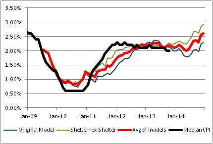
The black line is the actual Median CPI. The red line is the average of the other two models depicted as green and blue lines. The blue line is quite similar to the model I have been using for a very long time; it uses a couple of macro variables including a role for private indebtedness. The green line is something I introduced only in the last few years; it models shelter separately from the ex-shelter components because we have a pretty decent idea of what drives shelter inflation. Frankly, I like that model better, which is why my firm’s forecast for 2014 is for core (or median) inflation to be 3%-3.6%. The model says 3%, and I believe the tails are on the high side.
But the real purpose of my presenting that chart, and the aforementioned discussion, is to defend myself against the calumny that I am a perpetual bull on inflation. Nothing could be further from the truth. From 2004-2010, if I was bullish on inflation at all it was only a “trading opinion” based on market prices.[3] It is only since then that I have been loudly bullish on inflation. And, even then, while I will tell you why inflation could have extremely long tails on the upside, you will not find me forecasting 8%. Nor claiming that inflation really is somewhere that I said it would be, because I don’t like the numbers the BLS is reporting.
I have said in the past, and reiterate now, that one of the main reasons I write this column is mainly to hear reasoned counterarguments to my theses. I think I get sucked far too often into debates with unreasoned or unreasonable counterarguments, not to mention ad hominem attacks.
It goes with the territory of writing a public blog, I suppose. At some level it doesn’t matter much, because I wouldn’t have been on Wall Street for two decades if I bruised easily. But on the other hand, I have a right to self-defense and I have now exercised that right with respect to this particular charge!
[1] A quote variously attributed to Keynes, Samuelson, and others…and apropos here.
[2] Incidentally, note that our firm forecast may differ from the model forecast based on our discretionary reading of the model and other factors. In the last two years, the naked model has handily whupped our discretionary forecast.
[3] Of note is the fact that my company Enduring Investments was formed in early 2009 – even though my models still indicated that inflation was going to be swinging lower for a while.