Archive
Summary of My Post-Employment Tweets – Growl of Displeasure
The following is a summary and extension of my post-Employment tweets. You can follow me @inflation_guy (and tell your friends!)
- 175k +25k revisions, nice jobs figure. Oh, but Unemployment up to 6.7%. Love how these seem to always provide opposite surprises.
- One of my favorite labor charts. Want a Job Now, versus the Unemployment Rate:

- 1 way to add more jobs is to have em all work less. Is this an Obamacare effect since part-timers don’t count?
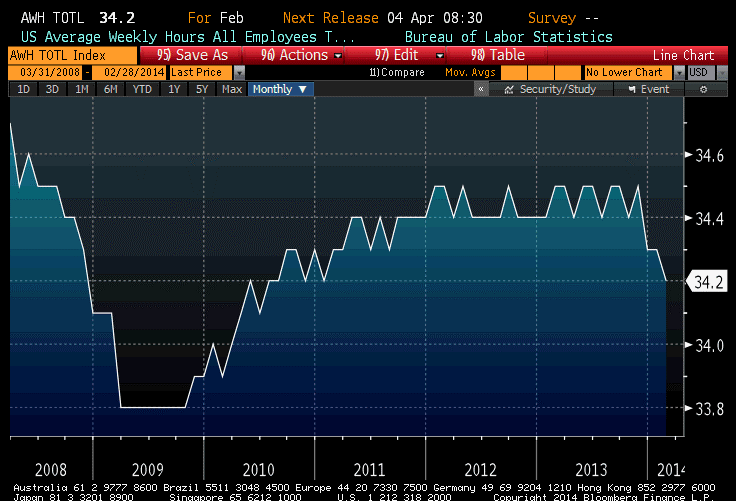
- …regardless, fewer hours worked –>lower output. Expect more downward revisions to Q1 growth ests. Q2 too, if this is ACA.
- If we all end up with jobs, but we’re all working only 30 hours per week, is that better than if only 93% have jobs, working 40?
It will be interesting over the next few months to see if the Hours Worked figures are weather-related (as will be claimed). I suspect that for the most part, they are not. Notice that if there was any weather effect over the last few years, it is not noticeable in the data (nor is it apparent in the unrevised data, incidentally). So, while this year’s weather was colder and snowier than usual, I am skeptical that this can account for more than a small downtick in the hours worked figures.
I rather suspect that the drop is more likely to be attributable to the definition of what constitutes a “full time worker” under the Affordable Care Act. And the question I asked rhetorically above is actually worth thinking about seriously because, looked at one way, the ACA is a jobs program: it will tend to cause businesses to cut back on full-time work and replace those people with more part-time work. The effect should be to cause the Jobless Rate to decline along with Hours Worked. But is that a good thing (because more people have some job) or a bad thing (because people who formerly had a full-time job now only have a part-time job)?
That’s a normative question, not a positive question. But I would think that one effect would be to push more people from what we think of today as “middle class” to lower-middle class, while perhaps raising some who were previously in poverty to be also lower-middle class. I don’t think this was one of the purposes of the law – because frankly, it doesn’t seem that much economic thought went into the design of the ACA – but it is interested to reflect on.
I don’t know what to make of the “Want a Job Now” chart. Let me explain that series, first. “Not in the Labor Force” implies that these people aren’t even looking for jobs, because if they were then they would be counted as unemployed. But, despite the fact that they are not looking, they would like to have a job and would take one if it was offered. While the Unemployment Rate is falling, almost as many people are in the “not in labor force but want a job now” category as were in that category at the beginning of 2011. Why aren’t these people looking?
A fair number of these workers, some 2.3mm of them, are described as “marginally attached” because they’ve looked for work in the last 12 months, and want a job, but haven’t looked in the last 4 weeks so that they aren’t counted as part of the work force. And those are the ones who are holding the category up (see Chart, source Bloomberg).
Some of those workers are not looking because they are “discouraged”, but that only represents about 750k of the 2.3 million or so in this category (and discouraged workers have fallen from about 1 million in 2011, so the decline is consistent with the Unemployment Rate).
So, we are left with a category of people who have looked for work in the past, and would take a job if it was offered, but haven’t looked in the last month. Or the month before. Or the month before. But, at some point, they had at least done a cursory search of the wanted ads.
I think the story of these “marginally attached” workers is worth studying. Are these structurally-unemployed people, who should be counted as such? Are they incentivized to remain out of the work force due to governmental benefits they receive? Or are they, and the decline in the labor force participation rate generally, telling us that the jobs aren’t coming back (or that the newly-created jobs are of lower quality than the old jobs)? I don’t know, but none of the answers is good. We want to see this number decline.
The story of the declining hours worked is potentially much more serious, though – partly because it is a new effect. The nation’s total output is number of employees, times average hours worked, times output per hour. If the number of employees is rising, but they’re working less, then unless productivity rises the total output (that is, GDP) won’t grow very quickly. This could be an early recession sign, or it could be a consequence of the ACA…or it could be a sign that the ACA is pushing a fairly non-robust economy towards the recessionary tipping point. Again, none of these things are good.
So, while the stock market roars its approval about this Employment number, I growl my displeasure. But this is normal.
A Payrolls Report that Matters Again
Tomorrow’s Employment Report offers something it hasn’t offered in a very long time: the chance to actually influence the course of monetary policy, and therefore markets.
Now that the taper has started, its continuation and/or acceleration is very “data dependent.” While many members of the FOMC are expecting for the taper to be completely finished by the middle of this year (according to the minutes released yesterday), investors understand that view is contingent on continued growth and improvement. This is the first Payrolls number in a very long time that could plausibly influence ones’ view of the likely near-term course of policy.
I don’t think that, in general, investors should pay much attention to this report in December or in January. There is far too much noise, and the seasonal adjustments are much larger than the net underlying change in jobs. Accordingly, your opinion of whether the number is “high” or “low” is really an opinion about whether the seasonal adjustment factors were “low” or “high.” Yes, there is a science to this but what we also know from science is that the rejection of a null hypothesis gets very difficult as the standard deviation around the supposed mean increases. And, for this number and next months’ number, the standard deviation is very high.
That will not prevent markets from trading on the basis of whatever number is reported by the BLS tomorrow. Especially in fixed-income, a figure away from consensus (197k on Payrolls, 7.0% on the Unemployment Rate will likely provoke a big trade. On a strong figure, especially coupled with a decline in the Unemployment Rate below 7%, you can expect bonds to take an absolute hiding. And, although it’s less clear with equities because of the lingering positive momentum from December, I’d expect the same for stocks – a strong number implies the possibility of a quicker taper, less liquidity, and for some investors that will be sufficient sign that it’s time to head for the hills.
I think a “weak” number will help fixed-income, and probably quite a lot, but I am less sure how positive it will be for the equity market.
In any event, welcome back to volatility.
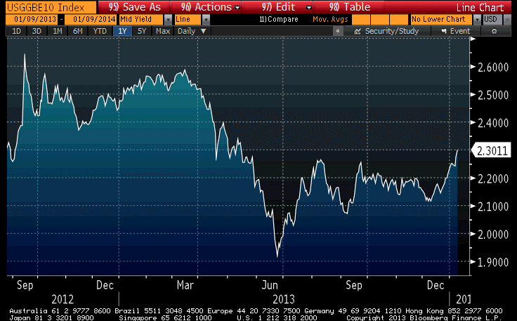
Meanwhile, with commodities in full flight, inflation breakevens are shooting higher. Some of this is merely seasonal – over the last 10 years, January has easily been the best month for breakevens with increases in the 10-year breakeven in 7 of the 10 years with an overall average gain of 15bps – and some of it is due to the reduction of bad carry as December and January roll away, making TIPS relatively more attractive. Ten-year breakevens have risen about 18bps over the last month, which is not inconsistent with the size of those two effects. Still, as the chart below (Source: Bloomberg) shows, 10-year breakevens are back to the highest level since before the summer shellacking.
 Indeed, according to a private metric we follow, TIPS are now back almost to fair value (they only very rarely get absolutely rich) compared to nominal bonds. This means that the benefit from being long breakevens at this level solely consists of the value that comes from the market’s mis-evaluating the likelihood of increasing inflation rather than decreasing inflation – that is, a speculation – and no longer gets a “following wind” from the fact that TIPS themselves were cheap outright. I still prefer TIPS to nominal Treasuries, but that’s because I think inflation metrics will increase from here and, along with those metrics, interest in inflation products will recover and push breakevens higher again.
Portfolio Projections from 2013
This will be my last “live” post of 2013. As such, I want to thank all of you who have taken the time to read my articles, recommend them, re-tweet them, and re-blog them. Thanks, too, for your generous and insightful comments and reactions to my writing. One of the key reasons for writing this column (other than for the greater glory of Enduring Investments and to evangelize for the thoughtful use of inflation products by individual and institutional investors alike) is to force me to crystallize my thinking, and to test that thinking in the marketplace of ideas to find obvious flaws and blind spots. Those weaknesses are legion, and it’s only by knowing where they are that I can avoid being hurt by them.
In my writing, I try to propose the ‘right questions,’ and I don’t claim to have all the right answers. I am especially flattered by those readers who frequently disagree with my conclusions, but keep reading anyway – that suggests to me that I am at least asking good questions.
So thank you all. May you have a blessed holiday season and a happy new year. And, if you find yourself with time to spare over the next few weeks, stop by this blog or check your email (if you have signed up) as I will be re-blogging some of my (subjectively considered) “best” articles from the last four years. Included in that list is an article on long-run returns to equities, one on Yellen’s defense of large-scale asset purchases, an article on the Phillips Curve, one on why CPI isn’t a bogus construct of a vast governmental conspiracy, and so on. Because I don’t expect some of the places where this column is ‘syndicated’ to post the re-blogs, you should consider going to the source site to sign up for these post, or follow me @inflation_guy on Twitter.
And now, on to my portfolio projections as of December 13th, 2013.
.
Last year, I said “it seems likely…that 2013 will be a better year in terms of economic growth.” It seems that will probably end up being the case, marginally, but it is less likely that 2014 improves measurably in terms of most economic variables on 2013 and there is probably a better chance that it falls short. This expansion is at least four years old. Initial Claims have fallen from 650k per week in early 2009 to a pace of just barely more than half that (335k) in the most-recent 26 weeks. About the best that we can hope for, plausibly, is for the current pace of improvement to continue. The table below illustrates the regularity of this improvement over the last four years, using the widely-followed metric of the Unemployment Rate:
| ‘Rate | (change) | |
| 12/31/2009 | 9.90% | |
| 12/31/2010 | 9.30% | -0.60% |
| 12/31/2011 | 8.50% | -0.80% |
| 12/31/2012 | 7.80% | -0.70% |
| 11/30/2013 | 7.00% | -0.80% |
Sure, I know that there are arguments to be made about whether the Unemployment Rate captures the actual degree of pain in the jobs market. It plainly does not. But you can pick any one of a dozen other indicators and they all will show roughly the same pattern – slow, steady improvement. There is no doubt that things are better now than they were four years ago, and no doubt that they are still worse than four years before that. My point is simply that we have been on the mend for four years.
Now, perhaps this expansion will last much longer than the typical expansion. But I don’t find terribly compelling the notion that the expansion will last longer because the recession was deeper. Was this recession deeper because the previous expansion was longer? If so, then the argument is circular. If not, then why would that connection only work in one direction? What I know is that the Treasury has spent the last four years running up large deficits to support the economy, and the Fed has nailed interest rates at zero and flooded the economy with liquidity. Those two things will at best be repeated in 2014, not increased; and there is a decent chance that one or the other is reversed. Another 0.8% improvement in the Unemployment Rate would put it at 6.2%, and I expect inflation to head higher as well. A taper will be called for; indeed, it should never have been necessary because policy is far too loose as it is. Whether or not an extremely dovish Fed Chairman will actually acquiesce to taper is an open question, but economically speaking it is already overdue and certainly will appear that way by the middle of the year, absent a crack-up somewhere.
Global threats to growth do abound. European growth is sluggish because of the condition of the financial system and the pressures on the Euro (but they think growth is sluggish because money isn’t free enough). UK growth has been improving, but much of that – as in the U.S. – has been on the back of housing markets that are improving too quickly to make me comfortable. Chinese growth has recently been downshifting. Japanese growth has been irregularly improving but enormous challenges persist there. Globally, the bright spot is a modest retreat in Brent Crude prices and lower prices of refined products (although Natural Gas prices seem to be on the rise again despite what was supposed to be a domestic glut). Some observers think that a lessening of tensions with Iran and recovery of capacity in Libya, along with increasing US production of crude, could push these prices lower and provide a following wind to global growth, but I am less sanguine that geopolitical tensions will remain relaxed for long and, in any event, depending on a calm Iran as the linchpin of 2014 optimism seems pretty cavalier to me.
Note that the muddled growth picture contains some elements of risk to price inflation. The ECB has been kicking around the idea of doing true QE or experimenting with negative deposit rates. The UK housing boom, like ours, keeps the upward pressure on measures of core inflation. There is no sign of an end to Japanese QE, and the PBOC seems willing to let the renmimbi rise more rapidly than it has in the past. And all of these global risks to domestic price inflation are in addition to the internally-generated pressures from rapid housing price growth in the United States.
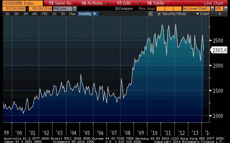
The good news on inflation domestically is that M2 money growth has slackened from the 8%-10% pace of last year to more like 6%-8% (see chart, source Bloomberg). This is still too fast unless money velocity continues to slide, but it is certainly an improvement. But the bad news is that money growth remains rapid in the UK and is accelerating in Japan. The only place it is flagging, in Europe, has a central bank that is anxious not to be last place on the global inflation scale. I expect core inflation (and median inflation) in the U.S. to rise throughout 2014 and for core inflation to end up above 3% for the year.
 Now, I have just made a number of near-term forecasts but I need to change gears when looking at the long-term projections. In what follows, I make no effort to predict the 3-month, 6-month, or 12-month returns of any market. Indeed, although I will present long-term risk and return outlooks, and they are presented as point estimates, I want to make it very clear that these are not predictions but rather statements of relative risk and return possibilities. For many types of instruments, the error bars around the average annual performance are so large as to make point estimates (in my view) nearly useless. The numbers come from models of how markets behave when they are priced “like they are now” in terms of several important metrics. They are not prescient. However, that is what investing is really all about: not making the “right” bet in terms of whether you can call the next card off the deck, but making the “right” bet with respect to the odds offered by the game, and betting the right amount given the odds and the edge.
I also will not make portfolio allocation recommendations here. The optimal portfolio allocation for you depends on more variables than I have at my disposal: your age, your career opportunities, your lifestyle, your goals, any insurance portfolio and your risk tolerance, to name just a few.
What I will do here, though, is to give top-down estimates of the long-run returns and risks of some broad asset classes, and make some general observations. I don’t analyze every possible asset class. For this exercise, I limit the universe to stocks, TIPS, nominal bonds (both long Treasury and corporate bonds), commodity indices and (since many of us already own it) residential real estate. My estimates and some notations about the calculations are in the table below.
| Inflation | 2.50% | Current 10y CPI Swaps |
| TIPS | 0.68% | Current 10y TIPS. This is not at equilibrium, but it is what we can lock in today. It is the highest rate available at year-end since 2010. |
| Treasuries | 0.37% | Nominal bonds and inflation-linked bonds ought to have the same a priori expectation, but Treasuries trade rich to TIPS because of their value as repo collateral. Current 10y nominal rate is 2.87%, implying 0.37% real. |
| T-Bills | -0.50% | Is less than for longer Treasuries because of liquidity preference. |
| Corp Bonds | -0.69% | Corporate bonds earn a spread that should compensate for expected credit losses. A simple regression of Moody’s “A”-Rated Corporate yields versus Treasury yields suggests the former are about 45bps rich to what they should be for this level of Treasury yields. |
| Stocks | 1.54% | 2.25% long-term real growth + 1.83% dividend yield – 2.54% per annum valuation convergence 2/3 of the way from current 24.3 Shiller P/E to the long-run mean. Note that I am using long-run growth at equilibrium, not what TIPS are implying. This is the worst prospective 10 year real return we have seen in stocks since December 2007. Now, to be fair in 1999 we did get to almost -2%, which would imply up to another 35-40% upside to stocks before we reached an equivalent height of bubbliness. That is a 35-40% that I am happy to miss. |
| Commodity Index | 6.26% | Various researchers have found that commodity futures indices have a long-run diversification return of about 3.5%. To this we add 1-month LIBOR to represent the return on the collateral behind the futures, and a ‘relative value’ factor to reflect the performance (relative to the expected model) of hard assets relative to currency. |
| Real Estate (Residential) | -0.19% | The long-run real return of residential real estate is around +0.50%. Current metrics have Existing Home Sales median prices at 3.79x median income, versus a long-term average of 3.55x. Converging to the mean over 10 years would imply an 0.69% per annum drag to the real return. This is the first time since 2008 that housing prices have offered a negative real return on a forward-looking basis. |
The results, using historical volatilities calculated over the last 10 years (and put in terms of ‘real annuitized income,’ a term that means essentially the variance compared to a fixed 10-year real annuity, which in this analysis would be the risk-free instrument), are plotted below. (Source: Enduring Investments).

Return as a function of risk is, as one would expect, positive. For each 0.33% additional real return expectation, an investor must accept a 1% higher standard deviation of annuitized real income. However, note that this is only such a positive trade-off because of the effect of commodities and TIPS. If you remove those two asset classes, which are the cheap high-risk and the cheap low-risk asset classes, respectively, then the tradeoff is worse. The other assets lie much more closely to the resulting line, which is flatter: you only gain 0.19% in additional real return for each 1% increment of real risk. Accordingly, I think that the best overall investment portfolio using public securities – which has inflation protection as an added benefit – is a barbell of broad-based commodity indices and TIPS.
TIPS by themselves are not particularly cheap; it is only in the context of other low-risk asset classes that they appear so. Our Fisher model is long inflation expectations and flat real rates, which merely says that TIPS are strongly preferable to nominal rates but not a fabulous investment in themselves (although 10-year TIPS yields are better now than they have been for a couple of years). Our four-asset model remains heavily weighted towards commodity indices; and our metals and miners model is skewed heavily towards industrial metals (50%, e.g. DBB) with a neutral weight in precious metals (24%, e.g. GLD) and underweight positions in gold miners (8%, e.g. GDX) and industrial miners (17%, e.g. PICK). (Disclosure: We have long positions in each of the ETFs mentioned.)
Feel free to send me a message (best through the Enduring website http://www.enduringinvestments.com ) or tweet (@inflation_guy) to ask about any of these models and strategies. In the new year, I plan to offer an email “course”, tentatively entitled “Characteristics of Inflation-Protecting Asset Classes,” that will discuss how these different assets behave with respect to inflation and give some thoughts on how to put an arm’s-length valuation on them. Keep an eye out for the announcement of that course. And in the meantime, have a happy holiday season and a merry new year!
Defensive
There was a great deal of excitement about today’s Employment Report. The S&P rallied 1.1%, erasing the month-to-date losses at a stroke. And for what? Nonfarm Payrolls were reported at 203k with a net +8k upward revision to the prior months, versus expectations for 185k. That’s a miss that is easily within the standard error. The 6-month average stayed at about 180k and the 12-month average at about 190k. The 3-month average reached 193k, but that is lower than it was in Q1 of this year so no great shakes there.
True, the Unemployment Rate dropped from 7.3% to 7.0%, reversing the unexpected uptick from last month as the labor force participation rate rebounded. Economists were always suspicious of that steep drop in the participation rate, and some bounce was expected (pushing the Unemployment Rate down). But so what? As the chart below (Source: Bloomberg) shows, this is just another step in a long, steady, slow improvement.

I think the reasoning must be something like this: the economy is stronger than we thought, by a little, yet this doesn’t change much about the timing of the taper. Unemployment is 7%, and core PCE is 1.1%. Neither one is close to the Evans Rule targets, so there’s plenty of time (at least, if you are a committed dove like is Yellen). They’re looking for reasons to be slow on tapering, not to accelerate it. At least, this is why equity investors were excited. Perhaps. It does not, though, change my own views in any way – the economy is moving along at roughly the pace that is now normal, adding jobs at a pace that is about what we should expect in the thick of an expansion. The expansion is still growing long in the tooth. But forecasting growth is no longer nearly as important as forecasting the Fed, and that seems fairly easy right now: mo’ money is mo’ better. Stocks are nearing an ugly disconnect, I think – but not today.
.
I seem to regularly take a lot of heat in the comments section of this column for several things. Some readers take me to task for covering up for The Man and his CPI Conspiracy. I won’t address that here, but on December 18th I’ll be running a combination of two old blog posts that explain why CPI isn’t a made-up number, and why most people perceive inflation as being higher than it actually is. The other major complaint is that I have been “calling for inflation forever” and that I am somehow an unrequited inflation-phobe.
I want to refute that specifically. The people who say that are sometimes confusing me with someone else, and that’s okay. But sometimes they make an assumption that since my Twitter handle is @inflation_guy, because I traded inflation derivatives on Wall Street and was the designer and market maker of the CPI futures contract that launched in 2004, and because I run a specialty investment management firm with a core focus on inflation, I must always be super bullish on inflation.
In fact, people who have followed my comments off-line and on-line for the last decade know that is very far from the truth. In fact, when I was an inflation swaps trader the dealer I worked for often got exasperated because I routinely told clients that I did not expect inflation to head higher very soon because of the huge overhang of private debt. “How can you expect us to sell inflation products,” they asked, “if you keep telling everyone there is no inflation?” My rejoinder: “If we are only selling these products when inflation goes up, we only have a business half the time, or whenever we can convince the client that inflation is going up. But these products almost always reduce risk, since almost every client has a natural exposure to inflation going up, and although they have systematically profited over the last two decades from a bet they didn’t know they were making, that cannot continue forever. That’s the reason people should buy inflation products: to reduce risk.”
So, for many years I was exactly the opposite of what I am sometimes accused nowadays of being: although I didn’t worry about deflation very much, I certainly wasn’t worried about runaway inflation.
When the facts change, I change my mind. What do you do, sir?[1]
It was clear that the Fed’s actions in 2008 were going to change things in a big way, but it is interesting that my models anticipated that inflation would continue to decline into 2010 and bottom in Q3 or early Q4 (which is what I said here among other places). It is from that point that I began to diverge with Wall Street opinion (again – since the consensus expected inflation in the middle 2000s while I did not). I published what I think is a helpful time series of my 12-month-ahead model forecasts in early 2012, contrasting it with a chart from Goldman.[2]
So now, let me update the model chart with a forecast for the next twelve months. Before I do, note that in the chart I have substituted Median CPI for Core CPI, for the reasons I have written about for a while now: Core CPI is being dragged down by several one-off movements, most notably in Medical Care, and so Median CPI is currently a better measure of the true central tendency of inflation.
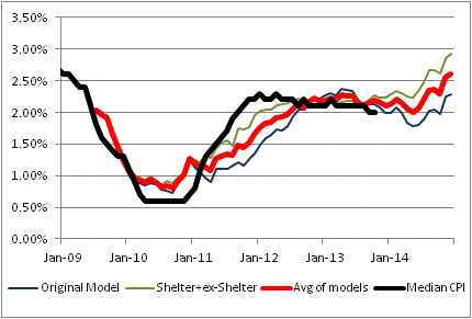
The black line is the actual Median CPI. The red line is the average of the other two models depicted as green and blue lines. The blue line is quite similar to the model I have been using for a very long time; it uses a couple of macro variables including a role for private indebtedness. The green line is something I introduced only in the last few years; it models shelter separately from the ex-shelter components because we have a pretty decent idea of what drives shelter inflation. Frankly, I like that model better, which is why my firm’s forecast for 2014 is for core (or median) inflation to be 3%-3.6%. The model says 3%, and I believe the tails are on the high side.
But the real purpose of my presenting that chart, and the aforementioned discussion, is to defend myself against the calumny that I am a perpetual bull on inflation. Nothing could be further from the truth. From 2004-2010, if I was bullish on inflation at all it was only a “trading opinion” based on market prices.[3] It is only since then that I have been loudly bullish on inflation. And, even then, while I will tell you why inflation could have extremely long tails on the upside, you will not find me forecasting 8%. Nor claiming that inflation really is somewhere that I said it would be, because I don’t like the numbers the BLS is reporting.
I have said in the past, and reiterate now, that one of the main reasons I write this column is mainly to hear reasoned counterarguments to my theses. I think I get sucked far too often into debates with unreasoned or unreasonable counterarguments, not to mention ad hominem attacks.
It goes with the territory of writing a public blog, I suppose. At some level it doesn’t matter much, because I wouldn’t have been on Wall Street for two decades if I bruised easily. But on the other hand, I have a right to self-defense and I have now exercised that right with respect to this particular charge!
[1] A quote variously attributed to Keynes, Samuelson, and others…and apropos here.
[2] Incidentally, note that our firm forecast may differ from the model forecast based on our discretionary reading of the model and other factors. In the last two years, the naked model has handily whupped our discretionary forecast.
[3] Of note is the fact that my company Enduring Investments was formed in early 2009 – even though my models still indicated that inflation was going to be swinging lower for a while.
Time is Running Out
All the expectations for resurgent growth are running into a time problem. While the Federal Reserve continues to pump the system, hoping for that burst of energy coming out of the slump, there is really little reason to expect anything more than we have already gotten. I’ve written recently about that in the context of payroll growth and the rate of improvement in the unemployment rate. But there is also, as I say, a time problem.
The current expansion, believe it or not, is getting long in the tooth. While there have been longer expansions – the one from 1991 to 2001, fueled by a continuous decline in interest rates, a budget that was near balance or in surplus, and an asset bubble engendered by the promise of the Internet and some remarkable Wall Street pitchmen – the average postwar expansion has only been 68 months, peak to peak, or 58 months, trough to peak. According to the NBER, on which we rely to jog our memories since this was so long ago, the prior business cycle peak occurred in December 2007 and the prior trough in June 2009. So, using those average business cycle lengths, the expected date of the subsequent peak would be between August 2013 and May 2014. This latter date is especially interesting because it is approximately the current consensus on when the QE taper is expected to begin (again).
I think it’s not unreasonable to suggest that getting more than an “average” expansion in the current circumstance would be a pleasant surprise indeed. With the size of government deficits, the uncertainty engendered by the morass in Congress and the rapid proliferation of regulatory overhead (both ACA-related and other), real interest rates much closer to the likely bottom than to the likely top, and continued threat of volatility in the international political economy… it is remarkable to me that we’ve even been able to squeeze out one of “average” duration.
And all it took was a few trillions!
It is well past time when it was appropriate for the Federal Reserve to stop trying to push the economy faster. Blowing into the sail simply doesn’t work very well to make the boat go faster. It will only lead to hyperventilation.
So now we are in a situation in which the expansion is likely to begin to wind down, and very likely to do so at least partly provoked by the Fed’s tightening of policy (for lessening QE is, as we have seen from the interest rate response, clearly a tightening of policy). It may become very tempting for the Yellen Fed to continue QE as weakness manifests, but the problem is going to be that inflation is going to be heading higher, not lower, into the slowdown as the housing price inflation continues to percolate into rental prices and a weakening dollar helps other prices to firm as well.
We really are in a very dangerous situation equity market-wise, as a result of this timing issue. Over the next year inflation is going to rise, growth is (probably) going to slow, and equity earnings ex-finance are looking decidedly punk as a recent article by Sheraz Mian from Zacks Investment Research pointed out. Which is not to say, of course, that the stock market can’t or won’t continue to ramp higher…just that it is increasingly subject to sudden-breakage risk as the shelf it sits on gets higher and higher.
The Baby is Calm … For Now
So, the bond market has had another few days of riding the yo-yo. A 20-bp bond selloff on Friday (followed by a 10bp rally today) was precipitated by a stronger-than-expected Employment Report, with the actual number of jobs created exceeding estimates by 100k (including revisions to the prior two months). Interestingly, the Unemployment Rate rose, but on the whole the data was clearly better than most observers expected even if the net result is that the economy is still limping along at almost precisely the same pace it has done so for the last few years (see chart, source: Bloomberg).
 And so the equity market reaction makes some sense. The jobs report was strong enough so as to alleviate (or at least salve, temporarily) fears that the economy is about to slip back into recession, while not being so strong that it could lead to a premature taper which leaves everyone gasping but unsatisfied.
The bond market, though, was routed. The bad convexity profile, combined with the poor liquidity of a trading session stranded between a holiday and a weekend, throttled fixed-income and drove rates to the highs of the move. Ten-year Treasury yields (2.74% on Friday) reached the highest levels in almost two years.
I was wrong about stocks, but right about bonds, when I said I expected the prior trends to re-assert themselves after quarter-end. Given an Employment number that missed expectations one way or the other, it was going to be hard to be right on both in the short-term.
But in the slightly longer-term, the imbalances between equities and fixed-income are building in a way they haven’t been for a long time. As the chart below shows, the rally in equities has been fueled importantly by a long decline in long-term real interest rates, from 3% to -1%, since 2008.
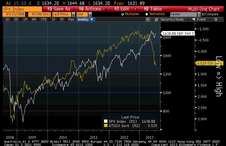 A further equity rally is not out of the question, of course. The real equity premium (the excess expected real return of stocks relative to TIPS) in mid-2011 was as low as it is now, and that “unattractive condition” preceded a 40% rally in the stock market over two years. The difference is that in 2011, real interest rates were low, but (we know in retrospect) were destined to go much lower. It seems unlikely – although not impossible! – that real rates are about to rally again from +0.53% to -1.00%, thereby precipitating an additional rally.
Indeed, although it may be a trick of the eye the chart above seems to suggest that equity price turns lag the turns in real yields. The regression of real yield levels versus equity levels happens to have its best fit with a lag of 19 weeks. Not to worry, however: if that’s not merely spurious, then it means you still have about a month before the big equity slide is due to begin!
Interestingly, the international backdrop is heating up again, although in prior incarnations the Arab Spring (now replaced by the Egyptian Summer) and Grexit crisis (now replaced with the Portuguese government stability crisis and …the Grexit crisis) didn’t cause any lasting damage to equities. However, it bears repeating that those crises occurred in the context of steady and significant declines in interest rates.
Calm, anyway, is inherently destabilizing. The Troika wouldn’t be pressing Greece for more concessions, or holding Portugal’s feet to the fire, if markets were going crazy. However, because markets (and especially, equity markets) are comparatively calm, it seems like a fair time for policymakers to send trial balloons aloft. Similarly, the FOMC seems oddly relaxed about the carnage in bond markets, with officials content to waggle fingers in disapprobation at market action rather than to reverse course and speak soothingly about how additional quantitative easing could be provided. I expect a one-thousand point Dow fall would change that perspective rather quickly. As parents know, it is easy to hold the line on good parenting until Junior throws a fit, and then it is so tempting to give him a lollipop to quiet him down. But, while he’s behaving, why not ask him to try broccoli today?
Wahhhhhhh![1] And then we’ll see whether central bank discipline is real, or merely threatened.
[1] This is not autobiographical. My son loves broccoli.
Summary of My Post-Employment Tweets
- upward surprise + upward revision in #Payrolls – not too shocking, as I pointed out in last article. Weak hours though…
- Here is part of what’s happening in #payrolls: more jobs, fewer hours = employers cutting back hours to avoid Obamacare coverage
- Question is, which is better for confidence? More jobs, lower earnings & wages, or fewer, but better, jobs? Probably the former.
- average weekly hours have stagnated since 2011, even as Unemployment has fallen.
Today’s Employment report was pretty straightforward: an upward surprise to payrolls and upward revisions; a decline in the Unemployment Rate, and declines in hours worked. The upward revisions to Payrolls is not really a surprise, although seeing the Unemployment Rate continue to decline when Consumer Confidence “Jobs Hard to Get” is increasing is unusual.
Two years ago, the “Average Hours Worked” was 34.4 hours and the Unemployment Rate was 9.0%. Today, average hours worked is still 34.4 hours and the Unemployment Rate is 7.5%.
What I said about Obamacare coverage should be expanded a bit. There have been anecdotal reports (see, e.g., here and here) that many employers are cutting back hours for some employees, because they are required to offer health insurance (at steep premium increases) to part-time employees working at least 30 hours per week. The incentives are large, especially for employers who are near the 50 employee cutoff, to cut back employee hours. The way this would show up in the data, if the behavior was widespread, would be (a) a decline in average hours, as more people work shorter shifts, and (b) potentially (but not automatically) an increase in the number employed, since an employer who cuts 100 hours of work from existing employees is now 10 hours short of the labor input needed. I suspect this is only partly the case – if you cut 100 hours, maybe you add three 25-hour part-timers (it still costs money to hire, after all) – but it may help explain why the payrolls number keeps rising and the jobless number keeps falling although the average hours worked is pretty stagnant.
It would also help resolve the conundrum between the “Jobs Hard to Get” survey result and the Unemployment Rate, although it is a small divergence at present. If respondents are answering the survey as if the question is whether good or full-time jobs are hard to get, it may well be the case that those jobs are getting more difficult to find while there are more part-time positions being offered.
This is mere speculation, and storytelling, but I think it’s plausible that this is happening and may be affecting the data.
Unemployment and Initial Claims – A Quick Chart
It was a pretty quiet day today, so instead of writing about the fairly boring market action (although AAPL broke below $500 for a few minutes and TIPS continued their recent bounce) I wrote a book report about the book How the Trading Floor Really Works. However, because people have requested that I separate obviously unrelated posts, you can find that review here.
There is one chart I would like to share – sort of a holdover from last week that I never got around to. It shows the unemployment rate (white line) against Initial Unemployment Claims (yellow line) for the last couple of cycles. (Source: Bloomberg)

So, do you think the job market is improving? You’re right! Does the job market still suck? You betcha!
There is also something different going on here, beyond the usual year-end seasonal adjustment tomfoolery. The decline in Initial Claims typically happens when the economy has stopped getting worse, and the current level is consistent with an economy that is turning jobs over at roughly the normal pace. We’re not creating lots more unemployed. But the slow decline in the Unemployment Rate is a sign that we’re not absorbing the existing unemployed through new growth of existing enterprises, or creation of new enterprises, as is typical in recoveries. I don’t think it should come as an absolute shock that in this business-unfriendly climate, businesses are reticent to expand, even if production as a whole is expanding.
Summary Of My Post-Payrolls Tweets
The following are my post-Payrolls tweets (@inflation_guy), along with some charts and added thoughts.
- Payrolls number close, expected 85k was actually 146k but 49k of downward revisions. Amazingly good guesses given Sandy.
- Unemployment Rate drops to 7.746% from 7.876% (so really 0.1 drop not 0.2 drop), due to sharp particip drop to 63.6 from 63.8
- Not a particularly good report; haven’t had >200k jobs since March, after these revisions. But chatterverse will say it’s bullish stocks
- Goods producing jobs -22k; service-providing +169k. Retail trade +53, allaying some fears that weak Xmas season could hurt #s.
- Here’s some good news: Aggregate weekly hours rose to a new post-2008 high of 104.1, which is higher than it was in 2000. [Note: chart below]
- “Not in labor force” rose again: second highest total ever. Not in labor force, want a job now also rose. This is “shadow unemployment.” [Note: charts below]
- The chatterverse will say it’s a good report, but in my view it isn’t good enough, and we’ll quickly turn to fiscal cliff again.
As noted, this isn’t a great report. It continues the theme of tepid recovery, but without the people leaving the labor force the unemployment rate would be much higher. The chart below (source: BLS via Bloomberg) shows the “not in labor force” numbers going back decades.

Now, the thing is that I’m not sure this is a temporary phenomenon – some of these people are leaving the labor force because they’re giving up, but some of them are leaving the labor force because they’re retiring, or retiring early. We would be expecting some rise in this number anyway, due to the fact that Baby Boomers are starting to retire. So I think the chart below (same source) is a better view of the part of this rise that’s truly disturbing. It shows the category “not in labor force, but want a job now.” These are people who are not counted in the labor force because they’re not looking for a job, but if someone called and offered them a job they’d take it. Presumably, when the job market starts visibly recovering, these people will start to look again.

Finally, let’s not lose sight of the fact that the economy is still stumbling, but at least it’s stumbling forward. The chart below (same source) shows the aggregate weekly hours worked by production or nonsupervisory employees (2002=100).

As I say above, this isn’t a great report, and it isn’t a bad report – in my view, it’s good enough so that the CNBC talking heads can tell everyone to buy but not so good that it will re-direct the narrative from the fiscal cliff. And it certainly isn’t good enough to claim that there’s any evidence the economy is “ready to explode” once the fiscal cliff is resolved.