Archive
European Inflation Concerns Also Rising?
In this space I write a lot about inflation, but specifically I focus mostly on US inflation. However, inflation is substantially a global process – a paper by two ECB economists in 2005 (and our independent followup) found that nearly 80% of the variance in inflation in the G7 and G12 could be accounted for by a common factor. This observation has investment implications, but I’m not focusing on those here…I’m just presenting that fact to explain why I am about to show a chart of European inflation.

Right, so technically it’s my second article in a row in which I mention European inflation. In last Friday’s “Potpourri for $500, Alex”, I noted that core European inflation rebounded to 1.1% after being counted for dead at 0.7% last month. But what is illustrated above is the inflation swaps market, and so is forward-looking. I think this looks a lot more dramatic: investors expect 5-year European inflation to average 1.5% over the next 5 years (a year ago, they were at 1.1% or so and two years ago the market was at 0.7%), and to converge up towards 1.8% where the 5y, 5y forward inflation swap indicates the approximate long-run expectation since it’s not significantly influenced by wiggles in energy.
What is especially interesting though is not the overall trend. Inflation markets everywhere, with the exception of the UK, have been trending higher for a couple of years – you are forgiven if you hadn’t heard that, but the ‘disinflation’ lobby is strong (most of the equity houses have some skin in the game in that direction, after all). No, what is most interesting to me is that inflation swaps have been trending higher recently even though energy prices have been in retreat and even though European yields (outside of Italy) have mostly been in decline. It isn’t as if Euro area growth has been setting the world afire. The currency has been weakening as US growth seems to be outstripping growth on the continent and as the European ‘experiment’ once again looks to be under stress.
What Euro inflation investors may believe, though, are two things. First, a trade war is really bad for inflation, and probably moreso for Europe than the US since there is a larger external sector. Trade frictions are bad for everyone, of course, but a splintering of the Euro bloc would be the ultimate in trade frictions. Second, the ECB is being much slower to stop QE and raise rates than is the Fed. Heck, the ECB’s deposit facility is still at -0.40%, where it has been for 2016. While I am in the camp that rates are of limited importance when economic liquidity is far larger than the economy demands (that is, when there are inert excess reserves), that’s not a mainstream view and as much as I would like to believe otherwise, markets respond to the mainstream view and not mine!
For some time, we’ve favored European ILB over US ILB, and that has been a steady if unexciting trade. Even after this move, European inflation bonds are still considerably cheap to US TIPS, which are themselves still fairly cheap relative to nominal US rates.
Two Important Changes Coming to the CPI
There are a couple of potentially important changes to the CPI that will take effect in the next few months. It is worth thinking about how these will affect the data.
- Sometime in “Spring 2018,” the BLS will reweight the physicians’ services index, which includes consumer out-of-pocket, Medicare Part B, and private insurance reimbursements, to better reflect the current market weights of various payer types.
This matters, because the ACA (nee Obamacare) caused a large shift in where payments were coming from, and one effect of that shift was to obfuscate actual inflation in medical care. Because CPI only includes payments that consumers make, and not the ones that government provides (Medicare Part A, Medicaid), large changes in the coverage population and the significant change in deductibles caused Medical Care inflation to do things that really didn’t make a lot of sense. We know that total spending on health care grew sharply under Obamacare as Medicare, Medicaid, private health insurance, and out-of-pocket spending all rose, but medical care inflation as measured by CPI sharply decelerated over the last 15 months. It isn’t because health care is suddenly more affordable; it’s because large change in the way medical care is paid for was bound to cause large change in the measurement of medical care. It is likely that reweighting this index to current weights will cause better stability in this measure – but at a higher level than the recent 1.7% rate. Since Medical Care is the main thing holding down core PCE, this will likely make the optics worse over the next year (and see what I have already said about the optics).
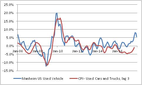
- With January 2018 data, CPI for used cars and trucks will change from a three-month moving average to a single-month price change. The BLS says “This modification will result in an index that reflects price change closer to the reference period.”
This matters, because as I’ve been pointing out over the last few months the CPI for used vehicles is quite a bit below where private surveys of used car prices suggest it should be. The recent rise in used car prices is happening largely because Hurricane Harvey removed hundreds of thousands of vehicles from the road, but the BLS measure has been lagging behind the private measure of these prices. This is one of those effects that is expected to make the CPI optics worse in 2018, and this change could make it worse, faster. If CPI measures of car inflation merely converge with the blue line below, it’s worth about 0.5% on core inflation. Moving to a 1-month, rather than a 3-month measure will make this more volatile, but also will make it converge more quickly. Indeed, it makes this month’s CPI report even more interesting and creates a chance for a significant surprise higher as soon as this month.
Hard to Sugar-Coat Nonsense Like This
Note: We are currently experimenting with offering daily, weekly, monthly, and quarterly analytical reports and chart packages. While we work though the kinks of mechanizing the generation and distribution of these reports, and begin to clean them up and improve their appearance, we are distributing them for free. You can sign up for a ‘free trial’ of sorts here.
One of the things that fascinates me about markets – and one of the reasons I think “Irrational Exuberance”, now in its third edition, is one of the best books on markets that there is – is how ‘storytelling’ takes the place of rational analysis so easily. Moreover, almost as fascinating is how easily those stories are received uncritically. Consider this blurb on Bloomberg from Wednesday (name of the consultant removed so as not to embarrass him):
Sugar: Talk in market is that climate change has pushed back arrival of winter in Brazil and extended the high-risk period for frost beyond July, [name removed], risk management consultant for [company name removed] in Miami, says by telephone.
Sugar futures have recently been bouncing after a long decline. From February through June, October Sugar dropped from 20.40 cents/lb to 12.74¢; since the end of June, that contract has rallied back to 14.50¢ (as of Wednesday), a 14% rally after a 38% decline. There are all sorts of reasons this is happening, or may be happening. So let’s think about ‘climate change’ as an explanation.
There are several layers here but it boils down to this: the consultant is saying (attributing it to “talk in the market,” but even relaying this gem seems like gross negligence) that the rally in the last few weeks is due to a change in the timing of the arrival of winter…a change which, even if you believe the craziest global warming scaremongers, could not possibly have been large enough over the last decade to be measurable against the backdrop of other natural oscillations. Put another way, in late June “the market” thought the price of sugar ought to be about 12.74¢/lb. Then, “the market” suddenly realized that global warming is increasing the risk to the sugar crop. Despite the fact that this change – if it is happening at all – is occurring over a time frame of decades and centuries, and isn’t exactly suffering from a lack of media coverage, the sugar traders just heard the news this month.
Obviously, that’s ridiculous. What is fascinating is that, as I said, in this story there are at least 4 credulous parties: the consultant, the author of the blurb, the editor of the story, and at least part of the readership. Surely, it is a sign of the absolute death of critical thinking that only habitual skeptics are likely to notice and object to such nonsense?
Behavioral economists attribute these stories to the need to make sense of seemingly-random occurrences in our universe. In ancient times, primitive peoples told stories about how one god stole the sun every night and hid it away until the morning, to explain what “night” is. Attributing the daily light/dark cycle to a deity doesn’t really help explain the phenomenon in any way that is likely to be useful, but it is comforting. Similarly, traders who are short sugar (as the chart below, source Floating Path, shows based on June 27th data) may be comforted to believe that it is global warming, and not unusually short positioning, that is causing the rally in sugar.
 As all parents know, too much sugar (or at least, being short it) isn’t good for your sleep. But perhaps a nice story will help…
Inflation-Linked Bonds: For the Wary, but the “Wise?”
Only a quick article at the moment. This is longer than a tweet-length answer, but didn’t need to be super long.
A friend sent me the link to the following article from the FT:
 But the article also includes a common gripe about inflation-linked bonds that isn’t really fair, and should be addressed. The argument is that inflation-linked bonds don’t really protect against inflation, because changes in real yields are much more impactful to the return than are changes in inflation.
This is true. It is also true that changes in nominal yields are much more impactful to the return of nominal bonds than is the coupon rate or yield on the bond. If you buy a 10-year Treasury yielding, say, 3%, and hold it for two years, you will most likely get a return quite a bit different from 3% because changes in the yield-to-maturity over that period overwhelms the yield of the bond (especially now). You only get 3% if you hold to maturity. (Well, technically you get 3% if you hold for a period equal to the Macaulay duration, but that’s a discussion for another time.)
So it isn’t fair to criticize inflation-linked bonds for not being an inflation hedge over every time period. As with nominal bonds, they are a perfect inflation hedge if held to the proper horizon, and a less-than-perfect hedge over different time periods.
However, you shouldn’t be trying to hedge inflation over the next week or month. You should be trying to hedge inflation over the long term. Accordingly, the fact that returns vary due to changes in real yields is not a damning fact about linkers. Unless, of course, you’re a highly levered participant.
A Short Remark About an Ominous Count
This will be a very short remark, partly because I am certain that someone else must have observed this already.
The Dow Jones Industrial Average declined on Tuesday after having risen in each of the preceding 12 days. I was curious, and the DJIA has data going back more than a century (unlike, for example, the S&P 500, the Russell, or other indices), so I checked to see how often that has happened before.
It turns out that only three times before in history has the Dow advanced in 12 consecutive sessions. The dates of those occurrences are (listed is the last day of advance before the first decline):
July 8, 1929
December 7, 1970
January 20, 1987
The latter of these three was actually a 13-day advance, and the longest in history.
Now, the 1970 occurrence seems to be nothing special. It occurred five years into a 15-year period that saw the Dow go nowhere in nominal terms, but there was nothing special about 1971. However, anyone who invests in the stock market ought to know the significance of 1929 and 1987. It also bears noting that current market valuations are higher (in terms of the Cyclically-Adjusted PE ratio) than on any of those three days – quite a bit higher, in fact.
None of which is to say that we won’t have another 10, 20, or 30-day streak ahead of us. I suspect the bulls will say “see? This same occurrence in 1929 and 1987 happened months before the denouement. We still have time to party!” And they may be right. This isn’t predictive. But it, especially when compared to valuation levels second only to those seen at the peak of the “Internet Bubble,” is ominous. This is a party I wouldn’t mind missing.
Do Shortages Cause Lower Prices?
This is a quick post this morning because it is rainy and I am grumpy and feel like complaining.
Over the weekend I saw a post from a major market news website. I don’t want to name the website, because what they wrote was embarrassingly obtuse. I wouldn’t like it if someone cited my blog when I write something obtuse, so I won’t link to theirs. Consider it professional courtesy.
Here is what they wrote: “The global bond selloff was blamed largely on fears the European Central Bank and the Bank of Japan will eventually run out of bonds to buy.”
At this point, time yourself to see how long it takes you to figure out what’s wrong with that sentence. Score yourself with this table:
1 second or less: Congratulations! You have excellent common sense.
2-30 seconds: You have good common sense but maybe spend too much time around markets.
31-2 minutes: You are smart enough to figure this out, but you watch too much financial TV.
Over 2 minutes: You can be a Wall Street economist!
“I don’t see anything wrong” : You can write for the blog in question.
I could give an answer key, but in the interest of ranting let me present instead an analogy:
In a certain town there is a grocery store, whose proprietor sells apples for 50 cents. One day, a man walks in, flags down the proprietor, and says, “Hello kind sir. I see you have apples for sale. I would like to buy your apples. You see, I have bought all of the apples in this state, and in the surrounding state. I have bought every apple in this town. In fact, I have bought almost all of this year’s harvest. So, I’d like to buy your apples because I have money to buy apples and you have the only apples left.”
The proprietor responds, “Great! I will sell them to you for a nickel each!”
Because, you see, since the apple buyer has just about run out of apples to buy, the price of apples should fall. Right? Well, that’s exactly the point the blog made about bonds: because investors fear the ECB and BOJ will eventually run out of bonds to buy, bond prices fell. If there are really investors out there who think that when the supply of something declines, its price will fall…please introduce me to them, because I’d like to trade with them.
The fact that global central banks continue to buy bonds is the single, best reason to think that yields may not rise. In normal times, bond yields would be rising right now to reflect the fact that inflation is rising, just about everywhere we measure inflation (maybe not in Japan – core inflation in Japan was rising thanks to more-rapid money growth, but when the BOJ lowered rates into negative territory it lowered money velocity and may have squashed the recent rise). But if central banks are buying every bond they can, then prices are more likely to stay high and yields low – even in places like the US where the central bank is not currently buying bonds, because a paucity of Japanese and European bonds tends to increase the demand for US bonds. The risk to the bulls is actually that central banks stop buying bonds.
Maybe that is the weird reasoning that the blog in question was employing: once there are no bonds, central banks will have to stop buying them. And when the central banks stop buying bonds, their prices should fall. Ergo, when there are no bonds to buy the prices should fall. Sure, that makes sense!
Interesting Intraday Oil Futures Flows
Here is an interesting chart that might suggest flows into oil markets.
Or perhaps it suggests something else. But I put together the chart below (data sourced from Bloomberg) because it seemed to me as if recently crude oil – and other energy markets, but I am focusing on Crude – has been having a nice little spike in the middle of the morning. Often, these have seemed inexplicable to me; other times (like yesterday) there was ostensibly news but it was not immediately obvious that the news was oil-supportive.

This chart shows a composite trading day for June NYMEX Crude Oil futures for the last 20 days. You can see that it appears I am not imagining it: on average, Crude has been rallying about 30 cents per day, beginning about 9:00ET.
I thought this might be flattered by the DOE weekly release, which is at 10:30ET on Wednesdays. So I removed those days and the relationship is still clear (although it makes the rise from 3am to 9am look relatively more important).
I don’t know exactly what this means, but it has “felt” to the old trader in me that the market was tending to gap in that time frame and this seems to confirm the visceral sense. It doesn’t necessarily mean my other gut feeling, that this might represent systematic daily allocations – perhaps to energy or broad commodity ETFs? Or OTC products? Or both? – is correct, however.
Surprising Surprises
If posting on December 22nd was a bad idea, imagine how stupid it is to post on December 23rd?
But I noticed something unusual and thought to point it out. Yesterday, I observed that the data has generally been weakening, and while some commentators are optimistic on the outlook for 2016 I am not one of them. Actually, it appears that perhaps commentators as a whole are not only too optimistic now, but have been too optimistic all year.
The Citi Economic Surprise Index is an interesting data series that measures how data releases have generally compared to economists’ prior expectations. When data is coming in weaker than expected, it declines; when data is coming in stronger than expected, it rises. This doesn’t necessarily mean that it declines when the economy is weakening, just when the data is surprising on the downside. I’ve always had trouble figuring out just how to use this information, because of that. Is the indicator rising because conditions are getting better, or just because economists are morose? Is it falling because conditions are getting worse, or because economists are too optimistic? Hard to tell.
With that said, here is what the indicator has done over the last three years (source: Bloomberg).

Nothing to see here, right? Well take a look at this! The table below shows the proportion of the time, by year (since the index was created in 2003), that the index was above zero.
| 2003 | 57% |
| 2004 | 49% |
| 2005 | 68% |
| 2006 | 43% |
| 2007 | 57% |
| 2008 | 36% |
| 2009 | 67% |
| 2010 | 56% |
| 2011 | 54% |
| 2012 | 63% |
| 2013 | 61% |
| 2014 | 54% |
| 2015 | 8% |
Now that, as they would say on Mythbusters, is a result. I have no idea what it means, that economic data has been consistently undershooting expectations all year so that the index has been negative 92% of the time. The second-worst outcome was 2008, but that was clearly a situation in which the economy was getting worse lots faster than economists anticipated.
I am inclined to think that this represents the optimism that economists seem to have that the Fed’s move to tighten policy reflects a response to actual underlying strength. I should add that I believe this is an unfounded, irrational, and borderline psychotic optimism given the historical prognosticative powers of the Federal Reserve…but if that is indeed what is happening then the optimism that these same economists have about the number of rate hikes we will see in 2016 is probably misplaced.
Proper Seasonal Gold Chart
In an excellent (and free!) daily email I receive, the Daily Shot, I ran across a chart that touched off my quant BS alert.
 This chart is from here, and is obviously a few years out-of-date, but that isn’t the problem. The problem is that the chart suggests that gold prices rise 5.5% every year. If you buy gold in January, at an index value of 100, and hold it through the flat part of January-June, then you reap the 5% rally in the second half of the year.
No wonder people love gold! You can get a 10% annual return simply by buying in July and selling in December!
The problem is that this is not the way you should do a seasonal chart. It has not be detrended. We detrend data because that way, we can express the expected return for any given day as (the normal expected return) plus (the seasonal component). This is valuable because, as analysts, we might have a general forecast for gold but we will want to adjust that forecast to a holding period return based on a seasonal pattern. This is very important, for example, with TIPS yields and breakevens, because inflation itself is highly seasonal.
Now, the seasonal chart done correctly still suggests that the best time to own gold is in the second half of the year, but it no longer suggests that owning gold is an automatic winner. (It is a separate argument whether we can reject the null hypothesis of zero seasonality altogether, but that’s not my point here).
 If I was doing this chart, I would also include only full calendar years, so if I move the start date back to January 1, 1982 and the end date to December 31, 2014 here is what I get:
 Frankly, I would also use real prices rather than nominal prices, since it is much easier to make a statement about the expected real return to gold (roughly zero over time, although it may be more or less than that based on current valuation metrics) than it is to make a statement about the expected nominal return to gold, since the latter includes an embedded assumption about the inflation rate, which I would prefer to strip out. And I would also include data from the 1970s.
Greece: We Get It
“When in the Course of human events it becomes necessary for one people to dissolve the political bands which have connected them with another and to assume among the powers of the earth, the separate and equal station to which the Laws of Nature and of Nature’s God entitle them, a decent respect to the opinions of mankind requires that they should declare the causes which impel them to the separation.
“We hold these truths to be self-evident, that all men are created equal, that they are endowed by their Creator with certain unalienable Rights, that among these are Life, Liberty and the pursuit of Happiness. — That to secure these rights, Governments are instituted among Men, deriving their just powers from the consent of the governed, — That whenever any Form of Government becomes destructive of these ends, it is the Right of the People to alter or to abolish it, and to institute new Government, laying its foundation on such principles and organizing its powers in such form, as to them shall seem most likely to effect their Safety and Happiness.”
Greece has voted ‘no.’ It should not surprise us that this has happened. The only surprise is that it took this long for “one people to dissolve the political bands which have connected them with another.”