Archive
Which Rates Are Converging?
In early 2020, global nominal interest rates converged around zero, with the US (at the 10-year maturity point) under 1% and the EU slightly negative. The monetary spigots were on, and central banks coordinated to squirt liquidity everywhere they could. Since that time, as monetary policy has diverged somewhat, nominal interest rates have diverged. Notably, Japanese rates remained lower than other developed country rates, but in general the picture spread out a bit.

What is interesting, though, is that this behavior of nominal rates obscures what is really happening ‘under the hood’ so to speak. Recall that nominal rates are (approximately) the sum of real rates – the cost of money – and compensation for expected inflation. Thanks to the CPI swaps market and/or the inflation-indexed bond market, we can break nominal rates into these two components. The evolution of those two components tells very different stories depending on the country or region. For the purposes of this article, I’m considering the US, EU, Japan, and the UK. Obviously the UK is the smallest economic unit there but they have the oldest inflation-linked bond market so they’re a crowd favorite.
In 2020, the UK had the highest implied inflation of this set, and the lowest real rates. In the UK, long-term real rates have been persistently very much lower than in the rest of the developed world, mainly because pension fund demand caused long-term linkers to be outrageously expensive.[1] On the other end of the curve, investors in Japanese inflation have persistently priced near-deflation so that in 2020 Japan had the lowest implied inflation and the highest real rates. So, even though Japan and the UK had very similar 10-year nominal rates, the composition of those real rates was wildly different. Note that in the second chart below, I am representing real rates as the spread between LIBOR/SOFR rates and the CPI swap rates, rather than looking at the inflation bond yields.[2]


Collectively, what these charts say is that inflation expectations across many disparate economies are converging, and right now that convergence looks like it’s headed to roughly where the US is at 2.5% (adjusting for differences in index composition). On the other hand, the cost of money is not noticeably converging, although real rates are gradually rising across many economies. Real interest rates are supposed to roughly reflect equilibrium economic growth, so the picture seems to be of gradually strengthening long-term equilibrium growth expectations across the US, EU, Japan, and UK, with the US having the strongest expected growth and Japan the weakest. Notably, the UK real rate has moved above the EU’s rate, which seems to make sense to me given the hot mess Europe is right now.
I don’t think this has any hot money trading implications. But I do think it’s useful to understand that while nominal rates remain different across economies, that’s becoming more and more due to differences in real rates and less and less due to differences in expected inflation rates. Of course, you can also see that the average cost of money globally is rising. Eventually, that could cause issues for other asset classes.
[1] Naturally, there are also some differences in the inflation definitions from one country to the next, and differences in what index is used for inflation swaps, which can account for some of these differences and explain why they never will, nor should, fully converge. I am abstracting from these differences; just look at the overall trend rather than try to read too much into the absolute differences, which may have good economic reasons.
[2] One reason I am doing so is that the JGBi bonds, unlike the inflation bonds in the US, UK, and Europe, do not have a deflation floor so that when inflation is very low, the real yields on those bonds naturally diverge because of the value of the embedded deflation floor. Which isn’t what we’re trying to look at. [ADDENDUM – A reader pointed out that I am very old. What I call the “new JGBis” do in fact have the deflation floor. The “new ones” have been issued since…2013. So this turns out to not be a very good reason supporting the way I’m doing this. Man, time flies.]
Inflation Market Valuations and Tactics in the New Year
There is so much to talk about, since it has been such a long time since I posted, that it is a little hard to know where to begin. So let’s begin 2025 with a few quick notes about inflation markets and markets generally. I wouldn’t call this an outlook, per se…I am trying to resist making that year-end/year-beginning offering to the jinx gods…but an update with some observations. As an aside, later today I’m planning to post a new Inflation Guy Podcast (this is a Podbean link but it’s available anywhere you get your podcasts) with some comments on the trajectory of inflation (as opposed to markets), and how that may be affected by things such as the massive California wildfires.
I will begin with a content warning: this note is much denser than most of my columns. If you’re a retail investor and/or only interested in developments in inflation rather than inflation instruments, then you might skip this one. I’ll talk more about expectations for inflation, of course, in other posts. But that’s not today’s post.
Let’s start by looking at 10-year real yields. The blue line in the chart below is 10-year TIPS yields; the black line (because it’s topical) is 10-year UK Gilt linker (real) yields. TIPS yields are up to 2.25%. Normally, when they get to around 2% I think of them as roughly fair in an absolute sense, because long-term risk-free real yields ought to in principle look something like long-term real economic growth. Instructive in the chart below is that as far as nominal UK yields have risen, inflation-linked yields are still well below US real yields.[1]

That’s partly a clientele effect, since there are many forced holders of UK linkers. But still, while US real yields ran up from -1% to +2.25% once inflation started (that is, TIPS declined in a mark-to-market sense when inflation went up – very, very important to understand if you think of TIPS as an inflation hedge. They are, but only at maturity), Gilt real yields went from -3% to +1.19%. The selloff was 100bps worse. Yikes.
The next chart shows my quantitative measure of relative cheapness (negative indicates richness, because I’m a bond guy). I said before that TIPS are now roughly fair in an absolute sense; relative to nominal bonds, they’re also roughly fair to slightly cheap. That’s the blue line. You can see that TIPS for most of the past decade were pretty cheap relative to nominals (even while they were absolutely rich because of negative real yields), but since people started caring a bit about inflation they’ve gone back to being mostly fair. However, Gilt linkers have been massively rich for a long time – again, because of the forced-holders problem. But they are starting to get cheaper. That 100bps greater selloff I mentioned above happens to show up here as 100bps cheapening relative to nominals, and relative to TIPS!

Today’s column is supposed to be mostly about US markets, but I can’t help myself. I ought to also point out that breakeven inflation in the UK is roughly 100bps higher than it is in the US, even though core inflation in the UK is 3.6% and in the US it’s 3.5%. So, possibly, part of the relative richness of UK linkers – since I’m looking at each country’s linkers in relation to its own nominal bonds – is actually cheapness of UK nominals, compared to the actual inflation there. Or maybe it’s the richness of US nominals, compared to the actual inflation here. (This is why relative value trading is so useful and important – we don’t need to have an opinion about which of these two things is true. Are US nominals too rich, maybe because they can be financed cheaply in repo markets at ‘special’ rates? Or are UK nominals too cheap, maybe because the UK budget situation is perceived to be somehow even more precarious than our own? I don’t know.)
Sorry about the digression there to the UK. I just got excited. The inflation markets and inflation in Japan are also really interesting right now, especially as wage growth is surging and the yen is bordering on collapsing…yet 10-year inflation in Japan is quoted around 1.5%. If you can get someone to transact. Maybe I’ll talk about Japan another time.
US markets. First, note the weird shape of the US CPI swaps curve.

I have several issues here, with one of them being the overall optimism that inflation is definitely going back to be close to target, despite any real sign that is going to happen. It borders on religious conviction, frankly. But also, we have a weird implied path where inflation droops, then spikes near the 10-year point, and then declines. To be sure, I’m committing a chart crime here with the y-axis; if you stepped back this would look almost flat. But this is more than enough for a hedgie to be interested, usually. What is really happening is that if we had a core inflation swaps curve (I do, but you don’t) it would show a gentle decline out to 8 years. It’s steep on the CPI swaps curve because the energy curves imply that energy inflation will drag core inflation lower for years.

Of course, they won’t but you can hedge the energy. Out to about 5-8 years, probably. And that’s probably why we have that little dip in the CPI curve – it’s really an energy thing.
So I’ve said that 2.25% real yields on TIPS are fairly attractive. About as attractive as they’ve been for some time, actually. But be aware of a couple of things. One is that the bond market as a whole is under pressure and probably will stay under pressure for a bit as investors worry about financing the government in a world where the trade deficit is probably going to be coming down (implying that domestic savings will have to go up, and the only good way to make that happen is with higher yields). Real yields could go higher, and probably will at some point. But you should recognize that seasonality works in favor of the TIPS buyer right now.

Breakevens have a strong tendency to rise in the early part of the year. In 22 of the last 26 years, 10-year breakevens have risen in the 60 days following January 8th. To be sure, some of that is because TIPS bear flat-to-negative accretions in the early part of the year because CPI in December almost always declines on an NSA basis, so the rise in price/decline in real yields that helps widen breakevens is partly reflecting a change in the source of total return in TIPS during those months to being more price and less yield.[2] The point being that buying nominal bonds in the beginning of the year, up until about May, runs into difficult seasonal patterns but this is not true with TIPS. Indeed, it means that if you’re buying fixed income at all in Q1, it probably should be TIPS.
Finally, I really should say something about equities here. I think it’s always important to realize that TIPS yields are a direct competitor with equities. Nominal yields are not, necessarily, because 7% nominal yields in a world where prices (and earnings) are going up at 9% are much worse than 5% nominal yields in a world where prices (and earnings) are going up at 3%. Equity earnings do tend to rise with inflation (but stocks are a poor inflation hedge because multiples also tend to contract significantly when there is inflation, so you need to hold equities for a long, long time for them to be a good inflation hedge), and since they do it means that inflation-linked yields are a more-fair comparison. Real yields at 2.25% are neither rich nor cheap in the grand scheme of things. But equities are, once you discount expected earnings growth for expected inflation. I calculate the expected long-term S&P real return assuming that the current multiple of long-term average earnings (the Shiller PE) reverts 2/3 of the way to its mean over 10 years. By making it 10 years, and not demanding full reversion, I lessen the impact of apparent overvaluation on expected returns. But high returns do, historically, tend to precede low returns! In any event, you can debate my approach but below you can see my point.

This first chart shows 10-year TIPS yields set against my calculated expected 10-year annualized real returns from the S&P 500. Granted, the S&P 500 is cheaper outside of the Magnificent 7. But you can see that while stocks and TIPS cheapened together in the inflation spike of 2022, equities have ‘forgotten’ that they should be priced for higher real yields…resulting in the chart below, which I call the “Real Equity Risk Premium” of expected equity returns minus TIPS real yields.

Some of you will say “that’s a trend. Let’s get on that and buy stocks.” To me, that sounds like the fellow falling out a window on the 29th floor and declaring as he passes the 6th floor ‘so far, so good.’ The point of the chart is that when you buy stocks now, you should be expecting to lose money, in real terms, over the next decade. Maybe you’ll average 3% and inflation will be 4%, for example. But TIPS will guarantee you will make 2.25% after inflation. As this spread gets more and more tilted against stocks, it gets harder and harder to explain why anyone would choose equity risk over TIPS risk, other than as a diversifier.
[1] This is not wholly unique to the UK. US 10y inflation bonds have higher real yields than linkers in Australia, Italy, Israel, Canada, France, the UK, Germany, and Spain.
[2] This is wonky stuff. If the expected forward price level doesn’t change, then the breakeven needs to go up because we are starting from lower and lower current price levels due to the (short) lag between the reporting of CPI and its realization in the carry of TIPS. If you don’t understand this because you’re not a rates strategist, don’t worry about it and take my word for it.
Where Inflation Stands in the Cycle
It’s important, I think, that I occasionally remind readers of a fact that is supported by overwhelming quantitative evidence, and yet virtually ignored by a wide majority of economists (and central bankers): inflation is a consequence of the stock of money growing faster than real economic growth. Period.
MV=PQ
That doesn’t mean that forecasting inflation is easy if we remember that fact, but at least we can make good directional predictions when, say, the stock of money rises 25% in a year, instead of mouthing some nonsense about inflation in such a case being “transitory.”
However, I realize that when someone mentions that equation a lot of people tune out, thinking this has become a religious argument between monetarists and Keynesians. So let me toss out some data. Keep in mind, there is measurement error in statistics for the money supply, real GDP (especially), and prices. And, as I’ve written before, sharp changes in M can cause a short-term impact on velocity until Q and P can catch up – my ‘trailer attached by a spring’ analogy. But over time, a shock move in velocity becomes less important (and reverses, which is what we are in the middle of), and so we would expect by simple algebra to see that a good prediction of the change in the price level is given by M/Q. Is it?
First let me share one of my favorite charts from a Federal Reserve Economic Review.[1] I’ve been using this for years.

This is over 5-year periods, and you can see that there’s a pretty good correlation – especially for large changes – in the change in the ratio of money/income and the change in prices. (By the way, the original article is still worth reading).
Here is another chart from that note, updated by me through the end of 2022.
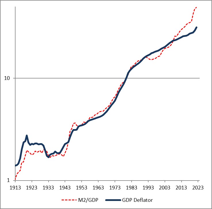
The fact that the price level has gone up a little bit less than the ratio of money to GDP over time is a reflection of the fact that money velocity has gone down slightly, and then more quickly, over the last 110 years. If you think velocity will fully revert, then the blue line will eventually converge with the red line – but in my mind there’s no reason to believe that velocity is stable or entirely mean-reverting over time…only that it doesn’t permanently trend higher or lower like money, prices, and GDP do.
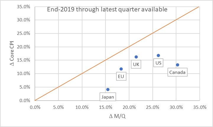
Obviously, this leads us to the question of where we are now. Here is a chart of the change in headline prices (CPI) as a function of the change in M/Q for five countries/regions.
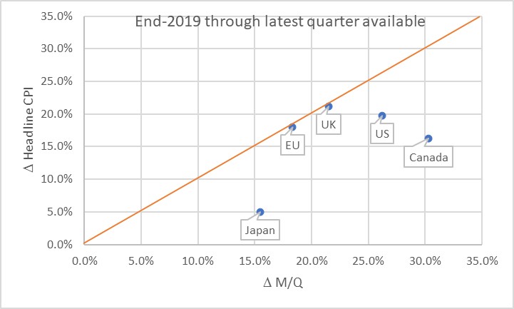
The chart basically says that the UK and EU have seen prices move almost exactly what you would have predicted, if you could have known in advance what M and Q were going to do. Naturally, none of us knew that. Japan, the US, and Canada haven’t seen prices rise as much as you would have expected, yet. Some of the reason why not is the effect I mentioned earlier: the dump of money into accounts during COVID was so fast that there was no time for prices to adjust. Actually, it’s only this close because food and energy adjust more rapidly…if you look at the picture with just core inflation, it appears there’s still some lifting to do to get back to the 45-degree line. As energy prices and food prices mean-revert some, core inflation should stay a little bubbly for a while.
Now, there’s three ways to get back to the line. We can see prices rise. We can see GDP rise. Or we can see the money supply fall. The latter two effects are better for consumers. The “GDP rises” is the best for everyone, although that’s the slowest-moving of the pieces. The “money supply fall” option is the best for consumers, but the worst for investors. Presently, we’re seeing a little bit of all three. But here is where I should take a moment to highlight how important the Fed’s balance sheet reduction has been in this process. Here is a chart from 2019Q4 to the present, just for the US, showing how this relationship developed over time.
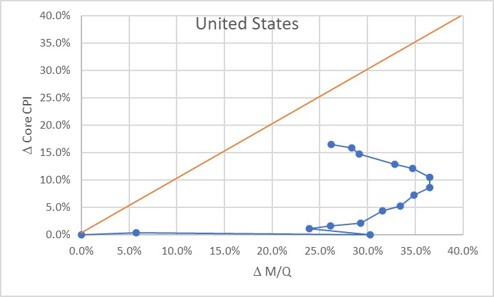
Initially, of course, there was a massive increase in money with no change in prices, as COVID hit in 2020. The point at (30%, 0%) is what the Fed had to work with as the lockdowns began to be lifted in late summer 2020. The sharp single-quarter reversal there was the result of the massive GDP spike in 2020Q3.
At that point, we would have anticipated that if nothing else happened, we would see a gradual 23% or so increase in the price level. If the Fed had immediately pulled back on the money printing, probably a lot less. Instead, the money printing continued for quite a while until by the middle of 2022 we were looking at a change in M/Q of about 37% since the end of 2019. Right about that time, the Fed got alarmed and began to shrink the balance sheet (and hike rates, although you will notice that the price of money does not show up on this chart but only its quantity!) That, combined with some decent growth, has decreased the pent-up pressure on prices. As of the end of 2023Q3, the aggregate M/Q change was 26.2%, while core prices had risen 16.4% (headline prices, including a 33% increase in energy and a 25% increase in food prices, are up 19.5% since the end of 2019).
If the money supply grows only at the rate of GDP from here, then this line will turn vertical and we have about a 10% increase in core inflation to ‘make up’ before we are back on the line. The good news is that the Fed currently is still reducing its balance sheet; the bad news is that M2 since April has stopped declining. More bad news is that GDP is likely to be soft or even negative here over the next few quarters, judging from payrolls, delinquencies, and other data. We could also hold out hope that velocity won’t fully rebound to pre-COVID levels, but there’s no reason other than “it sure would be nice if that happened” to expect that. Ergo, I think we’re still looking at higher-for-longer not just in the interest rate structure, but in the trajectory of inflation.
The most astonishing point on the charts above, in my mind, is the Japan point especially on the first chart. The amazing part isn’t that Japan’s inflation rate is lower than that of other countries here. They’ve added less money, so as a first pass you’d expect less inflation. But what’s amazing is that the Yen is also an absolute basket case, which means that imports – like, say, oil or gasoline – have gone up a lot more in price than for other countries. Crude oil in USD has risen about 22% in USD terms since the end of 2019. It’s up 66% in Yen terms! And yet, even with that Japanese inflation has stayed relatively low. So far. These charts tell me that I’d want to buy Japanese inflation and sell EU and UK inflation, where prices are closer to already reflecting the effect of the money geyser than they are in Japan.
[1] “Are Money Growth and Inflation Still Related?”, Economic Review, Federal Reserve Board of Atlanta, 2nd Quarter, 1999. https://www.atlantafed.org/-/media/documents/research/publications/economic-review/1999/q2/vol84no2_dwyer-hafer.pdf
RE-BLOG: Britain Survived the Blitz and Will Survive Brexit
Since tomorrow is a big day in the saga of Brexit, I thought I’d re-post the article I wrote on June 24, 2016, when the UK first decided to leave. (You can find the original post here). Two and a half years on, and civilization has not yet collapsed, and in fact the forecasts of immediate and unavoidable disaster have turned out to be somewhat overblown. No matter; people have just rolled the forecasts forward to the actual date of hard Brexit. Buy your canned goods now! My opinion is unchanged – seen from the perspective of a few years, a hard Brexit is not going to be the cataclysm that some predict.
So I see today that former Fed Chairman Alan Greenspan says this is the worst crisis he has seen. Bigger than the 1987 Crash? Bigger than Long Term Capital? Bigger than the internet bubble collapse? Bigger than the Lehman (et. al.) collapse? Really?
As humans, we tend to have short memories and (ridiculously) short planning horizons. Greenspan, especially in his apparent dotage, has a shorter memory even than he had previously – maybe this is convenient given his record. I don’t want to comment on his planning horizon as that would seem uncharitable.
Why is Brexit bad? The trade arrangements and treaties do not suddenly become invalid simply because the UK has voted to throw off the shackles of her overlords and return to being governed by the same rules they’ve been governed by basically since the Magna Carta. But Jim Bianco crystallized the issue for me this week. He pointed out that while Brussels could let this be a mostly painless transition, it has every incentive to make it as painful as possible. In Jim’s words, “if it isn’t painful then hands shoot up all over Europe to be the next to leave.” That’s an astute political observation, and I think he’s right. The EU will work hard to punish Britain for having the temerity to demand sovereignty.
But Britain survived the Blitz; they will survive Brexit.
Indeed, Britain will survive longer than the Euro. The sun is beginning to set on that experiment. The first cracks happened a few years ago with Greece, but the implausibility of a union of political and economic interests when the national interests diverge was a problem from the first Maastricht vote. Who is next? Will it be Greece, Spain, Italy, or maybe France where the anti-EU sentiment is higher even than it is in the UK? The only questions now are the timing of the exits (is it months, or years?) and the order of the exits.
As I said, as humans we not only have short memories but short planning horizons. From a horizon of 5 or 10 years, is it going to turn out that Brexit was a total disaster, leading to a drastically different standard of living in the UK? I can’t imagine that is the case – the 2008 crisis has had an effect on lifestyles, but only because of the scale and scope of central bank policy errors. In Iceland, which addressed the imbalances head-on, life recovered surprisingly quickly.
These are all political questions. The financial questions are in some sense more fascinating, and moreover feed our tendency to focus on the short term.
A lot of money was wagered over the last few weeks on what was a 52-48 proposition the whole way. The betting markets were skewed because of assumptions about how undecideds would break, but it was never far from a tossup in actual polling (and now perhaps we will return to taking polling with the grain of salt it is usually served with). Markets are reacting modestly violently today – at this writing, the US stock market is only -2.5% or so, which is hardly a calamity, but bourses in Europe are in considerably worse shape of course – and this should maybe be surprising with a 52-48 outcome. I like to use the Kelly Criterion framework as a useful way to think about how much to tilt investments given a particular set of circumstances.
Kelly says that your bet size should depend on your edge (the chance of winning) and your odds (the payoff, given success or failure). Going into this vote, betting on Remain had a narrow edge (52-48) and awful odds (if Remain won, the payoff was pretty small since it was mostly priced in). Kelly would say this means you should have a very small bet on, if you want to bet that outcome. If you want to bet the Leave outcome, your edge was negative but your odds were much better, so perhaps somewhat larger of a bet on Brexit than on Bremain was warranted. But that’s not the way the money flowed, evidently.
Not to worry: this morning Janet Yellen said (with the market down 2.5%) that the Fed stood ready to add liquidity if needed. After 2.5%? In 1995 she would have had to come out and say that every week or two. A 2.5% decline takes us back to last week’s lows. Oh, the humanity!
Just stop. The purpose of markets is to move risk from people who have it to people who want it. If, all of a sudden, lots of people seem to have too much risk and to want less, then perhaps it is because they were encouraged into taking too much risk, or encouraged to think of the risk as being less than it was. I wonder how that happened? Oh, right: that’s what the Fed called the “portfolio balance channel” – by removing less-risky assets, they forced investors to hold more-risky assets since those assets now constitute a larger portion of the float. In my opinion (and this will not happen soon), central banks might consider letting markets allocate risk between the people who want it and the people who don’t want it, at fair prices. Just a suggestion.
One final point to be made today. I have seen people draw comparisons between this episode and other historical episodes. This is refreshing, since it reflects at least some thoughtful attempt to remember history. Not all of these are apt or useful comparisons; I saw one that this is the “Archduke Ferdinand” moment of this generation and that’s just nuts. Europe is not a military powderkeg at the moment and war in Europe is not about to begin. But, to the extent that trade barriers begin to rise again, the idea that this may be a “Smoot-Hawley” moment is worth consideration. The Smoot-Hawley tariff is generally thought to have added the “Great” to the phrase “Great Depression.” I think that’s probably overstating the importance of this event – especially if everybody decides to respect Britons’ decision and try to continue trade as usual – but it’s the right idea. What I want to point out is that while rising tariffs tend to produce lower growth and lower potential growth, they also tend to produce higher inflation. The fall of the Berlin Wall and the opening of Eastern Europe is one big reason that inflation outcomes over the last few decades have been lower than we would have expected for the amount of money growth we have had. The US has gone from producing all of its own apparel to producing almost none, for example, and this is a disinflationary influence. What would happen to apparel prices if the US changed its mind and started producing it all domestically again? Give that some thought, and realize that’s the protectionist part of the Brexit argument.
We can cheer for a victory for independence and freedom, while continuing to fight against any tendency towards economic isolationism. But I worry about the latter. It will mean higher inflation going forward, even if the doomsayers are right and we also get lower growth from Brexit and the knock-on effects of Brexit.
Inflation-Linked Bonds: For the Wary, but the “Wise?”
Only a quick article at the moment. This is longer than a tweet-length answer, but didn’t need to be super long.
A friend sent me the link to the following article from the FT:
 But the article also includes a common gripe about inflation-linked bonds that isn’t really fair, and should be addressed. The argument is that inflation-linked bonds don’t really protect against inflation, because changes in real yields are much more impactful to the return than are changes in inflation.
This is true. It is also true that changes in nominal yields are much more impactful to the return of nominal bonds than is the coupon rate or yield on the bond. If you buy a 10-year Treasury yielding, say, 3%, and hold it for two years, you will most likely get a return quite a bit different from 3% because changes in the yield-to-maturity over that period overwhelms the yield of the bond (especially now). You only get 3% if you hold to maturity. (Well, technically you get 3% if you hold for a period equal to the Macaulay duration, but that’s a discussion for another time.)
So it isn’t fair to criticize inflation-linked bonds for not being an inflation hedge over every time period. As with nominal bonds, they are a perfect inflation hedge if held to the proper horizon, and a less-than-perfect hedge over different time periods.
However, you shouldn’t be trying to hedge inflation over the next week or month. You should be trying to hedge inflation over the long term. Accordingly, the fact that returns vary due to changes in real yields is not a damning fact about linkers. Unless, of course, you’re a highly levered participant.
Reforming Priors and Re-Forming Europe
By now, you have probably heard that the sun did not set on the British Empire as a result of BrExit. Here is one chart from Tuesday’s Daily Shot letter – and see that letter for others.

This is not at all shocking. While in the long-term it is possible (though I think unlikely) that Germany and other major European trading partners may choose to reduce the business they do with the UK – business which is bilateral, by the way – the immediate short-term impact of a lower pound sterling was much easier to read. In the immediate aftermath of the vote, I made the bold prediction that “Britain Survived the Blitz and Will Survive Brexit,” and then later that week in a post called “Twits and Brits” I made the fairly out-of-consensus prediction that “For what it’s worth, I think that thanks to the weakening of sterling Brexit is likely to be mildly stimulative to the UK economy, as well as somewhat inflationary, and slightly contractionary and disinflationary to the rest of the world.”
Oh, I should also point out that in early July I asked the question whether UK property price declines were rational, or overdone and concluded that “I don’t believe the current drop in listed UK property funds is a rational response to correcting bubble pricing, and it’s probably a good opportunity for cool-headed investors…and, more to the point, cool-headed investors who aren’t expecting to liquidate investments overnight.” What has happened since? See the chart below (Source: Daily Shot).

I only mention these items in back-patting fashion because (a) I am proud that I responded thoughtfully, rather than hysterically like many analysts, to the Brexit surprise, and (b) I want to promote my credibility when I make the following observation:
Good news for the UK is bad news for the Eurozone. Not for growth or inflation in the Eurozone, but for its very survival.
The audacity of Britain in leaving the EU was shocking to the establishment, but everyone carefully predicted disaster for the ancient empire. They did this not because the economics said it would be that way – as I pointed out, the economics pointed the other way – but because it was in the interest of the common-currency project that there be huge costs to breaking the covenant. The “marriage” of the countries in the Eurozone was difficult and painful, and the ongoing relationship has been difficult on some of the members. If “divorce” is easy – and even worse, if it is beneficial, then the marriage will not last. The experience of the UK so far – not only doing okay, but actually doing well – cannot be escaping notice in Athens or Rome (or Madrid or Lisbon…or Paris).
Now, that doesn’t mean the Euro is doomed to fail next week. But it means that in the next crisis, whether that is Greece redux or Italy or some other ground zero, the Eurozone bosses in Brussels will be lacking a major threat to use to force the recalcitrant nation to accept painful austerity. Remember that it was the threat of a generational depression that helped get Greece into line. How is Greece doing? The chart below (source: Bloomberg) shows that nation’s unemployment rate.

Admittedly it is not a statistically-valid sample, although to be sure it is a sample that matches the a priori arguments of those who suggested that Greece should leave the Euro: the country that exited the EU is doing fine, and better-than-expected, while the country that remained in the Eurozone is actually mired in a depression. Hmmm. So tell me again why my poor country needs to accept austerity to remain in the Eurozone?
So much about policy depends on one’s priors. If your prior expectation is that leaving the Eurozone is likely to be a disaster, then both sides in the negotiation are likely to reach agreement on a relatively smaller inducement to stay than if the prior expectation is that leaving the Eurozone might be a positive event for the leaver. The events to date should cause these priors to shift when the next crisis happens.
Speaking of priors, and changing countries: Friday’s employment report did not seem, to me, to be outside of the range of outcomes that would cause policymaker priors to change. That is, if the Fed Chairman was planning to raise rates later this month, prior to seeing the Employment report, then I wouldn’t expect the report was weak enough to change that course of action. Conversely, if the Chairman (as I believe) was not planning to hike rates, then it doesn’t seem to me that the report was strong enough to change that course of action.
Markets have decreased the implied probability of such a rate hike, compared to what it was before the report. That’s just Mr. Market’s bipolar nature. The 6-month moving average of payrolls was 189k last month; it is 175k now. The 12-month average is exactly unchanged at 204k. There’s nothing here that is out of the ordinary. But if your attitude was that rates should rise because they need to be returned to neutral, then a 151k monthly Non-Farm Payrolls shouldn’t affect that decision. And if your attitude was that the economy might be weakening, and can’t sustain a rate hike, the number doesn’t change your attitude either. So, while Mr. Market has changed the implied probability, I seriously doubt Dr. Yellen wavered at all.
The problem is that we don’t know what Dr. Yellen (and let’s be clear, hers is the only vote which matters) was thinking prior to the number. We don’t know her priors. But, unless the data appreciably strengthens or weakens between now and September 21st, we will know her priors after we see the results from the meeting. My guess continues to be that the Chairman’s operating assumption is that low rates do more good than harm, and that therefore a hike in rates is unlikely until inflation (already above the Fed’s target, and rising) gets quite a bit more above the Fed’s target, or market interest rates signal restlessness with the Fed’s course.
UK Property Price Declines – Rational or Overdone?
A couple of weeks after Brexit, and the world has not ended. Indeed, in the UK the fallout seems relatively tame. Sterling has weakened substantially, which will increase UK inflation relative to global inflation; but it will also help UK growth relative to global growth. That’s not a bad tradeoff, compared to predictions of the end-of-days. Although I am not so sure I like the tradeoff from Europe’s perspective…
There are a number of UK property funds that have been gated – but this appears to be not so much a Reserve Fund moment, and certainly not a Lehman moment, but just a natural reaction when a fund gives broader liquidity terms than the market for the underlying securities offers.
I think the property panic is probably overdone. It is partly triggered by fears that the financial center is going to leave London. This strikes me as absurd, having worked for several of the institutions that have offices in Canary Wharf. I checked my gut reaction with a friend who actually headed up a large banking institution for a time. His answer was “you are right to be very skeptical: English, availability of workforce, taxation, labor laws, contract law and legal framework. There will be some shifting at the margin but that’s it.” Brittania is not about to sink beneath the waves, folks.
Were UK property values overinflated? At least UK home prices don’t appear much more out-of-whack than US home prices do. The chart below (source: Bloomberg) shows the UK national average home price from the Nationwide Building Society (in white) versus the US median existing home sales price.

The picture looks more concerning if, instead of median home sales, you use the Case-Shiller Home Price Index as a comparison (see chart, source: Bloomberg). But while the CS20 is a superior measure of home prices, I’m always a bit wary of comparing two series that are constructed methodologically very differently. Still, this comparison would suggest UK prices have risen more than their US counterparts.

These comparisons are all on residential property, and I am comparing two markets which are likely both a bit overheated. But the scale of decline in the UK property funds seems to me to be too large relative to the overpricing that may exist, and I suspect it is more due (as I noted above) to the structure of the funds holding the property – which would suggest, in turn, that halting redemptions is the right thing to do to protect existing investors who would be disadvantaged if the portfolio was liquidated into a market that is not designed to have daily liquidity. Of course, the right answer is to not offer those liquidity terms in the first place…
One little niggling detail, however, deserves mention. I noted that UK home prices do not appear terribly out-of-whack relative to US home prices. The problem is that US home prices themselves appear out-of-whack by roughly 15-20%. The chart below (source: Bloomberg; Enduring Investments calculations and estimates) shows median home prices as a multiple of median incomes. What is apparent is that for many years these two series moved in lock-step, until the bubble; the popping of the bubble sent everything back to “normal” but we’re back to looking bubbly.

That said, I don’t believe the current drop in listed UK property funds is a rational response to correcting bubble pricing, and it’s probably a good opportunity for cool-headed investors…and, more to the point, cool-headed investors who aren’t expecting to liquidate investments overnight.
Twits and Brits
I want to talk today about some of the really important pieces of information that circulated this weekend. First, I am certain that everyone is familiar with the following chart, which made the rounds after the Brexit vote. It shows an enormous surge in the search term “What is the EU” after the Brexit vote was completed:
 This chart, or something very much like it, was all over the place. Oh, wait! I just realized that I forgot to put the axes on the chart! Here it is with a few more relevant pieces of information – incidentally the same information that was left off the original chart. It turns out that it wasn’t the chart I thought it was. Sorry about that…they looked the same.

(For the record, after an extended period of indolence, on Thursday I went for a run; on Friday I went for a run before putting on any other shoes first; on Saturday I went for a run and then later put on different shoes to go to a cocktail party.)
Is it too much to ask that people seeking to insult the British voters at least put some effort into their attempt? Ignore for a moment the simple fact that we don’t know who was searching this – it might well have been the people who voted to Remain, after all – and so the story line that the people who voted Leave were just morons gets no support from this chart. It also turns out that this was the second-most-searched term only for one small time segment: early in the morning after the vote. By 5am it was eclipsed by questions about the weather. Oh my – it seems the Britons also don’t know what weather is! Also, as the Telegraph’s skeptical story (linked above) points out, the raw number of people asking the question was only on the order of 1,000 – it was just a massive increase since it hadn’t been previously asked very much. This is where not having axes matters…it turns out this is a non-story, and nonsense.
Another piece of nonsense I want to point out is more general. I have seen several Twitter polls and other polls in something like this form:
Q: What effect do you think that Brexit will have on the global economy?
a) Deeply contractionary
b) Moderately contractionary
c) Somewhat contractionary
d) Expansionary
Now this is nonsense because the actual result not only has nothing to do with opinion, it’s not even clear why we would care about people’s opinion in this case (unless we are trying to show how pervasive the negative news stories are, or something). Polls work comparatively well when there is not a lot of information inequality – for example, when each person is asked about his or her own vote. But the poll above is analogous to this poll:
I submit that only me, and my valet, have the information sought by this poll; all other respondents have zero information. Therefore…what’s the value of the poll? Unless I or my valet are respondents, precisely zero; if we are, then the value is inverse to the number of other respondents diluting the response of the people who know.
Similarly, there is likely some information asymmetry among respondents to the poll about the effect of Brexit on the global economy. I would respectfully suggest that most people who are responding are saying what they have heard, or what they fear, or what they hope, while some people – macroeconomists, for example – might have actual models. To be sure, those models are probably only slightly better than the fearful and hopeful assumptions put into them, but the point is that this poll is nonsense in the same way that polling people about what they expect inflation next year to be is nonsense. The vast majority of respondents have no way to evaluate the question in a structured way, so what you are capturing is no more and no less than what people are worried about, which is itself just a reflection of what they’re seeing and hearing…for example, on Twitter.
(For what it’s worth, I think that thanks to the weakening of sterling Brexit is likely to be mildly stimulative to the UK economy, as well as somewhat inflationary, and slightly contractionary and disinflationary to the rest of the world. But the question about global effects is a trick question. Obviously, global production and consumption are unlikely to change much in real terms just due to the arrangement of trade flows. More friction in the system to the extent that Europe puts up significant trade barriers against the UK – something I don’t view as terribly likely – will lower global output slightly and raise global prices.)
These flash polls and Google trends data are part and parcel of the Twitterization of discourse. They have in common the fact that they can be snapshot and draw eyeballs and clicks, whether or not there is any content to the observations. In these cases, and in many others, there isn’t.
Here’s a thought: why don’t we wait a few months, or better yet a few years, before we judge the impact of Brexit? Sometimes, having actual data is even better than a Twitter poll.
The Disturbing Evolution of Central Banking
One of the more disturbing meta-trends in markets these days is the direction the evolution of central banking seems to be taking.
I have written before (and pointed to others, including within the Fed, who have written before[1] ) about the disturbing lack of attention being paid in the discussion and execution of monetary policy to anything that remotely resembles money. Whether we have to be concerned about money growth in the short- and medium-terms, ultimately, will depend on what happens to the velocity of money, and on how rapidly the central bank responds to any increase in money velocity. But there are trends that could be much more deleterious in the long run as the fundamental nature of central banking seems to be changing.
Today the Bank of England released its Quarterly Inflation Report, in which it introduced an “Evans Rule” construction to guide its monetary policy looking forward. Specifically, the BoE pledged not to reduce asset purchases until unemployment dropped below 7% (although Mark Carney in the news conference verbally confused reducing asset purchases with raising interest rates), unless:
“in the MPC’s view, CPI inflation 18 to 24 months ahead is more likely than not to be below 2.5 percent; secondly, if medium-term inflation expectations remain sufficiently well anchored; and, thirdly, the Financial Policy Committee has not judged the stance of monetary policy — has not judged — pardon me — the Financial Policy Committee has not judged that the stance of monetary policy poses a significant threat to financial stability, a threat that cannot otherwise be contained through the considerable supervisory and regulatory policy tools of various authorities.”
This is quite considerably parallel to the FOMC’s own rule, and seems to be the “current thinking” among central bankers. But in this particular case, the emperor’s nakedness is revealed: not only is inflation in the UK already above the 2.5% target, at 2.9% and rising from the lows around 2.2% last year, but the inflation swaps market doesn’t contemplate any decline in that inflation rate for the full length of the curve. Not that the swaps market is necessarily correct…but I’ll take a market-based forecast over an economist consensus, any day of the week.
So, for all intents and purposes, while the BOE is saying that inflation remains their primary target, Carney is saying (as my friend Andy the fxpoet put it today) “…the BOE’s inflation mandate was really quite flexible. In other words, he doesn’t really care about it at all.”
Along with this, consider that the candidates which have so far been mooted as possible replacements for Bernanke at the US Fed are all various shades of dovish.
Here, then, we see the possible long-term repercussions of the 2008 crisis and the weak recovery on the whole landscape of monetary policy going forward for many years. In some sense, perhaps it is a natural response to the failure or monetary policy to “get growth going,” although as I never tire of pointing out monetary policy isn’t supposed to have a big impact on growth. So, the institutions are evolving to be even more dovish.
At one time, I thought it would happen the other way. I figured that, since the ultimate outcome of this monetary policy experiment is clearly going to be higher inflation, the reaction would be to put hawkish central bankers in charge for many years. But as it turns out, the economic cycle actually exceeded the institutional cycle in duration. In other words, institutions usually evolve so slowly that they tend not to evolve in ways that truly hurt them, since the implications of their evolution become apparent more quickly than further evolution can kick in and compound the problem. In this case, the monetary response to the crisis, and the aftermath, has taken so long – it’s only half over, since rates have gone down but not returned to normal – that the institutions in question are evolving with only half of the episode complete. That’s pretty unusual!
And it is pretty bad. Not only are central banks evolving to become ever-more-dovish right exactly at the time when they need to be guarding ever-more-diligently against rising inflation as rates and hence money velocity turn higher, but they are also becoming less independent at the same time. A reader sent me a link to an article by Philadelphia Fed President Plosser, who points out that the boundaries between fiscal and monetary policy are becoming dangerously blurred. It is somewhat comforting that some policymakers perceive this and are on guard against it, but so far they seem ineffectual in preventing the disturbing evolution of central banking.
[1] Consider reading almost anything by Daniel L. Thornton at the St. Louis Fed; his perspective is summed up in the opening sentence of his 2012 paper entitled “Why Money Matters, and Interest Rates Don’t,” which reads “Today ‘monetary policy’ should be more aptly named ‘interest rate policy’ because policymakers pay virtually no attention to money.”
The Currency War Is Not New: It’s Merely Escalating
A quick summary of where we are in the “global currency war:”
For several years now, global central banks have been engaging quietly in this war. Each central bank has been implicitly playing “beggar-thy-neighbor” by making its currency relatively plentiful, and therefore relatively cheaper, than its neighbors. In one case, that of Switzerland, the currency issue became explicit rather than implicit, though not to weaken its currency but rather to stop it from strengthening without bound (see Chart, source Bloomberg). It is instructive that, in order to accomplish this end, the SNB had to pledge to print unlimited quantities of Swiss Francs to sell – essentially saying that if it can’t beat ‘em, it would have to join ‘em.

Now, in January some well-known asset managers muttered the ‘currency war’ phrase, and Japan’s Economic Minister Akira Amari suggested that the Yen could fall 10% (and Japanese officials have implied that they are looking for such a move to help end deflation). Since then, both the G20 and the G7 have discussed whether countries ought to be engaging in currency adjustment as a means of confronting macroeconomic challenges. Searches for the term “currency war” on Google (see chart, source Google) have risen appreciably. But again, this isn’t really new; what’s new is that people are actually talking about it.

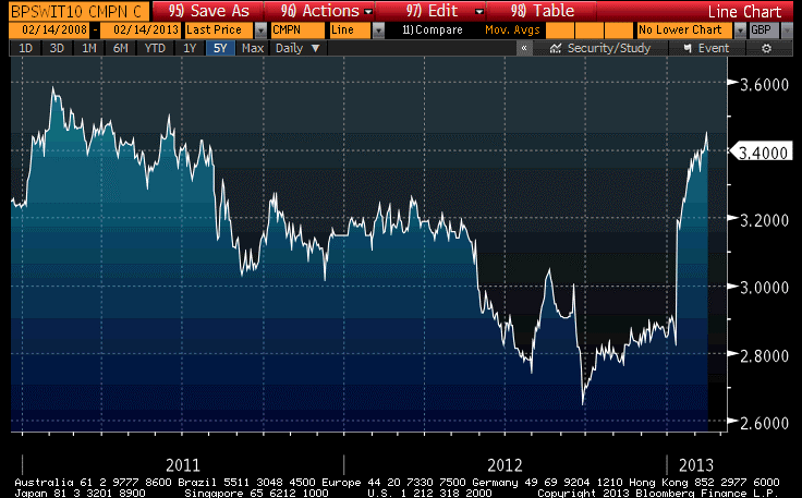
Earlier this month Adair Turner, chairman of the Financial Services Authority talked about “permanent monetary easing” and said that central bankers “may need to be a little bit more relaxed about the creation” of money. By permanent, he means that the central bank would print money with the express intention that the printing would never be reversed. Ignoring history, Lord Turner said “the potential benefits of paper money creation [to stimulate the economy] should not be ignored.” Today, the Bank of England released its quarterly forecasts, showing policymaker expectations that inflation will stay higher than the Bank’s target for longer than expected, and growth will be weaker than expected. Even less surprising, given talk about “permanent” easing, is that 10-year UK inflation swaps are now back above 3.40% (see chart, source Bloomberg). The first 30bps of this jump was due to the decision by the ONS to maintain the current definition of RPI for existing contracts (I mentioned this here), but some amount of it is probably due to the currency wars talk.
It bears noting too that the 10-year US inflation swap is within a handful of basis points of its post-Lehman highs.
The UK inflation market has been around longer than other inflation markets. Index-linked Gilts date back to the early 1980s. So I wonder whether we shouldn’t be a bit more curious about how much of the rise in UK inflation expectations actually reflect a rise in global inflation expectations due to the currency wars that are (and have been) underway.
Because to some extent, the question of “who will win” the currency war is difficult to discern, and to some extent the question is moot. Like in the movie “WarGames,” the only thing that has been certain since the currency war started a couple of years ago is that there will be a lot of scorched earth. The only real “winners” are debtors, relative to lenders.

Who will win? To change the analogy: if you’re in a bay surrounded by people in boats who are pumping water in so that they can see who can sink his boat the fastest, the winner is the one who is wearing a life vest. All the others are just some varying grade of loser. Don’t be the last one to grab a life vest.