Archive
Inflation Market Valuations and Tactics in the New Year
There is so much to talk about, since it has been such a long time since I posted, that it is a little hard to know where to begin. So let’s begin 2025 with a few quick notes about inflation markets and markets generally. I wouldn’t call this an outlook, per se…I am trying to resist making that year-end/year-beginning offering to the jinx gods…but an update with some observations. As an aside, later today I’m planning to post a new Inflation Guy Podcast (this is a Podbean link but it’s available anywhere you get your podcasts) with some comments on the trajectory of inflation (as opposed to markets), and how that may be affected by things such as the massive California wildfires.
I will begin with a content warning: this note is much denser than most of my columns. If you’re a retail investor and/or only interested in developments in inflation rather than inflation instruments, then you might skip this one. I’ll talk more about expectations for inflation, of course, in other posts. But that’s not today’s post.
Let’s start by looking at 10-year real yields. The blue line in the chart below is 10-year TIPS yields; the black line (because it’s topical) is 10-year UK Gilt linker (real) yields. TIPS yields are up to 2.25%. Normally, when they get to around 2% I think of them as roughly fair in an absolute sense, because long-term risk-free real yields ought to in principle look something like long-term real economic growth. Instructive in the chart below is that as far as nominal UK yields have risen, inflation-linked yields are still well below US real yields.[1]

That’s partly a clientele effect, since there are many forced holders of UK linkers. But still, while US real yields ran up from -1% to +2.25% once inflation started (that is, TIPS declined in a mark-to-market sense when inflation went up – very, very important to understand if you think of TIPS as an inflation hedge. They are, but only at maturity), Gilt real yields went from -3% to +1.19%. The selloff was 100bps worse. Yikes.
The next chart shows my quantitative measure of relative cheapness (negative indicates richness, because I’m a bond guy). I said before that TIPS are now roughly fair in an absolute sense; relative to nominal bonds, they’re also roughly fair to slightly cheap. That’s the blue line. You can see that TIPS for most of the past decade were pretty cheap relative to nominals (even while they were absolutely rich because of negative real yields), but since people started caring a bit about inflation they’ve gone back to being mostly fair. However, Gilt linkers have been massively rich for a long time – again, because of the forced-holders problem. But they are starting to get cheaper. That 100bps greater selloff I mentioned above happens to show up here as 100bps cheapening relative to nominals, and relative to TIPS!

Today’s column is supposed to be mostly about US markets, but I can’t help myself. I ought to also point out that breakeven inflation in the UK is roughly 100bps higher than it is in the US, even though core inflation in the UK is 3.6% and in the US it’s 3.5%. So, possibly, part of the relative richness of UK linkers – since I’m looking at each country’s linkers in relation to its own nominal bonds – is actually cheapness of UK nominals, compared to the actual inflation there. Or maybe it’s the richness of US nominals, compared to the actual inflation here. (This is why relative value trading is so useful and important – we don’t need to have an opinion about which of these two things is true. Are US nominals too rich, maybe because they can be financed cheaply in repo markets at ‘special’ rates? Or are UK nominals too cheap, maybe because the UK budget situation is perceived to be somehow even more precarious than our own? I don’t know.)
Sorry about the digression there to the UK. I just got excited. The inflation markets and inflation in Japan are also really interesting right now, especially as wage growth is surging and the yen is bordering on collapsing…yet 10-year inflation in Japan is quoted around 1.5%. If you can get someone to transact. Maybe I’ll talk about Japan another time.
US markets. First, note the weird shape of the US CPI swaps curve.

I have several issues here, with one of them being the overall optimism that inflation is definitely going back to be close to target, despite any real sign that is going to happen. It borders on religious conviction, frankly. But also, we have a weird implied path where inflation droops, then spikes near the 10-year point, and then declines. To be sure, I’m committing a chart crime here with the y-axis; if you stepped back this would look almost flat. But this is more than enough for a hedgie to be interested, usually. What is really happening is that if we had a core inflation swaps curve (I do, but you don’t) it would show a gentle decline out to 8 years. It’s steep on the CPI swaps curve because the energy curves imply that energy inflation will drag core inflation lower for years.

Of course, they won’t but you can hedge the energy. Out to about 5-8 years, probably. And that’s probably why we have that little dip in the CPI curve – it’s really an energy thing.
So I’ve said that 2.25% real yields on TIPS are fairly attractive. About as attractive as they’ve been for some time, actually. But be aware of a couple of things. One is that the bond market as a whole is under pressure and probably will stay under pressure for a bit as investors worry about financing the government in a world where the trade deficit is probably going to be coming down (implying that domestic savings will have to go up, and the only good way to make that happen is with higher yields). Real yields could go higher, and probably will at some point. But you should recognize that seasonality works in favor of the TIPS buyer right now.

Breakevens have a strong tendency to rise in the early part of the year. In 22 of the last 26 years, 10-year breakevens have risen in the 60 days following January 8th. To be sure, some of that is because TIPS bear flat-to-negative accretions in the early part of the year because CPI in December almost always declines on an NSA basis, so the rise in price/decline in real yields that helps widen breakevens is partly reflecting a change in the source of total return in TIPS during those months to being more price and less yield.[2] The point being that buying nominal bonds in the beginning of the year, up until about May, runs into difficult seasonal patterns but this is not true with TIPS. Indeed, it means that if you’re buying fixed income at all in Q1, it probably should be TIPS.
Finally, I really should say something about equities here. I think it’s always important to realize that TIPS yields are a direct competitor with equities. Nominal yields are not, necessarily, because 7% nominal yields in a world where prices (and earnings) are going up at 9% are much worse than 5% nominal yields in a world where prices (and earnings) are going up at 3%. Equity earnings do tend to rise with inflation (but stocks are a poor inflation hedge because multiples also tend to contract significantly when there is inflation, so you need to hold equities for a long, long time for them to be a good inflation hedge), and since they do it means that inflation-linked yields are a more-fair comparison. Real yields at 2.25% are neither rich nor cheap in the grand scheme of things. But equities are, once you discount expected earnings growth for expected inflation. I calculate the expected long-term S&P real return assuming that the current multiple of long-term average earnings (the Shiller PE) reverts 2/3 of the way to its mean over 10 years. By making it 10 years, and not demanding full reversion, I lessen the impact of apparent overvaluation on expected returns. But high returns do, historically, tend to precede low returns! In any event, you can debate my approach but below you can see my point.

This first chart shows 10-year TIPS yields set against my calculated expected 10-year annualized real returns from the S&P 500. Granted, the S&P 500 is cheaper outside of the Magnificent 7. But you can see that while stocks and TIPS cheapened together in the inflation spike of 2022, equities have ‘forgotten’ that they should be priced for higher real yields…resulting in the chart below, which I call the “Real Equity Risk Premium” of expected equity returns minus TIPS real yields.

Some of you will say “that’s a trend. Let’s get on that and buy stocks.” To me, that sounds like the fellow falling out a window on the 29th floor and declaring as he passes the 6th floor ‘so far, so good.’ The point of the chart is that when you buy stocks now, you should be expecting to lose money, in real terms, over the next decade. Maybe you’ll average 3% and inflation will be 4%, for example. But TIPS will guarantee you will make 2.25% after inflation. As this spread gets more and more tilted against stocks, it gets harder and harder to explain why anyone would choose equity risk over TIPS risk, other than as a diversifier.
[1] This is not wholly unique to the UK. US 10y inflation bonds have higher real yields than linkers in Australia, Italy, Israel, Canada, France, the UK, Germany, and Spain.
[2] This is wonky stuff. If the expected forward price level doesn’t change, then the breakeven needs to go up because we are starting from lower and lower current price levels due to the (short) lag between the reporting of CPI and its realization in the carry of TIPS. If you don’t understand this because you’re not a rates strategist, don’t worry about it and take my word for it.
A Relatively Good Deal Doesn’t Mean It’s A Good Deal
I suspect that everyone has ‘default activities’ that they automatically turn to when nothing else is working. For example, when I can’t sleep and I’ve tried everything, I go downstairs and have a bowl of cereal. Some folks hit the gym when they’re frustrated. Others go shopping when they’re depressed.
And apparently, some people buy stocks when they’re not turned on by anything else.
There wasn’t any outrageously positive news today that sent the S&P +0.8% on the day. Initial Claims (371k) was slightly higher than expected (but I advocate ignoring that release in late December and most of January). The dollar dropped sharply against the Euro. I initially thought that this was because the President nominated as Treasury Secretary someone with no financial markets experience at all but a solid resumé of hard-nosed negotiations with Congress, but the Euro gained against all major currencies so it was perhaps due more to the fact that ECB President Draghi didn’t ease further at the policy meeting held today (though they were not expected to). Bloomberg blamed a better-than-expected rise in Chinese exports, but the miss was well within the usual variance for a volatile number so that seems unlikely to me.
I am not entirely kidding about the frustration that “there’s nothing else to invest in.” I was just working today on a chart for a keynote presentation I have been asked to give at the Inside Indexing conference in Boston in April (See the link here, although most of the information on the site is still the 2012 data). I have previously run this chart, showing Enduring Investments’ projected 10-year annualized real returns and risks (this is as of year-end 2012).
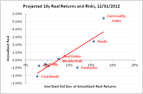
The slope of that line indicates that the current tradeoff of risk for return is 2.7:1. That is, for a 1% higher expected annualized real return, you will have to accept a 2.7% increase in the annualized standard deviation of annuitized real returns (the “right” measure of risk, as it measures the variance in the long-term real purchasing power of the investment). Now, here’s the chart as of April 23, 2003, using all the same methodology:
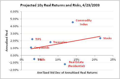
The slope of the line back then was 9.1:1. That is, in 2003 you needed to take more than three times as much risk to add 1% in expected real return to your portfolio.
But notice something else also that is very important. The change in the slope of the line didn’t come because expected equity or commodity index returns got better. Indeed, those two asset classes have roughly the same forward expected returns as they did back then, although slightly different risks the way we figure it. What happened is that the expected real returns to Treasuries, TIPS, and Corporate Bonds all fell precipitously.
Of course, this comes as no surprise to anyone, because we’ve all watched the Fed push interest rates down so far that we need extra decimal places. But I think comparing these charts you can understand a fundamental verity: people are not buying stocks because they expect awesome returns going forward (hopefully, anyway, because they’re not going to get them). They’re buying stocks because there’s less reward to buying less-risky asset classes. Which is, after all, what the Fed was trying to do (this is called the “portfolio balance channel” in monetary policymaker parlance: force people to take more risk than they want, because it’s a relatively good deal even if it’s not a good deal in an absolute sense).
.
A few other notes about today’s news:
Inflation markets were abuzz today, with inflation-linked bonds outpacing their nominal counterparts in many countries, because the UK’s ONS announced that it has decided not to change the RPI that applies to Gilt linkers (inflation-linked bonds, like TIPS). The ONS (similar to our BLS) has been studying how to make certain important technical corrections to the way the RPI is calculated to make it more accurate; these changes would have had the effect of lowering the RPI significantly. As a consequence, these bonds have been trading at higher real yields, reflecting the fact that if the ONS chose to change the RPI formulation, the yield on the bond would have to be higher to compensate investors for that change if the same value was to be delivered. That is, instead of a yield of (for example) 1% added to expected inflation of 2.5%, the yield would rise to 1.5% to reflect the expectation that measured inflation would be at 2.0%. Many investors thought it was very likely that the ONS would choose one of several options for restating RPI that would have had such a deleterious effect on the bonds.
In the event, the ONS made the wise decision that it would be unfair to change the terms of the bonds retroactively by making a significant change to the RPI, so they will release a second index called the RPIJ, which will now be the benchmark index and featured in ONS releases. But they will also continue to calculate the RPI and the existing bonds will continue to track RPI.
This is a great relief to inflation-linked bondholders the world over, because it sets a very important precedent. The U.S. Treasury has long said that if the BLS made a material change to the way CPI was calculated, it would plan to continue paying on the basis of the old-formulation CPI (if it was still available) or a suitable alternative, but many investors from time to time have worried about whether they would do that in practice. It will be harder to do so with the ONS precedent.
Because investors had thought the ONS was leaning the other way, Gilt linkers rallied a bunch. For example, the UKTI 1.25%-11/2055 rallied 10 points on the day (the yield fell by about 20bps), which is an enormous move at the long end. The 5-year linker (Nov 2017) yield fell 35bps. This is likely to have a spillover effect in US TIPS, since the latter now look much better on a relative value basis than they did previously. Anyone who was long UK linkers yesterday is probably considering 30 year TIPS at a pickup of 42bps.
Finally, in Fed news Esther George, the President of the Kansas City Fed (replacing Thomas Hoenig) was on the tape today. “Fed’s George Says Low Rates Risk Stoking Inflation Surge,” said Bloomberg. No kidding? (See here for Market News’ coverage of the same speech). At the very least, said George, the asset purchases will “almost certainly increase the risk of complicating the FOMC’s exit strategy.” Neither of those statements ought to be the least bit surprising or controversial, but it’s unusual to hear a Fed official state these things so bluntly. But she may have crossed the line with this one, which might get her ostracized at the next FOMC meeting:
Like others, I am concerned about the high rate of unemployment, but I recognize that monetary policy, by contributing to financial imbalances and instability, can just as easily aggravate unemployment as heal it.
Keep speaking truth to power, Ms. George!
