Archive
Why Bond Folks Are More Afraid of COVID-19
On Friday I tweeted a picture from our daily chart pack, and mused that either credit is too negative or stocks are not negative enough.
 I spent the weekend musing about why the bond guys seem to be so negative about the effects of the COVID-19 virus compared to the stock guys. Equity investors tend to tell me things like “well, the fundamentals are pretty sound” (ignoring the role that multiples play in stock market levels), which sometimes manifests in super-dumb things like Larry Kudlow’s admonition a few thousand points ago that people should buy the dip. (By the way, all those folks who bought the dip because Larry said so…will the government make them whole? Didn’t think so. Rule to remember: never take the advice of someone who has a vested interest in the outcome.)
Meanwhile, bond investors had put bond yields at all-time lows. This is especially amazing compared to the levels that yields reached in the Global Financial Crisis; back then, a housing bubble was in the process of imploding and, since shelter is a major part of core inflation it was a done deal that inflation was going to plunge, and far (Core CPI eventually got as low as 0.6%, although it didn’t get very low at all ex-housing). So low nominal yields made sense. But today, this does not seem to be in the offing. Core inflation is more likely to accelerate with the effects of the supply shock, unless the virus gets so bad that we really do have a major demand shock. And even then it should not fall very far. So the message from the bond market is super negative on growth, and stocks are only a little off their all-time highs (at least, until tonight. Right now S&P futures are -4%, although a lot of that has to do with the collapse of energy prices thanks to the disintegration of OPEC+). So again, I wonder, why?
After long thought I think it is because bond investors understand much more viscerally the power of compound interest. Compound interest is the concept that money grows not linearly, but exponentially over time. If I start with $400 and grow it at 12% per year, here is what it becomes.
 So that little $400 ends up being a really big pile of money after 60 years! From little acorns do mighty oak trees grow, and all of that. But equity folks don’t love this chart because the first 20 years looks incredibly uninteresting, not at all like Tesla. Now, if we look at this in log scale, it looks much more boring but this next chart says the same thing: stuff is compounding at 12%.
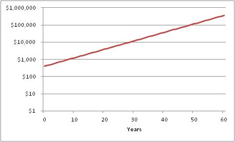 And that chart actually looks kinda similar to this chart, sourced here.
 This is a plot of COVID-19 cases outside of China, and the left axis is log scale. What this chart says is that there is no sign that the rate of growth of cases of COVID-19 is slowing. In fact, its spread has been remarkably consistent since the beginning of February. Roughly, the number of cases in the US has been growing at around 12% per day. Which means that the chart looks a whole lot like the chart of $400 turning into $360,000 over 60 years, except that now it is 400 cases (Friday’s figure) turning into 360,000 cases over 60 days.
 So when people say “the flu kills more people than this virus,” I know they’re equity folks. They see 400 cases and compare to 36,000 flu deaths and scoff. But that just tells me they don’t appreciate the power of compounding. Yes, COVID-19 hasn’t killed 36,000 Americans yet. But the flu kills that many per year despite the fact that (a) it isn’t generally communicable for very long outside of the period when the carrier has symptoms – which is why it’s okay to go back to school when you’re fever-free for 24 hours, (b) it has a pretty low fatality rate in the 1-2% range, and (c) almost everyone is inoculated against the flu. COVID-19 beats the flu on all three of those metrics.
That doesn’t mean that this bug will kill everyone, but it does mean that it is fairly likely to kill more than the flu unless something changes with the rate of exponential growth. By the end of May, the same growth rate would mean more than 6 million Americans have gotten the virus, which means a couple hundred thousand would die.
This is not a prediction, and I really hope that the rate of contagion slackens and the survival rate increases. I don’t know what would cause that to happen: I am not an epidemiologist. I’m just a bond guy, and I understand compounding. In investments, compounding is your friend. In disease, compounding is your enemy.
COVID-19 in China is a Supply Shock to the World
The reaction of much of the financial media to the virtual shutdown of large swaths of Chinese production has been interesting. The initial reaction, not terribly surprising, was to shrug and say that the COVID-19 virus epidemic would probably not amount to much in the big scheme of things, and therefore no threat to economic growth (or, Heaven forbid, the markets. The mere suggestion that stocks might decline positively gives me the vapors!) Then this chart made the rounds on Friday…

…and suddenly, it seemed that maybe there was something worth being concerned about. Equity markets had a serious slump yesterday, but I’m not here to talk about whether this means it is time to buy TSLA (after all, isn’t it always time to buy Tesla? Or so they say), but to talk about the other common belief and that is that having China shuttered for the better part of a quarter is deflationary. My tweet on the subject was, surprisingly, one of my most-engaging posts in a very long time.
It has been so long since we have seen a supply shock that we have forgotten what they look like. China Inc shutting down is a supply shock. Supply shocks are inflationary, not disinflationary. Carry on.
— Michael Ashton (@inflation_guy) February 24, 2020
The reason this distinction between “supply shock” and “demand shock” is important is that the effects on prices are very different. The first stylistic depiction below shows a demand shock; the second shows a supply shock. In the first case, demand moves from D to D’ against a stable supply curve S; in the latter case, supply moves from S to S’ against a stable demand curve D.


Note that in both cases, the quantity demanded (Q axis) declines from c to d. Both (negative) demand and supply shocks are negative for growth. However, in the case of a negative demand shock, prices fall from a to b; in the case of a negative supply shock prices rise from a to b.
Of course, in this case there are both demand and supply shocks going on. China is, after all, a huge consumption engine (although a fraction of US consumption). So the growth picture is unambiguous: Chinese growth is going to be seriously impacted by the virtual shutdown of Wuhan and the surrounding province, as well as some ports and lots of other ancillary things that outsiders are not privy to. But what about the price picture? The demand shock is pushing prices down, and the supply shock is pushing them up. Which matters more?
The answer is not so neat and clean, but it is neater and cleaner than you think. Is China’s importance to the global economy more because of its consumption, as a destination for goods and services? Or is it more because of its production, as a source of goods and services? Well, in 2018 (source: Worldbank.org) China’s exports amounted to about $2.5trillion in USD, versus imports of $2.1trillion. So, as a first cut – if China completely vanished from global trade, it would amount to a net $400bln in lost supply. It is a supply shock.
When you look deeper, there is of course more complexity. Of China’s imports, about $239bln is petroleum. So if China vanished from global trade, it would be a demand shock in petroleum of $240bln (about 13mbpd, so huge), but a bigger supply shock on everything else, of $639bln. Again, it is a supply shock, at least ex-energy.
And even deeper, the picture is really interesting and really clear. From the same Worldbank source:
 China is a huge net importer of raw goods (a large part of that is energy), roughly flat on intermediate goods, and a huge net exporter of consumer and capital goods. China Inc is an apt name – as a country, she takes in raw goods, processes them, and sells them. So, if China were to suddenly vanish, we would expect to see a major demand shock in raw materials and a major supply shock in finished goods.
The effects naturally vary with the specific product. Some places we might expect to see significant price pressures are in pharmaceuticals, for example, where China is a critical source of active pharmaceutical ingredients and many drugs including about 80% of the US consumption of antibiotics. On the other hand, energy prices are under downward price pressure as are many industrial materials. Since these prices are most immediately visible (they are commodities, after all), it is natural for the knee-jerk reaction of investors to be “this is a demand shock.” Plus, as I said in the tweet, it has been a long time since we have seen a serious supply shock. But after the demand shock in raw goods (and possibly showing in PPI?), do not be surprised to see an impact on the prices of consumer goods especially if China remains shuttered for a long time. Interestingly, the inflation markets are semi-efficiently pricing this. The chart below is the 1-year inflation swap rate, after stripping out the energy effect (source: Enduring Investments). Overall it is too low – core inflation is already well above this level and likely to remain so – but the recent move has been to higher implied core inflation, not lower.

Now, if COVID-19 blossoms into a true global contagion that collapses demand in developed countries – especially in the US – then the answer is different and much more along the lines of a demand shock. But I also think that, even if this global health threat retreats, real damage has been done to the status of China as the world’s supplier. Although it is less sexy, less scary, and slower, de-globalization of trade (for example, the US repatriating pharmaceuticals production to the US, or other manufacturers pulling back supply chains to produce more in the NAFTA bloc) is also a supply shock.