Archive
Trichet At War
NOTE – I don’t know how this failed to go out Thursday night…I guess this will be my Friday comment, even though there is more to say about Friday. Sorry about that!
***
Incredibly, the ECB is now officially on track to hike interest rates again in July – even as the European Union crumbles around them. When Trichet told the world that “strong vigilance [on inflation] is warranted,” it was a code that everyone had been looking for in advance. The ECB is planning to tighten.
I am almost speechless.
The ECB is virtually at war with EU member states. Trichet also said “It is certainly not our intention” to roll over the ECB’s holdings of Greek sovereign bonds. Remember that the plan currently being discussed is to persuade creditors to ‘voluntarily’ roll over their maturing bonds so as to not force Greece into a default (although the ratings agencies are uncharacteristically making things difficult on the politicos by suggesting that a ‘voluntary’ rollover might not be really voluntary if the alternative is default). If the ECB isn’t going to play that game, then the game is all but over. Now, Trichet left the door slightly ajar by saying “We would say it’s an enormous mistake to embark on a decision that would trigger a credit event,” which creates the wiggle room to reverse if it is made very clear by the agencies that this would not be considered a credit event. So he’s saying “we won’t roll our bonds because we’d hate to cause a credit event,” which is a bit crazy because without rolling the bonds there really aren’t many good solutions that don’t lead to a credit event!
But then, Trichet seems to be crazy. This is all somewhat reminiscent of something from Law & Order, where the criminal declares that he had to burn down the house to save his family from the devil. And it is a good reminder (Bernanke, are you listening?) of why central bankers should stay away from the microphone.
It tells you how worrisome the sovereign debt crisis is in Europe that, even with the ECB tightening and the Chairman of the Fed making every possible noise that there’s not even a reason to meet to discuss hiking rates until sometime in 2012, the dollar hasn’t broken lower. By rights it should be in free fall with a hawkish central bank on one side and a dovish central bank on the other side, right? And yet today, the dollar rallied slightly.
The economic data didn’t suddenly get better: Initial Claims were approximately on target but a smidge high at 427k with an upward revision to the prior week. The Trade figures for April showed a surprising narrowing, but that was mainly due to oil. Ex-petroleum, the Trade Balance worsened slightly. So really, economically speaking nothing much changed this week (and I can say that since there is no economic data due tomorrow).
The Fed also released the quarterly Flow-of-Funds report today, though, and while it doesn’t have immediate implications for trading today the way Payrolls or Claims does, the Z.1 always has interesting nuggets. A lot will be made of the fact that household debt has now declined for twelve consecutive quarters, but to me that isn’t the interesting story. The continuing story is that the mainflow of funds is the deleveraging of domestic financial institutions, offset by the increasing public debt. I’ve shown the chart below previously, and it is updated through Q1. Incidentally, in this one I haven’t moved Fannie and Freddie debt to the Federal side of the ledger, because I’m not sure if they’re included in “Domestic Financials” or “Business.”

Gov't continues to expand its share of the debt, and domestic financials to shrink theirs.
So, while households have shed a little bit of debt…a grand total of a 4.3% decline from three years ago – the proportion of total debt that is held by households has actually risen since then because almost all of the net deleveraging is coming from domestic financial institutions. It’s a beautiful, closed loop. Treasury has effectively assumed the debt of the domestic financial institutions, who in turn buy the Treasury’s debt. It’s symbiosis (or incest: your call).
.
This week I got a note from my insurance company about my health insurance. They are raising rates for my plan by 18% one year after I first took out the policy. But that isn’t the whole story, because in fact the plan is changing subtly. The operators at the company didn’t even mention the modifications, because they seem minor, but they are a big reason the price is changing:
| Section | Prior Benefit | New Benefit |
| Practitioner visits for illness or injury | $25 copayment per visit with a $1,500 maximum benefit per calendar year | $25 copayment per visit/no annual maximum |
| Wellness Benefit | 100% coverage up to a $750 maximum benefit per calendar year | 100% coverage/no annual maximum |
| Prescription drugs received while not confined in a hospital | $15 copay for generic and 50% coinsurance for brand-named drugs up to $1,000 maximum benefit per calendar year | $20 copay for generic drugs and a $500 deductible then 50% coinsurance for brand named drugs / no annual maximum |
| Home Health Care | 50% coinsurance up to a $3,000 maximum benefit per calendar year | 50% coinsurance/no annual maximum |
Now, these changes are occurring “in order to comply with the new Federal requirements under Health Care Reform.” They clearly increase the value (and the cost to the insurance company) of the plan, on average, because “no maximum” means the tail value is very large. Options traders know that a big part of the value of any option is in the value of the very-unlikely (but really high value) outcomes, so when you make the insurance company offer those tails the cost goes up quickly.
But I don’t want those tails. I have no need for a “no annual maximum” benefit for practitioner visits, because I will go to the doctor when I need it. I’m not worried about home health care. And yet, the law can’t allow me to opt out because if only the people who need this care pay for it, then the cost is incredibly high since it would be spread over only a few people. This is typical of most government programs, which tend to spread the costs and focus the benefits because the ones who receive the narrow benefits actually change their votes while the ones paying the diffuse costs tend not to change theirs. At least, this was the way it generally works, until the people paying the diffuse costs are paying so many of them that they start to notice.
More pertinent to my discussion today, though, is the effect this has on inflation metrics compared to the perception of inflation.[1] If the increased price of the insurance policy, in aggregate, summed to approximately the aggregate value received by the small minority who receive them, then the effect on CPI would be nil: the improvement to the average welfare is equal to the rise in the average cost, so while your costs went up so did your welfare on average. If we calculated a price index for every person, it would register a rise for most people (who don’t actually receive any new benefits because they don’t use the new features, but are paying higher prices) and a massive, massive deflation for the people who are paying 18% higher costs but receiving 10x the benefits they did previously.
And here is the wedge (or anyway, one of them) between measured inflation and perceived inflation. Because the person who is receiving that huge benefit does not see it as deflation. In all likelihood, that person still perceives that there was 18% inflation, even though their standard of living improved demonstrably and dramatically. But the ‘losers’ (like me) who pay the extra 18% and receive nothing useful in return most definitely perceive the 18% as inflation. In this case, the perception is that medical care inflation was up 18% while, by construction, quality-adjusted prices on average did not rise at all.
Additionally, it hardly needs to be said, the ‘uncapping’ of these benefits creates incentives for people to consume more medical care, which by itself will tend to raise the real price of medical care over time. And that really is inflation.
[1] All of the following discussion abstracts from the fact that medical care inflation is not measured this way in the CPI. The BLS takes a higher-level view of counting the price and volume changes of medical care actually delivered by providers and paid for whether by insurance or consumers directly. The point is still valid but it is easier to illustrate the diffuse-cost, focused-benefit problem this way.
Food Fight!
The maxim goes that victory has a thousand fathers, but defeat is an orphan. The solidarity in official Europe that accompanied the original Greek bailout is fraying, and rapidly. EU finance ministers have been working furiously to put together some sort of package that would “re-rescue” Greece while giving some hope that the package would actually meet approval from the various constituent nations of the EU. They have had another constraint as well, which Citigroup thinks is throwing a wrench into plans to ‘soft-restructure’ or ‘reprofile’ Greek debt. According to a Bloomberg story,
“Officials struggling to stem the crisis want to avoid triggering swaps out of concern for stigma, contagion and rewarding speculators, whom they blame for worsening the region’s crisis, Hampden-Turner said.”
This seems to me to be a bad time to throw a hissy fit. Stop me if I am wrong, but weren’t the speculators who said the first bailout wasn’t going to work…correct? Can you seriously make the case that Greece, plunging output and all, would have been just fine if nasty speculators hadn’t bet the ‘under’? For goodness’ sake, let it go. Maybe next time, the ministers ought to look at the market signals and talk to some of those folks who suggested last year’s band-aid wasn’t going to change anything but the timing of the ultimate resolution of the crisis. Actually, perhaps now might be a good time to talk to those people!
Meanwhile, the EU ministers have a bigger fight on their hands anyway. Their flank has been exposed by the ECB of all institutions. Today the ECB warned the EU that if Greece restructured its debt at all – haircuts, maturity extensions, whatever ‘reprofiling’ it wants to do – then the ECB would cut off the bottomless credit line that it extends to Irish and Greek banks. Specifically, it would stop accepting non-investment grade paper…such as, for example, Greek sovereign bonds…as collateral for these loans. Apparently the fiction they have grumblingly accepted, that sovereign bonds are always worth par, is harder to put over when the bonds have actually defaulted.
Well, isn’t this a fine kettle of fish? Hang together, Ben Franklin said, or assuredly we shall all hang separately. They’re warming up the gallows right now, and while half of the policymakers are preparing to tilt at another windmill the other half are preparing their alibis. I suspect this makes the tilt more difficult.
What would really help these various crises is for a nice, robust recovery to take hold. But this looks like a distant dream. Today’s Initial Claims data were better than expected, at 409k, but Existing Home Sales were disappointing (5.05mm versus 5.20mm, with a large rise in the inventory of new homes as shown below).
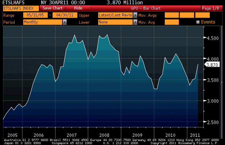
You can still have your pick of existing homes. Inventory remains very high.
This just isn’t getting better very quickly; a year ago the inventory of existing homes stood at 4.029mm; today it is at 3.870mm. We might hypothesize that the steady inventory might still represent improvement as the ‘shadow inventory’ of foreclosed and nearly-foreclosed homes is gradually making it into actual inventory – we will look at some charts a little later that call that idea into some question.
The reallydisappointing number was Philly Fed, which showed 3.9 versus 20.0 on the headline figure. The table below shows the various subindices (which are independent from the headline question), along with last month’s number and December’s for comparison.
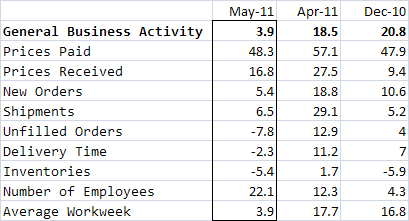
Philly Fed components
The fact that “Number of Employees” held up, and actually increased, while “New Orders,” “Average workweek,” and most other subindices dropped is moderately cheering, since it suggests the possibility that businesses are seeing the current slowdown as a temporary ripple of the Japanese supply-chain disruption. In that case, while New Orders might drop and people might not be working as hard, you wouldn’t necessarily want to be shrinking your workforce. I wouldn’t read too much into one month’s worth of the Philly Fed, but this is one interpretation that might soften the impact of the headline figure (who says I can’t be optimistic sometimes?).
Now, let’s step a bit further back and look at some other charts, which are from the New York Fed’s Quarterly Report on Household Debt and Credit. We read a lot about how credit trends are improving, and that’s surely true. Given how bad the economy was in the aftermath of the Lehman et. al. collapses, almost anything represents an improvement. This is why we can get excited about 400k Initial Claims, which ordinarily would be something less than thrilling. Back to credit, though. The following three charts are (a) the proportion of total consumer credit balances by state of delinquency, (b) the dollar value of new serious delinquent balances, and (c) the quarterly transition rates for 30-60 day late mortgage accounts.
–

–

There is no denying that all three of these charts are better than they were just a year or two ago. But there’s also no denying that each of these trends is still worse than it was at the depths of the last recession. Less than 90% of consumer loans are current, and around 4% are seriously ‘derogatory’ (somewhat more than 120-days late) The 120-day-late loans have either been curing or transitioning to the ‘derogatory’ category as fast as others are written off. The second chart suggests that mortgages are still going bad at very high rates. Think back to the ‘shadow inventory is draining’ hypothesis, which was a sunny way to look at the inventory of existing homes. The second chart above tells us that the shadow inventory continues to fill, albeit at a lower pace than it was filling last year. And finally, the last chart tells us explicitly how many of the 30-60 day late mortgages are getting current, versus getting more delinquent. In the good old days (when you could easily refinance yourself temporarily out of a bad situation and kick the can down the road, rather like Greece come to think of it), roughly four mortgages cured for every one that transitioned to 90+-days delinquent. Now, those numbers are even. Better than at the depths of the crisis, sure. But good? I wouldn’t say that.
The implication of this is that while the next hurricane isn’t hitting at high tide, it isn’t hitting at low tide either. The U.S. economy (and by extension, most of the global economy) is not healed, and not in a position to take another serious body blow such as might be associated with, say, a Greek default. Or an Irish default. Or a Portuguese default. Or a Spanish default. Or the Fed selling a couple trillion bonds.
I believe the Federal Reserve is serious about eventually withdrawing QE2, and steadfastly against QE3 (although the FOMC minutes left that door open wider than I had expected). But suppose that Greece can’t be saved without restructuring, and the ECB crosses its arms petulantly (they just tightened, after all), and various banks shudder and threaten to topple? Will the much more-dovish Federal Reserve ride to the rescue?
Do you want to bet they won’t?
Maybe this is why the TIPS auction went passably well today. The market had backed up 5bps, but investors were still being asked to buy a 10y TIPS issue with a real yield around 0.88%. The possibility that Bernanke might ride again – and we’re just now starting to experience the negative effects of his first ride – might be enough to persuade investors to hold small-upside paper in order to avoid the possible big downside if the food fight gets messy.
Dreams and Nightmares of Debt
The stock market fell, fairly hard. The S&P ended the day down 1.9%, just a smidge above the lows from late Feb although the actual close was the lowest since the end of January. The similarity of the last couple of weeks of price action to that which we saw in November is probably lost on no one (but just in case, see the two charts below). The only difference of note so far is that in November, right before the next stage of the rocket higher, the market tested the range lows but managed to close well above them while in this case, we’re closing right at the bottom of the range. In any event I wouldn’t take the November experience to be a roadmap of any sort, but the similarities are at once eerie and encouraging given what ensued after November.

The S&P in November.

The S&P, recently.
With our quota of encouraging anecdotes fulfilled for the day, we may continue. 10y note yields also reached the lowest levels seen since January. However, 10y TIPS yields fell to 0.88%, as low as they have been since early December. 10-year inflation swaps, however, are just a bit off their highs for the year. Indeed, over the last month nominal yields are down about 34bps at the 10y point, but TIPS yields are -49bps while 10y breakevens are +15bps.
The combination of these two details – a decline in nominal rates that is almost entirely the product of a decline in real rates rather than of a decline in inflation expectations, plus softening equity markets – would lead the market detective in me to suspect that a change in growth expectations is in the air. On this point we get some confirmation from a general softening in commodities. Crude was down -1.8% and gasoline -0.5% despite news that Saudi police had opened fire on protestors today, one day ahead of the ‘Day of Rage’ scheduled for tomorrow. But Grains were -1.4%, Livestock -0.2%, Softs -4.3% (mostly Coffee and Sugar), and Precious Metals -1.6% (the source for all of these summary numbers is the one-day change in the relevant DJ-UBS Spot commodity subindex).
Some observers saw the decline in nominal yields and in stock prices as indicative of a flight to quality, perhaps because Spain was downgraded one notch by Moody’s today with a continuing negative outlook or on the Saudi police-shooting-of-protestors news. But if that were the case, I would have expected to see a bigger move in bonds of the periphery countries (10y Spanish yields were up a whopping 1bp while Greek bonds rallied) or a rise in oil prices. And yet, neither of those things happened. This might be just a plain old re-assessment of growth dynamics.
Why that reassessment would happen today is a little beyond me. Sure, Initial Claims were worse-than-expected at 397k, but that series still appears to be trending lower overall (the big miss, though, means that volatility is still a big problem for analysts trying to evaluate the series). And yet, that still seems to be the cleanest explanation.
The quarterly Flow-of-Funds (Z.1) report was released by the Fed today, showing – and this is what leads the news – that household net worth rose $2.1 trillion on the quarter due mostly to gains in the equity markets. That sounds like a big number, and would make us feel pretty good if we didn’t all know by now just how ephemeral those stock gains are. And, in fact, other parts of the Z.1 help remind us of that fact. With this report in hand, we can update Tobin’s Q to the end of the year and find that the ratio of market value to replacement cost is about 1.1, which is roughly 45% above the average since 1952.That means we can now officially say that with the exception of the equity bubble, stocks have not been as richly priced on Tobin’s Q as they are now in the entire post-war period (see Chart).

Tobin's Q (shown as a ratio to the average Q)
The Z.1 also allows us to update a couple of other goodies. The first chart below shows the public debt (state, local, and federal, plus Fannie Mae and Freddie Mac as of 2008), private debt, and total debt as a percentage of GDP. It is pretty clear what is going on here. The federal government has essentially stepped in to try and make up for the deleveraging in the private sector.

Uncle Sam is helping us keep levered as a society. Thanks, Sam!
Total public sector debt outstanding as a proportion of GDP rose in Q4 from 88.7% to 90.6%. As recently as 2008Q2, it was 52.4%. Overall debt is 340% of GDP, down from 341% last quarter and 363% in the first quarter of 2009. But before getting too excited about this deleveraging, reflect that as of June 2008, total debt was 340% of GDP. In other words, all the credit crisis has done is to shift the debt from the private side of the ledger to the public side of the ledger. I’ve noted in the past that the division of debt between public and private is important for the inflation dynamic. Societies with heavy burdens of private debt tend to disinflation; societies with heavy burdens of public debt tend to inflation. As the next chart shows, before the crisis the total private debt had reached a level about 5.5x the size of the state and local debt. Since mid-2008, the ratio has fallen back to 2.75x.

Okay, we're back. Now stop the big deficits. Come on, stop. Please?
Can you see any place in this chart where we might expect to see a leverage-induced bubble in asset markets? The good news is that the current level of 2.75x was a fairly normal division prior to 1997 or so. The bad news is that there is no sign that the ratio is going to stop falling any time soon.
Another way to look at the debt dynamic is in the chart below. Abstracting from the absolute level of debt, which sectors have been adding to it and subtracting from it?

It isn't households doing most of the deleveraging. It's financials near-term and businesses long-term.
Can you see any place in this chart where we might be unsurprised to see an increase in overleveraged financial institutions? Another interesting aspect of the chart is the slow decline in the share of debt outstanding that the business sector represents.

Okay, I got a little carried away on charts today.
Yes! Businesses are getting less levered. Is this good, or bad? Well, the good news is that a company with less financial leverage is safer, in a business sense. Credits, overall, have been strengthening in the last couple of years (duh!) and in general businesses are less levered than they were in the 1980s and in the first half of the 1990s (of course, I’m not considering here operating leverage, which has definitely increased with computers and improved mechanization and which also increases the volatility of earnings by increasing the fixed:variable costs ratio). The bad news is that declining leverage implies a decline in ROE if all else is equal, since return on equity is just Profits/Sales * Sales/Assets * Assets/Equity (the DuPont equation) and this last term is leverage.
And you might reflect on another possible implication of the fact that businesses are trimming debt relative to equity. It suggests that, even with the miniscule level of interest rates, businesses perceive equity as being cheaper than debt as a place to raise money. In other words, they are happy to sell you more equity at the prices you’re paying.
Chart-A-Palooza! It’s Z.1 Time!
Initial Claims did not administer the coup de grace to the bond market. While TIPS continued to struggle, bonds were roughly unchanged on the day as Claims came out quite near to expectations (421k). It does appear that ‘Claims have begun a new slide to a lower level, but I would caution here against relying too much on one’s eyes. The spike in late summer makes the slide appear larger than it really is, and moreover at this time of year (and, frankly, through most of January) the volatility of the Claims numbers is much higher. Ergo, we need more data to be sure that we’re really seeing what we’re seeing. I would say that I “suspect” it is so, but I don’t have enough evidence yet to reject the null.
Absent such a mercy-strike, the market was reasonably quiet today. However, one of my favorite data releases – come to think of it, the fact that I have a favorite data release is pretty sad – was out today: the Federal Reserve’s quarterly Z1 Flow of Funds report, updated through Q3. I like this report because it allows me to update charts like these:

This chart shows that Federal, State, and Local debt (including Fannie Mae and Freddie Mac debt) as a proportion of total debt. This matters because the higher this ratio goes, the bigger the incentive for the government to simply monetize the debt. It isn’t outlandishly high yet, but the trend is kinda bad.
This chart makes a neat point. The private sector is deleveraging, slightly. But the overall economy is not, because the government has thoughtfully taken up the slack and borrowed whatever we weren’t borrowing. This is not unrelated to the fact that the economy didn’t collapse after 2008Q3. Some of you may applaud the Administration(s) for this since it helped avert an imminent collapse. Some of you may throw brickbats at the Administration(s), since if leverage was what was causing the collapse to threaten, we clearly have the same Sword of Damocles hanging over our heads. I tend towards the latter camp, but either way I think we can agree it’s a smashing chart.
So where has the private deleveraging come from? Well, there is a myth that the consumer is deleveraging. A little bit, yes, but most of the deleveraging is coming from domestic financial institutions (banks, dealers, etc). And yes, you might combine these last two charts and say “so, the financial system basically foisted a bunch of debt onto the federal ledger, aka taxpayers?” Yep, that was the deal the Administration(s) made with the devil. Again, some of you will applaud this for the short-term results and others will hurl rotten tomatoes. But probably none of you will pat Bank of America on the back these days. (I’m just sayin’.)

Tobin's Q / Average Q
And, yes, the Z.1 allows us to calculate a variation of Tobin’s Q. If you don’t know what Tobin’s Q is, you can read my comparatively-succinct explanation here, but in a nutshell it is a way of comparing the market value of equities to the replacement value of their assets. Higher means a frothier market. Here I’ve divided the calculated Q by the average Q since 1952 to get a normalized Q. If this makes you think the stock market may still be overvalued, then you can thank Q. You’re welcome!
Quacks
Initial Claims was reported as-expected at 457k; some observers tried to make much of the fact that the 4-week moving average fell to its lowest level in a while, but of course that’s because of the very low number recorded two weeks ago when the seasonal adjustments looked for an auto shutdown that didn’t happen.
I guarantee that the 4-week moving average will jump the week after next (when that data falls out). After all, each week only adds 1 data point. It doesn’t matter how you smooth it: every week has the same informational content. Focusing on the 4-week moving average is a way of keeping one’s self from getting too excited about this week’s number, but the easier method is…don’t get too excited about one week’s number. Each data point is the result of an experiment, measuring an unknown (and unknowable) underlying reality. Each data point, or collection of data points, has more value when those numbers start to diverge from those suggested by your operating hypothesis, causing you to question or reject your thesis. In this case, the operating hypothesis that the underlying rate of Initial Claims is approximately stagnant at roughly 460k per week is not threatened by this week’s 457k number, nor by the 464k number last week, nor by the 452.5k 4-week moving average. The jobs picture is the same as it has been: tepid.
Now, we did have an exciting (for an inflation guy) unscheduled release today, when St. Louis Fed President James Bullard released a pre-print of his suggestively-titled “Seven Faces of ‘The Peril'”, an article scheduled to appear in the September/October St. Louis Fed Review (the article is available here). In the abstract, he says “In this paper I discuss the possibility that the U.S. economy may become enmeshed in a Japanese-style, deationary outcome within the next several years.” As you might expect, it hit the headlines immediately.
I have yet to read the whole paper (tonight’s chore), but from a scan it looks very interesting. I don’t agree, at the outset, with some of his conclusion, but I am willing to be swayed on the reading. The conclusion reads, in part,
“During the recovery, the U.S. economy is susceptible to negative shocks which may dampen ination expectations. This could possibly push the economy into an unintended, low nominal interest rate steady state. Escape from such an outcome is problematic. Of course, we can hope that we do not encounter such shocks, and that further recovery turns out to be robust but hope is not a strategy. The U.S. is closer to a Japanese-style outcome today than at any time in recent history. In part, this uncomfortably close circumstance is due to the interest rate policy being pursued by the FOMC.”
Specifically, he is critical of the policy of the FOMC to pledge to leave interest rates very low “for an extended period,” and instead says “A better policy response to a negative shock is to expand the quantitative easing program through the purchase of Treasury securities.”
It certainly seems that Fed officials are starting to try and make it clear that they are willing to gun the motor a bit to make sure inflation achieves ‘escape velocity’ and doesn’t keep falling back to the neighborhood of zero. As readers know, I think that they are misguided, since ex-Housing, there is nothing approximating deflation in the U.S., but with money growth low and money velocity probably leveling out but with steady pressure on financial leverage (which is a concept related to velocity), it is not ridiculous to be worried about it. My models suggest core inflation is already beginning to bottom, and as I have written recently I think the “negative shock” about which Bullard speaks – he may even explicitly have the coming fiscal contraction in mind – will be addressed by the Fed as the only arm of government left that has any bullets. And I think that means inflation has potentially a lot of upside, as the Fed in Q1 will probably be pushing prices higher along with the already-generated upstroke.
But I am always disheartened to see policymakers look at Japan and despair of being able to force prices higher. Japan was extremely conservative in their pursuit of ZIRP, and then QE. I will say it again: it is trivially easy to get inflation. Add zeroes to the currency and you are absolutely, 100% guaranteed to get inflation. It is targeting responsible inflation that is the challenge. Japan did the monetary authorities of the world a great favor by conducting a dosage experiment. They didn’t give the patient a big enough dose. Just because the patient did not respond to 1cc of penicillin is no reason to throw out penicillin as a helpful medicine. It may require 2cc. Or maybe 10cc.
It is a little concerning to see quack theories gaining credence before we have tried a little harder to get the proper dosage of a medicine we know works. But what do you expect, I guess? Monetary policymakers today are barely a generation removed from the monetary policy witchdoctors of yesteryear.
.
I was musing today about investments. We know, of course, that we live in a “low return world,” as Mauldin would say it, or the “New Normal,” as Bill Gross likes to call it. Low returns are the order of the day, which is frustrating to everyone. Yields are low, real yields are low, prospective equity returns are low, etc. But there is one investment that can return you a guaranteed 5% or 6% nominal return with no risk. Yeah, I know we all want 15%, but that’s not available. 5% or 6% with no risk isn’t bad (especially if you believe we are headed into deflation, which I do not, but some do).
Pay off your mortgage. Paying 6% less in interest is equivalent to earning 6% on your investment. (You may say “but you get a tax break on that 6%!” Sure, but you pay taxes on that 6% investment; moreover, I am not sure the mortgage interest deduction is sacred any more…are you?)
Now this leads to a thought that I found interesting and I hope you will too. Could the low-return world be actually contributing to de-leveraging? Look, if you’re borrowing at 6% to buy a 10% investment, it makes sense to do so (well, if you can handle the variance in the investment). But if the investment only yields 4%, then borrowing at 6% to buy it is silly. That’s what you’re doing right now if you’re buying Treasuries at 3%. But if everyone realizes this, then … well, we know that credit demand is falling and the standard story is that Americans are growing more responsible. Could it simply be that they are making the best-available use of their money? (Note this is different than a low interest rate world. If rates are low but prospective returns higher, then more leverage makes sense. But once all returns have been forced down, it makes sense to de-leverage).
I doubt that the average homeowner is performing that calculus. Most of us fall into the common behavioral trap of thinking of our “borrowing” and “investments” as coming from two different pockets. We are not the homo economicus of theory. But perhaps at the margin this is happening, and it makes a more plausible story to me that investors are being somewhat rational rather than (alternatively) suddenly “coming to Jesus” on their borrowing-and-spending ways.
.
Friday brings some significant data. First we get the first look at Q2 GDP (Consensus: 2.5%; +1.0% on price deflator). Simultaneously, the Employment Cost Index (Consensus: +0.4%) will give a read on wage and benefit growth. Last quarter the ECI was +0.6%, but most of that was from a +1.1% jump in benefits while wages were +0.4%. The question is whether benefits merely drop down into line at +0.4% or +0.5%, or if they overcorrect. I suspect those cost increases were real, and think there’s some upside risk to this figure (although I don’t feel strongly about it). At 9:45ET, the Chicago PMI is expected to decline further to 56.0, and shortly thereafter we get the revision to the Michigan Confidence data (the least important indicator of the day, easily).
Getting The PIIGS Out Of The Mud
It is Thursday, which means that tomorrow we will hear reports and rumors about how a package will be put together to save Greece over the weekend. After all, it happens every Friday. Maybe that’s why stocks rocketed higher (although Bloomberg tells me it’s earnings), up 1.3% today.
Don’t get me wrong, I’m glad Bristol-Myers Squibb (BMY) was up 4.2% today, because it’s one of only a handful of stocks I own – a 5% dividend in a stable company is attractive to me. But I scratch my head as to why these earnings are so salutatory for the stock price. The company reported a strong quarter, but revised its estimate for full year earnings (which presumably includes the quarter) down by a nickel. To me, that’s a miss. Moreover, that lowering of the estimate consisted of plus 7 cents from normal operations, minus 12 cents due to the health care bill, for the net nickel. It said the healthcare bill cost them 1% of sales in Q1 and that these costs will increase. This is good news? I will give some thought to selling this security.
Initial Claims was 448,000, about what was expected. This is a little bit below the 8-week moving average of 455k and a little above the lows for the year of 439k. In other words, still firmly within the range for this year. As the chart below illustrates (Source: Bloomberg), that level is just about exactly where claims were just prior to Lehman’s bankruptcy on September 15, 2008. In other words, we can think of the roundtrip from 450k to 650k and back as being the measure of the financial crisis; the economic faults that pre-dated that crisis, and precipitated it, still persist. Now that Claims have begun to go sideways at the 450k level, we can’t even say that the return trip from the depths of the crisis generated any ‘positive momentum’ in employment. Simply, we’re still in a tight spot and we can’t reject the null hypothesis that employment is basically going nowhere.

Claims - Almost exactly where they were pre-Lehman
Despite the exuberant equity rally, the bond market bounced back with a gain of 14/32nds (1o year yields at 3.73%). Yesterday I noted that equities had recovered only a little of their recent selloff while bonds had retraced much of their recent rally; today’s move corrects that situation so I was evidently wrong to read much into that.
Inflation swaps were up 4-6bps today despite the decline in yields – that implies a pretty lusty performance by inflation-indexed bonds. TIPS have been trading well for a few days, amid some reports that liquidity in that market has been getting a bit sketchy. Since European banks are such active players in the inflation market, liquidity can sometimes suffer when risk budgets are being cut for reasons peculiar to European institutions (a couple of years ago, the sharp inversion of the Euro swap curve caused big losses at some institutions and led indirectly to thinner conditions in US inflation). I don’t know if that’s happening in this case, but it wouldn’t surprise me.
But the real question is, why are inflation markets rallying as the specter of a sovereign default is rising?
Here’s the debt dynamic. The first thing you should realize is that historically, societies with a high level of private debt tend to deflate; societies with a high level of public debt tend to inflate. Over the last 20 years and more, ours has been a society that has lathered on private debt with a vengeance, while prior to 2008 the level of public debt was rising, but manageable. Thus, for a long time I was a bear on inflation: it is very hard for a producer to raise prices to increase margins on a lower level of sales, if a certain level of cash flow is needed just to service debt.
That dynamic shifted just a couple of years ago when governments the world over took a lot of that private debt and made it public through direct bailouts as well as the indirect bailout of fiscal stimulus. Trillions and trillions of it. Now, when a country is laden with public debt, it tends to inflate because that’s the easiest way to effectively default. That’s the dynamic we are in now.
The problem is, I am not sure how to think about Greece. Because she doesn’t have control over her own currency, she cannot “effectively” default. And that basically means that from the standpoint of the debt dynamic, we probably should think of her (and all of the Euro member states) as private entities whose default has a deflationary impact.
…Except that Greece isn’t alone. Several other members of the EU are in direct trouble and would print money if they could. Moreover, if EU member states bail out Greece, then they are all becoming more indebted (just as happened here when the federal government took over Fannie Mae, Freddie Mac, General Motors, AIG, and Citigroup) collectively, and pressure will begin on the EU to “temporarily abandon” its inflation-targeting regime. An increase in Euro inflation might not be a horrible thing to the ECB if it helps get the PIIGS and their saviors out of the mud, although of course it would hurt the “credibility” of that central bank. Such a move may not even weaken the Euro that much, assuming that the Fed didn’t choose to respond with tight money to a desperate situation in Europe…although if the Euro needs to weaken in order to save the Union, then I imagine the thinking will be “so be it.”
Accordingly, while I thought the U.S. would probably lead global inflation higher, it may be a follower. Right now, 10-year inflation expectations from inflation swaps are 2.80% in the U.S. and 2.15% in Europe. That’s as wide as that spread has been in quite a while, because the ECB’s inflation target effectively keeps implied inflation from rising too far. I suspect people are giving them a bit too much credit for sticking to their guns through the next round of crisis, which seems likely to focus on European institutions. European linkers may be a bit cheap here.
On Friday, other than the obligatory trumpeting of an imminent deal off the Continent, we’ll get our first look at Q1 GDP (Consensus: +3.3%, with Core PCE at +0.5%). The Employment Cost Index (Consensus: +0.5%) will be released at the same time. If the consensus is correct and both Core PCE and ECI print at around 0.5%, we may see some wind taken out of TIPS’ sails. It is hard to buy inflation at 2% for 3 years, 2.3% for 5 years, or 2.8% for 10 years if it’s currently printing at 0.5% (even if that would be the right thing to do in the grand scheme of things).
Yay! The New Z.1 Is Here!
Why, oh why does Christmas come but once a year?
Actually, for economists and traders who are trying to read the economic tea leaves, once a year is almost too much. The November numbers (released in December), and the December numbers (released in January) are subject to huge error bars. In statistical terms, that means that it is extremely difficult to reject any given null hypothesis about the economy’s actual trajectory: put more simply, because of the huge uncertainty caused by seasonal adjustment of a very important season, it is difficult to look at a piece of data and say “well, my original idea clearly is wrong.” There’s just not much signal among the noise.
So, at present my operating assumption is that the economy is improving from deeply depressed Lehman-trauma-induced levels. That’s not saying a whole lot, and I don’t expect that improvement to lead to what we would normally consider a healthy recovery – growth sufficient to bring the Unemployment Rate down significantly over the next year. Moreover, a lot of that growth seems to me to be artificial. For example, it isn’t clear to me that the major auto companies need to be producing cars like mad given the state of durable demand, but I do suspect the czar isn’t going to let them slow production very much…inventory build is, after all, included in GDP, and a higher number does make his boss look good. And who knows, it might even be the right thing.
Friday’s Retail Sales figures were stronger than expected across the board, whether looking at the headline figure, ex-auto, or ex-auto-and-gasoline, and even including negative revisions to prior numbers. This is well, and good, and we should be of good cheer and all that. But I wonder how much demand moved forward to November as shoppers try and spread their purchases over a longer period this year. I know it is happening in my household – we’re done shopping. I suspect it isn’t a big effect, but my point is that it has been a very long time since we have had a Christmas shopping season in the middle of, or coming out of, a depression and we don’t know a lot about how the numbers are supposed to look.
In any event, a significant plurality of all the retail purchases for the year happen in the Thanksgiving-to-Christmas period, so Friday’s numbers are much less important than what is happening right now. And, anecdotal evidence aside, we won’t know about that until next month.
This may help explain why the stock market over the last week and a half has responded strikingly tepidly to great Employment and strong Retail Sales figures. Investors know that the real game begins now, and are ignoring the good news from last month. Maybe.
It may also be that stocks are expensive once again. On Thursday the Federal Reserve released the Z.1 report, which (geek alert) is one of my favorite. The Z.1 is the “Flow of Funds” report, and is released quarterly. This one is for Q3, so the data is always out-of-date. But it has nuggets like the count of non-Federal, non-financial debt outstanding, which fell in Q3 by $129.9bln, the most ever in a quarter, and is down $254bln over the last year. Lest you think that is quite a lot, I should observe that these precipitous declines bring the level of non-Federal debt outstanding to the still-pretty-steamy level of $27 trillion. A 1% decline over a year was not, exactly, the extent of what the doctor ordered for this economy. It needs to contract much, much more to reduce the risk in the economy. The flip side of that coin, of course, is that if it did, then the economy would be growing that much more slowly, or contracting still.
Our policymakers have taken severe steps to make sure that doesn’t happen. And this is the most disturbing sign, I think, that whether the current semi-expansion blossoms into something more or instead sputters, there could still be something ugly in our future. This is an imbalance. It needs to be, and will be corrected – either by a default debacle, or (on the more sunny side) by stagnant credit growth in the context of organic economic growth. The latter method is better, but slower, and there’s really no way to choose it. We just have to hope.
