Archive
Is Apparel the Canary in the Coal Mine?
(**Administrative Note: Get your copy of my new book What’s Wrong with Money: The Biggest Bubble of All! Here is the Amazon link.)
Last week, one of the curious parts of the CPI report was the large jump (1.6% month/month, or nearly 20% annualized) in Apparel. At the time, I dismissed this rise with a hand-wave, pointing out that it Apparel is only 4% of core and so I don’t worry as much about Apparel as I do, say, Medical Care or Housing.
But a Twitter follower called to my attention the words of @IanShepherdson, one of the real quality economists out there (and one whom I read regularly when he was with High Frequency Economics, and I was at Natixis). He hasn’t always been on top of the inflation story, but he nailed the housing bubble story in 2008 and I have great respect for him. Ian apparently said of Apparel that it could be the proverbial “canary in the coal mine” when it comes to inflation, since apparel tends to respond more quickly to inflationary pressures since it is a very competitive and very homogeneous category.
So I figured it was worth taking a longer look at inflation.
Now, I should point out that I probably have a bias about getting over-excited about inflation. Back in 2011-12, Apparel prices started to accelerate rapidly for the first time in a generation- and that’s no hyperbole. As the chart below (Source: Bloomberg) shows, the price index for seasonally-adjusted apparel prices went sideways-to-down-to-sideways between 1992 and 2012.

You can see from this why I may have gotten excited in 2012. Between 1970 and 1992, apparel prices rose at a very steady rate. Then, as post-Cold War globalization kicked into high gear, apparel manufacture moved from being largely produced in the US to being largely produced outside of the US; the effect on prices is apparent on the chart. But in 2011-2012, the price index began to move higher at almost the same slope as it had been moving prior to the globalization dividend. My thought back then was that the dividend only happens once: at first, input costs are stable or declining because high-cost US labor is replaced with low-cost overseas labor – but eventually, once all apparel is produced overseas, then the composition effect is exhausted and input prices will rise with the cost of labor again. In 2012, I thought that might be happening.
And then Apparel flattened out.
You can see, though, from the right side of the chart the latest spike that has Ian (and maybe me) so excited. The month/month rise was the third largest in the last 30 years, exceeded only by February 2009 and February 2000. As an aside, the fact that the three largest monthly spikes were all in February ought to make you at least a little suspicious that some of what is going on may be a seasonal-adjustment issue, but let’s leave that aside for now because I’m rolling.
What about the assertion that Apparel may be the ‘canary in the coal mine,’ giving an early indication on inflation? The chart below (source: Bloomberg, and Enduring Investments calculations) shows the year-over-year change in Apparel prices (on the right-hand scale) versus core CPI (on the left-hand scale).
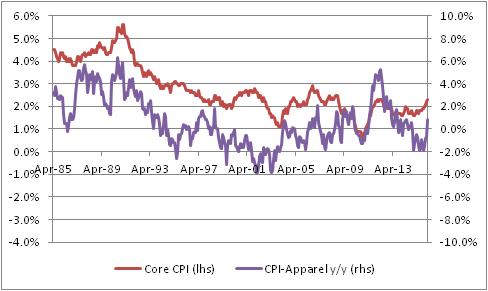
I do have to admit, there is something suggestive about that chart although it is at least somewhat visual since I can’t find a consistent lag structure in the data. But the clear turns do seem to happen first in Apparel, often. Ah, but here is the fun chart. For the next chart, I’ve also taken out Shelter from core inflation, since Shelter especially in recent years has been largely driven by pretty crazy monetary policy, as I have pointed out before many times. (And if you want to read what I think that’s likely to lead to, read my book.) To make it fair, I also removed Apparel itself since once Shelter and Food and Energy are all removed, Apparel is starting to matter.

In this chart, you can start to see a pretty interesting tendency for Apparel to perhaps lead, slightly – and so, perhaps, Ian is right. In this case, I certainly wouldn’t want to bet against him since I think that’s where inflation is going too. I just wasn’t sure that Apparel was a strong part of the argument. (But at the same time, notice the big spike in Apparel inflation in 2012 preceded a rise in ex-housing core, but not a large or sustained rise in ex-housing core).
The table below shows the breakdown of Apparel into its constituent parts. The first column is the category, the second column is the weight (in overall CPI), the third column is the current y/y change, and the fourth column is the previous y/y change.
| Category | Weights | y/y change | prev y/y change |
| Apparel | 3.1% | 0.892% | -0.530% |
| Men’s apparel | 0.63% | -0.445% | 0.483% |
| Boys’ apparel | 0.16% | -0.443% | 1.350% |
| Women’s apparel | 1.04% | 0.230% | -2.127% |
| Girls’ apparel | 0.21% | -1.274% | -2.283% |
| Men’s footwear | 0.21% | 2.854% | -0.461% |
| Boys’ and girls’ footwear | 0.17% | 2.506% | -0.046% |
| Women’s footwear | 0.31% | 0.730% | 0.926% |
| Watches | 0.08% | 8.525% | 0.805% |
| Jewelry | 0.13% | 6.156% | 2.874% |
I look at this to see whether there’s just one category that is having an outsized move; if there were, then we would worry more about one-off effects (say, the rollout of a new kind of women’s blouse that is suddenly all the rage). It is interesting that Men’s apparel and Boys’ apparel decelerated, while most everything else accelerated, but this happens all the time in the Apparel category. Actually, this is a pretty balanced set of sub-indices, for Apparel.
Now, I’m still not 100% sure this isn’t a seasonal-adjustment issue. It could be related to weather, or day count (29 days in February!), or some bottleneck at a port that caused a temporary blip in prices. I want to see a few more months before getting excited like I did in 2012! But we have had a couple of bad core CPI prints, and we also saw pressure in Medical Care so it is fair to say the number of alarm bells has broadened from one (Housing) to several (Housing, Medical Care, Apparel). It is fair to be concerned about price pressures at this point.
Summary (and Extension!) of My Post-CPI Tweets
Below is a summary and extension of my post-CPI tweets. You can follow me @inflation_guy:
- Core CPI unchanged – which is amazing. I can’t wait to see the breakdown on this one.
- Core 0.003%, taken out one more decimal. I thought y/y had a chance of rising to 1.8%; instead it fell to 1.61%.
- Last Dec, core was 0.10%, so part of this may be faulty seasonal adjustment. It is December, after all.
- Core services +2.4%, down from 2.5%. Core goods down to -0.8%, worst since mid-2007.
- Medical Care Commodities +4.8%! Biggest increase since 1993. Oh ACA, we hardly knew ye.
- Housing weakened, which isn’t insignificant. Primary rents 3.38% from 3.48%; OER 2.61% from 2.71%.
- We still think housing is headed higher but that was part of the surprise. Apparel too, -2.0% y/y from -0.3% previous.
- The apparel move is likely related to dollar strength. Most apparel isn’t made here.
- Accelerating major groups: Food/Bev, Med Care, Rec (28.2%). Decel: Housing, Apparel, Transp, Educ/Comm, Other (71.8%)
- Decline in apparel prices may be a story. In recent yrs Apparel had been rising after many years of dis/deflation. Weakness in Asia…
- Apparel y/y decline was largest since 2003.
- Core ex-housing down to 0.69%. Much lower than crisis lows. That’s where to look if you’re worried about deflation, not the headline.
- Very interesting core goods. Our three-item proxy is Apparel (-2%), New cars (-0.1%), and Medical Care commodities (+4.8%). Figure THAT out.
- This CPI is hard to dismiss. Hsng dip is most concerning (think it’s temporary tho), but broadening of decel categories worrisome.
- Core ex-housing looking really soft. Now, some of that is probably energy sneaking thru…not a prob normally but for BIG moves – maybe.
- That being said, market is pricing in 1% core for next yr, 1.25% for 2 years, 1.37% for 3 years…so infl market has overshot. A lot.
- number of categories at least 1 std dev above deflation went from 43% to 20% in one month.
- Now here’s something to not be worried about yet: our “relative inflation angst” index reached its highest level since 2011. Still low.
This was a wild report, full of interesting items. Let’s start with Apparel. In recent years, I have watched Apparel closely because one of my theses was that the domestic benefit from exporting production to cheap-labor countries was ending. Apparel is a nice clean category that went from normal inflation dynamics when most apparel was produced domestically (prior to 1993), to disinflation/deflation over the years where virtually all production was moved offshore, to normal inflation again once the cost savings on labor had been fully realized and so no longer a source of disinflation (at which time, costs ought to begin to track wage inflation in the exporting country, adjusted for currency moves).

While it seems that the recent decline should challenge that thesis (and that was my knee-jerk reaction), I think that perhaps it isn’t quite as clear-cut as I thought. In the past I had ignored the effect of foreign exchange movements, since (a) it didn’t matter when we were mostly domestic production and (b) over the last few years currencies have been broadly stable. I think the latest decline in apparel is almost surely related to the dollar’s strength, which unfortunately means that it isn’t as pure a test of my thesis as I had hoped. In any event, apparel is one place (one of few, in the US) where dollar strength manifests clearly in core goods prices, so this is a dollar effect.
The next chart is the chart of Medical Care Commodities (mainly pharmaceuticals). Remember when we had that quaint notion that the Affordable Care Act (Obamacare) was going to permanently reduce inflation in medical care? (Actually, we didn’t all have that quaint notion – in particular, I did not – but it was certainly a view pushed very hard by the Administration). It turns out that the decline in medical care inflation was mostly due to the effects of the sequester on Medicare payments, and now prices seem to be catching up. This is an ugly chart.

Ex-medical care commodities, however, it doesn’t appear that disinflation in core commodities will be in for much of a respite unless the dollar rally is arrested.

And now for one of the scariest charts: core inflation ex-shelter is as low as it has been since the early 2000s, when the uptick in housing costs (like now) hid a close scrape with deflation. I think the causes of that deflationary scrape were similar to those of today, if in fact we are going to head that way: too much private debt. Although the higher level of public debt makes the answer more indeterminate, high private debt imparts a disinflationary tendency. The “deleveraging” was supposed to get rid of the disinflationary tendency by moving private debt onto the public balance sheet. It really didn’t happen, except for auto companies and some large financial institutions like Fannie Mae.

The important difference between now and then is that in the early 2000s we had higher rates, higher velocity (which is correlated to rates) and no excess reserves. Today, all the Fed would need to do to arrest this tendency would be to lower the interest on excess reserves to a significant penalty rate and those excess reserves would quickly enter the money supply. Interestingly, a movement the other way – to raise interest rates – will likely also cause inflation to rise as it will raise money velocity. So I am not particularly concerned we will get into deflation even ex-housing. There are lots of ways out of that pickle. I am much more worried about overreaction. Once again, the Fed might have stumbled into the right policy: doing nothing. If you can’t be good…be lucky.
One final remark on our “inflation angst” index (not shown here): the rise in the index, which manifests itself in a perception that inflation is actually higher than reported, is driven by the increasing volatility of index components (such as airfares, gasoline, and apparel) and the increased dispersion of index components (such as apparel and medical care commodities). These both have the impact of making inflation feel higher than it actually is. It is nothing to worry about at these levels of inflation, because “higher than it actually is” still feels low. But if inflation volatility continues to pick up as the level picks up (as it eventually will), then it will feel much worse for consumers than it actually is. That’s not a 2015 story, however.
Keep in mind that the market has already discounted really bad core inflation for a long time. We are very unlikely to get such a bad outcome, unless housing collapses – which it might, since prices are getting back into bubble territory, but I don’t think it’s very likely. As a consequence, even such a bearish inflation report as this one has been followed by a rally in inflation swaps and breakevens. I think this is a wonderful time to be buying inflation. It’s hard to do in the retail market, although the Proshares UINF ETF is a reasonably clean way to be long 10-year breakevens. It is $28.80, and I expect it to be at $36 within 6-9 months. [Disclosure: Neither I nor any entity or fund owned or controlled by me owns this ETF or has any current plans to buy or sell it.] [Additional Disclosure: That would be difficult it seems. While Bloomberg says it has NAV it also seems to have been liquidated. Pity if true. But RINF, a 30-year breakeven, still exists. From $30.57, I would expect $37 over a similar period.]