Archive
Recession For Me But Not For Thee?
In late 2022, I often said that while I didn’t think it would be severe I figured we would have a recession in 2023 because we had never seen an energy spike at the same time that the Fed was aggressively tightening and not had a recession. Indeed, it would really be weird if those things could happen and not result in a recession. Then, what causes a recession?!?
And as we all know by now, 2023 was not a recession. So, like any good trader who makes a bad call I want to look and figure out why that happened. Funny thing is…I wasn’t completely wrong on that.
We need to continue to remember that the volatility of 2020-2022 is something that doesn’t just vanish; the oscillations echo and repeat with slowly decreasing amplitude. The story of those years was this:
The economy was mostly shuttered in mid-2020, and the federal government and Federal Reserve showered money on consumers and businesses. Because service-providers were basically closed, the money was poured into goods. This surge in demand led to long port delays and lead times, higher prices for goods, and a boom time for manufacturing. In the chart below, the orange line is the ISM Manufacturing New Orders index where 50 represents a dividing line between expansion and contraction (it’s a survey, so it’s not absolute levels but rather the change that is noted by respondents).

We can also see the boom in industrial production, next chart. The y/y increase in production was at 4% or 5% until late 2022.

In March 2022, the Fed hiked 25bps. They did 50bps in May, 75bps in June, another 75bps in July, and of course they kept going. Crude crested at $123/bbl in June. So by late summer of 2022, goods production started to see this in declining orders (first chart) and weakening production growth (second chart). My sources in industry started to see a buildup in client inventories, leading to lower orders – the celebrated ‘bullwhip’ effect. By late 2022 and for much of 2023, manufacturing was absolutely in a recession. The Conference Board’s Index of Leading Indicators had gone negative m/m in March 2022 and actually is still negative today.
Normally, that set of events would have produced a recession. But they didn’t. Why? Because the reopening of service industries was gathering steam over 2022. Remember that lots of restaurants were not allowed to operate at full capacity until the second half of 2021. You can see the purple line in the chart above jumped higher late in 2021 and from the middle of 2022 remained above the goods-producing orange line. (“New Orders” for services industries is a more complicated concept, but you get the point). Remember how difficult it was for many service providers to find employees willing to work, and the spike in wages that was necessary to lure them? Well, you don’t have to remember, because here’s a chart showing wage growth for services employees (Atlanta Fed Wage Growth Tracker for services, in dark blue) against ‘Supercore’ core-ex-shelter CPI.

The later blooming of services, and the difficulty of service providers to build up capacity, stretched out the services expansion so that while manufacturing was in a recession, services were in an expansion. And, since services are a much larger part of the US economy, this meant that we never recorded an actual recession on overall growth. Moreover, the decline in goods prices helped flatter the increase in pressure on services prices, so that inflation measures turned lower while inventories were being right-sized.
Now, we are starting to see manufacturing start to turn higher – that orange line in the first chart popped above 50 in January and retreated to just below it in February. This is consistent with what I am hearing from my contacts, who are being more discerning about responding to this increase in demand by greatly expanding capacity (and then possibly being burned again). It means that goods prices are no longer falling, and in many cases are rising again. I do think that there are some signs of consumer stress, such as auto loan delinquencies, and the purple “New Orders (Services)” line in the first chart looks to be slowly decelerating. So I think it’s possible that this year we actually do get a recession, but I think it will be mild because manufacturing is oscillating in the upward direction now. That oscillation means that growth will not be as soft as it would be if services and goods were synchronized, which is one reason I believe this will be a mild or ‘garden variety’ recession the likes of which we haven’t seen in a while.
Eventually the two parts of the economy will re-synchronize, but the way the reopening happened is I think why the macro call has been so difficult.
Do Data Matter Again?
In normal times, by which I mean before actions of the Federal Reserve became the only data point that mattered, the monthly ISM report was important because it was the first broad-based look at the most-recent month’s data.
Now that the Fed’s taper has begun – right about the time that the uncertainty of the impact of Obamacare implementation was at its peak, curiously enough – the ISM data seems to have taken on importance once again. I must say that I did not see that coming, but since guessing at the Fed’s actions every six weeks and ignoring all intervening data was so all-fired boring, I suppose I am glad for it. Looking at economic data and trying to figure out what is happening in the economy is more like analysis and less like being on The People’s Court trying to rule on a he-said, she-said case where the hes and shes are Federal Reserve officials. And that is welcome.
That being said, the January ISM report isn’t one I would necessarily place at the head of the class of importance, mainly because it is January. Still, it was an interesting one with the Manufacturing PMI dropping 5.2 points, matching the steepest decline since October 2008. The New Orders subindex plunged to 51.2 versus 64.4 last month, and Employment and Production indices also declined significantly. It’s clearly bad news, but I would be careful ascribing too much value to any January number – especially one based on a survey.
Also standing out in the report was the increase in the (non-seasonally adjusted) “Prices Paid” subcomponent, to 60.5. the jump was initially somewhat surprising to me because as the chart below – which I tweeted shortly after the number – seems to show, we have had a jump in Prices Paid that is not being driven by a concomitant jump in gasoline prices – and Prices Paid is predominantly driven by gasoline prices.

However, as I noted in that tweet, the Prices Paid index is measuring the rate of change of prices (the question posed to purchasing managers is whether prices are increasing faster, slower, or about the same as the month before), so just eyeballing it may not be enough. The chart below plots the 3-month change in gasoline prices versus the ISM Prices Paid subindex. What you can see is that the first chart is slightly deceiving. The change in gasoline prices has accelerated – back to zero after having been declining since February of 2013. And “unchanged” gasoline prices is roughly consistent with about 60 on the Prices Paid indicator. So, this isn’t as much of a surprise as it looked like, initially.

Still, whether it was the data or because of continued concern about emerging markets (though the S&P fell nearly as far in percentage terms as did the EEM today, leaving open the question of which is following which), stocks didn’t enter February with much cheer. But never fear, I am sure there is “cash on the sidelines” that will come charging to the rescue soon.
The past week has given a great illustration of one important difference between the price behavior of equities and commodities. That is that stocks are negatively skewed and positively kurtotic, while commodities are positively skewed and negatively kurtotic. That is to say, in layman’s terms, that stocks tend to crash downward, while commodities more frequently crash upwards. This happens because what tends to drive severe movements in commodities is shortages, where the short-term supply curve becomes basically vertical so that any increase in demand pushes up prices sharply. Exhibit one is Natural Gas (see chart, source Bloomberg), where inventories were above normal as recently as October and now are the lowest in a decade.
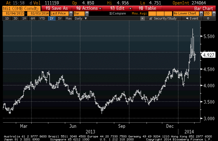
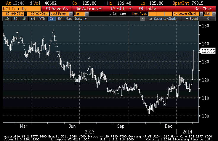
Exhibit two is Coffee (see chart, source Bloomberg), where drought in Brazil has lifted coffee prices 8-9% today and 35% from the five-year lows set in November. There’s an awful lot of coffee in Brazil, I understand, but there may be less this year.
In my view, stocks remain very expensive even after this quick 5.75% loss (-2.3% today). Obviously, less so! Commodities have outperformed stocks by basically remaining unchanged, but remain very cheap. Bonds have rallied, as money has shifted from stocks to bonds. This is fine, except that 10-year notes at 2.57% with median inflation at 2.1% and rising is not a position to own, only to rent. The question is, when investors decide that it’s time to take their profits in bonds, do they go to cash, back to equities, or to commodities? If you are one of the people mulling this very question, I have another chart to show you. It is the simple ratio of the S&P to the DJ-UBS (source: Bloomberg).

I think that makes where I stand fairly clear. If both stocks and commodities represent ownership in real property, and both have roughly the same long-term historical returns (according to Gorton & Rouwenhorst), then the ratio of current prices should be a coarse (and I stress coarse) relative-value indicator, right?
But let’s shift from the long-view lens back to the short view, now that a retreating Fed makes this more worthwhile. I am not sanguine about the outlook for stocks, obviously (and here’s one for the technicians: for the first time in years, exchange volume in January was higher than last year’s January volume). However, bulls may get a brief reprieve later this week when the Employment Report is released. Yes, it’s another January data point that ought to be ignored or at least averaged with December’s figure. And that’s the point here. Last month’s Employment Report showed only a 74k rise in Nonfarm Payrolls. That weakness was likely due to the fact that the seasonal adjustments (which dwarf the net number of jobs, in December and January) assumed more year-end and holiday hiring than actually occurred. But the flip side of that is that if fewer were hired in December, it probably means fewer were fired in January. Thus, I expect that the 185k consensus guess for new jobs is likely to be too low and we will have a bullish surprise on Friday. That might help the bulls get a foothold…but it is a long three trading days away.