Archive
Seasonal Adjustment and Springtime Inflation
On Tuesday, the Bureau of Labor Statistics will report the CPI index (along with endless other data) for March. Currently, the consensus estimate calls for +0.1%, and +0.1% ex-food-and-energy. This release will generate the usual irritation among conspiracy theorists who believe the government is monkeying with the inflation numbers for their own nefarious ends. I have previously explained why it is that inflation tends to feel faster than it actually is, and I have regularly debunked the claim by certain conspiracy-minded individuals that inflation has been running about 5% faster than the “official” mark since the early 1980s.[1] However, today I want to point out another reason that right now we will have a tendency to recognize that inflation is not rising at 0.1% per month, and that involves the issue of seasonal adjustment.
The point of seasonal adjustment is to remove regular, cyclical influences so that we can see if the underlying trend is doing anything interesting. Consider temperature. Is it particularly helpful for you as a meteorologist to know that the average temperature in April has been higher than the average temperature in January? Of course not, because we know that April is always warmer than January. Hence, with temperature we ask whether April was warmer than a typical April.
Closer to the point, consider gasoline. The national average gasoline price has risen in 61 of the last 66 days, as the chart below (Source: Bloomberg) illustrates.

Yes, if you’re noticing that gasoline prices have been rising you are not alone, and it is not an illusion! But should we worry about this rapid acceleration in gasoline? Does this necessarily presage spiraling inflation? Bloomberg offers an easy way to look at the seasonality question (we formerly had to do this by hand). The following chart shows the change in gasoline prices (in cents) since December 31st for each of the last four years, for the 5-year average (the heavy, yellow line) and for this year (the white line).

You can see that the rise from late January into April is not only normal, but the scale of the increase is just about the same this year as for the prior four years – what was unusual was that prices didn’t start rising until February.
Now, this particular seasonal pattern is important to inflation-watchers and TIPS traders because the volatility of gasoline prices is an important part of volatility in the overall price dynamic. In fact, it is important enough that if I take the average line from the gasoline chart above and overlay it with the official CPI seasonal adjustment factors from the BLS, you can see the ghost of the former in the latter (see chart, source Enduring Investments).

Now, the seasonal adjustment factors for the CPI as a whole are less dramatic (closer to 1, in the chart above, if you look at the right-hand scale compared to the left-hand scale) than are the factors for gasoline, but that makes sense since gasoline is only a small part – albeit a really important part – of the consumption basket of the average consumer. And the BLS methodology is a lot more sophisticated than the simple average-of-the-last-x-years approach I have taken here. But this should be good enough for you to grasp the intuition.
What this means is that when the BLS reports tomorrow that gasoline prices didn’t add anything to overall inflation in March, you should recognize that that does not mean that gasoline prices didn’t rise in March. It means that they didn’t rise significantly more or less than the average factor the BLS is assuming. Most of all, it doesn’t mean that the BLS is monkeying with the data to make it seem lower. The product of the seasonal adjustment factors is (approximately) 1.0, which means that what the BLS takes away in the springtime, to report inflation numbers lower than would be anticipated given a raw sampling of store prices, they will give back in the late fall and winter, and report inflation numbers higher than would be anticipated given a cursory glance of store shelves. What is left, hopefully, is a more-unbiased view of what is happening with the price level generally.
Where you can see this effect most clearly is in the difference between the seasonally-adjusted number that is reported and the rise in the NSA figure that is used to adjust inflation-indexed bonds like TIPS. While the consensus calls for a +0.1% rise in headline CPI, the forecasts expect the NSA CPI (the price level) to rise from 234.781 to 236.017, which is a rise of +0.5%. So yes – if it feels like inflation is suddenly rising at a 6% annualized pace, that is because it is. But fear not, because that will slow down later in the year. Probably.
[1] The summary of that argument: we know that wages have increased roughly 142% since the early 1980s – average hourly earnings was $8.45 in April 1984 and is $20.47 now, and this “feels about right” to most people. Against this, the CPI has risen 128%, meaning that our standard of living “should” have improved a little bit since then, but not much (although any individual may be doing somewhat better or worse). But if prices instead of rising at 2.8%/year had risen at 7.8%/year, prices in aggregate would have risen 851% versus a 142% increase in wages, and we would all be living in absolute squalor compared to our parents. This is offensively and obviously wrong.
Do Data Matter Again?
In normal times, by which I mean before actions of the Federal Reserve became the only data point that mattered, the monthly ISM report was important because it was the first broad-based look at the most-recent month’s data.
Now that the Fed’s taper has begun – right about the time that the uncertainty of the impact of Obamacare implementation was at its peak, curiously enough – the ISM data seems to have taken on importance once again. I must say that I did not see that coming, but since guessing at the Fed’s actions every six weeks and ignoring all intervening data was so all-fired boring, I suppose I am glad for it. Looking at economic data and trying to figure out what is happening in the economy is more like analysis and less like being on The People’s Court trying to rule on a he-said, she-said case where the hes and shes are Federal Reserve officials. And that is welcome.
That being said, the January ISM report isn’t one I would necessarily place at the head of the class of importance, mainly because it is January. Still, it was an interesting one with the Manufacturing PMI dropping 5.2 points, matching the steepest decline since October 2008. The New Orders subindex plunged to 51.2 versus 64.4 last month, and Employment and Production indices also declined significantly. It’s clearly bad news, but I would be careful ascribing too much value to any January number – especially one based on a survey.
Also standing out in the report was the increase in the (non-seasonally adjusted) “Prices Paid” subcomponent, to 60.5. the jump was initially somewhat surprising to me because as the chart below – which I tweeted shortly after the number – seems to show, we have had a jump in Prices Paid that is not being driven by a concomitant jump in gasoline prices – and Prices Paid is predominantly driven by gasoline prices.

However, as I noted in that tweet, the Prices Paid index is measuring the rate of change of prices (the question posed to purchasing managers is whether prices are increasing faster, slower, or about the same as the month before), so just eyeballing it may not be enough. The chart below plots the 3-month change in gasoline prices versus the ISM Prices Paid subindex. What you can see is that the first chart is slightly deceiving. The change in gasoline prices has accelerated – back to zero after having been declining since February of 2013. And “unchanged” gasoline prices is roughly consistent with about 60 on the Prices Paid indicator. So, this isn’t as much of a surprise as it looked like, initially.

Still, whether it was the data or because of continued concern about emerging markets (though the S&P fell nearly as far in percentage terms as did the EEM today, leaving open the question of which is following which), stocks didn’t enter February with much cheer. But never fear, I am sure there is “cash on the sidelines” that will come charging to the rescue soon.
The past week has given a great illustration of one important difference between the price behavior of equities and commodities. That is that stocks are negatively skewed and positively kurtotic, while commodities are positively skewed and negatively kurtotic. That is to say, in layman’s terms, that stocks tend to crash downward, while commodities more frequently crash upwards. This happens because what tends to drive severe movements in commodities is shortages, where the short-term supply curve becomes basically vertical so that any increase in demand pushes up prices sharply. Exhibit one is Natural Gas (see chart, source Bloomberg), where inventories were above normal as recently as October and now are the lowest in a decade.
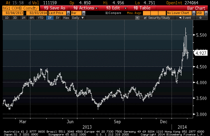
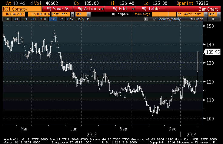
Exhibit two is Coffee (see chart, source Bloomberg), where drought in Brazil has lifted coffee prices 8-9% today and 35% from the five-year lows set in November. There’s an awful lot of coffee in Brazil, I understand, but there may be less this year.
In my view, stocks remain very expensive even after this quick 5.75% loss (-2.3% today). Obviously, less so! Commodities have outperformed stocks by basically remaining unchanged, but remain very cheap. Bonds have rallied, as money has shifted from stocks to bonds. This is fine, except that 10-year notes at 2.57% with median inflation at 2.1% and rising is not a position to own, only to rent. The question is, when investors decide that it’s time to take their profits in bonds, do they go to cash, back to equities, or to commodities? If you are one of the people mulling this very question, I have another chart to show you. It is the simple ratio of the S&P to the DJ-UBS (source: Bloomberg).

I think that makes where I stand fairly clear. If both stocks and commodities represent ownership in real property, and both have roughly the same long-term historical returns (according to Gorton & Rouwenhorst), then the ratio of current prices should be a coarse (and I stress coarse) relative-value indicator, right?
But let’s shift from the long-view lens back to the short view, now that a retreating Fed makes this more worthwhile. I am not sanguine about the outlook for stocks, obviously (and here’s one for the technicians: for the first time in years, exchange volume in January was higher than last year’s January volume). However, bulls may get a brief reprieve later this week when the Employment Report is released. Yes, it’s another January data point that ought to be ignored or at least averaged with December’s figure. And that’s the point here. Last month’s Employment Report showed only a 74k rise in Nonfarm Payrolls. That weakness was likely due to the fact that the seasonal adjustments (which dwarf the net number of jobs, in December and January) assumed more year-end and holiday hiring than actually occurred. But the flip side of that is that if fewer were hired in December, it probably means fewer were fired in January. Thus, I expect that the 185k consensus guess for new jobs is likely to be too low and we will have a bullish surprise on Friday. That might help the bulls get a foothold…but it is a long three trading days away.
RE-BLOG: My Two Cents On Nonsense
Note: The following blog post originally appeared on March 13, 2012 and is part of a continuing year-end ‘best of’ series, calling up old posts that some readers may have not seen before. I have removed some of the references to then-current market movements and otherwise cut the article down to the interesting bits. You can read the original post here.
I had not planned to write tonight, but there was too much that happened today, and too much that is likely to be misunderstood and misinterpreted. Not, necessarily, that what follows will help that situation, but I felt a need to add my two cents (which, don’t forget, is two cents more than you paid for it, so you’re two cents ahead no matter what).
…
And this takes us to the final, and most interesting, event of the day. It began when JP Morgan trumpeted a nickel increase in its dividend and a $15bln stock buyback. My first reaction was that this is not a phenomenon you tend to see in bear markets or early in bull markets, but rather in mature bull markets. Firms have a marked tendency to buy stock back when it’s expensive, not when it’s cheap, and an even more marked tendency to announce a buyback when they want a stock price supported. An announcement of a buyback program is not a promise to buy, and often no stock is actually bought. It is only an announcement of an intention to buy, which the firm need not honor. And this is a bank. Anyone with even a passing knowledge of Basel III knows that banks are going to be raising Tier 1 capital – especially in Europe, but in the U.S. as well – for a while. There is no way that banks, whether or not they feel overcapitalized by 2000s standards or not, are actually going to be buying back large chunks of stock. So my second thought was “wow, are they actually going to scare up the stock so that they can sell more? That can’t be legal.”
Moments later, we found out what the real point was. It seems the Fed had completed the stress tests and informed all of the banks a couple of days ago (it’s unclear when), and were going to make a public announcement on Thursday.
Sidebar: This is why people think that Wall Street is run by a bunch of crooks. The moment that banks had this information, they were in possession of material nonpublic information that should have been immediately released if the banks were going to prepare any offering in their own securities. Whether the Fed says they can or can’t, the information must be released. And here is one positive checkmark for JPM: they announced that the Fed had approved their buyback and dividend plans in the context of passing the stress test. But thanks a lot, Fed, for putting banks in the awkward position of having to choose between ticking off the Fed, or ticking off the SEC. And great job, bank managements, for mostly choosing to keep a secret that makes you look like a member of an elite club/secret cabal, rather than choosing to release the information. Good job, JPM. (But I’m not done with you yet).
So, the Fed decided that they needed to immediately release the stress tests results, early. Well, not immediately; they decided to wait until 4:30ET, after the markets closed to retail investors, because golly it would be too much to ask to let people get the information when the markets were open. Sidebar: this is why people think the Fed is run by a bunch of crooks who are in bed with the Wall Street crooks. Who is running the PR at the Fed?
Bank of America bravely followed JP Morgan through the breach to announce that they, too, had passed the stress tests. US Bank announced a share buyback, dividend hike, and a passing stress test grade. (Quick quiz, with the answer to be given later: are the banks announcing share buybacks likely to be the strong banks or the weak banks with respect to the stress test? Write down your answer and we’ll come back to it.) Volume on the exchange spiked, with better than 50% of the day’s volume coming in the last hour of trading, and almost 30% in the last 7 minutes before the bell.
The stress test results were released, and four financials failed: Ally Financial, SunTrust, MetLife, and Citigroup. Well, good luck raising capital now, Citi. (Important Disclosure: I am expressing no opinion on any of these individual equities or any of the other securities of these companies. I neither own, nor intend to buy, nor sell, any of their securities in the near future. My negative opinion on banks generally is well-known, but I do not have any position, positive or negative, on the banking sector, nor do I plan to make such a sector bet in the near future).
Now, initially the press coverage listed three of the four firms that failed, but not MetLife, so I was forced to go skimming through the “CCAR” report to find the fourth one. If I hadn’t done that, I almost certainly would not have noticed Figure 7, which is reproduced below for your easy reference.

You can see the four banks which failed are the shortest bars on this chart, so you can easily pick out Ally, Sun Trust, Citi, and with a straightedge you can conclude that MetLife is the fourth. But then it’s a really close race for fifth-worst with KeyCorp, US Bank, Morgan Stanley, and… JP Morgan. It must be great to be JP Morgan. When you wonder why they drew the line where they did, you might imagine the counterfactual situation where JP Morgan came out on the other side of the line. JP Morgan, which was the Fed before there was a Fed, and will probably be the Fed after the Fed is gone. JP Morgan, which the Fed called on multiple times during the crisis to save the world (for example, by serving as a lending conduit to entities which the Fed could not directly lend to). I wonder what the odds are that JP Morgan would be allowed to fail? I’m going to speculate: zero. And that’s why the line is where it is.
Now, it is interesting to see which banks scored very highly. They’re banks that don’t have exposure to as many of the blow-up areas that were tested by the Fed (which is not to say they aren’t exposed to blow-ups: just that they’re not the ones that the Fed tested).
By the way, don’t let anyone tell you “well, this was a really severe test, and so these banks are actually in really good shape.” Yes, this test is much more stringent than the cotton-candy version the European regulators put their banks through last year, but it only measures expected reactions to broad macroeconomic events, and not the interaction of the entire system under such a stressful scenario. That reaction is non-linear, and it is very difficult to model. Moreover, we can’t model the unknown: a rogue trader, a $65billion Ponzi scheme, a tsunami and nuclear meltdown in Japan, a terrorist attack in New York. As Roseanne Roseannadanna used to say, “It’s always something.”
When all is said and done, are we better off that the Fed did these stress tests? I suppose the answer is yes, if only because it means the regulators actually took some interest in looking at these businesses and their risks. But if it creates a false sense of comfort, or reverses the trend towards greater capital cushions, then probably not. Time will tell.
I am about ranted out for today, and there are no important economic releases tomorrow. It will be interesting to see how the spin machines work on Citigroup and JP Morgan, which are after all separated by only a thin line on Figure 7, but by a huge gulf in reputation.
———
You can follow me @inflation_guy, or subscribe to receive these articles by email here.
My Two Cents On Nonsense
I had not planned to write tonight, but there was too much that happened today, and too much that is likely to be misunderstood and misinterpreted. Not, necessarily, that what follows will help that situation, but I felt a need to add my two cents (which, don’t forget, is two cents more than you paid for it, so you’re two cents ahead no matter what).
Let us start with the good news, however. Retail Sales exceeded expectations, with +0.9% ex-autos and even +0.6% ex-autos and gasoline (yes, higher gasoline prices show up as higher retail sales), with upward revisions to both series last month. Clearly, retail sales are doing better than expected and are a bright spot; as I’ve said for a while, the trick here isn’t figuring out that the economy is improving, but figuring out whether that improvement will be consistent and can be built on. The jury is out on that one, and I will say that I am not exceedingly optimistic. But that is not today’s trade!
The Fed met today, and the market actually took a statement that was nearly empty of significance and wrung drama out of it. Stocks leapt, because while the Federal Reserve acknowledged that the economy was improving there was no sign of any wavering in the resolve to provide easy money for the next couple of years. They were correct to do so (based on that interpretation), although the curious thing was that commodities rose only sluggishly, and precious metals actually dropped 1% or so. That’s confusing because easy money for a couple of years ought to have the most direct effect on the prices of commodities. The dollar strengthened, though, partly because of the strong economic data, and this blunted some of the natural upward pressure in this circumstance.
Bonds sold off, also correctly, on the lack of any sign from the Fed that QE3 is being considered in any form. The question is, when the Fed is done with Operation Twist II, who will be buying the 10y note at 2%? China recently announced a large trade deficit on the basis of declining exports; this is probably a one-off but it raises the question of whose surplus will be dedicated to buying Treasuries (obviously, there is a net surplus somewhere; every country can’t run a deficit! We just don’t know whether the other surplus countries will prefer to buy Treasuries). Accordingly, the 10y note yield rose to 2.125%, up 9bps to the highest yield since the false breakout in late October last year (see Chart). While it is probably early to say that this will lead to a big rise in rates, every trader knows the old saw that the market will find the greatest pain, and right now there is a holder of trillions of dollars of long Treasury securities who has no way to sell them and is growing tired of supporting the market at these yields.

The rise in yields was predominantly due to a rise in inflation expectations; indeed, over the last week 10-year yields have risen 18bps; 16 of them have come from an increase in 10-year inflation expectations and only 2 of them from a rise in 10-year real yields. See the chart below of 10-year inflation breakevens, which are back at the highest levels since August.

This is significant, especially as it extends, because the Fed continues to profess that one reason they are not concerned about the rise in core inflation is because “inflation expectations are contained” and this is less and less true, whether you’re looking at market indications or listening to retail customers (whose perceptions of inflation turn out to be driven quite significantly by fluctuations in gasoline prices). Today retail gasoline prices reached $3.80 nationally, and given the usual lags in wholesale-to-retail transmission, it appears that record prices above $4/gallon are likely in the next month or so. Whatever the implication for economic growth (negative, but probably not as bad as the first time we saw those prices) and core inflation (no real effect), the effect on inflation expectations will be large and not helpful for either the Fed or a Treasury which still has a few trillions in securities to unload this year.
And this takes us to the final, and most interesting, event of the day. It began when JP Morgan trumpeted a nickel increase in its dividend and a $15bln stock buyback. My first reaction was that this is not a phenomenon you tend to see in bear markets or early in bull markets, but rather in mature bull markets. Firms have a marked tendency to buy stock back when it’s expensive, not when it’s cheap, and an even more marked tendency to announce a buyback when they want a stock price supported. An announcement of a buyback program is not a promise to buy, and often no stock is actually bought. It is only an announcement of an intention to buy, which the firm need not honor. And this is a bank. Anyone with even a passing knowledge of Basel III knows that banks are going to be raising Tier 1 capital – especially in Europe, but in the U.S. as well – for a while. There is no way that banks, whether or not they feel overcapitalized by 2000s standards or not, are actually going to be buying back large chunks of stock. So my second thought was “wow, are they actually going to scare up the stock so that they can sell more? That can’t be legal.”
Moments later, we found out what the real point was. It seems the Fed had completed the stress tests and informed all of the banks a couple of days ago (it’s unclear when), and were going to make a public announcement on Thursday.
Sidebar: This is why people think that Wall Street is run by a bunch of crooks. The moment that banks had this information, they were in possession of material nonpublic information that should have been immediately released if the banks were going to prepare any offering in their own securities. Whether the Fed says they can or can’t, the information must be released. And here is one positive checkmark for JPM: they announced that the Fed had approved their buyback and dividend plans in the context of passing the stress test. But thanks a lot, Fed, for putting banks in the awkward position of having to choose between ticking off the Fed, or ticking off the SEC. And great job, bank managements, for mostly choosing to keep a secret that makes you look like a member of an elite club/secret cabal, rather than choosing to release the information. Good job, JPM. (But I’m not done with you yet).
So, the Fed decided that they needed to immediately release the stress tests results, early. Well, not immediately; they decided to wait until 4:30ET, after the markets closed to retail investors, because golly it would be too much to ask to let people get the information when the markets were open. Sidebar: this is why people think the Fed is run by a bunch of crooks who are in bed with the Wall Street crooks. Who is running the PR at the Fed?
Bank of America bravely followed JP Morgan through the breach to announce that they, too, had passed the stress tests. US Bank announced a share buyback, dividend hike, and a passing stress test grade. (Quick quiz, with the answer to be given later: are the banks announcing share buybacks likely to be the strong banks or the weak banks with respect to the stress test? Write down your answer and we’ll come back to it.) Volume on the exchange spiked, with better than 50% of the day’s volume coming in the last hour of trading, and almost 30% in the last 7 minutes before the bell.
The stress test results were released, and four financials failed: Ally Financial, SunTrust, MetLife, and Citigroup. Well, good luck raising capital now, Citi. (Important Disclosure: I am expressing no opinion on any of these individual equities or any of the other securities of these companies. I neither own, nor intend to buy, nor sell, any of their securities in the near future. My negative opinion on banks generally is well-known, but I do not have any position, positive or negative, on the banking sector, nor do I plan to make such a sector bet in the near future).
Now, initially the press coverage listed three of the four firms that failed, but not MetLife, so I was forced to go skimming through the “CCAR” report to find the fourth one. If I hadn’t done that, I almost certainly would not have noticed Figure 7, which is reproduced below for your easy reference.
You can see the four banks which failed are the shortest bars on this chart, so you can easily pick out Ally, Sun Trust, Citi, and with a straightedge you can conclude that MetLife is the fourth. But then it’s a really close race for fifth-worst with KeyCorp, US Bank, Morgan Stanley, and… JP Morgan. It must be great to be JP Morgan. When you wonder why they drew the line where they did, you might imagine the counterfactual situation where JP Morgan came out on the other side of the line. JP Morgan, which was the Fed before there was a Fed, and will probably be the Fed after the Fed is gone. JP Morgan, which the Fed called on multiple times during the crisis to save the world (for example, by serving as a lending conduit to entities which the Fed could not directly lend to). I wonder what the odds are that JP Morgan would be allowed to fail? I’m going to speculate: zero. And that’s why the line is where it is.
Now, it is interesting to see which banks scored very highly. They’re banks that don’t have exposure to as many of the blow-up areas that were tested by the Fed (which is not to say they aren’t exposed to blow-ups: just that they’re not the ones that the Fed tested).
By the way, don’t let anyone tell you “well, this was a really severe test, and so these banks are actually in really good shape.” Yes, this test is much more stringent than the cotton-candy version the European regulators put their banks through last year, but it only measures expected reactions to broad macroeconomic events, and not the interaction of the entire system under such a stressful scenario. That reaction is non-linear, and it is very difficult to model. Moreover, we can’t model the unknown: a rogue trader, a $65billion Ponzi scheme, a tsunami and nuclear meltdown in Japan, a terrorist attack in New York. As Roseanne Roseannadanna used to say, “It’s always something.”
When all is said and done, are we better off that the Fed did these stress tests? I suppose the answer is yes, if only because it means the regulators actually took some interest in looking at these businesses and their risks. But if it creates a false sense of comfort, or reverses the trend towards greater capital cushions, then probably not. Time will tell.
I am about ranted out for today, and there are no important economic releases tomorrow. It will be interesting to see how the spin machines work on Citigroup and JP Morgan, which are after all separated by only a thin line on Figure 7, but by a huge gulf in reputation.