Archive
Risky Assumptions and Assumption of Risk
It is a valuable lesson, but no matter how often taught it seems never to be learnt. Assumptions are dangerous. Overconfidence is the most common, and from the point of view of an investor the most perilous, cognitive error. You have all heard about the experiments: a person is asked to estimate the weight of an elephant, and then asked to put a range around that estimate so that there is a 90% chance that the true weight is within that range. The range is always too tight, by orders of magnitude. We do not know what we think we know. Or, as the old saying goes “it isn’t that he knows so little; it’s that he knows so much that just isn’t so.”
Today this bias was on full display as Egyptian state television announced that President Mubarak would address the nation this evening. Celebrations were widespread as the rumor passed that he would be resigning his office. It may be that these rumors were passed intentionally with the purpose of embarrassing certain other leaders who tried to “scoop” Mubarak by intoning something to the effect that “we are witnessing history being made in Egypt today.”
When still-President Mubarak appeared before the cameras, after several hours of letting the world media whip itself into a fever pitch, it was to tell the rest of the world to mind its own business. He says he will leave in September. Exile? Uh, no: “I will die and be buried in Egypt.”
Whoops!
Now, there was no reason that anyone needed to put a high confidence on what the President (Egypt’s, that is) was going to say. Just wait and see. When we feel that we need to act on our anticipations of events, it is important to correct for our overconfidence. (This is one reason that having a “margin of safety” is such a key investing concept).
The market effects are hard to read, because the announcement came just before the end of trading, but appear to be muted. Oil prices rallied slightly; the S&P is down in the evening session as of this writing and bonds are unchanged from the close.
Earlier, however, bonds traded weak and the new 10y note’s yield rose back to 3.70%. The long bond auction went fine (with that much duration, the hurdle must be pretty low of course) but dealers tried to flip the Dutch treat and the market traded down in the late session after struggling up to nearly unchanged.
Some of the pressure on bonds may have been related to the 383k print on Initial Claims, but this again is very likely to be weather-related. I guess I jumped the gun on expecting the number’s volatility to be declining! Predictably, dealers who have been bullish trumpeted the “best Claims number in several years” as “continuing the downtrend in Claims.” The chart below shows the last quarters’ worth of Initial Claims. If you can see a downtrend in that, I’m impressed.
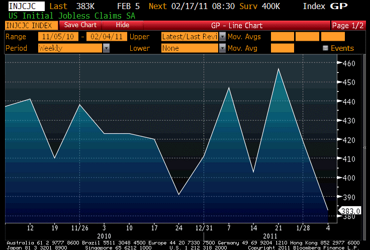
It takes creativity to see a "continuing downtrend" in claims.
One thing that the strong number this week does, especially when combined with the overconfidence bias, is to make disappointment easier next week. You can see at the top of the chart that the consensus forecast for next week’s number is 400k; only in the week of 12/24 (and this week) has anything lower than 400k printed, so this seems very aggressive – especially since half of the country was shut down for portions of last week and it would be remarkable indeed if the greatest snowstorm in 40 years didn’t keep some filers away.
In addition to the unrest in Egypt there was unrest at the Fed. Governor Kevin Warsh, who had been openly critical of the Fed’s decision to implement QE2, resigned his post after five years on the FOMC. While this supposedly has nothing to do with policy disagreements, there is room for skepticism on that score.
Speaking of the Fed, I had mentioned recently the speech that Brian Sack, head of the NY Fed’s Open Market Desk, was scheduled to make last night. Mr. Sack’s job as head of the System Open Market Account (SOMA) is to execute the monetary policy directives of the FOMC through open-market operations (system repos and repurchases, asset purchases and sales), and his topic last night was the implementation of the Fed’s Asset Purchase program. Mr. Sack is definitely a company man and would not be long in his role if he did not hew to the party line. Although the role is very important, there would be very low tolerance if he were to say anything important that wasn’t a more or less consensus view at the Fed, or at least shared by Chairman Bernanke (unlike with a regional Fed President, which have at least nominal autonomy). So it is useful to read the speech at least as an indication about what is “assumed” to be true at the Fed. Below are a few snippets of the speech and some of my reactions.
“The flexibility of this procedure can be seen in the patterns of our purchases over time. Earlier in the program, we ended up purchasing a large concentration of off-the-run securities, including bonds that were issued 15 to 25 years ago. Given their age, these bonds are generally less liquid and less valuable to market participants, and hence dealers were willing to sell them to us at cheaper prices relative to other securities. At more recent operations, however, we have received a greater share of offers to sell more recently issued Treasury securities, including on-the-run issues, and our purchases have shifted accordingly. This suggests that older, off-the-run securities may have become harder for dealers to obtain, and that they have increasingly found it appealing to offer more recent issues, which are available in greater supply and are generally more liquid. Our procedure allows this shift to take place, as long as the more recent issues are offered to us on generally favorable terms.”
This is a fascinating observation to me as a former fixed-income relative-value strategist. There are many opinions about the efficacy of the Fed’s asset purchase program, ranging from “no effect at all” to “the only thing keeping rates low. This snippet indicates that the Fed is having a fairly large effect. We can’t measure how the purchases have affected interest rates, because we don’t know where rates would have been if the Fed had not been buying. But this observation implies that with only $220bln, the Fedwere able to remove one of the most persistent arbs in the fixed-income markets. For as long as I have been in the bond market (more than 20 years), one dependable truth has been that off-the-run Treasury securities almost always trade cheap to near-the-run and on-the-run securities. On-the-run securities are in high demand for both longs and shorts, and frequently trade very special in the financing (repo) market. This is much less true for off-the-runs. The effect is pronounced enough normally that in order to create a good smooth model of the yield curve one typically needs to adjust the on-the-runs or ignore them. With less than half of their bankroll, Sack says the Fed eliminated most of this arb. What about the next 220bln?
“Since early November, one of the notable developments in financial markets has been the sharp increase in longer-term interest rates. At first glance, this change may seem at odds with the portfolio balance channel. However, it is important to understand the factors that led to the increase in interest rates in the current circumstances.
The upward movement in longer-term interest rates in large part reflects the greater optimism among investors about the outlook for economic growth. Investors revised up their baseline forecasts for the economy and reduced the perceived downside risks that they see around that outlook. This shift in the outlook led the market to price in the possibility of earlier increases in short-term interest rates and to scale back the size of asset purchases that they expect from the Federal Reserve. Both of those developments contributed to the significant rise in yields.”
The flexibility of the Fed’s theory as it concerns their asset purchases is somewhat disturbing. We are now told that the Fed expected rates to rise because of “greater optimism among investors about the optimism for economic growth.” I remember from Logic class back in college this simple admonition (and little else): if a statement is not falsifiable, it is false. If it is true that lower rates prove the efficacy of the Fed’s program (which is what they originally told us, that they wanted to hold rates down and in fact move them lower) and it is also true that higher rates are consistent with a successful program, then what would indicate a failed program? The answer is: none. The program is successful by assumption.
“In contrast, the rise in yields does not appear to be driven by the concerns expressed by some that the asset purchase program would unleash a considerable rise in U.S. inflation and inflation expectations to levels well above those consistent with the Federal Reserve’s mandate. Such an outcome would be detrimental to the economic outlook, leading to downward pressure on risky asset prices and a substantial weakening in the value of the dollar. However, what has taken place in U.S. markets to date does not resemble this outcome. Indeed, over the period since the November FOMC meeting, longer-term inflation expectations have remained at levels consistent with the Federal Reserve’s mandate, risky asset prices have advanced and the dollar has held its ground.”
The dollar has held its ground because everyone is monetizing, and Mr. Sack surely knows that there is no reason for the currency to collapse unless the relative supply of dollars, not the absolute supply of dollars, increases relative to other currencies. Longer term (and by this Sack means 5y, 5y forward – he has written about that in the past) inflation expectations have remained “contained,” and this is encouraging but hardly definitive.
Finally, why is it good that “risky asset prices have advanced”? He’s asserting that we want risky assets to be expensive, and therefore riskier? I thought the whole source of this problem was that risky assets were too expensive, and then when they re-set suddenly many institutions were undercapitalized?
All in all, I was very disappointed by this speech for Mr. Sack. I have come to expect very little from Fed mouthpieces, but since Mr. Sack is a relatively new addition to the institution I had hoped he wouldn’t allow himself to parrot this internal party-line nonsense. It is discouraging.
.
I said yesterday that I would write today about the conditions in the U.S. inflation markets. I am postponing that discussion until tomorrow. I think the biggest mystery about Friday is how the markets react (a) to Mubarak’s refusal to exit in short order and (more interesting) the question of how investors want to lean going home over the weekend. It isn’t clear for me whether Mubarak’s departure would be bullish or bearish for bonds (on the one hand, it means more short-term uncertainty in exchange for less long-term uncertainty, but it probably depends on how the transition of power occurs. Since he has declared that he isn’t going anywhere, and has passed up several options to gracefully exit the stage (by seeking “extended medical care” in Germany, for example), any change of government in the near-term would likely involve some degree of coercion/violence and at least a brief period of total chaos before it becomes clear who exactly is in charge. All I know is that somehow it will be bullish for equities no matter what happens (we are, after all, in a manic phase).
The economic data is second-tier with Trade at 8:30ET and Michigan Sentiment (Consensus: 75.0 vs 74.2 last) just before 10am.
Shooting The Messenger
The news was a bit more varied and interesting on Wednesday; bonds were higher and stocks lower but it is hard to attribute that to any one piece of news.
For a change, not all of the interesting news was overseas but much of it was. There were reports that protests in Egypt were “regaining momentum,” which if true is certainly unusual. Protests that flare up and burn out are less risky to a regime – as long as the “flare up” isn’t so high that it leads to a sudden transition of power – than ones that have a steady burn. Maybe we were too quick to push this issue to the back page just yet.
More concrete were two inflation stories. I’m seeing more and more inflation stories globally. This is also a change of tenor; until now it had seemed as if the stories were mostly “one-offs” but if there is one thing the unrest in the Middle East has done it is to draw journalists’ (and policymakers’) attention to the issue of food commodity price increases. In the UK, there was a report from the British Retail Consortium that food prices were +4.6% year-on-year, the fastest pace since the middle of 2009. The official UK price data isn’t due out until next Tuesday, but the inflation market is showing strains. As the chart below (Source: Enduring Investments) shows, 5y inflation swaps are on the verge of performing the rare feat of crossing above the 5y, 5y forward inflation rate.

UK 5y inflation about to cross above 5y, 5y forward inflation
That is, traders are expecting inflation to be lower from 5-10 years from now than they think it will be for the next 5 years. This last happened in the U.S. in the summer of 2008, when high energy prices combined with a slowing economy led investors to expect that the gasoline spike would not be repeated: $70 to $140 oil is one thing, but to expect headline inflation to continue to be as far above core inflation as it was required you to expect a move from $140 to $280 since inflation is a rate of change, not a level. Of course, that didn’t happen.
In this case, however, it is less clear that the arrow of growth is clearly pointed downward, at least for a year or two forward as it was in mid-2008. And recognize (look at the chart) that both of these measures are around 3.5%, well above the BOE’s 2% inflation target. The market is almost urging the BOE to tighten policy, although there seems little chance of that at present.
Even more interesting is the news out of Argentina. Actually, the story was out last Friday in the Financial Times and I missed it. A summary of the story, and a link to the FT if you subscribe, is available here.Today, Bloomberg ran a similar headline, which is why I saw it. To summarize: independent measures of Argentina’s inflation (such as that produced by the Billion Prices Project at MIT, about which I wrote just last week – and pointed out the Argentine discrepancy) show inflation running at about three times the government’s measure. The Argentine government, in an attempt to bully these independent surveys into saying inflation is closer to the 10% they claim, threatened them with a large fine if they did not produce their methods and, more chillingly, their sources within 24 hours. The way inflation is typically measured, such as by the BLS, involves flesh-and-blood human beings walking around and writing down prices in a systematic way. Argentina is making a thinly-veiled threat against the people who are doing this.
An important point, though, is that everyone knows the Argentine numbers are cooked. Arm’s-length calculations from these agencies and the BPP@MIT show much higher inflation. And the inflation-linked bond markets also recognize the lower quality of the index that Argentine bonds are linked to compared to, say, Chile’s or Colombia’s. Argentine real yields are 7.6% while Chile’s are 2.7% and Colombia’s 3.3%. Investors are compensating for the artificially-low inflation compensation that they get in Argentina by insisting on a higher real rate (even so, investors clearly are hoping that there is some chance the government will start reporting the correct figure rather than continuing to prevaricate for the next couple of decades).
All of this is interesting to an inflation guy, and I suppose the point is that these inflation stories are increasingly of interest to non-inflation guys. But I don’t like the idea of shooting the messenger, because in some sense I am one of those messengers.
The fact that there is a percolating global inflation is a surprise to no one except, perhaps, Ben Bernanke. The Chairman appeared before a House Budget Committee hearing today and, despite the increasing alarm about how inflation metrics appear to have bottomed virtually everywhere and commodities-based indices are flying, responded to a question about a future QE3 by saying that if the economy is still stagnant in June when QE2 is done, “we would have to think about additional measures.”
This is wrong on a bunch of levels, but let me mention just two. First, the answer ignores the Fed’s dual mandate and focuses on just the growth mandate. The reason that QE2 could be plausibly enacted wasn’t that growth was slow but also that inflation was low and still declining (although you didn’t need to be a great forecaster to see than in Q4 the year-on-year measures would begin to rise at least from base effects). That latter point is no longer true, and so any consideration of a QE3 should involve the question of growth but also the question of whether inflation and the inflation outlook is acceptable. But the second, and perhaps more grating error is that if the economy is still stagnant after QE1 and QE2, a rational person would say ‘hmmm, this doesn’t seem to be working’ and look for something else to try. The Fed these days is anything but rational, though. The Chairman had the temerity to drag out the Fed’s estimate that monetary policy had ‘saved or created’ 3 million jobs. I still can’t figure out if he is taking credit for the 3 million or so that the President and Congress saved, or if he’s talking about an incremental 3 million jobs.
In my opinion, concern about the stewardship of the fiscal and monetary policies of this country and most others is rational, warranted, and overdue. That creates many risks, but the clearest one I think is in inflation – global as well as local.
I will talk tomorrow about the state of the inflation market in the U.S.. The only interesting data of the week, Initial Claims (Consensus: 410k from 415k) is also due to be released. Claims should be starting to calm down after the crazy seasonal adjustment issues that are normal this time of year but that this year were even more severe. If there are going to be downward economic surprises this week, it comes down to this report because that’s just about all there is!
The Treasury will also seek to sell $16bln long bonds, which is an awful lot of duration. Today’s $24bln 10-year notes, however, drew a strong 3.23 bid:cover ratio on the back of a huge indirect bid (often seen as a proxy for foreign central bank interest) of $17bln. Dealers took only $6.7bln for the lowest percentage I’ve ever seen. This means dealers most likely have powder dry and will be able to bid for the long bond with some comfort.
True, yields are the highest they have been in a little while, but people are lining up for 3 5/8% 10-year notes? And 4 ¾% long bonds maybe? I salute these buyers and wish them the best of luck. Maybe Dr. Bernanke will buy them back.
Setting Up For Disappointment
Bonds were knocked lower again on Tuesday, with the 10-year yield reaching 3.72%. The 4.00% level is now clearly in range, and I expect rates to exceed that level within a couple of weeks.
The catalyst for today’s move seems to have been Richmond Fed President Lacker’s remarks indicating his opinion that the Fed should reconsider QE2 and stop the bond purchases. Lacker is a well-established hawk and a non-voter this year, but the market has come to assume that the buying will be there for a while and so there’s no need to head to the exits yet. Talk like this makes investors nervous, because the buying from the Fed is a big reason that yields are as low as they are – and clearly, even that robust buying isn’t enough to keep yields down.
With the rising yields, the Mortgage Bankers Association’s Purchase and Refi indices remain mired at low levels, indicating light volumes of traffic for new mortgage loans and for mortgage refinancing. Since low rates aren’t helping the housing market, the implication is that the main transmission of monetary policy through wealth effect channels is coming through equity market prices (commodity price increases are a net drag, since the U.S. is a net importer of commodities). God help us (or more to the point, God help Bernanke) if the stock market ever falls from its lofty perch.
There seems to be scarce catalysts for that outcome. Or, rather, there seem to be many catalysts, but the fear sense in investors is suddenly inert. There was a very mild shudder in European bond markets today when Anglo Irish Bank said it expects a 2010 pre-tax loss of some €17.6bln (around $24bln). This represents something less than an improvement over the €12.8bln loss for 2009 (actually for 15 months ended in Dec 2009, so it’s not as bad as it sounds). In a sobering reminder of the limits of the resuscitative powers of a steep yield curve, the bank reported net interest income of €700mm, which is nice; however, 43 years of such interest income would be required to replace the €40+bln lost in the last two years. “I’m a doctor, not a miracle-worker, Jim!”
Ango Irish’s Chairman speculated that something on the order of €50bln would be required to clean up the Irish banking system. The good news is that the government has already been offered a €85bln bailout by the EU; the bad news is that the rescue cash is supposed to also tide the Irish government over for a while. And further bad news is that it still isn’t clear whether Ireland will take the cash with the associated strings. No matter; European bonds fell, but no more than U.S. bonds fell today.
There is no economic news of note due tomorrow, but a few items to watch for on the tape. For starters, Chairman Bernanke will be testifying at the House Budget Committee at 10:00ET. More interesting, since we hear from him less, is the speech by SOMA manager Brian Sack at 5:45pm tomorrow evening. The topic is QE2. In the past, Mr. Sack has been very sanguine about the ease with which the FOMC could divest itself of its securities portfolio when the time came. It is extremely unlikely that we will sound any alarm, but at some point he must see the impossibility of quietly selling a trillion dollars worth of securities without pushing interest rates higher (especially since they are already the buyer of last resort apparently). He may also comment on the Desk’s capability to handle more purchases if needed (remember that the $600bln plus reinvestment of mortgage cash flows is thought to be approximately what the Fed said was the maximum flow rate they could handle comfortably). I will be attentive to his speech.
While the market seems immune to any setbacks of more than three days and 2%, I think that we are nearing another low-risk time to buy index puts. Not only are implied volatilities touching low levels not seen since the halcyon days of 2007 (making such a punt comparatively inexpensive), but economists are beginning to get ebullient. Deutsche Bank today raised its 2011 growth forecast a full percentage point to 4.3%, and Joe Lavorgna is usually a wonderful contrary indicator. But he isn’t alone. The economic data has been surprising on the high side, and that usually leads to economists trying to catch up to the data rather than letting the (significantly mean-reverting) data come back to them. The chart below shows the Citi Economic Surprise Index against the S&P 500.
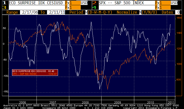
If you've been pleasantly surprised recently, be aware that doesn't usually continue forever.
Note that high readings of this index …which represent periods when the news has been better-than-expected…usually precede declines in the index (although parts of 2009 look like an anomaly). It isn’t that the data suddenly gets bad; it’s that when economists have been surprised this much and the market is running away from them, they tend to reflect the exuberance of the market and ratchet up expectations for future data. Since economic data never improves in a straight line, this sets up the inevitable disappointment. Of course, the effect works the other way as well.
Where Have All The Workers Gone?
Protests in Egypt have temporarily receded somewhat. This was inevitable when the President ignored the protestors’ “Day of Departure,” calling the protestors’ bluff in a bet that they wouldn’t be able to back up the implied threat. As it happened, Mubarak was right about that.
However, as one of the more skilled politicians in the Middle East – and, dictator or not, he certainly is a skilled politician – he is likely to be aware that his alternatives now are to dial up the brutality so as to crush his opposition and retain control, to return to business-as-usual and risk a bloody coup, or to look for a graceful way to exit. Reports circulated today that the man was considering the latter in the form of possibly taking an “extended medical leave in Germany.” German officials denied that any such visit had been requested, but it is an interesting and elegant segue from the current unstable equilibrium to a perhaps more-stable one.
Meanwhile, Egypt actually came to the capital markets for a record 3bln Egyptian pounds of 91-day Treasury Bills (about $500mm) and only managed to sell 2bln at a rate of 10.972%. That’s somewhat surprising because the CDS market, around a 400bps spread, doesn’t seem to signal that much distress. It is likely an issue of maturities: if something bad is going to happen to your Egyptian investment, it is likely to happen in the next several months rather than 3 years from now.
.
The Employment report last Friday was confusing, as it often is on a month-to-month basis and especially when that month is January. Stepping back to look at the longer-term view is often a useful exercise, however.
Many people have pointed out the steady decline in the Labor Force Participation Rate, which peaked in January 2000 and has been dripping lower ever since. It stabilized briefly in 2004-2007, but the second recession of the decade sapped it further.
It isn’t unusual, as the chart below shows, for recessions to cause a small decline in the Participation Rate, but it is quite unusual for participation not to reach a new high in the ensuing expansion. In fact, not since the “Tune in, turn on, drop out” era of the 1960s has it happened in this country.
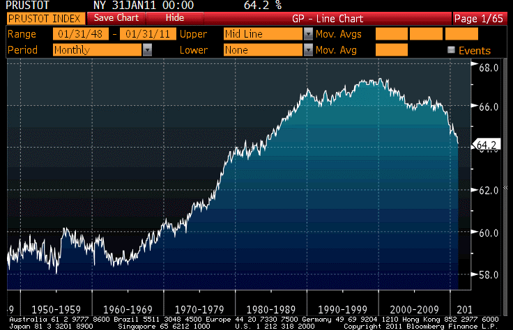
Labor force participation rate: what does the secular decline imply for unemployment?
It has only been a couple of years since the first of the Baby Boomers have hit retirement age, so this phenomenon is not entirely demographic in nature. Or is it? A 58-year-old who loses his job and was planning to retire in a few years anyway might, faced with a 10%+ unemployment rate, decide to call his (or her) current state of unemployment “retirement.” And this person may or may not ever make it back into the work force.
The BLS measures labor underutilization in more ways than just the Unemployment Rate, of course. Over the last few years, the favorite measure of many economic bears has become the U-6, which represents “Total unemployed, plus all persons marginally attached to the labor force, plus total employed part time for economic reasons, as a percent of the civilian labor force plus all persons marginally attached to the labor force.” “Persons marginally attached to the labor force” means people who haven’t looked for work in the last 4 weeks (and are not employed) but say they want a job and have looked for work sometime in the past 12 months. The current count of people who say they want a job is 2.80mm (not seasonally adjusted). Even during the robust expansion of the late 1990s, this figure never got below 1.04mm, so this class of worker has added about 1.5mm people to the underutilized work force in the last few years this category only got as low as 1.268mm in Sep 2007).
But I’m interested in the answer to a different question. What would the official unemployment rate be if the labor force itself wasn’t shrinking? Suppose there were just as many jobs, but now the labor force was at the 67.3% peak of 2000 rather than the 64.2% rate it sits at now. The difference, on the current civilian non-institutional population, works out to another 7.5mm additional workers. That dwarfs the marginal impact of the “want a job” category. If we counted those people as unemployed, adding 7.5mm to the 13.863mm of unemployed already looking would push the Unemployment Rate from 9.0% to 13.9%. And if we create a “U7” that consists of “Total unemployed, plus all persons marginally attached to the labor force, plus total employed part time for economic reasons, plus all persons who were in the labor force and are no longer even marginally attached, as a percent of the civilian labor force plus people who are no longer in the labor force” that number would presently be at 18.5%.
Well, we produce unemployment rates to give measures of pressure or slack in the economy, and it isn’t clear that my “U7” is valid as such a measure. The “labor force shrinkage” of 7.5mm people consists of marginally attached workers (folks who looked in the last year and say they want a job) as well as people who say they haven’t looked and/or don’t want a job. If that latter group (more than 5mm of them who once were in the workforce) are telling the truth, then they’re not going to be competing for jobs and we don’t need to worry about creating a job for them. On the other hand, it is useful for comparability because the other way we use the unemployment rate is to say “how much worse is the labor market now than it was at some point in the past?” In that sense, it is important to realize that one reason the unemployment rate isn’t much higher than 9% is because the workforce is shrinking, a lot.
That shrinkage decreases the total possible output of the nation because it represents a tighter limit on one scarce resource. Right now, that’s not a binding constraint, but if the economy returns to boom it could become so. In that circumstance, those people who subscribe to the “output gap” theory of inflation would become extremely concerned.
Now, I’m not one of those people. Scarce labor should increase real wages relative to profits, but as I illustrated the other day there’s no real connection between the unemployment rate and inflation. Still, some people will disagree so I present this phenomenon with no apprehension that it will meet with universal agreement about its implications.
.
All of these philosophical musings, as you may surmise, occur today because nothing else really happened. Equity bourse volume was the lowest of the year to date at only 832mm NYSE shares. Stocks continued to rally (surprise!) and bonds were roughly unchanged. Commodities retreated a bit (Crude -2%) and TIPS sagged 1-2bps. But that was all.
There is also nothing on the calendar for tomorrow, so if I have any more philosophy in me then you’ll probably be getting it! In the meantime, please be sure to check out my column (exclusive to Seeking Alpha) on Housing inflation, which should be posted (once the editors are done with it) by Tuesday morning.
No Disaster
U.S. Treasuries sold off another 4-9bps on Friday, bringing the 10y yield up to a 9-month high of 3.64%. And remember, that’s with the Fed showing a $600bln bid! In just the last five days, 5-year yields are 35bps higher and 10-year yields are 32bps higher. About 35% of that selloff has come from a rise in inflation expectations, and 65% from a rise in real yields.
Looking over a slightly longer time horizon, though, the picture is more muddled. From a month ago:
| Nom Yld | 1m Δ | Real Yld | 1m Δ | BEI | 1m Δ | |
| T2 | 0.756% | +13.5 bps | -1.068% | (35.7) bps | 1.824% | +49.2 bps |
| T3 | 1.231% | +21.4 bps | -0.646% | (14.5) bps | 1.877% | +35.9 bps |
| T5 | 2.265% | +25.7 bps | 0.132% | +0.5 bps | 2.133% | +20.9 bps |
| T7 | 3.008% | +29.1 bps | 0.673% | +11.7 bps | 2.335% | +17.4 bps |
| T10 | 3.642% | +31.1 bps | 1.283% | +33.2 bps | 2.361% | +2.4 bps |
| T30 | 4.736% | +32.4 bps | 2.161% | +28.8 bps | 2.562% | +3.4 bps |
Look at that change in the slope of the real yield curve! While everyone in the market is focused intently on the ‘green shoots’ of new growth, investors are increasingly willing to accept deeply negative real yields at the short end of the curve in exchange for inflation protection. Meanwhile, further out the curve investors are marking up long-run growth expectations (which are philosophically related to real yields) while not marking up expected inflation by as much. Fascinating. Keep that picture in mind, as I will have more to say about real yields later in this comment.
Don’t say I didn’t warn you about the Employment number. What a mess. The headline figure of 36,000 new jobs was feeble, but it was affected by weather. How much was it affected by weather? Well, I saw one dealer estimated the dampening effect at 150k-200k; another dealer said 40k. Which one do you think sees a robust recovery? Right, the first one. And isn’t it curious…he was seeing the economy as robust before the report too.
The Unemployment Rate fell 0.4% again, to 9.0%. But the reason why isn’t as simple as it seems. Yes, the Civilian Labor Force (CLF hereafter) plunged another 504k. However, this represents an annual adjustment to the estimated population, which estimate the BLS concocts with the help of the Census Department. So it isn’t as simple as saying there was a 622k fall in unemployment and a 504k decline in the CLF producing a much lower Unemployment number (because 622k means more to the numerator than 504k means to the denominator, understand?). That would be absolutely horrible news, with half a million people dropping out of the labor force. In fact, what happened was that the BLS estimated a 117k decline in unemployment (rise in employment) on an unchanged labor force, and then applied the 504k adjustment to both (decreasing both unemployment and the labor force). It results in essentially the same fraction but this is much less bad. It is still not very good. Okay, so that is the news from the Household Survey.
The benchmark revision to the aggregate level of employment in the Establishment Survey, which is where the Payrolls change (+36k) comes from, also moved total employment lower by 483k (on a seasonally adjusted basis). Essentially, the numbers are saying “we were a little high on the count of total jobs, but it turns out that was because we thought the whole country was bigger than it was, so even though there’s fewer jobs there are also fewer jobless.” Got that?
This isn’t malicious, just very confusing. The labor force participation rate, however you count the numbers, is still at a 26-year low and not signaling any great expansion of the economy.
The long and the short of it, in my view, is that there is nothing here to cause us to change the null hypothesis that the employment situation is improving, but only very slowly.
.
In Egypt – I think it behooves investors to keep one eye on Egypt since it is currently the hottest spot within the hot spot that is the Middle East – President Mubarak did not in fact leave voluntarily on the “Day of Departure.” For investors, this removes the one path that was likely to generate the least violence and least uncertainty. There are two remaining paths, since the President does not want to leave voluntarily: (1) he may end up staying, which likely will require increasing violence to quell the unrest; or (2) he may end up leaving involuntarily. Of those, the latter will cause the most short-term uncertainty and likely the most long-term certainty (unless you expect Mubarak to live forever) and the former will cause the least short-term uncertainty and the most long-term uncertainty. Which one do you think investors are clamoring for? Right again.
.
The best headline of the day, from Bloomberg: “Madoff Trustee Seeks $295mm in Fictitious Profits.” Hey, don’t we all? And, um, isn’t that what got Madoff into trouble, seeking fictitious profits rather than real profits?
.
Back to real yields. I had several people send me a link to the story “Treasury TIPS: A Looming Disaster for Small Investors.” Several others had previously sent me the Financial Times piece on which the article is based. So is there a disaster developing?
Well, the Wallace article is both right and wrong, as was Siegel’s. The answer depends on how you own TIPS, and for what time period.
As with any bond that matures rather than defaulting, if you hold TIPS to maturity you know exactly what you are going to get: all of your money back, with interest, and with both principal and interest adjusted for inflation (this is actually even better than with a nominal bond, in which you get all your interest and all your principal back, but you don’t know what those dollars will be worth).
Like any bond, if you sell the bond before maturity you do not know what you will end up getting. And, since TIPS funds generally do not have a maturity, this is also true of TIPS funds.
So it’s only a disaster if you buy TIPS now and sell them when real interest rates have risen. And even then, if inflation and inflation expectations have increased you likely will have done better in TIPS than in non-inflation-linked bonds. So the disaster is relative. If you think inflation is going appreciably higher, the first thing you should do is to avoid normal bonds, where interest rates will rise (and mark-to-market principal fall) without any inflation compensation. In that case, you’re long real rates and short inflation; with TIPS you’re only long real rates.
Having said that, real interest rates on TIPS are fairly low (and quite low at the short end) and I sold mine out some time ago. But it is prudent to have some kind of inflation protection, and although OSM isn’t as attractive as when I first wrote about it in May of last year it still is priced to yield around CPI+6% (closing today at $20.35). I also still own USCI, which I wrote about on October 21st.
I would also like to point out that long-term TIPS are yielding over 2%. Will they cause a disaster if the yield rises? Certainly, because they have a long duration. But by the same token, long-term real yields (unlike long-term nominal yields) are somewhat bounded by the relationship of long-term real yields to long-term economic growth. At the peak of the last expansion, 30y TIPS yielded around 2.5%. At the depths of 2010, they yielded around 1.5%. They’re now around 2.15%. Could they go to 4% if nominal rates soared? Assuredly, although remember that if nominal rates are rising because of inflation expectations that will not affect TIPS. But can they go to 6%? Not without some earth-shattering developments. So, even though they have a very long duration, they also have more anchoring. Put another way, long-term real yields have much less volatility, relative to short-term real yields, than long-term nominal yields have relative to short-term nominal yields.
So, while I am delighted that people are finally pointing out that TIPS are not immune to bad mark-to-markets in inflation episodes, as long as you’re holding to maturity or buying them with long-term real rates somewhat above 2%, it’s probably not going to be a disaster. And in the event where you do have significant losses, they will probably be sharply less than your losses in nominal securities in that circumstance (especially your real losses in nominal securities!).
And I will make one final point. If real yields on TIPS are low, that means real yields are low everywhere. Real yields are a component of Treasury yields, but embedded in the nominal yield. Real yields are a component of equity pricing, but embedded in the P/E multiple. And so on. You can’t avoid exposure to real yields by not holding TIPS! If real yields go from 2% long-term to 4% long-term all of these assets will suffer. A rise in real rates represents a rise in the cost of money, and that affects all assets.
Yes, it’s much more fun to be an investor in an era of declining real yields and declining inflation expectations. I hope you had fun over the last thirty years. But we are no longer in that world.
U.S. Wages and Egyptian President Employment
First things first: you didn’t miss yesterday’s comment. I didn’t write one. The ice/snow storm so impacted everything, from mass transit to market volumes and volatility to website hits, that I decided I didn’t have a lot to say. Contrary to my usual practice, I therefore said nothing.
Today was more interesting, however. Bond markets and stock markets have more or less lost interest in the revolution in Tunisia, the amazingly persistent unrest in Egypt (today Mubarak told ABC that he is “fed up” with being President and wants to leave but is afraid it would lead to real chaos), the demonstrations in Yemen and developing unrest elsewhere in the general region. Yeah, I can’t imagine what effect unrest in the Middle East could cause our economy.
That’s sarcasm, of course.
Rising energy prices, if they rise for demand-related reasons, needn’t be a major concern. Such a price rise acts as one of the “automatic stabilizers” and, while it pushes up consumer prices, it also acts to slow the economy. This helps reduce the need for the monetary authority to meddle (not that anything has stopped them any time recently). It doesn’t need to respond to higher (demand-induced) energy prices, because those higher prices are serving the usual rationing function of higher prices vis a vis scarce resources.
But when energy prices (or, to a lesser extent, food prices) rise because of supply-side constraints – say, reduced traffic through the Suez Canal, or fewer oil workers manning the pumps in a major oil exporting region – then that’s extremely difficult for the central bank to deal with. More-costly energy will slow the economy inordinately, and higher prices also translate into higher inflation readings so that if the central bank responds to the economic slowdown they risk adding to the inflationary pressures.
Equity investors, though, are just going with the momentum. Eat, drink and be merry! Since energy prices are only at $90/bbl, and haven’t exactly reacted with nervousness to the Middle-Eastern unrest, stock market participants can be excused for refusing to try and see around corners. For now.
Bonds now have a double reason to decline. Recent signs of mildly percolating domestic growth on the one hand, but the potential of supply-side shackles on any Fed desire to tighten policy. 10-year yields today reached the highest level seen since last May (for real yields, the highest level since July at 1.22%), and I expect yields to move towards the post-crisis highs of 4% on the 10y note, Fed purchases or no.
Domestic growth is percolating, to be sure, but as yet only mildly. Initial Claims today showed at 415k, near expectations. I mentioned on January 13th that the underlying pace seemed to me to be “about” 420k, and repeated that last week. (http://inflationguy.blog/2011/01/27/what-to-make-of-this/) I point that out mainly in amazement, since I don’t expect to have a lot of success with forecasting Claims and don’t generally try to do it. But the week-to-week numbers aren’t that important anyway; the important part is being able to identify when something big has changed. So far, it hasn’t. The movement from about 460k to about 420k in Claims is an improvement, but hardly a “big” improvement.
One of the ways that we can restrain ourselves from getting too excited, too soon, about the upturn in employment is to reflect on the fact that surveys still indicate considerable uncertainty and pessimism among the people who are vying for those jobs (or clinging to the ones they have, hoping they don’t have to compete for those scarce openings). This is illustrated by the apparent puzzle that Unit Labor Costs (reported yesterday) remain under serious pressure and Productivity continues to rise at the same time that profit margins are already extremely fat. Rising productivity is normal early in an expansion, but the bullish economists tell us that the expansion started a year and a half ago. We’re about halfway through the duration of the average economic expansion (if you believe the bulls). And fat profit margins are not as normal early in an expansion.
Now, we don’t measure Productivity and Unit Labor Costs very well at all. Former Fed Chairman Greenspan used to say that we need 5 years of data before we can spot a change in trend, and he may be low. But it seems plausible that there remains downward pressure on wages. Call it the “industrial reserve army of the unemployed” effect. While job prospects are improving, they are apparently not improving enough yet for employed people to start pressing their corporate overlords to spread more of the profits around to the proletariat.
Fear not, however, that this restrains inflation. The evidence that wage pressures lead to price pressures (and conversely, the absence of wage pressures suggest an absence of price pressures) is basically non-existent. Let me present two quick charts that make the point simply.
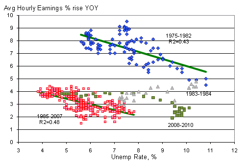
No surprise: tighter conditions in the labor market tend to be associate with wage inflation.
The chart above (Source for data: Bloomberg) shows the relationship between the Unemployment Rate and the (contemporaneous) year-on-year rise in Average Hourly Earnings. I have divided the chart into four phases: 1975-1982 (a period which runs from roughly the end of wage-and-price controls in mid-1974 until the abandoning of the monetarist experiment near the end of 1982), a “transition period” of 1983-1984, the period of 1985-2007 (the “modern pre-crisis experience”), and a rump period of the crisis until now. Several interesting results obtain.
First of all, there should be no surprise that that the supply curve for labor has the shape it does: when the pool of available labor is low, the price of that labor rises more rapidly; when the pool of available labor is high, the price of that labor rises more slowly. Labor is like any other good or service; it gets cheaper if there’s more of it for sale! What is interesting as well is that abstracting from the “transition period,” the slopes of these two regressions are very similar: in each case, a 1% decline in the Unemployment Rate increases wage gains by about ½% per annum. Including the rump period changes the slope of the relationship slightly, but not the sign. This may well be another “transition” period leading to a permanent shift in the tradeoff of Unemployment versus wage inflation.
But clearly, then, when Unemployment is high we can safely conclude that since there are no wage pressures there should be no price pressures, right?
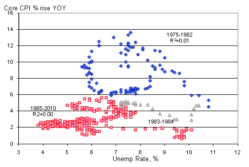
The Phillips Blob
The second chart puts paid to that myth. It shows the same periods, but plots changes in core CPI, rather than Hourly Earnings, as a function of the Unemployment Rate. This is the famous “Phillips Curve” that postulates an inverse relationship between unemployment and inflation. The problem with this elegant and intuitive theory is that the facts, inconveniently, refuse to provide much support.
Why does it make sense that wages can be closely related to unemployment, but inflation is not? Well, labor is just one factor of production, and retail prices are not typically set on a labor-cost-plus basis but rather reflect (a) the cost of labor, (b) the cost of capital, (c) the proportion of labor to capital, and importantly (d) the rate of substitution between labor and capital. This last point is crucial, and it is important to realize that the rate of labor/capital substitution is not constant (nor even particularly stable). When capital behaves more like a substitute for labor, a plant owner can keep customer prices in check and sustain margins at the same time by deepening capital. This shows up as increased productivity, and causes the relationship between wages and end product prices to decouple. Indeed, in the second chart above the R2s for both periods is…zero!
This isn’t some discovery that no one has stumbled upon before. In a wonderful paper published in 2000, Gregory Hess and Mark Schweitzer at the Cleveland Fed wrote that
It turns out that the vast majority of the published evidence suggests that there is little reason to believe that wage inflation causes price inflation. In fact, it is more often found that price inflation causes wage inflation. Our recent research, which updates and expands on the current literature, also provides little support for the view that wage gains cause inflation. Moreover, wage inflation does a very poor job of predicting price inflation throughout the 1990s, while money growth and productivity growth sometimes do a better job. The policy conclusion to be drawn is that wage inflation, whether measured using labor compensation, wages, or unit-labor-costs growth, is not a reliable predictor of inflationary pressures. Inflation can strike unexpectedly without any evidence from the labor market.
The real mystery is why million-dollar economists, who have access to the exact same data, continue to propagate the myth that wage-push inflation exists. If it does, there is no evidence of it.
.
So you can be assured that in tomorrow’s Employment Report my eyes will not be glued to the Average Hourly Earnings number, except to record it as a datum that other investors might lean on too much. I will in fact try, probably too much, to downplay the importance of the number in my mind altogether for a number of reasons:
- It is a January figure, and difficult to seasonally-adjust.
- There was unusually bad weather; the economists I’ve surveyed see that as reducing Payrolls around 50-75k. The consensus estimate is 143k against 103k last month (which, recall, was a terrible disappointment), and since ADP was at 187k this is a reasonable guess. (ADP is not as affected by the weather since it counts people on the payroll while for Payrolls a person actually needs to be paid for work during the survey week). Presumably, the BLS will provide an estimate if an unusual number of people reported being “not able to work due to inclement weather,” but then again…maybe they won’t.
- The annual benchmark revisions are also due. In October the BLS pre-estimated that they would drop the level of Employment at March 2010 by -366,000, but there are nine more volatile months in there. A large negative number will blunt some of the positive news if there is an upside surprise.
- The Unemployment Rate should rise. It plunged from 9.8% to 9.4% due to a new 26-year-low in the labor force participation rate. If there are glimmerings of life in the job market, it should begin to show up in the form of increased participation, and that will have the perverse effect of keeping the Unemployment Rate up or increasing it (Consensus for tomorrow is a rise to 9.5%).
Finally, there is the fact that recently, economic data hasn’t really mattered very much to market pricing. Global geopolitics and the evolution of the crisis in Europe (or its abrupt disappearance this week) have had bigger impacts on markets. And on that basis, the bigger employment news on Friday may be if the unemployment rate on Egyptian Presidents goes from 0% to 100%. I am still more comfortable being short fixed-income, though, since the market seems not to care about that any longer!
PIIGS Is Not Pigs
Illiquid conditions can also cause melt-ups. I didn’t anticipate that would happen, because frankly the conditions for a melt-up in stocks are really not in place: energy prices high, geopolitical uncertainty and volatility, and valuation levels that are already elevated.
But melt-up we did. Stocks soared despite signs that populist unrest has spread to Jordan (where Prime Minister Rifai resigned) and Syria (where opposition groups called for protests this weekend). “Buy on the sound of cannons”?!? The ISM Manufacturing number was stronger-than-expected, but not particularly surprising considering that Chicago had also been quite robust yesterday.
The Wall Street Journal had warned (“Cost Inflation Puts a Wrench Into the Works“) that the “Prices Paid” subindex could be the “sting in [the] tail” of the ISM report, and the Prices Paid did indeed rise to 81.5, a post-2008 high. However, it is a poorly-kept secret that “Prices Paid” moves in close tandem with energy prices, especially for big moves, (see Chart) so this is anything but a shock.
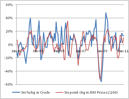
ISM Prices Index tracks oil price changes pretty well.
ISM, while encouraging, is certainly not a sufficient reason by itself for equities to launch x% higher – although I ought also admit that this market hasn’t need much reason at all to do so for the last few months. As I mentioned yesterday, it is simply incorrect to report, as the Bloomberg headline did, “Manufacturing in U.S. Grows at Fastest Pace Since ’04 as Recovery Quickens.” The level of ISM has little to do with the absolute rate of growth. It has everything to do with the relative rate of growth. Things were down so long, even sideways would look like up, and a modest improvement feels great to a purchasing manager. Earnings surprises in the latest quarter were at a lower-than-usual rate – that does not suggest that the economy is suddenly booming. Those who expect it to are likely to be disappointed.
Optimism, already in surplus, was probably helped by the massive rally in periphery bond markets today, caused paradoxically by the ECB’s announcement that it is halting the emergency purchase of eurozone bonds. So, a sudden cessation of buying from the buyer of last resort led…to a rally? Yes indeed, because for whatever reason investors seem to always – at least initially – give 100% credibility to anything the ECB says. If the ECB says they don’t need to support periphery bond markets because the crisis is over, then investors assume the crisis is over. This is really curious timing, given what is happening to energy prices and the geopolitical landscape, although it may be intended to influence the Irish to elect pro-deal factions when it comes time for the people to decide whether they want to live literally in thrall to Brussels for the next couple of decades. But there is no doubting the effect: credit default swap (CDS) spreads on the periphery countries tightened aggressively, and the bond markets rallied sharply. Greek 10y yields fell 29bps, Portuguese 10y yields -18bps, Spanish yields -16bps, Irish yields -14bps, and Italian yields -11bps. It’s suddenly good to be a PIIGS.
So, a sudden wave of optimism hits when trading desks are thinly staffed, and up go stocks. The S&P vaulted 1.7% to a new multi-year high on volume lower than each of the last two days. Bonds dropped and 10y (US) yields rose to 3.44% again. Inflation swaps rallied again and at 2.72% the 10y inflation swap rate is now higher than it has been since last May.
Higher bond yields and higher equities make sense if growth is suddenly robust, and earnings are expected to explode higher and catch up with valuations, but (a) in the most-recent quarter, there was a lower “beat” proportion than normal in earnings reports; (b) no expansion has ever begun with oil prices at $90bbl, so it is hard to handicap how much high energy prices will drag on growth; (c) a weaker dollar (the buck fell to its lowest level since November today) is stimulative, but it is also inflationary; (d) fiscal and monetary policies cannot get much looser and are likely to grow tighter in the year ahead; (e) there are now a handful of regimes in one region of the world that are either in turmoil or may shortly be in turmoil and there is a nonzero probability of a series of local turmoils turning into a broader regional turmoil; and finally (f) whatever the ECB says, there is virtually no chance for several countries in the EU periphery to ever repay their debts and banks there are undercapitalized if you consider the true value of the sovereign bonds they hold marked at par.
I don’t mean for that to sound like sour grapes from a medium-term equity bear; there are also good things going on. For example, the ISM Manufacturing report is a ray of sunshine (although not as much as we want to believe), employment is improving (although not as much as we want to believe), government is likely to shrink (although not as much as we want to believe), and interest rates will remain relatively low in a historical context for a while (although not as low as we want to believe). The caveats in each case are the same, but the market is valued at the belief rather than at what I think is the underlying reality. Of course, I may be completely wrong.
Tomorrow, the first of the week’s employment reports will be released. The ADP report for January is expected to show 140k new jobs. Remember that last month there was a massive head-fake as ADP printed 297k and Payrolls came in at half that. The 140k expectation is reasonable and beatable, but no one will be overreacting to this number after last month’s debacle. Bonds in particular were schnockered last month, and Jan 5th marked the low-to-date. This report comes with at least a grain of salt, and you can see it in the survey ranges. Last month, the survey range was 50k-150k with a median of 100k; this month the survey range is (100k)-200k, three times as large. In situations such as this, it is often a good trading strategy to fade any dramatic move made on the data print. (However, be wary of the continued illiquidity as the CME will likely be snowed under for tomorrow as well).
.
I promised yesterday to write about an interesting new way you can track inflation daily. It’s called The Billion Prices Project @ MIT. The BPP queries and compiles a huge number of on-line prices every day and computes a price index based on those prices. The weaknesses are as you would expect: unlike with the CPI, the basket is not controlled, but changes over time (and it isn’t clear to me how they adjust for item substitutions). It only surveys things you actually can buy online, so it emphasizes things like supermarkets, electronics, apparel, and furniture but omits things like education and medical care. It does not appear to have a concept of the consumption value of a home as distinct from its investment value. It doesn’t have a long history. And so on.
But with all those caveats, it gets the general shape of the price trend correct and it has the advantage of being calculated daily rather than monthly in arrears. There are daily price indices for Argentina, Australia, Brazil, Chile, Colombia, France, Italy, Russia, Turkey, the U.S., and Venezuela. For example, here is the chart for the U.S.:
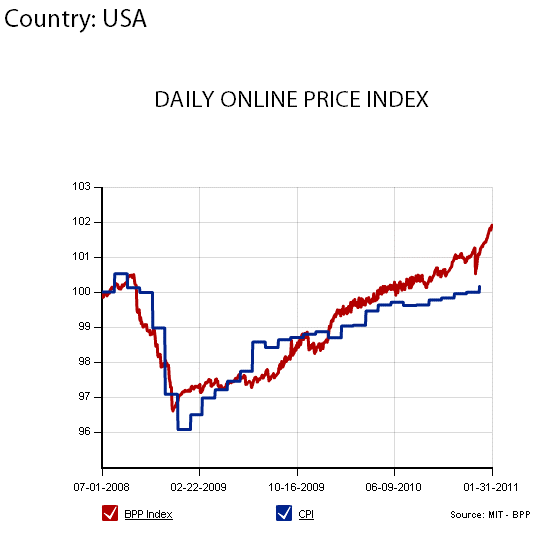
The Billion Prices Project @ MIT: chart for US.
It’s fascinating to see that some of the countries have fairly smooth price curves, probably as a result of having either some element of centralized price control or perhaps a smaller online selection. I am also interested to see that while most of the countries’ official price index tracks what is being seen on-line, this isn’t universally true. Take a look at Argentina and you will see what I mean.
Whether or not the BPP can be used to forecast, now or in the future as the project develops further, I suspect it is a useful check on whether inflation is accelerating or decelerating generally. We will have to wait for a good acceleration (or deceleration) to be sure. It is also helpful to dispel notions that the Bureau of Labor Statistics is somehow cooking the numbers to make inflation seem too low (but not telling the Fed, who is acting on their perception that inflation is too low). Unless the BPP is in on the conspiracy, the general level of inflation in developed countries seems to be approximately what the BLS (and other national statistics agencies) is saying it is.
