It Pays To Be Contrary
At one time, I think most of us assumed that the stock market would have a hard time rallying without its largest component, Apple (AAPL).
Pretty soon, Apple will solve that problem, since it won’t be too long before it is smaller than Exxon-Mobil (XOM) again. It is actually fairly remarkable that the S&P has managed to rally 3.2% this year even though AAPL is -8.7%.
This phenomenon is amazingly timely, considering that in the November/December issue of the Journal of Indexes there was an article by Rob Arnott and Lillian Wu called “The Winner’s Curse” in which the authors noted that “For investors, top dog status – the No. 1 company, by market capitalization, in each sector or market – is dismayingly unattractive.” Later, they note that “the U.S. national top dog underperforms the average company in the U.S. stock market by an average of 5 percent per year, over the subsequent decade.”
Nice call.
That observation follows naturally from Arnott’s work that led to fundamental indexing – his observation, simply, is that by definition if you are capitalization weighting you will always have “too high” a weight in stocks that are overvalued relative to their true prospects and “too low” a weight in stocks that are undervalued relative to their true prospects. There is no way to know if Apple is one of those – it’s a great company, and there’s no reason that the top-capitalization company is necessarily overvalued – but the authors of that article note that when you’re the top dog, more people are taking potshots at you. It suggests an interesting strategy, of buying the market except for the top firm in each industry.
This is why contrarians tend to do well. If you buy what everyone else is selling, and sell what everyone else is buying, there’s no reason to think you’ll be right on any given trade but you are much more likely to be buying something that is being sold “stupidly” and to sell something that is being bought “stupidly.”
Which brings me back to commodities, which are unchanged over the last 9 years (DJUBS Index) while the basic price level has risen 24% and M2 is +72%. But I know you knew that’s where I was going.
Below is a picture of the worst two asset classes of the last nine years (I picked 9 years because that’s the period over which both of them are roughly unchanged). The white line is the S&P-Case Shiller index, while the yellow line is the DJ-UBS Commodity Index.
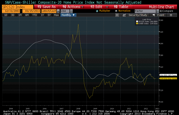
One of these two lines is currently generating much excitement among economists and investors, including institutional investors, who are pouring money into real estate. The other line is generating indifference at best, loathing at worst, and plenty of ink about how bad global growth is and how that means commodities can’t rally.
One of these lines is also associated with an asset class that has historically produced +0.5% real returns over long periods of time, and consequently isn’t an asset class that one would naturally expect to have great real returns. The other is associated with an asset class that has historically produced +5-6% real returns, comparable with equity returns, over long periods of time. Care to guess which is which?[1]
.
Tomorrow, the BLS will release the Consumer Price Index for December. The consensus for core inflation is for a “soft” +0.2%, and a year-on-year core inflation increase for 2012 of +1.9%.
Now, last December’s core inflation number was +0.146%, and last month’s year-on-year core CPI was +1.94%. What that means is that it will be quite difficult to get both +0.2% on the monthly core figure and +1.9% on the y/y change. If get +0.17% on core, then we should round up to +2.0% unless something odd happens with the seasonal adjustments.
In other words, I think it’s very likely that core inflation will pop back up to 2.0%. As a reminder, the Cleveland Fed’s Median CPI is still higher, at 2.2%, so it should not be surprising at all that core inflation has a better chance of going up than going down from here.
The two major subindices to look for are Owner’s Equivalent Rent, which last month was at 2.14% y/y, and Rent of Primary Residence, which was 2.73% y/y. Those two, combined, represent 30% of the consumption basket, and it was the flattening out of those series that caused core CPI to flatten around 2.0%. (Six months ago, the trailing y/y change in OER was 2.1%; the y/y change was 2.7%). Accordingly, watch closely for an uptick in those indicators. We believe that they are going to accelerate further, likely sometime in the next 3 months.
[1] Hint: the one that has historically provided great returns is one that few investors have very much of. The one that has historically provided bad returns is the one that represents most of a typical investor’s wealth.
‘One of these lines … is associated with an asset class that has historically produced +5-6% real returns, comparable with equity returns, over long periods of time.’
Okay, I give up. What is it?
At first, I thought you might mean ‘collateralized commodities.’ But a long-term GFD series purporting to represent the return on a collateralized position in CRB futures (despite the fact that the CRB index only began in 1956) shows a 4.67% nominal return from end-1925 to end-2011. After subtracting 3.0% inflation, it’s a 1.67% real return.
Mind you, I’m a great advocate of commodities for their lack of correlation to stocks and bonds. But the underlying raw assets, without the benefit of futures leverage, rebalancing return, and T-bill income from collateralization, have exhibited flat to falling prices for centuries owing to technological advances in production. Chart of long-term asset class returns:
http://pragcap.com/wp-content/uploads/2010/12/SG1.png
So my guess is ‘collectible Bugattis.’ 😉
Well, you chose the CRB rather than a good commodities index! Gorton & Rouwenhorst are the authorities on this issue, and they found similar returns and risks to stocks and CCIs (see Facts and Fantasies about Commodity Futures: http://papers.ssrn.com/sol3/papers.cfm?abstract_id=560042 ). I’ve found similar behavior. Most measures of the rebalancing effect seem to cluster around 3.5%, which is what I typically assume is the long-term real return, minus 0.5% for the real return of collateral, adjusted for mispricing of the market. But the academics say it’s more like 5-6%.
FWIW, the backfilled ‘collateralized CRB’ index from GFD produced a geometric nominal return of 7.12% from 1959/7 to 2004/12, the period covered in the Gorton & Rouwenhorst paper … whereas G&R’s monthly-rebalanced index showed a nominal return of 9.98%.
Due to its geometric construction, the CRB average is downward biased. The just-mentioned comparison could be consistent with a rebalancing return of around 3.0% in a better-designed, equally-weighted commodity index.
Unfortunately (as is common in academic papers), G&R provided summary results but did not publish their actual time series of monthly returns. Since I lack the data and resources to reconstruct G&R’s index, I use the collateralized CRB because (1) it’s probably conservative and (2) having the actual time series, I can test it in multi-asset portfolios. The returns are likely understated, but the volatility, correlation and rebalancing effects versus other asset classes should be fairly accurate.
A question, Mike … what commodity time series do you employ in your model testing?
For really long-term stuff, I splice the CRB (you have to add the collateral return, as you note, but I do this myself) to the GSCI to either the DJUBS or the Summerhaven index (depending on my purpose).