Archive
Are Home Prices Too High?
There is an advantage to squatting in the same niche of the market for years, even decades. And that is that your brain will sometimes make connections on its own – connections that would not have occurred to your conscious mind, even if you were studying a particular question in what you thought was depth.
A case in point: yesterday I was re-writing an old piece I had on the value of real estate as a hedge, to make it a permanent page on my blog and a “How-To” on the Inflation Guy app. At one point, I’m illustrating how a homeowner might look at the “breakeven inflation” of homeownership, and my brain asked “I wonder how this has changed over time?”
So, I went back in the Shiller dataset and I calculated it. To save you time reading the other article, the basic notion is that a homeowner breaks even when the value of the home rises enough to cover the after-tax cost of interest, property taxes, and insurance. In what follows, I ignore taxes and insurance because those vary tremendously by locality, while interest does not. But you can assume that the “breakeven inflation” line for housing ought to be at least a little higher. In the chart below, I calculate the breakeven inflation assuming that mortgage rates are roughly equal to the long Treasury rate (which isn’t an awful assumption if there’s some upward slope to the yield curve, since the duration of a 30-year mortgage is a lot less than the duration of a 30-year Treasury), that a homeowner finances 80% of the purchase, pays taxes at the top marginal rate, and can fully deduct the amount of mortgage interest. I have a time series of the top marginal rate, but don’t have a good series for “normal down payment,” so this illustration could be more accurate if someone had those data. The series for inflation-linked bonds is the Enduring Investments imputed real yield series prior to 1997 (discussed in more detail here, but better and more realistic than other real yield research series). Here then are the breakeven inflation rates for bonds and homes.

It makes perfect sense that these should look similar. In both cases, the long bond rate plays an important role, because in both cases you are “borrowing” at the fixed rate to invest in something inflation-sensitive.
The intuition behind the relationship between the two lines makes sense as well. Prior to the administration of Ronald Wilson Reagan, the top income tax rate was 70% or above. Consequently, the value of the tax sheltering aspect of the mortgage interest made it much easier to break even on the housing investment than to invest in inflation bonds (had they existed). That’s why the red line is so much lower than the blue line, prior to 1982 (when the top marginal rate was cut to 50%) and why the lines converged further in 1986 or so (the top marginal rate dropped to 39% in 1987). The red line even moves above the blue line, indicating that it was becoming harder to break even owning a home, when the top rate dropped to 28%-31% for 1988-1992. Pretty cool, huh?
Now, this just looks at the amount of (housing) inflation of the purchase price of the home needed to break even. But the probability of realizing that level of housing inflation depends, of course, on (a) the overall level of inflation itself and (b) the level of home prices relative to some notion of fair value. This is similar to the way we look at probable equity returns: what earnings or dividends do we expect to receive (which is related to nominal economic growth), and what is the starting valuation level of equities (since we expect multiples to mean-revert over time). That brings me back to a chart that I have previously found disturbing, and that’s the relationship between median household income and median home prices. For decades, the median home price was about 3.4x median household income. Leading up to the housing bubble, that ballooned to over 5x…and we are back to about 5x now.

That’s the second part of the question, then – what is the starting valuation of housing? The answer right now is, it’s quite high. So are we in another housing bubble? To answer that, let’s compare the two pictures here. In the key chart below, the red line is the home price/income line from the chart above (and plotted on the right scale) while the blue line is the difference between the breakeven inflation for housing versus breakeven inflation in the bond market.

In 2006, the breakeven values were similar but home prices were very high, which means that you were better off taking the bird-in-the-hand of inflation bonds and not buying a home at those high prices. But today, the question is much more mixed. Yes, you are paying a high price for a home today; however, you also don’t need much inflation to break even. If home prices rise 1.5% less than general inflation, you will be indifferent between owning real estate and owning an inflation bond. Which means that, unlike in 2006-7, you aren’t betting on home prices continue to outpace inflation. It’s a closer call.
I can come up with a more quantitative answer than this, but my gut feeling is that home prices are somewhat rich, but not nearly as much so as in 2006-07, and not as rich as I had previously assumed. Moreover, while a home buyer today is clearly exposed to an increase in interest rates (which doesn’t affect the cash flow of the owner, but affects the value the home has to a future buyer), a home buyer will benefit from additional “tax shelter value” if income tax rates rise (as long as mortgage interest remains tax deductible!). And folks, I don’t know if taxes are going up, but that’s the direction I’d place my bets.
How Many ‘Shortage’ Anecdotes Equal Data?
There is a growing list of categories of prices which are seeing abnormal price pressures. At least, they are abnormal by the standards of the last quarter-century! A couple of months ago, in “The Risk of Confusing Inflation Frames,” I wrote about some of the effects we might soon be seeing, and of the risk that some of the known-but-temporary effects will obfuscate more serious underlying issues.
In April, we will get the CPI for March; this will be the first CPI release to have ridiculously easy comparisons against the year-ago month. March 2020 was -0.2% on core CPI, and I suspect the consensus estimate for March 2021 will be something like +0.2%; this implies the y/y core inflation number will jump from 1.3% to around 1.7%, depending on rounding. But as I said, that disguises some of the important underlying pressures that may also start to appear with this number. There is an old saying that the plural of “anecdote” isn’t “data,” but eventually there must be a crossover point where the preponderance of independent anecdotes begins to approach the informational value of data, right? Well, here is a short list of some recent anecdotes and reports of shortages.
There has become an acute shortage of semiconductor chips, which has impacted automobile production (and will that increase prices for what is available?). There is a shortage of shipping containers, causing widespread increases in freight costs affecting a wide variety of goods. Packaging materials, which are also a part of the price of a great many goods, are also shooting higher in price. Worker shortages at various skill levels were reported in the most-recent Beige Book. There is a shortage of Uber and Lyft drivers.
There are other effects that have shown up but I misapprehended the significance of them at the time. Apparel prices have risen at an annualized 9% pace over the last four months. I’d attributed that to shipping, but there is more to it than that. In January US Customs issued a Withhold/Release Order (WRO) on cotton and tomato products coming from the Xinjiang region of China, where forced labor is employed; the order calls for the stoppage of freight with any amount of cotton (or tomatoes, but there is not much tomato in apparel) that originates from that region – even if it is only the thread on the hem. While this and the other effects on apparel are probably temporary, we don’t really know how temporary.
Importantly, we should add to these shortages a growing shortage of housing. The inventory of homes available for sale just hit an all-time low (the National Association of Realtors started keeping track in 1982).

And, as a result, the increase in the median sales price of existing homes just reached an all-time high spread over core CPI (home price increases sometimes have been higher, though it is unusual. For example, in May 1979 the year-over-year increase in the median home price was 16.9%. But core inflation was 9.4% at the time, so the real increase in home prices was only 7.5%).

I have written elsewhere about the fact that there is large divergence right now between what the BLS indicates the effective inflation in the cost of housing is, and what a measurement of asking rents suggest it should be. The significant chart is reproduced below – and the short story is that the divergence dates to the imposition of the COVID-related eviction moratorium. This has decreased the amount of rent that landlords actually expect to receive on average, which lowers effective rents even though every other measure of the true (free market) cost of shelter would be, is ratcheting higher at rates seldom if ever seen before.

Now, this moratorium was due to expire at the end of March, but the CDC just extended it until June (which may be one reason that TIPS breakevens have hit some minor resistance). That’s a little unfortunate since it means that the moratorium will expire right about the time that the CPI is enjoying favorable comparisons versus 2020. The understating of rent and owners’-equivalent rent inflation, since those are a huge portion of the consumption basket, has an outsized effect on CPI. I want to be fair here to the BLS: in an important sense, the CPI data on rents is not wrong because in fact if a tenant pays less because of the moratorium, then that tenant’s cost of living really did go down. Even though in a free market without such a moratorium his cost of living would have been higher, that’s not the question the BLS is trying to answer. The cost of living is lower in such a case. Of course, that’s temporary, and so when the moratorium is lifted we can expect the BLS will also faithfully report the catch-up. Which means that in the summer, when we would have expected y/y CPI to start to decline again as it faces more difficult comparisons to 2020…it may not, because rents will start to catch up. That’s going to toast the marshmallows of a lot of investors.
Now, there’s one more facet of the cost-of-shelter question and that’s whether home prices have risen too far, too fast and so it’s home prices and asking rents that will have to decline, rather than effective rents re-accelerating. This is a reasonable question. It is true that the ratio of home prices relative to incomes is getting back to levels that in the late 2000s indicated a bubble was getting ready to pop (see chart). For many, many years median home prices relative to median incomes was fairly stable at around 3.4x. Some increase makes sense since homes have been getting bigger, but it does give the appearance of being overextended.

However, last week in Money Illusion and Boiling Frogs I argued that the nominal value of certain real assets might be usefully compared to the level of the money supply as a way of assessing their real value. Comparing the equity market to M2 made the former look less frothy, and the argument is that maybe equity investors aren’t suffering from “money illusion” in the same way that consumers might be (so far). But the same cannot be said for the housing market. The chart below (Source: Bloomberg) divides the home price index (from the FHFA) by M2. While home prices relative to incomes look high, home prices relative to the stock of money look quite low. It is interesting how the QE of the early 2010s shows up as a one-time shift in this ratio, followed by a period of stability, isn’t it? It suggests that maybe home prices didn’t fully adjust to the new money-stock reality after the bubble’s burst in 2008 and the subsequent QE. And maybe such a one-time shift happens again now.

But it might also be the case that the current rapid escalation of home prices is the market’s attempt to get the real value of the housing stock to reflect the rapidly increasing value of the money stock. If that’s the case, then it also suggests that median wages probably will eventually follow. The last people to respond to money illusion generally are the people selling their labor.
I don’t know if this is the ‘right’ answer, and my purpose in these articles isn’t to give the ‘right’ answer. I just want to ask the right questions…and I feel like these are the right questions.
Summary of My Post-CPI Tweets (January 2021)
Below is a summary of my post-CPI tweets. You can (and should!) follow me @inflation_guy. Or, sign up for email updates to my occasional articles here. Investors, issuers and risk managers with interests in this area be sure to stop by Enduring Investments!
- Welcome to #CPI Day 2021! We get the last of 2020’s CPI figures today.
- There’s always volatility in year-end figures, and this one is no exception. Last month, in fact, was pretty weird. In the Nov CPI we had soft housing, very strong Apparel. Broad softness sprinkled with some large moves in small categories. My write-up: Summary of My Post-CPI Tweets (December 2020)
- As a result, while core CPI was higher-than-expected, Median inflation (which is a steadier measure) was soft. However, skewness on the upside is DIFFERENT from the way we’ve seen it for a while and I’ll be interested to see if that remains.
- Economists’ consensus is that Core is gonna soften – the m/m core CPI consensus is around 0.12%. I think that’s mostly a call on rents, which have been softening.
- But here’s the thing – rents haven’t really been softening much outside of big cities. What has been changing is that landlords have been expecting less rent due to financially-stressed tenants. This shows up in CPI as softening average rent growth.
- And that could change, although probably not until next month. Payments looked soft in December. But rent tracker indices have payments a bit better this month, and they should be: there was just another Federal money drop.
- Next month or two, we should see a rebound in rents. And in the long run, we definitely will because home prices are jumping and these two can’t diverge forever.
- Away from Shelter, dislocations in the supply chain remain and part of the trick over the next 6 months is going to be teasing out the COVID effects from the long-term effects. Freight costs have risen steeply and there are goods shortages in places b/c of container shortages!
- Another category I’m watching that has been weak for a while: Medicinal Drugs. Interestingly, this month (again, probably starts to hit Jan CPI when it is released next month) some major pharma manufacturers announced price increases.
- Not a huge surprise: pharma prices had been suppressed when President Trump was threatening to introduce Most Favored Nation rules (saying companies can’t charge Americans more than other countries). Pharma played nice. CPI-Medicinal Drugs is negative y/y!
- I wrote about that here: Drug Prices and Most-Favored-Nation Clauses: Considerations back in August. But the Biden Administration won’t be doing that. Ergo, it’s safe to raise prices again. And they have. We’ll see how much – starting next month.
- That’s all for the walk-up. Expect volatility! I will probably focus on the ex-shelter number. BTW, be aware that monthly comps get super easy after this month, for a few months. Core CPI will be over 2.5% y/y, probably, by April & push 3% in May. Then the comps get much harder.
- Do remember, as I constantly remind: the #Fed doesn’t care one bit about inflation. But if YOU do, and have interests in how to hedge/invest in the inflationary period approaching, visit https://enduringinvestments.com
- And one more note: I will be on Bloomberg TV with @adsteel and @GuyJohnsonTV at 10:10ET this morning. And my interview with @MetreSteven on @RealVision just dropped this morning. A lot happening in inflation today!! Good luck…
- Core CPI was +0.09%, a touch softer than expected. Y/Y at 1.62%.

- Seems like Dec is always weak…even accounting for the seasonals! Let’s see. Primary rents rose 0.10%, y/y declined further to 2.28% from 2.45%. As I said, that will start changing soon. OER was +0.14%, y/y down to 2.17% from 2.28%.
- Apparel took another big jump, +1.36% m/m. That’s part of the general strength in core goods. Core goods at 1.7% y/y, up from 1% just three months ago!
- Check THIS out. Core goods inflation above core services inflation for the first time in years. Since the GFC, actually. A lot of that is supply chain folks. But a lot of it is people buying products with government money drops.

- That rise in core goods happened even with CPI-Used Cars and Trucks -1.15% on the month, second weak month in a row. Looks like the used car prices in the CPI aren’t going to catch up with the private surveys on the upside, as they didn’t on the downside.

- Airfares slipped -2.29% after +3.49% last month. Lodging Away from Home flat vs +3.93% last month. Motor Vehicle Insurance though continued to rebound, +1.42% after +1.23% last month. Those are my main “covid categories.”
- In Medical Care, which was down for the second month in a row: Medicinal Drugs -0.24% (y/y down to -2.13%!), Doctors’ Services -0.02% (y/y to 1.74%), Hospital Services +0.30% (y/y 2.99%).
- I’ve said it before and I’ll say it again. It’s hard to measure medical care, but these are just silly numbers. I doubt doctors are charging less when their costs have gone up enormously. But perhaps they’re charging CONSUMERS less, and we’re measuring consumer prices? Hmm.
- CPI for Medicinal Drugs, y/y. Come on, man.
- Core inflation ex-shelter was roughly unchanged this month, +1.45% y/y. Was +1.46% last month. It hasn’t been much higher than 1.7% since 2012.
- So only two categories had large negative changes: Car and Truck Rental, -49.9% annualized, and Used Cars and Trucks, -12.96%. The latter coming down from a high level. But long list of >10% gainers again:
- >10% annualized: Jewelry and Watches (39.5%), Men’s/Boys Apparel (+31.8%), Women’s/Girls Apparel (+18.3%), Car Insurance (+17.9%), Misc Personal Goods (+15.5%), Personal Care Goods (+12.9%), Tobacco/smoking (+12.9%), Misc Personal Svcs (+10.8%).
- Those are just non-food and energy. Also >10% annualized increases in Dairy, Nonalcoholic Beverages, Fuel Oil, and Motor Fuel. But we know those are volatile. I include them in case anyone says “the government ignores milk.”
- Anyway, Median should be soft again but not as soft as core this month. Median category will be a housing regional so it’s just a guess but I’m saying +0.13% m/m, 2.23% y/y. Core will actually pass over Median in a few months, I think, due to base effects.
- College Tuition and Fees: +0.74% y/y vs +0.58%. I’ve talked elsewhere about how there’s a quality change here that the BLS knows about but is ignoring for now b/c should reverse: online college ain’t same as in-person college.
- University costs themselves are up a lot. Talked at length to a university CFO consultant yesterday and they believe many of these costs will remain BUT there are some really interesting applications of virtual education that I can’t fit in here. 🙂
- Circling back, just want to put the Apparel jump into context. Here is the Apparel price level index. So acceleration in 2011 (after years of nothing), slow deflation, crash into COVID, and just recovering some pricing power. Will be interesting to see how far it extends.

- Update to our OER model. And honestly, everyone’s model looks something like this – lagged effect of home price rises is a big contributor, as are incomes, to where rents should go. But we’re looking at measured rents ADJUSTED for non-collection. That’s the key.

- Here’s a fun one. 10-year inflation swaps are about to cross above current median inflation. That hasn’t happened in a long time. You would think the forward should be above, at least because tails tend to be to the upside, but they almost never are. At least, recently.

- Distribution of y/y price changes by bottom-level category. Big spike is OER of course. But a really wide dispersion otherwise. Chaos.

- Four-Pieces charts and then I’ll wrap up. Piece 1: Food & Energy.

- Piece 2: Core Goods. Wheee! Honestly this overshoots our models so I think at least some of it are dislocations. But some of it is real, too much money pushing too few goods. And some is the recently-weak USD, so if you get a much stronger dollar (@MetreSteven) it could change.

- Piece 3: Core Services less Rent of Shelter. This is the conundrum. I can’t imagine doctors services and hospital services stay depressed in this world. Other services may (office cleaning if there are no offices), but that’s also a consumption basket change. Stay tuned here.

- Piece 4, Rent of Shelter. I think this will start to reverse as early as next month when the next gov’t checks go out. And the Biden Administration promises more. So delinquencies should decline, raising measured rents.

- And that’s all for today. I’ll post a summary of these tweets in a bit. Remember to look up my interview on @RealVision, tune in to @BloombergTV at 10:10 to see me there, and visit http://EnduringInvestments.com if you need an inflation nerd!
Recent inflation prints have been held down by soft rents, and that continued this month. A lot of this is artificial: when landlords expect to collect less rent…which is not unreasonable during a recession…then this shows up as a decline in collected rents. But when/if those renters get more current, it shows up as a reacceleration in rents. That’s what I expect will happen, and it could happen soon since more Federal largesse is on its way. It’s an upside risk for the next few months. Although, in another sense, it isn’t really a risk: it’s what we should be expecting to see, given what is happening in home prices.
Rents are the main part of core services inflation. Because of the softness in rents and the softness in medical care services – which is a real head-scratcher – core services inflation fell below core goods inflation this month for the first time in a very long time. Now, normally you don’t see goods inflation in the middle of a recession, but then again normally Washington DC isn’t throwing thousands of dollars into the account of every family. Too much money: check. And supply chains are stressed. Too few goods: check. No surprise we’re seeing goods inflation.
So really, the wiggles in inflation we have seen over the last year are not particularly surprising in themselves, and it’s easy to explain them by falling back on the excuse du jour: “COVID.” Certainly, a lot of the chaotic pricing environment is due to Covid and the related disruption in our economic system. But the question is, what will happen on the other side? We have had massive money growth, with declining velocity until last quarter. Will velocity continue to decline? I am skeptical of that. Precautionary cash balances are higher than they ought to be, given where rates are, because people are nervous and when you are nervous you keep more in reserve. But this won’t be true forever. And we know that, behaviorally, the velocity of “found money”/windfalls is higher than the velocity of earned money, and moreover people are less price-sensitive when they spend a windfall. So I expect that as things go back to normal, inflation will rise – and probably a lot.
This is the test! Modern Monetary Theory holds you can print all you want, with no consequences, subject to certain not-really-binding constraints. The last person who offered me free wealth with no risk was a Nigerian prince, and I didn’t believe him either. I will say though that if MMT works, then we’ve been doing monetary policy wrong for a hundred years (but then, we also leached people to cure them, for hundreds of years) and all of our historical explanations are wrong – and someone will have to explain why in the past, the price level always followed the GDP-adjusted money supply.
Now, over the next four or five months it will be much easier to believe the inflation story. While core inflation was +0.24% last January and +0.22% last February, it was -0.10% in March, -0.45% in April, and -0.06% in May. By mid-year, that is, we will be around 2.8% core CPI y/y (if we just get 0.2% per month) before the comps turn much more difficult. Even though this is fully known, and even though it will therefore be a violation of the Efficient Markets Hypothesis, it will not stop people from becoming alarmed and for the markets to respond accordingly! So buckle in – at the very least, the first half of 2021 will be extraordinarily interesting.
The Outlook for Housing Inflation from Here, Oct 2020
In the last couple of CPI reports, two trends have started to become apparent. One is that inflation is broadening, in that more categories are seeing accelerating inflation. The second is that shelter, the largest and slowest-moving subcategory, has been decelerating.
Is there an inflationary process going on, then? Or are we in a disinflationary or even deflationary period? The answer to this question depends a little bit on what we think the inflation process is, and a little bit on figuring out what is really happening in housing.
I originally wrote this as one long piece, but decided rather to split it into two. So today I’m going to talk about why I think the shelter component of CPI is probably not about to enter into an inflation-dampening slide; on Monday or Tuesday I’ll discuss the inflation process itself and the broadening of inflation.
I have long said that if you’re going to predict core deflation, you’d better have a reason to expect deflation in housing. And if you’re going to predict accelerating core inflation, you’d better have a reason to expect acceleration in housing. Shelter is the 800-pound elephant in CPI; it moves slowly and ponderously and if it sits in one place, you’re not going to move the broad index very far. And the story for the better part of two decades in inflation is largely this: shelter inflation has been consistent and in the 2%-4% range; everything else in core has been fairly consistent but lower.[1]
The exception, of course, was in 2009-10, when the housing implosion dragged down rents in a short but deep dip. But if you’ll look at the following chart, which splits core into Shelter and ex-Shelter components, you’ll see that nothing else really looked like deflation was in the offing. Indeed, if you take out shelter, core inflation barely slowed in the aftermath of the Global Financial Crisis (Keynesians, take note).

To get a real inflationary outcome, then, we’ll need two things. One of these is that shelter needs to not decline, but rather accelerate. And the other is that non-shelter inflation needs to pick up. None of this needs to happen tomorrow, but it needs to happen. So, when Keynesians see Shelter declining markedly, they become gleeful because it sure doesn’t look like the enormous deficit spending and explosive money growth is doing anything to cause inflation.
Not so fast! Let’s take a deeper look first. The three main components of Shelter are (a) Owner’s Equivalent Rent, which is ~73% of Shelter; (b) Rent of Primary Residence – that is, apartment renters – which is ~24% of Shelter; and (c) Lodging Away from Home, which is about 2.8% of Shelter. (The difference is rounding and a little bit of “Tenants’ and household insurance.”) The chart below shows the y/y changes in these three pieces, unweighted.

Clearly, Lodging Away from Home provides a ton of volatility, and that massive decline – and not much of a bounce – has deducted about a third of a percent from the year/year growth rate of the broad Shelter CPI index. Lodging Away from Home is clearly and directly impacted by a lack of travel, so to get a better idea of the general shelter trends let’s strip that away. The two main categories, then:

Not surprisingly, Primary Rents and OER track each other very well. This makes some people very angry. Some mathematically-challenged inflation-conspiracy “alternative stats” sites claim that the Bureau of Labor Statistics changed to the rental-equivalence method of computing shelter costs to “hide” the real inflation, which they say is really 5-6% per year higher than what is reported. This is obvious nonsense, and I hate to always have to debunk it because it’s so easy to do. The reason that the US uses rental-equivalence is that you can think of a house as providing two things to the owner: an investment, and a place to live. It’s important to separate these two functions of a house, and so the BLS reasons that the “place to live” part is in competition with other ways you can get a place to live without the “investment” part: in other words, a rental. This gets confusing at times when home values are rising faster or slower than rents. This happens because although the “owner’s equivalent rent” part of a home is in competition with “rent of primary residence” – and so these two series move together as the chart above shows – the investment value of the house has no analog if you’re a renter. So when home prices and rents diverge, it is best to think of the divergence being caused by the investment portion.
Incidentally, you can understand this equivalence by reflecting on the fact that these two situations have equivalent financial outcomes: (1) live in your owned home and (2) rent your owned home to someone and use that income to rent someone else’s owned home. In both cases you are living in a house, and get investment returns related to home prices. But in the second one you’re clearly paying rent, and you also own a home that earns you the change in home prices plus a stream of rental payments, even though the two rental streams in this case (the one you’re paying, and the one you’re receiving from your tenant) happen to cancel. That’s essentially what is happening, then, in (1) and it’s the reason the BLS looks at housing in that way.
So, how much difference does it make over time to use rents, rather than home prices, to measure the cost of “shelter services”? The chart below shows the median price of an existing home, compared with OER. Note that prior to the bubble era, rents and prices moved pretty close in lock-step…through the late 1990s, there was no difference – certainly not 5-6% per year! And even with the wild swings induced by the ‘environment of abundant liquidity’, median home prices have risen ~4.2% per year since 1982, compared with ~3.2% for OER. One whole percent per year, which means the dastardly BLS has understated Shelter costs by 0.7% per year, and overall CPI by roughly 0.2% per year! Oh, and as lately as 2013 the difference was exactly zero percent per year. This seems like a conspiracy theory in search of a conspiracy.

Back to the story we came here to discuss. Why are rents decelerating, and is there reason to think that will continue?
In some parts of the country, notably in dense metropolitan areas where taxes and violence are rising, rents have not only slowed their rise but are actually in decline as renters can easily pick up and rent elsewhere. But elsewhere, rents are showing normal trends. The following picture, sourced from https://www.apartmentlist.com/research/national-rent-data, illustrates this phenomenon. New York, as President Trump recently noted, really is becoming a ghost town and rents are falling briskly in L.A., San Francisco, Boston, Washington, Minneapolis, Seattle, and Chicago and more mildly in Portland, Denver, Chicago, Houston, Dallas, and Philly. But they’re rising in lots of other places.

Also, rents in the CPI aren’t ‘asking rents.’ They are based on a survey of landlords, who report the rents they have actually received in the latest month plus any amounts they expect to receive in arrears. So if someone has paid rent to the landlord, that rent is included…but someone who is behind on the rent isn’t treated a zero. Instead, the landlord reports what amount of rent he/she expects to eventually receive. At times like the one we are currently living in, this can matter. While the government grants early in the year actually kept incomes surprisingly robust despite the lock-downs, those streams of money are drying up and with it, the potentially ability of some renters to make the rent. If landlords give a grace period to the renter, that doesn’t show up as a rent decline. But if the renter sneaks out the back window like George Thorogood,[2] it will. Nevertheless, at the moment the number of renters making full or partial payments is not too far below par, according to the NMHC Rent Tracker. However, if after a “blue wave” election the Congress declared a “rental holiday,” there would be a massive decline in the BLS rental figures. I give that a very low probability of happening, but it’s a risk to be aware of.
Overall, then, rents are softening mostly in the big cities and this is being reflected in Owners’ Equivalent Rent as well (for a good if wonky explanation of how the BLS measures Owners’ Equivalent Rent, see this publication on the BLS website). But how confident are we that this will continue? Notably, exactly the opposite thing is happening in home prices. Just this week, the National Association of Realtors reported that the median price paid in Existing Home Sales rose 15.4% over last year – the fastest rise since 2005.

That’s remarkable, and I must say unexpected. Some will say that this is a sign of a wave of people moving to the suburbs; maybe that’s true. But while 10-20% per year home price appreciation going forward seems unlikely, it is also unlikely that home prices are going to fall very much since the inventory of homes available for sale is near the lowest level in many, many years; historically, low inventories lead home price appreciation by about 12 months.

Although rents are decelerating, at least looking backwards, I find it very hard to believe that can be sustained. Apartment rental and home ownership are, after all, substitutes to some degree, and while they sometimes diverge for a time rents almost always eventually follow prices. In the Global Financial Crisis, for example, the drop and eventual recovery in home prices led OER by about 18 months, which is why it was pretty easy at the time to know that October 2010 was going to be the low in core CPI, plus or minus a month or two.

Now, lagging home prices is one way to get rents, and as you can see it doesn’t really suggest that a collapse in OER is imminent. But at Enduring Investments we also use an income-based model since one might reasonably suspect that when people’s incomes decline they are less likely to be willing and able to pay high primary rents, and over time if the amount that people spend on shelter is reasonably stable then the rise in nominal incomes is likely to parallel the rise in nominal rents. And although it doesn’t fit the contours of rents as well as one based on home prices, the implication of that model is very interesting, thanks to the big jump in incomes due to government transfer payments.

If you look at home buyer traffic, and what’s happening to home prices, it doesn’t seem a big stretch to suggest that at least some of that is resulting from the income replacement schemes that have left some people actually better off than before the crisis. The income model actually suggests we could see a decent acceleration in rents in the latter half of 2021.
When we put our various models together, we get a more stable picture that suggests the recent dip in rents is overdone and not likely to be the start of a significant slide lower (again, assuming no rental holiday!); in fact, the 800-pound gorilla might begin moving north soon.

That’s all for today on housing. On Monday or Tuesday, I’ll have a much shorter piece discussing the broadening of price pressures, and how that factors into the outlook. Thanks for reading. Be sure to stop by Enduring Investments if you would like to start a dialogue on this topic and how we can help you manage inflation risks.
[1] And for the better part of this last decade, I’ve been writing periodic updates about housing inflation, which you can find on my blog in the “Housing” category at https://inflationguy.blog/category/economy/housing/. What’s amazing is how many times I say “recently, there has been some alarm about OER” or “some people have been saying housing inflation is about to head lower.” Seems a recurring theme!
[2] “So I go in my room, pack up my things and I go/ I slip on out the back door, down the streets I go/She a-howlin’ about the front rent/She’ll be lucky to get any back rent/She ain’t gonna get none of it.” – One Bourbon, One Scotch, One Beer as sung by George Thorogood & The Destroyers.
Summary of My Post-CPI Tweets (February 2020)
Below is a summary of my post-CPI tweets. You can (and should!) follow me @inflation_guy. Or, sign up for email updates to my occasional articles here. Investors with interests in this area be sure to stop by Enduring Investments (updated site coming soon). Plus…buy my book about money and inflation. The title of the book is What’s Wrong with Money? The Biggest Bubble of All; order from Amazon here.
- Welcome to CPI day! Before we get started, note that at about 9:15ET I will be on @TDANetwork with @OJRenick to discuss the inflation figures etc. Tune in!
- In leading up to today, let’s first remember that last month we saw a very weak +0.11% on core CPI. The drag didn’t seem to come from any one huge effect, but from a number of smaller effects.
- The question of whether there was something odd with the holiday selling calendar, or something else, starts to be answered today (although I always admonish not to put TOO much weight on any single economic data point).
- Consensus expectations call for +0.2% on core, but a downtick in y/y to 2.2% from 2.3%. That’s not wildly pessimistic b/c we are rolling off +0.24% from last January.
- Next month, we have much easier comparisons on the y/y for a few months, so if we DO drop to 2.2% y/y on core today that will probably be the low for a little while. Feb 2019 was +0.11%, March was +0.15%, April was +0.14%, and May was +0.11%.
- So this month we are looking to see if we get corrections of any of last month’s weakness. Are they one-offs? We are also going to specifically watch Medical Care, which has started to rise ominously.
- One eye also on core goods, though this should stay under pressure from Used Cars more recent surveys have shown some life there. Possible upside surprise because low bar. Don’t expect Chinese virus effect yet, but will look for signs of it.
- That’s all for now…good luck with the number!
- Small upside surprise this month…core +0.24%, and y/y went up to 2.3% (2.27% actually).
- We have changes in seasonal adjustment factors and annual and benchmark revisions to consumption weights this month…so numbers are rolling out slowly.
- Well, core goods plunged to -0.3% y/y. A good chunk of that was because Used Cars dropped -1.2% this month, down -1.97% y/y.
- Core services actually upticked to 3.1% y/y. So the breakdown here is going to be interesting.
- Small bounce in Lodging Away from Home, which was -1.37% m/m last month. This month +0.18%, so no big effect. But Owners Equivalent Rent jumped +0.34% m/m, to 3.35% y/y from 3.27%. Primary Rents +0.36%, 3.76% y/y vs 3.69%. So that’s your increase in core services.
- Medical Care +0.18% m/m, 4.5% y/y, roughly unchanged. Pharma fell -0.29% m/m after +1.25% last month, and y/y ebbed to 1.8% from 2.5%. That goes the other way on core goods. Also soft was doctors’ services, -0.38% m/m. But Hospital Services +0.75% m/m.
- Apparel had an interesting-looking +0.66% m/m jump. But the y/y still decelerated to -1.26% from -1.12%.
- Here is the updated Used Cars vs Black Book chart. You can see that the decline y/y is right on model. But should reverse some soon.

- here is medicinal drugs y/y. You can see the small deceleration isn’t really a trend change.

- Hospital Services…

- Primary Rents…now, this and OER are worth watching. It had been looking like shelter costs were flattening out and possibly even decelerating a bit (not plunging into deflation though, never fear). This month is a wrinkle.

- Core ex-housing 1.53% versus 1.55% y/y…so no big change there. The upward pressure on core today is mostly housing.
- Whoops, just remembered that I hadn’t shown the last-12 months’ chart on core CPI. Note that the next 4 months are pretty easy comps. We’re going to see core CPI accelerate from 2.3%.

- So worst (core) categories on the month were Used Cars and Trucks and Medical Care Commodities, which we’ve already discussed. Interesting. Oddly West Urban OER looks like it was down m/m although my seasonal adjustment there is a bit rough.
- Biggest gainers: Miscellaneous Personal Goods, +41% annualized! Also jewelry, footwear, car & truck rental, and infants/toddlers’ apparel.
- Oddly, it looks like median cpi m/m will be BELOW core…my estimate is +0.22% m/m. That’s curious – it means the long tails are more on the upside for a change.
- Now, we care about tails. If all the tails start to shift to the high side, that’s a sign that the basic process is changing.
- One characteristic of disinflation and lowflation…how it happens…is that prices are mostly stable with occasional price cuts. If instead we go to mostly stable prices with occasional price hikes, that’s an inflationary process. WAY too early to say that’s what’s happening.
- Appliances (0.2% of CPI, so no big effect) took another big drop. Now -2.08% y/y. Wonder if this is a correction from tariff stuff.
- Gotta go get ready for air. Last thing I will leave you with is this: remember the Fed has said they are going to ignore inflation for a while, until it gets significantly high for a persistent period. We aren’t there yet. Nothing to worry about from the Fed.
Because I had to go to air (thanks @OJRenick and @TDAmeritrade for another fun time) I gave a little short shrift on this CPI report. So let me make up for that a little bit. First, here’s a chart of core goods. I was surprised at the -0.3% y/y change, but it actually looks like this isn’t too far off – maybe just a little early, based on core import prices (see chart). Still, there has been a lot of volatility in the supply chain, starting with tariffs and now with novel coronavirus, with a lot of focus on the growth effects but not so much on the price effects.
 It does remain astonishing to me that we haven’t seen more of a price impact from the de-globalization trends. Maybe there is some kind of ‘anchored inflation expectations’ effect? To be sure, it’s a little early to have seen the effect from the virus because ships which left before the contagion got started are still showing up at ports of entry. But I have to think that even if tariffs didn’t encourage a shortening of supply chains, this will. It does take time to approve new suppliers. Still I thought we’d see this effect already.
Let’s look at the four pieces charts. As a reminder, this is just a shorthand quartering of the consumption basket into roughly equal parts. Food & Energy is 20.5%; Core Goods is 20.1%; Rent of Shelter is 32.8%; and Core services less rent of shelter is 26.6%. From least-stable to most:


 We have discussed core goods. Core Services less RoS is one that I am keeping a careful eye on – this is where medical care services falls, and those indices have been turning higher. Seeing that move above 3% would be concerning. The bottom chart shows the very stable Rents component. And here the story is that we had expected that to start rolling over a little bit – not deflating, but even backing off to 3% would be a meaningful effect. That’s what our model was calling for (see chart). But our model has started to accelerate again, so there is a real chance we might have already seen the local lows for core CPI.
 I am not making that big call…I’d expected to see the local highs in the first half of 2020, and that could still happen (although with easy comps with last year, it wouldn’t be much of a retreat until later in the year). I’m no longer sure that’s going to happen. One of the reasons is that housing is proving resilient. But another reason is that liquidity is really surging, so that even with money velocity dripping lower again it is going to be hard to see prices fall. M2 growth in the US is above 7% y/y, and M2 growth in the Eurozone is over 6%. Liquidity is at least partly fungible when you have global banks, so we can’t just ignore what other central banks are doing. Over the last decade, sometimes US M2 was rising and sometimes EZ M2 was rising, but the last time we saw US>7% and EZ>6% was September 2008-May 2009. Before that, it happened in 2001-2003. So central banks are providing liquidity as if they are in crisis mode. And we’re not even in crisis mode.
 That is an out-of-expectation occurrence. In other words, I did not see it coming that central banks would start really stepping on the gas when global growth was slowing, but still distinctly positive. We have really defined “crisis” down, haven’t we? And this isn’t a response to the virus – this started long before people in China started getting sick.
So, while core CPI is currently off its highs, it will be over 2.5% by summertime. Core PCE will be running up on the Fed’s 2% target, too. If the Fed maintains its easy stance even then, we will know they are completely serious about letting ‘er rip. I can’t imagine bond yields can stay at 2% in that environment.
Update and Summary on Housing Inflation
It’s inflation week, and so an excellent time to sign up to follow my live CPI tweets on my “premium” channel by signing up at PremoSocial. Membership also gets you access to my daily and weekly chart packages, to which I tweet a link daily on that channel. (Consider it – for only $10/month!)
It’s worth turning for a bit to look at the housing market. Shelter is a large part of what consumers spend money on, and therefore a large part of the CPI. It also happens that primary rents (if you rent your dwelling) and “Owners’ Equivalent Rent” or OER tend to be some of the slowest-moving pieces of the CPI. I’ve said many times that if you can get the direction of OER right, it’s very hard to be extremely wrong on the direction of core inflation.
Recently, there’s been some softening in home sales, and so in some quarters there has been an alarm raised that OER is about to start softening and therefore core inflation has peaked. My purpose in this article is to examine that evidence with an eye that is a bit more studied on these matters.
I think that often, economists tend to see patterns in the data when those patterns are congruent with what their models suggest should be happening. For example, it is reasonable to think that high home prices, coupled with rising mortgage rates, ought to slow home sales. There’s certainly evidence that changes in yields affects refinancing activity, as the chart below (source: Bloomberg) relating the Mortgage Bankers’ Association refi index to 10-year yields shows. The recent rise in yields (I’ve shown Treasuries, but mortgage rates move similarly) has depressed refinancing activity – and this makes sense, since fewer mortgages are profitable to refinance at these rates.

Alas, this relationship doesn’t hold very well when it comes to purchase data. Far more important to a home purchaser are current incomes and job prospects, both of which remain relatively strong for now. This next chart shows 10 year yields against the MBA “Purchase” index. At best, interest rates are a secondary or tertiary effect. This makes sense because the decision to refinance a house is a financing decision; the decision to buy a house in the first place is an investing decision.

Nevertheless, there has recently been some softening in purchasing activity of new homes. This next chart shows the seasonally-adjusted rate of existing home sales. I can see the softening, but I’m not sure it looks like it’s a very big deal yet. This is where, though, economists’ models might cause one to say that this looks like it’s rolling over because higher interest rates and lower affordability are dampening demand. Maybe. But this might also be noise especially considering we don’t see any softening in the purchase data. It might be that there’s less home-hopping (maybe because more people have secure jobs, there’s less migration?) or perhaps there’s less activity from the pure financial buyer (pension fund, e.g.) who is paying cash. Or, it could be noise.

Now, one of the reasons that people are sounding an alarm about housing might be that equities of home builders have recently swooned. The chart below shows the S&P Homebuilders SPDR ETF (Ticker: XHB), which has been declining rather sharply of late. Weak homebuilders, weak homebuilding, right? Perhaps. But lumber prices also recently doubled and then halved so there could be some volatility on costs as well. In any event, I’m extremely reluctant to attribute dramatic economic significance, not to mention prescience, to a collection of stocks run by equity monkeys.

I think the picture of home sales and home building is a typical late-cycle picture. That shouldn’t be surprising – we’re late in the cycle, even if there are some people who believe that the expansion will still be going strong in 2020. I’m not one of those people, although I hope I’m wrong. There is definitely some softening in activity indicators. But we’re talking here about pricing indicators. How do those look in housing and rents?
The chart below is the Case-Shiller 20-city composite, y/y. I’ve definitely read commentaries recently saying that this is a sign that housing inflation is rolling over.

The problem is that the Case-Shiller survey is smoothed, lagged, and revised. Moreover, it typically has much more volatility than we have seen in the last few years. The chart below is longer-term. I don’t know that I’d read a great deal into the recent weakening. Even if it is a true reading of a slowdown in pricing, it’s a pretty small effect. My own study suggests about a 10% pass-through to rents, with an 18-month lag. So, even if you want to get alarmed, you have a year and a half to do it.

I’m not really convinced, in case you couldn’t tell, that home prices are about to plunge even though I think they’re high. For one thing, the inventory of homes available for sale remains very low (a regression of properly lagged-and-seasonally-adjusted home inventories against the change in CPI shelter suggests that the current level of inventories is consistent with a 3.6% rise in Shelter CPI between August 2019 and August 2020. Currently, Shelter CPI is at 3.39%).

A more direct effect on Primary Rents and OER is from actual rental inflation, rather than indirectly through home prices. And here the information is again pretty ho-hum. The chart below is of CBRE apartment rents, y/y percentage change. Rents have slowed from 2015-16, but they’re still well above core inflation.
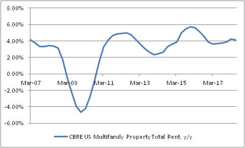
There have been some anecdotal reports of cooling rentals in hot or dense markets, but so far these are mostly anecdotes. Rental prices bear some watching, of course – especially since they pass through into CPI much more quickly than changes in home prices do.
Now, here’s a cautionary note about housing in general. I am most assuredly not a bull on real home prices and I think that they’ll probably underperform CPI going forward. And here’s the reason why. For many years, the relationship between home prices and incomes was very stable. Starting in 2000, home prices began to rise sharply faster than incomes, culminating in what we now know was a pretty ugly bubble. The chart below shows that bubble, and the return to the traditional relationship between home prices and incomes…and a renewed rise in that ratio. I am not saying that home prices are as bubbly now as they were in 2005. Indeed, the easy availability of credit these days makes it plausible that the equilibrium ratio is higher than the 3.4x of the 1970s, 80s, and 90s. The caveat, of course, is that this is true only if there has been a permanent easing in the availability of credit…and as the Fed is currently starting to slowly drain excess reserves, this is less clear. So, this is the warning sign and one good reason to keep a careful eye on home prices going forward.

Adding it all up, I don’t think there’s very persuasive evidence that we are about to see a meaningful deceleration in rental inflation. But just as I’m not persuaded that rents are about to decelerate markedly, I don’t see a great chance of a strong further acceleration (and our model is strikingly boring at present, as the chart below – source Enduring Intellectual Properties – illustrates).

Ergo, core inflation (and more importantly, median), to accelerate much further, needs to see a broadening of pressures from beyond merely rent. And we’re starting to see some signs of that in core goods, and a faint whisper in other quarters. Rents are not likely to be the driving force for the next leg higher in inflation. But at the same time, we haven’t yet seen very much evidence that rents are about to collapse. Home prices are too high, relative to incomes. They’re probably higher partly because of optimism about incomes, though, and if wages validate that optimism then home prices may not be due for as bruising a correction this time. Wages are clearly accelerating, so the jury is out on that point.
I think the overall conclusion therefore is that a fair forecast for rents and OER in the CPI still calls for stability for a while. If you’re hoping for inflation to decelerate soon, you ought look elsewhere.
Again, don’t forget to sign up at PremoSocial to get access to my CPI-day updates!
Some Abbreviated but Important Thoughts on Housing
I posted this chart yesterday to my Twitter feed (@inflation_guy, or @inflation_guyPV through PremoSocial for some additional content), but didn’t have time to write very much about it. This is the Shiller 20-City Home Price Index year/year change (Source: Bloomberg).

My observation was that when you take out the housing bubble, it looks more ominous. It’s actually really the bubble and bust, which makes the recent trend look uninteresting. This is what the chart looks like if you go further back like that.

So it actually looks calm and stable, because the axis explodes to -20% to +20%. The volatility of recent years has caused us to forget that for decades before that, the behavior of home prices was actually pretty sedate. Although residential real estate over very long time periods has only a slightly positive real return, adjusted for the maintenance and other required expenditures, that means the ratio of home prices to median income has tended to be fairly stable. We have historically valued homes as a consumption good only, which meant that the home price traded as a multiple of rents or incomes within a pretty narrow range. Here’s a chart of median home prices to median household income going back to the 1970s (Source: Bloomberg, Enduring Intellectual Properties calculations).

This is true even though there have been important tax changes along the way which changed the value of the home as a tax shelter, changes in the structure of the typical family unit, and so on. Despite that, homes were pretty stable investments – really, they were more savings vehicles than investments.
The fact that home prices are now accelerating, and are rising faster than incomes, implies several things. First, as the last chart above shows, the ‘investment value’ of the home is again inflating to levels that, in 2005-2008, proved unsustainable. The bubble in housing isn’t as bad as it was, and not as bad as stocks are now, but the combination of those two bubbles might be worse than they were when they were mostly independent (in 2000 there wasn’t a housing bubble and in 2007 the bubble in stocks wasn’t nearly as bad as in 2000 and now).
The second implication is that as home prices rise, it isn’t just the value of the investment in the home that is rising but also its cost as a consumption item. Because shelter to rent is a substitute for shelter that you own, rising home prices tends to imply that rents also accelerate. Recently, “Owner’s Equivalent Rent” has been decelerating somewhat, although only coming back to our model. But the gradual acceleration in the home price increase implies that shelter inflation is not going to continue to moderate, but rather should continue to put upward pressure on core inflation, of which 42% consists of “Rent of Shelter.”
Housing Disinflation Isn’t Happening Yet
Before everyone gets too animated about the decline in core inflation, with calls for central banks to put the brakes on rate normalization, let’s realize that the main drivers of lower inflation over the last few months – zero rise in core CPI over three months! – are not sustainable. I’ve written previously about the telecommunications-inflation glitch that is a one-off effect. Wireless telephone services fell -1.38% month-over-month in February (not seasonally adjusted), -6.94% in March, and -1.73% in April. In May, the decline was -0.06%. Here is a chart, courtesy of Bloomberg, showing the year-to-date percentage declines for the last decade. The three lines at top show the high, average, and low change over the prior decade, so you can see the general deflationary trend in wireless telecom services and the historical outliers in both directions. The orange line is the year-to-date percentage change. Again, the point here is that we cannot expect this component of inflation to deliver a similar drag in the future.

The other main drag comes from a less-dramatic decline in a much-larger component: Owners’ Equivalent Rent. In this month’s CPI tweetstorm, I pointed out that this decline is mostly just returning the OER trend to something closer to our model (see chart below), but many observers (who don’t have such a model) have seen this as a precursor to a more-significant decline in rents.

This is actually a much more-important question than the dramatic, and easy-to-diagnose, issue of wireless telecommunications, because OER is a ponderous category. You can’t get high inflation without OER rising, and you can’t get deflation or even significant disinflation without OER declining. It’s just too big. So what are the prospects for OER rolling over?
Here are two reasons that I think it’s very unlikely that this is a precursor to a significant decline in housing inflation.
First, while I understand that rent increases in some parts of the country are moderating, they are always moderating somewhere in the country. Owners’ Equivalent Rent tends to parallel primary rents (“Rent of Primary Residence,” which measures the actual price of a rental unit as opposed to implied rent of an owner-occupied dwelling) reasonably well, and when home prices are rising it tends to imply that rents – as the price of a substitute, at least for the consumption part of home prices – are also rising. (A house is both an investment asset and a consumption good, and the BLS’s method for separating these two components of a home recognizes that the consumption component should look a lot like the substitute). And the fact is that Primary Rents are not (yet?) decelerating much (see chart, source Bloomberg).

Yes, I understand and agree that home prices are already too high to be sustainable in the long run. Either incomes need to outpace home prices for a while, or home prices need to decline again, or we need to become accustomed to housing becoming a permanently larger part of our consumption and asset mix (see chart, source Enduring Investments).

But is that going to happen? Well, here are two charts that should make you somewhat skeptical that at least on the supply side we are about to see a decline in home prices. First, here is the index of Housing Starts, which last month took a nasty drop. Even without the nasty drop, though, notice that the level of starts was not only far below the level of the last few peaks in the housing market, but actually not far above the troughs reached in the recessions of the mid-1970s, early 1980s, and early 1990s. The only reason the current level of starts looks high is because homebuilders basically stopped building for a few years after the housing bubble.

Homebuilders stopped building because there was suddenly plenty of inventory on the market! In the immediate aftermath of the bubble, the homes that were available for sale were often distressed sellers and as prices rose, more and more of the so-called “shadow inventory” (people who wanted to sell, but were now underwater and couldn’t sell) was freed. This kept a lid on overall housing starts, but the net effect is that even now, when most of that shadow inventory has presumably been liquidated (a decade after the bubble and at new price highs), the inventory of existing homes available for sale has become and has remained quite low (see chart, source Bloomberg).

The supply side, then, doesn’t seem to offer much cause to expect home prices to moderate, even if their prices are relatively high. I’d want to see an overreaction of builders, adding to supply, before I’d worry too much about another bust, and we haven’t seen that yet. So we have to turn to the demand side if we expect home prices to decline. On that side of the coin, there are two arguments I sometimes hear: 1) household formation in the era of the Millennial is low, or 2) households don’t buy as much housing as they used to.
There is no evidence that household formation has slowed in recent years. As the chart below (source Bloomberg) shows, household formation has been rising since 2009 or so, and is back in line with long-term trends. Millennials may have weird notions of home life (I don’t judge!), but they still form households of their own.

As for the second point there…notice that I phrased the question as whether Millennials are buying less housing, rather than as buying fewer homes. I think it’s plausible to suggest that Millennials might demand fewer homes to buy, but it’s hard to imagine that they’re neither going to rent nor buy homes – and if they do either, they are demanding shelter as a consumption item. It just becomes a question of whether they’re demanding rental housing or owned housing.
The upshot of this is that there’s no sign yet of a true ebbing in housing/rental inflation. And until there is, there’s scant need to fear a disinflationary trend taking hold.
Tariffs are Good for Inflation
The news of the day today – at least, from the standpoint of someone interested in inflation and inflation markets – was President Trump’s announcement of a new tariff on Canadian lumber. The new tariff, which is a response to Canada’s “alleged” subsidization of sales of lumber to the US (“alleged,” even though it is common knowledge that this occurs and has occurred for many years), ran from 3% to 24% on specific companies where the US had information on the precise subsidy they were receiving, and 20% on other Canadian lumber companies.
In related news, lumber is an important input to homebuilding. Several home price indicators were out today: the FHA House Price Index for new purchases was up 6.43% y/y, the highest level in a while (see chart, source Bloomberg).

The Case-Shiller home price index, which is a better index than the FHA index, showed the same thing (see chart, source Bloomberg). The first bump in home price growth, in 2012 and 2013, was due to a rebound to the sharp drop in home prices during the credit crisis. But this latest turn higher cannot be due to the same factor, since home prices have nearly regained all the ground that they lost in 2007-2012.

Those price increases are in the prices of existing homes, of course, but I wanted to illustrate that, even without new increases in materials costs, housing costs were continuing to rise faster than incomes and faster than prices generally. But now, the price of new homes will also rise due to this tariff (unless the market is slack and so builders have to absorb the cost increase, which seems unlikely to happen). Thus, any ebbing in core inflation that we may have been expecting as home price inflation leveled off may be delayed somewhat longer.
But the tariff hike is symptomatic of a policy that provokes deeper concern among market participants. As I’ve pointed out previously, de-globalization (aka protectionism) is a significant threat to inflation not just in the United States, but around the world. While I am not worried that most of Trump’s proposals would result in a “reflationary trade” due to strong growth – I am not convinced we have solved the demographic and productivity challenges that keep growth from being strong by prior standards, and anyway growth doesn’t cause inflation – I am very concerned that arresting globalization will. This isn’t all Trump’s fault; he is also a symptom of a sense among workers around the world that globalization may have gone too far, and with no one around who can eloquently extol the virtues of free trade, tensions were likely to rise no matter who occupied the White House. But he is certainly accelerating the process.
Not only do inflation markets understand this, it is right now one of the most-significant things affecting levels in inflation markets. Consider the chart below, which compares 10-year breakeven inflation (the difference between 10-year Treasuries and 10-year TIPS) to the frequency of “Border Adjustment Tax” as a search term in news stories on Google.

The market clearly anticipated the Trumpflation issue, but as the concern about BAT declined so did breakevens. Until today, when 10-year breakevens jumped 5-6bps on the Canadian tariff story.
At roughly 2%, breakevens appear to be discounting an expectation that the Fed will fail to achieve its price inflation target of 2% on PCE (which would be about 2.25% on CPI), and also excluding the value of any “tail outcomes” from protectionist battles. When growth flags, I expect breakevens will as well – and they are of course not as cheap as they were last year (by some 60-70bps). But from a purely clinical perspective, it is still hard to see how TIPS can be perceived as terribly rich here, at least relative to nominal Treasury bonds.
Homes Are Where the Heat Is
This week’s main event is supposed to be the FOMC meeting. Certainly, for some time now that has been the case: in a week with a Fed meeting, nothing else matters. Knowing this, many investors will probably over-parse the language from the FOMC statement following the meeting, even though there is little to no chance of any policy change at this meeting nor at any of the next few meetings (it certainly would be a huge surprise if the Fed were either to tighten, or even to indicate a growing likelihood of a future tightening, after Cleveland Fed President Mester recently mused about helicopter drops).
In the meantime, though, we have some housing data that is somewhat interesting. New Home Sales were released today, showing a new seasonally-adjusted post-crisis high. To be sure, sales are still well off the bubble highs, but they are back to roughly average for the period prior to the bubble (see chart, source Bloomberg).

New Home Sales is more regular (outside of a bubble) than Existing Home Sales, because additions to the housing stock are partly driven by household formation and that’s reasonably constant over long periods of time. The more important number (in part because it is also it is much larger) is Existing Home Sales, which was released last week and looks even stronger (see chart, source Bloomberg).

Existing Home Sales is also affected by household formation, but the level of the aggregate stock of housing matters as well so this measure tends to rise over time. Even so, it looks to be at least back on the long-run trend.
Now, as an inflation scout I spend a lot of time looking at housing. Housing is the largest part of the consumption basket almost everywhere in the world, whether the shelter is owned or rented, and it is an even larger part of the more-stable core inflation basket. If you get housing right, in short, it is hard to be very wrong on inflation overall. This is why I’ve been persistent in saying that deflation in the US, outside of the energy price collapse, isn’t coming any time soon. The rise of home prices in the US, as measured by the S&P CoreLogic Case-Shiller index (which becomes more of a mouthful every time someone new buys the index!), has eased to around 5% per annum versus a rebound-inspired 10% in late 2013/early 2014 (see chart, source Bloomberg).

Here is where it pays to be a bit careful. A simple-lag model would predict that rents and owners-equivalent-rents should shortly be declining from current 9-year high rates of increase. But logically, that can’t make sense – if home prices rose 5% forever, then obviously rents would eventually rise something like 5% per year as well. This is a case for a distributed-lag model (even better would be distributed lags on real prices, reflecting the fact that if overall inflation rises then the same real home price increase would reflect a higher nominal home price increase, but there isn’t enough “exciting” inflation in the last couple decades of data to calibrate that well). And one simple such model, shown below (source: Enduring Investments),[1] suggests that the current level of OER is sustainable even though it currently incorporates the lagged effects of that post-2013 deceleration.

Now, of interest is that all of our models currently predict that rents will continue to rise for a bit, but only for a bit. Shelter inflation seems baked-in-the-cake through 2017, which is as far as our models project, but doesn’t seem to have a lot of acceleration left (maybe 0.25%) before levelling off. Having said that, there is another consideration that bears comment. The chart below (source: Bloomberg) shows the S&P CoreLogic CS Index again, this time plotted against the number of “Existing Homes Available for Sale” (and a 12-month moving average of that not-seasonally-adjusted index).

The relationship here is a bit loose, for a bunch of reasons, but the point to be made is this: the inventory of homes for sale has returned to levels that prevailed in the late-90s and early-00s, leading to home price increases in excess of the current 5%-per-annum level. When inventories first fell to this level, there was some fear that a large “shadow inventory” of homes that would have been sold at higher prices would be released into the market, holding down prices. If that has happened, it has been gradual as the inventory of homes actually listed has not risen appreciably in the last three years; moreover, it hasn’t held down home prices very well. The upshot is, I think, that home prices are likely to continue to rise by around 5% per year, or possibly faster; this will likely keep upward pressure on rents for the next couple of years.
But, as noted above, the upward pressure on rents will probably be limited from these levels, unless and until prices ex-housing begin to rise more aggressively. We expect them to do so; in any case, current CPI swaps quotes that imply core inflation will be at or below 1.5% for the next three or four years remain egregiously mispriced.
[1] Please contact me, or contact us through our website, if you’re interested in inflation-related products and services, including institutional consulting arrangements. Interested in investing in Enduring Investments? We are currently raising equity in the firm through a Crowdfunding campaign. See https://www.crowdfunder.com/enduring-investments-llc/ or contact me for more details as we expect to close subscriptions soon.