Tariffs Don’t Hurt Domestic Growth
I really wish that economics was an educational requirement in high school. It doesn’t have to be advanced economics – just a class covering the basics of micro- and macroeconomics so that everyone has at least a basic understanding of how an economy works.
If we had that, perhaps the pernicious confusion about the impact of tariffs wouldn’t be so widespread. It has really gotten ridiculous: on virtually any news program today, as well as quite a few opinion programs (and sometimes, it is hard to tell the difference), one can hear about how “the trade war is hurting the economy and could cause a recession.” But that’s ridiculous, and betrays a fundamental misunderstanding about what tariffs and trade barriers do, and what they don’t do.
Because to the extent that people remember anything they were taught about tariffs (and here perhaps we run into the main problem – not that we weren’t taught economics, but that people didn’t think it was important enough to remember the fine points), they remember “tariffs = bad.” Therefore, when tariffs are implemented or raised, and something bad happens, the unsophisticated observer concludes “that must be because of the tariffs, because tariffs are bad.” In the category of “unsophisticated observer” here I unfortunately have to include almost all journalists, most politicians, and most alarmingly a fair number of economists and members of the Fed. Although, to be fair, I don’t think the latter two groups are making the same error as the former groups; they’re probably just confusing the short-term and the long-term or thinking globally rather than locally.
In any event, this reached a high enough level of annoyance for me that I felt the need to write this short column about the effects of tariffs. I actually wrote some of this back in June but needed to let it out again.
The effect of free trade, per Ricardo, is to enlarge the global economic pie. (Ricardo didn’t speak in terms of pie, but if he did then maybe people would understand this better.) However, in choosing free trade to enlarge the pie, each participating country surrenders its ability to claim a larger slice of the pie, or a slice with particular toppings (in this analogy, choosing a particular slice means selecting the particular industries that you want your country to specialize in). Clearly, this is good in the long run – the size of your slice, and what you produce, is determined by your relative advantage in producing it and so the entire system produces the maximum possible output and the system collectively is better off.
However, that does not mean that this is an outcome that each participant will like. Indeed, even in the comparative free trade of the late 1990s and 2000s, companies carefully protected their champion companies and industries. Even though the US went through a period of truly sucking at automobile manufacturing, we still have the big three automakers. On the other hand, the US no longer produces any apparel to speak of. In fact, I would suggest that the only way that free trade works at all in a non-theoretical world is if (a) all of the participants are roughly equal in total capability or (b) the dominant participant is willing to concede its dominant position in order to enrich the whole system, rather than using that dominant position to secure its preferred slices for itself. Many would argue that (b) is what happened, as the US was willing to let its manufacturing be ‘hollowed out’ in order to make the world a happier place on average. Enter President Trump, who suggested that as US President, it was sort of his job to look out for US interests. And so we have tariffs and a trade war.
What is the effect of tariffs?
- Tariffs are good for the domestic growth of the country imposing them. There is no question about it in a static equilibrium world: if you raise the price of the overseas competitor, then your domestic product will be relatively more attractive and you will be asked to make more of it. If other countries respond, then the question of whether it is good or bad for growth depends on whether you are a net importer or exporter, and on the relative size of the Ex-Im sector of your economy. The US is a net importer, which means that even if other countries respond equally it is still a gain…but in any event, the US economy is relatively closed so retaliatory tariffs have a comparatively small effect. The effect is clearly uneven, as some industries benefit and some lose, but tariffs are a net gain to growth for the US in the short term (at least).
- Tariffs therefore are good for US employment. In terms of both growth and employment, recent weakness has been blamed on tariffs and the trade war. But this is nonsense. The US economy and the global economy have cycles whether or not there is a trade war, and we were long overdue for a slowdown. The fact that growth is slowing at roughly the same time tariffs have been imposed is a correlation without causality. The tariffs are supporting growth in the US, which is why Germany is in a recession and the US is not (yet). Anyone who is involved with a manufacturing enterprise is aware of this. (I work with one manufacturer which has suddenly started winning back business that had previously been lost to China in a big way).
- Tariffs are bad for global growth. The US-led trade war produces a shrinkage of the global pie (well, at least a slowing of its growth) even as the US slice gets relatively larger. But for countries with big export-import sectors, and for our trade partners who are net exporters to the US and have tariffs applied to their goods, this is an unalloyed negative. And as I said, more-fractious trade relationships reduce the Ricardian comparative advantage gain for the system as a whole. It’s just really important to remember that the gains accrue to the system as a whole. The question of whether a country imposing tariffs has a gain or a loss on net comes down to whether the growth of the relative slice outweighs the shrinkage of the overall pie. In the US case, it most certainly does.
- Trade wars are bad for inflation, everywhere. I’ve written about this at length since Trump was elected (see here for one example), and I’d speculated on the effect of slowing trade liberalization even before that. In short, the explosion of free trade agreements in the early 1990s is what allowed us to have strong growth and low inflation, even with a fairly profligate monetary policy, as a one-off that lasted for as long as trade continued to open up. That train was already slowing – partly because of the populism that helped elect Mr. Trump, and partly because the 100th free trade agreement is harder than the 10th free trade agreement – and it has gone into reverse. Going forward, the advent of the trade war era means we will have a worse tradeoff of growth and inflation for any given monetary policy. This was true anyway as the free-trade-agreement spigot slowed, but it is much more true with a hot trade war.
- Trade wars are bad for equity markets, including in the US. A smaller pie means smaller profits, and a worse growth/inflation tradeoff means lower growth assumptions need to be baked into equity prices going forward. Trade wars are of course especially bad for multinationals, whose exported products are the ones subject to retaliation.
In the long run, trade wars mean worse growth/inflation tradeoffs for everyone – but that doesn’t mean that every country is a net loser from tariffs. In the short run, the effect on the US of the imposition of tariffs on goods imported to the US is clearly positive. Moreover, because the pain of the trade war is asymmetric – a country that relies on exports, such as China, is hurt much more when the US imposes tariffs than the US is hurt when China does – it is not at all crazy to think that trade wars in fact are winnable in the sense of one country enlarging its slice at the expense of another country or countries’ slices. To the extent that the trade war is “won,” and the tariffs are not permanent, then they are even beneficial (to the US) in the long run! If the trade war becomes a permanent feature, it is less clear since slower global growth probably constrains the growth of the US economy too. Permanent trade frictions would also produce a higher inflation equilibrium globally.
In this context, you can see that the challenge for monetary policy is quite large. If the US economy were not weakening anyway, for reasons exogenous to trade, then the response to a trade war should be to tighten policy since tariffs lead to higher prices and stronger domestic growth. However, the US economy is weakening, and so looser policy may be called for. My worry is that the when the Federal Reserve refers to the uncertainty around trade as a reason for easing, they either misapprehend the problem or they are acting as a global central bank trying to soften the global impact of a trade war. I think a decent case can be made for looser monetary policy – but it doesn’t involve trade. (As an aside: if central bankers really think that “anchored inflation expectations” are the reason we haven’t had higher inflation, then why are they being so alarmist about the inflationary effects of tariffs? Shouldn’t they be downplaying that effect, since as long as expectations remain anchored there’s no real threat? I wonder if even they believe the malarkey about anchoring inflation expectations.)
Do I like tariffs? Well, I don’t hate them. I don’t think the real economy is the clean, frictionless world of the economic theorists; since it is not, we need to consider how real people, real industries, real companies, and real regimes behave – and play the game with an understanding that it may be partially and occasionally adversarial, rather than treating it like one big cooperative game. There are valid reasons for tariffs (I actually first enumerated one of these in 1992). I won’t make any claims about the particular skill of the Trump Administration at playing this game, but I will say that I hope they’re good at it. Because if they are, it is an unalloyed positive for my home country…whatever the pundits on TV think about the big bad tariffs.
Summary of My Post-CPI Tweets (August 2019)
Below is a summary of my post-CPI tweets. You can (and should!) follow me @inflation_guy. Or, sign up for email updates to my occasional articles here. Investors with interests in this area be sure to stop by Enduring Investments or Enduring Intellectual Properties (updated sites coming soon). Plus…buy my book about money and inflation. The title of the book is What’s Wrong with Money? The Biggest Bubble of All; order from Amazon here.
- Welcome to another CPI day. The tone going into this one is soooo much different than last month. We are coming off of a surprising jump in core CPI of 0.29%, rather than three straight weak numbers, for starters.
- For another, the Fed is already in easing mode; last month we were just preparing for it. Despite the high inflation print, and median CPI near its highs y/y (2.84%), the Fed eased anyway.
- (If you needed any more evidence that the Fed cares more about the stock market and “risk management” of forward growth expectations, than about inflation, that was an exhibit for you.)
- With global growth sliding, protests in Hong Kong, the Argentinian peso collapsing…this CPI number today won’t change the Fed’s trajectory. They’re going to keep easing for a while.
- I expect inflation to peak later in Q4 or in Q1, but in the meantime it may make the Fed feel a bit uncomfortable. List 4 tariffs being implemented will probably finally result in a tariff effect (not for a few months, as they take effect Sep 1).
- As for today: last month’s jump was fueled by housing, and by used (not new, not leased) cars and trucks. Most of that was catch-up although housing’s strength is a little surprising.
- I don’t expect retracements there. And there’s upside risk from medical care, especially hospital services, though it’s hard to time.
- Recent increases in the CPI for health insurance, which is a residual, may indicate coming acceleration in inflation for drugs and/or hospital services, which are due. Hard to time this though.
- Consensus on the Street is for roughly 0.19% on core CPI. That would keep y/y steady, right at 2.1%. Good luck.
- Well whoopsie. Another 0.29% on core CPI. That brings y/y core to 2.21%
- This makes the lull earlier this year look decidedly different.

- Let’s see. Lodging Away from Home jumps out, retracing a -0.64% fall last month to +0.94% this month, but that’s only 1% of CPI.
- Primary Rents and OER both were better behaved this month, +0.28% and +0.25%, but that actually lowers the y/y for both of them.
- Heh heh…did someone say hospital services? It rose 0.46% m/m, pushing the y/y to 0.77% from 0.50%. No real victory lap for me yet…it’s got a long way to go.

- Pharma was also positive, +0.29% m/m versus -0.46% m/m last. Overall, Medical Care rose to 2.57% y/y versus 1.96% last month. Medical Care is about 9% of CPI.
- Used cars and trucks accelerated to 1.47% y/y versus 1.25%. So no retracement to the bounce last month. I hadn’t expected any since the move last month looked like a return to fair.
- Apparel +0.44% m/m. That takes the y/y to -0.55% versus -1.29% last month. Couple of months ago there was a sharp fall as BLS shifted to a new methodology. Looks like this is catching up. Still mild deflation in apparel, no tariff effects.
- Overall, Core Goods was +0.40% y/y. Wait, what?? About time! HIGHEST Y/Y CORE GOODS SINCE 2013. The persistent-deflation-in-goods narrative just took a hickey.

- However, hold the victory lap on that. Model says we may be close to the highs on core goods. (But the model doesn’t know about tariffs.)

- This is rare…Other Goods and Services, the eighth of eight major subgroups in CPI, rose 0.52% m/m. That category (only 3% of CPI) is a dog’s breakfast so unusual to see a m/m jump that large. Will be worth looking into.
- Core inflation ex-shelter rose to 1.31% y/y from 1.16% last month.
- New Vehicles and Leased Cars and Trucks both decelerated further. So if anyone ‘blames’ used cars for the strong print, point out that overall “New and used motor vehicles” decelerated to 0.30% y/y from 0.43%. This kind of talk will make you popular at parties.
- CPI for health insurance continued to surge, now up 15.88% y/y. Remember, this is a residual, but I think that means it may signal changes that the BLS hasn’t picked up yet. It’s the highest on record.

- Back to that dog’s breakfast of “Other”. Nothing really stands out. This category has cigarettes, personal care products (cosmetics, etc), personal care services (haircuts, e.g.), funeral expenses, legal services, financial services, dry cleaning…pretty balanced increases.
- Biggest declines this month are jewelry and watches (-17% annualized) and infants’ and toddlers’ apparel (-12.8% annualized). Bunch of annualized >10% gains tho: Mens’ & boys’ and womens’ & girls’ apparel, public transportation, lodging away from home, tobacco, motor fuel.
- Early look at median CPI…my estimate is 0.28% m/m, which would put y/y to 2.88% and a new high.
- OK, time for the four-pieces charts. And then a wrap-up. First, Food & Energy.

- Second piece: Core goods. This is really where the story is, and where it’s likely to be going forward. A reminder here about how long the inflation process can take! Folks were looking for tariff effects the moment they went into effect. But businesses wait-and-see first.

- Now businesses have seen, and the tariffs look to be pretty sturdy, and they’re moving prices. And more to come probably.
- Core services less rent of shelter. Medical Care maybe has stopped going down, but it isn’t going up yet.

- And the stable Rent of Shelter. A little surprised it’s so buoyant still.

- Well, the wrap-up is obvious here. Second 0.3% core month in a row, and no obvious outliers. The acceleration seems to be concentrated in core goods, but fairly broad. I still think we will see inflation peak later 2019 or early 2020, but…there are no signs of it yet.
- So this is what the Fed faces: slowing global growth, political unrest, and rising inflation. In that circumstance, will they keep easing? OF COURSE THEY WILL, THEY DON’T CARE ABOUT INFLATION. Haven’t for a decade at least.
- And what about markets? 10-year inflation swaps are shown below, compared to Median CPI (last point estimated). There’s a serious disconnect here.

- So as Porky says, “That’s all, folks!” Thanks for tuning in. I’ll put the summary of these tweets up on my site mikeashton.wordpress.com within the hour.
What is amazing about inflation is both how slowly it changes and also how quickly it changes. Three months ago we were looking at four soft months in a row on core CPI and people were starting to chirp about the coming deflation. Then we get two of the highest core prints in a long time – and broad-based at that – and the story will be 180 degrees different. (Another reason to watch Median CPI rather than Core CPI is that the head fakes aren’t very good in Median – there was never much question that the broad trend was staying higher).
To be sure, the Fed doesn’t really care about inflation, and markets don’t much care either. Unless, that is, it causes the Administration to slow its march toward tariffs. As I write this, the Trump Administration has announced they will delay the tariffs on “some” products – including cell phones, laptops, video game consoles, some toys, and some apparel – until December 15th (just in time for Christmas, but it means that these goods won’t see prices higher during the holiday shopping season since everything on store shelves will have already been imported. Thanks Wal-Mart!). Stocks have taken that as a signal to rip higher because the fact that inflation is rising on 98% of the consumption basket is so one-hour-ago. Happy days are here again!
But make no mistake. The inflation pressures are not all from tariffs. In fact, few of them seem to be specifically traceable to tariffs. This is a continuation of a broad accelerating trend we have seen for several years. See above: inflation changes slowly. The Federal Reserve will ignore this because they believe the slower global growth will restrain inflation so that there is nothing they need to do about it. In some sense they are right, because the market has already lowered interest rates by so much it is likely to push money velocity lower again. I still think inflation will peak later this year or early next year, but if I were on the FOMC…I’d be somewhat nervous about that projection today.
Be Quiet! Let the Man Stop Speaking!
I continue to get more and more disappointed in Powell as a Fed chairman. When he came in, as someone who was not an economist by training and therefore not (yet, as it turns out) captured by the economic orthodoxy, I was optimistic that he might be able to break the cycle of tragic decisions by the Federal Reserve. The Fed’s path has (along with errors in other central banks mirroring the Fed’s “leadership”) led to a series of bubbles and busts, with the busts not even being allowed to cleanse the system and so defer future bubbles. It has led to an overleveraged consumer, overleveraged business, and overleveraged public accounts, and this has in turn helped produce an exceptionally fragile financial economy.
The Fed has now embarked on a new easing program, as “insurance” and “risk management” against a future slowdown. Considering that it isn’t the Fed’s job to prevent business cycles, this represents enormous hubris – but that’s what happens when you take a bunch of people and put them in a really fancy building and tell them how smart they are.
For years, the Fed has been telegraphing their moves, so that the sort of Fed watching I used to do as a fixed-income strategist is almost moot. The amount of market volatility around the Fed’s rate cut today – or, really, around Powell’s ham-handed presser afterwards – is remarkable considering that the market got exactly what it expected, except for some mild adjustments to possible paths forward in the distant future. But let’s face it: relying on what the Chairman says today about what monetary policy might be next year (for the record, he said it is unlikely the Fed could hike rates again) is like relying on today’s weather forecast for next Tuesday. There is just so much other stuff that has yet to happen that you really shouldn’t put any weight at all on that future forecast. If you’re canceling next week’s picnic because the meteorologist today said it could rain next week, you haven’t been paying much attention to the efficacy of meteorological forecasts. Count that double for economists.
But for whatever reason, I found myself listening to part of the Q&A period and instead of continuing to scream at the television I thought I’d write down a couple of the things that annoyed me. But just a couple.
- Powell said “Global disinflationary pressures persist.” This seems to be more of a slogan than analysis. Let’s take more than three seconds to examine it. Pray tell, what are these “disinflationary pressures?” Here are some popular candidates.
- Aging populations in developed countries – this certainly isn’t it. Aging populations are of course inflationary, not disinflationary. An aging population implies lower potential output, all else equal, and a leftward shift of the aggregate supply curve is plainly inflationary. To be sure, this isn’t economic orthodoxy, but the economic orthodoxy in this case (as in so many cases) is simply wrong.
- Trade – Globalization of trade has been the dominant disinflationary force for thirty years. Unfortunately, it seems to have run its course. There certainly doesn’t seem to be any sign that global trade is continuing to broaden and in fact it seems to be recently in reverse. At best, it is going nowhere fast after many years of being in fact a disinflationary force.
- Lower interest rates – It is plain to monetarists that lower interest rates cause lower inflation, since lower interest rates cause a decline in monetary velocity by increasing the demand for real cash balances (decreasing the prevalence of attractive substitutes). However, it also seems pretty plain that the Fed is not arguing this, both because they aren’t really monetarists any longer but more importantly because it this was their argument then it’s weirdly circular: “we’re lowering interest rates because of global disinflationary pressures, such as the fact that interest rates are going down.”
- Global debt overhang – this seems to be the only reasonable argument about a possible source of global disinflationary pressures. A high level of private debt tends to be disinflationary because it increases the value of cash flow compared to profit. You can go broke realizing profits, if you don’t have enough cash flow to service your debt; this causes heavily-indebted companies to be more reluctant to risk market share by raising prices and causes heavily-indebted individuals to be more reluctant to risk continuous employment by asking for pay increases. On the other side, though, we know that heavy public debt loads have historically tended to be inflationary once they reach some difficult-to-define tipping point, because central authorities have increased incentives to let inflation run a bit hot to help grow out of obligations. But again, this is sort of circular as well since one reason that there is so much debt is because real interest rates are so low. And real interest rates are so low because central banks keep easing. So it would seem weird to be making the argument about too much debt causing disinflation and then lowering interest rates.
I don’t think he is thinking about the “AirBnB effect” (not real) or the “Amazon effect” (not real) or any of the various other postulated effects stemming from gee-whiz technology that never seems to hold up to actual scrutiny. In the end, I don’t think he really had anything in particular in mind. For the Fed, the fact that inflation hasn’t gone up means that there are disinflationary forces. Q.e.d.
Powell also noted: “If you look at the economy right now there’s no sector that’s booming and therefore might bust.”
Nope.


 Sources: GuruFocus, Bloomberg, DOE, Enduring Investments.
Summary of My Post-CPI Tweets (July 2019)
Below is a summary of my post-CPI tweets. You can (and should!) follow me @inflation_guy. Or, sign up for email updates to my occasional articles here. Investors with interests in this area be sure to stop by Enduring Investments or Enduring Intellectual Properties. Plus…buy my book about money and inflation. The title of the book is What’s Wrong with Money? The Biggest Bubble of All; order from Amazon here.
- Big, big CPI day today. After four straight 0.1s (rounded down to that, in each case) on core CPI, the importance here is hard to overstate.
- With the Fed gearing up to ease, partly because of low inflation, these prints all matter more.
- (…although the Fed minutes suggested the Fed is taking a “risk management” approach, which makes the hurdle for NOT easing a lot higher since they can always say they’re addressing future risks, not current data.)
- The problem is that better measures of inflation, like Median or Trimmed Mean, are not really showing the same slowdown as core. That is, these are still one-offs, or “transitory” in Fed-speak.
- But that’s one way that inflation involves – as one-offs that become more frequent until those one-offs are the median. Still, while I expect inflation to peak later this year I don’t think that’s happening yet.
- There is an underlying mystery in all of this and that is: where is the tariff effect?! The markets have moved on from worrying about it because it hasn’t shown up yet.
- But the short-term bump from the actual tariffs was never the real threat with de-globalization. The important effects are long-term, not short term. Still, it makes investors more confident that China tariffs don’t really matter much.
- OK, just a few minutes until the number. After the number and my reactions to it, tune in to @TDANetwork where I will be talking with @OJRenick at about 9:15ET. The consensus is for 0.2% on core CPI, keeping y/y at 2.0%. Good luck out there.
- Well, that’s more like it. Core CPI +0.29%, pushing y/y from 2.00 to 2.13%.
- Breakdown in a moment but first thing it’s really important to remember: this does not mean the Fed won’t ease this month. Almost surely, they still will. Remember, this is “risk management” to them. They’ve set it up to ease anyway.
- Last 12 core CPI.

- OK, big m/m jump in Primary Rents and Owners’ Equivalent are the obvious culprits. Rents went to 3.87% y/y from 3.73% y/y on a +0.424% m/m jump. OER rose from 3.34% y/y to 3.41% y/y.
- Used Cars and Trucks also finally caught up a bit…they’d been way below where private surveys had them, but this month +1.59% m/m, vs -1.37% last month. y/y goes from +0.28% to 1.25%.
- Apparel +1.13% m/m. Y/y it’s still in deflation at -1.3%, but last month that was -3.1%. Tariff effect or just the new method adjustment starting to smooth out? I expect the new method will show more volatility, FWIW.
- You can see the main trend in apparel hasn’t really changed; this month’s bump just moves it back towards the prior flat-to-slightly-down trend.

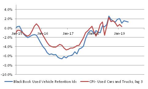
- CPI-Used cars and trucks vs Blackbook. Had been a bit below, now spot on.

- Core ex-shelter rises to 1.16% from 1.04%. That’s still well below the highs from late last year but underscores that this is not JUST housing (although…housing is a big part of it).
- This is interesting. Hospital Services (part of Medical Care) continues to plunge. -0.1% m/m and down to +0.50% y/y.

- also medicinal drugs continues to decline. And Doctor’s services was stable. But Medical Care as a whole drooped to 1.96% from 2.08% y/y. Those are the three big pieces, but…
- …Medical Care CPI didn’t decline further because Dental Services (0.79% weight, about half of doctors’ services) had a big jump, y/y to 1.94% from 1.15%. Get those teeth taken care of, people.
- College tuition and fees ebbed to 3.45% from 3.81% y/y.
- Back to Transportation…while Used Cars jumped (mostly just getting back to trend), New vehicles continued to droop. 0.58% y/y from 0.90% y/y. And leased cars got cheaper.
- My early estimate of Median CPI is +0.27%, bringing y/y back up slightly to 2.81%. Note the monthly series is much more stable than core, which is one reason to like Median.

- The largest negative changes this month were in Motor Fuel, Fuel Oil, Miscellaneous Personal Goods, Infants’ and Toddlers’ Apparel, and Public Transportation. All -10% or more on an annualized basis, but mostly small too.
- Largest increases were Jewelry and Watches, Car and Truck Rental (both of those over 60% annualized), Footwear, Used Cars and Trucks, and Men’s and Boys’ Apparel.
- I think that’s enough for today as I have to go get on air for @TDANetwork in 15 minutes. Tune in! Bottom line here is: keep focusing on Median, inflation isn’t headed down YET, but…Fed is still going to ease this month.
- Totally forgot to do the four-pieces charts. Will have to skip this month.
- OK, the four-pieces charts – I’ll have them in my tweet summary so might as well post them here. As a reminder these are four pieces that add up to CPI, each 1/5 to 1/3 of the total.
- First up, Food and Energy.

- Core goods. Now, this is interesting because it shows the reversal of some of the ‘transitory’ effects. Our model has this going to 1%, but recent outturns had been discouraging. Now back on track.

- Core services, though, continues to be drippy. A lot of the sogginess is medical care. I wonder what happens if the Administration wins and Obamacare is repealed? Short term, probably higher, but in the long-term less government involvement is also less inflationary.

- Finally, rent of shelter. Running a bit hotter than I expected it to be, and due to start fading a little. But no sign of a sharp deceleration in core while this is stable.

(I had to end this earlier this month because of the TD Ameritrade Network appearance, but went back and added the four-pieces charts later.)
The bottom line here is that nothing has changed in terms of what we should expect from central banks. They’re willing to let inflation run hot anyway because they thing low inflation was the problem. So they will ease this month, and probably will continue to ease as growth wanes. They will feel like they are ahead of the curve, and when inflation ebbs as I expect it to, they will say “see? We were right and we were even pre-emptive!”
Indeed, this is really the biggest risk in the longer-term. The Fed is going to be “right” but for all the wrong reasons. Inflation is not going to be declining because growth is slowing; these are merely coincident at the moment. Lower interest rates causing lower money velocity (since the opportunity cost of holding cash is going to go back towards zero) is the cause of the coming ebb in inflation which, by the way, won’t be as severe as in the last recession. But the risk is that the Fed becomes more confident in their models because they “worked,” and rely on them later.
Here’s an analogy. I just tossed a coin and the Fed went off, and ran complicated models factoring in gravity, wind resistance, the magnetism of the metals in the coin, biometric analyses about the strength of my thumb, and they concluded and called “heads.” It turned out to be heads, and the Fed is very happy about how well their models worked. Now, I know that it was “heads” because I tossed a two-headed coin.
So later, when I toss the coin again, the Fed runs the same model and calls “tails.” But this time, they are much more confident in their call, because of the model’s past success. Of course, since they didn’t actually get the right answer for the right reason the first time, there’s no more chance of being right than there was before…they’re just going to rely on it much more. And that’s the risk here. When the next inflation upturn happens, which I think will happen in the next cycle, the Fed will be very confident that their ‘expectations-augmented Phillips curve’ and Keynesian models will work…and they’ll be very, very late when inflation goes up.
But a really important point is: that’s not today’s trade. I doubt it’s even this year’s trade, although if I’m wrong and the peak isn’t happening yet it may be. The market realities remain:
- The Fed is going to ease this month, almost certainly 25bps.
- The Fed and other central banks are likely to keep easing preemptively, and then keep easing when the recession begins, and keep policy rates too low once the next expansion starts (although market rates will signal when that’s happening).
- Equities are too high for this growth regime; TIPS are way, way too cheap for any reasonably likely inflation regime…at least, relative to nominal bonds. But equities will probably take a while to figure that out.
Summary of My Post-CPI Tweets (June 2019)
Below is a summary of my post-CPI tweets. You can (and should!) follow me @inflation_guy. Or, sign up for email updates to my occasional articles here. Investors with interests in this area be sure to stop by Enduring Investments or Enduring Intellectual Properties. Plus…buy my book about money and inflation. The title of the book is What’s Wrong with Money? The Biggest Bubble of All; order from Amazon here.
- OK, CPI day at last. We get to find out if Powell meant “transitory” in the one-month sense (probably not) or in the 3-6 month sense (more likely).
- After all we have had three weak core CPI figures in a row: 0.110% for Feb, 0.148% in March, 0.138% in April. Three 0.1%s, rounded.
- Last month the culprit was used cars, -1.3% m/m, and Apparel at -0.8% m/m, the latter due to a methodology change. These are both short-term transitory, probably.
- Meanwhile, the evidence that core is being infected these last three months by tail events is in the median CPI, which was +0.26%, +0.27%, and +0.20% the last 3 months.
- Housing, on the other hand, remains strong, and this should continue for a bit; Medical Care remains weak with pharma especially (+0.1% y/y)…and I think that is “longer-term transitory” that should start to retrace higher.
- I am expecting a return to normalcy, not so much a rebound, in autos and apparel. But that should be enough to hit the consensus figures of 0.21% on core, 2.09% y/y.
- Longer-term, the fact that interest rates have fallen so far suggests that the small rebound we have seen over the last year and a half in money velocity may have trouble extending.
- So I think Median probably peaks late this year or early next, though I don’t expect it to fall off a cliff, either, in this recession.
- Grabbing coffee. Back in 11 minutes.
- So maybe a liiiiiittle more transitory than we thought! Core +0.11% m/m, +2.00% y/y.
- Last 12 months. The comp is easier next month, but none of the last 4 months would have exceeded it anyway!

- Apparel basically flat m/m, which is approximately what I expected…-3.06% y/y though, which includes the methodology change.
- CPI-Used Cars and Trucks was again down sharply m/m. -1.38%. That’s unlikely. Pushes y/y to +0.28%, Black Book has it about 1% above that.
- Housing: OER +0.26% m/m, Primary Rents +0.24%. Actually those aren’t far from the trends (y/y in each case declined a couple of hundredths, to 3.34% and 3.73% respectively), but last month had been chippier.
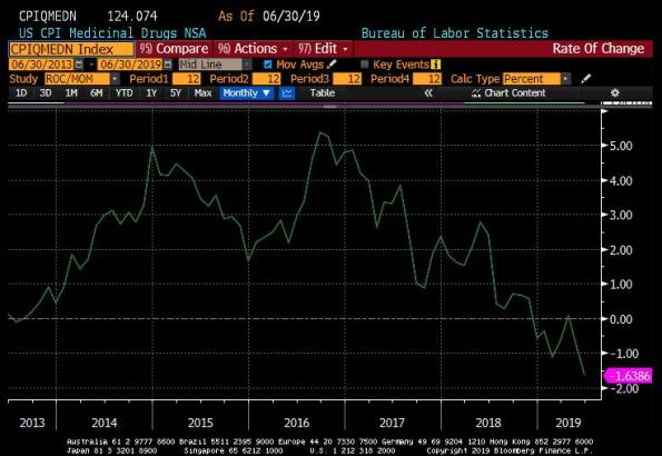
- Medical Care (and then I’m going to take a few minutes and dig deeper on some of these)…Medicinal Drugs (pharma) went into deflation. -0.11% m/m, -0.82% y/y. Chart in a moment. Doctor’s Services roughly unch, but only 0.30% y/y. Hospital Services bounced a bit, 1.30% y/y.
- Even with the bounce, Hospital Services is lower than two months ago, 3 months ago, etc. One year ago it was 4.70% y/y. Hospital Services is the largest component of the Medical Care subindex.
- Here is the y/y chart for drugs. Now, it’s very hard to measure this because there is tremendous dispersion in consumer costs for prescription drugs…massive differences based on which outlet, formulary, insurance, etc you have. Doing a lot of work on this. Sooo…

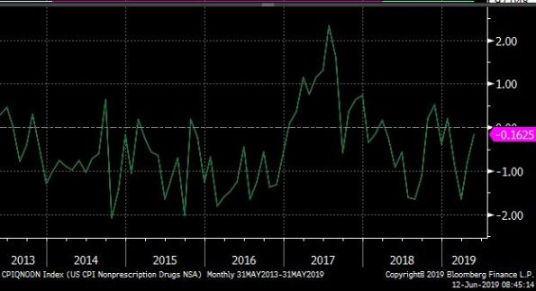
- this is the y/y picture for NONprescription drugs, which are much easier to measure. Basically no chg. So either prescriptn drug mkt is getting much more competitive (I doubt it), there is some change in collection method (possible), or a shift showing up as change.
- there is no lower-level index for drugs so we can’t really dig any deeper on that unfortunately. But it’s significant, not only for the CPI of course but for consumers generally (and the budget deficit) if health care costs really ARE slowing in a permanent way.
- CPI – College Tuition and Fees, essentially unch at 3.81% vs 3.86% y/y. But well off the lows.

- Now what does that last picture look like…oh, yeah, the S&P Target Tuition Inflation Index (my baby).

- Core inflation ex-housing down to 1.04%, the lowest level since February 2018. Still nowhere near the lows, nowhere near deflation, and with lots of transitory stuff in it.

- Core goods prices still in deflation, -0.2%. But lagged effect of the dollar’s 2017 selloff should just now be starting to wash into the core goods data. And we still haven’t seen the tariff effect yet. So this is still to come and the reason I don’t think we’ve peaked yet.

- WEIRD: Biggest declines on the month were used cars & trucks (-15.3% annualized), Leased cars & trucks (-13.8%). Biggest gainers: Car and Truck Rental (+26.5%), Public Transportation (+24.8%).
- Early estimate for Median CPI is +0.21% m/m, making y/y 2.81%. So, again, it’s a tails story.
- Sorry, didn’t calculate the sheet for y/y. Should be 2.76% y/y for median, down from 2.80%.
- Here is m/m Median CPI. Notice there’s really no major slowdown here. It’s been pretty steady and rising slightly y/y for a while. Nothing below 0.2% m/m since last August.

- OK, four pieces and then we’ll sum up. Piece 1 is food and energy.

- Piece 2 is core goods. As I said, I expect this to turn back higher. This is where you find Used Cars and Apparel…so transitory stuff is big here. This is also where tariffs fall heaviest.

- Piece 3 is Core Services less Rent of Shelter. Same story here: “What is up with medical care?” It may be that since consumers under the ACA end up paying out of pocket for a much larger share, they’re bargaining harder. That could be why it feels so much worse than this.

- Finally, rent of shelter – same old same old. No deflation while this remains steady as a rock.

- So, in sum. I do think that Powell is right in focusing on the “transitory” inflation slowdown. Better measures, such as Median (see below for Median vs core), show no significant slowdown yet.

- …and it’s hard to see where a slowdown would come from. Medical Care is already very slow. Core goods is already very slow, with negative tails already in the data but not much sign yet of the tariff effect sure to come. Housing is solid.
- So for now, I expect median inflation to continue to crawl higher. As we get later in the year, though, unless interest rates rebound a lot higher there’s a decent chance that money velocity droops again.
- Now, money velocity is already REALLY low so it may not. This chart isn’t our best model but it suggests velocity is already too low for the level of int rates (I’m not sure it’s a linear function near zero though). It was responding, but lower int rates may truncate a bounce.

- OK that’s all for today folks. Visit us at http://www.enduringinvestments.com if you want to have a more private chat. Thanks for tuning in!
Nothing more really to add – I will say that although Powell is right and these are transitory factors, I have lost faith that the Chairman is a “different sort” of Fed Chair since he doesn’t have an academic background. He was at first, but appears to have been captured by the econocognoscenti. Ergo, I expect the Fed will ignore the fact that inflation is still drifting higher, and start to cut rates as the growth figures make it ever clearer that the economy is heading towards (if not already in) recession. Long-end yields are already 110bps or more off the highs, so I think the bond market already has more than half its recession-rally finished (I don’t think we’ll have new low yields this cycle since I don’t think inflation will collapse and I don’t think the recession will be as bad). But stocks haven’t even begun their earnings-recession selloff, so…
How Not to Do Income-Disparity Statistics
I am a statistics snob. It unfortunately means that I end up sounding like a cynic most of the time, because I am naturally skeptical about every statistic I hear. One gets used to the fact that most stats you see are poorly measured, poorly presented, poorly collected, or poorly contexted. I actually play a game with my kids (because I want them to be shunned as sad, cynical people as well) that I call “what could be wrong with that statistic.” In this game, they have to come up with reasons that the claimed implication of some statistic is misleading because of some detail that the person showing the chart hasn’t mentioned (not necessarily nefariously; most users of statistics simply don’t understand).
But mostly, bad statistics are harmless. I have it on good authority that 85% of all statistics are made up, including that one, and another 12.223% are presented with false precision, including that one. As a result, the only statistic that anyone believes completely is the one they are citing themselves. So, normally, I just roll my eyes and move on.
Some statistics, though, because they are widely distributed or widely re-distributed and have dramatic implications and are associated with a draconian prescription for action, deserve special scrutiny. I saw one of these recently, and it is reproduced below (original source is Ray Dalio, who really ought to know better, although I got it from John Mauldin’s Thoughts from the Frontline).

Now, Mr. Dalio is not the first person to lament how the rich are getting richer and the poor are getting poorer, or some version of the socialist lament. Thomas Piketty wrote an entire book based on bad statistics and baseless assertions, after all. I don’t have time to tackle an entire book, and anyway such a work automatically attracts its own swarm of critics. But Mr. Dalio is widely respected/feared, and as such a simple chart from him carries the anti-capitalist message a lot further.[1]
I quickly identified at least four problems with this chart. One of them is just persnickety: the axis obviously should be in log scale, since we care about the percentage deviation and not the dollar deviation. But that is relatively minor. Here are three others:
- I suspect that over the time frame covered by this chart, the average age of the people in the top group has increased relative to the average age of the people in the bottom group. In any income distribution, the top end tends to be more populated with older people than the bottom end, since younger people tend to start out being lower-paid. Ergo, the bottom rung consists of both young people, and of older people who haven’t advanced, while the top rung is mostly older people who have Since society as a whole is older now than it was in the 1970s, it is likely that the average age of the top earners has risen by more than the average age of the bottom earners. But that means the comparison has changed since the people at the top now have more time to earn, relative to the bottom rung, than they did before. Dalio lessens this effect a little bit by choosing 35-to-64-year-olds, so new graduates are not in the mix, but the point is valid.
- If your point is that the super-wealthy are even more super-wealthier than they were before, that the CEO makes a bigger multiple of the line worker’s salary than before, then the 40th percentile versus 60th percentile would be a bad way to measure it. So I assume that is not Dalio’s point but rather than there is generally greater dispersion to real earnings than there was before. If that is the argument, then you don’t really want the 40th versus the 60th percentile either. You want the bottom 40% versus the top 40 percent except for the top 1%. That’s because the bottom of the distribution is bounded by zero (actually by something above zero since this chart only shows “earners”) and the top of the chart has no bound. As a result, the upper end can be significantly impacted by the length of the upper tail. So if the top 1%, which used to be centi-millionaires, are now centi-billionaires, that will make the entire top 40% line move higher…which isn’t fair if the argument is that the top group (but not the tippy-top group, which we all agree are in a category by themselves) is improving its lot more than the bottom group. As with point 1., this will tend to exaggerate the spread. I don’t know how much, but I know the direction.
- This one is the most insidious because it will occur to almost nobody except for an inflation geek. The chart shows “real household income,” which is nominal income (in current dollars) deflated by a price index (presumably CPI). Here is the issue: is it fair to use the same price index to deflate the incomes of the top 40% as we use to deflate the income of the bottom 40%? I would argue that it isn’t, because they have different consumption baskets (and more and more different, as you go higher and higher up the income ladder). If the folks at the top are making more money, but their cost of living is also going up faster, then using the average cost of living increase to deflate both baskets will exaggerate how much better the high-earners are doing than the low-earners. This is potentially a very large effect over this long a time frame. Consider just two categories: food, and shelter. The weights in the CPI tell us that on average, Americans spend about 13% of their income on food and 33% on shelter (these percentages of course shift over time; these are current weights). I suspect that very low earners spend a higher proportion of their budget on food than 13%…probably also more than 33% on shelter, but I suspect that their expenditures are more heavily-weighted towards food than 1:3. But food prices in real terms (deflated by the CPI) are basically unchanged over the last 50 years, while real shelter prices are up about 37%. So, if I am right about the relative expenditure weights of low-earners compared to high-earners, the ‘high-earner’ food/shelter consumption basket has risen by more than the ‘low-earner’ food/shelter consumption basket. Moreover, I think that there are a lot of categories that low-earners essentially consume zero of, or very small amounts of, which have risen in price substantially. Tuition springs to mind. Below I show a chart of CPI-Food, CPI-Shelter, and CPI-College Tuition and Fees, deflated by the general CPI in each case.

The point being that if you look only at incomes, then you are getting an impression from Dalio’s chart – even if my objection #1 and #2 are unimportant – that the lifestyles of the top 40% are improving by lots more than the lifestyles of the bottom 40%. But there is an implicit assumption that these two groups consume the same things, or that the prices of their relative lifestyles are changing similarly. I think that would be a hard argument. What should happen to this chart, then, is that each of these lines should be deflated by a price index appropriate to that group. We would find that the lines, again, would be closer together.
None of these objections means that there isn’t a growing disparity between the haves and the have-nots in our country. My point is simply that the disparity, and moreover the change in the disparity, is almost certainly less than it is generally purported to be with the weakly-assembled statistics we are presented with.
[1] Mr. Mauldin gamely tried to object, but the best he could do was say that capitalists aren’t good at figuring out how to share the wealth. Of course, this isn’t a function of capitalists. The people who decide how to distribute the wealth in capitalism are the consumers, who vote with their dollars. Bill Gates is not uber-rich because he decided to keep hundreds of billions of dollars away from the huddling masses; he is uber-rich because consumers decided to pay hundreds of billions of dollars for what he provided.
Tariffs and Subsidies…on Money
Many, many years ago (27, actually) I wrote a paper on how a tariff on oil actually has some beneficial effects which needed to be balanced against the beneficial effect that a lower oil price has on economic growth. But since the early 1990s until 2015 or so I can count on the fingers of one hand how many times the issue of tariffs came up in thoughts about the economy and markets. To the extent that anyone thought about them at all, it was to think about how lowering them has an unalloyed long-term positive effect. Which, for the most part, it does.
But the economics profession can sometimes be somewhat shamanistic on the topic of tariffs. Tariffs=bad; time for the next chapter in the book. There is much more complexity to the topic than that, as there is with almost any economic topic. Reducing economics to comic-book simplicity only works when there is one overwhelmingly correct idea, like “when demand for a good goes up, so does the equilibrium price.” The end: next chapter.
Tariffs have, though, both short-term and long-term effects. In the long-term, we all agree, the effects of raising tariffs are deleterious. For any given increase in money and velocity, we end up with lower growth and higher inflation, all else equal. It is important to realize that these are largely one-time effects although smeared out over a long period. That is, after equilibrium is reached if tariffs are not changed any longer, tariffs have no large incremental effect. It is the change in tariffs that matters, and the story of the success of the global economy in terms of having decent growth with low inflation for the last thirty years is largely a story of continuously opening trade. As I’ve written previously, this train was just about running out of track anyway so that we were likely to go back to a worse combo of growth and inflation, but reversing that trend would lead to significantly worse combinations of growth and inflation in the medium-to-long term.
In the short-term, however, tariffs can have a positive effect (if they are expected to remain) on the tariff-imposing country, assuming no retaliation (or even with retaliation, if the tariff-imposing country is a significant net importer). They raise employment, and they raise the wage of the employed. They even may raise the real wage of the employed if there is economic slack. The chart below shows the y/y change in manufacturing jobs, and ex-manufacturing jobs, for the last 40 years. Obviously, the manufacturing sector has been shrinking – a story of increased productivity, but also of trade liberalization as manufacturing was offshored. The Obama-era work programs (e.g. “Cash for Clunkers”) temporarily reversed some of that differential decline, but since 2016 – when we got a new President – manufacturing payrolls growth has caught up to non-manufacturing. That’s not a surprise – it’s the short-term effect of tariffs.

The point is that tariffs are a political winner in the short-term, which is one reason I think that people are overestimating the likelihood that “Tariff Man” is going to rapidly concede on trade and lower tariffs. If the Administration gets a clear “win” in trade negotiations, then I am sure the President is amenable to reversing tariffs. But otherwise, it doesn’t hurt him in the heavy manufacturing states. And those states turn out to be key.
(This is a relative observation; it doesn’t mean that total payrolls will rise. The economic cycle still has its own momentum, and while tariffs can help parts of the economy in the short term it doesn’t change the fact that this cycle was very long in the tooth with lots of imbalances that are overdue for correction. It is no real surprise that employment is softening, even though it is a lagging indicator. The signs of softening activity have been accumulating for a while.)
But in the long run, we all agree – de-liberalizing trade is a bad deal. It leads among other things to bloat and inefficiency in protected sectors (just as any decrease in competition tends to do). It leads to more domestic capacity than is necessary, and duplicated capacity in country A and country B. It promotes inefficiency and unbalanced growth.
So why, then, are investors and economists so convinced that putting tariffs or subsidies on money has good (or even neutral) long-term effects? When the Fed forces interest rates higher or lower, by arbitrarily setting short-term rates or by buying or selling long-term bonds – that’s a tariff or a subsidy. It is protecting interest-rate sensitive sectors from having interest rates set by competition for capital. And, as we have seen, it leads in the long run to inefficient building of capacity. The Fed evinces concern about the amount of leverage in the system. Whose fault is that? If you give away free ice cream, why are you surprised when people get fat?

The only way that tariffs, and interest rate manipulations, have a chance of being neutral to positive is if they are imposed as a temporary rebalancing (or negotiating) measure and then quickly removed. In the case of Federal Reserve policy, that means that after cutting rates to address a temporary market panic or bank run, the central bank quickly moves back to neutral. To be clear, “neutral” means floating, market-determined rates where the supply and demand for capital determines the market-clearing rate. If investors believed that the central bank would pursue such a course, then they could evaluate and plan based on long-term free market rates rather than basing their actions on the expectation that rates would remain controlled and protective.
It is no different than with tariffs. So for central bankers criticizing the trade policy of the Administration, I say: let those among you who are without sin cast the first stone.
What “Transitory Factors” Might Tell Us About Inflation
There is a lot of buzz around inflation these days. Some people are explaining why we shouldn‘t worry and some people why we should, but regardless – it’s a topic of conversation for the first time in ages. And despite this (or rather, because of it, because I find myself very busy these days), I haven’t written in a long time despite the fact that I have a few things worth writing about. I keep trying, though.
Today I am cheating a bit and taking a column from the quarterly inflation outlook that my company (Enduring Investments) just sent to customers. But I think it is fair to include it here, because the musing was provoked by a recent exchange I had on Twitter while doing my monthly CPI analysis/tweetstorm (follow me @inflation_guy).
As readers know, I tend to focus on Median CPI, rather than Core CPI, as my forecast target variable. The reason is that price changes are rarely distributed randomly. If they were, then the choice of core or median CPI would be irrelevant because they would normally be the same, or roughly the same. But when a distribution has long tails, the ends of the distribution exert a lot of pressure on the average and so median can differ substantially from the mean simply because one tail is much longer than the other even if most of the distribution is similar.
Consider a playground see-saw and imagine that on one side of the see-saw are seated several small children. Think of the “average” of the see-saw system as the point where the see-saw balances. Well, there are lots of ways to balance the system with weight on the other side of the see-saw: a very large weight close to the fulcrum will do it. But the further away from the fulcrum one places the weight, the smaller the weight necessary to balance the scale. As Archimedes said, “give me a lever long enough, and a place to stand, and I can move the world.” The point is that an influence far from the middle of the distribution can have a very significant effect on the average because it is far away from the distribution: the effect on the mean is (weight * distance from the mean).
Example: the mean of 98% of a distribution is 12. The remaining 2% of the distribution is 28. The weighted average is [(12 * 0.98) + (118 * .02)] / (0.98 + 0.02) = 14.12. That little 2% caused the mean to go from 12, without the tail, to 14.12 with the tail…a movement of 17.7%! Notice that .02 * 118 = 2.12, which is the amount the mean moved. And if that tail is 228 rather than 118, the mean goes to 16.32. So you see, the length of the tail matters. In both cases, the median was 12, which I would argue is a better indicator of the “central tendency” of the distribution.
(If the distribution is approximately normal, then the tails roughly balance and so the mean and median are about the same. But many economic indicators are not normally distributed, especially ones like income or home prices which are bound by zero on one side. Thus, for many economic series the median, rather than mean, is a better measure. Even though CPI is not bound by zero, it is not normal because prices are not set in a continuous process but instead to have jump-discontinuities.)
The chart below, which I often show in my CPI tweetstorm, shows the see-saw of CPI, where I’ve broken up the index into its lowest-level components and placed those weights on a number line representing the most-recent year-over-year changes. The height of the bar indicates the amount of the basket that sits in that bucket. As you can see, nearly half of the CPI is inflating faster than 3% (which is why Median CPI is 2.8%), and the mode of the distribution is between 3.5% and 4.0%. But because of the far left tail, the mean – which is what core CPI is – is just barely over 2%. Because we have much longer left-hand tails than right-hand tails, the average is biased lower relative to median.

But is this “normal?” Some people have occasionally accused me of picking Median CPI because it tends to be higher, and so the number makes it look like there is more inflation. If the spread were constant, then it would be a bit academic which we chose as the forecast variable, and in fact Core would have a better claim since after all, as consumers purchasing that basket we are in fact paying the average price and not the median.
In fact, though, I think that the tendency of core in recent years to trade below median really is its own interesting story about how prices evolve. If we have 3% inflation, it does not mean that all prices are going up at 3% per year, 0.75% per quarter, 0.25% per month. The price of any given good doesn’t move smoothly but rather episodically, sporadically, spastically. When we are in a disinflationary period, or anyway a low-inflation period, what is happening is that those episodes involve periods of slower prices and “transitory factors” that tend to be on the downside.[1] In that sense, it may be that the Fed, and me/Enduring, both err when they try to look through ‘transitory factors’ because transitory factors may be part of the process. The argument for that perspective is similar to the argument I myself make about why “ex-items” measures make sense when you are looking at an individual company’s earnings but not when you look at the aggregate earnings of the economy. Because bad stuff, or “items,” are always happening to someone somewhere. You can throw them out of any one analysis but if you own the index, you’ll get some of those “items.” You just don’t know from where. Perhaps inflation is the same way.
However, I should point out that median inflation is not always below core. The chart below shows median and core CPI going back to 1983, which is when the Cleveland Fed’s series for Median CPI begins. Notice that from 1983 until 1993, Median CPI was generally lower than core CPI. In 1994, this changed and it has been the opposite ever since.

The year 1994 is significant because that is also the year that most models for inflation that are calibrated on pre-1994 data break down (or, conversely, it is the year prior to which a model calibrated on post-1994 data breaks down). I have written previously about this phenomenon and the fact that the Fed believes this is when inflation expectations abruptly became “anchored,” whatever that means – but *I* believe that this discontinuity is when globalization kicked into high gear with an explosion in the number of bilateral and multilateral trade agreements. It strikes me as plausible that these items are related. When markets are suddenly opened to global competition, affected markets will suddenly show slower price appreciation due to the pressure from that competition (and the replacement of high-cost domestic goods with lower-cost imports). But which market is currently being affected will not stay constant, but change over time. In other words, I think the fact that core has been persistently below median for a long time is a symptom of the globalization “dividend.”
If I am right, and if if I am also right about the arrow of globalization changing direction, then it follows that core and median might flip positions at some point over the next couple of years. And then the “transitory effects” will be mostly on the high side.
[1] It could also be indicative of a bias from the measurers that their improved methods are always looking for lower inflation – not in the “the BLS is making up this *@&$^” sense but in the sense that for lots of reasons the CPI appears to be overstated because of technical details about the functional form, the way measurement errors happen, etc. And so researchers may spend more time looking for ways that inflation is overstated. I don’t think that research bias is actually much of a problem. But I figured I ought to mention that that is one possible interpretation.
Summary of My Post-CPI Tweets (May 2019)
Below is a summary of my post-CPI tweets. You can (and should!) follow me @inflation_guy. Or, sign up for email updates to my occasional articles here. Investors with interests in this area be sure to stop by Enduring Investments or Enduring Intellectual Properties. Plus…buy my book about money and inflation. The title of the book is What’s Wrong with Money? The Biggest Bubble of All; order from Amazon here.
- Happy(?) tariff day! With new tariffs imposed overnight, important to remember that the IMPORTANT effect on prices is not the near-term bump (which is small), but the fact that the disinflation of last 25y was possible because of trade liberalization.
- Also of course happy CPI day. We get the number in a few minutes. Here are a few pre-thoughts.
- Last month, core CPI was +0.148% m/m and 2.042% y/y, which both rounded down and looked like big misses.
- They weren’t really big misses, and at least some of that was due to a plunge in Apparel prices that was probably methodology-related (at least, that’s what the econs had anticipated so let’s take as an initial guess that they were right).
- Rents, the biggest and most important (and slow-moving) piece, were firm – firmer than I’ve been expecting in fact.
- But used cars was weak, along with Doctor’s services…along with Apparel, in general there was a lot of “left-tail stuff.”
- The left-tail nature of last month’s figure was illustrated by the fact that MEDIAN, the measure I focus on, was +0.27% to 2.85% y/y…another post-crisis high.
- Today, the consensus is for 0.2%/2.1% on core inflation. We would have to get something below 0.12% m/m to keep core from bumping to 2.1%, and any kind of firm number (>0.21%) could pop us back to a rounded 2.2%.
- That’s because last April was pretty weak. In fact four of the next 5 months were under 0.2% a year ago, so the comps will be easier for core.
- Core CPI +0.14%, slightly weaker than expected but rounding down to 0.1% again. Y/Y was 2.07%, so it did round up.
- Soft-looking but as noted earlier, base effects made it hard to maintain a 2.0% on core.
- Last 12 m/m core cpis.

- OK, the number is stronger than it looks. Used Cars very weak, -1.31% m/m which is crazy. Doesn’t look anything like the private surveys. Apparel -0.76% m/m again, -2.9% y/y. That’s not an accurate depiction of what’s happening.
- Because mainly of those two pieces, core goods went to -0.2% from flat. With tariffs rising, that doesn’t pass the sniff test. Core services, though, rose to 2.8% y/y. Primary rents were +0.45% m/m, 3.76% y/y, and OER +0.33%.
- Rent of primary residence. This is surprising, but important.

- Here is OER. With the Shiller index softening, many had expected rents to follow. But chippy wages are helping to keep a bid here, for now at least.

- There’s a real problem using home price indicators to forecast rents, because your model for that was built over a qtr-century in which wages & inflation were low and stable. If wages rise, then maybe home prices will lag rents – but we don’t know because we haven’t seen it.
- OK on to other things. Medical Care rose to 1.92% y/y vs 1.72% last mo. Every month it’s something different m/m tho. It was Pharma. Then Doctors’ Services last month. This month Dr Svcs bounced a little but Hospital Svcs -0.46% m/m. And Hosp Svcs is lgst part of Med Care.
- Core ex-housing was unchanged at 1.1% y/y. That’s actually surprising considering the drag from apparel and used cars.
- I may have been wrong on Used Cars being very surprising though. Guess there must be some uncaptured seasonal issue because y/y actually rose (meaning last April was also awful). And this is right on model. So I retract my concern about Used Cars.

- Biggest category drops on the month: Men’s and Boy’s Apparel (again), Footwear, Processed Fruits and Veggies, and Used Cars and Trucks. Biggest rises: Motor Fuel, Lodging Away from Home, Jewelry and Watches, and Medical Care Commodities (pharma)
- I skipped ahead to look at my guess for Median. It’s going to be a solid 0.2%, although that will cause the y/y to drop to “only” 2.80%. At least, that’s my estimate…won’t be reported for hours.
- College Tuition and Fees at 3.86% y/y compared with 3.84% y/y.
- Health Insurance doing its health insurance thing again.

- I mean, on housing it’s not ALARMING how fast it’s growing. It isn’t way above our model or anything. It just looks bad compared to what people were expecting given the S&P Corelogic Case/Shiller index.

- In green is the case/shiller y/y. So you can see people why were expecting a slowdown in rents. But you can also see that…it’s not a very good fit.

- That’s not quite fair b/c there’s no lag incorporated…home prices lead rents by ~21 months, so really we shouldn’t even see that impact for a while. Here it is lagged. Still not a good fit though and at times (2011, 2014) the direction of shiller didn’t match even lagged.

- Just a quick market comment…here’s the median CPI vs 10y inflation swaps. It’s going to be very hard to get much more bearish on long-term inflation swaps unless we see SOME signs that inflation is ebbing. So far, no signs at all.

- Four pieces. First Food & energy:

- Next, core goods. Our model has this headed higher, although not huge – maybe 0.5% or 1.0%. Recent deceleration is unsustainable especially in a fractious-trade world.

- Core Services less Rent of Shelter. No real change this month. If this is going to go up, it is going to be because medical care rises. To this end, it’s interesting that the previous spikes in Health Care Insurance (shown earlier) preceded spikes in other Medical Care.

- I wonder if the fact that Insurance is a residual means that when it is spiking, it means we’re just capturing prices in the wrong place until the survey catches up. Worth investigation.
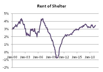
- Finally, Rent of Shelter. Clearly no disinflation here, yet.
- I think that’s good for today. Don’t forget to stop by my blog (http://mikeashton.wordpress.com ), though I must admit I’ve been slack recently in writing – but that’s because business is very exciting right now. A little tariff, a little MMT talk, and the phone rings.
The upshot of all of this is that core CPI continues to give a bad read on where inflation has been. Core tells us that inflation is ebbing. But the median category in fact has been steadily rising for several years. That doesn’t mean the inflation dynamic won’t roll over, but merely that so far it has not. The Fed’s concern that inflation isn’t getting to its target is misplaced, although ironically if they are able to restrain interest rates then the velocity dynamic means inflation is probably not far from peaking. But I don’t think we know that yet.
Summary of My Post-CPI Tweets (April 2019)
Below is a summary of my post-CPI tweets. You can (and should!) follow me @inflation_guy. Or, sign up for email updates to my occasional articles here. Investors with interests in this area be sure to stop by Enduring Investments or Enduring Intellectual Properties. Plus…buy my book about money and inflation. The title of the book is What’s Wrong with Money? The Biggest Bubble of All; order from Amazon here.
- CPI in under 10 minutes. Gentlefolk, start your engines!
- Start with the consensus: this month economists are calling core 0.18% m/m, and 2.1% y/y.
- Remember that last month, core was 0.11%, in a downside surprise driven by pharmaceuticals and autos, while Rents were actually somewhat bubbly again.
- However, Median inflation turned out to be 0.26%, pushing y/y to basically tie the post-crisis highs at 2.77%.
- That should lead you to suspect that there were some ‘tail effects’ last month that could be reversed this month. So that would make me marginally bullish this number, all else equal.
- Now, there’s talk about the fact that the BLS is changing its collection method for Apparel to use a direct feed from retailers rather than manual price-sampling.
- Some people think the change in the method of collecting Apparel prices should depress Apparel, but I’m not really sure why that would be so unless there was some systematic bias in collections pushing prices higher.
- If so, I’m not sure it’s showing. Apparel is -0.76% y/y. In any event, Apparel is only 3% of CPI so effect should be quite small. And apparel recently has been weak. So I’m not too worried about that. Famous last words, I guess.
- Core prints at 0.1%, 2.0% y/y. But that’s not as weak as it looks. It was actually something like 0.148%, whereas market was looking for 0.18% or so…y/y is 2.04%. So both barely rounded down.
- last 12 months’ core CPI chart. Just bumping sideways. We ought to be back to 2.1% y/y next month, as we drop off a weak April 2018 print.

- Well, trust the bow-tied set, I suppose. Apparel -1.94% m/m, -2.2% y/y. I guess those manual price checkers were pushing prices up, after all. (?)
- And CPI for Used Cars and trucks, second month in a row, weak at -0.38%. That’s lower than Black Book (which has been a much better fit than Manheim since last year’s methodology change) suggests it should be.

- But more importantly and lastingly – rents remained firm, with primary rents +0.42% m/m and OER +0.32% m/m. That keeps OER stable y/y and raises Primary rents to 3.68% y/y.
- Primary rents y/y. Not sure if this is an aberration because I don’t track market rents. Seems unusual for late in the cycle, but wage growth has been strong and supports this dynamic. But seems a bit strong.

- Pharma bounced, rising to -0.39% y/y from -1.19% y/y. But the downtrend doesn’t seem terribly damaged.

- Core ex-housing drooped a little bit, not surprisingly given the breakdown. Core ex-shelter is 1.10%, down from a 1.54% November high but still well above the 2017 lows of 0.53%.
- Interestingly, like last month where Used Cars fell and New Cars gained, the same thing happened this month. Used cars & trucks went to 0.44% y/y vs 1.11%; New cars to 0.72% from 0.29%. A little odd, but just wiggles.
- Although Medicinal Drugs re-accelerated slightly, Professional Services (doctors)) decelerated to 0.39% from 0.97% y/y, as did Hospital and related services (1.94% from 2.12%). As a result, Medical Care WOULD have decelerated but for Health insurance.
- Always worth a reminder: health insurance in the CPI is a residual, since CPI measures only the portion of medical care that individuals pay directly. But it rose to 9.06% y/y from 7.66%.

- Near and dear to my heart, the CPI for College tuition and fees continues to accelerate. 3.44% vs 3.00%. Why yes, funny you ask. We DID have something to do with creating the S&P Target Tuition Inflation Index. https://us.spindices.com/indices/multi-asset/sp-target-tuition-inflation-index …

- This chart is why we like to ignore core and focus on median. Clearly a lot of left-tail stuff going on.

- Primary rents y/y. Not sure if this is an aberration because I don’t track market rents. Seems unusual for late in the cycle, but wage growth has been strong and supports this dynamic. But seems a bit strong.
- So, having said that…my early guess at median CPI is for +0.27%, which would push median to 2.85%, clearly the highest since the end of the crisis. We will have to wait a couple of hours for the official figure.
- Four pieces. Not much change this month except in the last piece. Here’s Food & Energy.

- Piece 2: Core goods. Dragged down by used cars, pharmaceuticals. Our models have this still going higher so I think these are one-off effects.

- Core services less rent-of-shelter. Doctors, hospitals dragging this down. Be wary if Medicare-for-all proposals start to gain traction; if they do then I’d suspect doctors and hospitals would start to raise prices before their prices get fixed or cut.

- Part 4 is Rent of Shelter. I’ve been saying forever that we’re not getting deflation because this isn’t about to fall off a cliff. On the contrary, it’s actually moved above our ensemble model.

- So, here’s our ensemble model for OER. Primary rents are actually a [little] bit above our model. As you can see, we’re expecting a gradual slackening of rental pressures. BUT…

- …but our model based on income (not shown) rather than home prices is actually calling for higher rents. You can argue that higher wages have helped produce these higher rents.

- But if that’s the case, it means that when inflation is actually rising, looking back at home prices is NOT the right way to do it. Indeed, if the wage hypothesis is the driver then we’d expect to see a divergence in Primary and OER rents that leads shelter costs higher.
- ..there’s no real sign yet that primary rents are accelerating way past OER, but it’s something to keep an eye on if rent inflation continues to surprise on the upside.

- That’s all for now. Thanks for tuning in.
The upshot of today’s report is that while there are lots of small one-offs that are making sharp moves lower, and each of them has the potential to cause month-over-month mischief, the broad body of prices is remaining stable and/or edging higher. Regardless of what happens to apparel (Women’s and Girls’ Apparel, Men’s and Boys’ Apparel, and Footwear accounted for the three largest declines this month) or used or leased cars and trucks, housing costs appear to be moving higher.
It is early to be certain about this, but there have been anecdotes about faster rent growth in places and there are some signs (as in the rent chart above) that these pressures are diffusing more broadly. With strong wage growth, it wouldn’t be terribly surprising if there was more household formation (there has been, although not a huge amount) and more pressure on rents as people move up. How this resolves is key to the medium-term outlook. If higher wages help to push rents higher, and continue to put downward pressure on the number of existing homes available for sale (see below, source Bloomberg), then core inflation is simply not going to droop lower in the way the Fed expects it will. If, on the other hand, this is just a temporary rise, then the one-off declines in core inflation will eventually be joined by soggy rents and core will drift somewhat lower.
 Either way, I see little chance that core or median inflation will even remotely approach the lows from the last cycle, even if we enter recession later this year as I expect. To get there, housing would need to implode again and the dynamics are simply too healthy for that at the moment.