Archive
Two Disturbing Trends
Note: We are currently experimenting with offering daily, weekly, monthly, and quarterly analytical reports and chart packages. While we work though the kinks of mechanizing the generation and distribution of these reports, and begin to clean them up and improve their appearance, we are distributing them for free. You can sign up for a ‘free trial’ of sorts here.
Today I want to mention two disturbing trends – one of which may have some minor implications for inflation.
The first is the six-month downtrend in the US Dollar (see chart, source Bloomberg).

I’ve included the last several years’ worth of pricing for the broad trade-weighted dollar so as to help avoid any alarmist conclusions. While the trade-weighted dollar is down more than 7% since the beginning of 2017, it is unchanged on a trailing-two-year basis and still quite a bit above the level of three years ago. Moreover, as I’ve mentioned before – when the question concerned the effect of the dollar’s rise on inflation – the dollar doesn’t have a huge impact on US inflation. The US economy is much more closed than, for example, the economies of the Eurozone, the UK, or Switzerland – while the US is a major trade partner for virtually every country in the world, exports and imports as a percentage of GDP are less important than they are for most other countries in the world. Consequently, while movements in currency pairs will cause the declining currency to absorb more of the joint inflationary impulse of the two countries, the effect is fairly small in the US. A 15% dollar appreciation over a two-year period is associated with roughly a 1% deflation in core goods, nine months later, which is close to where core goods inflation has been (actually between 0 and -0.8% for the last few years). Core goods themselves are only about ¼ of core inflation overall. Since the dollar’s appreciation or depreciation has almost no discernable effect on core services a 15% dollar appreciation over two years only nudges core CPI down 0.25%.
So the effect is not large. However, it’s worth noting when the two-year rate of change goes from +16% (which it was one year ago) to 0%. This should start to add incrementally to core goods inflation, and provide a small upward lift to core inflation over the next year or so. But that assumes the dollar does not continue to slide. Continued dollar weakness might be attributed to the US political situation, but it isn’t as if most of our major trading partners are experiencing striking political stability (UK? Europe?). But dollar weakness could also be associated with a reversal in the relative hawkishness of the US Fed compared to other global central banks.
The run-up in the dollar corresponded with the end of Quantitative Easing in the US in 2014, combined with the continuation of QE (and more to the point, LSAP) in Europe and Japan. As hard as it is to think of Janet Yellen as being a hawk, on a global, relative basis her Fed was comparatively hawkish and this helped push the dollar higher.
Which brings us to the second disturbing trend, which may help to explain why the dollar is weakening: commercial bank credit growth has slowed markedly over the last year. The chart below (Source: Enduring Investments) shows the year-over-year change in commercial bank credit, based on data reported by the Federal Reserve.

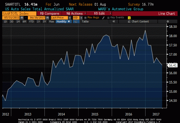
The current y/y rate of credit growth, at 3.4%, is a number much more consistent with recession than with expansion as the chart above illustrates. To be sure, it is hard to see many overt signs of weakness in the domestic economy, although auto sales have been weakening (see chart, source Bloomberg) and they can sometimes be an early harbinger of economic difficulties.
It is also worth noting that credit growth hasn’t translated into slower money growth – M2 is still rising at 6% per year – so there is not an implication of slower inflation from the deceleration in corporate credit (at least, so far). But, between the suggestion the dollar is making that Federal Reserve policy may not be as hawkish going forward as the market had assumed, and the interesting and possibly disturbing sign from slowing growth in corporate credit, I’m starting to become alert for other early signs of recession.
Of course, the dollar’s slide might instead indicate that the ECB and/or BOJ are about to become less dovish, more rapidly than the market had expected. While core Euro inflation has been a little more buoyant than many had expected (1.1% in the last release), it seems unlikely to drastically change Draghi’s course. However, I will keep an open mind on that point. I’m not saying a recession is imminent; I’m just saying that I’m starting to watch more carefully.
Reversing the “Portfolio Balance Channel”
Note: We are currently experimenting with offering daily, weekly, monthly, and quarterly analytical reports and chart packages. While we work though the kinks of mechanizing the generation and distribution of these reports, and begin to clean them up and improve their appearance, we are distributing them for free. You can sign up for a ‘free trial’ of sorts here.
Today I want to write about something that’s been bothering me a bit recently. It’s about the Fed’s impending decision to start drawing down its balance sheet over some number of years (whether or not we have an announcement about that at tomorrow’s meeting, it seems likely that “balance sheet reduction” is on tap for later this year). Something had been gnawing at me about that, and until now I haven’t been able to put my finger on it.
It concerns the ‘portfolio balance channel.’ This bit of Fed arcana is part of how the central bank explained the importance of the practice of buying trillions in Treasury bonds. Remember that back when the Fed first started doing Large-Scale Asset Purchases (LSAP), they were concerned that a lack of ‘animal spirits’ were causing investors to shy away from taking risk in the aftermath of the credit crisis. Although this is entirely normal, to the FOMC it was something to be corrected – if people and firms aren’t willing to take risk, then it is difficult for the economy to grow.
So, as the Fed explained it, part of the reason that they were buying Treasuries is that by removing enough safe securities from the market, people would be forced to buy riskier securities. When QE1 started, 10-year TIPS were yielding 2.5%, and that’s a pretty reasonable alternative to equities in a high-risk environment. But the Fed’s ministrations eventually pushed TIPS yields (along with other yields, but by focusing on real rates we can abstract from the part of that decline that came from declining inflation expectations rather than the forced decline in real yields) down to zero in 2011, and eventually deeply negative. As expected, despite the risk aversion being experienced by investors they began to move into equities as the “only game in town” – think about how many times you’ve heard people lament they own equities because ‘there’s nothing else worth owning’? The eventual result, of course, was that expected returns to equities began to fall in line with the (manipulated) expected returns to other securities, until we got the current situation where, according to our calculations, TIPS now have a higher expected real return than equities again (but at a much lower level).

What was bothering me, of course, was that shrinking the balance sheet also implies reversing the “portfolio balance channel.” Via QE, the Fed forced investors into stocks because there were fewer Treasury securities outstanding; every time the Fed bought $1 of bonds, some fraction of that went into stocks. The reverse must also be true – for every $1 of bonds the Fed sells, some fraction of that money must come out of stocks.
I’m not the first person to note that reducing the balance sheet should be a negative for equities since it “reduces liquidity.” But I was always uncomfortable with the vagueness of the “liquidity” mechanism…after all, lots of people predicted cataclysm when the Fed “tapered” QE. The reversal of the portfolio balance channel, though, is a real effect. The money to buy the extra bonds that will be on the market – bonds not held by the Fed must be held by someone, after all – will come from somewhere. And some of that “somewhere” will be from equities, some from real estate, some from cash, etc. I don’t know how big an effect it will be, but I know the sign.
Hard to Sugar-Coat Nonsense Like This
Note: We are currently experimenting with offering daily, weekly, monthly, and quarterly analytical reports and chart packages. While we work though the kinks of mechanizing the generation and distribution of these reports, and begin to clean them up and improve their appearance, we are distributing them for free. You can sign up for a ‘free trial’ of sorts here.
One of the things that fascinates me about markets – and one of the reasons I think “Irrational Exuberance”, now in its third edition, is one of the best books on markets that there is – is how ‘storytelling’ takes the place of rational analysis so easily. Moreover, almost as fascinating is how easily those stories are received uncritically. Consider this blurb on Bloomberg from Wednesday (name of the consultant removed so as not to embarrass him):
Sugar: Talk in market is that climate change has pushed back arrival of winter in Brazil and extended the high-risk period for frost beyond July, [name removed], risk management consultant for [company name removed] in Miami, says by telephone.
Sugar futures have recently been bouncing after a long decline. From February through June, October Sugar dropped from 20.40 cents/lb to 12.74¢; since the end of June, that contract has rallied back to 14.50¢ (as of Wednesday), a 14% rally after a 38% decline. There are all sorts of reasons this is happening, or may be happening. So let’s think about ‘climate change’ as an explanation.
There are several layers here but it boils down to this: the consultant is saying (attributing it to “talk in the market,” but even relaying this gem seems like gross negligence) that the rally in the last few weeks is due to a change in the timing of the arrival of winter…a change which, even if you believe the craziest global warming scaremongers, could not possibly have been large enough over the last decade to be measurable against the backdrop of other natural oscillations. Put another way, in late June “the market” thought the price of sugar ought to be about 12.74¢/lb. Then, “the market” suddenly realized that global warming is increasing the risk to the sugar crop. Despite the fact that this change – if it is happening at all – is occurring over a time frame of decades and centuries, and isn’t exactly suffering from a lack of media coverage, the sugar traders just heard the news this month.
Obviously, that’s ridiculous. What is fascinating is that, as I said, in this story there are at least 4 credulous parties: the consultant, the author of the blurb, the editor of the story, and at least part of the readership. Surely, it is a sign of the absolute death of critical thinking that only habitual skeptics are likely to notice and object to such nonsense?
Behavioral economists attribute these stories to the need to make sense of seemingly-random occurrences in our universe. In ancient times, primitive peoples told stories about how one god stole the sun every night and hid it away until the morning, to explain what “night” is. Attributing the daily light/dark cycle to a deity doesn’t really help explain the phenomenon in any way that is likely to be useful, but it is comforting. Similarly, traders who are short sugar (as the chart below, source Floating Path, shows based on June 27th data) may be comforted to believe that it is global warming, and not unusually short positioning, that is causing the rally in sugar.
 As all parents know, too much sugar (or at least, being short it) isn’t good for your sleep. But perhaps a nice story will help…
Bitcoin Versus Tesla
Last night, over drinks – a detail that will gain more salience when I describe the discussion – several friends and I were talking about lots of market-related items (as well as, of course, many non-market items).
The topics were as diverse as bitcoin, New Jersey Transit, and Tesla. However…and here’s where the drinks may have played a role…we also explored intersections of the elements of this set. For example, one of our party pointed out that fifteen Teslas would produce about the same power as a diesel locomotive, but at a fraction of the price. Given the recent record of New Jersey Transit’s locomotive fleet (among other problems), perhaps this is worth considering. Not only that, going to work in a train pulled by 15 Teslas would be much more stylish.[1]
A more interesting connection is between Bitcoin and Tesla.
In my book, I reflect at length about the significance of having money which is backed by something concrete (no matter what that is) compared to something backed only by faith – faith that other people will accept our money as a medium of exchange, in exchange for goods or services at rates reasonably predictable and not terribly volatile. Inflation is caused by too much money in the system; hyperinflation is what happens when a currency loses its anchor of confidence and people lose faith that these things will be true in the future. I talk a bit about how high rates of inflation, by eroding confidence, can lead to hyperinflation – but that’s only true of fiat currencies. If money is backed by something tangible, whether it is a precious metal or a bushel of rice, there are limits to how much it can depreciate in real terms and hyperinflation is difficult to come by in these circumstances.
In this context, consider Bitcoin or any of its crypto-currency brethren. Bitcoin is not backed by anything; indeed, it is backed by even less than the “classic” fiat currencies that issuing governments at least promise to accept in payment of citizen obligations to the government. This is not a critique – it simply is. Evidently, the inflation issue is not currently a problem with Bitcoin…as the chart below (source: Bloomberg) suggests, everything in the world is deflating in Bitcoin-equivalents.

But the fact remains that if something were to happen – such as the MtGox scandal a few years ago, at the left side of that chart – that affected people’s confidence that someone else would take Bitcoin in payment, then the value of Bitcoin could (and did) drop precipitously. At the extreme, Bitcoin could go to zero if no one was willing to accept it in exchange – for example, if for some reason it became impossible to confirm that the contents of your Bitcoin wallet was really yours.[2] There is no one you can turn to who is guaranteed to give you something real in exchange.
Now, no one thinks of Tesla as a currency. But, actually, equity securities representing ownership in Tesla could be considered a form of currency – you can exchange them for other items of value, although the usual way is to exchange them for dollars which can then be used to buy other items of value. I am not sure I would call its price in exchange reasonably stable…but it’s certainly more stable than Bitcoin. Here’s the salient commonality, however: at the current price, representing a 11x price-to-book ratio, 6x price to sales ratio, and undefinable price to free cash flow (-$9.74/share free cash flow) or earnings, on a stock with negative net margins, ROA, ROE, and ROC, the price of Tesla is almost entirely faith-based. It is based on a quasi-religious belief by the equity owners that the CEO will manage to produce cars at a positive margin and maintain a large market share, which it will be able to maintain even once large auto manufacturers start to compete.
Far be it from me to question whether investors’ faith will prove well- or ill-founded. I will leave that to my friend @markbspiegel. I don’t own Tesla and have no plans to be long it or short it. My point, though, is that it is remarkably like Bitcoin in that it is backed primarily by faith and, as with any faith-based currency, is entirely based on that faith remaining unshaken. For the implications of having that faith shaken, see Enron in 2001 (chart below, source Bloomberg).

Interestingly, in the battle of Bitcoin versus Tesla it is the former that is winning. A share of Tesla in 2015 was worth 1 Bitcoin. Today, that share is only worth 0.14 Bitcoins (see chart, showing the ratio of Tesla to Bitcoin).[3]

All of which goes mainly to show – be careful when you go out for drinks with quant finance friends!
[1] We thought perhaps Elon Musk is just being coy, playing the long game before he springs this brilliant idea on the public. But today another friend of mine pointed out that it isn’t just the power you’re paying for but the sustainability of that power, and he estimated that 15 Teslas could only pull the train for about 8 miles. Oh well.
[2] “Preposterous!” shout the supporters of Bitcoin. Relax, I’m not saying this is something that will or could happen. It’s not a prediction. It’s merely a thought experiment.
[3] This is a ridiculous chart and it means nothing. But it’s fun. You should see what it looks like if you go back farther. In 2010, one share of Tesla was worth 300 Bitcoins!
Summary of My Post-CPI Tweets (July 2017)
Below is a summary of my post-CPI tweets. You can (and should!) follow me @inflation_guy or sign up for email updates to my occasional articles here. Investors with interests in this area be sure to stop by Enduring Investments. Plus…buy my book about money and inflation. The title of the book is What’s Wrong with Money? The Biggest Bubble of All; order from Amazon here.
- quick CPI review: last 3 months have been -0.12%, +0.07%, and +0.06% on core CPI – that is, basically flat.
- three months before that were 0.22%, 0.31%, and 0.21%. Basically a 3% annualized rate. Which of these is “right”?
- Market has become convinced something around the current 1.75% average is “right.” But we’ve had big misses both sides.
- Consensus for today is for 0.2% on core, 1.7% y/y, but that’s a very narrow range. Basically 0.15% m/m gets both of those.
- If we get 0.16%, then y/y should round up to 1.8% y/y. If we get 0.14%, then m/m rounds down to 0.1%.
- Of course, recent months have shown us something wildly different is possible!
- core CPI 0.119%, again below consensus…y/y drops to 1.71%.
- This is closer to the summer lull we’ve seen recently. But still low. Here are the last 12 months of core CPI.

- That chart is weird, looks like there was a dramatic effect in March that’s wearing off. But it’s actually been a series of one-offs.
- Core services at 2.5% y/y, down from 2.6% (and down from 3.1% as recently as Feb). Core goods -0.6%, up from -0.8%.
- Core CPI ex-shelter was basically unchanged at 0.6% y/y, matching 13-year lows.

- Owners Equiv Rent was +3.23% y/y, Primary Rents 3.86% vs 3.85%. So the low print isn’t main part of housing.
- But housing overall – the major subgroup – decelerated to 3.02% from 3.12%. So that deceleration is elsewhere.
- Medical Care CPI was unchanged at 2.66% y/y.
- Pharma inflation 3.31% from 3.34%. Professional Services 0.58% from 1.0%. But hospital services 5.65% from 4.95%.
- This chart is physician’s services. I’m really curious about this.

- An optimist could say ‘this is b/c high deductibles under Ocare force consumers to negotiate aggressively with doctors.”
- Pessimist: “even if that’s true, it means fewer doctors tomorrow, ergo higher prices.” & where is this effect in hospital prices?
- I don’t see anything very quirky in these numbers unlike past months. OER still converging with our model.

- If there’s “nothing unusual,” it suggests underlying core rate is something near 1.5%. But inflation always on the way to somewhere.
- Four-pieces breakdown: Food & Energy

- Four-pieces breakdown: Core Goods. Still bumping along, but this will turn higher as USD weakens.

- Four-pieces breakdown: Core Svcs less Rent of Shelter. This continues to be The Story.

- Four-pieces breakdown: Rent of Shelter – as I said, ebbing but just because it was ahead of itself. Housing isn’t about to deflate.

- As @pearkes points out, core services ex-housing largely a medical story, and that’s likely temporary. Chart for CPI medical care:

- I find it ironic: if Ocare IS helping to contain health care, it’s b/c consumers negotiate harder when they don’t really have health care.
- …which would seem to run counter to the professed reason for the ACA, which was to increase coverage. Is it working b/c it’s not working?
- Enough CPI for today. Don’t forget to buy my book!
- Also, good friend just published a thriller: http://amzn.to/2um7vIi He’s a very engaging author if you like fiction.
It was just a few months ago that we worried about whether core inflation was about to accelerate past 3%. Then, we had a few months where some people (not me!) worried that we were suddenly plunging into deflation and core inflation was around 0%. The reality seems to be somewhere in the middle. The recent ultra-low prints are clearly the results of one-offs, but it also seems as if the ongoing upward pressures – for example, in housing – have come off the boil as well. Back when rents were surging, I was worried that our model was perhaps not capturing some other dynamic and that rents would run away to the upside; in the event, it was probably just noise.
So what is the true underlying dynamic? We have to remember that economic statistics are just experiments – samples of an unknowable distribution. And, since economic data is very noisy, it usually takes a lot of data to be able to say for sure that something has changed. Economists and other prognosticators are usually not so patient. We got a weak number, and we want to say right now that something fundamental has changed. It doesn’t work that way.
Inflation data are usually fairly stable (once you strip out food and energy), so a couple of surprising figures is often enough to signal a changing dynamic. But one curious aspect of the last year’s worth of core inflation data is that it has been very volatile – in fact close to being the most volatile in the last twenty years:

There are a couple of implications to that observation, but the key one here is that it means it’s harder to reject any particular null hypothesis when the data are all over the place.
So here’s the summary: the main contributor to lower core inflation that is difficult to shrug off completely is the abrupt plunge in medical care inflation. This also happens to be the category that is most difficult to measure, since most consumers do not directly pay for much of their health care…or, anyway, they didn’t until Obamacare led to dramatic increases in deductibles. But that change in who pays for health care makes it very difficult to disentangle what the price of health care is actually doing, as opposed to the quantity of health care consumed. Very, very difficult.
My suspicion, based on direct observation and conversations with professionals in hospital and practice management, is that there are indeed pressures to contain healthcare costs, part of which are being caused by the fact consumers are having to negotiate directly with doctors for care and part of which are the result of other institutional pressures, such as the effect of Medicare/Obamacare legislation on formulary negotiations. Does that mean Obamacare is “succeeding?” If the sole purpose of the ACA was to lower health care costs by reducing the consumption of health care – maybe it is, at least in the short run. Certainly, there is a lot of energy on the entrepreneurial side dedicated to finding ways to cut costs, and lots of inefficiencies that can be wrung out…and, if “angry consumers” is the impetus for organizations finally wringing out these inefficiencies, I suppose that’s not a bad thing.
As I said earlier, I think it’s too early and there’s too much noise to say that something fundamental has changed. Heck, a year ago I thought medical inflation was about to run away on the upside (and I wasn’t alone, as the Republican sweep of Congress attests). I am not about to be fooled in the opposite direction as easily. What I will say is that I have trouble believing that inflation in the cost of physicians’ services is going to go negative, or stay near zero for a long time. I could be wrong, but I suspect that part of the pendulum will start to swing back over the next six months.