Archive
A Real Concern About Over(h)eating
I misread a headline the other day, and it actually caused a market analogy to occur to me. The headling was “Powell Downplays Concern About Overheating,” but I read it as “Powell Downplays Concern About Overeating.” Which I was most delighted to hear; although I don’t normally rely on Fed Chairman for dietary advice[1] I was happy to entertain any advice that would admit me a second slice of pie.
Unfortunately, he was referring to the notion that the economy “has changed in many ways over the past 50 years,” and in fact might no longer be vulnerable to rapidly rising price pressures because, as Bloomberg summarized it, “The workforce is better educated and inflation expectations more firmly anchored.” (I don’t really see how an educated workforce, or consumers who have forgotten about inflation, immunizes the economy from the problem of too much money chasing too few goods, but then I don’t hang out with PhDs…if I can avoid it.) Come to think of it, perhaps the Chairman ought to stick to dietary advice after all.
But it was too late for me to stop thinking about the analogy, which diverges from what Powell was actually talking about. Here we go:
When a person eats, and especially if he eats too much, then he needs to wait and digest before tackling the next course. This is why we take a break at Thanksgiving between the main meal and dessert. If, instead, you are already full and you continue to eat then the result is predictable: you will puke. I wonder if it’s the same with risk: some risk is okay, and you can take on more risk up to a point. But if you keep taking on risk, eventually you puke. In investing/trading terms, you rapidly exit when a small setback hits you, because you’ve got more risk on than you can handle. Believe me: been there, done that. At the dinner table and in markets.
So with this analogy in place, let’s consider the “portfolio balance channel.” In the aftermath of the Global Financial Crisis, the Fed worked to remove low-risk securities from the market in order to push investors towards higher-risk securities. This was a conscious and public effort undertaken by the central bank because (they believed) investors were irrationally scared and risk-averse, and needed a push to restore “animal spirits.” (I’m not making this up – this is what they said). It was like the Italian grandmother who implores, “Eat! Eat! You’re just skin and bones!” And they were successful, just like Grandma. The chart below (source: Enduring Investments) plots the slope of the securities market line relating expected real return and expected real risk, quarterly, going back to 2011. It’s based on our own calculations of the expected real return to stocks, TIPS, Treasuries, commodities, commercial real estate, residential real estate, corporate bonds, and cash, but you don’t have to believe our calculations are right. The calculation methodology is consistent over time, so you can see how the relative value in terms of risk and reward evolved.
 The Fed succeeded in getting us to eat more and more risky securities, so that they got more and more expensive relative to safer securities (the amount of additional risk required to get an increment of additional return got greater and greater). Thanks Grandma!
But the problem is, we’re still eating. Risk is getting more and more expensive, but we keep reaching for another cookie even though we know we shouldn’t.
Puking is the body’s way of restoring equilibrium quickly. Abrupt market corrections (aka “crashes”) are the market’s way of restoring equilibrium quickly.
This isn’t a new idea, of course. One of my favorite market-related books, “Why Stock Markets Crash” by Didier Sornette, (also worth reading is “Ubiquity” by Mark Buchanan) talks about how markets ‘fracture’ after bending too far, just like many materials; the precise point of fracture is not identifiable but the fact that a fracture will happen eventually if the material continues to bend is indisputable.
My analogy is more colorful. Whether it is any more timely remains to be seen.
[1] To be fair, I also don’t rely on Fed Chairman for economic advice.
Signs of a Top, OR that I am a Grumpy Old Man
I was at an alternative investments conference last week. I always go to this conference to hear what strategies are in vogue – mostly for amusement, since the strategies that are in vogue this year are ones they will spit on next year. Two years ago, everyone loved CTAs; last year the general feeling was “why in the world would anyone invest in CTAs?” Last year, the buzzword was AI strategies. One comment by a fund-of-funds manager really stuck in my head, and that was that this fund-of-funds was looking for managers with quantitative PhDs but specifically ones with no market experience so that “they don’t have preconceived notions.” So, you can tell how that worked out, and this year there was no discussion of “AI” or “machine learning” strategies.
This year, credit strategies were in vogue and the key panel discussion involved three managers of levered credit portfolios. Not surprisingly, all three thought that credit is a great investment right now. One audience question triggered answers that were striking. The question was (paraphrasing) ‘this expansion is getting into the late innings. How much longer do you think we have until the next recession or crisis?” The most bearish of the managers thought we could enter into recession two years from now; the other two were in the 3-4 year camp.
That’s borderline crazy.
It’s possible that the developing trade war, the wobbling of Deutsche Bank, the increase in interest rates from the Fed, higher energy prices, Italy’s problems, Brexit, the European migrant crisis, the state pension crisis in the US, Elon Musk’s increasingly erratic behavior, the fact that the FANG+ index is trading with a 59 P/E, and other imbalances might not unravel in the next 3 years. Or 5 years. Or 100 years. It’s just increasingly unlikely. Trees don’t grow to the sky, and so betting on that is usually a bad idea. But, while the tree still grows, it looks like a good bet. Until it doesn’t.
There are, though, starting to be a few peripheral signs that the expansion and markets are experiencing some fatigue. I was aghast that venerable GE was dropped from the Dow Jones to be replaced by Walgreens. Longtime observers of the market are aware that these index changes are less a measure of the composition of the economy (which is what they tell you) and more a measure of investors’ animal spirits – because the index committee is, after all, made up of humans:
- In February 2008 Honeywell and Altria were replaced in the Dow by Bank of America (right before the largest banking crisis in a century) and Chevron (oil prices peaked over $140/bbl in July 2008).
- In November 1999, Chevron (with oil at $22) had been replaced in the Dow (along with Sears, Union Carbide, and Goodyear) by Home Depot, Intel, Microsoft, and SBC Communications at the height of the tech bubble, just 5 months before the final melt-up ended.
It isn’t that GE is in serious financial distress (as AIG was when it was dropped in September 2008, or as Citigroup and GM were when they were dropped in June 2009). This is simply a bet by the index committee that Walgreens is more representative of the US economy than GE and coincidentally a bet that the index will perform better with Walgreens than with GE. And perhaps it will. But I suspect it is more about replacing a stodgy old company with something sexier, which is something that happens when “sexy” is well-bid. And that doesn’t always end well.
After the credit-is-awesome discussion, I also noted that credit itself is starting to send out signals that perhaps not all is well underneath the surface. The chart below (Source: Bloomberg) shows the S&P 500 in orange, inverted, against one measure of corporate credit spreads in white.

Remember, equity is a call on the value of the firm. This chart shows that the call is getting more valuable even as the first-loss piece (the debt) is getting riskier – or, in other words, the cost to bet on bankruptcy, which is what a credit spread really is, is rising. Well, that can happen if overall volatility increases (if implied volatility rises, both a call and a put can rise in value which is what is happening here), so these markets are at best saying that underlying volatility/risk is rising. But it’s also possible that the credit market is merely leading the stock market. It is more normal for these markets to correlate (inverted) over time – see the chart below, which shows the same two series for 2007-2009.

I’m not good at picking the precise turning points of markets, especially when values start to get really bubbly and irrational – as they have been for some time. It’s impossible to tell when something that is irrational will suddenly become rational. You can’t tell when the sleepwalker will wake up. But they always do. As interest rates, real interest rates, and credit spreads have risen and equity yields have fallen, it is getting increasingly difficult for me to see why buying equities makes sense. But it will, until it doesn’t.
I don’t know whether the expansion will end within the next 2, 3, or 4 years. I am thinking it’s more likely to be 6 months once the tax-cut sugar high has truly worn off. And I think the market peak, if it isn’t already in, will be in within the next 6 months for those same reasons as companies face more difficult comps for earnings growth. But it could really happen much more quickly than that.
However, I recognize that this might really just mean that I am a grumpy old man and you’re all whippersnappers who should get off my lawn.
Summary of My Post-CPI Tweets (June 2018)
Below is a summary of my post-CPI tweets. You can (and should!) follow me @inflation_guyPV and get this in real time, by going to PremoSocial. Until the end of June, you can get $9.99 off (one month free, or a discount off the already-discounted annual plan) by using code “tryme”. Or, sign up for email updates to my occasional articles here. Investors with interests in this area be sure to stop by Enduring Investments or Enduring Intellectual Properties. Plus…buy my book about money and inflation. The title of the book is What’s Wrong with Money? The Biggest Bubble of All; order from Amazon here.
- 27 minutes to CPI! Here are my pre-figure thoughts:
- Last month (April CPI) was a big surprise. The 0.098% rise in core was the lowest in almost a year, rewarding those economists who see this recent rise as transitory. (I don’t.)
- But underneath the headlines, April CPI was nowhere near as weak as it seemed. The sticky prices like housing were stronger and much of the weakness came from a huge drop in Used Cars and Trucks, which defied the surveys.
- Medical Care and Apparel were also both strong last month.
- Now, BECAUSE the weakness was concentrated in a small number of categories that had large moves, median inflation was still +0.24% last month, which drives home the fact that the underlying trend is much stronger than 0.10% per month.
- The question this month is: do we go back to what we were printing, 0.18%-0.21% per month (that’s the 2 month and 6 month avg prior to last month, respectively), or do we have a payback for the weak figure last month?
- To reiterate – there were not really any HIGH SIDE upliers to potentially reverse. Maybe housing a touch, but not much. To me, this suggests upside risk to the consensus [which is around 0.17% or so and a bump up (due to base effects) to 2.2% y/y].
- I don’t make monthly point forecasts, but I would say there’s a decent chance of an 0.21% or better…which number matters only since it would accelerate the y/y from 2.1% to 2.3% after rounding. So I agree with @petermcteague here, which is a good place to be.
- Note there’s also the ongoing risk each month of seeing tariffs trickle through or trucking pressures start to diffuse through to other goods prices. Watch core goods.
- So those are my thoughts. Put it this way though – I don’t see much that would cause the Fed to SLOW the rate hike plans, at least on the inflation side. Maybe EM or something not US economy-related, but we’d have to have a shockingly broadly weak number to give the FOMC pause.
- Starting to wonder why we even both with an actual release. Economists nailed it, 0.17% m/m on core, 2.21% y/y.
- That’s a 2.05% annualized increase. Which would be amazing if the Fed could nail that every month.
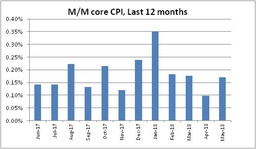
- Core goods accelerated to -0.3% from -0.4%, so the jump there hasn’t happened. Core services moved up to 3.0% from 2.9%. That is the highest core services since Feb 2017, but not absurd.
- still waiting on core goods acceleration…

- Used cars and trucks again dropped sharply. -0.89% after -1.59% last month. That’s m/m. The y/y is -1.68%. Again, that’s at odds with all of the private surveys and is a big disconnect. I can’t explain it.
- Owners’ Equiv Rent put in another solid month +0.25% m/m, up to 3.41% y/y. Starting to get a bit ahead of our model again.

- Large jump in lodging away from home, 2.93% m/m. That takes the y/y to 4.29%. LAFH is only 0.9% of CPI, but that’s an outlier that will probably come back next month.
- Medical Care scored a solid 0.2%, accelerating to 2.38% y/y.

- Pharma (3.73% vs 2.65%), Doctor’s Services (0.55% vs 0.31%), and Hospital Services (4.74% vs 4.49%) all accelerated.
- Apparel was flat on the month, but that moved y/y up to 1.4% vs 0.8%.
- Neither stocks nor breakevens care about this figure. Summer has set in. It used to be that the summer lull was a couple of weeks in August. Then it went to all of August as the US mirrored Europe. Now it pretty much starts in June and lasts until Labor Day.
- I forgot to mention Primary Rents, by the way. They actually decelerated to 3.63% y/y from 3.70%, which takes some the sting out of a potential OER reversal. The Primary Rents move was countertrend so it should also retrace next month. But only 1/3 of the weight of OER.
- The Primary Rents move does tend to reinforce the message of our model, that OER is a tiny bit out over its skis. However as that chart illustrated, it can diverge a bunch from our model.
- Biggest m/m declines were in Car and Truck Rental and Public Transportation (what’s up with vehicles??), followed by Mens and Boys’ Apparel. I’ve mentioned Used Cars and Trucks. Household Furnishings also weak.
- Biggest m/m increases are the aforementioned Lodging Away from Home, Infants and Toddlers’ Apparel, Motor Fuel, and Medical Care Commodities (mostly Pharma).
- All of the median categories are Rent and OER subcategories which are hard to get a read on, but median should again be mid-0.2s, probably 0.26-0.27% m/m pushing y/y to nearly 2.7% on Median CPI! Last mo was highest since 1/09; this would be highest since 2008.
- This is median BEFORE today’s figure, which will come later. And I could be wrong about it.

- Core ex-housing, something worth watching especially since housing seems back in an uptrend, rose to 1.29% from 1.21%. That’s the highest since Jan 2017, but it hasn’t been higher than 1.61% since early 2013. Right now can still claim it’s a housing story.
- Putting together the four-pieces charts.
- Still not much action in inflation markets. From the swap curve: US #Inflation mkt pricing: 2018 2.2%;2019 2.2%;then 2.3%, 2.4%, 2.4%, 2.4%, 2.5%, 2.5%, 2.4%, 2.5%, & 2028:2.5%.
- Four Pieces: Food & Energy first. Roughly 21% of CPI.

- Core Goods, about 19% or so of CPI. Rising very slowly. If core inflation is to reach ‘escape velocity’ this needs to rise a fair amount. Tariffs will help that, eventually.

- Core services, less rent of shelter. About 27% of overall CPI. Lot of medical care here, which as we expected has been pulling this higher. Again, for CPI to reach escape velocity you’d want to see this above 3%.

- And the big kahuna, housing, about 1/3 of overall CPI. Had a steady run-up, got ahead of itself and came back to model, and now is accelerating again. Housing indeed looks tight, and this should continue especially if wages continue to accelerate.

- Diffusion look at inflation is still pretty dull. Slightly less than half of all categories of CPI are accelerating faster than 3%. But that’s been very consistent between 40% and 50% (obviously at ~50%, median CPI would be at 3%).

- OK, last overall point. May was an easy hurdle to get an acceleration in y/y, as May 2017 was only +0.08. June and July of last year were both +0.143%, so again we should see more acceleration. Y/y core CPI should be at 2.3% next mo & hit 2.4% in Sept just on base effects.
- …that’s merely assuming 0.2% per month from core CPI, which is between what TTM core says it is and what median stays it is. If we print just a smidge above 0.2% per month we could hit 2.5% in November. Again, that’s assuming no big acceleration in underlying pressures.
- I happen to believe there ARE some underlying pressures so I think we’ll hit 2.5% sooner than that and median will press 3%. Nothing super alarming for the Fed, but somewhat discomfiting. The real test will be once we hit Dec and Jan and those hard comps.
- That’s all for today. Thanks for tuning in, and thanks for subscribing to the modestly-priced premium channel. I really appreciate your voting with your dollars in this way!
Breakevens eventually did care a little bit, rising a tick or so. Market-wise, today’s number continues to do two things. First, it doesn’t really give any reason for the Fed to arrest or delay its current plans to gradually hike overnight rates. There was no surprise here – this is still all very much in the realm of base effects as we drop off the strange deceleration from last year. Second, there’s really no reason for interest rates in the US to stay below 3%. In an expanding economy with accelerating inflation which is already at 2.2%, or 2.7% on median, a 3% nominal yield makes little sense. Real yields, and nominal yields, are too low. So, honestly, are breakevens…inflation swaps are showing forward expected inflation rates of no more than 2.5% out for many years, even though median inflation (and headline inflation!) is already above that level. You have to have a great deal of faith in an untested hypothesis – the idea that inflation expectations will be ‘anchored’ and overwhelm any effects from tariffs, actual production bottlenecks, and monetary largesse, to keep inflation low and steady – to be actively shorting inflation at these levels, and if you’re buying Treasuries at yields below 3% you are actively betting on inflation declining.
If it seems a strange time to be making that bet, I agree with you. But market sentiment is clearly biased in favor of a belief that the weather will always be sunny and warm and that neither inflation nor commodities will go higher, or equities or bonds lower, from these levels. The contrary evidence about inflation, anyway, continues to build and to my mind it requires an increasing effort of will to ignore that evidence.
European Inflation Concerns Also Rising?
In this space I write a lot about inflation, but specifically I focus mostly on US inflation. However, inflation is substantially a global process – a paper by two ECB economists in 2005 (and our independent followup) found that nearly 80% of the variance in inflation in the G7 and G12 could be accounted for by a common factor. This observation has investment implications, but I’m not focusing on those here…I’m just presenting that fact to explain why I am about to show a chart of European inflation.

Right, so technically it’s my second article in a row in which I mention European inflation. In last Friday’s “Potpourri for $500, Alex”, I noted that core European inflation rebounded to 1.1% after being counted for dead at 0.7% last month. But what is illustrated above is the inflation swaps market, and so is forward-looking. I think this looks a lot more dramatic: investors expect 5-year European inflation to average 1.5% over the next 5 years (a year ago, they were at 1.1% or so and two years ago the market was at 0.7%), and to converge up towards 1.8% where the 5y, 5y forward inflation swap indicates the approximate long-run expectation since it’s not significantly influenced by wiggles in energy.
What is especially interesting though is not the overall trend. Inflation markets everywhere, with the exception of the UK, have been trending higher for a couple of years – you are forgiven if you hadn’t heard that, but the ‘disinflation’ lobby is strong (most of the equity houses have some skin in the game in that direction, after all). No, what is most interesting to me is that inflation swaps have been trending higher recently even though energy prices have been in retreat and even though European yields (outside of Italy) have mostly been in decline. It isn’t as if Euro area growth has been setting the world afire. The currency has been weakening as US growth seems to be outstripping growth on the continent and as the European ‘experiment’ once again looks to be under stress.
What Euro inflation investors may believe, though, are two things. First, a trade war is really bad for inflation, and probably moreso for Europe than the US since there is a larger external sector. Trade frictions are bad for everyone, of course, but a splintering of the Euro bloc would be the ultimate in trade frictions. Second, the ECB is being much slower to stop QE and raise rates than is the Fed. Heck, the ECB’s deposit facility is still at -0.40%, where it has been for 2016. While I am in the camp that rates are of limited importance when economic liquidity is far larger than the economy demands (that is, when there are inert excess reserves), that’s not a mainstream view and as much as I would like to believe otherwise, markets respond to the mainstream view and not mine!
For some time, we’ve favored European ILB over US ILB, and that has been a steady if unexciting trade. Even after this move, European inflation bonds are still considerably cheap to US TIPS, which are themselves still fairly cheap relative to nominal US rates.
Potpourri for $500, Alex
When I don’t write as often, I have trouble re-starting. That’s because I’m not writing because I don’t have anything to say, but because I don’t have time to write. Ergo, when I do sit down to write, I have a bunch of ideas competing to be the first thing I write about. And that freezes me a bit.
So, I’m just going to shotgun out some unconnected thoughts in short bursts and we will see how it goes.
Wages! Today’s Employment Report included the nugget that private hourly earnings are up at a 2.8% rate over the last year (see chart, source Bloomberg). Some of this is probably due to the one-time bumps in pay that some corporates have given to their employees as a result of the tax cut, and so the people who believe there is no inflation and never will be any inflation will dismiss this.

On the other hand, I’ll tend to dismiss it as being less important because (a) wages follow prices, not the other way around, and (b) we already knew that wages were rising because the Atlanta Fed Wage Tracker, which controls for composition effects, is +3.3% over the last year and will probably bump higher again this month. But the rise in private wages to a 9-year high is just one more dovish argument biting the dust.
As an aside, Torsten Slok of Deutsche Bank pointed out in a couple of charts today that one phenomenon of recent years has been that people staying in the same jobs increasingly see zero wage growth. Although this is partly because wage growth in general has been low, the spread between wage growth for “job switchers” and “job stayers” is now about 1.25% per year, the highest rate in about 17 years. His point is that as we see more switchers due to a tight labor market, that implies more wage growth (again, the Atlanta Fed Wage Growth Tracker does a better job, so this just means average hourly earnings should increasingly converge with the Atlanta Fed figure).
Today I was on the TD Ameritrade Network and they showed a chart that I’d included in our Quarterly Inflation Outlook (which we distribute to customers). I tweeted the chart back on May 22 but let me put it here, with some brief commentary lifted from our quarterly:

“As economic activity has started to absorb more and more unemployed into the workforce, a shortage has developed in the population of truck drivers. This shortage is not easy to overcome, since it takes time to train new truck drivers (and the robo-truck is still no more than science fiction). Moreover, recent advances in electronically monitoring the number of hours that drivers are on the road – there have been rules governing this for a long time, but they relied on honest reporting from the drivers – have artificially reduced the supply of trucker hours at just the time when more were needed because of economic growth…As a result of this phenomenon, total net-of-fuel-surcharge truckload rates are 15% higher than they were a year ago, which is the highest rate of increase since 2004. As the chart (source: FTR Associates and BLS) illustrates, there is a significant connection between truckload rates lagged 15 months and core inflation (0.74 correlation).”
According to FTR Transportation Intelligence, the US is short about 280,000 truck drivers compared to what it needs.
Remember when everyone said Europe was about to head back into deflation, thanks to that surprise dip in core inflation last month? Here is what I had to say about that on my private Twitter feed (sign up here if this stuff matters to you) at the time.

As Paul Harvey used to say, the rest of the story is that core European CPI printed this month at 1.1%, shocking (almost) everyone for a second month.

I had a conversation recently with a potential client who said they didn’t want to get into a long-commodity strategy because they were afraid of chasing what is hot. It’s a reasonable concern. No one wants to be the pigeon who bought the highs.
But some context is warranted. I didn’t want to be impolite, but I pointed out that what he was saying was that in the chart below, he was afraid it was too late to get on the orange line because it is too hot.

Incidentally, lest you think that I chose that period because it flatters the argument…for every period starting June 30, XXXX and ending June 1, 2018, the orange line is appreciably below the white line and has never been meaningfully above it, for XXXX going back to 2002. For 2002-2011, the two indices shown here were pretty well correlated. Since 2011, it has been a one-way underperformance ticket for commodities. They are many things, but “hot” is not one of them!
I haven’t heard back.