Archive
Is A Bond Rally Due?
As we head into a very busy week of economic data, the bond market remains drippy with the 10-year yield up to 2.59%. (Just writing that makes me laugh. Who would have thought, only a few years ago, that 2.59% was a high-ish yield?)
How we got here, from the ultra-low levels of the last two years, is well-traveled territory. The Fed’s swing from “QE-infinity” to “someday, maybe, we might not buy as many bonds” helped trigger a run for the exits, and then negative convexity inflection points kept the rout going for a long time. Most lately, the threat of muni bond convexity has been looming as the next big concern.
But my message today is actually one of good cheer. The worst of the bond selloff was now more than three weeks ago, without a further low being established. In my experience, convexity-inspired selloffs typically end not with a sharp rebound but with a sideways trade as “trapped” long positions gradually work their way out and buyers start to nibble. But it remains a buyer’s market for several weeks, at least.
We are getting far enough along in that process that I suspect we have a rally due. This has nothing to do with any economic data coming up. There is enough data coming this week, from Consumer Confidence to Payrolls to GDP to the Fed statement, that both bulls and bears will be able to find something to point to. And I am not pointing to technicals, exactly. I am just saying that markets rarely move in a straight line, and even bear markets – such as the one I think we have now entered, in bonds – have nice rallies from time to time.
But here’s a reason to expect this to happen relatively soon. The chart below is a neat “seasonal heat map” chart from Bloomberg showing the monthly yield change for the last 10 years and the average monthly change on the top line.
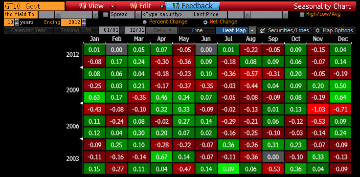 For a long time, I have been following the rule of thumb I learned as a mere babe in the bond market, and that’s that the best time of the year to buy bonds is the first few days of September. From at least the late 1970s until today, September until mid-October has been the strongest seasonal period of the year (not every year, but with enough consistency that you wanted to avoid being short in September). But the heat map above shows that this tendency may have shifted. The month that has seen the best average bond market performance over the last decade has been August, with yields falling an average of 22bps with rallies in 8 of the last 10 years. If we were sitting with 10-year yields at 1.59%, I would be less interested in this observation, but at 2.59% I am looking for the counter-trade.
To be sure, yields in the big picture are headed higher, not lower. But I am looking for signs that the recent selloff has over-discounted the immediate threat of ebbing Federal Reserve purchases. And I don’t expect growth to suddenly leap forward here, either.
As an aside, 10-year TIPS yields have also experienced one of their best months in August, with the other clear positive month being January. But, because nominal yields have been so strong, August has been the worst month for breakevens, with 10-year breakevens falling 10bps on average over the last ten years. No other month has seen breakevens decline as much as 6bps, on average.
Now, although I am a bond bear in the big picture, I don’t think that the housing market is doomed because interest rates will go up one or two or three percent. I am fascinated by how many analysts seem to think that unless 10-year rates are below 3%, the housing market will collapse. I argued about six weeks ago that higher mortgage rates should not impact sales of homes very much as long as the interest rate is less than the expected capital gain the homeowner expects to make on the home. (Higher rates will, however, cut fairly quickly into speculative building activity, which is much more rates-sensitive). And here is another reason not to worry too much about the housing market. A story in Bloomberg last week says that adjustable-rate mortgages are booming again, with mortgagees taking them out at the highest pace since 2008. Faced with higher rates, and a Fed with is not likely to raise short rates for a long while – as they have taken pains to keep reminding us – homebuyers have rationally decided to take the cheaper money and let the future refinancing take care of itself.
Whether that is sowing the seeds of a future debacle I will leave to other pundits to debate. From my perspective, the important point is that higher rates are not likely to slow home sales, or the recent rise in home prices, very much…unless they get a lot higher.
Babies and Bathwater
Before I descend into the mundane discussion of economies and markets, let me first congratulate the Duke and Duchess of Cambridge on the birth of their son. In watching the pictures of the royals leaving the hospital with their child, I was struck at the fact that when his wife passes off the child, Prince William looks as uncomfortable holding a baby as most first-time fathers are. He did, however, have more luck with the mechanics of the car seat…as, again, most new fathers do.
However, when he drives home, he won’t have to worry about the rising cost of housing, and probably doesn’t fret much about whether his child will be able to afford a comfortable life in an inflationary future. “Will my son be better off than I am?” is a question for non-royals!
I have no idea what the rents are for a Kensington Palace apartment, but I will bet they are rent-controlled. Meanwhile, housing prices in the U.S. continue to rise rapidly. Today’s announcement of the FHA Home Price Index suggested prices have risen 7.3% over the last year (the fourth month in a row over 7%), while the median price of a home in the Existing Home Sales report yesterday was 13.2% above the year-ago level (see chart).

Aside from inflation, however, where the future trajectory is clear, the performance of the economy is probably best characterized by the word “muddled” (thank you, John Mauldin). Last Thursday, the Philly Fed index was published at 19.8 – a two-year high – versus expectations for 8.0; on Monday the Chicago Fed index showed -0.13 versus expectations for flat, and today the Richmond Fed index was -11 (the second-worst since 2009) versus expectations for +9.
And, in the meantime, Microsoft (MSFT) and Google (GOOG) missed earnings badly and Detroit declared bankruptcy. Apple (AAPL) is just out with earnings and pulled the old trick of “beat on current earnings, match on revenues, but guide lower for next quarter.” The current consensus for Q2 GDP (the advance estimate is due out next week) is a mere 1.3%.
With all of this, equity prices are doing well with stocks up 5.4% for the month. Bond yields are fairly flat, with 10-year yields up 4bps from the end of June, but TIPS are doing relatively well (10y real yields -14bps; 10y breakevens +18bps). And even the DJ-UBS Commodity index is +4.3%. Gold is up nearly 10%.
Three weeks do not a turn in sentiment make, but I do find it interesting that real estate, inflation breakevens, gold, and commodities generally are all enjoying a renaissance right after inflation-linked bonds and commodities were buried in late June, with large outflows especially from TIPS funds (the shares outstanding of the TIP ETF went from 183 million at year-end, to 165 million in late May, to just 139 million now). It got so bad that my company reached out to customers in late June with a thorough explanation and presentation of why we thought the market was ‘getting it wrong.” Investors were throwing out the baby with the bathwater.
To be sure, I think real yields, breakevens, and nominal yields will eventually be much higher. But if nominal yields can simply avoid breaking higher for the next few weeks, I think the stage will be set for a fixed-income rally into September and October. As I have written before, in the aftermath of a convexity event such as we have just seen, a “cool down” period of a few weeks is usually necessary to work off the bad positions induced and trapped by the market’s sudden slide. Once these positions are worked off, I think the weak economic growth and weakening corporate internals will pressure stocks lower and the stock and bond markets will get back into some semblance of what static-equilibrium types think of as “fair value” relative to one another.[1]
Even so, I think that commodities, breakevens, and even gold might have already seen the worst of their markets. In this suspicion I have been wrong before. Money velocity in Q2 will have declined further (probably to about 1.50 from 1.53 in Q1), but I think it will be higher – or at least not much lower – in Q3. And once velocity turns, time has run out. I am reminded of an old quote from Milton Friedman, from his book Money Mischief: Episodes in Monetary History.
“When the helicopter starts dropping money in a steady stream – or, more generally, when the quantity of money starts unexpectedly to rise more rapidly – it takes time for people to catch on to what is happening. Initially, they let actual balances exceed long-run desired balances, partly out of inertia; partly because they may take initial price rises as a harbinger of subsequent price declines, an anticipation that raises desired balances; and partly because the initial impact of increased money balances may be on output rather than on prices, which further raises desired balances. Then, as people catch on, prices must for a time rise even more rapidly, to undo an initial increase in real balances as well as to produce a long-run decline.” (p.36)
When this happens, stocks will take a beating. But it may be the final beating in this long, drawn out, secular bear. I guess it is far too early to say that, but I recently saw two news items that I have long been waiting for. The first is that CNBC is having ratings “issues,” and it is starting to get bad enough that the producers are thinking about “tinkering with primetime.” The second, which is clearly related, is that Maria Bartriromo is thinking of leaving business news to take her inestimable talents elsewhere.
As with commodities and inflation breakevens recently, a sine qua non for the start of a new bull market of substantial magnitude – not a 100% rally from the lows, but a 100% rally above the old highs – is that everyone stops thinking that stocks are smart and exciting investments, that they are “where it’s at,” and that all the cool people are buying stocks. And I have never been able to figure out how an environment sufficiently depressing to germinate a new bull market can occur if the cheerleaders are televised 24/7. Honestly, I had just about given up. While we still need cheap valuations and rotten sentiment to start a bull market (and we are very far from both of those standards in equities), a move towards general indifference among investors would be a good start.
[1] As the quote marks suggest, I don’t think that they will be right when you hear people declare that “stocks now offer good value relative to bonds again.” I think the people who use the “Fed model” tend to overprice stocks generally…and they tend to be much more diligent disciples of the model when yields are falling than when they are rising. When yields rise, they tend to say that stocks are better values than bonds because bond yields are going to rise, while when yields are low they tend to say that stocks are better values than bonds because of the current level of bond yields.
Ben, Can I Speak With Your Mommy?
Although the market action was restrained today, one gets the feeling that it was the heat rather than the lack of news. There were at least two events worth commenting on today.
The first was the Housing Starts figure, which at 836k (versus 960k expected) was about 13% worse than expected. As the chart below (source: Bloomberg) shows, housing starts are now about 16% below the highs hit earlier this year. And the industry, while upbeat (see the NAHB upside surprise yesterday), must be that way because of the perceived future business since the level of starts we are retreating from is only slightly above the level reached at the depths of the 1991 recession.

However, this is positive news both for investors in housing and for the economy as a whole. The decline in housing starts appears to be a price response to higher interest rates (it certainly isn’t a response to a glut, as inventories are extremely low right now). It is terrific news that this is happening, because it is a rational response to higher interest rates on the part of spec builders (who are much more sensitive to financing than is the average homebuyer). On the chart below, I’ve added the 10-year Treasury yield (inverted).

Note that the correlation of levels from January 1990 to December 2006 is about -0.80: you can see the zig-zags line up pretty well, and remember this is not even mortgage rates but Treasury rates. But you can see that from 2003 to 2005 or so, Housing Starts continued to rise while interest rates were also rising.
While it’s on much less data, and clearly the intercept of the regression is very different, the correlation of these two series has resumed a fairly high inverse correlation (-0.68) since December 2008.
The growth news here isn’t particularly good, since higher rates will clearly lead to fewer housing starts. It isn’t horrible, since the construction and real estate industry is, after all, a much smaller part of the economy now than it was in the height of the bubble. But after all, that is how higher interest rates are supposed to impact growth – so it’s natural, even if the Fed may not care for the messiness of nature.
In any event, less building translates into more support for prices in the existing housing market, which is good for homeowners and financial investors. Some economists will also expect the higher home prices to ignite further economic growth, via a “wealth effect,” but I am skeptical of that in this case. In the mid-2000s, there was clearly a wealth effect from the home price boom, because the combination of higher prices and lower interest rates meant that consumers could cash out home equity to support additional spending. But in the extant case, increasing home prices are occurring in conjunction with interest rates going up. In that circumstance, there will not be very much refinancing activity (why refinance into a higher rate mortgage?). So, is the wealth effect caused by wealth per se, or by wealth that can be drawn on and spent, via refinancing? I suspect it is the latter, which means that the higher wealth will have a much lower “wealth effect” coefficient going forward and some economists, and probably the Fed, will overestimate growth as a result.
Speaking of the Fed, the other event of the day was the start of Chairman Bernanke’s final monetary policy report to the Congress – unless it turns out that he stays Chairman longer than expected, for example because no other candidate is found who can be confirmed and actually wants the job. Remember, this Chairman got to play Santa Claus; the next one gets to be Scrooge (pre-visitation).
For the most part, this was an unremarkable testimony. After being careful to ladle on the dovishness in good measure after the bond market reacted to the Fed’s declaration that QE will be ending soon (not to mention, a lot of negative convexity in the market), there was no way that Bernanke was going to be anything but quite supportive.
But one part sort of struck me because it is a major departure from the line taken by all previous Fed chairmen. In the past, the Fed was generally willing to pursue a fairly accommodative monetary policy if fiscal policy was restrictive or at least responsible. Chairman Greenspan even made that promise explicit, and public, in 1995. (See here for background on that period.) And Bernanke himself, four years ago, admonished the Congress to “demonstrate a strong commitment to fiscal sustainability in the longer term.”
But Chairman Bernanke is now complaining about the effort to make mild cuts in government spending. Today he said that “fiscal policy is stunting the recovery,” and that “the risks remain that tight federal fiscal policy will restrain economic growth over the next few quarters by more than we currently expect.”
To be clear, he is complaining about the fact that Federal expenditures over the last six months were only $1.688 trillion, compared to $1.717 trillion in the last six months of 2012. It isn’t that there has been dramatic spending restraint due to the sequester – it has been, at best, very mild (we can get a more-generous figure by comparing against the first six months of 2012, in which case spending is down from $1.851 trillion…about 1% of GDP). Revenues are up, by about $202bln with comparison against the year-ago period (about 1.25% of GDP). This is a drag, but it isn’t a 2.25% drag because this is replaced at least in part elsewhere in the economy. Indeed, revenues are up and spending is down partly because the economy is doing better. It’s called an automatic stabilizer…that’s how it works.
In any event, if the Chairman of the Fed is going to whine when very moderate fiscal conservatism causes the economy to expand at only 1-2% per year, then what chance do we ever have of balancing the budget? Who is wearing the big boy pants? Ben, can I speak with your mommy?
And, if we’re not going to even try very hard to balance the budget, what chance do we have to restrain inflation, once the tide has decisively turned? The answer is none. No chance at all, unless someone – or people generally – demand fiscal and monetary sanity be returned.
Bond Beatings Continue
The beatings are continuing, and apparently morale really does improve with such treatment. Consumer Confidence for June vaulted to the highest level since early 2008, at 81.4 handily beating the 75.1 consensus. Both “present situation” and “expectations” advanced markedly, although the “Jobs Hard to Get” subindex barely budged. It is unclear what caused the sharp increase, since gasoline prices (one of the key drivers, along with employment) also didn’t move much and equity prices had been steadily gaining for some time. It may be that the rise in home prices is finally lifting the spirits of consumers, or it may be that credit is finally trickling down to the average consumer.
Whatever the cause, it is not likely to prevent the rise in money velocity that is likely under way, driven by the rise in interest rates. Between the rise in home prices – the Case-Shiller home price index rose a bubble-like 12.05% over the year ended April, and Existing Home Sales median prices have advanced a remarkable 14.1% faster than core inflation (a near record, as the chart below shows) over the year ended in May. (Lagged 18 months, such a performance suggests about a 3.9% rise in Owners’ Equivalent Rent for 2014).
 But of course, we must fear deflation more than ever!
The nonsense about deflation is incredible to me. Euro M2 growth hasn’t been this high (4.73% for year ended April) since August of 2009. Japanese M2 growth hasn’t been this rapid (3.4% for year ended May) since May 2002. US money supply is “only” growing at 6.5% or so, down from its highs but still far too fast for a sluggishly-growing economy to avoid inflation unless velocity continues to decline. But you don’t have to be a monetarist to be concerned about these things. You only need to be able to see home prices.
Core inflation in the US is being held down by core goods, as I have recently noted. In particular, CPI for Medical Care just recorded its lowest year-on-year rise since 1972, and Prescription Drugs (1.32% of CPI and an important part of core goods) declined on a y/y basis for the first time since 1973. The chart below (source: Bloomberg) illustrates that as recently as last August, that category was rising at a 4.0% pace.
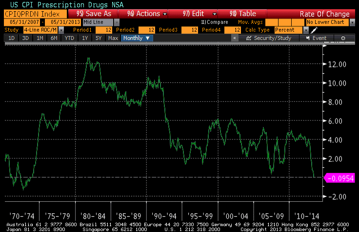
Now, I suspect that this has something to do with Obamacare, but no one seems to know the full impact of the law. Keep in mind that Medical Care in CPI excludes government spending on medical care. So, one possible narrative is that the really sick people are leaving for Obamacare while the healthy people are continuing to consume non-governmental health care services. This would be a composition effect and would imply that we should start looking at CPI ex-medical for a cleaner view of general price trends. I have no idea if this is what is happening, but I am skeptical that prescription meds are about to decline in price for an extended period of time!
But that’s the bet: either core inflation is going to go up, driven by things like housing, or it’s going to go down, driven by things like prescription medication. Place your bets.
Equity prices recovered today, but bond prices continued to slide into the long, dark night. For a really incredible picture, look at the chart below (source: Bloomberg), which shows the multi-decade decline in 10-year yields on a log scale, culminating in the celebrated breakout below that channel. Incredibly, the recent selloff has yields back to the midpoint of the channel and not outrageously far from a breakout on the other side!
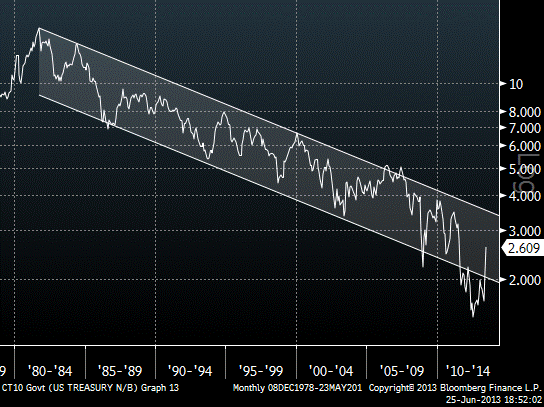
Incidentally, students of bond market history may be interested to know that the selloff has now reached the status of the worst ever bond market selloff (of 90 days or less) in percentage terms. Since May 2nd, 10-year yields have risen from 1.626% to 2.609%, a 98.3bp selloff which means that yields have risen 60.5% in less than two months.
And we are probably not done yet. I wrote about a month ago about the “convexity trade,” and I made the seemingly absurd remark that “This means the bond market is very vulnerable to a convexity trade to higher yields, especially once the ball gets rolling. The recent move to new high yields for the last 12 months could trigger such a phenomenon. If it does, then we will see 10-year note rates above 3% in fairly short order.”[emphasis in original] Incredibly, here we are with 10-year yields at 2.61%, up 60bps over the last month, and that statement doesn’t seem quite so crazy. As I said: I have seen it before! And indeed, the convexity trade is partly to blame for what we are seeing. I asked one old colleague today about convexity selling, and here was his response:
“massive – the REITs are forced deleveraging and there are other forced hands as well. The real money guys are too large and haven’t even sold yet – no liquidity for them. The muni market has basically crashed and at 5% yields in muni there is huge extension risk on a large amount of bonds: something like $750bln in bonds go from 10-year to 30-year maturities as you cross 5%.” (name withheld)
Now, I am not a muni expert so I have no idea what index it is I am waiting to see cross 5%. But the convexity trade is indeed happening.
Lots of bad things have happened to the market, but they really aren’t big bad things. In fact, I move that we stop using the term “perfect storm” to mean “modestly bad luck, but I had a lot of leverage.” The Fed was never going to be aggressively easy forever, and as various speakers have pointed out recently they didn’t exactly promise to be aggressively tightening any time soon. There is bad news on the inflation front, but the market is clearly not reacting to that. Some ETFs have had some liquidity issues, and emerging markets have tumbled, and there was a liquidity squeeze in China. But these are hardly end-of-the-world developments. What makes this a really bad month is the excess leverage, combined with the diminished risk appetite among primary dealers who have been warned against taking too much “proprietary risk.”
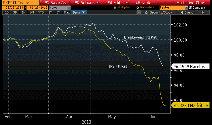
And markets are mispriced. Three-year inflation swaps imply that core inflation will be only 1.9% compounded for the next three years (the 1-year swap implied 1.6%; the 2y implies 1.75%). That is more than a little bit silly. While I have not been amazed that the convexity trade drove yields very high, and probably will drive them higher, it has surprised me that inflation swaps and inflation breakevens have continued to decline. Still, investors who paid heed to our admonition to be long breakevens rather than TIPS have done quite a bit better, as the chart below (source Bloomberg), normalized to February 25th (the date of one of our quarterly outlook pieces) illustrates.
As the bond selloff extends, I don’t think TIPS will continue to underperform nominal bonds. I believe breakevens, already at low levels (the 10-year breakeven, at 1.97%, is lower than any actual 10-year inflation experience since 1958-1968), will be hard to push much lower, especially in a rising-yield environment.
Classic
Numerous classic cognitive errors are on display at once in these markets. We have “overconfidence,” with large bets being made on the basis of strongly-believed models and forecasts…but these are forecasts of the dynamics of a system whose configuration is distinctly unlike anything we have seen before, even remotely. What does a “taper” do to rates? How can we know, since we have never even had QE, much less a taper, before? How aggressively does it make sense to bet on the outcome of such a transition period, given rational-sized error bars on the estimates?
We also see naïve extrapolation of trends. TIPS go down every day, it seems, for no better reason than that “core inflation is low, and the Fed is no longer going to be maintaining as loose a policy.” Ten-year TIPS yields have risen 83bps since April 25th (5y TIPS, +107bps since April 4th). Ten-year breakevens have fallen from 2.59%, within 15bps of an all-time high, on March 14th to 2.03% – the lowest since January 2012 – now. What has changed? Our model identified TIPS as cheap to Treasuries (that is, breakevens too low for the level of nominal rates) and went nearly max-long when breakevens were still at 2.30%. It is some solace that this position has fared better than a long position in TIPS, but when markets simply follow recent momentum mindlessly it can be painful.
Year-ahead core inflation is priced in the market at roughly 1.50%, despite the fact that current core inflation of 1.7% is only at this level because of persistently soggy core goods prices (and core goods are much more volatile than core services prices). Meanwhile, although core services prices remain buoyant, housing rents have not even begun to respond to the sudden boom in housing prices. To realize the core inflation priced into the 1-year inflation swap, core goods prices need to remain low and rends would need to decelerate while a shortage of owner-occupied housing drives the prices of existing homes skyward. It is possible, but it would be a very unusual economic occurrence. As I have previously written, we are maintaining our forecast for core inflation in 2012 at 2.6%-3.0%; although we may tweak that lowers if next week’s CPI is disappointing, we will not be changing it dramatically. Based on both top-down and bottom-up forecasts, we think the inflation market right now is very wrong. However, in accordance with paragraph 1, above, our 80% confidence interval for that estimate would be quite wide. Still, we feel that most errors looking out at least one year are going to be in the direction of higher inflation, not lower inflation.
Now, our forecast relies significantly on the behavior of the housing market, since shelter is the largest share of the budget for most of us. There has been a lot written recently about how the rise in rates could shatter the housing recovery. But let me explain why I don’t think that will happen.
I remember reading many years ago in “The Money Game” by Adam Smith (a pseudonym) that “you make more money with good investing decisions than with good financing decisions.” At least, I think that’s where I read it. In any event, it is true: if you are creating the next Microsoft, it makes very little difference if you finance it at 2% or at 15%, because the investment performance will completely obliterate the cost of financing. And this is why higher rates, even significantly higher rates, will not derail the housing market while prices are rising at 10%+ per annum. A home buyer is clearly happier to borrow at 3% than at 5% (tax-deductible), but if the home price is appreciating at 10% per annum (tax free, for much of it, and tax-deferred in any event) then it is a home run for the buyer either way. What hurts the housing market is when the expectation of future home price changes goes from go-go to stop-stop. And, with most consumers concerned with inflation and recent price trends in the home market, this isn’t going to change soon.
Here is an illustration of the real-world response of housing to rates. This first chart is the Mortgage Banking Association’s Refinancing index, plotted against 10-year Treasury rates (inverted). You can see that the recent rise in rates is having a significant impact on refinancing activity.

And this next chart is a chart of the MBA Purchase Index, showing activity on mortgages related to new purchases of homes. Again, the 10-year Treasury rate is inverted. You can see that there is no meaningful correlation here; if anything, purchase activity has been rising over the past year while rates have also been rising.

So, rest easy: higher interest rates are not going to meaningfully impact the housing market, unless they go much higher. Indeed, homebuyers might reasonably believe here that there is a “Bernanke put” on home prices in the same way that investors (correctly) believed there was a “Greenspan put” on stock prices. The Fed (and for that matter the state and federal governments) clearly have responded and can reasonably be expected to respond robustly to a future home price bust. So why not be long real estate here, if your downside is protected…and in any case, is limited to your home equity?
And if home prices do not decline, then rents are not going to decline, and in fact need to accelerate to keep up with the previously-seen rise in home prices. That is going to cause core inflation to rise going forward.
.
One final note: over the next month or two I hope to put out a few more articles like the one I wrote on June 8th about equity returns and inflation, but focusing on other asset classes such as real estate, infrastructure, commodity indices, etcetera. But in the meantime, I wanted to point out one security to keep an eye on. It is one of only two inflation-linked bonds that is traded on an exchange with a daily price and reasonable bid/offer spreads. The symbol is OSM (for Bloomberg users: you need the <CORP> key), and it is a floating-rate inflation-linked bond issued by SLM Corp with a March 2017 maturity. The problem with this security is that it is very hard to figure out what its true yield is unless you have an inflation derivatives curve, and even harder to figure out whether the issue is priced correctly given that you own SLM credit. The recent selloff has driven the real yield of this issue to (approximately) 3.40%, which is obviously much higher than is available for TIPS. The bad news is that the bond is still fairly expensive given the spread that should exist for a SLM bond, but in terms of raw real yield to maturity there are not many inflation-linked bonds out there with that yield. I am not recommending this security, but mention it as a point of information for investors who may want to check it out on their own.
Existing Home Inflation Remains “Contained”
Right, the Fed’s actions have definitely not caused any inflation.
 Asset inflation is only a temporary relief/diversion from consumer price inflation. In this case (unlike with, say, equities), the investment good is also a consumption good – housing – so the pass-through is relatively straightforward. And, I would say, probably inevitable.
A Broken Record But It’s A Good Song
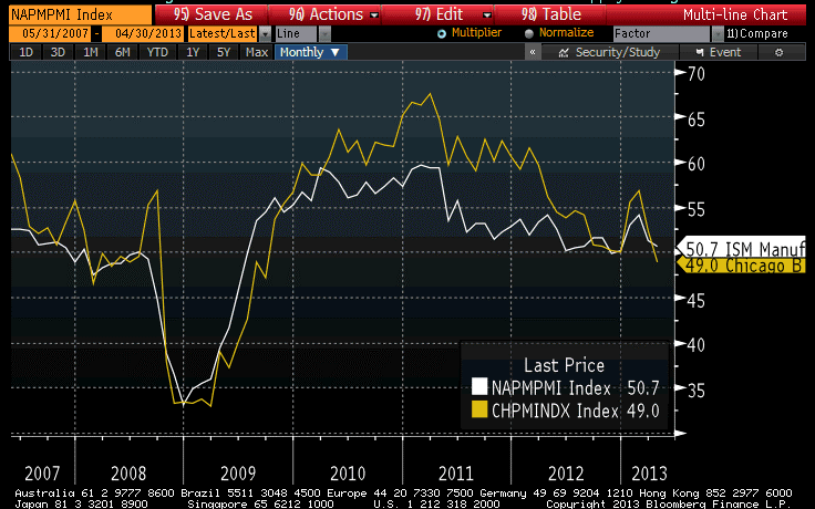
There has been a bunch of new data over the last couple of days, but I am afraid that all of the new stuff will not keep me from sounding like a broken record.
Consumer Confidence jumped yesterday, but more interesting is the fact that the “Jobs Hard to Get” subindex rose to the highest level since late last year, suggesting that weak jobs data isn’t entirely a one-off. Today, the ADP report was weaker-than-expected, at 119k (versus expectations for 150k) and a downward revision to last month. The Chicago Purchasing Managers’ Index on Tuesday was the weakest since 2009, but the ISM Manufacturing report today was on-target. Still, neither manufacturing index is generating much confidence that the economy is about to take off, and the early-year bump has been entirely reversed (see chart, source Bloomberg).
The Shiller Home Price Index, reported on Tuesday, was higher-than-expected at 9.3% year-on-year, rather than the 9.0% expected (and versus an 8.1% last!). What’s really interesting about this is that the recent surge in year-on-year growth has come because the usual seasonal pattern that sees prices sag in the springtime hasn’t been in evidence this year – accordingly, the year-on-year comparisons have gotten easier as prices have gone sideways rather than falling as they tend to do between August and March (see chart, source Bloomberg).

That’s interesting because such a phenomenon was also a condition of the bubble years prior to 2007 – prices generally rose steadily with only a hint of seasonality. Post-bubble, if you wanted to sell your house in February you had to offer a concession on price. Those concessions aren’t happening any more, which is a back-door confirmation of the overall price action.
As I have said before, ad nauseum, we are seeing slow and/or falling growth and firm and/or rising inflation in the pipeline, and that’s not at all inconsistent. Mainstream economists, and journalists of all stripes, seem to accept as a fundamental verity the linkage between growth and inflation, but the only minor problem with this firmly-held belief is that it ain’t so. Growth is bad, and inflation is still going to go up. In Q1, core CPI rose at a 2.1% pace, and I still think that for the full year core CPI will rise at 2.6%-3.0%.
I want to add a quick word here about a thesis that has been advanced recently. The thought is that if the abrupt housing demand is coming from investors rather than consumers, then rising housing prices might be consistent with pressure on rents. I think it’s important to clear up this confusion. Microeconomics tells us that when the price of a good goes up, the price of a substitute tends to rise as well. It is possible, if the overall price level is flat, that a phenomenon such as is described in this hypothetical could happen, with home prices rising and rents falling. But what is much more likely is that rents simply go up more slowly than home prices, so that they decline relative to home prices, rather than declining absolutely. This is, in fact, what we see historically: large increases in home prices tend to lead to increases in rents, but not of the same magnitude, and vice-versa. Whether the mechanism for this is a systematic institutional investor presence or just a large number of one-off instances of individuals renting out their second “investment” homes doesn’t really matter. Accordingly, I don’t expect to see a drastically different course carved out by the rental/home price relationship from what it has been historically. The main difference may be that the lags between home prices, inventories, rents, and so on might get screwed up somewhat, if institutional investors cause this to happen in a more organized way than the organic way in which it usually happens.
Another aside: there has also been a lot made recently, especially in commodity markets, about weak data from China. It is amazing how important it is to global commodity markets that China grows at 9% and not 8%. If I were a member of Chinese leadership, I would be trying to convince my data bureau to release slightly weak figures, since every time it does the hedge funds of the world offer large amounts of commodities as discount prices, which is just what a growing economy needs. It’s not like anyone believes the figures when they are reported to be high; I wonder why we believe it when they are reported to be low?
In addition to the data today, the Federal Reserve finished its meeting and announced no change in monetary policy for now. And there isn’t one coming for a while, either. There was no important change in the statement, although the Fed did take care to remind us that it “is prepared to increase or reduce the pace of its purchases to maintain appropriate policy accommodation as the outlook for the labor market or inflation changes.” [emphasis added] That’s comforting. But the simple fact is that the economy isn’t going to be booming any time soon, and the Committee isn’t going to taper its purchases unless it does because they labor under the delusion that they’re helping. Perhaps next year.
For the rest of the week, investors will be focused on Friday’s Employment Report. I am not really worried about the report being weaker-than-expected, because from everything I read it seems that the market is already anticipating something close to Armageddon (or at least, that’s how they are explaining the continued pressure on breakevens and commodities). So far, this is a routine slowdown that might be slipping into a renewed recession. Meanwhile, expectations on Friday are for Payrolls of 145k, up from 88k but down from the pace of the last year. And the ‘whisper’ number seems to be lower than that. I suspect the more likely surprise is that there is an upward revision to the 88k and the number exceeds estimates. Somehow, that will be also perceived as a negative for breakevens!
TIPS suffered today, even as nominal bonds rallied. Our Fisher yield decomposition model currently suggests that TIPS are as cheap, relative to nominals, as they have been since early September last year (when 10-year breakevens were at the same level they are at now). I am quite bullish on breakevens from here.
Rage Against the Machines
The explosion today wasn’t at the White House. That was a false report, put out when the Twitter account of the Associated Press was hacked. But that report immediately led to immolation at some high-frequency trading (HFT) fund, somewhere, almost certainly. The S&P immediately dropped 16 points as some news algorithm (or algorithms) scraped the tweet and immediately converted it into sell orders. As they say in the circus, “whoops!” And, as in the circus, that utterance is almost immediately followed by the sound of ambulances. In an otherwise very quiet market, there was a five minute period of very active trading, punctuated by swearing so loud you could almost hear it.
Somewhere, there is a fund that was founded on the basis of its smart algos that can “react faster than humans can react,” which took losses faster than a human could have taken losses. Ouch, I say. Ouch. But my sympathy for HAL is tempered by the fact that HAL has no sympathy for me.
I am pretty sure that the rapid movement in housing prices has nothing to do with HFT algorithms, although the violence of the move is starting to be vaguely reminiscent. Fortunately, home sales documentation is still not effected in microseconds, so we all still have a chance to beat the machines. Over the last few days, we have seen Existing and New Home Sales data, and the FHA’s Home Price Index; the more stable two of these confirmed that home prices continue to accelerate. In fact, as the chart below shows, the year-on-year rise in Existing Home median prices is more than 10% faster than core inflation for only the second time since the data has been kept. The first time that happened was in the midst of the housing bubble.

Housing is nowhere near bubble territory yet, and as the chart also shows the rise in home prices can persist at better than 10% over CPI for at least a little while. However, it can’t last too long because of the reflexivity of it: eventually, no matter what happens to home prices, the increases will pass into core inflation and the spread will be eaten away from the bottom.
This isn’t even necessarily a negative sign of a re-inflating bubble. In principle, if home prices had gotten overextended on the downside in a “negative bubble,” this could simply be a snap-back and just healthy. However, that doesn’t appear to be the case. I showed here that median existing home prices as a multiple of median household income are right on the average for the last 36 years or so – certainly not cheap. The chart below shows a similar relationship for New Homes. Note that with new homes, one would expect an uptrend since the average new home has grown in size over the years and loan qualifications have also allowed lower-income borrowers to dedicate larger shares of their incomes to buying new homes.[1]

The simple implication of the fact that home prices continue to accelerate higher is that core inflation is absolutely going to head higher. I think that Owners’ Equivalent Rent will turn higher in the next couple of months; Pimco recently wrote a piece saying they think the upturn takes until late this year; but it will happen. And it will happen regardless of whether the “shadow inventory” of homes hits the market or not, although if there really is a large unsold shadow inventory of homes, that will moderate the advance. My question is: where is this shadow inventory? Existing home prices are 10-20% off the lows depending on what series you use. Are sellers waiting for a return to the peak?
Some observers have noted that homes are now suddenly appearing on the market, and they divine a supply response. This is possible, but what is more likely is that this is the normal seasonal pattern: people put their homes on the market in the spring, not in the winter. This is why the sales data are seasonally-adjusted, so don’t trust your anecdotal evidence! The chart below shows the nonseasonally-adjusted single family Existing Home Sales (source: NAR) for the last few years. You can see that the data mavens fully expect home sales to be picking up now, which is why there are many more homes on the market suddenly. There are every year at this time.

So I think we are still left with the conundrum. Where are all of those shadow homes? We know where the new homes are – they were never built, because the market was awful. That inventory will respond as builders build new homes. But as for the shadow inventory of existing homes…maybe they don’t exist?
From the standpoint of inflation, the question of shadow inventory only matters to the trajectory of future inflation, not to the question of how much CPI will rise in 2013 and 2014. Those OER increases are virtually baked in the cake, unless something very strange is happening. While an important lesson of the last few years is that very strange things happen all the time, we’re talking about a specific very strange thing: the possibility that the price of a good (a home) rises, and the price of a close substitute (a rental) does not. While those can diverge from time to time, I have great confidence in the economic verity that the prices of substitutes tend to move together.
The only way there might be a big divergence is if home prices are rising because the investment value of the home, and not its value as housing, is what is increasing (although in the bubble years, rents eventually rose as well). But if that is the case, wouldn’t that in itself be a sign that there is concern about inflation, so that people are seeking real assets wherever they can find them? Concern about inflation need not lead to inflation, but it may be a contemporaneous indication that inflation is rising and it merely hasn’t shown up in the data yet.
The rise in home prices is the biggest single alarm being sounded about inflation at the moment, and it seems to me that it pays to listen to it, and check that the doors and windows are locked…just to be sure.
[1] This is a much smaller effect with existing homes, since the average square footage of the homes existing in the entire nation changes much more slowly; also, many existing homes are move-up homes so the marginal-borrower effect, which I suspect is pretty small anyway except for the bubble years, is less pronounced.
The Economy in the Plastic Bubble
We’re going to leave behind the topic of Cyprus for a day. It does seem as if events are coming to a head, but with banks there closed until Tuesday (and the ECB lifeline in place until Monday), there will be lots of news over the next few days but most of it will be heat without light.
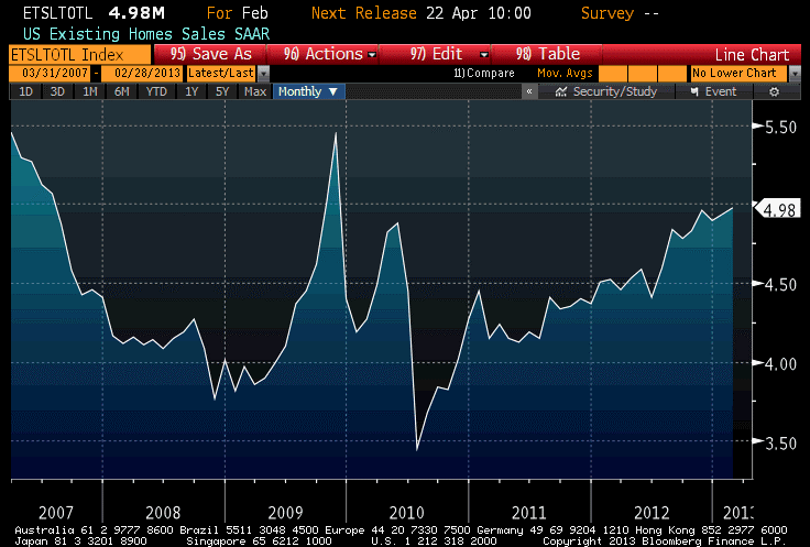
So, speaking of heat and light, let’s look at today’s data. Specifically, let’s look at Existing Home Sales.
While the total sales number fell just shy of the 5mm-unit level, the 4.98mm print still represented the highest number (aside from the home-buyer-tax-credit induced surge in 2009) since 2007 (see chart, source Bloomberg).
The inventory of homes available for sale bounced off of 14-year lows, but remains at levels lower than any we’ve seen in over a decade.
And, near and dear to my heart, the median price of existing homes accelerated from last month (although, due to historical revisions, last month’s y/y was revised down to 10.67%) and stands at 11.34%. The January Home Price Index from FHA also came out; the 6.46% year-on-year rate of increase in that index is also the highest post-2007.
There are long lags between both of these indices and the appearance of price pressures in the Consumer Price Index, but at the moment all indicators of housing point the same direction: Owner’s Equivalent Rent should be in the 2.75% neighborhood by year-end, and could be as high as 3%. This is a key part of our forecast that core CPI should reach 2.6%-3.0% by year-end, and accelerate further in 2014.
The amazing recent run in home prices – which I suspect is driven in part by institutional investor interest in real estate – has caused existing home prices as a multiple of household income to move above levels that prevailed for the last quarter-century of the 20th century. The housing industry likes to present charts of housing affordability, which takes into account the current level of interest rates, because currently those interest rates make even the relatively high home prices look more affordable.
Yes, I said “relatively high home prices.” The median sales price of existing homes averaged 3.36x median household income from 1975 to 2000, with a relatively small range of values around that average. Even including the bubble, when the multiples reached 4.8x, the average through 2011 only rose to 3.54. As of year-end 2012, the multiple was back to approximately 3.48 and if median prices rise “only” 8% this year (remember, the current pace is 11.3% and rising) the multiple will be around 3.6x by the end of the year (see chart, source U.S. Census Bureau, National Association of Realtors, Enduring Investments).

Notice that even at the depths of the crisis, home prices were only slightly cheap by pre-2000 standards. Similarly, equity prices at the lows only reached approximately fair value by pre-2000 standards. There are two interpretations of this fact set. It could mean that the pre-2000 era valuations were too low, and that modern financial markets and structures make higher valuation multiples permanently viable. Or it could mean that the Federal Reserve continues to artificially support markets at multiples that are not likely to be sustainable in the long run. I suspect the latter point is more accurate, although I am open-minded about whether the former point might have some validity.
This isn’t necessarily a bad strategy, if the idea is to let the market stair-step down to equilibrium rather than letting it crash there all at once. But I don’t see anything that suggests the Federal Reserve has the slightest idea how to value assets. I understand that they don’t want to substitute their own analysis for the market’s judgment (at least, that would be the counterargument), but that’s what they’re doing anyway – with no indication that they plan to back off anytime soon. The Fed is just more comfortable in the bubble, and afraid to leave it entirely. But don’t we have to, eventually?
The VIX returned to 14 today, which makes a bit more sense to me than the 12.7 level of yesterday. It still seems low to me, but at least there is a way for long-vol positions to actually lose.
Gravity Still Works, After All
Mild weakness in housing data (Housing Starts fell to only the second-highest level since 2008) seemed to be a sufficient excuse today to send stocks lower, but really the main culprit was gravity. We will have to see if the market corrects more than the 1.25% it dropped today, but it shouldn’t be all that surprising!
It actually looked a little bit like one of the classic “risk-off” trades we have seen in recent years. Commodities fell, especially precious metals, energy, and industrial metals while agriculture rallied. The dollar leapt to the highest level since November. Inflation breakevens declined a touch, and interest rates slipped a couple of basis points. What’s more, the VIX jumped to match its highest closing level of the year.
Searching for a new story on why commodities fell, a rumor passed along the market (memorialized by Bloomberg here) that a hedge fund was being flushed out of commodities positions. But that made little sense, unless the fund had been long energy and short agriculture – and if they had been, they would have been winning over the last several months, not blowing up! More likely, it was just gravity, which seems to operate more heavily on commodities than on stocks these days. I guess stocks are from Mars, commodities from Venus.
I think this is all part of a corrective move, but the corrections are a bit out-of-sync and that makes me nervous. In the article I wrote on January 31, I pointed out that the dollar index, 5-year inflation breakevens, and commodities were all nearing critical breakout or breakdown levels. I thought they were all about to break those levels and continue trends, but what actually happened was quite the opposite: the dollar index is up significantly (back to near the November highs, as I said), 5-year breakevens are a couple of basis points cheaper (although not much) and commodities have done what commodities have done all too often over the last year: slid to lower nominal, and even cheaper real, levels. Although I didn’t show it on January 31st, the 5y CPI, 5y forward – an important metric for the Fed – has also declined slightly from 3.09% to 3.04%.[1]
I expect the markets to return to the levels they held at January month-end, however. The FOMC minutes out this afternoon showed that while there continue to be dissenting, hawkish voices at the Fed (notably, Esther George cast the lone dissenting voice this month – how I like this Fed President!), they continue to be completely drowned out by the doves. Again looking for an angle to explain the stock market decline – which started this morning, long before the minutes were released and probably even before they were leaked to Goldman[2] – market headlines bleated about how the “Fed Minutes Show Debate Over Stimulus,” about how the Fed is “uneasy” over QE, and about how several officials suggested varying the pace of QE over time.
This wild and crazy debate, this uprising of the inflation hawks, produced (I note again for the record) one dissenting vote. Remember, even non-voters can participate in debate and appear in the minutes even if they don’t vote. In this case, the “several members” likely included George and Richard Fisher of Dallas (non-voter), with some chance that a third, also non-voting, member joined them (maybe Plosser?) But they are arrayed against a very dovish core of the FOMC, and the minutes contain a clear indication that the Committee prefers to err on the side of keeping accommodation too long rather than remove it too soon:
“A number of participants stated that an ongoing evaluation of the efficacy, costs, and risks of asset purchases might well lead the Committee to taper or end its purchases before it judged that a substantial improvement in the outlook for the labor market had occurred. Several others argued that the potential costs of reducing or ending asset purchases too soon were also significant, or that asset purchases should continue until a substantial improvement in the labor market outlook had occurred. A few participants noted examples of past instances in which policymakers had prematurely removed accommodation, with adverse effects on economic growth, employment, and price stability; they also stressed the importance of communicating the Committee’s commitment to maintaining a highly accommodative stance of policy as long as warranted by economic conditions. In this regard, a number of participants discussed the possibility of providing monetary accommodation by holding securities for a longer period than envisioned in the Committee’s exit principles, either as a supplement to, or a replacement for, asset purchases.”
I similarly wouldn’t read much into the “number of participants” asking for ongoing evaluation of the efficacy, costs, and risks of asset purchases. This sort of debate has been occurring in the minutes of almost every meeting since the Fed first began QE, and it would be striking if there was not any discussion of efficacy, costs and risks – especially considering that the efficacy of this unprecedented policy action has been fairly unimpressive, to be kind.
I see no reason to doubt the Fed’s word that they will keep accommodation until the Unemployment Rate improves or inflation moves enough higher to concern them. But there is certainly no concern, even among the hawks, about the current level and trajectory of inflation:
“Nearly all participants anticipated that inflation over the medium-term would run at or below the Committee’s 2 percent objective.”
Unless you’re talking about the vague concern expressed by “a few” participants about inflation over the long run:
“Participants generally saw recent price developments as consistent with their projections that inflation would remain at or below the Committee’s 2 percent objective over the medium run. There was little evidence of wage or cost pressures outside of isolated sectors, and measures of inflation expectations remained stable. However, a few participants expressed concerns that the current highly accommodative stance of monetary policy posed upside risks to inflation in the medium or longer term.”
This continues to be where the whole house of cards is vulnerable. A series of bad inflation numbers (and I am sure it would take a series, not just one or two) could alter the debate later this year. Tomorrow’s release of January CPI (Consensus: +0.1%/+0.2% ex-food-and-energy; +1.6%/+1.8% y/y) is not likely to be the first of those bad numbers, but it is coming soon. The consensus expectations are quite soft, essentially +0.05% on headline inflation (the energy spike didn’t really start until February) and +0.16% or 0.17% on core CPI.
But the housing price data are unequivocal: a large portion of the consumption basket is going to see prices rising at an accelerating rate, soon. Our models seem to suggest the inflection point could be another couple of months away, but it is dangerous to get too caught up in model minutae. The big message from the models is that the unambiguously higher home prices (in Existing Home Sales, New Home Sales, the FHA’s Home Price Index, the Case/Shiller index) are leading to higher rents (judging from surveys of apartment rents from REIS and CBRE) and this reflects higher shelter costs that will show up in core CPI within a few months. If it happens tomorrow, then stocks are vulnerable – but if not, then Martian gravity isn’t going to be enough to hold down stocks for very long.
We know that in low-gravity environments, human skeletal structure gradually weakens so that a return to normal gravity can be very dangerous for someone who has been in space for a long time. The stock market has been in space for a very long time. At some point, when “normal gravity” (in the form of a neutral Federal Reserve policy) returns, equities will have a rough transition to make. But that day isn’t yet, so while I don’t have expectations of much higher equity prices from here I also wouldn’t get too excited about looking for a 20% decline, either.
[1] Technical note: when looking at breakevens, and especially forward breakevens, over a long period of time, it is important to use inflation swaps whenever they are available because there are fewer idiosyncrasies with the structure of the inflation swaps curve than with the breakeven curve. As a case-in-point, while 5y inflation, 5 years forward taken from inflation swaps has fallen 5bps since January 24th, Bloomberg’s 5y, 5y BEI has dropped some 30bps over the same period, due to changes in which TIPS and nominal bonds make up that index.
[2] I’m kidding, sorta.