Archive
Gravity Still Works, After All
Mild weakness in housing data (Housing Starts fell to only the second-highest level since 2008) seemed to be a sufficient excuse today to send stocks lower, but really the main culprit was gravity. We will have to see if the market corrects more than the 1.25% it dropped today, but it shouldn’t be all that surprising!
It actually looked a little bit like one of the classic “risk-off” trades we have seen in recent years. Commodities fell, especially precious metals, energy, and industrial metals while agriculture rallied. The dollar leapt to the highest level since November. Inflation breakevens declined a touch, and interest rates slipped a couple of basis points. What’s more, the VIX jumped to match its highest closing level of the year.
Searching for a new story on why commodities fell, a rumor passed along the market (memorialized by Bloomberg here) that a hedge fund was being flushed out of commodities positions. But that made little sense, unless the fund had been long energy and short agriculture – and if they had been, they would have been winning over the last several months, not blowing up! More likely, it was just gravity, which seems to operate more heavily on commodities than on stocks these days. I guess stocks are from Mars, commodities from Venus.
I think this is all part of a corrective move, but the corrections are a bit out-of-sync and that makes me nervous. In the article I wrote on January 31, I pointed out that the dollar index, 5-year inflation breakevens, and commodities were all nearing critical breakout or breakdown levels. I thought they were all about to break those levels and continue trends, but what actually happened was quite the opposite: the dollar index is up significantly (back to near the November highs, as I said), 5-year breakevens are a couple of basis points cheaper (although not much) and commodities have done what commodities have done all too often over the last year: slid to lower nominal, and even cheaper real, levels. Although I didn’t show it on January 31st, the 5y CPI, 5y forward – an important metric for the Fed – has also declined slightly from 3.09% to 3.04%.[1]
I expect the markets to return to the levels they held at January month-end, however. The FOMC minutes out this afternoon showed that while there continue to be dissenting, hawkish voices at the Fed (notably, Esther George cast the lone dissenting voice this month – how I like this Fed President!), they continue to be completely drowned out by the doves. Again looking for an angle to explain the stock market decline – which started this morning, long before the minutes were released and probably even before they were leaked to Goldman[2] – market headlines bleated about how the “Fed Minutes Show Debate Over Stimulus,” about how the Fed is “uneasy” over QE, and about how several officials suggested varying the pace of QE over time.
This wild and crazy debate, this uprising of the inflation hawks, produced (I note again for the record) one dissenting vote. Remember, even non-voters can participate in debate and appear in the minutes even if they don’t vote. In this case, the “several members” likely included George and Richard Fisher of Dallas (non-voter), with some chance that a third, also non-voting, member joined them (maybe Plosser?) But they are arrayed against a very dovish core of the FOMC, and the minutes contain a clear indication that the Committee prefers to err on the side of keeping accommodation too long rather than remove it too soon:
“A number of participants stated that an ongoing evaluation of the efficacy, costs, and risks of asset purchases might well lead the Committee to taper or end its purchases before it judged that a substantial improvement in the outlook for the labor market had occurred. Several others argued that the potential costs of reducing or ending asset purchases too soon were also significant, or that asset purchases should continue until a substantial improvement in the labor market outlook had occurred. A few participants noted examples of past instances in which policymakers had prematurely removed accommodation, with adverse effects on economic growth, employment, and price stability; they also stressed the importance of communicating the Committee’s commitment to maintaining a highly accommodative stance of policy as long as warranted by economic conditions. In this regard, a number of participants discussed the possibility of providing monetary accommodation by holding securities for a longer period than envisioned in the Committee’s exit principles, either as a supplement to, or a replacement for, asset purchases.”
I similarly wouldn’t read much into the “number of participants” asking for ongoing evaluation of the efficacy, costs, and risks of asset purchases. This sort of debate has been occurring in the minutes of almost every meeting since the Fed first began QE, and it would be striking if there was not any discussion of efficacy, costs and risks – especially considering that the efficacy of this unprecedented policy action has been fairly unimpressive, to be kind.
I see no reason to doubt the Fed’s word that they will keep accommodation until the Unemployment Rate improves or inflation moves enough higher to concern them. But there is certainly no concern, even among the hawks, about the current level and trajectory of inflation:
“Nearly all participants anticipated that inflation over the medium-term would run at or below the Committee’s 2 percent objective.”
Unless you’re talking about the vague concern expressed by “a few” participants about inflation over the long run:
“Participants generally saw recent price developments as consistent with their projections that inflation would remain at or below the Committee’s 2 percent objective over the medium run. There was little evidence of wage or cost pressures outside of isolated sectors, and measures of inflation expectations remained stable. However, a few participants expressed concerns that the current highly accommodative stance of monetary policy posed upside risks to inflation in the medium or longer term.”
This continues to be where the whole house of cards is vulnerable. A series of bad inflation numbers (and I am sure it would take a series, not just one or two) could alter the debate later this year. Tomorrow’s release of January CPI (Consensus: +0.1%/+0.2% ex-food-and-energy; +1.6%/+1.8% y/y) is not likely to be the first of those bad numbers, but it is coming soon. The consensus expectations are quite soft, essentially +0.05% on headline inflation (the energy spike didn’t really start until February) and +0.16% or 0.17% on core CPI.
But the housing price data are unequivocal: a large portion of the consumption basket is going to see prices rising at an accelerating rate, soon. Our models seem to suggest the inflection point could be another couple of months away, but it is dangerous to get too caught up in model minutae. The big message from the models is that the unambiguously higher home prices (in Existing Home Sales, New Home Sales, the FHA’s Home Price Index, the Case/Shiller index) are leading to higher rents (judging from surveys of apartment rents from REIS and CBRE) and this reflects higher shelter costs that will show up in core CPI within a few months. If it happens tomorrow, then stocks are vulnerable – but if not, then Martian gravity isn’t going to be enough to hold down stocks for very long.
We know that in low-gravity environments, human skeletal structure gradually weakens so that a return to normal gravity can be very dangerous for someone who has been in space for a long time. The stock market has been in space for a very long time. At some point, when “normal gravity” (in the form of a neutral Federal Reserve policy) returns, equities will have a rough transition to make. But that day isn’t yet, so while I don’t have expectations of much higher equity prices from here I also wouldn’t get too excited about looking for a 20% decline, either.
[1] Technical note: when looking at breakevens, and especially forward breakevens, over a long period of time, it is important to use inflation swaps whenever they are available because there are fewer idiosyncrasies with the structure of the inflation swaps curve than with the breakeven curve. As a case-in-point, while 5y inflation, 5 years forward taken from inflation swaps has fallen 5bps since January 24th, Bloomberg’s 5y, 5y BEI has dropped some 30bps over the same period, due to changes in which TIPS and nominal bonds make up that index.
[2] I’m kidding, sorta.
Home Price Increases – Not An Illusion
It seemed like last month I was focusing on the bigger picture a lot more than I have been recently. This is a function of the calendar, in that all of the important data tends to be clustered towards the end of the month, but also of the opportunity. When economists and investors are on-the-ball, they shouldn’t be blindsided by something as obvious as the fact that the sharp change in tax rates and withholding schedules at the end of the year, and the intentional direction of economic activity into Q4 in preference to Q1, was bound to cause an apparent acceleration in late Q4, and a deceleration in Q1. The fact that many economists and investors seemed to be taking the end-of-year data at face value indicated a potential opportunity.
January Consumer Confidence is a case-in-point. It was expected to decline slightly, to 65.1, and instead dropped to 58.6 – quite a sharp drop from the prior month (see chart, source Bloomberg), especially since December’s figure was revised upward slightly. The overall level of Consumer Confidence sits at a lower level than any in 2012. Not to belabor the point, but this is entirely to be expected. However, as the upcoming data displays a zag to the data’s December zig, expect the market mood to change. It has not yet changed, to be sure. The stock market put in yet another new high, and bonds another low, so the market mood remains bulletproof for now.
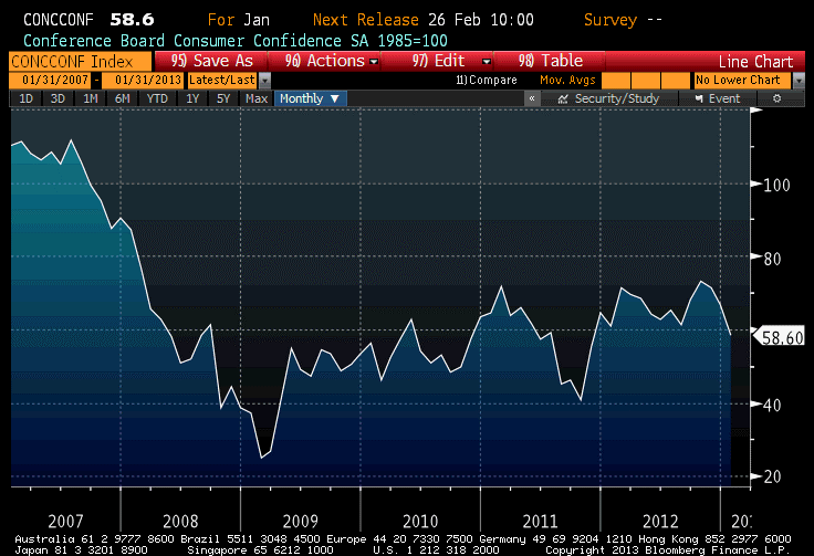
In addition to the headline Confidence number, I always look at the “Jobs Hard to Get” subcomponent, which rose to 37.7 from 36.1. That represents the sharpest rise (higher indicates that more respondents are calling jobs “hard to get,” and so is a sign of economic languor rather than vigor) since the first half of last year. The level of this index tends to correlate reasonably well with the Unemployment Rate, and employment conditions generally. This leads me to suspect that tomorrow’s ADP report (Consensus: 165k from 215k in Dec) is likely to be softer than expectations. It bears observing, however, that even the 37.7 “Jobs Hard to Get” number is lower (that is, stronger) than it was for all of 2012 up until November. Accordingly, I’d expect a rise in Friday’s Unemployment Rate, but I wouldn’t be shocked if we didn’t see one.
The other important piece of data was the S&P Case-Shiller Home Price Index, released for November. The index rose 5.52% y/y ended in November, the highest rate of increase since 2006 (see chart, source Bloomberg).
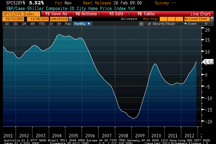
Now, this isn’t surprising because we’ve already had lots of other home price data for November and December, such as the Existing Home Sales and New Home Sales median price indices. But here is why you should care. Some observers have taken to dismissing the striking rise in these indices that we have so far seen; some have suggested that the home sales numbers are showing rising prices because the composition of the homes that are being sold is changing because of the paucity of credit available to lower-income (smaller home) borrowers. While using median prices, rather than mean prices, will tend to lessen this problem somewhat, it is a plausible hypothesis.
But the S&PCSSHPI[1] is designed to be a constant-quality index, and the index is calculated on the basis of repeat sales of the same homes. Thus, it doesn’t suffer from the composition-of-sales bias that the Existing and New Home Sales data might have – and it also shows that home price increases are accelerating. Home prices, in short, really are rising at a faster pace than at any time since 2006, and at 3.6% above core inflation (3.8% if you also exclude shelter from core inflation). As we’ve been saying for months, there is very little risk that core inflation is going to fall appreciably any time soon, when 40% of it (housing) is seeing an accelerating rate of inflation.
On Wednesday, in addition to the aforementioned ADP, we’ll get the advance release of Q4 GDP (Consensus: 1.1%, 2.1% Personal Consumption). I suspect that this is likely to be exceeded, although doing the GDP math for the advance report (which involves a fair number of estimates) is a bit beyond my art. If it really comes in as weak as 1.1%, then this coupled with a weak ADP could give the bond bulls some cover. If instead the GDP figure is a surprise on the high side, then given the current state of market emotion I’d expect investors to latch onto the (old news) Q4 GDP data and ignore the news from January.
But the key event of the day is the announcement of the FOMC’s decision around 2:15ET. There is not likely to be much of note to come from the FOMC statement, which ought to be largely unchanged. With all of the uncertainty surrounding the year-end data and the fiscal cliff/debt ceiling debates still ahead, the Committee will not be rocking the boat in January.
[1] I just felt like abbreviating since the Standard & Poors/Case-Shiller Home Price Index is ridiculously long, and I was curious whether the abbreviation helped. It doesn’t, unless you’re tweeting.
Dropping the Anchor
The S&P managed to hit the seemingly-important 1,500 level today, before fading to close unchanged. The market took heart early from the print of Initial Claims at 330k. This is of course good news, although some blame may be due to the holiday-shortened week (the BLS had to estimate claims for some states, including California, which were unable to submit their figures in time) and the still-volatile seasonal pattern. Traditionally, this is the week I start paying attention to ‘Claims, but each subsequent number matters more than the last. I’d love to hear that the post-holiday layoffs weren’t as significant as they usually are, implying that more ‘seasonal’ workers are being retained. I’m skeptical of it, though, until we see a few more weeks of such evidence or confirmation in the survey numbers.
This is a good time to remember that economic data aren’t “right” or “wrong”; they are experiments, like taking the heights of five random motorists and trying to guess the average height of the people who drive on a particular freeway. We never know the true underlying state of the economy, or the true underlying trend rate of any particular economic datum. We come into an economic release with a null hypothesis, and that hypothesis may either be rejected or not rejected (economic data can never really confirm your hypothesis, but they can support your hypothesis). It is for this reason that I ignore the first few Initial Claims figures of the new year. The error bars on them are so wide that it is almost impossible to reject any halfway-rational null hypothesis. Once we have seen a couple more Claims figures in this range, or gotten support for the notion of an improving job market from Consumer Confidence figures (for example), it will be easier to reject the null hypothesis that the economy is still bumping along in a nearly-jobless recovery.
Also today, the TIPS auction produced strong results despite the fact that the market never priced in a ‘concession’ for the size. At 1:00ET, the bid in the market was -0.62%, but the U.S. Treasury sold $15bln at a lower yield (higher price) of -0.63%. Moving $15bln in size without hitting the bid is a fair sign of hunger in the inflation market.
And why shouldn’t there be hunger? If you think the economy is heating up, you can’t really short bonds unless you want to sell them and hope the Fed is just about done buying. But the Fisher equation says:
(1+n)=(1+r)(1+i)(1+p), which we usually simplify to say
Nominal rates = real rates + expected inflation
If the Fed is holding nominal rates constant, and investors are expecting inflation to rise as growth heats up (note: I am not changing my view that these are unrelated…I’m merely observing how investors behave in the market), then TIPS ought to stay comparatively well-bid because investors will buy breakevens as the bearish trade, rather than selling Treasuries in a Quixotic attempt to outlast the Fed. I think breakevens and inflation swaps, which remain near the highest levels since 2006 (in the 10-year sector) and near the highest levels since there have been TIPS, are going to remain pretty well bid.
The last data of the week are the New Home Sales (Consensus: 385k from 377k) from December. The forecast is for the highest level of sales in several years, and the biggest hurdle seems to be that inventories of homes remain very low.
One quick observation about home prices and “inflation expectations” that is interesting. Pollster Rasmussen reported today that 29% of Americans expect their home’s value to rise over the next year. While this is close to the highest levels the survey has recorded (it was only started in April 2010), it is strikingly low considering that both new and existing home sales prices are up at a double-digit pace over the last year, and even the slower-moving Case-Shiller index has home prices up at over twice the rate of core inflation (4.31% as of October, the last available data, with next week’s release expected to be 5.6%). The point simply being this: the Federal Reserve relies mightily on the assumption that inflation cannot really get started when inflation expectations are well-anchored. But nowhere are inflation expectations better anchored, probably, than in home prices – and yet, home prices are rising at something not far away from the peak rates of a couple of years ago.
That’s something to think about. Maybe it’s time that the Fed dropped the whole notion of anchored inflation expectations, which no one has ever demonstrated since there are no good measures of consumer inflation expectations. The idea of an inflation-expectations anchor was developed to explain why inflation did not accelerate in the 1990s even while the economy did, causing previously-estimated models to breakdown. There are other explanations that don’t require positing an anchor that cannot be measured (for example, the private/public debt ratio plays an important role in my company’s models), but the imaginations of the academic community became…well…anchored to the idea. It’s time to drop that anchor…at least until we develop a way to measure those expectations, and then to test the idea.
Learning the Wrong Lessons
According to Bloomberg, investors are the most optimistic on stocks they have been in 3½ years. As is normal, investors mistake a sense of optimism about the economy for a sense of optimism on equities. As is normal, investors are reaching this peak of optimism as the stock market achieves its highest nominal level in five years, and among the highest valuation multiples in … hey!…about five years. What a coincidence! (Incidentally, while we calculate our long-term valuation metrics ourselves this page is a pretty good source for a quick-and-dirty view of valuations. I don’t have any relationship to the company and this is the only page on the site that I’ve used so I am not endorsing any other page!)
Now, while I am probably as optimistic on the economy as I have been in the past few years, I’m still less-optimistic than the crowd since I think the crowd hasn’t yet assimilated the fact that the little growth spurt at the end of Q4 owes quite a lot to the movement of dividends and incomes into Q4 from Q1, and thus the first quarter of this year will probably look rather poor.
In fact, while I am clearly negative long-term on the prospects for nominal Treasury bonds, that’s my investment view. My trading view is that at 1.84%, Treasury bond yields are probably going to go lower before they go higher. That’s partly because the present yields incorporate a lot of enthusiasm about growth – enthusiasm I think will be dashed once the January numbers begin to be reported in earnest. But the trading view is also because the Fed is buying virtually all of the net supply the Treasury is supplying to the market, with no sign that project is ending. I have no illusions that buying 10-year Treasuries at 1.84% and holding to maturity will be an awful investment. But if I was a short-term swing trader, I’d play for the next 20bps to be lower, not higher, in yield.
With respect to January data, incidentally, here is what we have so far (outside of Initial Claims, which as I have pointed out previously are all over the map at this time of year):
| Release for January |
Consensus Forecast |
Actual |
| Empire Manufacturing |
0.0 |
-7.78 |
| NAHB Housing Mkt Index |
48 |
47 |
| Philadelphia Fed Index |
5.6 |
-5.8 |
| Michigan Confidence |
75.0 |
71.3 |
| Richmond Fed Mfg Index |
5 |
-12 |
For the most part, these are not just misses but big misses. I wonder how long it will take for investors to notice? Initial Claims on Thursday could get attention as the numbers start to converge on the actual condition of the underlying economy, but the first big January datum is the January 29th release of Consumer Confidence, which is currently expected to rise slightly from December. That is followed by ADP on January 30th (but any weakness there will likely be tempered by the advance release of Q4 GDP on the same day), the Chicago PMI on the 31st, and the ISM PMI and Unemployment on February 1st. Regardless of what happens over the next few days, I don’t want to be short bonds headed into that gauntlet next week.
I said the January data were big misses “for the most part,” because the NAHB miss wasn’t really a big miss. Housing is even strong enough now to resist downside surprises. As an aside, although it is a December number, the median price of existing home sales rose 10.89% year-on-year. Adjusted for the level of core inflation (so that we’re looking at the real rise in existing home prices), this is the fastest rise in history except for several months in 2005 – see the chart, (source Enduring Investments).

As for stocks, the fact that investors are as bullish as they have been in a third of a decade is sad but not terribly surprising (although this is a survey of Bloomberg users, which supposedly are much more astute since they have to come up with the 1700 clams per month for the service). On a related note, I was recently reading an article, called “I Saw The Movie,” in the January issue of Financial Advisor Magazine. In the article, the author compares the fear that some investors have of the stock market to the (irrational) fear of going into the water after watching Jaws. The author notes that “If your balance in 2011 resembled your balance in early 2008, you lost three years – but you didn’t lose any money, unless you sold out of panic…the vast majority of big losers were those who sold at the ebb of fall of ’08 to the spring of ’09 and parked their boats in the shallows of rock-bottom savings accounts.”
This, it occurs to me, is the real toll that the Fed’s QE has had on the investor class. It taught the wrong lesson. The lesson that has been taught is that you should hold on through all things, good and bad, and things will be okay. It is true that with hindsight, those who sold with the market finally at fair value (but no cheaper) in March of ’09 missed a rollicking rally all the way back to similar levels of overvaluation. But the real lesson should have been that most investors shouldn’t have been overweight in equities in 2008 or in 2007, based on market valuations. In the absence of manipulation of asset prices through the “portfolio balance channel” (see my discussion of this phenomenon in my recent article “A Relatively Good Deal Doesn’t Mean It’s A Good Deal”), those who sold in March of 2009 would have missed an average market return rather than the 21% per annum the market actually delivered since then. So the problem isn’t that they got out in 2009, but that they got in (or stayed in) in 2007 and 2008, and then got out in 2009. Investors who heeded the overvaluation of the market at, say, year-end 1998 and never got back in have earned a compounded return of 2.54% in T-Bills, 7.39% in TIPS, 5.64% in commodities, or 5.77% in the Lehman/Barclays Agg (nominal bonds) compared with 2.94% in stocks.
And that return is based on the pumped-up valuations that still exist in stocks today.
Investors, and their advisors for the most part, haven’t learned the right lessons yet, which is why patient investors are still having to wait to get back into equities even though the Federal Reserve is working very hard to force them back into the market via the portfolio balance channel.
The right lesson is this: investing for the long term is mostly about valuations, and very little about the economic cycle, the news cycle, or the lunar cycle. And two of those three we can’t predict, anyway. Yes, there is a tactical element of trading, but most investors should be (a) rebalancing on a regular basis, (b) paying attention to basic rudiments of asset valuation so as to adjust – mainly at the margin – their basic asset mix, and (c) turning off the television.
Greed Over Fear?
Desperation is unattractive, and desperate greed – needing to have a big return, quickly – is dangerous when it comes to investing. But investors appear to be getting increasingly desperate to swing for home runs rather than to try for singles and doubles, if the increased stampeding of retail investors’ monies into equities is any indication. Again today, stocks rallied steadily for most of the day. As the S&P reaches a new 5-year high with every advance, and is not terribly far away from an all-time (not inflation-adjusted) high, investors are increasingly throwing caution to the wind and plunging back in to stocks. Blackrock’s CEO, Larry Fink, observed today that “…the move back into equities is one of the mega trends we witnessed in the fourth quarter, and that has continued into the first 15, 16 days of the year.”
According to Fink, investors are doing this because of disdain for bond returns, not because of a desire to go “risk on.” And yet, risk-on they are going. They are going risk-on with corporate margins at post-WWII highs and following a Q4 that will be exaggerated by the tax-related movement of income from Q1 into Q4 (for example, via the payment of special dividends), and a Q1 that will end up looking weaker than the underlying fundamentals really are. Are these desperate investors ready to see a few months of weak data when they’re buying in at the highs?
Today’s data offered both the good and the bad. The good was the December Housing Starts number, which achieved the highest level since 2008 (see chart, source Bloomberg). To be sure, building activity is nowhere near the levels that were common in the 1980s, 90s, and 00s, but it is recovering. This should continue, as the inventory of new homes is at a very low level. The bad was the January Philly Fed index, which was expected to rise but which instead declined. The index of current conditions (at -5.8%) is the worst for a January since 2009.

Much was made of the sharp decline in the Initial Claims figure, which was expected at 369k but instead came in at 335k. My advice is to ignore any Claims figure in the second half of December until late January, as the seasonal adjustment factors are actually much larger than the net number – that is, the report should have a huge error bar around the weekly number, which is a seasonally-adjusted figure. If this is why stocks rocketed higher, then the desperation is even more disturbing. No one ought to ever invest on the basis of a weekly economic number.
.
After yesterday’s CPI report, I expected to see a number of denunciations of “inflation-phobes,” and I was not disappointed. David Wessel’s column in the Wall Street Journal was one example. Although Wessel came to the wrong conclusion (he agreed with Bernanke that there isn’t “much evidence” that the monetary policy of the last several years is going to be inflationary), at least he did undertake to “weigh…arguments on the other side.”
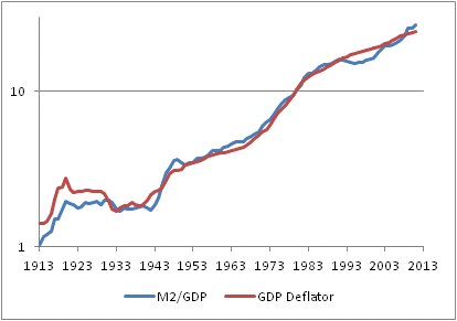
But he almost lost me straightaway, when he said that “the link between the money supply and the inflation rate is hard to discern in data…” Take a look at the chart below (source: Enduring Investments) and tell me if it’s really hard to discern the link in the data.

Oh, and on a longer-term basis there is this, which I wrote about in this great article.
What is hard to discern in the data is any link between inflation and growth, other than the spurious one that comes from the fact that the 2008 crisis was caused by an implosion of housing prices, which then impacted core inflation with a lag. (See chart, source Bloomberg)

Or, more consonant with the NAIRU theory, any link between the unemployment rate and core inflation (see chart, source Bloomberg).

This last chart is fun. If you run core CPI as a function of the unemployment rate from 2000-2012, you get a good correlation that looks like the right thing. But again, it’s spurious: if you look at the same relationship from 1990-2000, you also get a good correlation…but exactly the opposite slope to the relationship (that is, implying that lower unemployment causes lower inflation). Showing them both together makes the point that…you can’t see much in this data.
These latter two relationships are absolutely accepted without question in large swaths of the economics profession, such as when Wessel argues that “it would be difficult to spark and sustain inflation with so many unemployed workers, empty stores and offices and underused factories.” Where does he see that in the data?
I shouldn’t be so hard on Mr. Wessel, because he does make a reasonable effort to give some arguments about why people fear that the Fed will either intentionally or unintentionally make a mistake. But I think his best argument is one that he doesn’t make on purpose: policymakers and many economists just don’t understand what inflation is and how it works, and that creates a very high likelihood of error in the future. Moreover, they not only don’t understand, but they greatly overestimate their degree of understanding. I recognize, as an investor, trader, and economist, that there is some chance that my forecasts are wrong. Furthermore, since I understand that overconfidence is a very common cognitive error, I even recognize that I am most likely underestimating the chances that I am wrong. As a consequence, I am very conservative with my approach to investment when the consequences of an error are very high. Most good investors are very wary of overconfidence.
No such wariness afflicts the economic profession, unfortunately, especially at one particular address on Constitution Avenue Northwest in Washington, DC.
Wrapping Up – And Some Portfolio Projections
Whether it’s with a bang or with a whimper, the year is drawing to a close. So too is this author’s year; I expect that this will be my last post for 2012. Let me take a quick moment to thank all of you who have taken the time to read my articles, recommend them, and re-tweet them. Thanks, too, for your generous and insightful comments and reactions to my writing. One of the key reasons for writing this column (other than for the greater glory of Enduring Investments and to evangelize for the thoughtful use of inflation products by individual and institutional investors alike) is to force me to crystallize my thinking, and to test that thinking in the marketplace of ideas to find obvious flaws and blind spots. Those weaknesses are legion, and it’s only by knowing where they are that I can avoid being hurt by them.
In my writing, I try to propose the ‘right questions,’ and I don’t claim to have all the right answers. I am especially flattered by those readers who frequently disagree with my conclusions, but keep reading anyway – that suggests to me that I am at least asking good questions.
So thank you all, and I hope you have a blessed holiday season and a happy new year. And now, back to our regularly-scheduled article.
.
It seems likely, although not a sure thing, that 2013 will be a better year in terms of economic growth. Certainly, we are ending 2012 in better shape than we entered it. One way or the other, the budget deficit will come down – at least partly because the prospective rise in tax rates has moved forward some realization of taxable gains – and, although that is a negative from a classical C+I+G+(X-M) perspective, I believe a smaller deficit will help assuage some business and consumer fears and be no worse than neutral … if, in fact, we get a smaller deficit! A bigger point is that while Europe is far from out of the woods, a near-term exit of Greece from the Euro finally seems unlikely. Stay tuned for Italian and Spanish dramas in 2013, and plenty of other pressures on the continent, but the worst case that we feared a year ago has been at least kicked down the road a piece.
Domestic growth to end 2012 is looking better, too. Today the Philly Fed index showed its highest print since March (8.1 versus -10.7 last month and expectations for -3.0). Existing Home Sales came in at 5.04mm, the first time above 5mm (without a government program, such as got Existing Home Sales up there briefly at the end of 2009) since 2007. The inventory of existing homes fell to the lowest level since 2002 (see chart, source Bloomberg).
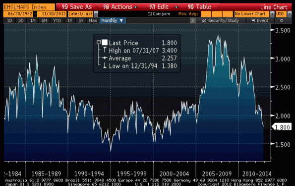
Yes, there is additional “shadow inventory,” and so this isn’t the “true” inventory once you include bank REO property and other wannabe sellers who are waiting for the market to pick up, but that shadow inventory will clear a lot faster now that prices are rising. The monthly Home Price Index from the FHFA was released today, showing that nominal home prices in October rose 5.5% over last October (see chart, source Bloomberg).

Even in real terms, home prices are rising. Over time, residential real estate has roughly appreciated at the rate of inflation plus 0.5% (so that in real terms, home prices tend to just tread water). Between 1997 and 2007, however, real home prices rose some 50% before collapsing 28% between 2007 and 2011. But this latest bounce is real (see chart, source Bloomberg; I’ve merely divided the HPI by the NSA CPI price level and multiplied by 100), and it comes thanks to profligate monetary policy. To the extent that tax rates rise but the mortgage deduction persists, fiscal policy too will probably support home prices going forward. It isn’t a sustainable rise in real prices, but if it is merely sustainable in nominal prices it will heal a lot of upside-down borrowers.

On the topic of profligate monetary policy, I ought to note that M2 growth has been reaccelerating, and has grown at a 9.8% pace over the last 13 weeks. Over the last 52 weeks, M2 is +7.6%. Assuredly, it isn’t the sustained 10% pace we saw at the beginning of 2012, but it is still far more than is needed to keep prices stable with a 2-3% real growth rate…as long as velocity stabilizes or heads higher. So, while the unemployment part of the “misery index” has been improving, the inflation part of the index is likely to continue to worsen. That will be the story in 2013, I suspect, as quantitative easing continues by central banks around the globe (and continues to accelerate in places: the Bank of Japan last night increased its purchasing program by another ¥10trln) and prices or real assets are not only no longer falling, but rather starting to rise.
Where to invest in this environment? Nominal bonds are the worst of all worlds; Treasuries are priced for a -1% real return over the next 10 years, and corporate bonds are even worse with a -2.1% expected real return. (Incidentally, you can compare these estimates to those I produced in 2010 and 2011 via these links. They’re mostly worse, following a better year from asset markets than we had a right to expect!) TIPS produce a -0.74% real return for the next 10 years. Stocks are at +2.44%, which looks good by comparison but is only fair given the risk, and low compared to historical norms – and also more expensive than they were at the end of 2011 (2.57% expected 10 year real return) and 2010 (2.58%). Commodities are cheaper: by my metric, diversified commodity indices are now expected to return 5.43% per year, after inflation, over the next decade (2010: 4.30%, 2011: 4.78%, so you can see this is not an exercise in forecasting the next year’s returns!). Residential real estate has richened slightly but is priced roughly at the long-run average, so I expect returns to be around 0.2% per year for the next decade. The chart below summarizes these estimates (source: Enduring Investments).

Our Fisher model is flat inflation expectations and short real rates; our four-asset model remains heavily weighted towards commodity indices; and our new metals and miners model is skewed heavily towards industrial metals (53%, e.g. DBB) and precious metals (43%, e.g. GLD) with negligible weights in gold miners (2%, e.g. GDX) and industrial miners (2%, e.g. PICK). (Disclosure: We have long positions in each of the ETFs mentioned.)
Feel free to send me a message (best through the Enduring website) or tweet (@inflation_guy) to ask about any of these models and strategies. And otherwise, have a happy holiday season and a merry new year! I look forward to a great 2013, a robust inflation market that continues to grow (the CME is likely to list both TIPS and CPI futures in the coming year), and no small amount of volatility to navigate. This column will return circa January 3rd or 4th.
Does ‘Straight Up’ Qualify As Volatility?
The stock market gained 2% today, and commodities jumped 1.25% led by energy, metals, and softs. There was no news that could have rationally justified such a move, and volumes were as light as they have been in two weeks. Some commentators, grasping for straws, suggested that the decent NAHB Housing Market Index number (up to 46 versus 41 expected, to the highest level since 2006) and modestly stronger-than-expected Existing Home Sales figure (4.79mm versus expectations for 4.74mm) triggered the rally, but that ignores the fact that most of the equity move was completed prior to the 10:00ET release of these figures.
Others resolved the conundrum by saying that “apparent progress on the fiscal cliff” led to the rally, but the only progress made was that neither side was hurling epithets at the other in public. There is no sign of any agreement being made, and certainly no chance of any agreement being made that would persuade investors with big gains to avoid realizing taxes this year (since it is exceedingly unlikely that the upper end of the tax structure will be unchanged or lower next year). Now, I’d suggested last week that “this is mostly a cycling of positions, a re-setting of tax basis at a higher level, and shouldn’t amount to a major selloff by itself,” but there are other reasons to be less-than-exuberant about the market’s immediate prospects too.
One of these is the conflict in and around Israel and the territories under her control. While there is loose talk about a ‘cease-fire,’ Israel is demanding a long-term agreement to stop the rocket fire and Hamas is saying “Israel started it.” I think it says something about our political discourse here that it is probably easier to resolve the Israeli-Gaza-Syria-Egypt-Iran conflict than to resolve the Fiscal Cliff discussions, but also keep in mind that Israel still wants to do something about Iran’s nuclear capabilities, so a cease-fire strangely may not be in her interest at the moment.
There is no doubt that our domestic housing market is getting better, to be sure. I’ve pointed out periodically (see here, here, and here for example ) that home prices are rising again and not surprisingly that is making home builders happy again. The chart below (source: Bloomberg) shows the NAHB index I alluded to earlier.
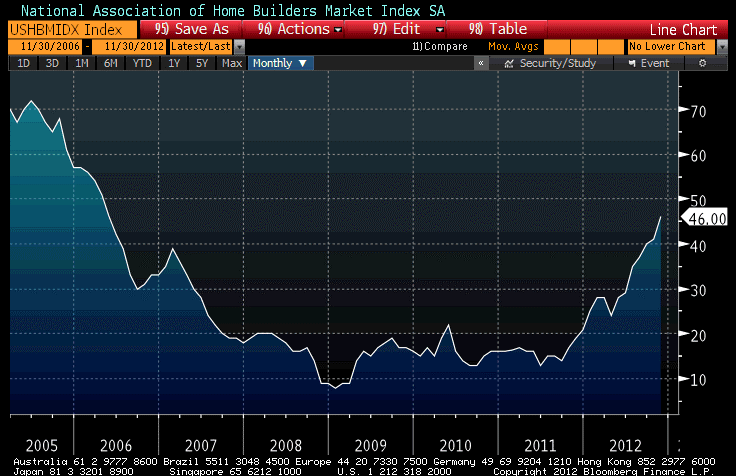
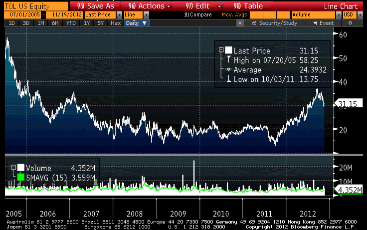
It looks suspiciously like the chart of home builder Toll Brothers (TOL) shown below (source Bloomberg), suggesting that there is not a lot of true analysis going on among the buyers of that stock. Toll Brothers has a current P/E of 61 on trailing earnings, and 50 on estimated forward earnings. I don’t have a position in TOL, nor do I plan to; I just point this out in case your child was thinking of becoming an equity analyst. Help him or her along a different path.
Part of the reason for today’s surprise in home builder sentiment might be the sudden promise of new home building activity along parts of the eastern sea board, courtesy of Sandy, but the trend has been well established for a while. While there is ample inventory of existing homes (though these are being drawn down as well, slowly), the inventory of new homes has been at a 50+ year low for more than a year (see chart, source Bloomberg) and it was just a matter of time before more were built. An existing home is a good, but imperfect, substitute for a new home.

Now, as an inflation guy the reason I care is because the decline in home inventory, coupled with virtually free money for builders and home buyers who can qualify, is pushing up the cost of a big chunk of the consumption basket. Owner’s Equivalent Rent (which is 60% of housing, which in turn is 40% of CPI) has been rising at slightly faster than that of core inflation. As the chart below shows, there is a distinct relationship between prices in the market for existing homes and the general increase in rents (both direct and imputed) 15 months later.
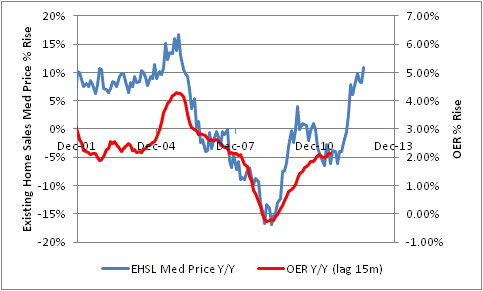
It’s not a new story, but rather one I’ve been talking about for some time, and remains a key reason I remain bullish on inflation despite global central bank protestations (and asset manager convictions, as far as I can tell) that deflation is a more proximate threat.
Meanwhile, other economists have concluded that the reason inflation has been rising rather than falling despite huge amounts of slack globally must be that … their Phillips curve needs recalibration. In a recent funny note by Goldman’s economics group – though it was not meant to be funny – entitled “A Flatter and More Anchored Phillips Curve,” they said
“We have long argued that labor market slack would weigh heavily on inflation in the aftermath of the Great Recession. This view has generally worked well as core (ex food and energy) inflation has fallen substantially since 2007. But the decline in core inflation abated in late 2010 and—despite recent signs of renewed disinflation—core inflation has generally been stickier than the large amount of slack would have suggested.
“A candidate explanation is that the inflation process (or “Phillips curve”) has changed in recent years. Economists have argued for some time that improved central bank credibility, globalization and downward rigidity of nominal wages have altered inflation dynamics since the inflationary 1980s.
Considering that the Great Recession didn’t really kick in until late 2008, and core inflation (ex-shelter, which was suffering from the implosion of a giant bubble) rose from 2007 until late 2009, another ‘candidate explanation’ would be that their model was not mis-calibrated but rather completely mis-specified. The Phillips Curve, which relates wages, not core inflation, to slack in the labor market, is not useful in forecasting inflation. This is well known, and yet expensive economists have worked incredibly hard to resurrect the theory. (Here’s a fuller illustration/explanation of why the Phillips Curve as typically used is wrong).
But beyond that – if you need to keep changing the calibration of your model to fit the facts, then it’s not a good model. That’s sort of Modeling 101. The economists explain/plead further:
Economic principles suggest that core inflation is driven by two main factors. First, actual inflation depends on inflation expectations, which might have both a forward-looking and a backward-looking component. Second, inflation depends on the extent of slack (or spare capacity) in the economy. This is most intuitive in the labor market: high unemployment means that many workers are looking for jobs, which in turn tends to weigh on wages and prices. This relationship between inflation, expectations of inflation and slack is called the “Phillips curve.”
Well, no. Economic principles suggest that inflation is mainly driven by money and the velocity of money. Some discredited principles suggest what they say, but it’s not working. Their own chart, showing they’re off by some 100%, is reproduced below.

On to happier items. In case anyone still thought France was a AAA nation, Moody’s announced their opinion this afternoon that it is not, in downgrading the nation from Aaa to Aa1. Moreover, France remains on watch negative, due to structural challenges and a “sustained loss of competitiveness” in the country. I guess on second thought, that’s not so happy. How did France lose competitiveness? Do you think it has anything to do with the incredibly expensive social contracts and the short working week and year? But no, perhaps they didn’t spend enough on education and national health care.
Mounting Pressure
The most striking facet of today’s trading was that the stock market actually reacted to the Fed’s announcement, which was precisely as universally expected: no change in anything but the technical language about where the economy currently stands. It wasn’t a huge reaction, but the fact that the S&P actually dropped 5 points on the news is mind-boggling to me because it implies that some people were expecting big things out of the Fed today.
To be sure, the arrow of action on the Fed is clear and pointed to ever-increasing amounts of liquidity, but this wasn’t ever on the docket for today. However several Street economists have predicted, plausibly I think, that when Operation Twist expires in December (partly because the SOMA will run out of short-dated Treasuries to sell) the Fed might keep going with the buying leg of the Twist – effectively increasing the monthly outright purchases of paper to $85bln (including Treasuries) from $40bln (all mortgage paper) currently.
Operation Twist has been a useless operation from the standpoint of monetary policy – it has neither added nor subtracted liquidity from the system. It may have had some value from the standpoint of asset-market-maintenance policy, by removing duration from the market and forcing investors to accept more risk for the same amount of reward. So it may be the case that Twist had some effect, but mostly a bad effect since it certainly doesn’t seem from market pricing that investors have been timid about taking risk. And I suppose it ought also be observed that “asset-market-maintenance” isn’t part of the legislative mandate of the Federal Reserve. However, legislators can be generous when markets are being pumped up – it’s when the air goes out that they’re unhappy.
Weirdly, though, I would prefer Operation Twist, which has little impact, to what is likely to replace it (additional QE).
Policymakers globally are growing increasingly bold about quantitative easing. In Europe today, ECB President Draghi told German legislators that outright bond purchases by the ECB “will not lead to inflation. In our assessment, the greater risk to price stability is currently falling prices in some euro-area countries. In this sense, OMTs are not in contradiction to our mandate: in fact, they are essential for ensuring we can continue to achieve it.” (See also this story.)
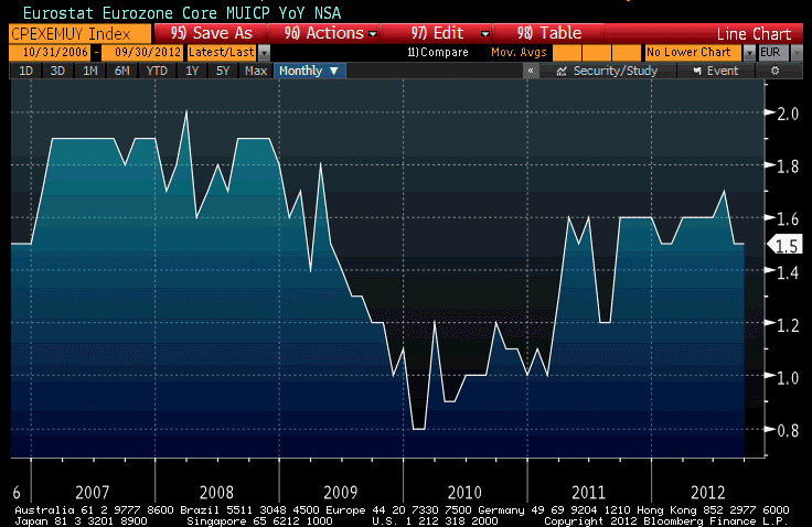
Central bankers are getting bold, but I’m not sure I understand why. They clearly see the connection between QE and inflation – fending off deflation was the purpose of QE2 and Draghi is clearly indicating the same even though core inflation in the Eurozone has risen from 0.8% in 2010 to 1.5% now (see chart below, source Bloomberg). That’s not exactly flashing red signals on inflation, but it is utterly fantastic to suggest that it indicates deflation is a greater risk.
In the U.S., QE3 and the likely acceleration of QE3 later this year is happening in the context of year-on-year rises in median new home sales prices (released today) and existing home sales prices (released last week) of over 11%, as the chart below (Source: Bloomberg) shows. Note that the existing home sales data is much more dependable on a month-to-month basis, because the number of existing homes and existing home sales swamps the number of new homes sold, but both show the same, clear trend. Home prices are now rising nearly as fast, nationwide, as they did in the bubble years.

For the record, the all-time record one-year price rise in existing home sales was 17.4% in May, 1979. Of course, in May 1979 core inflation was rising at 9.4%. In fact, with the exception of the last phases of the bubble of the early ‘Aughts, existing home sales prices are rising at the fastest margin above core inflation ever, as the chart below shows (Source: Bloomberg; Enduring Investments calculations)

Policymakers, and investors, seem to be numb to the threat of additional QE for one of two reasons. Either it is because of the belief that prior QE did not cause inflation (incorrect, as illustrated above and by the statements of intentionality of the policymakers themselves) or because they’re buying the line that QE is only adding to “sterile” excess reserves.
I think that this is dangerously sanguine. In fact, although it is true that QE initially results in greater excess reserves only, and these have only slowly trickled into transactional money, I think there’s reason to believe that adding more QE may increase that pace of transmission. Picture a large cylindrical vat, open on top with a small valve at the bottom. The water in the vat represents excess reserves, and the water trickling out through the valve is transactional money.
Many things can affect the pace at which the vat water flows through the valve – lending opportunities tied to credit demand and credit quality, disincentives to lend such as Interest on Excess Reserves (IOER), and moral suasion in both directions. Crank IOER to 25%, and all of the water poured into the vat remain as sterile excess reserves and QE is just reliquifying the banking system. Put IOER at a 10% penalty rate, and all of the water going in the top will flow out of the bottom very quickly – and all of the other water that’s already in the vat, too.
But even if you don’t adjust the valve at all, the greater weight of water in the cylinder, as you keep adding more water, will increase the flow out of the valve. Adding more QE is akin, economically, to increasing the weight of water in the cylinder.
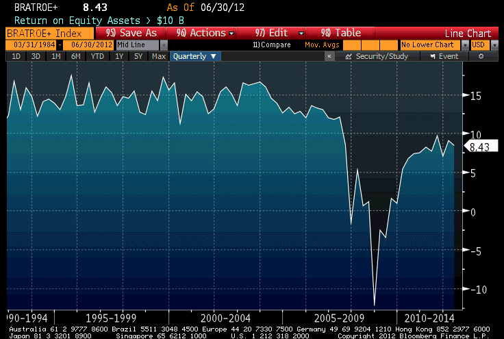
The parallel economic concept is that a greater of excess reserves increases the opportunity cost of reserves. The average return on assets for a bank gradually declines as more of these assets become excess reserves rather than required reserves against lent funds. Leverage also declines, with the result (as I have pointed out before) that return on equity suffers. The chart below (Source: Bloomberg) shows the return on equity for large banks (those with more than $10bln in assets). You can see that while bank earnings have recovered significantly from the nadir of the crisis, they also appear to have leveled off at around 8% compared to the 15% that was the consistent standard prior to 2007.
The lending officers in these banks, although they’re being told to increase the quality of their loans, are being told more and more to also increase the quantity of their loans. They cannot do both, but as the pressure of too many reserves on the balance sheet builds, the pressure to make more marginal loans increases as well. This is the part of the valve that the Fed cannot control, and where danger lies going forward. The multiplier may well respond, eventually, to the weight of the reserves themselves.
Good News, For Now
First, an observation: yesterday’s article, “Incredible Inflation Bond Bargain,” received more hits than any other article I have written in recent memory. Apparently, people still are looking for bargains, and still looking for bond bargains as well. This is heartwarming to a bond guy, and of course even more to an inflation guy. But then, true bargains are rare, and true bargains offered by the government are even more rare. A belated hat tip to “Gratian”, who asked me what I thought about I-bonds and provoked that article. Thanks for the suggestion!
.
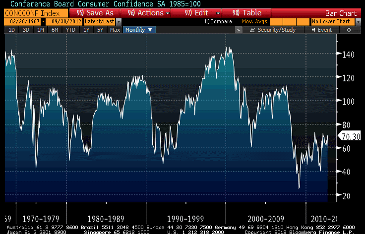
There was some mild good news today. Consumer Confidence rose more than expected, to 70.3 and only a couple of points below the post-Lehman highs set in early 2010 and 2011. Yes, 70.3 is still very low (the series is set so that confidence in 1985 equals 100, and in the recessions of the early 1980s and the early 1990s it was generally in the 55-80 range), but the longest journey begins with a single step. On the bright side, there’s lots of room for improvement (see chart, source Bloomberg).
The internals of the Confidence number are not as good. Both “current conditions” and the 6-month ahead outlook improved, especially the outlook (when ‘my guy,’ whoever your guy happens to be, will be in the White House six months from now, surely things will be better), but the “Jobs Hard to Get” subindex, which is highly correlated with the level of the Unemployment Rate, barely nudged lower. Still, as depressing as it sounds, consumer confidence is a relative bright spot among recent data.
Home prices, as we have documented several times, are rising and the S&P/Case Shiller Home Price Index confirmed that by reaching the highest level it has seen since 2010. The 20-city composite is now rising at 1.2% year/year, which doesn’t sound much but is the highest rate of change since the dead-cat bounce of 2010. Keep in mind that the index methodology involves a fair amount of smoothing, so it lags the actual improvement in the market. By comparison, the RadarLogic 28-day composite index as of the end of July recorded the highest year-on-year change since 2006 (see chart, source Bloomberg).

Also relatively good news was the Richmond Fed Manufacturing Index, which rose to +4 – not as good as it was earlier this year, but 23 points above its July low. The Richmond Fed district includes the “toss-up” battleground states of North Carolina and Virginia and the “leans Romney” state of South Carolina. It is encouraging that manufacturing in this region (with its 28 toss-up electoral votes) is outperforming activity in the Dallas Fed district (Texas, northern Louisiana, and southern New Mexico, none of which are considered toss-ups), the Chicago Fed District (which includes Michigan, most of Illinois and Wisconsin, and 6-electoral-vote-toss-up Iowa) and the Philly Fed district (which is Pennsylvania, NJ, and Delaware, and no toss-ups). This is merely an observation, and even if there were clear indications that the Administration was directing money towards projects in battleground states I wouldn’t object to it – that’s one of the prerogatives of incumbency. If you want that prerogative, work hard so that you can get to be the incumbent.
While the data points today were good, stocks gave up the ghost and managed to lose most of the post-FOMC rally. That doesn’t really shock me so much. Commodities, which should be more sensitive to inflationary monetary policy, are down outright since the Fed declared an unbounded easing policy, and both markets have rallied since June on the growing expectation of QE3. The fact that QE3 was larger than many observers expected caused some short-covering on the news, but I suspect most investors who thought QE3 was coming were already long their preferred assets. The actual open-ended Fed buying will definitely buoy commodities (which remain undervalued relative to past QEs) and might lift equities (which, however, offer fairly weak prospective real returns given the current market valuations), but we had already priced in some expectations.
And in the meantime, while today’s numbers were not bad, the overall picture remains pretty weak. I think the threat of sequestration at the end of the year will start to affect growth more seriously in October, because the end of the fiscal year for government expenditures is September 30th. Businesses that have the government as a significant client recognize that they may well be in Limbo on October 1st. This is what happens when government spending is 40% of GDP! The sequestration doesn’t happen until January, so spending from October until December in theory will be unaffected. But, in practice, the government enters into contracts (for equipment and construction, for example) that cover many months, and it isn’t entirely clear whether for example the Defense Department can enter into a one-year contract if it isn’t known that the money will be there. I know several people in businesses that are directly affected by this issue, and they’re concerned about it now, not just in January.
.
I saw an interesting study by State Street Global Advisors mentioned in a Pensions & Investing Online article. According to the study, about ¾ of institutional investor executives consider a ‘tail-risk’ event in the next twelve months to be likely. But here is the interesting paragraph in the P&I article:
“Survey respondents — money managers, family offices, consultants and private banks — expect the five most likely causes of a tail-risk event in the next year would be a global economic recession (36%); a recession in Europe (35%); the breakup of the eurozone (33%); Greece dropping the euro (29%); and a recession in the U.S. (21%). (Percentages total more than 100% because respondents could select multiple causes.)”
Apparently, ‘inflation’ isn’t even on the radar as a tail risk. Of course, as an investor, what is more important than the tail risks you can estimate the probabilities of are the tail risks you aren’t even thinking about or can’t estimate the probabilities of. Incredibly, not only has the myth that recessions cause disinflation and deflation failed to weaken during the last few years, when weak growth has been accompanied by accelerating core inflation, it seems to have strengthened! While investors, as evidenced by the performance of inflation-linked bonds and of breakevens (and inflation swaps) and commodities, believe that inflation might well be a risk, it doesn’t seem that many investors are focusing on it as a tail event. That is, they expect that a “bad” inflation outcome might be 2.5% or 3.0% core inflation. An outlier event to them may be 3.5% or 4.0%.
But what we know about inflationary outcomes is that if anything, they have tails that are quite long. And there’s plausible reasoning which can produce very high numbers for that tail; see for example my article from late last month – before QE3 – called “What Keeps Me Awake At Night.” I always take care to say that these concerns aren’t predictions, but they are plausible possibilities, and the bottom line is that we don’t really know how these relationships work at this scale. No central bank has ever dealt with numbers like this. It is a known unknown, and thus a source of a tail risk of indeterminate length.
In my opinion, when it’s cheap to insure against such risks then it ought to be done. Presently, you can (as an institutional investor) protect against the risk that inflation will compound at greater than 4% for the next ten years for roughly 2.2% of the notional amount, or 22bps per annum. There are multiple ways to do this, some of which may be cheaper and all of which are beyond the scope of this article – but the point is that we have investors enumerating downward “tail risks” on growth while equity margins and valuations are high, and largely ignoring “tail risks” on inflation that could damage a number of different asset classes. I see lots of potentially dangerous scenarios for equities in October, several (but not all) of which are also dangerous for bonds.
Central Bank Groupthink
Lest anyone be confused about the unanimity and collective will of central banks globally on the question of how aggressively to pursue a dovish monetary policy, the Bank of Japan on Wednesday surprised even the Japanese finance minister by increasing the size of its own quantitative easing program. After many years of pursuing a half-heartedly dovish monetary policy, the BOJ is now fully on board with asset purchases that will total some $1 trillion. Why not? The Fed’s aggressive asset purchases moved core inflation from 0.6% to 2.3% before a recent softening – and a rise in core inflation is what Japan has been working on for years. Five-year inflation swaps in Japan now are quoted around 0.80%, indicating that at least some investors think the BOJ’s stated policy of provoking 1% inflation has some chance of being achieved.
It is no surprise that there is great intellectual exchange between the economists at all of the central banks. While this can be a good thing (after all, Japan finally caught on that they can’t kill a rhino with a flyswatter), it is also dangerous in that it provokes groupthink. Since the Fed has clearly lost any of its monetarist leanings, in favor of an experimentalist “anything but Friedman” (ABF) philosophy, this isn’t really a good thing. If I have to groupthink – and, after all, it is hard to resist that tendency when one is in a group – I want to groupthink with Albert Einstein and his colleagues; I don’t want to groupthink with the cast of “Jersey Shore.”
Despite this obvious fanning of the inflationary flames, inflation breakevens softened again today and commodity prices slipped a bit further. The latter was mainly due to energy prices, as Crude has now dropped over 8% this week. The trigger for this correction has been the statement from the Saudis that they’ll supply lots of oil to the market, and a surprising rise in crude oil inventories. But the Saudis frequently boast that they can pump all they want, and crude oil inventories are highly variable. It seems odd to me to have what amounts to a negative “Middle East unrest premium,” but some too-smart-by-half observers speculated today that the chance of an attack of Israel on Iran has lessened since the moon will be waxing soon and providing too much light for a nighttime attack. Um…let me say that I’m just reporting this idea, not supporting it. I think if the dollar continues to weaken, oil prices will continue to rise. That basic relationship has held for most of a decade now. The chart below (Source: Bloomberg) shows the dollar index versus the front NYMEX Crude contract, weekly closes, for the last six years or so (the last point is Friday’s). The simple R2 is about 0.57.

While aggressive monetary easing from other central banks will help support the dollar, the Fed is still by far the most aggressive central bank. If the crisis continues to recede, then the dollar’s safe haven bid will continue to fade. I’m not so sure of the former, but I don’t want to bet on dollar strength here with the Fed dedicated to providing unlimited quantities of reserves.
In other economic news, and not at all unrelated to that, today’s Existing Home Sales figure was the strongest since 2009-2010, at 4.82mm units. Inventories of existing homes rose slightly, but still remain around 2003-2005 levels rather than the 2006-2011 levels. To be sure, there is plenty of shadow inventory still around, but these levels of existing home inventories have historically been low enough to allow home price appreciation.
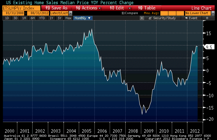
In fact, as weird as it sounds housing has gone from being a systematic drag on core inflation to being a supportive factor in core inflation going forward. The levels of inventory should help support home price dynamics going further, but we needn’t look far into the future. Over the last year, the 9.5% rise in the median existing home sales price compares more favorably with the rates of 2002-2005 than it does to the 2006-2011 experience (see chart, source Bloomberg).
So don’t look now, but we’re in the midst of a home price rally. This is remarkable given the difficulty, still, of securing a home mortgage compared to the crazy days of the early ‘Aughts. Yes, perhaps the crazy credit terms followed the bubble’s inflation, rather than preceding and causing it. But if that’s true, then we’d have to lay the blame for the bubble more directly on the central bank’s doorstep.
Well, re-inflating the housing bubble is after all one of the things the Fed is unabashedly trying to do. Rising home prices frees trapped homeowners and solves the problem of underwater mortgages. It is just one way that inflation saves a lot of grief for policymakers.
Existing Home Sales is not the only place we see signs of percolating housing prices and warnings of continued buoyancy of housing CPI (Owners’ Equivalent Rent of Residences has been up at a 2% pace over the last year, actually higher than core CPI for the first time since 2009. Prior to that, y/y OER had been higher than core for all but one month of the period 1993-2009.[1]
This upward pressure on housing inflation will continue. I have previously documented the connection between rents and OER, which has suggested that OER could be headed to over 3% soon. The connection between rents and Owners’ Equivalent Rent is obviously pretty close, but here is another way of looking at the same thing. The chart below (source: Bloomberg) shows OER versus the National Multi Housing Council’s “Market Tightness” index, lagged four quarters. Tight housing conditions, no surprise, lead higher rents.
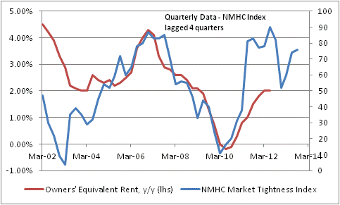
This regression is not as tight as the one between rents and OER, but the R2 is still about 0.48 since 2003. Moreover, the current level of the Market Tightness index points to an OER over the next year just a bit above 3%.
The final piece of the puzzle that you need to know is this: OER is 23.5% of the overall CPI, and roughly 30.7% of core inflation. Throw in “Rent of primary residence,” which is in fact direct rents, and the total is 29.9% of overall CPI and 39% of core. If housing inflation is returning, then there are two possibilities: either we are entering another housing bubble, which I think would be unprecedented (have we ever had back-to-back bubbles in the same asset class?), or else this rise will be accompanied by a rise in other prices so that nominal home prices will be rising while real home prices do not (or not as much). Either way, it looks like the Fed is getting what it wanted – and I wonder only how long it will take before people realize this isn’t an accident.
[1] In another sign ignored by those who believe there is a conspiracy (by the government, the Masons, or maybe the Knights Templars) to lower CPI, the BLS adjusts the value of the housing stock for wear-and-tear in a negative quality adjustment that has the tendency of pushing up inflation by just about the same amount that the oft-reviled positive quality adjustments push down inflation.
