Archive
RE-BLOG: My Two Cents On Nonsense
Note: The following blog post originally appeared on March 13, 2012 and is part of a continuing year-end ‘best of’ series, calling up old posts that some readers may have not seen before. I have removed some of the references to then-current market movements and otherwise cut the article down to the interesting bits. You can read the original post here.
I had not planned to write tonight, but there was too much that happened today, and too much that is likely to be misunderstood and misinterpreted. Not, necessarily, that what follows will help that situation, but I felt a need to add my two cents (which, don’t forget, is two cents more than you paid for it, so you’re two cents ahead no matter what).
…
And this takes us to the final, and most interesting, event of the day. It began when JP Morgan trumpeted a nickel increase in its dividend and a $15bln stock buyback. My first reaction was that this is not a phenomenon you tend to see in bear markets or early in bull markets, but rather in mature bull markets. Firms have a marked tendency to buy stock back when it’s expensive, not when it’s cheap, and an even more marked tendency to announce a buyback when they want a stock price supported. An announcement of a buyback program is not a promise to buy, and often no stock is actually bought. It is only an announcement of an intention to buy, which the firm need not honor. And this is a bank. Anyone with even a passing knowledge of Basel III knows that banks are going to be raising Tier 1 capital – especially in Europe, but in the U.S. as well – for a while. There is no way that banks, whether or not they feel overcapitalized by 2000s standards or not, are actually going to be buying back large chunks of stock. So my second thought was “wow, are they actually going to scare up the stock so that they can sell more? That can’t be legal.”
Moments later, we found out what the real point was. It seems the Fed had completed the stress tests and informed all of the banks a couple of days ago (it’s unclear when), and were going to make a public announcement on Thursday.
Sidebar: This is why people think that Wall Street is run by a bunch of crooks. The moment that banks had this information, they were in possession of material nonpublic information that should have been immediately released if the banks were going to prepare any offering in their own securities. Whether the Fed says they can or can’t, the information must be released. And here is one positive checkmark for JPM: they announced that the Fed had approved their buyback and dividend plans in the context of passing the stress test. But thanks a lot, Fed, for putting banks in the awkward position of having to choose between ticking off the Fed, or ticking off the SEC. And great job, bank managements, for mostly choosing to keep a secret that makes you look like a member of an elite club/secret cabal, rather than choosing to release the information. Good job, JPM. (But I’m not done with you yet).
So, the Fed decided that they needed to immediately release the stress tests results, early. Well, not immediately; they decided to wait until 4:30ET, after the markets closed to retail investors, because golly it would be too much to ask to let people get the information when the markets were open. Sidebar: this is why people think the Fed is run by a bunch of crooks who are in bed with the Wall Street crooks. Who is running the PR at the Fed?
Bank of America bravely followed JP Morgan through the breach to announce that they, too, had passed the stress tests. US Bank announced a share buyback, dividend hike, and a passing stress test grade. (Quick quiz, with the answer to be given later: are the banks announcing share buybacks likely to be the strong banks or the weak banks with respect to the stress test? Write down your answer and we’ll come back to it.) Volume on the exchange spiked, with better than 50% of the day’s volume coming in the last hour of trading, and almost 30% in the last 7 minutes before the bell.
The stress test results were released, and four financials failed: Ally Financial, SunTrust, MetLife, and Citigroup. Well, good luck raising capital now, Citi. (Important Disclosure: I am expressing no opinion on any of these individual equities or any of the other securities of these companies. I neither own, nor intend to buy, nor sell, any of their securities in the near future. My negative opinion on banks generally is well-known, but I do not have any position, positive or negative, on the banking sector, nor do I plan to make such a sector bet in the near future).
Now, initially the press coverage listed three of the four firms that failed, but not MetLife, so I was forced to go skimming through the “CCAR” report to find the fourth one. If I hadn’t done that, I almost certainly would not have noticed Figure 7, which is reproduced below for your easy reference.
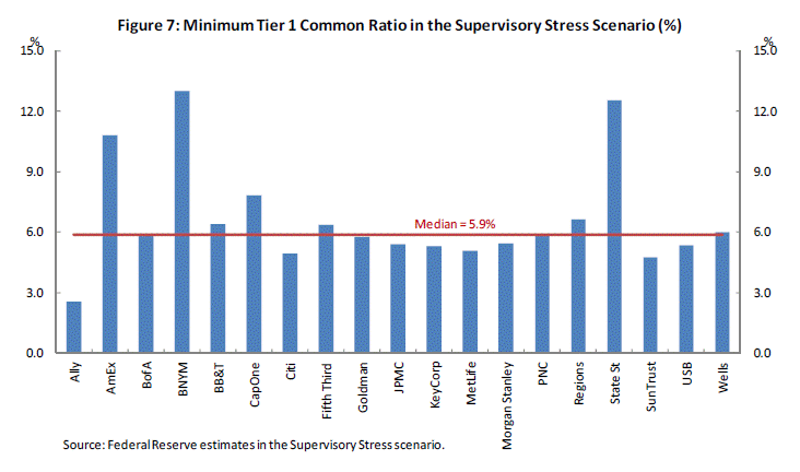
You can see the four banks which failed are the shortest bars on this chart, so you can easily pick out Ally, Sun Trust, Citi, and with a straightedge you can conclude that MetLife is the fourth. But then it’s a really close race for fifth-worst with KeyCorp, US Bank, Morgan Stanley, and… JP Morgan. It must be great to be JP Morgan. When you wonder why they drew the line where they did, you might imagine the counterfactual situation where JP Morgan came out on the other side of the line. JP Morgan, which was the Fed before there was a Fed, and will probably be the Fed after the Fed is gone. JP Morgan, which the Fed called on multiple times during the crisis to save the world (for example, by serving as a lending conduit to entities which the Fed could not directly lend to). I wonder what the odds are that JP Morgan would be allowed to fail? I’m going to speculate: zero. And that’s why the line is where it is.
Now, it is interesting to see which banks scored very highly. They’re banks that don’t have exposure to as many of the blow-up areas that were tested by the Fed (which is not to say they aren’t exposed to blow-ups: just that they’re not the ones that the Fed tested).
By the way, don’t let anyone tell you “well, this was a really severe test, and so these banks are actually in really good shape.” Yes, this test is much more stringent than the cotton-candy version the European regulators put their banks through last year, but it only measures expected reactions to broad macroeconomic events, and not the interaction of the entire system under such a stressful scenario. That reaction is non-linear, and it is very difficult to model. Moreover, we can’t model the unknown: a rogue trader, a $65billion Ponzi scheme, a tsunami and nuclear meltdown in Japan, a terrorist attack in New York. As Roseanne Roseannadanna used to say, “It’s always something.”
When all is said and done, are we better off that the Fed did these stress tests? I suppose the answer is yes, if only because it means the regulators actually took some interest in looking at these businesses and their risks. But if it creates a false sense of comfort, or reverses the trend towards greater capital cushions, then probably not. Time will tell.
I am about ranted out for today, and there are no important economic releases tomorrow. It will be interesting to see how the spin machines work on Citigroup and JP Morgan, which are after all separated by only a thin line on Figure 7, but by a huge gulf in reputation.
———
You can follow me @inflation_guy, or subscribe to receive these articles by email here.
RE-BLOG: U.S. Wages and Egyptian President Employment
Note: The following blog post originally appeared on February 3, 2011 (with an additional reference that was referred to in a February 17, 2012 post) and is part of a continuing year-end ‘best of’ series, calling up old posts that some readers may have not seen before. I have removed some of the references to then-current market movements and otherwise cut the article down to the interesting bits. You can read the original post here.
Rising energy prices, if they rise for demand-related reasons, needn’t be a major concern. Such a price rise acts as one of the “automatic stabilizers” and, while it pushes up consumer prices, it also acts to slow the economy. This helps reduce the need for the monetary authority to meddle (not that anything has stopped them any time recently). It doesn’t need to respond to higher (demand-induced) energy prices, because those higher prices are serving the usual rationing function of higher prices vis a vis scarce resources.
But when energy prices (or, to a lesser extent, food prices) rise because of supply-side constraints – say, reduced traffic through the Suez Canal, or fewer oil workers manning the pumps in a major oil exporting region – then that’s extremely difficult for the central bank to deal with. More-costly energy will slow the economy inordinately, and higher prices also translate into higher inflation readings so that if the central bank responds to the economic slowdown they risk adding to the inflationary pressures.
…
One of the ways that we can restrain ourselves from getting too excited, too soon, about the upturn in employment is to reflect on the fact that surveys still indicate considerable uncertainty and pessimism among the people who are vying for those jobs (or clinging to the ones they have, hoping they don’t have to compete for those scarce openings). This is illustrated by the apparent puzzle that Unit Labor Costs (reported yesterday) remain under serious pressure and Productivity continues to rise at the same time that profit margins are already extremely fat. Rising productivity is normal early in an expansion, but the bullish economists tell us that the expansion started a year and a half ago. We’re about halfway through the duration of the average economic expansion (if you believe the bulls). And fat profit margins are not as normal early in an expansion.
Now, we don’t measure Productivity and Unit Labor Costs very well at all. Former Fed Chairman Greenspan used to say that we need 5 years of data before we can spot a change in trend, and he may be low. But it seems plausible that there remains downward pressure on wages. Call it the “industrial reserve army of the unemployed” effect. While job prospects are improving, they are apparently not improving enough yet for employed people to start pressing their corporate overlords to spread more of the profits around to the proletariat.
Fear not, however, that this restrains inflation. The evidence that wage pressures lead to price pressures (and conversely, the absence of wage pressures suggest an absence of price pressures) is basically non-existent. Let me present two quick charts that make the point simply.
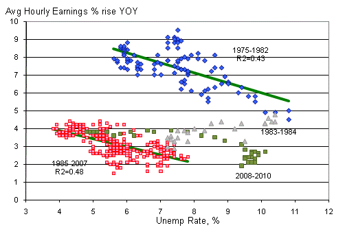
No surprise: tighter conditions in the labor market tend to be associate with wage inflation.
The chart above (Source for data: Bloomberg) shows the relationship between the Unemployment Rate and the (contemporaneous) year-on-year rise in Average Hourly Earnings. I have divided the chart into four phases: 1975-1982 (a period which runs from roughly the end of wage-and-price controls in mid-1974 until the abandoning of the monetarist experiment near the end of 1982), a “transition period” of 1983-1984, the period of 1985-2007 (the “modern pre-crisis experience”), and a rump period of the crisis until now. Several interesting results obtain.
First of all, there should be no surprise that that the supply curve for labor has the shape it does: when the pool of available labor is low, the price of that labor rises more rapidly; when the pool of available labor is high, the price of that labor rises more slowly. Labor is like any other good or service; it gets cheaper if there’s more of it for sale! What is interesting as well is that abstracting from the “transition period,” the slopes of these two regressions are very similar: in each case, a 1% decline in the Unemployment Rate increases wage gains by about ½% per annum. Including the rump period changes the slope of the relationship slightly, but not the sign. This may well be another “transition” period leading to a permanent shift in the tradeoff of Unemployment versus wage inflation.
But clearly, then, when Unemployment is high we can safely conclude that since there are no wage pressures there should be no price pressures, right?
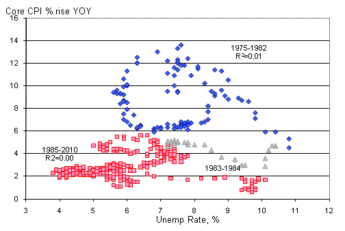
The Phillips Blob
The second chart puts paid to that myth. It shows the same periods, but plots changes in core CPI, rather than Hourly Earnings, as a function of the Unemployment Rate. This is the famous “Phillips Curve” that postulates an inverse relationship between unemployment and inflation. The problem with this elegant and intuitive theory is that the facts, inconveniently, refuse to provide much support. [Note: the above chart is very similar to one appearing in this excellent article by economist John Cochrane, which appeared in the Fall of 2011.]
Why does it make sense that wages can be closely related to unemployment, but inflation is not? Well, labor is just one factor of production, and retail prices are not typically set on a labor-cost-plus basis but rather reflect (a) the cost of labor, (b) the cost of capital, (c) the proportion of labor to capital, and importantly (d) the rate of substitution between labor and capital. This last point is crucial, and it is important to realize that the rate of labor/capital substitution is not constant (nor even particularly stable). When capital behaves more like a substitute for labor, a plant owner can keep customer prices in check and sustain margins at the same time by deepening capital. This shows up as increased productivity, and causes the relationship between wages and end product prices to decouple. Indeed, in the second chart above the R2s for both periods is…zero!
This isn’t some discovery that no one has stumbled upon before. In a wonderful paper published in 2000, Gregory Hess and Mark Schweitzer at the Cleveland Fed wrote that
It turns out that the vast majority of the published evidence suggests that there is little reason to believe that wage inflation causes price inflation. In fact, it is more often found that price inflation causes wage inflation. Our recent research, which updates and expands on the current literature, also provides little support for the view that wage gains cause inflation. Moreover, wage inflation does a very poor job of predicting price inflation throughout the 1990s, while money growth and productivity growth sometimes do a better job. The policy conclusion to be drawn is that wage inflation, whether measured using labor compensation, wages, or unit-labor-costs growth, is not a reliable predictor of inflationary pressures. Inflation can strike unexpectedly without any evidence from the labor market.
The real mystery is why million-dollar economists, who have access to the exact same data, continue to propagate the myth that wage-push inflation exists. If it does, there is no evidence of it.
———
You can follow me @inflation_guy, or subscribe to receive these articles by email here.
RE-BLOG: Perfect Drugs From Perfect Pharmacists
Note: The following blog post originally appeared on January 11th, 2011 and is part of a continuing year-end ‘best of’ series, calling up old posts that some readers may have not seen before. I have removed some of the references to then-current market movements and otherwise cut the article down to the interesting bits. You can read the original post here.
…Looking over the Atlantic, ECB President Trichet offered what some observers saw as a threat that the ECB would raise interest rates to combat inflation if energy-price increases pass through to broad price increases. The German bond market, and others, sold off on his “conditional warning”:
“We see evidence of short-term upward pressure on overall inflation, mainly owing to energy prices, but this has not so far affected our assessment that price developments will remain in line…Very close monitoring of price developments is warranted.”
This is an empty threat. There is no chance that the ECB will raise rates to combat inflation while they are simultaneously buying every bond in sight to try and lower borrowing costs for member nations (and especially the periphery countries). The ECB may be slightly more politically independent than the Fed, but tightening while member nations are trying feverishly to balance their budgets – with their only chance being either a strong resurgent economy or a cheapening of their nominal liabilities through inflation – is highly unlikely.
Trichet has more credibility, though, than our own domestic monetary policymakers. I have to take some time here to mention Fed Vice-Chair Janet Yellen’s speech from last weekend, since I have been meaning to for several days. It is important because the speech was an important defense of the Large Scale Asset Purchase (LSAP) program that the Fed has been conducting, and in that context we should be very afraid of what comes next. Because if this is the best thinking they have to share on the subject, then we are in a situation not unlike the baby who finds Daddy’s firearm in an unlocked position. Tragedy is likely to ensue.
In a nutshell, Dr. Yellen’s argument boils down to this:
- The LSAP program is not affecting the dollar.
- The LSAP program is not triggering “significant excesses or imbalances in the United States.”
- The LSAP program does not risk markedly higher inflation because there is slack in the economy.
- However, the LSAP program has had an enormous effect on jobs, adding about 3 million jobs to the economy.
So, the program has been hugely successful in the ways they needed it to be, without any side effects and no chance of anything going wrong. Does it make me a bad person that I am naturally suspicious of a drug that will make me immensely strong, lengthen my life, improve my love life, and cure hangovers but has no negative side effects? How about if that drug worked as intended the first time it was tested?
Incidentally, the claim that the LSAP program has created about 3 million jobs is interesting because the Administration claimed 2 million jobs were saved or created through fiscal stimulus. Each is not claiming that their policy in conjunction with other policies not under their control created jobs, so these must be additive. Fiscal policy, plus monetary policy, saved or created some 5 million jobs. Right now, the Civilian Labor Force is 153,690,000 and unemployment is 14,485,000 (9.4%), so these actions have prevented an Unemployment Rate of about 12.7%. This is interesting because no one was forecasting a 12.7% Unemployment Rate before these programs were put into place, so the people who are now telling us that the drug is working perfectly are the same people who had previously told us that no drug would be needed.
These results – the 2 million, 3 million jobs – are coming from time series regressions that are conducted with high mathematics and great rigor. But there are lots of reasons that econometric analysis should not be expected to work well in this case:
- The distributions you are trying to analyze are not static, which is a precondition for most time series analysis, nor normal. Indeed, you are actually trying to change the distributions with your policy.
- It is pretty plain that the model is not completely specified. That is, the people who were examining whether fiscal policy was effective didn’t include the separate effect of monetary policy, and vice-versa, so they both think it was their policy which worked. The fact that both of these policies are pushing in the same direction at roughly the same time also creates a problem of multicollinearity, a technical condition that basically means that with two people pulling on the same rope at the same time it is hard to tell who is pulling how much.
- The noise in the relationships far outweigh the signal, which means that all conclusions will (or should) have massive error bars on them.
- The analyst is analyzing the result of a single experiment. It is like trying to divine the laws of motion after hitting a cue ball a single time on the break of a game of billiards, except that the balls aren’t round, you can’t measure anything directly, and you have dirt in your eye. But in this case, the implications of reaching incorrect conclusions are far greater than if you were lining up your next shot in a game of pool.
Econometricians ought to be more guarded about conclusions such as this. Indeed, any reasonable experience with financial data sets tends to produce the realization that it is often hard to get any conclusive information out of them, although it is very easy to generate suggestive relationships that can’t be rejected simply because the error bars are too large to reject any particular hypothesis. It may be that the econometricians within the Fed who are actually doing the dirty work are providing the policymakers with all of the proper caveats, and warnings about the usefulness of the data, and that they policymakers are simply ignoring it. Or it may be that econometricians at the Fed feel pressure knowing that while 90% of the time there is nothing conclusive to say, it is hard to support your case for continued employment when your results most of the time are indistinguishable from not working.
The Fed continues to be especially cavalier about the end game. Yellen says the Fed remains “unwaveringly committed” to price stability, but says:
“I disagree with the notion that the large quantity of reserves resulting from our asset purchases poses some special barrier to removing policy stimulus when the right time comes. The FOMC will be able to increase short-term rates by raising the interest rate that we pay on excess reserves–currently 1/4 percent. That ability will allow us to manage short-term interest rates effectively and thus to tighten policy when needed, even if bank reserves remain high.”
Oh really? And you’ll be able to do that, politically, with unemployment at 9%? And you’re so sure that the effect will be immediate, perfectly calibrated, and won’t have any unanticipated side effects? She also suggests that they can withdraw stimulus by offering deposits to member institutions through a Term Deposit Facility, and also by selling portions of their holdings. The notion that you can have a huge effect by implementing a policy, but that reversing the policy will have little effect, is an offense against common sense. No, it’s an offense against financial physics. Yellen isn’t the first Fed official to make statements like this, and won’t be the last. And then, we’ll have several years of apologies when it doesn’t work out the way they said it would.
———
You can follow me @inflation_guy, or subscribe to receive these articles by email here.
RE-BLOG: Tales of Tails
Note: The following blog post originally appeared on June 27th, 2010 and is part of a continuing year-end ‘best of’ series, calling up old posts that some readers may have not seen before. I have removed some of the references to then-current market movements and otherwise cut the article down to the interesting bits. You can read the original post here.
…I also raised my eyebrows at an article in the UK Telegraph which declares that the Fed is considering a “fresh monetary blitz” since the recovery is faltering. I am always happy to be skeptical when an article doesn’t name names, but this seems to me to be fairly likely to be true:
“Key members of the five-man Board are quietly mulling a fresh burst of asset purchases, if necessary by pushing the Fed’s balance sheet from $2.4 trillion (£1.6 trillion) to uncharted levels of $5 trillion.”
The strategy makes sense, if you believe that the long-term effects of dramatic monetary policy movements can be evaluated over a period of a couple of quarters. I would not be surprised at all to discover that the thinking at 20th Street and Constitution Avenue is something along the lines of “hey, we did it once and didn’t cause inflation, so why not take out the paddles again? CLEAR! ZAP.” I’ve written before of the odd set of speeches we saw earlier this year describing a wondrous alchemy that the Fed seemed to believe they could accomplish: buy assets rapidly to save the economy by keeping rates low and adding liquidity. Sell the assets without completely reversing the effect by doing so slowly. Clearly, if there is real belief that the Board can pump and dump without the “dump” causing any problems, then for God’s sake why not pump?
Obviously, that’s a bunch of hooey, but I remain wary that there may be those who believe it.
The market on Friday was led (and maybe even supported) by financial stocks, because the market finally learned the form of the financial reform bill. It is bad, and will cause severe damage to bank earnings. It isn’t as bad as some people feared, but it is about as bad as was ever likely to become law. Prop trading at banks is still banned, and banks will have two years to push trading of commodities, non-investment grade bonds, and CDS that are not cleared through an exchange to separately-capitalized subsidiaries. Most derivatives will have to be cleared and traded on exchanges, which means less customization (bad for dealers, and bad for clients too). This law will be bad for turnover, bad for margins, and will cause leverage ratios to decline (probably the only reasonable part of the prescription, from my view). The Dupont model tells me those three things imply much lower ROE.
So why did bank stocks rally? This is worth a deep reflection because it explains something about markets.
Bank stocks rallied because as bad as the legislation is, the fact that we now know the form of the legislation removes the most onerous tail risks.
Bob Merton, many years ago, observed that the equity of a company can be thought of as a call option on the value of a firm: the value can only go to zero, if the firm is insolvent, but can be worth a great deal. So what do we know about options? One of the things we know is that a great deal of the value of an option comes from the expected value of unlikely, extreme outcomes. If you remove the chance at the home run, an option gets much cheaper.
This is one big reason that bear markets often end with a sharp rally off the lows (although please note that it does not follow that every sharp rally implies an end to the bear market!) – once the disaster case, the chance of an outright crash or broad economic or financial calamity, recedes in probability, the value of equities rise appreciably. A company which avoids bankruptcy by a hair will see its stock rise dramatically when the chance of losing everything goes away. Observe the behavior of many of the financials during the crisis. When TARP and other bank-supportive mechanisms began to have traction the sector leaped, not because earnings were about to be multiplied 10 times but because the fear of zeros greatly receded.
(Aside #1: Most analysts, of course, look at equity values as related linearly to earnings, and in normal circumstances they are. …a PE of 25x is rich, 15x is cheap, for example. But this is likely because behavioral biases prevent analysts from considering the value of the disaster which they think is very unlikely. In any case, a 15x multiple might be quite expensive indeed compared to a 25x multiple, if the former company is about to receive a legal judgement that could potentially destroy the firm. Indeed, one real problem with conventional investment analysis is that the 15x multiple stock might be cheap, or the multiple may in fact be a sign that tail risks are higher for this equity than for the 25x one. Buying enormous dividend yields is often unproductive because the high yield implies a market belief, often correct, that the dividend is not likely to be paid or paid in that amount.)
(Aside #2: Because so much of the value in an option comes from the tail, evaluating options using simple Black-Scholes when the underlying risk isn’t lognormal can be extremely dangerous, especially with exotic options that have path-dependent valuations and with options on underlying instruments that are known to have a high likelihood of non-linear performance – near-bankrupt equities, for example. Black-Scholes implied vols are nearly useless in such a case).
So, owning a stock or stocks generally when the tail risks are about to recede is a good recipe for making sparkling returns. But we have another name for this sort of investing strategy: “catching a knife.” You can own an AIG-like bounce, but also get run over by Lehman. On the flip side, because as an equity investor you own these negative tail events naturally, you can add a lot of value by avoiding the blow-up.
Rising volatility, then, tells you two things: first, it tells you that the market’s sense of the risk of a possible calamity is growing; second, it tells you that once these fears recede you might earn a solid return. You already knew this; it’s why the VIX is considered a contrary indicator by some.
Does it make sense to be investing more, then, when a blowup might happen, or investing less? As it turns out, the answer to this question is not entirely clear but thanks to the Kelly Criterion we can make some observations. The Kelly Criterion describes the optimal bet size, as a proportion of the bankroll, for a series of uncorrelated bets with a given edge and payoff. The simple observation (which becomes a lot less simple after they start involving the math) is that you want to bet more of your payroll if you are (a) getting good odds and (b) are very confident of the outcome. That is, your bet size should increase if you are getting good odds, and have a good edge. Kelly worked out the math to determine what the optimal bet size should be under certain conditions.
The relevance here is as follows: when a crisis hits, two things are happening to you as an equity investor. First, you are becoming more confident that the market will reward you for buying when everyone else is selling, because (as noted above) unless the world actually does end you are likely to be getting a good price. Second, though, you need to recognize that the increasing chance of debacle implies a worse payoff. In April of 2008, the chances of losing everything the next day were pretty slim. In mid-September 2008, the chances were appreciable that a bunch of your portfolio might be in trouble. So your edge (confidence in winning, if the bet was repeated a bunch of times) was growing, but your odds (payoff if you win, relative to your loss if you don’t) were worsening.
The schematic below shouldn’t be taken literally, but is meant to illustrate the basic relationships.
 These lines are the pure results from the Kelly formula for the indicated inputs. Perhaps an investor might consider his/her “bankroll” in this case to be the maximum portfolio concentration in equities. Obviously, if you are extremely confident that you are going to win, then no matter what the payoff you should be making a pretty reasonable bet; therefore, the lines converge on the right. But as we move left, we get a sense of the tradeoff between the edge and the odds. When volatility is rising, the investor is moving to the left, implying a lower confidence of a payoff; if the market is trading to lower prices, it improves your odds but you can see that you would need vastly better odds to counteract the effect of increased uncertainty. I would suggest that in the range of normal investor confidence, rising volatility implies that you should tend to be taking chips off the table, even though it means you may miss a minor pop if the world doesn’t end.
We are not currently in a crisis quite like what we saw in 2008. But the elevated levels of implied volatility suggest that crisis is not so far off as we would like to see it. I think this means that we should be avoiding the possibility of the long negative tail, and taking chips off the table.
———
You can follow me @inflation_guy, or subscribe to receive these articles by email here.
RE-BLOG: “I Am Become Debt, Destroyer Of Worlds”
Note: The following blog post originally appeared on January 25th, 2010. I have removed the references to then-current market movements and otherwise cut the article down to the interesting bits. In this case, I have also updated the charts and clarified the text for the additional data we have since then. You can read the original post here.
…However, it supports my belief that the slide late last week isn’t (yet) the beginning of a slide into oblivion. Also supporting that point, Greece managed to sell €8 billion bonds quite easily today. I don’t really understand why it was so easy. I suppose there is a deep reservoir of people who don’t want to see a European sovereign go bust – for example, other Europeans – but it isn’t as if that 8 billion will carry Greece forever. They are in dire straits, and as I’ve pointed out here before they can’t print money and that fact is what makes a default possible. I do believe this could be the beginning of the end for the Euro, but I don’t think that end is imminent. Institutions have selfish memes and tend to protect themselves vigorously. In this case, I suspect that other European central banks, big European investors, European corporate entities…they all have a very strong vested interest in holding the Euro together, and they will do so as long as it is possible. And it will be possible for a while.
An interesting factoid that I saw on CNBC today: of companies announcing Q4 earnings so far, 9% have beaten earnings-per-share (EPS) estimates, but 65% have beaten revenue estimates. What does that mean? I think it means that margins have been lower than analysts expected (although there’s a statistical caveat, because the number of misses may or may not correlate to the size of the miss), which means that they’re buying business through lower prices or, on the other hand, are holding prices down while input costs rise. One is a disinflationary spin and one is an inflationary spin. The data suggest the latter, as inflation-other-than-housing has been percolating some, but wage growth (a big input) hasn’t exactly been robust either. I’ll call it a tie on that evidence (with respect to inflation implications), but either way tightening margins are a sign of economic weakness.
But my bigger worry is that some sharper near-term imbalances are brewing. Economic weakness we can work through, if the basic capital markets and economic structures are left in place and government doesn’t take too much of the productive capacity of the country (these assumptions are somewhat in doubt these days, but let’s look past that). What worries me in the reasonably short-term is that there are some big imbalances that are following on the heels of the imbalances that just blew up…and those just about cracked the edifice of Western civilization.
All of these imbalances are of our own making, but none has been created as fast as this one. I will do my best to explain it, and I hope that somewhere my logic falls down and someone can correct me.
When the government runs a deficit, where does it get the money so that its expenditures can exceed its revenues? It borrows, from essentially two places: domestic savers and foreign savers. In recent years, domestic savings have been low, and the government has financed its deficits more and more with money lured from foreign investors who hold dollars. Because the only reason these folks hold dollars is because we are buying more stuff from them than they are buying from us, we have a trade deficit. If domestic savings is stable, then over time the budget deficit and the trade deficit must equal; but a better way to think of this is that budget deficit = (trade deficit plus domestic savings).
This is why folks talk about the “twin deficits,” trade and budget. Large deficits can only be financed entirely from within if there is substantial domestic savings, but we have been discouraging savings for a couple of decades now. The graphic relationship is sloppy, partly because we’re not great at measuring these values and partly because domestic savings ebbs and flows, but you can see that the larger trade deficit in recent decades seems to be at least of similar magnitude as the budget deficit (Source: Economagic.com):
 Well zowie…those last few points are interesting, are they not? The government is running an epic deficit, as we all know, but the trade deficit has actually improved since 2008. How is that possible? It is possible because domestic savings has been growing by trillions of dollars over the last few years.
Now, you might say “that’s great news!” except that it isn’t great news at all. The largest part of that “savings” is the money that the Fed has printed by buying Treasuries, agencies, and other collateral. This is where the rise in the money base (see chart below) is showing up.

To tie these charts together, I will note that the total rise in the balance sheet assets since August 27, 2008 has been $3.0 trillion. And the cumulative difference in the budget deficit, less the trade deficit, has been $3.1 trillion.
That’s right: the improvement in the trade deficit, despite the huge budget deficit, comes almost entirely because the Fed has provided the needed savings with its checkbook. But now here’s the problem. The Fed declares that they are not going to keep doing that, which means that (a) they’re lying, or (b) there is going to be a massive improvement in the budget deficit, soon, or (c) the trade deficit is going to start looking really, really, really bad, pretty soon.
Any guesses for (a), (b), or (c)? [Editor’s note: with hindsight, it seems that (a) really was the correct answer. It isn’t clear whether that is the correct answer today. I suspect there will be come combination of (a), (b), and (c).]
Assuming that the Fed isn’t lying, and assuming that the federal government isn’t going to find fiscal Jesus and slash a couple trillion from the deficit (as I’ve noted though, if they just don’t have any emergencies this year the deficit ought to improve a few hundred billion), then the trade deficit is going to start to look ugly. Epic ugly. Medusa-ugly.
And this leads to the worry – if the trade deficit explodes, then two other things are going to happen, although how much of each I can’t even guess: (I) protectionist sentiment is going to become very shrill, and fall on the ears of a President who is looking to burnish his populist creds, and (II) the dollar is going to be beaten like a red-headed stepchild (being a red-headed stepchild, I use that simile grudgingly).
Others – Warren Buffet is one – have publicly toted up the numbers and observed that it’s hard to figure out how we finance such deficits unless most of it comes from overseas. To entice such largesse, the currency unit will need to be cheaper, and rates will have to be higher.
This is my worry – not a global meltdown, but a U.S.-specific meltdown. Higher rates, higher inflation, lower equities, and a lot of volatility. And it may happen quickly, when it happens. [Editor’s note: Thanks to the Fed pursuing the policy in (a) above, it hasn’t yet happened!]
When might this happen? Putting dates on nightmare scenarios is ordinarily a useless chore. It is usually far better to merely be alert to possibilities and to move quickly when the rock looks like it’s toppling. But in this case, there is a particular time period I am especially concerned about: the end of March (as in, about two months from now).
The Fed is gradually reducing its purchases of MBS, with the intention of ending those purchases…in March. Also, Japanese year-end is in March, and lest we forget the Japanese represent some 20% of the foreign ownership of Treasuries. There is a reason that seasonals for the bond market are weak in the spring. If we can skate past April 1 without something serious happening, then I will breathe a sigh of relief and go back to balanced-rock-watching. But in the meantime, I sleep fitfully.
———
You can follow me @inflation_guy, or subscribe to receive these articles by email here.
