Archive
Bailing In
Cyprus, for now, has seen disaster averted. In a flurry of weekend maneuvers, Cypriot and troika officials decided on a plan to merge the top two banks, fully protecting the insured depositors while socking the uninsured depositors of those two banks and the non-government financial stakeholders. In short: depositors at the largest bank will lose ~40% of their deposits above the guaranteed threshold, depositors at the second-largest bank will lose ~100% of their deposits above the threshold, bondholders (both senior and subordinated) at the second-largest bank will be wiped out and bondholders (including senior bondholders) at the largest bank will be wiped out. Equity holders in both banks will be fully wiped out.
That’s not completely accurate, because there are various classes of government (Cyprus) and supranational stakeholders (e.g. the ECB) who it appears will be spared, but the rest will be fully “bailed in.”
Yes, let’s take a minute to examine this addition to the lexicon. “Bailed in” is the opposite of “bailed out.” We already had a term for that; we used to say that these people were “wiped out.” But now, the idiocracy has decided that “bailed in” is a kinder and gentler way of saying that you’ve lost everything, but thanks for your contribution to the bailout.” It’s based on the law of conservation of bailing, I think, which states that for every bailout there is an equal and opposite bail-in.
Personally, I don’t think it’s a word and Microsoft Word doesn’t think so either.
However, we should get used to the word because the head of the Eurogroup of Eurozone finance ministers said that the Cyprus solution is the “new template” for resolving future Eurozone banking problems. I would hope that somewhere here it would occur to these people that the “template” they arrived at after almost losing Cyprus was something like what a financial-sector analyst (say, three years out of school) would have come up with as the “first-pass after thinking about the problem for five minutes” solution. Unfortunately, the “after thinking about it for five more minutes” solution recognizes that this solution pushes assets into the too-big-to-fail banks, since no person (or corporation) in his right mind will hold more than the deposit insurance maximum at any given bank (even if that person believes that the idiocracy learned a lesson and won’t grab insured deposits in the future), unless it’s very unlikely that the bank would ever be allowed to fail in the first place.
To be sure, the Powers That Be are aware that this solution isn’t perfect, since banks in Cyprus are to remain closed “until further notice.” This is because the obvious side-effect to the implemented Plan B is that every uninsured deposit will flee the country’s third, fourth, fifth, and sixth-largest banks the moment the wires open. This is the classic problem with bank runs. If you ring-fence a group of banks, the weakest bank outside of that circle immediately becomes the weakest overall bank and the run commences there. Thus, unless you protect all of the banks, the run will continue until there are no more uninsured but vulnerable deposits.
Now, if the original Plan A hadn’t called for the “bailing in” of depositors even at more-stable banks, then the bank run may not have happened since “vulnerable” then would be taken to mean “deposits at a weak institution.” But now, depositors in Cyprus are on notice that “vulnerable” means “deposits in a country that has weak banks, whether or not that includes this one.” Indeed, I would expect many “insured” deposits to leave the banking system for mattresses and other alternative savings vehicles, now that we know that an “insured” deposit in Cyprus is just exactly as secure as the politicians’ spines allow it to be. This time, the spines held (and three cheers for the Cypriot legislature who declared they’d secede before allowing their insured citizens to be mugged), but what about next time? In their place, I’d be taking out enough to live on for a few months, at least.
Incredibly, despite the fact that the stock market got exactly what it wanted, market gains evaporated within minutes of the opening bell as smart money sold to the folks who did what CNBC told them to do (it’s okay…it’s just that they’re trying to bail you in. You want to help the institutions, right?). Commodities and bonds were flat, but there’s always tomorrow. Ironically, today’s weak market performance came on the heels of a couple of strong regional Fed reports from Dallas and Chicago, and ahead of what is likely to be decent Durable Goods (Consensus: +3.9%, +0.6% ex-transportation), New Home Sales (Consensus: 420k from 437k, but that would still be the 2nd highest non-tax-break number since 2008), and Consumer Confidence (Consensus: 67.5 from 69.6, but still closer to the highs than the lows of the last few years) data. Also out is the S&P Case Shiller index for January, which is expected to have risen 7.85% from year-ago levels.
All of which, and much more, is already in the price. Stocks only look good if your alternative is a bank account in Cyprus.
The Economy in the Plastic Bubble
We’re going to leave behind the topic of Cyprus for a day. It does seem as if events are coming to a head, but with banks there closed until Tuesday (and the ECB lifeline in place until Monday), there will be lots of news over the next few days but most of it will be heat without light.
So, speaking of heat and light, let’s look at today’s data. Specifically, let’s look at Existing Home Sales.
While the total sales number fell just shy of the 5mm-unit level, the 4.98mm print still represented the highest number (aside from the home-buyer-tax-credit induced surge in 2009) since 2007 (see chart, source Bloomberg).
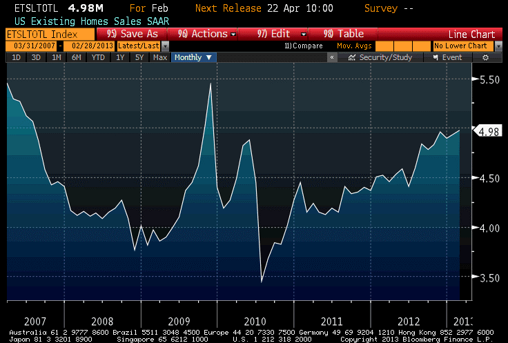
The inventory of homes available for sale bounced off of 14-year lows, but remains at levels lower than any we’ve seen in over a decade.
And, near and dear to my heart, the median price of existing homes accelerated from last month (although, due to historical revisions, last month’s y/y was revised down to 10.67%) and stands at 11.34%. The January Home Price Index from FHA also came out; the 6.46% year-on-year rate of increase in that index is also the highest post-2007.
There are long lags between both of these indices and the appearance of price pressures in the Consumer Price Index, but at the moment all indicators of housing point the same direction: Owner’s Equivalent Rent should be in the 2.75% neighborhood by year-end, and could be as high as 3%. This is a key part of our forecast that core CPI should reach 2.6%-3.0% by year-end, and accelerate further in 2014.
The amazing recent run in home prices – which I suspect is driven in part by institutional investor interest in real estate – has caused existing home prices as a multiple of household income to move above levels that prevailed for the last quarter-century of the 20th century. The housing industry likes to present charts of housing affordability, which takes into account the current level of interest rates, because currently those interest rates make even the relatively high home prices look more affordable.
Yes, I said “relatively high home prices.” The median sales price of existing homes averaged 3.36x median household income from 1975 to 2000, with a relatively small range of values around that average. Even including the bubble, when the multiples reached 4.8x, the average through 2011 only rose to 3.54. As of year-end 2012, the multiple was back to approximately 3.48 and if median prices rise “only” 8% this year (remember, the current pace is 11.3% and rising) the multiple will be around 3.6x by the end of the year (see chart, source U.S. Census Bureau, National Association of Realtors, Enduring Investments).

Notice that even at the depths of the crisis, home prices were only slightly cheap by pre-2000 standards. Similarly, equity prices at the lows only reached approximately fair value by pre-2000 standards. There are two interpretations of this fact set. It could mean that the pre-2000 era valuations were too low, and that modern financial markets and structures make higher valuation multiples permanently viable. Or it could mean that the Federal Reserve continues to artificially support markets at multiples that are not likely to be sustainable in the long run. I suspect the latter point is more accurate, although I am open-minded about whether the former point might have some validity.
This isn’t necessarily a bad strategy, if the idea is to let the market stair-step down to equilibrium rather than letting it crash there all at once. But I don’t see anything that suggests the Federal Reserve has the slightest idea how to value assets. I understand that they don’t want to substitute their own analysis for the market’s judgment (at least, that would be the counterargument), but that’s what they’re doing anyway – with no indication that they plan to back off anytime soon. The Fed is just more comfortable in the bubble, and afraid to leave it entirely. But don’t we have to, eventually?
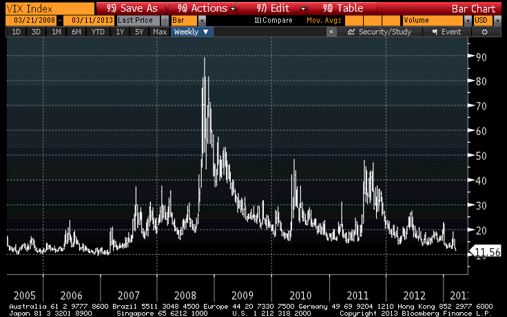
The VIX returned to 14 today, which makes a bit more sense to me than the 12.7 level of yesterday. It still seems low to me, but at least there is a way for long-vol positions to actually lose.
They Really Do Care
It really is a marvel of a market these days. It doesn’t strike me as completely odd that stocks have recovered almost all of the losses they experienced on the first Cyprus news, but what is amazing to me is that the VIX index has retraced about half of its jump and that “fear index” sits just about a point and a half above six-year lows.
Yes, Cyprus is a small country, which is a point that seems endlessly repeated as a sort of incantation, a warding against bad stuff happening. As my friend Andy F pointed out, subprime-mortgage-backed paper was also pretty small (roughly 1.3T in size compared with a worldwide bond market around 80T), and somehow still managed to leave a mark. Cyprus is very small, relative to the Eurozone. But if it was as small in significance as it is in relative GDP, do you think the EU finance ministers would be wasting this much time on them? It’s a bit like saying “I don’t care about my grade in Calculus,” and then staying up all night studying. There’s a clue that perhaps someone cares more than they’re letting on.
If Cyprus was insignificant, as opposed to small, then the other Eurozone countries would simply pony up the dough, or wave goodbye and let Cyprus exit the Eurozone.
But they can’t just pony up the dough, as that would continue a bad precedent.
And they can’t just wave goodbye. Why? Because Cyprus’s significance far outweighs its size. If Greece had left the Euro, there would be no precedent value to Cyprus’s doing so and this crisis would have been but a blip. But it doesn’t matter how big the first domino here is: the EU has sworn that the Euro is inviolate, that it’s impossible to undo, that there’s no provision from anyone leaving the union, etc. If any country leaves the Euro, the statement of absolutes is exposed to be false. And worse, from the standpoint of the elites…what if a country leaves the Euro and survives?
So, while everyone tries to persuade investors (and they’re largely succeeding, it seems) not to be concerned about Cyprus because it’s so small, the country declared that its banks will remain closed through next Tuesday. Russians are lecturing Europeans on how the seizure of private property reminds them of Soviets. And, after declaring that the Cypriot government had to enforce the levy or lose the bailout funds – and then watching the legislature vote 36-0 to reject the levy – European officials are trying to find some way to look like they are sticking to their principles while compromising them. The ECB has delayed a decision on whether to keep supporting Cypriot banks as the discussions between Cyprus and Eurozone finance ministers continue. Looks like someone really does want to pass that unimportant Calculus exam! Perhaps we should not take the protestations of insignificance at face value.
All of which is to say that within a week or two, unless the Eurozone capitulates, Cyprus is still going to go through bank failures and sovereign default and possibly exit or be ejected from the Eurozone. The market is pricing a near-100% chance that these finance ministers capitulate, scuttling their own political futures for the sake of the Euro and returning the Euro crisis to a slow simmer from a rolling boil – not solving anything, but delaying the inevitable. So far, this has been a good bet. But 100-1 odds are probably worth taking, especially when it involves a politician sacrificing his/her future for an idea.
The FOMC also met today, and as expected the pedal remains pressed to the metal. If there had been any question about that one week ago (and I don’t think there really was), the Cypriot events eliminated any chance that the FOMC would even hint at an eventual walking-back of liquidity. It’s not going to happen any time soon.
On Thursday, we’ll get a look at Existing Home Sales for February. While most focus will be applied to the headline number, which is expected to touch 5.0mm sales for the first time (absent government programs) since 2007, I am much more attentive to the year-on-year rise in the median home sales price. That figure was last at an astounding 12.61%, and surely can’t go much higher than that?
Stealing Really Is That Bad
Cyprus banks are closed until Thursday. At this point, the Cypriot legislature has not voted on any particular scheme of theft, although some Eurozone officials seem to think that it would be okay to only rape the people who have deposits bigger than €100,000, just as long as it’s a really brutal rape to make up for letting the smaller depositors off. (This only sounds like it makes sense if you use their words, but not if you use their meaning.)
It is incredible but the Eurozone elite really don’t seem to understand why the Cyprus plan is so bad. They really are natural Socialists! As Merkel and her party became the primary defenders of the decision to seize Cypriot depository assets today, there was a very good article in Businessweek that contained several jaw-dropping quotes.
“I have to go to my constituency and explain to my people in my constituency why we are willing to lend more than 3 billion euros ($3.9 billion) to Cyprus,” Michael Fuchs, deputy parliamentary leader of Merkel’s Christian Democratic Union party, said in an interview with BBC Radio 4 today. “Why should Germans bail out these people and they are not willing to accept at least a minor bailing out by themselves?”
Well, Mr. Fuchs, here is the problem: you didn’t ask them if they would “accept” at least a “minor” bailing out. You ordered people who didn’t need a bailout – savers with earned balances in the banks – to pay for the bailout. I daresay that it doesn’t seem “minor” to those who had their money stolen to save someone else.
Yes, I understand the parallel, that you feel the alternative was to have your taxpayers foot the bill, and they don’t need a bailout either so why should they pay for it? As Merkel said: “the responsible people are partly included and not only the taxpayers in other countries.” But here’s the thing – at least you have the authority to order that the taxes your citizens paid be used for things they didn’t want, but you did. You have no authority, and indeed no one had the authority, to order the seizure of private assets for something you wanted. (Cyprus, and Cypriot banks, had the ability to seize the assets, but that’s not the same as the legally-sourced authority to do so.)
Moreover, you had another alternative, and that’s to recognize that the elite who want the Union to survive in its current form can’t afford to foot the costs for it to do so – and to let Cyprus go. Yep, I understand that to you that would have been tantamount to Armageddon. But the more you destroy the foundations of capitalism and the free market in favor of naked Socialism, the more appealing Armageddon looks by comparison…
And here’s another quote, by the budget spokesman of Merkel’s main opposition party: “The profiteers of the Cypriot business model must pay the bill – not the European taxpayers.” I heartily agree, but the “profiteers” aren’t the depositors! If that appellation is attached to anyone, it would be to the bank equity holders, and perhaps the bondholders. Arguably, it may apply to the citizens of Cyprus, but almost equally to the people of the Eurozone who benefited when Cyprus lived and consumed beyond her means. But the depositors were not ‘profiteering’ by putting deposits in the bank. They were saving.
So it’s the Russian and the Greek depositors that you really wanted to target? Then why not target anyone who is Russian or Greek? I would go further and say that it isn’t the Russians’ fault that Cypriot banks were willing to take their money, and not the Greeks’ fault that European oversight of Eurozone banks was so fractured that Cypriot banks sought out these deposits as they grew and became unsustainable, ungainly creations. Being a Greek or a Russian with money isn’t a crime – unless you’re a Socialist. And if you’re a Socialist, then it isn’t the Greek or Russian part…it’s the “having money” part.
But they don’t seem to see why people are concerned.
Now, in the micro picture none of those reflections are very market-oriented, but in the macro picture they certainly are. We all have to deal on a day-to-day basis with the reality that markets are nakedly manipulated by central banks these days (with fancy names like “portfolio balance channel,” for example). I was speaking today to an investor about a particular type of arbitrage in my sphere of expertise. As we were brainstorming what could go wrong with the trade, the biggest possibility was “what if one central bank decides to stop manipulating markets and another central bank continues, but they’re the wrong ones? Or what if they start manipulating markets in a different way?” We didn’t directly consider the question of “what if they just seize the profits?” but investors actually now need to consider that in the calculus of risk and return.
But that part isn’t new, as some readers of my articles have pointed out. Government witch-hunts have long been carried out in search of the miscreants who “caused” market mayhem. After the 1929 crash, the Senate held hearings and even went after stock exchange members who’d actually held long positions during the crash. What is new is the targeting of people who have saved simply because it would be more convenient for the government to have their money.
They came for the hedge funds, and I didn’t speak out because I wasn’t a hedge fund. They came for the banks, and I didn’t speak out because I wasn’t a bank. They came for the savers…and there was no one left to speak for me. Right?
Equities took the news with surprising aplomb. Yes, stocks fell 0.55% after being down somewhat more than that, but that reverses only two average days during this most recent run. Commodities, which should be a direct beneficiary of global monkey-business associated with fiat money deposits, sold off hard with the notable (and reasonable) exception of gold. That is borderline insane, but consistent with the insanity of the last couple of months. These days I wake up every morning half expecting to see commodities prices offered at zero. Interestingly, inflation traders seemed to grasp the point, as 10-year inflation swaps and breakevens were stable even though rates generally declined. But commodities is Q1’s red-headed stepchild (and I say that as a red-headed stepchild).
It sounds crazy to say, but Europe losing its collective mind on this topic is bad for equities only if the bank run spreads to other countries in Europe, or if Cyprus decides to leave the Euro and to flee into the tender mercies of Russia’s embrace. Those aren’t certainties by any stretch of the imagination. Consequently, anything that looks vaguely like calm will likely be rewarded by a melt-up in stocks, probably to new highs. The outcomes are distinctly binary at the moment, which isn’t risk I personally care to take since equities are aggressively valued even if these risks were not present.
Willie Suttonomics
I am sure that the Eurozone finance ministers have never heard of Willie Sutton. But they are engaging now in Willie Suttonomics.
Willie Sutton was the bank robber from the early part of the 20th century who, when asked why he robbed banks, reputedly answered “because that’s where the money is!” This weekend, the Troika agreed to extend a critical loan to Cyprus in order to stave off a default for the small Eurozone nation. The €10bln loan was extended on condition that bank depositors be levied 6.75% or 9.9% of their deposits (the lesser amount if under €100,000) as part of the solution, and the new president of Cyprus said he accepted because he was given no choice.
I fail to see how this differs from what Willie Sutton did, except that Sutton at least went to prison – multiple times – for the crime. You went into the bank on Thursday and your deposits read €20,000 as you were saving for a new car, or a house, or college; on Monday, you have €18,650. It is being called, disingenuously, a “tax,” but considering that no Cypriot body approved the “tax” it is hard to see how that appellation fits. The money vanished from the vault with no warning. That seems more like a bank robber’s job…except that ordinarily, when a bank is robbed the depositors are protected. The depositors would have been better off if the money had been stolen by Willie Sutton!
My son, who is 9 years old, saw it the same way when I explained the basic facts of what happened to the depositors. He said “that sounds like something Lex Luthor would do.” From the mouths of children…and I don’t judge him wrong on this.
On Monday, I imagine that markets will try and behave as if this “puts the crisis behind us” again. But also on Monday, I imagine that every corporate Treasurer who has money in a bank in Europe will be trying to diversify those deposits to other jurisdictions. Perhaps, if I am such a treasurer, I will pull money from Italy to put into Germany or perhaps I will put it into UK or US banks. But one thing I certainly will not do is leave all of it in a bank in Italy, or Portugal, or Hungary, or Spain.
It is possible that nothing will happen, or at least not right away as stunned European depositors wait to find out if it’s really true, and some dwell in denial. But it’s also possible that we could see the mother of all bank runs, because it’s no longer necessary for depositors to stand in long lines to withdraw their cash, as happened in every major banking crisis that happened before deposit insurance. This is exactly the opposite of deposit insurance – instead of the government protecting depositors, the government is opening the vault for the robbers.
Now, it’s not completely approved as of this writing. According to Reuters, the Cypriot parliament will vote on Sunday whether to mug depositors for the levy. But, since the alternative is that Cyprus will have to default on Tuesday, the odds are good that either they’ll approve the levy (which banks have already sequestered, without any law to tell them to do so), or there will be some 11th hour brinkmanship with the Troika and Cyprus on Monday. But by Tuesday, you will either have the disorderly default of a Eurozone member, or confiscation of deposits held in banks of a Eurozone country. Now that’s a Hobson’s choice if ever there was one.
Here are some stories elsewhere about the crazy Troika scheme: here, here, and here. And I rarely cite Zerohedge but here is a good summary of some quotes from well-placed individuals in Europe. Comfortingly, the response so far has been shock and anger. Most observers are, rightly, dismissing the soothing statements that this action is an “exception.” Yes, it is – a confiscatory exception, and one that was completely random and unforeseeable by the depositors. Does it make one feel better that the crazy man on the street just set his neighbor’s car on fire, if he says “but it’s just his car – no one else’s.” No, because you know he’s a crazy man, and now you know there is nothing he won’t do. Random injustice is worse than systematic injustice.
Hold on to your assets, folks – I have no idea what happens on Monday but I have a feeling it will require more liquidity. But then, doesn’t everything these days?
Summary of My Post-CPI Tweets
Here’s a summary of my post-CPI tweets:
- #CPI +0.7%/+0.2% ex food & energy. Y/Y core back up over 2% at 2.004%. And going higher.
- Gasoline prices +9.1%, so there you go for everyone who thought Jan’s number was low.
- Economists had been looking for a “soft” 0.2% on core core, and got it at +0.17% rounding up to +0.2%.
- y/y rise in Owner’s Equivalent Rent rose to 2.14%, a new post-2008 high. That’s on the way to 3% or 4% over the next 1-2 years, at least.
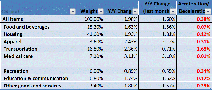
- Accelerating Major groups: whoa…EVERY major group accelerated y/y. All 8 of them. I’ve never seen that.
- Food & Bev: 1.625% from 1.558%. Housing 1.929% from 1.805%. Apparel 2.426% from 2.115%. Transp 2.361% from 0.712%.
- Recreation 0.890% vs 0.554%. Educ/Comm 1.740% from 1.622%. Other 1.803% from 1.574%. Only close one: Medical 3.107% from 3.095%
- #CPI didn’t surprise on the upside, but there is just nothing weak about this number. Anywhere.
- Well, core goods I guess. +0.3% from +0.4%. But core services went to 2.6%, mainly on housing strength. If core goods ever recover…
The mainstream media and many economists will yawn at this number and miss the big picture. There is just nothing important here that is weak. In particular, every major group accelerated on a year-on-year basis. That’s amazing. It’s not unprecedented, I am sure, but I don’t remember seeing it happen before. Usually some are accelerating, some are decelerating, even when inflation overall is accelerating or decelerating.
In particular, housing continues to quietly accelerate, as we’ve been predicting. It is going significantly higher.
Core inflation is going to accelerate further, although the next several months have solid year-earlier comparisons of +0.22%, +0.22%, +0.20%, and +0.21%. But we think we’ll see core inflation nevertheless accelerate over that time frame, and then there are six easy comparisons in a row with nothing above 0.17%. By year-end, we still think we will see core of 2.6%-3.0%.
You can follow me @inflation_guy!
Some Useful Charts And Thoughts About Personal Investing
I just finished a paper called “Managing Laurels: Liability-Driven Investment for Professional Athletes,” and I thought that one or two of the charts might be interesting for readers in this space.
An athlete’s investing challenge is actually much more like that of a pension fund than it is of a typical retiree, because of the extremely long planning horizon he or she faces. While a typical retiree at the age of 65 faces the need to plan for two or three decades, an athlete who finishes a career at 30 or 35 years of age may have to harvest investments for fifty or sixty years! This is, in some ways, closer to the endowment’s model of a perpetual life than it is to a normal retiree’s challenge, and it follows that by making investing decisions in the same way that a pension fund or endowment makes them (optimally, anyway) an athlete may be better served than by following the routine “withdrawal rules” approach.
In the paper, I demonstrate that an athlete can have both good downside protection and preserve upside tail performance if he or she follows certain LDI (liability-driven investing) principles. This is true to some extent for every investor, but what I really want to do here is to look at those “withdrawal rules” and where they break down. A withdrawal policy describes how the investor will draw on the portfolio over time. It is usually phrased as a proportion of the original portfolio value, and may be considered either a level nominal dollar amount or adjusted for inflation (a real amount).
For many years, the “four percent rule” said that an investor can take 4% of his original portfolio value, adjusted for inflation every year, and almost surely not run out of money. This analysis, based on a study by Bengen (1994) and treated more thoroughly by Cooley, Hubbard, and Walz in the famous “Trinity Study” in 1998, was to use historical sampling methods to determine the range of outcomes that would historically have resulted from a particular combination of asset allocation and withdrawal policies. For example, Cooley et. al. established that given a portfolio mix of 75% stocks and 25% bonds and a withdrawal rate of 6% of the initial portfolio value, for a thirty-year holding period (over the historical interval covered by the study) the portfolio would have failed 32% of the time for, conversely, a 68% success rate.
The Trinity Study produced a nice chart that is replicated below, showing the success rates for various investment allocations for various investing periods and various withdrawal rates.
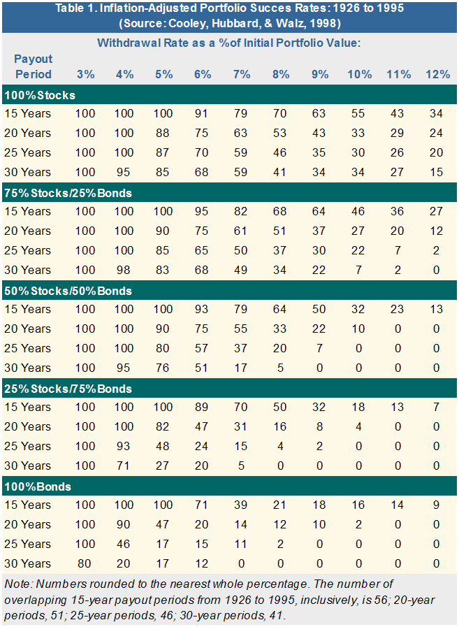
Now, the problem with this method is that the period studied by the authors ended in 1995, and started in 1926, meaning that it started from a period of low valuations and ended in a period of high valuations. The simple, uncompounded average nominal return to equities over that period was 12.5%, or roughly 9% over inflation for the same period. Guess what: that’s far above any sustainable return for a developed economy’s stock market, and is an artifact of the measurement period.
I replicated the Trinity Study’s success rates (roughly) using a Monte Carlo simulation, but then replaced the return estimates with something more rational: a 4.5% long-term real return for equities (but see yesterday’s article for whether the market is currently priced for that), and 2% real for nominal bonds (later I added 2% for inflation-indexed bonds…again, these are long-term, in equilibrium numbers, not what’s available now which is a different investing question). I re-ran the simulations, and took the horizons out to 50 years, and the chart below is the result.

Especially with respect to equity-heavy portfolios, the realistic portfolio success rates are dramatically lower than those based on the “historical record” (when that historical record happened to be during a very cheerful investing environment). It is all very well and good to be optimistic, but the consequences of assuming a 7.2% real return sustained over 50 years when only a 4.5% return is realistic may be incredibly damaging to our clients’ long-term well-being and increase the chances of financial ruin to an unacceptably-high figure.
Notice that a 4% (real) withdrawal rate produces only a 68% success rate at the 30 year horizon for the all-equity portfolio! But the reality is worse than that, because a “success rate” doesn’t distinguish between the portfolios that failed at 30 years and those that failed spectacularly early on. It turns out that fully 10% of the all-equity portfolios in this simulation have been exhausted by year 19. Conversely, 90% of the portfolios of 80% TIPS and 20% equities made it at least as far as year 30 (this isn’t shown on the chart above, which doesn’t include TIPS). True, those portfolios had only a fraction of the upside an equity-heavy portfolio would have in the “lucky” case, but two further observations can be made:
- Shuffling off the mortal coil thirty years from now with an extra million bucks in the bank isn’t nearly as rewarding as it sounds like, while running out of money when you have ten years left to lift truly sucks; and
- By applying LDI concepts, some investors (depending on initial endowment) can preserve many of the features of “safe” portfolios while capturing a significant part of the upside of “risky” portfolios.
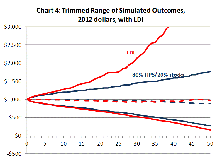
The chart below shows two “cones” that correspond to two different strategies. For each cone, the upper line corresponds to the 90th percentile Monte Carlo outcome for that strategy and portfolio, at each point in time; the lower line corresponds to the 10th percentile outcome; the dashed line represents the median. Put another way, the cones represent a trimmed-range of outcomes for the two strategies, over a 50-year time period (the x-axis is time). The blue lines represent an investor who maintains 80% in TIPS, 20% in stocks, over the investing horizon with a withdrawal rate of 2.5%. The red lines represent the same investor, with the same withdrawal rates, using “LDI” concepts.
While this paper concerned investors such as athletes who have very long investing lives and don’t have ongoing wages that are large in proportion to their investment portfolios (most 35-year-old investors do, which tends to decrease their inflation risk), the basic concepts can be applied to many types of investors in many situations.
And it should be.
Short But Sour
A slow Monday, and the S&P could barely manage a +0.3% rally. That’s tantamount to a selloff, these days, as the all-time nominal highs are a mere 20 points away. I’m not joking: with stocks up 9.1% on the year, the S&P is averaging +0.19% per day, which means the all-time highs ought to be reached by next Wednesday.
Meanwhile, our measure of valuation for equities has reached levels not seen since July of 2011. The expected compounded after-inflation return for the S&P 500, inclusive of dividends, is just 2.00% (it got to 1.81% in July 2011 – and, for the record, it stood at 0.83% at the end of 2006).
The VIX tumbled today to the lowest level since April of 2007 (see chart, source Bloomberg), two weeks after Fed Chairman Bernanke told Congress that the “subprime crisis” was likely to stay “contained” (which it did, in roughly the same sense that the universe itself has a boundary).
Now, I don’t want to follow the usual course and list all of the things we could be worrying about (Italy, Cyprus, France, Iran, North Korea…) to somehow argue that prices are too high. After all, there’s always something to worry about. No, that’s not my argument at all. My argument is that prices are too high regardless of what the news is.
Over the next ten years, compounded real returns after inflation will likely be in the neighborhood of 2% per annum. They could reach 5% per annum, but they could be -3% per annum with equal probability. Note that these are real returns I am speaking of, so there is no reason stocks can’t continue to reach new nominal highs especially if consumer prices continue to accelerate.
(And here’s an odd fact: while equity market volumes over the last few years have been shrinking persistently, the gap between 2012 and 2013 has been narrowing over the last month and a half. That is, volumes are still running about 78mm shares/day below the year-to-date pace in 2012, but at the end of January that figure was 113mm shares/day. So volume is still shrinking, but no longer monotonically.)
So I’m not sure when we are going to get a significant correction on the order of late 2011 (~20%), but we are overdue. Frankly, if I thought the correction was likely to be no more than 20%, I probably wouldn’t even be particularly concerned, because 10% and 20% corrections happen in healthy markets. But I can’t discount the possibility of a 2000-2002 or 2007-2008 sort of decline. The conditions are “right” for just such an occurrence, unfortunately.
All Men Are Mortal
Hugo Chavez, dictator of Venezuela and socialist extraordinaire, passed away on Monday in Caracas. The world will little note nor long remember what Chavez did for/to his country, and yet we care about his passing – not because of what he was, but because of what Venezuela could be and could have been.
I visited Venezuela in 1997 or so – pre-Chavez – when I was the main US fixed-income strategist for Bankers Trust. I had dinner with several members of the central bank, who said quite frankly that if they chose, they could easily pay off Venezuela’s external debt with their oil revenues. And that, mind you, was with oil prices around $20/bbl. It was also approximately the high point of Venezuelan production, which has fallen from 3mbpd to 2.4mpbd since then. Venezuela provides about 3% of the world’s supply of crude, despite the fact that it has among the biggest, if not the biggest, reserves of oil in the world. And yet, according to Capital Economics as cited by the Wall Street Journal, oil prices below $100/bbl could trigger a balance of payments crisis. The dictator milked his nation’s natural resources for billions upon billions – some of it went to “the people” in ways that were wasted by the typical inefficiencies of a socialist economy, and much of it to secure his own power.
It’s not quite as easy as saying that the next Presidente should develop Venezuela’s oil resources. Venezuela isn’t just a member of OPEC; it is a founding member of OPEC along with Iran, Iraq, Kuwait, and Saudi Arabia. So it isn’t as if the country can just start pumping wildly and change its fortunes through improved revenues. For the good of the country, most of what will need to happen under Presidentes in the future will be structural and expenditure-side. (Where have we heard that before?)
Accordingly, oil prices are likely to remain relatively undisturbed by this development, unless it appears that the next Presidente is a pure capitalist who plans to exit OPEC. Don’t hold your breath for that. In fact, to the extent that there is any unrest or confusion in the country because of a power vacuum, it might increase oil prices in the near-term. For now, Chavez’s vice president (Nicolas Maduro) will become president and a new president theoretically elected in thirty days. However, the history of Chavez, Maduro, and their party does not make most observers comfortable that this will necessarily happen in the way it is written in the Venezuelan constitution.
Meanwhile, Venezuela’s inflation is a hardly-worth-noticing 21.6%. They must have a really positive output gap, right? Of course, such inflation might have something to do with the fact that the money supply is up 600% since the end of 2007…nah, couldn’t be. The chart below (source Bloomberg, with my annotations) shows M2, GDP, and CPI for Venezuela, normalized to January 31, 2008 (just after a redenomination of old Bolivars into Bolivar Fuerte at 1000:1, which would have made the chart look screwy).

Notice a couple of things. First, notice that the huge money-printing has done nothing whatsoever to Venezuelan growth. Second, note that the huge money-printing has, however, drastically increased prices in Venezuela. Third, notice that the increase in prices has been similar in magnitude to the increase in money (technically, the increase in money divided by GDP, but as I said GDP didn’t move much) – which is just exactly what theory predicts, and what has been seen time and time again in hundreds of countries spanning scores of years.
This isn’t an instance of “hyperinflation;” rather there has been consistent inflation in the 20-35% per annum range since 2008. That’s high, but not so high that it’s completely divorced from our experience of the reaction of prices to monetary policy. It is, or should be, a precautionary lesson. As bad as Chavez’s mismanagement of the Venezuelan economy was, which helped produce the stinky growth, it was the mismanagement of the money supply that caused the inflation.
It is interesting, too, that since inflation tends to increase wealth inequality if the wealthy can own assets other than money, the inflation itself tended to keep the poor – the main constituency of a populist – in a position of greater need and greater reliance on the State. Increasing inequality and plausible deniability as to whether it is the leader’s policies that are creating that inequality: that’s a delicious cocktail if the leader has a desire to hold and increase his power.
So we take notice of Chavez’s passing, for its potential impact on oil markets but even more for the opportunity it gives us to reflect on the lessons we could have, and should have, learned from the operation of his regime.
Gold, and Dilemmas
At the start of another Employment week, the same refrain echoes: higher equity markets, soft commodities markets (because changes in China’s policies will hurt the demand for commodities…but I suppose that it will not hurt the profitability of U.S. shares?), and continued negative news from Europe that is mostly ignored during Employment week.
Actually, maybe the news from Italy is being mostly ignored here because it is hard for Americans to truly fathom what is going on. Remember that the basic issue is that a majority of Italians voted for one or another party that favored ending austerity measures and/or leaving the Euro, but left no single party controlling both houses of parliament. Until this morning, it appeared that no single party would be able to form a government, which meant that a new election would likely be called soon. But now it appears that the Five Star Movement (Beppe Grillo’s party) is offering to stage a walk-out from the senate. Now, that sounds negative, right? Well, actually it’s progress (and Grillo’s party would have to be given some policy concessions in exchange for walking out, which sounds like “lovely parting gifts” to me) since Five Star doesn’t have enough delegates to prevent a quorum from being established if they leave (with no quorum, the body cannot conduct business) but their absence would allow a majority to be established on a lower number.
In the U.S., the approach would be different: the Senators would reach a deal and then vote on the deal, with no one having to manipulate the process in an arcane Robert’s-Rules-of-Order fashion. On the other hand, they had a senate in Rome about 2,500 years before we had one, so who are we to question their parliamentary process?! And our institutions are no less clownish at times…such as right now, since despite so many dire threats the world apparently did not end over the weekend once the budgetary sequester went into effect.
.
Since the markets were quiet today (and likely will remain relatively quiet until the Employment report on Friday, if recent patterns hold true), I thought I’d take up a topic I’ve been meaning to discuss for a while: a look at the relative value of gold and a link to an interesting new paper on gold.
First, let me say that our systematic metals and mining strategy is currently approximately neutral-weight on gold itself, overweight on industrial metals, and deeply underweight on mining stocks. But that strategy relies on metrics I am not discussing here; nothing, moreover, that I discuss here should be taken as an indication of whether Enduring Investments would suggest an investor should add or subtract to his or her particular exposure.
Disclaimer completed, let’s look at the yellow metal relative to other assets, as I first did in this space back in August of 2010 when I concluded that gold did not look particularly overvalued. Gold subsequently rallied another 60%, then slid (in case you haven’t heard!). It is currently still 30% above where it was in August of 2010. So is it overvalued?
Some observers have noted that the ‘real price of gold’ (that is, gold deflated by the current price level) has recently risen to levels not seen since the peak of the gold market in the early 1980s (see chart, source Bloomberg, which shows gold in constant December 2012 dollars).

This is true, of course, but measuring the ‘real’ price of gold is a funny concept. The gold price relative to the cost of the consumption basket is a metric that has meaning, because it tells you how much consumption you displace to buy an ounce of gold, but unless you’re evaluating the consumption of gold I am not sure that’s a relevant metric.
On the other hand, it makes more sense to me to look at investments relative to gold, since that’s what is likely to be displaced by a purchase of gold. Some of these relationships are not particularly useful analytically, though, or at least appear at first blush not to be. For example, looking at gold versus the stock market (see chart, source Bloomberg) you can’t tell very much except that gold was rich or stocks were cheap (or both) in 1980 and gold was cheap or stocks were rich (or both) in 2000. Or, so I wrote in 2010.

However, I subsequently noticed another chart that looked somewhat similar. Below (source: Enduring Investments) I have put the data from the chart above alongside a measure of the volatility of inflation expectations, as taken from the Michigan Sentiment Survey. (As I’ve written previously, surveys of sentiment are not satisfying ways to measure true inflation expectations, but they’re all we’ve got and they might nevertheless be valuable in measuring the volatility of inflation expectations, which is what we’re trying to do here).

The notion is this: when inflation expectations are becoming both lower and more stable, then stocks become more valuable and gold less so as an investment item. But, when inflation expectations are rising and/or becoming less-stable, then stocks become less valuable and gold more so as an investment item. I haven’t worked very carefully to refine this relationship, but the Michigan series begins in 1978 so that’s the main limitation. Yet, without any lags nor tweaking of period lengths, the R-squared here (on levels, not changes) is 0.745, which is firmly in the “interesting” category.
Having said that, unless we’re able to forecast the volatility of inflation this isn’t particularly helpful in assessing whether gold is rich or cheap relative to stocks (although on the regression, not shown, the ratio of gold/S&P is 1.04 but ought to be more like 1.07, so gold looks slightly cheap to stocks). The main thing we can do with this is explain why gold prices have risen relative to stock prices over the last decade, and it makes sense. In this context, the recent slide in gold/rally in stocks can be attributed to a soothing, perhaps temporary, in consumers’ concerns about inflation.
The champion relationship, although less creative, is the ratio of gold to crude. Over a long period of time, an ounce of gold has bought between 15 and 20 barrels of crude oil (West Texas Intermediate), with occasional spikes wider and at least one lengthy period between 7 and 12. The chart below (source: Bloomberg) shows this classic relationship. It makes some sense that two hard commodities, both exchange traded and having no natural real return to them, ought to broadly parallel each other over time. Again, this isn’t a very good trading relationship but it is a decent sanity check.

By this measure, gold is approximately at fair value, although an argument could be made that WTI is no longer the fair price for crude. In terms of Brent Crude, Gold is only 14.3 barrels and so arguably slightly cheap.
None of this will delight the gold bulls, but it also won’t delight the gold bears. Gold, at least the way I look at it, seems to me to be somewhere between slightly cheap to roughly fair value versus a pair of comparables. Of course, it may be that stocks and crude oil are slightly expensive, on the other hand!
Gold bulls and bears also will both find things to like and things to dislike in a paper by Erb and Harvey called “The Golden Dilemma.” Given that gold bulls tend to be more, er, passionate about the subject, they will likely be more strident in their disagreements but it is a capable attempt to tackle many of the well-known arguments for owning gold and put them to logical and empirical test.
These gentlemen (who have some serious chops in commodities research) conclude that as an inflation hedge, gold is (1) not an effective short-term hedge, (2) not an effective long-term hedge, (3) might be effective over the very, very, very long-term, and (4) probably effective in a hyperinflationary situation. Although this depends somewhat on your meaning of “hedge,” I concur that gold is not a hedge. It can, with some work, be made into a smarter hedge, which works better (especially in conjunction with other metals, and mining stocks). But they make a fairly powerful argument that if there’s even a teensy chance that hyperinflation happens, a high gold price can be rational since the tail of an option contributes quite a bit to its value.
Incidentally, a slide-show version of the paper is here and is pretty good even if you didn’t read the paper.