Archive
Shots Fired
This isn’t the first time that stocks have corrected, even if it is the first time that they have corrected by as much as 4% in a long while. I point out that rather obvious fact because I want to be cautious not to suggest that equities are guaranteed to continue lower for a while. Yes, I have noted often that the market is overvalued and in December put the 10-year expected real return for stocks at only 1.54%. Earlier in that month, I pointed out and remarked on Hussman’s observation that the methods of Didier Sornette suggested a market “singularity” between mid-December and January. And, earlier this month, I followed up earlier statements in which I said I would be negative on stocks when momentum turned and added that I would sell new lows below the lows of the week of January 17th.
But none of that is a forecast of an imminent decline of appreciable magnitude, and I want to be clear of that. The high levels of valuation make any decline potentially dangerous since the levels that will attract serious value investors are so far away. But that is not tantamount to forecasting a waterfall decline, which I have not done and will not do. How does one forecast animal spirits? And that is exactly what a waterfall decline is all about. Yes, there may be precipitating events, but these are rarely known in prospect. Sure, stocks fell sharply after Bear Stearns in the summer of 2007 liquidated two mortgage-backed funds, but stocks reached new highs in October 2007. What happened in mid-October 2007 to trigger the top? Here is a crisis timeline assembled by the St. Louis Fed. There is basically nothing in October 2007. Similarly, as Bob Shiller has documented, at the time of the 1987 crash there was no talk whatsoever about portfolio insurance. The explanation came later. How about March 2000, the high on the Nasdaq (although the S&P 500 didn’t top until September)?
What two of these episodes – 2000 and 2007 – have in common is that valuations were stretched, but I think it’s important to note that there was no obvious precipitating factor at the time. It wasn’t until well into the stock market debacle in 2007-08 that it became obvious (even to Bernanke!) that the subprime crisis wasn’t just a subprime crisis.[1]
Here is my message, then: when you hear shots fired, it isn’t the best idea to wait around to figure out why people are shooting before you put your head down. Because as the saying goes: if the enemy is in range, so are you.
And, although it may not end up being a full-fledged firefight, shots are being fired, mere days before Janet Yellen takes the helm of the Fed officially (which may be ominous since Fed Chairmen are traditionally tested by markets early in their tenure). Last night, Turkey was forced to crank up money rates by about 450bps, depending which rate you look at. When Argentina was having currency issues, it wasn’t surprising – when you have runaway inflation, even if you declare inflation to be something else, the currency generally gets hit eventually. And Russia’s central bank was established only in 1990. But Turkey, about 65% larger in GDP terms than Argentina, is relatively modern economically and has a central bank that was established in the 1930s and has been learning lessons basically in parallel with our Fed since the early 1980s. Heck, it’s almost a member of the EU. So when that central bank starts cranking up rates to defend the currency, I take note. It may well mean nothing, but since global economics has been somewhat dull for the last year or so (and that’s a good thing), it stands out as something different.
What was not different today was the Fed’s statement, compared to its prior statement. The FOMC decided to continue the taper, down to “only” $65bln in purchases monthly now. This was never really in question. It would have been incredibly shocking if the Fed had paused tapering because of a mild ripple in global equity markets. The only real surprise was actually on the hawkish side, as Minnesota Fed President Kocherlakota did not dissent in favor of maintaining unchanged (or increased) stimulus – something he has been agitating for recently. Don’t get too used to the Fed being on the hawkish side of expectations, however. As noted above, Dr. Yellen takes the helm starting next week.
The Treasury held its first auction of floating rate notes (FRNs) today, and the auction was highly successful. And why should they not be? They are T-bill credits that reset to the T-bill rate quarterly, plus 4.5bps. In the next few days I will post an article explaining, however, why floating rate notes don’t provide “inflation protection;” there has been a lot of misinformation about that point, and while I explained why this isn’t true in a post from May 2012 when the concept of the FRN program was first mooted, it is worth reiterating in more detail.
So we now have a new class of securities. Why? What constituency was not being sufficiently served by the existing roster of 1-month, 3-month, 6-month, and 1-year TBills, and 2 year notes?
I will ask another “why” question. Why is the President proposing the “myRA” program, which is essentially a way to push savings bonds (the basics of the program is that if you sign up and meet certain income requirements, the government will give you the splendid opportunity to put your money in an account that returns a low, guaranteed rate of interest). This is absolutely nothing new. You can already set up an account with http://www.TreasuryDirect.gov and have your employer make a payroll direct deposit to that account. And there’s no income maximum, and no requirement to ever roll it into an IRA. Yes, it’s true – with Treasury Direct, you will have to pay federal taxes on the interest, but the target audience for the myRA program is not likely to be paying much in the way of taxes so that’s pretty small beer.[2]
The answer to the “why” in both cases is that the Treasury, noticing that one regular trillion-dollar buyer of its debt is leaving the trough, is looking rather urgently for new buyers. FRNs, and a new way to push Treasuries on middle-class America.
Interest rates have declined since year-end, partly because equities have been weak, partly because some growth indicators have been weak recently, and partly because the carry on long Treasury securities is positively terrific. But the Treasury is advertising fairly loudly that they are concerned about whether they’ll be able to raise enough money, at “reasonable” rates, through conventional auctions. Both of these “innovations” cause interest payments to be pegged at the very short end of the curve, where the Fed has pledged to control interest rates for now, but I think interest rates will rise eventually.
Probably not, however, while the bullets fly.
[1] In a note to Natixis clients on December 4th, 2007, entitled “Tragedy of the Commons,” I commented that “M2 has grown only at a 4.4% annual rate over the last 13 weeks, and that’s egregiously too little considering the credit mess (not just subprime, as I am sure my readers are aware, but Alt-A and Prime mortgages, auto loans and credit cards too),” but the idea that the crisis was broader than subprime wasn’t the general consensus at the time by any means. Incidentally, in that same article I said “We have not entered a recession with core inflation this low in many decades, and this recession looks to be a doozy. I believe that by late 2008 we will be confronting the possibility of deflation once again. And, as in the last episode, the Fed will face a stark choice: if short rates don’t get to zero before inflation gets to zero, the Fed loses as they will never be able to get short rates negative,” which I mention since some people think I have always been bullish on inflation.
[2] I wonder how the money is treated for purposes of the debt ceiling. If the Treasury is no longer able to issue debt, then surely it won’t be able to do what amounts to issuing debt in the “myRA” program? So if they hit the debt ceiling, does interest on the account go to zero?
Get A Grip
What I am about to write will probably not be terribly popular in this equity-centric culture of ours, but it needs to be said.
On a number of business news shows this weekend, I’ve heard about this week’s “equity market debacle.” Fox Business News on Saturday noted that “retirees depending on their savings are very nervous right now” because of “serious damage to portfolios after the big sell off this week.”
Get a grip, people!
To be sure, the 3% decline this week is the largest 5-day decline since June, but the real implication of that fact is that we have been in a frighteningly one-way market for a while now. I recently documented that we hadn’t had a drawdown of more than 5% from a previous peak since June 24th, and nothing more than 2% for a couple of months. However, 3% declines over 5 days should not be unusual. If implied volatility, e.g. the VIX, is at 13%, which is was until this selloff began, then a 5-day decline of 3% is only a 1.67-standard deviation event and it should happen about three or four times a year. The 2-day selloff of nearly 3% was a more unusual event, but hardly financial Armageddon.
Here’s the bigger point. You’ve laid out all your plans for the remainder of your life. If, one week ago, you were going to achieve your goals, but today with stocks 3% below all-time highs you are not, then you should not be in stocks. You’re 3% away from success – why would you risk that?
If, on the other hand, you’ve laid out your plans but you need stocks to rise 30% per year to make your plans work – your retirement goals, or your kids’ college education, or whatever – then you shouldn’t be in equities either. The problem here isn’t the market – it’s your plans. I blame financial television for this one, for the popularizing of the absurd term “putting your money to work.” Your money doesn’t work. Money is inert. The best you can hope for if you prod it with a stick is that it doesn’t blow away. Sometimes stocks go up, and sometimes they go down. From these valuation levels, it has long been the case that down was more likely than up over the next few years. Your money is “at work,” but it’s working in a wind tunnel and it’s not tied down.
Stocks are risky assets, folks! A gambling metaphor is probably inappropriate, and investing is different from gambling in that with gambling, the gambler generally loses over time while with investing – smart, patient investing – the investor generally wins, but here is one way in which the metaphor works: when you enter a casino, you only gamble what you can afford to lose. In the case of stocks, you should only invest as much as you can afford to lose 60-70% of. So your first question, in thinking about your asset allocation, should not be “how much do I need my portfolio to return,” and then spin the risk dial so you get the answer, but “can I lose 70% of this and still accomplish my goals?” If the answer is no, then you are risking too much because stocks sometimes do fall 70%.
And if you can’t accomplish your goals with the cash you have unless you have a strong equity market, then you have two prudent choices: 1) work harder, and longer, or 2) save more during the same period of work. The third choice is to gamble it on stocks and hope it turns out well.
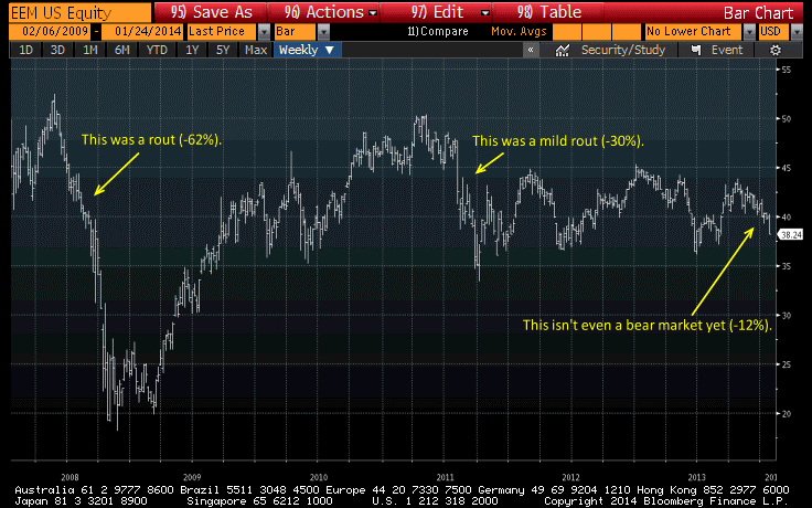
If you’re over-committed to equities, this is an excellent time to reconsider that commitment. If you have ridden stocks up, then pat yourself on the back and think hard about reallocating. You haven’t lost much and it shouldn’t be keeping you up at night…because the ‘carnage’ just isn’t that bad. The chart below (source: Bloomberg with my annotations) is of the ETF EEM, which tracks the MSCI Emerging Markets Index. Repeatedly on Thursday and Friday, we heard that US stocks were suffering because of the “rout” in emerging markets. Some currencies took a hit, yes. But emerging equity markets were hardly “routed.” Again: if 12% is going to destroy you financially, then you should count on being destroyed with some regularity.
I have to say the carnage isn’t that bad yet, because stocks might still drop precipitously and in any event probably won’t perform like they did for the last six months again for some while. But if you have the right, prudent plan, then not only do you not have to panic now, you won’t have to panic then.
How Inflation and Deflation Can Peacefully Coexist
In the discussion about whether the economy is exhibiting “inflationary tendencies” or “deflationary tendencies,” I find that many, many observers grow confused by the fact that we measure prices in dollars, which are themselves subject to changes in relative value due to supply and demand.
It helps to forget about dollars as the unit of measure. Just because it says “One Dollar” does not mean that it is an ever-fixed mark. With apologies to Shakespeare, dollars are not the star to every wandering bark, whose worth’s unknown although its dollar price be taken.[1] There are two ways to look at the “inflation/deflation” debate. Depending on which one you are referring to, deflationary tendencies are not inconsistent with price inflation, and price inflation is not inconsistent with deflationary tendencies.
One is the question of dollar price; and here we are mainly concerned with the supply of dollars and the number of times they are spent, compared to the amount of stuff there is to buy. More dollars chasing the same goods and services imply higher prices. Of course, this is just another way of stating the monetarist equation: P ≡ MV/Q. This is an identity and true by definition. Moreover, it is true in practice: rapid money growth over some moderate length of time always corresponds with rapid deterioration in the purchasing power of the money unit – in other words, inflation. At least, we have no examples of (a) extremely high money growth without high inflation, or (b) extremely high inflation without high money growth.
But this is not the same discussion as saying that “the aging demographic means we will have deflation,” as many economists will have it (for example, in a recent Out of the Box offered by Mauldin Economics here). But deflation, in that sense, can still happen: if you have fewer workers making the same amount of GDP, then goods (and services) prices will fall relative to wages, which would be deflation the way we typically mean it if the overall price level was otherwise unchanged. However, if the money supply increases by a factor of 10, then nominal prices will increase no matter what else is going on. It may be, though, that in this case wages will increase slightly more than prices, so that there will be “deflation” in the unitless sense.
So, these are not inconsistent statements: (a) there will be increasing inflation next year, and (b) large amounts of private debt and demographic “waves” around the world are a deflationary force. The resolution to the seeming inconsistency is that (b) causes downward pressure on certain prices relative to other prices or, if you ignore the unit of exchange, it causes downward pressure in the ratio of one good that can be exchanged for another. Yet at the same time (a) implies that the overall increase in output in goods and services will be outstripped by the number of dollars spent on them, driving prices higher.
So you should cheer for the sort of deflation caused by the demographic wave that Harry Dent is talking about in the John Mauldin Out-of-the-Box piece. At least, you should cheer for it if you are still earning wages. But do not confuse that concept with the notion that prices in dollar terms will fall. That is wholly different, and unless central banks screw up pretty badly it is not going to happen. Indeed, despite all of the so-called “deflationary tendencies” – most of which I agree are important – I believe prices are going to rise in dollar terms and in fact they are going to rise at increasing rates (higher inflation) over the next few years.
[1] See Sonnet 116, in case you missed out on a liberal arts education and don’t get the reference!
Imagining the Unimaginable
Last week I met and spoke with some bright minds at a big reinsurance company, who were sampling some views on inflation. Among the questions, however, were ones concerning my views on nominal interest rates, to which they are more directly exposed.
Since I was a rates strategist long before I was an inflation specialist, I do have some opinions on the matter.
Early this month, I wrote an article asking “which consensuses are worth fading?” in which I noted that of all of the “consensus” views, I am most sanguine about the view that interest rates will rise over the course of this year. Now, there are lots of ways that this view can be derailed. For example, there are a lot of concerns about a slowdown in China and what that might mean for global growth. There are other land mines, such as the risk of a default of Puerto Rico, which could send investors scurrying for at least a short time into nominal bonds. And, of course, we are not out of the woods ourselves, and a dovish Chairman Yellen (if in fact she turns out to be as dovish as we all expect) could easily stop or reverse the taper even though that does not seem to be the plan at the moment according to the Wall Street Journal’s Jon Hilsenrath.
But abstracting from the chance that a metaphorical meteor might strike the earth and ruin all of our plans, what are the chances of somewhat higher rates, or drastically higher rates? In my mind, the chances of these different outcomes derive from the types of causes that could provoke them.
10-year rates at 4% by year end – To get 10-year rates to approach 4% (a level last touched in 2010 and not seen on a closing basis since before the crisis in 2008) doesn’t require a miracle. The Fed is in taper mode, and there reportedly remains a pocket of ‘negative convexity’ that could turn a mild selloff into a major selloff if interest rates rise towards 3.25%. It was the ‘convexity trade’ that helped fuel the move in 10-year notes to 3% last year (see my comment about that here) from 1.65% in May, and another convexity-triggered selloff could easily cause rates to reach 4% at some point this year. Of course, that would still be an interesting technical development, since it would be the largest deviation above the log-channel lower in rates that has been in force for more than thirty years (see chart, source Bloomberg).

10-year rates at 5% by year end – Five percent 10-year rates seems outlandishly far away, and we haven’t seen them since 2007, but we should recognize that this is roughly a neutral nominal rate. If real growth is expected to be 2.75% on average over time, and inflation is expected to be around 2.25%, then r + i = 5%. If the Fed is normalizing policy, is it really that much of a reach to get normal market rates? I don’t see 5% as being outrageous. However, realistically I would have to say that there will be a lot of friction between here and there, by which I mean that as interest rates rise, investors will find them increasingly attractive and will rotate from equities to bonds. That will make a 200bp selloff somewhat difficult, in my view. But against this, we need to keep in the backs of our minds the possibility that the Federal Reserve could choose to start selling securities from its portfolio at some point; while the Fed professes to be relying on its reverse repo facility to be able to drain liquidity as needed, that’s only plausible if they need to drain relatively small amounts of liquidity (tens or scores of billions). As rates approach 5%, losses in the Fed’s SOMA portfolio will be large enough that it will be technically impossible for it to fully drain all of the reserves they have added – and will be a political football, no matter how the Fed chooses to account for a mark-to-market loss (see my article from a year ago on this topic here and a follow-up article with additional issues here). I am not making any predictions about what the Fed will do or not do when rates start to rise past 4%; I only point out that there will be a lot of zeroes involved and that tends to affect decision-making. A move to 5% isn’t, in short, completely crazy although I don’t think we’ll get there.
10-year rates at 8% by year end – How can you get really ugly outcomes, like 8% nominal rates (which we haven’t seen since 1991)? This is outside the realm of forecasting. A 500bp move in a year is roughly a 4-5 standard deviation event. In the post-WWII period we have never had a 500bp move on a year-end to year-end basis. In fact, we have never had 10-year rates move more than 400bps in a 12-month period. So, this is really outside of the range of outcomes one could reasonably expect in a normal world.
This is, of course, not a normal world. But it is non-normal because weird departures from normality happen stochastically and, when they do, the distribution we draw market outcomes from is unknown. Put another way: for rates to rise to 8% in a year would take something really crazy. So, we can’t make predictions, but we can play with entertaining suppositions and I will do that in a moment. But before I do, I just want to make very clear that guessing how rates would come unglued and get to 8% in 12 months is, since it relies on a chaotic break, probably unknowable in advance. We can, though, test the limits of imagination to see if we can come up with a plausible scenario in which such an outcome would not be impossible.
And here is where inflation, and specifically inflation expectations, come in. The dynamics of nominal interest rates imply that at low levels of nominal rates, movements are caused mostly by changes in real rates (thus the high beta of TIPS at low rates) while at high levels of nominal rates, movements are caused mostly by changes in inflation expectations.
Suppose that inflation expectations can be characterized as “multi-equilibrium,” meaning that they are mean-reverting within some ranges but then can jump to a new equilibrium when expectations become “unanchored.” I’m not particularly enamored of that notion, because it has been used to conceal of a lot of bad econometrics, but let’s just suppose it’s possible that inflation expectations can both anchor, and become unanchored. We could hypothesize, for example, that consumers (and investors) don’t encode “1.987% inflation” or “3.5093% inflation” or “6.421% inflation,” but rather “low inflation,” which means anything where inflation doesn’t enter into daily consideration, or “medium inflation” (which is where inflation considerations cannot be overlooked), or “high inflation” (which is where inflation considerations are the prime concern).
If that describes the way that inflation expectations behave – and I think it is fair to say that, at least, it is the way that financial journalists behave – then it’s plausible to say that inflation expectations might move very rapidly from a distribution centered around, say, 2% to one centered around 5%. And that, in turn, could trigger a very sharp move in nominal rates. If that happened, it could plausibly be worse than historical precedents if only because the system is far, far more leveraged now than it was in the late 1970s, when we last saw a sharp ramp-up in expectations.
Again, none of the foregoing is a forecast per se, but a statement of possibilities. I expect nominal rates will at some point this year (probably in late Q3) approach 4%, and I think there’s a measurable chance that things could get ugly enough, in an environment where Wall Street dealers are discouraged from providing liquidity by leaning against the flow, to push rates towards 5%. I don’t really think that’s very likely, though. And I think it’s quite unlikely that rates could approach 8% this year, or even next year. But if you’re thinking about tail risks – and you should be – it’s less important that it may happen than that it can happen. The point is not to try and look for the signals that this particular scenario is unfolding; by the very nature of such a chaotic move, it is very unlikely that we’ll correctly guess in advance what will actually cause it. But, if we can imagine a not-wickedly-outlandish scenario in which this outcome can be achieved, then it means the unimaginable is no longer unimaginable. It is possible, and the next question is whether it is worth hedging against that tail risk.
Catching Up on the Week
Friday before a long weekend is probably the worst time in the world to publish a blog article, but other obligations having consumed me this week, Friday afternoon is all I am left with. Herewith, then, a few thoughts on the week’s events. [Note to editors at sites where this comment is syndicated. Feel free to split this article into separate articles if you wish.]
Follow the Bouncing Market
In case there was any doubt about how fervently the dip-buyers feel about how cheap the market is, and how badly they feel about the possibility of missing the only dip that the equity market will ever have, those doubts were dispelled this week when Monday’s sharp fall in stock prices was substantially reversed by Tuesday and new all-time highs reached on Wednesday. Neither selloff nor rally was precipitated by real data; Friday’s weak jobs data might plausibly have resulted in a rally (and it did, on Friday) on the theory that the Fed’s taper might be downshifted slightly, but there was no other data; on Tuesday, December Retail Sales was modestly stronger than expected but hardly worth a huge rally; on Wednesday, Empire Manufacturing was strong – but who considers that an important report to move billions of dollars around on? There were some memorable Fed quotes, chief among them of course Dallas Fed President Fisher’s observation that the Fed’s adding of liquidity has done what adding liquidity in other contexts often does, and so investors are looking at assets with “beer goggles.” It’s not a punch bowl reference, but the same basic idea. But certainly, not a reason for a sharp reversal of the Monday selloff!
The lows of Monday almost reached the highs of the first half of December, before the late-month, near volume-less updraft. Put another way, anyone who missed the second half of December and lightened up on risk before going on vacation missed the big up-move. I would guess that some of these folks were seizing on a chance to get back involved. To a manager who hasn’t seen a 5% correction since June of last year, a 1.5% correction probably feels like a huge opportunity. Unfortunately, this is characteristic of bubble markets. That doesn’t necessarily imply that today’s equity market is a bubble market that will end as all bubble markets eventually do; but it means it has at least one more characteristic of such markets: drawdowns get progressively smaller until they vanish altogether in a final melt-up that proceeds the melt-down. The table below shows the last 5 drawdowns from the highs (measuring close to close) – the ones you can see by eyeballing a chart, by the date the drawdown ended.
|
6/24/2013 |
5.80% |
|
8/27/2013 |
4.60% |
|
10/8/2013 |
4.10% |
|
12/13/2013 |
1.80% |
|
1/13/2014 |
1.60% |
I mentioned last week that in equities I’d like to sell weakness. We now have some specificity to that desire: a break of this week’s lows would seem to me to be weakness sufficient to sell because it would indicate a deeper drawdown than the ones we have had, possibly breaking the pattern.
There is nothing about this week’s price action, in short, that is remotely soothing to me.
A Couple of Further Thoughts on Thursday’s CPI Data
I have written previously about why it is that you want to look at some measure of the central tendency of inflation right now other than core CPI. In a nutshell, there is one significant drag on core inflation – the deceleration in medical care CPI – which is pulling down the averages and creating the illusion of disinflation. On Thursday, the Cleveland Fed reported that Median CPI rose to 2.1%, the first 0.1% rise since February (see chart, source Bloomberg).
 Moreover, as I have long been predicting, Rents are following home prices higher with (slightly longer than) the usual lag. The chart below (source Bloomberg ) shows Owners’ Equivalent Rent, which jumped from 2.37% y/y to 2.49% y/y this month. The re-acceleration, which represents the single biggest near-term threat to the continued low CPI readings, is unmistakeable.
 Sorry folks, but this is just exactly what is supposed to happen. An updated reminder (source: Enduring Investments) is below. Our model had the December 2013 level for y/y OER at 2.52%…in June 2012. Okay, so the accuracy is mere luck, but the direction should not be surprising.
 For the record, the same model has OER at 3.3% by December 2014, 3.4% for OER plus Primary Rents. That means if every other price in the country remains unchanged, core inflation would be at 1.4% or so at year-end just based on the weight that rents have in core inflation (of course, median inflation would then be at zero). If every other price in the country goes up at, say, 2%, then core inflation would be at 2.6%. (Our own core inflation forecast is actually slightly higher than that, because we see other upward risks to prices). And the tails, as I often say, are almost entirely to the upside.
Famous Last Words?
So, Dr. Bernanke is riding off into the sunset. In an interview at the Brookings Institution, the “Buddha of Banking,” as someone (probably himself) has dubbed the soon-to-be-former Chairman spoke with great confidence about how well everything, really, has gone so far and how he has no doubt this will continue in the future.
“The problem with Q.E.,” he said, with more than a hint of a smile, “is that it works in practice, but it doesn’t work in theory.” “I don’t think that’s a concern and those who’ve been saying for the last five years that we’re just on the brink of hyperinflation I would point them to this morning’s C.P.I. number.” (“Reflections by America’s Buddha of Banking“, NY Times)
Smug superiority and trashing of straw men aside, no one rational ever said we were on the “brink of hyperinflation,” and in fact a fair number of economists these days say we’re on the brink of deflation – certainly, far more than say that we’re about to experience hyperinflation.
“He noted the Labor Department’s report Thursday that overall consumer prices in December were up just 1.5% from a year earlier and core prices, which strip out volatile food and energy costs, were up 1.7%. The Fed aims for an annual inflation rate of 2%.
“Such readings, he said, ‘suggest that inflation is just not really a significant risk of this policy.’“ (“Bernanke Turns Focus to Financial Bubbles, Instability”, Wall Street Journal )
And that’s simply idiotic. It’s simply ignorant to claim that the policy was a complete success when you haven’t completed the round-trip on policy yet by unwinding what you have done. It’s almost as stupid as saying you’re “100 percent” confident that anything that is being done for the first time in history will work as you believe it will. And, of course, he said that once.
I will also note that if QE doesn’t have anything to do with inflation, then why would it be deployed to stop deflation…which was one of the important purposes of QE, as discussed by Bernanke before he ever became Chairman (“Deflation: Making Sure “It” Doesn’t Happen Here”, 11/21/2002)? Does he know that we have an Internet and can find this stuff? And if QE is being deployed to stop deflation, doesn’t that mean you think it causes inflation?
On inflation, Bernanke said, “I think we have plenty of tools to manage interest rates and tighten monetary policy even if (the Fed’s) balance sheet stays where it is or gets bigger.” (“Bernanke downplays cost of economic stimulus”, USA Today)
No one has ever doubted that the Fed has plenty of tools, even though the efficacy of some of the historically-useful tools is in doubt because of the large balance of sterile excess reserves that stand between Fed action and the part of the money supply that matters. No, what is in question is whether they have the will to use those tools. The Fed deserves some small positive marks from beginning the taper under Bernanke’s watch, although it has wussied out by saying it wasn’t tightening (which, of course, it is). But the real question will not be answered for a while, and that is whether the FOMC has the stones to yank hard on the money supply chain when inflation and money velocity start heading higher.
It’s not hard, politically, to ease. For every one person complaining about the long-run costs, there are ten who are basking in the short-run benefits. But tightening is the opposite. This is why the punch bowl analogy of William McChesney Martin (Fed Chairman from 1951 to 1970, and remembered fondly partly because he preceded Arthur Burns and Bill Miller, who both apparently really liked punch) is so apropos. It’s no fun going the other way, and I don’t think that a wide-open Fed that discourses in public, gives frequent interviews, and stands for magazine covers has any chance of standing firm against what will become raging public opinion in short order once they begin tightening. And then it will become very apparent why it was so much better when no one knew anything about the Fed.
The question of why the Fed would withdraw QE, if there was no inflationary side effect, was answered by Bernanke – which is good, because otherwise you’d really wonder why they want to retreat from a policy that only has salutatory effects.
“Bernanke said the only genuine risk of the Fed’s bond-buying is the danger of asset bubbles as low interest rates drive investments to riskier holdings, such as stocks, real estate or junk bonds.But he added that he thinks stocks and other markets ‘seem to be within historical ranges.’” (Ibid.)
I suppose this is technically true. If you include prior bubble periods, then today’s equity market valuation is “within the historical range.” However, if you exclude the 1999 equity market bubble, it is much harder to make that argument with a straight face, at least using traditional valuation metrics. I won’t re-prosecute that case here.
So, this is perhaps Bernanke’s last public appearance, we are told. I suspect that is only true until he begins the unseemly victory lap lecture circuit as Greenspan did, or signs on with a big asset management firm, as Greenspan also did. I am afraid that this, in fact, will not be the last we hear from the Buddha of Banking. We can only hope that he takes his new moniker to heart and takes a Buddhist vow of silence.
Summary of My Post-CPI Tweets
The following is a summary of my tweets following the CPI release today. You can follow me @inflation_guy. I am about to get on a plane to visit a reinsurance company to talk about inflation, so forgive me if I don’t add much color to the original tweets (as I usually do).
- CPI +0.3%, +0.1% ex-food-and-energy. About as-expected but core a little soft in that range. 1.71% is y/y core.
- Another 0.0% for Medical Care CPI. It’s hard to get core goods rising when Medical Care remains flaccid. That will change.
- Core #inflation ex-housing is down to only 1.1%! Core goods still in deflation dragging it all down…-0.1% vs +2.3% for core services.
- Owner’s Equiv Rent to 2.49% y/y. Clearly accelerating and a big risk to core going forward.
- Accel Major Grps: Housing, Apparel, Transp, Other (64.8%) decel: Food/Bev, Med Care, Recreation (28.4%). Educ/Comm unch.
- Med Care CPI only +2.01% y/y. That’s very unlikely to continue.
Big risk to core remains housing, which accelerated a heady +0.1% y/y, which is a big move for a ponderous group like Housing. Not surprising – I’ve been forecasting it for a long time, and it’s happening.
A Payrolls Report that Matters Again
Tomorrow’s Employment Report offers something it hasn’t offered in a very long time: the chance to actually influence the course of monetary policy, and therefore markets.
Now that the taper has started, its continuation and/or acceleration is very “data dependent.” While many members of the FOMC are expecting for the taper to be completely finished by the middle of this year (according to the minutes released yesterday), investors understand that view is contingent on continued growth and improvement. This is the first Payrolls number in a very long time that could plausibly influence ones’ view of the likely near-term course of policy.
I don’t think that, in general, investors should pay much attention to this report in December or in January. There is far too much noise, and the seasonal adjustments are much larger than the net underlying change in jobs. Accordingly, your opinion of whether the number is “high” or “low” is really an opinion about whether the seasonal adjustment factors were “low” or “high.” Yes, there is a science to this but what we also know from science is that the rejection of a null hypothesis gets very difficult as the standard deviation around the supposed mean increases. And, for this number and next months’ number, the standard deviation is very high.
That will not prevent markets from trading on the basis of whatever number is reported by the BLS tomorrow. Especially in fixed-income, a figure away from consensus (197k on Payrolls, 7.0% on the Unemployment Rate will likely provoke a big trade. On a strong figure, especially coupled with a decline in the Unemployment Rate below 7%, you can expect bonds to take an absolute hiding. And, although it’s less clear with equities because of the lingering positive momentum from December, I’d expect the same for stocks – a strong number implies the possibility of a quicker taper, less liquidity, and for some investors that will be sufficient sign that it’s time to head for the hills.
I think a “weak” number will help fixed-income, and probably quite a lot, but I am less sure how positive it will be for the equity market.
In any event, welcome back to volatility.
Meanwhile, with commodities in full flight, inflation breakevens are shooting higher. Some of this is merely seasonal – over the last 10 years, January has easily been the best month for breakevens with increases in the 10-year breakeven in 7 of the 10 years with an overall average gain of 15bps – and some of it is due to the reduction of bad carry as December and January roll away, making TIPS relatively more attractive. Ten-year breakevens have risen about 18bps over the last month, which is not inconsistent with the size of those two effects. Still, as the chart below (Source: Bloomberg) shows, 10-year breakevens are back to the highest level since before the summer shellacking.
 Indeed, according to a private metric we follow, TIPS are now back almost to fair value (they only very rarely get absolutely rich) compared to nominal bonds. This means that the benefit from being long breakevens at this level solely consists of the value that comes from the market’s mis-evaluating the likelihood of increasing inflation rather than decreasing inflation – that is, a speculation – and no longer gets a “following wind” from the fact that TIPS themselves were cheap outright. I still prefer TIPS to nominal Treasuries, but that’s because I think inflation metrics will increase from here and, along with those metrics, interest in inflation products will recover and push breakevens higher again.
More on Health Care: Agreeing on the Questions
Since I wrote a blog post in early December on “The Effect of the Affordable Care Act on Medical Care Inflation,” in which I lamented that “I haven’t seen anything of note written about the probable effect of the implementation of the Affordable Care Act on Medical Care CPI,” several things have come to my attention. This is a great example of one reason that I write these articles: to scare up other viewpoints to compare and contrast with my own views.
In this case, the question is not a trivial one. Personally, I approach the issue from the perspective of an inflation wonk,[1] but the ham-handed rollout of the ACA has recently spawned greater introspection on the question for purely political reasons. This is awkward territory, because articles like that by Administration hack Jason Furman in Monday’s Wall Street Journal do not further the search for actual truth about the topic. And this is a topic on which we should really care about a number of questions: how the ACA is affecting prices, how it is affecting health care utilization and availability, how it is affecting long-term economic growth, and so on. I will point out that none of these are questions that can be answered definitively today. My piece mentioned above speculated on possible effects, but we simply will not know for sure for a long time.
So, when Furman makes statements like “The 7.9 million private jobs added since the ACA became law are themselves enough to disprove claims that the ACA would cause the sky to fall,” we should immediately be skeptical. It should be considered laughably implausible to suggest that Obamacare had a huge and distinguishable effect before it was even implemented. Not to mention that it is very bad science to take a few near-term data points, stretching only for a couple of years in a huge and ponderous part of the economy, to extrapolate trends (this is the error that Greenspan made in the 1990s when he heralded the rise in productivity growth that was eventually all revised away when the real data was in). Furman also conflates declines in the rate of increase of spending with decelerating inflation – but changes in health care spending include price changes (inflation) as well as changes in utilization. I will talk more about that in a minute, but suffice to say that the Furman piece is pure politics. (A good analysis of similar logical fallacies made by a well-known health care economist that Furman cites is available here by Forbes.)
I want to point you to another piece (which also has flaws and biases but is much more subtle about it), but before I do let’s look at a long-term chart of medical care inflation and the spread of medical care inflation to headline inflation. One year is far too short a period to compare these two things, not least because one-time effects like pharmaceuticals losing patent protection or sequester-induced spending restraints can muddy the waters in the short run. The chart below (source: Enduring Investments) shows the rolling ten-year rise in medical care inflation and, in red, the difference between that and rolling ten-year headline inflation.
 You can see from this picture that the decline in medical care inflation, and the tightening of the spread between medical care inflation and headline inflation, is nothing particularly new. Averaging through all of the year-to-year wiggles, the spread of medical care has been pretty stable since the turn of the century (which, since this is a 10-year average, means it has been pretty stable for a couple of decades). Maybe what we are seeing is actually the anticipation of HillaryCare? (Note: that is sarcasm.)
Now, the tightening relative to overall inflation is a little exaggerated in that picture, because for the last decade or so headline inflation has been somewhat above core inflation due to the persistent rise in energy prices throughout the ‘00s. So the chart below (source: Enduring Investments) shows the spread of medical care inflation over core inflation, which demonstrates even more stability and even less reason to think that something big and long-term has really changed. At least, not that we would already know about.
 The other piece I mentioned, which is more worth reading (hat tip Dr. L) is “Health Care Spending – A Giant Slain or Sleeping?” in the New England Journal of Medicine. The authors here include David Cutler, whom Forbes suspected was tainting his views with politics (see link above), so we need to be somewhat cautious about the conclusions but in any event they are much more nuanced than in the Furman article and the article makes a number of good points. And, at the least, the authors distinguish between spending on health care and inflation in health care. A few snippets, and my remarks:
- “Estimates suggest that about half the annual increase in U.S. health care spending has resulted from new technology. The role of technology itself partly reflects other underlying forces, including income and insurance. Richer countries can afford to devote more money to expensive innovations.” This is an interesting observation that we ought to think carefully about when professing a desire to “bend the cost curve.” If we are reining in inflation, that’s a good thing. But is it a good thing to rein in innovation in health care? I don’t think so.
- The authors, though, clearly question the value of technological innovation. “The future of technological innovation is, of course, unknown. But most forecasts do not call for a large increase in the number of costly new treatments… some observers are concerned that a wave of costly new biologic agents (for which generic substitutes are scarce) will soon flood the market.” Heaven forbid that we get new treatments! “The use of cardiac procedures has slowed as well.” This is a good thing?
- “Health spending has clearly been associated with health improvements, but analysts differ on whether the benefits justify the cost.” Personally, it makes me uncomfortable to leave this question in the hands of the analysts. If the benefits don’t justify the cost, and the market was free, then no one will pay for those improvements. It’s only with a highly regulated market – replete with “analysts” doing their cost/benefit analysis on health care improvements – that this even comes up.
- Some of the statistical argument is a little weak. “The recent reduction in health care spending appears to have been correlated with slower employment growth in the health care field; this suggests that such changes may continue.” I’m not sure that the causality runs that way. Surely tighter limits on what health care workers can earn might cause slower employment growth? That’s at least as plausible as the direction they are arguing.
That sounds very critical, but I point these things out mainly to make them obvious. Overall, the paper does a very good job of discussing the possible causes of the recent slowdown in health care inflation (although they focus inordinately on “the first 9 months of 2013”, a period during which we know the sequester impacted health care prices), give plenty of credit to reforms instituted far before ACA implementation, correctly distinguish between utilization and prices, and highlight some of the promising trends in health care costs – and yes, there are some! The authors are clearly supportive of the ACA, which I am not, but by and large they raise the salient questions.
It matters less if we instantly agree on the solution than that we agree on the questions.
[1] Actually, a little more than a generic inflation wonk in this case; I’ve also written about, presented on (and you can listen to my presentation while you walk through the slides) and consulted on the topic of hedging health care inflation, for example in post-employment benefit plans.
Forecasting Cold to Continue Into Summer?
We are a people of language. The way we talk about a thing affects how we think about it. This is something that behavioral economists are very aware of; and even more so, marketers. There is a reason that portfolio “insurance” was such a popular strategy. Language matters. When we call a market decline a “correction,” we tend to want to buy it; when we call it a “crash” or a “bear market”, we tend to want to sell it.
And so as the “arctic vortex” reaches its cold fingers down from the frozen northland, it is really hard for us to think about economic “overheating.” Even though economic overheating doesn’t lead to inflation, I really believe that it is hard for investors to worry about inflation (the “fire” in the traditional “fire versus ice” economic tightrope that central bankers walk) when it is so. Darn. Cold.
But nevertheless, we can take executive notice of certain details that may suggest, overheating or not, inflation pressures really are building. I have been writing for some time about how the recent rapid rise in housing prices was eventually going to pass through to rents, and although the lag was a couple of months longer than it has historically been, it seems to be finally happening as an article in today’s Wall Street Journal suggests. This is significant for at least two reasons. The first is that housing costs are a very large part of the consumption basket for the average consumer, so any acceleration in those prices can move the otherwise-ponderous core CPI comparatively quickly. The second reason, though, is more important. Over the last couple of years, as housing prices have improbably spiked again and inventories have declined sharply, many observers have pointed out the presence of an institutional element among home purchasers. That is to say that homes have been bought in large numbers not only by individuals, but by investors who saw an inexpensive asset (they sure solved that problem!). And some analysts reasoned that the prevalence of these investors might break the historical connection between rents and home prices, at least in the short run, in the same way that a sudden influx of pension fund money could change the relationship between equity prices and earnings (that is, P/Es).
In the long run, of course, this is unlikely, but to the extent it happens in the short run it could delay the upturn in core inflation for a long time. But recent indications, such as that article referred to above, are that this effect is not as large as some had thought. The substitution effect does work. Higher home prices do cause rents to rise as more potential buyers choose to rent instead. It is a question for econometricians in the next decade whether the institutions had a large and lasting effect, or a short and ephemeral effect, or no effect at all. But what we can begin to say with a bit more confidence is that this influx of investors did not remove the tendency of home prices and rents to move together, with a lag.
On to other matters. The market curve for inflation has remained remarkably static for a long time. It is relatively steep, and perennially seems to forecast benign inflation for the next couple of years before headline inflation becomes slightly less-benign (but still not high) a few years down the road. The chart below (Source: Enduring Investments) shows the first eight years of the inflation swaps curve from today, and one year ago.
 If that was the only story, I probably wouldn’t bother mentioning it. But inflation swaps settle to headline CPI, like TIPS and other inflation-linked bonds do; however, a fair amount of the volatility in headline inflation comes from movements in energy. This is why policymakers and prognosticators look at core inflation. You cannot directly trade core inflation yet, but we can extract expected energy inflation (implied by other markets) from the implied headline inflation rates and derive “implied core inflation swaps” curves. And here, we find that the relatively static yield curves seen above hide a more interesting story. The chart below (Source: Enduring Investments) shows these two curves as of today, and one year ago.
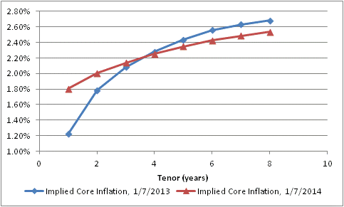 At the beginning of 2013, investors has just experienced a 1.94% rise in core prices (November to November, which is the data they would have had at the time), yet anticipated that core inflation would plunge to only 1.22% in 2013. They actually got 1.72% (as of the latest report, so still Nov/Nov). Now, investors are anticipating about 1.8% over the next 12 months – I am abstracting from some lags – but expect that inflation will ultimately not rise as much as they had feared at this time last year.
Another way to look at this change is to map the implied forward core inflation rates onto the years they would apply to. The chart below (Source: Enduring Investments) does that.
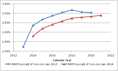 The blue line shows the market’s forecast of core inflation as of January 7th, 2013, year by year. So investors were implicitly saying that core CPI would be 1.22% in 2013, 2.36% in 2014, 2.68% in 2015, 2.87% in 2016, and so on. One year later, the forecast (in red) for 2014 has come down to 1.80%, the forecast for 2015 has declined to 2.20%, the forecast for 2016 has dropped to 2.41%, etcetera.
Has this happened because inflation surprised to the downside in 2013? Hardly. As I just noted, the market “expected” core inflation of 1.22% in 2013 and actually got 1.72%. And yet, investors are pricing higher confidence that inflation will stay low – remaining basically unchanged in 2014 before rising very slowly thereafter – and in fact won’t seriously threaten the Fed’s core mission basically ever.
As I wrote yesterday, we need to tread carefully around consensus. Now, some investors might prefer to be non-consensus by anticipating and investing for deflation in the out years, but taking the whole of the information I look at and model I think the more dangerous break with consensus would be a more-rapid and more-extreme rise in core inflation. I do not think that this economically-cold pricing environment will continue into what is essentially a monetary summer.
Which Consensuses Are Worth Fading?
A new year is upon us all, and with a five-day work week this week there is no longer any ignoring it. Markets were definitely more lubricated (and traders less so) on Monday than they were last week.
And so, as we return to full alertness, it is time to consider the recent trends and ask ourselves just what is going on. But before we do, I want to remind readers who missed the year-end series of “classics reposted” that they are worth some time to peruse if you still have time in the new year! A quick summary of those posts is here.
The only new data of the new year so far has been the ISM reports (Initial Claims was reported on January 2nd, but ‘Claims in the few weeks around year-end are so noisy that they ought to be simply ignored). The Manufacturing report came out last week, and the survey at 57.0 remains at levels similar to that of early 2011. Today’s Non-Manufacturing ISM was only 53.0, and actually closer to the lows of the last several years (see chart, source Bloomberg).
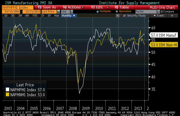
Be careful, though, how you interpret either the “strongest since early 2011” or “nearly as weak as it has been since 2010” readings. The ISM reports don’t measure activity but rather the rate of change of that activity – so higher numbers don’t indicate better growth, but more improvement in growth. Respondents are asked a question that is essentially “are things getting better or worse?” with sub-questions covering new orders, employment, and so on. So a high ISM number may mean that things are growing well, or it may mean that things were looking pretty grim but are now looking up. In either case, of course, we want to see bigger numbers but a high ISM now means more than a high ISM in 2010!
And the internals of the ISM (Manufacturing) report, which came out last week, were positive. For example, the “New Orders” component rose to 64.2, indicating good expectations of forward growth and perhaps giving some hope that the large rise in Q4 inventories may be more intentional inventory accumulation than many thought. In any event, I tend to lean more on the Manufacturing number than the non-Manufacturing number, even though the manufacturing economy is a smaller part of the economy, because there is more history to the former. I am not optimistic that economic growth will surge this year, and indeed I think the chances that we’ve seen the best growth of this cycle are not negligible. But the current readings from the ISMs are encouraging.
Less encouraging is the level of encouragement we are getting.
For example: On a new-year outlook news show last weekend, I saw one guest opine that oil is obviously going to fall further in 2014 because traders are going to see the shale oil boom, the Keystone Pipeline, etcetera and “sell, sell, sell.” Now, a good rule of thumb is that institutional oil traders aren’t hearing about those things for the first time when they hit the weekend news shows. If the news of the shale oil production and the Keystone Pipeline would make them sell…then they have already sold. That doesn’t mean that oil won’t go down, but one reason it will not go down is because of information that all of the professionals had months ago. In fact, if it is just now becoming consensus on news shows that oil could go down, then I suspect that’s a consensus worth fading.
If I had to guess at the consensus view on various asset classes, I’d surmise based on the opinions I’ve been reading and seeing that analysts generally are bullish on equities, bullish-to-neutral on credit, bearish on rates generally, bearish on commodities, bullish on economic growth, and bearish on inflation. In general, it pays well over time to fade the consensus, (although it pays better when it’s a very strong consensus but momentum is fading), so it is reasonable to ask whether the consensus views are vulnerable. So my question is, what are the odds that the consensus prognostication (whatever it is – perhaps some may disagree that these are the consensus views) is wrong on all particulars? I mean, sometimes the dragon wins. I think that it is more likely that they are wrong on all particulars than right on all particulars, but if it is some of each – and that is of course the most probable outcome – I’d say my confidence that the consensus is wrong is, from strongest confidence (most likely the consensus is wrong) to weakest (least likely the consensus is wrong) is:
Inflation (I think it will go up)
Commodities (I think they’ll go up, and downward momentum has ebbed)
Equities (I think they’ll probably go down, but upward momentum remains)
Credit (I suspect spreads will widen but I am not confident of that)
Growth (I think we have a reasonable chance of recession but I don’t see the signs yet)
Rates (they might well go up even though that’s the consensus. In fact, I am probably in the consensus)
I think the biggest question from here, investing-wise, is how the market responds to the year-end moon shot in equities. Does the parachute open or does the rocket come crashing back to earth? Or, I guess, does the rocket’s next stage fire? I am highly sensitive to the fact that a number of smart investors are extremely near-term cautious here, so I am watchfully flat and would look to sell weakness in stocks.