Archive
Beware the Hook
The bungee jumper doesn’t just bounce once.
Stated in a more high-falutin’ way, perturbed systems normally don’t converge straight back to equilibrium.
Obviously, the 2020-2021 COVID-triggered episode took the form of a severe shock to the system. The initial shock (to relitigate the familiar story for the thousandth time) was the panicky global shutdown initiated due to a fear of the unknown parameters of the virus. The counter-shock was the massive fiscal and monetary response to that shutdown. Almost all of the inflation-related problems we have had since then can be traced back to the fact that the initial shock lasted 6-9 months while the counter-shock lasted multiple years. “Can you give me a little push, Daddy?” says the child on the swing. “Sure,” says Dad, who then launches Junior screaming into orbit with a mighty shove.
It doesn’t matter if Daddy stops pushing; it’ll take a while for Junior’s oscillations to get back to zero. (The therapy sessions will last for years.) And so it is with the economy.[1] Positive momentum succumbs to gravity, which induces negative momentum, which succumbs to gravity again on the other side of the zero mark.
The Fed’s massive push shows up in the following chart (source: Bloomberg); highlighted in blue (left scale) is the sharp rise in M2 from 2020-2022. This surge – which indirectly financed the direct Federal stimulus payments – was meant to offset the various contractionary forces caused by forced idleness among the ‘non-essential’ workforce, such as the 140bln contraction in revolving consumer credit (in black, right scale).

So far, so good, although you can see that the M2 explosion lasted far longer than the damage to consumer credit and most other growth and liquidity metrics. The Fed adroitly (if belatedly) began to shrink its balance sheet slowly, leaning against the continued recovery in private markets. Inflation began to subside, and although it has happened more slowly than everyone would like it is going to continue a while further as rents gradually recede to a 3-4% rate of increase.
That does not, though, get the inflation rate to smoothly converge on the target even though that seems to be the forecast of a great majority of the economists out there who are employed in fancy glass and steel buildings by fancy institutions. Indeed, we are starting to see signs of a ‘hook’ higher in certain metrics that could presage a second wave of upside surprises in inflation. The system overcorrects: the latest news from Black Friday and Cyber Monday that sales were stronger than expected driven partly by increased popularity of ‘buy now pay later’ plans[2] is something that we perhaps should have expected. And so the combination of slow-but-constant balance-sheet shrinkage at the Fed and faster credit growth is helping to produce a gentle hook higher in money growth.

To be clear, I do not expect this ‘hook’ to produce a new high in the inflation rate, and any increase is probably not even to be enough to trigger further Fed tightening from here. But it should keep the Fed sternly standing off to the side, hands on hips, with a gaze which says plainly “stop playing on that swing. You have chores.”
The point is…and I guess this goes back to some extent to my observation back in July that the volatility of inflation is a tell that the oscillations still have a ways to go before dampening back to equilibrium…that this hook is evident in lots of measures. Recently, it has been pointed out that the year-ahead inflation expectations measure in the University of Michigan consumer sentiment survey has leapt higher despite declining gasoline prices (see chart), as consumers react negatively to the disconnect between politicians saying that prices are declining and their perceptions that prices are still increasing (even if inflation is declining).

And, since the Case-Shiller numbers were out today, I’d be remiss if I didn’t point out that y/y home prices are rising again in sharp contrast to where public forecasts of rents, home prices, and housing futures have been mooted.

The reason this matters is that it seems like the investing universe is all-in on the idea that not only has inflation crested, but it is heading right back down placidly to target. The bungee-jumper’s bounce is distinctly out-of-consensus, and it could scare some people if it is perceived as a new wave, rather than as a bounce. The housing market re-acceleration, in particular, could start to get some attention and some observers might think that means the Fed needs to hike interest rates further. The reality here isn’t as important as the inflection in the narrative. Beware the hook.
[1] Fortunately, I am an inflation therapist with a very reasonable hourly rate although I do not accept most insurance.
[2] AKA “I’ll gladly pay you Tuesday for a hamburger today.”
Thanksgiving Memories: Re-Blog of Two Goodies
Since there aren’t a lot of folks out there trading today, that also means there probably aren’t a lot of folks reading articles about markets. I could just talk about the OpenAI guy going to Microsoft and then back again (I really couldn’t care less, but it seems everyone is breathless for new episodes of the Real Housewives of Artificial Intelligence), but I thought readers would be better served by a reprise of a couple of my old articles on inflation tails.
The first one is a lightly edited re-post of “Royally Skewed,” first posted May 9, 2011. (Wow, I’ve been doing this blog for a while!) Incidentally, feel free to go to the inflationguy.blog and search for topics of interest. Sometimes you can find a nugget among the 1100 or so articles!
Royally Skewed
Although commodities do occasionally crash, in general commodity prices are positively kurtotic (fat-tailed) and positively skewed. This is in contradistinction to equity prices, which are positively kurtotic but negatively skewed. In English, that means that both stock prices and commodity prices crash more than we would expect them to if price changes were random, but while stocks tend to crash down, commodities tend to crash up.
The reason for this is simple: commodity supply curves become very inelastic (steeper) when the level of actual, current inventory is fully allocated. There are only so many soybeans available right now. But at low levels of demand and lower prices, the supply curve gets more and more elastic (flatter), which means large declines in demand don’t drop prices as sharply as large increases in demand can increase them at the other end of the curve.
The practical import of this observation is this: one must be more careful shorting commodities than shorting stocks, because while a bull market in stocks can grind you to death, a bull move in commodities can rip you to suddenly to shreds (the fact that in a limit up market there is literally no price at which you are allowed to cover, while this situation rarely exists in equities, means that market infrastructure contributes to the danger).
Skewness and kurtosis, in addition to being great cocktail-party words, are also important concepts for investors to understand. More specifically, it is important for investors to think carefully about the difference of the “higher moments” (as skewness and kurtosis are sometimes collectively called) between asset classes and particular investments. Given a choice between two investments with the same expected return and variance, a long-only investor should always choose the one with ‘fat tails’ on the upside rather than the one with ‘fat tails’ on the downside. This is true for two reasons. First, the marginal pleasure of a gain, for most investors, is lower than the marginal pain of a loss, and this is increasingly true for large gains and losses. Second, a large gain increases the bankroll, but a large loss can be a portfolio-ending experience. All of the rules about long-term investing are based on the assumption that the long term can be reached – or, as Warren Buffett has said, one “-100%” really messes up any series of portfolio returns.
Recently, in a great customer letter called “Five fallacies about inflation (and why global policy rates are too low),” Markus Heider, Jerome Saragoussi, and Francis Yared of Deutsche Bank made some very adroit observations about the risks of inflation going forward. The quick summary is that they see inflation as the greater risk than deflation because 1. The output gap is smaller than suggested by the high unemployment rate; 2. A negative output gap does not imply declining inflation [frequent readers know I harp on this a lot]; 3. EM countries are exporting inflation rather than disinflation; 4. Commodity price inflation is becoming structural and is exacerbated by low global real policy rates; and 5. Central banks’ credibility is at risk of being eroded.
But the single best part of the report, in my opinion, is the chart they created to summarize the effect of their views on the distribution of possible inflation outcomes going forward. That chart is below (reprinted with permission):

In short, the higher expected value, flatter distribution, and fat upper tail combine to make long-inflation bets worthwhile even if they are somewhat expensive right now. This is one reason that TIPS are seemingly egregiously priced. It’s all about the skew. If we don’t get inflation, we probably bounce around between 1% and 3% inflation for a while. If we do get inflation, it could get ugly. Therefore, it makes sense to give up some current return to ‘buy the tail option.’ I agree, and think their picture is truly worth a thousand words. (I still think that TIPS are too expensive for my taste even with this fact, but it is the reason I was willing to be long them when 10-year real yields were as low as 1%. It’s just a harder call at 0.65%!).
I highly recommend you contact your Deutsche Bank contact to get a copy of this report (from April 1). Honestly, while the overall state of inflation research is clearly better now than it was, just a few years ago, these guys at DB seem to me to have some of the most consistently high-quality research in the space.
The second article dovetails with that one. In this article, from December 7, 2021, I provide a guess at the value of long inflation tails. This article is cleverly titled “A Guess at the Value of Long Inflation Tails,” because “Royally Skewed” was already taken.
A Guess at the Value of Long Inflation Tails
In my last post, “You Have Not Missed It,” I promised the following:
“There is one final point that I will explain in more detail in another post. Breakevens also should embed some premium because the tails to inflation are to the upside. When you estimate the value of that tail, it’s actually fairly large.”
So, as promised, here is that explanation.
Viewing the forward inflation curve as a forecast of expected inflation (whether using “breakevens” or, more accurately, inflation swaps) is biased in a particular way. Or, at least, it should be. The “breakeven” inflation rate is the rate at which a long-only investor over the ensuing period would be roughly as well off with a nominal bond (which pays a real rate plus a premium for expected inflation) and an inflation-indexed bond (which pays a real rate, plus actual inflation realized over the period). Obviously the inflation-indexed bond is safer in real space, so arguably nominal bonds should also offer a risk premium to induce a buyer to take inflation risk.[1] Ordinarily, though, we ignore this risk and just consider breakeven inflation to be the difference between real and nominal yields. Inflation swaps are cleaner, in that if inflation is higher than the stated fixed rate, the fixed-rate payer on the swap ‘wins’ and receives a cash flow at the end, whereas if inflation turns out to be lower than the stated fixed rate, it is the fixed-rate receiver who wins. So from here on, I will talk in terms of inflation swaps, which also abstract from various bond-financing issues of the breakeven…but the reader should understand that the concept applies to other measures of expected inflation as well.
Now, suppose that you expect 10-year inflation to come in at 2% per annum. Suppose that in the inflation swap market, the 10-year rate is 2% ‘choice’ – that is, you may either buy inflation at 2% or sell inflation at 2%. Since you expect inflation to be 2%, are you indifferent about whether you should buy or sell?
The answer is no. In this case you should be much more eager to buy 2% than to sell 2%, given that your point estimate is 2%. The reason why is that the distribution of inflation outcomes is not symmetrical: you are much more likely to observe a miss far above your expectation than to observe a miss far below your expectation. Therefore, the expected value of that miss is in your favor if you buy the inflation swap (pay fixed and receive inflation) at 2%. There is, in other words, an embedded option here that means the swap market should trade above where most people expect inflation to be.
We can roughly quantify at least the order of magnitude of this effect. Consider the distribution below. This chart (Source: Enduring Investments) shows the difference, from 1956 until 2011, of 10-year inflation expectations[2] compared with subsequent 10-year actual inflation results. The blue line is at 0% – at that point, actual inflation turned out to be right where a priori expectations had it. The chart obviously only covers until 2011 since that is the last year from which we have a completed 10-year period. Recognize that I am not charting the levels of inflation, but the level of inflation relative to the original expectation.

Notice that the chart has a cluster of outcomes (and in fact, the most-probable outcomes) just to the left of zero, where expectations exceeded the actual outcome by a little bit, but that there are very few long tails to the left. However, misses to the right, where the actual outcome was above the beginning-of-period expectations, were sometimes quite large. The median point (where half of the misses are to the left, and half are to the right) is 0.21%. But this is not a symmetric distribution, so if we randomly sample points from this distribution, we find that the average of that sample is 0.59%.
So, if you buy the inflation swap at 2% when your expectations are at 2%, on average you’ll win by 59bps, at least historically. Of course, past results are no indication of future returns, and a Fed economist would argue that we have much better control of inflation now than we ever have in the past (Ha ha. I crack myself up.). And inflation volatility markets, when they can be found, don’t trade at such high implied volatilities. Noted, although the wild swings in growth and the deficit and the money supply, not to mention recent realized outcomes, might make more cynical observers question whether we should be so confident in that view right at the moment.
Moreover, a counterargument is that at the present time an investor also has the advantage of investing when expectations are fairly low, so the downside tails are not as likely. The worst outcome of that whole 1956-2011 period was an 8.75% undershoot of inflation versus expectations. This happened in the 10 years following September 1981, when expectations were for 10-year inflation of 12.70% and actual inflation was 3.95%. But with expectations at 2.50%, is it really feasible to get a -6.25% compounded inflation rate? That would imply a 50% fall in the price level (and, I should note, it would mean that investors in TIPS would win hugely in real space since they get back no worse than nominal par. But that doesn’t help the swap buyer).
To be a little more fair, then, the following chart considers only the periods where inflation expectations were 5% per annum or less at the beginning of the period. That truncates only 10% of the distribution, but as you might expect the vast majority of the truncation is on the left-hand side. This is fair because it’s naturally harder to miss far below your expectations when your expectations are very low to begin with.[3]

The value of the expected miss in this contingent view is 1.13%. So, in order for the market to be priced fairly if general expectations are for 2.5% average CPI inflation the 10-year inflation swap would have to be around 3.63%. Again, even allowing for the “policymakers are smarter now” argument (an argument quite lacking, I would argue, in empirical evidence) I would feel comfortable saying that 10-year inflation swaps, and breakevens, should embed at least a 50bps or so ‘option premium’ relative to expectations.
I don’t believe that they do. Indeed, consider that the buyer of 10-year TIPS (with breakevens at 2.50%) not only wins if 10-year inflation is above 2.50% but the average win historically (conditioned on breakevens being below 5% to start, and by construction only considering wins) has been about 2.07% per annum – a massive outperformance. Not only that, but any losses are essentially guaranteed to be small because the tails on the left-hand side are truncated: if inflation is negative (that is, if the loss would have been greater than 2.50%) it is limited by the fact that the Treasury guarantees the nominal principal.
As an aside, we do consider this sort of option in other contexts. In the Eurodollar futures market, for example, we recognize that the person who is short the Eurodollar contract (and therefore gets a positive mark-to-market when interest rates rise) is in a better situation than the long (who gets the positive mark-to-market when interest rates fall), because the short gets to invest wins at higher interest rates and borrow losses at lower interest rates, while the long must borrow to cover losses when interest rates are higher, and but gets to invest wins when interest rates are lower. As a result, Eurodollar futures trade lower than the forwards implied from the swap curve, since the buyer needs to be induced by a better-than-expected price. And there are other such examples. But I am pretty sure I have never seen an example of an embedded option like this that is priced so differently relative to history than the embedded options in the inflation market!
[1] However, since this risk is symmetric – the seller of the bond also has risk in real space, but in the opposite direction – it isn’t immediately obvious why one side should get an inducement over the other. So I will leave the ‘risk premium’ aside.
[2] For long-term inflation expectations back before the advent of TIPS, I used the Enduring model relating real yields to nominal yields, about which I’ve written previously. You can find a brief discussion of this and an illustration of the model at this link: https://inflationguy.blog/2016/12/23/a-very-long-history-of-real-interest-rates/
[3] The author’s wife has been known to make something like this observation from time to time.
Summary of My Post-CPI Tweets (Oct 2023)
Below is a summary of my post-CPI tweets. You can follow me on X at @inflation_guy. Sign up for email updates to my occasional articles here. Individual and institutional investors, issuers and risk managers with interests in this area be sure to stop by Enduring Investments! Check out the Inflation Guy podcast!
- Welcome to the #CPI #inflation walkup for November (October’s figure). This is the next-to-last month I will be doing this!
- If you miss the live tweets, you can find a summary later at https://inflationguy.blog and I will podcast a summary at inflationguy.podbean.com . Those will continue in 2024 after the live tweeting stops.
- Well, this report ought to be interesting. My forecasts are very different from the other forecasts out there. The Bloomberg consensus has +0.09% on SA headline, and 0.30% on core. The swap market, Kalshi, and Cleveland Fed are all in the same ballpark.

- I have 0.14% NSA, roughly 0.22% on headline, and 0.38% on core.
- It is a little wild to me that everyone else is so low, and it makes me concerned that I’m missing something. But I think it comes down to the fact that everyone must be expecting a big give-back on OER this month.
- Used car prices should add this month. Health care insurance pivots from an 0.04% drag to an 0.02% add. Even airfares could rise, despite sliding jet fuel, because fares are too low given the level of fuel.
- All of those are in my forecast (well, I conceded flat on airfares but it could go either way). I assume they’re in everyone’s forecast. So that leads me to believe that the assumption is a correction in OER is in store.
- OK, I see the chart too. It sure LOOKS like OER did something weird last month. If OER prints 0.45% m/m instead of 0.55%, then that takes 2.5bps off my forecast. That still doesn’t get there. You need an 0.35% or something.

- And oh by the way, I’d argue that the jump might just be payback for a too-rapid fall that happened earlier this year. There was no reason to expect monthlies to drop from 0.7% m/m in Feb to 0.48% in March. Rents are not collapsing and home prices are now going back up.
- I know that’s inconvenient to the deflation story but it’s right on par with where my model says it should be. (Our model is Primary Rents but OER is based on rents).

- So okay, I’ll drop my forecast 2.5bps on the assumption we go back to 0.45% m/m for OER. Now ya happy?!? But I’m not assuming any ‘payback’.

- Meanwhile, I haven’t even talked about the fact that I have +1% on Used Cars, but that might be too conservative given how strong auctions were in the latter part of September (not picked up in the last number).
- And I don’t have anything for New Cars – but thanks to the new wage agreement, car prices both New and Used are going to go up again.
- I’ve already spoken plenty about the reversal in Health Insurance; it shouldn’t take anyone by surprise this year.
- The change in method means that the shift from -0.04% to +0.02% per month should only last six months – it shortens the lag but this transition period increases the effect to synchronize.
- With all this, Core CPI should stay at 4.1% y/y, or rise (if my forecast is on point). As I said last month, getting it below 4% is going to be more of a challenge. And Median inflation will fall to probably around 5.25% this month, but again we’re in the hard part now.
- Breakevens have net slumped a bit this month, but that hides the fact that after last month’s CPI they spiked for a week or so. 10y breaks got to 2.50% in the bond market selloff before settling back.

- If the bond bear market continues (and the balance of large government budget deficits, smaller trade deficits, and a Fed in run-off means more pressure on rates to attract domestic savers), breakevens will go back up.
- Not sure that’s a good play in Q4, since this tends to be a good seasonal time for bonds, but a bad CPI could change that. And, naturally, with a recession coming (we think?) it’ll be harder to get higher rates immediately.
- However…the secular bull market in bonds is over so the real question is whether interest rates are aimless for a decade, or in a secular bear market. Too long a topic for a tweet storm!
- So that’s it for the walkup. Pretty simple task today: 1. check OER, 2. check core ex-housing, 3. check core services ex-housing (“supercore” for a finer read on the Fed (?))
- Keep checking the improving distribution of inflation – core below median means the tails are moving to the downside, in a disinflationary signature, but not sure that will outlast 2024.
- Good luck!
- Very soft number! Let’s see how much of this is ‘payback.’
- If it’s CPI day there must be I.T. issues. It’s a law. Headline was +0.045%, Core +0.227%. Used cars was a DRAG, which is completely at odds with surveys. OER dropped to 0.41% m/m, but that by itself wouldn’t be enough for the downside surprise.
- Airfares fell, Lodging away from home fell significantly, New Cars was a marginal decline…and health insurance didn’t add as much as it was supposed to (not sure why) although it was positive. Looks like a well-rounded soft number.
- Here is m/m OER. Back to prior level, but no payback.

- In the big picture, the 3-month average isn’t all that soothing, especially when we look at Used Cars and other quirks that will likely be repaid.

- So Black Book was -1.85% in September, NSA CPI Used Cars was -5.63%. BB was +1.07% in October, NSA CPI Used Cars was -1.40%. Private auctions were strong. This is confounding – might be a seasonal quirk that BLS reflects different seasonals, but the NSA pretty far off.
- m/m CPI: 0.0449% m/m Core CPI: 0.227%
- Last 12 core CPI figures

- M/M, Y/Y, and prior Y/Y for 8 major subgroups

- Primary Rents: 7.18% y/y OER: 6.85% y/y

- Further: Primary Rents 0.5% M/M, 7.18% Y/Y (7.41% last) OER 0.41% M/M, 6.85% Y/Y (7.08% last) Lodging Away From Home -2.5% M/M, 1.2% Y/Y (7.3% last)
- Some ‘COVID’ Categories: Airfares -0.91% M/M (0.28% Last) Lodging Away from Home -2.45% M/M (3.65% Last) Used Cars/Trucks -0.8% M/M (-2.53% Last) New Cars/Trucks -0.09% M/M (0.3% Last)
- Here is my early and automated guess at Median CPI for this month: 0.359%

- Now, this is really the important thing. Median is still 0.36%. That tells you this is left-tail stuff more than the rents stuff.
- Piece 1: Food & Energy: 0.17% y/y

- Food at Home was +0.26% SA; Food Away from Home +0.37%. Food added 0.04% to headline, which was right on my forecast. Look, talk to any restaurateur – wages are still a big problem. Food AFH isn’t going to deflate soon.
- Energy was -0.22% m/m NSA; I’d estimated -0.17% so it was very slightly more drag.
- Piece 2: Core Commodities: 0.0948% y/y

- Piece 3: Core Services less Rent of Shelter: 3.71% y/y

- Piece 4: Rent of Shelter: 6.76% y/y

- Core Goods: 0.0948% y/y Core Services: 5.5% y/y

- Core goods actually ticked up slightly. Despite the decline in Used and New cars.
- This is part of the core goods story – continued acceleration in Medicinal Drugs. Honestly this is something we’ve been expecting for a long time and just surprised how long it has taken. Many of the APIs for pharma come from China.

- Core ex-housing actually ticked up very slightly from 1.97% y/y to 2.05% y/y. That sounds great but prior to COVID it hadn’t been above 2% since 2012 so that’s still too high.
- Largest declines (annualized m/m) in core were Lodging Away From Home (which is quite surprising) at -26% and Car and Truck Rental (also surprising) at -17%. Both core services but only the latter is “supercore”.
- Largest advances Motor Vehicle Insurance +26%, Tobacco +25%, Jewelry and Watches +16%.
- I am probably not going to be exactly right on median because in my calculation the median category is Northeast Urban OER, which means we’re relying on my ad-hoc seasonal adjustment. Could be as low as 0.32% m/m, or a smidge higher. Either way, it’s not price stability.
- I guess on Health Insurance I’ll have to leave the explanation to someone with a pointier pencil. My calculations had the effect being about 2bps/month; this month is was about 0.8bps. I would call that negligible except that previously it had been a 4bps drag.
- Our housing model, updated with the latest data. Kinda right on par. But notice our model never gets anywhere close to deflation in housing. Those calling for such are going to be disappointed.

- This is a strange dichotomy and I wonder if some physician can explain it. Maybe doctors are making their money by channeling expensive services through hospitals. But it’s weird to see hospital inflation so buoyant while doctors’ services are deflating.


- Education and Communication was a little soft. Some of that was a curious (to me) -0.24% NSA m/m decline in College tuition and fees. Probably a quirk. Also Telephone hardware was -1.9% m/m.
- Apparel was soft – partly this is expected because of the lagged strength of the dollar on core goods, but the -5.1% decline in Women’s outerwear seems unusual.
- The EI Inflation Diffusion Index is back almost to flat. Note that doesn’t mean 0 inflation. To get back to persistently having Median CPI around 2-3%, you’d want to see the diffusion index quite a bit negative. I think that’s going to be difficult.

- Last chart, and it tells the story. Left tail is growing, but rest of the distribution is moving left only reluctantly. The big fingers on the right are housing. It’s encouraging that there is more diversity here – a sign that the money impulse that affects everything is waning.

- Here is today’s summary. Core was surprisingly tame but it was largely from some quirky one-offs. Median didn’t improve very much. Neither Core nor Median over the last 3 months is where the Fed wants it. This doesn’t change, therefore, the higher-for-longer meme.
- It also doesn’t demand further tightening, but that’s not news. We already knew the Fed was done.
- Looking ahead, there will be further slow progress on housing, although as I keep saying – not as much as some forecasters think. The problem is that outside of housing, core inflation doesn’t look like it wants to fall much further.
- Naturally all of this depends on what the Fed does going forward. If the money supply keeps bumping along around zero growth, then eventually the velocity rebound will run its course and inflation will go back to 2-3%.
- But higher rates mean that velocity is probably going to do more than just rebound, so higher for longer will need to be longer than people expect – or, possibly, than the Fed can maintain in the face of recession.
- That’s the hard part. This so far has been the easy part. If market rates rise again in sloppy fashion after the new year, despite recession signs…what does the Fed do? Inflation won’t be at target yet, or even close. Stay tuned!
- …and thanks for staying tuned. Have a good day.
The CPI was a happy surprise today, but not so much that I would throw a party. The low miss was partly caused by inexplicable declines in autos and lodging away from home, while the correction in rents basically just went back to the prior level rather than stepping down to a slower pace. Rents are still going to come down, and in some places in the country they are falling – but in some places they are still rising briskly.
That dispersion in experienced rental inflation is actually part of the good news, and it’s good news that we see throughout the CPI over the last several months. It’s the good news that the Enduring Investments Inflation Diffusion Index is capturing: all prices are not moving as one, as they mostly did during the upswing in inflation. A high correlation between unrelated categories tends to suggest a common impulse is causing the movement – and is yet another reason that the notion that inflation was coming from various idiosyncratic supply chain issues should never have been entertained. There was clearly a large impulse acting on all prices: the 20%+ spike in money growth. Now that the money supply is flat, though velocity is rebounding, price dispersion is reasserting.
(Spoiler alert: it isn’t yet happening on the inter-country experience – all countries saw their inflation move in synchrony when it went up, and all are seeing it move in synchrony coming down, so it’s early to say the battle is won.)
We’re still just starting the difficult part, from the standpoint of monetary policy but also from the standpoint of figuring out how quickly inflation can get tamped back down to target. And the dispersion makes that more difficult, because the signal gets lost in the noise – just as it used to, before the money gusher. Next month we’ll have to deal with likely rebounds in Lodging Away from Home as well as increases in autos, reversing this month’s surprises, but we’ll probably get slightly better rent numbers.
What I can say is that the market reaction to all of this is absurd. This just doesn’t move the needle on the Fed. There was no tightening and no easing in the pipeline before this number, and after this number that hasn’t changed an iota. But at this hour stocks are +2% and bonds are soaring. I know the conventional wisdom is that rates are going back to zero…it just seems kind of early to get on that train when median inflation is still 5.3%…
Where Inflation Stands in the Cycle
It’s important, I think, that I occasionally remind readers of a fact that is supported by overwhelming quantitative evidence, and yet virtually ignored by a wide majority of economists (and central bankers): inflation is a consequence of the stock of money growing faster than real economic growth. Period.
MV=PQ
That doesn’t mean that forecasting inflation is easy if we remember that fact, but at least we can make good directional predictions when, say, the stock of money rises 25% in a year, instead of mouthing some nonsense about inflation in such a case being “transitory.”
However, I realize that when someone mentions that equation a lot of people tune out, thinking this has become a religious argument between monetarists and Keynesians. So let me toss out some data. Keep in mind, there is measurement error in statistics for the money supply, real GDP (especially), and prices. And, as I’ve written before, sharp changes in M can cause a short-term impact on velocity until Q and P can catch up – my ‘trailer attached by a spring’ analogy. But over time, a shock move in velocity becomes less important (and reverses, which is what we are in the middle of), and so we would expect by simple algebra to see that a good prediction of the change in the price level is given by M/Q. Is it?
First let me share one of my favorite charts from a Federal Reserve Economic Review.[1] I’ve been using this for years.

This is over 5-year periods, and you can see that there’s a pretty good correlation – especially for large changes – in the change in the ratio of money/income and the change in prices. (By the way, the original article is still worth reading).
Here is another chart from that note, updated by me through the end of 2022.
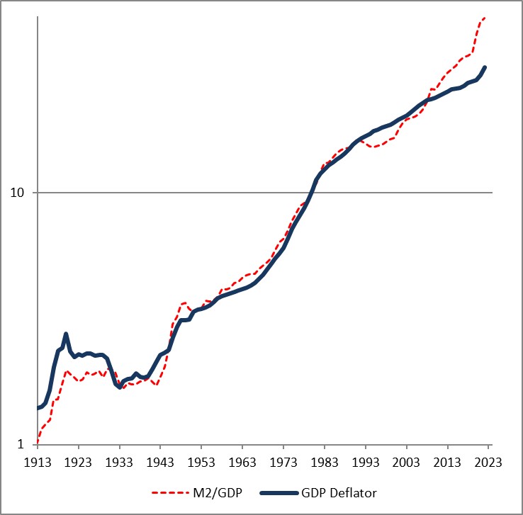
The fact that the price level has gone up a little bit less than the ratio of money to GDP over time is a reflection of the fact that money velocity has gone down slightly, and then more quickly, over the last 110 years. If you think velocity will fully revert, then the blue line will eventually converge with the red line – but in my mind there’s no reason to believe that velocity is stable or entirely mean-reverting over time…only that it doesn’t permanently trend higher or lower like money, prices, and GDP do.
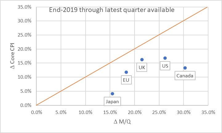
Obviously, this leads us to the question of where we are now. Here is a chart of the change in headline prices (CPI) as a function of the change in M/Q for five countries/regions.
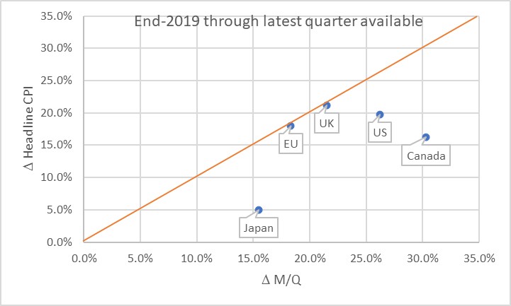
The chart basically says that the UK and EU have seen prices move almost exactly what you would have predicted, if you could have known in advance what M and Q were going to do. Naturally, none of us knew that. Japan, the US, and Canada haven’t seen prices rise as much as you would have expected, yet. Some of the reason why not is the effect I mentioned earlier: the dump of money into accounts during COVID was so fast that there was no time for prices to adjust. Actually, it’s only this close because food and energy adjust more rapidly…if you look at the picture with just core inflation, it appears there’s still some lifting to do to get back to the 45-degree line. As energy prices and food prices mean-revert some, core inflation should stay a little bubbly for a while.
Now, there’s three ways to get back to the line. We can see prices rise. We can see GDP rise. Or we can see the money supply fall. The latter two effects are better for consumers. The “GDP rises” is the best for everyone, although that’s the slowest-moving of the pieces. The “money supply fall” option is the best for consumers, but the worst for investors. Presently, we’re seeing a little bit of all three. But here is where I should take a moment to highlight how important the Fed’s balance sheet reduction has been in this process. Here is a chart from 2019Q4 to the present, just for the US, showing how this relationship developed over time.
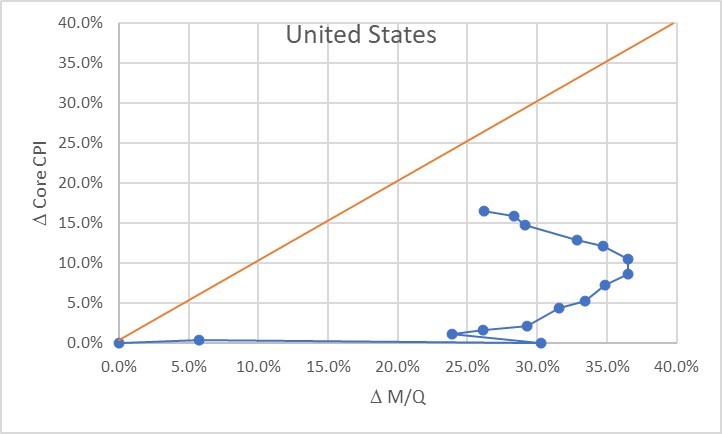
Initially, of course, there was a massive increase in money with no change in prices, as COVID hit in 2020. The point at (30%, 0%) is what the Fed had to work with as the lockdowns began to be lifted in late summer 2020. The sharp single-quarter reversal there was the result of the massive GDP spike in 2020Q3.
At that point, we would have anticipated that if nothing else happened, we would see a gradual 23% or so increase in the price level. If the Fed had immediately pulled back on the money printing, probably a lot less. Instead, the money printing continued for quite a while until by the middle of 2022 we were looking at a change in M/Q of about 37% since the end of 2019. Right about that time, the Fed got alarmed and began to shrink the balance sheet (and hike rates, although you will notice that the price of money does not show up on this chart but only its quantity!) That, combined with some decent growth, has decreased the pent-up pressure on prices. As of the end of 2023Q3, the aggregate M/Q change was 26.2%, while core prices had risen 16.4% (headline prices, including a 33% increase in energy and a 25% increase in food prices, are up 19.5% since the end of 2019).
If the money supply grows only at the rate of GDP from here, then this line will turn vertical and we have about a 10% increase in core inflation to ‘make up’ before we are back on the line. The good news is that the Fed currently is still reducing its balance sheet; the bad news is that M2 since April has stopped declining. More bad news is that GDP is likely to be soft or even negative here over the next few quarters, judging from payrolls, delinquencies, and other data. We could also hold out hope that velocity won’t fully rebound to pre-COVID levels, but there’s no reason other than “it sure would be nice if that happened” to expect that. Ergo, I think we’re still looking at higher-for-longer not just in the interest rate structure, but in the trajectory of inflation.
The most astonishing point on the charts above, in my mind, is the Japan point especially on the first chart. The amazing part isn’t that Japan’s inflation rate is lower than that of other countries here. They’ve added less money, so as a first pass you’d expect less inflation. But what’s amazing is that the Yen is also an absolute basket case, which means that imports – like, say, oil or gasoline – have gone up a lot more in price than for other countries. Crude oil in USD has risen about 22% in USD terms since the end of 2019. It’s up 66% in Yen terms! And yet, even with that Japanese inflation has stayed relatively low. So far. These charts tell me that I’d want to buy Japanese inflation and sell EU and UK inflation, where prices are closer to already reflecting the effect of the money geyser than they are in Japan.
[1] “Are Money Growth and Inflation Still Related?”, Economic Review, Federal Reserve Board of Atlanta, 2nd Quarter, 1999. https://www.atlantafed.org/-/media/documents/research/publications/economic-review/1999/q2/vol84no2_dwyer-hafer.pdf
Money Velocity Update!
Now that we have our first estimate of GDP for Q3, we also have our first estimate of M2 velocity for the third quarter. Because there is an amazing amount of uninformed hypothesis out there, I figured it was worth a quick review of where we are and where we’re going, and why it matters.
Why it matters: without the rebound in velocity, the slow-but-steady decline in M2 that we have experienced since mid-2022 would be outright deflationary. The money decline and the velocity re-acceleration are part and parcel of the same event, and that is the geyser of money that was squirted into the economy during COVID. Velocity collapsed for mostly mechanical reasons: it is a plug number in MVºPQ, and since prices do not instantly adjust to the new money supply float, velocity must decline to balance the equation. Another way of looking at it is that if you add money to people’s accounts faster than they can spend it then velocity will decline. I have previously presented an analogy that in this unique circumstance money velocity behaves as if it were a spring connecting a car, speeding away suddenly, with a trailer that has some inertia. Initially the spring absorbs the potential energy, and later provides it to the trailer as it catches up. Ultimately, the spring returns to its original length, when the car has stopped accelerating and the trailer is going at the same speed.
As M2 has declined in an unprecedented way, after surging in an unprecedented way, velocity has rebounded in an unprecedented way after plunging in an unprecedented way. All of these things are connected, episodically (but we will look at the underlying, lasting dynamics in a bit). With this latest GDP update, M2 velocity rose 1.9%, the 9th largest quarterly jump since 1970. Over the last four quarters, it has risen 10.4%, the largest on record, and 16% over eight quarters, also the largest on record.

https://fred.stlouisfed.org/series/M2V
To return to the level M2 Velocity was at, at the end of 2020Q1, it needs to rise another 4.8%. For M2 to return to the level it was at, at the end of 2020Q1, it needs to fall another 23%. One of these is likely to happen; the other one is not. The net difference, after subtracting cumulative growth (8.8% since then, so far), is a permanent increase in the price level. If M2 continues to come down, the net effect is a higher level of inflation over this period but not calamitous.
Note that there is no way we get the price level back to where it was, unless M2 declines considerably farther for considerably longer, or unless money velocity inexplicably turns around and dives again. I know that some well-known bond bull portfolio managers have been calling for that, but they were wrong the whole way along so why would you listen to them now?
I’ve been pretty clear that (a) I have been surprised that the Fed was successful in decreasing the money supply, since I thought the elasticity of loan supply would be more than the elasticity of loan demand (I was wrong), (b) I think the Fed deserves credit for shrinking the balance sheet, which they have long said doesn’t matter (it matters far more than interest rates, for inflation), (c) Powell deserves credit for turning into a hawk and pushing the institution of the Federal Reserve to become hawkish after decades under Greenspan, Bernanke, and Yellen where the only question being asked was ‘do we wait for the stock market to drop 10%, or only 5%, before we flood the system with money?’ Chairman Powell deservedly will go down in history as the guy who recognized the ‘spring effect’ that kept long-term upward pressure on inflation even as so many people were chirping about supply constraints and ‘transitory inflation’ (including, to be fair, Powell himself. But whatever he said, what he did was pretty reasonable).
However, the next bit is going to be challenging.
Velocity, being the inverse of the demand for real cash balances, is primarily affected by two main forces – one of them durable and one of them ephemeral. The ephemeral effect, which is rarely super-important, is that people tend to want to hold more cash when they are uncertain. Indeed, our model for velocity actually captured accidentally some of the ‘spring effect’ because for us it showed up as extreme uncertainty. Put another way, even if the Fed hadn’t flushed tons of money into the system, velocity would have had something of a sharp decline because of the high degree of economic uncertainty. Ergo, it was crucial that they flush in at least some money because otherwise we would have had outright deflation. They didn’t get the magnitude right, but they got the sign right. Anyway, the ‘uncertainty’ effect doesn’t last forever. The measure of uncertainty I use is a news-based index of economic policy uncertainty; it has retraced about 85% of its spike although it has been persistently high since political divisiveness became the main fact of US political life back in 2009 or so.

The more durable effect on the desire to hold cash is the presence of better-yielding alternatives to cash. When interest rates are uniformly zero and the stock market is on the moon, there’s very little reason to not hold cash. But when non-cash rates are high, and stocks and other investments more reasonably priced, cash is a wasting asset that people want to ‘put to work.’ The easiest way to see that is with interest rates, which for the last couple of decades have tracked the decline in money velocity closely as both declined.
And here is the problem. If interest rates are back at 2007 levels, then naïvely we would expect velocity to be back in the vicinity of 2007 levels also. But that is massively higher than the current level. In 2007, money velocity was around 1.98 or so: about 49% higher than the current level!

Needless to say, there’s no way the money supply is contracting that much. If velocity rose even, say, 30% then we would have a serious and long-lasting inflation problem. Fortunately, because of the economic policy uncertainty and other non-interest rate effects (I did say that “naïvely” we would be looking for 1.98, right?), the eventual rise in velocity beyond the snap-back level is much less than that. It actually only adds about 6% to the snap-back level. That still means 2% more inflation than would otherwise be expected, for three years, or 3% more for two years.

Of course, interest rates could fall again and ‘fix’ that problem. But it’s hard to see that happening while the money supply continues to contract, isn’t it? And that’s where it gets difficult. If you continue to decrease the balance sheet – which you need to do – and money continues to contract, then you probably get more velocity and inflation stays higher than you expect. Or, if you drop interest rates then you don’t get velocity much over the pre-COVID level, but you also get more money growth and inflation stays higher than you expect.
All of which adds up to one reason why I continue to think that inflation will stay sticky and higher than we want it, for a while. Powell has surprised me before, though, and this would be a good time to do it again.