Archive
Why the Fed Doesn’t Fear Inflation, But You Do
The core PCE deflator for March recorded a near-record 1.1%. Should we worry that deflation is taking hold?
Well, first of all you should recognize that the PCE, unlike the CPI, is frequently revised and by significant amounts. As the chart below shows, this is only a near-record because there was a massive revision that raised the 2010 low from 0.7% or so to 1.1%. We should be wary, in my opinion, to draw any strong conclusions from (and certainly wary of implementing policy based on) a data series that can have the rate of change revised by 60%.

But still, core PCE is near its lows while core CPI is not. Should we be concerned about deflation? Should the Fed?
There are a number of reasons for the difference. A persistent difference of about 0.25%-0.5% is consistent with differences in the type of formula used and other “normal” differences. The Fed favors the PCE because it has a broader representation of the economy – in that it doesn’t focus “just” on consumers – and because it adjusts more quickly as the composition of spending changes. However, if you are looking at how the costs to you the consumer change, the CPI is the index that you should be looking at.
The main reason that core PCE is currently so much lower than core CPI is that PCE has a much lower weight on housing. And, thanks to the Fed’s loose money policy, it is housing that is driving the CPI higher. The difference in housing weights currently adds 0.31% to CPI compared to PCE. The PCE makes up for this low weight in housing by having a much higher weight on medical care (about three times the CPI weight). Why the huge difference in the medical care weight?
The CPI and PCE metrics are meant to measure different things – the PCE is broader, but the CPI measures specifically expenditures by consumers. Consequently, the difference in medical care weights occurs because the CPI measures spending by consumers, while the PCE includes spending by Medicare, Medicaid, other government entities, the employer portion of health insurance, and other non-consumer payers. Which do you think is more relevant for consumers? And which do you think is a better representation of what a typical consumer spends: 42% on housing and 6% on medical care, or 26% on housing and 22% on medical care? In simple terms, do you spend more for your house, or do you spend about equal amounts on both? I suspect that for most Americans, especially those who are employed and those who are currently receiving Medicare, spending on housing is vastly higher than direct spending on medical care.
Isn’t it convenient for the Fed that right now, they can focus on a metric that is pointedly underweighting the category of expenditure that is most directly being affected by quantitative easing? This is one reason that I do not expect QE to stop any time this year.
Telling Stories About TIPS
It always bugs me a bit when a market event that happens for one cause is attributed to another cause merely to advance an easy narrative. The awful 5y TIPS auction yesterday and subsequent flush of TIPS breakevens is being attributed to a “fading of inflation concerns.” There may be some fading of inflation concerns, although as I demonstrated in my last article expectations for core inflation haven’t been fading.
But the main reasons the auction failed were far simpler. Prime among these is that the 5-year TIPS have always had more problems being sold, because people who want inflation protection tend to primarily want long inflation protection. In the last couple of years, I’ve had discussions with many institutional investors who expressed interest when I discussed a 50-year inflation-linked bond. But the 5y TIPS are mainly of interest to (a) indexers and (b) foreign central banks. As such, they are prone to occasional disasters when the central banks don’t show up, dealer risk-taking appetite is low, and market momentum is such that dealers don’t feel like warehousing the auction risk until the indexes are rebalanced at month-end and the indexers come for the paper. This isn’t to say that I expected this to be a bad auction, because the last few auctions of all kinds have been pretty normal (that is, more like normal Treasury auctions than like TIPS auctions of old). But it’s not surprising to me that it happened. And it has nothing to do with inflation fears fading, except that some buyers perhaps figured they could buy at better levels later because of the market narrative about inflation fears fading.
And today, we’re seeing a big bounce-back in breakevens so far. What does that do to the narrative?
(As an aside, and for disclosure, our Fisher model identified TIPS as exceptionally cheap compared with nominal bonds after the auction and went fully long breakevens on the close.)
Why Inflation Futures Matter
The Chicago Mercantile Exchange (CME) is currently having discussions with market participants and is considering launching in 2013 two new futures contracts related to inflation: a Consumer Price Index (CPI) futures contract and a deliverable TIPS futures contract. My company has been an advocate for these contracts and involved in their construction. We expect to be involved in making markets in them. Our interest is therefore no doubt obvious. But are these contracts important, in a larger sense, for the market? The answer is yes, and here is why.
It is a fact of financial life that most mature markets enjoy three legs of a liquidity ecosystem: cash markets, over-the-counter (OTC) derivatives, and exchange-traded derivatives. For example, in the nominal interest rates market Treasuries provide a deep and liquid cash market, there is a large and well-functioning market for LIBOR swaps, and there is efficient and transparent pricing in the futures markets as represented by Bond, Note, 5-year Note, 2-year Note, UltraBond, and Eurodollar contracts.
The presence of three legs, rather than only one or two, in this ecosystem is important. With two legs, there are only two directions of liquidity transmission: A to B and B to A. But with three legs, there are six ways that liquidity can be transferred: A to B, A to C, B to A, B to C, C to A and C to B. By adding the third leg, the avenues of liquidity transmission aren’t increased 50%, but threefold.
This richer liquidity ecosystem matters the most in crisis situations, such as during the credit crisis of 2008. Consider that during the crisis, credit and inflation markets became quite illiquid at times while equities, nominal rates, and commodities remained (comparatively) liquid. The main difference between these two sets is that the latter three markets all have cash, OTC, and exchange-traded instruments while the former two have only two (in both cases, cash and OTC derivatives).
Accordingly, while the inflation-linked bond market has become truly huge (see chart below, source Barclays Capital) and the inflation-linked swap market has enjoyed an almost uninterrupted rise in volumes since 2006, investors need the third component of the ecosystem: exchange-traded futures contracts on inflation and/or real rates. It is interesting to note that one analysis of the original CPI futures contract traded on the CSCE (many years ago) suggested that a prime cause of the contract’s failing was that “…the CPI futures market, unlike other futures markets, has no underlying asset which is storable or traded on an active spot market, which reduces the opportunities for arbitrageurs and speculators to participate in the market.” (Horrigan, B. R., “The CPI Futures Market: The Inflation Hedge That Won’t Grow”, Federal Reserve Bank of Philadelphia Business Review , May/June 1987, 3-14).

Adding these products will likely increase the volumes and the liquidity of all inflation products, including (perhaps especially) the liquidity of off-the-run TIPS. This liquidity will also remove the main lingering concern among those investors who have not yet made meaningful investments in the market.
Inflation-related futures are not a new idea. Since at least the 1970s, economists have anticipated that these instruments would one day be available. Several previous attempts, dating back to as early as the mid-1980s, have failed for various reasons – too early, too different, bad structure. But futures that present a different method of investing in, trading, or hedging inflation and real rate exposures are needed, not only because they create opportunities to make different sorts of trades or to trade more efficiently but also for the good of the market itself. Healthy markets in CPI futures and TIPS futures will create a better liquidity ecosystem for the entire inflation market, including for off-the-run TIPS bonds and seasoned inflation swaps.
Unfortunately, at the moment the CME appears to be afraid of launching new products that might not immediately work. It wasn’t always that way – once, a CME official told me that since it cost them virtually nothing to list a contract, they favored launching lots of them and seeing what the market took to. This has changed, and the pendulum has swung in the opposite direction. Now, although many market participants are asking for these futures and there are market-makers willing to make markets, the CME is deferring a decision on them until later in the year. I remain hopeful that they will launch, because they are sorely needed.
Short But Sour
A slow Monday, and the S&P could barely manage a +0.3% rally. That’s tantamount to a selloff, these days, as the all-time nominal highs are a mere 20 points away. I’m not joking: with stocks up 9.1% on the year, the S&P is averaging +0.19% per day, which means the all-time highs ought to be reached by next Wednesday.
Meanwhile, our measure of valuation for equities has reached levels not seen since July of 2011. The expected compounded after-inflation return for the S&P 500, inclusive of dividends, is just 2.00% (it got to 1.81% in July 2011 – and, for the record, it stood at 0.83% at the end of 2006).
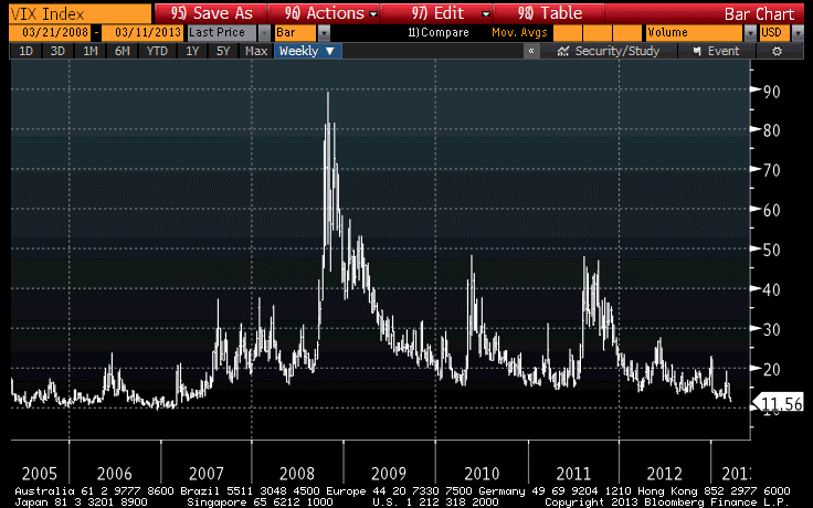
The VIX tumbled today to the lowest level since April of 2007 (see chart, source Bloomberg), two weeks after Fed Chairman Bernanke told Congress that the “subprime crisis” was likely to stay “contained” (which it did, in roughly the same sense that the universe itself has a boundary).
Now, I don’t want to follow the usual course and list all of the things we could be worrying about (Italy, Cyprus, France, Iran, North Korea…) to somehow argue that prices are too high. After all, there’s always something to worry about. No, that’s not my argument at all. My argument is that prices are too high regardless of what the news is.
Over the next ten years, compounded real returns after inflation will likely be in the neighborhood of 2% per annum. They could reach 5% per annum, but they could be -3% per annum with equal probability. Note that these are real returns I am speaking of, so there is no reason stocks can’t continue to reach new nominal highs especially if consumer prices continue to accelerate.
(And here’s an odd fact: while equity market volumes over the last few years have been shrinking persistently, the gap between 2012 and 2013 has been narrowing over the last month and a half. That is, volumes are still running about 78mm shares/day below the year-to-date pace in 2012, but at the end of January that figure was 113mm shares/day. So volume is still shrinking, but no longer monotonically.)
So I’m not sure when we are going to get a significant correction on the order of late 2011 (~20%), but we are overdue. Frankly, if I thought the correction was likely to be no more than 20%, I probably wouldn’t even be particularly concerned, because 10% and 20% corrections happen in healthy markets. But I can’t discount the possibility of a 2000-2002 or 2007-2008 sort of decline. The conditions are “right” for just such an occurrence, unfortunately.
Unemployment and Initial Claims – A Quick Chart
It was a pretty quiet day today, so instead of writing about the fairly boring market action (although AAPL broke below $500 for a few minutes and TIPS continued their recent bounce) I wrote a book report about the book How the Trading Floor Really Works. However, because people have requested that I separate obviously unrelated posts, you can find that review here.
There is one chart I would like to share – sort of a holdover from last week that I never got around to. It shows the unemployment rate (white line) against Initial Unemployment Claims (yellow line) for the last couple of cycles. (Source: Bloomberg)

So, do you think the job market is improving? You’re right! Does the job market still suck? You betcha!
There is also something different going on here, beyond the usual year-end seasonal adjustment tomfoolery. The decline in Initial Claims typically happens when the economy has stopped getting worse, and the current level is consistent with an economy that is turning jobs over at roughly the normal pace. We’re not creating lots more unemployed. But the slow decline in the Unemployment Rate is a sign that we’re not absorbing the existing unemployed through new growth of existing enterprises, or creation of new enterprises, as is typical in recoveries. I don’t think it should come as an absolute shock that in this business-unfriendly climate, businesses are reticent to expand, even if production as a whole is expanding.
Were the FOMC Minutes Really That Hawkish?
I suppose I need to say something quickly about the FOMC minutes which were released yesterday, because the markets are seemingly gyrating on a “surprisingly hawkish” reading of them. The dollar is rising strongly, and part of the reason that equities slid in the afternoon yesterday was that it was perceived the Fed wouldn’t be endlessly doing QE.
The “surprisingly hawkish” part allegedly comes from this quote:
In considering the outlook for the labor market and the broader economy, a few members expressed the view that ongoing asset purchases would likely be warranted until about the end of 2013, while a few others emphasized the need for considerable policy accommodation but did not state a specific time frame or total for purchases. Several others thought that it would probably be appropriate to slow or to stop purchases well before the end of 2013, citing concerns about financial stability or the size of the balance sheet. One member viewed any additional purchases as unwarranted.
Various reports today focused entirely on this phrase. Bloomberg, for example, said “Fed board members said they will probably end their $85 billion monthly bond purchases, known as quantitative easing, in 2013, according to minutes of their Dec. 11-12 meeting released yesterday.” Of course, they said nothing of the kind. This paragraph followed an extensive discussion about “several persistent headwinds” including the likelihood of tighter fiscal policy, and “[t]he staff viewed…the risks as skewed to the downside.” There is far more negative in these minutes than there is positive. This illustrates the danger of taking a single quote out of context.
But what is even more important is this: the Evans Rule is now parameterized. The statement about when officials think that QE will end is simply a statement about when they think the parameters will be realized. But who cares? Private forecasters are no worse than Fed forecasters! Personally, I thought that we’d breach those parameters fairly quickly, and my note on the subject was called “Objects In Mirror May Be Closer Than They Appear.” The error here seems to be that people expected QE-infinity really meant that the Fed would be easing forever, and that was incorrect a couple of weeks ago…not yesterday.
In any event, it doesn’t matter because the real question isn’t how much more water they add to the vat (that is, sterile reserves) but how (and if) they are able to remove the water that is already in the vat – which is trying very hard to get through the valve into M2. Again, I urge readers who took the end of the year off to look at my piece on this topic, “What Will the Fed Do When It’s Finally Time To Tighten?” Money supply is accelerating again, +8.25% over the last year. And European M2 in November (numbers just out recently) accelerated to the fastest y/y pace since 2009.
If this makes investors concerned about the sketchy valuations of fixed income and stocks, then good – those markets are frothy and I will welcome prices where long equity investing holds more long-term promise than it currently does. But the reaction to the minutes, in my view, is mostly a case of people failing to understand Fedspeak.
Fama on the Fed and Inflation
I don’t agree with Eugene Fama on everything, but I’d be a fool if I didn’t agree with him on quite a bit. Fama wrote the paper which, back in the early 1980s, pointed out that if you modeled inflation as a result of monetary factors and Keynesian factors (unemployment, e.g.), the Keynesian factors didn’t add anything. Since then, economists have pretty much forgotten that lesson, so that we have to continually battle the Keynesian “let’s just expand government spending” crowd.
Many of his views about efficient markets are pretty extreme, and that’s where I can’t agree wholeheartedly. However, I read with interest the discussion between Fama and Bob Litterman in this month’s issue of the Financial Analysts Journal. The full interview, called “An Experienced View on Markets and Investing,” is located here, and since the FAJ has made the entire interview available for free I am going to quote liberally from the last page. Indeed, I am going to print three of the last four questions, because they correlate exactly to things I have written in this space, and echo almost exactly the views I have expressed. Considering Fama is one of the godfathers of modern finance, I take this as indication I am on the right track, at least sometimes.
In the passages below, I have added all the emphasis marks.
.
Litterman: What impact will the big expansion in the Federal Reserve’s balance sheet have on the markets?
Fama: It has basically rendered the Fed powerless to control inflation. In 2008, when Lehman Brothers collapsed, the Fed wanted to get the markets moving and made massive purchases of securities. The corollary to that activity, however, is that reserves issued by the Fed and held by banks exploded. An explosion in reserves causes an explosion in the price level unless interest is paid on the reserves. So, the Fed started to pay interest on its reserves, which means that the central bank issued bonds to buy bonds. I think it’s a largely neutral activity.
Before 2008, controlling inflation was a matter of controlling the monetary base (currency plus reserves). But when the central bank pays interest on its reserves, it is the currency supply that determines inflation. But banks can exchange currency for reserves on demand, which means the Fed cannot control the currency supply and inflation, or the price level, is out of its control. The Fed had the power to control inflation, but I don’t think it does under the current scenario.
[Ashton’s note: Fama identifies why the monetary base is no longer tied to inflation – the link to transactional money has been severed thanks to IOER. See some of my remarks on this here.]
Litterman: But isn’t one way out of our debt problem to inflate it away?
Fama: Yes, that’s one way to handle it, but it’s far from a great solution. If the Fed were to stop paying interest on its reserves, we’d probably have a big inflation problem. The monetary base was about $150 billion before the Fed stepped in in 2008. Currency plus required reserves are still in that neighborhood, but the Fed is holding $2.5 trillion—trillion!—worth of debt financed almost entirely by excess reserves. The price level could expand by the ratio of those two numbers, and that translates into hyperinflation. Economies typically do not function well in hyperinflation. The real value of the government debt might disappear, but the economy is likely to disappear with it.
Litterman: What would your suggestion be for monetary or fiscal policy at this point?
Fama: Simple. Balance the budget. I heard a very prominent person say in private that we could balance the budget by going back to the level of government expenditures in 2007. The economy is currently about the size it was then. If you just rolled expenditures back to that point, I think it would come close to balancing the budget.
[Ashton’s note – just this month, I commented that all you have to do to get the budget back into a semblance of balance was to reverse most of the things that were done over the last decade.]
.
The whole FAJ article is pretty good, but I wanted to make sure that everyone caught this part of it!
Is European Money Growth Helping Stoke U.S. Inflation?
The monthly European M2 numbers are out (they are released with approximately a one-month lag), and so we can get a look at the monetary conditions through the end of October.

The chart above (source: FRB and ECB) shows that whatever the ECB is claiming about not conducting QE, money supply growth is most definitely accelerating.
The data also allows me to update one of my current-favorite charts, showing the connection between developed markets money growth (proxied here by US M2 plus Euro M2) and core U.S. inflation. The chart is below (source: BLS, FRB, ECB, Enduring Investments calculations).

What is most amazing to me about this pretty reasonable (correlation= 0.6) relationship is that it is contemporaneous. This is really important, because what it means is that we can argue that money velocity may not actually have fallen in the U.S. as much as it is commonly believed to have. If the proper measure, now that all of our economies are so interconnected, is global money rather than narrowly domestic money, then one answer to the question “why did the 10% growth in the U.S. money supply not lead to much higher inflation, much higher real growth, or both” (the correlation between U.S. M2 growth and U.S. core inflation is only 0.44) could be “because Europe’s tight money was counterbalancing our loose money.”
If this speculation is right, then it makes the ubiquity of QE much more worrisome, because it means that even if the Fed stops throwing wood on the fire, if everyone else is doing so we may still see domestic inflation (although, in that case the dollar would likely strengthen appreciably, blunting that effect).