Archive
A Curve Ball
I saw a story on MarketWatch on Monday which declared that the “Treasurys most sensitive to rising interest rates” had been ditched by investors while those investors instead were “gobbling up longer-term securities,” causing the curve to reach its flattest level since 2009. I thought that was interesting, since an inverted yield curve is a valuable indicator of potential recession.[1]
However, the MarketWatch article concerns the slope between the 5-year and 30-year Treasuries (see chart, source Bloomberg).

Ordinarily, I watch the 2y-10y spread rather than the 5y-30y spread, because the 2-year rate is more responsive to near-term adjustments in Fed policy and the 10y note is more liquid than the 30y bond. And that spread hasn’t done anything of particular note (see chart, source Bloomberg).

Obviously, the charts look similar, and as you can tell in both cases a flat or inverted curve is a precursor to recession. But I think in this case it may well make sense to look at the 5y-30y spread, as MarketWatch implicitly suggests. The 2-year note, which normally responds rapidly to changes in Fed policy, may not do so as much in this cycle because when the Fed starts to attempt to increase overnight interest rates, it is going to find it difficult to do. The 2-year note, which ordinarily impounds the expected tightening of monetary policy, must now also incorporate the fact that with trillions of dollars in excess reserves, overnight rates cannot be easily increased by the Fed except by increasing interest on excess reserves (IOER). Accordingly, as the Fed continues to tighten policy – first, by decreasing QE3 and then by trying to mop up the excess reserves – short rates themselves may not rise.
That is, people waiting for a curve inversion of 3m bills or 2-year notes to 10-year notes to signal the next recession are going to be late in reacting. The curve cannot invert, at least from 3-month or 2-year Treasuries to longer Treasuries, when the Fed is pinning short rates at zero. But it is possible that the curve could invert from 5-year notes, and I will be paying more attention than usual to that possibility now.
——-
Along with yesterday’s article I should have included the following chart (source: Bloomberg).
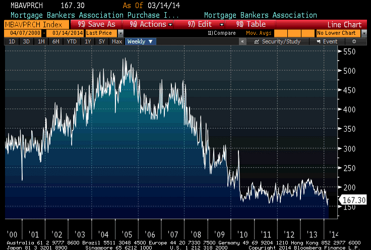
This is a chart of the Mortgage Bankers’ Association Purchase index, and it illustrates that mortgage origination activity for the purpose of purchasing, rather than refinancing, a home has remained quite low ever since the bubble initially burst. This speaks again to my point from that article: the Fed’s purchases of MBS did not result in a surge in home-buying activity. There has been plenty of refi business, but the Fed didn’t need to buy MBS to cause an uptick in refi activity – they only needed to force interest rates generally lower (I concede that, early on, they were concerned about the MBS basis, but that hasn’t been an issue for several years).
But refinancing doesn’t increase home prices. New buying activity does, and the data seem to suggest that the marginal price here is being set by the cash buyer, whom the Fed’s MBS purchase program did nothing to help.
So the Fed’s buying of MBS did not do what it said it would do. In the event, all that it did was to remove risky securities from the market so that investors seeking risk were pushed into riskier securities (read: stocks). Was that its true purpose? Who knows…but what I am sure of is that the Fed didn’t do this for the avowed purpose of causing the one result they actually got: reducing negative convexity in the market.
And, in general, I find it disingenuous that the Fed claims credit for one clearly-unintended consequence, while disavowing all of the other unintended consequences, many of which haven’t yet been seen since the policy hasn’t ended.
[1]However, be clear on this: an inverted yield curve, specifically from the 3-month bill to the 10-year note, is highly predictive of a recession. But the opposite is not true. That is, you do not need an inverted curve to get a recession.
We’re the Government, and We’re Here to Help
Today’s article will be brief (some might say blessedly so). The topic is the publication of an article on the NY Fed’s blog entitled “Convexity Event Risks in a Rising Interest Rate Environment.”
Long-time readers may recall that I wrote an article last year, with 10-year notes at 2.12%, called “Bonds and the ‘Convexity Trade’,” in which I commented that “the bond market is very vulnerable to a convexity trade to higher yields…the recent move to new high yields for the last 12 months could trigger such a phenomenon. If it does, then we will see 10-year note rates above 3% in fairly short order.” Within a few weeks, 10-year note yields hit 2.60% and eventually topped out at 3%.
Now, the Fed tells me that this selloff was “more gradual and therefore inconsistent with a sell-off driven primarily by convexity hedging.” I suppose in a way I can agree. The sell-off was primarily driven by the fact that the Fed had abused the hell out of the bond market and pushed it to unsustainable levels. But I don’t think that’s what they’re saying.
Indeed, the Fed is actually claiming credit for the fact that the selloff was only 140bps. You see, the reason that we didn’t get a convexity-based selloff – or at least, we only got the one, and not the one I was really concerned about, on a push over 3% – is because the Fed had bought so many mortgage-backed securities that there weren’t enough current-coupon MBS left to cause a debacle!
How wonderfully serendipitous it is that even the most egregious failures of the Federal Reserve turn out to benefit society in heretofore unexpected ways. You will recall that one of the main reasons given by the Federal Reserve to purchase mortgages in the first place was to help unfreeze the mortgage market, and to provoke additional mortgage origination. In that, it evidently failed, for if it had succeeded then the total amount of negative convexity in public hands would not have changed very dramatically. In fact, it would have been worse since the new origination would have been current coupons and replacing higher coupons.
The real reason that the convexity-spurred selloff wasn’t worse isn’t because the Fed had taken all of the current coupon MBS out of the market, but because the Fed continued to buy even in the move to higher yields. A negative-convexity selloff has two parts: the increased demand for hedging, and the decreased supply of counterparties to take the other side as the ball gets rolling. In this case, one big buyer remained, which emboldened dealers who knew they wouldn’t be stuck “holding the bag.” That is the reason that the selloff was “only” 140bps and not worse.
However, the observation that the Fed’s policy was a failure, as it did not stimulate vast amounts of new mortgage activity, remains. It is true that there is less negative convexity in the mortgage market than there would otherwise have been in the absence of Fed buying. But that’s an indictment, not exoneration.
Ex-Communication Policy
Well, I guess it would be hard to have a clearer sign that investors are over their skis than to have the Fed drop the portion of their communique that was most-binding – in a move that was fully anticipated by almost everyone and telegraphed ahead of time by NY Fed President Dudley – and watch markets decline anyway.
To be sure, the stock market didn’t exactly plunge, but bonds took a serious hit and TIPS were smacked even worse. TIPS were mainly under pressure because there is an auction scheduled for tomorrow and it was dangerous to set up prior to the Fed meeting, not because there was something secretly hawkish about the Fed’s statement. Indeed, they took pains to say that “a highly accommodative stance of monetary policy remains appropriate,” and apparently they desire for policy to remain highly accommodative for longer relative to the unemployment threshold than they had previously expressed.
The next Fed tightening (let us pretend for a moment that the taper is not a tightening – it obviously is, but let’s pretend that we’re only talking about overnight interest rates) was never tied to a calendar, and it would be ridiculous to do so. But it seems that maybe some investors had fallen in love with the idea that the Fed would keep rates at zero throughout 2015 regardless of how strong or how weak the economy was at that time, so that when the Fed’s members projected that rates might reach 1% by the end of 2015 – be still, my heart! – these investors had a conniption.
Now, I fully expect the Fed to tighten too little, and too late. I also expect that economic growth will be sufficiently weak that we won’t see interest rates rise in 2015 despite inflation readings that will be borderline problematic at that time. But that view is predicated on my view of the economy and my assessment of the FOMC members’ spines, not on something they said. You should largely ignore any Fed communication unless it regards the very next meeting. They don’t know any better than you do what the economy is going to be doing by then. If they did, they would only need one meeting a year rather than eight. Focus on what the economy is likely to be doing, and you’ll probably be right more often than they are.
Arguably, this was not the right theory when the Fed was simply pinning rates far from the free-market level, but as the Fed’s boot comes off the market’s throat we can start acting like investors again rather than a blind, sycophantic robot army of CNBC-watching stock-buying machines.
Now, I said above that “the stock market didn’t exactly plunge,” and that is true. On the statement, it dropped a mere 0.3% or so. The market later set back as much as 1%, with bonds taking additional damage, when Chairman Yellen said that “considerable period” (as in “a considerable period between the end of QE and the first rate increase) might mean six months.
Does that tell you anything about the staying power of equity investors, that a nuance of six months rather than, say, nine or twelve months of low rates, causes the market to spill 1%? There are a lot of people in the market today who don’t look to own companies, but rather look to rent them. And a short-term rental, at that, and even then only because they are renting them with money borrowed cheaply. For the market’s exquisite rally to unravel, we don’t need the Fed to actually raise rates; we need markets to begin to discount higher rates. And this, they seem to be doing. Watch carefully if 10-year TIPS rates get back above 0.80% – the December peak – and look for higher ground if those real yields exceed 1%. We’re at 0.60% right now.
Stocks will probably bounce over the next few days as Fed speakers try and downplay the importance of the statement and of Yellen’s press conference remarks (rhetorical question: how effective is a communication strategy if you have to re-explain what you were communicating)? If they do not bounce, that ought also to be taken as a bad sign. Of course, I continue to believe that there are many more paths leading to bad outcomes for equities (and bonds!) than there are paths leading to good outcomes. Meanwhile, commodity markets were roughly unchanged in aggregate today…
Summary of My Post-CPI Tweets
The following is a summary of my post-CPI tweets. You can follow me @inflation_guy.
- Core CPI +0.12%, a bit lower than expected.
- Core 1.56% y/y
- Both core services and core goods decelerated, to 2.2% y/y and -0.4% y/y. This is highly surprising and at odds with leading indicators.
- Accelerating groups: Food/Bev, Housing, Med Care (63.9%). Decel: Apparel, Transp,Recreation, Educ/Comm (32.7%). “Other” unch
- Primary rents fell to 2.82% y/y from 2.88%, OER 2.51% from 2.52%.
- Primary rents probably fell mainly because of the rise in gas prices, which implies the non-energy rent portion is lower.
- …but that obviously won’t persist. It’s significantly a function of the cold winter. Primary rents will be well into the 3s soon.
- Household energy was 0.7% y/y at this time last year; now it’s 5.5%. Again, that slows the increase in primary rents
- Medical Care moved higher again, slowly reversing the sequester-induced decline from last yr. Drugs +1.86% y/y from 0.91% last month.
- Core ex-housing leaked lower again, to only 0.84% y/y. Lowest since 2004. If you want to worry about deflation, go ahead. I don’t.
- The Enduring Inflation Angst Index rose to -0.51%, highest since Nov 2011 (but still really low).
I must admit to some mild frustration. Our call for higher primary rents and owners’ equivalent rents has finally been shown to be correct, as these two large components of consumption have been heading higher over the last few months (the lag was 3-4 months longer than is typical). But core inflation, despite this, has stubbornly refused to rise, as a smattering of small-but-important categories – largely in the core goods part of CPI – are weighing on the overall number.
It is also almost comically frustrating that some of the drag on core CPI is happening because of the recent rise in Natural Gas prices, which has increased the imputed energy component of primary rents. As a reminder, the BLS takes a survey of actual rents, but since utilities are often included in rental agreements the BLS subtracts out the changing value of that benefit that the renter gets. So, if your rent last December was $1,000, and your utilities were $100, and your rent this month is still $1,000 but utilities are $125, then the BLS recognizes that you are really paying $25 less for rent. Obviously, this only changes where price increases show up – in this example, overall housing inflation would be zero, but the BLS would show an increase in “Household Energy” of 25% and a decline in “Rent of Primary Residence” of 2.78% (which is -$25/$900). But “Household Energy” is a non-core component, while “Rent of Primary Residence” is a core component…suggesting that core inflation declined.
There isn’t much we can do about this. It’s clearly the right way to do the accounting, but because utility costs vary much more than rental costs it induces extra volatility into the rental series. However, eventually what will happen is either (a) household energy prices will decline again, causing primary rents to recover the drag, or (b) landlords will increase rents to capture what they see as a permanent increase in utilities prices. So, in the long run, this doesn’t impact the case for higher rents and OER – but in the short run, it’s frustrating because it’s hard to explain!
Now, core inflation outside of housing is also stagnant, and that’s surprising to me. Apparel prices have flatlined after increasing robustly in 2011 and 2012 and maintaining some momentum into mid-2013. Ditto for new cars. Both of those series I have expected to re-accelerate, and they have not. They, along with medical care commodities, are the biggest chunks of core goods in the CPI, which is why that series continues to droop. However, medical care commodities – which was driven lower in 2013 due to the effect of the sequester on Medicare payments – is starting to return to its prior level as that effect drops out (see chart, source BLS).

We will see in a few hours what happens to median inflation. My back of the envelope calculation on the median suggests median CPI might actually rise this month in reverse of last month.
The China Syndrome
The last month or two has provided a wonderful illustration of why a diversified commodity index is a better investment than an investment in any given commodity. Since mid-February, April Lean Hogs has rallied 23%. Since late January, May Wheat is up 23%. March Coffee is up 80%. Gold is up 9%. But Crude Oil is 6% off its highs. Copper is 12% off its highs (8% since Thursday). April Nat Gas was up 42% from November through late February, but has lost 10% since then.
This is great if you happened to be 100% in Coffee, and bad if you happened to be heavy into copper or RIO or BHP. But this sort of volatility and non-correlation is exactly where much of the return to commodity indices, over the long run, comes from. Later this month, commodity indices will sell coffee and buy copper, systematically buying low and selling high. This phenomenon is worth on average a couple of points of return per year.
Most commentators seem to be focusing on the precipitous decline in copper prices, supposedly because “Doc Copper” is supposed to be a good leading indicator of economic growth. But in this case, the behavior of copper is mostly due to quasi-panic over China’s recently flagging growth figures. Although China is not the only consumer of copper (although sometimes you might think so, from the news coverage), prices are set at the margin and if there was an actual recession in China as opposed to a modest slowdown, then this would push copper prices lower.
But that would be terrific for Europe and the U.S., because it would mean cheaper copper for us. Similarly, decreasing Chinese growth would relax some pressure on energy prices, which would also be a boon for the Western world. I think people forget that one of the key reasons the “Asian Contagion” from the 1997 Asian Financial Crisis never happened (U.S. growth “bottomed” at 4.1% in mid-1998 – a level it hasn’t reached since 2004) was not because of Federal Reserve action (from March 1997 until August 1998, the Fed Funds target never budged from 5.5%) but because commodity prices plunged from 1997 into 1999. The DJ-UBS index fell from around 128 one month before the Thai baht collapsed to 75 in the first quarter of 1999 (see chart, source Bloomberg).

Even worse (or better, depending on your perspective) was the decline in energy. Crude oil dropped 55%, from the $25 area at the beginning of 1997 to $11 by late 1998. That remains the lowest real price of U.S. oil recorded since 1946 (see chart, source Enduring Investments using data from Dow Jones and the Bureau of Labor Statistics).
 It may be impolitic to say so, but probably the single best thing that could happen to U.S. growth would be for Chinese growth to slow, pushing the price of important commodity prices lower. As a nation, we consume far more commodities than we produce, so lower input prices is a net positive.
However, I suspect this is much ado about nothing. Chinese growth, even if it slows, is likely to remain plenty hot enough to keep commodity prices from falling very much, even in real terms. Real commodity prices have been falling steadily since 2011 (which is why all of the talk about the “end of the commodity supercycle” a year ago was so humorous) until early this year, even while the amount of currency in circulation has steadily increased. It certainly seems to me as if we have priced commodities fairly conservatively, and they can probably withstand a growth slowdown in China as long as the country doesn’t enter a bona fide crisis.
Summary of My Post-Employment Tweets – Growl of Displeasure
The following is a summary and extension of my post-Employment tweets. You can follow me @inflation_guy (and tell your friends!)
- 175k +25k revisions, nice jobs figure. Oh, but Unemployment up to 6.7%. Love how these seem to always provide opposite surprises.
- One of my favorite labor charts. Want a Job Now, versus the Unemployment Rate:

- 1 way to add more jobs is to have em all work less. Is this an Obamacare effect since part-timers don’t count?
- …regardless, fewer hours worked –>lower output. Expect more downward revisions to Q1 growth ests. Q2 too, if this is ACA.
- If we all end up with jobs, but we’re all working only 30 hours per week, is that better than if only 93% have jobs, working 40?
It will be interesting over the next few months to see if the Hours Worked figures are weather-related (as will be claimed). I suspect that for the most part, they are not. Notice that if there was any weather effect over the last few years, it is not noticeable in the data (nor is it apparent in the unrevised data, incidentally). So, while this year’s weather was colder and snowier than usual, I am skeptical that this can account for more than a small downtick in the hours worked figures.
I rather suspect that the drop is more likely to be attributable to the definition of what constitutes a “full time worker” under the Affordable Care Act. And the question I asked rhetorically above is actually worth thinking about seriously because, looked at one way, the ACA is a jobs program: it will tend to cause businesses to cut back on full-time work and replace those people with more part-time work. The effect should be to cause the Jobless Rate to decline along with Hours Worked. But is that a good thing (because more people have some job) or a bad thing (because people who formerly had a full-time job now only have a part-time job)?
That’s a normative question, not a positive question. But I would think that one effect would be to push more people from what we think of today as “middle class” to lower-middle class, while perhaps raising some who were previously in poverty to be also lower-middle class. I don’t think this was one of the purposes of the law – because frankly, it doesn’t seem that much economic thought went into the design of the ACA – but it is interested to reflect on.
I don’t know what to make of the “Want a Job Now” chart. Let me explain that series, first. “Not in the Labor Force” implies that these people aren’t even looking for jobs, because if they were then they would be counted as unemployed. But, despite the fact that they are not looking, they would like to have a job and would take one if it was offered. While the Unemployment Rate is falling, almost as many people are in the “not in labor force but want a job now” category as were in that category at the beginning of 2011. Why aren’t these people looking?
A fair number of these workers, some 2.3mm of them, are described as “marginally attached” because they’ve looked for work in the last 12 months, and want a job, but haven’t looked in the last 4 weeks so that they aren’t counted as part of the work force. And those are the ones who are holding the category up (see Chart, source Bloomberg).
Some of those workers are not looking because they are “discouraged”, but that only represents about 750k of the 2.3 million or so in this category (and discouraged workers have fallen from about 1 million in 2011, so the decline is consistent with the Unemployment Rate).
So, we are left with a category of people who have looked for work in the past, and would take a job if it was offered, but haven’t looked in the last month. Or the month before. Or the month before. But, at some point, they had at least done a cursory search of the wanted ads.
I think the story of these “marginally attached” workers is worth studying. Are these structurally-unemployed people, who should be counted as such? Are they incentivized to remain out of the work force due to governmental benefits they receive? Or are they, and the decline in the labor force participation rate generally, telling us that the jobs aren’t coming back (or that the newly-created jobs are of lower quality than the old jobs)? I don’t know, but none of the answers is good. We want to see this number decline.
The story of the declining hours worked is potentially much more serious, though – partly because it is a new effect. The nation’s total output is number of employees, times average hours worked, times output per hour. If the number of employees is rising, but they’re working less, then unless productivity rises the total output (that is, GDP) won’t grow very quickly. This could be an early recession sign, or it could be a consequence of the ACA…or it could be a sign that the ACA is pushing a fairly non-robust economy towards the recessionary tipping point. Again, none of these things are good.
So, while the stock market roars its approval about this Employment number, I growl my displeasure. But this is normal.
Clap Along if You Feel that Happiness is the Truth
It might seem crazy what I’m ’bout to say
Sunshine she’s here, you can take a break
I’m a hot air balloon that could go to space
With the air, like I don’t care baby by the way
– From “Happy” by Pharrell Williams
Cliff Asness and John Liew have an article that is in the latest issue of Institutional Investor, discussing the development, strengths, and shortfalls of the Efficient Market Hypothesis, which underlies the Nobel award for both Fama (as a proponent) and Shiller (as a skeptic) this year.One of the interesting points that Asness and Liew make is that examinations of market efficiency depend on the “joint hypothesis” that (a) prices move efficiently to represent correct values, and (b) the model of values that they move to is correct. They point out that if prices seem to deviate from fair value (as expressed by a model), that could mean that either markets are inefficient/irrational, or that the model is wrong (or both). And they suggest strengthening the EMH to include a limitation on such models that they make some kind of sense – since a model that incorporates irrational behavior might well-describe all sorts of crazy market action but not be “efficient” in any sense that makes sense to us.
This may not be an irrelevant reflection, given the price events of today. Stocks more than rebounded from yesterday’s Ukraine-induced selloff, implying that not only are stocks just as valuable today as they were yesterday, but that they are even more valuable than they were before we found out about escalating tensions in the Crimean. This seems to border on the “unusual model” side of things – especially since nothing particularly soothing happened today.
Earlier today, Reuters reported that one of the Russian threats made in response to the vague declarations of the U.S. that “all options are on the table, from diplomatic to economic” (pointedly leaving out “military,” as Obama did yesterday, because gosh knows we don’t want the Russians to think that’s even a possibility) was that Russians might not repay loans due to U.S. banks (or, presumably, European banks if they joined any sanctions). This is a clever threat, in the old vein of “if you owe $100, it’s your problem; if you owe $1 billion, it’s the bank’s problem.” Everyone who thinks that economic sanctions are a no-brainer are correct, in the sense that it would imply no brain.
Russia also tested an intercontinental ballistic missile. This was “viewed as non-threatening and is not connected to what is going on in Crimea,” which is of course absurd: regardless of how long the test has been scheduled, someone who was trying to “de-escalate” tensions would surely defer the test for a week. The fact that the test happened is one of many signs today that Putin’s soothing words were hollow. All of the actions today, from additional warships steaming towards the Crimean peninsula to ICBM launches and confrontations between Ukrainian and Russian troops, were consistent with an escalating crisis even as Putin said there was no “immediate” need to invade eastern Ukraine.
Stocks loved the idea that the conflict may be over, with the west simply conceding the Crimea and Russia deciding that she is sated for the time being, as ridiculously unlikely as that outcome actually is. And, as I fully expected, we heard over and over today the Rothschildian admonition to “buy on the sound of cannons.” And indeed, they bought. Oh, how they bought. The S&P rose 1.53% and most European bourses were up 2%-3%. The expected comparisons were made, to the performance of equities during and following the Cuban Missile Crisis, the first Gulf War, and the invasion of the Sudetenland.
These comparisons are all nonsense. Here’s why.
| Event | Date | CAPE prior to |
| Sudetenland | June 1938 | 11.99 |
| Cuba | Oct 1962 | 17.32 |
| Kuwait | Aug 1990 | 16.17 |
| Ukraine | now | 24.87 |
This is what happens when people learn the “whats” of history, but don’t learn the “whys.” The Rothschildian point isn’t simply to buy on the sound of cannons. It’s to buy when markets are cheap because of the sound of cannons. And that is most assuredly not the case presently. If stocks had dropped 50% because of the Russian invasion, I would have been at the front of the line telling people to buy. It is reckless and feckless to buy when the market is expensive, and there are cannons that suggest a higher risk premium is warranted at least for a time.
Really, what is the risk here, today? Is the risk really that an investor might miss the next 25%, because the world becomes not only safe, but safer than it was a week ago, and a super-cheap market simply takes off? Or is there some risk that an investor might participate in the next -25%? Good heavens, surely the latter is a far greater risk right now. And, after all, Rothschild also said “sell on the sound of trumpets” (it’s always interesting how the bearish parts get forgotten), so that if the crisis is over and the west is victorious then you’re supposed to be selling! Here I guess is my point: this is not Rothschild’s market.
And, as Asness and Liew might put it, the model that implies stocks are more valuable after such an episode…might not be a rational model. But today, Pharrell wins: clap along if you feel like that’s what you want to do!
A Growling Bear is Bad for Everyone
I was convinced last week that the stock markets, as well as the inflation markets, were underestimating the importance of the Ukrainian conflict. I thought that I had a little more time to write about that before the crisis came to a head, which turned out not to be true. However, it seems that markets are still underestimating the importance of the Ukrainian conflict.
About the best possible outcome at this point is that Putin stops with an annexation of the Russian equivalent of the Sudetenland, with the episode merely pointing out (again) the impotence of Western leaders to respond to Russian aggression but not actually damaging much besides our pride. Even in that case, to me this signals a dangerous new evolution in the development of Russia’s relationship with the West. But the worse cases are far worse.
The angry fist-shaking of the old democracies is moderately amusing; less amusing are the stupid threats being made about economic sanctions. Let us stop for a minute and review what the West imports from Russia.
According to this article from Miyanville (from early 2013), Russia is the world’s largest producer of chromium (30% of the world market), nickel (19%), and palladium (43%), and is the second-largest producer of aluminum (10%), platinum (12%), and zirconium (19%). It has the largest supply of natural gas (although we are gaining rapidly), the second largest supply of coal, and the 8th-largest endowment of crude oil. The Ukraine itself is the third largest exporter of corn and the sixth-largest exporter of wheat. Meanwhile, the top 10 exports to Russia include engines, aircraft, vehicles, meat, electronic equipment, plastics, live animals, and pharmaceuticals.
So, we are fundamentally exporting “nice to haves” while importing “must haves.” Who needs trade more?
Let me make a further, suggestive observation. I maintain that the tremendous, positive trade-off of growth and inflation (high growth, low inflation) that the U.S. has experienced since the 1990s is at least partly a story of globalization following the end of the Cold War. Over the last couple of years, I have grown fond of showing the graph of apparel prices, which shows a steady rise until the early 1990s, a decline until 2012 or so, and then what appears to be a resumption of the rise. The story with apparel is very clear – as we moved from primarily domestically-sourced apparel to almost completely overseas-sourced apparel, high-cost production was replaced by low-cost production, which dampened the price increases for American consumers. It is a very clear illustration of the “globalization dividend.”
Of course, mainstream economic theory holds that the inflation/growth tradeoff suddenly became attractive for the U.S. in 1991 or so because inflation expectations abruptly became “anchored.” Why look for a good reason, when you can simply add a dummy variable to an econometric model??
But suppose that I am right, and the fall of the Soviet Union in 1991 played a role in the terrific growth/inflation tradeoff we have experienced since then. Incidentally, here are some data:
- Cold War (1963, immediately following the Cuban missile crisis, until the fall of the USSR): U.S. annual growth averaged 3.4% (not compounded); inflation averaged 5.4%. The DJIA rose at a compounded nominal rate of 5.6%.
- Post-Cold-War (1991-2013, including three recessions): U.S. annual average growth 2.6%; annual average inflation 2.4%. The DJIA rose at a compounded nominal rate of 7.5%.
This is not to say that globalization is about to end, or go into reverse, necessarily. It is to illustrate why we really ought to be very concerned if it appears that the Bear appears to be back in expansion mode – whether it is something we can prevent or not. And it is also to illustrate why putting a firm end to that expansion mode, rather than sacrificing global trade and cheap energy to a resurrection of the Cold War, is probably worth considering.
I still don’t think that equity investors understand the significance of what is going on in the Ukraine.