Archive
“You Want ANOTHER Hike? Already?”
(**Administrative Note: Get your copy of my new book What’s Wrong with Money: The Biggest Bubble of All! Here is the Amazon link.)
I was surprised in December when the most dovish central banker ever to lead the Fed allowed the body to implement a tightening, so perhaps I shouldn’t be surprised now that she is staunchly resisting an increasingly-raucous chorus of hawks. Prior to the Fed’s last meeting, I noted that if there was ever an excuse for tightening, unemployment being around 5% with core CPI above 2% while emergency measures still remain in place from the last crisis was probably a pretty good one. When the Fed eschewed action at the meeting, I scratched my head even though I wasn’t totally shocked. Yellen is a dove, and an unrepentant one at that. Despite all efforts to rehabilitate her image in that regard, the truth remains.
But her arguments are getting increasingly weak. Her argument seems to be that if domestic growth is weak, then even if inflation is rising the Fed will maintain the extraordinary measures as long as inflation is not yet at disturbing levels, or if the inflation is believed to be transient. Okay, fair enough – I believe it’s the wrong tine of the fork to focus on, since in the long run growth is maximized when inflation is low, stable, and predictable (as Greenspan once was fond of reminding us) and because the Fed can actually control inflation through monetary policy while there is little evidence they can control real growth. But still, it’s a point that many at the Federal Reserve would agree with.
However, in her remarks on Tuesday Yellen went further and pointed to weakness in other parts of the world where the Fed clearly has no direct mandate but also where it isn’t clear the weakness isn’t a net positive for the US in terms of our growth/inflation tradeoff. Lower energy prices due to weak growth in Europe and China, for example, has a positive impact on the United States which almost certainly outweighs the decline in our exports to those countries.
Yellen’s argument sounds a lot like what you will sometimes hear around bonus time at a large company (and perhaps here I will reveal lingering frustrations of my own!). In some companies, what you hear at bonus time if your group or your particular project did really well is “you did well, but we can’t pay you as much as it deserves because the firm/the division/the group came in below plan.” At the same organization, if your group or your project did poorly while the overall firm had a banner year, the bonus time discussion will begin with “well, as you know you didn’t perform well…”
Growth will always be weak somewhere in the world. Soon enough, it will probably be weak here. But even when it weakens here it is not likely to be so weak that we continue to need extraordinary liquidity provision such as that which is currently in place.
Yes: to me, the bigger issue is the size of the Fed’s balance sheet and the global pile of excess reserves. Higher interest rates from the central bank are not only not a cure, they make the problem worse by causing money velocity to increase. But I would be somewhat less uncomfortable if there was any indication that the Fed had some sense of urgency on the inflation front.
In any event, if the Fed does not raise rates in April then it means it will be at least 6 months between 25bp rate increases. At that rate, it would be about six years until the short rate returned to something like a normal level. But that’s irrelevant – because a change in rates every six months cannot be seriously called a tightening “campaign.”
The Fed’s credibility erodes further with every passing day. The good news is that there isn’t much left to erode.
The Gravity of the Liquidity Situation
(**Administrative Note: Get your copy of my new book What’s Wrong with Money: The Biggest Bubble of All! Here is the Amazon link.)
In the long list of nightmares that market risk managers have to wrestle with on a daily basis, some have gradually receded. For competently-run banks and large trading institutions, the possibility of a rogue trader making undiscovered trades or mis-marking his own book – another Nick Leeson – is increasingly remote given the layers of oversight. But one nightmare in particular has been increasing in frequency since 2009, especially as Volcker Rule and Dodd-Frank restrictions have been implemented.
The concern is market illiquidity. Every year that goes by, liquidity in the financial markets is declining. This is not apparent to the casual observer, or casual investor, who faces a tight market for his hundred- or thousand-lot. But probably every institutional investor has a story of how his attempt to hit a bid on the screens resulted in his trading the minimum size while the rest of the bid fled with sub-millisecond dispatch. And so the question is: if your mutual fund is hit by redemptions at the same time that its market (equities, emerging markets, credit?) is falling apart – and that is the normal time that redemptions swell – then at what price will it be able to get out? And what if there is no bid at all that is big enough?
Banks and other dealing institutions have responded to both the new regulatory restrictions themselves, and to the effects of the restrictions, by decreasing the size of their balance sheet dedicated to trading. Much of the apparent ‘liquidity’ in the market now is provided by the algos (the algorithmic trading systems) who as we have seen can be there and gone in an eyeblink. I am not aware of anything that has been done in the wake of the various “flash crashes” we have seen that would lead me to have great confidence that in the next big market discontinuity markets will function any better than they did in 2008. In fact, public liquidity is quite a bit smaller and I would expect them to function a fair bit worse.
Yes, many institutions have begun to access “dark pools” where they face anonymous counterparties in crossing large trades, rather than chasing hair-trigger algos for a fraction of the size they need. But nothing is particularly soothing about the dark pools, either (starting with their name). The whole point of a market discontinuity is that flow traders end up all on the same side of the flow; in these times we want the speculative traders with big balance sheets to take the other side of trades at a price that reflects a reasonable return on their capital. Those spec traders, or at least the big-balance-sheet banks, aren’t providing extra liquidity in dark pools either.
Banks have also responded to the beat-down regularly administered by socialists like Bernie Sanders and by sympathetic ears in the press (and among the populist splinters of the right as well) – by cutting the experienced and expensive traders who have more experience in pricing scarce liquidity, and perhaps finding it sometimes. Again, none of this makes me optimistic about how we will handle the next “event.”
None of this rant is new, really. But what is interesting and new is that the illiquidity is starting to show up in very visual ways. Regular readers know that my primary area of domain expertise is in rates, and specifically in inflation. Consider the chart below (source: Enduring Investments), which I would consider strong evidence that market liquidity in inflation is worse now than it was two years ago. The chart shows 1-year inflation forward from various points on the inflation curve. That is, the point on the far left is 1 year inflation, 0 years forward (in other words, today’s 1-year inflation swap). The next point is 1 year inflation, 1 year forward. And so on, so that the last point is 1 year inflation, 29 years forward.

Ignore the level of inflation expectations generally – that isn’t my point here. Obviously, inflation expectations are lower and that is not news. But the curve from two years ago shows a nice, smooth, “classic rates derivatives” shape. Inflation is priced in the market as rising in smooth fashion. This doesn’t mean that anyone really expects that inflation will rise smoothly like that; only that such is the best single guess and, moreover, one that has nice characteristics in terms of derivatives pricing and transparency.
The blue curve shows the curve from last Thursday. Now, I could have chosen any curve in the last month or two and they would have been similarly choppy. You can see that the market is evidently pricing in that inflation will be 1.72% over the next year, and then decline, then rise, then decline, then rise irregularly until 9 years from now when it will abruptly peak and descend.
That’s a mess, and it is an indication that liquidity in the inflation swaps market is insufficient to pull the curves into a nice, smooth shape. This is analogous to one important characteristic of a planet, from an astrophysicist’s point of view: any body that is not sufficiently massive to pull itself into a sphere is not a planet, by definition. I would argue that the inability of the market to pull the inflation curve into a nice and smooth “derivatives” shape is an early warning sign that the “mass” of liquidity in this market – and in others – is getting worse in a visually-apparent way.
Is Apparel the Canary in the Coal Mine?
(**Administrative Note: Get your copy of my new book What’s Wrong with Money: The Biggest Bubble of All! Here is the Amazon link.)
Last week, one of the curious parts of the CPI report was the large jump (1.6% month/month, or nearly 20% annualized) in Apparel. At the time, I dismissed this rise with a hand-wave, pointing out that it Apparel is only 4% of core and so I don’t worry as much about Apparel as I do, say, Medical Care or Housing.
But a Twitter follower called to my attention the words of @IanShepherdson, one of the real quality economists out there (and one whom I read regularly when he was with High Frequency Economics, and I was at Natixis). He hasn’t always been on top of the inflation story, but he nailed the housing bubble story in 2008 and I have great respect for him. Ian apparently said of Apparel that it could be the proverbial “canary in the coal mine” when it comes to inflation, since apparel tends to respond more quickly to inflationary pressures since it is a very competitive and very homogeneous category.
So I figured it was worth taking a longer look at inflation.
Now, I should point out that I probably have a bias about getting over-excited about inflation. Back in 2011-12, Apparel prices started to accelerate rapidly for the first time in a generation- and that’s no hyperbole. As the chart below (Source: Bloomberg) shows, the price index for seasonally-adjusted apparel prices went sideways-to-down-to-sideways between 1992 and 2012.

You can see from this why I may have gotten excited in 2012. Between 1970 and 1992, apparel prices rose at a very steady rate. Then, as post-Cold War globalization kicked into high gear, apparel manufacture moved from being largely produced in the US to being largely produced outside of the US; the effect on prices is apparent on the chart. But in 2011-2012, the price index began to move higher at almost the same slope as it had been moving prior to the globalization dividend. My thought back then was that the dividend only happens once: at first, input costs are stable or declining because high-cost US labor is replaced with low-cost overseas labor – but eventually, once all apparel is produced overseas, then the composition effect is exhausted and input prices will rise with the cost of labor again. In 2012, I thought that might be happening.
And then Apparel flattened out.
You can see, though, from the right side of the chart the latest spike that has Ian (and maybe me) so excited. The month/month rise was the third largest in the last 30 years, exceeded only by February 2009 and February 2000. As an aside, the fact that the three largest monthly spikes were all in February ought to make you at least a little suspicious that some of what is going on may be a seasonal-adjustment issue, but let’s leave that aside for now because I’m rolling.
What about the assertion that Apparel may be the ‘canary in the coal mine,’ giving an early indication on inflation? The chart below (source: Bloomberg, and Enduring Investments calculations) shows the year-over-year change in Apparel prices (on the right-hand scale) versus core CPI (on the left-hand scale).
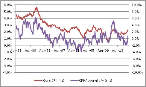
I do have to admit, there is something suggestive about that chart although it is at least somewhat visual since I can’t find a consistent lag structure in the data. But the clear turns do seem to happen first in Apparel, often. Ah, but here is the fun chart. For the next chart, I’ve also taken out Shelter from core inflation, since Shelter especially in recent years has been largely driven by pretty crazy monetary policy, as I have pointed out before many times. (And if you want to read what I think that’s likely to lead to, read my book.) To make it fair, I also removed Apparel itself since once Shelter and Food and Energy are all removed, Apparel is starting to matter.

In this chart, you can start to see a pretty interesting tendency for Apparel to perhaps lead, slightly – and so, perhaps, Ian is right. In this case, I certainly wouldn’t want to bet against him since I think that’s where inflation is going too. I just wasn’t sure that Apparel was a strong part of the argument. (But at the same time, notice the big spike in Apparel inflation in 2012 preceded a rise in ex-housing core, but not a large or sustained rise in ex-housing core).
The table below shows the breakdown of Apparel into its constituent parts. The first column is the category, the second column is the weight (in overall CPI), the third column is the current y/y change, and the fourth column is the previous y/y change.
| Category | Weights | y/y change | prev y/y change |
| Apparel | 3.1% | 0.892% | -0.530% |
| Men’s apparel | 0.63% | -0.445% | 0.483% |
| Boys’ apparel | 0.16% | -0.443% | 1.350% |
| Women’s apparel | 1.04% | 0.230% | -2.127% |
| Girls’ apparel | 0.21% | -1.274% | -2.283% |
| Men’s footwear | 0.21% | 2.854% | -0.461% |
| Boys’ and girls’ footwear | 0.17% | 2.506% | -0.046% |
| Women’s footwear | 0.31% | 0.730% | 0.926% |
| Watches | 0.08% | 8.525% | 0.805% |
| Jewelry | 0.13% | 6.156% | 2.874% |
I look at this to see whether there’s just one category that is having an outsized move; if there were, then we would worry more about one-off effects (say, the rollout of a new kind of women’s blouse that is suddenly all the rage). It is interesting that Men’s apparel and Boys’ apparel decelerated, while most everything else accelerated, but this happens all the time in the Apparel category. Actually, this is a pretty balanced set of sub-indices, for Apparel.
Now, I’m still not 100% sure this isn’t a seasonal-adjustment issue. It could be related to weather, or day count (29 days in February!), or some bottleneck at a port that caused a temporary blip in prices. I want to see a few more months before getting excited like I did in 2012! But we have had a couple of bad core CPI prints, and we also saw pressure in Medical Care so it is fair to say the number of alarm bells has broadened from one (Housing) to several (Housing, Medical Care, Apparel). It is fair to be concerned about price pressures at this point.
Summary of My Post-CPI Tweets
Below is a summary of my post-CPI tweets. You can (and should!) follow me @inflation_guy or sign up for email updates to my occasional articles here. Investors with interests in this area be sure to stop by Enduring Investments. Plus…buy my book about money and inflation, just published this month! The title of the book is What’s Wrong with Money? The Biggest Bubble of All, order from Amazon here.
- Good morning and welcome to another wonderful CPI day!
- Three notes before CPI prints in 17 minutes: First, the market is expecting a “soft” 0.2% core (something like 0.16%, rounding up)
- Second: If we get exactly 0.2% core, then y/y will round higher to 2.3%. Third: if we get exactly 0.3%, y/y core will round to 2.4%.
- Highest core print since the crisis was 2.32% in 2012. We have a shot of exceeding that today with a robust print.
- Ten minutes to CPI and time for 1 more coffee and a commercial message: please buy my new book! http://amzn.to/21uYse8
- whoopsie, core CPI +0.3%. Actually 0.28%, puts y/y at 2.34%. Yayy, a new post-crisis record!
- Ouch, seems like a big jump in y/y Medical Care, waiting for the breakdown. If so, that makes core PCE jump even more (again).
- So back to back months we’ve had 0.29% and 0.28%. I hate to say I told you so but…
- I said 2.33%, Actually 2.34%. We were VERY close to printing 2.4% y/y & setting off panic at the Fed. Which is abt 4 yrs overdue.
- I should say 4 years and $2 trillion overdue.
- [retweet from @boes_] Core consumer price inflation ex-shelter really accelerating: was 1.6% year over year in February

- core cpi. What, me worry?

- while I wait for my sheets to calculate, let me stress this is not meaningless for the FOMC meeting today.
- Arguments for waiting another meeting before raising rates are very thin. https://inflationguy.blog/2016/03/14/feeble-arguments-against-a-rate-hike/
- i have got to put this database on a faster computer. OK, core services 3.1% from 3% and core goods +0.1% from -0.1%.
- first positive y/y in core goods in two years.
- Housing: 2.12% from 2.10%. Primary rents (3.68% from 3.71%) and OER (unch at 3.16%) are NOT the drivers of the core jump.
- Lodging away from home 4.19% vs 2.67%, but that’s a small piece of CPI (<1%)
- Apparel had big jump in y/y rate to 0.89% from -0.53%, but again Apparel as a whole is 3% of headline, 4% of core.
- Medical care: 3.50% from 3.00%. Yep.
- Drugs 2.34% from 2.21%. Professional svcs 2.54% from 2.08%. Hospital svcs 4.90% from 4.32%. Health insurance 5.97% from 4.76%. Ouch.
- Med care is ~10% of core, so that 50bp jump is 0.05% on core.
- And remember, Medical care gets a HIGHER WEIGHT in the Fed’s preferred measure, core PCE.
- U-G-L-Y CPI ain’t got no alibi. It’s ugly (woot! woot!) it’s ugly.
- The good news is pretty thin gruel. Median CPI should be +0.22% or so, keeping y/y around 2.42%. At least it isn’t running away yet.
- Also, NEXT month we roll off an 0.21% from the y/y figure. So the hurdle will be higher for an uptick in core CPI.
- Like I said, thin gruel. There can be no doubt whatsoever that deflation risks are zero for the foreseeable future.
- Stocks are doing tremendously well with this, only -9 points or so S&P futures. This is awful news for equities.
- …but some observers like to spin “rising inflation” as “sign of robust growth.” Nope. See “1970s” in your encyclopedia.
- The only way this is good news is if you recently wrote a book on inflation. Which, as it turns out, I did: http://amzn.to/1RNTjZu
- Distribution of price changes. You can be forgiven for seeing this as giving the Fed the finger.

As much as I like to talk, there’s just not a lot more to say. This number is awful, as it not only was well above expectations (the m/m figure was about double the rise which analysts expected) but also it wasn’t driven by shelter but rather by Apparel (a little) and – worst of all – Medical Care. Here is a chart of y/y Medical Care (Source: Bloomberg).

Here is a subcomponent of medical care, “Professional Services” (Source: Bloomberg).

And finally, again, here’s the context. This chart (Source: Bloomberg) shows median inflation (top line), core inflation converging on it (middle line), and core PCE shooting higher (bottom line). Note that the top and bottom lines are not updated for the most-recent month.

At this hour, stocks are inexplicably unchanged. This is awful news for stocks, which tend to be most-highly valued when inflation is low and stable and the Fed is quiescent. Now we have inflation that is moderate, but rising, and a Fed which is not only active, but with numbers like this may eventually become more so. If they do not, it is only because growth is weak (and weakening)…and someone please explain to me why that is a positive environment for stocks? One can make an argument that bonds can do okay if growth flags (even though growth does not cause or lead inflation), because real rates are too high for the level of nominal rates and that could conceivably reach equilibrium by TIPS rallying rather than nominal bonds selling off. But it’s a hard argument to be bullish on the big two asset classes. (However, I expect Wall Street to make that argument loudly.)
Feeble Arguments Against a Rate Hike
(**Administrative Note: Get your copy of my new book What’s Wrong with Money: The Biggest Bubble of All! Here is the Amazon link.)
We look forward to a week filled with data including CPI, the Empire Manufacturing report, Housing Starts, Industrial Production, and Existing Home Sales – not to mention the important primary election contests in Ohio and Florida tomorrow. But at the top of the list of important events is the FOMC meeting on Wednesday.
The consensus of Wall Street economists right now is that the FOMC will leave interest rates alone. The consensus is almost universal that the Fed will choose to skip this week’s meeting. So, in keeping with my general role as a gadfly, I want to give some reasons why the Fed might very well choose to raise rates.
One place to start is by examining the arguments for not raising rates. Before I do that, let me assure readers that I have not changed my opinion that this is the most dovish Federal Reserve in history. But, since they have broken the skin on the milk we can no longer consider the possibility that there is no way this Fed would ever hike rates. Prior to the December meeting, it was plausible to think that the hurdle for hiking was very high and that it was possible that 2016 might end with rates still at zero. The question is, though, no longer whether the Fed is willing to hike rates, but whether they currently want to hike rates…and when.
Here are what I see as the main arguments for skipping a rate hike at this meeting:
(1) While the US economy is doing okay, the global economy is weak especially in Europe.
I will take here a somewhat different tack than some other observers might. The standard answer here is “the Fed is not responsible for the global economy, but for the US economy.” This is true, but since I don’t think changing interest rates 25bps in an environment of abundant liquidity has any meaningful effect on domestic or global growth my perspective is different. The ECB just lowered rates, in large part to put downward pressure on the Euro versus other currencies and hence to help Euro growth and inflation. By raising rates, the Federal Reserve would actually reinforce that move, since doing so would tend to strengthen the US dollar and other pegged or semi-pegged currencies against the Euro and other units. So in my view, if the Fed wants to help other economies and is not worried about the domestic economy so much…the solution is actually to raise rates, not to keep them stable or lower.
(2) The Fed needs to remain wary of the risk of deflation.
With inflation at the highest levels since the crisis, with median inflation above the stated FOMC target (and core CPI inflation at the target, with core PCE below but rising rapidly), this seems like a crazy thought process that doesn’t really require a lot of discussion to dismiss. If inflation at 2.0%-2.5% and rising is representative of an economy at risk of deflation, then up is down, down is up, and we should just forget the pretense that we care about the data. If 2.5% and rising is at risk of deflation, then where are we safe? 3.5% and rising? 4.5% and rising? If the Fed doesn’t want to stop inflation now that it has reached the target, what does it mean to have a target?
(3) Domestic growth is not yet strong enough to sustain higher rates.
If near-zero rates for the better part of a decade has not healed the economy, then maybe the low rates are the problem and not the solution. In any event, how much stronger is the economy likely to get than a 4.9% unemployment rate? Yes, the forward indicators aren’t looking great but if the Fed won’t hike when Unemployment is at 4.9% then they probably aren’t going to hike when Unemployment is above 5% either. This is actually an argument for getting another tightening in before the Fed needs to consider reversing policy later in the year.
(4) Asset markets can’t take it. Hiking rates would push stocks and bonds lower.
Even though the Fed tries to persuade us that they don’t worry much about markets, we know that’s not true. But it would seem to be odd to worry about them now when the S&P is down 1.2% on the year, and the cyclically-adjusted P/E is in the top 5% of historically recorded values. Bond yields are near the lowest levels of the last hundred years, real yields still well below 1% out to 10 years (and negative inside of 5 years, and remember I think these are much cheaper than nominal bonds). Real home prices are the most above trend, excepting only for the late lamented bubble, on record (see chart, source Shiller, Irrational Exuberance, 3rd edition as updated by author).

Some would say that it would be a good thing for asset prices to be lower, so that the people of this world who are going to be net investors for the next 20 years get better future returns. But in any event, it is hard to argue that asset markets are ailing in any particularly terrible way.
(5) The market isn’t expecting the Fed to raise rates.
Well, why the hell not? The Fed has said “as conditions warrant.” Well, they warrant. True, the FOMC doesn’t want to surprise the market and they haven’t done any work at suggesting they’re about to hike rates…other than putting the rate-hike campaign in motion in the first place…but in this case it is hard to understand why we should not be expecting the Fed to raise rates. If not now, when?
Look, the Fed has set the hurdle on growth and inflation, and it is hard to argue the economy hasn’t cleared those hurdles. I think, therefore, that the market is under-appreciating the probability of a rate hike on Wednesday. Yes, if they raise rates the very next thing they will do is move those hurdles farther away. But if they don’t raise rates at this meeting, the only argument can be “it’s March and people aren’t expecting one until April.” That seems to me to be a fantastically feeble argument, although one must grudgingly admit that feeble arguments are the stock in trade of central banks these days.
Roller Skating in a Buffalo Herd
The ECB fired its “bazooka” today, cutting official rates more into negative territory, increasing QE by another €20bln per month, expanding the range of assets the central bank can buy to now include corporate bonds, and creating a new 4-year program whereby the ECB will loan long-term money to banks at rates that could be negative (based on bank credit extended to corporate and personal borrowers).
My point today is not to opine on the power or wisdom of these policy moves. The main thing I want to observe is this: the inflation market is pricing in what amounts to success for global central banks, with consumer inflation averaging something between 1 and 2 percent per year for the next decade (a bit lower in Japan; a bit higher in the UK). Not only are inflation swaps prices much lower than would be expected from a pure monetarists’ standpoint – but options prices are also very low. The chart below (source: Enduring Investments) shows normalized volatilities[1] over the last five years for a 10-year, 2% year-over-year inflation cap. That is, every year you take a look and see if inflation was over 2%. If it was, then the owner of this option is paid the difference between actual inflation and 2%; if it was not, the owner gets zero. So you get to look ten times at whether inflation has gotten above 2%, and get paid each time it has.

The chart shows that whatever inflation is expected to be, the price to cover the risk that inflation is actually somewhat higher is very low. So, not only is inflation expected to be low, but it is expected to be not volatile either.
Look, we’re talking about bazookas, helicopters…does something not seem right about pricing in very little risk of screwing up?
Whether you believe my thesis in my freshly-released book What’s Wrong With Money?[2] that the likely course of inflation over the next few years is higher and potentially much higher, or you agree with those who think deflation is imminent, shouldn’t we agree that bazookas introduce volatility?
Central banks are attempting to do something that has never been done. Shouldn’t we at least be a teensy bit nervous, as they line up to perform the first-ever quintuple-lutz, that no one has ever landed one before? That no one has ever landed a commercial passenger jet on an aircraft carrier?
Uncertainty is supposed to lower asset values, all else being equal. So even if you think stocks at these levels are “fair,” in an environment with earnings and interest rates where they are now and projected earnings following a certain path, an increase in the volatility of those outcomes should lower the clearing price of those assets since the buyer of the asset (which has positive value) is also assuming the volatility (which has a negative value).
But the market also says that uncertainty right now is low. Yes, the VIX is well off its lows and seems to suggest greater short-term uncertainty (see chart below, source Bloomberg) – but I would argue that the long-term volatility of the economic fundamentals has rarely been this high.

Supposedly you can’t roller skate in a buffalo herd,[3] but we also have never tried to do it. There’s a reason we haven’t tried to do it!
But the Fed, and the rest of the world’s central banks, are not only roller skating in a buffalo herd – the world’s markets seem to be suggesting that investors are sure they’re going to succeed. Regardless of whether you’re optimistic about the outcome, I would argue it’s nearly impossible to be both optimistic and highly confident!
[1] This means something to options traders but can be glossed over by non-options traders. Essentially the point is that you can’t use a regular Black-Scholes model to price options if the strike and/or the forward can have a negative value!
[2] #1 on Amazon in “Economic Inflation,” thanks largely to all of you!
TIPS Are Less Cheap – But Still Very Cheap
(**Administrative Note: My new book What’s Wrong with Money: The Biggest Bubble of All has been launched. Here is the Amazon link. Please kindly consider buying a copy for yourself, for your neighbor, and for your library! If you are moved to write a review, or if you wander across a review that you think I may not have seen, please let me know. And thanks in advance for your support.)
Yesterday I wrote about the crowded short trade that boosted energy futures 40-50% from the lows of only a few weeks ago. A related crowded trade was the short-inflation trade, and it also was related to carry.
TIPS, as many readers will know, accumulate principal value based on realized inflation; the real coupon rate is then paid on this changing principal amount. As a rough shorthand, TIPS thus earn something like the real interest rate plus the realized inflation (which goes mainly to principal, but slowly affects the coupon over time). So, if the price level is declining, then although you will be receiving positive coupons your principal amount will be eroding (TIPS at maturity will always pay at least par, but can have a principal amount less than par on which coupons are calculated). And vice versa, of course – when the price level is increasing, so does your principal value and you still receive your positive coupons.
This means that, neglecting the price change of TIPS, the earnings that look like interest – those paid as interest, and those paid as accumulation of principal, which an owner receives when he/she sells the bond or it matures – will be lower when inflation is lower and higher when inflation is higher. It acts a little bit like a floating-rate security, which is one reason that many people believe (incorrectly) that FRNs hedge inflation almost as well as TIPS. They don’t, but that’s something I’ve addressed previously and it’s not my point today.
My point is that TIPS investors behave as if this carry is a hot potato. When carry is increasing, everyone wants to own TIPS; when carry is decreasing no one wants to own TIPS. The chart below (Source: BLS) shows the seasonal adjustment factor used by the Bureau of Labor Statistics to adjust the CPI. The figure implies that prices tend to rise into the summer and then decline into year-end, compared to the average trend of the year, so we should expect higher increases in nonseasonally-adjusted CPI in the summer and lower increases or even outright decreases late in the year.

Now, the next chart (Source: Enduring Investments) shows what 10-year breakevens have done over the last 16 years, on average, compared to the year’s average.

Do these two pictures look eerily similar?
From a capital markets theory perspective, this is nuts. It says that breakevens expand (TIPS outperform) when everyone knows carry should be increasing, and narrow (TIPS underperform) when everyone knows carry should be decreasing. And from a P&L perspective, a 30bp increase in 10-year breakevens swamps the change in accruals that happens as the result of seasonal changes in CPI. Moreover, these are known seasonal patterns; one should not be able to ‘outsmart’ the market by buying breakevens in January and shorting them in May. Theory says that while you’re owning negative carry, you should make it up in the rise of the price of the bond to meet the forward price implied by the carry. Nevertheless, for years you were able to beat the carry, at least if you were a first mover. (Incidentally, an investor doesn’t try to beat the average seasonal, but the actual carry implied by movements in energy too – which are also reasonably well-known in advance).
But as liquidity in the market has suffered (not just in TIPS, but in many non-benchmark securities, thanks to Dodd-Frank and the Volcker Rule), it has become harder for large accounts to do this. More importantly, the market has tended to drastically overshoot carry – either because less-sophisticated investors were involved, or because momentum traders (aka hedge funds) were involved, or because investor sentiment about inflation tends to overshoot actual inflation. Accordingly, as energy has fallen over the last year-and-a-half, TIPS have gotten cheaper, and cheaper, and cheaper relative to fair value. In early January 2015, I put out a trade recommendation (to select institutional clients) as breakevens were about 90bps cheap. The subsequent rally never extinguished the cheapness, but it was a profitable trade.
On February 11th of this year, TIPS reached a level of cheapness that we had only seen in the teeth of the global financial crisis (ignoring the period prior to 2002, when TIPS were not yet a widely-held asset class). The chart below shows that TIPS recently reached, by our proprietary measure, 120bps cheap.

But, as with energy, the short trade was overdone. 10-year breakevens got to 1.20% – an almost inconceivable level that would signal a massive failure not only of Fed policy, but of monetarism itself. Monetarism doesn’t make many claims, but one of these is that if you print enough money then you can create inflation. Since then, as the chart below (source: Bloomberg) shows, 10-year breakevens rallied about 35 bps before falling back over the last couple of days. And we still show breakevens as about 100bps cheap at this level of nominal yields.

Yesterday I noted that the structural negative carry for energy markets at present was likely to limit the rally in crude oil, as short futures positions get paid to stay short. But this is a different type of carry than the carry we are talking about with TIPS. With TIPS, the carry is caused by movement in spot energy (mostly gasoline) prices; with crude oil markets, the carry is caused by rolling futures positions forward. The TIPS carry, in short, will eventually stop being so miserable – spot gasoline is unlikely to continue to decline without bound. But even if spot gasoline stabilizes, short futures positions can still be profitable if oversupply into the spot market keeps futures curves in contango. Accordingly, while I think energy futures will slip back down, I am much more confident that TIPS breakevens have seen the worst levels we are likely to see.
Unfortunately, for the non-institutional investor it is hard to be long breakevens. The CME has never re-launched CPI futures, despite my many pleadings, and most ETF products related to breakevens have been dissolved – with the notable, if marginal, exception of RINF, which tracks 30-year breakevens but has a very small float. It appears to be approximately fair, however. Other than that – your options are to be long a TIPS product and long an inverse-Treasury product, but the hedge ratios are not simple, not static, and the fees would make this unpleasant.
However, as I wrote recently what this means for the individual investor is that there is no strategic reason to own nominal bonds now. If I own nominal Treasury bonds, I would be moving into TIPS in preference to such a low-coupon, naked-short-inflation-risk position.
Crowded Shorts and Stupid Math
(**Administrative Note: My new book What’s Wrong with Money: The Biggest Bubble of All has been launched. Here is the Amazon link. Please kindly consider buying a copy for yourself, for your neighbor, and for your library! If you are moved to write a review, or if you wander across a review that you think I may not have seen, please let me know. And thanks in advance for your support.)
With today’s trade, WTI Crude oil is now up 45% from the lows set last month! That’s great news for the people who had endured a 75% fall from the 2014 highs to last month’s low. More than half of the selloff has been recouped, right?
Well…not exactly.

Stupid math.
In a nutshell, a 45% rally from $110 would be a bit more impressive than 45% from $26.05, which was the low print for front Crude. And energy markets, in both technical and fundamental terms, have a lot of wood to chop before prices return to the former highs, or even the $40-60 range on crude that many people think reflects fundamental value.
So why the dramatic rally? Oil bulls will say it is because rig counts are down, so that supply destruction is happening and helping to balance the market. Perhaps, although rig counts have been falling for some time. Also, some producers have been talking about reining in production…again, perhaps this is important although since the US is the world’s largest producer of oil and neither Saudi Arabia (#2) nor Russia (#3) are in a good economic position to reduce revenues further than they already have been reduced by falling prices this would seem to be a marginal effect. And I might also add the point that thanks to the very long fall in prices, energy commodities are much cheaper than other commodities – which have also fallen, but far less – on a value metric. But no one trades commodities on value.
The real reason is that being short energy has become a very crowded trade. This is partly because of the large overhang of crude and other products in storage, but also partly because the energy futures curves are enormously in contango, which means there are large roll returns to be earned on the short side by being short – because, when the delivery month approaches, the short position buys back the front month and sells the next, higher-priced, contract. In this way, the seller is continuously selling higher prices and rolling down into a well-supplied spot market. See the chart below (source: Enduring Investments), which shows the return you would earn if you shorted the one-year-out Crude contract and rolled it in to the current spot price.

Obviously, the main risk is if spot prices suddenly rally, say, 45%, leaving you with a heavy mark-to-market loss and the prospect of only making some of it back through carry. That is what has started to happen over the last couple of weeks in crude (and some other contracts). It was a crowded carry trade that is now somewhat less crowded.
What happens over time, though, is that it is hard to sustain these flushes unless the carry situation changes markedly. Once oil prices rise enough that the short on fundamentals is at least a not-horrible bet, the carry trade re-asserts. It is, simply put, much easier to be short this contract than long it. What changes the picture eventually is that the fundamental picture changes, either lowering future expected prices (flattening the energy curve relative to spot, and reducing the contango) or raising spot prices as the supply overhang is actually absorbed (raising the front end, and reducing the contango). In the meantime, this is just a crowded-trade rally and likely limited in scope.
Tomorrow, I will mention another crowded-short trade that has recently rebounded, but which is less likely to re-assert itself aggressively going forward.