Archive
Profiting From Zero Duration Inflation
One of the nice features of the USDi digital currency is that its path is known with certainty well in advance. The price of USDi is determined by the interpolated CPI index value compared with the value on the reference day (315.605). So, for example, we know that today’s[1] USDi value is 1.02681 because today’s CPI index value is 324.06614, and we know that because we know how to interpolate between the CPI prints from 3 months ago (324.122) and 2 months ago (324.054).
Importantly, those numbers we are interpolating between are the Non-seasonally-adjusted CPI figures from December (released in January) and January (released in February). And that interpolation methodology is exactly the methodology that TIPS use.[2]
You will notice that the CPI from 2 months ago is lower than the CPI from 3 months ago. That means that prices actually fell, before seasonal adjustment, which means that USDi actually declined slightly over the course of the month. It was even worse in January, because the November CPI was – as I have noted before – complete garbage due to the fact that BLS procedures led them to assume zero inflation for a lot of the missing October data. In the chart below, you can see the sharp correction during which USDi actually declined during January (and slightly further, in February).

Now, because we can ‘see the future’ due to the interpolation mechanism, we know exactly where USDi will trade each day in March. That’s also indicated on the chart. So we know that in March, USDi will rise at a 4.53% annualized pace. One-month t-bills are 3.6% right now. You do the math.
It gets better: the same BLS procedures that led to the terrible November number lead to self-correction, so the CPI Index will catch up over time. The biggest part of that catch-up is due to the rotation of the rent sample over 6 months, so while we do not know exactly what CPI will print at for February, March, April, and May, we have a good confidence that it will be above trend. We can see that from the CPI “fixings” market where those particular CPI prints trade. The market price is the market price, and sometimes wrong, but based on what trades in the market right now we can anticipate (orange line above) that USDi will climb at an annualized rate of 5.63% in April and 5.53% in May before slipping back to a still-better-than-bills 4.17% in June.
What does any of this have to do with duration?
Well, you may read this and say to yourself “I can get the same benefit if I just buy short TIPS bonds.” But no, you can’t. That’s because when you buy a TIPS bond, the principal amount rises with inflation but you still have to deal with price. It turns out that TIPS traders are very aware that their accretion (what we call the uplift in principal) is going to be higher than TBill rates over the next few months, and so the current price of TIPS bonds fully discount this. The July 2026 TIPS, which will mature at the CPI index value of July 15th (which is interpolated between April’s CPI and May’s CPI, so it includes all of those rebound months), trades at a price of 100-13…and remember, it matures at 100. So you’ll gain the accretion, but lose on price. I’ll save you the math: that price means the real yield of that bond is about -1%, which is convenient since the CPI between now and then is going to be something around 1% higher than the Tbill yield.
Every day that passes, as the principal value of the TIPS bond accretes, the price will decline. The only way you can profit versus fixed-rate Treasuries is if you are smarter than the market, and your forecast of CPI is better than what is already embedded in the price of the bond.
USDi has a price, but it is completely insensitive to yields which means you do not have to pay a premium to buy it now (nor did you get a discount back in December knowing the bad January numbers were coming). You can buy USDi today knowing that you will earn those exciting forthcoming CPI prints, without sacrificing principal.[3] You can buy USDi against USDC on Uniswap, or simply go to https://usdicoin.com/mint.
I’ve told you before how interesting USDi is since it’s the zero-duration instrument. Here is another concrete example.
[1] I say “today’s” because I am illustrating all of this with daily interpolation, but in practice USDi interpolates every block or “hash,” which is just a few seconds in length.
[2] …except for the fact that TIPS interpolate daily and USDi almost continuously.
[3] Of course, this is not investment advice. Although it sure sounds like it. Do your homework!
Inflation Market Valuations and Tactics in the New Year
There is so much to talk about, since it has been such a long time since I posted, that it is a little hard to know where to begin. So let’s begin 2025 with a few quick notes about inflation markets and markets generally. I wouldn’t call this an outlook, per se…I am trying to resist making that year-end/year-beginning offering to the jinx gods…but an update with some observations. As an aside, later today I’m planning to post a new Inflation Guy Podcast (this is a Podbean link but it’s available anywhere you get your podcasts) with some comments on the trajectory of inflation (as opposed to markets), and how that may be affected by things such as the massive California wildfires.
I will begin with a content warning: this note is much denser than most of my columns. If you’re a retail investor and/or only interested in developments in inflation rather than inflation instruments, then you might skip this one. I’ll talk more about expectations for inflation, of course, in other posts. But that’s not today’s post.
Let’s start by looking at 10-year real yields. The blue line in the chart below is 10-year TIPS yields; the black line (because it’s topical) is 10-year UK Gilt linker (real) yields. TIPS yields are up to 2.25%. Normally, when they get to around 2% I think of them as roughly fair in an absolute sense, because long-term risk-free real yields ought to in principle look something like long-term real economic growth. Instructive in the chart below is that as far as nominal UK yields have risen, inflation-linked yields are still well below US real yields.[1]

That’s partly a clientele effect, since there are many forced holders of UK linkers. But still, while US real yields ran up from -1% to +2.25% once inflation started (that is, TIPS declined in a mark-to-market sense when inflation went up – very, very important to understand if you think of TIPS as an inflation hedge. They are, but only at maturity), Gilt real yields went from -3% to +1.19%. The selloff was 100bps worse. Yikes.
The next chart shows my quantitative measure of relative cheapness (negative indicates richness, because I’m a bond guy). I said before that TIPS are now roughly fair in an absolute sense; relative to nominal bonds, they’re also roughly fair to slightly cheap. That’s the blue line. You can see that TIPS for most of the past decade were pretty cheap relative to nominals (even while they were absolutely rich because of negative real yields), but since people started caring a bit about inflation they’ve gone back to being mostly fair. However, Gilt linkers have been massively rich for a long time – again, because of the forced-holders problem. But they are starting to get cheaper. That 100bps greater selloff I mentioned above happens to show up here as 100bps cheapening relative to nominals, and relative to TIPS!

Today’s column is supposed to be mostly about US markets, but I can’t help myself. I ought to also point out that breakeven inflation in the UK is roughly 100bps higher than it is in the US, even though core inflation in the UK is 3.6% and in the US it’s 3.5%. So, possibly, part of the relative richness of UK linkers – since I’m looking at each country’s linkers in relation to its own nominal bonds – is actually cheapness of UK nominals, compared to the actual inflation there. Or maybe it’s the richness of US nominals, compared to the actual inflation here. (This is why relative value trading is so useful and important – we don’t need to have an opinion about which of these two things is true. Are US nominals too rich, maybe because they can be financed cheaply in repo markets at ‘special’ rates? Or are UK nominals too cheap, maybe because the UK budget situation is perceived to be somehow even more precarious than our own? I don’t know.)
Sorry about the digression there to the UK. I just got excited. The inflation markets and inflation in Japan are also really interesting right now, especially as wage growth is surging and the yen is bordering on collapsing…yet 10-year inflation in Japan is quoted around 1.5%. If you can get someone to transact. Maybe I’ll talk about Japan another time.
US markets. First, note the weird shape of the US CPI swaps curve.

I have several issues here, with one of them being the overall optimism that inflation is definitely going back to be close to target, despite any real sign that is going to happen. It borders on religious conviction, frankly. But also, we have a weird implied path where inflation droops, then spikes near the 10-year point, and then declines. To be sure, I’m committing a chart crime here with the y-axis; if you stepped back this would look almost flat. But this is more than enough for a hedgie to be interested, usually. What is really happening is that if we had a core inflation swaps curve (I do, but you don’t) it would show a gentle decline out to 8 years. It’s steep on the CPI swaps curve because the energy curves imply that energy inflation will drag core inflation lower for years.

Of course, they won’t but you can hedge the energy. Out to about 5-8 years, probably. And that’s probably why we have that little dip in the CPI curve – it’s really an energy thing.
So I’ve said that 2.25% real yields on TIPS are fairly attractive. About as attractive as they’ve been for some time, actually. But be aware of a couple of things. One is that the bond market as a whole is under pressure and probably will stay under pressure for a bit as investors worry about financing the government in a world where the trade deficit is probably going to be coming down (implying that domestic savings will have to go up, and the only good way to make that happen is with higher yields). Real yields could go higher, and probably will at some point. But you should recognize that seasonality works in favor of the TIPS buyer right now.

Breakevens have a strong tendency to rise in the early part of the year. In 22 of the last 26 years, 10-year breakevens have risen in the 60 days following January 8th. To be sure, some of that is because TIPS bear flat-to-negative accretions in the early part of the year because CPI in December almost always declines on an NSA basis, so the rise in price/decline in real yields that helps widen breakevens is partly reflecting a change in the source of total return in TIPS during those months to being more price and less yield.[2] The point being that buying nominal bonds in the beginning of the year, up until about May, runs into difficult seasonal patterns but this is not true with TIPS. Indeed, it means that if you’re buying fixed income at all in Q1, it probably should be TIPS.
Finally, I really should say something about equities here. I think it’s always important to realize that TIPS yields are a direct competitor with equities. Nominal yields are not, necessarily, because 7% nominal yields in a world where prices (and earnings) are going up at 9% are much worse than 5% nominal yields in a world where prices (and earnings) are going up at 3%. Equity earnings do tend to rise with inflation (but stocks are a poor inflation hedge because multiples also tend to contract significantly when there is inflation, so you need to hold equities for a long, long time for them to be a good inflation hedge), and since they do it means that inflation-linked yields are a more-fair comparison. Real yields at 2.25% are neither rich nor cheap in the grand scheme of things. But equities are, once you discount expected earnings growth for expected inflation. I calculate the expected long-term S&P real return assuming that the current multiple of long-term average earnings (the Shiller PE) reverts 2/3 of the way to its mean over 10 years. By making it 10 years, and not demanding full reversion, I lessen the impact of apparent overvaluation on expected returns. But high returns do, historically, tend to precede low returns! In any event, you can debate my approach but below you can see my point.

This first chart shows 10-year TIPS yields set against my calculated expected 10-year annualized real returns from the S&P 500. Granted, the S&P 500 is cheaper outside of the Magnificent 7. But you can see that while stocks and TIPS cheapened together in the inflation spike of 2022, equities have ‘forgotten’ that they should be priced for higher real yields…resulting in the chart below, which I call the “Real Equity Risk Premium” of expected equity returns minus TIPS real yields.

Some of you will say “that’s a trend. Let’s get on that and buy stocks.” To me, that sounds like the fellow falling out a window on the 29th floor and declaring as he passes the 6th floor ‘so far, so good.’ The point of the chart is that when you buy stocks now, you should be expecting to lose money, in real terms, over the next decade. Maybe you’ll average 3% and inflation will be 4%, for example. But TIPS will guarantee you will make 2.25% after inflation. As this spread gets more and more tilted against stocks, it gets harder and harder to explain why anyone would choose equity risk over TIPS risk, other than as a diversifier.
[1] This is not wholly unique to the UK. US 10y inflation bonds have higher real yields than linkers in Australia, Italy, Israel, Canada, France, the UK, Germany, and Spain.
[2] This is wonky stuff. If the expected forward price level doesn’t change, then the breakeven needs to go up because we are starting from lower and lower current price levels due to the (short) lag between the reporting of CPI and its realization in the carry of TIPS. If you don’t understand this because you’re not a rates strategist, don’t worry about it and take my word for it.
When to Own Breakeven Inflation
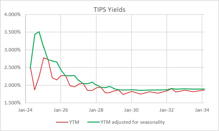
It is interesting to me that, with as important and liquid as the inflation-linked bond market is, tactical allocation between TIPS and nominal bonds is at best an afterthought for most investors. Perhaps this is because TIPS – if you think in nominal space, like most investors do – can be quirky and complex to analyze on a bond-by-bond basis. Here’s a picture of the TIPS yield curve. The red line is the way that TIPS real yields are calculated, and therefore the curve as perceived in the market. The green line is the true yield curve, adjusting for the way the seasonality of inflation prints affects each particular bond.
That’s understandable, but I don’t think it’s sufficient. Most investors do not invest in individual bonds, especially in TIPS space. They invest via mutual funds or ETFs, although the ‘laddering’ of TIPS to form a crude inflation-linked annuity is a popular approach amongst do-it-yourselfers. So why do so many investors own nominal bonds, instead of inflation-linked bonds, as an immutable strategic allocation? Even those who make occasional tactical shifts into TIPS seem to do so when they are expecting inflation to rise, and so are making a macro call instead of a quantitative call. But there are lots of times when owning TIPS instead of nominal bonds is just a good bet, regardless of your immediate inflation view. The most obvious one I wrote about back in March 2020 in “The Big Bet of 10-year Breakevens at 0.94%,” and I’ve also written generally about why you might want to be long inflation-linked bonds even if the current level of implied inflation (aka ‘breakevens’) is near to fair on the basis of your own view about the trajectory of inflation (see “A Guess at the Value of Long Inflation Tails” as an example).
But the times when just being long TIPS instead of nominals…or being long breakevens or inflation swaps if you do it as a leveraged play…is advantageous are not limited to unusual circumstances. TIPS also have tended to be systematically cheap over long periods of time, which I’ve also documented. Another way to consider the same question is to ask, “if I bought 10-year breakevens when they were at a particular level, how would I have done historically?” Or, equivalently, “if I had switched into 10y TIPS, instead of 10y Treasuries, when the spread was at a particular level, how much would I have out- or under-performed historically?” The chart below answers that question.

I went back to February 1998. For each of 6,453 days (ending in June 2023 since I had to look forward 6 months) I considered the starting 10-year breakeven rate and calculated the return to being long that breakeven over the next 6 months.[1] That return is dependent on the relative yields of the different securities, how those yields (and hence the breakeven) changed over time, and how actual inflation developed. It’s worth pointing out that this time period, core inflation was below 3% for 90% of the time. Ergo, you wouldn’t expect to have lots of big wins because of inflation surprise, although of course toward the end of the historical period you did.
The chart shows for each bin (I threw all 58 days with 10-year breakevens lower than 0.75% into the same bucket, which turned out to be equal to the number of days in the 2.75%-3.00% bucket) what the average 6-month return was to being long 10-year breakevens along with the 10th percentile and 90th percentile. So you can see that on average, you didn’t lose money being long breakevens anywhere under 2.50%, despite the fact that inflation throughout this period was very low. That’s a function of what I said before, that TIPS in general were cheap throughout this period. And if you bought breakevens (or switched into TIPS) any time that the breakeven was below 1.5%, you had a 90% or better chance of winning.
Naturally, it shouldn’t be a surprise that if you buy breakevens at a cheap level – as with any asset – you stand a better chance of winning than if you bought it at a dear level. What is a little more of a surprise is that there hasn’t historically been very much pain, on average, to being long breakevens even when they are high. In fact, unless you bought breakevens above 2.75% – basically, one event in 2022 – you had at least a 40% chance of winning your bet (10y TIPS outperforming).

This isn’t to say that there aren’t a lot of ways to lose, trading or investing in TIPS. Like any other investment, they can lose money and in 2022-2023 being naked long TIPS was almost as painful as being naked long any other fixed-income instrument. Almost. You did lots better than if you’d owned nominal Treasuries through the same episode!
[1] I used the Bloomberg US 10 year Breakeven Inflation Index, which is a total return index (BXIIUB10 Index on Bloomberg), from its inception in 2006; prior to that I used Enduring Investments calculations which utilized roughly the same methodology.
Why the M2 Slowdown Doesn’t Blunt My Inflation Concern
We are now all good and focused on the fact that inflation is headed higher. As I’ve pointed out before, part of this is an illusion of motion caused by base effects: not just cell phones, but various other effects that caused measured inflation in the US to appear lower than the underlying trend because large moves in small components moved the average lower even while almost half of the consumption basket continues to inflate by around 3% (see chart, source BLS, Enduring Investments calculations).

But part of it is real – better central-tendency measures such as Median CPI are near post-crisis highs and will almost certainly reach new highs in the next few months. And as I have also pointed out recently, inflation is moving higher around the world. This should not be surprising – if central banks can create unlimited amounts of money and push securities prices arbitrarily higher without any adverse consequence, why would we ever want them to do anything else? But just as the surplus of sand relative to diamonds makes the former relatively less valuable, adding to the float of money should make money less valuable. There is a consequence to this alchemy, although we won’t know the exact toll until the system has gone back to its original state.
(I think this last point is underappreciated. You can’t measure an engine’s efficiency by just looking at the positive stroke. It’s what happens over a full cycle that tells you how efficient the engine is.)
I expect inflation to continue to rise. But because I want to be fair to those who disagree, let me address a potential fly in the inflationary ointment: the deceleration in the money supply over the last year or so (see chart, source Federal Reserve).

Part of my thesis for some time has been that when the Fed decided to raise interest rates without restricting reserves, they played a very dangerous game. That’s because raising interest rates causes money velocity to rise, which enhances inflation. Historically, when the Fed began tightening they restrained reserves, which caused interest rates to rise; the latter effect caused inflation to rise as velocity adjusted but over time the restraint of reserves would cause money supply growth (and then inflation) to fall, and the latter effect predominated in the medium-term. Ergo, decreasing the growth rate of reserves tended to cause inflation to decline – not because interest rates went up, which actually worked against the policy, but because the slow rate of growth of money eventually compounded into a larger effect.
And so my concern was that if the Fed moved rates higher but didn’t do it by restraining the growth rate of reserves, inflation might just get the bad half of the traditional policy result. The reason the Fed is targeting interest rates, rather than reserves, is that they have no power over reserves right now (or, at best, only a very coarse power). The Fed can only drain the inert excess reserves, which don’t affect money supply growth directly. The central bank is not operating on the margin and so has lost control of the margin.
But sometimes they get lucky, and they may just be getting lucky. Commercial bank credit growth (see chart, source Federal Reserve) has been declining for a while, pointing to the reason that money supply growth is slowing. It isn’t the supply of credit, which is unconstrained by reserves and (at least for now) unconstrained by balance sheet strength. It’s the demand for credit, evidently.

Now that I’ve properly laid out that M2 is slowing, and that declining M2 growth is typically associated with declining inflation (and I haven’t even yet pointed out that Japanese and EU M2 growth are both also at the lowest levels since 2014), let me say that this could be good news for inflation if it is sustained. But the problem is that since the slowing of M2 is not the result of a conscious policy, it’s hard to predict that money growth will stay slow.
The reason it needs to be sustained is that we care about percentage changes in the stock of money plus the percentage change in money velocity. For years, the latter term has been a negative number as money velocity declined with interest rates. But M2 velocity rose in the fourth quarter, and my back-of-the-envelope calculation suggests it probably rose in Q1 as well and will rise again in Q2 (we won’t know Q1’s velocity until the advance GDP figures are reported later this month). If interest rates normalize, then it implies a movement higher in velocity to ‘normal’ levels represents a rise of about 12-14% from here (see chart, source Bloomberg.[1])

If money velocity kicks in 12-14% over some period to the “MVºPQ” relationship, then you need to have a lot of growth, or a pretty sustained decline in money growth, to offset it. The following table is taken from the calculator on our website and you can play with your own assumptions. Here I have assumed the economy grows at 2.5% per year for the next four years (no mean feat at the end of a long expansion).

The way to read this chart is to say “what if velocity over the next four years returns to X. Then what money growth is associated with what level of inflation?” So, if you go down the “1.63” column, indicating that at the end of four years velocity has returned to the lower end of its long-term historical range, and read across the M2 growth rate row labeled “4%”, you come to “4.8%,” which means that if velocity rises to 1.63 over the next four years, and growth is reasonably strong, and money growth remains as slow as 4%, inflation will average 4.8% per year over those four years.
So, even if money growth stays at 4% for four years, it’s pretty easy to get inflation unless money velocity also stays low. And how likely is 4% money growth for four years? The chart below shows 4-year compounded M2 growth rates back thirty or so years. Four percent hasn’t happened in a very long time.

Okay, so what if velocity doesn’t bounce? If we enter another bad recession, then it’s conceivable that interest rates could go back down and keep M2 velocity near this level. This implies flooding a lot more liquidity into the economy, but let’s suppose that money growth is still only 4% because of tepid credit demand growth and velocity stays low because interest rates don’t return to normal. Then what happens? Well, in this scenario presumably we’re no longer looking at 2.5% annual growth. Here’s rolling-four-year GDP going back a ways (source: BEA).

Well, let’s say that it isn’t as bad as the Great Recession, and that real growth only slows a bit in fact. If we get GDP growth of 1.5% over four years, velocity stays at 1.43, and M2 grows only at 4%, then:
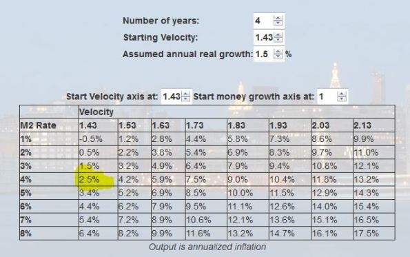
…you are still looking at 2.5% inflation in that case.
I’m going through these motions because it’s useful to understand how remarkable the period we’ve recently been through actually is in terms of the growth/inflation tradeoff, and how unlikely to be repeated. The only reason we have been able to have reasonable growth with low inflation in the context of money growth where it has been is because of the inexorable decline in money velocity which is very unlikely to be repeated. If velocity just stops going down, you might not have high inflation numbers but you’re unlikely to get very low inflation outcomes. And if velocity rises even a little bit, it’s very hard to come up with happy outcomes that don’t involve higher inflation.
I admit that I am somewhat surprised that money growth has slowed the way it has. It may be just a coin flip, or maybe credit demand is displaying some ‘money illusion’ and responding to higher nominal rates even though real rates have not changed much. But even then…in the last tightening cycle, the Fed hiked rates from 1% to 5.25% over two years in 2004-2006, and money growth still averaged 5% over the four years ended in 2006. While I’m surprised at the slowdown in money growth, it needs to stay very slow for quite a while in order to make a difference at this point. It’s not the way I’d choose to bet.
[1] N.b. Bloomberg’s calculation for M2 velocity does not quite match the calculation of the St. Louis Fed, which is presumably the correct one. They’re ‘close enough,’ however, for this purpose, and this most recent print is almost exactly the same.
TIPS for a Risky Period
Whoever is selling stocks these days is really appreciative of those who are pushing the market higher. Thanks to overnight rallies in China and Japan on Tuesday night, US stocks launched higher at the open on Wednesday. Now, neither the modest rally in Shanghai (led by official buying) and the bigger rally in Japan (on Prime Minister Abe’s pledge to cut corporate taxes next year) had the slightest thing to do with items that impact the US, but the rally led a wave that rolled through futures markets around the globe until about seven minutes after traditional stock trading hours opened in New York, when the high of the day was set. The next six-and-a-half hours saw a 440-point decline in the Dow and around 50 in the S&P to a net loss of about 1.4% on the day.
“Gee, thanks!” said the pension fund guys who got to unload stocks about 3% higher than they otherwise would have. Who says the fast money monkeys don’t have salutatory effects?
The clue that today’s rally was not going to be sustained was actually in the energy markets. Prior equity oscillations had been mirrored with quite reasonable fidelity in the last week or two, but this morning energy markets were noticeably flat-to-down. Equities soon joined them.
Now, yesterday I mentioned that real yields are near their highest levels of the last five years, and that nominal yields are essentially in the middle of that range. I didn’t illustrate the latter point; but see below (source: Bloomberg).

So it is clear, to me, where you would rather place your bets in fixed-income: with real yields around 65bps and nominal yields at 2.20, you only want to own nominal bonds if inflation is less than 1.55% for ten years. Note that if inflation is negative, then you do approximately the same with TIPS as with nominal bonds, since in both cases your nominal principal is preserved. So it is a narrow set of circumstances in which you do better owning nominals, and you don’t do much better. On the other hand, there are long tails on the other side: ways that by owning TIPS you will do dramatically better.
I mention this, even though both nominal bonds and TIPS offer poor prospective returns, because it is the time of year when seasonally it is difficult to lose by owning fixed-income. The chart below (source: Bloomberg) shows the average change in nominal 10-year yields over the course of a calendar year for the last 30 years (gold), 10 years (white), and 5 years (red). Note that this isn’t a pure seasonal chart because it doesn’t correct for the average drift over the course of the year, but it suffices to show that buying bonds after the early-September backup has been a good strategy for many years…really, until the last five years, and even then it was a push between mid-Sep and mid-Nov.

So what I want to do in a period of uncertainty, headed into the fourth quarter, is to own TIPS, either outright or via an ETF like TIP. If the market comes unglued, then all interest rates should decline; if the market drops because real growth is weakening, then real rates should fall more than nominal rates (and in any event, owning TIPS gives you the positive tail exposure I mentioned above). If the market turns around and rallies, then energy probably recovers somewhat and this will help TIPS compared to nominals. But in any event, I am reducing risk into a very risky period.
A Relatively Good Deal Doesn’t Mean It’s A Good Deal
I suspect that everyone has ‘default activities’ that they automatically turn to when nothing else is working. For example, when I can’t sleep and I’ve tried everything, I go downstairs and have a bowl of cereal. Some folks hit the gym when they’re frustrated. Others go shopping when they’re depressed.
And apparently, some people buy stocks when they’re not turned on by anything else.
There wasn’t any outrageously positive news today that sent the S&P +0.8% on the day. Initial Claims (371k) was slightly higher than expected (but I advocate ignoring that release in late December and most of January). The dollar dropped sharply against the Euro. I initially thought that this was because the President nominated as Treasury Secretary someone with no financial markets experience at all but a solid resumé of hard-nosed negotiations with Congress, but the Euro gained against all major currencies so it was perhaps due more to the fact that ECB President Draghi didn’t ease further at the policy meeting held today (though they were not expected to). Bloomberg blamed a better-than-expected rise in Chinese exports, but the miss was well within the usual variance for a volatile number so that seems unlikely to me.
I am not entirely kidding about the frustration that “there’s nothing else to invest in.” I was just working today on a chart for a keynote presentation I have been asked to give at the Inside Indexing conference in Boston in April (See the link here, although most of the information on the site is still the 2012 data). I have previously run this chart, showing Enduring Investments’ projected 10-year annualized real returns and risks (this is as of year-end 2012).
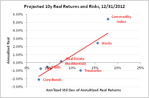
The slope of that line indicates that the current tradeoff of risk for return is 2.7:1. That is, for a 1% higher expected annualized real return, you will have to accept a 2.7% increase in the annualized standard deviation of annuitized real returns (the “right” measure of risk, as it measures the variance in the long-term real purchasing power of the investment). Now, here’s the chart as of April 23, 2003, using all the same methodology:
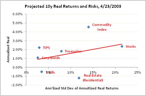
The slope of the line back then was 9.1:1. That is, in 2003 you needed to take more than three times as much risk to add 1% in expected real return to your portfolio.
But notice something else also that is very important. The change in the slope of the line didn’t come because expected equity or commodity index returns got better. Indeed, those two asset classes have roughly the same forward expected returns as they did back then, although slightly different risks the way we figure it. What happened is that the expected real returns to Treasuries, TIPS, and Corporate Bonds all fell precipitously.
Of course, this comes as no surprise to anyone, because we’ve all watched the Fed push interest rates down so far that we need extra decimal places. But I think comparing these charts you can understand a fundamental verity: people are not buying stocks because they expect awesome returns going forward (hopefully, anyway, because they’re not going to get them). They’re buying stocks because there’s less reward to buying less-risky asset classes. Which is, after all, what the Fed was trying to do (this is called the “portfolio balance channel” in monetary policymaker parlance: force people to take more risk than they want, because it’s a relatively good deal even if it’s not a good deal in an absolute sense).
.
A few other notes about today’s news:
Inflation markets were abuzz today, with inflation-linked bonds outpacing their nominal counterparts in many countries, because the UK’s ONS announced that it has decided not to change the RPI that applies to Gilt linkers (inflation-linked bonds, like TIPS). The ONS (similar to our BLS) has been studying how to make certain important technical corrections to the way the RPI is calculated to make it more accurate; these changes would have had the effect of lowering the RPI significantly. As a consequence, these bonds have been trading at higher real yields, reflecting the fact that if the ONS chose to change the RPI formulation, the yield on the bond would have to be higher to compensate investors for that change if the same value was to be delivered. That is, instead of a yield of (for example) 1% added to expected inflation of 2.5%, the yield would rise to 1.5% to reflect the expectation that measured inflation would be at 2.0%. Many investors thought it was very likely that the ONS would choose one of several options for restating RPI that would have had such a deleterious effect on the bonds.
In the event, the ONS made the wise decision that it would be unfair to change the terms of the bonds retroactively by making a significant change to the RPI, so they will release a second index called the RPIJ, which will now be the benchmark index and featured in ONS releases. But they will also continue to calculate the RPI and the existing bonds will continue to track RPI.
This is a great relief to inflation-linked bondholders the world over, because it sets a very important precedent. The U.S. Treasury has long said that if the BLS made a material change to the way CPI was calculated, it would plan to continue paying on the basis of the old-formulation CPI (if it was still available) or a suitable alternative, but many investors from time to time have worried about whether they would do that in practice. It will be harder to do so with the ONS precedent.
Because investors had thought the ONS was leaning the other way, Gilt linkers rallied a bunch. For example, the UKTI 1.25%-11/2055 rallied 10 points on the day (the yield fell by about 20bps), which is an enormous move at the long end. The 5-year linker (Nov 2017) yield fell 35bps. This is likely to have a spillover effect in US TIPS, since the latter now look much better on a relative value basis than they did previously. Anyone who was long UK linkers yesterday is probably considering 30 year TIPS at a pickup of 42bps.
Finally, in Fed news Esther George, the President of the Kansas City Fed (replacing Thomas Hoenig) was on the tape today. “Fed’s George Says Low Rates Risk Stoking Inflation Surge,” said Bloomberg. No kidding? (See here for Market News’ coverage of the same speech). At the very least, said George, the asset purchases will “almost certainly increase the risk of complicating the FOMC’s exit strategy.” Neither of those statements ought to be the least bit surprising or controversial, but it’s unusual to hear a Fed official state these things so bluntly. But she may have crossed the line with this one, which might get her ostracized at the next FOMC meeting:
Like others, I am concerned about the high rate of unemployment, but I recognize that monetary policy, by contributing to financial imbalances and instability, can just as easily aggravate unemployment as heal it.
Keep speaking truth to power, Ms. George!
Incredible Inflation Bond Bargain
The economic data continues to drip weaker. Today’s Chicago Fed index was the lowest since 2009, and while the Dallas Fed index rose, it remains negative. These aren’t major indicators, but the general tone of data recently has been weak and nothing recently stands out as positive…except for Existing Home Sales, which raises other issues as noted last week. A friend in the southwest U.S. describes the local housing market in Phoenix as “definitely bubblicious” and passed along this link, describing how rental properties in Phoenix are seeing aggressive bidding from would-be renters.
Now, economic activity is also not exactly falling off a cliff, and some Americans insist that the economy is doing just great (these seem to be the Obama voters but I can’t tell which way the causation runs – are they Obama voters because they think the economy is doing well, or do they think the economy is doing well because they are Obama voters and that’s the story?). But to listen to Fed speakers, you would think economic collapse is imminent. Last week, Minnesota Fed President Kocherlakota[1] advocated keeping monetary policy extraordinarily accommodative until the unemployment rate gets down to 5.5% or until the medium-term outlook for inflation rises above 2.25% (on core PCE). Today, San Francisco Fed President Williams said that he expects the Fed to end asset purchases “before late 2014” (which, for those of you scoring at home, would imply the Fed has about a trillion dollars to go) and shouldn’t raise rates until mid-2015. I wonder what it is that Fed officials are forced to check at the door: their brains, or their optimism?
No wonder that inflation-linked bonds are so expensive these days!
Which brings me, actually, to the main topic I wanted to discuss today. A reader asked me the other day about I-series savings bonds from the U.S. Treasury. For those of you who aren’t familiar with them, I-bonds are like regular savings bonds except that they pay a real interest rate. That is, instead of getting a fixed coupon, you get a fixed coupon plus inflation, which is added to the principal and compounded until the bond is redeemed. You can buy them on Treasury Direct and keep them in electronic form, and in fact that’s the best way to buy them. You can buy up to $10,000 per Social Security number per year.
And that limit turns out to be a good thing, because if it weren’t for that limit hedge funds would be going nuts on series I bonds right now. Because the people who created I bonds never contemplated a negative real interest rate, or else thought the marketing angle of selling bonds at a negative real interest rate would be too bad, the fixed part of the I bond coupon is floored at 0%. This is significant, since the market rate for a 5-year TIPS bond right now is -1.59%. The coupon rate on the I-bond is set for the next six months of new sales (the fixed coupon stays the same for the life of any given bond) every May and November, and typically is set very close to the 5-year TIPS rate (see chart below, source Treasury Direct and Bloomberg).

Notice, though, that at the far right-hand part of the chart the last few I-bonds issued have had coupons of 0%, since the actual TIPS rate has been considerably below that. And that means that if you are going to buy TIPS, then before you spend a single dollar on the April-2017 TIPS you should buy your full $10,000 limit on I-bonds, because you save 1.59% compounded for at least 5 years. That’s an extra 8.2% total return on your money over that period![2]
Occasionally, there can be good deals when the TIPS market moves between the setting of a coupon and the next coupon set. When the current series coupon was set at zero, back in May 2012, the advantage was only about 125bps and it’s now 159bps. But the current advantage is in good measure structural, rather than due to timing. As a consequence of that structural mistake (not allowing a negative real coupon), combined with the TIPS market’s rally since May, the current spread is actually the highest ever seen for the program (see chart below, source Treasury Direct and Bloomberg).

I don’t regularly recommend specific trade ideas in this (public) space, for a whole host of regulatory reasons, but I can say this: look into series I-bonds unless you (a) don’t care about inflation, (b) feel like you need to take lots more risk, (c) feel comfortable that if you wait long enough, you’ll get a better investment opportunity in inflation-linked bonds, or (d) have so much money that $10,000 per member of your household, per year, simply isn’t meaningful.
And if it’s case (d), then please write because I need more friends like you!
[1] Kocherlakota is described by some as a hawk, but he can most accurately be described as ‘confused.’ He once explained that the Fed might have to raise interest rates, even if inflation expectations were low, to force them higher, getting the causality exactly backward.
[2] Note that if you do not intend to hold the I-bond for at least 5 years, there is a penalty associated with early redemption – you lose some interest accrual. Even with that, it’s not a terrible deal given how cheap these are now, and most investors should have some inflation protection in their portfolios to diversify the risk of all of those investments (equities, nominal bonds) that do poorly in inflationary environments. So, for the buy-and-hold part of your portfolio, these are terrific.
TIPS Are No Longer Cheap, But Still Preferable
TIPS have gone from being rich on an absolute basis, but cheap against nominal bonds, to (still) rich on an absolute basis, but fair versus nominal bonds as nominal yields have risen. That statement is based, however, on a static equilibrium – given where nominal yields are now, after a 40bp selloff since July, real yields have fallen slightly (see chart, source Bloomberg – nominal yields in yellow, real yields in white) and are about right.

I have previously documented this move, pointing out the rise in breakevens and/or inflation swaps. However, because I was traveling I didn’t write anything following Friday’s skyrocketing breakevens, which followed through on Monday to within a couple of basis points of all-time highs (see chart, source Bloomberg).

That leap seemed exceptionally surprising to some, given the weakness of core CPI on Friday. But inflation expectations on Friday were still reacting to the Fed’s open-ended QE move, which had moved 10-year breakevens to near 2.50% on Thursday. After sleeping on it, many investors realized what we realized immediately: there is nothing deflationary about buying bonds without limit, using money printed for the purpose. The Fed professes to be concerned about the negative tail risk to growth (which they can do nothing about), and ignores the positive tail risk to inflation (which they could do something about, if they chose). It is not at all surprising that breakevens leapt.
As I said, these recent gyrations have moved TIPS to being approximately fair value relative to nominal bonds, given the yield of nominal bonds. But the further question is whether those nominal yields are themselves at fair value, or are on the way to higher or lower levels.
A reasonable question to interpose here is this: is this as good as it gets for bonds? What could be better than unlimited Fed buying? Well…I suppose unlimited buying in Treasuries, as opposed to mortgages, would be better, but with 10-year yields at 1.81% one would think that both a considerable amount of buying and a considerable amount of bad economic news is priced in. To be sure, the news continues to be bad; Friday’s -10.41 print in the Empire Manufacturing Survey was the lowest since the dip in 2008-09. Lower than the “cash for clunkers” hangover in 2010. Lower than the post-Japanese-tsunami drag in 2011.
But consider this: in the throes of a much worse crisis (especially demographically), and with the Japanese central bank making only timid efforts to resist deflation – and certainly not buying every bond in sight, as the Fed is – the average yield of 10-year Japanese government bonds (JGBs) from 1997-2007 was 1.51% (see chart, source Bloomberg).

Even if you take the crisis-on-a-crisis period of post-2008 for Japan, the average 10-year yield is about 1.15% – and that’s with deflation in full bloom and the central bank until the last year or so doing little to fight it.
In Japan, core inflation is at -0.6% over the last 12 months, and 10-year yields are at 0.81%. Our core inflation is 1.3% higher and our nominal yields only 1% higher. There is a lot of disinflation and/or Fed buying that is already in the price. I am not saying that we ought to be selling nominal bonds here; I’ve gotten burned on that call in the past, and anyway we are in the middle of the strongest bullish seasonal period of the year for bonds. But the Fed just added to the length of the possible “high inflation tail” outcome – and I fail to see what the offsetting bullish tail is. I can’t imagine why anyone would buy nominal bonds at these levels, given what the Fed and their pals at other central banks are doing.
But if nominal yields do rise further, this means that TIPS yields will eventually start to rise as well. I still prefer TIPS to nominals, and I still want to be long breakeven inflation, but admittedly it is a more difficult trade at these levels than it was back on August 7th, when I first noted that our Fisher model indicated a short position in TIPS and a long position in breakevens.
I say this, going into a TIPS auction tomorrow with 10-year TIPS yields near all-time lows and 10-year breakevens as I noted near all-time highs. It’s not going to feel like a bargain for anyone, but a year from now, it may seem like it.
Now, make no mistake: the core inflation print on Friday of +0.052% was a definite surprise on the weak side. But it wasn’t quite as weak as it looked. In fact, thanks to Housing and Transportation, 62% of the CPI major subgroups saw their year-on-year rates of change rise, while only 38% (Food/Beverages, Apparel, Recreation, Education/Communication, and Medical Care) saw those rates decline. Much of the weakness in core inflation came from apparel (which is interesting and worth watching to see if it continues) and large moves in used cars and airline fares. Moreover, as I observed last week, the year-ago comparisons get much easier for the next four months, so that the current 1.9% core inflation print is likely to be the lowest for this year. If it’s not, then we’ll need to re-assess what is going on, but for now nothing has changed about my forecast. Do note that the Cleveland Fed’s Median CPI was unchanged again up at a 2.3% y/y rate of change, reinforcing the fact that the core decline over the last few months has been driven by some outlier price movements rather than by a shift in the central moment of the distribution.