Archive
RE-BLOG: Groucho And Holiday Inn Express
Note: The following blog post originally appeared on March 28th, 2010 and is part of a continuing year-end ‘best of’ series, calling up old posts that some readers may have not seen before. I have removed some of the references to then-current market movements and otherwise cut the article down to the interesting bits. You can read the original post here.
Some bond bears were probably also scared by the fact that CNBC asked the question on Friday, “Time To Sell Bonds To Buy Stocks?” (Remind me when they last asked whether it was time to sell stocks to buy…anything?) They’re half right this time, I think, but I don’t like having them as company either. Balancing the Groucho effect (“I don’t want to belong to any club that would accept people like me as a member”) is the Holiday Inn Express effect (in which people develop amazing abilities unrelated to their backgrounds: “Are you a doctor?” “No, but I stayed at a Holiday Inn Express last night”). Barron’s, specifically Michael Santoli, who writes the “Streetwise” column, sought to explain why rising yields are good for stocks. When equity guys are busy telling the bond vigilantes why they’re not scared of them…they’re scared of them.
During a day in which there was little in the way of economic data, several Fed speakers were on the tape. While it is ordinarily very important to listen attentively to comments from Fed officials, these days it isn’t so crucial because we know what conditions will lead to meaningful tightening and they (much lower unemployment rate, some sign of broad core inflation including housing) aren’t going to happen any time soon. Why? Dr. Bernanke is fighting a desperate rear guard action against those people who reasonably question whether the Fed has been all it’s cracked up to be. The threat is real; Fed Governor Kevin Warsh on Friday stated that Fed credibility would suffer if independence was lost. Although this statement raises other questions (namely, “what credibility??), it is indicative of the FOMC’s mood. If you think Bernanke is going to tighten rates meaningfully when Unemployment is near 10%…or 9%…or 8%…and risk having the Fed’s independence stripped, I think you ought to think again. Of course, this means that the de facto independence of the Fed is questionable, but anyone who thinks that this is a fight the Fed should pick shortly after the bottom of the worst recession in at least 30 and maybe 80 years, please raise your hand. I didn’t think so.
A Word About Current Value In Long TIPS
When investors are thinking about what assets to include in their portfolios, they obviously care about both risk and return. Of course, the problem is that they care about a priori risk and return, which are unknowable, and so tend to populate portfolio allocation simulations with estimates of long-run returns that are no better than guesses (we tend to have a better sense of long-run variances, although what causes problems there is that the distribution is not normal). This is why equities are so dominant in many portfolios, despite their evident short-term risk: generally, investors make one of three key errors in looking at long-run equity returns:
- They use long-run historical nominal returns to form the estimate. Investors shouldn’t care about nominal returns at all, so this is clearly incorrect.
- They use long-run historical real returns. This is better, but it neglects the fact that most historical periods which terminate in the last decade-plus will also reflect multiple expansion as a source of return. There is no good reason to expect that the multiple expansion of the last eighty years will repeat over the next eighty.
- They use a tortured interpretation of the Capital Asset Pricing Model to back out high expected returns for equities. “Stocks are riskier; therefore, they should have a higher return.” The CAPM isn’t meant to be a causal model but rather an observation about how capital assets should be priced. If riskiness implies more return, then lottery tickets should be the best investment.
But we can look at long-term data in a more thoughtful way and get a better sense for what a fair return to equities is, in the long run. Brad Cornell and Rob Arnott wrote a short article (“The ‘Basic Speed Law’ for Capital Markets Returns“) that pointed out three important long-term truisms. First, the long-run growth rate of per-capita GDP in the U.S., a measure closely related to productivity growth, has been around 2% for the last 100 years. Second, if the real economy is growing around 2% per capita in the long run, then earnings in the corporate sector must also be limited to roughly that growth (since otherwise it would soon become larger than the economy itself). And third, if the growth of earnings is limited similarly, then stock price index growth must be limited to something similar as well, net of valuation changes.
The version of the chart which appears below is sourced from Census, BEA, and Robert J Shiller data, and updated through the end of 2009. Over the last 80 years, the compounded growth rate of real per capita GDP has been 2.1%; for real earnings it is 2.6%; and for stock prices it is 1.8%. However, those rates are computed using arbitrary end points – December 1929 and December 2009. A better way is to run an exponential regression, and on the chart the straight lines are the results of that regression (the line appears straight because the axes are loglinear, so the regression line is linear in log space). The growth rates then are 2.25% for real per capita GDP, 1.74% for real earnings (n.b., if you take out 2008Q4-2009Q3, the coefficient is 1.95%), and 2.87% for the real stock price growth rate.

- I hope you like 2%, because that’s what you’re gettin’.

Now, 2.87% as a long-run real growth rate for equities doesn’t sound great, but it’s actually even exaggerated because over that period, equity multiples expanded from 13.3x earnings to 21.6x earnings, so a bunch of that return is coming from multiple expansion that may not repeat. If the current multiple is fair (I think it’s high, but let’s be generous), then the long-run expected return to equities ought to be similar to the long-run expected growth in earnings, which is limited to the long-run growth in GDP per capita. Or, roughly, 2-2.25% (There really isn’t a lot of difference here, actually; real GDP uses the GDP deflator to measure price inflation, while real earnings uses CPI; the latter is generally about 0.25% or so higher, so these are essentially both 2%, if you use CPI, or 2.25%, if you want to use the deflator.)
That’s what you can expect to get from equities in the truly long-run, plus dividends – of 1.8% on the S&P right now. With that long-run growth, of course, comes a ton of volatility. Meanwhile, you can get a 30-year real yield of 2.17% from TIPS, with much less volatility (and no volatility at a horizon equal to the duration of the bond). Moreover, remember TIPS pay based on CPI, which is the “faster” of the two inflation measures used above.
So, unless you are into market timing, TIPS are currently priced to produce a long-run real return equal to stocks, with less volatility. That’s a decent deal! If we get a big rate sell-off, that deal may get better still, but while the short end of the TIPS curve doesn’t look terribly attractive the long end remains reasonable.
———
You can follow me @inflation_guy, or subscribe to receive these articles by email here.
RE-BLOG: “I Am Become Debt, Destroyer Of Worlds”
Note: The following blog post originally appeared on January 25th, 2010. I have removed the references to then-current market movements and otherwise cut the article down to the interesting bits. In this case, I have also updated the charts and clarified the text for the additional data we have since then. You can read the original post here.
…However, it supports my belief that the slide late last week isn’t (yet) the beginning of a slide into oblivion. Also supporting that point, Greece managed to sell €8 billion bonds quite easily today. I don’t really understand why it was so easy. I suppose there is a deep reservoir of people who don’t want to see a European sovereign go bust – for example, other Europeans – but it isn’t as if that 8 billion will carry Greece forever. They are in dire straits, and as I’ve pointed out here before they can’t print money and that fact is what makes a default possible. I do believe this could be the beginning of the end for the Euro, but I don’t think that end is imminent. Institutions have selfish memes and tend to protect themselves vigorously. In this case, I suspect that other European central banks, big European investors, European corporate entities…they all have a very strong vested interest in holding the Euro together, and they will do so as long as it is possible. And it will be possible for a while.
An interesting factoid that I saw on CNBC today: of companies announcing Q4 earnings so far, 9% have beaten earnings-per-share (EPS) estimates, but 65% have beaten revenue estimates. What does that mean? I think it means that margins have been lower than analysts expected (although there’s a statistical caveat, because the number of misses may or may not correlate to the size of the miss), which means that they’re buying business through lower prices or, on the other hand, are holding prices down while input costs rise. One is a disinflationary spin and one is an inflationary spin. The data suggest the latter, as inflation-other-than-housing has been percolating some, but wage growth (a big input) hasn’t exactly been robust either. I’ll call it a tie on that evidence (with respect to inflation implications), but either way tightening margins are a sign of economic weakness.
But my bigger worry is that some sharper near-term imbalances are brewing. Economic weakness we can work through, if the basic capital markets and economic structures are left in place and government doesn’t take too much of the productive capacity of the country (these assumptions are somewhat in doubt these days, but let’s look past that). What worries me in the reasonably short-term is that there are some big imbalances that are following on the heels of the imbalances that just blew up…and those just about cracked the edifice of Western civilization.
All of these imbalances are of our own making, but none has been created as fast as this one. I will do my best to explain it, and I hope that somewhere my logic falls down and someone can correct me.
When the government runs a deficit, where does it get the money so that its expenditures can exceed its revenues? It borrows, from essentially two places: domestic savers and foreign savers. In recent years, domestic savings have been low, and the government has financed its deficits more and more with money lured from foreign investors who hold dollars. Because the only reason these folks hold dollars is because we are buying more stuff from them than they are buying from us, we have a trade deficit. If domestic savings is stable, then over time the budget deficit and the trade deficit must equal; but a better way to think of this is that budget deficit = (trade deficit plus domestic savings).
This is why folks talk about the “twin deficits,” trade and budget. Large deficits can only be financed entirely from within if there is substantial domestic savings, but we have been discouraging savings for a couple of decades now. The graphic relationship is sloppy, partly because we’re not great at measuring these values and partly because domestic savings ebbs and flows, but you can see that the larger trade deficit in recent decades seems to be at least of similar magnitude as the budget deficit (Source: Economagic.com):
 Well zowie…those last few points are interesting, are they not? The government is running an epic deficit, as we all know, but the trade deficit has actually improved since 2008. How is that possible? It is possible because domestic savings has been growing by trillions of dollars over the last few years.
Now, you might say “that’s great news!” except that it isn’t great news at all. The largest part of that “savings” is the money that the Fed has printed by buying Treasuries, agencies, and other collateral. This is where the rise in the money base (see chart below) is showing up.

To tie these charts together, I will note that the total rise in the balance sheet assets since August 27, 2008 has been $3.0 trillion. And the cumulative difference in the budget deficit, less the trade deficit, has been $3.1 trillion.
That’s right: the improvement in the trade deficit, despite the huge budget deficit, comes almost entirely because the Fed has provided the needed savings with its checkbook. But now here’s the problem. The Fed declares that they are not going to keep doing that, which means that (a) they’re lying, or (b) there is going to be a massive improvement in the budget deficit, soon, or (c) the trade deficit is going to start looking really, really, really bad, pretty soon.
Any guesses for (a), (b), or (c)? [Editor’s note: with hindsight, it seems that (a) really was the correct answer. It isn’t clear whether that is the correct answer today. I suspect there will be come combination of (a), (b), and (c).]
Assuming that the Fed isn’t lying, and assuming that the federal government isn’t going to find fiscal Jesus and slash a couple trillion from the deficit (as I’ve noted though, if they just don’t have any emergencies this year the deficit ought to improve a few hundred billion), then the trade deficit is going to start to look ugly. Epic ugly. Medusa-ugly.
And this leads to the worry – if the trade deficit explodes, then two other things are going to happen, although how much of each I can’t even guess: (I) protectionist sentiment is going to become very shrill, and fall on the ears of a President who is looking to burnish his populist creds, and (II) the dollar is going to be beaten like a red-headed stepchild (being a red-headed stepchild, I use that simile grudgingly).
Others – Warren Buffet is one – have publicly toted up the numbers and observed that it’s hard to figure out how we finance such deficits unless most of it comes from overseas. To entice such largesse, the currency unit will need to be cheaper, and rates will have to be higher.
This is my worry – not a global meltdown, but a U.S.-specific meltdown. Higher rates, higher inflation, lower equities, and a lot of volatility. And it may happen quickly, when it happens. [Editor’s note: Thanks to the Fed pursuing the policy in (a) above, it hasn’t yet happened!]
When might this happen? Putting dates on nightmare scenarios is ordinarily a useless chore. It is usually far better to merely be alert to possibilities and to move quickly when the rock looks like it’s toppling. But in this case, there is a particular time period I am especially concerned about: the end of March (as in, about two months from now).
The Fed is gradually reducing its purchases of MBS, with the intention of ending those purchases…in March. Also, Japanese year-end is in March, and lest we forget the Japanese represent some 20% of the foreign ownership of Treasuries. There is a reason that seasonals for the bond market are weak in the spring. If we can skate past April 1 without something serious happening, then I will breathe a sigh of relief and go back to balanced-rock-watching. But in the meantime, I sleep fitfully.
———
You can follow me @inflation_guy, or subscribe to receive these articles by email here.
Portfolio Projections from 2013
This will be my last “live” post of 2013. As such, I want to thank all of you who have taken the time to read my articles, recommend them, re-tweet them, and re-blog them. Thanks, too, for your generous and insightful comments and reactions to my writing. One of the key reasons for writing this column (other than for the greater glory of Enduring Investments and to evangelize for the thoughtful use of inflation products by individual and institutional investors alike) is to force me to crystallize my thinking, and to test that thinking in the marketplace of ideas to find obvious flaws and blind spots. Those weaknesses are legion, and it’s only by knowing where they are that I can avoid being hurt by them.
In my writing, I try to propose the ‘right questions,’ and I don’t claim to have all the right answers. I am especially flattered by those readers who frequently disagree with my conclusions, but keep reading anyway – that suggests to me that I am at least asking good questions.
So thank you all. May you have a blessed holiday season and a happy new year. And, if you find yourself with time to spare over the next few weeks, stop by this blog or check your email (if you have signed up) as I will be re-blogging some of my (subjectively considered) “best” articles from the last four years. Included in that list is an article on long-run returns to equities, one on Yellen’s defense of large-scale asset purchases, an article on the Phillips Curve, one on why CPI isn’t a bogus construct of a vast governmental conspiracy, and so on. Because I don’t expect some of the places where this column is ‘syndicated’ to post the re-blogs, you should consider going to the source site to sign up for these post, or follow me @inflation_guy on Twitter.
And now, on to my portfolio projections as of December 13th, 2013.
.
Last year, I said “it seems likely…that 2013 will be a better year in terms of economic growth.” It seems that will probably end up being the case, marginally, but it is less likely that 2014 improves measurably in terms of most economic variables on 2013 and there is probably a better chance that it falls short. This expansion is at least four years old. Initial Claims have fallen from 650k per week in early 2009 to a pace of just barely more than half that (335k) in the most-recent 26 weeks. About the best that we can hope for, plausibly, is for the current pace of improvement to continue. The table below illustrates the regularity of this improvement over the last four years, using the widely-followed metric of the Unemployment Rate:
| ‘Rate | (change) | |
| 12/31/2009 | 9.90% | |
| 12/31/2010 | 9.30% | -0.60% |
| 12/31/2011 | 8.50% | -0.80% |
| 12/31/2012 | 7.80% | -0.70% |
| 11/30/2013 | 7.00% | -0.80% |
Sure, I know that there are arguments to be made about whether the Unemployment Rate captures the actual degree of pain in the jobs market. It plainly does not. But you can pick any one of a dozen other indicators and they all will show roughly the same pattern – slow, steady improvement. There is no doubt that things are better now than they were four years ago, and no doubt that they are still worse than four years before that. My point is simply that we have been on the mend for four years.
Now, perhaps this expansion will last much longer than the typical expansion. But I don’t find terribly compelling the notion that the expansion will last longer because the recession was deeper. Was this recession deeper because the previous expansion was longer? If so, then the argument is circular. If not, then why would that connection only work in one direction? What I know is that the Treasury has spent the last four years running up large deficits to support the economy, and the Fed has nailed interest rates at zero and flooded the economy with liquidity. Those two things will at best be repeated in 2014, not increased; and there is a decent chance that one or the other is reversed. Another 0.8% improvement in the Unemployment Rate would put it at 6.2%, and I expect inflation to head higher as well. A taper will be called for; indeed, it should never have been necessary because policy is far too loose as it is. Whether or not an extremely dovish Fed Chairman will actually acquiesce to taper is an open question, but economically speaking it is already overdue and certainly will appear that way by the middle of the year, absent a crack-up somewhere.
Global threats to growth do abound. European growth is sluggish because of the condition of the financial system and the pressures on the Euro (but they think growth is sluggish because money isn’t free enough). UK growth has been improving, but much of that – as in the U.S. – has been on the back of housing markets that are improving too quickly to make me comfortable. Chinese growth has recently been downshifting. Japanese growth has been irregularly improving but enormous challenges persist there. Globally, the bright spot is a modest retreat in Brent Crude prices and lower prices of refined products (although Natural Gas prices seem to be on the rise again despite what was supposed to be a domestic glut). Some observers think that a lessening of tensions with Iran and recovery of capacity in Libya, along with increasing US production of crude, could push these prices lower and provide a following wind to global growth, but I am less sanguine that geopolitical tensions will remain relaxed for long and, in any event, depending on a calm Iran as the linchpin of 2014 optimism seems pretty cavalier to me.
Note that the muddled growth picture contains some elements of risk to price inflation. The ECB has been kicking around the idea of doing true QE or experimenting with negative deposit rates. The UK housing boom, like ours, keeps the upward pressure on measures of core inflation. There is no sign of an end to Japanese QE, and the PBOC seems willing to let the renmimbi rise more rapidly than it has in the past. And all of these global risks to domestic price inflation are in addition to the internally-generated pressures from rapid housing price growth in the United States.
The good news on inflation domestically is that M2 money growth has slackened from the 8%-10% pace of last year to more like 6%-8% (see chart, source Bloomberg). This is still too fast unless money velocity continues to slide, but it is certainly an improvement. But the bad news is that money growth remains rapid in the UK and is accelerating in Japan. The only place it is flagging, in Europe, has a central bank that is anxious not to be last place on the global inflation scale. I expect core inflation (and median inflation) in the U.S. to rise throughout 2014 and for core inflation to end up above 3% for the year.
 Now, I have just made a number of near-term forecasts but I need to change gears when looking at the long-term projections. In what follows, I make no effort to predict the 3-month, 6-month, or 12-month returns of any market. Indeed, although I will present long-term risk and return outlooks, and they are presented as point estimates, I want to make it very clear that these are not predictions but rather statements of relative risk and return possibilities. For many types of instruments, the error bars around the average annual performance are so large as to make point estimates (in my view) nearly useless. The numbers come from models of how markets behave when they are priced “like they are now” in terms of several important metrics. They are not prescient. However, that is what investing is really all about: not making the “right” bet in terms of whether you can call the next card off the deck, but making the “right” bet with respect to the odds offered by the game, and betting the right amount given the odds and the edge.
I also will not make portfolio allocation recommendations here. The optimal portfolio allocation for you depends on more variables than I have at my disposal: your age, your career opportunities, your lifestyle, your goals, any insurance portfolio and your risk tolerance, to name just a few.
What I will do here, though, is to give top-down estimates of the long-run returns and risks of some broad asset classes, and make some general observations. I don’t analyze every possible asset class. For this exercise, I limit the universe to stocks, TIPS, nominal bonds (both long Treasury and corporate bonds), commodity indices and (since many of us already own it) residential real estate. My estimates and some notations about the calculations are in the table below.
| Inflation | 2.50% | Current 10y CPI Swaps |
| TIPS | 0.68% | Current 10y TIPS. This is not at equilibrium, but it is what we can lock in today. It is the highest rate available at year-end since 2010. |
| Treasuries | 0.37% | Nominal bonds and inflation-linked bonds ought to have the same a priori expectation, but Treasuries trade rich to TIPS because of their value as repo collateral. Current 10y nominal rate is 2.87%, implying 0.37% real. |
| T-Bills | -0.50% | Is less than for longer Treasuries because of liquidity preference. |
| Corp Bonds | -0.69% | Corporate bonds earn a spread that should compensate for expected credit losses. A simple regression of Moody’s “A”-Rated Corporate yields versus Treasury yields suggests the former are about 45bps rich to what they should be for this level of Treasury yields. |
| Stocks | 1.54% | 2.25% long-term real growth + 1.83% dividend yield – 2.54% per annum valuation convergence 2/3 of the way from current 24.3 Shiller P/E to the long-run mean. Note that I am using long-run growth at equilibrium, not what TIPS are implying. This is the worst prospective 10 year real return we have seen in stocks since December 2007. Now, to be fair in 1999 we did get to almost -2%, which would imply up to another 35-40% upside to stocks before we reached an equivalent height of bubbliness. That is a 35-40% that I am happy to miss. |
| Commodity Index | 6.26% | Various researchers have found that commodity futures indices have a long-run diversification return of about 3.5%. To this we add 1-month LIBOR to represent the return on the collateral behind the futures, and a ‘relative value’ factor to reflect the performance (relative to the expected model) of hard assets relative to currency. |
| Real Estate (Residential) | -0.19% | The long-run real return of residential real estate is around +0.50%. Current metrics have Existing Home Sales median prices at 3.79x median income, versus a long-term average of 3.55x. Converging to the mean over 10 years would imply an 0.69% per annum drag to the real return. This is the first time since 2008 that housing prices have offered a negative real return on a forward-looking basis. |
The results, using historical volatilities calculated over the last 10 years (and put in terms of ‘real annuitized income,’ a term that means essentially the variance compared to a fixed 10-year real annuity, which in this analysis would be the risk-free instrument), are plotted below. (Source: Enduring Investments).

Return as a function of risk is, as one would expect, positive. For each 0.33% additional real return expectation, an investor must accept a 1% higher standard deviation of annuitized real income. However, note that this is only such a positive trade-off because of the effect of commodities and TIPS. If you remove those two asset classes, which are the cheap high-risk and the cheap low-risk asset classes, respectively, then the tradeoff is worse. The other assets lie much more closely to the resulting line, which is flatter: you only gain 0.19% in additional real return for each 1% increment of real risk. Accordingly, I think that the best overall investment portfolio using public securities – which has inflation protection as an added benefit – is a barbell of broad-based commodity indices and TIPS.
TIPS by themselves are not particularly cheap; it is only in the context of other low-risk asset classes that they appear so. Our Fisher model is long inflation expectations and flat real rates, which merely says that TIPS are strongly preferable to nominal rates but not a fabulous investment in themselves (although 10-year TIPS yields are better now than they have been for a couple of years). Our four-asset model remains heavily weighted towards commodity indices; and our metals and miners model is skewed heavily towards industrial metals (50%, e.g. DBB) with a neutral weight in precious metals (24%, e.g. GLD) and underweight positions in gold miners (8%, e.g. GDX) and industrial miners (17%, e.g. PICK). (Disclosure: We have long positions in each of the ETFs mentioned.)
Feel free to send me a message (best through the Enduring website http://www.enduringinvestments.com ) or tweet (@inflation_guy) to ask about any of these models and strategies. In the new year, I plan to offer an email “course”, tentatively entitled “Characteristics of Inflation-Protecting Asset Classes,” that will discuss how these different assets behave with respect to inflation and give some thoughts on how to put an arm’s-length valuation on them. Keep an eye out for the announcement of that course. And in the meantime, have a happy holiday season and a merry new year!
Defensive
There was a great deal of excitement about today’s Employment Report. The S&P rallied 1.1%, erasing the month-to-date losses at a stroke. And for what? Nonfarm Payrolls were reported at 203k with a net +8k upward revision to the prior months, versus expectations for 185k. That’s a miss that is easily within the standard error. The 6-month average stayed at about 180k and the 12-month average at about 190k. The 3-month average reached 193k, but that is lower than it was in Q1 of this year so no great shakes there.
True, the Unemployment Rate dropped from 7.3% to 7.0%, reversing the unexpected uptick from last month as the labor force participation rate rebounded. Economists were always suspicious of that steep drop in the participation rate, and some bounce was expected (pushing the Unemployment Rate down). But so what? As the chart below (Source: Bloomberg) shows, this is just another step in a long, steady, slow improvement.

I think the reasoning must be something like this: the economy is stronger than we thought, by a little, yet this doesn’t change much about the timing of the taper. Unemployment is 7%, and core PCE is 1.1%. Neither one is close to the Evans Rule targets, so there’s plenty of time (at least, if you are a committed dove like is Yellen). They’re looking for reasons to be slow on tapering, not to accelerate it. At least, this is why equity investors were excited. Perhaps. It does not, though, change my own views in any way – the economy is moving along at roughly the pace that is now normal, adding jobs at a pace that is about what we should expect in the thick of an expansion. The expansion is still growing long in the tooth. But forecasting growth is no longer nearly as important as forecasting the Fed, and that seems fairly easy right now: mo’ money is mo’ better. Stocks are nearing an ugly disconnect, I think – but not today.
.
I seem to regularly take a lot of heat in the comments section of this column for several things. Some readers take me to task for covering up for The Man and his CPI Conspiracy. I won’t address that here, but on December 18th I’ll be running a combination of two old blog posts that explain why CPI isn’t a made-up number, and why most people perceive inflation as being higher than it actually is. The other major complaint is that I have been “calling for inflation forever” and that I am somehow an unrequited inflation-phobe.
I want to refute that specifically. The people who say that are sometimes confusing me with someone else, and that’s okay. But sometimes they make an assumption that since my Twitter handle is @inflation_guy, because I traded inflation derivatives on Wall Street and was the designer and market maker of the CPI futures contract that launched in 2004, and because I run a specialty investment management firm with a core focus on inflation, I must always be super bullish on inflation.
In fact, people who have followed my comments off-line and on-line for the last decade know that is very far from the truth. In fact, when I was an inflation swaps trader the dealer I worked for often got exasperated because I routinely told clients that I did not expect inflation to head higher very soon because of the huge overhang of private debt. “How can you expect us to sell inflation products,” they asked, “if you keep telling everyone there is no inflation?” My rejoinder: “If we are only selling these products when inflation goes up, we only have a business half the time, or whenever we can convince the client that inflation is going up. But these products almost always reduce risk, since almost every client has a natural exposure to inflation going up, and although they have systematically profited over the last two decades from a bet they didn’t know they were making, that cannot continue forever. That’s the reason people should buy inflation products: to reduce risk.”
So, for many years I was exactly the opposite of what I am sometimes accused nowadays of being: although I didn’t worry about deflation very much, I certainly wasn’t worried about runaway inflation.
When the facts change, I change my mind. What do you do, sir?[1]
It was clear that the Fed’s actions in 2008 were going to change things in a big way, but it is interesting that my models anticipated that inflation would continue to decline into 2010 and bottom in Q3 or early Q4 (which is what I said here among other places). It is from that point that I began to diverge with Wall Street opinion (again – since the consensus expected inflation in the middle 2000s while I did not). I published what I think is a helpful time series of my 12-month-ahead model forecasts in early 2012, contrasting it with a chart from Goldman.[2]
So now, let me update the model chart with a forecast for the next twelve months. Before I do, note that in the chart I have substituted Median CPI for Core CPI, for the reasons I have written about for a while now: Core CPI is being dragged down by several one-off movements, most notably in Medical Care, and so Median CPI is currently a better measure of the true central tendency of inflation.
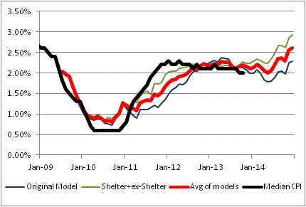
The black line is the actual Median CPI. The red line is the average of the other two models depicted as green and blue lines. The blue line is quite similar to the model I have been using for a very long time; it uses a couple of macro variables including a role for private indebtedness. The green line is something I introduced only in the last few years; it models shelter separately from the ex-shelter components because we have a pretty decent idea of what drives shelter inflation. Frankly, I like that model better, which is why my firm’s forecast for 2014 is for core (or median) inflation to be 3%-3.6%. The model says 3%, and I believe the tails are on the high side.
But the real purpose of my presenting that chart, and the aforementioned discussion, is to defend myself against the calumny that I am a perpetual bull on inflation. Nothing could be further from the truth. From 2004-2010, if I was bullish on inflation at all it was only a “trading opinion” based on market prices.[3] It is only since then that I have been loudly bullish on inflation. And, even then, while I will tell you why inflation could have extremely long tails on the upside, you will not find me forecasting 8%. Nor claiming that inflation really is somewhere that I said it would be, because I don’t like the numbers the BLS is reporting.
I have said in the past, and reiterate now, that one of the main reasons I write this column is mainly to hear reasoned counterarguments to my theses. I think I get sucked far too often into debates with unreasoned or unreasonable counterarguments, not to mention ad hominem attacks.
It goes with the territory of writing a public blog, I suppose. At some level it doesn’t matter much, because I wouldn’t have been on Wall Street for two decades if I bruised easily. But on the other hand, I have a right to self-defense and I have now exercised that right with respect to this particular charge!
[1] A quote variously attributed to Keynes, Samuelson, and others…and apropos here.
[2] Incidentally, note that our firm forecast may differ from the model forecast based on our discretionary reading of the model and other factors. In the last two years, the naked model has handily whupped our discretionary forecast.
[3] Of note is the fact that my company Enduring Investments was formed in early 2009 – even though my models still indicated that inflation was going to be swinging lower for a while.
The Effect of the Affordable Care Act on Medical Care Inflation
I haven’t seen anything of note written about the probable effect of the implementation of the Affordable Care Act (ACA, or “Obamacare”) on Medical Care CPI. This is probably because the calculation of Medical Care inflation in the CPI is confusing to many and because the direct effects of the ACA are still speculative at this point. But this is a potentially dangerous oversight since Medical Care is 7.2% of the CPI, and is after all the part that has recently been dragging Core CPI and Core PCE lower because of its unusual weakness.
Even if one cannot fathom the details, we know that the ACA will add volatility to the measurement of medical care inflation, and with measured medical care inflation so low presently, relative to historical trends, this implies mostly upside risk to prices. The following chart (Source: Enduring Investments) shows the rolling annual increase in Medical Care CPI, along with core CPI.

The most generous interpretation of this chart is that the ACA was already having an impact on holding down medical care prices prior to its implementation, although this ignores the known effect of the sequester on medical care inflation outturns: the sequester slowed Medicare payments to providers, and this had the effect of lowering measured medical care inflation temporarily. Another cavalierly optimistic interpretation might be to suggest the possibility that the secular outperformance of medical care inflation relative to broad inflation is coming to an end.
While the actual economic effect of the ACA will only be determined over a long period of time as the actual rules and the free market response become more clear, I think that the effects of the ACA on the measurement of medical care inflation, at least for several years, will have the effect of pushing medical care inflation higher. The reasons for this are less about the question of whether disrupting the private insurance industry and price system is likely to create overall gains in efficiency in delivering health care, and hence lower prices (I doubt it), and more about the somewhat arcane way that medical care costs are accounted for in the Consumer Price Index.
Accounting for changes in the cost of medical care is a very challenging problem for a number of reasons. One of these reasons is that changes in medical care prices, like all price changes, reflect both inflation and the possible change in the quality of the delivered product. A mundane example of this problem outside of medical care is when the size of a candy bar increases 20% and the price of the bar rises 25%. Clearly, in such a case there isn’t 25% inflation in the cost of a candy bar, because the consumer is getting 20% more candy in the bargain. That is a simple quality adjustment, and the BLS regularly makes these changes (more often, of course, the candy bar shrinks so that the quality adjustment increases measured inflation rather than the other way around!). More problematic and controversial are when the quality change is more subjective, such as when a car adds chrome wheel rims or a disk drive doubles in size, or when the BLS makes changes for the aging of the housing stock. Nevertheless, the BLS has sophisticated models for making these adjustments with the least amount of subjective evaluation possible.
How, though, does one measure the improvement in the quality of medical care when the whole course of treatment for a given condition may change? The service being provided, after all, isn’t “one MRI image” but “improved leg function as the result of surgery done with the benefit of improved MRI imaging.” This is a continued challenge for the BLS and one that the Bureau has spent many resources researching over the last few years.
So one problem that the BLS faces is that the price index does not necessarily measure quality improvements well. Another problem is that the Consumer Price Index is supposed to measure costs to consumers, and few consumers pay directly for their medical care but rather for insurance; moreover, the government itself pays for much medical care through Medicare and other programs which have no direct cost (at least, in a direct financial sense as opposed to an economic sense) to the consumer of medical care. For many consumers, too, their employer picks up part of the cost of insurance.
The BLS therefore measures medical care not by looking at the cost of insurance but by looking at what insurance companies pay for the medical care on behalf of the consumers, and then separately accounting for the insurance company profit as a different consumer item. Government purchases of health care are entirely outside of the consumer price index since the government is not a “consumer!” The employer-paid portion of health care insurance is also excluded since a company is also not a consumer.
So what does this mean for the effects of the ACA on the cost of medical care? I can see several likely effects:
- Because the BLS measures the prices being paid by insurance companies to doctors, rather than insurance costs, the sharp increases in insurance costs due to the transition to the health care exchanges dictated by the ACA may not be immediately reflected in the price index for medical care. However, it is also possible that doctors and hospitals may take advantage of the confusion by changing their prices at this time and blaming the increase on the increased burdens of the ACA. Prescription drugs, too, may see price increases for this reason. The outcome of this part of the transition is probably indeterminate on medical care inflation in the short term, but it clearly increases the range of possible outcomes. If provider price increases happen quickly even though new insurance policies will only gradually be taken, then medical care inflation might increase quickly in the short run. But the opposite might also happen, so that consumers face higher insurance costs but medical care inflation does not reflect this.
- Much more problematic is a composition effect that will affect the relative health of the patients that doctors will be treating, almost immediately. Many Americans have just lost their private health insurance. Faced with this, consumers who are relatively healthy are likely to decrease their doctor visits relative to comparatively unhealthy patients because of the increased out-of-pocket cost of going to a doctor. Unhealthy patients have less of an option to decrease consumption of medical care in response to higher costs, and indeed some very unhealthy patients have seen their costs decline due to the ACA (which was, after all, the point: not affordable care for all, but affordable care for those who were finding health care very expensive partly because they needed a lot of it). Because the BLS measures health care costs at the provider level, this could increase measured health care inflation quickly because of increased utilization of more-expensive treatment options.
- The fact that the BLS only considers the employee-paid part of company health care plans also has very interesting implications under the chaotic transition to the ACA. When an employer pays less of the premium for a corporate plan, the employee pays a higher price (and feels inflation) even if the overall premium doesn’t change. But this increases the weight of Medical Care in the consumer’s consumption basket, so that the 7.2% weight in the CPI will increase, and probably substantially, over the next couple of years. Consider the previous chart, illustrating that medical care inflation has outstripped broader inflation indices for at least the last three or four decades. To the extent this continues, a higher weight of medical care implies a higher overall level of inflation.
- In general, the ACA creates uncertainty among service providers in the health care industry. A typical reaction of suppliers facing uncertainty in any industry is to raise prices in order to increase the margin for error (in much the same way that asset prices tend to be lower when investors feel less safe and thus must build a margin of safety into the bid price). While not strictly inflation since the cushion would not increase each year, it would tend to increase measured inflation over the medium term.
It is very difficult to evaluate the size and timing of each of these effects, but it is important to note that while some of the effects are indeterminate (such as #1 above), there are no effects I can discern that would tend to decrease measured inflation of medical care. Consequently, I expect that Medical Care inflation – which has been, I have previously mentioned, a key source of the weakness in core inflation compared to median inflation – is likely to rise appreciably over the next year. Note that this is likely to be the case even if the ACA actually succeeds in lowering the aggregate economic cost of healthcare (about which fact I are skeptical) because the way the BLS measures medical care inflation is likely to cause increases in this index.
Madness or Wisdom?
Trading, and to some extent investing, is all about knowing when markets are moving with the wisdom of the crowds and when they’re moving with the madness of the crowds. In recent years, there has seemed to be much more madness than wisdom (a statement which can probably be generalized beyond the financial markets themselves, come to think of it). Where do we stand now?
I think a recent letter by John Hussman of Hussman Strategic Advisors, entitled “An Open Letter to the FOMC: Recognizing the Valuation Bubble In Equities,” is worth reading. Hussman is far from the only person, nor even the most august or influential investor, questioning the valuation of equities at the moment. Our own valuation models have had the projected 10-year compounded real return of equities below 3% for several years, and below 2% since late April. For a time, that may have been sustainable because of the overall low level of real rates, but since the summertime rates selloff the expected equity premium has been below 1.5% per annum, compounded – and is now below 1% (see Chart, source Enduring Investments).
 Hussman shows a number of other ways of looking at the data, all of which suggest that equity prices are unsustainable in the long run. But what really caught my eye was the section “Textbook speculative features”, where he cites none other than Didier Sornette. Sornette wrote a terrific book called Why Stock Markets Crash: Critical Events in Complex Financial Systems, in which he argues that markets at increased risk of failure demonstrate certain regular characteristics. There is now a considerable literature on non-linear dynamics in complex systems, including Ubiquity: Why Catastrophes Happen by Mark Buchanan and Paul Ormerod’s Why Most Things Fail: Evolution, Extinction and Economics . But Sornette’s book is one of the better balances between accessibility to the non-mathematician and utility to the financial practitioner. But Hussman is the first investor I’ve seen to publicly apply Sornette’s method to imply a point of singularity to markets in real time. While the time of ‘breakage’ of the markets cannot be assessed with any more, and probably less, confidence than one can predict a precise time that a certain material will break under load – and Hussman, it should be noted, “emphatically” does not lay out an explicit time path for prices – his assessment puts Sornette dates between mid-December and January.
Hussman, like me, is clearly of the belief that we are well beyond the wisdom of crowds, into the madness thereof.
One might reasonably ask “what could cause such a crash to happen?” My pat response is that I don’t know what will trigger such a crash, but the cause would be the extremely high valuations. The trigger and the cause are separate discussions. I can imagine a number of possibilities, including something as innocuous as a bad “catch-up” CPI print or two that produces a resurgence of taper talk or an ill-considered remark from Janet Yellen. But speculating on a specific trigger event is madness in itself. Again, the cause is valuations that imply poor equity returns over the long term; of the many paths that lead to poor long-term returns, some include really bad short-term returns and then moderate or even good returns thereafter.
I find this thought process of Hussman’s interesting because it seems consonant with another notion: that the effectiveness of QE might be approaching zero asymptotically as well. That is, if each increment of QE is producing smaller and smaller improvements in the variables of interest (depending who you are, that might mean equity prices, long-term interest rates, bank lending, unemployment, etc), then at some point the ability of QE to sustain highly speculative valuations goes away and we’re left with the coyote-running-over-the-cliff scenario. Some Fed officials have been expressing opinions about the declining efficacy of QE, and Janet Yellen comes to office on February 2nd. I suspect the market is likely to test her very early.
None of this means that stocks cannot go straight up from here for much longer. There’s absolutely nothing to keep stock prices from doubling or tripling from here, except the rationality of investors. And as Mackay said, “Men, it has been well said, think in herds; it will be seen that they go mad in herds, while they only recover their senses slowly, and one by one.” Guessing at the date on which the crowd will toggle back from “madness” to “wisdom” is inherently difficult. What is interesting about the Sornette work, via Hussman, is that it circles a high-risk period on the calendar.
For two days in a row now, I’ve discussed other people’s views. On Wednesday or Thursday, I’ll share my own thoughts – about the possible effects of Obamacare on measured Medical Care inflation.
Inflation Consequences of QE – per Reynard
Before getting into today’s column, let me first describe my plan of attack for the month of December. I plan to have several comments this week and next week, culminating in my annual “Portfolio Projections” piece at the end of next week. Then, for the last two weeks of the month, I plan to ‘re-blog’ some of my best articles from the last four years (editing out the current events, which will no longer be topical of course). Included in that list is an article on long-run returns to equities, one on Yellen’s defense of large-scale asset purchases, an article on the Phillips Curve, one on why CPI isn’t a bogus construct of a vast governmental conspiracy, and so on. Because I don’t expect some of the places where this column is ‘syndicated’ to post the re-blogs, you should consider going to the source site to sign up for these posts.
With that housekeeping complete, I want to turn today to a scholarly article I recently stumbled on which is worth a read even once you have read my synopsis and comments. The article, written one year ago by Samuel Reynard of the Swiss National Bank, is entitled “Assessing Potential Inflation Consequences of QE after Financial Crises.” It appears to be unpublished except as a working paper, which perhaps shouldn’t be surprising since it is so decidedly clear-eyed and takes the consensus view of QE to task.
What I love about this article is that Reynard’s view is remarkably consonant with my own – the only example I can come up with of a reasonably-placed central banker espousing such commonsensical views (Daniel Thornton at the St. Louis Fed gets an honorable mention though), backed with quantitative data and clear reasoning. Here is the paper’s abstract:
“Financial crises have been followed by different inflation paths which are related to monetary policy and money creation by the banking sector during those crises. Accounting for equilibrium changes and non-linearity issues, the empirical relationship between money and subsequent inflation developments has remained stable and similar in crisis and normal times. This analysis can explain why the financial crisis in Argentina in the early 2000s was followed by increasing inflation, whereas Japan experienced deflation in the 1990s and 2000s despite quantitative easing. Current quantitative easing policies should lead to increasing and persistent inflation over the next years.”
In the introduction, the author directly tackles current central bank orthodoxy: “It is usually argued that it is sufficient to monitor inflation expectations, and that central banks can avoid accelerating inflation by quickly withdrawing reserves (or by increasing the interest rate payed on reserves) once inflation expectations start rising. The monetary analysis of this paper however shows that there has never been a situation of excess broad money (created by the banking system) which has not been followed by increasing inflation, and that the increase in inflation occurs after several years lags.”
Reynard starts with the quantity theory of money (MV≡PQ), which I have discussed at length in this column. Regular readers will know that I am careful to distinguish transactional money from base money – as does Reynard – and that the sole reason inflation has not accelerated is that money velocity has declined. This decline is not due to the financial crisis directly, but as I have shown before it is due to the decline in interest rates. This makes monetary policy problematic, since an increase in interest rates which in ordinary times (that is, when there isn’t a couple trillion of excess reserves) would cause M2 to decelerate and dampen inflation will also cause money velocity to rise – offsetting to some extent the effects of the rising interest rates on the money supply. (Among other things, this effect tends to help cause monetary policy to overshoot on both sides). Reynard’s insightful way around this problem is to “model equilibrium velocity as a function of interest rate to reflect changes in inflation environments.” That is, the monetary equation substitutes an interest rate variable, based on a long-run equilibrium relationship with velocity, for velocity itself. In Reynard’s words,
“Thus the observed money level is adjusted…by the interest rate times the estimated semi-elasticity of money demand to account for the fact that, for example in a long-lasting disinflationary environment when inflation and interest rate decrease, the corresponding increase in money demand reflecting the decline in opportunity cost is not inflationary: the price level does not increase with the money level given that equilibrium velocity decreases.”
This is exactly right, and it is exceedingly rare that a central banker has that sort of insight – which is one of the reasons we are in this mess with no obvious way out. Reynard then uses his model to examine several historical cases of post-crisis monetary and inflationary history: Switzerland, Japan, Argentina and the 1930s U.S. He finds that there are downward rigidities to the price level that cause inflation to resist turning negative (or to fall below about 1.5% in the U.S.), but that when there is excess liquidity the link between liquidity and inflation is very tight with a lag of a couple of years. Reynard’s opinion is that it is this non-linearity around price stability that has caused prior studies to conclude there is no important link between money and inflation. As Fama observed back in the early 1980s, and I observe pretty much daily to the point that it is now a prohibited topic at the dinner table, when inflation is very low there is a lot of noise in the money-inflation relationship that makes it difficult to find the signal. But the money-inflation connection at higher levels of inflation and money, and over longer periods of time, is irrefutable.
In the last section of the paper, the author assesses the effects of current QE (through November 2012) on future inflation in the U.S. His conclusion is that “Excess liquidity has always been followed by persistent increases in inflation. Current quantitative easing policies should lead to increasing and persistent inflation over the next years.” The chart accompanying this statement is reproduced below.

As you can see, the model suggests inflation of 3-4% in 2013 and 5% in late 2014. While clearly inflation in 2013 has been lower than suggested by the chart, this isn’t supposed to be a trading model. I suspect that if get 3-4% in 2014 and 5%+ in 2015 (our forecast is for 3.0%-3.6% on core inflation in 2014 and 3.3%-4.8% in 2015), the issue of whether Reynard was essentially correct will not be in question!