Archive
Where Inflation Stands in the Cycle
It’s important, I think, that I occasionally remind readers of a fact that is supported by overwhelming quantitative evidence, and yet virtually ignored by a wide majority of economists (and central bankers): inflation is a consequence of the stock of money growing faster than real economic growth. Period.
MV=PQ
That doesn’t mean that forecasting inflation is easy if we remember that fact, but at least we can make good directional predictions when, say, the stock of money rises 25% in a year, instead of mouthing some nonsense about inflation in such a case being “transitory.”
However, I realize that when someone mentions that equation a lot of people tune out, thinking this has become a religious argument between monetarists and Keynesians. So let me toss out some data. Keep in mind, there is measurement error in statistics for the money supply, real GDP (especially), and prices. And, as I’ve written before, sharp changes in M can cause a short-term impact on velocity until Q and P can catch up – my ‘trailer attached by a spring’ analogy. But over time, a shock move in velocity becomes less important (and reverses, which is what we are in the middle of), and so we would expect by simple algebra to see that a good prediction of the change in the price level is given by M/Q. Is it?
First let me share one of my favorite charts from a Federal Reserve Economic Review.[1] I’ve been using this for years.

This is over 5-year periods, and you can see that there’s a pretty good correlation – especially for large changes – in the change in the ratio of money/income and the change in prices. (By the way, the original article is still worth reading).
Here is another chart from that note, updated by me through the end of 2022.
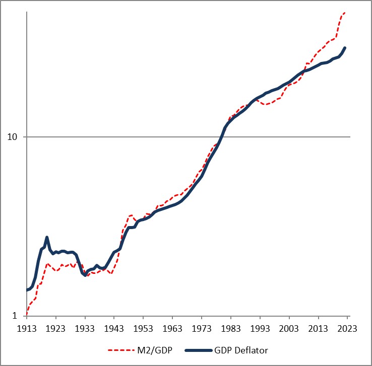
The fact that the price level has gone up a little bit less than the ratio of money to GDP over time is a reflection of the fact that money velocity has gone down slightly, and then more quickly, over the last 110 years. If you think velocity will fully revert, then the blue line will eventually converge with the red line – but in my mind there’s no reason to believe that velocity is stable or entirely mean-reverting over time…only that it doesn’t permanently trend higher or lower like money, prices, and GDP do.
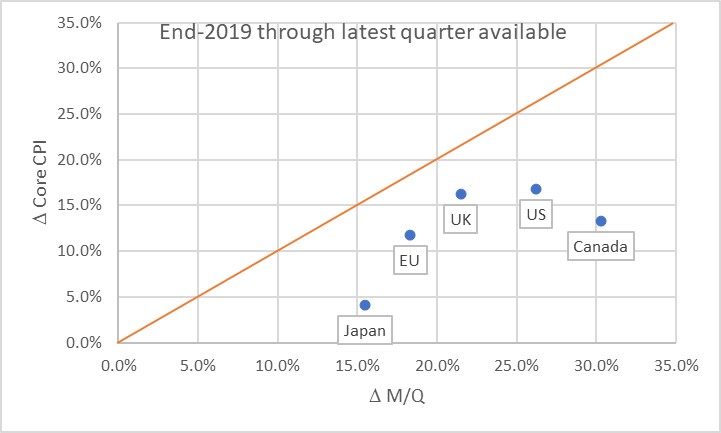
Obviously, this leads us to the question of where we are now. Here is a chart of the change in headline prices (CPI) as a function of the change in M/Q for five countries/regions.
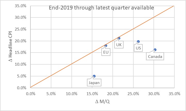
The chart basically says that the UK and EU have seen prices move almost exactly what you would have predicted, if you could have known in advance what M and Q were going to do. Naturally, none of us knew that. Japan, the US, and Canada haven’t seen prices rise as much as you would have expected, yet. Some of the reason why not is the effect I mentioned earlier: the dump of money into accounts during COVID was so fast that there was no time for prices to adjust. Actually, it’s only this close because food and energy adjust more rapidly…if you look at the picture with just core inflation, it appears there’s still some lifting to do to get back to the 45-degree line. As energy prices and food prices mean-revert some, core inflation should stay a little bubbly for a while.
Now, there’s three ways to get back to the line. We can see prices rise. We can see GDP rise. Or we can see the money supply fall. The latter two effects are better for consumers. The “GDP rises” is the best for everyone, although that’s the slowest-moving of the pieces. The “money supply fall” option is the best for consumers, but the worst for investors. Presently, we’re seeing a little bit of all three. But here is where I should take a moment to highlight how important the Fed’s balance sheet reduction has been in this process. Here is a chart from 2019Q4 to the present, just for the US, showing how this relationship developed over time.
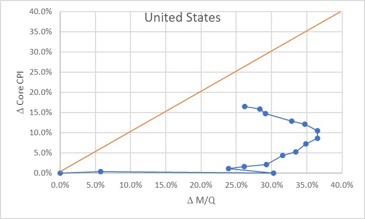
Initially, of course, there was a massive increase in money with no change in prices, as COVID hit in 2020. The point at (30%, 0%) is what the Fed had to work with as the lockdowns began to be lifted in late summer 2020. The sharp single-quarter reversal there was the result of the massive GDP spike in 2020Q3.
At that point, we would have anticipated that if nothing else happened, we would see a gradual 23% or so increase in the price level. If the Fed had immediately pulled back on the money printing, probably a lot less. Instead, the money printing continued for quite a while until by the middle of 2022 we were looking at a change in M/Q of about 37% since the end of 2019. Right about that time, the Fed got alarmed and began to shrink the balance sheet (and hike rates, although you will notice that the price of money does not show up on this chart but only its quantity!) That, combined with some decent growth, has decreased the pent-up pressure on prices. As of the end of 2023Q3, the aggregate M/Q change was 26.2%, while core prices had risen 16.4% (headline prices, including a 33% increase in energy and a 25% increase in food prices, are up 19.5% since the end of 2019).
If the money supply grows only at the rate of GDP from here, then this line will turn vertical and we have about a 10% increase in core inflation to ‘make up’ before we are back on the line. The good news is that the Fed currently is still reducing its balance sheet; the bad news is that M2 since April has stopped declining. More bad news is that GDP is likely to be soft or even negative here over the next few quarters, judging from payrolls, delinquencies, and other data. We could also hold out hope that velocity won’t fully rebound to pre-COVID levels, but there’s no reason other than “it sure would be nice if that happened” to expect that. Ergo, I think we’re still looking at higher-for-longer not just in the interest rate structure, but in the trajectory of inflation.
The most astonishing point on the charts above, in my mind, is the Japan point especially on the first chart. The amazing part isn’t that Japan’s inflation rate is lower than that of other countries here. They’ve added less money, so as a first pass you’d expect less inflation. But what’s amazing is that the Yen is also an absolute basket case, which means that imports – like, say, oil or gasoline – have gone up a lot more in price than for other countries. Crude oil in USD has risen about 22% in USD terms since the end of 2019. It’s up 66% in Yen terms! And yet, even with that Japanese inflation has stayed relatively low. So far. These charts tell me that I’d want to buy Japanese inflation and sell EU and UK inflation, where prices are closer to already reflecting the effect of the money geyser than they are in Japan.
[1] “Are Money Growth and Inflation Still Related?”, Economic Review, Federal Reserve Board of Atlanta, 2nd Quarter, 1999. https://www.atlantafed.org/-/media/documents/research/publications/economic-review/1999/q2/vol84no2_dwyer-hafer.pdf
Money Velocity Update!
Now that we have our first estimate of GDP for Q3, we also have our first estimate of M2 velocity for the third quarter. Because there is an amazing amount of uninformed hypothesis out there, I figured it was worth a quick review of where we are and where we’re going, and why it matters.
Why it matters: without the rebound in velocity, the slow-but-steady decline in M2 that we have experienced since mid-2022 would be outright deflationary. The money decline and the velocity re-acceleration are part and parcel of the same event, and that is the geyser of money that was squirted into the economy during COVID. Velocity collapsed for mostly mechanical reasons: it is a plug number in MVºPQ, and since prices do not instantly adjust to the new money supply float, velocity must decline to balance the equation. Another way of looking at it is that if you add money to people’s accounts faster than they can spend it then velocity will decline. I have previously presented an analogy that in this unique circumstance money velocity behaves as if it were a spring connecting a car, speeding away suddenly, with a trailer that has some inertia. Initially the spring absorbs the potential energy, and later provides it to the trailer as it catches up. Ultimately, the spring returns to its original length, when the car has stopped accelerating and the trailer is going at the same speed.
As M2 has declined in an unprecedented way, after surging in an unprecedented way, velocity has rebounded in an unprecedented way after plunging in an unprecedented way. All of these things are connected, episodically (but we will look at the underlying, lasting dynamics in a bit). With this latest GDP update, M2 velocity rose 1.9%, the 9th largest quarterly jump since 1970. Over the last four quarters, it has risen 10.4%, the largest on record, and 16% over eight quarters, also the largest on record.

https://fred.stlouisfed.org/series/M2V
To return to the level M2 Velocity was at, at the end of 2020Q1, it needs to rise another 4.8%. For M2 to return to the level it was at, at the end of 2020Q1, it needs to fall another 23%. One of these is likely to happen; the other one is not. The net difference, after subtracting cumulative growth (8.8% since then, so far), is a permanent increase in the price level. If M2 continues to come down, the net effect is a higher level of inflation over this period but not calamitous.
Note that there is no way we get the price level back to where it was, unless M2 declines considerably farther for considerably longer, or unless money velocity inexplicably turns around and dives again. I know that some well-known bond bull portfolio managers have been calling for that, but they were wrong the whole way along so why would you listen to them now?
I’ve been pretty clear that (a) I have been surprised that the Fed was successful in decreasing the money supply, since I thought the elasticity of loan supply would be more than the elasticity of loan demand (I was wrong), (b) I think the Fed deserves credit for shrinking the balance sheet, which they have long said doesn’t matter (it matters far more than interest rates, for inflation), (c) Powell deserves credit for turning into a hawk and pushing the institution of the Federal Reserve to become hawkish after decades under Greenspan, Bernanke, and Yellen where the only question being asked was ‘do we wait for the stock market to drop 10%, or only 5%, before we flood the system with money?’ Chairman Powell deservedly will go down in history as the guy who recognized the ‘spring effect’ that kept long-term upward pressure on inflation even as so many people were chirping about supply constraints and ‘transitory inflation’ (including, to be fair, Powell himself. But whatever he said, what he did was pretty reasonable).
However, the next bit is going to be challenging.
Velocity, being the inverse of the demand for real cash balances, is primarily affected by two main forces – one of them durable and one of them ephemeral. The ephemeral effect, which is rarely super-important, is that people tend to want to hold more cash when they are uncertain. Indeed, our model for velocity actually captured accidentally some of the ‘spring effect’ because for us it showed up as extreme uncertainty. Put another way, even if the Fed hadn’t flushed tons of money into the system, velocity would have had something of a sharp decline because of the high degree of economic uncertainty. Ergo, it was crucial that they flush in at least some money because otherwise we would have had outright deflation. They didn’t get the magnitude right, but they got the sign right. Anyway, the ‘uncertainty’ effect doesn’t last forever. The measure of uncertainty I use is a news-based index of economic policy uncertainty; it has retraced about 85% of its spike although it has been persistently high since political divisiveness became the main fact of US political life back in 2009 or so.

The more durable effect on the desire to hold cash is the presence of better-yielding alternatives to cash. When interest rates are uniformly zero and the stock market is on the moon, there’s very little reason to not hold cash. But when non-cash rates are high, and stocks and other investments more reasonably priced, cash is a wasting asset that people want to ‘put to work.’ The easiest way to see that is with interest rates, which for the last couple of decades have tracked the decline in money velocity closely as both declined.
And here is the problem. If interest rates are back at 2007 levels, then naïvely we would expect velocity to be back in the vicinity of 2007 levels also. But that is massively higher than the current level. In 2007, money velocity was around 1.98 or so: about 49% higher than the current level!

Needless to say, there’s no way the money supply is contracting that much. If velocity rose even, say, 30% then we would have a serious and long-lasting inflation problem. Fortunately, because of the economic policy uncertainty and other non-interest rate effects (I did say that “naïvely” we would be looking for 1.98, right?), the eventual rise in velocity beyond the snap-back level is much less than that. It actually only adds about 6% to the snap-back level. That still means 2% more inflation than would otherwise be expected, for three years, or 3% more for two years.

Of course, interest rates could fall again and ‘fix’ that problem. But it’s hard to see that happening while the money supply continues to contract, isn’t it? And that’s where it gets difficult. If you continue to decrease the balance sheet – which you need to do – and money continues to contract, then you probably get more velocity and inflation stays higher than you expect. Or, if you drop interest rates then you don’t get velocity much over the pre-COVID level, but you also get more money growth and inflation stays higher than you expect.
All of which adds up to one reason why I continue to think that inflation will stay sticky and higher than we want it, for a while. Powell has surprised me before, though, and this would be a good time to do it again.
Union Power and Inflation
One of the biggest stories of the past week has been the synchronized strike by the United Auto Workers (UAW) against the Big Three auto makers in Detroit. Although so far only 13,000 workers out of the 146,000 who pledge allegiance to the UAW have struck, the strategy of striking against each of the Big Three at the same time is interesting. In the past, the UAW would choose a particular automaker to strike, win concessions from that company, and then use the new contract as the basis to cudgel the other automakers into a similar deal. This would completely shut down one company, but not the entire country’s car-making capacity. In this case, the UAW is significantly impacting operations at all three while not completely shutting down any of them – although the implicit threat is that they could, at any time, do so.
What is also interesting is that the demands of the union are aggressive, not to say ambitious. The union is asking for a 36% increase in pay, implemented over four years…plus a reduction to a 32-hour work-week while being paid for 40 hours. Combined, those two demands represent a 70% increase in compensation per hour for a union employee (or, put another way, assuming that a car can’t suddenly be made with 20% less labor, it means the cost of labor going into the vehicle will increase 70%). Additionally, they want a restoration of defined-benefit pension plans and contracted cost-of-living adjustments, which isn’t included in that 70% figure.
Whether or not the union is able to get a sizeable portion of its demands (so far, the auto companies have offered 20% over four years, but the other components of the deal are at least as important), this clearly stands out as one of the most audacious labor asks of the last quarter-century. The timing should not be surprising. Historically, union size and activism is positively related to the level of inflation (see chart, source BLS).

You might think that unions also strengthen when unemployment is high. This is not as true as you would think: when unemployment is high, the union would be asking a company to deliver jobs even though there is no work to be done and the company’s viability may be threatened by a weak economy. Consequently, union actions in a recession tend to be less vigorous (the UAW in fact points out that they made concessions in the Global Financial Crisis to help keep automakers afloat), and unionization is less valuable to the workers in those cases. But in inflation, the union is asking the company to give more to the workers it has and needs, out of its growing revenues and profits (even though those revenues and profits look less impressive, and may even be shrinking, after inflation). Moreover, while unemployment hurts the workers who are unemployed (and unable to pay union dues, also), inflation hurts all workers. Consequently, it is inflation and not unemployment that energizes unions.
Naturally, this is part of the feedback loop that concerns policymakers. When I talk about the wage-price feedback loop, I’m generally talking about how it manifests in core services ex-shelter (“supercore”), where a large part of the cost of the product is labor. In the case of a car, labor is only about 15% – although the exact figure depends who you ask and whether you’re asking about the percentage of cost or the percentage of price. So a 70% increase in that cost would “only” add about 10% to the cost/price of a new car whereas a 70% increase in the cost of an accountant would raise the cost of getting your taxes done by something pretty close to 70%. However, union power has its own momentum, and it manifests in things like (for example) automatic cost-of-living adjustments and persistent pressure on fringe benefits and pensions from a union whose influence in this sort of environment is growing.
That’s not to say that it’s good or bad – but this is another cost of letting the short-term inflation spike linger on by not addressing it by aggressively shrinking the balance sheet early on. The longer inflation stays higher, the more power unions have. And the more power unions have, the more momentum inflation has.
Inflation Volatility Tells Us This is Probably Not Over
In the course of this inflation cycle – and I do think this is a cycle, and not necessarily a one-off, although the subsequent peaks may not surpass this year’s peak in Median CPI for some years – the typical topic has of course been the level of inflation, and/or its acceleration or deceleration (not to mention, many uneducated suppositions about the cause, which we know good and well boils down to profligate spending and unprecedented provision of money). I’ve also written and talked about the oft-overlooked fact that when inflation rises for some time above about 2.5%-3%, stocks and bonds become correlated rather than inversely correlated, and this has a significant effect on portfolio risk that insightful investment managers will take into account.
What I haven’t written about much is the fact that problems are also caused by the volatility of inflation. While this tends to go hand-in-hand with higher inflation, the problems caused by inflation’s volatility are somewhat different than those caused by its level.

The current episode follows a 15-year period during which inflation was both low and stable. The thirty years prior to that, from 1973-2003, the level of inflation was a bit more than twice the 2004-2018 period average but the volatility of inflation was tripled.
The importance of inflation volatility is that it operates on inflation expectations in a very different way than the inflation level does. (We know that inflation expectations do not have the center-stage role in ‘anchoring inflation’ that previously-discredited theory claimed it did, but I do think there is a psychological tendency that adds some inertia to inflation by affecting businesses’ beliefs about how easy it will be to increase prices.) Inflation volatility tends to increase consumers’ perceptions of inflation through the behavioral tendencies towards loss aversion and attribution bias (as I argued in a 2012 paper published in Business Economics). But it has other effects as well.
Quantitatively, higher variance makes it harder to reject the null hypothesis that inflation is staying high; an uncertain worker is therefore less likely to accept a lower wage that may not suffice and a business is less likely to hold the line on prices that may be continuing to rise elsewhere. When you don’t know the true competitive pricing situation, both businesses and their employees are likely to err on the conservative side. This also gives momentum to inflation.
Higher inflation volatility is what causes the inflation factor to carry more weight in the minds of consumers and investors, which in turn is what induces the aforementioned positive correlation between stocks and bonds. When inflation is low (but more importantly stable), the importance of inflation to investors is also low and variations in inflation are given less weight than variations in growth. Since stocks and bonds behave similarly with respect to inflation, but inversely with respect to economic growth, the dampening of the inflation factor is the reason that stocks and bonds are inversely-correlated in low-and-stable inflation regimes.
Also, although investors seem not to incorporate this understanding into prices, higher inflation volatility should increase the value of a “tail outcome” in inflation, and increase the value of holding that option by being long breakevens, or long TIPS instead of nominal bonds. That is, when inflation isn’t going to vary too much then it’s hard to win big by owning TIPS over nominals; but if inflation varies a lot then there should be a fairly large premium built into breakevens since you’d much rather be long them (and long that tail) than short them (and short the tail). However, as I said this seems not to actually be incorporated in inflation markets, which trade far below the level they ought to if inflation tails have even a small value.
So, how volatile has inflation been?
When I started thinking about this blog post I was originally going to point out that the volatility of Used Car CPI is so much higher than it used to be. We almost never spent a lot of time thinking about how much Used Cars would add or subtract from core. Here is a chart of the rolling 12-month volatility of y/y Used Cars CPI.

Not surprisingly, the volatility of CPI for Used Cars and Trucks reached nearly double the level it did in the aftermath of the Global Financial Crisis, when the “cash for clunkers” program and the destruction wrought by Hurricane Katrina both had major impacts on the market for used cars. But it goes beyond that.
The unusual volatility of the food and beverages group, partly as a result of the war in Ukraine and the spikes in fertilizer prices, has been documented previously. It seems to be receding but remains quite high historically.

Heck, let’s look at three of my ‘Four Pieces’ (leaving aside energy). Here’s Core Goods.

Even though the level of core goods inflation has come way back down, the volatility of core goods means that consumers can’t get terribly comfortable with prices (nor can producers).
How about ‘supercore’?

This is also high, but the interesting part is how tame it had been for most of the post-GFC period. Remembering that this is the category where the wage-price feedback loop is felt most strongly, I think this says something about the flaccidity of labor power during that decade. Well, that’s back – and perhaps we’ve re-entered an extended period of volatility in that group?
Here is the volatility of Owners’ Equivalent Rent (which looks about the same as Primary Rents, for what it’s worth, so I didn’t feel I needed to show them both).

Not as terrible as I would have thought, although to be fair this is typically a less-volatile category anyway. Again, though, look at the amazingly boring period post-GFC. (As an aside, that’s when a certain inflation specialist was trying to get attention for Enduring Investments.)
In a second I’ll show all-items CPI, but first let’s look at Medical Care.

This is the only category of the ones I’ve shown where volatility is still increasing. That’s largely because of Health Insurance, which as I’ve documented/complained about for some time has endured one of the most massive swings in any imputed category. That will not plummet soon, though, since in October the Health Insurance drag of -4% or so annualized will reverse to +1% or so.
Last but not least, here is headline CPI’s volatility.

I will just say that it is a good thing that inflation dealers no longer really trade inflation options. Because, if they did, they not only would be generally short a whole lot of in-the-money inflation cap delta in the book but also would be short a bunch of vega too and implied vol would probably be a lot higher. But the importance of this picture is that while headline inflation has been receding (largely due to energy) and core inflation has been dropping too (not-insignificantly due to Health Insurance and Used Cars), the volatility of inflation does not yet look like it’s calming down in a decisive way.
Until it does, I think it would be cavalier to assume that we are heading back to the low-and-stable inflation regime, even if the last few months’ out-turns for CPI have been agreeable. Volatility, and not just the level of inflation, matters.
Enough with Interest Rates Already
One of the things which alternately frustrates me and fascinates me is the mythology surrounding the idea that the central bank can address inflation by manipulating the price of money, even if it ignores the quantity of money.
I say “mythology” because there is virtually no empirical support for this notion, and the theoretical support for it depends on a model of flows in the economy that seem contrary to how the economy actually works. The idea, coarsely, is that by making money more dear the central bank will make it harder for businesses to borrow and invest, and for consumers to borrow and spend; therefore growth will slow. This seems to be a reasonable description of how the world works. But this then gets tied into inflation by appealing to the idea that lower aggregate demand should lower price pressures, leading to lower inflation. The models are very clear on this point: lower growth causes less inflation and more growth causes more inflation. The fact that this doesn’t appear to be the case in practice seems not to have lessened the fervor of policymakers for this framework. This is the frustrating part – especially since there is a viable alternative framework which seems to actually describe how the world works in practice, and that is monetarism.
The fascinating part are the incredibly short memories that policymakers enjoy when it comes to pursuing new policy using their preferred framework. Here’s the simplest of examples: from December 2008 until December 2019, the Fed Funds target rate spent 65% of the time pinned at 0.25%. The average Fed funds rate over that period was 0.69%. During that period, core inflation ranged from a low of 0.6% in 2010 to a high of 2.4%, hitting either 2.3% or 2.4% in 2012, 2016, 2017, 2018, and 2019. That 0.6% was an aberration – fully 86% of the time over that 11 years, core inflation was between 1.5% and 2.4%. Ergo, it seems reasonable to point out that ultra–low interest rates did not seem to cause higher inflation. If that is our most-recent experience, then why would the Fed now be aggressively pursuing a theory that depends on the idea that high interest rates will cause lower inflation? The most-recent evidence we have is that interest rates do not seem to affect inflation.
This isn’t just a recent phenomenon. But the nice thing about the post-GFC period is that for a good part of it, the Fed was ignoring bank reserves and the money supply and effecting policy entirely through interest rates (well, occasionally squirting some QE around, but if anything that should have increased inflation – it certainly didn’t dampen the effect of low interest rates). This became explicit in 2014 when Joseph Gagnon and Brian Sack, shortly after leaving the Fed themselves, published “Monetary Policy with Abundant Liquidity: A New Operating Framework for the Federal Reserve.” In this piece, they argued that the Fed should ignore the quantity of reserves in the system, and simply change interest rates that it pays on reserves generated by its open market operations. The fundamental idea is that interest rates matter, and money does not, and the Fed dutifully has followed that framework ever since. As I just noted, though, the results of that experiment would seem to indicate that low interest rates, anyway, don’t seem to have the effect that would be predicted (and which effect is necessary if the policy is to be meaningful).
And really, this shouldn’t be a surprise because for the prior three decades, the level of the real policy rate (adjusting the nominal rate here by core CPI, not headline) has been completely unrelated to the subsequent change in core inflation.

So, to sum up: for at least 40 years, the level of real policy rates has had no discernable effect on changes in the level of inflation. And yet, current central bank dogma is that rates are the only thing that matters.
I stopped the chart in 2014 because that’s when the Gagnon/Sack experiment began, but it doesn’t really change anything to extend it to the current day. Actually, all you get is a massive acceleration and deceleration in core inflation that all happened before any interest rate changes affected growth (seeing as how we have not yet had a recession). So it’s a result-within-a-result, in fact.
Any observation about how the Fed manages the price of money rather than its quantity would not be complete without pointing out that the St. Louis Federal Reserve’s economist emeritus Daniel L Thorton, one of the last known monetarists at the Fed until his retirement, wrote a paper in 2012 entitled “Monetary Policy: Why Money Matters and Interest Rates Don’t” [emphasis in the original title]. In this well-argued, landmark, iconic, and totally ignored paper Dr. Thornton argued that the central bank should focus almost entirely on the quantity of money, and not its price. Naturally, this is concordant with my own view, plus more than a century of evidence around the world that the price level is closely tied to the quantity of money.
To be fair, the connection of changes in M2 to changes in the price level has also been weak since the mid-1990s, for reasons I’ve discussed at length elsewhere. But at least money has a history of being related to inflation, whereas interest rates do not (except as a result of inflation, rather than as a cause of them); moreover, we can rehabilitate money by separately modeling money velocity.
There does not appear to be any way to rehabilitate interest rate policy as a tool for addressing inflation. It hasn’t worked, it isn’t working, and it won’t work.
Food Inflation Served Hot and Cold
Well, the Fed is done raising interest rates. They aren’t quite done tightening yet, because the Federal Reserve is going to continue to shrink its balance sheet slowly. That’s important. The fact that the Fed is no longer hiking rates, but is continuing to normalize its balance sheet, is quietly impressive to me. It makes me wonder whether someone at the Fed understands that saturating the economy with bank reserves means that today’s tightening is fundamentally different from the tightening of yesteryear, which was a money phenomenon and not a rates phenomenon.
We may never know, but I do have to admit that Chairman Powell impressed me a little in his post-FOMC presser. Not impressed me like ‘he’s the greatest’ but impressed me like ‘this is what I’d hoped we were getting.’ I wrote back in 2017 that the fact he is not an economics PhD was a positive…although the fact that he did not know anything about macroeconomics before joining the Fed suggested that he has learned economics in an echo chamber from some of the most blinkered non-monetarists on the planet, whose main claim to fame is that their forecasts have been consistently, and sometimes colossally, wrong for a long period of time. Still, he has a different background and that always offers hope.
The conduct of monetary policy under Powell has certainly been different than it was under his predecessors. We have to give him that! In any event, he said several things that impressed me because they surprised me. I’ll have more details and specifics in our Quarterly Inflation Outlook released a few days after CPI this month (you can subscribe at https://inflationguy.blog/shop/ ).
But today, I’m here to talk about food inflation. Normally, food inflation along with energy is deducted from the CPI to produce Core CPI, which is more stable and therefore should give better signals with less noise as long as food and energy inflation are mostly mean-reverting. And normally, they are. Energy is famously mean-reverting; the nationwide average price of a gallon of gasoline right now is $3.574, which is down 5 cents from…April 2008. There is a lot of noise and not much signal, so it makes sense to deduct.
Similarly, food inflation has a large commodity component and is also very volatile. It is not as volatile as is energy, partly because we don’t consume most of the foods that we buy in pure commodity form but rather in a packaged form; also foodstuffs are much more heterogeneous than gasoline and so branding matters a lot. Still, the food component of CPI is pretty volatile and normally fairly mean reverting although unlike energy it definitely has an upward tilt over time.
For some time now, though, food prices have been consistently adding to overall inflation. In mid-2021, trailing 12-month CPI for the “Food” subindex was about 2%; by late 2022 that was up to 11%! Recently, though, Food has started to come back to earth a little bit. The reason why is interesting and illuminating.
“Food,” which is 13.5% of the CPI, has two primary subgroups. “Food at home” is 8.7% of the CPI (about 2/3 of “Food”) and “Food away from home” is 4.8% of the CPI. The recent deceleration in the Food category has come entirely from “Food at home” (see chart, source BLS). That group got to about 14% y/y inflation, but most recently has fallen to a mere 8%. The steadier “Food away from home” is still plugging away, last at 8.8% y/y…a new high, actually.

As you might expect, while “Food at home” does not directly track, say, wholesale cattle or wheat prices, persistent changes in commodities prices does eventually percolate into pricing. The following chart shows a very simple relationship between “Food at home” and the Bloomberg Commodity Index “Agriculture” subindex (which tracks the performance of coffee, corn, wheat, beans, bean oil, cattle, hogs, cotton, and sugar. Aside from cotton, that list comprises a good part of what Americans buy to eat at home. So it isn’t terribly surprising that, at least for large movements in prices, these things eventually show up in the prices of things we buy. In this chart, the commodity index is lagged 12 months and shown on the right-hand scale. As an aside, consider how little of the price of what we buy must represent the actual commodity cost, if a 60% rise in commodities prices only results in a 14% increase in the price of Food at home, a full year later!

That chart says that “Food at home” should continue to decelerate and be a gentle drag for another year. On the other hand, “Food away from home” has completely different drivers that aren’t related to commodities prices hardly at all.

In contrast to the prior observation, consider how much of “Food away from home” must be labor, if the correlation between labor inflation and “Food away from home” is so high and of such a similar scale. Of course, we know that to be the case: the labor shortage hit the restaurant industry very hard and those effects are still being felt. There is not yet any sign of a decline in wage growth among these workers, and consequently there is not any sign of a deceleration in inflation of “Food away from home.” It should continue to be additive to CPI for a while.
The dichotomy between these two parts of the “Food” category is, of course, exactly what concerns the Federal Reserve and other economists who examine inflation. I’ve written about it here (and spoken about it on my podcast) a bunch of times: core services ex housing is where the wage-price feedback loop lives. It’s where the persistence of inflation comes from, and that is why it is the Fed’s main focus. Although I was writing about this before the Fed ever mentioned it, I have to give them credit – I thought they would seize on the fact that energy prices are pulling down overall inflation, or that rents may be decelerating soon, and use that as an excuse to take their usual dovish turn. They have not. The Fed actually seems to be focused on the right thing.
Maybe Powell is different, after all.
No Need to Rob Peter to Pay Paul
So, I suppose the good news is that policymakers have stopped pretending that prices will go back down to the pre-pandemic levels. My friend Andy Fately (@fx_poet) in his daily note today called to my attention these dark remarks from Bank of England Chief “Economist” Huw Pill:
“If the cost of what you’re buying has gone up compared to what you’re selling, you’re going to be worse off…So somehow in the UK, someone needs to accept that they’re worse off and stop trying to maintain their real spending power by bidding up prices, whether higher wages or passing the energy costs through on to customers…And what we’re facing now is that reluctance to accept that, yes, we’re all worse off, and we all have to take our share.”
I think it’s worth stopping to re-read those words again. There are two implications that immediately leap out to me.
The first is that this is scary-full-Socialist. “We all have to take our share” is so anti-capitalist, anti-freedom, anti-individualist that it reeks of something that came from the pages of Atlas Shrugged. No, thank you, I don’t care to take my share of your screw-up. I would like to defend my money, and my real spending power, and my real lifestyle. If that comes at the cost of your lifestyle, Mr. Pill, then I’m sorry.
But the second point is that…it doesn’t come at the cost of someone else’s lifestyle. This is why I put “economist” in quotation marks above. There is still a lot of confusion out there between the price level and inflation, and what a change in the price level means, but if you’re an economist there shouldn’t be.
You see statements like this everywhere…”food prices are up 18%. If people are spending 18% more on food, it means they’re spending less elsewhere.” “Rents are up 17%. If people are spending 17% more on rent, it means they’re spending less elsewhere.” “Pet food is up 21%. If people are spending 21% more on pet food, it means they’re spending less elsewhere.” “New vehicle prices are up 22%. If people are spending 22% more on new vehicles, it means they’re spending less elsewhere.” “Price of appliances are up 19%. If people are spending 19% more on new appliances, it means they’re spending less elsewhere.”
You get my point. All of those, incidentally, are actual aggregate price changes since the end of 2019.
This is where an actual economist should step in and say “if the amount of money in circulation is up 37%, why does spending 18% more on good or service A mean that we have to spend less on good or service B?” In fact, this is only true if the growth in the aggregate amount of money is distributed highly unevenly. In ‘normal’ times, that might be a defensible assumption but during the pandemic money was distributed remarkably evenly.
Okay…the amount of money in circulation is a ‘stock’ number and the prices of stuff changing over time is a ‘flow’ number, which is why money velocity also matters. M*V is up about 24% since the end of 2019. So a 20% rise in prices shouldn’t be surprising, and since there’s lots more money out there a 20% rise in the price of one good does not imply you need to spend less on another good. That’s only true in a non-inflationary environment. The world has changed. You need to learn to think in real terms, especially if you are a “Chief Economist.”

(N.b. to be sure, this is somewhat definitional since we define V as PQ/M, but the overarching point is that with 40% more money in the system, it should be not the slightest bit surprising to see prices up 20%. And, if velocity really does act like a spring storing potential energy, then we should eventually expect to see prices up more like 30-40%.)
Here’s a little bonus thought.
Rents are +17%, which is roughly in line with a general rise in the prices of goods and services. Home prices are up about 36% (using Shiller 20-City Home Price Index), which is roughly in line with the raw increase in M2.
Proposition: since the price of unproductive real assets is essentially an exchange rate of dollars:asset – which means that an increase in a real asset’s price is the inverse of the dollar’s decrease – then the price of a real asset should reflect the stock of money since price is dictated by the relative scarcity of the quantity of dollars versus the real asset. But the price of a consumer good or service should reflect the flow of money, so something more like the MV/Q concept.
Implication:

Discuss.
Summary of My Post-CPI Tweets (February 2023)
Below is a summary of my post-CPI tweets. You can (and should!) follow me @inflation_guy, but subscribers to @InflGuyPlus get the tweets in real time and a conference call wrapping it all up by about the time the stock market opens. Subscribe by going to the shop at https://inflationguy.blog/shop/ , where you can also subscribe to the Enduring Investments Quarterly Inflation Outlook. Sign up for email updates to my occasional articles here. Individual and institutional investors, issuers and risk managers with interests in this area be sure to stop by Enduring Investments! Check out the Inflation Guy podcast!
- Welcome to the #CPI #inflation walkup! To be sure, the importance of this data point in the short run is much less than it was a week ago, but it would be a mistake to lose sight of inflation now that the Fed is likely moving from QT to QE again.
- A reminder to subscribers of the tweet schedule: At 8:30ET, when the data drops, I will post a number of charts and numbers, in fairly rapid-fire succession. Then I will retweet some of those charts with comments attached. Then I’ll run some other charts.
- Afterwards (recently it’s been 9:30ish) I will have a private conference call for subscribers where I’ll quickly summarize the numbers.
- After my comments on the number, I will post a partial summary at https://inflationguy.blog and later will podcast a summary at inflationguy.podbean.com .
- I am also going to try and record the conference call for later. I think I’ve figured out how to do that. If I’m successful, I’ll tweet that later also.
- Thanks again for subscribing! And now for the walkup.
- This picture of the last month has changed quite a bit over the last few days! Suddenly, rates have reversed and the nominal curve is steepening. The inflation market readings are…of sketchy quality at the moment.

- Now, the swap market has also re-priced the inflation trough: instead of 2.65% in June (was in low 2s not long ago), the infl swap market now has y/y bottoming at 3.34% b/c of base effects before bouncing to 3.7% & then down to 3.15% by year-end. I think that’s pretty unlikely.
- Let’s remember that Median CPI reached a new high JUST LAST MONTH, contrary to expectations (including mine). The disturbing inflation trend is what had persuaded investors…until late last week…that the Fed might abruptly lurch back to a 50bp hike.
- These are real trends…so I’m not sure why economists are acting as if they are still certain that inflation is decelerating. The evidence that it is, so far at least, is sparse.
- Also, this month not only did the Manheim used car index rise again, but Black Book (historically a better fit although BLS has changed their sampling source so we’re not sure) also did. I have that adding 0.04%-0.05% to core.
- But maybe this is a good time to step back a bit, because of the diminished importance of this report (to be sure, if we get a clean 0.5%, it’s going to be very problematic for the Fed which means it should also be problematic for equity investors).
- Over the last few days we’ve read a lot about how banks are seeing deposits leave for higher-yielding opportunities. This is completely expected: as interest rates rise, the demand for real cash balances declines.
- You may have heard me say that before. But it’s really Friedman who said that first: velocity is the inverse of the demand for real cash balances. DEPOSITS LEAVING FOR HIGHER YIELDS IS EXACTLY WHAT HIGHER VELOCITY MEANS.
- And it is the reason for the very high correlation of velocity with interest rates.
- So the backdrop is this: money may be declining slightly but velocity is rebounding hard. Exactly as we should expect. Our model is shown here – it’s heavily influenced by interest rates (but not only interest rates).

- And if the Fed is going to move from its modest QT to QE, especially if they don’t ALSO slash rates back towards zero, then the inflationary impulse has little reason to fade.
- You know, I said back when the Fed started hiking that they would stop once the market forced them to. What has been amazing is that there were no accidents until now, so the market let them go for it. And in the long run this is good news – rates nearer neutral.
- But we have now had some bumps (and to be fair, I said no accidents until now but of course if the FDIC and Fed had been doing their job and monitoring duration gaps…this accident started many many months ago).
- With respect to how the Fed responds to this number: it is important to remember that the IMPACT ON INFLATION of an incremental 25bps or 50bps is almost zero. Especially in the short run. It might even be precisely zero.
- But the impact of 25bps or 50bps on attitudes, on deposit flight, and on liquidity hoarding could be severe, in the short run. On the other hand, if the Fed stands pat and does nothing but end QT, it might smack of panic.
- If I were at the Fed, I’d be deciding between 25bps and 0bps. And the only decent argument for 25bps is that it evinces a “business as usual” air. It won’t affect 2023 inflation at all (even using the Fed’s models which assume rates affect inflation).
- Here are the forecasts I have for the number – I tweeted this yesterday too. I’m a full 0.1% higher on core than the Street economists, market, and Kalshi. But I’m in-line on headline. So obviously as noted above I see the risks as higher.

- Market reactions? If we get my number or higher, it creates an obvious dilemma for the Fed and that means bad things for the market no matter how the Fed resolves that. Do they ignore inflation or ignore market stability?
- If we get lower than the economists’ expectation (on core), then it’s good news for the market because MAYBE it means the Fed isn’t in quite such a bad box and can do more to support liquidity (read: support the mo mo stock guys).
- So – maybe this report is important after all! Good luck today. I will be back live at 8:31ET.
- Well, headline was below core!
- Waiting for database to update but on a glance this doesn’t look good. Core was an upside surprise slightly and that was with used cars a DRAG.
- m/m CPI: 0.37% m/m Core CPI: 0.452%
- Last 12 core CPI figures

- So this to me looks like bad news. I don’t see the deceleration that everyone was looking for. We will look at some of the breakdown in a minute.
- M/M, Y/Y, and prior Y/Y for 8 major subgroups

- Standing out a couple of things: Apparel (small weight) jumps again…surprising. And Medical Care is back to a drag…some of that is insurance adjustment (-4.07% m/m, pretty normal) and some is Doctors Services (-0.52% m/m), while Pharma (0.14%) only a small add.
- Core Goods: 1.03% y/y Core Services: 7.26% y/y

- We start to see the problem here: any drag continues to be in core goods. Core goods does not have unlimited downside especially with the USD on the back foot. Core services…no sign of slowing.
- Primary Rents: 8.76% y/y OER: 8.01% y/y

- And rents…still accelerating y/y.
- Further: Primary Rents 0.76% M/M, 8.76% Y/Y (8.56% last) OER 0.7% M/M, 8.01% Y/Y (7.76% last) Lodging Away From Home 2.3% M/M, 6.7% Y/Y (7.7% last)
- Last month, OER and Primary Rents had slipped a bit and econs assumed that was the start of the deceleration. Maybe, but they re-accelerated a bit this month. Lodging away from home a decent m/m jump, but actually declined y/y so you can see that’s seasonal.
- Some ‘COVID’ Categories: Airfares 6.38% M/M (-2.15% Last) Lodging Away from Home 2.26% M/M (1.2% Last) Used Cars/Trucks -2.77% M/M (-1.94% Last) New Cars/Trucks 0.18% M/M (0.23% Last)
- FINALLY we see the rise in airfares that has been long overdue. I expected this to add 0.01% to core; it actually added 0.05%. Those who want to say this is a good number will screech “outlier!” but really it’s just catching up. The outlier is used cars.
- Both the Manheim and Black Book surveys clearly showed an increase in used car prices. But the BLS has recently changed methodologies on autos. Not clear what they’re using. Maybe it’s just timing and used will add back next month. We will see.
- Here is my early and automated guess at Median CPI for this month: 0.634%

- Now, the caveat to this chart is that I was off last month (the actual figure reported is shown), but that was January. I think I’ll be better on February. I have the median category as Food Away from Home. This chart is bad news for the deceleration crowd, and for the Fed.
- Piece 1: Food & Energy: 7.97% y/y

- OK, Food and Energy is decelerating, but both still contributed high rates of change. Energy will oscillate. It is uncomfortable that Food is still adding.
- Piece 2: Core Commodities: 1.03% y/y

- This is the reason headline was lower than expected. Core goods – in this case largely Used Cars, which I thought would add 0.05% and instead subtracted 0.09% from core. That’s a -14bps swing. +5bps from airfares, but health insurance was a drag…and we were still >consensus.
- Piece 3: Core Services less Rent of Shelter: 5.96% y/y

- …and this is the engine that NEEDS to be heading sharply lower if we’re going to get to 3.15% by end of year. It’s drooping, but not hard.
- Piece 4: Rent of Shelter: 8.18% y/y

- …and I already talked about this. No deceleration evident. As an aside, it’s not clear why we would see one with rising landlord costs, a shortage of housing, and robust wage gains, but…it’s an article of faith out there.
- Core inflation ex-shelter decelerated from 3.94% y/y to 3.74% y/y. That’s good news, although mainly it serves to amplify Used Cars…but look, even if you take out the big add from sticky shelter, we’re still not anywhere near target.
- Equity investors seem to love this figure. Be kind. They’re not thinking clearly these days. It’s a bad number that makes the Fed’s job really difficult.
- Note that Nick Timiraos didn’t signal anything yesterday…that means the Fed hasn’t decided yet. Which means they cared about this number. Which means to me that we’re likely getting 25bps, not 0bps. Now, maybe they just wanted to watch banking for another few days, but…
- …the inflation news isn’t good. As I said up top, 25bps doesn’t mean anything to inflation, but if they skip then it means we are back in QE and hold onto your hats because inflation is going to be a problem for a while.
- Even if they hike, they will probably arrest QT – and that was the only part of policy that was helping. Higher rates was just accelerating velocity. But I digress. Point is, this is a bad print for a Fed hoping for an all-clear hint.
- The only core categories with annualized monthly changes lower than -10% was Used Cars and Trucks (-29%). Core categories ABOVE +10% annualized monthly: Public Transport (+46%), Lodging AFH (+31%), Jewelry/Watches (+20%), Misc Personal Svcs (+17.7%), Footwear (+18%), >>>
- Women’s/Girls’ Apparel (+15%), Tobacco and Smoking Products (+13%), Recreation (+11%), Motor Vehicle Insurance (+11%), Infants’/Toddlers’ Apparel (+11%), and Misc Personal Goods (+10%). Although I also have South Urban OER at +10%, using my seasonality estimate.
- On the Medical Care piece, we really should keep in mind this steady drag from the crazy Health Insurance plug estimate for this year. It’ll almost certainly be an add next year. Imagine where we’d be on core if that was merely flat rather than in unprecedented deflation.
- Let’s go back to median for a bit. The m/m Median was 0.63% (my estimate), which is right in line with last month. The caveat is that the median category was Food Away from Home but that was surrounded by a couple of OER categories which are the ones I have to estimate. [Corrected from original tweet, which cited 0.55% as my median estimate]
- I can’t re-emphasize this enough. Inflation still hasn’t PEAKED, much less started to decline.

- One place we had seen some improvement was in narrowing BREADTH of inflation. Still broad, but narrower. However, this month it broadened again just a bit and the EIIDI ticked higher. Higher median, broader inflation…and that’s with Used Cars a strange drag.

- Stocks still don’t get it, but breakevens do. The 10y BEI is +7bps today. ESH3 is +49 points though!
- We’ll stop it there for now. Conference call will be at 9:30ET (10 minutes). (518) [redacted] Access Code [redacted]. I will be trying to record this one for playback for subscribers who can’t tune in then.
- The conference call recording seemed to go well. If you want to listen to it, you can call the playback number at (757) 841-1077, access code 736735. The recording is about 12 minutes long.
In retrospect, my forecast of 0.4% on seasonally-adjusted headline and 0.5% on core looks pretty good…but that’s only because we got significant downward one-offs, notably from Used Cars. If Used Cars had come in where I was expecting (+1.4%) instead of where it actually came in (-2.8%), and the rest of the report had been the same, then core inflation would have been 0.6% and we would be having a very different discussion right now.
As it is, this is not the number that the Fed needed. Inflation has not yet peaked, and that’s with Health Insurance providing a 4-5bps drag every month. That’s with Used Cars showing a drag instead of the contribution I expected. The “transitory” folks will be pointing to rents and saying that it seems ridiculous, and ‘clearly must decline,’ but that’s not as clear to me. Landlords are facing increased costs for maintenance, financing, energy, taxes; there is a shortage of housing so there is a line of tenants waiting to rent, and wage growth remains robust so these tenants can pay. Why should rents decelerate or even (as some people have been declaring) decline?
Apparel was also a surprising add. Its weight is low but the strength is surprising. A chart of the apparel index is below. Clothing prices now are higher than they’ve been since 2000. The USA imports almost all of its apparel. This is a picture of the effect of deglobalization, perhaps.

So all of this isn’t what the Fed wanted to see. A nice, soft inflation report would have allowed the Fed to gracefully turn to supporting markets and banks, and put the inflation fight on hold at least temporarily. But the water is still boiling and the pot needs to be attended. I think it would be difficult for the Fed to eschew any rate hike at all, given this context. However, I do believe they’ll stop QT – selling bonds will only make the mark-to-market of bank securities holdings worse.
But in the bigger picture, the FOMC at some point needs to address the question of why nearly 500bps of rate hikes have had no measurable effect on inflation. Are the lags just much longer than they thought, and longer than in the past? That seems a difficult argument. But it may be more palatable to them than considering whether increasing interest rates by fiat while maintaining huge quantities of excess reserves is a strategy that – as monetarists would say and have been saying – should not have a significant effect on inflation. The Fed models of monetary policy transmission have been terribly inaccurate. The right thing to do is to go back to first principles and ask whether the models are wrong, especially since there is a cogent alternative theory that could be considered.
Back when I wrote What’s Wrong With Money?, my prescription for unwinding the extraordinary largesse of the global financial crisis – never mind the orders-of-magnitude larger QE of COVID policy response – was exactly the opposite. I said the Fed should decrease the money supply, while holding interest rates down (since, if interest rates rise, velocity should be expected to rise as well and this will exacerbate the problem in the short-term). The Fed has done the opposite, and seem so far to be getting the exact opposite result than they want.
Just sayin’.
The Powell of Positive Thinking
Yes: Federal Reserve Chairman Powell was very hawkish at his Congressional testimony on Tuesday and Wednesday. He clearly signaled (again) that once Fed overnight policy rates reach a peak, they would not be declining for a while. He additionally signaled that the peak probably will be higher than previously signaled (I’ve been saying and thinking 5% for a while, but it’s going to be higher), and even signaled the increasing likelihood of a return to 50bp hikes after the recent deceleration to 25bps.
This latter point, in my view, is the least likely since all of the reasons for the step down to 25bps remain valid: whether the peak is 5% or 6%, it is relatively nearby and the confidence that we should have that rates have not risen enough should therefore be decreasing rapidly. Moreover, since monetary policy works with a lag and there has been very little lag since the aggressive tightening campaign began, it would be reasonable to slow down or stop to assess the effect that prior hikes have had.
But here is the bigger point, and one that Powell did not broach. There is really not much evidence at all that the Fed’s hikes to date have affected inflation. It is completely an article of faith that they surely will, but this is not the same as saying that they have. Consider for a moment: in what way could we plausibly argue that rate hikes so far have been responsible for the decline in inflation? The decline in inflation has been entirely from the goods sector, and a good portion of that has been from used cars returning to a normal level (meaning, in line with the growth in money) after having overshot. How exactly has monetary policy driven down the prices of goods?
This is not to say that higher interest rates have not affected economic activity, and this (to me) is the real surprise: given the amount of leverage extant in the corporate world, it amazes me that we haven’t seen a more-serious retrenchment. Some of this is pent-up demand that still needs to be satisfied, for example in housing where significant rate hikes would normally dampen housing demand substantially and seems to have. However, there is a severe shortage of housing in the country and so construction continues (and home prices, while they have fallen slightly, show no signs of the collapse that so many have forecast). Higher rates are also rippling through the commercial MBS market, as many commercial landlords have inexplicably financed their projects with floating rate debt and where the cost of leverage can make or break the project.
Higher interest rates, on the other hand, tend to support residential rents, at least until unemployment eventually rises appreciably. I think perhaps that not many economists are landlords, but higher costs tend to not result in a desire to charge lower rents. On the commercial side, leases are for longer and turnover is more costly, but the average residential landlord these days is not facing a shortage of demand.
So where have rate hikes caused inflation to decline? Judging from the fact that Median CPI just set a new high, I think the answer is pretty plain: they haven’t. And yet, the Fed believes that if they keep hiking, inflation will fall into place. Where else can we more plainly see at work the maxim that “if a piece doesn’t fit, you’re not using a big enough hammer?” Or maybe, this is just a reflection of the notion that if you want something bad enough, the wanting itself will cause the thing to happen. [N.B. this is really more in line with the prescription from Napoleon Hill’s classic book “Think and Grow Rich”, but the title of Peale’s equally-classic “The Power of Positive Thinking” suggested a catchier title for this article. Consider it poetic license.]
Moreover, what we have seen is that higher interest rates have had the predicted effect on money velocity. Although I have elsewhere noted that part of the rebound in money velocity so far is due to the ‘spring force’ effect, there is substantial evidence that one of the main drivers of money velocity is the interest rate earned on non-cash balances. Enough so, in fact, that I wrote about the connection in June 2022 in a piece entitled “The Coming Rise in Money Velocity,” before the recent surge in velocity began. [I’d also call your attention to a recently-published article by Samuel Reynard of the Swiss National Bank, “Central bank balance sheet, money, and inflation,” where he incorporates money velocity into his adjusted money supply growth figure. Reynard is one of the last monetarists extant in central banking circles.]
Now, nothing that I have just written is going to deter Powell & Co from continuing to hike rates until demand is finally crushed and, according to their faith but in the absence of evidence to date, inflation will decelerate back to where they want it. But with long-term inflation breakevens priced at levels mirroring that faith, it is worth questioning whether there is some value in being apostate.
Summary of My Post-CPI Tweets (January 2023)
Below is a summary of my post-CPI tweets. You can (and should!) follow me @inflation_guy, but subscribers to @InflGuyPlus get the tweets in real time and a conference call wrapping it all up by about the time the stock market opens. Subscribe by going to the shop at https://inflationguy.blog/shop/ , where you can also subscribe to the Enduring Investments Quarterly Inflation Outlook. Sign up for email updates to my occasional articles here. Individual and institutional investors, issuers and risk managers with interests in this area be sure to stop by Enduring Investments! Check out the Inflation Guy podcast!
- We get the first CPI of 2023 this morning! A fair number of things are changing, but I don’t think the net result is going to be all that large.
- A reminder to subscribers of the path here: At 8:30ET, when the data drops, I’ll be pulling that in and will post a number of charts and numbers, in fairly rapid-fire succession. Then I will retweet some of those charts with comments attached. Then I’ll run some other charts.
- Afterwards (recently it’s been 9:30ish) I will have a private conference call for subscribers where I’ll quickly summarize the numbers.
- After my comments on the number, I will post a partial summary at https://inflationguy.blog and later will podcast a summary at inflationguy.podbean.com .
- Thanks again for subscribing! And now for the walkup.
- First, let’s look at what the market has done over the last month. The front of the curve has gone from incorporating disinflation down to 2%, to disinflation down to 2.65%. Nominal and real yields are both higher as well.

- It’s still hard for me to imagine we could be at 2.65% y/y CPI by this time next year. I suppose it’s possible but a lot of things need to go right.
- For one thing, services inflation needs to stop going up, and reverse hard. Core Goods has already fallen to 2.1% y/y. It’s unlikely to go into hard deflation given deglobalization but even if the strong dollar gets us to 0%, that doesn’t get core to 2.65%.

- Consider, for example, Used Cars. There is some talk this month about the surprising rise in the Manheim index, but Black Book has a higher correlation and BB is still declining. I don’t have Used Cars adding this month.
- However, it’s probably about done dragging…this chart shows the aggregate rise in M2 versus the aggregate rise in Used Car CPI. Yes, prices probably went up ‘too much’ but they’re in the zone of what we SHOULD expect all prices to be doing.

- FWIW, New Car prices haven’t risen nearly so much, but they’ve been steadily accelerating. This month, the BLS shifts to JD Power as its source for new car prices. No real idea what that should do to the report – one hopes, not much.
- Let’s set the overall context, by the way: we have passed the peak of Median CPI (unless something really wacky happens today) and we are going to decelerate from here for a while. Probably to 4-5%.
- But this is likely to happen lots more slowly than people think! Everyone expects rents to collapse. But everyone also expected home prices to collapse. Guess what: neither is going to happen.
- Look, home prices were high relative to rents. But that doesn’t mean home prices need to plunge. What has happened so far has been what you’d expect: home prices have fallen a small amount in nominal space, and rents have gone up a lot. This will probably continue.

- Rents can’t go down a LOT without home prices collapsing – and rents would have to lead that. But I have a hard time understanding how home prices OR rents collapse when you have a few million new heads to put roofs over, and a shortage of housing as it is.
- Now, this month we also have a re-weighting of the CPI basket. It is based on 2021 consumption, which means it partially retraces the prior re-weight which was on 2019-2020 and so had a lot of COVID.
- This means more weight on the sticky categories and less on core goods. Keep in mind that at the margin this only adds a couple of bps per month, but it will also lower inflation volatility a little bit and slow the disinflationary tendency. But just at the margin!
- Putting this together, the consensus economists are a bit stronger this month than they have been. But there are some forecasters out there calling for a MASSIVELY bad print. I don’t see where they get that from. Here are my forecasts vs market.

- I am a little higher, despite the fact that I am not weighting anything to a Used Cars bounce. I keep waiting for Airfares to stop declining in the face of fares that seem massively higher on every route I check. I don’t get that.
- I have to think that the stock market is potentially quite vulnerable to a high number, unless there’s an obvious outlier. We are at high exuberance for the Fed pausing, despite declining earnings.
- OK, that’s all for the walkup. As I am tweeting more stuff intra-month, I think the pre-CPI walkup can be a little shorter on CPI morning. LMK if you disagree as I’m trying to offer a service people think is worthwhile! Good luck today. I will be back live at 8:31ET.
- m/m CPI: 0.517% m/m Core CPI: 0.412%
- ok. Headline and core slightly higher than expected. Consensus was for +0.45% and +0.36%. I was at +0.44% and +0.42%, so closer on core. The NSA was the surprise, at +0.800%, which pushed y/y to 6.41% against expectations for 6.2%. Y/Y core barely rounded up to 5.6%.
- Last 12 core CPI figures

- Second month in a row with an 0.4% core. That means we’re running at just under 5% on core CPI. Not exactly great. But better than it was!
- M/M, Y/Y, and prior Y/Y for 8 major subgroups

- Note the drag on medical care. And note the large jump in Apparel, which goes in the ‘surprise’ category.
- Core Goods: 1.44% y/y Core Services: 7.16% y/y

- Yeah, this isn’t going to get us to a 2.0%-2.5% CPI at year-end. Core Goods continues to decelerate but the deceleration is running out of steam. Core Services is still rising!
- Primary Rents: 8.56% y/y OER: 7.76% y/y

- Further: Primary Rents 0.74% M/M, 8.56% Y/Y (8.35% last) OER 0.67% M/M, 7.76% Y/Y (7.53% last) Lodging Away From Home 1.2% M/M, 7.7% Y/Y (3.2% last)
- Again, this isn’t playing to form if you’re looking for disinflation. It’s consistent with my view, but lots of people will scream about this since “private surveys of rents” show something very different. But it would be a weird conspiracy theory to push inflation HIGHER.
- Do note, the m/m for shelter decelerated a little bit (except for Lodging Away from Home) on a m/m basis. But 0.67% m/m on OER and 0.74% m/m on Primary Rents is still very strong.
- Some ‘COVID’ Categories: Airfares -2.15% M/M (-2.05% Last) Lodging Away from Home 1.2% M/M (1.1% Last) Used Cars/Trucks -1.94% M/M (-1.99% Last) New Cars/Trucks 0.23% M/M (0.58% Last)
- AIRFARES MAKES NO SENSE. Who is seeing lower airfares? I’m trying to book RT to San Antonio from Newark and it’s $600. New Cars continues to rise. The Used Cars increase that some people were looking at from Mannheim (I wasn’t!) didn’t materialize and we STILL got a high core.
- Here is my early and automated guess at Median CPI for this month: 0.481%

- This is not coming down very fast, but it’s coming down on a y/y basis. I have the median category as Recreation, so this is probably a decent guess at median.
- Add’l observation on rents: Piped Gas was +6.7% m/m (SA) this mo. Utilities are subtracted from some rents to get the pure rent number, when utilities are included in the rent. Mechanically this means that a high utilities number will tend to shave a little off of Primary Rents.
- Piece 1: Food & Energy: 9.63% y/y

- Food and energy actually slightly higher y/y this month. Food & Beverages at +0.50% for the month, still running about 10% y/y. That hurts.
- Piece 2: Core Commodities: 1.44% y/y

- Piece 3: Core Services less Rent of Shelter: 6.03% y/y

- Core Services less Rent of Shelter – this is the big one where the wage feedback loop happens. It’s not decelerating very quickly. At least it’s going in the right direction but since wages aren’t decelerating, there’s really not much good news here.
- Piece 4: Rent of Shelter: 7.96% y/y

- The deflation in Medical Care is basically all due to the continuing drag from Health Insurance. Pharma was +1.2% m/m, matching the highest m/m since 2016. Y/y that’s still just 3.15%. Doctors’ Services was flat, Hospital Services +0.7% NSA. Med Equipment negative but small cat.
- Some good news is that core ex-shelter is down to 3.9% y/y. But with the huge divergence between core GOODS and core SERVICES ex-rents, I’m not sure that number means as much as it once did. Still, the lowest it has been since April 2021.
- I ran this chart earlier. Assuming the same seasonal change in median home prices this month as last January, the rise in rents pushes this down to 1.43. Almost back to trend. Home prices are NOT as extended as people think.

- Kinda funny watching stocks. They really don’t know what to think. Hey, stocks! This is a bad number. Higher than expected, even with Used Cars still a drag. Airfares a drag. Health Insurance a continued drag. I am looking at the breadth stuff now.
- In fact, outside of Used Cars, the only other non-energy category with a <-10% annualized monthly change was Public Transportation. On the >10% side we have:
- Infants/Toddlers’ Apparel (55% annualized m/m), Misc Personal Goods (+44%), Car/Truck Rental (+43%), Mens/Boys Apparel (+18%), Motor Vehicle Insurance (+18%), Vehicle Maint & Repair (+17%), Jewelry/Watchs (+16%), Lodging Away from Home (+15%), Motor Vehicle Fees (+15%), >>>
- Medical Care Commodities (+14%), and Water and sewer and trash collection services (+11%).
- So, this is NOT the picture of a disinflationary price distribution. It’s actually a little quirky because the Median CPI is lower than the median category arranged by the y/y changes. (Median CPI is chained monthlies).

- I mean…this is improving? But not crashing.

- Last “distribution” chart. Our EIIDI is weighted a little differently, and it’s still declining but this month it was only a BARE decline. It tends to lead median, so I remain confident Median CPI is going to drop significantly this year…but it isn’t going to 2-3%.

- Last chart and then I’ll wrap up. This is just showing that the CPI for Used Cars and Trucks was just about where it should be this month. The Mannheim though may just be leading by more. As I said in the walk-up, there’s no reason to expect used car prices to drop much more.

- OK, here’s the bottom line today: higher number than expected and for all the wrong reasons. The things which were supposed to push the number higher didn’t, but we got there anyway. The sticky categories didn’t look good, and they have higher weights.
- We will have to wait another month for good news. The Fed is still going to tighten to 5% before they stop, and this isn’t a good enough reason to keep going…but it’s a good enough reason to talk tougher this month. And they already were talking kinda tough.
- In 5 minutes, let’s say 9:35ET, I’ll have the conference call. <<REDACTED>> Access Code <<REDACTED>> and we’ll sum it all up.
- BTW here is another reason to not worry too much about rents plunging. These are quarterly series that tracked very well until the pandemic/eviction moratorium. Red line is sourced Reis; blue is census bureau. ASKING rents are coming down. EFFECTIVE still rising.

Here’s the simple summary for today’s number: the data was close to expectations, although a bit on the high side. But you have to remember that some of the reasons people were forecasting that high of a number in the first place included “Manheim used car survey suggests an increase” (Used Cars actually were -1.9% m/m), “Medicare re-pricing should push medical care higher for the consumer sector too” (Medical Care CPI actually was -0.4% m/m), and “Airfares are going up, not down” (Airfares actually were -2.2% m/m).
Okay, that last one was mainly me because I still don’t understand how airfares are dropping steadily when I can’t find a single fare within 50% of the normal price I pay for the regular routes I price. But the point is that we did not get a boost from the expected places, but still exceeded expectations; ergo, the boost came from unexpected places. It was broader. Forecasters were looking for a broader slowdown with some one-off increases keeping the m/m number high; in fact they got broad strength with one-off decreases holding it back. This is not good news.
Now, if I am on the FOMC I still want to pause at 5% and take a look around – this isn’t so surprising, unless you really were looking for inflation to hit 2.2% in June (the inflation swaps market’s last trade for June y/y is still at 2.54%, which remains mind-boggling to me). But I keep saying it and everyone will gradually come around to this view: inflation is not getting to 2% in 2023. It’s not getting to 3%. We should count ourselves fortunate if median inflation gets to 4%. The disinflation will be a multi-year project, and the tough part frankly doesn’t even happen until we get to 4%.
Right now, you’ve squeezed most of the juice out of the Core Goods category. You need to see Core Services at least stop accelerating. Deceleration of Core Services inflation, especially rents, are a sine qua non for the Fed getting to its target. We aren’t on the bombing run to the target yet. We’re still at 40,000 feet and slowly descending.
**Late breaking news, after I’d written this whole thing. The Cleveland Fed’s calculation of Median CPI was a LOT higher than mine. The m/m figure was 0.654% and the y/y rose to a new high of 7.08% y/y. I am not sure how I missed by that much and will need to do some diagnosis (it’s not that hard a number to calculate, except for the regional OER numbers), but the bottom line is that we evidently have not yet reached the median CPI peak!