Archive
“Why Aren’t Home Prices Falling?”
From time to time, I like to point out errors that we make because we think in nominal space, or because we had 25 years of inflation being so low that we didn’t have to think about it very much. I do think that at some level, we should consider pointing the finger at economics education, which teaches static equilibria until you get into fairly advanced (graduate level) classes – and even then, generally in nominal terms.
There’s a very good videocast that I like to check in with occasionally, by Altos Research, which runs through recent data on home buying trends along with useful commentary. It tends to be more thoughtful and to not fall victim to the wild swings of emotion that seem to affect a lot of housing market observers. I think it’s important for me to say that I like this channel, since I’m about to criticize an episode they recently put out.
It was called ‘Why Aren’t Home Prices Falling?’ and you can find the quick 15-minute video here: https://www.youtube.com/watch?v=J-0bkqeFZEE. You can get a good feel for the videocast, and the useful analysis they bring, from this episode.
But the question ‘why aren’t home prices falling?’ is an odd one. Median CPI is still running at 4.2% y/y. Sticky CPI is +4.1%. Apartment rents are +5.0% and never declined y/y, even when there was a rent moratorium. Asset prices in general are quite a bit higher over the last few years also, so whether you’re looking at homes from the standpoint of an investment or a consumption item, it’s hard to see why one would naturally default to ‘home prices should be falling.’
The thought process is that ‘home prices went up so much, no one can afford them! Therefore, prices should fall.’ This thought process does not originate with Altos; they are just trying to answer the question being asked. In my view, though, they aren’t answering the right question. Really, when you think about it, the whole framing of the question evokes Yogi Berra saying that ‘no one goes to that club any more because it’s too crowded.’ Home prices going up a lot is a pretty serious piece of evidence that supply and demand has previously cleared at a price that (it is assumed) is too high for people to afford. That should sound odd.
The thought process goes further by noting that the volume of transactions has really declined markedly over the last couple of years, thanks to high interest rates keeping supply off the market as homeowners with current low interest rates locked in recognize that buying a new home would involve an effective refinancing to more expensive money. But if that restriction in supply is the main reason that home prices didn’t decline, then why have home prices in Australia and the UK also generally been rising, except for a dip around the same time that we had a dip in the US? Australian mortgages are normally floating-rate, and in the UK a 5-year fixed rate is the standard. But the low y/y change in Australia (according to the Dallas Fed’s index of Australian home prices – don’t ask me why they track Australian home prices) in 2023 was -4.3% (now +7.7%), the low in the UK was -2.5% (now +2.2%), and the low in the US was -3.4% (now +2.9%, using Existing Home Sales Median y/y). All of those markets saw very large rises, small and brief declines, and are now rising again.
These are very different property markets, very different mortgage markets, very different governments, taxation regimes, populations, and yet they have strikingly similar patterns of home price changes in a market that classically is all about ‘location, location, location.’ This should lead the thoughtful analyst to think that there’s something else going on.
The something else – not to beat a dead horse again – is the change in the quantity of money, which has followed a very similar pattern in every major economy in the years after 2019. And this is where conventional Economics education falls short. Here is a chart of the y/y changes in US M2, alongside the y/y change in Existing Home Median sales prices.

Not all of the price changes you are seeing in homes is a ‘real’ price change. Much of what you are seeing is a change not in the value of a home, but in the value of the currency unit relative to durable physical assets. But in Econ 101, they’d tell you that you should look at changes in supply and demand, and that will predict changes in the price and quantity at which the market clears. In that narrow frame, you might look at the large increase in home prices and attribute it to changes in demand due to declining interest rates, although you’d be confused when the massive increase in interest rates caused only a modest and temporary drop in nominal home prices. (In late 2022, the Case-Shiller futures for end-of-2023 were pricing in a 19% decline in nominal prices with inflation at a positive 3-5% per year, implying an unprecedented collapse in real prices).[1]
Obviously, that frame doesn’t make sense when the underlying price level is rapidly changing, and the underlying quantity of money is rapidly changing. This is often more obvious when we make it extreme. Suppose the money supply went up 400%, and prices quintupled as well, and interest rates went to 100%. Would you expect home prices to decline in nominal terms? That would be absurd – the price level going up by a factor of 5 means that the value of the measuring stick is what is changing. And remember, it is entirely consistent to have the volume of transactions decline sharply while the nominal price increases. Homebuilders care about the volume of transactions; homebuyers care about the price. You may be absolutely bearish on homebuilders, while still expecting home prices to increase, especially if the price level is increasing.
That’s exactly what we have been experiencing. And, with the money supply growing again and median prices still rising at 4% per year, it does not seem to me that there is any natural reason to expect home prices to decline. So the short answer to the question ‘Why Aren’t Home Prices Falling?’ is ‘There’s no reason they should.’
[1] Markets are where risk clears, not where investors ‘expect’ prices to be, and there were wonderful gains to be made even well into 2023 by helping the nervous real estate longs clear their risk. https://inflationguy.blog/2023/08/29/home-price-futures-curve-still-looks-weird/
A Price-Linked USD
Let me introduce you, for those who aren’t already acquainted, to the Unidad de Fomento.
The Unidad de Fomento (UF) is an almost-unique currency in the world.[1] It was established in 1967 by Chile as a non-circulating currency – I will get to that in a minute – and has survived a period of hyperinflation and a rebasing of the circulating Chilean currency from Escudos to Chilean Pesos in 1975. That is an amazing testimony.
What is unique about the UF is that it is directly indexed to the price level. The value of the UF increases (or in theory decreases) every day with the inflation index. This means that unlike the actual circulating currency, the UF maintains its purchasing power over time. If you could buy a physical UF, it would be like buying a 1967 Chilean peso. As long as you hold it, you will be able to buy exactly as much actual stuff as you could have in 1967, or for that matter last year. If you put enough UF in your pocket to buy an empanada when the price of an empanada was 1,000 pesos, then when you take it out of your pocket you should still be able to buy an empanada no matter what the price of an empanada is today.[2]
Every day, what is changing is the exchange rate between 1967 pesos and ‘today’ pesos, and the only part of that which is changing is the price level. That is, after all, exactly what a price level means. It means snapshotting the value of this basket of goods and services in, say, 1983 (as for the CPI) and then telling you what roughly the same basket of goods and services (allowing for changes in the consumption basket over time) would cost today. So the NSA CPI today at 314.54 means that if the consumption basket cost $100 in 1983, today the same basket would cost $314.54. Except that if we had a UF for the dollar, we would simply say the basket cost 100 UF$ in 1983 and 100 UF$ in 2024. That’s powerful.
I noted that the Chilean UF is a non-circulating currency. Then what good is it if you can’t actually buy goods and services with it?
The purpose of the UF was to facilitate contracts and wage agreements in a period of inflation uncertainty. When the future price level is unknown, negotiating longer-term agreements becomes more difficult. Consider a labor union negotiating a multi-year labor contract. The union, who is contracting to provide labor at certain future prices, will want larger increases to protect itself from the possibility that those future wages are eroded by higher-than-expected inflation. Management, on the other hand, wants lower increases because agreeing to larger increases if inflation is lower than expected will make its cost structure less competitive. For a short-term contract, the risk on both sides is low. But the longer the term of the contract, the more the risks grow for both sides and the harder it will be to reach an agreement. Where this manifests is that in low and stable inflation regimes, contracts tend to have longer tenors; in high and unstable inflation regimes, contracts tend to have very short tenors or to be completely untenable.
This is the problem that UF solves. The parties to a negotiation no longer have to protect their nominal wages and prices. They have offsetting risks to inflation, so they agree to real wage increases or price escalations by negotiating not in Chilean Pesos but in UF. Then, as time passes, those agreed-upon UF amounts are translated at the then-current exchange rate between UF and Chilean Pesos – reflecting the change in the price level that has actually occurred.
There are many salutatory effects to this. Suddenly, the need to get ahead of wage and price increases and negotiate larger increases to protect against inflation vanishes – and, with it, the feedback loop where higher wages induce higher prices, which in turn induce higher wages. (As I’ve discussed previously here, that doesn’t necessarily accelerate inflation, but it makes inflation much stickier going down than it is going up.)
Why am I mentioning this?
We do not have anything like this in the United States at this point. We have CPI, and companies do negotiate contracts on the basis of CPI. Longer-term construction contracts, such as for power plants or airplanes, often have escalators tied to particular price indices. Frankly, the ability to base a contract on a non-circulating currency is not itself something that is necessary in the USA today[3] although in 1967 in Chile it was. However it has escaped no one’s notice that over time, our currency is a medium of exchange but becomes less and less a good store of value when inflation moves away from the zero bound. Obviously, there are investment products which help address this issue but to the extent that there are any cash balances, higher inflation implies higher monetary velocity partly because the money itself becomes a worse and worse store of value.
One solution to this would be inflation-linked savings accounts, which don’t exist (although I’ve tried to convince people to do that!) Another solution would be to have a currency – a circulating currency – which you could hold which would keep up with inflation. Such a currency would be superior to USD, because it would be USD preserving the purchasing power of the base year.
Why don’t we have such a thing? Well, the US has a monopoly on issuance of its currency, and every time they issue more it is a pure gain to the government, called seigniorage. But that’s not really the reason, because the government would also earn seigniorage on “USDUF.” The real reason is that the USD is a successful fiat currency because, and only because, everyone believes that everyone else will accept it as worth $1. Any new currency, if unbacked, would have to generate trust anew that everyone else would accept the USDUF-USD exchange rate to be equal to the price level. Unless the US government guaranteed that exchange rate by freely exchanging dollars for USDUF on demand, there is no guarantee that USDUF would trade at the appropriate level.
I don’t see the government doing this any time soon. But it really should.
[1] In 2001, Bolivia established a similar currency, the Unidad de Fomento Vivienda, which is based on the same mechanism but is not as widely used as the Chilean UF due to the latter’s long head start.
[2] I am taking some liberties for the sake of illustration. Obviously some goods keep up with the price index, some run ahead and some fall behind…it’s really only true that the value of the UF is constant in terms of the overall consumption basket, not each specific item.
[3] …although having historical financial statements and financial projections in real terms instead of nominal terms, using real discount rates instead of nominal rates, would make a ton of sense and you can show that corporate finance in real space is more efficient and more sensible if there’s any volatility in inflation.
Bounce in Money Growth is Good News and Bad News
The monthly money supply numbers are out. I have bad news and good news.
The bad news is that the contraction in the money supply appears to be over. That’s not bad news per se (see below), but it’s bad in that the anti-inflationary work that was happening is coming to an end before it’s quite finished. Although I would be reluctant to annualize any one month’s change in M2, the $92bln increase in M2 in March was the largest increase since 2021. It only annualizes to 5.5%, so it isn’t exactly running away from us – but it’s positive. The 3-month and 6-month changes are also positive, and the highest since early 2022 in each case. Again, we’re only 0.72% above the ding-dong lows of last October, but the sign is now positive.
With the money supply figures now in, and with the advance Q1 GDP report due this week, we can revisit our chart of “how much more inflation ‘potential energy’ remains.” (see “Where Inflation Stands in the Cycle,” November 2023). As that article (and this chart) illustrates, if M2 doesn’t go down then this gets more difficult. M2 in Q1 rose at a 1.24% annualized rate over Q4. GDP is expected to rise 2.5% annualized. So M/Q…barely moves, as the chart shows.

We will eventually get back to the line, unless velocity is permanently impaired. Despite all of the crazy people who told you it was, there’s no evidence of that. M2 velocity will rise about 1% (not annualized), if the GDP forecasts are on point. That will be the smallest q/q change in several years, and velocity will be getting very close to the 2020Q1 dropping-off point. But there frankly is no reason for velocity to stop there; higher interest rates imply higher money velocity. However, we are getting close.

(Incidentally, if you’re curious how we can be almost back to the dropping-off point of velocity and yet still be 5% below the line in the first chart above, it’s because I’m using core inflation. With food and energy, we’re a little closer to the line and have used up more of the ‘potential energy.’ But food and energy are of course volatile and so while a good spike in energy prices would look like we’ve used up all of the potential energy, that could just be a one-off effect.)
Either way, we aren’t too far away from getting back to home base and that’s good news. Yes, prices by the time we are done will have risen 25% since the end of 2019, and that can’t really be characterized as a ‘win.’ Let’s go Brandon. But we are getting closer.
The good news about the new rise in M2 is that it’s timely. Markets and the economy were starting to show signs of money getting a little tight; losing a little lubrication in the machinery. An economy does need money to run, and while the only way we can get back to the old price level is to have money supply continue to decrease, that’s also a painful process. In the long run, we would have price stability if the change in M was approximately equal to the change in GDP. If we want 2% inflation, then we need M to grow about 2% faster than GDP. Vacillating velocity means that it isn’t purely mechanical like that – the steady decline in velocity since 1997 is the only reason that inflation stayed tame despite too-fast money growth over that period – but the long downtrend in velocity is likely finished since the long decline in rates is finished. Thus, if we get money supply growth back to the neighborhood of 4%, we can get our 2-2.5% growth with restrained inflation over time.
I am not super optimistic that all of that will work out so nice and cleanly like we draw it up on the chalkboard, but I am more optimistic about it than I was two years ago. We still have some sticky inflation ahead of us, but if the Fed keeps reducing its balance sheet then eventually we will get inflation below the sticky zone and back towards ‘target’ (even though there isn’t a target per se any more).
Re-Blog: Volatility and Position Size
This is one of my favorites, and every few years I re-blog some portion of this article. The original, I wrote in 2010. The basic question is, what is the correct way to respond as an investor to increasing uncertainty? In the original blog and in various re-posting edits, I’ve applied a basic idea called the “Kelly Criterion” to explain why responding to market selloffs by trimming a position, rather than adding to it, is often the right strategy (in the sense of it being mathematically optimal, not in the sense of it always producing the best returns). The idea also applies to the question of what to do when the general level of uncertainty and volatility rises (or falls) in markets. With developing uncertainty in the Middle East and the US spiraling towards what looks to be a summer of crazy politics, it is rational – even optimal – to ‘take some chips off the table.’ Read on for why.
(“Kicking Tails” originally appeared February 12, 2018)
Like many people, I find that poker strategy is a good analogy for risk-taking in investing. Poker strategy isn’t as much about what cards you are dealt as it is about how you play the cards you are dealt. As it is with markets, you can’t control the flop – but you can still correctly play the cards that are out there.[1] Now, in poker we sometimes discover that someone at the table has amassed a large pile of chips by just being lucky and not because they actually understand poker strategy. Those are good people to play against, because luck is fickle. The people who started trading stocks in the last nine years, and have amassed a pile of chips by simply buying every dip, are these people.
All of this is prologue to the observation I have made from time to time about the optimal sizing of investment ‘bets’ under conditions of uncertainty. I wrote a column about this back in 2010 (here I link to the abbreviated re-blog of that column) called “Tales of Tails,” which talks about the Kelly Criterion and the sizing of optimal bets given the current “edge” and “odds” faced by the bettor. I like the column and look back at it myself with some regularity, but here is the two-sentence summary: lower prices imply putting more chips on the table, while higher volatility implies taking chips off of the table. In most cases, the lower edge implied by higher volatility outweighs the better odds from lower prices, which means that it isn’t cowardly to scale back bets on a pullback but correct to do so.
When you hear about trading desks having to cut back bets because the risk control officers are taking into account the higher VAR, they are doing half of this. They’re not really taking into account the better odds associated with lower prices, but they do understand that higher volatility implies that bets should be smaller.
In the current circumstance, the question merely boils down to this. How much have your odds improved with the recent 10% decline in equity prices? Probably, only a little bit. In the chart below, which is a copy of the chart in the article linked to above, you are moving in the direction from brown-to-purple-to-blue, but not very far. But the probability of winning is moving left.

Note that in this picture, a Kelly bet that is less than zero implies taking the other side of the bet, or eschewing a bet if that isn’t possible. If you think the chance that the market will go up (edge) is less than 50-50 you need better payoffs on a rally than on a selloff (odds). If not, then you’ll want to be short. (In the context of recent sports bets: prior to the game, the Patriots were given a better chance of winning so to take the Eagles at a negative edge, you needed solid odds in your favor).
Now if, on the other hand, you think the market selloff has taken us to “good support levels” so that there is little downside risk – and you think you can get out if the market breaks those support levels – and much more upside risk, then you are getting good odds and a positive edge and probably want to bet aggressively. But that is to some extent ignoring the message of higher implied volatility, which says that a much wider range of outcomes is possible (and higher implied volatility moves the delta of an in-the-money option closer to 0.5).
This is why sizing bets well in the first place, and adjusting position sizes quickly with changes in market conditions, is very important. Prior to the selloff, the market’s level suggested quite poor odds such that even the low volatility permitted limited bets – probably a lot more limited than many investors had in place, after many years of seeing bad bets pay off.
[1] I suspect that Bridge might be as good an analogy, or even better, but I don’t know how to play Bridge. Someday I should learn.
AI: Even a Big Deal is Smaller Than You Think
So, we are back to the argument about whether we have reached a new era of permanently higher growth and earnings, and because of productivity also a permanent state of steady disinflationary pressures.
Live long enough, and you’ll see this argument come around a couple of times. In the late 60s with the “Nifty Fifty” stocks, in the 1990s with the Internet, and now with AI. As a first pass, it’s worth noting as an equity investor that the first two of those eras were followed by long periods of flat to negative real returns in equities. But my purpose here is simply to revisit the important fact that productivity is always improving, so something which improves productivity is normal and not exciting. The question which arises periodically when we see some really golly-gee-whiz innovation is whether that innovation can meaningfully accelerate the rate of productivity growth over time.
Total real growth over time is simply the growth in the labor force, plus the growth in output per hour (productivity). Assuming that the labor force grows at roughly the same rate as the overall population,[1] real GDP per capita should grow at roughly the rate of productivity. The chart below extends a chart which first appeared in an article by Brad Cornell and Rob Arnott in 2008 (“The ‘Basic Speed Law’ for Capital Markets Returns“), updated to the end of 2023Q3. Note that real earnings and real GDP grow at almost the same rate over time – the log regression slope is 2.09% for real per capita GDP and 2.17% for real earnings.

(By the way, although it isn’t part of my discussion here note that the middle line, real stock prices, isn’t parallel. It was, back when this chart first appeared in 2008; the fact that it isn’t any more is obviously attributable to increases in valuation multiples over a long period of time. Discuss.)
A permanent (or at least long-lived) increase in the long-run rate of productivity growth, then, would be massively important. It would mean that GDP per capita – standard of living, in other words – would rise at a permanently faster pace. This is the crux of the question, as I said above and as NY Fed President John Williams said in an interview with Axios a few days ago (ht Alex Manzara):
“One way to think of it is AI is – and this is my own, but based on what I heard from others – is AI is just that new thing that’s going to get us that 1% to 1.5% productivity growth that we’ve been getting for decades or even a century.
“It’s the thing that gets us that, just like computers did or other changes in technology and how we produce things in the economy. So it’s just the thing that gets us that 1% to 1.5% productivity growth.
“The other view, which I think has some support, is AI is more of a general purpose technology. …So there is a possibility that we could get a decade or more faster productivity growth if this really is its general purpose and revolution. You can’t exclude that.”
What Williams said, about AI being a “general purpose technology” that spurs faster productivity growth for a decade or more, is something that we honestly have a pretty good history of. The explosion of the internet into general use in the late 1990s triggered an equity market bubble that eventually popped. Greenspan mused, in late 1996, that it’s hard to tell when stock prices reflect “irrational exuberance” and in February 1997 he said “history counsels caution” because “…regrettably, history is strewn with visions of such ‘new eras’ that in the end have proven to be a mirage.”
Was it a mirage? There is no question, a quarter-century later, that the internet has completely changed almost everything about the way that we live and work. If there was ever a ‘general purpose’ technology that led to a sustained long-term increase in productivity, the Internet is it.
My next chart only goes back to 1979. It shows US Nonfarm Business Productivity, calculated quarterly by the BLS as part of the GDP report. Obviously, the quarterly numbers are incredibly volatile – so much so, in fact, that I’ve truncated a large portion of the tails. It’s devilishly hard to measure productivity. More on that in a moment. The red line is the 20-quarter (5-year) moving average. The average over the whole period is…surprise!…1.92%, very close to the average increase in real earnings and real GDP per capita. As I said before, that’s what we expected to find.

But there is certainly a bulge in the chart. Noticeably, it doesn’t happen until long after the internet hype had crested, but it is definitely there. The average on this chart from 1979-1998 is 1.78%, and the average since 2005 is 1.59%. But the average from 1999-2005 inclusive is a whopping 3.11%. An acceleration of productivity growth of 1.4% or so, for 7 years, means that our standard of living moved permanently higher by about 10% during that period, over and above what it would have done anyway.
That’s meaningful. I would also argue that it’s probably the upper limit of what we should expect from the AI revolution. Starting in few years, if this is a “general purpose technology” advancement, we could conceivably see growth accelerate by 1.5% per year for some part of a decade. Let’s all hope that happens, because that 10% total growth is the real growth – it is extra growth without any extra inflation. A free lunch, as it were. I say that’s probably the rough upper limit because I can’t imagine how the AI revolution could possibly be more impactful than the internet revolution was, or any of the other major technology revolutions we have seen over the past century.
That’s the good news. If this is real, it would be a wonderful thing and there’s some historical evidence that when the market gets excited like this, it might not be entirely a mirage. Now the bad news. If this is an internet-style leap forward, the aggregate incremental increase in real earnings we should expect compared with the normal trend is…10%. Not a doubling, or tripling, but 10%. Naturally, those gains will accrue to a smaller subset of companies at first, but the other lesson of the internet boom is that those gains eventually percolate around because that’s the whole point of a “general purpose technology.”
Have we gotten our 10% yet? Seems like maybe we have.
[1] This assumption is clearly false, but it’s false in transparent ways. Right now, the population is growing faster than the labor force due to immigration. As Baby Boomers retire, the labor force will grow more slowly than the population. Etc. The assumption here is not meant to be uniformly and universally true, but approximately true on average so as to make the general point which follows. To the extent that this assumption is transparently incorrect, we know how to adjust the general point which follows, for the specific conditions.
Thanksgiving Memories: Re-Blog of Two Goodies
Since there aren’t a lot of folks out there trading today, that also means there probably aren’t a lot of folks reading articles about markets. I could just talk about the OpenAI guy going to Microsoft and then back again (I really couldn’t care less, but it seems everyone is breathless for new episodes of the Real Housewives of Artificial Intelligence), but I thought readers would be better served by a reprise of a couple of my old articles on inflation tails.
The first one is a lightly edited re-post of “Royally Skewed,” first posted May 9, 2011. (Wow, I’ve been doing this blog for a while!) Incidentally, feel free to go to the inflationguy.blog and search for topics of interest. Sometimes you can find a nugget among the 1100 or so articles!
Royally Skewed
Although commodities do occasionally crash, in general commodity prices are positively kurtotic (fat-tailed) and positively skewed. This is in contradistinction to equity prices, which are positively kurtotic but negatively skewed. In English, that means that both stock prices and commodity prices crash more than we would expect them to if price changes were random, but while stocks tend to crash down, commodities tend to crash up.
The reason for this is simple: commodity supply curves become very inelastic (steeper) when the level of actual, current inventory is fully allocated. There are only so many soybeans available right now. But at low levels of demand and lower prices, the supply curve gets more and more elastic (flatter), which means large declines in demand don’t drop prices as sharply as large increases in demand can increase them at the other end of the curve.
The practical import of this observation is this: one must be more careful shorting commodities than shorting stocks, because while a bull market in stocks can grind you to death, a bull move in commodities can rip you to suddenly to shreds (the fact that in a limit up market there is literally no price at which you are allowed to cover, while this situation rarely exists in equities, means that market infrastructure contributes to the danger).
Skewness and kurtosis, in addition to being great cocktail-party words, are also important concepts for investors to understand. More specifically, it is important for investors to think carefully about the difference of the “higher moments” (as skewness and kurtosis are sometimes collectively called) between asset classes and particular investments. Given a choice between two investments with the same expected return and variance, a long-only investor should always choose the one with ‘fat tails’ on the upside rather than the one with ‘fat tails’ on the downside. This is true for two reasons. First, the marginal pleasure of a gain, for most investors, is lower than the marginal pain of a loss, and this is increasingly true for large gains and losses. Second, a large gain increases the bankroll, but a large loss can be a portfolio-ending experience. All of the rules about long-term investing are based on the assumption that the long term can be reached – or, as Warren Buffett has said, one “-100%” really messes up any series of portfolio returns.
Recently, in a great customer letter called “Five fallacies about inflation (and why global policy rates are too low),” Markus Heider, Jerome Saragoussi, and Francis Yared of Deutsche Bank made some very adroit observations about the risks of inflation going forward. The quick summary is that they see inflation as the greater risk than deflation because 1. The output gap is smaller than suggested by the high unemployment rate; 2. A negative output gap does not imply declining inflation [frequent readers know I harp on this a lot]; 3. EM countries are exporting inflation rather than disinflation; 4. Commodity price inflation is becoming structural and is exacerbated by low global real policy rates; and 5. Central banks’ credibility is at risk of being eroded.
But the single best part of the report, in my opinion, is the chart they created to summarize the effect of their views on the distribution of possible inflation outcomes going forward. That chart is below (reprinted with permission):

In short, the higher expected value, flatter distribution, and fat upper tail combine to make long-inflation bets worthwhile even if they are somewhat expensive right now. This is one reason that TIPS are seemingly egregiously priced. It’s all about the skew. If we don’t get inflation, we probably bounce around between 1% and 3% inflation for a while. If we do get inflation, it could get ugly. Therefore, it makes sense to give up some current return to ‘buy the tail option.’ I agree, and think their picture is truly worth a thousand words. (I still think that TIPS are too expensive for my taste even with this fact, but it is the reason I was willing to be long them when 10-year real yields were as low as 1%. It’s just a harder call at 0.65%!).
I highly recommend you contact your Deutsche Bank contact to get a copy of this report (from April 1). Honestly, while the overall state of inflation research is clearly better now than it was, just a few years ago, these guys at DB seem to me to have some of the most consistently high-quality research in the space.
The second article dovetails with that one. In this article, from December 7, 2021, I provide a guess at the value of long inflation tails. This article is cleverly titled “A Guess at the Value of Long Inflation Tails,” because “Royally Skewed” was already taken.
A Guess at the Value of Long Inflation Tails
In my last post, “You Have Not Missed It,” I promised the following:
“There is one final point that I will explain in more detail in another post. Breakevens also should embed some premium because the tails to inflation are to the upside. When you estimate the value of that tail, it’s actually fairly large.”
So, as promised, here is that explanation.
Viewing the forward inflation curve as a forecast of expected inflation (whether using “breakevens” or, more accurately, inflation swaps) is biased in a particular way. Or, at least, it should be. The “breakeven” inflation rate is the rate at which a long-only investor over the ensuing period would be roughly as well off with a nominal bond (which pays a real rate plus a premium for expected inflation) and an inflation-indexed bond (which pays a real rate, plus actual inflation realized over the period). Obviously the inflation-indexed bond is safer in real space, so arguably nominal bonds should also offer a risk premium to induce a buyer to take inflation risk.[1] Ordinarily, though, we ignore this risk and just consider breakeven inflation to be the difference between real and nominal yields. Inflation swaps are cleaner, in that if inflation is higher than the stated fixed rate, the fixed-rate payer on the swap ‘wins’ and receives a cash flow at the end, whereas if inflation turns out to be lower than the stated fixed rate, it is the fixed-rate receiver who wins. So from here on, I will talk in terms of inflation swaps, which also abstract from various bond-financing issues of the breakeven…but the reader should understand that the concept applies to other measures of expected inflation as well.
Now, suppose that you expect 10-year inflation to come in at 2% per annum. Suppose that in the inflation swap market, the 10-year rate is 2% ‘choice’ – that is, you may either buy inflation at 2% or sell inflation at 2%. Since you expect inflation to be 2%, are you indifferent about whether you should buy or sell?
The answer is no. In this case you should be much more eager to buy 2% than to sell 2%, given that your point estimate is 2%. The reason why is that the distribution of inflation outcomes is not symmetrical: you are much more likely to observe a miss far above your expectation than to observe a miss far below your expectation. Therefore, the expected value of that miss is in your favor if you buy the inflation swap (pay fixed and receive inflation) at 2%. There is, in other words, an embedded option here that means the swap market should trade above where most people expect inflation to be.
We can roughly quantify at least the order of magnitude of this effect. Consider the distribution below. This chart (Source: Enduring Investments) shows the difference, from 1956 until 2011, of 10-year inflation expectations[2] compared with subsequent 10-year actual inflation results. The blue line is at 0% – at that point, actual inflation turned out to be right where a priori expectations had it. The chart obviously only covers until 2011 since that is the last year from which we have a completed 10-year period. Recognize that I am not charting the levels of inflation, but the level of inflation relative to the original expectation.

Notice that the chart has a cluster of outcomes (and in fact, the most-probable outcomes) just to the left of zero, where expectations exceeded the actual outcome by a little bit, but that there are very few long tails to the left. However, misses to the right, where the actual outcome was above the beginning-of-period expectations, were sometimes quite large. The median point (where half of the misses are to the left, and half are to the right) is 0.21%. But this is not a symmetric distribution, so if we randomly sample points from this distribution, we find that the average of that sample is 0.59%.
So, if you buy the inflation swap at 2% when your expectations are at 2%, on average you’ll win by 59bps, at least historically. Of course, past results are no indication of future returns, and a Fed economist would argue that we have much better control of inflation now than we ever have in the past (Ha ha. I crack myself up.). And inflation volatility markets, when they can be found, don’t trade at such high implied volatilities. Noted, although the wild swings in growth and the deficit and the money supply, not to mention recent realized outcomes, might make more cynical observers question whether we should be so confident in that view right at the moment.
Moreover, a counterargument is that at the present time an investor also has the advantage of investing when expectations are fairly low, so the downside tails are not as likely. The worst outcome of that whole 1956-2011 period was an 8.75% undershoot of inflation versus expectations. This happened in the 10 years following September 1981, when expectations were for 10-year inflation of 12.70% and actual inflation was 3.95%. But with expectations at 2.50%, is it really feasible to get a -6.25% compounded inflation rate? That would imply a 50% fall in the price level (and, I should note, it would mean that investors in TIPS would win hugely in real space since they get back no worse than nominal par. But that doesn’t help the swap buyer).
To be a little more fair, then, the following chart considers only the periods where inflation expectations were 5% per annum or less at the beginning of the period. That truncates only 10% of the distribution, but as you might expect the vast majority of the truncation is on the left-hand side. This is fair because it’s naturally harder to miss far below your expectations when your expectations are very low to begin with.[3]

The value of the expected miss in this contingent view is 1.13%. So, in order for the market to be priced fairly if general expectations are for 2.5% average CPI inflation the 10-year inflation swap would have to be around 3.63%. Again, even allowing for the “policymakers are smarter now” argument (an argument quite lacking, I would argue, in empirical evidence) I would feel comfortable saying that 10-year inflation swaps, and breakevens, should embed at least a 50bps or so ‘option premium’ relative to expectations.
I don’t believe that they do. Indeed, consider that the buyer of 10-year TIPS (with breakevens at 2.50%) not only wins if 10-year inflation is above 2.50% but the average win historically (conditioned on breakevens being below 5% to start, and by construction only considering wins) has been about 2.07% per annum – a massive outperformance. Not only that, but any losses are essentially guaranteed to be small because the tails on the left-hand side are truncated: if inflation is negative (that is, if the loss would have been greater than 2.50%) it is limited by the fact that the Treasury guarantees the nominal principal.
As an aside, we do consider this sort of option in other contexts. In the Eurodollar futures market, for example, we recognize that the person who is short the Eurodollar contract (and therefore gets a positive mark-to-market when interest rates rise) is in a better situation than the long (who gets the positive mark-to-market when interest rates fall), because the short gets to invest wins at higher interest rates and borrow losses at lower interest rates, while the long must borrow to cover losses when interest rates are higher, and but gets to invest wins when interest rates are lower. As a result, Eurodollar futures trade lower than the forwards implied from the swap curve, since the buyer needs to be induced by a better-than-expected price. And there are other such examples. But I am pretty sure I have never seen an example of an embedded option like this that is priced so differently relative to history than the embedded options in the inflation market!
[1] However, since this risk is symmetric – the seller of the bond also has risk in real space, but in the opposite direction – it isn’t immediately obvious why one side should get an inducement over the other. So I will leave the ‘risk premium’ aside.
[2] For long-term inflation expectations back before the advent of TIPS, I used the Enduring model relating real yields to nominal yields, about which I’ve written previously. You can find a brief discussion of this and an illustration of the model at this link: https://inflationguy.blog/2016/12/23/a-very-long-history-of-real-interest-rates/
[3] The author’s wife has been known to make something like this observation from time to time.
Where Inflation Stands in the Cycle
It’s important, I think, that I occasionally remind readers of a fact that is supported by overwhelming quantitative evidence, and yet virtually ignored by a wide majority of economists (and central bankers): inflation is a consequence of the stock of money growing faster than real economic growth. Period.
MV=PQ
That doesn’t mean that forecasting inflation is easy if we remember that fact, but at least we can make good directional predictions when, say, the stock of money rises 25% in a year, instead of mouthing some nonsense about inflation in such a case being “transitory.”
However, I realize that when someone mentions that equation a lot of people tune out, thinking this has become a religious argument between monetarists and Keynesians. So let me toss out some data. Keep in mind, there is measurement error in statistics for the money supply, real GDP (especially), and prices. And, as I’ve written before, sharp changes in M can cause a short-term impact on velocity until Q and P can catch up – my ‘trailer attached by a spring’ analogy. But over time, a shock move in velocity becomes less important (and reverses, which is what we are in the middle of), and so we would expect by simple algebra to see that a good prediction of the change in the price level is given by M/Q. Is it?
First let me share one of my favorite charts from a Federal Reserve Economic Review.[1] I’ve been using this for years.

This is over 5-year periods, and you can see that there’s a pretty good correlation – especially for large changes – in the change in the ratio of money/income and the change in prices. (By the way, the original article is still worth reading).
Here is another chart from that note, updated by me through the end of 2022.
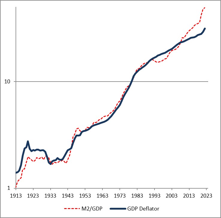
The fact that the price level has gone up a little bit less than the ratio of money to GDP over time is a reflection of the fact that money velocity has gone down slightly, and then more quickly, over the last 110 years. If you think velocity will fully revert, then the blue line will eventually converge with the red line – but in my mind there’s no reason to believe that velocity is stable or entirely mean-reverting over time…only that it doesn’t permanently trend higher or lower like money, prices, and GDP do.
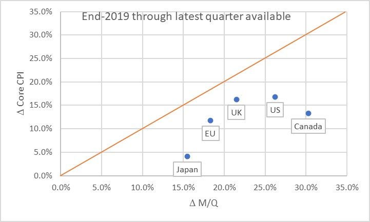
Obviously, this leads us to the question of where we are now. Here is a chart of the change in headline prices (CPI) as a function of the change in M/Q for five countries/regions.
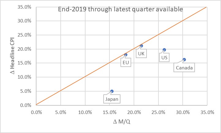
The chart basically says that the UK and EU have seen prices move almost exactly what you would have predicted, if you could have known in advance what M and Q were going to do. Naturally, none of us knew that. Japan, the US, and Canada haven’t seen prices rise as much as you would have expected, yet. Some of the reason why not is the effect I mentioned earlier: the dump of money into accounts during COVID was so fast that there was no time for prices to adjust. Actually, it’s only this close because food and energy adjust more rapidly…if you look at the picture with just core inflation, it appears there’s still some lifting to do to get back to the 45-degree line. As energy prices and food prices mean-revert some, core inflation should stay a little bubbly for a while.
Now, there’s three ways to get back to the line. We can see prices rise. We can see GDP rise. Or we can see the money supply fall. The latter two effects are better for consumers. The “GDP rises” is the best for everyone, although that’s the slowest-moving of the pieces. The “money supply fall” option is the best for consumers, but the worst for investors. Presently, we’re seeing a little bit of all three. But here is where I should take a moment to highlight how important the Fed’s balance sheet reduction has been in this process. Here is a chart from 2019Q4 to the present, just for the US, showing how this relationship developed over time.
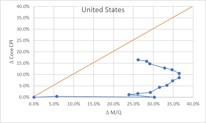
Initially, of course, there was a massive increase in money with no change in prices, as COVID hit in 2020. The point at (30%, 0%) is what the Fed had to work with as the lockdowns began to be lifted in late summer 2020. The sharp single-quarter reversal there was the result of the massive GDP spike in 2020Q3.
At that point, we would have anticipated that if nothing else happened, we would see a gradual 23% or so increase in the price level. If the Fed had immediately pulled back on the money printing, probably a lot less. Instead, the money printing continued for quite a while until by the middle of 2022 we were looking at a change in M/Q of about 37% since the end of 2019. Right about that time, the Fed got alarmed and began to shrink the balance sheet (and hike rates, although you will notice that the price of money does not show up on this chart but only its quantity!) That, combined with some decent growth, has decreased the pent-up pressure on prices. As of the end of 2023Q3, the aggregate M/Q change was 26.2%, while core prices had risen 16.4% (headline prices, including a 33% increase in energy and a 25% increase in food prices, are up 19.5% since the end of 2019).
If the money supply grows only at the rate of GDP from here, then this line will turn vertical and we have about a 10% increase in core inflation to ‘make up’ before we are back on the line. The good news is that the Fed currently is still reducing its balance sheet; the bad news is that M2 since April has stopped declining. More bad news is that GDP is likely to be soft or even negative here over the next few quarters, judging from payrolls, delinquencies, and other data. We could also hold out hope that velocity won’t fully rebound to pre-COVID levels, but there’s no reason other than “it sure would be nice if that happened” to expect that. Ergo, I think we’re still looking at higher-for-longer not just in the interest rate structure, but in the trajectory of inflation.
The most astonishing point on the charts above, in my mind, is the Japan point especially on the first chart. The amazing part isn’t that Japan’s inflation rate is lower than that of other countries here. They’ve added less money, so as a first pass you’d expect less inflation. But what’s amazing is that the Yen is also an absolute basket case, which means that imports – like, say, oil or gasoline – have gone up a lot more in price than for other countries. Crude oil in USD has risen about 22% in USD terms since the end of 2019. It’s up 66% in Yen terms! And yet, even with that Japanese inflation has stayed relatively low. So far. These charts tell me that I’d want to buy Japanese inflation and sell EU and UK inflation, where prices are closer to already reflecting the effect of the money geyser than they are in Japan.
[1] “Are Money Growth and Inflation Still Related?”, Economic Review, Federal Reserve Board of Atlanta, 2nd Quarter, 1999. https://www.atlantafed.org/-/media/documents/research/publications/economic-review/1999/q2/vol84no2_dwyer-hafer.pdf
Money Velocity Update!
Now that we have our first estimate of GDP for Q3, we also have our first estimate of M2 velocity for the third quarter. Because there is an amazing amount of uninformed hypothesis out there, I figured it was worth a quick review of where we are and where we’re going, and why it matters.
Why it matters: without the rebound in velocity, the slow-but-steady decline in M2 that we have experienced since mid-2022 would be outright deflationary. The money decline and the velocity re-acceleration are part and parcel of the same event, and that is the geyser of money that was squirted into the economy during COVID. Velocity collapsed for mostly mechanical reasons: it is a plug number in MVºPQ, and since prices do not instantly adjust to the new money supply float, velocity must decline to balance the equation. Another way of looking at it is that if you add money to people’s accounts faster than they can spend it then velocity will decline. I have previously presented an analogy that in this unique circumstance money velocity behaves as if it were a spring connecting a car, speeding away suddenly, with a trailer that has some inertia. Initially the spring absorbs the potential energy, and later provides it to the trailer as it catches up. Ultimately, the spring returns to its original length, when the car has stopped accelerating and the trailer is going at the same speed.
As M2 has declined in an unprecedented way, after surging in an unprecedented way, velocity has rebounded in an unprecedented way after plunging in an unprecedented way. All of these things are connected, episodically (but we will look at the underlying, lasting dynamics in a bit). With this latest GDP update, M2 velocity rose 1.9%, the 9th largest quarterly jump since 1970. Over the last four quarters, it has risen 10.4%, the largest on record, and 16% over eight quarters, also the largest on record.

https://fred.stlouisfed.org/series/M2V
To return to the level M2 Velocity was at, at the end of 2020Q1, it needs to rise another 4.8%. For M2 to return to the level it was at, at the end of 2020Q1, it needs to fall another 23%. One of these is likely to happen; the other one is not. The net difference, after subtracting cumulative growth (8.8% since then, so far), is a permanent increase in the price level. If M2 continues to come down, the net effect is a higher level of inflation over this period but not calamitous.
Note that there is no way we get the price level back to where it was, unless M2 declines considerably farther for considerably longer, or unless money velocity inexplicably turns around and dives again. I know that some well-known bond bull portfolio managers have been calling for that, but they were wrong the whole way along so why would you listen to them now?
I’ve been pretty clear that (a) I have been surprised that the Fed was successful in decreasing the money supply, since I thought the elasticity of loan supply would be more than the elasticity of loan demand (I was wrong), (b) I think the Fed deserves credit for shrinking the balance sheet, which they have long said doesn’t matter (it matters far more than interest rates, for inflation), (c) Powell deserves credit for turning into a hawk and pushing the institution of the Federal Reserve to become hawkish after decades under Greenspan, Bernanke, and Yellen where the only question being asked was ‘do we wait for the stock market to drop 10%, or only 5%, before we flood the system with money?’ Chairman Powell deservedly will go down in history as the guy who recognized the ‘spring effect’ that kept long-term upward pressure on inflation even as so many people were chirping about supply constraints and ‘transitory inflation’ (including, to be fair, Powell himself. But whatever he said, what he did was pretty reasonable).
However, the next bit is going to be challenging.
Velocity, being the inverse of the demand for real cash balances, is primarily affected by two main forces – one of them durable and one of them ephemeral. The ephemeral effect, which is rarely super-important, is that people tend to want to hold more cash when they are uncertain. Indeed, our model for velocity actually captured accidentally some of the ‘spring effect’ because for us it showed up as extreme uncertainty. Put another way, even if the Fed hadn’t flushed tons of money into the system, velocity would have had something of a sharp decline because of the high degree of economic uncertainty. Ergo, it was crucial that they flush in at least some money because otherwise we would have had outright deflation. They didn’t get the magnitude right, but they got the sign right. Anyway, the ‘uncertainty’ effect doesn’t last forever. The measure of uncertainty I use is a news-based index of economic policy uncertainty; it has retraced about 85% of its spike although it has been persistently high since political divisiveness became the main fact of US political life back in 2009 or so.

The more durable effect on the desire to hold cash is the presence of better-yielding alternatives to cash. When interest rates are uniformly zero and the stock market is on the moon, there’s very little reason to not hold cash. But when non-cash rates are high, and stocks and other investments more reasonably priced, cash is a wasting asset that people want to ‘put to work.’ The easiest way to see that is with interest rates, which for the last couple of decades have tracked the decline in money velocity closely as both declined.
And here is the problem. If interest rates are back at 2007 levels, then naïvely we would expect velocity to be back in the vicinity of 2007 levels also. But that is massively higher than the current level. In 2007, money velocity was around 1.98 or so: about 49% higher than the current level!

Needless to say, there’s no way the money supply is contracting that much. If velocity rose even, say, 30% then we would have a serious and long-lasting inflation problem. Fortunately, because of the economic policy uncertainty and other non-interest rate effects (I did say that “naïvely” we would be looking for 1.98, right?), the eventual rise in velocity beyond the snap-back level is much less than that. It actually only adds about 6% to the snap-back level. That still means 2% more inflation than would otherwise be expected, for three years, or 3% more for two years.

Of course, interest rates could fall again and ‘fix’ that problem. But it’s hard to see that happening while the money supply continues to contract, isn’t it? And that’s where it gets difficult. If you continue to decrease the balance sheet – which you need to do – and money continues to contract, then you probably get more velocity and inflation stays higher than you expect. Or, if you drop interest rates then you don’t get velocity much over the pre-COVID level, but you also get more money growth and inflation stays higher than you expect.
All of which adds up to one reason why I continue to think that inflation will stay sticky and higher than we want it, for a while. Powell has surprised me before, though, and this would be a good time to do it again.
Enough with Interest Rates Already
One of the things which alternately frustrates me and fascinates me is the mythology surrounding the idea that the central bank can address inflation by manipulating the price of money, even if it ignores the quantity of money.
I say “mythology” because there is virtually no empirical support for this notion, and the theoretical support for it depends on a model of flows in the economy that seem contrary to how the economy actually works. The idea, coarsely, is that by making money more dear the central bank will make it harder for businesses to borrow and invest, and for consumers to borrow and spend; therefore growth will slow. This seems to be a reasonable description of how the world works. But this then gets tied into inflation by appealing to the idea that lower aggregate demand should lower price pressures, leading to lower inflation. The models are very clear on this point: lower growth causes less inflation and more growth causes more inflation. The fact that this doesn’t appear to be the case in practice seems not to have lessened the fervor of policymakers for this framework. This is the frustrating part – especially since there is a viable alternative framework which seems to actually describe how the world works in practice, and that is monetarism.
The fascinating part are the incredibly short memories that policymakers enjoy when it comes to pursuing new policy using their preferred framework. Here’s the simplest of examples: from December 2008 until December 2019, the Fed Funds target rate spent 65% of the time pinned at 0.25%. The average Fed funds rate over that period was 0.69%. During that period, core inflation ranged from a low of 0.6% in 2010 to a high of 2.4%, hitting either 2.3% or 2.4% in 2012, 2016, 2017, 2018, and 2019. That 0.6% was an aberration – fully 86% of the time over that 11 years, core inflation was between 1.5% and 2.4%. Ergo, it seems reasonable to point out that ultra–low interest rates did not seem to cause higher inflation. If that is our most-recent experience, then why would the Fed now be aggressively pursuing a theory that depends on the idea that high interest rates will cause lower inflation? The most-recent evidence we have is that interest rates do not seem to affect inflation.
This isn’t just a recent phenomenon. But the nice thing about the post-GFC period is that for a good part of it, the Fed was ignoring bank reserves and the money supply and effecting policy entirely through interest rates (well, occasionally squirting some QE around, but if anything that should have increased inflation – it certainly didn’t dampen the effect of low interest rates). This became explicit in 2014 when Joseph Gagnon and Brian Sack, shortly after leaving the Fed themselves, published “Monetary Policy with Abundant Liquidity: A New Operating Framework for the Federal Reserve.” In this piece, they argued that the Fed should ignore the quantity of reserves in the system, and simply change interest rates that it pays on reserves generated by its open market operations. The fundamental idea is that interest rates matter, and money does not, and the Fed dutifully has followed that framework ever since. As I just noted, though, the results of that experiment would seem to indicate that low interest rates, anyway, don’t seem to have the effect that would be predicted (and which effect is necessary if the policy is to be meaningful).
And really, this shouldn’t be a surprise because for the prior three decades, the level of the real policy rate (adjusting the nominal rate here by core CPI, not headline) has been completely unrelated to the subsequent change in core inflation.

So, to sum up: for at least 40 years, the level of real policy rates has had no discernable effect on changes in the level of inflation. And yet, current central bank dogma is that rates are the only thing that matters.
I stopped the chart in 2014 because that’s when the Gagnon/Sack experiment began, but it doesn’t really change anything to extend it to the current day. Actually, all you get is a massive acceleration and deceleration in core inflation that all happened before any interest rate changes affected growth (seeing as how we have not yet had a recession). So it’s a result-within-a-result, in fact.
Any observation about how the Fed manages the price of money rather than its quantity would not be complete without pointing out that the St. Louis Federal Reserve’s economist emeritus Daniel L Thorton, one of the last known monetarists at the Fed until his retirement, wrote a paper in 2012 entitled “Monetary Policy: Why Money Matters and Interest Rates Don’t” [emphasis in the original title]. In this well-argued, landmark, iconic, and totally ignored paper Dr. Thornton argued that the central bank should focus almost entirely on the quantity of money, and not its price. Naturally, this is concordant with my own view, plus more than a century of evidence around the world that the price level is closely tied to the quantity of money.
To be fair, the connection of changes in M2 to changes in the price level has also been weak since the mid-1990s, for reasons I’ve discussed at length elsewhere. But at least money has a history of being related to inflation, whereas interest rates do not (except as a result of inflation, rather than as a cause of them); moreover, we can rehabilitate money by separately modeling money velocity.
There does not appear to be any way to rehabilitate interest rate policy as a tool for addressing inflation. It hasn’t worked, it isn’t working, and it won’t work.
No Need to Rob Peter to Pay Paul
So, I suppose the good news is that policymakers have stopped pretending that prices will go back down to the pre-pandemic levels. My friend Andy Fately (@fx_poet) in his daily note today called to my attention these dark remarks from Bank of England Chief “Economist” Huw Pill:
“If the cost of what you’re buying has gone up compared to what you’re selling, you’re going to be worse off…So somehow in the UK, someone needs to accept that they’re worse off and stop trying to maintain their real spending power by bidding up prices, whether higher wages or passing the energy costs through on to customers…And what we’re facing now is that reluctance to accept that, yes, we’re all worse off, and we all have to take our share.”
I think it’s worth stopping to re-read those words again. There are two implications that immediately leap out to me.
The first is that this is scary-full-Socialist. “We all have to take our share” is so anti-capitalist, anti-freedom, anti-individualist that it reeks of something that came from the pages of Atlas Shrugged. No, thank you, I don’t care to take my share of your screw-up. I would like to defend my money, and my real spending power, and my real lifestyle. If that comes at the cost of your lifestyle, Mr. Pill, then I’m sorry.
But the second point is that…it doesn’t come at the cost of someone else’s lifestyle. This is why I put “economist” in quotation marks above. There is still a lot of confusion out there between the price level and inflation, and what a change in the price level means, but if you’re an economist there shouldn’t be.
You see statements like this everywhere…”food prices are up 18%. If people are spending 18% more on food, it means they’re spending less elsewhere.” “Rents are up 17%. If people are spending 17% more on rent, it means they’re spending less elsewhere.” “Pet food is up 21%. If people are spending 21% more on pet food, it means they’re spending less elsewhere.” “New vehicle prices are up 22%. If people are spending 22% more on new vehicles, it means they’re spending less elsewhere.” “Price of appliances are up 19%. If people are spending 19% more on new appliances, it means they’re spending less elsewhere.”
You get my point. All of those, incidentally, are actual aggregate price changes since the end of 2019.
This is where an actual economist should step in and say “if the amount of money in circulation is up 37%, why does spending 18% more on good or service A mean that we have to spend less on good or service B?” In fact, this is only true if the growth in the aggregate amount of money is distributed highly unevenly. In ‘normal’ times, that might be a defensible assumption but during the pandemic money was distributed remarkably evenly.
Okay…the amount of money in circulation is a ‘stock’ number and the prices of stuff changing over time is a ‘flow’ number, which is why money velocity also matters. M*V is up about 24% since the end of 2019. So a 20% rise in prices shouldn’t be surprising, and since there’s lots more money out there a 20% rise in the price of one good does not imply you need to spend less on another good. That’s only true in a non-inflationary environment. The world has changed. You need to learn to think in real terms, especially if you are a “Chief Economist.”

(N.b. to be sure, this is somewhat definitional since we define V as PQ/M, but the overarching point is that with 40% more money in the system, it should be not the slightest bit surprising to see prices up 20%. And, if velocity really does act like a spring storing potential energy, then we should eventually expect to see prices up more like 30-40%.)
Here’s a little bonus thought.
Rents are +17%, which is roughly in line with a general rise in the prices of goods and services. Home prices are up about 36% (using Shiller 20-City Home Price Index), which is roughly in line with the raw increase in M2.
Proposition: since the price of unproductive real assets is essentially an exchange rate of dollars:asset – which means that an increase in a real asset’s price is the inverse of the dollar’s decrease – then the price of a real asset should reflect the stock of money since price is dictated by the relative scarcity of the quantity of dollars versus the real asset. But the price of a consumer good or service should reflect the flow of money, so something more like the MV/Q concept.
Implication:

Discuss.