Archive
Breaking Open the Piggy Bank
We have one month in the books in 2013 already; my, how time flies when you’re having fun! But the fun may not last much longer.
I have spent lots of time, over the last year, answering the question “why hasn’t inflation responded to QE?” My response has been that it has: core inflation rose from 0.6% to 2.3% from October 2010 to January 2012, rising for a record-tying fifteen consecutive months – a feat that last happened in 1973-74, as official prices adjusted to catch up for being frozen during wage and price controls. By a bunch of measures, that was an acceleration of core inflation that was unprecedented in modern U.S. economic history. As I wrote at the time (in “Inflation: As ‘Contained’ As An Arrow From A Bow“), the only reason to defer panic was that Housing inflation was overdue to level out and decelerate. Fortunately, it did.
But, as I’ve written extensively recently, that blessing has been rescinded and the question of “why hasn’t inflation responded to QE” will shortly be moot. In the next couple of months, core inflation will begin to re-accelerate, driven by the pass-through of rising home prices into rents. In our view, the best we can hope for is that core inflation only reaches 2.6% this year. Absent a change from the historical relationship between home prices and rents, some 40% of the core consumption basket is going to be rising at 3.5% or better by late this year.
So, when will markets get a whiff of this?
We are primarily motivated by valuations, and we are patient investors. Moreover, we think it makes more sense to focus effort on valuation work, because if your valuation work isn’t pretty good then timing isn’t going to matter much. But nevertheless, it is helpful to look for signs and signals that indicate time may be drawing short. So I’d like to go all ‘techie’ for a few minutes and show three charts that suggest markets are preparing for a new, higher-inflation reality.
The first one is the dollar index (see chart, source Bloomberg). This one is interesting, because I am not convinced that U.S. QE will cause a uniquely American inflation. After all, everybody’s doing it. This chart is technically of a head-and-shoulders pattern, but I’m just pointing to that trendline that keeps bringing in buyers.

A break below the current level (and as a trader, I’d be tentative until the September lows broke as well) projects to a test of the bottom end of a much bigger consolidation pattern that has been forming since the beginning of the crisis in 2008 (see next chart, source Bloomberg – the green oval is the area of detail in the prior chart). Below there be dragons.

Now, at the same time we have inflation breakevens (the compensation, in nominal bonds, for expected inflation – represented as the raw spread between the Treasury yield and the TIPS real yield). I’ve shown this uptrend in breakevens and/or inflation swaps in a number of ways recently, but the chart below (source: Bloomberg) shows a long-term view. In the last three months, the 5-year breakeven has risen about 35bps (and you get a similar picture from inflation swaps, but the data isn’t as clean that far back). Right now, bond investors are demanding a fairly high level of expected inflation compensation over TIPS and their guaranteed return of actual inflation. We’ve got a ways to go before we hit all-time highs on the 5y BEI, but the 10-year BEI is only about 22bps away from all-time highs.

Those prior charts haven’t yet broken out, and so while the timer is buzzing the alarm might ultimately not be set off. But in commodities, there are some interesting signs that the lows may be in even though sentiment remains very negative. The chart below (source: Bloomberg) illustrates that in January, the DJ-UBS commodity index gapped through trendline resistance not once, but twice.

In my experience, technical analysis of commodity indices is a fraught exercise, but commodities have quietly been doing quite well lately. Although the S&P rose 5% in January to only 2.4% for the DJ-UBS, that’s mostly due to the first trading day of the year. Since January 9th, the DJ-UBS is +3.7% while the total return of the S&P is only +2.6%. Surprised?
Now, the conventional wisdom is that stocks are a great place to hide if there is inflation. That conventional wisdom is wrong. Stocks may do okay if starting from modest valuations, but a rise of inflationary concerns (especially if accompanied by rising interest rates) while stocks are at high valuations would likely be less than generous to equity investors.
So, of course, retail investors have been breaking their piggy banks open to rush into stocks, in a rush not seen for many years. It is tragic, but it is the natural result of the Fed’s misguided[1] crusade to stimulate the economy via the portfolio balance channel (see my discussion and illustration of this topic here). Where does the retail investor turn, when he sees rising gasoline prices, rising home prices, and a shrinking paycheck due to higher withholding rates? The television is telling him that it’s time to jump aboard the equity train. Although he has been prudently suspicious of equity markets for much of the last decade, he is also aware that the cash he has in the bank is evaporating in real value.
And perhaps that’s why total savings deposits at all depository institutions (the main component of non-M1 M2) has fallen more in the last two weeks than in any two-week period…ever. About $115bln has fled from savings accounts in the last fortnight. Now, that’s a volatile series, and it might mean nothing unless we happened to see it show up somewhere.
Like, perhaps, here?

The chart above (source: ICI, via Bloomberg) shows the net new cash flows into equity funds, which just happen to be at the highest level over the past three weeks (about $30bln) of any time during the period of data available on Bloomberg.
Again, it isn’t because the future suddenly looks bright. Initial Claims today was 368k, above expectations and unfortunately putting a big dent in the notion that the ‘Claims data over the last few weeks was signaling a meaningful shift in the rate of new claims. The number is probably still going to go lower, but it is likely to be a drift, not a break. And we will see a similar story tomorrow, probably, when the Payrolls figure (Consensus: 165k) and Unemployment Rate (Consensus: 7.8%, but I think it might tick up to 7.9%) will paint the same sort of picture. No, people are not reaching for their wallets to invest in stocks because they are suddenly flush. More likely, it’s because they’re frustrated and confused; they feel they’re being left behind. Perhaps there is a bit of desperation, if retirement is getting further away as the cost of retirement rises and take-home pay stagnates.
In any event, what you do not want to see, four years and 125% above the S&P lows, is people taking money out of savings to put into stocks. If you are not one of the people putting money in, then consider being one of the people taking your profits out – and looking to those markets that actually do tend to keep up or outperform inflation. I hasten to remind readers that they don’t ring a bell at the top of the market, and so one ought to be careful to rely too much on the “signs” and “timing signals” suggested above. But the sharp-pencil work suggests that core inflation is going to head back up in the next 2-3 months; in my opinion, you don’t necessarily need signs to position for that – you need excuses.
.
[1] One is tempted to say ‘evil,’ but I don’t believe the Fed actually is anticipating the pain they are likely to cause to the little guy. Indeed, they may believe that the impact of their actions may fall disproportionally on the rich: an economist at the Federal Reserve Bank of St. Louis recently co-published a paper entitled “Understanding the Distributional Impact of Long-Run Inflation,” which concludes in part that “When money is the only asset, a faster rate of monetary expansion acts as a progressive tax that lowers wealth inequality; when bonds can be traded, wealth inequality is less affected by inflation because the rich hold more illiquid portfolios than the poor.” [emphasis added]
Home Price Increases – Not An Illusion
It seemed like last month I was focusing on the bigger picture a lot more than I have been recently. This is a function of the calendar, in that all of the important data tends to be clustered towards the end of the month, but also of the opportunity. When economists and investors are on-the-ball, they shouldn’t be blindsided by something as obvious as the fact that the sharp change in tax rates and withholding schedules at the end of the year, and the intentional direction of economic activity into Q4 in preference to Q1, was bound to cause an apparent acceleration in late Q4, and a deceleration in Q1. The fact that many economists and investors seemed to be taking the end-of-year data at face value indicated a potential opportunity.
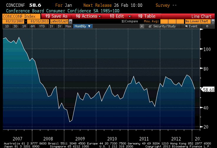
January Consumer Confidence is a case-in-point. It was expected to decline slightly, to 65.1, and instead dropped to 58.6 – quite a sharp drop from the prior month (see chart, source Bloomberg), especially since December’s figure was revised upward slightly. The overall level of Consumer Confidence sits at a lower level than any in 2012. Not to belabor the point, but this is entirely to be expected. However, as the upcoming data displays a zag to the data’s December zig, expect the market mood to change. It has not yet changed, to be sure. The stock market put in yet another new high, and bonds another low, so the market mood remains bulletproof for now.
In addition to the headline Confidence number, I always look at the “Jobs Hard to Get” subcomponent, which rose to 37.7 from 36.1. That represents the sharpest rise (higher indicates that more respondents are calling jobs “hard to get,” and so is a sign of economic languor rather than vigor) since the first half of last year. The level of this index tends to correlate reasonably well with the Unemployment Rate, and employment conditions generally. This leads me to suspect that tomorrow’s ADP report (Consensus: 165k from 215k in Dec) is likely to be softer than expectations. It bears observing, however, that even the 37.7 “Jobs Hard to Get” number is lower (that is, stronger) than it was for all of 2012 up until November. Accordingly, I’d expect a rise in Friday’s Unemployment Rate, but I wouldn’t be shocked if we didn’t see one.
The other important piece of data was the S&P Case-Shiller Home Price Index, released for November. The index rose 5.52% y/y ended in November, the highest rate of increase since 2006 (see chart, source Bloomberg).
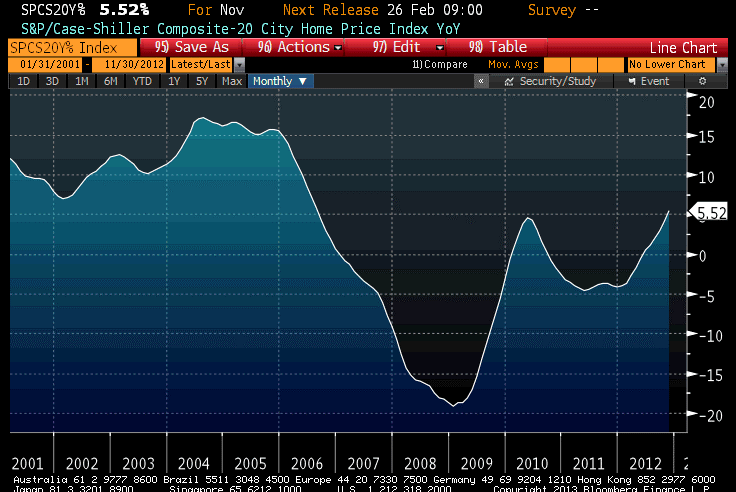
Now, this isn’t surprising because we’ve already had lots of other home price data for November and December, such as the Existing Home Sales and New Home Sales median price indices. But here is why you should care. Some observers have taken to dismissing the striking rise in these indices that we have so far seen; some have suggested that the home sales numbers are showing rising prices because the composition of the homes that are being sold is changing because of the paucity of credit available to lower-income (smaller home) borrowers. While using median prices, rather than mean prices, will tend to lessen this problem somewhat, it is a plausible hypothesis.
But the S&PCSSHPI[1] is designed to be a constant-quality index, and the index is calculated on the basis of repeat sales of the same homes. Thus, it doesn’t suffer from the composition-of-sales bias that the Existing and New Home Sales data might have – and it also shows that home price increases are accelerating. Home prices, in short, really are rising at a faster pace than at any time since 2006, and at 3.6% above core inflation (3.8% if you also exclude shelter from core inflation). As we’ve been saying for months, there is very little risk that core inflation is going to fall appreciably any time soon, when 40% of it (housing) is seeing an accelerating rate of inflation.
On Wednesday, in addition to the aforementioned ADP, we’ll get the advance release of Q4 GDP (Consensus: 1.1%, 2.1% Personal Consumption). I suspect that this is likely to be exceeded, although doing the GDP math for the advance report (which involves a fair number of estimates) is a bit beyond my art. If it really comes in as weak as 1.1%, then this coupled with a weak ADP could give the bond bulls some cover. If instead the GDP figure is a surprise on the high side, then given the current state of market emotion I’d expect investors to latch onto the (old news) Q4 GDP data and ignore the news from January.
But the key event of the day is the announcement of the FOMC’s decision around 2:15ET. There is not likely to be much of note to come from the FOMC statement, which ought to be largely unchanged. With all of the uncertainty surrounding the year-end data and the fiscal cliff/debt ceiling debates still ahead, the Committee will not be rocking the boat in January.
[1] I just felt like abbreviating since the Standard & Poors/Case-Shiller Home Price Index is ridiculously long, and I was curious whether the abbreviation helped. It doesn’t, unless you’re tweeting.
Not Growing to the Sky – Nor Ready to Fall, Yet
If only we could dwell permanently in January, looking at December 2012 economic data, the U.S. would be a warm and sunny place. Today’s Durable Goods number came in above expectations, although with revisions the ex-transportation figure was only slightly above forecasts. Again, though, this is a report for December, when incomes were higher due to the tax anticipation.
The December data is mostly finished, however, and now the January data begins to be reported. That starts with Consumer Confidence (Consensus: 64.0 from 65.1) on Tuesday. It can’t happen soon enough for the bond market. The 10-year Treasury note touched 2% today, for the first time since last April; 10-year TIPS got above -0.60% for the first time since August (although, to be fair, 11bps of that is due to the roll, since the old 10-year TIPS are still at -0.69% which wouldn’t even be the highest yield this month).
It is impressive to see the bond market selling off even though the Federal Reserve continues to buy. Partly, this may be because investors are fearful that the strong data will cause the Fed to stop buying, whereupon we all know we don’t want to be overlong. That is unlikely to happen, certainly at this week’s meeting. It is no mystery that December’s numbers were pumped up by large distributions being made in 2012 over 2013, and the Fed would want to see (a) more strength than was evident even in December and (b) that strength maintained for a little while at least! And, of course, while the fiscal cliff can has been kicked down the road a couple of months, there is also still a debt ceiling debate that must be had in the next month or two. It seems unlikely that the Fed would stop buying Treasuries while those uncertainties still loom.
Over the last 18 months, the 10-year note has come up to the 2% level a number of times. Usually, that level has been pierced by 3-4bps before the market reversed again, but on two occasions yields went as high as 2.40%.
I think the top in bonds (lows in yield) have been reached, but I don’t think the market will break to higher yields just yet. As I noted last week, I really don’t want to be short bonds headed into the next week-plus of data.
Now, looking at a long-term chart the current set-up in 10-year yields is interesting. The chart below (Source: Bloomberg) is of monthly closing levels in 10-year yields, with the y-axis drawn with logarithmic scale. For years, I’ve always drawn the channel shown on the chart, such that it contained the entire bull market until the breakout around the time of the 2008 crisis.
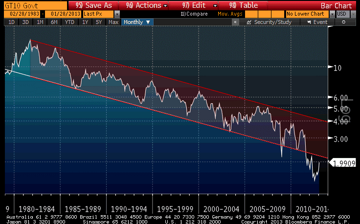
A more common, but I think arguably less-correct way, is to draw the y-axis with a normal linear scale. In this case, the most-recent low actually makes a rare 6-point support trendline on the monthly closes. The channel is no longer truly a channel (the lines are not quite parallel), and the channel doesn’t include the two 1980-1984 spikes, but it’s a much prettier picture.

In either case, there is nothing to suggest that the secular downtrend in rates has yet become an uptrend. Someday, it will, because trees don’t grow to the sky, and I wouldn’t want to wait until 3.50% to start re-positioning (much less, the 4% implied by the log chart). But I don’t think that day is here yet.
Now, while most people are still not afraid of inflation – which is the most-likely reason for nominal interest rates to eventually normalize – inflation swaps continue to rise. The 10-year inflation swap rate reached 2.80% today, about 10bps from the post-Lehman highs (see Chart, source Enduring Investments). Some people, evidently, are starting to be concerned.

Incidentally, some might be tempted to attribute today’s inflation market rally the rise in unleaded gasoline futures. Unleaded rallied on news that Hess Corp (HES) is closing its NJ oil refining facility and its U.S. terminal network. However, this did not seem to translate into the inflation markets, as it often does – normally, the inflation swaps curve would flatten as the gasoline move has more relevance for a shorter inflation horizon, but today the front of the curve if anything underperformed after carry is taken into consideration. The rise in inflation swap quotes is deeper than this.
Dropping the Anchor
The S&P managed to hit the seemingly-important 1,500 level today, before fading to close unchanged. The market took heart early from the print of Initial Claims at 330k. This is of course good news, although some blame may be due to the holiday-shortened week (the BLS had to estimate claims for some states, including California, which were unable to submit their figures in time) and the still-volatile seasonal pattern. Traditionally, this is the week I start paying attention to ‘Claims, but each subsequent number matters more than the last. I’d love to hear that the post-holiday layoffs weren’t as significant as they usually are, implying that more ‘seasonal’ workers are being retained. I’m skeptical of it, though, until we see a few more weeks of such evidence or confirmation in the survey numbers.
This is a good time to remember that economic data aren’t “right” or “wrong”; they are experiments, like taking the heights of five random motorists and trying to guess the average height of the people who drive on a particular freeway. We never know the true underlying state of the economy, or the true underlying trend rate of any particular economic datum. We come into an economic release with a null hypothesis, and that hypothesis may either be rejected or not rejected (economic data can never really confirm your hypothesis, but they can support your hypothesis). It is for this reason that I ignore the first few Initial Claims figures of the new year. The error bars on them are so wide that it is almost impossible to reject any halfway-rational null hypothesis. Once we have seen a couple more Claims figures in this range, or gotten support for the notion of an improving job market from Consumer Confidence figures (for example), it will be easier to reject the null hypothesis that the economy is still bumping along in a nearly-jobless recovery.
Also today, the TIPS auction produced strong results despite the fact that the market never priced in a ‘concession’ for the size. At 1:00ET, the bid in the market was -0.62%, but the U.S. Treasury sold $15bln at a lower yield (higher price) of -0.63%. Moving $15bln in size without hitting the bid is a fair sign of hunger in the inflation market.
And why shouldn’t there be hunger? If you think the economy is heating up, you can’t really short bonds unless you want to sell them and hope the Fed is just about done buying. But the Fisher equation says:
(1+n)=(1+r)(1+i)(1+p), which we usually simplify to say
Nominal rates = real rates + expected inflation
If the Fed is holding nominal rates constant, and investors are expecting inflation to rise as growth heats up (note: I am not changing my view that these are unrelated…I’m merely observing how investors behave in the market), then TIPS ought to stay comparatively well-bid because investors will buy breakevens as the bearish trade, rather than selling Treasuries in a Quixotic attempt to outlast the Fed. I think breakevens and inflation swaps, which remain near the highest levels since 2006 (in the 10-year sector) and near the highest levels since there have been TIPS, are going to remain pretty well bid.
The last data of the week are the New Home Sales (Consensus: 385k from 377k) from December. The forecast is for the highest level of sales in several years, and the biggest hurdle seems to be that inventories of homes remain very low.
One quick observation about home prices and “inflation expectations” that is interesting. Pollster Rasmussen reported today that 29% of Americans expect their home’s value to rise over the next year. While this is close to the highest levels the survey has recorded (it was only started in April 2010), it is strikingly low considering that both new and existing home sales prices are up at a double-digit pace over the last year, and even the slower-moving Case-Shiller index has home prices up at over twice the rate of core inflation (4.31% as of October, the last available data, with next week’s release expected to be 5.6%). The point simply being this: the Federal Reserve relies mightily on the assumption that inflation cannot really get started when inflation expectations are well-anchored. But nowhere are inflation expectations better anchored, probably, than in home prices – and yet, home prices are rising at something not far away from the peak rates of a couple of years ago.
That’s something to think about. Maybe it’s time that the Fed dropped the whole notion of anchored inflation expectations, which no one has ever demonstrated since there are no good measures of consumer inflation expectations. The idea of an inflation-expectations anchor was developed to explain why inflation did not accelerate in the 1990s even while the economy did, causing previously-estimated models to breakdown. There are other explanations that don’t require positing an anchor that cannot be measured (for example, the private/public debt ratio plays an important role in my company’s models), but the imaginations of the academic community became…well…anchored to the idea. It’s time to drop that anchor…at least until we develop a way to measure those expectations, and then to test the idea.
Today’s Icarus
It is hard to be the top dog.
Today, despite another low-volume session (incredibly, NYSE Composite volume is already 1.5 billion shares behind 2012’s volume-to-date), investors were looking forward to a slew of earnings announcements. By and large, companies hit or exceeded the hurdles set for them, as they typically do.
Apple (AAPL), which released fiscal Q1 earnings after the close, was among those that exceeded expectations. Sales rose 18%, although falling marginally short of expectations, and the company posted a $13.81/share profit compared with expectations for $13.53/share. Apple guided Q2 revenue estimates downward, and the stock was pummeled more than 6% after the close.
What’s amazing to me is that investors were not satisfied. Bloomberg gaped that “Apple Inc. posted no profit growth and the slowest increase in sales in 14 quarters…” This is a very large company. How long did people think that the firm could grow at “only” 18%? The same story also suggested the reason for the disappointing reaction: “The results reinforce concern that Apple’s growth is being hurt by higher production costs…”
No, its growth is being hurt because it’s a very large company. (Review the beginning of my January 15th post, where I link the research on the performance of the stock market’s “top dog”.)
Now, Apple is a wonderful, wonderful company. I want to be like Apple. I want my daughter to marry someone like Apple. It only has an 11.7 trailing P/E, and a yield of 2.06%. There’s much to like. But it’s huge. Like Microsoft before it, it is going to transition to a period of large-industrial-concern growth (MSFT has a 10.7 multiple and a 3.33% yield). The difference between MSFT and AAPL is that the former has an almost unassailable position in some of its markets. The latter, while a very cool company, has unassailable positions in … perhaps the iPod, to the extent that market isn’t cannibalized by the smartphone market. On the other hand, MSFT is a ruthless, uncreative company that has historically put out buggy products (although version 275 of Excel seems to crash less). AAPL is an ultra-cool, creative company that is in ‘what have you done for me lately’ product markets. I am not saying that I would do a long-short on MSFT-AAPL, and I’m not even saying that AAPL needs to trade lower from these levels. I’m merely pointing out that the dividend growth model contemplates a transition to lower long-run growth, and AAPL is going to have lower long-term growth eventually. That shouldn’t be surprising. Its main problem as an investment was that it was far too expensive for a company in transition, and moreover that transition was almost assured once it became such a huge company. Gravity isn’t just a good idea, Icarus: it’s the law.
The good news is that if AAPL is on its way to becoming IBM (without the gray-costumed drones of the 1984 advertisements, of course), it may have fallen far enough. IBM trades at a 13.4 P/E and a 1.66% dividend yield. Even Icarus bounced once he’d fallen for a while.
.
Thursday’s main economic data will be Initial Claims (Consensus: 355k from 335k). It is getting late enough in January that it is starting to make sense to pay attention to Claims again; however, as always with a weekly figure it will take a few weeks to let the average settle out.
More important, to me, is the auction of the new 10-year TIPS. This is not a re-opening, but rather a January-2023 maturity. The Treasury will be auctioning $15bln of the security, and I believe the auction will go well. The WI is pricing at roughly a 10-11bp pick-up from the current 10-year. That looks like too much, and I would expect that investors who own the current 10-year TIPS would be eager to add 11bps for six months of maturity (and pick up a slightly closer-to-the-money deflation floor in the process). Add to this the fact that the 10-year sector is fairly cheap on the curve generally, and you have the ingredients for a pretty good auction even if the absolute levels of yield are heinous and the breakevens are relatively wide by recent standards.
Learning the Wrong Lessons
According to Bloomberg, investors are the most optimistic on stocks they have been in 3½ years. As is normal, investors mistake a sense of optimism about the economy for a sense of optimism on equities. As is normal, investors are reaching this peak of optimism as the stock market achieves its highest nominal level in five years, and among the highest valuation multiples in … hey!…about five years. What a coincidence! (Incidentally, while we calculate our long-term valuation metrics ourselves this page is a pretty good source for a quick-and-dirty view of valuations. I don’t have any relationship to the company and this is the only page on the site that I’ve used so I am not endorsing any other page!)
Now, while I am probably as optimistic on the economy as I have been in the past few years, I’m still less-optimistic than the crowd since I think the crowd hasn’t yet assimilated the fact that the little growth spurt at the end of Q4 owes quite a lot to the movement of dividends and incomes into Q4 from Q1, and thus the first quarter of this year will probably look rather poor.
In fact, while I am clearly negative long-term on the prospects for nominal Treasury bonds, that’s my investment view. My trading view is that at 1.84%, Treasury bond yields are probably going to go lower before they go higher. That’s partly because the present yields incorporate a lot of enthusiasm about growth – enthusiasm I think will be dashed once the January numbers begin to be reported in earnest. But the trading view is also because the Fed is buying virtually all of the net supply the Treasury is supplying to the market, with no sign that project is ending. I have no illusions that buying 10-year Treasuries at 1.84% and holding to maturity will be an awful investment. But if I was a short-term swing trader, I’d play for the next 20bps to be lower, not higher, in yield.
With respect to January data, incidentally, here is what we have so far (outside of Initial Claims, which as I have pointed out previously are all over the map at this time of year):
| Release for January |
Consensus Forecast |
Actual |
| Empire Manufacturing |
0.0 |
-7.78 |
| NAHB Housing Mkt Index |
48 |
47 |
| Philadelphia Fed Index |
5.6 |
-5.8 |
| Michigan Confidence |
75.0 |
71.3 |
| Richmond Fed Mfg Index |
5 |
-12 |
For the most part, these are not just misses but big misses. I wonder how long it will take for investors to notice? Initial Claims on Thursday could get attention as the numbers start to converge on the actual condition of the underlying economy, but the first big January datum is the January 29th release of Consumer Confidence, which is currently expected to rise slightly from December. That is followed by ADP on January 30th (but any weakness there will likely be tempered by the advance release of Q4 GDP on the same day), the Chicago PMI on the 31st, and the ISM PMI and Unemployment on February 1st. Regardless of what happens over the next few days, I don’t want to be short bonds headed into that gauntlet next week.
I said the January data were big misses “for the most part,” because the NAHB miss wasn’t really a big miss. Housing is even strong enough now to resist downside surprises. As an aside, although it is a December number, the median price of existing home sales rose 10.89% year-on-year. Adjusted for the level of core inflation (so that we’re looking at the real rise in existing home prices), this is the fastest rise in history except for several months in 2005 – see the chart, (source Enduring Investments).

As for stocks, the fact that investors are as bullish as they have been in a third of a decade is sad but not terribly surprising (although this is a survey of Bloomberg users, which supposedly are much more astute since they have to come up with the 1700 clams per month for the service). On a related note, I was recently reading an article, called “I Saw The Movie,” in the January issue of Financial Advisor Magazine. In the article, the author compares the fear that some investors have of the stock market to the (irrational) fear of going into the water after watching Jaws. The author notes that “If your balance in 2011 resembled your balance in early 2008, you lost three years – but you didn’t lose any money, unless you sold out of panic…the vast majority of big losers were those who sold at the ebb of fall of ’08 to the spring of ’09 and parked their boats in the shallows of rock-bottom savings accounts.”
This, it occurs to me, is the real toll that the Fed’s QE has had on the investor class. It taught the wrong lesson. The lesson that has been taught is that you should hold on through all things, good and bad, and things will be okay. It is true that with hindsight, those who sold with the market finally at fair value (but no cheaper) in March of ’09 missed a rollicking rally all the way back to similar levels of overvaluation. But the real lesson should have been that most investors shouldn’t have been overweight in equities in 2008 or in 2007, based on market valuations. In the absence of manipulation of asset prices through the “portfolio balance channel” (see my discussion of this phenomenon in my recent article “A Relatively Good Deal Doesn’t Mean It’s A Good Deal”), those who sold in March of 2009 would have missed an average market return rather than the 21% per annum the market actually delivered since then. So the problem isn’t that they got out in 2009, but that they got in (or stayed in) in 2007 and 2008, and then got out in 2009. Investors who heeded the overvaluation of the market at, say, year-end 1998 and never got back in have earned a compounded return of 2.54% in T-Bills, 7.39% in TIPS, 5.64% in commodities, or 5.77% in the Lehman/Barclays Agg (nominal bonds) compared with 2.94% in stocks.
And that return is based on the pumped-up valuations that still exist in stocks today.
Investors, and their advisors for the most part, haven’t learned the right lessons yet, which is why patient investors are still having to wait to get back into equities even though the Federal Reserve is working very hard to force them back into the market via the portfolio balance channel.
The right lesson is this: investing for the long term is mostly about valuations, and very little about the economic cycle, the news cycle, or the lunar cycle. And two of those three we can’t predict, anyway. Yes, there is a tactical element of trading, but most investors should be (a) rebalancing on a regular basis, (b) paying attention to basic rudiments of asset valuation so as to adjust – mainly at the margin – their basic asset mix, and (c) turning off the television.
Greed Over Fear?
Desperation is unattractive, and desperate greed – needing to have a big return, quickly – is dangerous when it comes to investing. But investors appear to be getting increasingly desperate to swing for home runs rather than to try for singles and doubles, if the increased stampeding of retail investors’ monies into equities is any indication. Again today, stocks rallied steadily for most of the day. As the S&P reaches a new 5-year high with every advance, and is not terribly far away from an all-time (not inflation-adjusted) high, investors are increasingly throwing caution to the wind and plunging back in to stocks. Blackrock’s CEO, Larry Fink, observed today that “…the move back into equities is one of the mega trends we witnessed in the fourth quarter, and that has continued into the first 15, 16 days of the year.”
According to Fink, investors are doing this because of disdain for bond returns, not because of a desire to go “risk on.” And yet, risk-on they are going. They are going risk-on with corporate margins at post-WWII highs and following a Q4 that will be exaggerated by the tax-related movement of income from Q1 into Q4 (for example, via the payment of special dividends), and a Q1 that will end up looking weaker than the underlying fundamentals really are. Are these desperate investors ready to see a few months of weak data when they’re buying in at the highs?
Today’s data offered both the good and the bad. The good was the December Housing Starts number, which achieved the highest level since 2008 (see chart, source Bloomberg). To be sure, building activity is nowhere near the levels that were common in the 1980s, 90s, and 00s, but it is recovering. This should continue, as the inventory of new homes is at a very low level. The bad was the January Philly Fed index, which was expected to rise but which instead declined. The index of current conditions (at -5.8%) is the worst for a January since 2009.

Much was made of the sharp decline in the Initial Claims figure, which was expected at 369k but instead came in at 335k. My advice is to ignore any Claims figure in the second half of December until late January, as the seasonal adjustment factors are actually much larger than the net number – that is, the report should have a huge error bar around the weekly number, which is a seasonally-adjusted figure. If this is why stocks rocketed higher, then the desperation is even more disturbing. No one ought to ever invest on the basis of a weekly economic number.
.
After yesterday’s CPI report, I expected to see a number of denunciations of “inflation-phobes,” and I was not disappointed. David Wessel’s column in the Wall Street Journal was one example. Although Wessel came to the wrong conclusion (he agreed with Bernanke that there isn’t “much evidence” that the monetary policy of the last several years is going to be inflationary), at least he did undertake to “weigh…arguments on the other side.”
But he almost lost me straightaway, when he said that “the link between the money supply and the inflation rate is hard to discern in data…” Take a look at the chart below (source: Enduring Investments) and tell me if it’s really hard to discern the link in the data.

Oh, and on a longer-term basis there is this, which I wrote about in this great article.
What is hard to discern in the data is any link between inflation and growth, other than the spurious one that comes from the fact that the 2008 crisis was caused by an implosion of housing prices, which then impacted core inflation with a lag. (See chart, source Bloomberg)

Or, more consonant with the NAIRU theory, any link between the unemployment rate and core inflation (see chart, source Bloomberg).

This last chart is fun. If you run core CPI as a function of the unemployment rate from 2000-2012, you get a good correlation that looks like the right thing. But again, it’s spurious: if you look at the same relationship from 1990-2000, you also get a good correlation…but exactly the opposite slope to the relationship (that is, implying that lower unemployment causes lower inflation). Showing them both together makes the point that…you can’t see much in this data.
These latter two relationships are absolutely accepted without question in large swaths of the economics profession, such as when Wessel argues that “it would be difficult to spark and sustain inflation with so many unemployed workers, empty stores and offices and underused factories.” Where does he see that in the data?
I shouldn’t be so hard on Mr. Wessel, because he does make a reasonable effort to give some arguments about why people fear that the Fed will either intentionally or unintentionally make a mistake. But I think his best argument is one that he doesn’t make on purpose: policymakers and many economists just don’t understand what inflation is and how it works, and that creates a very high likelihood of error in the future. Moreover, they not only don’t understand, but they greatly overestimate their degree of understanding. I recognize, as an investor, trader, and economist, that there is some chance that my forecasts are wrong. Furthermore, since I understand that overconfidence is a very common cognitive error, I even recognize that I am most likely underestimating the chances that I am wrong. As a consequence, I am very conservative with my approach to investment when the consequences of an error are very high. Most good investors are very wary of overconfidence.
No such wariness afflicts the economic profession, unfortunately, especially at one particular address on Constitution Avenue Northwest in Washington, DC.
It Pays To Be Contrary
At one time, I think most of us assumed that the stock market would have a hard time rallying without its largest component, Apple (AAPL).
Pretty soon, Apple will solve that problem, since it won’t be too long before it is smaller than Exxon-Mobil (XOM) again. It is actually fairly remarkable that the S&P has managed to rally 3.2% this year even though AAPL is -8.7%.
This phenomenon is amazingly timely, considering that in the November/December issue of the Journal of Indexes there was an article by Rob Arnott and Lillian Wu called “The Winner’s Curse” in which the authors noted that “For investors, top dog status – the No. 1 company, by market capitalization, in each sector or market – is dismayingly unattractive.” Later, they note that “the U.S. national top dog underperforms the average company in the U.S. stock market by an average of 5 percent per year, over the subsequent decade.”
Nice call.
That observation follows naturally from Arnott’s work that led to fundamental indexing – his observation, simply, is that by definition if you are capitalization weighting you will always have “too high” a weight in stocks that are overvalued relative to their true prospects and “too low” a weight in stocks that are undervalued relative to their true prospects. There is no way to know if Apple is one of those – it’s a great company, and there’s no reason that the top-capitalization company is necessarily overvalued – but the authors of that article note that when you’re the top dog, more people are taking potshots at you. It suggests an interesting strategy, of buying the market except for the top firm in each industry.
This is why contrarians tend to do well. If you buy what everyone else is selling, and sell what everyone else is buying, there’s no reason to think you’ll be right on any given trade but you are much more likely to be buying something that is being sold “stupidly” and to sell something that is being bought “stupidly.”
Which brings me back to commodities, which are unchanged over the last 9 years (DJUBS Index) while the basic price level has risen 24% and M2 is +72%. But I know you knew that’s where I was going.
Below is a picture of the worst two asset classes of the last nine years (I picked 9 years because that’s the period over which both of them are roughly unchanged). The white line is the S&P-Case Shiller index, while the yellow line is the DJ-UBS Commodity Index.
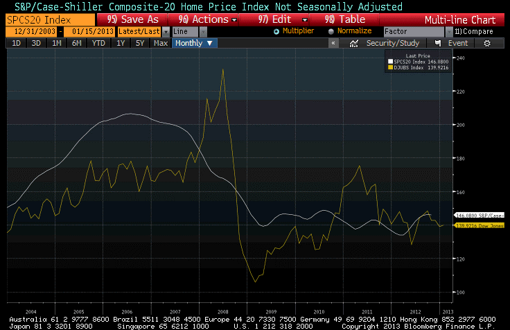
One of these two lines is currently generating much excitement among economists and investors, including institutional investors, who are pouring money into real estate. The other line is generating indifference at best, loathing at worst, and plenty of ink about how bad global growth is and how that means commodities can’t rally.
One of these lines is also associated with an asset class that has historically produced +0.5% real returns over long periods of time, and consequently isn’t an asset class that one would naturally expect to have great real returns. The other is associated with an asset class that has historically produced +5-6% real returns, comparable with equity returns, over long periods of time. Care to guess which is which?[1]
.
Tomorrow, the BLS will release the Consumer Price Index for December. The consensus for core inflation is for a “soft” +0.2%, and a year-on-year core inflation increase for 2012 of +1.9%.
Now, last December’s core inflation number was +0.146%, and last month’s year-on-year core CPI was +1.94%. What that means is that it will be quite difficult to get both +0.2% on the monthly core figure and +1.9% on the y/y change. If get +0.17% on core, then we should round up to +2.0% unless something odd happens with the seasonal adjustments.
In other words, I think it’s very likely that core inflation will pop back up to 2.0%. As a reminder, the Cleveland Fed’s Median CPI is still higher, at 2.2%, so it should not be surprising at all that core inflation has a better chance of going up than going down from here.
The two major subindices to look for are Owner’s Equivalent Rent, which last month was at 2.14% y/y, and Rent of Primary Residence, which was 2.73% y/y. Those two, combined, represent 30% of the consumption basket, and it was the flattening out of those series that caused core CPI to flatten around 2.0%. (Six months ago, the trailing y/y change in OER was 2.1%; the y/y change was 2.7%). Accordingly, watch closely for an uptick in those indicators. We believe that they are going to accelerate further, likely sometime in the next 3 months.
[1] Hint: the one that has historically provided great returns is one that few investors have very much of. The one that has historically provided bad returns is the one that represents most of a typical investor’s wealth.
Unemployment and Initial Claims – A Quick Chart
It was a pretty quiet day today, so instead of writing about the fairly boring market action (although AAPL broke below $500 for a few minutes and TIPS continued their recent bounce) I wrote a book report about the book How the Trading Floor Really Works. However, because people have requested that I separate obviously unrelated posts, you can find that review here.
There is one chart I would like to share – sort of a holdover from last week that I never got around to. It shows the unemployment rate (white line) against Initial Unemployment Claims (yellow line) for the last couple of cycles. (Source: Bloomberg)

So, do you think the job market is improving? You’re right! Does the job market still suck? You betcha!
There is also something different going on here, beyond the usual year-end seasonal adjustment tomfoolery. The decline in Initial Claims typically happens when the economy has stopped getting worse, and the current level is consistent with an economy that is turning jobs over at roughly the normal pace. We’re not creating lots more unemployed. But the slow decline in the Unemployment Rate is a sign that we’re not absorbing the existing unemployed through new growth of existing enterprises, or creation of new enterprises, as is typical in recoveries. I don’t think it should come as an absolute shock that in this business-unfriendly climate, businesses are reticent to expand, even if production as a whole is expanding.
How the Trading Floor Really Works
I have a book on my shelf, called The Money Market, by Marcia Stigum. It covers the workings of the capital markets, from basic instrument details of bonds, commercial paper, and so on to detailed discussions of how banks operate in the money markets to service client needs. There are chapters on futures, options, and swaps, government securities, repo markets, and bankers’ acceptances. When I first came into the market, in 1990, I bought a copy of this book and read it cover to cover – all 1250 pages of it. Together with Money Market Calculations: Yields, Break-Evens, and Arbitrage (also Stigum), it was absolutely essential reading for people entering the bond market.
The third edition was published in 1989, and is fairly out-of-date by now. Unfortunately, Ms. Stigum died in 2003 and so the fourth edition (now called Stigum’s Money Market), although updated by Anthony Crescenzi, is not quite on par with the prior versions. I would still recommend the fourth edition, however, to anyone who is actively considering entering the bond markets as a career.
But I have another book that I would recommend both to the people who are thinking of trying to get onto a Wall Street trading floor to pursue a career in finance as well as to those people who are just curious about how the trading floor really works. It is called, appropriately enough, How the Trading Floor Really Works. It is published by Bloomberg Financial, and written by Terri Duhon. (Disclosure: I worked with Terri for a brief time when we were both at JP Morgan, so I know she is writing from a position of knowledge on the topic).
This is not meant to be a mechanically precise book, like Stigum’s books on money market calculations. For example, in the section on derivatives, Duhon dispenses with such details as the fact that in a USD interest rate swap Libor is typically paid quarterly on an actual/360 day count basis, while the fixed side is paid semi-bond. That’s a detail that is utterly irrelevant for the purposes of this book, which is to illustrate how and why a Wall Street broker/dealer does what it does: how it makes money, how it services clients, how it balances the short-term profit and long-term profit motives, and what the different functions on the trading floor are (and how they fit together). The book begins with chapters on “What Are Financial Markets,” and “What Role Do Banks Play in Financial markets,” and later discusses “How Do Traders Make a Market,” “How Is Proprietary Trading Different from Market Making,” and “What Is the Relationship Between Sales and Trading?” The book addresses cash, derivatives, how “structurers” and “quants” are engaged in the bank’s business, and how risk is managed.
Crusty Wall Street veterans will not find anything in here that is terribly surprising, but most people with a “Main Street” view of Wall Street probably will. One really neat feature of the book is the generous sprinking of market anecdotes describing actual episodes on various trading floors (thankfully without names). These give the book an honest verisimilitude – I can attest that these things actually happen on trading floors, and indeed I am pretty sure that I was actually present for one of the vignettes.
I really enjoyed the book. If you are curious how Wall Street actually works – this is a book you should consider reading (and it’s only about 1/3 the cost of the Stigum book!). You can go to the Amazon page from the link above.