Archive
Nudge at Neptune
Okay, I get it. Your stockbroker is telling you not to worry about inflation: it’s really low, core inflation hasn’t been above 3% for two decades…and, anyway, the Fed is really trying to push it higher, he says, so if it goes up then that’s good too. Besides, some inflation isn’t necessarily bad for equities since many companies can raise end product prices faster than they have to adjust wages they pay their workers.[1] So why worry about something we haven’t seen in a while and isn’t necessarily that bad? Buy more FANG, baby!
Keep in mind that there is a very good chance that your stockbroker, if he or she is under 55 years old, has never seen an investing environment with inflation. Also keep in mind that the stories and scenes of wild excess on Wall Street don’t come from periods when equities are in a bear market. I’m just saying that there’s a reason to be at least mildly skeptical of your broker’s advice to own “100 minus your age” in stocks when you’re young, which morphs into advice to “owning more stocks since you’re likely to have a long retirement” when you get a bit older.
Many financial professionals are better-compensated, explicitly or implicitly, when stocks are going up. This means that even many of the honest ones, who have their clients’ best interests at heart, can’t help but enjoy it when the stock market rallies. Conversations with clients are easier when their accounts are going up in size every day and they feel flush. There’s a reason these folks didn’t go into selling life insurance. Selling life insurance is really hard – you have to talk every day to people and remind them that they’re going to die. I’d hate to be an insurance salesman.
And yet, I guess that’s sort of what I am.
Insurance is about managing risks. Frankly, investing should also be about managing risks – about keeping as much upside as you can, while maintaining an adequate margin of safety. Said another way, it’s about buying that insurance as cheaply as you can so that you don’t spend all of your money on insurance. That’s why diversification is such a powerful idea: owning 20 stocks, rather than 1 stock, gets you downside protection against idiosyncratic risks – essentially for free. Owning multiple asset classes is even more powerful, because the correlations between asset classes are generally lower than the correlations between stocks. Diversification works, and it’s free, so we do it.
So let’s talk about inflation protection. And to talk about inflation protection, I bring you…NASA.
How can we prevent an asteroid impact with Earth?
The key to preventing an impact is to find any potential threat as early as possible. With a couple of decades of warning, which would be possible for 100-meter-sized asteroids with a more capable detection network, several options are technically feasible for preventing an asteroid impact.
Deflecting an asteroid that is on an impact course with Earth requires changing the velocity of the object by less than an inch per second years in advance of the predicted impact.
Would it be possible to shoot down an asteroid that is about to impact Earth?
An asteroid on a trajectory to impact Earth could not be shot down in the last few minutes or even hours before impact. No known weapon system could stop the mass because of the velocity at which it travels – an average of 12 miles per second.
NASA is also in the business of risk mitigation, and actually their problem is similar to the investor’s problem: find protection, as cheaply as possible, that allows us to retain most of the upside. We can absolutely protect astronauts in space from degradation of their DNA from cosmic rays, with enough shielding. The problem is that the more shielding you add, the harder it is to go very far, very fast, in space. So NASA wants to find the cheapest way to have an effective cosmic ray shield. And, in the ‘planetary defense’ role for NASA, they understand that deflecting an asteroid from hitting the Earth is much, much easier if we do it very early. A nudge when a space rock is out at the orbit of Neptune is all it takes. But wait too long, and there is no way to prevent the devastating impact.
Yes, inflation works the same way.
The impact of inflation on a normal portfolio consisting of stocks and bonds is devastating. Rising inflation hurts bonds because interest rates rise, and it hurts stocks because multiples fall. There is no hiding behind diversification in a ’60-40’ portfolio when inflation rises. Other investments/assets/hedges need to be put into the mix. And when inflation is low, and “high” inflation is far away, it is inexpensive to protect against that portfolio impactor. I have written before about how low commodities prices are compared with equity prices, and in January I also wrote a piece about why the expected return to commodities is actually rising even as commodities go sideways.
TIPS breakevens are also reasonable. While 10-year breakevens have risen from 1.70% to 2.10% over the last 9 months or so, that’s still below current median inflation, and below where core inflation will be in a few months as the one-offs subside. And it’s still comfortably below where 10-year breaks have traded in normal times for the last 15 years (see chart, source Bloomberg).

It is true that there are not a lot of good ways for smaller investors to simply go long inflation. But you can trade out your nominal Treasuries for inflation bonds, own commodities, and if you have access to UCITS that trade in London there is INFU, which tracks 10-year breakevens. NASA doesn’t have a lot of good options, either, for protecting against an asteroid impact. But there are many more plausible options, if you start early, than if you wait until inflation’s trajectory is inside the orbit of the moon.
[1] Your stockbroker conveniently forgets that P/E multiples contract as inflation rises past about 3%. Also, your stockbroker conveniently abandons the argument about how businesses can raise prices before raising wages, meaning that consumer inflation leads wage inflation, when he points to weak wage growth and says “there’s no wage-push inflation.” Actually, your stockbroker sounds like a bit of an ass.
Forward Inflation is Nothing to be Alarmed About (Yet)
Note: my articles are now released about 8 hours earlier on the blog site and on my private Twitter feed @inflation_guyPV, which you can sign up for here, than they are released on my ‘regular’ Twitter feed.
It’s time to get a little wonky on inflation.
Recently, I saw a chart that illustrated that 5y, 5y forward inflation – “what the Fed watches” – had recently risen to multi-year highs. While a true statement, that chart obscures a couple of important facts that are either useful, or interesting, or both. Although probably just interesting.
First, the fact that 5y, 5y forward inflation (for the non-bond people out there, this is the rate that is implied from the market for 5-year inflation expectations starting 5 years from now) has recently gone to new highs is interesting, but 5y5y breakevens are still at only 2.20% or so. Historically, the Fed has been comfortable with forward inflation (from breakevens) around 2.50%-2.75% even though its own target is 2% on core PCE (which works out to be something like 2.25%-2.35% on core CPI). That’s because yield curves are typically upward-sloping; in particular, inflation risk ought to trade with a forward premium because the inflation process exhibits momentum and so inflation has long tails. Ergo, long-dated inflation protection is much more valuable than shorter-dated inflation protection, not just because there is more uncertainty about the future but because the value of that option increases with time-to-maturity just like any option…but actually moreso since inflation is not naturally mean-reverting, unlike most financial products on which options are struck.
[As an aside, the fact that longer-term inflation protection is much more valuable than shorter-term inflation protection is one of the reasons it is so curious that the Treasury keeps wanting to add to the supply of 5-year TIPS, as it just announced it intends to do, even though the 5-year auction is usually the worst TIPS auction because not many people really care about 5 year inflation. On the other hand, 10-year TIPS auctions usually do pretty well and 30-year TIPS auctions often stop through the screens, because that’s very valuable protection and there isn’t enough of it.]
A second interesting point about 5y5y inflation is that it is only at recent highs if you measure it with breakevens. If you measure it with inflation swaps, forward inflation is still 10bps or so short of the 2016 highs (see chart, source Bloomberg and Enduring Investments calculations).

This chart also illustrates something else that is really important: actual 5y5y forward inflation expectations are up around 2.40%, not down at 2.20%. Inflation swaps are a much better way to measure inflation expectations because they do not suffer from some of the big problems that bond-based breakevens have. For example:
- The inflation swaps market is always trading a clean 5-year maturity swap and a clean 10-year maturity swap. By contrast, the ’10-year note’ is a 10-year note for only one day, but remains the on-the-run 10-year note until a new one is auctioned.
- The 5-year breakeven consists of a “5-year” TIPS bond and a “5-year” Treasury, even though these may have different maturities. They are always close, but not exact, and the duration of the TIPS bond changes at a different rate as time passes than the duration of the Treasury. In other words, the matching bonds for the breakeven don’t match very well.
- A minor quantitative point is that the “breakeven” is typically taken as the difference between the nominal Treasury yield and the real TIPS yield, but since the Fisher equation says (1+n) = (1+r)(1+i), the breakeven (i in this notation) should actually be (1+n)/(1+r)-1. At low yields this is a small error, but the error changes with the level of yields.
- A more important quantitative point is that the nominal bond’s yield not only has real rates and expected inflation, but also a risk premium which is unobservable. So, in the construction above, I ignored the fact that the Fisher equation is actually (1+n)=(1+r)(1+i)(1+p), with the breakeven therefore representing both the i and the p. Inflation swaps, on the other hand, represent pure inflation.
- But then why is the inflation swap always higher than the breakeven? This is the biggest point of all: the breakeven is created by buying a TIPS bond and shorting a nominal Treasury security. Shorting the Treasury security involves borrowing the bond and lending money in the financing markets; because nominal Treasuries are coveted collateral – especially the on-the-run security used for the breakeven – they very often trade at “special” rates in the financing markets. As a result, nominal Treasury yields are ‘too low’ by the value of this financing advantage, which means in turn that the breakeven is too low. If TIPS also traded “special” at similar rates, then this would be less important as it would average out. However, TIPS almost never trade special and in particular, they don’t trade as deep specials. Consequently, breakevens calculated as the spread between a TIPS bond and nominal bond understate actual inflation expectations.[1]
This is all a very windy way to say this: ignore 5y5y forward breakevens and focus on 5y5y forward inflation swaps. Historically the Fed is comfortable with that up around 2.75%-3.25%, although that’s probably partly because they are iffy on bond math. In any case, there is nothing the slightest bit alarming about the current level of forward inflation expectations; indeed, central bankers had much more cause to be alarmed when forward inflation expectations were down around 1.50% – implying that investors had no confidence that the Fed could get within 50bps of its own stated target when given half a decade to do it – than where they are now.
But check with me again in 50bps!
[1] This is widely known, although I think I get the credit for being the first person to point it out in 2006, only two years after the inflation swaps market in the US got started. I figured it out because I was a market maker in swaps and when I was paying inflation in the swap, and receiving a fixed rate higher than the breakeven, and hedged with the breakeven, I was breaking even. The answer was in the financing. I formalized my argument in this paper although my original article was credited and cited in this much more widely read article by Fleckenstein, Longstaff, and Lustig. But the bottom line is that as the Dothraki say, ‘it is known.’
Why Commodities Are a Better Bet These Days
Don’t you want to follow my private Twitter channel, where these articles appear first and the only place you can get my real-time CPI report analysis on CPI day? You can do so for only $10 per month at PremoSocial here.
It’s been a long time since an article about commodities felt like ‘click bait.’ After all, commodity indices have been generally declining for about seven years – although 2016 saw a small advance – and the Bloomberg Commodity Index today sits 63% below its all-time high set in the summer of 2008. I’ve written before, quite a bit, about this absurdity of the market, represented in the following chart comparing one real asset (equities) to another real asset (commodities). The commodity index here is the Bloomberg spot index, so it does not include the drag (boost) from contango (backwardation).

This is the fair comparison for a forward-looking analysis. Some places you will see the commodity index plotted against the S&P, as below. Such a chart makes the correct inference about the historic returns to these two markets; the prior chart makes a more poignant point about the current pricing of stocks versus commodities.
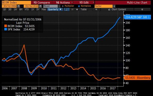
There’s nothing that says these two markets should move in lock-step as they did from 2003-2007, but they ought to at least behave similarly, one would think. So it is hard to escape the reasoning that commodities are currently very cheap to equities, as one risk-asset to another.
Furthermore, commodity indices offer inflation protection. Here are the correlations between the GSCI and headline inflation, core inflation, and the change in those measures, since 1970 and 1987 respectively.

Stocks? Not so much!

So, commodities look relatively cheap…or, anyway, they’re relatively cheaper, having gone down for 7 years while stocks went higher for 7 years. And they give inflation protection, while stocks give inflation un-protection. So what’s not to like? How about performance! The last decade has been incredibly rough for commodities index investors. However, this is abnormal. In a watershed paper in 2006 called Facts and Fantasies about Commodity Futures, Gorton and Rouwenhorst illustrated that, historically, equities and commodity futures have essentially equivalent monthly returns and risks over the period from 1959-2004.
Moreover, because the drivers of commodity index returns in the long run are not primarily spot commodity prices[1] but, rather, the returns from collateral, from roll or convenience yield, from rebalancing, and from “expectational variance” that produces positive skewness and kurtosis in commodity return distributions,[2] we can make some observations about how expected returns should behave between two points in time.
For example, over the last few years commodities markets have been heavily in contango, meaning that in general spot prices were below forward prices. The effect of this on a long commodity index strategy is that when futures positions are rolled to a new contract month, they are being rolled to higher prices. This drag is substantial. The chart below shows the Bloomberg Commodity Index spot return, compared to the return of the index as a whole, since 2008. The markets haven’t all been in contango, and not all of the time. But they have been in serious contango enough to cause the substantial drag you can see here.

So here is the good news. Currently, futures market contango is the lowest it has been in quite a while. In the last two years, the average contango from the front contract to the 1-year-out contract has gone from 15% or so to about 2% backwardation, using GSCI weights (I know I keep switching back and forth from BCOM to GSCI. I promise there’s nothing sinister about it – it just depends what data I had to hand when I made that chart or when it was calculated automatically, such as the following chart which we compute daily).

That chart implies a substantial change in the drag from roll yield – in fact, depending on your weights in various commodities the roll yield may currently be additive.
The other positive factor is the increase in short-term interest rates. Remember that a commodity index is (in most cases) represents a strategy of holding and rolling futures contracts representing the desired commodity weights. To implement that strategy, an investor must put up collateral – and so an unlevered commodity index return consists partly of the return on that particular collateral. It is generally assumed that the collateral is three-month Treasury Bills. Since the financial crisis, when interest rates went effectively to zero in the US, the collateral return has approximated zero. However, surprise! One positive effect of the Fed’s hiking of rates is to improve projected commodity index returns by 1.5-2% per year (and probably more this year). The chart below shows 3-month TBill rates.

I hope this has been helpful. For the last 5 years, investing in commodities was partly a value/mean-reversion play. This is no longer so true: the change in the shape of the futures curves, combined with rising interest rates, has added substantially to the expected return of commodity indices going forward. It’s about time!
[1] This is a really important point. When people say “commodities always go down in the long run because of increased production,” they’re talking about spot commodity prices. That may be a good reason not to own spot gold or silver, or any physical commodity. Commodity spot returns are mean reverting with a downward slant in real space, true. But a commodity index gets its volatility from spot returns, but its main sources of long term return are actually not terribly related to spot commodities prices.
[2] In other words while stocks “crash” downwards, commodities tend to “crash” upwards. But this isn’t necessary to understand what follows. I just want to be complete. The term “expectational variance” was coined by Grant Gardner.
Point Forecast for Real Equity Returns in 2018
Point forecasts are evil.
Economists are asked to make point forecasts, and they oblige. But it’s a dumb thing to do, and they know it. Practitioners, who should know better, rely on these point forecasts far more than they should. Because, in economics and especially in markets, there are enormous error bars around any reasonable point forecast, and those error bars are larger the shorter-term the forecast is (if there is any mean-reversion at all). I can no more forecast tomorrow’s change in stock market prices than I can forecast whether I will draw a red card from a deck of cards that you hand me. I can make a reasonable 5-year or 10-year forecast, at least on a compounded annualized basis, but in the short term the noise simply swamps the signal.[1]
Point forecasts are especially humorous when it comes to the various year-end navel-gazing forecasts of stock market returns that we see. These forecasts almost never have fair error bars around the estimate…because, if they did, there would be no real point in publishing them. I will illustrate that – and in the meantime, please realize that this implies the forecast pieces are, for the most part, designed to be marketing pieces and not really science or research. So every sell-side firm will forecast stock market rallies every year without fail. Some buy side firms (Hoisington springs to mind) will predict poor returns, and that usually means they are specializing in something other than stocks. A few respectable firms (GMO, e.g.) will be careful to make only long-term forecasts, over periods of time in which their analysis actually has some reasonable predictive power, and even then they’ll tend to couch their analysis in terms of risks. These are good firms.
So let’s look at why point forecasts of equity returns are useless. The table below shows Enduring’s year-end 10-year forecast for the compounded real return on the S&P 500, based on a model that is similar to what GMO and others use (incorporating current valuation levels and an assumption about how those valuations mean-revert).[2] That’s in the green column labeled “10y model point forecast.” To that forecast, I subtract (to the left) and add (to the right) one standard deviation, based on the year-end spot VIX index for the forecast date.[3] Those columns are pink. Then, to the right of those columns, I present the actual subsequent real total return of the S&P 500 that year, using core CPI to deflate the nominal return; the column the farthest to the right is the “Z-score” and tells how many a priori standard deviations the actual return differed from the “point forecast.” If the volatility estimate is a good one, then roughly 68% of all of the observations should be between -1 and +1 in Z score. And hello, how about that? 14 of the 20 observations fall in the [-1,1] range.

Clearly, 2017 was remarkable in that we were 1.4 standard deviations above the 12/31/2016 forecast of +1.0% real. Sure, that “forecast” is really a forecast of the long-term average real return, but that’s not a bad place to start for a guess about next year’s return, if we must make a point forecast.
This is all preliminary, of course, to the forecast implied by the year-end figures in 2017. The forecast we would make would be that real S&P returns in 2018 have a 2/3 chance of being between -10.9% and +11.1%, with a point forecast (for what that’s worth) of +0.10%. In other words, a rally this year by more than CPI rises is still as likely as heads on a coin flip, even though a forecast of 0.10% real is a truly weak forecast and the weakest implied by this model in a long time.
It is clearly the worst time to be invested in equities since the early 2000s. Even so, there’s a 50-50 chance we see a rally in 2018. That’s not a very good marketing pitch. But it’s better science.[4]
[1] Obligatory Robert Shiller reference: his 1981 paper “Do Stock Prices Move Too Much to be Justified by Subsequent Changes in Dividends” formulated the “excess volatility puzzle,” which essentially says that there’s a lot more noise than signal in the short run.
[2] Forecasts prior to 2009 predate this firm and are arrived at by applying the same methodology to historical data. None of these are discretionary forecasts and none should be taken as implying any sort of recommendation. They may differ from our own discretionary forecasts. They are for illustration only. Buyer beware. Etc.
[3] The spot VIX is an annualized volatility but incorporating much nearer-term option expiries than the 1-year horizon we want. However, since the VIX futures curve generally slopes upward this is biased narrow.
[4] And, I should hasten point out: it does have implications for portfolio allocations. With Jan-2019 TIPS yielding 0.10% real – identical to the equity point forecast but with essentially zero risk around that point – any decent portfolio allocation algorithm will favor low-risk real bonds over stocks more than usual (even though TIPS pay on headline CPI, and not the core CPI I am using in the table).
Retail Investors Aren’t As Stupid As They Tell You
Let’s face it, when it comes to the bullish/bearish argument about equities these days, the bears have virtually all of the arguments in their favor. Not all, but almost all. However, I always think the bears hurt their case with certain poor arguments that tend to be repeated a lot – in fact, it’s one way to tell the perma-bears from the thoughtful bears.
One of the arguments I have seen recently is that retail investors are wayyy out over their skis, and are very heavily invested in stocks with very low cash assets. This chart, which I saw in a recent piece by John Mauldin, is typical of the genre.

Now, bears are supposed to be the skeptics in the equation, and there is just nowhere near enough skepticism being directed at the claim that retail investors are being overly aggressive. Gosh, the first place a person could start is with asking “shouldn’t allocations properly be lower now, with zero returns to cash, than they were when yields were higher?”
But as it turns out, we don’t even have to ask that question because there’s a simpler one that makes this argument evaporate. Consider an investor who, instead of actively allocating to stocks when they’re “hot” (stupid retail investor! Always long at the top!) and away from them when they’re “cold” (dummy! That’s when you should be loading up!), is simply passive. He/she begins in mid-2005 (when the chart above begins) with a 13% cash allocation and the balance of 87% allocated to stocks. Thereafter, the investor goes to sleep for twelve years. The cash investments gain slowly according to the 3-month T-Bill rate; the equity investments fluctuate according to the change in the Wilshire 5000 Total Market index. This investor’s cash allocation ends up looking like this.

How interesting! It turns out that since the allocation to cash is, mathematically, CASH / (CASH+STOCKS), when the denominator declines due to stock market declines the overall cash ratio moves automatically! Thus, it seems that maybe what we’re looking at in the “scary” chart is just the natural implication of fluctuating markets and uninvolved, as opposed to returns-chasing, investors.
Actually, it gets better than that. I put the second chart on top of the first chart, so that the axes correspond.
 It turns out that retail investors are actually much more in cash than a passive investor would be. In other words, instead of being the wild-and-woolly returns chasers it turns out that retail investors seem to have been responding to higher prices by raising cash, doing what attentive investors should do: rebalancing. So much for this bearish argument (to be clear, I think the bears are correct – it’s just that this argument is lame).
Isn’t math fun?
Some Abbreviated but Important Thoughts on Housing
I posted this chart yesterday to my Twitter feed (@inflation_guy, or @inflation_guyPV through PremoSocial for some additional content), but didn’t have time to write very much about it. This is the Shiller 20-City Home Price Index year/year change (Source: Bloomberg).

My observation was that when you take out the housing bubble, it looks more ominous. It’s actually really the bubble and bust, which makes the recent trend look uninteresting. This is what the chart looks like if you go further back like that.

So it actually looks calm and stable, because the axis explodes to -20% to +20%. The volatility of recent years has caused us to forget that for decades before that, the behavior of home prices was actually pretty sedate. Although residential real estate over very long time periods has only a slightly positive real return, adjusted for the maintenance and other required expenditures, that means the ratio of home prices to median income has tended to be fairly stable. We have historically valued homes as a consumption good only, which meant that the home price traded as a multiple of rents or incomes within a pretty narrow range. Here’s a chart of median home prices to median household income going back to the 1970s (Source: Bloomberg, Enduring Intellectual Properties calculations).

This is true even though there have been important tax changes along the way which changed the value of the home as a tax shelter, changes in the structure of the typical family unit, and so on. Despite that, homes were pretty stable investments – really, they were more savings vehicles than investments.
The fact that home prices are now accelerating, and are rising faster than incomes, implies several things. First, as the last chart above shows, the ‘investment value’ of the home is again inflating to levels that, in 2005-2008, proved unsustainable. The bubble in housing isn’t as bad as it was, and not as bad as stocks are now, but the combination of those two bubbles might be worse than they were when they were mostly independent (in 2000 there wasn’t a housing bubble and in 2007 the bubble in stocks wasn’t nearly as bad as in 2000 and now).
The second implication is that as home prices rise, it isn’t just the value of the investment in the home that is rising but also its cost as a consumption item. Because shelter to rent is a substitute for shelter that you own, rising home prices tends to imply that rents also accelerate. Recently, “Owner’s Equivalent Rent” has been decelerating somewhat, although only coming back to our model. But the gradual acceleration in the home price increase implies that shelter inflation is not going to continue to moderate, but rather should continue to put upward pressure on core inflation, of which 42% consists of “Rent of Shelter.”
The Limits to Trusting the Robots
After another day on Thursday of stocks starting to look mildly tired – but only mildly – only to rally back to a new closing high, it hardly seems unusual any more. I have to keep pinching myself, reminding myself that this is historically abnormal. Actually, very abnormal. If the S&P 500 Total Return Index ends this month with a gain, it will be the second time in history that has happened. The other time was in 1936, as stocks bounced back from a deep bear market (at the end of those 12 months, in March 1936, stocks were still 54% off the 1929 highs). A rally this month would also mean that stocks have gained for 19 out of the last 20 months, the longest streak with just one miss since…1936 again.
But we aren’t rebounding from ‘oversold.’ This seems to be a different situation.
What is going on is confounding the wise and the foolish alike. Every dip is bought; the measures of market constancy (noted above, for example) are at all-time highs and the measures of market volatility such as the VIX are at all-time lows. It is de rigeur at this point to sneer “what could go wrong?” and you may assume I have indeed so sneered. But I also am curious about whether there is some kind of feedback loop at work that could cause this to go on far longer than it “should.”
To be sure, it shouldn’t. By many measures, equities are at or near all time measures of richness. The ones that are not at all-time highs are still in the top decile. Buying equities (or for that matter, bonds) at these levels ought to be a recipe for a capitalistic disaster. And yet, value guys are getting carried out left and right.
Does the elimination (with extreme prejudice) of value traders have any implications?
There has been lots of research about market composition: models, for example, that examine how “noise” and “signal” traders come together to create markets that exhibit the sorts of characteristics that normal markets do. Studies of what proportion of “speculators” you need, compared to “hedgers,” to make markets efficient or to cause them to have bubbles form.
So my question is, what if the combination of “buy the dip” micro-time-frame value guys, combine with the “risk parity” guys, represents a stable system?
Suppose equity volatility starts to rise. Then the risk-parity guys will start to sell equities, which will push prices lower and tend to push volatility higher. But then the short-term value guys step in to ‘buy the dip.’ To be clear, these are not traditional value investors, but rather more like the “speculators” in the hedger/speculator formulation of the market. These are people who buy something that has gone down, because it has gone down and is therefore cheaper, as opposed to the people who sell something that has gone down, because the fact that it has gone down means that it is more likely to go down further. In options-land, the folks buying the dip are pursuing a short-volatility strategy while the folks selling are pursuing a long-volatility strategy.[1]
Once the market has been stabilized by the buy-the-dip folks, who might be for example hedging a long options position (say, volatility arbitrage guys who are long actual options and short the VIX), then volatility starts to decline again, bringing the risk-parity guys back into equities and, along with the indexed long-only money that is seeking beta regardless of price, pushing the market higher. Whereupon the buy-the-dip guys get out with their scalped profit but leaving prices higher, and volatility lower, than it started (this last condition is necessary because otherwise it ends up being a zero-sum game. If prices keep going higher and implied volatility lower, it need not be zero-sum, which means both sides are being rewarded, which means that we would see more and more risk-parity guys – which we do – and more and more delta-hedging-buy-the-dip guys – which we do).
Obviously this sort of thing happens. My question though is, what if these different activities tend to offset in a convergent rather than divergent way, so that the system is stable? If this is what is happening then traditional value has no meaning, and equities can ascend arbitrary heights of valuation and implied volatility can decline arbitrarily low.
Options traders see this sort of stability in micro all the time. If there is lots of open interest in options around, say, the 110 strike on the bond contract, and the Street (or, more generally, the sophisticated and leveraged delta-hedgers) is long those options, then what tends to happen is that if the bond contract happens to be near 110 when expiry nears it will often oscillate around that strike in ever-declining swings. If I am long 110 straddles and the market rallies to 110-04, suddenly because of my gamma position I find myself long the market since my calls are in the money and my puts are not. If I sell my delta at 110-04, then I have locked in a small profit that helps to offset the large time decay that is going to make my options lose all of their remaining time value in a short while.[2] So, if the active traders are all long options at this strike, what happens is that when the bond goes to 110-04, all of the active folks sell to try and scalp their time decay, pushing the bond back down. When it goes to 99-28, they all buy. Then, the next time up, the bond gets to 110-03 and the folks who missed delta-hedging the last time say “okay, this time I will get this hedge off” and sell, so the oscillation is smaller. Sometimes it gets really hard to have any chance of covering time decay at all because this process results in the market stabilizing right at 110-00 right up until expiration. And that stabilization happens because of the traders hedging long-volatility positions in a low-volatility environment.
But for the options trader, that process has an end – options expiration. In the market process I am describing where risk-parity flows are being offset by buy-the-dip traders…is there an end, or can that process continue ad infinitum or at least, “much longer than you think it can?”
Spoiler alert: it already has continued much longer than I thought it could.
There is, however, a limit. These oscillations have to reach some de minimus level or it isn’t worth it to the buy-the-dip guys to buy the dip, and it isn’t worth reallocation of risk-parity strategies. This level is much lower now than it has been in the past, thanks to the spread of automated trading systems (i.e., robots) that make the delta-hedging process (or its analog in this system) so efficient that it requires less actual volatility to be profitable. But there is a limit. And the limit is reach two ways, in fact, because the minimum oscillation needed is a function of the capital to be deployed in the hedging process. I can hedge a 1-lot with a 2 penny oscillation in a stock. But I can’t get in and out of a million shares that way. So, as the amount of capital deployed in these strategies goes up, it actually raises the potential floor for volatility, below which these strategies aren’t profitable (at least in the long run). However, there could still be an equilibrium in which the capital deployed in these strategies, the volatility, and the market drift are all balanced, and that equilibrium could well be at still-lower volatility and still-higher market prices and still-larger allocations to risk-parity etc.
It seems like a good question to ask, the day after the 30th anniversary of the first time that the robots went crazy, “how does this stable system break down?” And, as a related question, “is the system self-stabilizing when perturbed, or does it de-stabilize?”
Some systems are self-stabilizing with small perturbations and destabilizing with larger perturbations. Think of a marble rolling around in a bowl. A small push up the side of the bowl will result in the marble eventually returning to the bottom of the bowl; a large push will result in the marble leaving the bowl entirely. I think we are in that sort of system. We have seen mild events, such as the shock of Brexit or Trump’s electoral victory, result in mild volatility that eventually dampened and left stocks at a higher level. I wonder if, as more money is employed in risk parity, the same size perturbation might eventually be divergent – as volatility rises, risk parity sells, and if the amount of dip-buyers is too small relative to the risk parity sellers, then the dip-buyers don’t stabilize the rout and eventually become sellers themselves.
If that’s the secret…if it’s the ratio of risk-parity money to dip-buyer money that matters in order to keep this a stable, symbiotic relationship, then there are two ways that the system can lose stability.
The first is that risk parity strategies can attract too much money. Risk parity is a liquidity-consumer, as they tend to be sellers when volatility is rising and buyers when volatility is falling. Moreover, they tend to be sellers of all assets when correlations are rising, and buyers of all assets when correlations are falling. And while total risk-parity fund flows are hard to track, there is little doubt that money is flowing to these strategies. For example one such fund, the Columbia Adaptive Risk Allocation Fund (CRAZX), has seen fairly dramatic increases in total assets over the last year or so (see chart, source Bloomberg. Hat tip to Peter Tchir whose Forbes article in May suggested this metric).

The second way that ratio can lose stability is that the money allocated to buy-the-dip strategies declines. This is even harder to track, but I suspect it is related to two things: the frequency and size of reasonable dips to buy, and the value of buying the dip (if you buy the dip, and the market keeps going down, then you probably don’t think you did well). Here are two charts, with the data sourced from Bloomberg (Enduring Intellectual Properties calculations).

 The former chart suggests that dip-buyers may be getting bored as there are fewer dips to buy (90% of the time over the last 180 days, the S&P 500 has been within 2% of its high). The latter chart suggests that the return to buying the dip has been low recently, but in general has been reasonably stable. This is essentially a measure of realized volatility. In principle, though, forward expectations about the range should be highly correlated to current implied volatility so the low level of the VIX implies that buying the dip shouldn’t give a large return to the upside. So in this last chart, I am trying to combine these two items into one index to give an overall view of the attractiveness of dip buying. This is the VIX, minus the 10th percentile of dips to buy.

I don’t know if this number by itself means a whole lot, but it does seem generally correct: the combination of fewer dips and lower volatility means dip-buying should become less popular.
But if dip-buying becomes less popular, and risk-parity implies more selling on dips…well, that is how you can get instability.
[1] This is not inconsistent with how risk parity is described in this excellent paper by Artemis Capital Management (h/t JN) – risk parity itself is a short volatility strategy; to hedge the delta of a risk parity strategy you sell when markets are going down and buy when markets are going up, replicating a synthetic long volatility position to offset.
[2] If this is making your eyes glaze over, skip ahead. It’s hard to explain this dynamic briefly unless I assume some level of options knowledge in the reader. But I know many of my readers don’t have that requisite knowledge. For those who do, I think this may resonate however so I’m plunging forward.
The Phillips Curve is Working Just Fine, Thanks
I must say that it is discouraging how often I have to write about the Phillips Curve.
The Phillips Curve is a very simple idea and a very powerful model. It simply says that when labor is in short supply, its price goes up. In other words: labor, like everything else, is traded in the context of supply and demand, and the price is sensitive to the balance of supply and demand.
Somewhere along the line, people decided that what Phillips really meant was that low unemployment caused consumer price inflation. It turns out that doesn’t really work (see chart, source BLS, showing unemployment versus CPI since 1997).

Accordingly, since the Phillips Curve is “broken,” lots of work has been done to resurrect it by “augmenting” it with expectations. This also does not work, although if you add enough variables to any model you will eventually get a decent fit.
And so here we are, with Federal Reserve officials and blue-chip economists alike bemoaning that the Fed has “only one model, and it’s broken,” when it never really worked in the first place. (Incidentally, the monetary model that relates money and velocity (via interest rates) to the price level works quite well, but apparently they haven’t gotten around to rediscovering monetarism at the Fed).
But the problem is not in our stars, but in ourselves. There is nothing wrong with the Phillips Curve. The title of William Phillips’ original paper is “The Relation between Unemployment and the Rate of Change of Money Wage Rates in the United Kingdom, 1861-1957.” Note that there is nothing in that title about consumer inflation! Here is the actual Phillips Curve in the US over the last 20 years, relating the Unemployment Rate to wages 9 months later.

The trendline here is a simple power function and actually resembles the shape of Phillips’ original curve. The R-squared of 0.91, I think, sufficiently rehabilitates Phillips. Don’t you?
I haven’t done anything tricky here. The Atlanta Fed Wage Growth Tracker is a relevant measure of wages which tracks the change in the wages of continuously-employed persons, and so avoids composition effects such as the fact that when unemployment drops, lower-quality workers (who earn lower wages) are the last to be hired. The 9-month lag is a reasonable response time for employers to respond to labor conditions when they are changing rapidly such as in 2009…but even with no lag, the R-squared is still 0.73 or so, despite the rapid changes in the Unemployment Rate in 2008-09.
So let Phillips rest in peace with his considerable contribution in place. Blame the lack of inflation on someone else.
.
Come see our new store at https://store.enduringip.com!
The Gold Price is Not ‘Too Low’
Note: We are currently experimenting with offering daily, weekly, monthly, and quarterly analytical reports and chart packages. While we work though the kinks of mechanizing the generation and distribution of these reports, and begin to clean them up and improve their appearance, we are distributing them for free. You can sign up for a ‘free trial’ of sorts here.
Before I start today’s article, let me say that I don’t like to write about gold. The people who are perennially gold bulls are crazy in a way that is unlike the people who are perennial equity bulls (Abby Joseph Cohen) or perennial bond bulls (Hoisington). They will cut you.
That being said, they are also pretty amusing.
To listen to a gold bull, you would think that no matter where gold is priced, it is a safe haven. Despite the copious evidence of history that says gold can go up and down, certain of the gold bulls believe that when “the Big One” hits, gold will be the most prized asset in the world. Of course, there are calmer gold bulls also but they are similarly dismissive of any notion that gold can be expensive.
The argument that gold is valuable simply because it is acceptable as money, and money that is not under control of a central bank, is vacuous. Lots of commodities are not under the control of a central bank. Moreover, like any other asset in the world gold can be expensive when it costs too much of other stuff to acquire it, and it can be cheap when it costs lots less to acquire.
I saw somewhere recently a chart that said “gold may be forming a major bottom,” which I thought was interesting because of some quantitative analysis that we do regularly (indeed, daily) on commodities. Here is one of the charts, approximately, that the analyst used to make this argument:

I guess, for context, I should back up a little bit and show that chart from a longer-term perspective. From this angle, it doesn’t look quite like a “major bottom,” but maybe that’s just me.

So which is it? Is gold cheap, or expensive? Erb and Harvey a few years ago noticed that the starting real price of gold (that is, gold deflated by the price index) turned out to be strikingly predictive of the future real return of holding (physical) gold. This should not be terribly shocking – although it is hard to persuade equity investors today that the price at which they buy stocks may affect their future returns – but it was a pretty amazing chart that they showed. Here is a current version of the chart (source: Enduring Investments LLC):

The vertical line represents the current price of gold (all historical gold prices are adjusted by the CPI relative to today’s CPI and the future 10-year real return calculated to derive this curve). It suggests that the future real return for gold over the next decade should be around -7% per annum. Now, that doesn’t mean the price of gold will fall – the real return could be this bad if gold prices have already adjusted for an inflationary future that now unfolds but leaves the gold price unaffected (since it is already impounded in current prices). Or, some of each.
Actually, that return is somewhat better than if you attempt to fit a curve to the data because the data to the left of the line is steeper than the data to the right of the line. Fitting a curve, you’d see more like -9% per annum. Ouch!
In case you don’t like scatterplots, here is the same data in a rolling-10-year form. In both cases, with this chart and the prior chart, be careful: the data is fit to the entire history, so there is nothing held ‘out of sample.’ In other words, “of course the curve fits, because we took pains to fit it.”

But that’s not necessarily a damning statement. The reason we tried to fit this curve in the first place is because it makes a priori sense that the starting price of an asset is related to its subsequent return. Whether the precise functional form of the relationship will hold in the future is uncertain – in fact, it almost certainly will not hold exactly. But I’m comfortable, looking at this data, in making the more modest statement that the price of gold is more likely to be too high to offer promising future returns than it is too low and likely to provide robust real returns in the future.
Pre-Existing Conditions and Fire Insurance
When it comes to health care, I continue to be amazed at the utter nonsense that gets tossed about when the discussion comes to insuring pre-existing conditions. The problem seems to be that no one who understands insurance has anything to say about health care legislation, because the question of why you may not want to guarantee issuance of insurance at a given rate no matter what pre-existing conditions the patient has is really not hard to understand. Consider this little vignette:
Caller: Hi, I’d like to buy some home insurance, please.
Agent: Sure, I’d be happy to help with that.
Caller: Does the insurance cover loss from fire?
Agent: Of course. That’s just one of many coverages you get with our insurance. Can you tell me a little bit about your house?
Caller: It’s three bedrooms, two baths. Worth about $300,000. What will the insurance cost me?
Agent: It depends on a few more pieces of information I have to gather from you, but about <pause> $800 per year.
Caller: That sounds great. Sign me up. Do you need my credit card?
Agent (laughing): Just a moment, sir! I need to get more information to give you an accurate quote. Can you tell me about the condition of your home?
Caller: You mean, right now?
Agent: Um…yes.
Caller: It’s on fire.
Agent: Your house is on fire?
Caller: Yep. Can we speed this up a bit?
Agent: Sir, we can’t insure your house against fire if it’s already on fire!
Caller: Why not? Just because it’s a condition that existed prior to my call?
Agent: Well, yes.
Caller: That’s outrageous! I demand you issue me insurance!
Agent (after conferring with management): Sir, it turns out we can offer you insurance on your home…
Caller: See? I knew you could be reasonable.
Agent: …for $350,000.
See, here’s the thing. Insurance is based on the principle of distributing money in a pool of similar risks from insureds who don’t experience the insurable event to those who do experience the insurable event. If someone enters the pool who has already had the insurable event, it’s simply a transfer – there’s no insurance. Person A needs $100,000 in surgeries, and gets an insurance policy that costs $1,000. Where does the rest of the money come from? It doesn’t come from the insurance company, and I think perhaps people don’t understand that point (and Republicans are truly abysmal at explaining it). The rest of the money comes from other insureds. Consider this situation: rather than get private insurance, you and twenty of your fraternity brothers from college – all about the same age and health – decide to form your own mutual insurance network. Everyone agrees that if anyone gets sick, the whole group will pitch in equally to pay the medical bills of the sick person. Now, suppose one person says “can we take my mom in as well? She has early-onset dementia and was just diagnosed with lung cancer. She’d be glad to join the group and pay an equal share, because fair is fair!” Do you think it is fair that mom pays the same amount?
The insurance company makes money if the money they pay out is less than the money they take in, but they also stand to lose if they underwrite the risks poorly and pay out more than they take in. And insurance companies don’t systematically rip people off by underwriting policies super-conservatively. In fact, the evidence seems to be that insurance companies rather frequently fall prey to pressures to move more product, and underwrite policies too aggressively.
The social-justice question can be separated from the health care insurance question. If you feel that everyone should have their medical bills covered, no matter what, then create a federal umbrella program for high-risk insureds and pay for that program with taxpayer funds. That’s explicit: let the cost of health insurance cover the actual cost of health insurance, which involves conditions the risk pool doesn’t have yet, and represent the welfare or charity – because that’s what it is, of course, when others pick up the expense of those unable to pay – as exactly that. After all, the federal government offers flood insurance to landowners who can’t get insurance at a “reasonable price” because the land floods all the time; that is a similar welfare situation in which taxpayers have decided they are willing to foot the bill because it’s a social good that people live or build on the flood plain. (I’m not sure why, but that’s the import of the federal flood insurance program). So there’s precedent for the government taking over pools that are too risky for private markets.
Again, this isn’t rocket science and it isn’t hard to explain. Why doesn’t someone get on television and explain it? How about a commercial using my script?
