Archive
This ‘Cycle’ Certainly Hasn’t Been Super
Five years into the biggest money-printing exercise of all time, and commodities are (incredibly) approaching the status of being universally loathed. On Friday, gold provided a great illustration of one reason I always say that investors should have a position in diversified commodity indices. A Goldman Sachs report released a couple of days ago (with gold 20% off the highs) suggested that prices may have further to fall; more important to Friday’s rout, though, was the increase in the European assessment of how much more money Cyprus will have to raise for itself (€6bln, or about 35-40% of annual Cypriot GDP) to complete the bailout, and the speculation that Cypriot gold reserves will have to be sold.
Add to this the fact that Friday’s economic data was weak with ex-Auto Retail Sales -0.4% and the Michigan Confidence figure showing a surprising drop. Clearly, investors believe this to be a death knell for inflation (as opposed to the “death bell” – I’m not sure what that is – that Citigroup says has been sounded for the commodity supercycle).
But all of the data, and the European sovereign crisis, apparently does support rapidly rising home prices and equities at disturbing multiples of 10-year earnings!
Considering that commodities have been around far longer than equities, bonds, or even money itself, it is incredible how little understanding there is about them.
One misunderstanding, and key to understanding the current situation, is not peculiar to commodities. It is simply the common confusion of nominal and real quantities. In a nutshell, the change in any good’s nominal price over time consists of two things: a real price change, and a change in the price that recognizes that the value of the currency unit measuring stick has changed – that is, inflation. We’re familiar with this construction in the form of the Fisher equation, which tells us that nominal yields represent the combination of a real return that is the cost of money plus a premium (or, less frequently, a discount) for the expected change in the price level over the holding period. But that construction applies to all price changes.
So if the price of your ham sandwich rises 3% this year, is there a bull market in ham sandwiches? Well, in all likelihood not – it’s just that the overall price level is rising by roughly that amount. What about if the price of the ham sandwich rises by only 1%, because ham is becoming cheaper? Then we would say that there was a 2% decline in the real price of the ham sandwich, plus 3% inflation.
Now, if prices instead rose 15%, the ham sandwich in this latter scenario would not still be only rising in price by 1%. It would likely rise by 13% or so: the 15% inflation, minus the 2% decline in the real price of a ham sandwich. Even if a ham sandwich glut was forcing a 10% decline in real prices, the nominal price of a ham sandwich would still be rising in that case.
So, when groups trumpet the “end of the commodity cycle,” they seem to be confused. It is possible that they are saying that real commodity prices should decline over time, but I wonder whether their clients would be awed by that prediction since it has been the norm for hundreds of years. Moreover, if they were referring to real prices, then if CPI goes up 10% and commodity prices go up 5%, they will be right – but clients might not see it the same way.
But I don’t think that’s what they are saying. If it is, then those groups are also a bit late to the party – commodity indices, which include additional sources of return, have underperformed inflation by 28% since 2004 and are down about half from the 2008 highs. Frankly, in the chart below (Source: Bloomberg), which shows the DJ-UBS commodity index divided by the NSA CPI, I don’t see anything which looks like an up-leg of a supercycle, except perhaps the doubling from 2003-2008. Is a 100% gain over five years a “supercycle”?
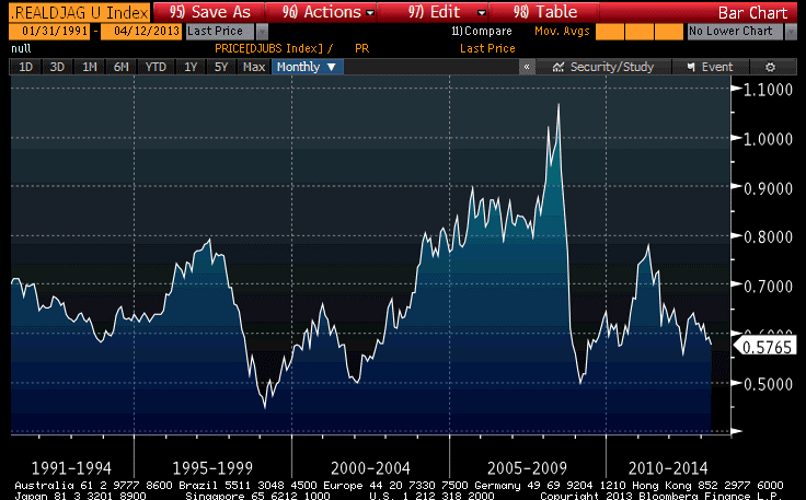
Now, in the SP-GSCI, which has a much greater weight in energy, it looks plausibly like a “supercycle,” as prices tripled in real terms off the lows in 1999 (see Chart, source Bloomberg), and admittedly the chart looks a little feeble at the moment. But that difference is, as I just suggested, mostly due to energy. And if you think the energy supercycle has ended…just short energy, don’t paint all commodities with the ugly brush!

And, by the way, it seems like a pretty wimpy supercycle if the peak in real terms doesn’t even approach the earlier peak.
In nominal terms, all of these charts look different, with the downswings being dampened and the upswings accentuated, because of inflation. But that’s certainly not the right way to look at commodities (or any asset) over time. We don’t care about the nominal return. We care about the real return. And viewed through a real return lens, commodities are much closer to being really cheap than to being really rich!
Obviously, I disagree with all of these groups when it comes to commodities generally. About gold I have no firmly-held opinion about its valuation at the moment, but commodities generally we see as cheap – in fact, we expect triple the real returns from investing in commodities indices over the next ten years compared to equity investing. This is a function of both the very rich absolute valuations of equities and the very cheap absolute valuations of commodities indices.
Moreover, if inflation does in fact accelerate – something which has nothing to do with the weak Michigan or Retail Sales numbers – then commodities will also have terrific nominal returns while equities might well have negative nominal returns.
Droopy
For a change, fixed-income is where all of the excitement is. For more than a month (since March 5th, the S&P has closed no lower than 1540 and no higher than 1570, plus or minus a couple of nickels: a month-long range of less than 2%. What’s really amazing about that is that on seven of those twenty-three trading days, the range of the day was more than half of the month’s entire closing range. In two of the last four trading days, the intraday range was two-thirds of that for the entire month!
Meanwhile, the 10-year Treasury rate has gone from 1.90% to 2.06%, down to 1.71%, and ending today at 1.75%. The closing range in point terms of the current 10-year note was 99-16 to 102-19, or a bit more than 3% (and it was obviously more than that for the long bond). It has been a long time since bonds were more volatile than stocks over a period as long as a month.
Most of that volatility in nominal rates has been on the real interest rate side. The range in closing 10-year TIPS yields is -0.52% to -0.76%, or 24bps, compared to 35bps for the nominal yield. That’s more volatility than the real yield should be displaying at this level of rates, and it has moved TIPS from being slightly cheap a month ago to somewhat rich. Our Fisher yield decomposition model, which had been neutral on TIPS and breakevens since mid-February, is now modestly short TIPS (and still flat breakevens). Moreover, the leverage applied by our long-inflation-biased “smart beta” model is only 2/3 of the neutral leverage, so conservatism is the watchword at the moment.
The rally in TIPS and nominal yields owes much, I am sure, to the somewhat feeble data we have seen over the last week. The Employment data, in particular, were very disappointing, especially to that group of people who expected profligate monetary policy easing to create economic growth. It will surprise no regular reader of this column that I am not shocked to see a lack of growth response to aggressive monetary policy easing – as I take pains to remind readers, monetary policy is not supposed to affect growth, except in the presence of money illusion. It is therefore something less than a news flash that growth is responding more to tiny changes in government spending (albeit temporarily) than to massive changes in monetary aggregates.
To be sure, even monetary aggregates have been drooping lately…at least, the ones that matter. M2 has been lurching along in the mid-6% growth rate year-on-year, and flat over the last quarter (see chart, source Federal Reserve). That’s only slightly above the average growth rate in M2 since 1981 – although, to be fair, the average core inflation over the same time period has been about 3.1%, so core inflation is still well below where we would expect it to get to if this rate of monetary growth continues.

Growth in commercial bank credit growth, also, has retreated to only 4.1% year-over-year after spending most of the past year above 5%. It too is still right around the long-term average real growth in commercial bank credit (see chart, source Federal Reserve, Enduring Investments), but last year it had been edging towards the mid-2000s standard.

So these are positive developments from the standpoint of future inflation, but it is far too early to call victory on that front. I expect the rise in M2 to re-accelerate in fairly short order; but in any event it is important to remember that the Fed is not the only game in town and not the only central bank that is pursuing easy-money policies. Indeed, last week the biggest news was that the Bank of Japan pledged to double its monetary base, its holdings of JGBs, and its holdings of ETFs and JREITs over a period of only two years.
This policy will almost surely produce the result the Japanese policymakers have been shamelessly vocal about seeking: higher inflation, in a short period of time. At the end of the day, the inflation that Japan gets in the near-term will depend on what their domestic money velocities and multipliers do, but they will surely get higher inflation eventually just as the Fed’s policies have produced inflation even with declining multipliers and velocity. To my mind, the Japanese inflation swaps market – which according to Bloomberg is at 1.26% for 5 years and 1.01% for 10 years – seems to be cheap!
But the Japanese policy will certainly not stop at the water’s edge. Around 2/3 of our domestic inflation is sourced from global factors, and the monetary policy of a major trading partner is a significant global factor. The behavior of the Yen and industry response to changing competitive pressures from Japan will determine how much of the BOJ’s inflation remains domestic and how much is exported, but it would be surprising indeed if the result was entirely contained within the borders of Japan. The Yen has responded sharply to the policy changes at the BOJ (see chart, source Bloomberg), but in my opinion it has very much further to go. In fact, the only reason we may not get back to mid-1980s levels is that the Fed’s policy is similarly aggressive – the only difference at the moment is that the Fed is giving lip service to the notion that they intend to hold down inflation in the long run. (I don’t believe them.)

None of the above has much, if anything, to do with North Korea, or Cyprus, or Slovenia, or Portugal. All of those countries still are potential wild cards, and all of them (it needs hardly be said) constitute downside risk. The White House is seemingly satisfied to wait to see if North Korea really will launch a nuclear-tipped missile; this means that the entire distribution of potential outcomes is compressed so that there is a very high likelihood of nothing bad happening, and a very small chance of something really, really bad happening. How do you trade that? The answer is that you use options. Implied volatilities are under pressure again because the recent tight range makes it difficult to eat the time decay of long-vol positions. But as for me, I’m delighted to pay insurance premiums for insurance that turns out to be unnecessary, especially when that premium is low. I don’t have any long equity positions, but if I did then I’d be protecting them with cheap put options.
Whose Move Is It?
Markets have been surprisingly quiet over the last few days. Some of that, no doubt, is due to the NCAA basketball tournament, to the Good Friday/Easter Monday holiday in the U.S. and in Europe, and to baseball’s Opening Day.
We also had Japanese year-end and the end of Q1 in the U.S., and to the extent that the last week has brought any market moves of interest at least a portion of that can be put on the account of the calendar. On Thursday, the S&P set a record month-end close, although a higher intraday print was established in October of 2007. But while news accounts attributed the almost-record to an “easing of Cyprus fears,” it is much more likely that it was due to the normal (and well-known) quarter-end “mark ‘em up” machinations of less-scrupulous fund managers in illiquid market conditions.
In a similar vein, the quirk of having the quarter end on a Thursday three days before the calendar turns helped exaggerate a massive move in grains, especially corn, on a mildly bearish crop report. Those who are invested in commodities for tactical reasons are being flushed because they’re tired of waiting, as an article in today’s Wall Street Journal made clear. The investors who are leaving do not have comfort in the asset class because they don’t understand the drivers of the asset class; the result is that they become performance chasers. So, when crop reports suggest that the real price of corn should fall a little bit, investors slash nominal prices 10% in ‘get me out’ orders.
But as I said, these investors don’t understand the fundamental drivers of the asset class. The article cited above regarded the breakdown of the correlation between commodity indices and equity indices as something sinister, saying that the correlation is at its lowest level since 2008 and suggesting that this means that one of the two markets is wrong. As it turns out, though, the correlation of stocks and commodities is a relatively new phenomenon. Over the last 5 years, the correlation of monthly changes in the DJ-UBS index and the S&P is 0.61. However, for the 17 years prior to that, the correlation was 0.04 (see chart, source Bloomberg).

For the GSCI commodity index, the last-5-years correlation is 0.65, but for the 38 years prior to that (the GSCI has a longer history) the correlation was -0.02. In short, there is no reason to read a whole lot into the recent decoupling of stocks and commodities, except that it may suggest the hot money is finally leaving commodities. The correlation breakdown is also a good thing for anyone who believes – as I do – that stocks are overvalued. And, since a good portion of commodities’ long-run return comes from a rebalancing effect that is larger when the inter-commodity correlations are lower, this is more good news.
The choppy melt-up in stocks on Thursday was partially reversed by the new-quarter blues today, but all of this is mere detail. Over the last week, while authorities in Europe have encouraged investors to put the Cyprus issue to bed additional details have emerged that deserve mentioning. For example, it turns out that the larger depositors (over €100,000) investors in one of the Cypriot banks will not get a 10% haircut, or a 20% haircut, but something close to a 100% haircut – 37.5% of the deposit balance in excess of 100k will be converted to equity in the bankrupt bank. There are some reports that certain deposits belonging to “EU funds” will be exempt from the haircut. There are of course the stories that capital controls implemented in Cyprus were ignored in non-Cyprus branches of Cypriot banks, and one Cypriot newspaper is claiming that relatives of the president withdrew substantial funds from Laiki bank just before the bank was shut down.
While the worst of the immediate crisis has surely passed, it seems madness to me to pretend that it never happened or that it will have no knock-on effects. For that matter, it seems madness to conclude that since the knock-on effects were not immediate, that no such effects exist. On the other hand, when events are no longer going bang-bang-bang in rapid succession, it is reasonable to ask “whose move is it?” Will bank deposits begin to flee from periphery countries, or wait to see what assurances European officials give? Are central bankers already injecting liquidity into shaky banks, or are they waiting for the invitation from the banks in-country? Are investors reducing risk and diversifying away from European assets, or are they waiting to see if other investors do so first? All of these actions entail costs, and so there is a natural desire of every party to delay action…but to not delay action so long as to cause those costs to rise substantially.
As a trader, my inclination is to hit a bid and get out, and not worry about the bid/offer spread or those other costs. But I am not dealing with billions of Euros when I do that. Still, the insight is that when bad things might happen, the here-and-now transactions costs are usually a poor reason not to seek protection. This is why T-Bills over the last couple of years have occasionally had negative nominal yields (see the chart of 3-month T-bill yields below, source Bloomberg). Yes, it’s clearly dumb to pay $1.01 now to receive $1 in the future. But is it dumber than the alternatives?

The Economy in the Plastic Bubble
We’re going to leave behind the topic of Cyprus for a day. It does seem as if events are coming to a head, but with banks there closed until Tuesday (and the ECB lifeline in place until Monday), there will be lots of news over the next few days but most of it will be heat without light.
So, speaking of heat and light, let’s look at today’s data. Specifically, let’s look at Existing Home Sales.
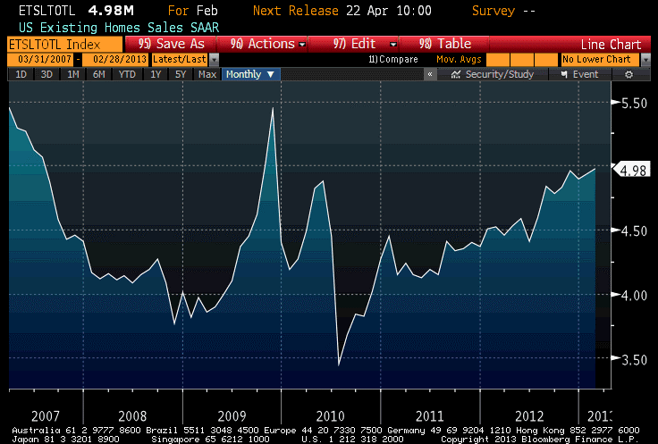
While the total sales number fell just shy of the 5mm-unit level, the 4.98mm print still represented the highest number (aside from the home-buyer-tax-credit induced surge in 2009) since 2007 (see chart, source Bloomberg).
The inventory of homes available for sale bounced off of 14-year lows, but remains at levels lower than any we’ve seen in over a decade.
And, near and dear to my heart, the median price of existing homes accelerated from last month (although, due to historical revisions, last month’s y/y was revised down to 10.67%) and stands at 11.34%. The January Home Price Index from FHA also came out; the 6.46% year-on-year rate of increase in that index is also the highest post-2007.
There are long lags between both of these indices and the appearance of price pressures in the Consumer Price Index, but at the moment all indicators of housing point the same direction: Owner’s Equivalent Rent should be in the 2.75% neighborhood by year-end, and could be as high as 3%. This is a key part of our forecast that core CPI should reach 2.6%-3.0% by year-end, and accelerate further in 2014.
The amazing recent run in home prices – which I suspect is driven in part by institutional investor interest in real estate – has caused existing home prices as a multiple of household income to move above levels that prevailed for the last quarter-century of the 20th century. The housing industry likes to present charts of housing affordability, which takes into account the current level of interest rates, because currently those interest rates make even the relatively high home prices look more affordable.
Yes, I said “relatively high home prices.” The median sales price of existing homes averaged 3.36x median household income from 1975 to 2000, with a relatively small range of values around that average. Even including the bubble, when the multiples reached 4.8x, the average through 2011 only rose to 3.54. As of year-end 2012, the multiple was back to approximately 3.48 and if median prices rise “only” 8% this year (remember, the current pace is 11.3% and rising) the multiple will be around 3.6x by the end of the year (see chart, source U.S. Census Bureau, National Association of Realtors, Enduring Investments).

Notice that even at the depths of the crisis, home prices were only slightly cheap by pre-2000 standards. Similarly, equity prices at the lows only reached approximately fair value by pre-2000 standards. There are two interpretations of this fact set. It could mean that the pre-2000 era valuations were too low, and that modern financial markets and structures make higher valuation multiples permanently viable. Or it could mean that the Federal Reserve continues to artificially support markets at multiples that are not likely to be sustainable in the long run. I suspect the latter point is more accurate, although I am open-minded about whether the former point might have some validity.
This isn’t necessarily a bad strategy, if the idea is to let the market stair-step down to equilibrium rather than letting it crash there all at once. But I don’t see anything that suggests the Federal Reserve has the slightest idea how to value assets. I understand that they don’t want to substitute their own analysis for the market’s judgment (at least, that would be the counterargument), but that’s what they’re doing anyway – with no indication that they plan to back off anytime soon. The Fed is just more comfortable in the bubble, and afraid to leave it entirely. But don’t we have to, eventually?
The VIX returned to 14 today, which makes a bit more sense to me than the 12.7 level of yesterday. It still seems low to me, but at least there is a way for long-vol positions to actually lose.
Short But Sour
A slow Monday, and the S&P could barely manage a +0.3% rally. That’s tantamount to a selloff, these days, as the all-time nominal highs are a mere 20 points away. I’m not joking: with stocks up 9.1% on the year, the S&P is averaging +0.19% per day, which means the all-time highs ought to be reached by next Wednesday.
Meanwhile, our measure of valuation for equities has reached levels not seen since July of 2011. The expected compounded after-inflation return for the S&P 500, inclusive of dividends, is just 2.00% (it got to 1.81% in July 2011 – and, for the record, it stood at 0.83% at the end of 2006).
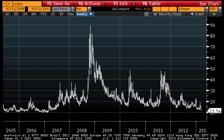
The VIX tumbled today to the lowest level since April of 2007 (see chart, source Bloomberg), two weeks after Fed Chairman Bernanke told Congress that the “subprime crisis” was likely to stay “contained” (which it did, in roughly the same sense that the universe itself has a boundary).
Now, I don’t want to follow the usual course and list all of the things we could be worrying about (Italy, Cyprus, France, Iran, North Korea…) to somehow argue that prices are too high. After all, there’s always something to worry about. No, that’s not my argument at all. My argument is that prices are too high regardless of what the news is.
Over the next ten years, compounded real returns after inflation will likely be in the neighborhood of 2% per annum. They could reach 5% per annum, but they could be -3% per annum with equal probability. Note that these are real returns I am speaking of, so there is no reason stocks can’t continue to reach new nominal highs especially if consumer prices continue to accelerate.
(And here’s an odd fact: while equity market volumes over the last few years have been shrinking persistently, the gap between 2012 and 2013 has been narrowing over the last month and a half. That is, volumes are still running about 78mm shares/day below the year-to-date pace in 2012, but at the end of January that figure was 113mm shares/day. So volume is still shrinking, but no longer monotonically.)
So I’m not sure when we are going to get a significant correction on the order of late 2011 (~20%), but we are overdue. Frankly, if I thought the correction was likely to be no more than 20%, I probably wouldn’t even be particularly concerned, because 10% and 20% corrections happen in healthy markets. But I can’t discount the possibility of a 2000-2002 or 2007-2008 sort of decline. The conditions are “right” for just such an occurrence, unfortunately.
A Bad Day At The Federal Reserve
There will be many more days ahead for the Fed, and many of them will have plenty of good news. It is a mistake to trya and read too much into one day’s economic releases. With that said, here is my attempt to do exactly that.
I tweeted the following real-time reactions (@inflation_guy) following the CPI release this morning:
- Ready for an exciting day…CPI, Claims, Philly Fed, a 30-year TIPS auction, wild commodity swings, 3 Fed Presidents…buckle up!
- Hello! Core inflation +0.3%, higher-than-expected. Look out above.
- Apparel +0.8%. Some will pooh-pooh the number on that basis, but Apparel has been trending higher for more than a year.
- To be fair, core inflation BARELY rounded up to +0.3%. But the market was looking for +0.16% or +0.17%.
- Core Services remains at +2.5% y/y, but core goods ticks up to +0.4%. The recovery of core goods has been something we’re looking for.
- Somewhat surprisingly, the +0.251% rise in core inflation did so without having a rise in Owners’ Equiv Rent. Went from 2.1% y/y to 2.08%
- Accel Inflation: Housing, Apparel, Educ/Commun, Other (54.7% of basket); Decel: Food/Bev, Transp, Med Care, Rec (45.3% of basket)
- In Transp, the drag was almost all fuel. New/used Cars, maintenance, insurance, airline fares, inter- and intracity transp all up.
- What’s amazing in the CPI today is how much it did with how little from the main driver of housing. That uptick is yet to come.
- …and, next month, headline will get upward pressure from the steep rise in gasoline, which also dampens discretionary spending.
The primary takeaway from the CPI release is this: yes, core inflation surprised a little bit on the high side. But it did so without the support of the main factor that I think will push core inflation almost certainly higher going forward: housing. Rents (both primary and OER) neither accelerated nor decelerated this month from the prior year-on-year pace. And yet, there is really no temporary factor that pushed inflation higher this month. It was fairly broad-based. Apparel stood out on the month-to-month change perspective, but here is the chart (source Bloomberg) on Apparel:
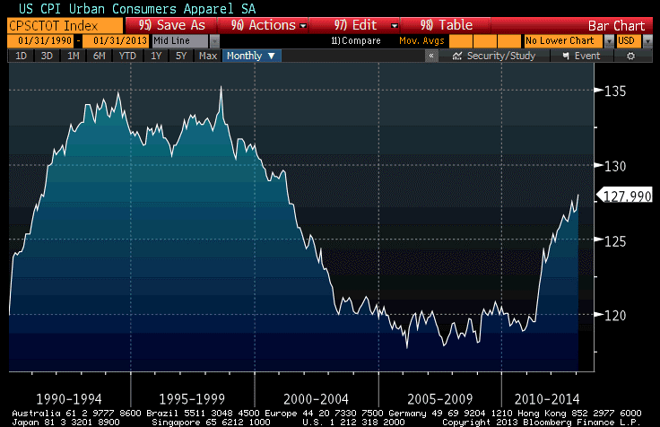
This month doesn’t appear to me as too much of a true outlier. The underlying dynamic there has simply changed.
So this month core inflation stayed at 1.9%; next month it is very likely to return to 2.0% as we are dropping off the weak February change from last year. And all of that, before the housing inflation hits the data.
Speaking of housing inflation, there is no sign yet of that abating. In today’s Existing Home Sales report, the year-on-year change in Median Existing Home Sales Prices rose to 12.61%, another post-2005 record, and the highest real price increase ever, outside of 2005. This is happening because the inventory of new homes has dropped to almost a record low – really! Sure, the chart below (source Bloomberg) ignores “shadow inventory,” but it is starting to look more like the inventory of new homes now.
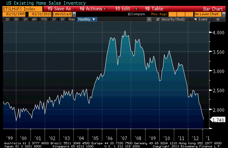
Some of that is seasonal, but there’s no doubt that lower inventories are now helping the home pricing dynamic. And, as I’ve shown previously, the inventory of existing homes actually has a nice relationship with shelter inflation 1-2 years later (Source: Enduring Investments):

The current level of inventories translates into a 3.6% expected rise in CPI-Shelter over the course of 2014. So you see, we’re not only firing inflationary rounds but we’re also continuing to feed more ammunition into the gun for next year. Our model of housing inflation projects Owners’ Equivalent Rent no lower than 3% by year-end 2013. And if that happens, there is no way that overall core inflation is going to be at 2%.
Now, in addition to the bad news on prices and the news on home prices that are probably seen at the Fed as a guarded positive (after all, it means the mortgage crisis is essentially over as more borrowers will be ‘above water’ again every month hereafter), there was also a mild surprise on the high side from Initial Claims (362k versus 355k) and a bad miss on the Philly Fed index for February. This latter was expected at +1.0 after -5.8 last month; instead it dropped to -12.5. Philadelphia-area manufacturers have reported softening business conditions in three of the last four months, suggesting that December’s pop to +4.6 was the outlier. Now, there were similar one-month dips in August of 2011 and June of 2012, so we’ll have to see if it is sustained…but it is consistent with the report out of Wal-Mart and the worsening of business conditions in Europe.
Higher prices (and more coming, on the headline side, as retail gasoline prices have now risen in 35 consecutive days) and lower business activity. This is exactly the opposite of what the Fed wants. It has been a bad day at the Fed.
However, it is exactly what traditional monetarism expects: accommodative monetary policy leads to higher prices (check), and has no effect on real activity in the absence of money illusion (check). So score one point for Friedman today.
And so, what else would you expect after such a day? Bond yields are declining, inflation breakevens are narrowing, and industrial commodities (metals and energy) are sliding. As with so much else these days, that makes no sense, unless you just don’t know what’s going on. When we encounter these bouts with irrationality (or, more fairly, thick-headedness), the market can be frustrating for a long time – and the ultimate denouement can sometimes be jarring. As I said earlier in this post: buckle up!
Gravity Still Works, After All
Mild weakness in housing data (Housing Starts fell to only the second-highest level since 2008) seemed to be a sufficient excuse today to send stocks lower, but really the main culprit was gravity. We will have to see if the market corrects more than the 1.25% it dropped today, but it shouldn’t be all that surprising!
It actually looked a little bit like one of the classic “risk-off” trades we have seen in recent years. Commodities fell, especially precious metals, energy, and industrial metals while agriculture rallied. The dollar leapt to the highest level since November. Inflation breakevens declined a touch, and interest rates slipped a couple of basis points. What’s more, the VIX jumped to match its highest closing level of the year.
Searching for a new story on why commodities fell, a rumor passed along the market (memorialized by Bloomberg here) that a hedge fund was being flushed out of commodities positions. But that made little sense, unless the fund had been long energy and short agriculture – and if they had been, they would have been winning over the last several months, not blowing up! More likely, it was just gravity, which seems to operate more heavily on commodities than on stocks these days. I guess stocks are from Mars, commodities from Venus.
I think this is all part of a corrective move, but the corrections are a bit out-of-sync and that makes me nervous. In the article I wrote on January 31, I pointed out that the dollar index, 5-year inflation breakevens, and commodities were all nearing critical breakout or breakdown levels. I thought they were all about to break those levels and continue trends, but what actually happened was quite the opposite: the dollar index is up significantly (back to near the November highs, as I said), 5-year breakevens are a couple of basis points cheaper (although not much) and commodities have done what commodities have done all too often over the last year: slid to lower nominal, and even cheaper real, levels. Although I didn’t show it on January 31st, the 5y CPI, 5y forward – an important metric for the Fed – has also declined slightly from 3.09% to 3.04%.[1]
I expect the markets to return to the levels they held at January month-end, however. The FOMC minutes out this afternoon showed that while there continue to be dissenting, hawkish voices at the Fed (notably, Esther George cast the lone dissenting voice this month – how I like this Fed President!), they continue to be completely drowned out by the doves. Again looking for an angle to explain the stock market decline – which started this morning, long before the minutes were released and probably even before they were leaked to Goldman[2] – market headlines bleated about how the “Fed Minutes Show Debate Over Stimulus,” about how the Fed is “uneasy” over QE, and about how several officials suggested varying the pace of QE over time.
This wild and crazy debate, this uprising of the inflation hawks, produced (I note again for the record) one dissenting vote. Remember, even non-voters can participate in debate and appear in the minutes even if they don’t vote. In this case, the “several members” likely included George and Richard Fisher of Dallas (non-voter), with some chance that a third, also non-voting, member joined them (maybe Plosser?) But they are arrayed against a very dovish core of the FOMC, and the minutes contain a clear indication that the Committee prefers to err on the side of keeping accommodation too long rather than remove it too soon:
“A number of participants stated that an ongoing evaluation of the efficacy, costs, and risks of asset purchases might well lead the Committee to taper or end its purchases before it judged that a substantial improvement in the outlook for the labor market had occurred. Several others argued that the potential costs of reducing or ending asset purchases too soon were also significant, or that asset purchases should continue until a substantial improvement in the labor market outlook had occurred. A few participants noted examples of past instances in which policymakers had prematurely removed accommodation, with adverse effects on economic growth, employment, and price stability; they also stressed the importance of communicating the Committee’s commitment to maintaining a highly accommodative stance of policy as long as warranted by economic conditions. In this regard, a number of participants discussed the possibility of providing monetary accommodation by holding securities for a longer period than envisioned in the Committee’s exit principles, either as a supplement to, or a replacement for, asset purchases.”
I similarly wouldn’t read much into the “number of participants” asking for ongoing evaluation of the efficacy, costs, and risks of asset purchases. This sort of debate has been occurring in the minutes of almost every meeting since the Fed first began QE, and it would be striking if there was not any discussion of efficacy, costs and risks – especially considering that the efficacy of this unprecedented policy action has been fairly unimpressive, to be kind.
I see no reason to doubt the Fed’s word that they will keep accommodation until the Unemployment Rate improves or inflation moves enough higher to concern them. But there is certainly no concern, even among the hawks, about the current level and trajectory of inflation:
“Nearly all participants anticipated that inflation over the medium-term would run at or below the Committee’s 2 percent objective.”
Unless you’re talking about the vague concern expressed by “a few” participants about inflation over the long run:
“Participants generally saw recent price developments as consistent with their projections that inflation would remain at or below the Committee’s 2 percent objective over the medium run. There was little evidence of wage or cost pressures outside of isolated sectors, and measures of inflation expectations remained stable. However, a few participants expressed concerns that the current highly accommodative stance of monetary policy posed upside risks to inflation in the medium or longer term.”
This continues to be where the whole house of cards is vulnerable. A series of bad inflation numbers (and I am sure it would take a series, not just one or two) could alter the debate later this year. Tomorrow’s release of January CPI (Consensus: +0.1%/+0.2% ex-food-and-energy; +1.6%/+1.8% y/y) is not likely to be the first of those bad numbers, but it is coming soon. The consensus expectations are quite soft, essentially +0.05% on headline inflation (the energy spike didn’t really start until February) and +0.16% or 0.17% on core CPI.
But the housing price data are unequivocal: a large portion of the consumption basket is going to see prices rising at an accelerating rate, soon. Our models seem to suggest the inflection point could be another couple of months away, but it is dangerous to get too caught up in model minutae. The big message from the models is that the unambiguously higher home prices (in Existing Home Sales, New Home Sales, the FHA’s Home Price Index, the Case/Shiller index) are leading to higher rents (judging from surveys of apartment rents from REIS and CBRE) and this reflects higher shelter costs that will show up in core CPI within a few months. If it happens tomorrow, then stocks are vulnerable – but if not, then Martian gravity isn’t going to be enough to hold down stocks for very long.
We know that in low-gravity environments, human skeletal structure gradually weakens so that a return to normal gravity can be very dangerous for someone who has been in space for a long time. The stock market has been in space for a very long time. At some point, when “normal gravity” (in the form of a neutral Federal Reserve policy) returns, equities will have a rough transition to make. But that day isn’t yet, so while I don’t have expectations of much higher equity prices from here I also wouldn’t get too excited about looking for a 20% decline, either.
[1] Technical note: when looking at breakevens, and especially forward breakevens, over a long period of time, it is important to use inflation swaps whenever they are available because there are fewer idiosyncrasies with the structure of the inflation swaps curve than with the breakeven curve. As a case-in-point, while 5y inflation, 5 years forward taken from inflation swaps has fallen 5bps since January 24th, Bloomberg’s 5y, 5y BEI has dropped some 30bps over the same period, due to changes in which TIPS and nominal bonds make up that index.
[2] I’m kidding, sorta.
Too Much Fuel Will Extinguish The Fire
Stocks continue to climb inexorably: 21 of the 33 trading days this year have seen stocks end the day higher. About the only market that is doing appreciably better is gasoline. Retail gasoline prices have risen 33 of the past 33 calendar days, and front Unleaded has risen 22 of the 33 trading days in 2013.
This brings us, of course, to the question: if gasoline rises every day, then how long will it be until higher gasoline prices start to affect equity prices?
The question is not quite as straightforward as it appears. On the surface, we have two competing effects: first, stronger economic activity will tend to support both gasoline prices and corporate earnings, giving a lift to equities. And some recent data, such as last Friday’s hefty upside surprise in the Empire Manufacturing figures for February (+10.04 when -2.00 was expected), suggests that growth in Q1 may not be slowing too much further although the European, Japanese, and US economies each contracted in Q4.
(By the way, did you realize that? Each of the three biggest First World economies contracted in Q4 and the US equity markets declined -1.0%).
Not that equities necessarily must pull back when growth lags (if they did, then all good economists would also be good traders), but when you’re talking about markets that are pricing in a continuation of historically wide margins and historically high price-earnings multiples, it would seem that a pullback when there is weakness economically is as good a time as any. Stocks can’t go up in a line forever, can they?
Actually, they can, but we’ll get to that in a minute. I mentioned two competing effects that are apparent, with one of these being the stronger economic activity will tend to support both gasoline prices and earnings. The other is that higher gasoline prices have a depressing effect on discretionary expenditures. Along with the higher payroll taxes which manifested in January and the lower Q1 incomes as a result of dividends being pushed into Q4, the higher gasoline prices may have contributed to what a finance VP at Wal-Mart described as “a total disaster” start to February. This is an “automatic stabilizer” effect at work: higher growth tends to produce higher energy prices, which tend in turn to dampen economic growth – and vice-versa.
So which effect dominates? Can gasoline prices and stock prices keep going up together?
The answer is that their nominal prices can absolutely continue to rise together, but their real prices cannot. If I double the price level, then no matter what happens to growth or the marginal rate of substitution between gasoline and all other discretionary goods and services, both nominal gasoline prices and nominal corporate earnings (and therefore, quite likely equity prices) will both rise. However, higher real energy prices imply lower real equity prices eventually. But that’s not a day-trade; in the fairly short run (say, several months) the price level is roughly constant so that one of these two markets is likely to decline in nominal terms.
Frankly, the odds in my mind are on stocks breaking first. But as the chart below (source: Bloomberg) shows, the ratio of gasoline to stocks is not really out-of-whack one way or the other. This is unleaded regular gasoline divided by the S&P level…and what’s fascinating to me is how regular the relationship has been (especially in 2010!).

By the way, the distinction about nominal and real prices also is relevant for the observation some have made that gasoline inventories are reasonably adequate, but prices continue to rise. Gasoline prices are high in nominal terms, but not as high in real terms. In nominal terms, unleaded has risen 105% since the second Bush inauguration, but only 65% in real terms. That still sucks, mind you, and is one reason that growth hasn’t been robust in a while. As of December 2004, gasoline was 3.934% of the average consumption basket; according to the BLS (new numbers are out today!) that became 5.274% as of December 2012.[1] Therefore, we spend about 1.34% less of our total consumption on other things than we did in 2004.
With gasoline, medical care, and college tuition all squeezing us (not to mention taxes, which is not a consumption item and therefore not in the CPI), it isn’t surprising that we’re spending a smaller proportion of our consumption basket on apparel and housing than we used to (for a longer-term view, see my comment from a couple of weeks ago “Fun With the CPI”). These are long-term, secular trends. What could hurt the market in the shorter-run is that when there is a significant move in energy prices, we can’t change the amount of housing we consume to compensate. We stop buying the Wal-Mart things. And we save less.
And eventually, we stop buying stocks. Don’t we?
[1] N.b.: that doesn’t mean we spend 35% more on gasoline now; as noted, gasoline has doubled in price. But 35% more of our consumption is spent on gasoline, than we spent previously. It is interesting that with a 65% increase in the real price of gasoline, our gasoline consumption has only risen 35% (due to smaller cars, better gas mileage, more air travel, more mass transit, etc).
Fun With The CPI
As the markets gyrate, trying to decide on just what the next move is going to look like, I thought I’d answer a question a friend posed to me recently. He asked “what does the consumption basket look like today, compared with 25 years ago?”
The question was something of a challenge to me (well, more precisely to the BLS, who puts together the CPI) because my friend – like so many others – had heard that the BLS assumes that when the price of steak goes up, you eat more chicken, and that the CPI doesn’t capture what may be construed as a decline in consumer welfare due to this effect.
The BLS doesn’t in fact make such determinations. In 1999, the BLS started using a geometric mean formula that captures the fact that consumers in fact tend to switch their consumption patterns towards items that have fallen in relative price. But that only affects items in the same very low-level “basic” category (the example the BLS gives is “different types of ground beef in Chicago”), and not at the higher levels like chicken-for-beef.
Moreover, an important point is that consumers will buy more of the item whose price relative to other goods has declined (say, chicken) even if the consumer is compensated for that change. Suppose a consumer pays $10 per week for soda, $5 each for Coke and Pepsi (which he considers interchangeable). Now suppose the price of Pepsi doubles, but the American Society for the Promotion of Cola Products sends the consumer $5. With the additional $5 he could continue to buy equal amounts of Coke and Pepsi, but will he? Of course not; the consumer will spend his $10 all on the cheaper brand and keep the extra $5, or buy more total cola by spending the entire $15—but all on the cheaper brand. The consumer’s utility/dollar is now much higher with one (formerly interchangeable) brand.
It is important that the BLS attempt to get the consumption basket to look as much like the average consumer’s consumption basket as possible, in order that the price index resembles as closely as possible a true cost of living index. So it doesn’t spend a lot of time guessing. Every few years, the BLS conducts a “Consumer Expenditure Survey” to collect information about spending habits from around 60,000 quarterly interviews and 28,000 detailed weekly purchase diaries gathered over a two year period. From these, the base weights are determined for about 200 item categories in dozens of cities and regions. These are then aggregated up into successively larger groups up to the eight “major groups” (Food & Beverages, Housing, Apparel, Transportation, Medical Care, Other, Recreation, and Education & Communication) and the overall CPI-U.
In short, the BLS does everything possible to avoid making value judgments about what is being spent. That being said, studies have assessed the aggregate effect of substitution adjustments to be around 0.3% per year.[1]
So with that all said, how much have our spending patterns shifted in the CPI? Are we spending money dramatically differently than we did 25 years ago?
You can find the CPI weights for 1988 here, and compare them to current weights found on p. 11 of the monthly CPI report, for example here. Be aware that the categories sometimes change over time, so that for example in 1988 there was not an “Education and Communication” major category. But here are some comparisons:
| Category |
1988 weight |
2012 weight |
| Food and beverages |
17.72% |
14.96% |
|
Food at Home |
9.98% |
8.47% |
|
Alcoholic Beverages |
1.545% |
0.93% |
| Housing |
42.30% |
40.21% |
|
Primary Rents |
7.85% |
6.36% |
|
Owners’ Equivalent Rent |
19.33% |
23.49% |
| Apparel |
6.35% |
3.49% |
| Transportation |
17.21% |
16.54% |
| Medical care |
5.97% |
6.92% |
| Tobacco and Smoking Products |
1.35% |
0.79% |
| Energy |
7.33% |
9.49% |
| College Tuition |
1.17% |
1.66% |
| Beef and veal |
1.05% |
0.54% |
| Poultry |
0.48% |
0.33% |
| Pork |
0.57% |
0.37% |
| Fish and Seafood |
0.39% |
0.30% |
| “Other meats” |
0.41% |
0.27% |
| All Items Less Food & Energy |
76.50% |
76.49% |
In summary? Surprisingly, while we get a lot less for our money than we used to, our patterns of expenditure haven’t changed much, in aggregate. Sure, some of us are spending less on education while others spend more, simply because our patterns change as we go through life (and the BLS has some age-related indices as well). We spend, not surprisingly, less of our money today on clothes, food, alcohol, cigarettes, housing, and transportation – even with higher energy prices. Overall, though, we spend more on energy itself, on medical care, and on tuition. You can see the effect of the ‘home ownership movement’ in the greater basket weight of “Owner’s Equivalent Rent” compared to “Primary Rents”. But overall, the spending patterns are evolutionary, not revolutionary.
Oh, and we do spend less, as a portion of our total expenditure, on beef and veal! But we also spend less on chicken, pork, fish, and “other meats” (shudder).
[1] I won’t talk here about quality adjustments, including so-called “hedonic” adjustments, except to say that the aggregate effect of quality adjustments is so small as to be hardly worth considering. Hedonic adjustment lowers the CPI for a number of categories whose weight total to around 0.7% of the index, but increases the CPI for Rent, Owners’ Equivalent Rent, and Apparel, plus some smaller categories, totaling about 32% of the index. So large downward adjustments on lightweight categories are balanced by very small upward adjustments on large categories. The net effect is thought to be less than 0.01% per year (see Johnson, Reed, and Stewart, “Price Measurement in the United States: a Decade after the Boskin Report”, 2006).
