Archive
Equity Returns and Inflation
There has been a lot written in the academic literature about why equity returns and inflation seem to be inversely related. What is amazing to me is that Wall Street seems to still try to propagate the myth that equities are a good hedge for inflation (sometimes “in the long run” is added without irony), when virtually all of the academic work since 1980 revolves around explaining the fact that equity returns are bad in inflationary times – especially early in inflationary times. There is almost no debate any longer about whether equity returns are bad in inflationary times. About the strongest statement that is ever made against this hypothesis is something like Ahmed and Cardinale made in a Journal of Asset Management article in 2005,[1] that “For a long-term investor such as a pension fund, the key implication of these results is that short-term dynamics cannot be completely ignored in the belief that the stock market will turn out to be a perfect inflation hedge in the long run.” For someone looking for a refutation of the hypothesis, that is pretty small beer.
And yet, it is amazing how often I am called to defend this observation! So, since it seems I have never fully documented my view in one place, I want to refer to a handful of articles and concepts that have shaped my view about why you really don’t want to own equities when inflation is getting under way.
I will repeat a key point from above: this is not news. In the mid-1970s, several authors tackled the question about stocks and inflation, and all found essentially the same thing. My favorite summing up comes from the conclusion of an article by Zvi Bodie in the Journal of Finance:[2]
“The regression results obtained in deriving the estimates seem to indicate that, contrary to a commonly held belief among economists, the real return on equity is negatively related to both anticipated and unanticipated inflation, at least in the short run. This negative correlation leads to the surprising and somewhat disturbing conclusion that to use common stocks as a hedge against inflation one must sell them short.”
By the early 1980s this concept was fairly well accepted (something about deeply negative real returns over the course of a decade-plus probably helped with the acceptance). In a seminal work in 1981,[3] Eugene Fama suggested that the negative relationship between equity returns an inflation is actually proxying for a positive relationship between real activity and equity returns (which makes sense), but since real activity tends to be inversely related to inflation rates, this shows up as a coincidental relationship between bad equity returns and inflation. But I am not here to argue the nature of the causality. The point is that since about 1980, the main argument has been about why this happens, not whether it happens.
The reason it happens is this: while a business, in inflationary times, sees both revenues and expenses rise, and therefore reasonably expects that nominal profits should rise over time with the price level (and overall, it generally does), the indirect owner of shares in a business cares about how those earnings are discounted in the marketplace. And, over a very long history of data, we can see strong evidence that equity multiples tend to be highest when inflation is low and stable, and much lower when there is either inflation or deflation. The chart and table below represent an update I did for a presentation a couple of years ago (it doesn’t make much sense to update a table using 120 years of data, every year) illustrating this fact. The data is from Robert Shiller’s site at http://www.econ.yale.edu/~shiller/data/ie_data.xls but I first saw the associated chart (shown below it) in Ed Easterling’s excellent (and highly-recommended) book, Unexpected Returns: Understanding Secular Stock Market Cycles
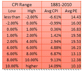

Now, it should be noted Modigliani and Cohn in 1979 argued that equity investors are making a grievous error by discounting equities differently in high-inflation and low-inflation environments. They argue that since equities are real assets, investors should be reflecting higher future earnings when they are discounting by higher nominal rates, so that the multiple of nominal earnings should not change due to inflation except for various things like tax inefficiencies and the like whose net effect is not entirely clear. Be that as it may, it has been a very consistent error, and it seems best to assume the market will be consistent in its irrationality rather than inconsistent by suddenly becoming rational.
So, if inflation picks up, then so do earnings – but only slowly. And in the meantime, a large change in the multiple attached to those (current) earnings implies that the current equity price should decline substantially when the adjustment is made to discount higher inflation. After that sharp adjustment, it may be that equity prices become decent hedges against inflation. And in fact, if multiples were particularly low now then I might argue that they had already discounted the potential inflation. But they are not – 10-year P/Es are very high right now.
In short, there is almost no evidence supporting the view that equities are a decent hedge for inflation in the short run, and some careful studies don’t even find an effect in the long run. In a thorough white paper produced by Wood Creek Capital Management,[4] George Martin breaks down equity correlations by industry and time period, and only finds a small positive correlation between Energy-related equities and inflation – and that is likely due to the fact that energy provides most of the volatility of CPI in the short-run. Among many meaningful conclusions about different asset classes, Dr. Martin concludes that equities do not offer a good short-term inflation hedge, nor a good long-term inflation hedge.
In fact, I think (especially given the current pricing of equities) the case is worse than that: equities are, as Dr. Bodie originally said in 1976, likely to hedge inflation only if you short them.
[1] “Does inflation matter for equity returns?”, Journal of Asset Management, vol 6, 4, pp. 259-273, 2005.
[2] “Common Stocks as a Hedge Against Inflation”, The Journal of Finance, Vol. 31, No. 2, Papers and Proceedings of the Thirty-Fourth Annual Meeting of the American Finance Association Dallas, Texas December 28-30, 1975 (May, 1976), pp. 459-470, Wiley, Article Stable URL: http://www.jstor.org/stable/2326617
[3] “Stock Returns, Real Activity, Inflation, and Money”, The American Economic Review, Vol. 71, No. 4 (Sep., 1981), pp. 545-565, American Economic Association, Stable URL: http://www.jstor.org/stable/1806180
[4] “The Long Horizon Benefits of Traditional and New Real Assets in the Institutional Portfolio,” Wood Creek Capital Management, February 2010. Available at http://www.babsoncapital.com/BabsonCapital/http/bcstaticfiles/Invested/WCCM_Real_Assets_White_Paper_Final.pdf.
Rough Week, but it Could Have Been Worse
It was an interesting week. Considerable volatility in the foreign exchange markets (the dollar fell 5.5 handles from 105.50 yen to 95 yen before bouncing to 97.5 yen at week’s end) and a slide in several foreign equity markets (chiefly the Nikkei, -6.5%, but also the UK -2.6%, Italy -3.0%, Mexico, Brazil, Turkey -9%, etc) impacted the U.S. bourse at the margin but not severely. On Monday, a weak ISM helped push US stocks lower and bonds higher; but on Friday an as-expected Employment report led to a massive equity rally and sharp losses on bonds with the 10-year yield reaching a new high for the move.
The reaction from bonds isn’t terribly surprising. Bond funds are seeing near-record outflows as everyone knows that yields would not be near these levels without Fed backing, and no one wants to be the last one out. Any fear that “taper” is going to happen soon was going to send yields higher, and as I wrote on May 29th there is some risk for much higher yields.
The equity reaction on Friday is a little more confusing. Sure, the airwaves were full of news of the “better than expected” payrolls, although the combination of the May positive surprise (+12k) and the revisions to the prior two months (-12k) puts the Jobs number precisely on the consensus estimates while the Unemployment Rate rise slightly due to a rise in the participation rate. To be sure, there is nothing in the number to force the Fed to consider a “taper” with any kind of urgency, but considering that Bernanke and Dudley have already signaled that no taper is imminent, this is hardly news: the data on Friday was almost exactly as-expected.
Going forward, the market continues to face the same hurdles: higher rates mean more competition for investment dollars and will pressure equity prices. Lower unemployment implies that the current ratio of real wage growth relative to gross margins – which reflects the great power of capital right now relative to labor, with margins at record highs while real wages stagnate – will begin to shift back in favor of wages and away from capital. Higher rates also imply higher money velocity and hence, higher inflation. (See chart, source Bloomberg.)

If 5-year rates went to, say, 2%, and M2 velocity rose to 1.732 as the regression suggests, it would represent a 12.9% rise in money velocity. If M2 merely ticks along at the current (high, but not as high as it was) rate of 6.6% growth year-on-year, and GDP grows at an optimistic 4% rate, then it implies inflation of roughly 15.7% (1.129 * 1.066 / 1.04).
There are a lot of “ifs” in that statement, and I want to make clear that I am not forecasting 15.7% inflation over the next year, or even the next two years combined. But the point is that the risks are not insignificant. It isn’t a rise of core CPI to 2.5% by year-end that is the potential problem, although stocks might not take that well. It is a rise above that, which causes rates to rise, which causes velocity to accelerate further, etcetera in a spiral that the Fed is powerless to do anything about since it must first remove $1.9 trillion in excess reserves from the banking system…
And in that sort of inflationary environment, equities would be roundly trashed. A reader asked me to expound further on my prior observations about equities and inflation, and this seems like the right place to do it. However, so as to limit the length of this article, I am posting that further discussion/article separately here.
Is This the “Real” Selloff?
Let the wailing and gnashing of teeth begin: the stock market is down almost 5% from the highs!
It was once the case that investors viewed equity market volatility with aplomb. When you could only check your stock prices daily in the paper, and when people were cautious and unlevered because they recognized that crazy things sometimes happened and they couldn’t count on the central bank to bail them out, a 5% setback was just part of the normal zigs and zags. But now we see the VIX rising into the high teens, and a bid developing in Treasuries.
The bid, however, is not as apparent in TIPS. Investors irrationally consider TIPS a “risk-on” asset, even though they are safer than Treasuries since they pay in real dollars. It’s a wonderful thing, because every time there is a market upset “risk-off” trade, TIPS and/or breakevens start to offer terrific value and instead of losing when the panic passes, as with normal Treasuries that slide back down when the flight-to-quality passes, TIPS valuations will snap back. In the meantime, they offer hard-to-miss entry points. For example, right now the 10-year breakeven is at 2.19%, which means expectations are that the Fed will miss its 2% target on PCE on the low side over the next ten years (since PCE is regularly around 0.25%-0.5% below CPI).
Even if that happens, the Fed surely will not miss it by very much (in that direction) – in the worst recession of our lifetimes, core CPI printed 1.8% for 2009, 0.8% for 2010, 2.2% for 2011, and 1.9% for 2012. Headline CPI was 2.7%, 1.5%, 3.0%, and 1.7%, so the average for core over the last four years of epic financial disaster has been 1.7% and for headline, 2.2%. So why in the world would someone buy a 10-year Treasury note at 2.09% when they can own 10-year TIPS for -0.10% + inflation? There seems to me to be mostly downside to holding nominal bonds relative to TIPS…but investors will consistently make this error, and it may get worse, if stocks continue to correct.
However, that error will not last for long, I suspect. CPI will be released on June 18th, and I expect everyone will expect a very soft core inflation number. I believe the housing part of inflation will start to heat up as soon as this month, and I would be very surprised to see inflation print below what will surely be very soft expectations. If core inflation prints 0.3%, rather than last month’s 0.1%, the market will be completely the other way.
That’s not the near-term concern, though. Near-term, investors are concerned that the weak economic growth we have seen for the last several years rolls over rather than continuing to accelerate. The weak ISM print on Monday (the first below 50 since 2009) and today’s modest downward surprise in the ADP employment number (135k new jobs, the weakest since September) has increased nervousness that a stock market which is currently trading at nearly 23 times 10-year earnings, in an environment of record gross margins, might not be able to handle an environment that is less than perfect. I don’t blame investors for that concern.
Another concern, which oddly seems to be vying for equal time, is that the Fed “sounds serious” about ceasing its program of securities purchases. I am highly doubtful that both the weak growth and the end-of-QE concerns can both come to fruition, but even if growth continued to bump along at soft, but not recession levels I doubt the Fed would be cutting QE very soon. The Fed speakers who “sound serious” about reining in QE are mostly established hawks like Dallas Fed President Fisher, who said on Tuesday that “we cannot live in fear that gee whiz, the market is going to be unhappy that we are not giving them more monetary cocaine.” Against that, set the people whose votes actually matter: Bernanke, who evinces few concerns that there’s anything negative about QE and so isn’t in any particular hurry to stop it, and Dudley, who said recently that it will be a few months before the Fed can even decide on a tapering strategy (which would presumably have to precede an actual taper). I side with Fisher on this one, but my vote counts just about as much as Mr. Fisher’s.
(However, I can’t wait to see what my friend Andy at fxpoetry.com does with the cocaine comment tomorrow).
My view has not changed much: I think growth is going to be slow, but we’re probably not going to slip back into recession although we are technically due for one by the calendar. I think inflation is going to rise, and keep rising, and I think the Fed will be very slow to stop QE. Even once it stops QE, it will be slow to remove the accommodation, and inflation will continue to accelerate while it does so. I think stocks are overvalued and offer very poor real returns going forward. I do think that TIPS are now a much better deal than Treasuries, and not a bad deal on an outright basis relative to equities – the first time in a while I could have said that. In fact, the expected 10-year real return on equities is less than 2% more than the expected 10-year real return on TIPS (the latter of which has no risk), which is the worst valuation for stocks relative to TIPS since August of 2011.
In fact, here’s a fact which is worth dwelling on for any investor who says that stocks are a good deal because nominal interest rates are low. Stocks, of course, are real assets (although they tend to do poorly in inflationary periods, as I have said), and if you want to compare them to an interest rate you ought to be comparing them to a real interest rate rather than a nominal interest rate. So, let’s do that. The chart below (Source: Bloomberg) shows the 10-year TIPS yield (in yellow, inverted) plotted against the S&P 500 for the period I just mentioned.
 I think the conclusions are likely obvious. The last time real yields were at these levels, the S&P was between 1200 and 1400 (if you want to be generous about the early-2012 example). It’s over 1600 now.
Summary of My Post-CPI Tweets
Writing from the Netherlands after visiting future clients this week; here is a summary of my post-CPI tweets (Follow me @inflation_guy) :
- very surprising core inflation, barely rounded up to 0.1% month/month. Waiting for breakdown, but Shelter was still +0.1% so something odd.
- Core CPI ex-shelter only 1.39%, not terribly far from the 2010 lows.
- …part of the answer is that core commodities decelerated further, -0.1% y/y. But core services, most of which is housing, ALSO decel.
- Major groups; Accel: Food/Bev (15.3%); Decel: Apparel, Transp, Medical Care, Educ/Comm (34.3%). Balance unch on y/y rate rounded to tenths.
- Housing actually accelerated slightly. So decline in core was apparel, Medical Care, Education, and non-fuel transportation. Hmmm.
- …If you believe core is going to keep falling, you DON’T want to bet on it being led lower by Medical Care and Education.
- We expect this to be the low print on core. Our forecast remains 2.6%-3.0% for 2013, but only 0.6% has been realized so far
- It wd probably be prudent to lower our 4cast range; we will if there is another miss lower in May. But not by much: housing still the driver
I think the sixth bullet is the key point: core inflation is drooping because of Medical Care and Education & Communication decelerating. This is terrific news, but there’s about forty years of history that should lead one to be skeptical that these are the categories that will lead inflation lower.
Our forecast for 2.6%-3.0% is based on an expected acceleration in rents, based on the recent rise in home prices. We’re not changing that forecast yet because our model didn’t expect the acceleration to happen yet. However, it should begin to happen in the next 1-3 months.
If primary and Owners’ Equivalent rents don’t begin to accelerate in the next month or two, we will lower our 2013 forecast simply because it will be difficult to see a sufficient acceleration to reach our goal with only a half year or so to go. But the reason we don’t lower our forecast much is that the primary driver here is still rents, and there is no question which way rent inflation is headed. Only if we conclude that for some strange reason there is going to be a permanent shift in the capitalization rate of owner-occupied housing (that is, if there is a permanent shift in the ratio of rents to prices from what it has historically been) would we reconsider the direction of our forecast, and then only if home prices stopped launching higher.
Meanwhile, weak growth numbers, soft inflation numbers, and the seeming success of the Abe program in Japan as growth there has abruptly surprised higher (although it cannot be attributable to the BOJ monetization, since that program hasn’t been around long enough to affect the real economy even if there is money illusion at work) ought to cause any silly talk about the “taper” of the Fed’s buying program. That was always due for enormous skepticism, but with all of the arrows pointing the wrong way there is almost no chance that the FOMC will elect to taper purchases in the next few months. Indeed, I would expect the “hints” of such action to cease in short order. The only reason to talk about it is to (a) convince the world that Fed policy is credible, but a ruling on that credibility won’t be made until the episode is over, based on results, not at this time and based on what they say; or (b) because there is little cost of doing so, since the markets won’t panic if there’s no chance of near-term implementation.
Magic Trees
Imagine an island on which magic trees grow. These trees, as it turns out, are exactly like the trees everywhere else, except for three things. First, these trees never die. Second, the trees always grow to exactly 100 feet tall eventually. And third, to pass time on this boring island the villagers place bets on which specific trees in a given acre of land (on which all trees were planted at the same time) will grow the fastest over the next ten years.
Right after an acre is planted, there is much activity that can only be termed purely speculative. Without any obvious difference in the first shoots, the villagers place their bets based on which of the tree-market brokers tells the best story about a particular tree. These brokers do tend to change their minds frequently, however, so it turns out that there is rapid trading.
After a few years, some trees have clearly started to grow faster than other trees. Villagers tend to invest more on these trees that have “momentum.” And this trend continues, because the further in the lead a given tree is over its rivals, the more momentum it clearly has. There is, however, a class of investors who like to invest in the smaller trees, since the bet is on the rate of growth over time, and these investors think that the smaller trees are likely to revert to the mean (indeed, because all of these magic trees end up at the same height, they are correct on average).
The villagers who “own” the taller trees are generally happy, since their trees are “in the lead.” They don’t much care for the villagers who “own” the smaller trees, because they think these folk are just negative ninnies. The value-villagers are fairly confident, though, because they understand the math; and many of them are dismissive of the momentum-villagers and call them “lemmings.”
The odd thing is that both of these “investors” have their time in the sun. Early on in a tree’s growth pattern, the ones quickly out of the gate do tend to grow more rapidly. Consequently, momentum is a viable strategy. But the bigger the lead gets for these trees, the worse the bet becomes that the rate of growth will continue. Once the tree reaches 99 feet, for example, there are not many ways that it can beat a 20-foot tree going forward (remember – all of these magic trees always grow to be exactly 100 feet in time). And yet, the momentum-villagers remain true to their investment style, saying “the 20-foot tree must just be sick. And it can’t get as much sun because the 99-foot tree is shading it. The 99-foot tree may only grow 1 foot over the next ten years, but the 20-foot tree might not grow at all.” And, after all, it is fun to have your bet on the biggest tree in the forest. However, the value-villagers almost always win that bet.
This allegory isn’t really about growth versus value in equity investing. It is about asset class performance and, more specifically, the performance of equities versus commodities. There is a significant amount of history to suggest that over long periods of time, the average growth rate of equities and the average growth rate of commodity indices is approximately equal. This happens because the basic sources of both asset classes are fairly steady: aggregate economic growth, in the case of equities, and collateral return plus rebalancing effect, plus some other smaller sources of return, in commodities. So regardless of what you think about equities or commodities, in general when equities are dramatically outperforming commodities, you should be selling them to buy commodities, and vice-versa. But that isn’t how most investors bet. Most investors make up a story about why the tree is stunted, and will never grow, will never catch up, and then turn to bet on the tall tree.
It is a mistake.
It is a mistake, though, that the Street actively encourages because where the broker makes his money is on frenzy. Rallying markets tend to produce more volume and excitement, and that means more money for the broker. This is especially true when the market is equities, since there isn’t much underwriting of commodities to be done but there is quite a lot of underwriting of new equity issues.
Frankly, this over-exuberant cheerleading sometimes results in lies being disseminated to investors. Consider the following snapshot of a Bloomberg page describing the characteristics, including the P/E ratio, of the Russell 2000 index. You will see it says the Price/Earnings ratio is about 18.41. We all know that means that if you pay $18.41, you will get a set of stocks that will have $1 in earnings, collectively. Right?
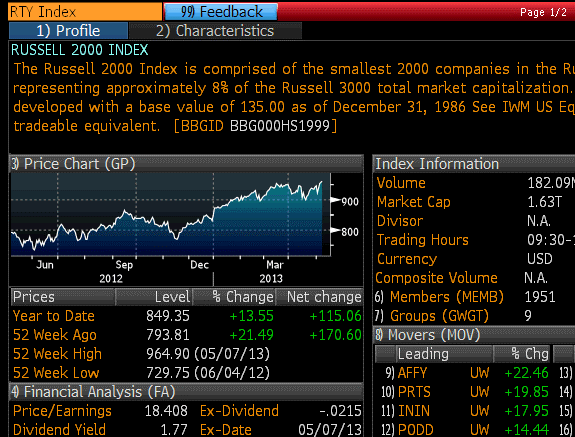
Well, the following chart is also from Bloomberg, and you get it if you type RTY<Index>FA<GO>. What it says is that the Price/Earnings Ratio is actually 54.86, which means that your $18.41 actually only gets you $0.33 of earnings! What’s going on here? Well, the next line shows you that what Bloomberg considers the “real” P/E ratio – important enough to have on the front page – is really the Price/Earnings ratio if we only count the positive earnings.

So, that $18.41 does in fact get us $1 in earnings. Wall Street doesn’t want us to focus on the fact that it also gets us $0.67 in losses, so that the net is only $0.33. Because surely, those losses were one-time events, and obviously all 2000 companies will make money next year, right?
It may be that stocks are a great bargain here, and that multiples will expand further, the economy will surge in a way we haven’t seen in a decade or two, in an environment of tame inflation but ample liquidity. If that is the case, then equity investors will win over the next five years because they’re betting on the trees that have grown the most in the last two years. But in all other cases, commodity indices should grow faster than stocks as both revert to their long-term growth rates.
Comparisons
With little economic data on the calendar, and the Fed speakers back-loaded at the Chicago Fed conference later in the week, there is time to reflect on other questions (unless, of course, the Israel/Syria back-and-forth turns into something more than the last couple of jabs have produced).
It is interesting to me that analysts and journalists truly enjoy finding comparisons between present situations and actors, except when the comparisons suggest unpleasant conclusions. This is at a time when there are really no comparable periods in history to compare to, at least with respect to major global policy initiatives!
I read comparisons between Shinzo Abe’s pressure on the Bank of Japan and Fed Chairman Bernanke’s campaign to resurrect the American economy with ever-greater monetary policy shocks. Somewhere, I saw an analyst ask “isn’t Abe taking note of the failure of U.S. monetary policy to goose the economy?” But the comparison is not apt because the two men, and the two economies, face very different challenges. Abe doesn’t need to increase consumer spending and reinvigorate the economy with monetary policy. While that might be nice, the main goal of Japanese monetary policy now is to raise the price level and the rate of inflation. They are using exactly the right tool to do so: lots of monetary easing. On the other hand, Bernanke is trying to kick-start the real economy with a monetary tool, while at least in principle avoiding an inflationary outcome. That’s like trying to hammer a nail with a fish. It might work, but it’s the wrong tool for the job. So the comparison doesn’t work: one man knows how to use his tools, the other does not.
Here is another useless comparison: “Bond Buyers See No 1994 as Bernanke Clarity Tops Greenspan.” The myth that transparency really helps markets in the long run is sort of silly: is there any sign that the crises caused by monetary policy have become less frequent since the Greenspan glasnost than they were before? I know that’s the belief, because the Fed has told us that’s the way it is. But my scorecard tells a sorry tale of bubbles and crashes since the early 1990s. It isn’t a lack of transparency that causes routs. It’s leverage, and negative gamma. Mortgage hedgers are more active now than they were in 1994, and they have larger books. Hedge funds are orders of magnitude larger. And Wall Street is smaller, and is able to provide less liquidity – partly because they are more levered (which they think is okay because of “Fed transparency”), and partly because the government doesn’t want them to take bets with the leverage they have (which, since they’re paying for failures under the current system, isn’t wholly absurd).
So will the next bond selloff not be as bad as in 1994, because the Fed will give more warning? Remember that no matter how transparent the Fed is, there is still a transition point. Somehow, the market goes from a state of thinking there will be no tightening of policy, to a state of thinking that there will be a tightening of policy. That requires a re-pricing, whether it occurs because the Fed signaled it in a speech or a statement, or because they signaled it by doing Matched Sales for the SOMA account with Fed funds already trading above target (as was the old way of telling us something had changed). There is no way to go from “not knowing” to “knowing” without a moment of realization. And when that phase change ultimately occurs, the greater leverage inherent in the market and the diminished role of market makers will cause the selloff (in my view) to very likely be more dramatic than in 1994.
One place where we cannot prevent comparisons – nor should we want to – is in the asset markets. Stocks are doing well, despite absurd valuations, because most other markets are either more-absurdly valued (e.g., Treasury bonds) or have horrible momentum that means they’re not popular right now (e.g., commodities). I have no doubt that equity performance over the next 10 years will be very uninspiring, because equity markets that start from this level of valuation never produce inspiring returns. But when people ask me what the trigger will be for a selloff, I have to shrug. There have been plenty of “reasons” for that to happen. But I think the ultimate reason is probably this: equities are perceived as the “only game in town.” I have read several articles recently that echo this one: “Bond Fund Managers are Loading Up on Stocks.” When there is some other asset class, or some other world market, that starts doing appreciably better, perhaps investors will decide to allocate away. Unfortunately, the candidates for that market are pretty few, given the general level of valuations. Could it be commodities, which is one of the few genuinely cheap markets? Or perhaps real estate, which is still only fair value but has some pretty striking momentum? I don’t know – but I am also not sitting around waiting for a “trigger event.” There may well be a selloff without such a trigger.
Summary of My Post-Employment Tweets
- upward surprise + upward revision in #Payrolls – not too shocking, as I pointed out in last article. Weak hours though…
- Here is part of what’s happening in #payrolls: more jobs, fewer hours = employers cutting back hours to avoid Obamacare coverage
- Question is, which is better for confidence? More jobs, lower earnings & wages, or fewer, but better, jobs? Probably the former.
- average weekly hours have stagnated since 2011, even as Unemployment has fallen.
Today’s Employment report was pretty straightforward: an upward surprise to payrolls and upward revisions; a decline in the Unemployment Rate, and declines in hours worked. The upward revisions to Payrolls is not really a surprise, although seeing the Unemployment Rate continue to decline when Consumer Confidence “Jobs Hard to Get” is increasing is unusual.
Two years ago, the “Average Hours Worked” was 34.4 hours and the Unemployment Rate was 9.0%. Today, average hours worked is still 34.4 hours and the Unemployment Rate is 7.5%.
What I said about Obamacare coverage should be expanded a bit. There have been anecdotal reports (see, e.g., here and here) that many employers are cutting back hours for some employees, because they are required to offer health insurance (at steep premium increases) to part-time employees working at least 30 hours per week. The incentives are large, especially for employers who are near the 50 employee cutoff, to cut back employee hours. The way this would show up in the data, if the behavior was widespread, would be (a) a decline in average hours, as more people work shorter shifts, and (b) potentially (but not automatically) an increase in the number employed, since an employer who cuts 100 hours of work from existing employees is now 10 hours short of the labor input needed. I suspect this is only partly the case – if you cut 100 hours, maybe you add three 25-hour part-timers (it still costs money to hire, after all) – but it may help explain why the payrolls number keeps rising and the jobless number keeps falling although the average hours worked is pretty stagnant.
It would also help resolve the conundrum between the “Jobs Hard to Get” survey result and the Unemployment Rate, although it is a small divergence at present. If respondents are answering the survey as if the question is whether good or full-time jobs are hard to get, it may well be the case that those jobs are getting more difficult to find while there are more part-time positions being offered.
This is mere speculation, and storytelling, but I think it’s plausible that this is happening and may be affecting the data.
A Broken Record But It’s A Good Song
There has been a bunch of new data over the last couple of days, but I am afraid that all of the new stuff will not keep me from sounding like a broken record.
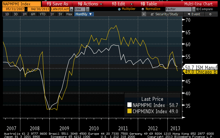
Consumer Confidence jumped yesterday, but more interesting is the fact that the “Jobs Hard to Get” subindex rose to the highest level since late last year, suggesting that weak jobs data isn’t entirely a one-off. Today, the ADP report was weaker-than-expected, at 119k (versus expectations for 150k) and a downward revision to last month. The Chicago Purchasing Managers’ Index on Tuesday was the weakest since 2009, but the ISM Manufacturing report today was on-target. Still, neither manufacturing index is generating much confidence that the economy is about to take off, and the early-year bump has been entirely reversed (see chart, source Bloomberg).
The Shiller Home Price Index, reported on Tuesday, was higher-than-expected at 9.3% year-on-year, rather than the 9.0% expected (and versus an 8.1% last!). What’s really interesting about this is that the recent surge in year-on-year growth has come because the usual seasonal pattern that sees prices sag in the springtime hasn’t been in evidence this year – accordingly, the year-on-year comparisons have gotten easier as prices have gone sideways rather than falling as they tend to do between August and March (see chart, source Bloomberg).

That’s interesting because such a phenomenon was also a condition of the bubble years prior to 2007 – prices generally rose steadily with only a hint of seasonality. Post-bubble, if you wanted to sell your house in February you had to offer a concession on price. Those concessions aren’t happening any more, which is a back-door confirmation of the overall price action.
As I have said before, ad nauseum, we are seeing slow and/or falling growth and firm and/or rising inflation in the pipeline, and that’s not at all inconsistent. Mainstream economists, and journalists of all stripes, seem to accept as a fundamental verity the linkage between growth and inflation, but the only minor problem with this firmly-held belief is that it ain’t so. Growth is bad, and inflation is still going to go up. In Q1, core CPI rose at a 2.1% pace, and I still think that for the full year core CPI will rise at 2.6%-3.0%.
I want to add a quick word here about a thesis that has been advanced recently. The thought is that if the abrupt housing demand is coming from investors rather than consumers, then rising housing prices might be consistent with pressure on rents. I think it’s important to clear up this confusion. Microeconomics tells us that when the price of a good goes up, the price of a substitute tends to rise as well. It is possible, if the overall price level is flat, that a phenomenon such as is described in this hypothetical could happen, with home prices rising and rents falling. But what is much more likely is that rents simply go up more slowly than home prices, so that they decline relative to home prices, rather than declining absolutely. This is, in fact, what we see historically: large increases in home prices tend to lead to increases in rents, but not of the same magnitude, and vice-versa. Whether the mechanism for this is a systematic institutional investor presence or just a large number of one-off instances of individuals renting out their second “investment” homes doesn’t really matter. Accordingly, I don’t expect to see a drastically different course carved out by the rental/home price relationship from what it has been historically. The main difference may be that the lags between home prices, inventories, rents, and so on might get screwed up somewhat, if institutional investors cause this to happen in a more organized way than the organic way in which it usually happens.
Another aside: there has also been a lot made recently, especially in commodity markets, about weak data from China. It is amazing how important it is to global commodity markets that China grows at 9% and not 8%. If I were a member of Chinese leadership, I would be trying to convince my data bureau to release slightly weak figures, since every time it does the hedge funds of the world offer large amounts of commodities as discount prices, which is just what a growing economy needs. It’s not like anyone believes the figures when they are reported to be high; I wonder why we believe it when they are reported to be low?
In addition to the data today, the Federal Reserve finished its meeting and announced no change in monetary policy for now. And there isn’t one coming for a while, either. There was no important change in the statement, although the Fed did take care to remind us that it “is prepared to increase or reduce the pace of its purchases to maintain appropriate policy accommodation as the outlook for the labor market or inflation changes.” [emphasis added] That’s comforting. But the simple fact is that the economy isn’t going to be booming any time soon, and the Committee isn’t going to taper its purchases unless it does because they labor under the delusion that they’re helping. Perhaps next year.
For the rest of the week, investors will be focused on Friday’s Employment Report. I am not really worried about the report being weaker-than-expected, because from everything I read it seems that the market is already anticipating something close to Armageddon (or at least, that’s how they are explaining the continued pressure on breakevens and commodities). So far, this is a routine slowdown that might be slipping into a renewed recession. Meanwhile, expectations on Friday are for Payrolls of 145k, up from 88k but down from the pace of the last year. And the ‘whisper’ number seems to be lower than that. I suspect the more likely surprise is that there is an upward revision to the 88k and the number exceeds estimates. Somehow, that will be also perceived as a negative for breakevens!
TIPS suffered today, even as nominal bonds rallied. Our Fisher yield decomposition model currently suggests that TIPS are as cheap, relative to nominals, as they have been since early September last year (when 10-year breakevens were at the same level they are at now). I am quite bullish on breakevens from here.
Why the Fed Doesn’t Fear Inflation, But You Do
The core PCE deflator for March recorded a near-record 1.1%. Should we worry that deflation is taking hold?
Well, first of all you should recognize that the PCE, unlike the CPI, is frequently revised and by significant amounts. As the chart below shows, this is only a near-record because there was a massive revision that raised the 2010 low from 0.7% or so to 1.1%. We should be wary, in my opinion, to draw any strong conclusions from (and certainly wary of implementing policy based on) a data series that can have the rate of change revised by 60%.

But still, core PCE is near its lows while core CPI is not. Should we be concerned about deflation? Should the Fed?
There are a number of reasons for the difference. A persistent difference of about 0.25%-0.5% is consistent with differences in the type of formula used and other “normal” differences. The Fed favors the PCE because it has a broader representation of the economy – in that it doesn’t focus “just” on consumers – and because it adjusts more quickly as the composition of spending changes. However, if you are looking at how the costs to you the consumer change, the CPI is the index that you should be looking at.
The main reason that core PCE is currently so much lower than core CPI is that PCE has a much lower weight on housing. And, thanks to the Fed’s loose money policy, it is housing that is driving the CPI higher. The difference in housing weights currently adds 0.31% to CPI compared to PCE. The PCE makes up for this low weight in housing by having a much higher weight on medical care (about three times the CPI weight). Why the huge difference in the medical care weight?
The CPI and PCE metrics are meant to measure different things – the PCE is broader, but the CPI measures specifically expenditures by consumers. Consequently, the difference in medical care weights occurs because the CPI measures spending by consumers, while the PCE includes spending by Medicare, Medicaid, other government entities, the employer portion of health insurance, and other non-consumer payers. Which do you think is more relevant for consumers? And which do you think is a better representation of what a typical consumer spends: 42% on housing and 6% on medical care, or 26% on housing and 22% on medical care? In simple terms, do you spend more for your house, or do you spend about equal amounts on both? I suspect that for most Americans, especially those who are employed and those who are currently receiving Medicare, spending on housing is vastly higher than direct spending on medical care.
Isn’t it convenient for the Fed that right now, they can focus on a metric that is pointedly underweighting the category of expenditure that is most directly being affected by quantitative easing? This is one reason that I do not expect QE to stop any time this year.
Not So Fast on the Deflation Talk
I wonder how quickly all of the calls of “deflation!” will turn into calls of “hyperinflation!”
After gold was pummeled $200 in two days on April 12th and 15th, there was a proliferation of commentators who suddenly declared that inflation fears were in full flight. Although the decline in inflation swaps to that point was mainly attributable to the decline in energy prices (subsequently, some air has indeed come out of implied core inflation, but still there is no deceleration in inflation, much less deflation, priced in), the chorus of “I told you so’s” was deafening and many were encouraging Chairman Bernanke and other central bankers to take a victory lap. After the disastrous 5-year TIPS auction on April 18th I could almost hear Darth Vader saying “strike down the 5-year breakeven and the journey to a deflationary mindset will be complete.”
Well, not so fast. Since that point, gold has recovered about $100 in rallying six out of the last eight sessions. The 5-year breakeven has recovered from 1.94% to 2.15% (although to be fair about half of that was due to the roll). The 10-year breakeven also bounced 14bps, and is back above 2.40%. Today, every commodity in the DJ-UBS index, with the exception of Coffee, rallied.
Why? What has changed over the last week and a half? Nothing important; if anything, the data has been weaker than the data preceding the washout. And that fact, I continue to think, is a fact the salience of which remains ungrasped by central bankers. Unless it’s by sheer coincidence, global growth simply isn’t going to explode upward while incentive structures are so bad and governments consume such a large part of the economy. And as long as growth doesn’t explode higher, central banks will keep easing, because – despite almost five years of contrary evidence – they think it helps growth. I believe the only way that global QE stops is if central banks come to understand that they aren’t doing any good on growth, and are doing much harm on inflation, though with a lag.
I am not terribly optimistic that such a eureka moment is nigh, especially when the economics community is so subject to confirmation bias that a technical washout in gold can provoke hosannas.
An April 12 article in the Washington Post highlighted recent research that indicates a one-percentage point increase in unemployment makes us feel four times as bad as a one-percentage point increase in inflation. This is not particularly surprising, at some level, although I greatly suspect that the results are non-linear – but I am not shocked that it feels worse to see people lose their jobs (or to lose one’s own job) than to absorb slightly higher price increases.
But the article goes on to argue that “Such findings could have significant implications for monetary policy, which until the most recent recession has primarily been concerned with controlling inflation. But now some central banks are speaking of allowing inflation to rise or stay slightly above their usual targets in hopes of bringing down unemployment.” The idea the article is proposing is that it is incorrect to balance evenly the (inherently conflicting) mandates the Fed is tasked with to seek lower inflation and lower unemployment; they should favor, according to this argument, lower unemployment.
There are several flaws in this argument, but I believe it is likely that the Fed more or less agrees with the sentiment.
One flaw is that the damage to inflation comes in the compounding. If unemployment is 6% now and 6% next year, there has been no change. But if inflation is 6% this year and 6% next year, then prices are up 12.4%. And if it’s for three years, it’s 19.1%. How many years of that 1% compounding inflation do you trade for 1% incremental change in unemployment?
A bigger flaw, in my view, is that central banks don’t have any important control over the unemployment rate, while they have important control over inflation. It may also be the case that a 1% rise in background radiation levels makes people feel even worse than a 1% rise in unemployment, but that doesn’t mean the Fed should target radiation levels!
Moreover, even if you think the Fed can affect growth, it is still true that for big moves in these numbers (because we really don’t care so much about 1% inflation change or 1% unemployment change, after all) the central bank’s power to cause harm is clearly much larger in inflation. It is possible to get 101% inflation, and in fact many central banks have done so. No central bank has ever managed to produce 101% unemployment.
I doubt that commodities and breakevens will go higher in a straight line from here. And every time there is a break lower, the deflationists will call for the surrender of the monetarists. But I do wonder if this latest break is the worst we will see until there is at least some sign that QE is going to end.
