Archive
Too Much Fuel Will Extinguish The Fire
Stocks continue to climb inexorably: 21 of the 33 trading days this year have seen stocks end the day higher. About the only market that is doing appreciably better is gasoline. Retail gasoline prices have risen 33 of the past 33 calendar days, and front Unleaded has risen 22 of the 33 trading days in 2013.
This brings us, of course, to the question: if gasoline rises every day, then how long will it be until higher gasoline prices start to affect equity prices?
The question is not quite as straightforward as it appears. On the surface, we have two competing effects: first, stronger economic activity will tend to support both gasoline prices and corporate earnings, giving a lift to equities. And some recent data, such as last Friday’s hefty upside surprise in the Empire Manufacturing figures for February (+10.04 when -2.00 was expected), suggests that growth in Q1 may not be slowing too much further although the European, Japanese, and US economies each contracted in Q4.
(By the way, did you realize that? Each of the three biggest First World economies contracted in Q4 and the US equity markets declined -1.0%).
Not that equities necessarily must pull back when growth lags (if they did, then all good economists would also be good traders), but when you’re talking about markets that are pricing in a continuation of historically wide margins and historically high price-earnings multiples, it would seem that a pullback when there is weakness economically is as good a time as any. Stocks can’t go up in a line forever, can they?
Actually, they can, but we’ll get to that in a minute. I mentioned two competing effects that are apparent, with one of these being the stronger economic activity will tend to support both gasoline prices and earnings. The other is that higher gasoline prices have a depressing effect on discretionary expenditures. Along with the higher payroll taxes which manifested in January and the lower Q1 incomes as a result of dividends being pushed into Q4, the higher gasoline prices may have contributed to what a finance VP at Wal-Mart described as “a total disaster” start to February. This is an “automatic stabilizer” effect at work: higher growth tends to produce higher energy prices, which tend in turn to dampen economic growth – and vice-versa.
So which effect dominates? Can gasoline prices and stock prices keep going up together?
The answer is that their nominal prices can absolutely continue to rise together, but their real prices cannot. If I double the price level, then no matter what happens to growth or the marginal rate of substitution between gasoline and all other discretionary goods and services, both nominal gasoline prices and nominal corporate earnings (and therefore, quite likely equity prices) will both rise. However, higher real energy prices imply lower real equity prices eventually. But that’s not a day-trade; in the fairly short run (say, several months) the price level is roughly constant so that one of these two markets is likely to decline in nominal terms.
Frankly, the odds in my mind are on stocks breaking first. But as the chart below (source: Bloomberg) shows, the ratio of gasoline to stocks is not really out-of-whack one way or the other. This is unleaded regular gasoline divided by the S&P level…and what’s fascinating to me is how regular the relationship has been (especially in 2010!).

By the way, the distinction about nominal and real prices also is relevant for the observation some have made that gasoline inventories are reasonably adequate, but prices continue to rise. Gasoline prices are high in nominal terms, but not as high in real terms. In nominal terms, unleaded has risen 105% since the second Bush inauguration, but only 65% in real terms. That still sucks, mind you, and is one reason that growth hasn’t been robust in a while. As of December 2004, gasoline was 3.934% of the average consumption basket; according to the BLS (new numbers are out today!) that became 5.274% as of December 2012.[1] Therefore, we spend about 1.34% less of our total consumption on other things than we did in 2004.
With gasoline, medical care, and college tuition all squeezing us (not to mention taxes, which is not a consumption item and therefore not in the CPI), it isn’t surprising that we’re spending a smaller proportion of our consumption basket on apparel and housing than we used to (for a longer-term view, see my comment from a couple of weeks ago “Fun With the CPI”). These are long-term, secular trends. What could hurt the market in the shorter-run is that when there is a significant move in energy prices, we can’t change the amount of housing we consume to compensate. We stop buying the Wal-Mart things. And we save less.
And eventually, we stop buying stocks. Don’t we?
[1] N.b.: that doesn’t mean we spend 35% more on gasoline now; as noted, gasoline has doubled in price. But 35% more of our consumption is spent on gasoline, than we spent previously. It is interesting that with a 65% increase in the real price of gasoline, our gasoline consumption has only risen 35% (due to smaller cars, better gas mileage, more air travel, more mass transit, etc).
Learning the Wrong Lessons
According to Bloomberg, investors are the most optimistic on stocks they have been in 3½ years. As is normal, investors mistake a sense of optimism about the economy for a sense of optimism on equities. As is normal, investors are reaching this peak of optimism as the stock market achieves its highest nominal level in five years, and among the highest valuation multiples in … hey!…about five years. What a coincidence! (Incidentally, while we calculate our long-term valuation metrics ourselves this page is a pretty good source for a quick-and-dirty view of valuations. I don’t have any relationship to the company and this is the only page on the site that I’ve used so I am not endorsing any other page!)
Now, while I am probably as optimistic on the economy as I have been in the past few years, I’m still less-optimistic than the crowd since I think the crowd hasn’t yet assimilated the fact that the little growth spurt at the end of Q4 owes quite a lot to the movement of dividends and incomes into Q4 from Q1, and thus the first quarter of this year will probably look rather poor.
In fact, while I am clearly negative long-term on the prospects for nominal Treasury bonds, that’s my investment view. My trading view is that at 1.84%, Treasury bond yields are probably going to go lower before they go higher. That’s partly because the present yields incorporate a lot of enthusiasm about growth – enthusiasm I think will be dashed once the January numbers begin to be reported in earnest. But the trading view is also because the Fed is buying virtually all of the net supply the Treasury is supplying to the market, with no sign that project is ending. I have no illusions that buying 10-year Treasuries at 1.84% and holding to maturity will be an awful investment. But if I was a short-term swing trader, I’d play for the next 20bps to be lower, not higher, in yield.
With respect to January data, incidentally, here is what we have so far (outside of Initial Claims, which as I have pointed out previously are all over the map at this time of year):
| Release for January |
Consensus Forecast |
Actual |
| Empire Manufacturing |
0.0 |
-7.78 |
| NAHB Housing Mkt Index |
48 |
47 |
| Philadelphia Fed Index |
5.6 |
-5.8 |
| Michigan Confidence |
75.0 |
71.3 |
| Richmond Fed Mfg Index |
5 |
-12 |
For the most part, these are not just misses but big misses. I wonder how long it will take for investors to notice? Initial Claims on Thursday could get attention as the numbers start to converge on the actual condition of the underlying economy, but the first big January datum is the January 29th release of Consumer Confidence, which is currently expected to rise slightly from December. That is followed by ADP on January 30th (but any weakness there will likely be tempered by the advance release of Q4 GDP on the same day), the Chicago PMI on the 31st, and the ISM PMI and Unemployment on February 1st. Regardless of what happens over the next few days, I don’t want to be short bonds headed into that gauntlet next week.
I said the January data were big misses “for the most part,” because the NAHB miss wasn’t really a big miss. Housing is even strong enough now to resist downside surprises. As an aside, although it is a December number, the median price of existing home sales rose 10.89% year-on-year. Adjusted for the level of core inflation (so that we’re looking at the real rise in existing home prices), this is the fastest rise in history except for several months in 2005 – see the chart, (source Enduring Investments).

As for stocks, the fact that investors are as bullish as they have been in a third of a decade is sad but not terribly surprising (although this is a survey of Bloomberg users, which supposedly are much more astute since they have to come up with the 1700 clams per month for the service). On a related note, I was recently reading an article, called “I Saw The Movie,” in the January issue of Financial Advisor Magazine. In the article, the author compares the fear that some investors have of the stock market to the (irrational) fear of going into the water after watching Jaws. The author notes that “If your balance in 2011 resembled your balance in early 2008, you lost three years – but you didn’t lose any money, unless you sold out of panic…the vast majority of big losers were those who sold at the ebb of fall of ’08 to the spring of ’09 and parked their boats in the shallows of rock-bottom savings accounts.”
This, it occurs to me, is the real toll that the Fed’s QE has had on the investor class. It taught the wrong lesson. The lesson that has been taught is that you should hold on through all things, good and bad, and things will be okay. It is true that with hindsight, those who sold with the market finally at fair value (but no cheaper) in March of ’09 missed a rollicking rally all the way back to similar levels of overvaluation. But the real lesson should have been that most investors shouldn’t have been overweight in equities in 2008 or in 2007, based on market valuations. In the absence of manipulation of asset prices through the “portfolio balance channel” (see my discussion of this phenomenon in my recent article “A Relatively Good Deal Doesn’t Mean It’s A Good Deal”), those who sold in March of 2009 would have missed an average market return rather than the 21% per annum the market actually delivered since then. So the problem isn’t that they got out in 2009, but that they got in (or stayed in) in 2007 and 2008, and then got out in 2009. Investors who heeded the overvaluation of the market at, say, year-end 1998 and never got back in have earned a compounded return of 2.54% in T-Bills, 7.39% in TIPS, 5.64% in commodities, or 5.77% in the Lehman/Barclays Agg (nominal bonds) compared with 2.94% in stocks.
And that return is based on the pumped-up valuations that still exist in stocks today.
Investors, and their advisors for the most part, haven’t learned the right lessons yet, which is why patient investors are still having to wait to get back into equities even though the Federal Reserve is working very hard to force them back into the market via the portfolio balance channel.
The right lesson is this: investing for the long term is mostly about valuations, and very little about the economic cycle, the news cycle, or the lunar cycle. And two of those three we can’t predict, anyway. Yes, there is a tactical element of trading, but most investors should be (a) rebalancing on a regular basis, (b) paying attention to basic rudiments of asset valuation so as to adjust – mainly at the margin – their basic asset mix, and (c) turning off the television.
It Pays To Be Contrary
At one time, I think most of us assumed that the stock market would have a hard time rallying without its largest component, Apple (AAPL).
Pretty soon, Apple will solve that problem, since it won’t be too long before it is smaller than Exxon-Mobil (XOM) again. It is actually fairly remarkable that the S&P has managed to rally 3.2% this year even though AAPL is -8.7%.
This phenomenon is amazingly timely, considering that in the November/December issue of the Journal of Indexes there was an article by Rob Arnott and Lillian Wu called “The Winner’s Curse” in which the authors noted that “For investors, top dog status – the No. 1 company, by market capitalization, in each sector or market – is dismayingly unattractive.” Later, they note that “the U.S. national top dog underperforms the average company in the U.S. stock market by an average of 5 percent per year, over the subsequent decade.”
Nice call.
That observation follows naturally from Arnott’s work that led to fundamental indexing – his observation, simply, is that by definition if you are capitalization weighting you will always have “too high” a weight in stocks that are overvalued relative to their true prospects and “too low” a weight in stocks that are undervalued relative to their true prospects. There is no way to know if Apple is one of those – it’s a great company, and there’s no reason that the top-capitalization company is necessarily overvalued – but the authors of that article note that when you’re the top dog, more people are taking potshots at you. It suggests an interesting strategy, of buying the market except for the top firm in each industry.
This is why contrarians tend to do well. If you buy what everyone else is selling, and sell what everyone else is buying, there’s no reason to think you’ll be right on any given trade but you are much more likely to be buying something that is being sold “stupidly” and to sell something that is being bought “stupidly.”
Which brings me back to commodities, which are unchanged over the last 9 years (DJUBS Index) while the basic price level has risen 24% and M2 is +72%. But I know you knew that’s where I was going.
Below is a picture of the worst two asset classes of the last nine years (I picked 9 years because that’s the period over which both of them are roughly unchanged). The white line is the S&P-Case Shiller index, while the yellow line is the DJ-UBS Commodity Index.
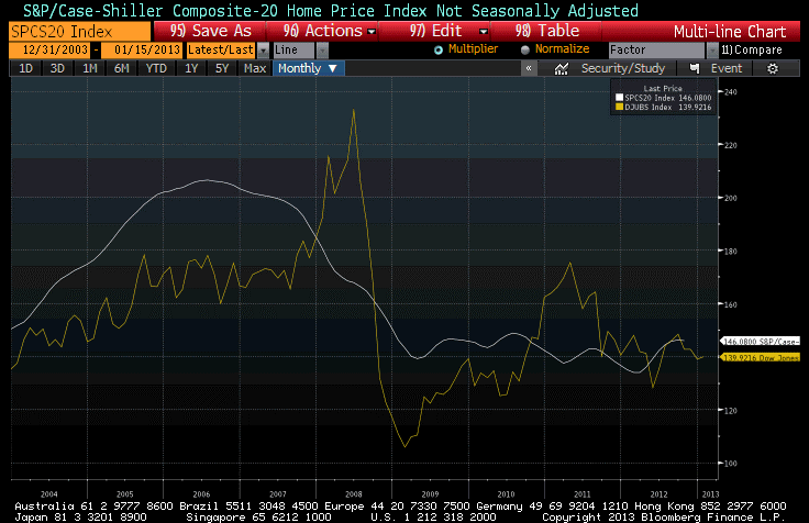
One of these two lines is currently generating much excitement among economists and investors, including institutional investors, who are pouring money into real estate. The other line is generating indifference at best, loathing at worst, and plenty of ink about how bad global growth is and how that means commodities can’t rally.
One of these lines is also associated with an asset class that has historically produced +0.5% real returns over long periods of time, and consequently isn’t an asset class that one would naturally expect to have great real returns. The other is associated with an asset class that has historically produced +5-6% real returns, comparable with equity returns, over long periods of time. Care to guess which is which?[1]
.
Tomorrow, the BLS will release the Consumer Price Index for December. The consensus for core inflation is for a “soft” +0.2%, and a year-on-year core inflation increase for 2012 of +1.9%.
Now, last December’s core inflation number was +0.146%, and last month’s year-on-year core CPI was +1.94%. What that means is that it will be quite difficult to get both +0.2% on the monthly core figure and +1.9% on the y/y change. If get +0.17% on core, then we should round up to +2.0% unless something odd happens with the seasonal adjustments.
In other words, I think it’s very likely that core inflation will pop back up to 2.0%. As a reminder, the Cleveland Fed’s Median CPI is still higher, at 2.2%, so it should not be surprising at all that core inflation has a better chance of going up than going down from here.
The two major subindices to look for are Owner’s Equivalent Rent, which last month was at 2.14% y/y, and Rent of Primary Residence, which was 2.73% y/y. Those two, combined, represent 30% of the consumption basket, and it was the flattening out of those series that caused core CPI to flatten around 2.0%. (Six months ago, the trailing y/y change in OER was 2.1%; the y/y change was 2.7%). Accordingly, watch closely for an uptick in those indicators. We believe that they are going to accelerate further, likely sometime in the next 3 months.
[1] Hint: the one that has historically provided great returns is one that few investors have very much of. The one that has historically provided bad returns is the one that represents most of a typical investor’s wealth.
Wrapping Up – And Some Portfolio Projections
Whether it’s with a bang or with a whimper, the year is drawing to a close. So too is this author’s year; I expect that this will be my last post for 2012. Let me take a quick moment to thank all of you who have taken the time to read my articles, recommend them, and re-tweet them. Thanks, too, for your generous and insightful comments and reactions to my writing. One of the key reasons for writing this column (other than for the greater glory of Enduring Investments and to evangelize for the thoughtful use of inflation products by individual and institutional investors alike) is to force me to crystallize my thinking, and to test that thinking in the marketplace of ideas to find obvious flaws and blind spots. Those weaknesses are legion, and it’s only by knowing where they are that I can avoid being hurt by them.
In my writing, I try to propose the ‘right questions,’ and I don’t claim to have all the right answers. I am especially flattered by those readers who frequently disagree with my conclusions, but keep reading anyway – that suggests to me that I am at least asking good questions.
So thank you all, and I hope you have a blessed holiday season and a happy new year. And now, back to our regularly-scheduled article.
.
It seems likely, although not a sure thing, that 2013 will be a better year in terms of economic growth. Certainly, we are ending 2012 in better shape than we entered it. One way or the other, the budget deficit will come down – at least partly because the prospective rise in tax rates has moved forward some realization of taxable gains – and, although that is a negative from a classical C+I+G+(X-M) perspective, I believe a smaller deficit will help assuage some business and consumer fears and be no worse than neutral … if, in fact, we get a smaller deficit! A bigger point is that while Europe is far from out of the woods, a near-term exit of Greece from the Euro finally seems unlikely. Stay tuned for Italian and Spanish dramas in 2013, and plenty of other pressures on the continent, but the worst case that we feared a year ago has been at least kicked down the road a piece.
Domestic growth to end 2012 is looking better, too. Today the Philly Fed index showed its highest print since March (8.1 versus -10.7 last month and expectations for -3.0). Existing Home Sales came in at 5.04mm, the first time above 5mm (without a government program, such as got Existing Home Sales up there briefly at the end of 2009) since 2007. The inventory of existing homes fell to the lowest level since 2002 (see chart, source Bloomberg).
Yes, there is additional “shadow inventory,” and so this isn’t the “true” inventory once you include bank REO property and other wannabe sellers who are waiting for the market to pick up, but that shadow inventory will clear a lot faster now that prices are rising. The monthly Home Price Index from the FHFA was released today, showing that nominal home prices in October rose 5.5% over last October (see chart, source Bloomberg).

Even in real terms, home prices are rising. Over time, residential real estate has roughly appreciated at the rate of inflation plus 0.5% (so that in real terms, home prices tend to just tread water). Between 1997 and 2007, however, real home prices rose some 50% before collapsing 28% between 2007 and 2011. But this latest bounce is real (see chart, source Bloomberg; I’ve merely divided the HPI by the NSA CPI price level and multiplied by 100), and it comes thanks to profligate monetary policy. To the extent that tax rates rise but the mortgage deduction persists, fiscal policy too will probably support home prices going forward. It isn’t a sustainable rise in real prices, but if it is merely sustainable in nominal prices it will heal a lot of upside-down borrowers.

On the topic of profligate monetary policy, I ought to note that M2 growth has been reaccelerating, and has grown at a 9.8% pace over the last 13 weeks. Over the last 52 weeks, M2 is +7.6%. Assuredly, it isn’t the sustained 10% pace we saw at the beginning of 2012, but it is still far more than is needed to keep prices stable with a 2-3% real growth rate…as long as velocity stabilizes or heads higher. So, while the unemployment part of the “misery index” has been improving, the inflation part of the index is likely to continue to worsen. That will be the story in 2013, I suspect, as quantitative easing continues by central banks around the globe (and continues to accelerate in places: the Bank of Japan last night increased its purchasing program by another ¥10trln) and prices or real assets are not only no longer falling, but rather starting to rise.
Where to invest in this environment? Nominal bonds are the worst of all worlds; Treasuries are priced for a -1% real return over the next 10 years, and corporate bonds are even worse with a -2.1% expected real return. (Incidentally, you can compare these estimates to those I produced in 2010 and 2011 via these links. They’re mostly worse, following a better year from asset markets than we had a right to expect!) TIPS produce a -0.74% real return for the next 10 years. Stocks are at +2.44%, which looks good by comparison but is only fair given the risk, and low compared to historical norms – and also more expensive than they were at the end of 2011 (2.57% expected 10 year real return) and 2010 (2.58%). Commodities are cheaper: by my metric, diversified commodity indices are now expected to return 5.43% per year, after inflation, over the next decade (2010: 4.30%, 2011: 4.78%, so you can see this is not an exercise in forecasting the next year’s returns!). Residential real estate has richened slightly but is priced roughly at the long-run average, so I expect returns to be around 0.2% per year for the next decade. The chart below summarizes these estimates (source: Enduring Investments).

Our Fisher model is flat inflation expectations and short real rates; our four-asset model remains heavily weighted towards commodity indices; and our new metals and miners model is skewed heavily towards industrial metals (53%, e.g. DBB) and precious metals (43%, e.g. GLD) with negligible weights in gold miners (2%, e.g. GDX) and industrial miners (2%, e.g. PICK). (Disclosure: We have long positions in each of the ETFs mentioned.)
Feel free to send me a message (best through the Enduring website) or tweet (@inflation_guy) to ask about any of these models and strategies. And otherwise, have a happy holiday season and a merry new year! I look forward to a great 2013, a robust inflation market that continues to grow (the CME is likely to list both TIPS and CPI futures in the coming year), and no small amount of volatility to navigate. This column will return circa January 3rd or 4th.
Central Bank Groupthink
Lest anyone be confused about the unanimity and collective will of central banks globally on the question of how aggressively to pursue a dovish monetary policy, the Bank of Japan on Wednesday surprised even the Japanese finance minister by increasing the size of its own quantitative easing program. After many years of pursuing a half-heartedly dovish monetary policy, the BOJ is now fully on board with asset purchases that will total some $1 trillion. Why not? The Fed’s aggressive asset purchases moved core inflation from 0.6% to 2.3% before a recent softening – and a rise in core inflation is what Japan has been working on for years. Five-year inflation swaps in Japan now are quoted around 0.80%, indicating that at least some investors think the BOJ’s stated policy of provoking 1% inflation has some chance of being achieved.
It is no surprise that there is great intellectual exchange between the economists at all of the central banks. While this can be a good thing (after all, Japan finally caught on that they can’t kill a rhino with a flyswatter), it is also dangerous in that it provokes groupthink. Since the Fed has clearly lost any of its monetarist leanings, in favor of an experimentalist “anything but Friedman” (ABF) philosophy, this isn’t really a good thing. If I have to groupthink – and, after all, it is hard to resist that tendency when one is in a group – I want to groupthink with Albert Einstein and his colleagues; I don’t want to groupthink with the cast of “Jersey Shore.”
Despite this obvious fanning of the inflationary flames, inflation breakevens softened again today and commodity prices slipped a bit further. The latter was mainly due to energy prices, as Crude has now dropped over 8% this week. The trigger for this correction has been the statement from the Saudis that they’ll supply lots of oil to the market, and a surprising rise in crude oil inventories. But the Saudis frequently boast that they can pump all they want, and crude oil inventories are highly variable. It seems odd to me to have what amounts to a negative “Middle East unrest premium,” but some too-smart-by-half observers speculated today that the chance of an attack of Israel on Iran has lessened since the moon will be waxing soon and providing too much light for a nighttime attack. Um…let me say that I’m just reporting this idea, not supporting it. I think if the dollar continues to weaken, oil prices will continue to rise. That basic relationship has held for most of a decade now. The chart below (Source: Bloomberg) shows the dollar index versus the front NYMEX Crude contract, weekly closes, for the last six years or so (the last point is Friday’s). The simple R2 is about 0.57.

While aggressive monetary easing from other central banks will help support the dollar, the Fed is still by far the most aggressive central bank. If the crisis continues to recede, then the dollar’s safe haven bid will continue to fade. I’m not so sure of the former, but I don’t want to bet on dollar strength here with the Fed dedicated to providing unlimited quantities of reserves.
In other economic news, and not at all unrelated to that, today’s Existing Home Sales figure was the strongest since 2009-2010, at 4.82mm units. Inventories of existing homes rose slightly, but still remain around 2003-2005 levels rather than the 2006-2011 levels. To be sure, there is plenty of shadow inventory still around, but these levels of existing home inventories have historically been low enough to allow home price appreciation.
In fact, as weird as it sounds housing has gone from being a systematic drag on core inflation to being a supportive factor in core inflation going forward. The levels of inventory should help support home price dynamics going further, but we needn’t look far into the future. Over the last year, the 9.5% rise in the median existing home sales price compares more favorably with the rates of 2002-2005 than it does to the 2006-2011 experience (see chart, source Bloomberg).

So don’t look now, but we’re in the midst of a home price rally. This is remarkable given the difficulty, still, of securing a home mortgage compared to the crazy days of the early ‘Aughts. Yes, perhaps the crazy credit terms followed the bubble’s inflation, rather than preceding and causing it. But if that’s true, then we’d have to lay the blame for the bubble more directly on the central bank’s doorstep.
Well, re-inflating the housing bubble is after all one of the things the Fed is unabashedly trying to do. Rising home prices frees trapped homeowners and solves the problem of underwater mortgages. It is just one way that inflation saves a lot of grief for policymakers.
Existing Home Sales is not the only place we see signs of percolating housing prices and warnings of continued buoyancy of housing CPI (Owners’ Equivalent Rent of Residences has been up at a 2% pace over the last year, actually higher than core CPI for the first time since 2009. Prior to that, y/y OER had been higher than core for all but one month of the period 1993-2009.[1]
This upward pressure on housing inflation will continue. I have previously documented the connection between rents and OER, which has suggested that OER could be headed to over 3% soon. The connection between rents and Owners’ Equivalent Rent is obviously pretty close, but here is another way of looking at the same thing. The chart below (source: Bloomberg) shows OER versus the National Multi Housing Council’s “Market Tightness” index, lagged four quarters. Tight housing conditions, no surprise, lead higher rents.

This regression is not as tight as the one between rents and OER, but the R2 is still about 0.48 since 2003. Moreover, the current level of the Market Tightness index points to an OER over the next year just a bit above 3%.
The final piece of the puzzle that you need to know is this: OER is 23.5% of the overall CPI, and roughly 30.7% of core inflation. Throw in “Rent of primary residence,” which is in fact direct rents, and the total is 29.9% of overall CPI and 39% of core. If housing inflation is returning, then there are two possibilities: either we are entering another housing bubble, which I think would be unprecedented (have we ever had back-to-back bubbles in the same asset class?), or else this rise will be accompanied by a rise in other prices so that nominal home prices will be rising while real home prices do not (or not as much). Either way, it looks like the Fed is getting what it wanted – and I wonder only how long it will take before people realize this isn’t an accident.
[1] In another sign ignored by those who believe there is a conspiracy (by the government, the Masons, or maybe the Knights Templars) to lower CPI, the BLS adjusts the value of the housing stock for wear-and-tear in a negative quality adjustment that has the tendency of pushing up inflation by just about the same amount that the oft-reviled positive quality adjustments push down inflation.
Ripping The Bandage
As a follow-up to yesterday’s article, we take note of the home price data in today’s reports. New Home Sales median prices didn’t echo the spike in existing home sales, but as I said yesterday it is hard to draw much conclusion from this series, when there is so little volume that prices jump around significantly (see Chart, source Bloomberg).

However, on the other side the FHFA Home Price Index showed its biggest leap in at least a couple of decades. Again, one point does not a trend make, but the odds that existing home prices are actually rising – at least for the homes that are changing hands – just went up again.

But not all observers agree, to be sure. Readers of yesterday’s comment fell into several natural categories. One large such category was the group that feels the large amount of shadow inventory that is held by banks in their REO books, as well as homeowners who are holding their homes off the market in hopes of higher prices, virtually guarantees lower prices.
I don’t disagree with the general notion. The housing overhang is certainly not cleared, and it will take a while for it to do so. But the expectation that this inventory will depress prices further is based on a misunderstanding of the supply and demand relationship. It’s really the fault of sloppy microeconomics texts, that tended to draw “supply and demand” charts with “Price” on the vertical axis and “Quantity” on the horizontal axis. This is accurate in the static equilibrium sense, when we are just taking a snapshot of the demand and supply curves to figure out the clearing price and quantity right now. But it glosses over an important detail and so misses conveying the richness of the relationship.
The “Price” axis need not be in dollars. There’s no reason that it must be so – any exchangeable good will do. If I have a supply and demand curve for Yankees tickets,[1] there is no reason that I can’t have the ‘price’ axis in units of cups of beer. (In actual fact, that exchange regularly happens, as when one person says “come on buddy, I’ll take you to the game and you buy the beer.”) The curves will look similar, and there will be an intersection quantity and the clearing price will be in units of beer cups. Or ounces of gold. Or acres of farmland.
By putting the units in terms of dollars, we have to be very careful about interpreting shifts of the supply curve or the demand curve. Importantly, we must remember that when we shift those curves the assumption is that the shift happens instantly. When we use units of price that change in value constantly – as does the dollar – the intersection of quantity and price can move just because time passes. It is perhaps more useful to think of the “Price” axis as being in terms of “consumption baskets.” How many consumption baskets will I exchange for that new car? Let’s say the answer is ten. Next year, the answer will still be ten (assuming no change in my preferences). But if I answered in dollars, then the answer is different, and will tend to rise over time as the value of that dollar diminishes.
So yes, to clear excess housing inventory it’s essential that home prices fall. But it isn’t essential that they fall in nominal terms. If home prices rose 5% next year, but the price of everything else went up 25%, homes would be cheaper. This is actually better than seeing nominal prices fall by 20%, because it removes any incentive to default on a mortgage that is fixed in nominal terms.
Remember: supply and demand cross at the clearing real price and quantity, not the clearing nominal price and quantity, unless we are explicitly speaking only about an instantaneous equilibrium.
This misunderstanding is the same one that is at the heart of the commodities slide, which is beginning to feel to me more like momentum trading than investment flows. I keep hearing that commodities are declining on growth fears, but if that is so then why are coffee, hogs, and cotton leading the way down and not gasoline and copper? (And, by the way, how come when stocks decline it’s a “buying opportunity” but when commodities go down, everybody thinks the world is coming to an end?) Commodities got pummeled again today, with the DJ-UBS down by -1.6%. Stocks got smacked early on and played with the 1300 level again, but managed a rally in the afternoon and actually ended with a gain of +0.2%. Bonds rallied again, and inflation swaps fell.
The near-term concern of course is Greece, with more and more stories coming out confirming that various European institutions have been developing “contingency plans” in the event that Greece leaves the Euro. Some observers think that Greece might even do it this weekend.
Once you’ve decided that the bandage needs to come off, the best way to take it off is to just rip it off in one motion. So, if Europe has finally come to that view, then the right thing to do is to just go ahead and do it at a time of your own choosing rather than letting events take the timing out of your hands. I seriously doubt that Greece will leave the EZ this weekend, with an election just a few weeks away, but it wouldn’t completely shock me. I’m more shocked by the idea that all of these institutions are just now developing their contingency plans, when it has been clear for months, years even, that Greece had to leave the Euro. And I am a little shocked that markets apparently had completely discounted this possibility until recently, and are surprised.
Thursday’s economic data consists of Durable Goods (Consensus: +0.2%/+0.8% ex-Transportation), which ought to show a partial rebound after an awful -4.2%/-1.1% showing last month. Initial Claims are expected to be unchanged at 370k. And liquidity will begin to suffer in the afternoon before a thin session on Friday.
[1] We assume here that they intersect above a zero price.
Real Estate – A Good Investment Again?
After the comparatively high-volume selloff on Friday, the stock market responded with a low-volume rebound on Monday (except for new IPO FacePlant, which is now 18.4% below the IPO price) and a low-volume, water-treading session today. Monday’s rebound was punctuated by chirps of “oversold!” from certain financial news networks, but unfortunately nothing fundamental has changed other than the price.
Existing Home Sales were reported today as-expected. Inventories of existing homes rose, but this was strictly in line with the normal seasonal pattern (see Chart, which I mainly show to illustrate a neat new Bloomberg function I discovered).

Using the same style chart, though, consider what happened to the median sales price of Existing Homes. Ordinarily, the non-seasonally-adjusted price in April is down 0-5% from year-end prices. This year, though, NSA prices are up about 10%.

To the man who has a hammer, everything looks like a nail, it’s true. But to me, this is a remarkable chart that smacks of asset price inflation in housing. Consider that Existing Home Sales, at a 4.62mm seasonally-adjusted pace, are running at about 65% of 2005’s pace, and only 88% of 2000’s pace. The pace of sales is still quite a bit depressed, in other words, yet the year-on-year rise in prices is about 10.4% (see the chart below, which is a more-normal time series). Prices in other words rose much more-rapidly in April than they typically do at this time of year, despite the level of unemployment and other, various measures of economic softening.

Don’t read too much into one month’s data, even if it is entirely consistent with what should be happening given the accelerating rise in bank lending and the persistent rise in money supply. But be wary.
Housing is, as I’ve been writing for a while, near fair-value or even slightly cheap after a long period where it was overvalued compared to traditional relationships to income and rents. (The same people who today tell me I am too bearish on stocks are the ones who told me I was too bearish on housing back in the mid-2000s. But I’m not even that bearish on stocks – I’m just not bullish enough for some people!) It is, as commodities are, a classic “real asset” that doesn’t return very much, but tends to keep up with inflation over long periods of time. It ought to respond to money growth, now that the bubble seems to have run its course. However, I’m as surprised as you are that it seems to be happening – I thought, as did many of you, that housing prices would fall straight through fair value and become cheap. And they probably would have, had central banks not printed so much money.
Ironically, the other classic “real assets” are commodities, and they continue to get pummeled. The DJ-UBS index lost another 1% today, with grains and softs losing 3.4% and 2.4% respectively. I think that what is happening is that since commodities are traded and consumed internationally, it is easier to get confused about the role that the global growth dynamic should play. Case in point is cotton, which was -3.9% today and now sits 68% off the highs from March 2011. Someone in China mentioned that yarn production may drop below 20 million metric tons this year, from 20.5 million last year, due to weak global growth. -0.5 million tons translates into -68% on the price? That’s one inelastic supply curve! But weak global growth clearly shouldn’t really affect the price of a house in Idaho, so this error doesn’t translate as easily to housing as a real asset. Therefore, housing prices are now rising (maybe) while commodity prices trade incredibly cheap (although gasoline futures prices rose 5 cents on Monday).
It has been a long time since it was worthwhile to watch the housing numbers, but today’s pricing data raises my interest in the New Home Sales figures tomorrow (Consensus: 335k vs 328k). It isn’t the number of new sales that interests me; that number is low and even with a high-side surprise will continue to be low compared to old standards for a long time. But since the inventory of new homes is at a life-of-series low (see Chart) I will be looking for signs that the bids are starting to reach up for the offers.[1]

The median price series for New Home Sales isn’t as smooth as the one for Existing Home Sales, simply because the absolute number of sales is much smaller. But if there really is something going on in home prices, I’ll expect to see it in New Home Sales in the next month or two as well.
In any event, with 1-year CPI swaps ending today at 1.44% and 2-year swaps at 1.69% – let’s just say I wouldn’t want to be caught shorting that market at these levels! Core inflation is at 2.3%, so you’d better be expecting either a sharp fall in core or a huge drop in gasoline prices. Neither appears to me to be in the cards – there’s a better chance of gasoline prices falling in the near-term if there’s an economic train wreck in Europe, but in that case go out another year: the 2-year at 1.69% implies 1y, 1y forward inflation of only 1.94%.
[1] As an aside, a reader in Phoenix told me recently that bids there and in Vegas have been getting jumpy recently, all of a sudden starting a few months ago. “Pull up Redfin and try to call an agent about a property in Mesa, Tempe or Scottsdale. If a house is out on MLS more than a day they likely have 10 bids stacked with an agreement above the ask. This just started ~60-90 days ago and has accelerated. Crazy, like no one remembers 2008-2010.” It was an interesting anecdote – but now the data are reinforcing that observation.
More on CPI (Not To Be Confused With Moron CPI)
I posted earlier today some thoughts that I tweeted right after the CPI figures were released this morning, and added a few ancillary thoughts as well. I figured that may be all that I would write today, since CPI is clearly the most important release of the day and because I am hard at work on our Quarterly Inflation Outlook piece.
But then I saw a number of headlines such as this:
- “Retail Sales Edge Up, Inflation Flat as Energy Prices Fall”
- “Tame Inflation, Strong Factory Data Lift Futures”
…and I realized I had to write today.
It isn’t true that core CPI was “as-expected” or that inflation was “flat.” Of the 78 economists polled by Bloomberg about the monthly change in core CPI, one called for 0.0%, eight expected +0.1%, and the balance expected +0.2%. The average works out to be 0.184%. This is consistent with poll results on the question of the year-on-year core CPI rate, which saw one economist at +2.1%, nine at +2.2%, and the rest at +2.3%. So economists generally were looking for a “soft” +0.2% print.
What we actually got was +0.242%, the third-highest print since 2008; this caused the year-on-year core rate to be 2.314%, compared to 2.255% last month. That is, last month we barely rounded up to 2.3% and this month we had to round down. This is about as big a miss as you can have, without actually printing a +0.3% and causing everyone to wig out.
(Incidentally, while it’s relevant for short-term trading of TIPS and inflation swaps, headline inflation is not a policy target. We focus on core inflation, for policy purposes, when headline is higher than core, and we focus on core inflation when headline is lower than core. Policymaker pronouncements that discuss headline inflation are potential hints that a central banker is looking for an excuse one way or the other. Today’s headline inflation is not a good predictor of next year’s headline inflation, but today’s core inflation is likely to be reasonably close to next year’s core inflation.)
Also rising on a year-on-year basis: Rent of Shelter (2.216% vs 2.104%). The bubble is now unwound, rents are rising at near the pace of other prices, and we can no longer look to housing as being a restraining force on core inflation going forward.
Services less energy services rose to 2.449% versus 2.325% (see Chart below, source Bloomberg). This is 57% of the CPI basket. Again, there is nothing to suggest “tame” inflation here. As I wrote back in February, inflation is as “contained” as an arrow from a bow.

The implication of the chart above is interesting. The only reason that core inflation was as low as it was in the years leading up to 2008 was that commodities ex food-and-energy commodities (which category adds up to 19.4% of the CPI) were basically not inflating (see Chart below, source Bloomberg). This is where the “globalization” effect happens, since it’s much easier to import goods than services, but some evidence suggests that this effect has largely run its course.

So “Commodities ex-food-and-energy commodities” is rising at 2%. What if “Services less energy services” returns to, say, 3.5%, where it happily existed in the ‘Naughts, while commodities inflation stays steady? Core inflation in that case would rise to 3.1%. Moreover, with every central bank in the world printing money (by the way, M2 growth is back to 9.2% year/year) there is no reason to think that the standard of the mid-2000s is where inflation should stop.
In this context, it would be stupid for the Fed to consider further quantitative easing at its next meeting in June. Therefore, I fully expect it!
One-year inflation swaps are around 1.50%. Two-year inflation swaps are at 1.75%. Five-year inflation swaps are at 2.2%. I think these are all very low.
So why are people suddenly so calm about inflation, whereas a couple of months ago everyone was all lathered up?
Partly, it’s because people tend to remember the stuff they buy more than they remember the services they buy. Partly, it’s because gasoline prices have receded about 20 cents in the last few weeks, so there’s a near-term reinforcement of the idea that inflation isn’t so bad. Partly, it’s because almost every economist and the Fed itself is saying that inflation isn’t a threat while global growth is in trouble. And partly, it’s because price changes over the last few months have been very regular and much less scattered. Consumers tend to encode volatile prices as rising prices; also, they tend to remember the price changes of the stuff that’s gone up better than they remember the price changes of the stuff that’s gone down. Over the last few months, both the volatility of monthly inflation rates among the many subindices the BLS calculates, and the dispersion of those rates, have been unusually low. So much so, in fact, that my measure of “inflation angst” is at an all-time low for the period over which I have calculated it (see Chart, source Enduring Investments). The chart shows the amount by which inflation feels higher than it actually is, due to these cognitive effects.

Meanwhile, Europe is getting worse again. Greece decided to pay off a bond that was covered under UK law and which hadn’t been subject to PSI – which, as you all remember, was something they swore wouldn’t happen. But the country had to scrape together lots of green stamps and supermarket coupons to make the payment, and with the country’s politics in disarray it seems the can wasn’t kicked as far down the road as everyone thought. Greece has gone from “of course they won’t leave the euro,” to “it’s impossible anyway” to “they’re not allowed to” to “see, that was no problem,” to “I wonder when they will.” And, as expected, the effect is spreading to other periphery countries. Spanish 10-year yields rose to 6.35% today, the highest level since November (see Chart, source Bloomberg).

Stock prices fell today, extending the recent mini-slump. The only reason to own stocks here, and I think the only reason prices are as high as they are, is that you want to own anything but fixed-rate bonds with the 10-year rate at 1.74%! Inflation-indexed bonds (TIPS) are better, but still are more risk than return at this point (10-year TIPS yield is -0.41%). So the argument for stocks as “anything but bonds” is a reasonable one. But it’s an even more powerful argument in favor of owning stuff that people actually consume, and yet commodities have been dripping steadily all month. The combination of low recent returns to commodity indices and continued robust money growth has our expected return models projecting 10-year real returns of 5.4% for commodity indices, compared to 2.3% for the S&P, with similar risk.
We are confident in our valuation models. But no, that doesn’t stop it from hurting right now!
CPI: Summary Of My Tweets
- Core CPI was +0.24%, barely missing an +0.3% print (interestingly, Bloomberg no longer calculates beyond the 1st decimal).
- Y/Y core 2.31%, which is “as expected”…except that economists were looking for a round UP to 2.3%.
- Core ex-housing is no longer as important as it was…since housing is close to fair now…but it’s 2.36% y/y.
- …that’s actually the highest Core CPI y/y print yet. We’ve had 2.3%, 2.2%, 2.3% and 2.3%, but the first two 2.3% were up-rounders.
- …and means 17 of last 18 months we’ve seen y/y core CPI increase.
- Accelerating groups: Apparel, Educ/Comm, Other (15.4%). Decelerating: Food/Bev, Transport, Recreation (37.4%). Unch: Med Care, Housing
The hurdle next month to push year-on-year core CPI higher for the 18th of the last 19th months is challenging. In May 2011, core CPI threw the highest print since 2008: +0.252% (rounded to +0.3%). That being said, this month’s print was the third-highest since 2008, so it’s not a complete reach.
Some observers will focus on the last 3 months of core CPI, which were +0.098%, +0.230%, and +0.242%, projecting to a relatively-calming 2.3% annualized – which is what it appears we’ve done, stabilize right on the Fed’s target. But it appears the February number was the aberration. Annualizing the last four months would give us 2.4% (January’s change was +0.218%), and annualizing just these last two months gives us 2.8%. I don’t recommend playing around too much with annualization, but I point this out because popular opinion will try and pretend the +0.098% was wasn’t an outlier.
Another way you can get a sense for the acceleration of inflation, and the easy potential for further inflation, is to look at the median monthly print and annualize. (This isn’t the same as the Cleveland Fed’s “Median CPI” – that indicator is looking at the median one-month change of all of the goods and services prices collected by the BLS.) What I am doing in the chart below is looking at the median month-on-month print from the last 12 monthly releases, and annualizing that figure. You can see that the number no longer looks like it has leveled off.

What that suggests is that the recent failure of inflation to continue rising on a year-on-year basis is due to the low prints that are “tail events” on the downside, and not because the overall process of inflation has somehow been magically arrested at the Fed’s target.
Stalling?
Be careful here. The most dangerous market climates occur when the news and/or the economy is in transition. When things are great, everyone knows they’re great; the market may get overvalued but there’s not a catalyst for a drop. When times are awful, everyone knows they’re awful; the market may get undervalued (although this has not happened in a while) but there’s not a catalyst for a pop. It’s when the economy is in the middle of a phase change that sharp movements can occur as we shift from euphoria to lamentation, and sometimes right back, overnight.
The key test on Thursday was the auction of 10-year Spanish bonds. Spain also sold 2-year maturities, which gave it some flexibility to sell more of those and less of the 10-year and still sell “more than the €2.5bln target.” The bid:cover ratios were okay, but the 10-year got bombed after the auction, trading up 10bps in yield to 5.90%. Watch how this trades – it is very likely that some participants were arm-twisted into bidding, and those buyers will be dumping paper indiscreetly.
Meanwhile, in the background, Italian yields have been rising again as well. The 10-year bond is at 5.60% (see Chart, source Bloomberg). No one is worrying about Italy at the moment, because we’re all too busy worrying about Spain. But the positive momentum has evaporated there, as you can see from the chart. Somewhat amazingly, investors are completely ignoring the silly talk about the trillion-dollar firebreak. Today Poland announced it would contribute $8bln to the IMF effort. With Japan and Poland leading the way to saving Europe, we have officially descended into farce.

In the U.S., the economic data was weaker-than-expected. It wasn’t disastrous; the economy continues to grow, but isn’t gaining strength in any measurable way. Initial Claims were 386k (with an upward revision) compared to 370k expected. Philly Fed went from 12.5 last month to 8.5 this month (vs. 12.0 expected). Philly Fed is a good current illustration: the index measures not the level of activity, but the rate of change, by asking how conditions are compared to the prior month. So low, positive numbers means that growth is limping, but limping forward a little bit every month.
Existing Home Sales have fallen back after a couple of good-weather months. On the plus side, the inventory of existing homes remains near a seven-year low, which should help support the pricing dynamic in the housing market (as will the general buoyancy of inflation generally). More on housing, below.
Five-year TIPS were auctioned, and as is normal for the 5-year it was somewhat sloppy going in and coming out. Finding natural demand for long-dated real bonds is easy. Finding natural demand for shorter-dated real bonds is always somewhat iffy. After the auction, TIPS backed up 3-4bps across the board. Unlike with Spanish bonds, however, other investors are actually willing to buy TIPS at these levels (because, while very expensive, they’re still cheap relative to nominal bonds).
Tomorrow’s calendar is light, and trading will probably be thin. But as I say: be careful here.
.
The housing market is obviously still suffering, and one reason that the inventory of existing homes appears so manageable is that there is a considerable ‘shadow inventory’ of homes that aren’t on the market because the sellers are discouraged by market conditions. So it is even more surprising to me that we haven’t seen a development that some observers have been long waiting for in the U.S.: the home price indexed mortgage (hereafter abbreviated HPIM).
A HPIM is a loan, secured by a home, whose principal value rises or falls with the value of home prices. The index chosen for home prices can be a national index (which would enhance the securitization of the mortgage) or a more local index (which would more-closely connect the mortgage’s principal to the value of the particular home). The coupon is fixed, as with TIPS, but paid on a variable amount of principal. The principal amortizes over time as with a regular mortgage.
Various laws set up for the nominal world, and possibly taxation issues, have impaired the development of the HPIM in the U.S. But they exist in some other countries (e.g., Turkey), and theorists have spent some time examining the concept so this is not a “new” idea. But when the housing market was booming, and people saw their houses as leveraged speculative vehicles as well as places to live, borrowers also didn’t want to take a loan that they saw as likely to grow rapidly in principal value. Now, however, the value is more obvious:
If you are a homebuyer, you may be willing to take your time buying a home right now, fearful that prices could fall further. But with an indexed mortgage, if the value of the home falls then so does your loan. Therefore, there’s much less reason to defer a home purchase, which is one reason that HPIMs could help clear the housing market inventory. Also, while your total outlays will be similar if housing inflation actually turns out to be what is currently priced into the market when you take out your mortgage, the pattern of those outlays tends to help the homebuyer because the coupon payment would be lower than a nominal coupon, especially in the early years of the mortgage, as the inflation accrual adds to the principal.
At present, for example, 30-year mortgage yields are around 4%, so your interest payment on a $100,000 mortgage will be $333.33/month in the first month of the loan. However, the coupon on a HPIM would likely be around 1.5%, or $125/month, if long-term inflation is expected to be around 2.5%, and the principal would be expected to grow around 0.2% per month. And after one year (if no principal was paid, for simplicity) the coupon would be expected to rise to $128.12, which is 1.5% of the new principal ($100,000 * 1.025 = $102,500).
Again, in the boom years it would have been hard to persuade a homebuyer to give up his perceived upside, but notice that the “upside” depends on home prices rising faster than the nominal rate embedded in the loan. Still, a home financed with a fixed-rate loan does represent a serious inflation hedge in normal times. With an HPIM, however, the ability to participate in the upside doesn’t vanish – it is just limited to the amount of equity a homeowner has. So if I own a $100,000 house and I have an $80,000 mortgage and prices double, I still ‘participated’ in the home price rally: my asset is now worth $200,000, my liability is now worth $160,000, and instead of $20k equity I now have $40k equity. That’s not as good as if I had had a nominal loan, which is still worth $80,000 so that my equity is now $120k, but if I want more participation I can always buy more of my house back from the bank (that is, pay down the loan and build equity). In other words, with the HPIM structure a homebuyer cannot take a highly-levered speculative position in housing; however, you profit on the part of the house that your family, and not the bank, owns. This doesn’t sound like a bad idea, does it?
Moreover, the idea that taking out a mortgage to buy a house is a sure-fire way to build wealth was mostly a period myth anyway. Over the long haul, residential real estate grows at a real rate of only about 0.5%, which means that without a good bit of inflation, a mortgagor paying a fixed rate of 5% or 6% or 7% is actually falling behind in real value (even with the tax deductibility of interest, although that helps). It is true that in a boom, you can make lots of money borrowing 99% of a purchase that rises 15% in value every year…whether that purchase is a home or an internet stock. The problem is that you can lose it all by being levered in a bust, and you don’t do very well if prices simply stagnate.
As an investor, by the way, I’d love to be able to buy a bond backed by home-price-indexed mortgages. And the existence of such a market would allow the creation of bonds that paid inflation minus housing inflation; in other words, it would help the ‘inflation basis’ market germinate.
I don’t see much hope that this sort of mortgage is coming soon, because while there are proponents and theorists around for the concept, it is an innovation that requires some changes in legal and tax infrastructure – and there are few evangelists out there for this sort of product. But despite that, I am still a bit surprised that we don’t hear more talk about it – because it is a good idea.