Archive
Do Floating-Rate Notes (FRNs) Protect Against Inflation?
Since the Treasury this week auctioned floating-rate notes (FRNs) for the first time, it seems that it is probably the right time for a brief discussion of whether FRNs protect against inflation.
The short answer is that FRNs protect against inflation slightly more than fixed-rate bonds, but not nearly as well as true TIPS-style bonds. This also goes, incidentally, for CPI-linked floaters that pay back par at maturity.
However, there are a number of advisors who advocate FRNs as an inflation hedge; my purpose here is to illustrate why this is not correct.
There are reasonable-sounding arguments to be made about the utility of FRNs as an inflation hedge. Where central bankers employ a Taylor-Rule-based approach, it is plausible to argue that short rates ought to be made to track inflation fairly explicitly, and even to outperform when inflation is rising as policymakers seek to establish positive real rates. And indeed, history shows this to be the case as LIBOR tracks CPI with some reasonable fidelity (the correlation between month-end 3m Libor and contemporaneous Y/Y CPI is 0.59 since 1985, see chart below, data sourced from Bloomberg).
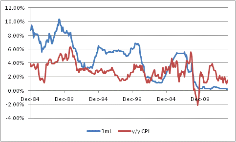
It bears noting that the correlation of Libor with forward-looking inflation is not as strong, but these are still reasonable correlations for financial markets.
The correlation between inflation and T-Bills has a much longer history, and a higher correlation (0.69) as a result of tracking well through the ‘80s inflation (see chart below, source Bloomberg and Economagic.com).

And, of course, the contemporaneous correlation of CPI to itself, if we are thinking about CPI-linked bonds, is 1.0 although the more-relevant correlation, given the lags involved with the way CPI floaters are structured, of last year’s CPI to next year’s CPI is only 0.63.
Still, these are good correlations, and might lead you to argue that FRNs are likely good hedges for inflation. Simulations of LIBOR-based bonds compared to inflation outcomes also appear to support the conclusion that these bonds are suitable alternatives to inflation-linked bonds (ILBs) like TIPS. I simulated the performance of two 10-year bonds:
Bond 1: Pays 1y Libor+100, 10y swaps at 2.5%.
Bond 2: Pays an annual TIPS-style coupon of 1.5%, with expected inflation at 2.0%.
Note that both bonds have an a priori expected nominal return of 3.5%, and an a priori expected real return of 1.5%.
I generated 250 random paths for inflation and correlated LIBOR outcomes. I took normalized inflation volatility to be 1.0%, in line with current markets for 10-year caps, and normalized LIBOR volatility to be 1.0% (about 6.25bp/day but it doesn’t make sense to be less than inflation, if LIBOR isn’t pegged anyway) with a correlation of 0.7, with means of 2% for expected inflation and 2.5% for expected LIBOR and no memory. For each path, I calculated the IRR of both bonds, and the results of this simulation are shown in the chart below.
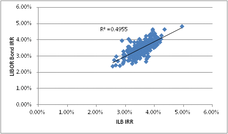
You can see that the simulation produced a chart that seems to suggest that the nominal internal rates of return of nominal bonds and of inflation-linked bonds (like TIPS) are highly correlated, with a mean of about 3.5% in each case and a correlation of about 0.7 (which is the same as an r-squared, indicated on the chart, of 0.49).
Plugged into a mean-variance optimization routine, the allocation to one or the other will be largely influenced by the correlation of the particular bond returns with other parts of the investor’s portfolio. It should also be noted that the LIBOR-based bond may be more liquid in some cases than the TIPS-style bond, and that there may be opportunities for credit alpha if the analyst can select issuers that are trading at spreads which more than compensate for expected default losses.
The analysis so far certainly appears to validate the hypothesis that LIBOR bonds are nearly-equivalent inflation hedges, and perhaps even superior in certain ways, to explicitly indexed bonds. The simulation seems to suggest that LIBOR bonds should behave quite similarly to inflation-linked bonds. Since we know that inflation-linked bonds are good inflation hedges, it follows (or does it?) that FRNs are good inflation hedges, and so they are a reasonable substitute for TIPS. Right?
However, we are missing a crucial part of the story. Investors do not, in fact, seek to maximize nominal returns subject to limiting nominal risks, but rather seek to maximize real return subject to limiting real risks.[1]
If we run the same simulation, but this time calculate the Real IRRs, rather than the nominal IRRs, a very different picture emerges. It is summarized in the chart below.

The simulation produced the assumed equivalent average real returns of 1.5% for both the LIBOR bond and the TIPS-style bond. But the real story here is the relative variance. The TIPS-style bond had zero variance around the expected return, while the LIBOR bond had a non-zero variance. When these characteristics are fed into a mean-variance optimizer, the TIPS-style bond is likely to completely dominate the LIBOR bond as long as the investor isn’t risk-seeking. This significantly raises the hurdle for the expected return required if an investor is going to include LIBOR-based bonds in an inflation-aware portfolio.
So what is happening here? The problem is that while the coupons in this case are both roughly inflation-protected, since LIBOR (it is assumed) is highly correlated to inflation, there is a serious difference in the value of the capital returned at the maturity of the bond. In one case, the principal is fully inflation-protected: if there has been 25% inflation, then the inflation-linked bond will return $125 on an initial $100 investment. But the LIBOR-based bond in this case, and in all other cases, returns only $100. That $100 is worth, in real terms, a widely varying amount (I should note that the only reason the real IRR of the LIBOR-based bond is as constrained as it appears to be in this simulation is because I gave the process no memory – that is, I can’t get a 5% compounded inflation rate, but will usually get something close to the 2% assumed figure. So, in reality, the performance in real terms of a LIBOR bond is going to be even more variable than this simulation suggests.
The resolution of the conundrum is, therefore, this: if you have a floating rate annuity, with no terminal value, then that is passably decent protection for an inflation-linked annuity. But as soon as you add the principal paid at maturity, the TIPS-style bond dominates a similar LIBOR bond. “Hooray! I got a 15% coupon! Boo! That means my principal is worth 15% less!”
The moral of the story is that if your advisor doesn’t understand this nuance, they don’t understand how inflation operates on nominal values in an investor’s portfolio. I am sorry if that sounds harsh, but what is even worse than the fact that so many advisors don’t know this is that many of those advisors don’t know that they don’t know it!
[1] N.b. Of course, they seek to maximize after-tax real returns and risks, but since the tax treatments of ILBs and Libor floaters are essentially identical we can abstract from this detail.
Shots Fired
This isn’t the first time that stocks have corrected, even if it is the first time that they have corrected by as much as 4% in a long while. I point out that rather obvious fact because I want to be cautious not to suggest that equities are guaranteed to continue lower for a while. Yes, I have noted often that the market is overvalued and in December put the 10-year expected real return for stocks at only 1.54%. Earlier in that month, I pointed out and remarked on Hussman’s observation that the methods of Didier Sornette suggested a market “singularity” between mid-December and January. And, earlier this month, I followed up earlier statements in which I said I would be negative on stocks when momentum turned and added that I would sell new lows below the lows of the week of January 17th.
But none of that is a forecast of an imminent decline of appreciable magnitude, and I want to be clear of that. The high levels of valuation make any decline potentially dangerous since the levels that will attract serious value investors are so far away. But that is not tantamount to forecasting a waterfall decline, which I have not done and will not do. How does one forecast animal spirits? And that is exactly what a waterfall decline is all about. Yes, there may be precipitating events, but these are rarely known in prospect. Sure, stocks fell sharply after Bear Stearns in the summer of 2007 liquidated two mortgage-backed funds, but stocks reached new highs in October 2007. What happened in mid-October 2007 to trigger the top? Here is a crisis timeline assembled by the St. Louis Fed. There is basically nothing in October 2007. Similarly, as Bob Shiller has documented, at the time of the 1987 crash there was no talk whatsoever about portfolio insurance. The explanation came later. How about March 2000, the high on the Nasdaq (although the S&P 500 didn’t top until September)?
What two of these episodes – 2000 and 2007 – have in common is that valuations were stretched, but I think it’s important to note that there was no obvious precipitating factor at the time. It wasn’t until well into the stock market debacle in 2007-08 that it became obvious (even to Bernanke!) that the subprime crisis wasn’t just a subprime crisis.[1]
Here is my message, then: when you hear shots fired, it isn’t the best idea to wait around to figure out why people are shooting before you put your head down. Because as the saying goes: if the enemy is in range, so are you.
And, although it may not end up being a full-fledged firefight, shots are being fired, mere days before Janet Yellen takes the helm of the Fed officially (which may be ominous since Fed Chairmen are traditionally tested by markets early in their tenure). Last night, Turkey was forced to crank up money rates by about 450bps, depending which rate you look at. When Argentina was having currency issues, it wasn’t surprising – when you have runaway inflation, even if you declare inflation to be something else, the currency generally gets hit eventually. And Russia’s central bank was established only in 1990. But Turkey, about 65% larger in GDP terms than Argentina, is relatively modern economically and has a central bank that was established in the 1930s and has been learning lessons basically in parallel with our Fed since the early 1980s. Heck, it’s almost a member of the EU. So when that central bank starts cranking up rates to defend the currency, I take note. It may well mean nothing, but since global economics has been somewhat dull for the last year or so (and that’s a good thing), it stands out as something different.
What was not different today was the Fed’s statement, compared to its prior statement. The FOMC decided to continue the taper, down to “only” $65bln in purchases monthly now. This was never really in question. It would have been incredibly shocking if the Fed had paused tapering because of a mild ripple in global equity markets. The only real surprise was actually on the hawkish side, as Minnesota Fed President Kocherlakota did not dissent in favor of maintaining unchanged (or increased) stimulus – something he has been agitating for recently. Don’t get too used to the Fed being on the hawkish side of expectations, however. As noted above, Dr. Yellen takes the helm starting next week.
The Treasury held its first auction of floating rate notes (FRNs) today, and the auction was highly successful. And why should they not be? They are T-bill credits that reset to the T-bill rate quarterly, plus 4.5bps. In the next few days I will post an article explaining, however, why floating rate notes don’t provide “inflation protection;” there has been a lot of misinformation about that point, and while I explained why this isn’t true in a post from May 2012 when the concept of the FRN program was first mooted, it is worth reiterating in more detail.
So we now have a new class of securities. Why? What constituency was not being sufficiently served by the existing roster of 1-month, 3-month, 6-month, and 1-year TBills, and 2 year notes?
I will ask another “why” question. Why is the President proposing the “myRA” program, which is essentially a way to push savings bonds (the basics of the program is that if you sign up and meet certain income requirements, the government will give you the splendid opportunity to put your money in an account that returns a low, guaranteed rate of interest). This is absolutely nothing new. You can already set up an account with http://www.TreasuryDirect.gov and have your employer make a payroll direct deposit to that account. And there’s no income maximum, and no requirement to ever roll it into an IRA. Yes, it’s true – with Treasury Direct, you will have to pay federal taxes on the interest, but the target audience for the myRA program is not likely to be paying much in the way of taxes so that’s pretty small beer.[2]
The answer to the “why” in both cases is that the Treasury, noticing that one regular trillion-dollar buyer of its debt is leaving the trough, is looking rather urgently for new buyers. FRNs, and a new way to push Treasuries on middle-class America.
Interest rates have declined since year-end, partly because equities have been weak, partly because some growth indicators have been weak recently, and partly because the carry on long Treasury securities is positively terrific. But the Treasury is advertising fairly loudly that they are concerned about whether they’ll be able to raise enough money, at “reasonable” rates, through conventional auctions. Both of these “innovations” cause interest payments to be pegged at the very short end of the curve, where the Fed has pledged to control interest rates for now, but I think interest rates will rise eventually.
Probably not, however, while the bullets fly.
[1] In a note to Natixis clients on December 4th, 2007, entitled “Tragedy of the Commons,” I commented that “M2 has grown only at a 4.4% annual rate over the last 13 weeks, and that’s egregiously too little considering the credit mess (not just subprime, as I am sure my readers are aware, but Alt-A and Prime mortgages, auto loans and credit cards too),” but the idea that the crisis was broader than subprime wasn’t the general consensus at the time by any means. Incidentally, in that same article I said “We have not entered a recession with core inflation this low in many decades, and this recession looks to be a doozy. I believe that by late 2008 we will be confronting the possibility of deflation once again. And, as in the last episode, the Fed will face a stark choice: if short rates don’t get to zero before inflation gets to zero, the Fed loses as they will never be able to get short rates negative,” which I mention since some people think I have always been bullish on inflation.
[2] I wonder how the money is treated for purposes of the debt ceiling. If the Treasury is no longer able to issue debt, then surely it won’t be able to do what amounts to issuing debt in the “myRA” program? So if they hit the debt ceiling, does interest on the account go to zero?
Imagining the Unimaginable
Last week I met and spoke with some bright minds at a big reinsurance company, who were sampling some views on inflation. Among the questions, however, were ones concerning my views on nominal interest rates, to which they are more directly exposed.
Since I was a rates strategist long before I was an inflation specialist, I do have some opinions on the matter.
Early this month, I wrote an article asking “which consensuses are worth fading?” in which I noted that of all of the “consensus” views, I am most sanguine about the view that interest rates will rise over the course of this year. Now, there are lots of ways that this view can be derailed. For example, there are a lot of concerns about a slowdown in China and what that might mean for global growth. There are other land mines, such as the risk of a default of Puerto Rico, which could send investors scurrying for at least a short time into nominal bonds. And, of course, we are not out of the woods ourselves, and a dovish Chairman Yellen (if in fact she turns out to be as dovish as we all expect) could easily stop or reverse the taper even though that does not seem to be the plan at the moment according to the Wall Street Journal’s Jon Hilsenrath.
But abstracting from the chance that a metaphorical meteor might strike the earth and ruin all of our plans, what are the chances of somewhat higher rates, or drastically higher rates? In my mind, the chances of these different outcomes derive from the types of causes that could provoke them.
10-year rates at 4% by year end – To get 10-year rates to approach 4% (a level last touched in 2010 and not seen on a closing basis since before the crisis in 2008) doesn’t require a miracle. The Fed is in taper mode, and there reportedly remains a pocket of ‘negative convexity’ that could turn a mild selloff into a major selloff if interest rates rise towards 3.25%. It was the ‘convexity trade’ that helped fuel the move in 10-year notes to 3% last year (see my comment about that here) from 1.65% in May, and another convexity-triggered selloff could easily cause rates to reach 4% at some point this year. Of course, that would still be an interesting technical development, since it would be the largest deviation above the log-channel lower in rates that has been in force for more than thirty years (see chart, source Bloomberg).

10-year rates at 5% by year end – Five percent 10-year rates seems outlandishly far away, and we haven’t seen them since 2007, but we should recognize that this is roughly a neutral nominal rate. If real growth is expected to be 2.75% on average over time, and inflation is expected to be around 2.25%, then r + i = 5%. If the Fed is normalizing policy, is it really that much of a reach to get normal market rates? I don’t see 5% as being outrageous. However, realistically I would have to say that there will be a lot of friction between here and there, by which I mean that as interest rates rise, investors will find them increasingly attractive and will rotate from equities to bonds. That will make a 200bp selloff somewhat difficult, in my view. But against this, we need to keep in the backs of our minds the possibility that the Federal Reserve could choose to start selling securities from its portfolio at some point; while the Fed professes to be relying on its reverse repo facility to be able to drain liquidity as needed, that’s only plausible if they need to drain relatively small amounts of liquidity (tens or scores of billions). As rates approach 5%, losses in the Fed’s SOMA portfolio will be large enough that it will be technically impossible for it to fully drain all of the reserves they have added – and will be a political football, no matter how the Fed chooses to account for a mark-to-market loss (see my article from a year ago on this topic here and a follow-up article with additional issues here). I am not making any predictions about what the Fed will do or not do when rates start to rise past 4%; I only point out that there will be a lot of zeroes involved and that tends to affect decision-making. A move to 5% isn’t, in short, completely crazy although I don’t think we’ll get there.
10-year rates at 8% by year end – How can you get really ugly outcomes, like 8% nominal rates (which we haven’t seen since 1991)? This is outside the realm of forecasting. A 500bp move in a year is roughly a 4-5 standard deviation event. In the post-WWII period we have never had a 500bp move on a year-end to year-end basis. In fact, we have never had 10-year rates move more than 400bps in a 12-month period. So, this is really outside of the range of outcomes one could reasonably expect in a normal world.
This is, of course, not a normal world. But it is non-normal because weird departures from normality happen stochastically and, when they do, the distribution we draw market outcomes from is unknown. Put another way: for rates to rise to 8% in a year would take something really crazy. So, we can’t make predictions, but we can play with entertaining suppositions and I will do that in a moment. But before I do, I just want to make very clear that guessing how rates would come unglued and get to 8% in 12 months is, since it relies on a chaotic break, probably unknowable in advance. We can, though, test the limits of imagination to see if we can come up with a plausible scenario in which such an outcome would not be impossible.
And here is where inflation, and specifically inflation expectations, come in. The dynamics of nominal interest rates imply that at low levels of nominal rates, movements are caused mostly by changes in real rates (thus the high beta of TIPS at low rates) while at high levels of nominal rates, movements are caused mostly by changes in inflation expectations.
Suppose that inflation expectations can be characterized as “multi-equilibrium,” meaning that they are mean-reverting within some ranges but then can jump to a new equilibrium when expectations become “unanchored.” I’m not particularly enamored of that notion, because it has been used to conceal of a lot of bad econometrics, but let’s just suppose it’s possible that inflation expectations can both anchor, and become unanchored. We could hypothesize, for example, that consumers (and investors) don’t encode “1.987% inflation” or “3.5093% inflation” or “6.421% inflation,” but rather “low inflation,” which means anything where inflation doesn’t enter into daily consideration, or “medium inflation” (which is where inflation considerations cannot be overlooked), or “high inflation” (which is where inflation considerations are the prime concern).
If that describes the way that inflation expectations behave – and I think it is fair to say that, at least, it is the way that financial journalists behave – then it’s plausible to say that inflation expectations might move very rapidly from a distribution centered around, say, 2% to one centered around 5%. And that, in turn, could trigger a very sharp move in nominal rates. If that happened, it could plausibly be worse than historical precedents if only because the system is far, far more leveraged now than it was in the late 1970s, when we last saw a sharp ramp-up in expectations.
Again, none of the foregoing is a forecast per se, but a statement of possibilities. I expect nominal rates will at some point this year (probably in late Q3) approach 4%, and I think there’s a measurable chance that things could get ugly enough, in an environment where Wall Street dealers are discouraged from providing liquidity by leaning against the flow, to push rates towards 5%. I don’t really think that’s very likely, though. And I think it’s quite unlikely that rates could approach 8% this year, or even next year. But if you’re thinking about tail risks – and you should be – it’s less important that it may happen than that it can happen. The point is not to try and look for the signals that this particular scenario is unfolding; by the very nature of such a chaotic move, it is very unlikely that we’ll correctly guess in advance what will actually cause it. But, if we can imagine a not-wickedly-outlandish scenario in which this outcome can be achieved, then it means the unimaginable is no longer unimaginable. It is possible, and the next question is whether it is worth hedging against that tail risk.
A Payrolls Report that Matters Again
Tomorrow’s Employment Report offers something it hasn’t offered in a very long time: the chance to actually influence the course of monetary policy, and therefore markets.
Now that the taper has started, its continuation and/or acceleration is very “data dependent.” While many members of the FOMC are expecting for the taper to be completely finished by the middle of this year (according to the minutes released yesterday), investors understand that view is contingent on continued growth and improvement. This is the first Payrolls number in a very long time that could plausibly influence ones’ view of the likely near-term course of policy.
I don’t think that, in general, investors should pay much attention to this report in December or in January. There is far too much noise, and the seasonal adjustments are much larger than the net underlying change in jobs. Accordingly, your opinion of whether the number is “high” or “low” is really an opinion about whether the seasonal adjustment factors were “low” or “high.” Yes, there is a science to this but what we also know from science is that the rejection of a null hypothesis gets very difficult as the standard deviation around the supposed mean increases. And, for this number and next months’ number, the standard deviation is very high.
That will not prevent markets from trading on the basis of whatever number is reported by the BLS tomorrow. Especially in fixed-income, a figure away from consensus (197k on Payrolls, 7.0% on the Unemployment Rate will likely provoke a big trade. On a strong figure, especially coupled with a decline in the Unemployment Rate below 7%, you can expect bonds to take an absolute hiding. And, although it’s less clear with equities because of the lingering positive momentum from December, I’d expect the same for stocks – a strong number implies the possibility of a quicker taper, less liquidity, and for some investors that will be sufficient sign that it’s time to head for the hills.
I think a “weak” number will help fixed-income, and probably quite a lot, but I am less sure how positive it will be for the equity market.
In any event, welcome back to volatility.
Meanwhile, with commodities in full flight, inflation breakevens are shooting higher. Some of this is merely seasonal – over the last 10 years, January has easily been the best month for breakevens with increases in the 10-year breakeven in 7 of the 10 years with an overall average gain of 15bps – and some of it is due to the reduction of bad carry as December and January roll away, making TIPS relatively more attractive. Ten-year breakevens have risen about 18bps over the last month, which is not inconsistent with the size of those two effects. Still, as the chart below (Source: Bloomberg) shows, 10-year breakevens are back to the highest level since before the summer shellacking.
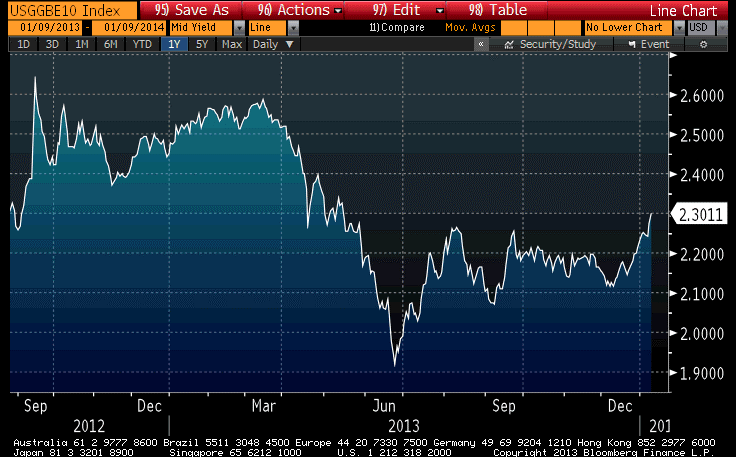 Indeed, according to a private metric we follow, TIPS are now back almost to fair value (they only very rarely get absolutely rich) compared to nominal bonds. This means that the benefit from being long breakevens at this level solely consists of the value that comes from the market’s mis-evaluating the likelihood of increasing inflation rather than decreasing inflation – that is, a speculation – and no longer gets a “following wind” from the fact that TIPS themselves were cheap outright. I still prefer TIPS to nominal Treasuries, but that’s because I think inflation metrics will increase from here and, along with those metrics, interest in inflation products will recover and push breakevens higher again.
Forecasting Cold to Continue Into Summer?
We are a people of language. The way we talk about a thing affects how we think about it. This is something that behavioral economists are very aware of; and even more so, marketers. There is a reason that portfolio “insurance” was such a popular strategy. Language matters. When we call a market decline a “correction,” we tend to want to buy it; when we call it a “crash” or a “bear market”, we tend to want to sell it.
And so as the “arctic vortex” reaches its cold fingers down from the frozen northland, it is really hard for us to think about economic “overheating.” Even though economic overheating doesn’t lead to inflation, I really believe that it is hard for investors to worry about inflation (the “fire” in the traditional “fire versus ice” economic tightrope that central bankers walk) when it is so. Darn. Cold.
But nevertheless, we can take executive notice of certain details that may suggest, overheating or not, inflation pressures really are building. I have been writing for some time about how the recent rapid rise in housing prices was eventually going to pass through to rents, and although the lag was a couple of months longer than it has historically been, it seems to be finally happening as an article in today’s Wall Street Journal suggests. This is significant for at least two reasons. The first is that housing costs are a very large part of the consumption basket for the average consumer, so any acceleration in those prices can move the otherwise-ponderous core CPI comparatively quickly. The second reason, though, is more important. Over the last couple of years, as housing prices have improbably spiked again and inventories have declined sharply, many observers have pointed out the presence of an institutional element among home purchasers. That is to say that homes have been bought in large numbers not only by individuals, but by investors who saw an inexpensive asset (they sure solved that problem!). And some analysts reasoned that the prevalence of these investors might break the historical connection between rents and home prices, at least in the short run, in the same way that a sudden influx of pension fund money could change the relationship between equity prices and earnings (that is, P/Es).
In the long run, of course, this is unlikely, but to the extent it happens in the short run it could delay the upturn in core inflation for a long time. But recent indications, such as that article referred to above, are that this effect is not as large as some had thought. The substitution effect does work. Higher home prices do cause rents to rise as more potential buyers choose to rent instead. It is a question for econometricians in the next decade whether the institutions had a large and lasting effect, or a short and ephemeral effect, or no effect at all. But what we can begin to say with a bit more confidence is that this influx of investors did not remove the tendency of home prices and rents to move together, with a lag.
On to other matters. The market curve for inflation has remained remarkably static for a long time. It is relatively steep, and perennially seems to forecast benign inflation for the next couple of years before headline inflation becomes slightly less-benign (but still not high) a few years down the road. The chart below (Source: Enduring Investments) shows the first eight years of the inflation swaps curve from today, and one year ago.
 If that was the only story, I probably wouldn’t bother mentioning it. But inflation swaps settle to headline CPI, like TIPS and other inflation-linked bonds do; however, a fair amount of the volatility in headline inflation comes from movements in energy. This is why policymakers and prognosticators look at core inflation. You cannot directly trade core inflation yet, but we can extract expected energy inflation (implied by other markets) from the implied headline inflation rates and derive “implied core inflation swaps” curves. And here, we find that the relatively static yield curves seen above hide a more interesting story. The chart below (Source: Enduring Investments) shows these two curves as of today, and one year ago.
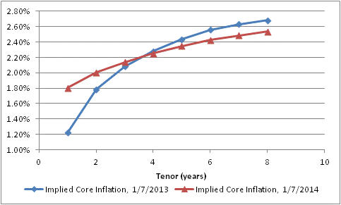 At the beginning of 2013, investors has just experienced a 1.94% rise in core prices (November to November, which is the data they would have had at the time), yet anticipated that core inflation would plunge to only 1.22% in 2013. They actually got 1.72% (as of the latest report, so still Nov/Nov). Now, investors are anticipating about 1.8% over the next 12 months – I am abstracting from some lags – but expect that inflation will ultimately not rise as much as they had feared at this time last year.
Another way to look at this change is to map the implied forward core inflation rates onto the years they would apply to. The chart below (Source: Enduring Investments) does that.
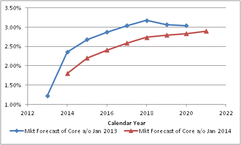 The blue line shows the market’s forecast of core inflation as of January 7th, 2013, year by year. So investors were implicitly saying that core CPI would be 1.22% in 2013, 2.36% in 2014, 2.68% in 2015, 2.87% in 2016, and so on. One year later, the forecast (in red) for 2014 has come down to 1.80%, the forecast for 2015 has declined to 2.20%, the forecast for 2016 has dropped to 2.41%, etcetera.
Has this happened because inflation surprised to the downside in 2013? Hardly. As I just noted, the market “expected” core inflation of 1.22% in 2013 and actually got 1.72%. And yet, investors are pricing higher confidence that inflation will stay low – remaining basically unchanged in 2014 before rising very slowly thereafter – and in fact won’t seriously threaten the Fed’s core mission basically ever.
As I wrote yesterday, we need to tread carefully around consensus. Now, some investors might prefer to be non-consensus by anticipating and investing for deflation in the out years, but taking the whole of the information I look at and model I think the more dangerous break with consensus would be a more-rapid and more-extreme rise in core inflation. I do not think that this economically-cold pricing environment will continue into what is essentially a monetary summer.
Which Consensuses Are Worth Fading?
A new year is upon us all, and with a five-day work week this week there is no longer any ignoring it. Markets were definitely more lubricated (and traders less so) on Monday than they were last week.
And so, as we return to full alertness, it is time to consider the recent trends and ask ourselves just what is going on. But before we do, I want to remind readers who missed the year-end series of “classics reposted” that they are worth some time to peruse if you still have time in the new year! A quick summary of those posts is here.
The only new data of the new year so far has been the ISM reports (Initial Claims was reported on January 2nd, but ‘Claims in the few weeks around year-end are so noisy that they ought to be simply ignored). The Manufacturing report came out last week, and the survey at 57.0 remains at levels similar to that of early 2011. Today’s Non-Manufacturing ISM was only 53.0, and actually closer to the lows of the last several years (see chart, source Bloomberg).
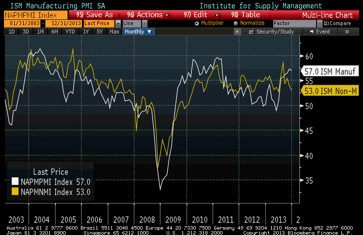
Be careful, though, how you interpret either the “strongest since early 2011” or “nearly as weak as it has been since 2010” readings. The ISM reports don’t measure activity but rather the rate of change of that activity – so higher numbers don’t indicate better growth, but more improvement in growth. Respondents are asked a question that is essentially “are things getting better or worse?” with sub-questions covering new orders, employment, and so on. So a high ISM number may mean that things are growing well, or it may mean that things were looking pretty grim but are now looking up. In either case, of course, we want to see bigger numbers but a high ISM now means more than a high ISM in 2010!
And the internals of the ISM (Manufacturing) report, which came out last week, were positive. For example, the “New Orders” component rose to 64.2, indicating good expectations of forward growth and perhaps giving some hope that the large rise in Q4 inventories may be more intentional inventory accumulation than many thought. In any event, I tend to lean more on the Manufacturing number than the non-Manufacturing number, even though the manufacturing economy is a smaller part of the economy, because there is more history to the former. I am not optimistic that economic growth will surge this year, and indeed I think the chances that we’ve seen the best growth of this cycle are not negligible. But the current readings from the ISMs are encouraging.
Less encouraging is the level of encouragement we are getting.
For example: On a new-year outlook news show last weekend, I saw one guest opine that oil is obviously going to fall further in 2014 because traders are going to see the shale oil boom, the Keystone Pipeline, etcetera and “sell, sell, sell.” Now, a good rule of thumb is that institutional oil traders aren’t hearing about those things for the first time when they hit the weekend news shows. If the news of the shale oil production and the Keystone Pipeline would make them sell…then they have already sold. That doesn’t mean that oil won’t go down, but one reason it will not go down is because of information that all of the professionals had months ago. In fact, if it is just now becoming consensus on news shows that oil could go down, then I suspect that’s a consensus worth fading.
If I had to guess at the consensus view on various asset classes, I’d surmise based on the opinions I’ve been reading and seeing that analysts generally are bullish on equities, bullish-to-neutral on credit, bearish on rates generally, bearish on commodities, bullish on economic growth, and bearish on inflation. In general, it pays well over time to fade the consensus, (although it pays better when it’s a very strong consensus but momentum is fading), so it is reasonable to ask whether the consensus views are vulnerable. So my question is, what are the odds that the consensus prognostication (whatever it is – perhaps some may disagree that these are the consensus views) is wrong on all particulars? I mean, sometimes the dragon wins. I think that it is more likely that they are wrong on all particulars than right on all particulars, but if it is some of each – and that is of course the most probable outcome – I’d say my confidence that the consensus is wrong is, from strongest confidence (most likely the consensus is wrong) to weakest (least likely the consensus is wrong) is:
Inflation (I think it will go up)
Commodities (I think they’ll go up, and downward momentum has ebbed)
Equities (I think they’ll probably go down, but upward momentum remains)
Credit (I suspect spreads will widen but I am not confident of that)
Growth (I think we have a reasonable chance of recession but I don’t see the signs yet)
Rates (they might well go up even though that’s the consensus. In fact, I am probably in the consensus)
I think the biggest question from here, investing-wise, is how the market responds to the year-end moon shot in equities. Does the parachute open or does the rocket come crashing back to earth? Or, I guess, does the rocket’s next stage fire? I am highly sensitive to the fact that a number of smart investors are extremely near-term cautious here, so I am watchfully flat and would look to sell weakness in stocks.
Artful Dodger
On some level you have to respect, even admire, Ben Bernanke for his clever announcement of the taper yesterday. The Fed surprised many long-time Fed watchers who figured that a major change in policy wouldn’t happen with an outgoing Chairman in the illiquid end-of-year period when the economic backdrop is essentially the same as it was at the prior meeting. I am one of those who was surprised, and I was not planning to write an article today because I didn’t think there would be much to write about! (But do be sure to tune in for the “reblogging best-of” series, which continues through month-end).
I was fascinated at the widespread confusion about the ultimate meaning of the FOMC statement, which seemed quite clear to me. This state of confusion is itself a very good thing. When investors are confused, they tend to keep a wider margin of safety. As long-time readers know, probably the biggest complaint I have with Fed policy of the last twenty years is the movement to transparency, which has made our markets no more predictable but dramatically less safe, with more-frequent small moves and much larger tails when highly-levered investors are surprised by something – Fed policy, banking crises, hedge fund failures, etc. So if this were to kick off a new period of opacity in Federal Reserve communications, it would be terrific. But I am not hopeful on this point.
But I have to have grudging respect for the people who formed the new “communications policy.” They used a practice long used by companies who see one of their jobs being to manage the stock price (personally I agree with Buffett here and think management’s job is to manage the company value and let Mr. Market set the price, but this is no longer a widespread view at least in the money management community). A company that is reporting “disappointing” earnings will very often simultaneously “guide higher” in future earnings. It is very rare, with certain companies – and you know who you are – to have poor earnings and poor guidance. The point is to blunt the market price reaction to real news that is bad – “the company made less money for shareholders” – with squirrelly expectations that are good – “but we’ll probably make lots more money in the future!” Incredibly, this seems to work even though we all know that the positive guidance will get battered down repeatedly before the next report.
And that’s what the Fed did. And here is what the statement said:
- The Fed is going to be buying fewer Treasuries going forward. This is real. There are going to be fewer purchasers of US Treasuries than we expected there to be just a few days ago. To be sure, they didn’t pledge to continue the taper, and made it data dependent, etc…but everything the Fed does is data dependent. In all likelihood the taper will continue, but I don’t know that. What I know is this: after no move in September and October, I didn’t expect one until March. So I thought there was a 3-month fuse. Now I know the fuse has already been lit. That’s meaningful in ways we will shortly discover.
- The Fed said they expect to keep interest rates really low for a really long period of time, based on their projections of how inflation and employment will evolve over the next couple of years. This is entirely “forward guidance,” but it’s not even for next quarter. The Fed knows no more about what inflation will be in one year – and even less, growth – than they knew two months ago. So any promise along these lines should, and shall, be overtaken by events. That is, the guidance will be watered down into the next meeting if it behooves the Fed to do so. And they will tighten when they feel the need to do so, and make up the reason to do so at that time.
That’s it. That’s what the statement says. There should be no confusion here. The $10bln taper was at the hawkish end of expectations and it matters to asset markets (year end and reluctance to take profits rather than let it ride for a week may delay asset market reactions, but it matters). The “communications” were dovish but…who cares? We already knew we have a very dovish Chairman coming in next year. No surprise there, and anyway if you’re leaning on the Fed for your two-year forecasts – good luck and Godspeed.
One final note and reminder: none of this affects the inflation outlook at all. The Fed is increasing excess reserves still, and more slowly than before. The transfer of excess reserves to required reserves and to money, by the making of loans, is a decision in the hands of the banks. Not until the Fed starts operating on required reserves, years from now, with reserves be constraining on banks. Higher interest rates will help banks make loans that are more additive to value relative to the cost of equity capital, and so money growth will stay too high and velocity will rise going forward. But none of this has anything to do with the Fed, for quite some time.
What the Fed action does do is affect the market-clearing levels of assets such as stocks and bonds because of the decline in Fed buying. I would expect interest rates to rise from here, and that will eventually get the attention of equity investors.
Portfolio Projections from 2013
This will be my last “live” post of 2013. As such, I want to thank all of you who have taken the time to read my articles, recommend them, re-tweet them, and re-blog them. Thanks, too, for your generous and insightful comments and reactions to my writing. One of the key reasons for writing this column (other than for the greater glory of Enduring Investments and to evangelize for the thoughtful use of inflation products by individual and institutional investors alike) is to force me to crystallize my thinking, and to test that thinking in the marketplace of ideas to find obvious flaws and blind spots. Those weaknesses are legion, and it’s only by knowing where they are that I can avoid being hurt by them.
In my writing, I try to propose the ‘right questions,’ and I don’t claim to have all the right answers. I am especially flattered by those readers who frequently disagree with my conclusions, but keep reading anyway – that suggests to me that I am at least asking good questions.
So thank you all. May you have a blessed holiday season and a happy new year. And, if you find yourself with time to spare over the next few weeks, stop by this blog or check your email (if you have signed up) as I will be re-blogging some of my (subjectively considered) “best” articles from the last four years. Included in that list is an article on long-run returns to equities, one on Yellen’s defense of large-scale asset purchases, an article on the Phillips Curve, one on why CPI isn’t a bogus construct of a vast governmental conspiracy, and so on. Because I don’t expect some of the places where this column is ‘syndicated’ to post the re-blogs, you should consider going to the source site to sign up for these post, or follow me @inflation_guy on Twitter.
And now, on to my portfolio projections as of December 13th, 2013.
.
Last year, I said “it seems likely…that 2013 will be a better year in terms of economic growth.” It seems that will probably end up being the case, marginally, but it is less likely that 2014 improves measurably in terms of most economic variables on 2013 and there is probably a better chance that it falls short. This expansion is at least four years old. Initial Claims have fallen from 650k per week in early 2009 to a pace of just barely more than half that (335k) in the most-recent 26 weeks. About the best that we can hope for, plausibly, is for the current pace of improvement to continue. The table below illustrates the regularity of this improvement over the last four years, using the widely-followed metric of the Unemployment Rate:
| ‘Rate | (change) | |
| 12/31/2009 | 9.90% | |
| 12/31/2010 | 9.30% | -0.60% |
| 12/31/2011 | 8.50% | -0.80% |
| 12/31/2012 | 7.80% | -0.70% |
| 11/30/2013 | 7.00% | -0.80% |
Sure, I know that there are arguments to be made about whether the Unemployment Rate captures the actual degree of pain in the jobs market. It plainly does not. But you can pick any one of a dozen other indicators and they all will show roughly the same pattern – slow, steady improvement. There is no doubt that things are better now than they were four years ago, and no doubt that they are still worse than four years before that. My point is simply that we have been on the mend for four years.
Now, perhaps this expansion will last much longer than the typical expansion. But I don’t find terribly compelling the notion that the expansion will last longer because the recession was deeper. Was this recession deeper because the previous expansion was longer? If so, then the argument is circular. If not, then why would that connection only work in one direction? What I know is that the Treasury has spent the last four years running up large deficits to support the economy, and the Fed has nailed interest rates at zero and flooded the economy with liquidity. Those two things will at best be repeated in 2014, not increased; and there is a decent chance that one or the other is reversed. Another 0.8% improvement in the Unemployment Rate would put it at 6.2%, and I expect inflation to head higher as well. A taper will be called for; indeed, it should never have been necessary because policy is far too loose as it is. Whether or not an extremely dovish Fed Chairman will actually acquiesce to taper is an open question, but economically speaking it is already overdue and certainly will appear that way by the middle of the year, absent a crack-up somewhere.
Global threats to growth do abound. European growth is sluggish because of the condition of the financial system and the pressures on the Euro (but they think growth is sluggish because money isn’t free enough). UK growth has been improving, but much of that – as in the U.S. – has been on the back of housing markets that are improving too quickly to make me comfortable. Chinese growth has recently been downshifting. Japanese growth has been irregularly improving but enormous challenges persist there. Globally, the bright spot is a modest retreat in Brent Crude prices and lower prices of refined products (although Natural Gas prices seem to be on the rise again despite what was supposed to be a domestic glut). Some observers think that a lessening of tensions with Iran and recovery of capacity in Libya, along with increasing US production of crude, could push these prices lower and provide a following wind to global growth, but I am less sanguine that geopolitical tensions will remain relaxed for long and, in any event, depending on a calm Iran as the linchpin of 2014 optimism seems pretty cavalier to me.
Note that the muddled growth picture contains some elements of risk to price inflation. The ECB has been kicking around the idea of doing true QE or experimenting with negative deposit rates. The UK housing boom, like ours, keeps the upward pressure on measures of core inflation. There is no sign of an end to Japanese QE, and the PBOC seems willing to let the renmimbi rise more rapidly than it has in the past. And all of these global risks to domestic price inflation are in addition to the internally-generated pressures from rapid housing price growth in the United States.
The good news on inflation domestically is that M2 money growth has slackened from the 8%-10% pace of last year to more like 6%-8% (see chart, source Bloomberg). This is still too fast unless money velocity continues to slide, but it is certainly an improvement. But the bad news is that money growth remains rapid in the UK and is accelerating in Japan. The only place it is flagging, in Europe, has a central bank that is anxious not to be last place on the global inflation scale. I expect core inflation (and median inflation) in the U.S. to rise throughout 2014 and for core inflation to end up above 3% for the year.
 Now, I have just made a number of near-term forecasts but I need to change gears when looking at the long-term projections. In what follows, I make no effort to predict the 3-month, 6-month, or 12-month returns of any market. Indeed, although I will present long-term risk and return outlooks, and they are presented as point estimates, I want to make it very clear that these are not predictions but rather statements of relative risk and return possibilities. For many types of instruments, the error bars around the average annual performance are so large as to make point estimates (in my view) nearly useless. The numbers come from models of how markets behave when they are priced “like they are now” in terms of several important metrics. They are not prescient. However, that is what investing is really all about: not making the “right” bet in terms of whether you can call the next card off the deck, but making the “right” bet with respect to the odds offered by the game, and betting the right amount given the odds and the edge.
I also will not make portfolio allocation recommendations here. The optimal portfolio allocation for you depends on more variables than I have at my disposal: your age, your career opportunities, your lifestyle, your goals, any insurance portfolio and your risk tolerance, to name just a few.
What I will do here, though, is to give top-down estimates of the long-run returns and risks of some broad asset classes, and make some general observations. I don’t analyze every possible asset class. For this exercise, I limit the universe to stocks, TIPS, nominal bonds (both long Treasury and corporate bonds), commodity indices and (since many of us already own it) residential real estate. My estimates and some notations about the calculations are in the table below.
| Inflation | 2.50% | Current 10y CPI Swaps |
| TIPS | 0.68% | Current 10y TIPS. This is not at equilibrium, but it is what we can lock in today. It is the highest rate available at year-end since 2010. |
| Treasuries | 0.37% | Nominal bonds and inflation-linked bonds ought to have the same a priori expectation, but Treasuries trade rich to TIPS because of their value as repo collateral. Current 10y nominal rate is 2.87%, implying 0.37% real. |
| T-Bills | -0.50% | Is less than for longer Treasuries because of liquidity preference. |
| Corp Bonds | -0.69% | Corporate bonds earn a spread that should compensate for expected credit losses. A simple regression of Moody’s “A”-Rated Corporate yields versus Treasury yields suggests the former are about 45bps rich to what they should be for this level of Treasury yields. |
| Stocks | 1.54% | 2.25% long-term real growth + 1.83% dividend yield – 2.54% per annum valuation convergence 2/3 of the way from current 24.3 Shiller P/E to the long-run mean. Note that I am using long-run growth at equilibrium, not what TIPS are implying. This is the worst prospective 10 year real return we have seen in stocks since December 2007. Now, to be fair in 1999 we did get to almost -2%, which would imply up to another 35-40% upside to stocks before we reached an equivalent height of bubbliness. That is a 35-40% that I am happy to miss. |
| Commodity Index | 6.26% | Various researchers have found that commodity futures indices have a long-run diversification return of about 3.5%. To this we add 1-month LIBOR to represent the return on the collateral behind the futures, and a ‘relative value’ factor to reflect the performance (relative to the expected model) of hard assets relative to currency. |
| Real Estate (Residential) | -0.19% | The long-run real return of residential real estate is around +0.50%. Current metrics have Existing Home Sales median prices at 3.79x median income, versus a long-term average of 3.55x. Converging to the mean over 10 years would imply an 0.69% per annum drag to the real return. This is the first time since 2008 that housing prices have offered a negative real return on a forward-looking basis. |
The results, using historical volatilities calculated over the last 10 years (and put in terms of ‘real annuitized income,’ a term that means essentially the variance compared to a fixed 10-year real annuity, which in this analysis would be the risk-free instrument), are plotted below. (Source: Enduring Investments).

Return as a function of risk is, as one would expect, positive. For each 0.33% additional real return expectation, an investor must accept a 1% higher standard deviation of annuitized real income. However, note that this is only such a positive trade-off because of the effect of commodities and TIPS. If you remove those two asset classes, which are the cheap high-risk and the cheap low-risk asset classes, respectively, then the tradeoff is worse. The other assets lie much more closely to the resulting line, which is flatter: you only gain 0.19% in additional real return for each 1% increment of real risk. Accordingly, I think that the best overall investment portfolio using public securities – which has inflation protection as an added benefit – is a barbell of broad-based commodity indices and TIPS.
TIPS by themselves are not particularly cheap; it is only in the context of other low-risk asset classes that they appear so. Our Fisher model is long inflation expectations and flat real rates, which merely says that TIPS are strongly preferable to nominal rates but not a fabulous investment in themselves (although 10-year TIPS yields are better now than they have been for a couple of years). Our four-asset model remains heavily weighted towards commodity indices; and our metals and miners model is skewed heavily towards industrial metals (50%, e.g. DBB) with a neutral weight in precious metals (24%, e.g. GLD) and underweight positions in gold miners (8%, e.g. GDX) and industrial miners (17%, e.g. PICK). (Disclosure: We have long positions in each of the ETFs mentioned.)
Feel free to send me a message (best through the Enduring website http://www.enduringinvestments.com ) or tweet (@inflation_guy) to ask about any of these models and strategies. In the new year, I plan to offer an email “course”, tentatively entitled “Characteristics of Inflation-Protecting Asset Classes,” that will discuss how these different assets behave with respect to inflation and give some thoughts on how to put an arm’s-length valuation on them. Keep an eye out for the announcement of that course. And in the meantime, have a happy holiday season and a merry new year!
Twit or Treat?
I guess we have to add to the list of uncomfortable comparisons to 1999’s equity mania the Twitter IPO. A widely-known company with no earnings…and no visible way to produce any revenues of note, much less earnings…went public and promptly doubled. Hedge funds which were able to get in on the IPO allocation cheered this nice kick to their performance numbers, and the backers of the now-$25bln-company are surely elated. But the rest of us have got to be thinking about Pets.com.
It was an article by Hussman Funds (ht rich t) that got me thinking more deeply about these comparisons. Although the article was referred to me partly because of the insightful comments about the Phillips Curve, which echo similar comments I have made in the past, I kept reading to the end as I usually do when trapped in a Hussman article! While there are a number of us (including Hussman, Grantham, Arnott, e.g.) who have been concerned for a while about equity market valuations since we use similar metrics, I really haven’t been terribly concerned about the possibility of an imminent and steep market decline for a while, though I think returns from these levels over the next decade will be close to flat in real terms as they were after the 1999 peak. However, Hussman had me thinking about this.
I do think that there is one key difference from 1999, and that is that not everyone is talking about stocks. That is, not yet…the Twitter IPO might get us there – on Fox Business News today a young talking head (who was no more than 10 years old in 1999) made sure that viewers were informed that anyone could buy Twitter, just by calling their broker. (Not just anyone, though, could get in at the IPO price…a point the cub reporter neglected to mention).
The counter-argument to “is this a 1999 set-up?” takes two forms. The less-sophisticated form is “nuh-uh”, although usually said in a slightly more elaborate way that implies the questioner is a mindless, not to mention soulless, Communist who isn’t getting enough loving at home. The more-sophisticated argument is worth considering, but isn’t particularly soothing to me. This hypothesis is that this isn’t 1999, it’s 1997, before the parabolic blow-off and with lots of room left to run. It wasn’t as if there was any lack of skepticism about the stock market’s levels (which, sweetly, we considered lofty at the time):
“Is it possible that there is something fundamentally new about this current period that would warrant such complacency? Yes, it is possible. Markets may have become more efficient, competition is more global, and information technology has doubtless enhanced the stability of business operations. But, regrettably, history is strewn with visions of such “new eras” that, in the end, have proven to be a mirage. In short, history counsels caution.” – Alan Greenspan, February 26th, 1997
The bubble, of course, did not pop in 1997. It popped in 1999, after Greenspan had abandoned his prior skepticism (in late 1998, as he came to believe that “I do not claim that all market behavior is a rational response to changes in the real world. But most of it must be. For, were it otherwise, the relatively stable economic environments that have been evident among the major industrial countries over the generations would not be possible”). Between 1997 and 1999, there was plenty of time for investors to make money, and as long as they realized they were taking money for the future and got out before 2000…alas, very few of them did.
But, speaking from experience, the 1997-1999 period was very lonely. While investors who gradually sold their long positions out in 1998 and 1999 did much better than the ones they were selling to, they were also very unpopular at cocktail parties. The bearish analysts were put on the street, begging for tuppence. Which, considering that most of them were in the United States, was also unsuccessful.
The 1999 bubble…and the later property bubble…also did not burst until the Fed was actually tightening policy. It is on this point that many bullish arguments depend, but it is a weak one I believe. To be sure, there is no chance that the Fed will be tightening policy any time soon. The taper is not going to happen until 2014Q2 at the earliest, and I think it will take until later in 2014, when inflation figures will become uncomfortable, before they will start pulling back on QE. Some observers believe it will be much later. A Wall Street Journal article on Wednesday detailed a recent research paper written by the head of the monetary affairs division at the Fed; it argued that it may make sense for the Fed to lower its Unemployment Rate threshold and said that “an ‘optimal’ policy might keep rates near zero as late as 2017.”
The activist Fed continues to be one of the biggest risks to the market and the economy. As a trader, I know that 90% of trading is just sitting there, waiting for the ‘fat pitch’ you can do something about. It boggles my mind that a central banker doesn’t sit around at least that much, considering that they know even less about the complexities of the global economy than I know about the complexities of the market. And, unlike the global economy, the market doesn’t fight back when I act on it.
I actually have a feeling that we won’t be worrying about those Unemployment thresholds, either the old ones or the ones proposed in that paper. As I wrote late last month, the expansion is getting a bit long in the tooth and I would not be surprised to see another recession looming in 2014. I don’t have any reason for that outlook other than the calendar, but sometimes these reasons become obvious only in hindsight.
In any event, though, I wouldn’t wait around for the Fed to be tightening. It isn’t overnight funding rates that I would worry about, but longer-term interest rates, and there has already been a warning shot fired that indicates the Fed is not wholly in control of those rates.
So, it may be too early to be out of equities. Maybe even a lot too early. But one thing I am sure of is that it isn’t too late. It is the latter condition, not the former, that is the most damaging to one’s financial position.
Is Inflation of 2% Enough for You?
In one of those “what could possibly go wrong with that plan” moments – which are becoming all too frequent these days – the New York Times this weekend reported that there is “growing concern inside and outside the Fed that inflation is not rising fast enough.”
At some level, this is not exactly new thinking. For decades, economists have argued that “price stability” really means inflation of something just slightly over 0%, because it is assumed to be quite hard to get out of a deflationary spiral. in my view, that’s silly, because simply adding a zero to the currency in everyone’s pocket is a guaranteed way to get out of deflation. It may be that since nudging inflation higher is harder than kicking it higher, the costs of mild deflation are higher than the costs of mild inflation, but I think the jury is out on that question since it isn’t something we have ever experienced. But in any event, this is the reason that inflation in the neighborhood of 2%, rather than 0%, has been the Fed’s implicit or explicit target for a long time.
To the extent that discussion stays academic, it’s not worrisome. Navel-gazing is an occupational hazard of being a professional economist, after all. But now, there are louder and more frequent voices arguing that 2% is too low a target. To see how urgent a problem this is, I submit the following chart, which shows median CPI, along with a horizontal line at 2.25% (roughly equivalent to a 2% target on PCE). Wow, I can see the reason for panic. We are nearly 0.2% below that! And we got within 0.6% of deflation in 2010, in the aftermath of the worst credit crisis in almost 100 years.
 I am all for the idea that mild inflation serves to lubricate the gears of commerce, but we should remember that when the CFO of Costco says he likes rising inflation because in that circumstance “the retailer is generally able to expand its profit margins,” that’s good for the equity market perhaps but not as good for the consumer!
It always amazes me how sketchy is the understanding of inflation in a capital markets context by members of the Fed. In the aforementioned article, Chicago Fed President Evans is quoted saying “If inflation is lower than expected, then debt financing is more burdensome than borrowers expected. Problems of debt overhang become that much worse for the economy.” This is absolutely true, but almost completely irrelevant in the current context. Inflation has been lower than a priori expectations since about 1980, which is why a long-nominal-bond position has routinely outperformed inflation. But currently, as the chart below illustrates, 10-year inflation breakevens are at 2.19%. Fully 72% of all 10-year periods since 1914 have seen compounded inflation above that level.
 Ten-year inflation swaps, a better measure of inflation expectations, are at 2.52%, which still doesn’t sound like a horrible bet for borrowers. If inflation comes in above 2.52%, the borrower of 10-year fixed-rate money wins; if it comes in below 2.52%, the borrower loses. This is one reason that it is so rare to see corporations issue inflation-indexed debt…they like that bet.
Finally, the article explains that higher inflation allows workers to get higher wages, and gives the example of teachers in Anchorage, Alaska, who just agreed to a contract giving them 1% pay increases for each of the next three years. Since inflation is likely to be above that, the article says, they will be probably receiving a pay cut in real terms. This is absolutely true. (It is also the exact opposite position of the debtor, in that the teachers will do better in real terms if deflation actually happened. Sometimes I just wish the authors of these articles would be consistent.) But this circumstance certainly isn’t helped by inflation; since wage increases tend to trail inflation, real wages tend to lag in inflationary upticks.
None of this represents deep insight from this author. It merely represents that I have at least a rudimentary understanding of how inflation works, and a respect for the damage which inflation can cause to economies, workers, and savers. The fact that this is increasingly rare these days is probably cyclical, and unfortunately is probably a minimum condition for setting up this next inflation debacle. In that context, and with more Federal Reserve economists openly musing about needing to target higher inflation, does 2.19% breakeven sound like a bad deal?
